
Pantone Fall 2018
/
I’m obsessed with ink palettes, it’s a bit of a sickness really. Every little while I post a seasonal ink palette based off of what I’m loving right now, but for today I decided to match up inks with Pantone’s 2018 Fall Trend Report. This year they did a Top 10 Color Palette, and a Classic Color Palette. I love having two different palettes to work from. Frankly, I’m not trendy at all, but Pantone is great at keeping up with the current trends, so let’s find some inks that match their colors.


Classic Color Palette, left to right:
PenBBS 141 La Liberte
Pilot Iroshizuku Kiri-same

I love neutral inks, so I rather love this palette. Between the Top 10 and the Classic Colors, there are a million color palettes you can create. Here’s some of my favorite combinations:

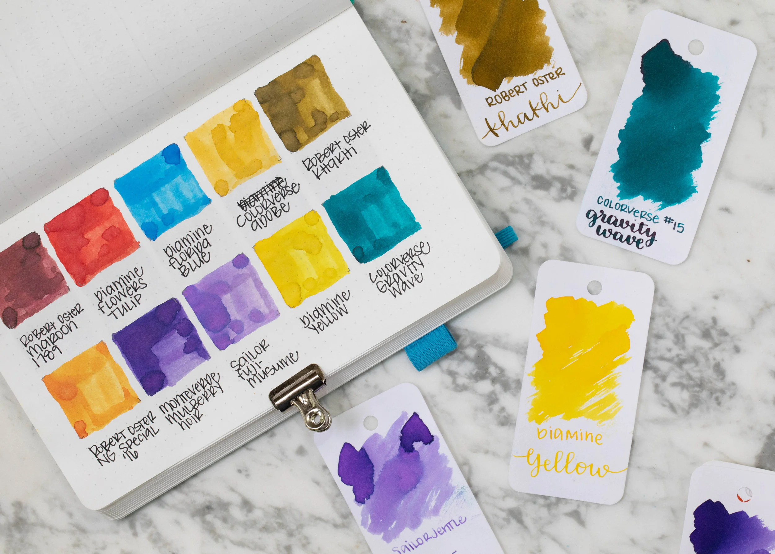
Robert Oster Maroon 1789, Robert Oster Khakhi, Monteverde Mulberry Noir, and Colorverse Gravity Wave. I love this color combo.

Robert Oster Caffe Crema, Diamine Flowers Tulip, Robert Oster Ng Special ‘16, and Colorverse Adobe. I would call this more of a classic fall palette since it has brown, red, orange and yellow, what most people call “fall” colors.

Diamine 1864 Blue Black, Robert Oster Caffe Crema, Robert Oster Maroon 1789, and Monteverde Mulberry Noir.

Diamine 1864 Blue Black, Monteverde Mulberry Noir, Robert Oster Ng Special ‘16, and Colorverse Gravity Wave.

Robert Osteer Maroon 1789, Diamine Silver Fox, Colorverse Gravity Wave, and Monteverde Mulberry Noir.
Do you think you follow color trends or just use what you love? Come back next week to see my favorite fall stationery supplies.
Disclaimer: All photos and opinions are my own. There are no affiliate links on this page, and this post is not sponsored in any way.