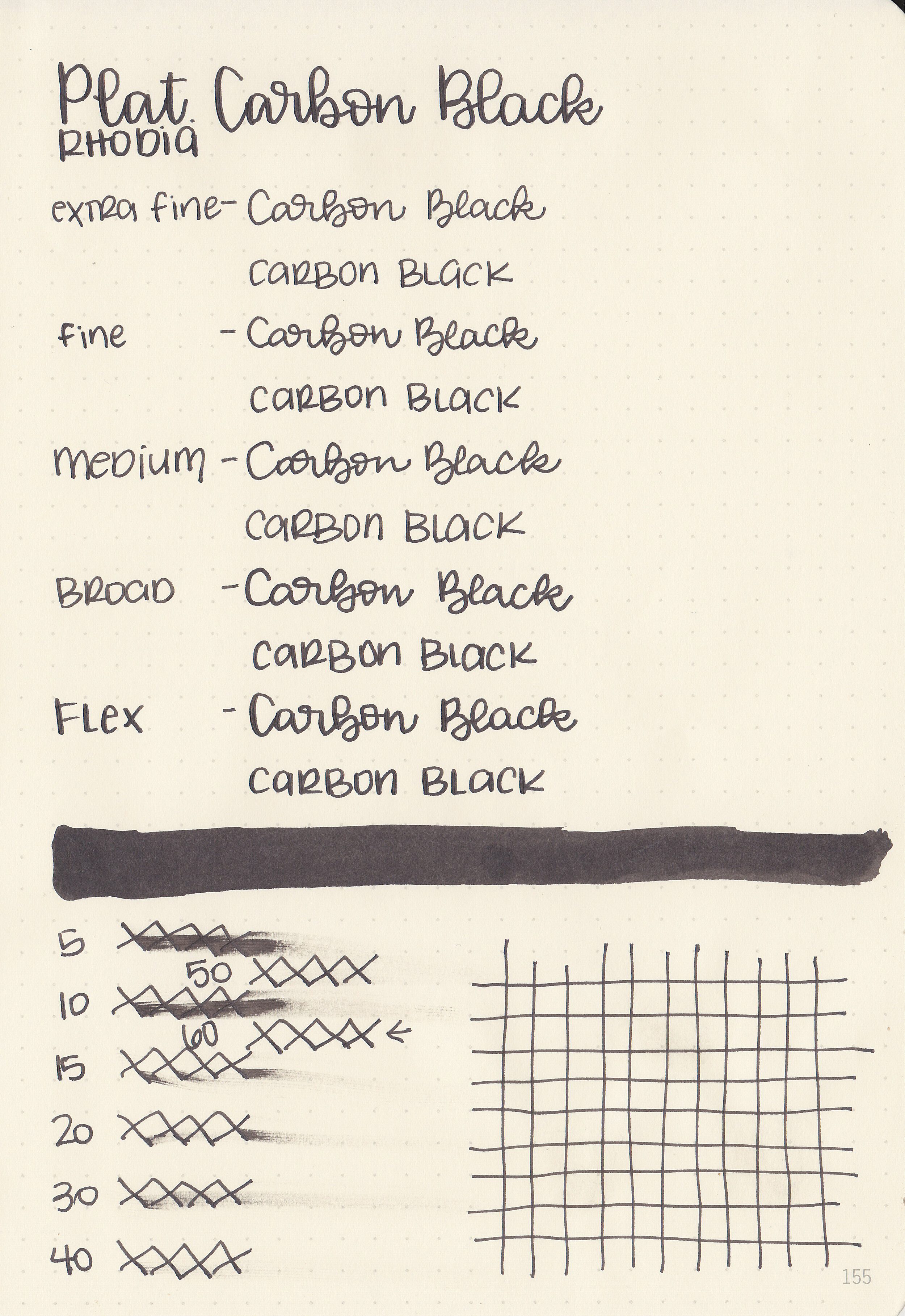
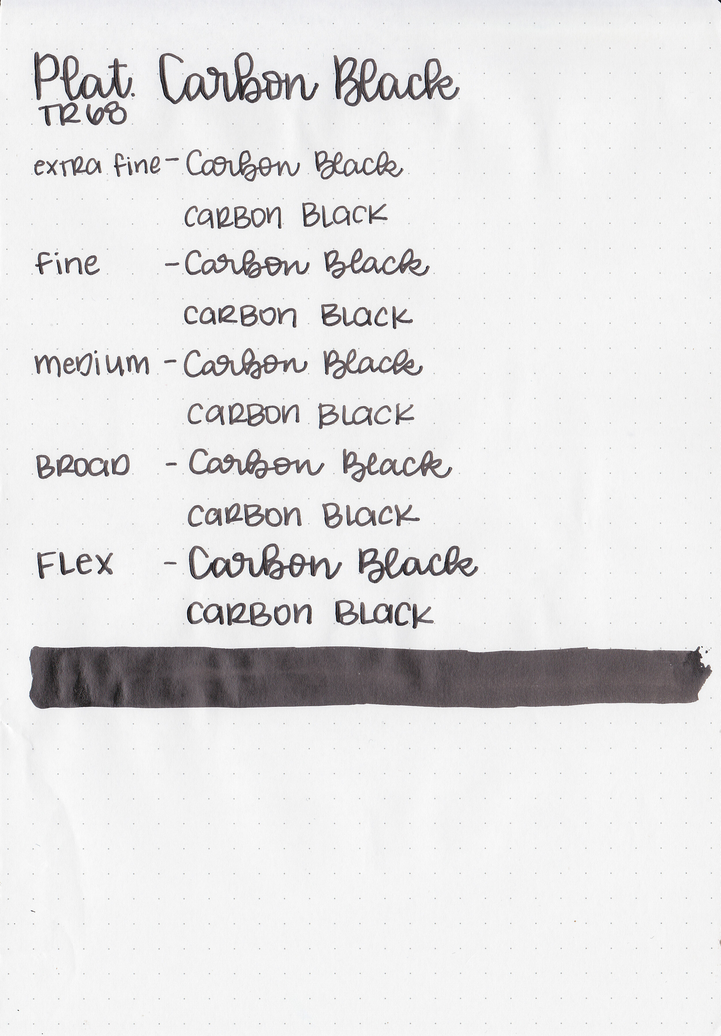
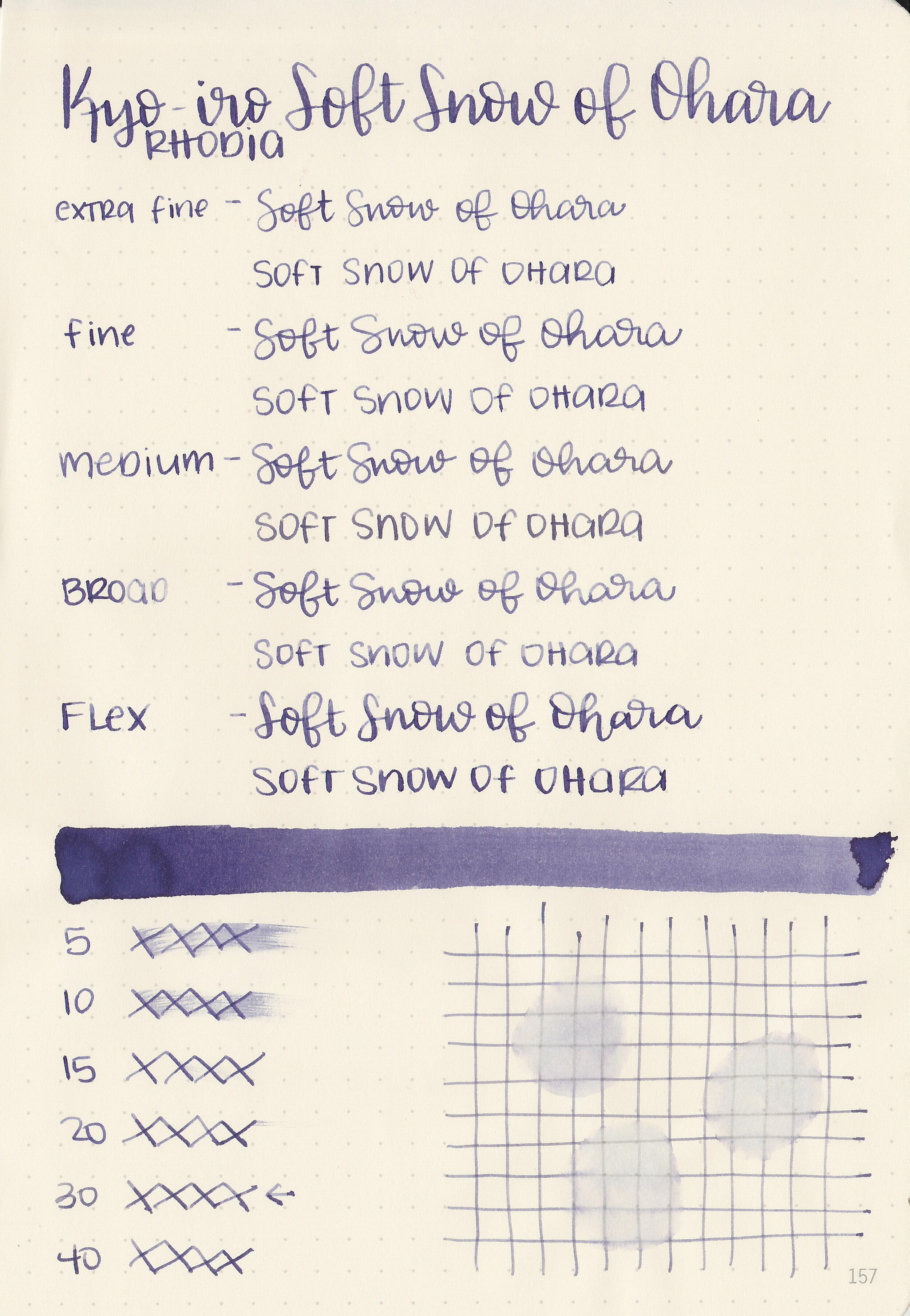
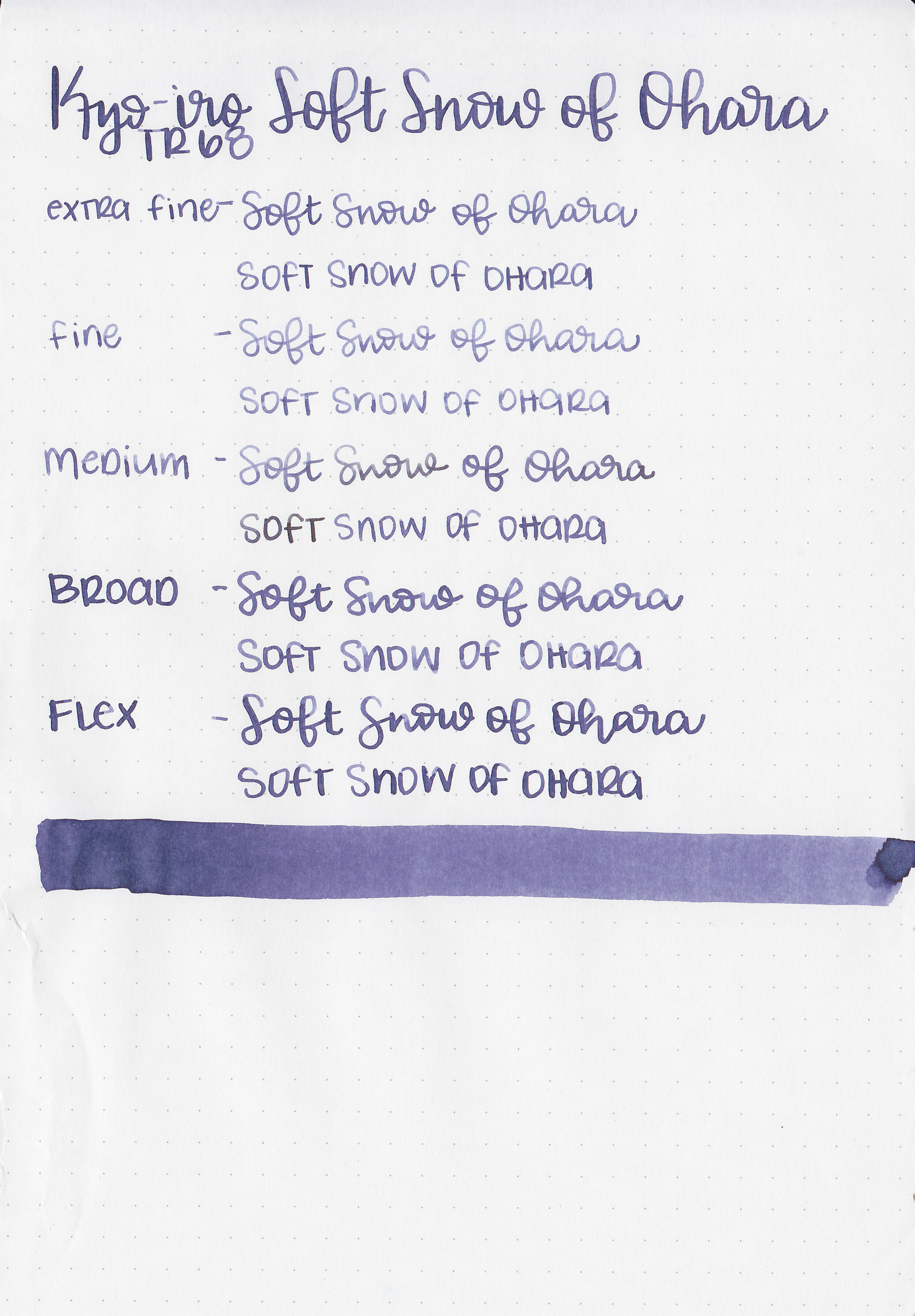
Ink Review #1067: Kyo-iro Soft Snow of Ohara
/
Today’s ink is Kyo-iro 02 Soft Snow of Ohara. This ink has been on my radar for a while, I’ve just never tried it before. Thanks to the reader that sent this ink in! You can find this ink for sale at most retailers including Pen Chalet.

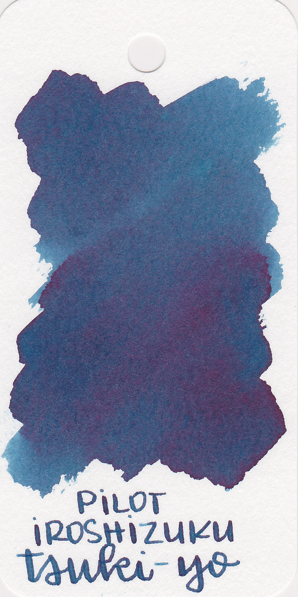
The color:
Soft Snow is a dark, moody purple.
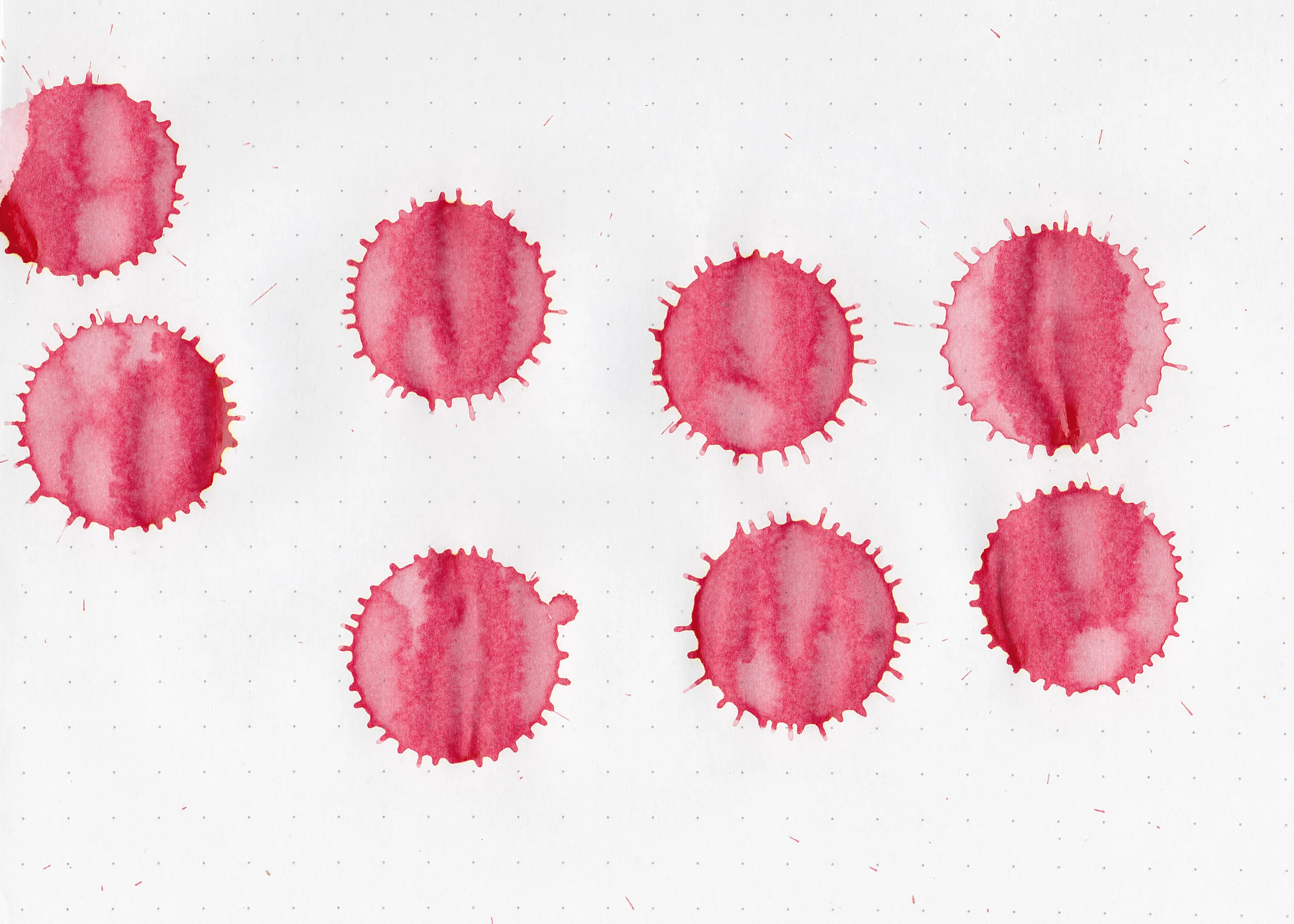
Swabs:
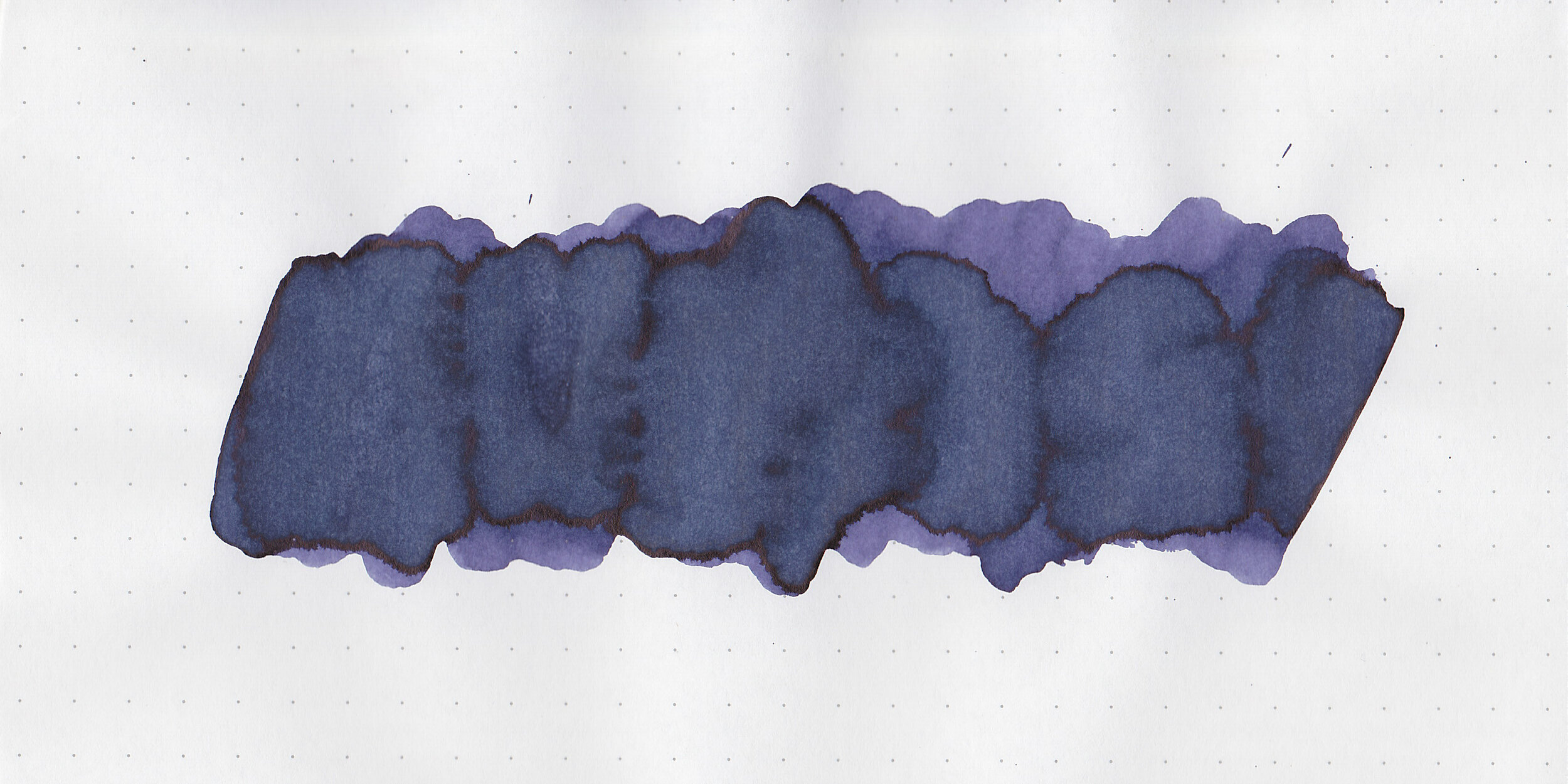
In large swabs on Tomoe River paper there’s a small bit of black sheen.

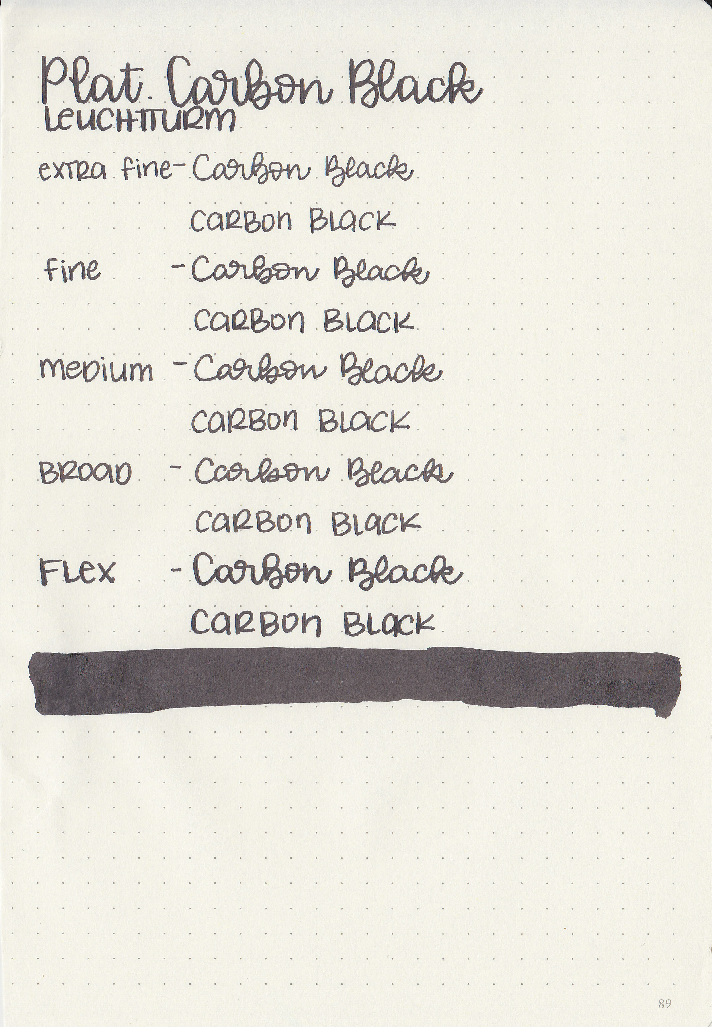
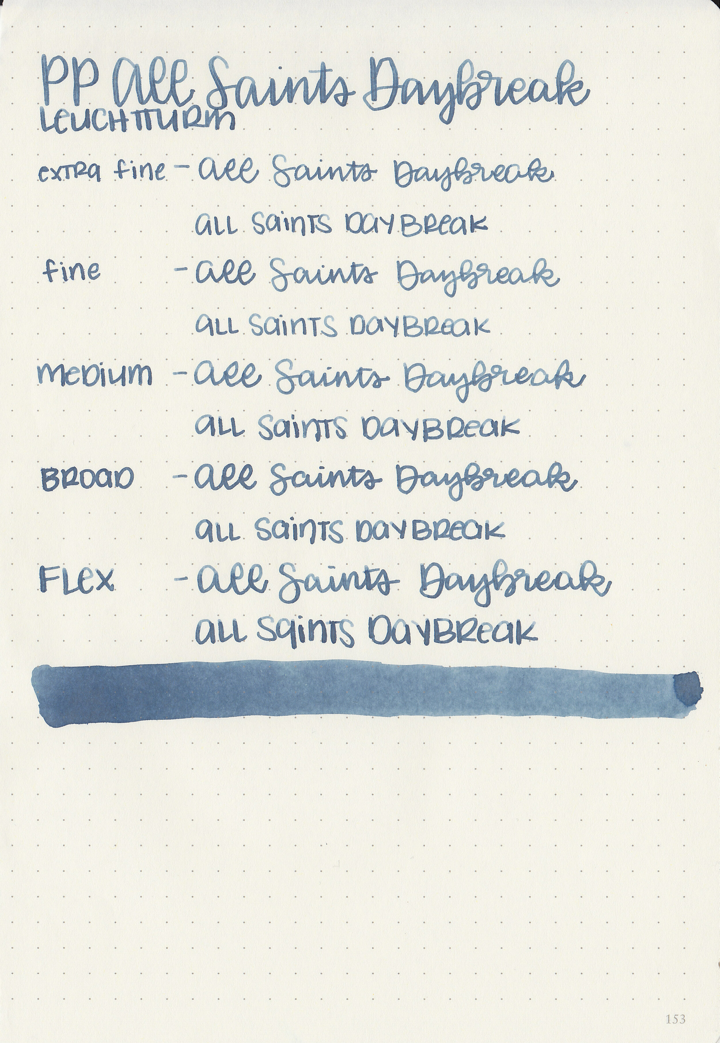
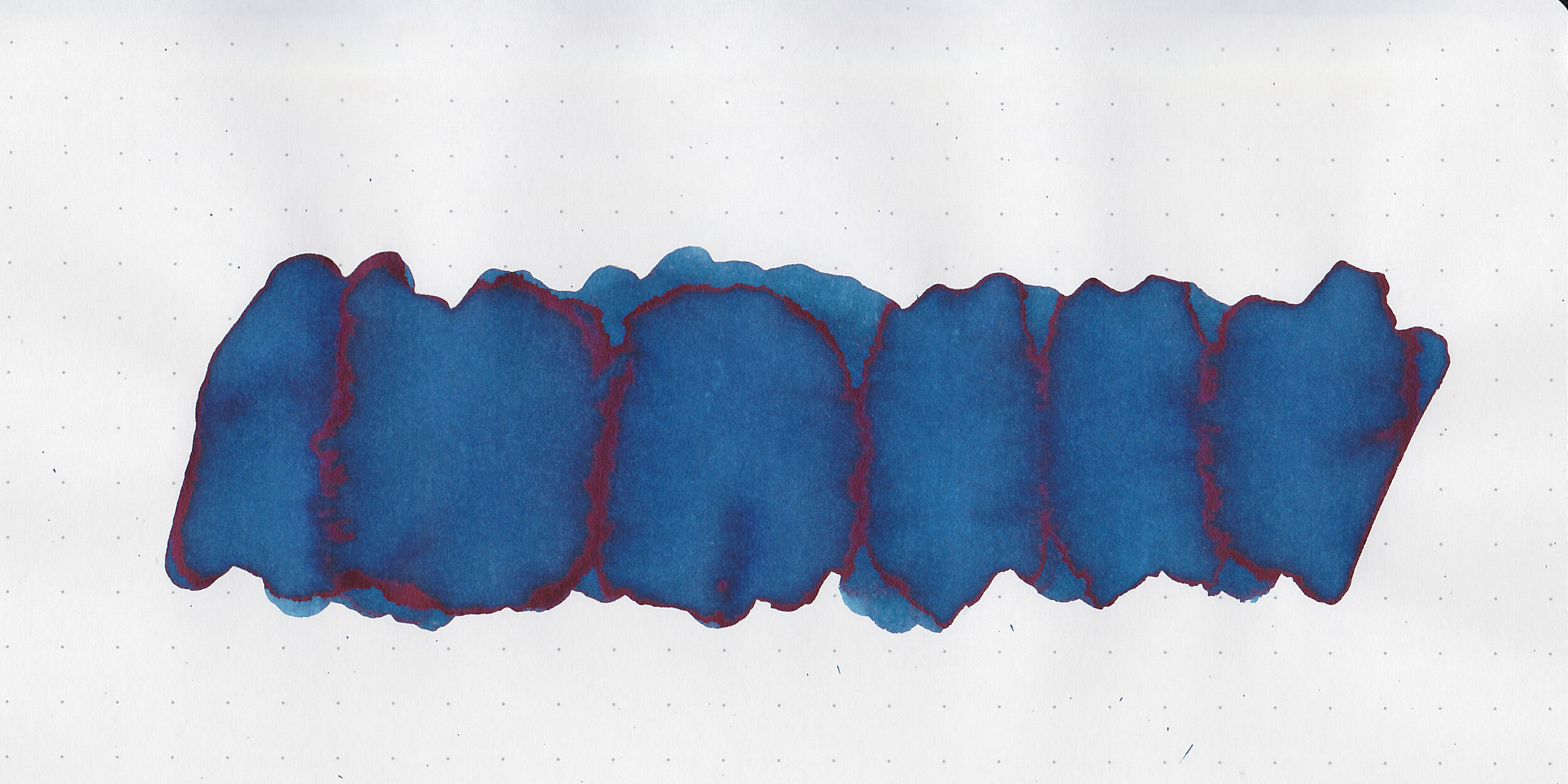
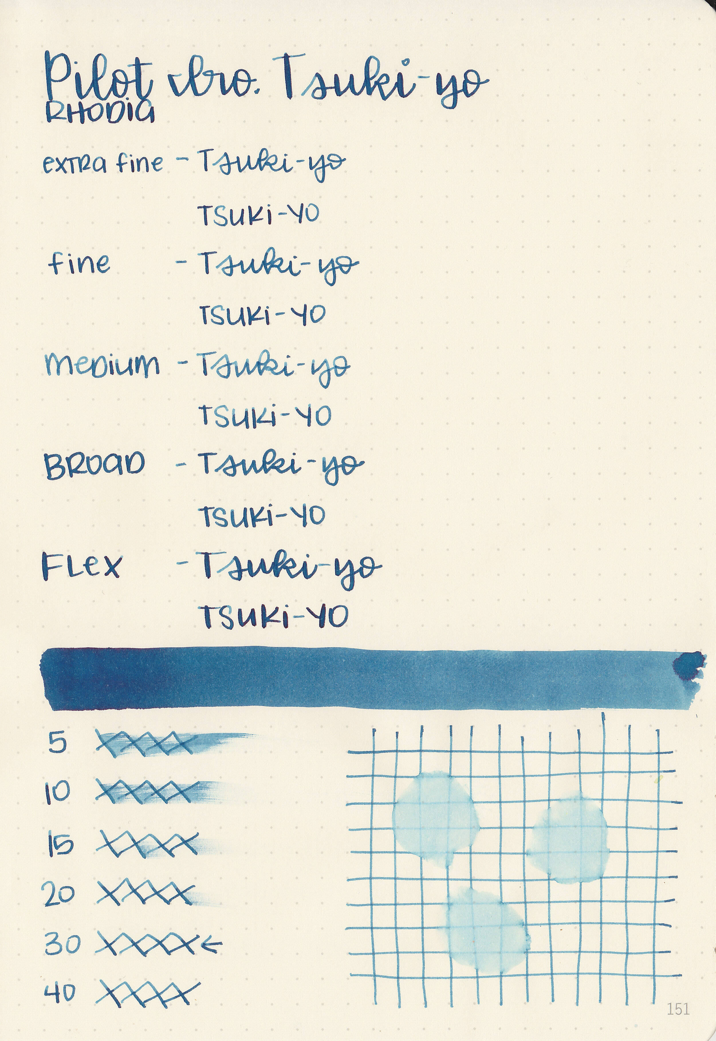
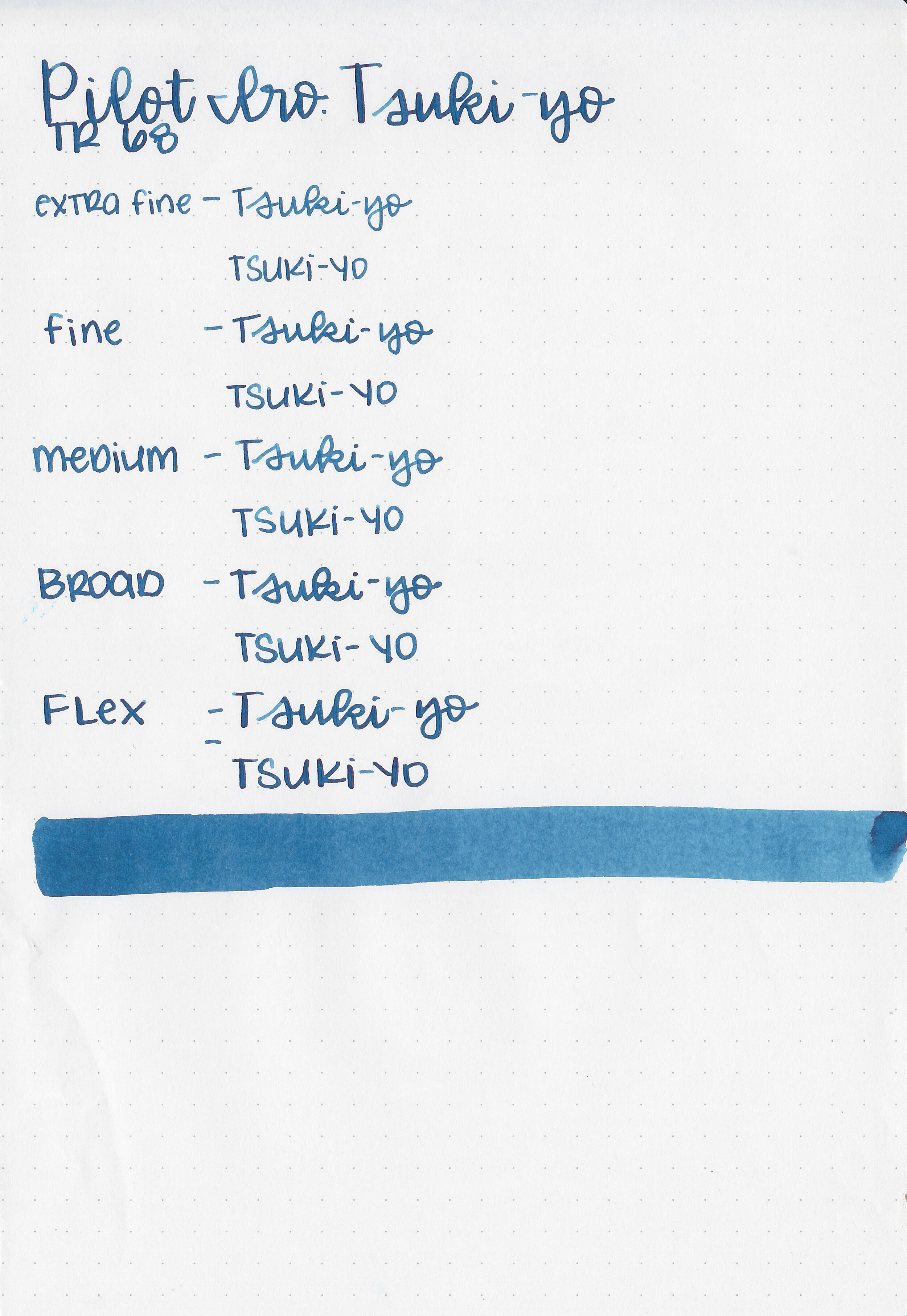
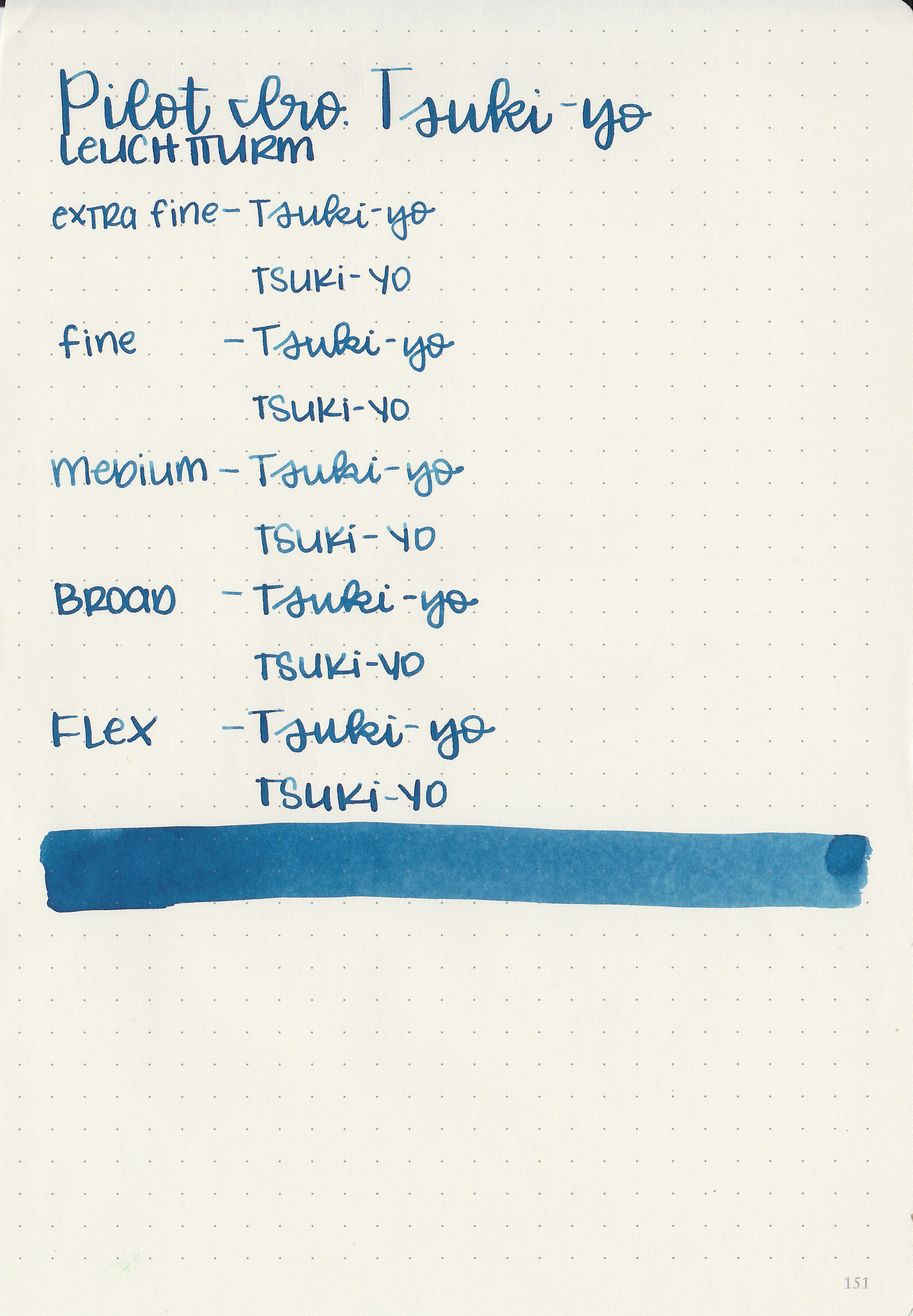
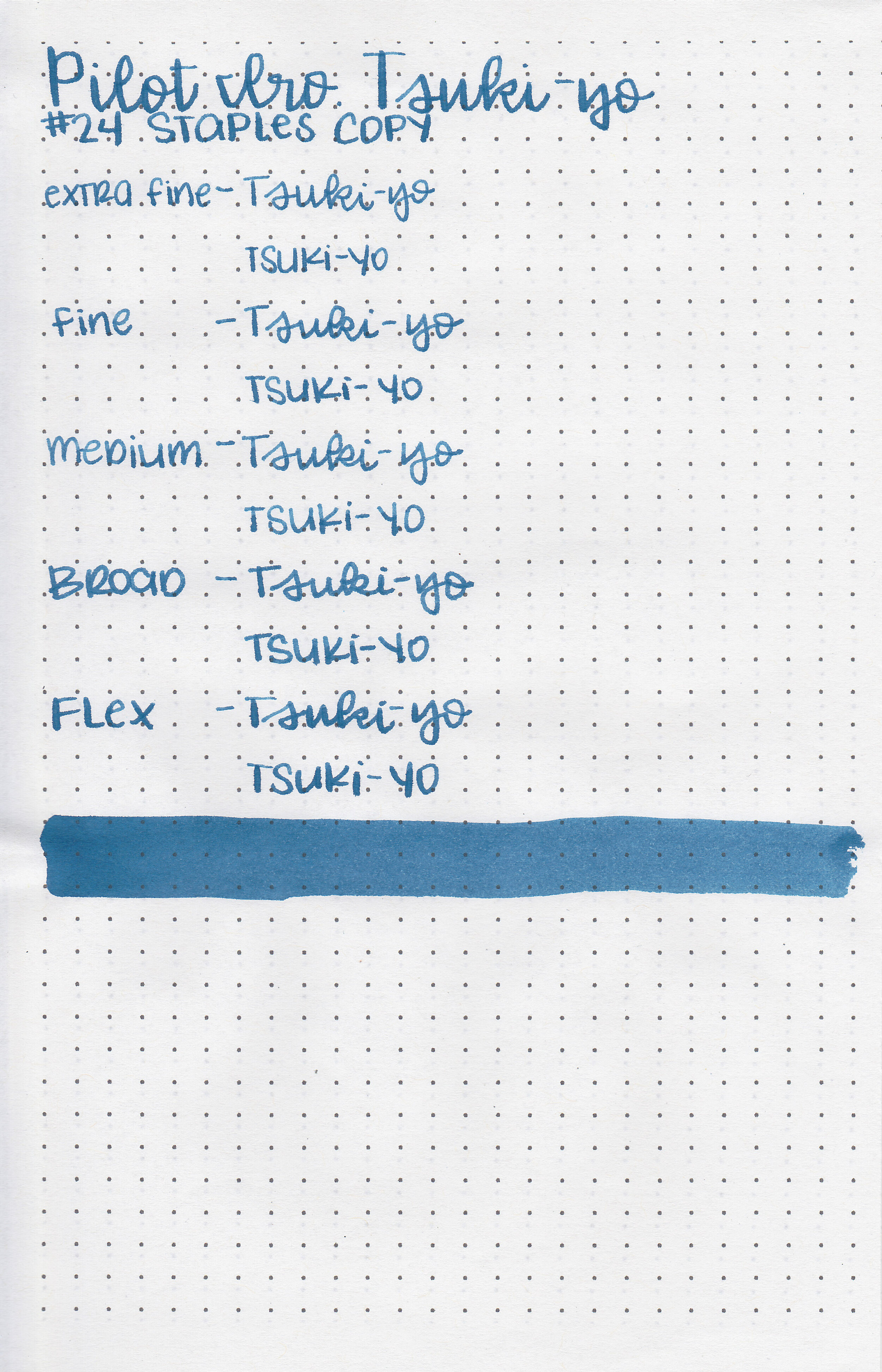
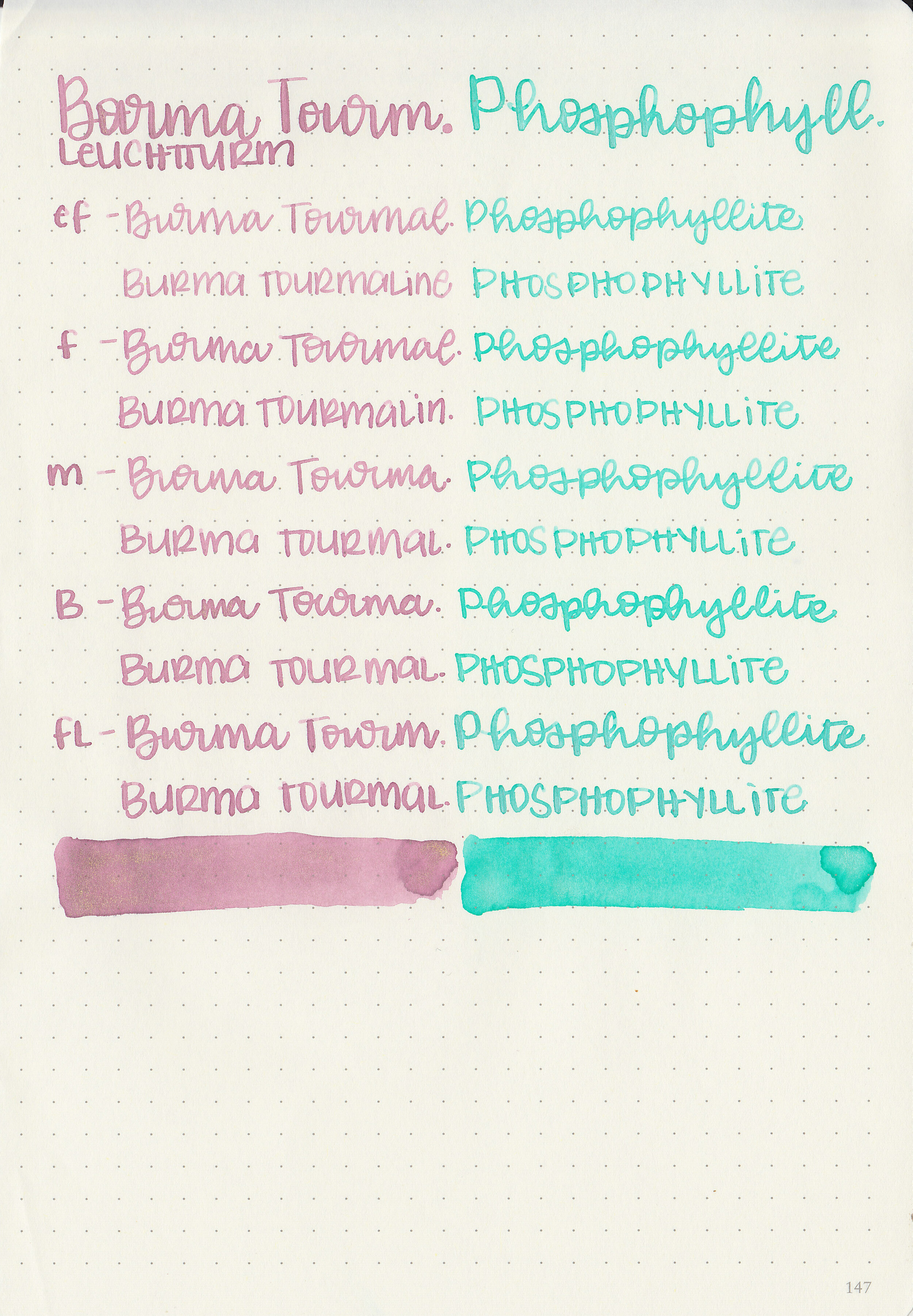
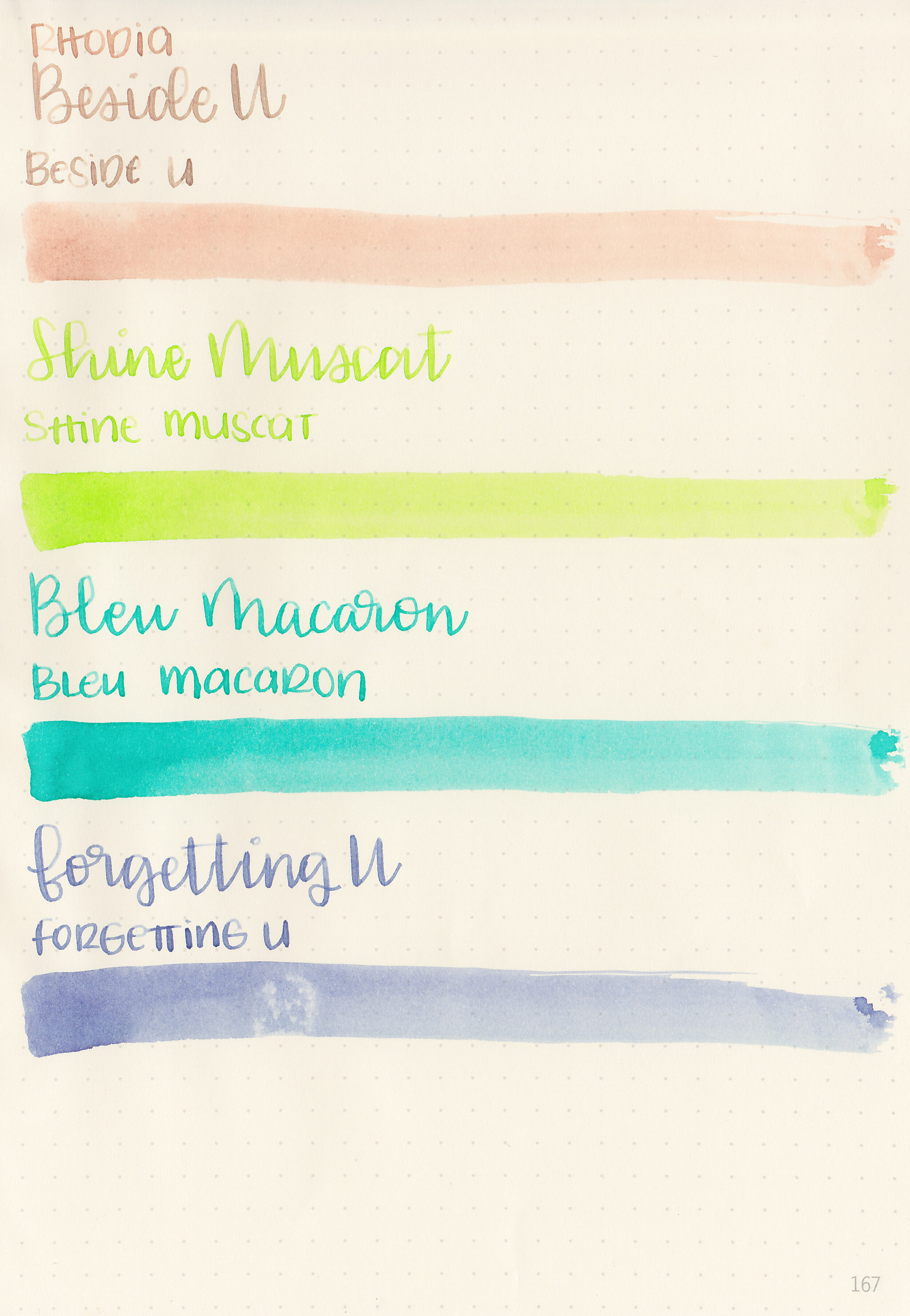
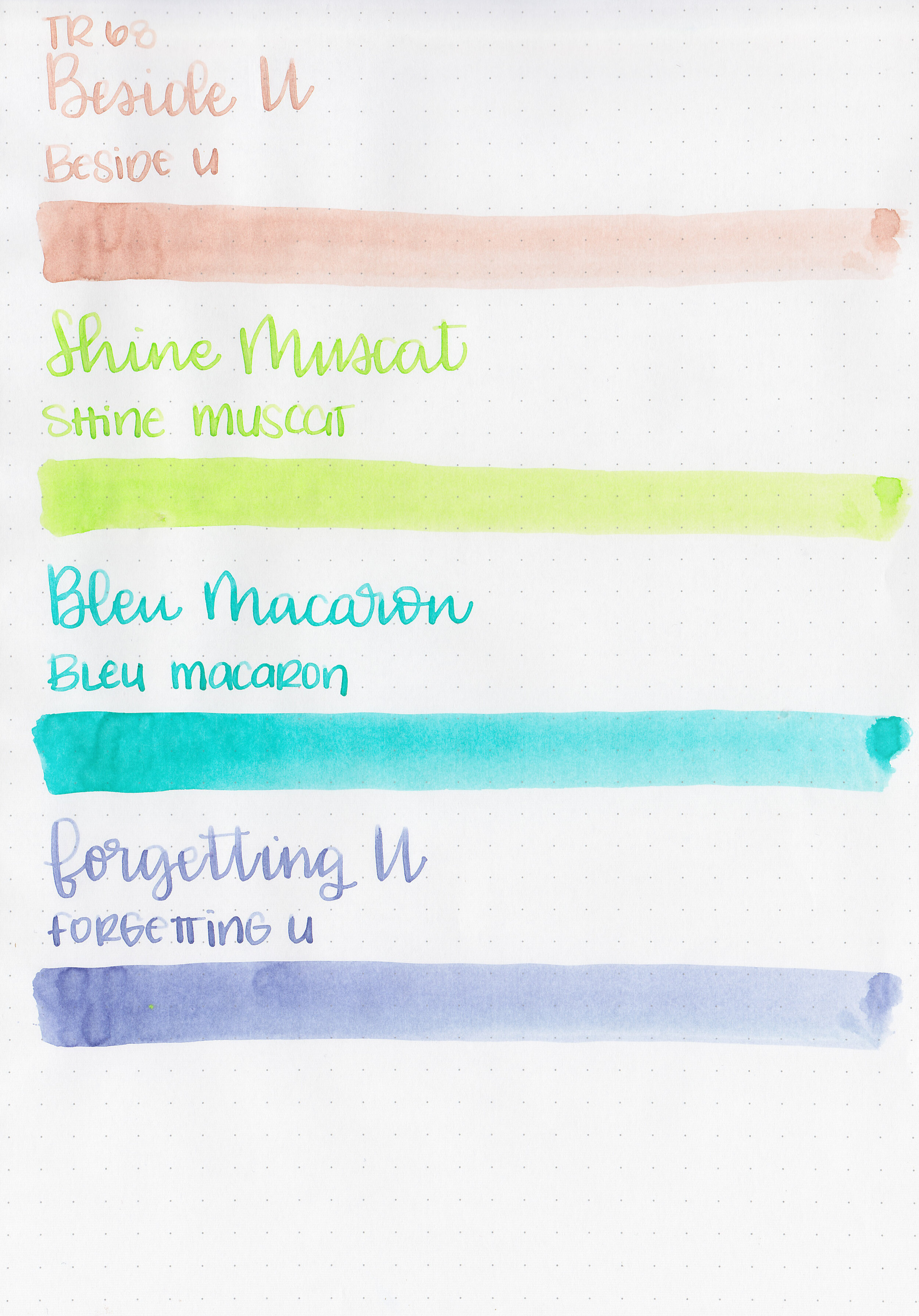
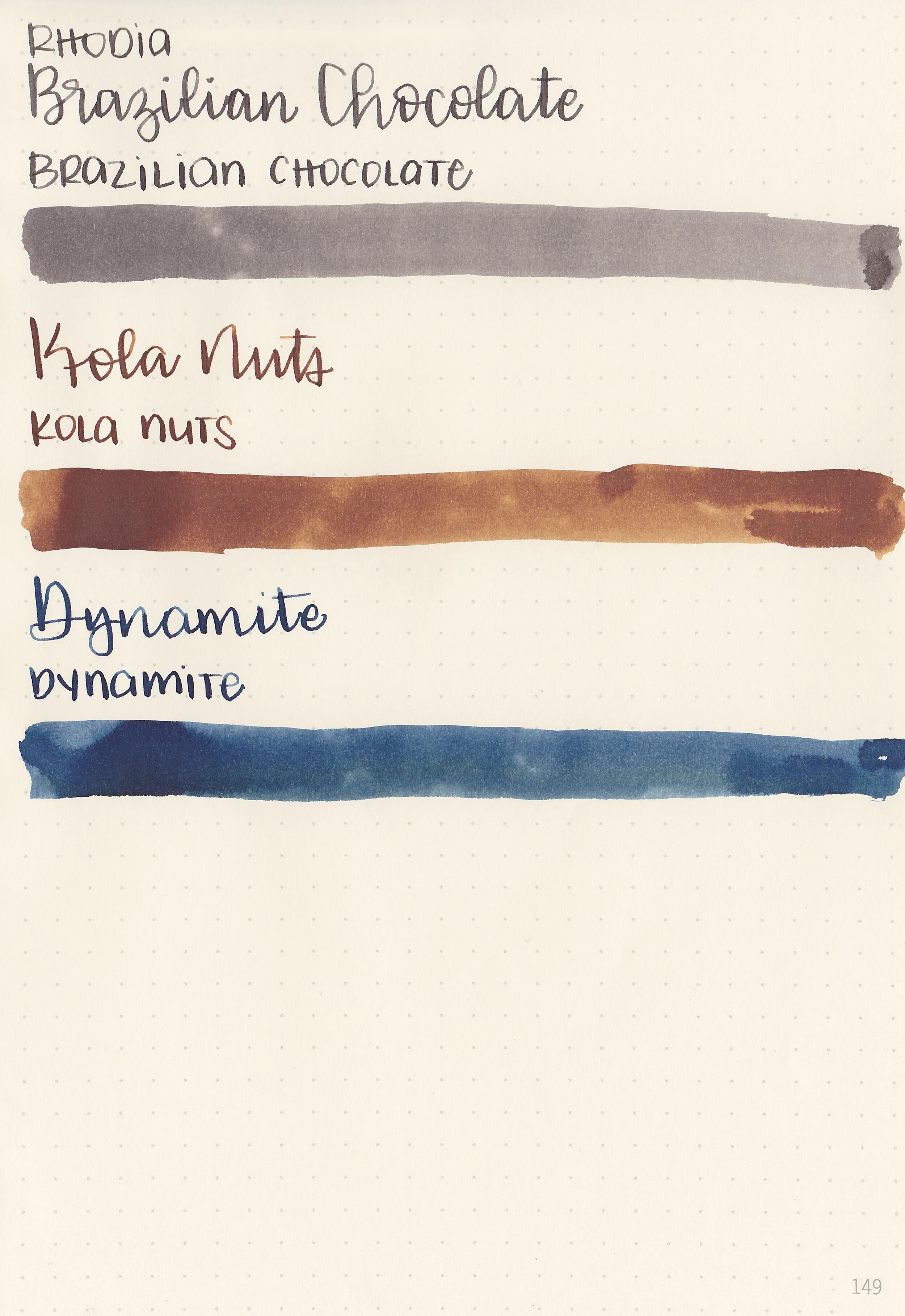
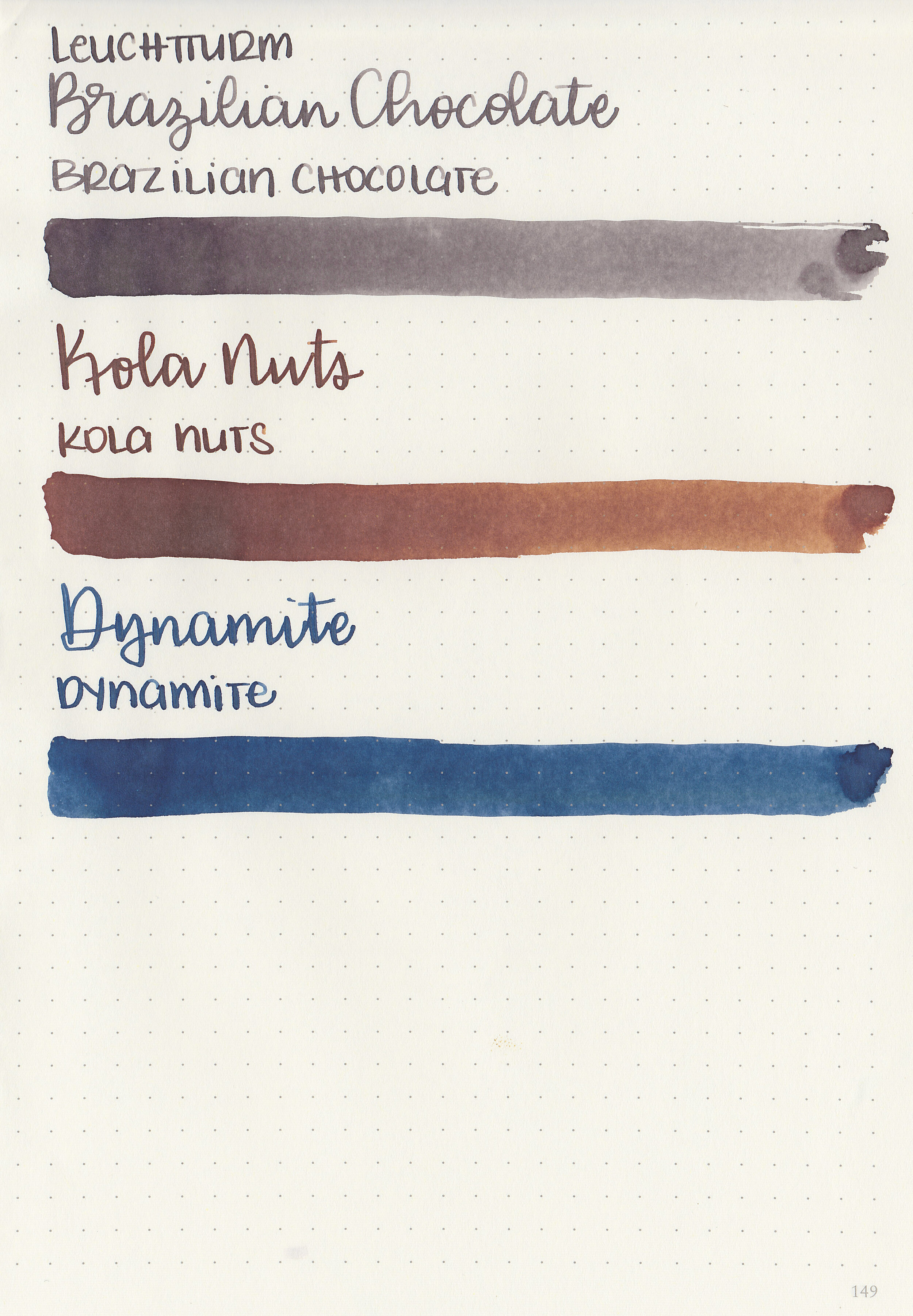
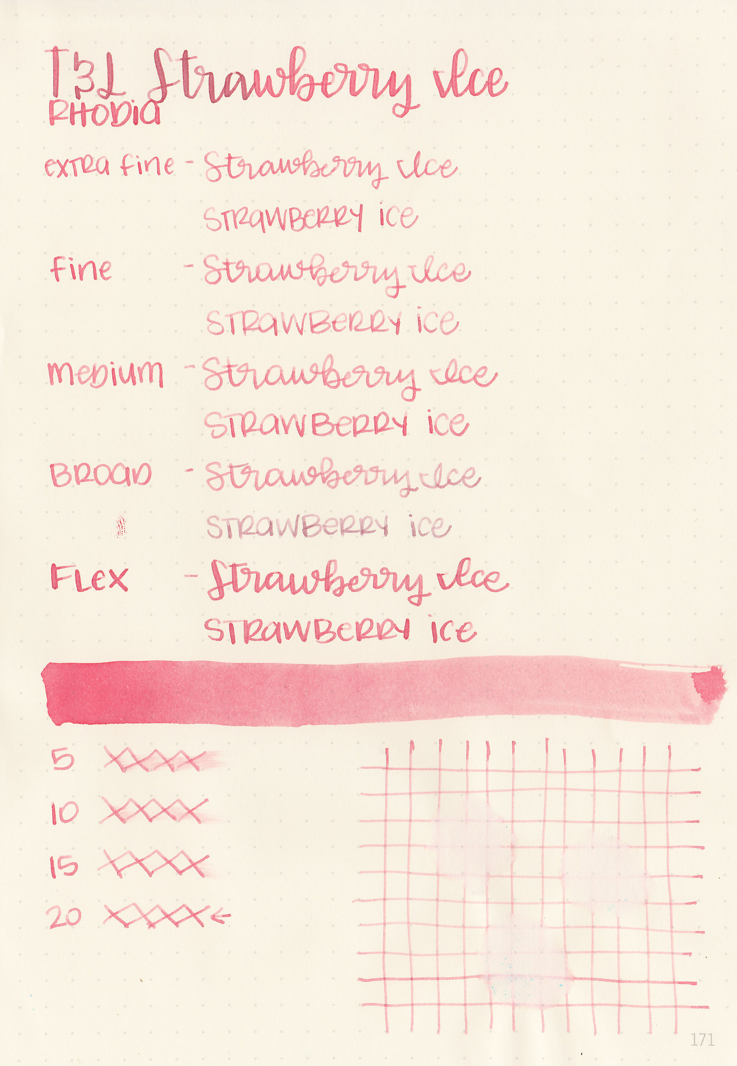
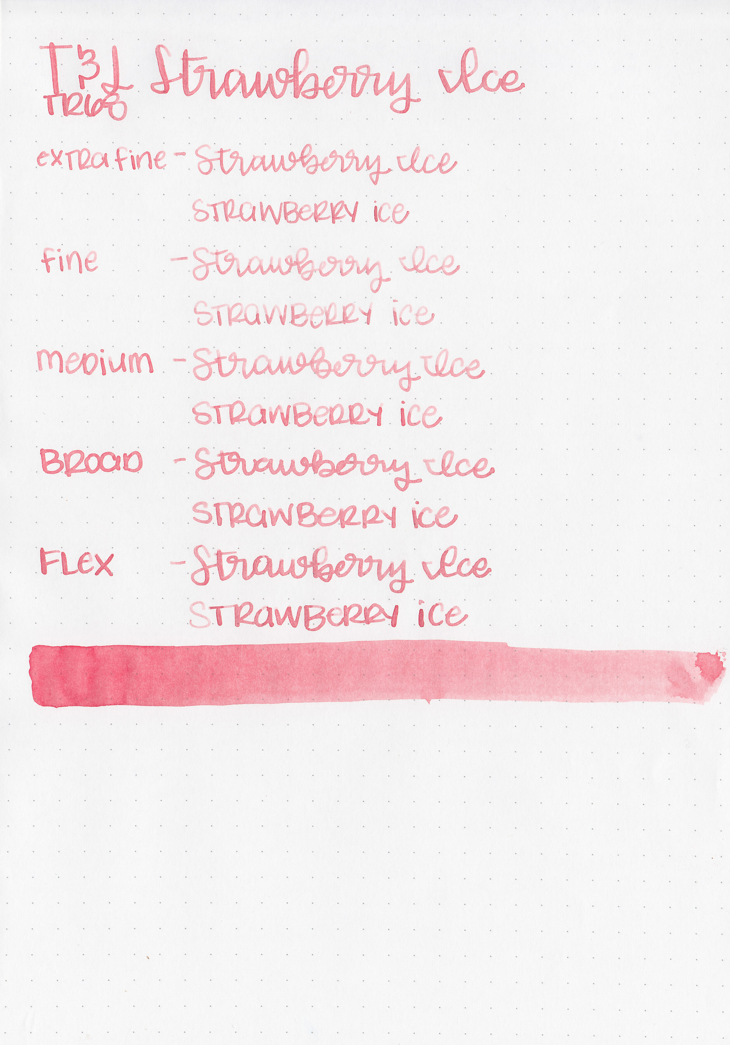
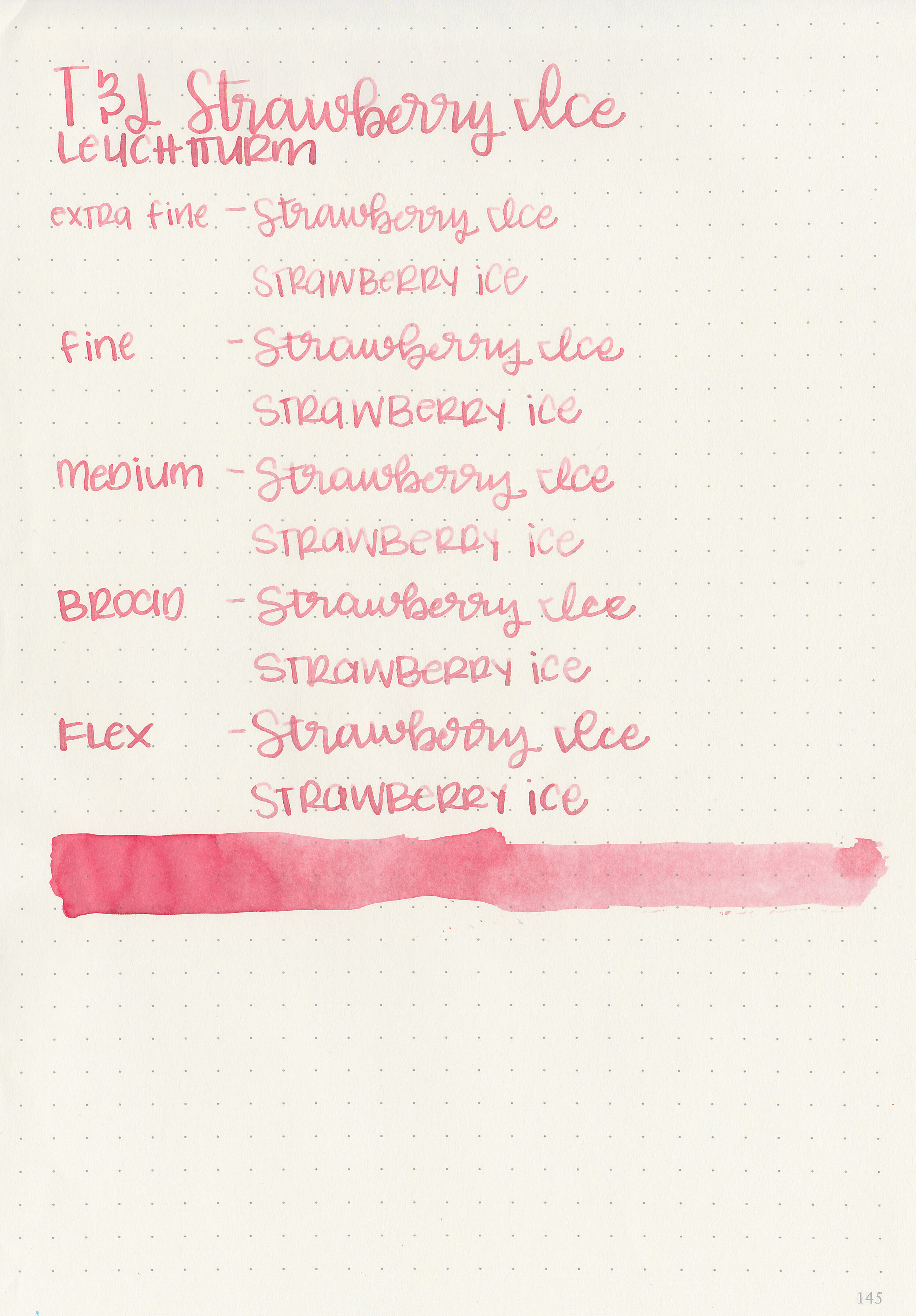
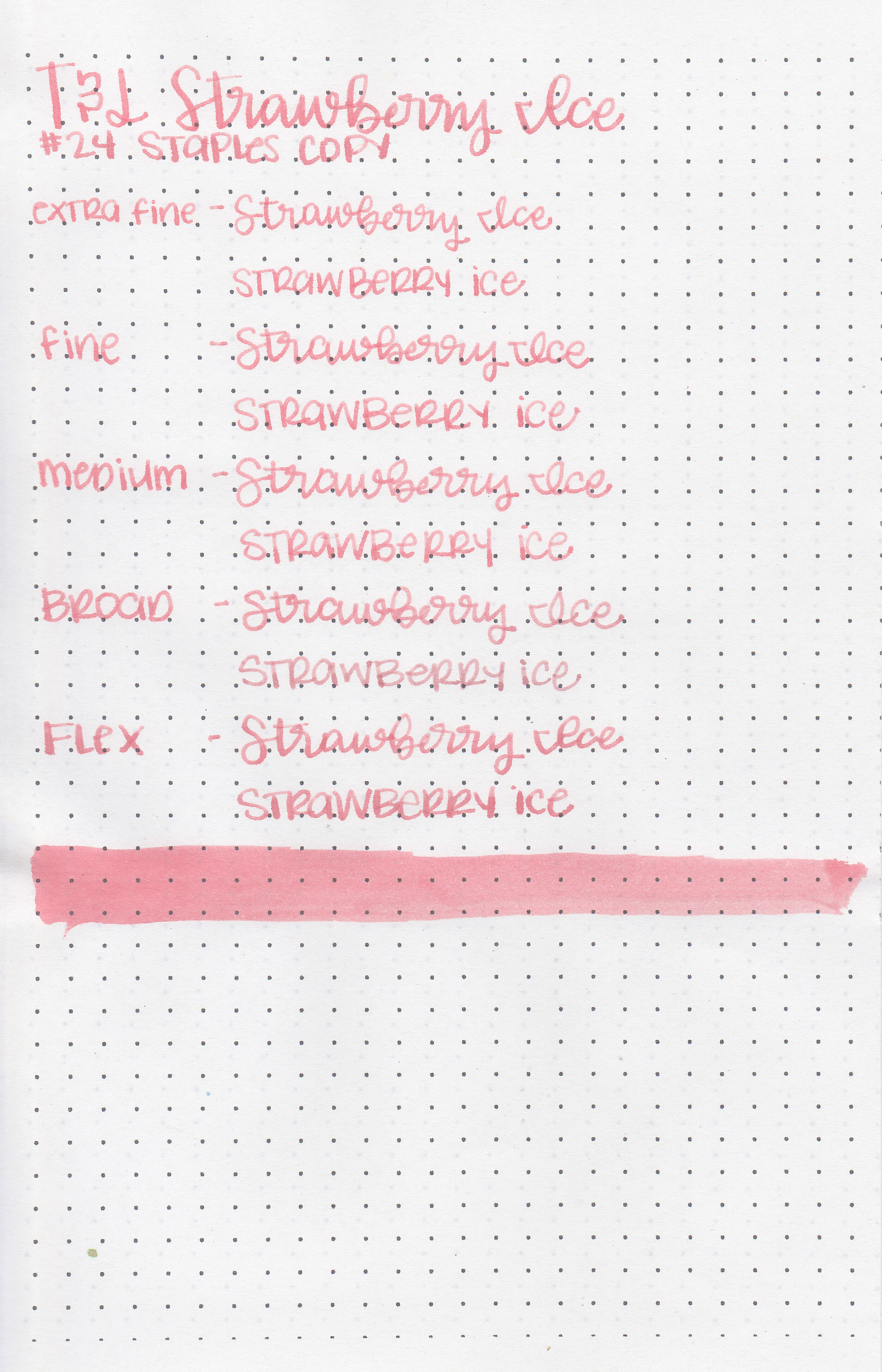
Writing samples:
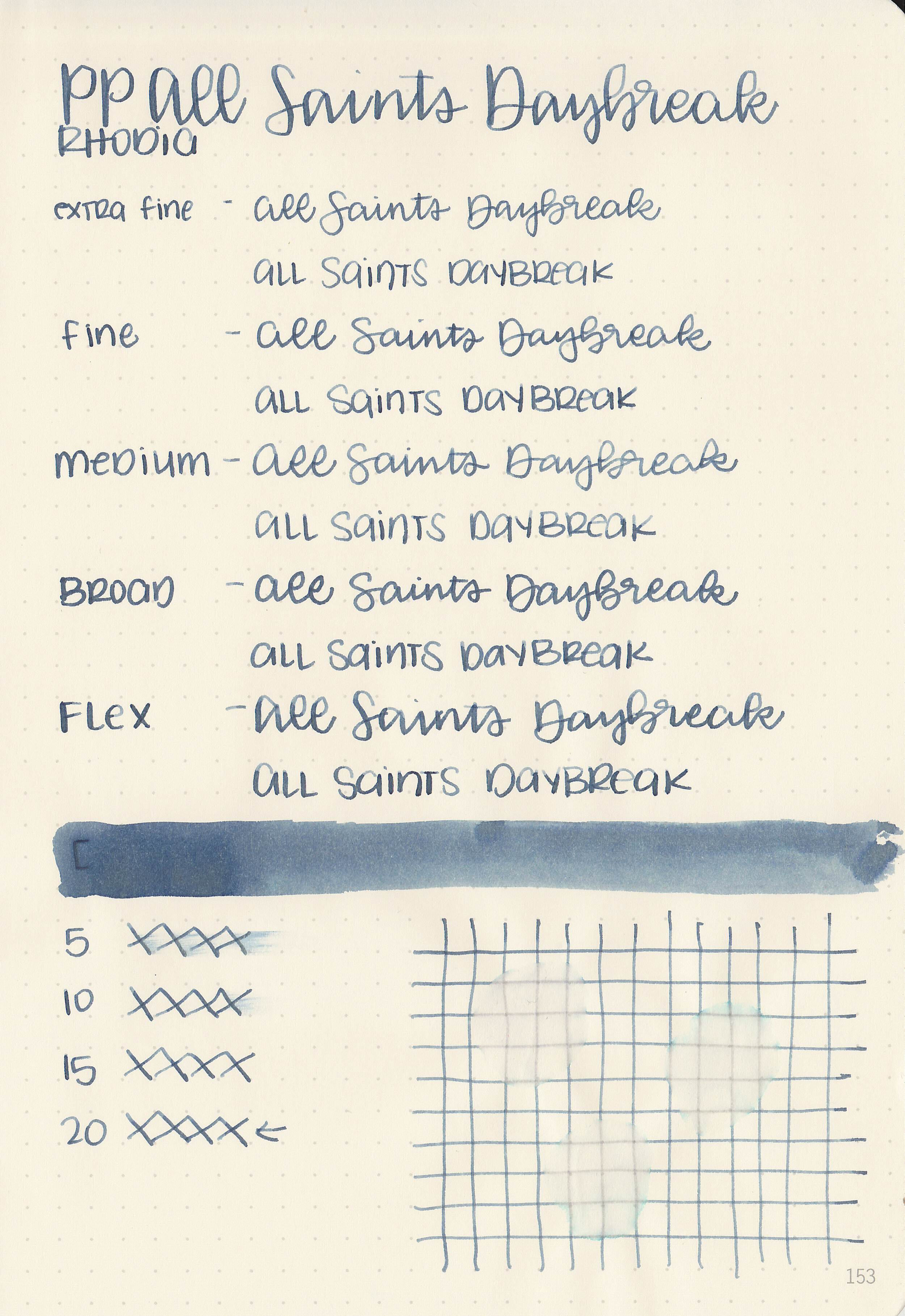
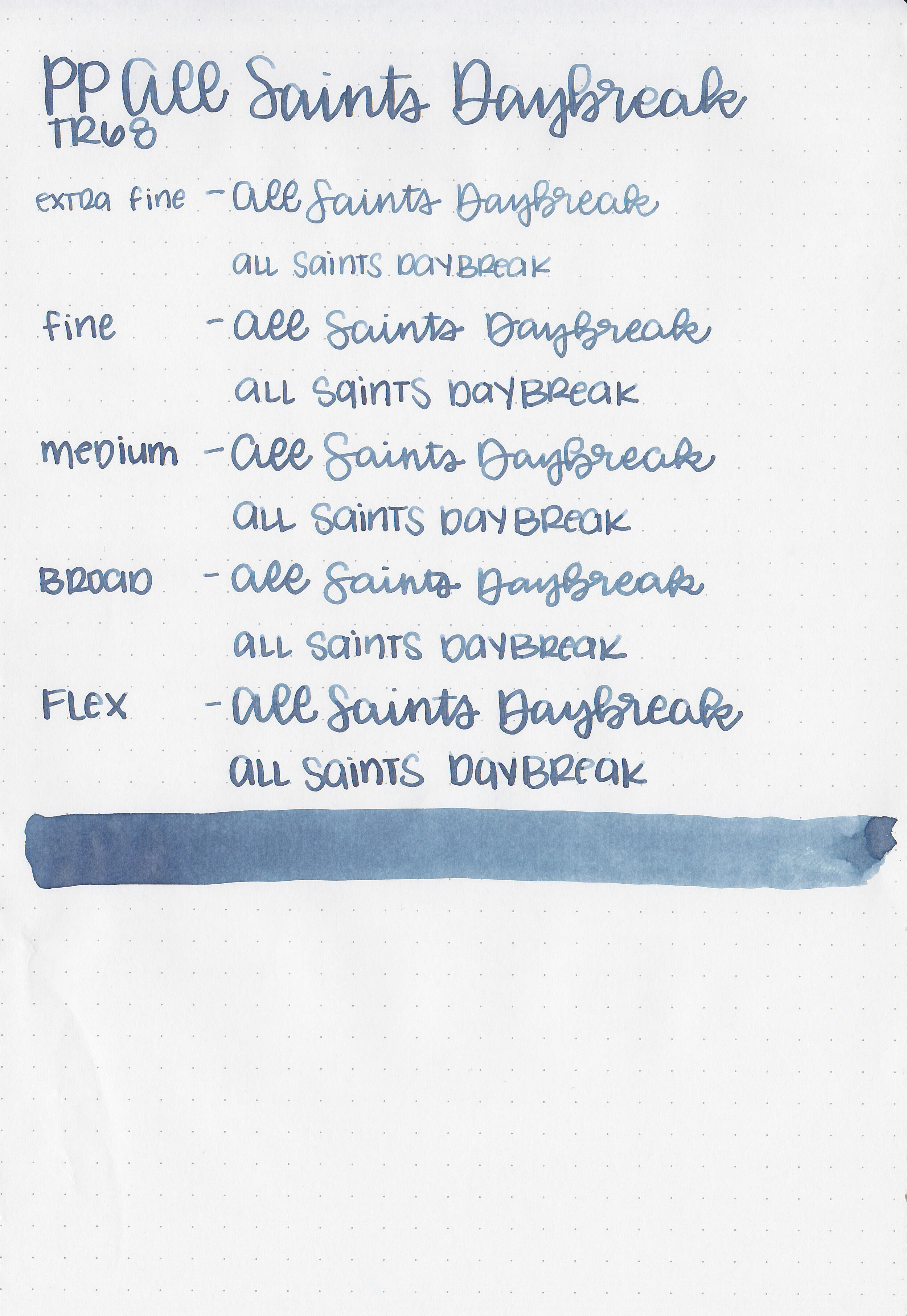
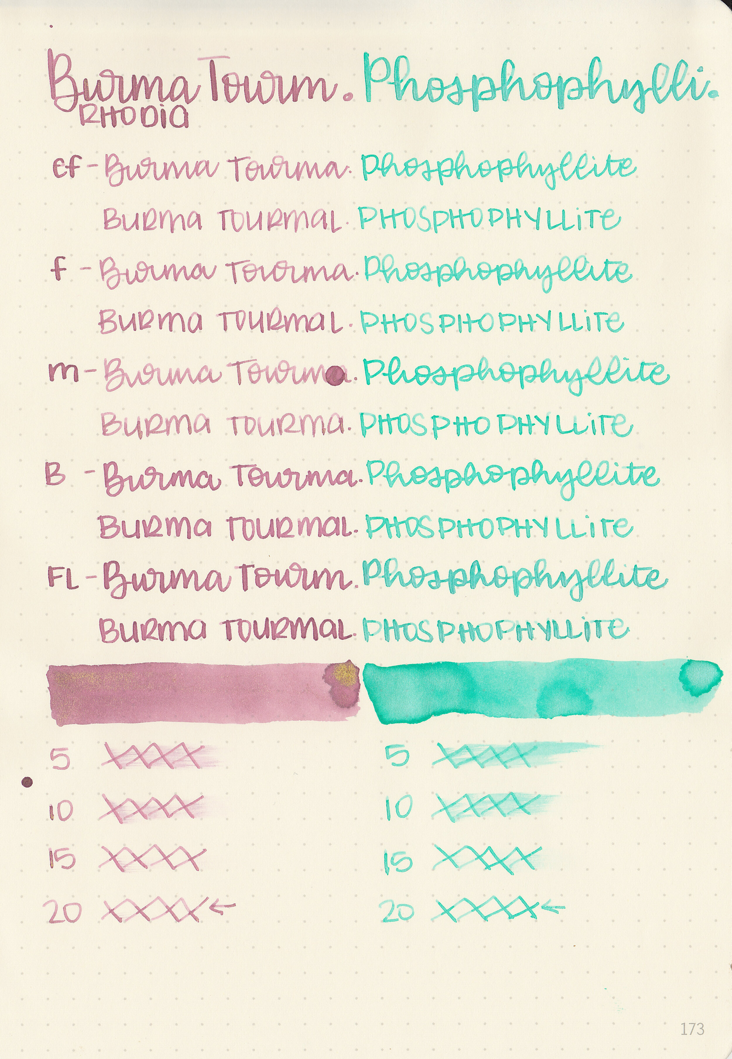
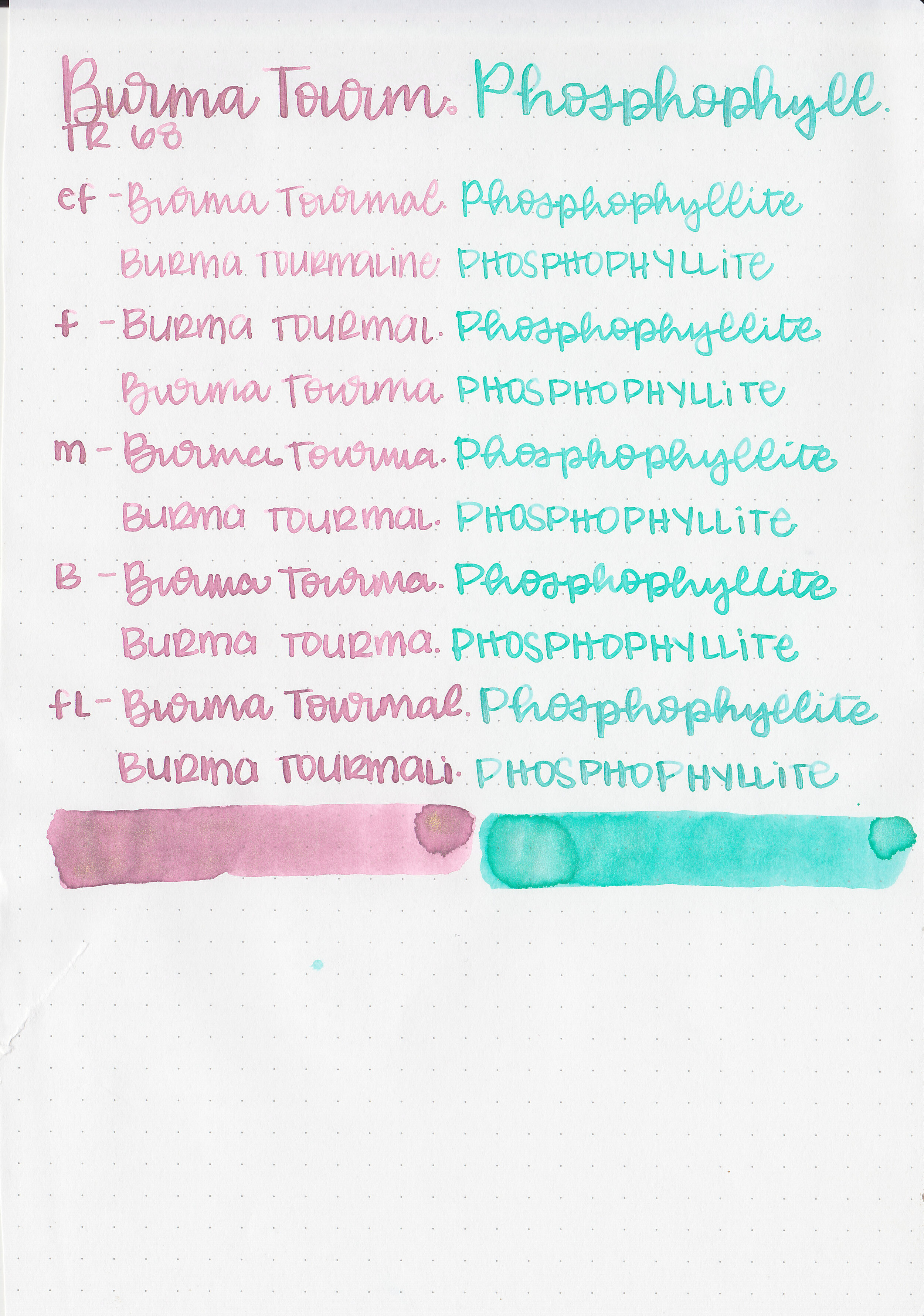
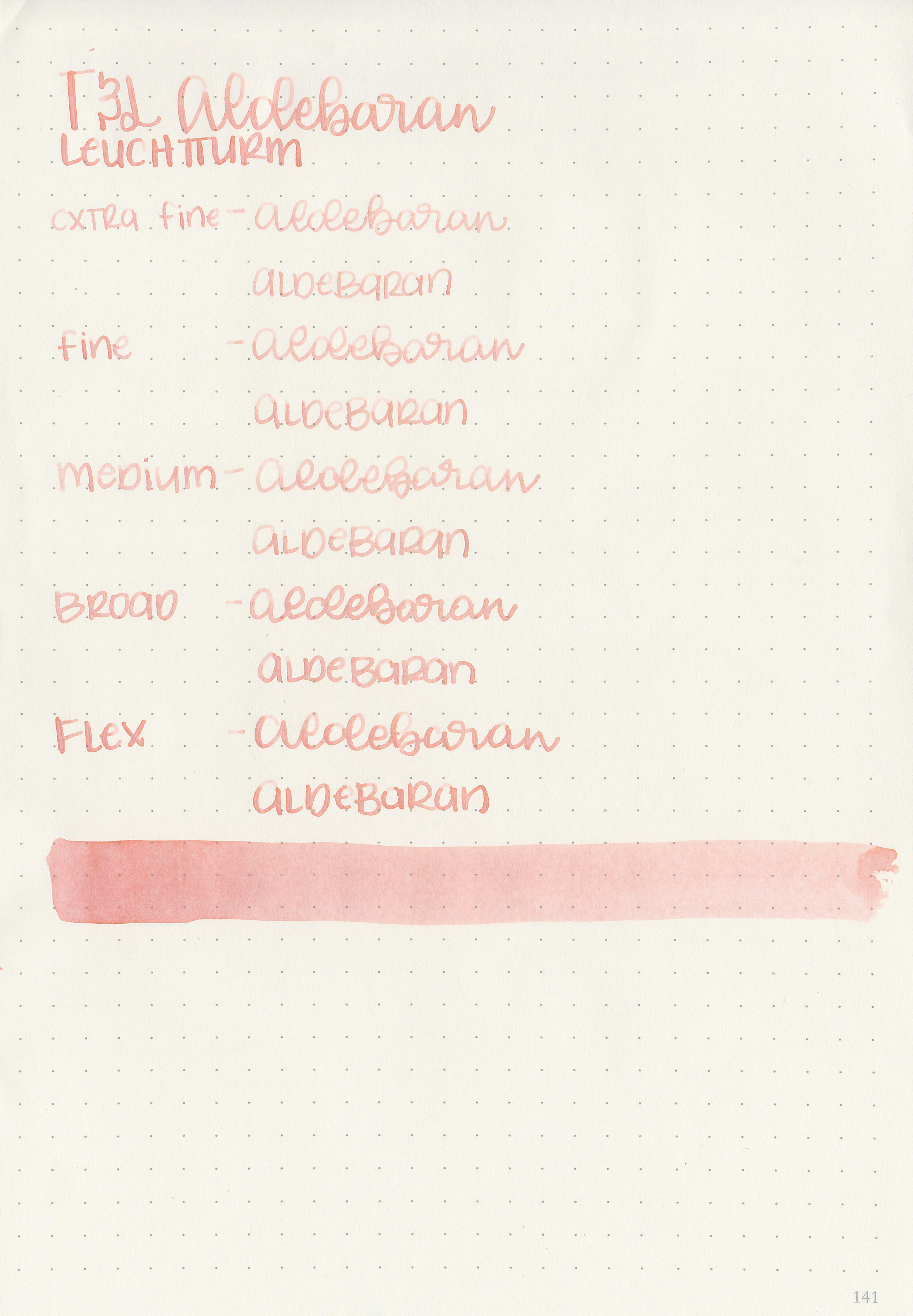
Let's take a look at how the ink behaves on fountain pen friendly papers: Rhodia, Tomoe River, and Leuchtturm.
Dry time: 30 seconds
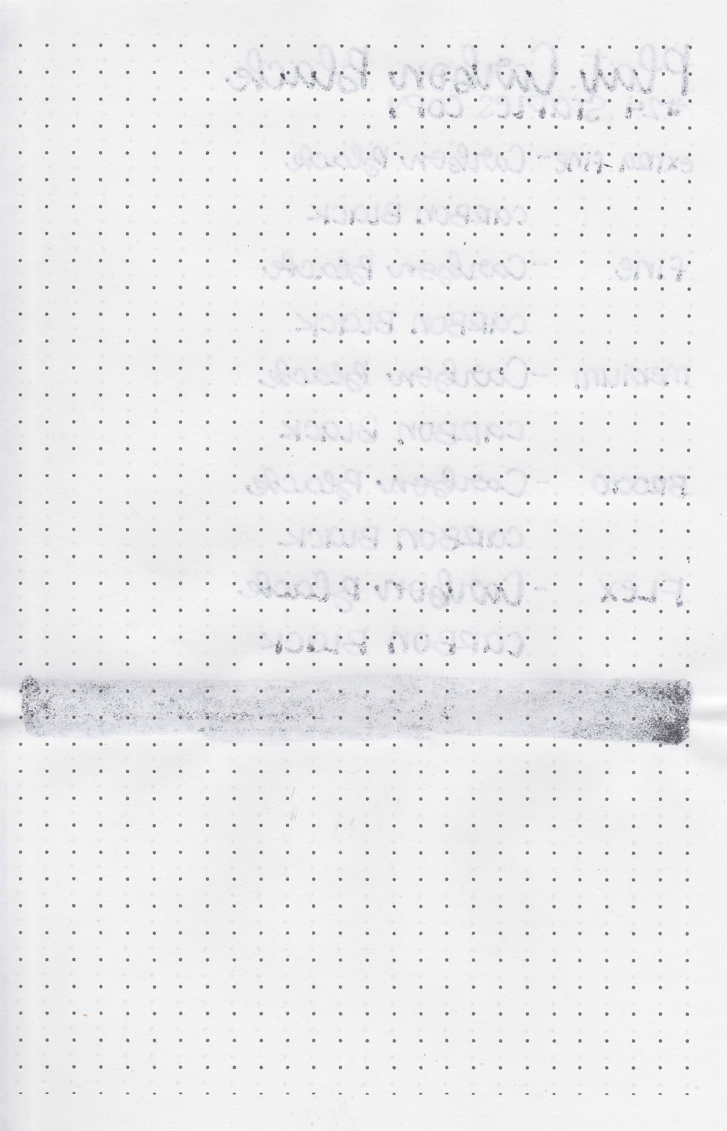
Water resistance: Low
Feathering: None
Show through: Medium
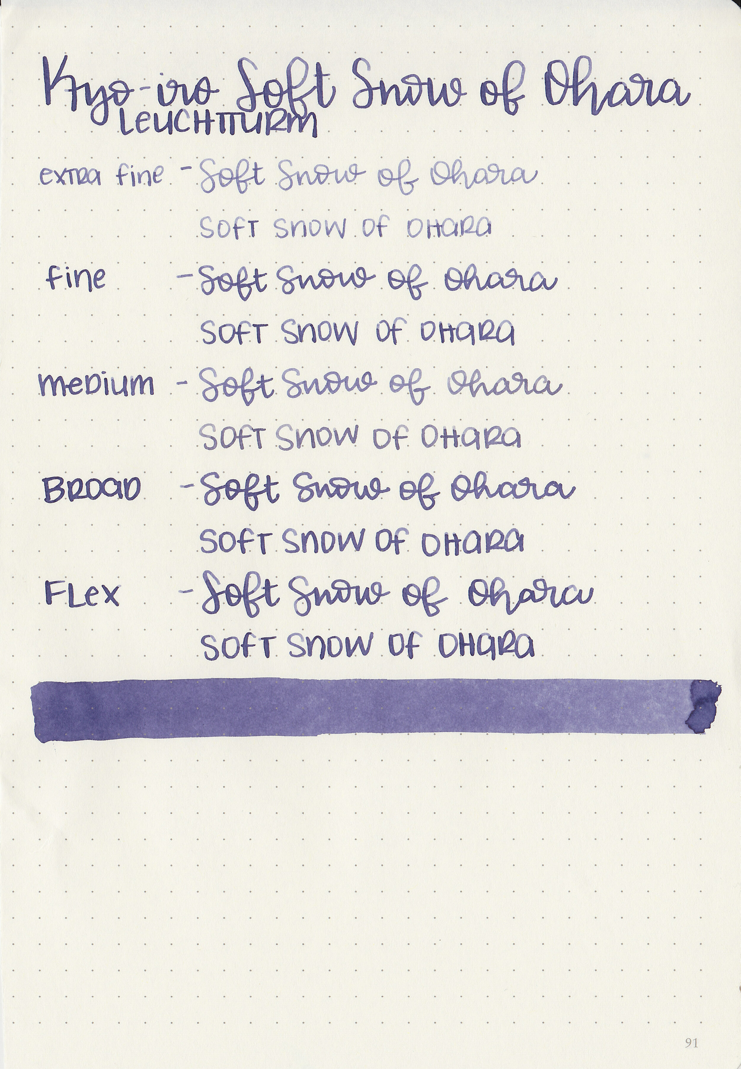
Bleeding: None
Other properties: medium shading, tiny sheen, and no shimmer.
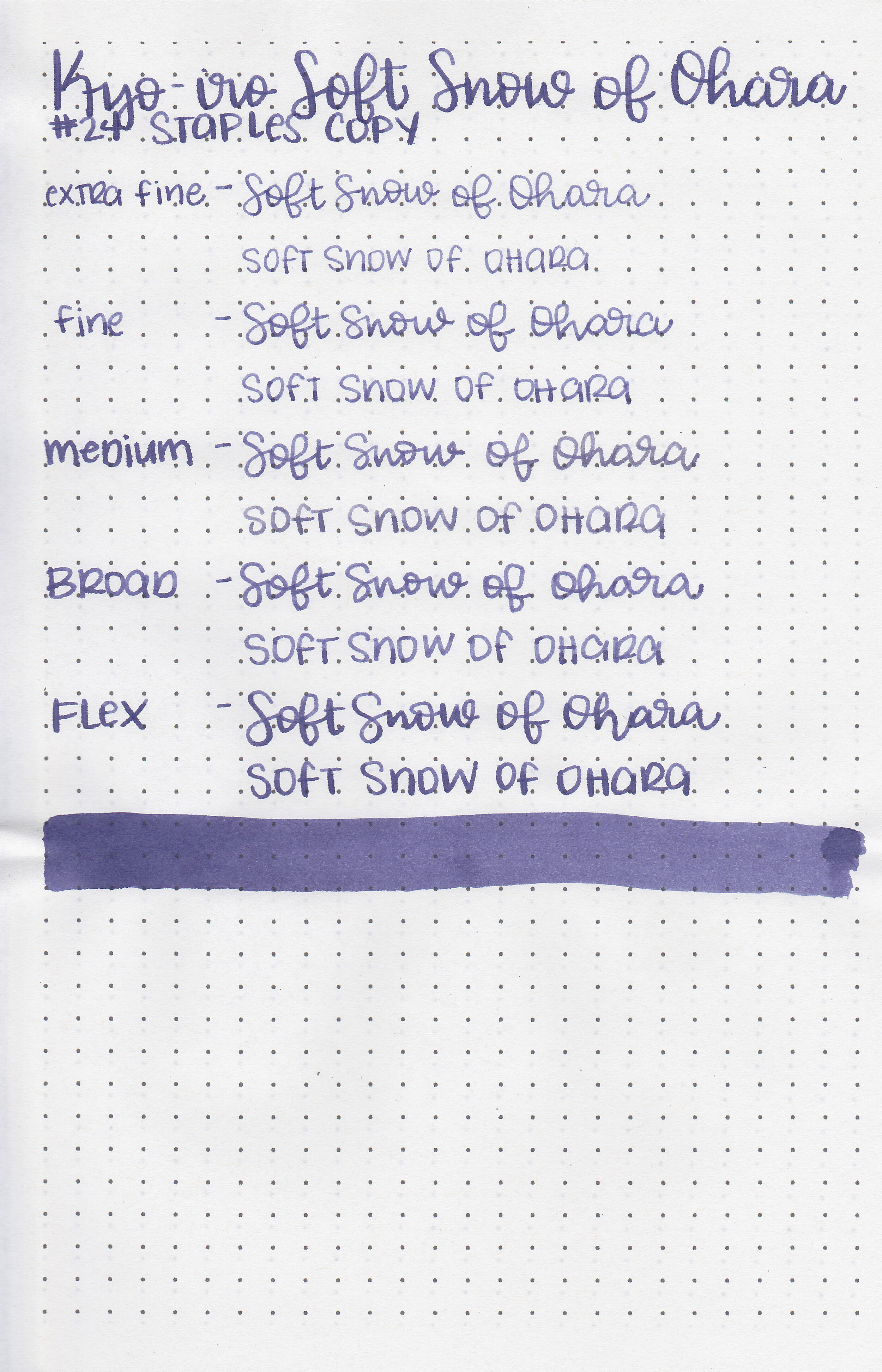
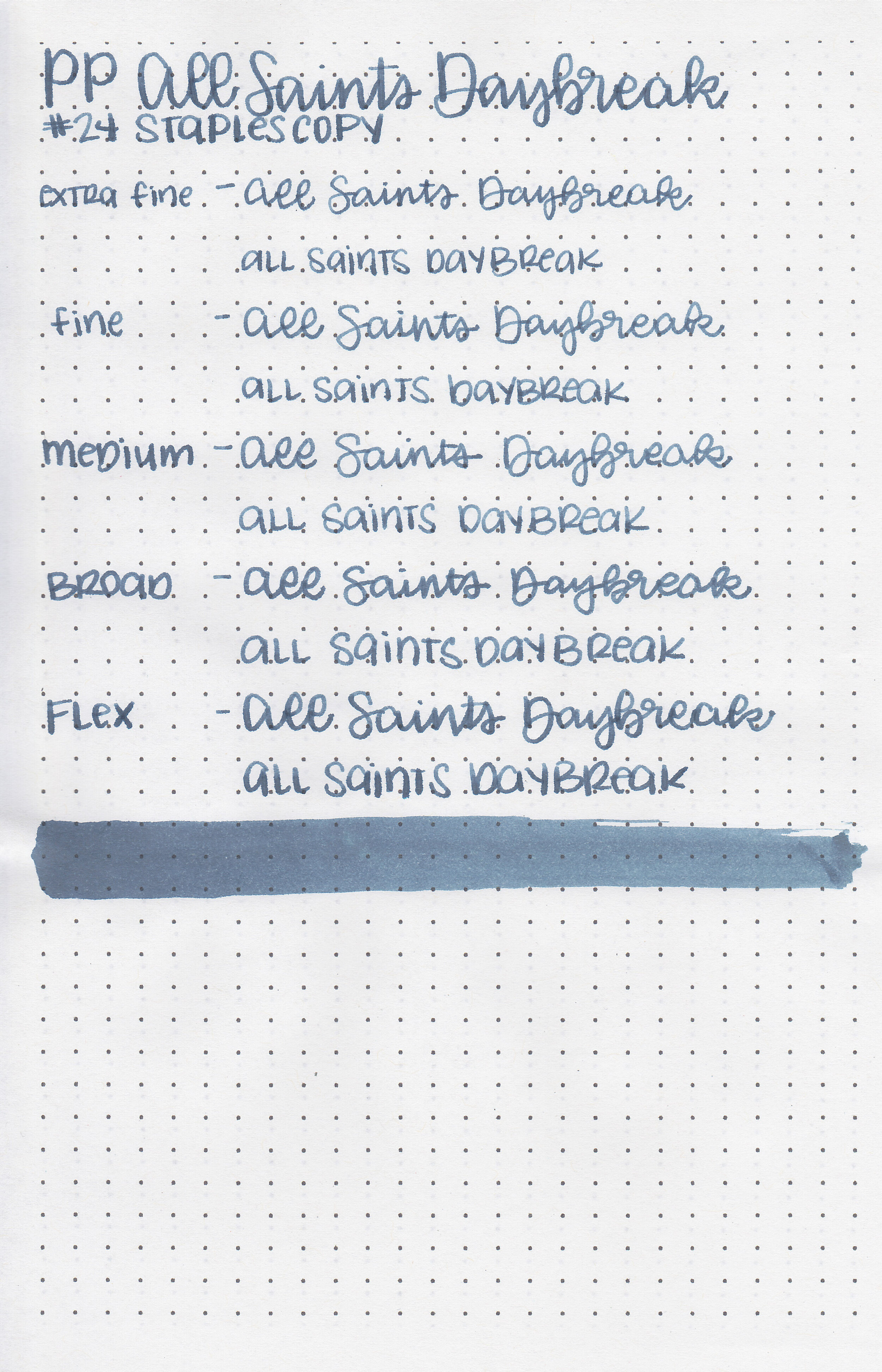
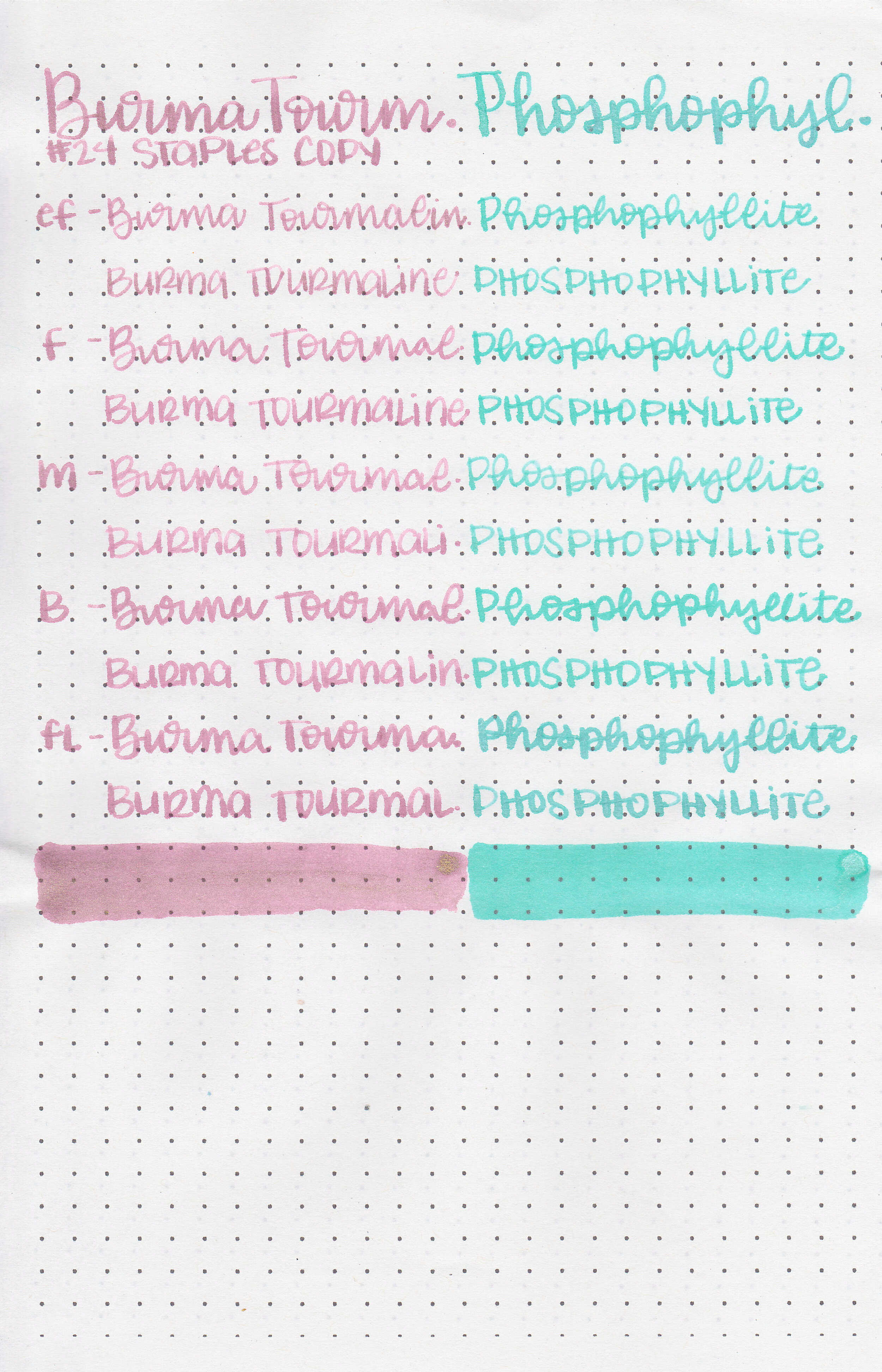
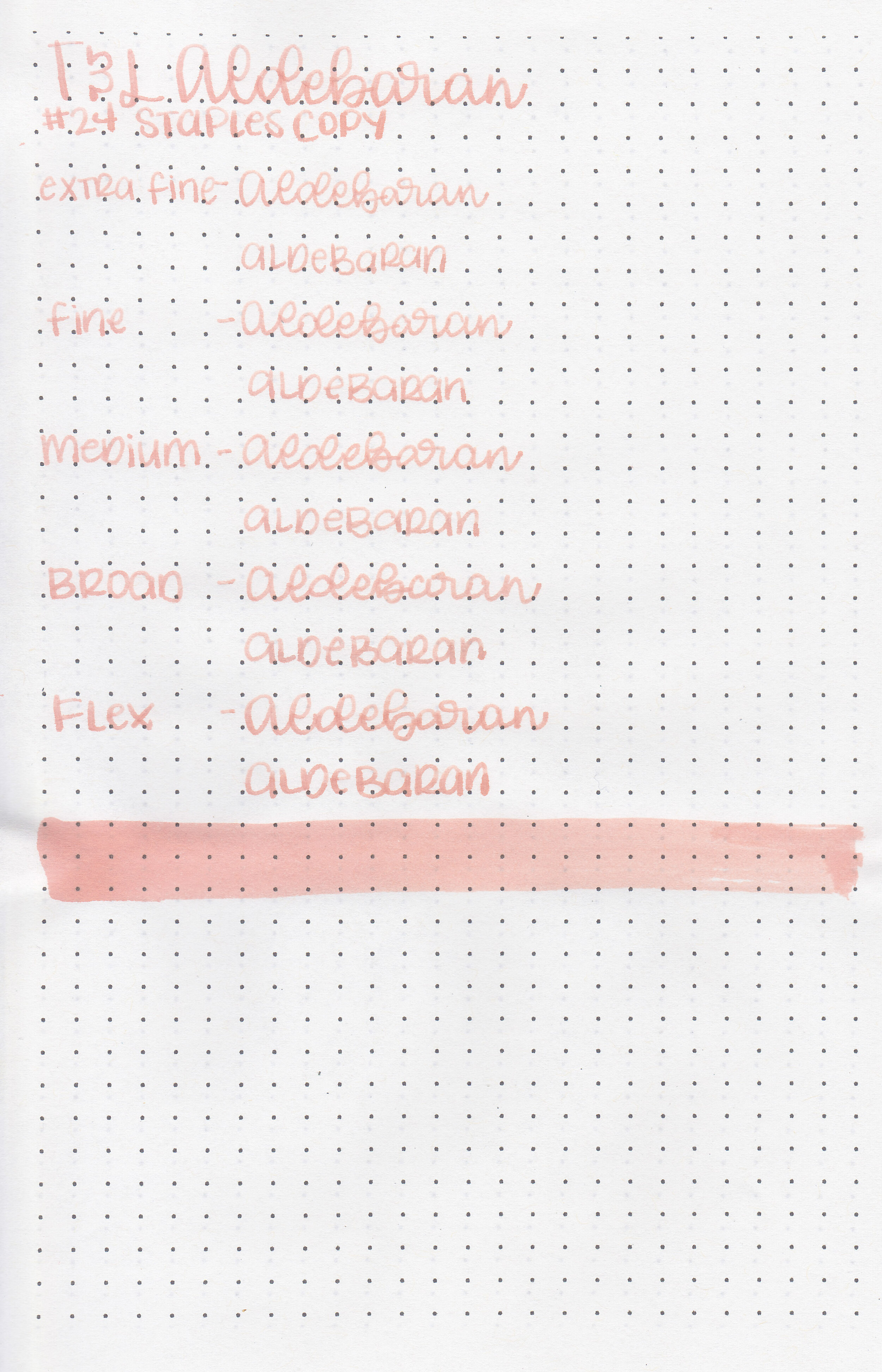
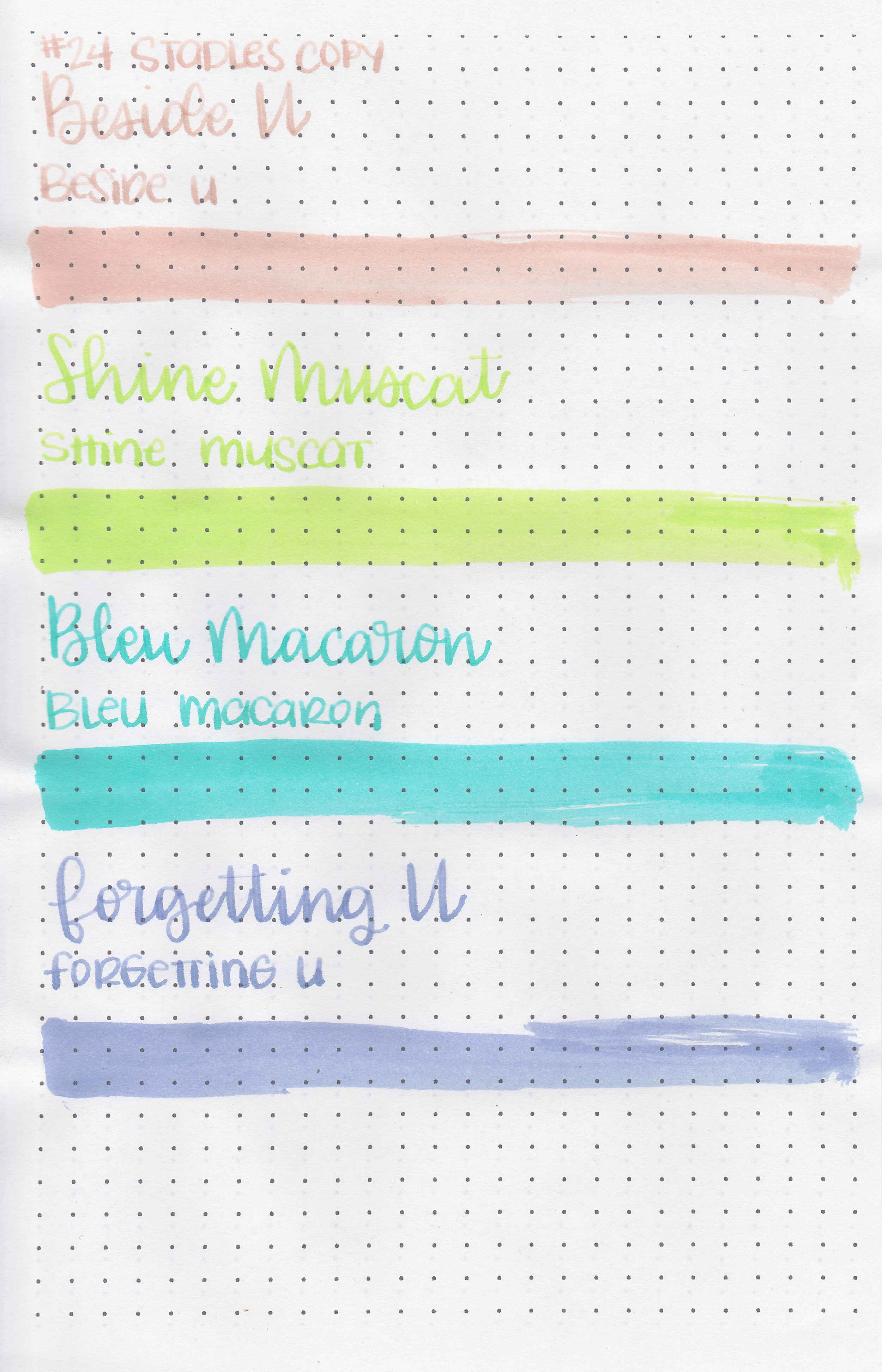
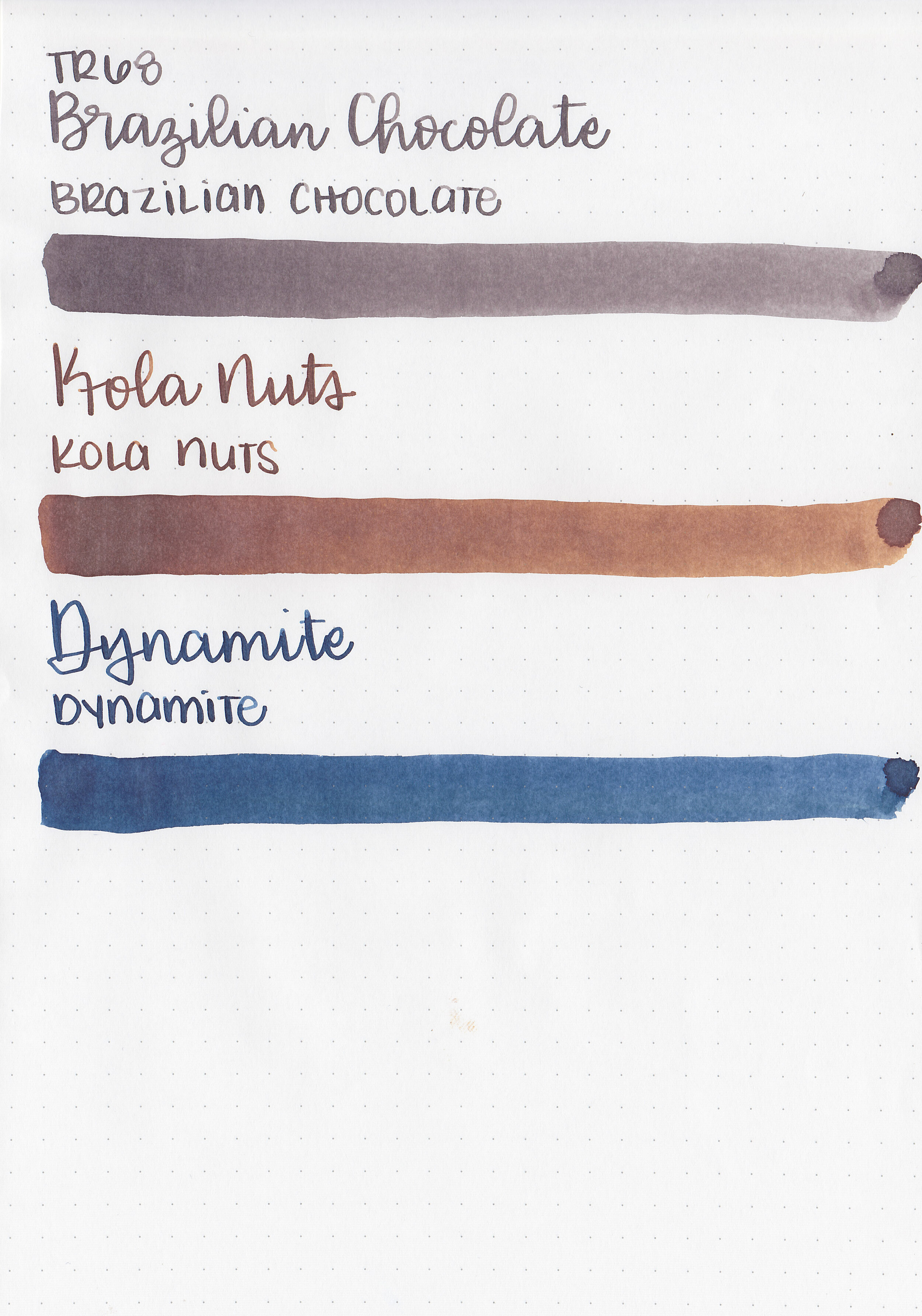
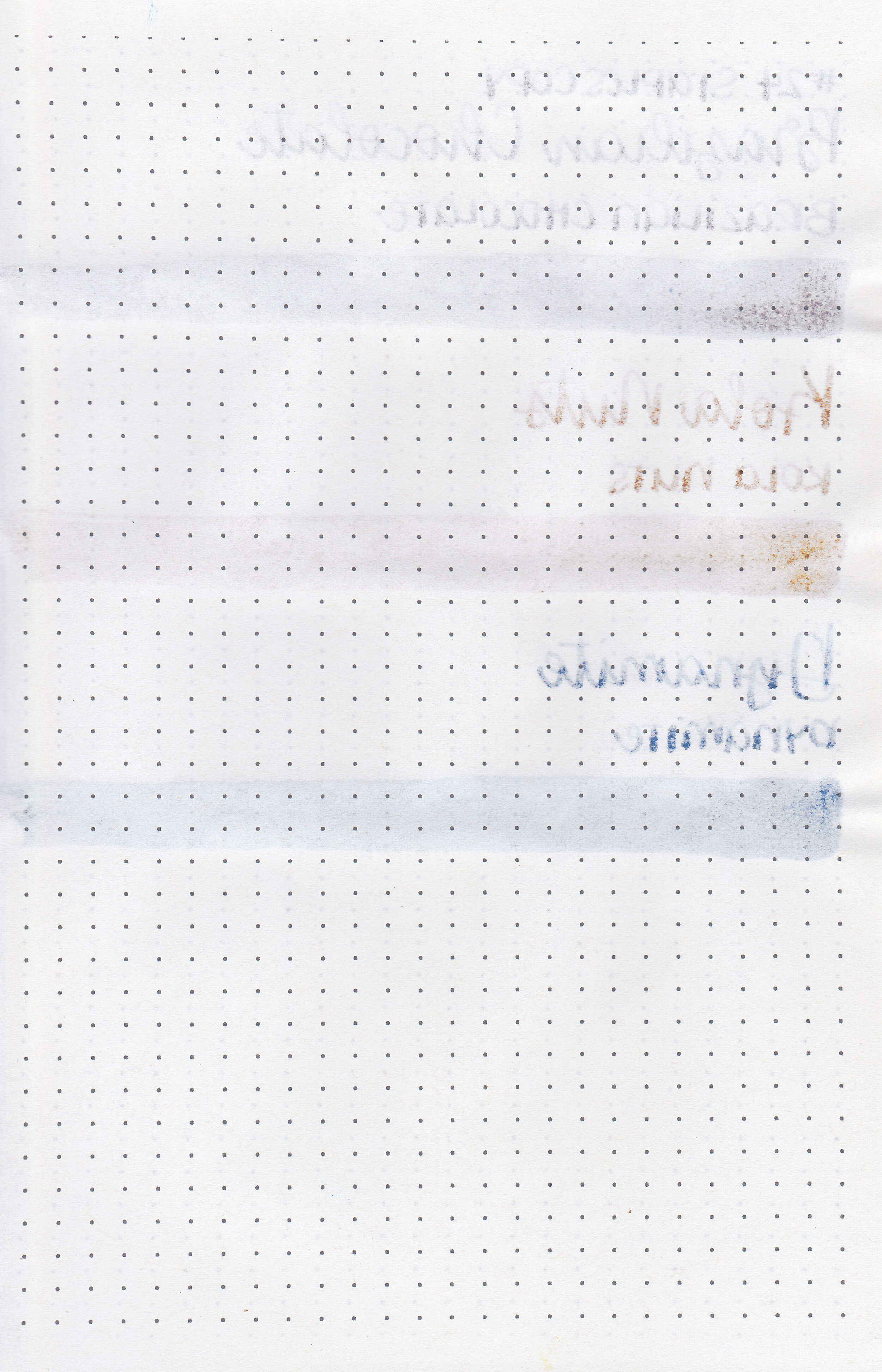
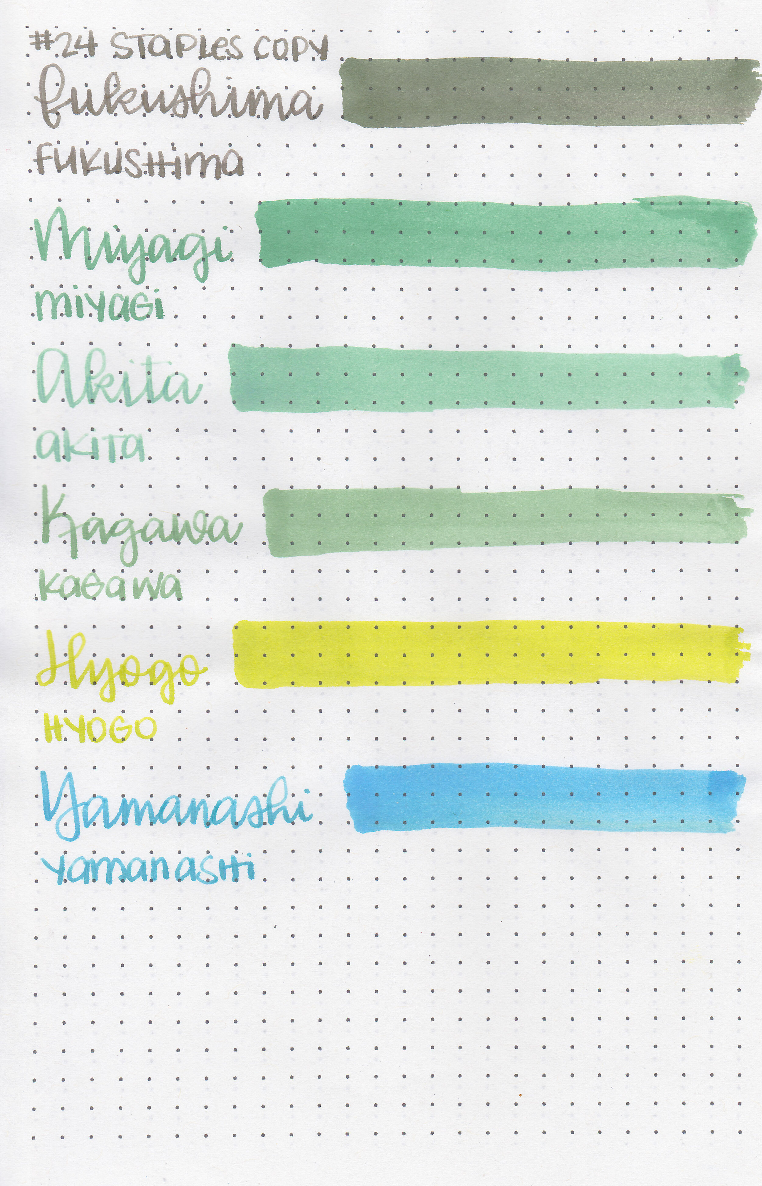
On Staples 24 lb copy paper there was some feathering but no bleeding.
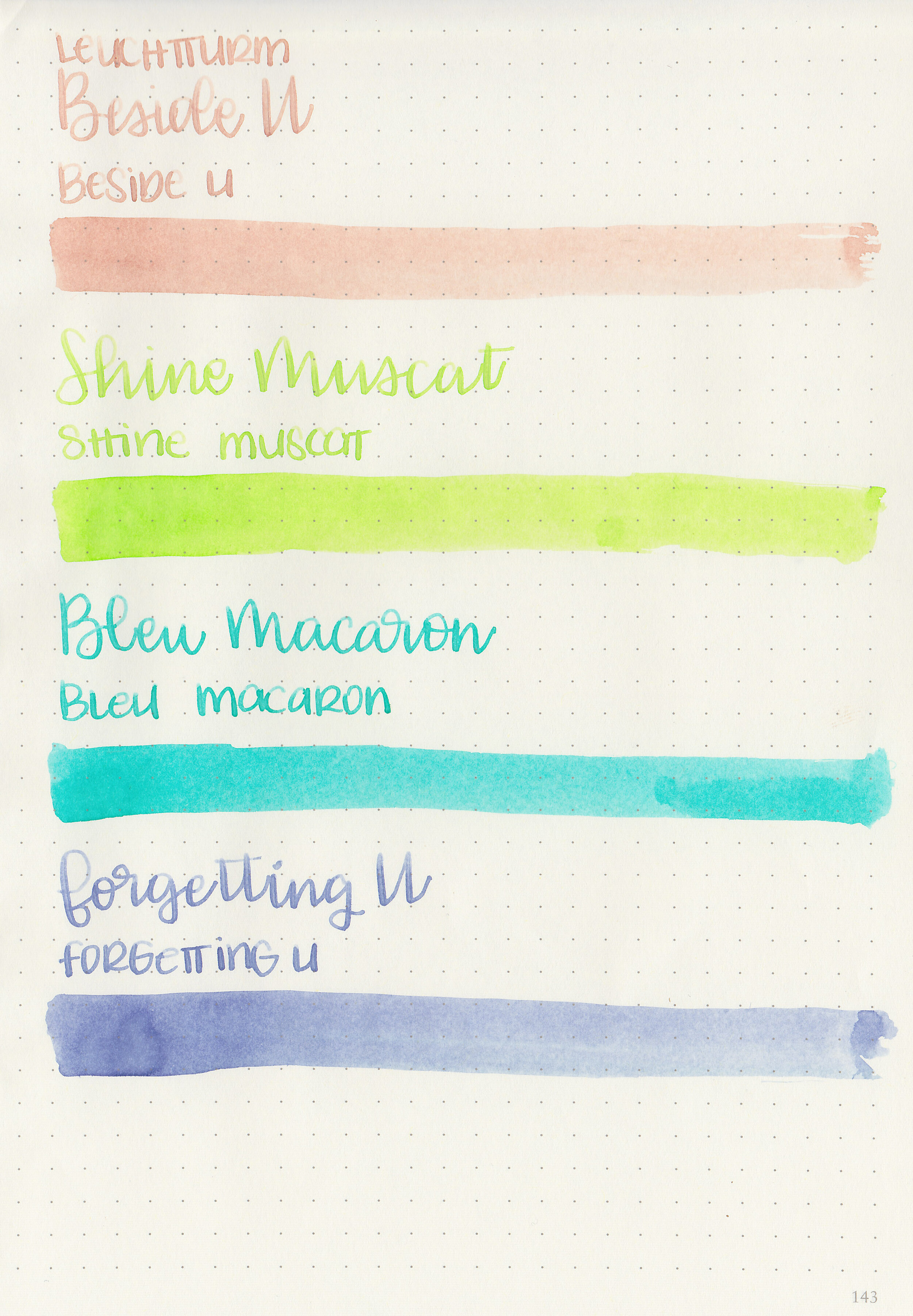
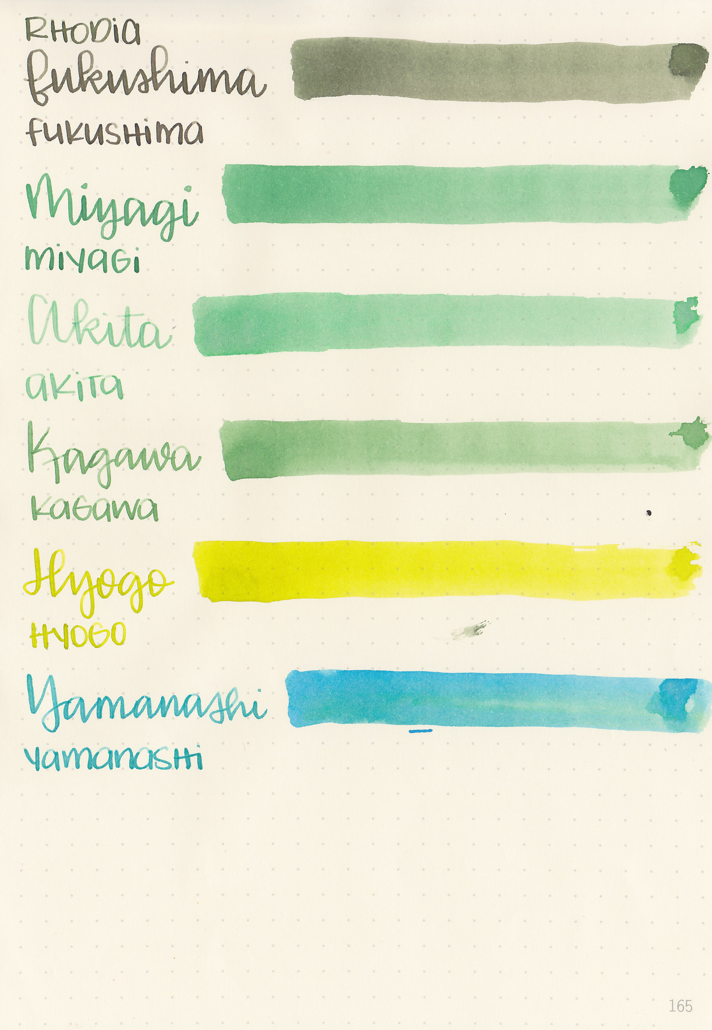
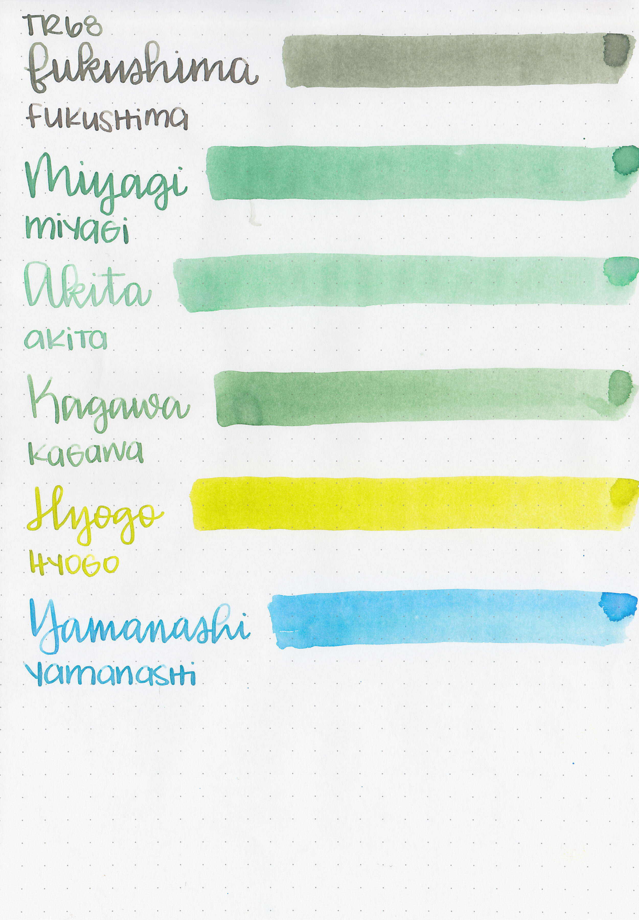
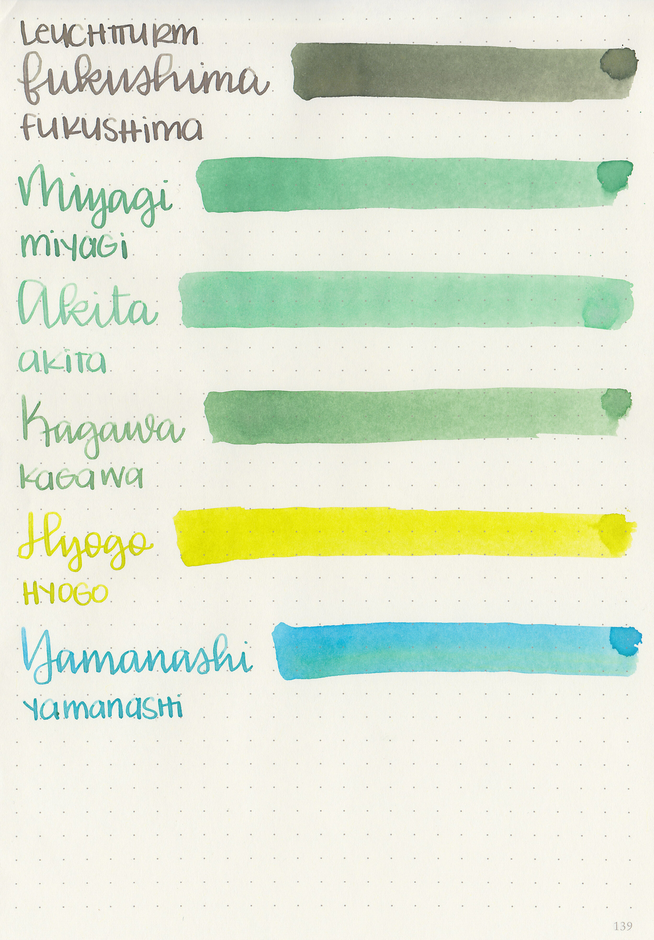
Comparison Swabs:

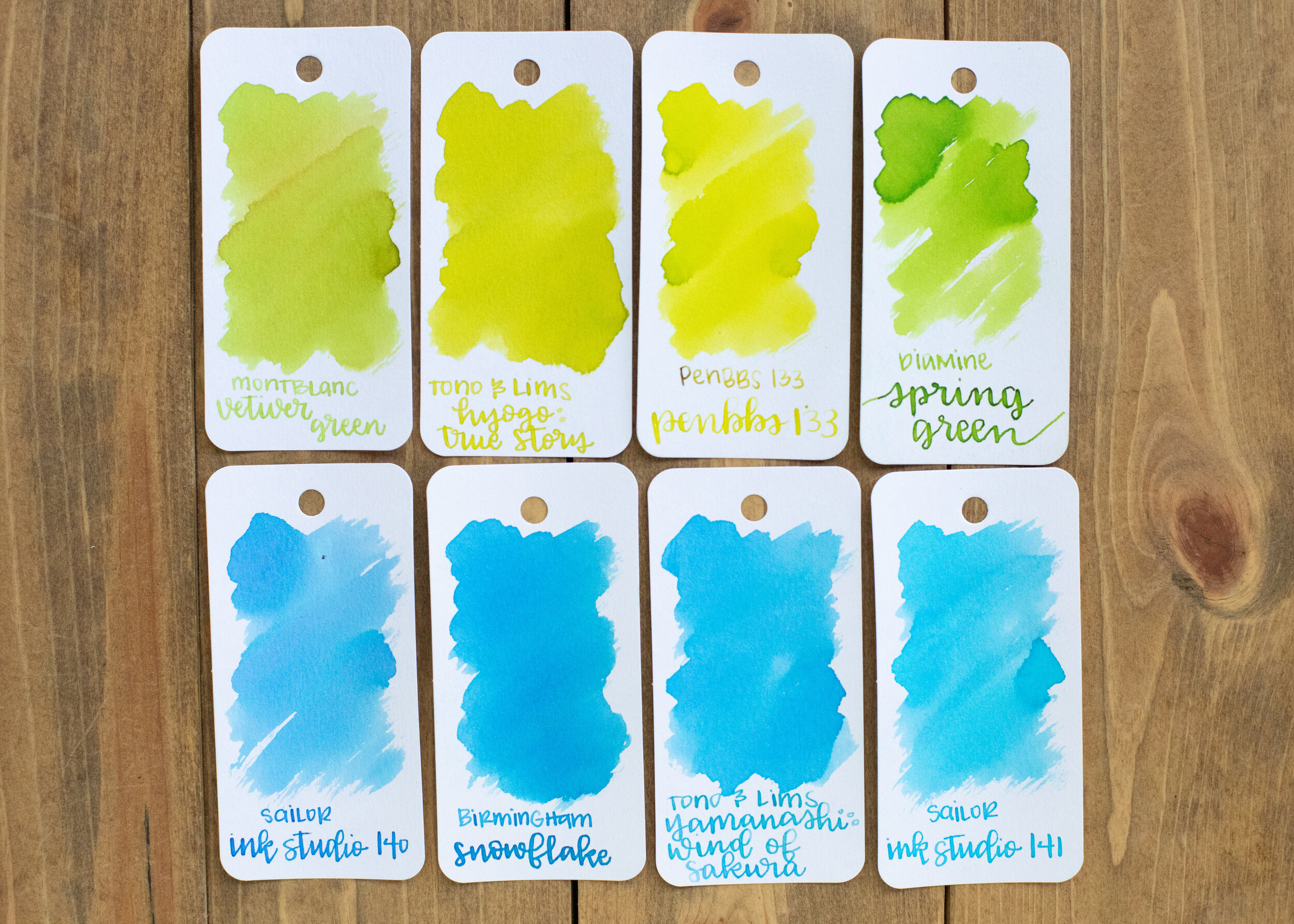
Soft Snow is less saturated than Sailor Jentle Shigure, and a bit more blue than Diamine Lilac Night. Click here to see the Kyoto inks together, and click here to see the purple inks together.
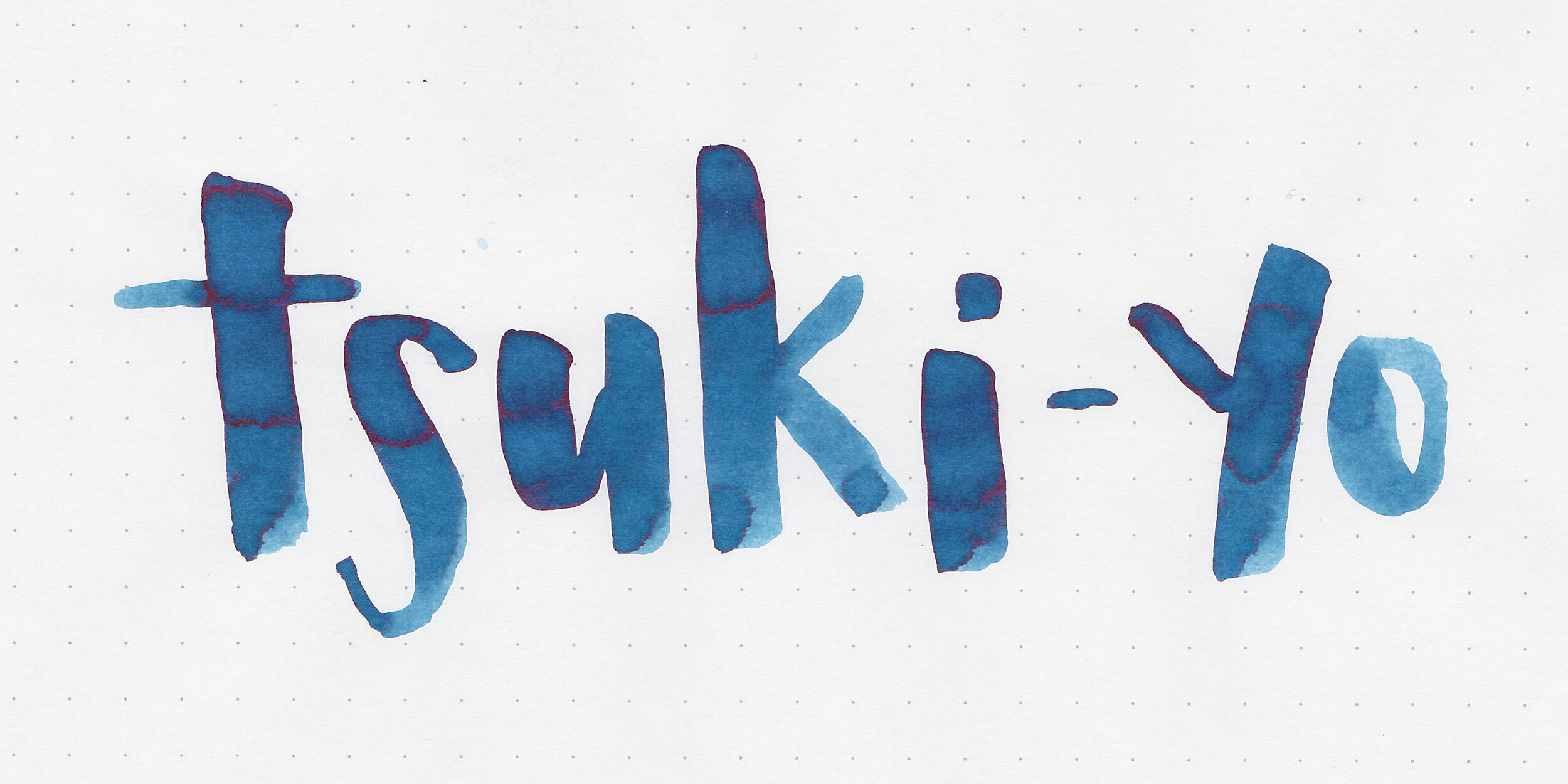
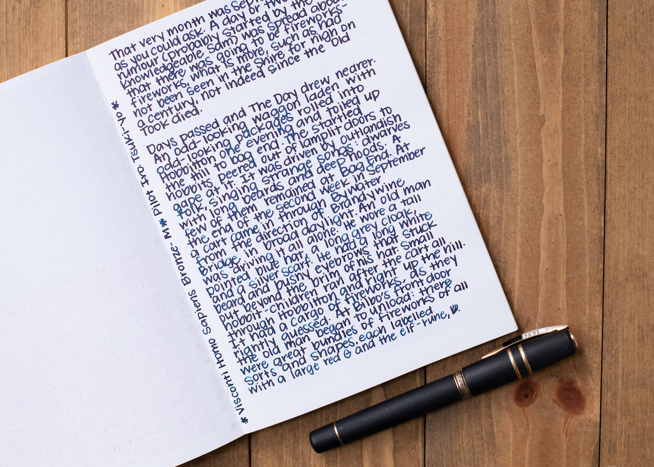
Longer writing:

I used a Pelikan M805 Stresemann with a medium nib on a Yoseka A5 notebook. The ink had a super dry flow, but with the Pelikan medium nib it did fine.
Overall, I like the color and shading but it is really dry. If I used this ink again I would add a drop of ink additive like White Lightning so it flows a bit better.
Disclaimer: A sample of this ink was provided by a reader. All photos and opinions are my own. This page does contain affiliate links but this post is not sponsored in any way.