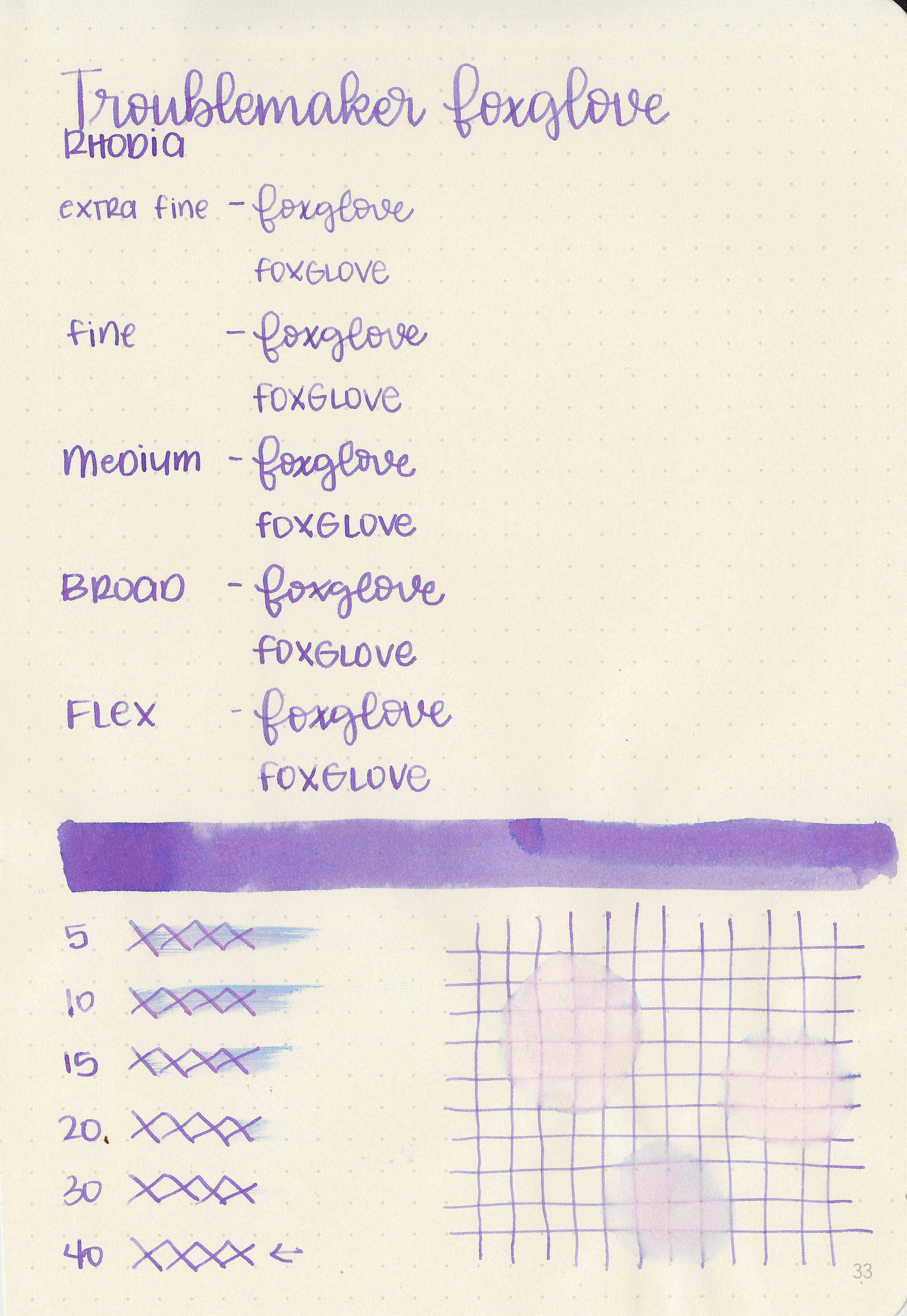
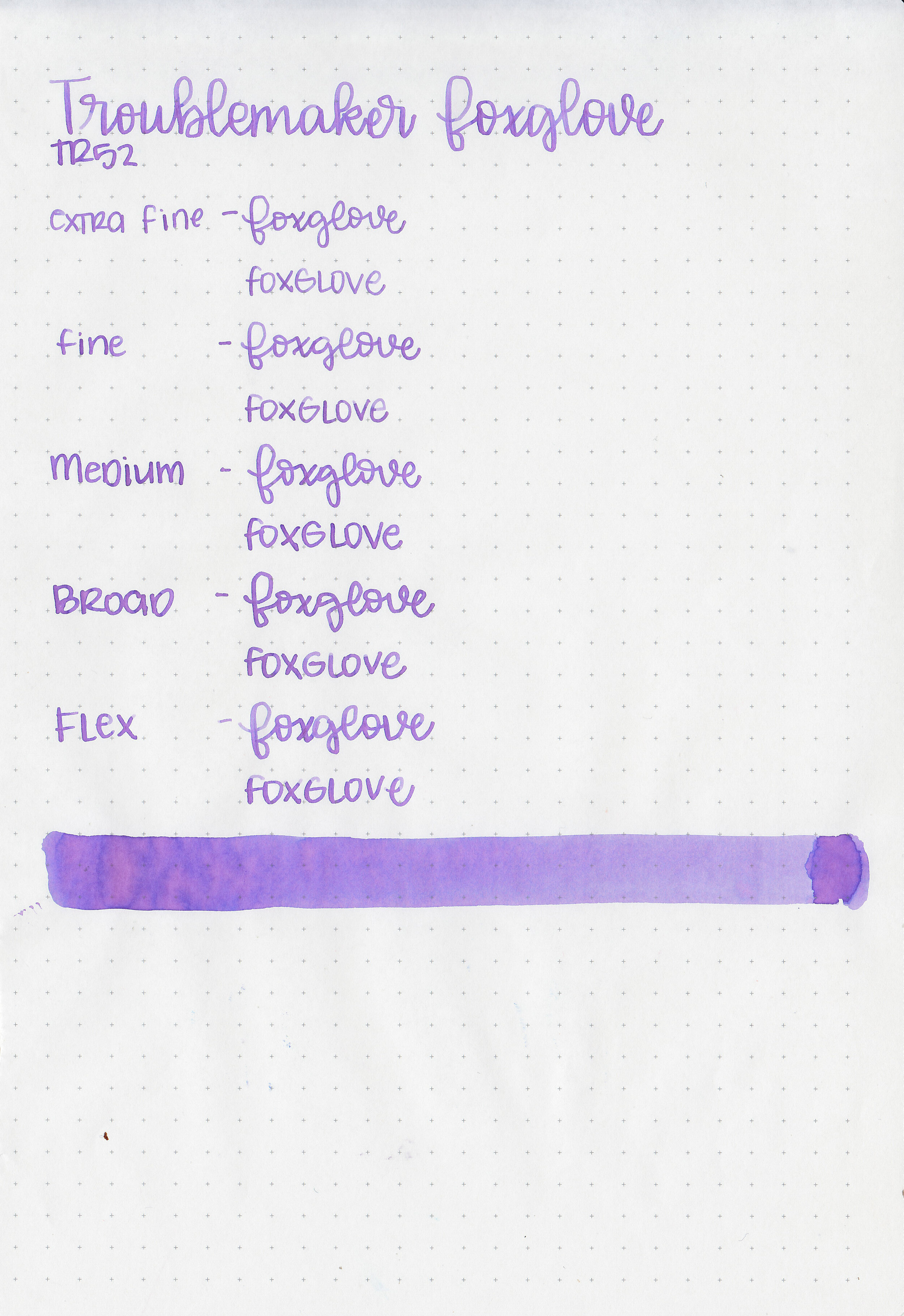
Ink Review #1092: Pilot Blue
/
When I purchased my Pilot Custom 823 Smoke with a broad nib, there was a bottle of Pilot Blue ink included in the box. I’m 100% in love with my 823 by the way-it’s amazing and my only regret is that I didn’t buy a second one with a medium nib at the same time (in a different color of course!). So let’s take a look at Pilot Blue! I purchased my 823 with the included ink from Pen Chalet, but you can buy Pilot Blue on its own from Vanness Pens.
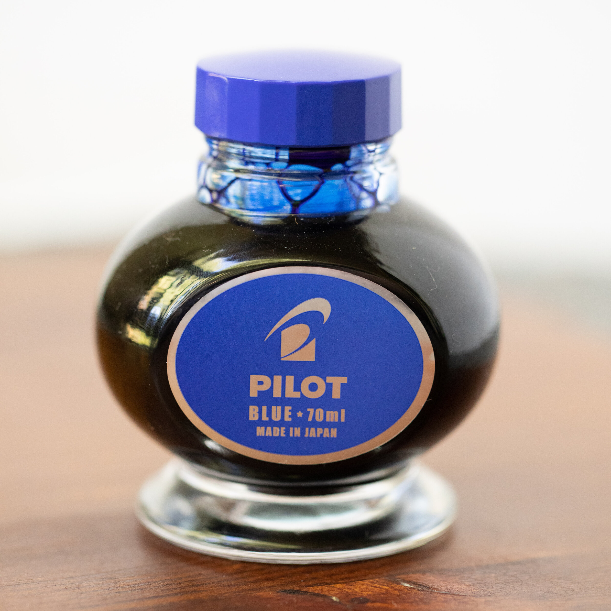
The Bottle:
The bottle is a heavy glass 70ml.

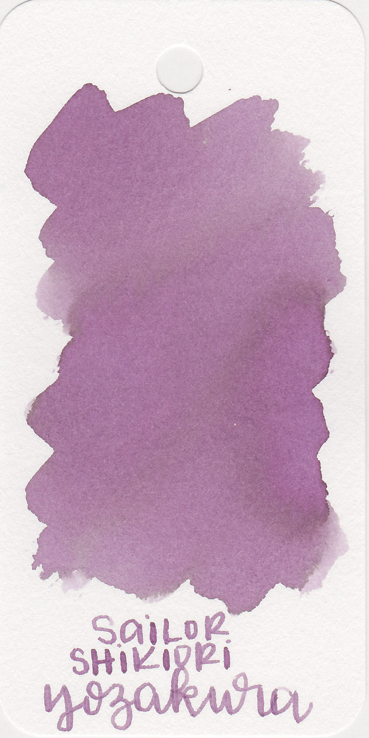
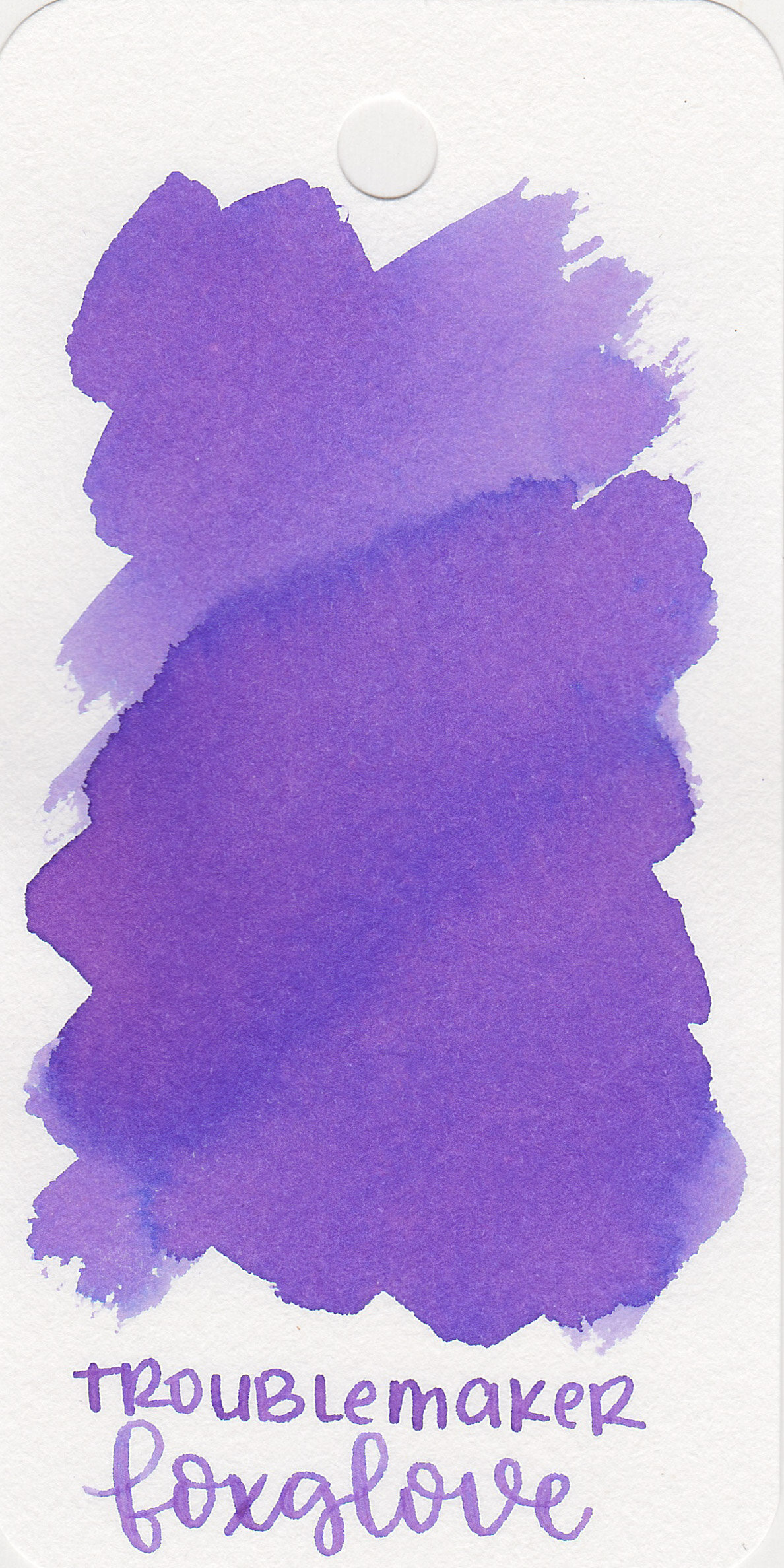
The color:
Pilot Blue is a standard classroom and work appropriate blue.
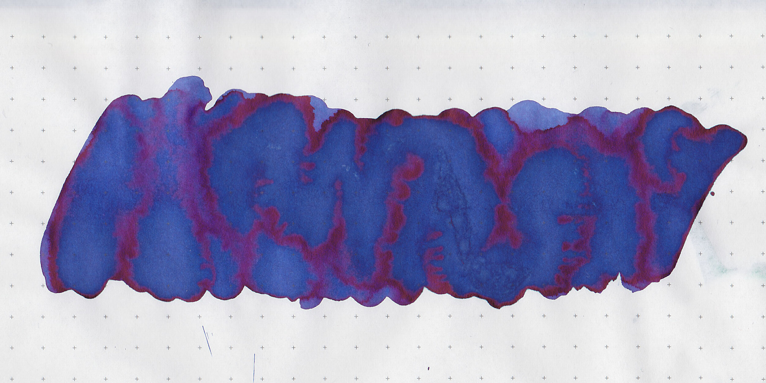
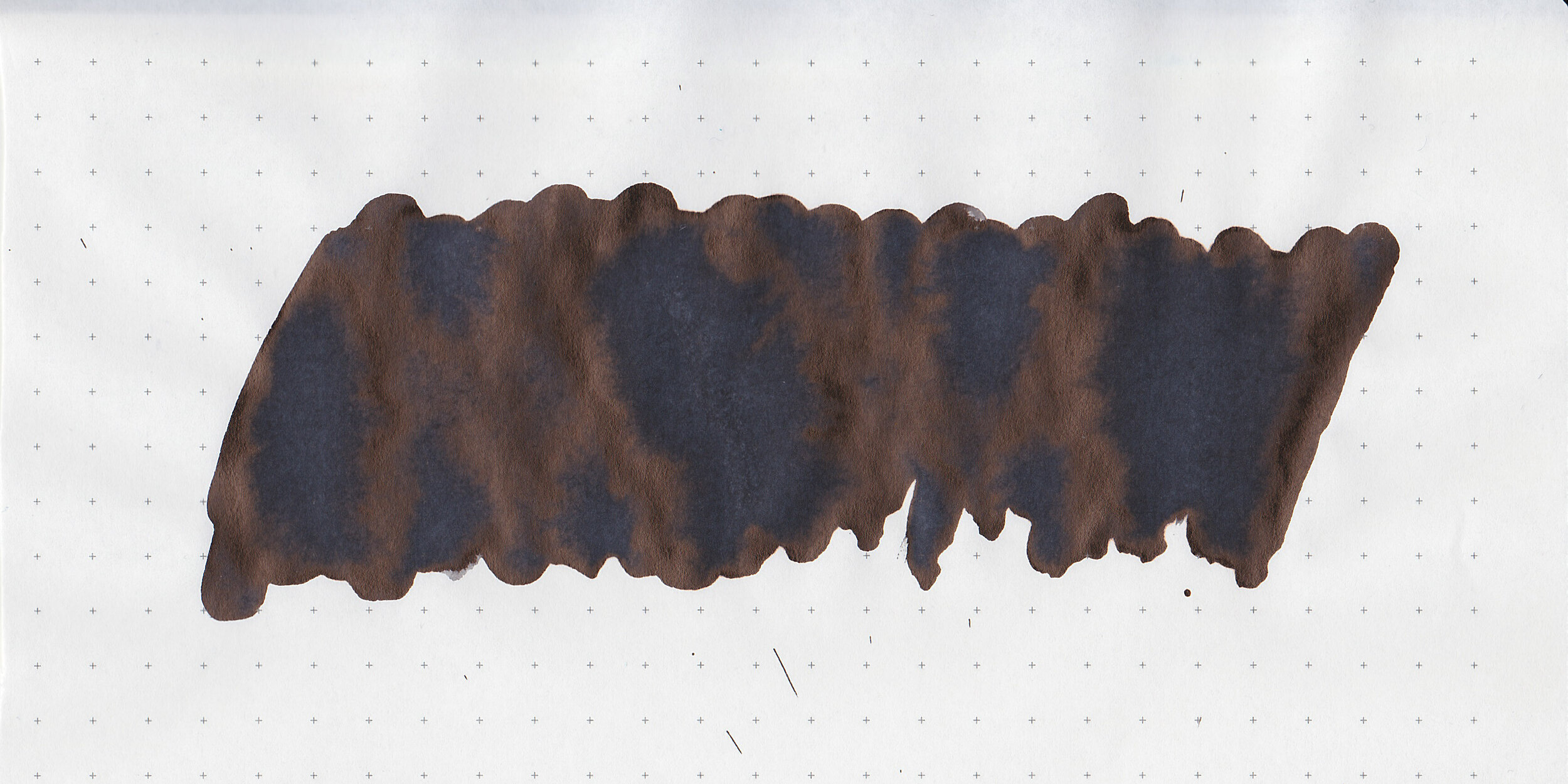
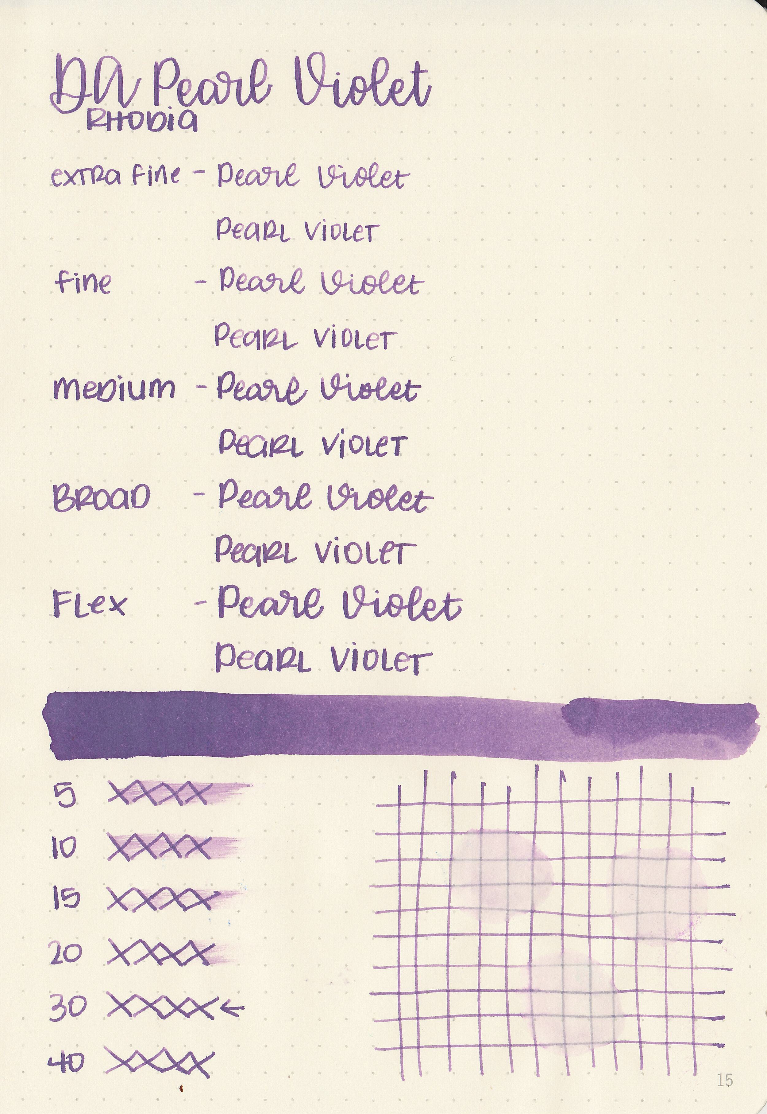
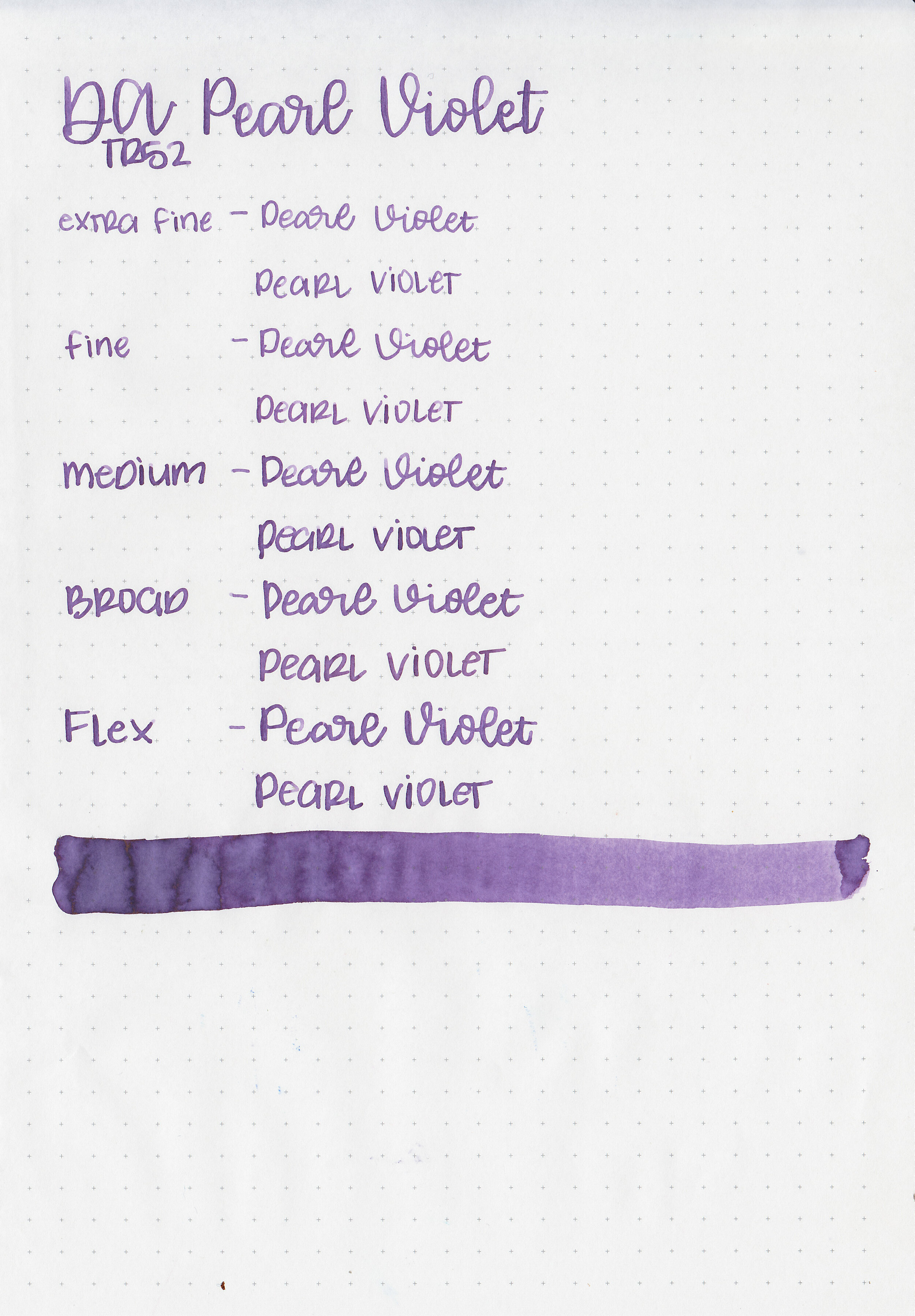
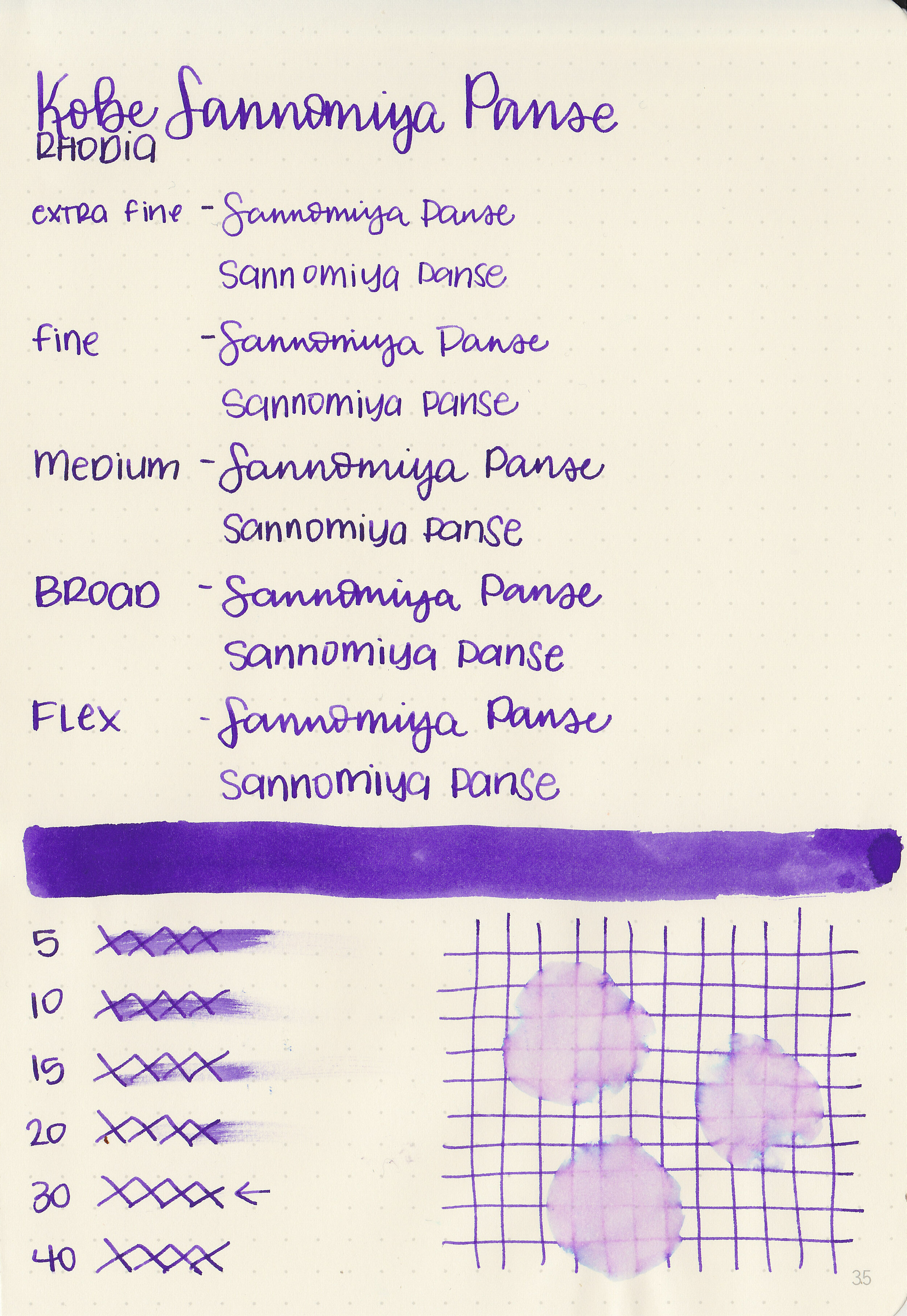
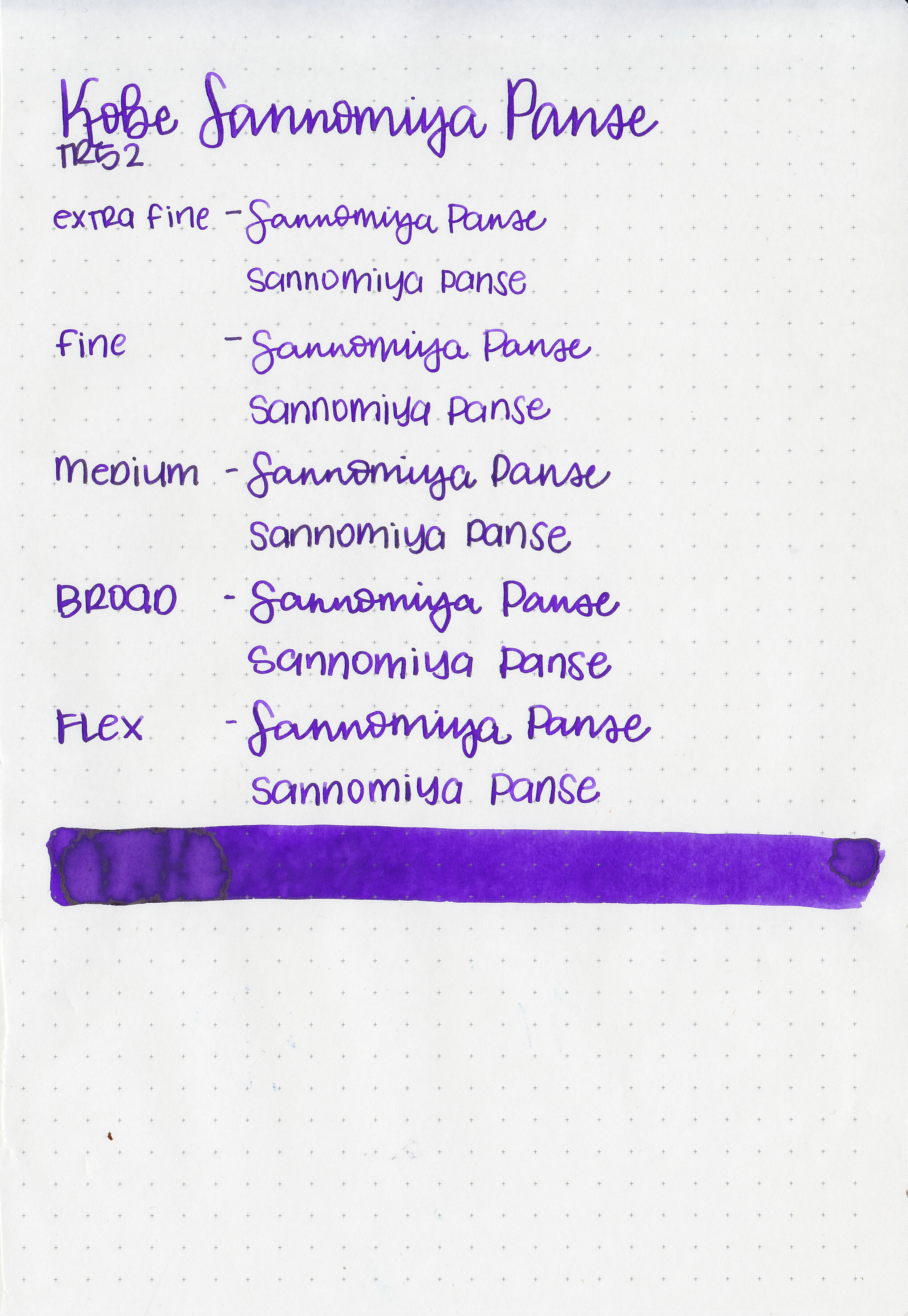
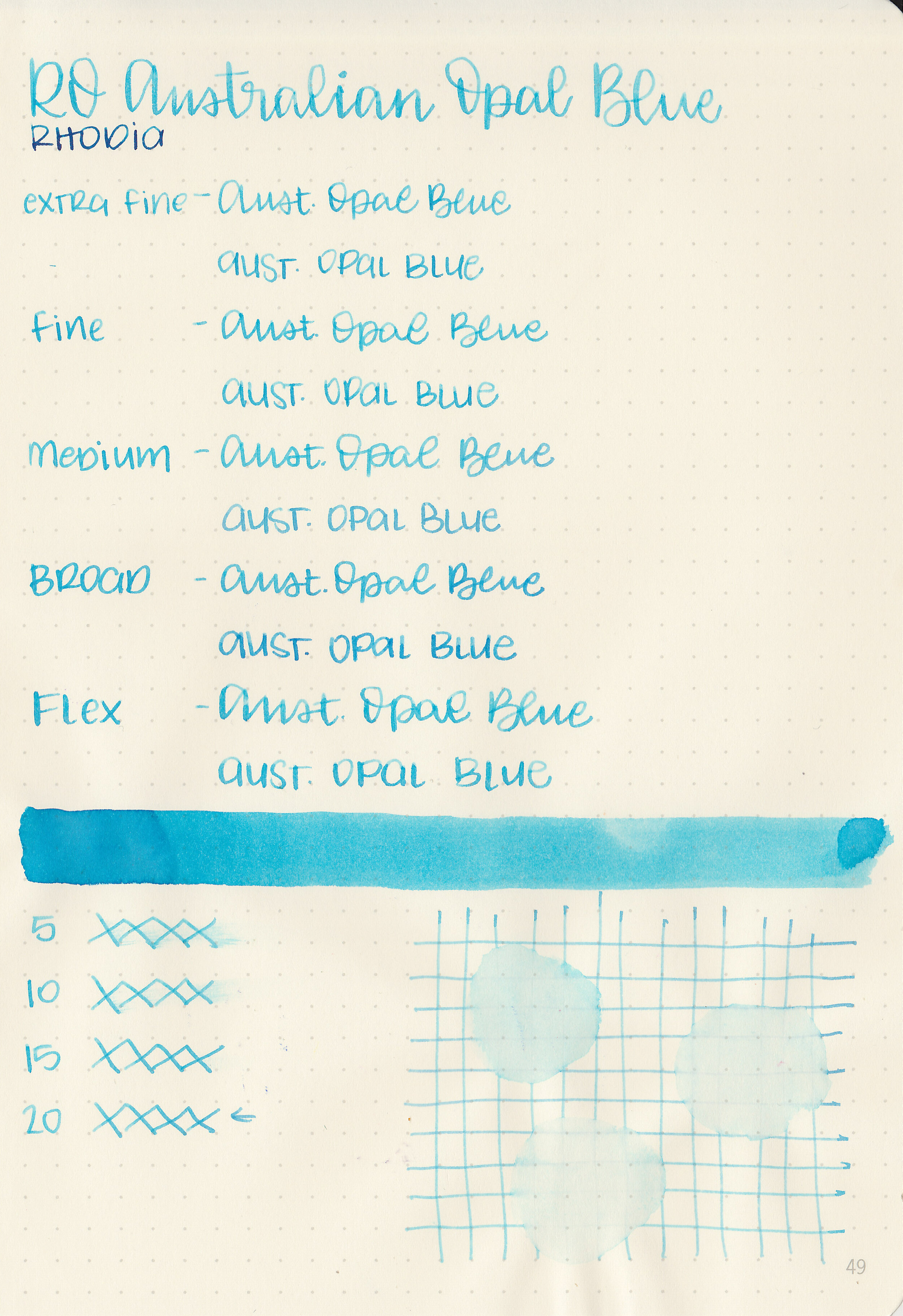
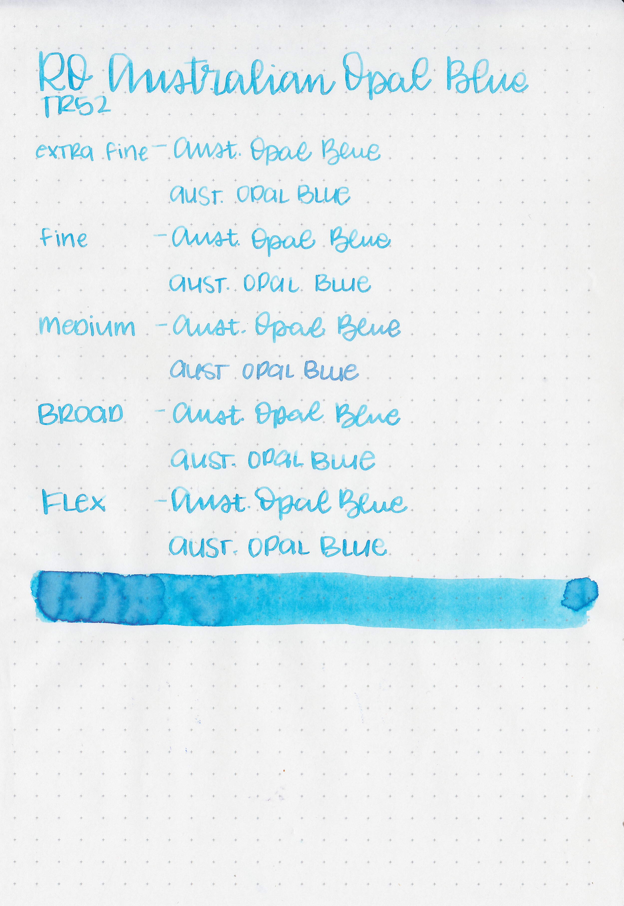
Swabs:

In large swabs on Tomoe River paper the ink has some coppery sheen.

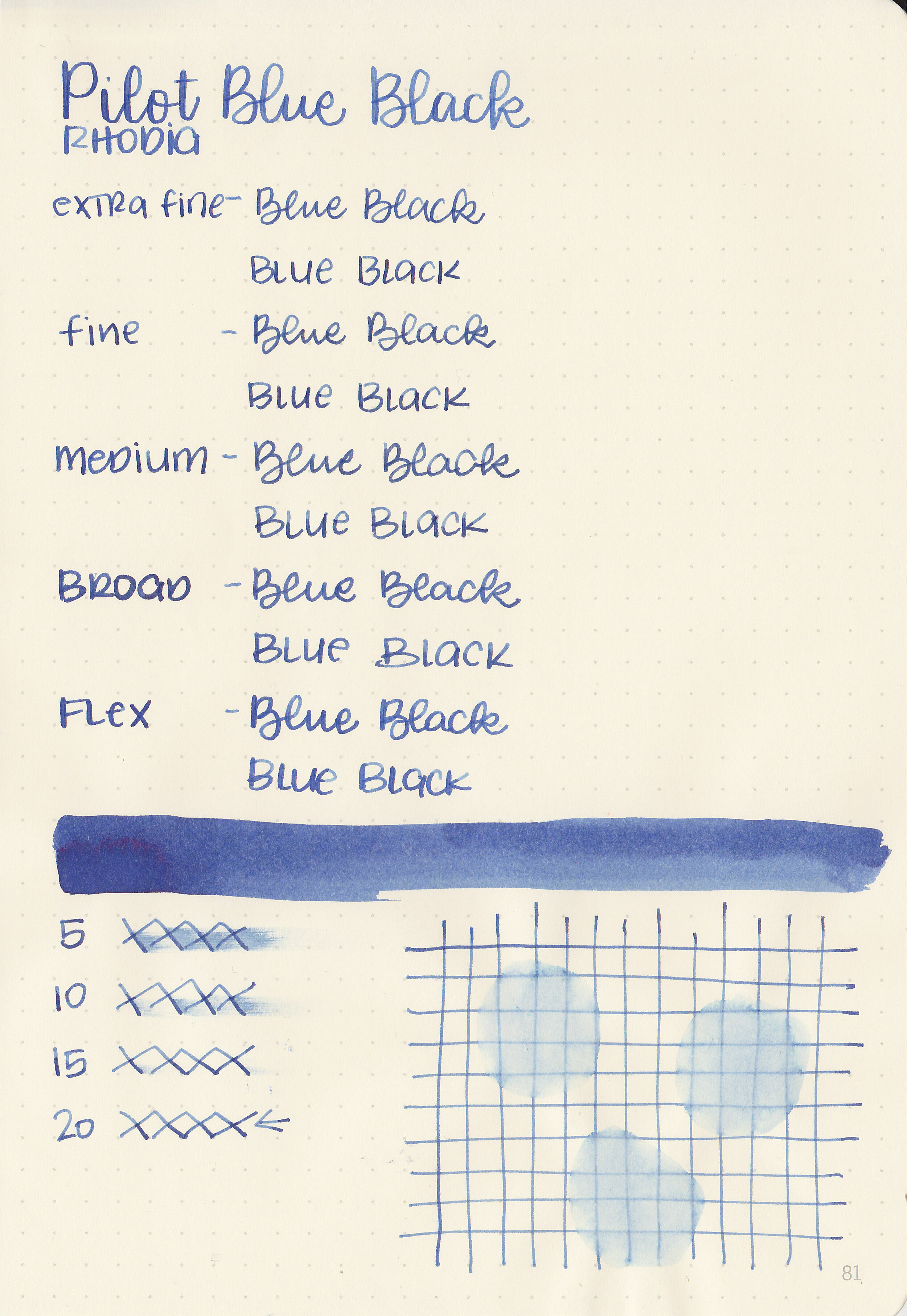
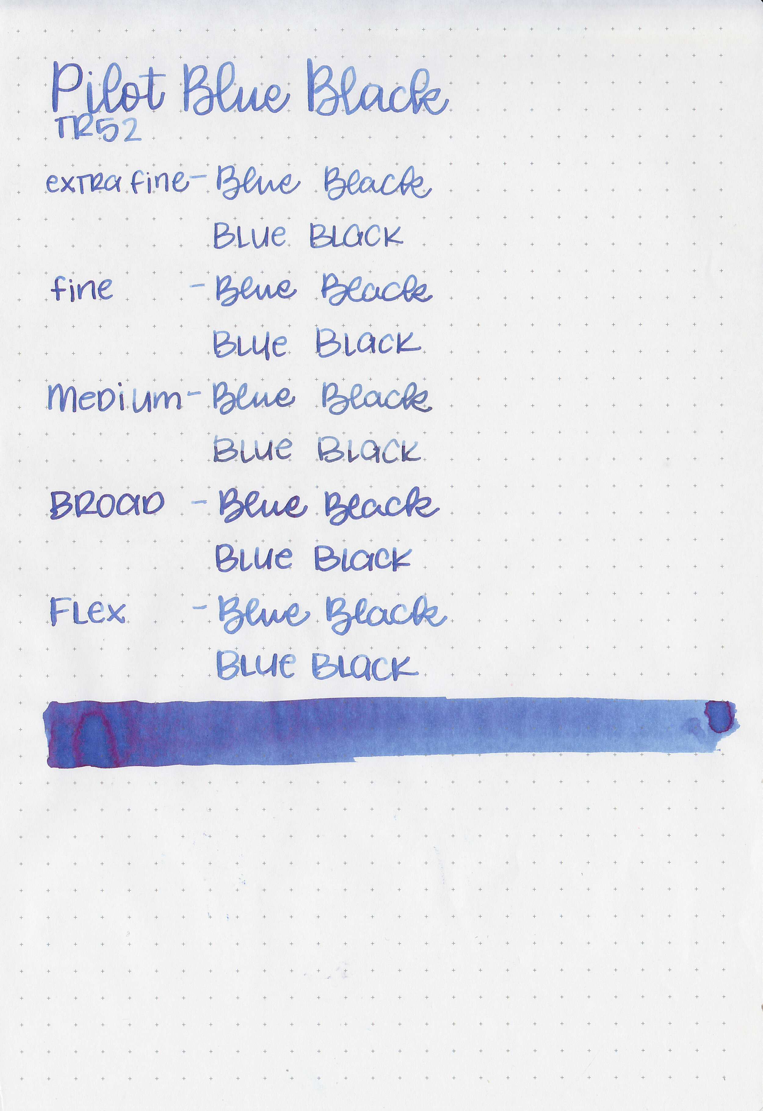
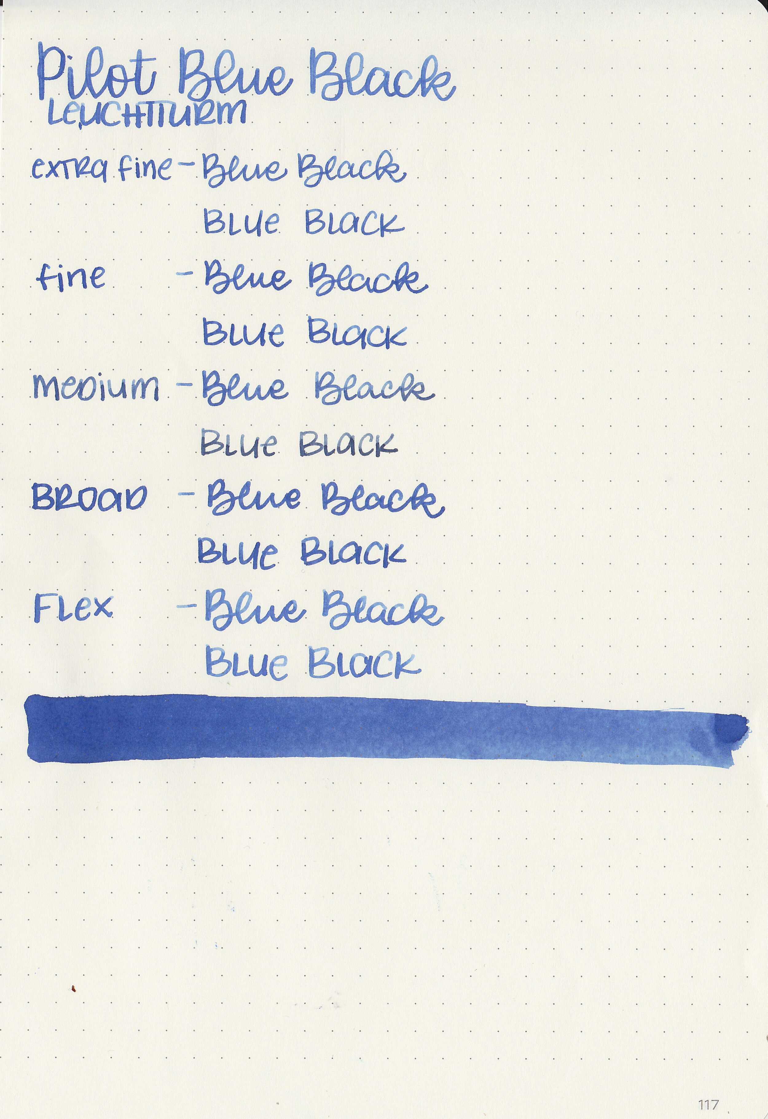
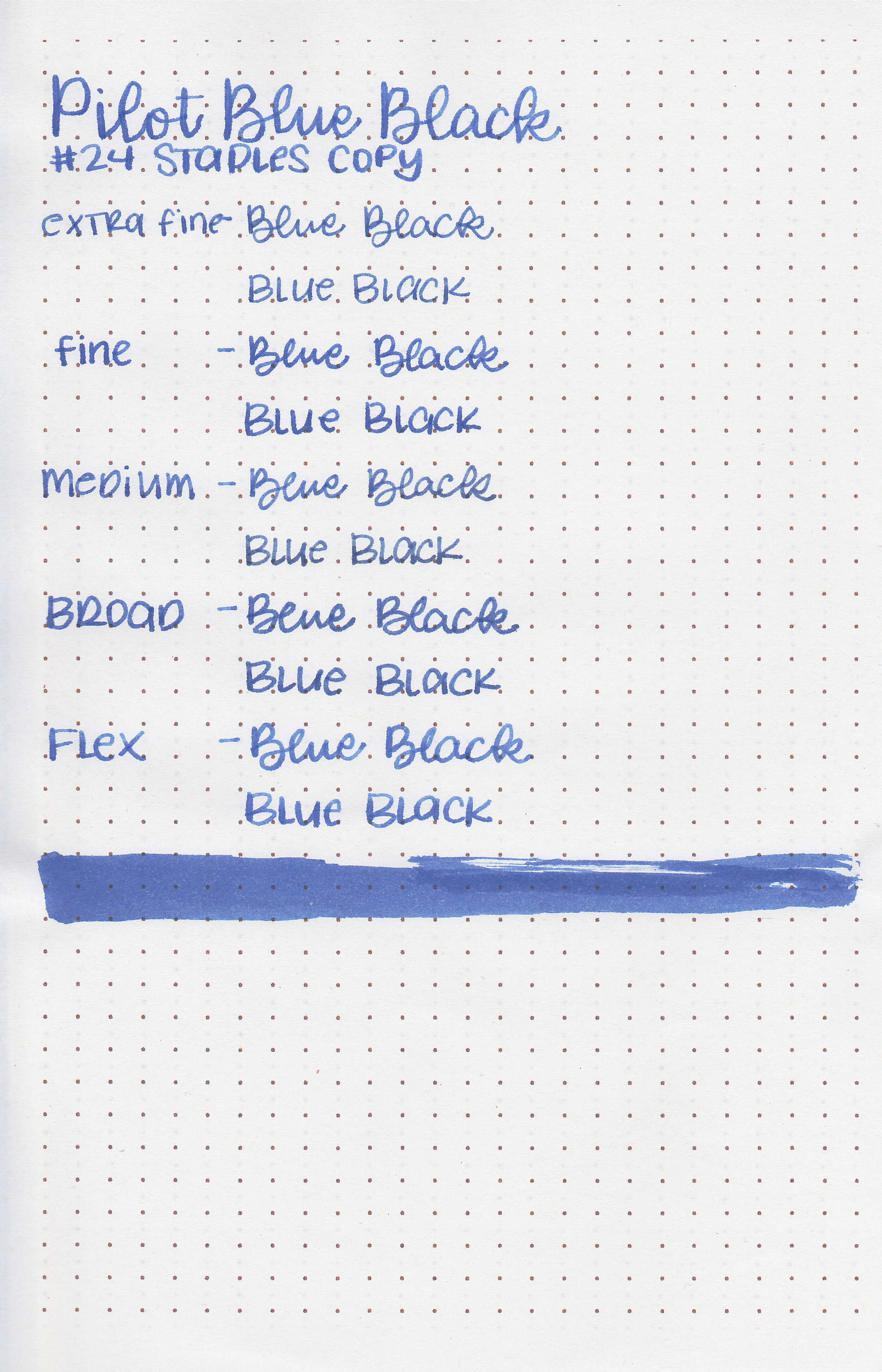
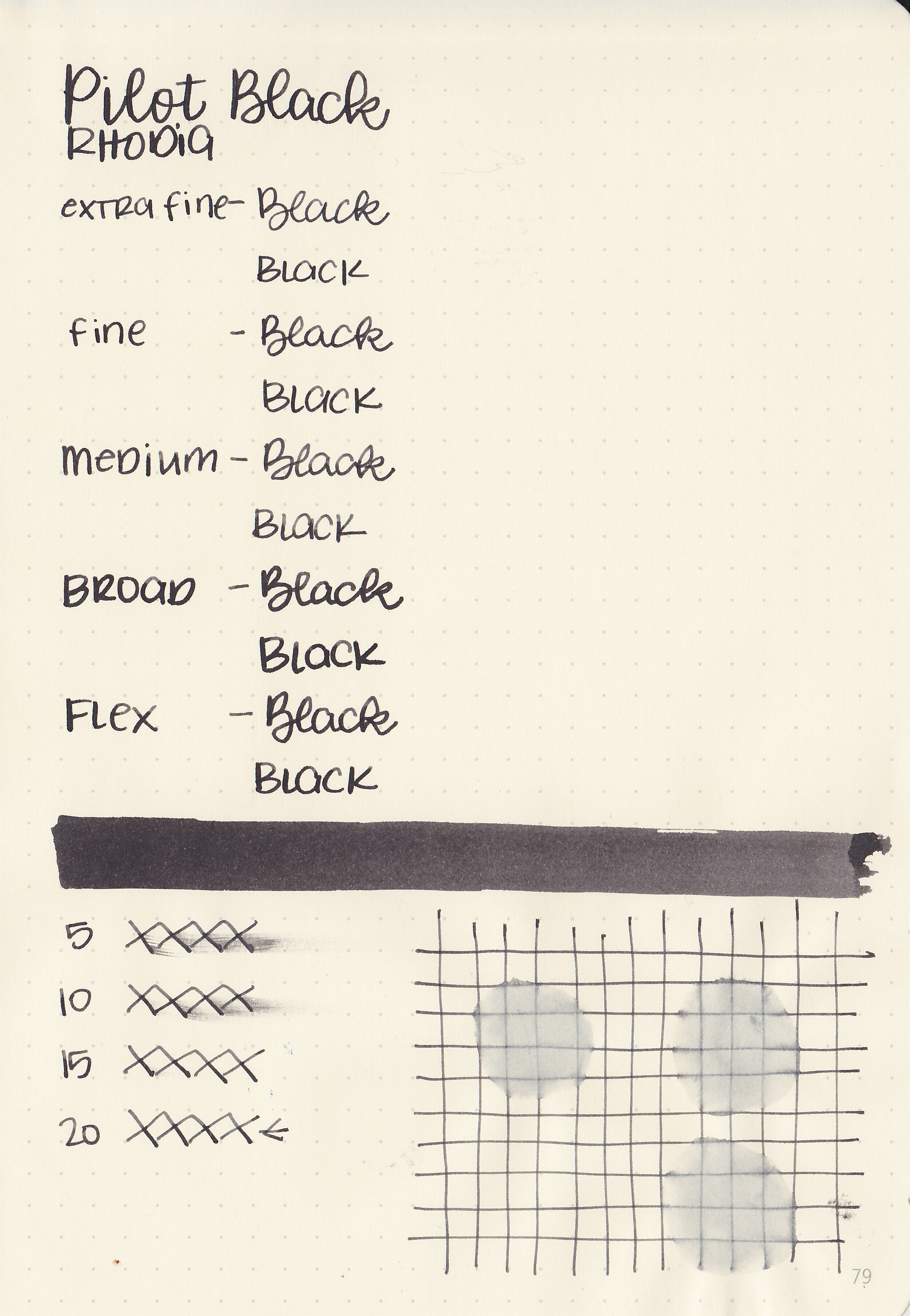
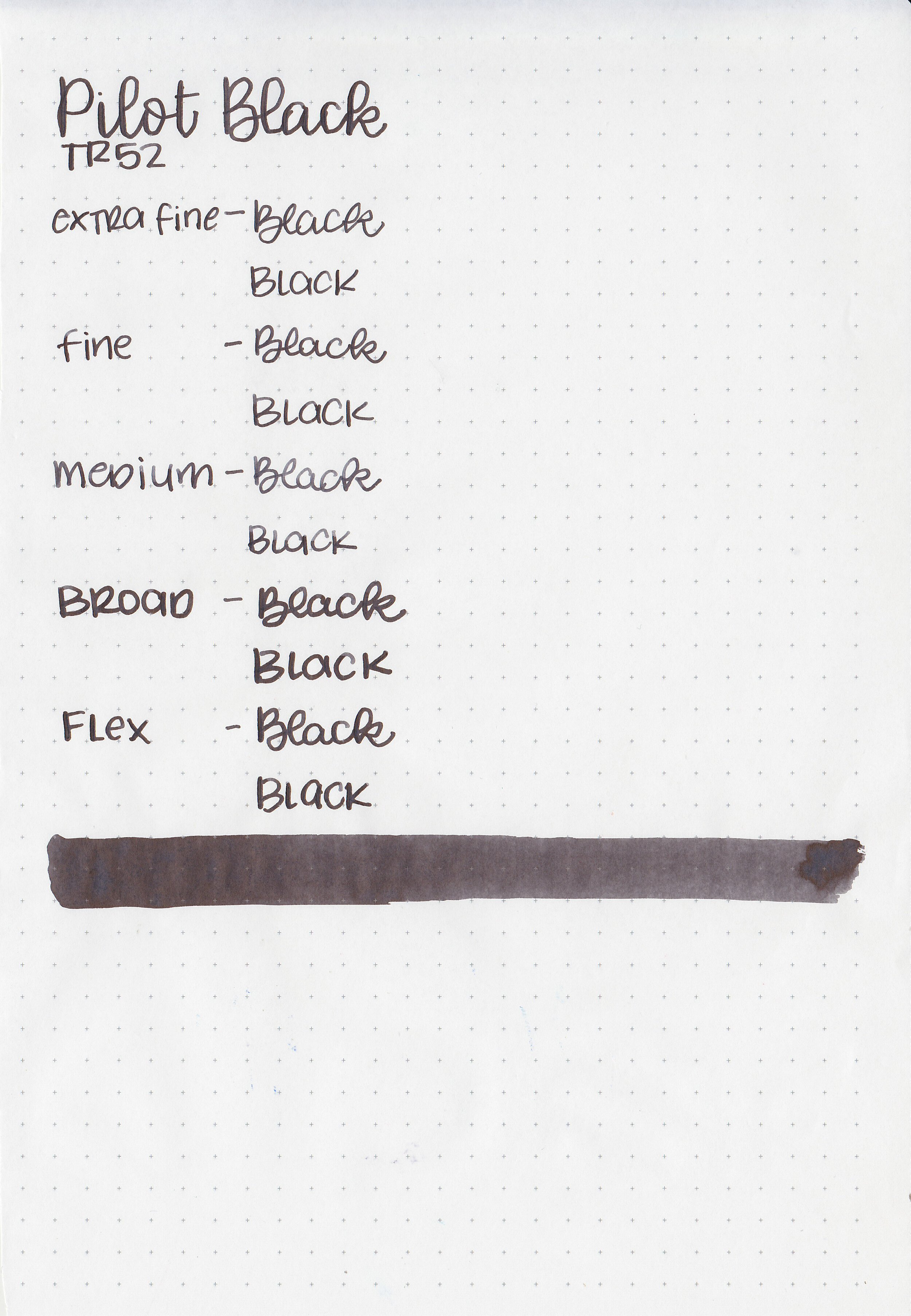
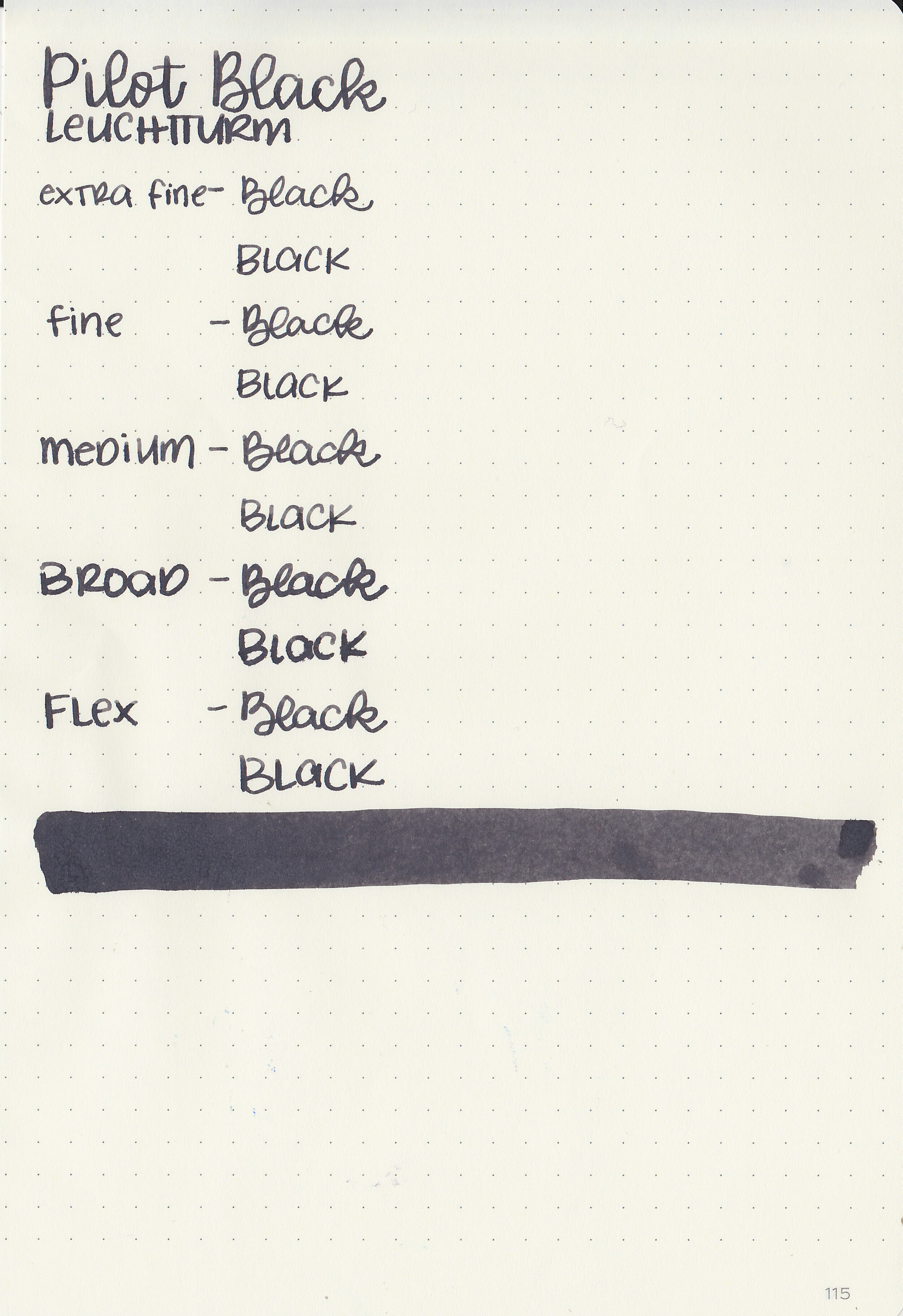
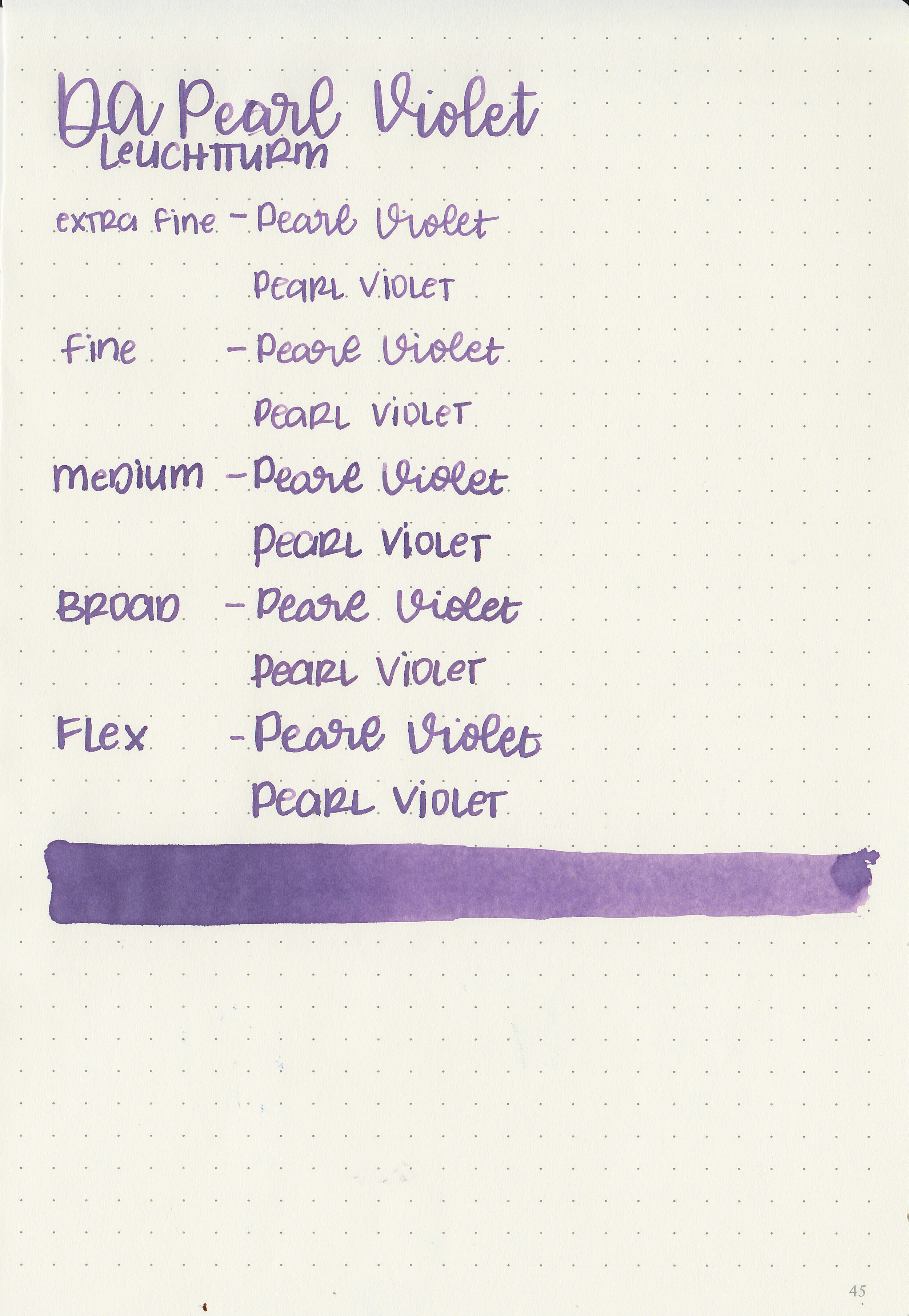
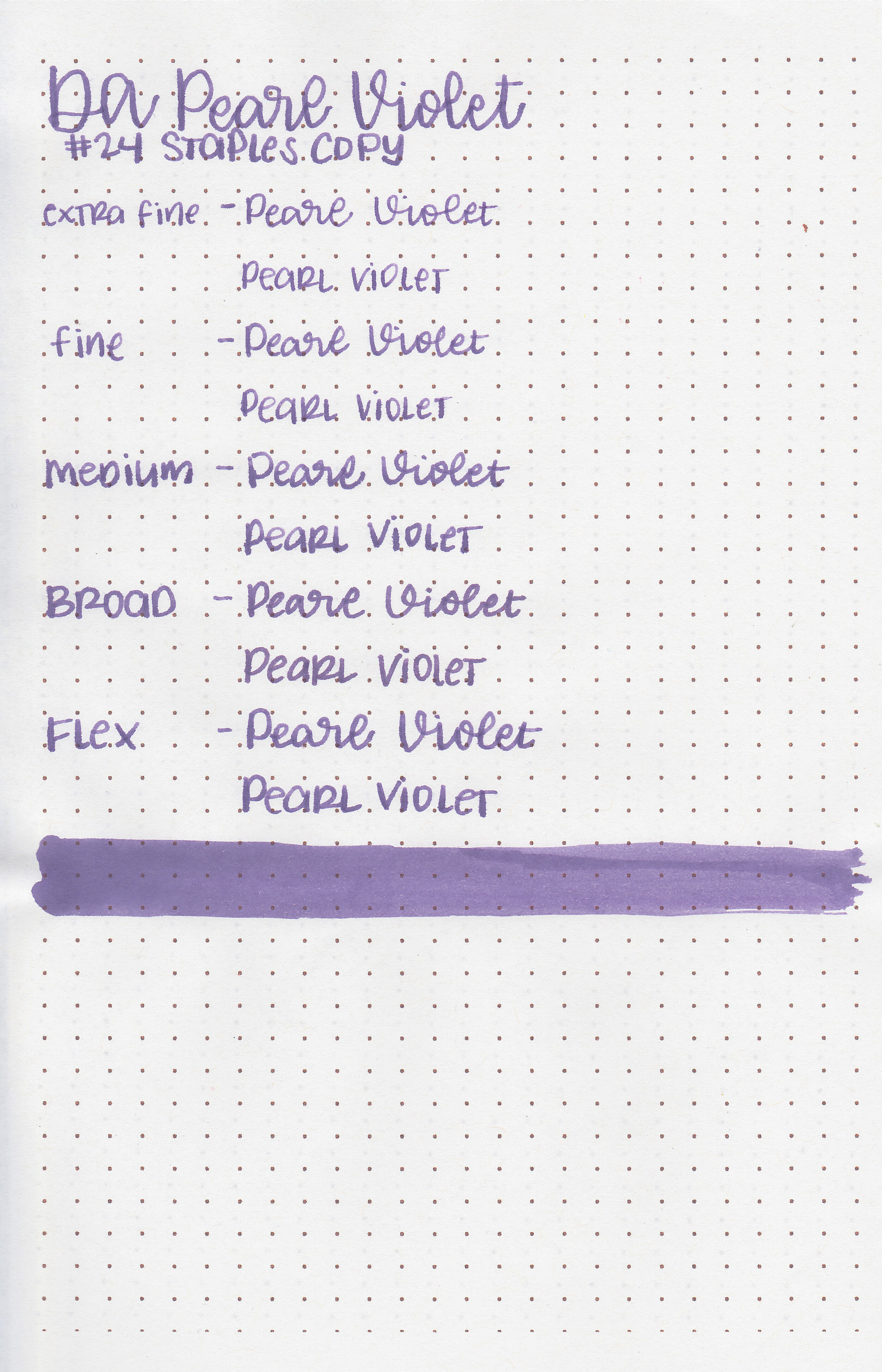
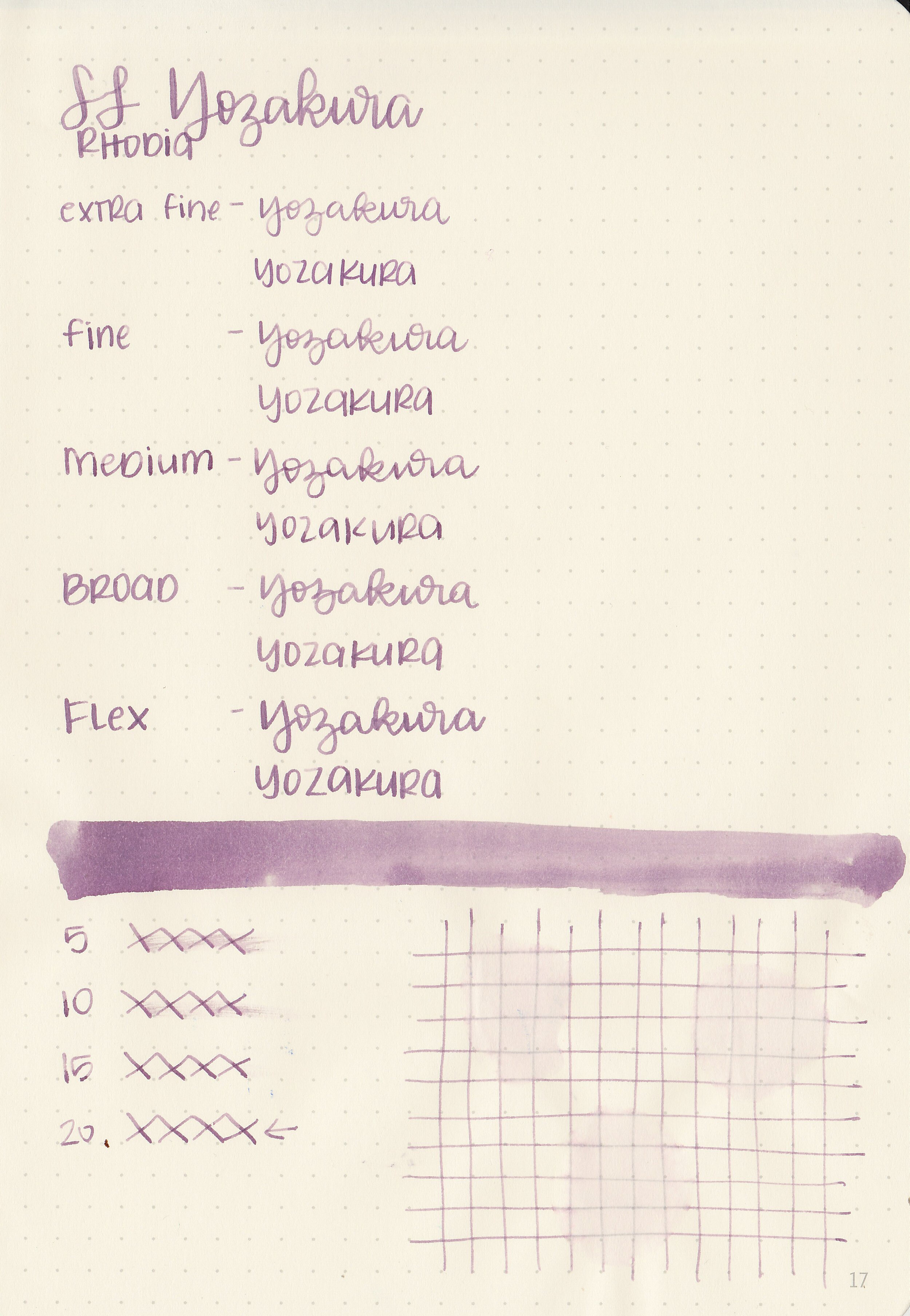
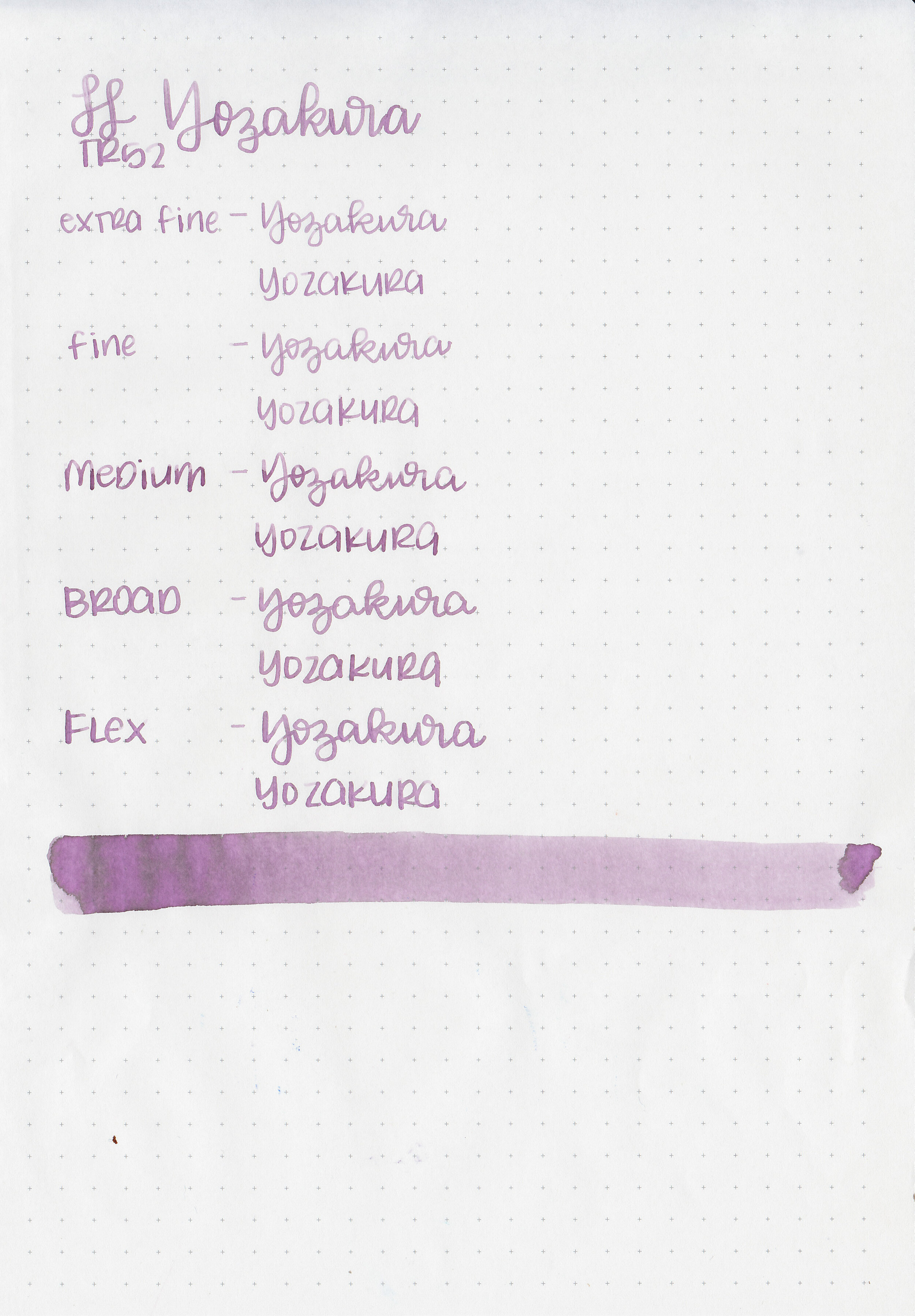
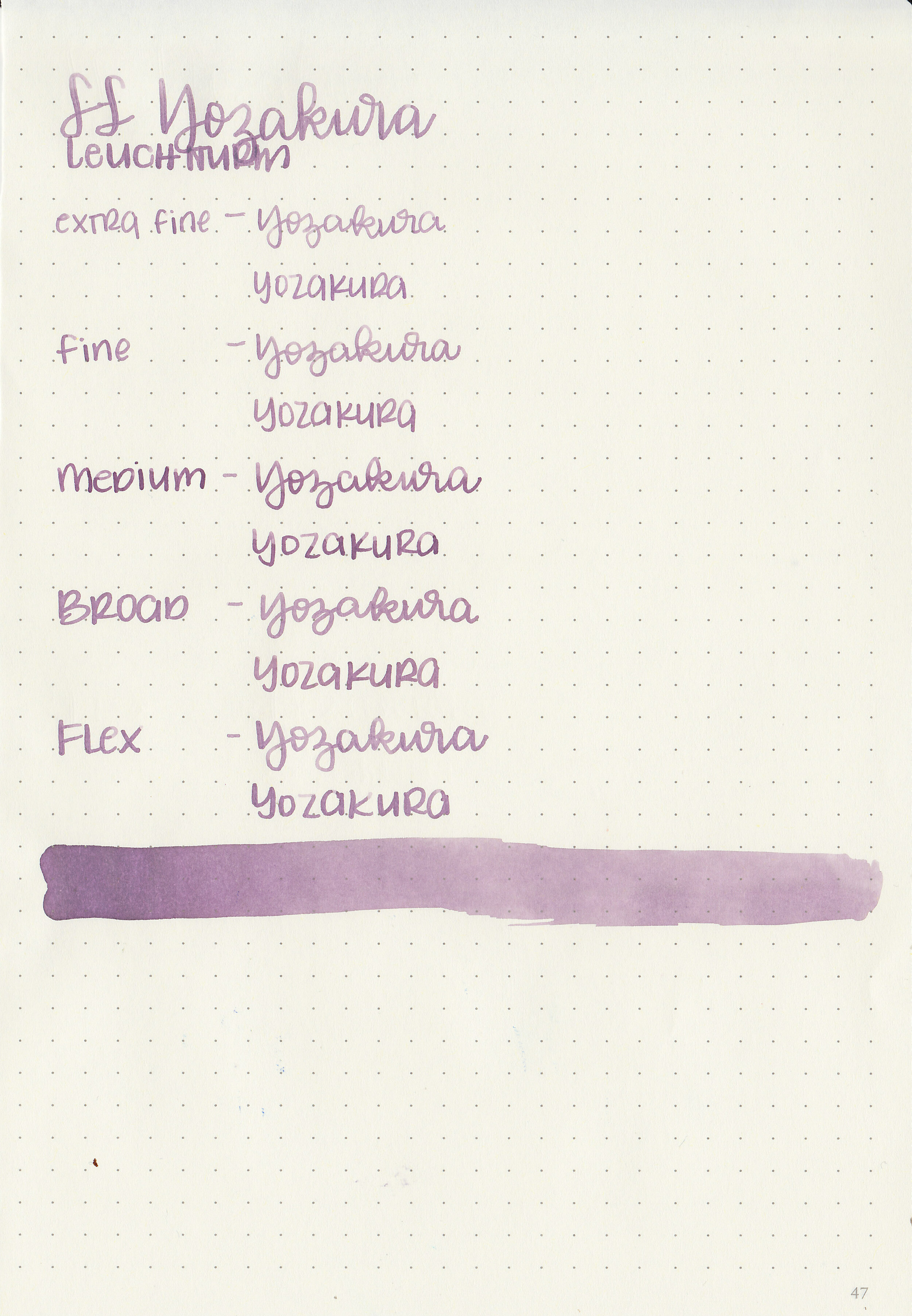
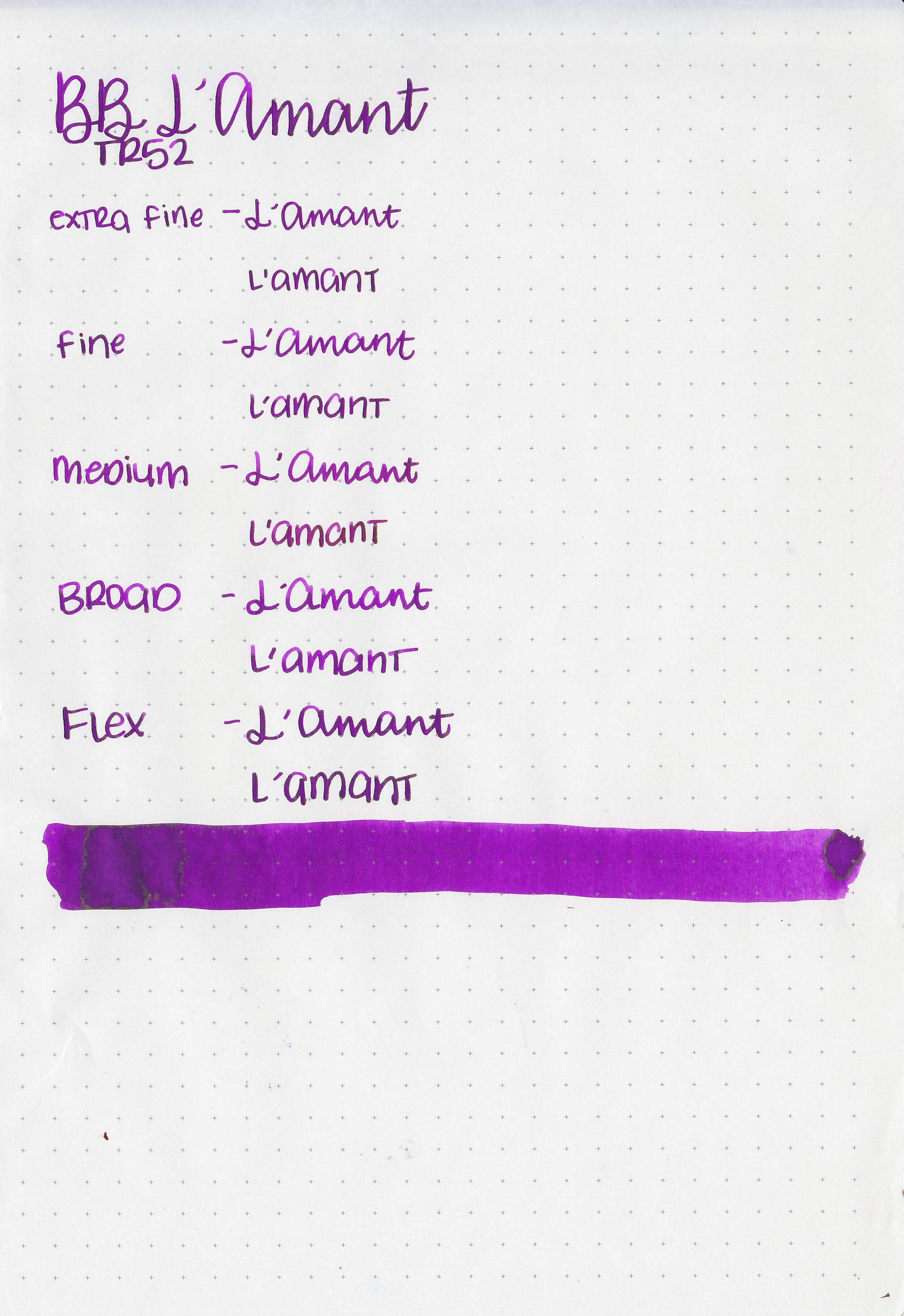
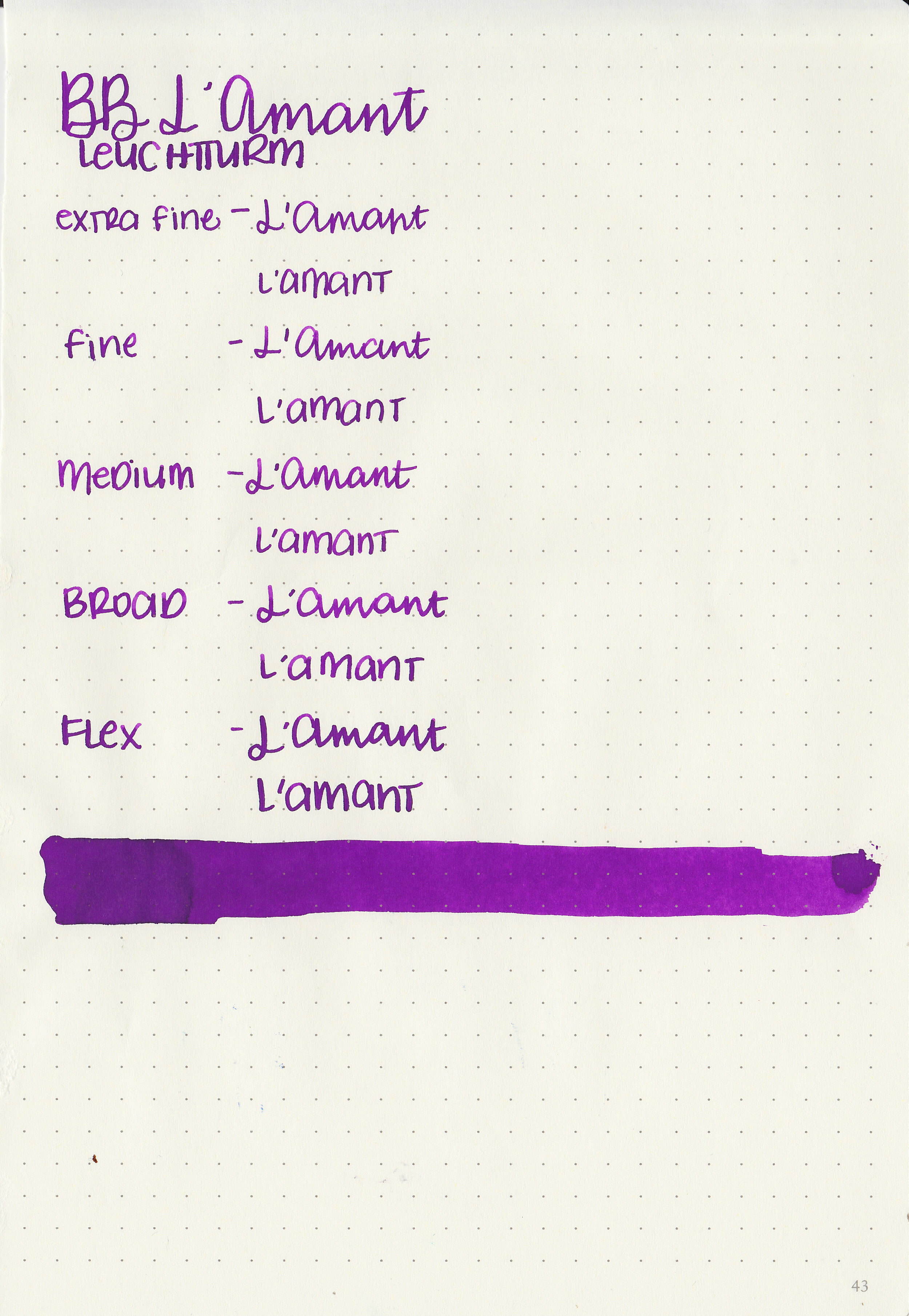
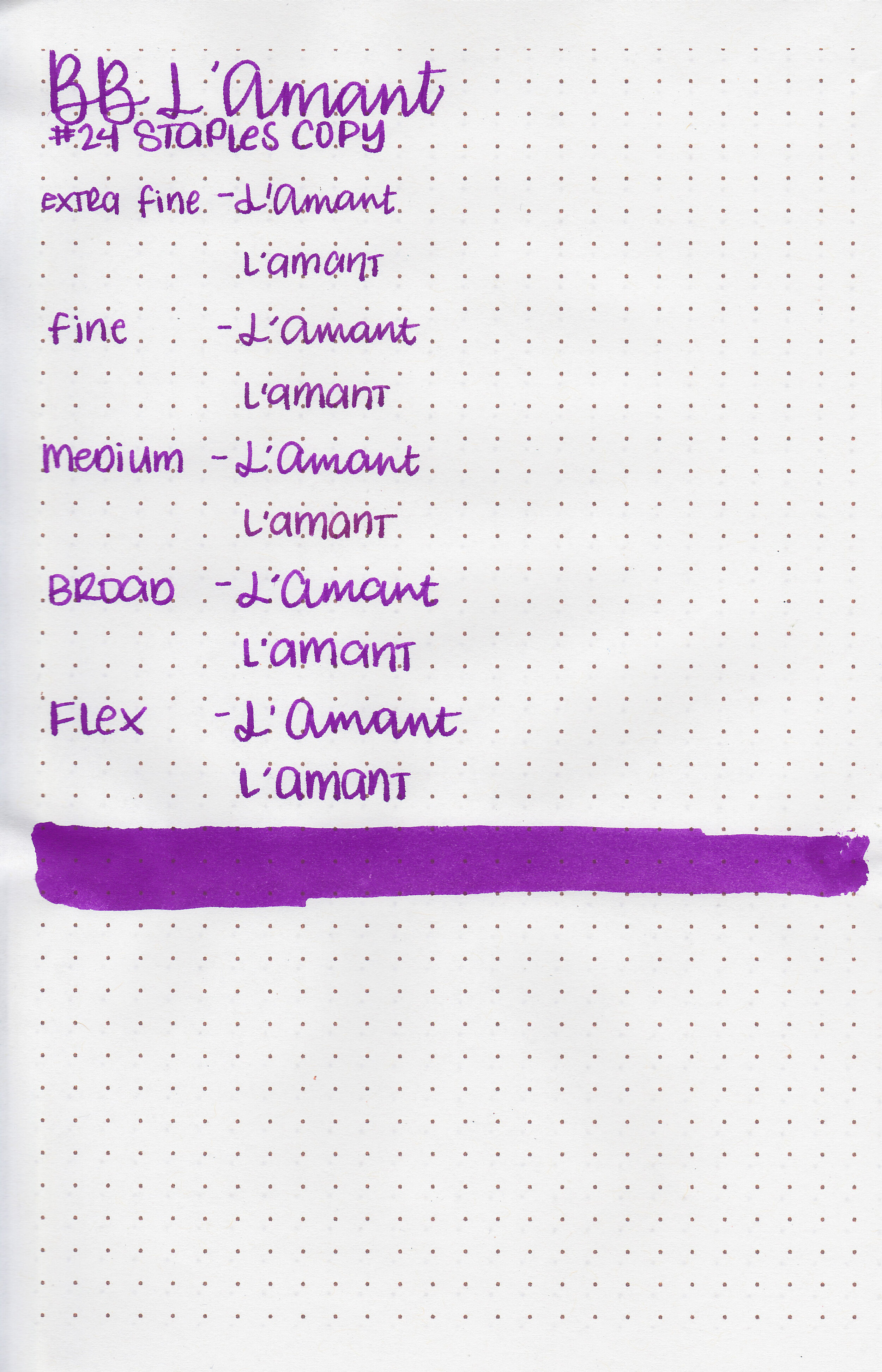
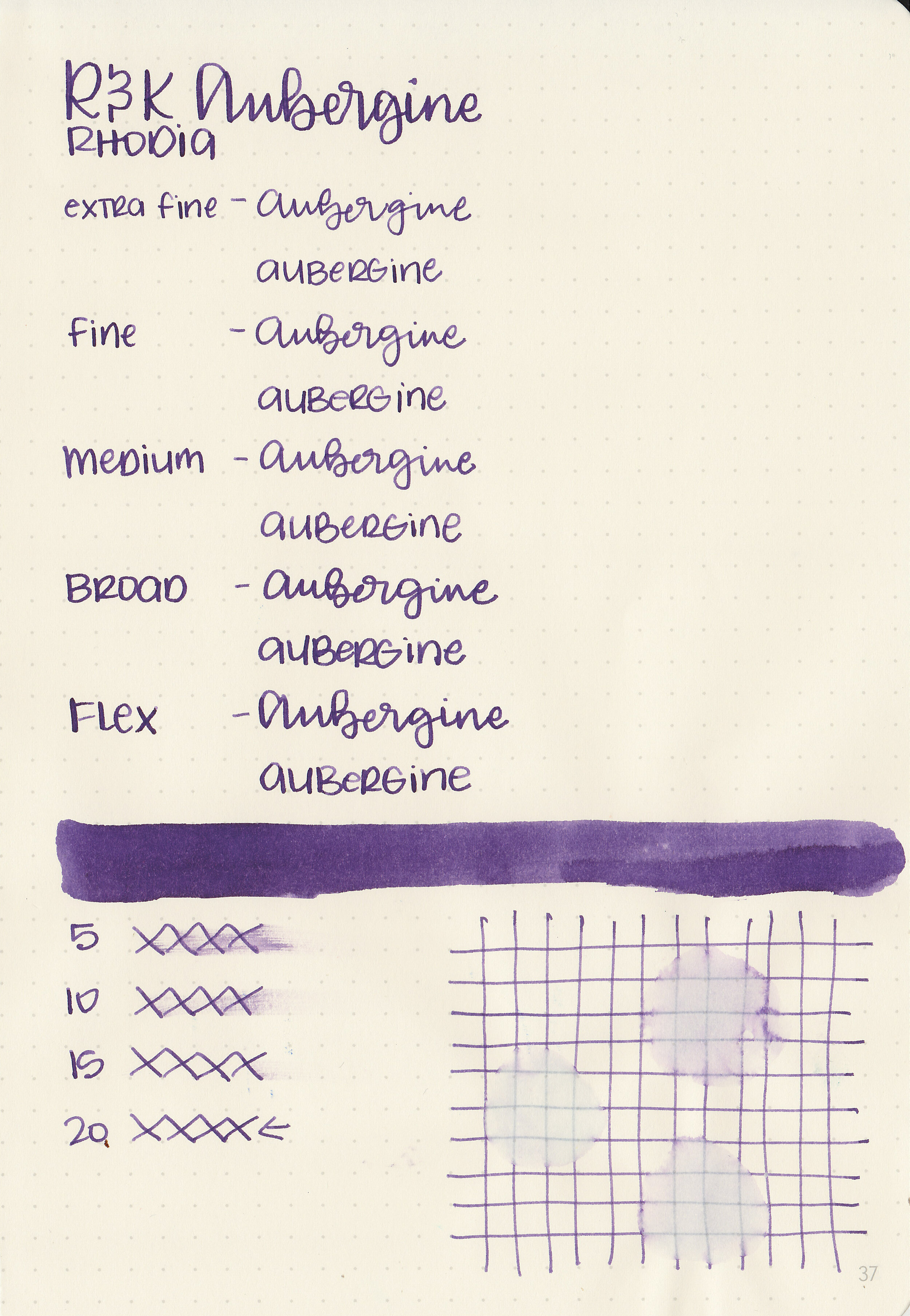
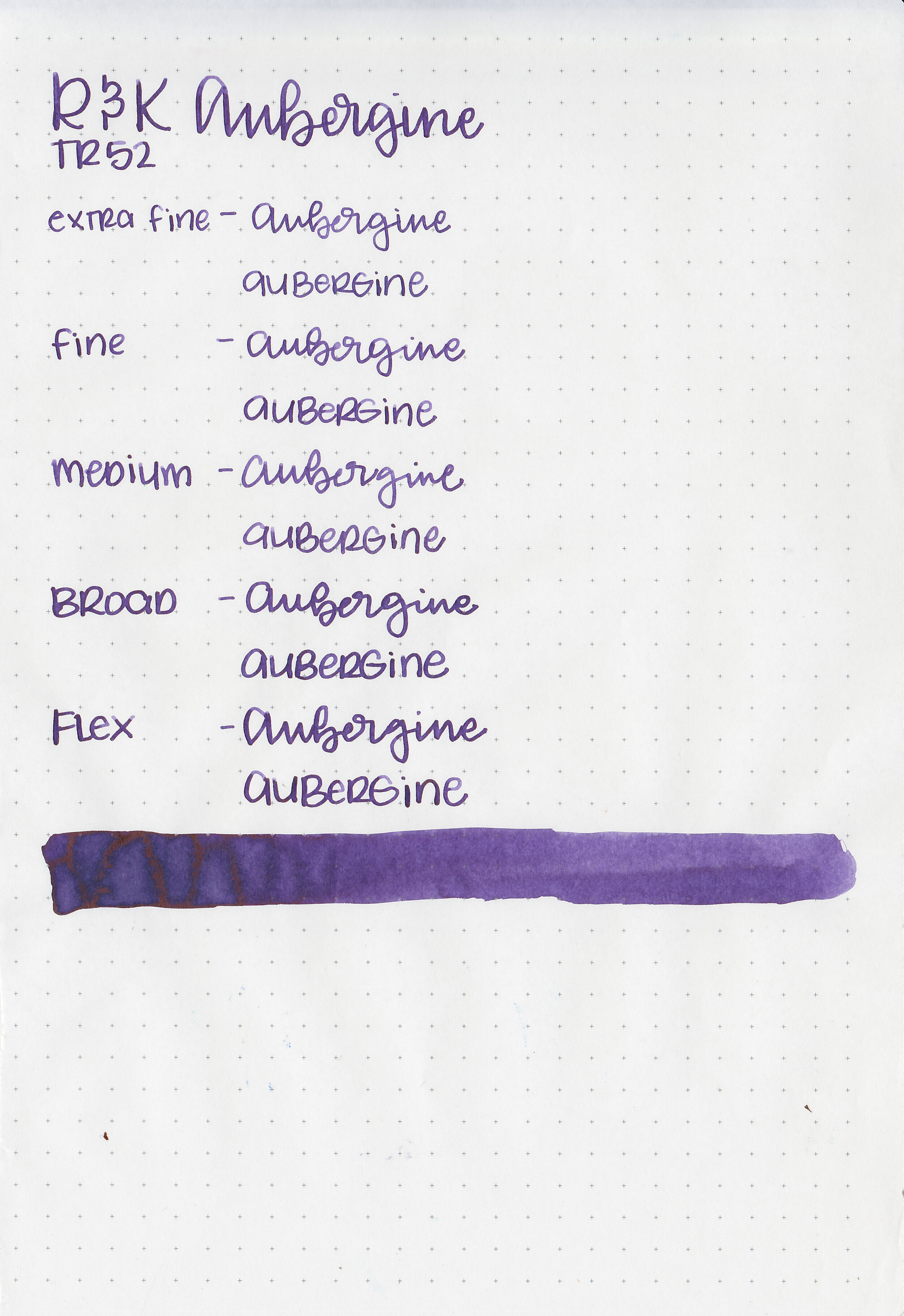
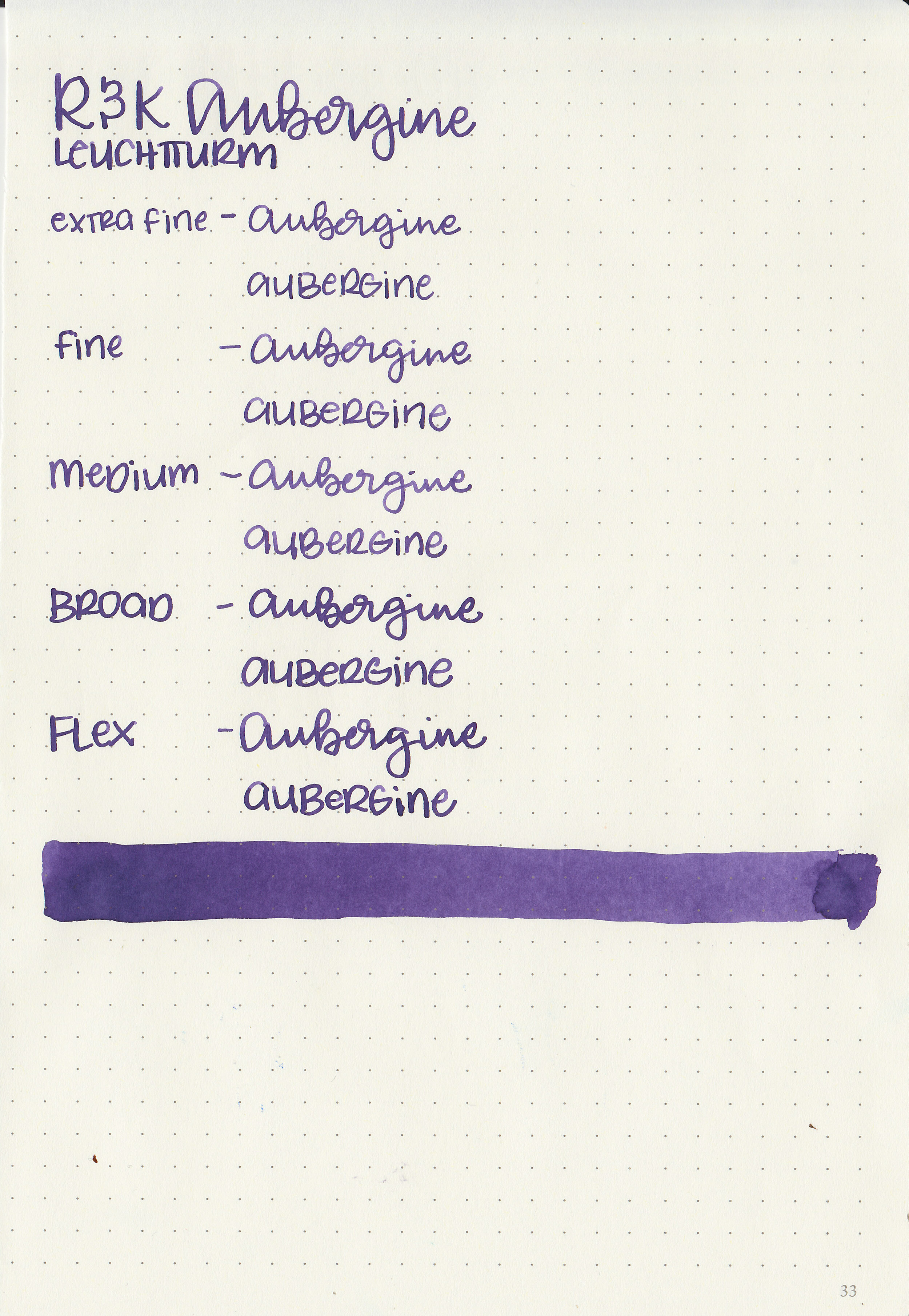
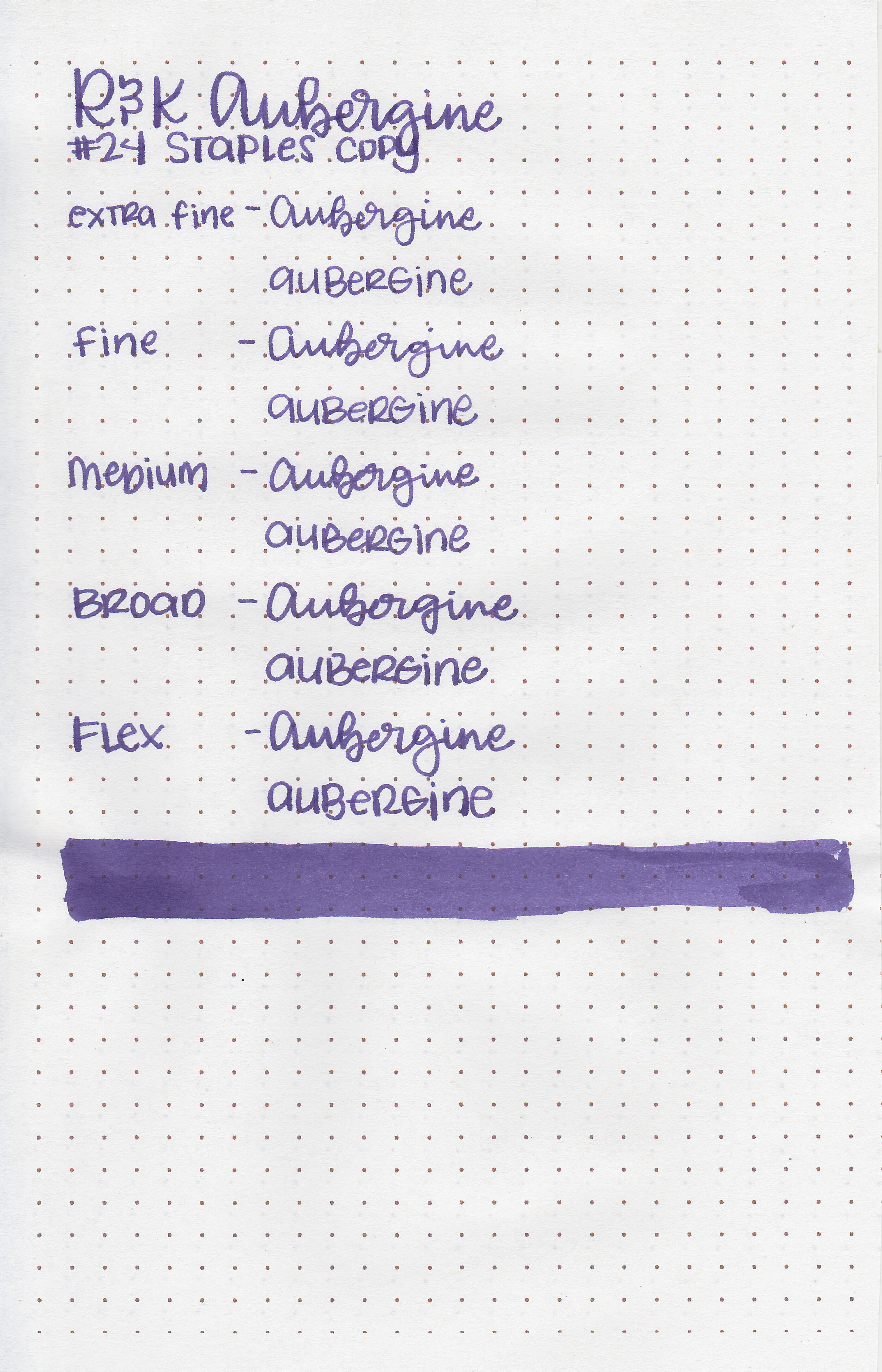
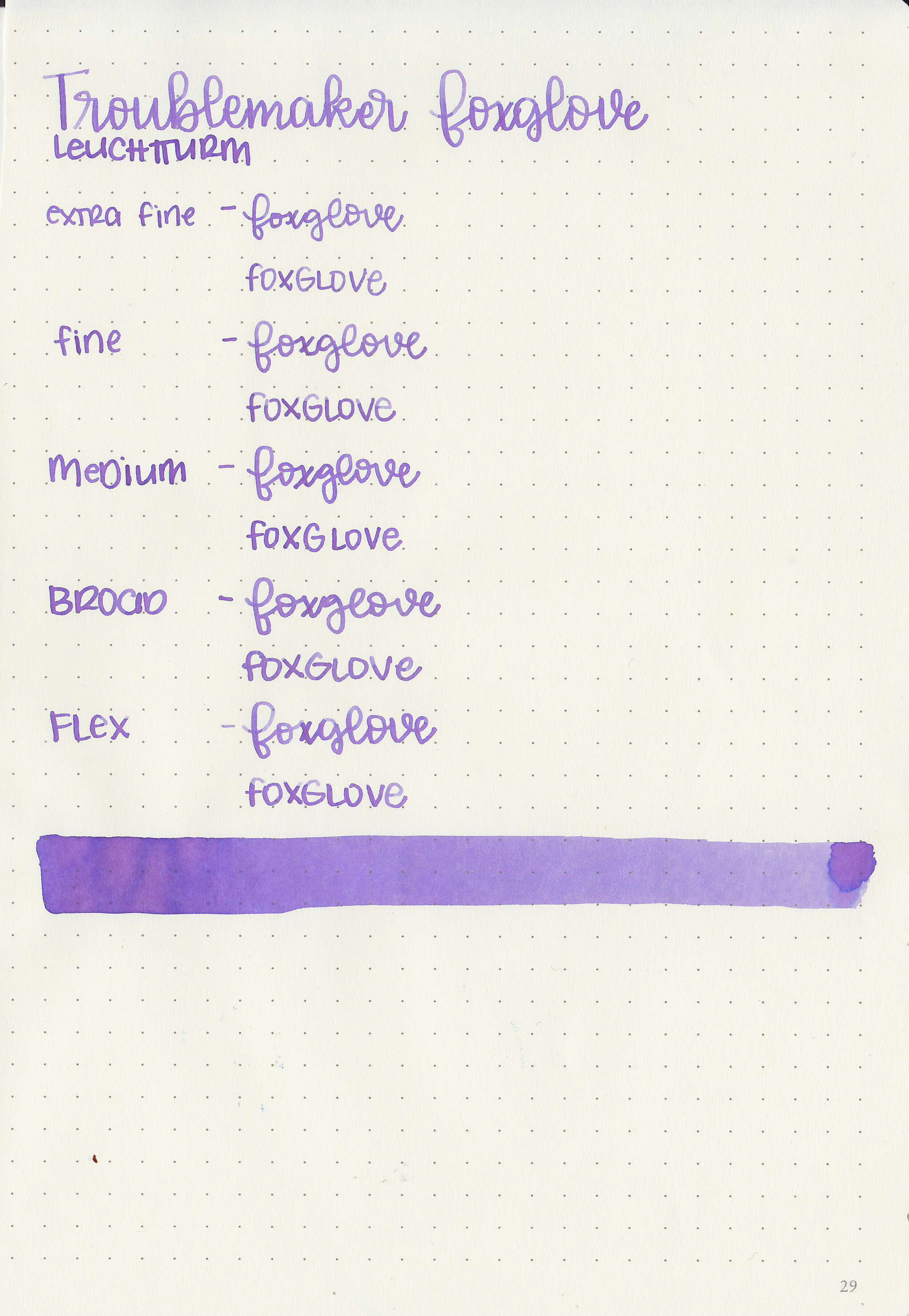
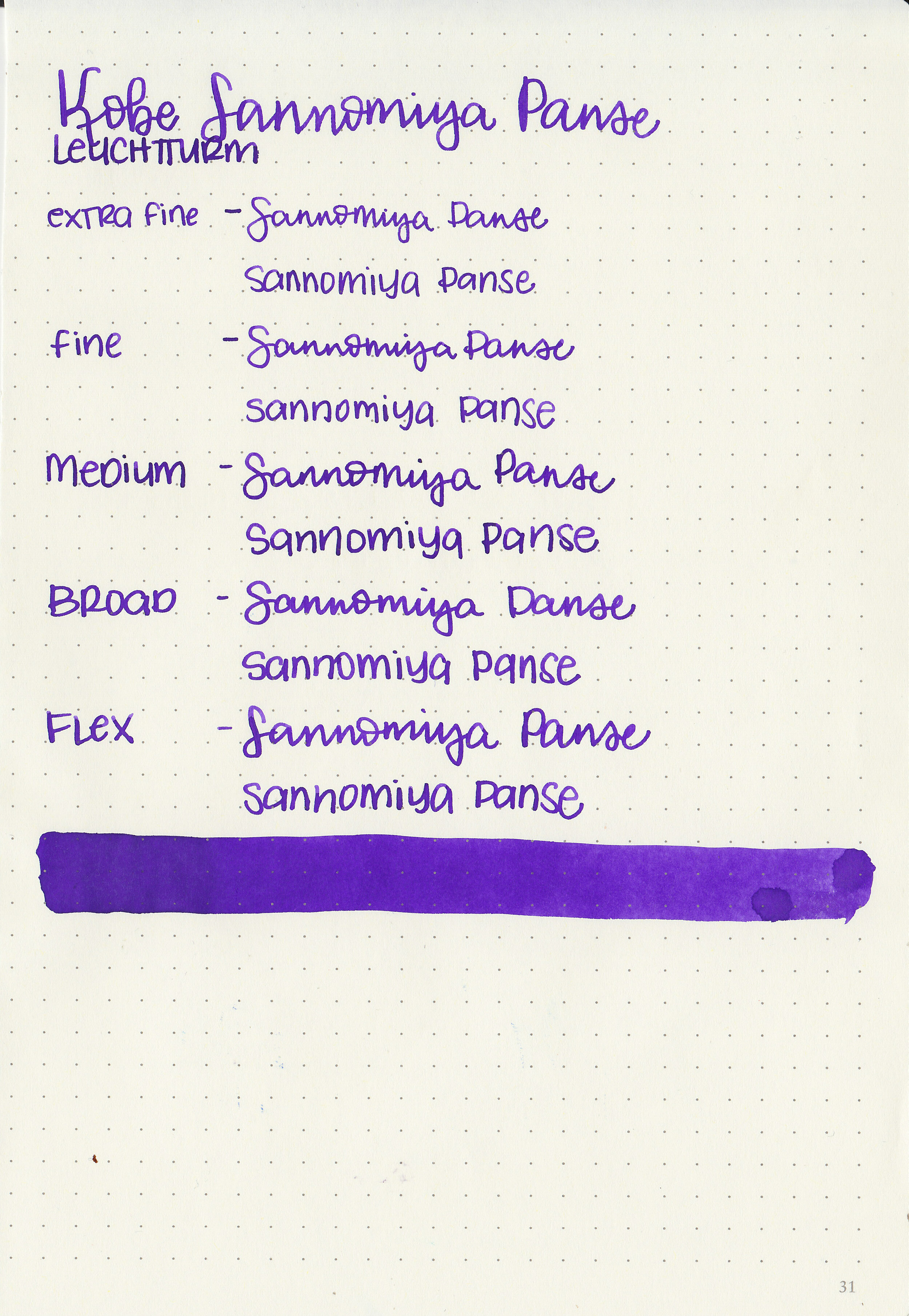
Writing samples:
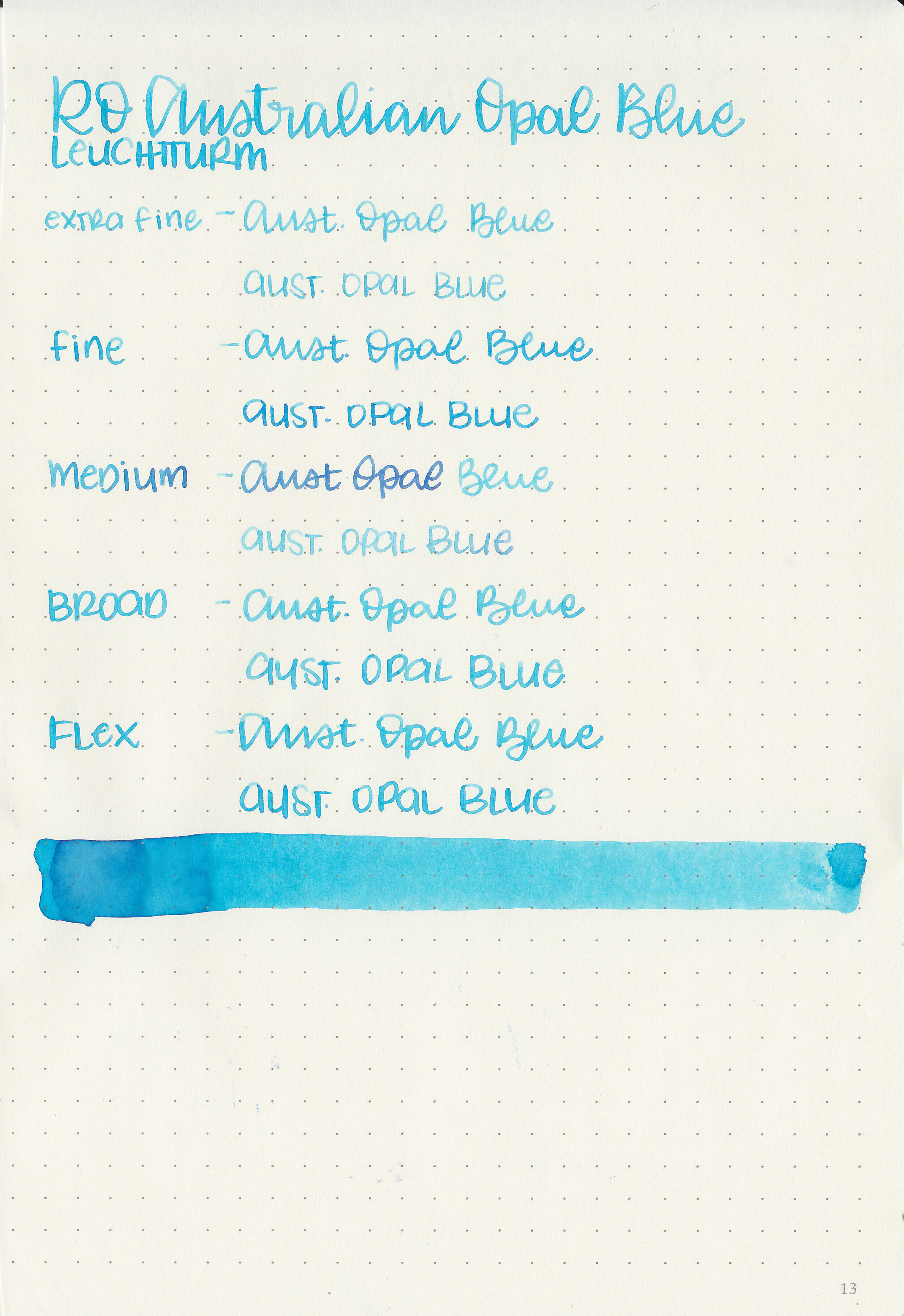
Let's take a look at how the ink behaves on fountain pen friendly papers: Rhodia, Tomoe River, and Leuchtturm.
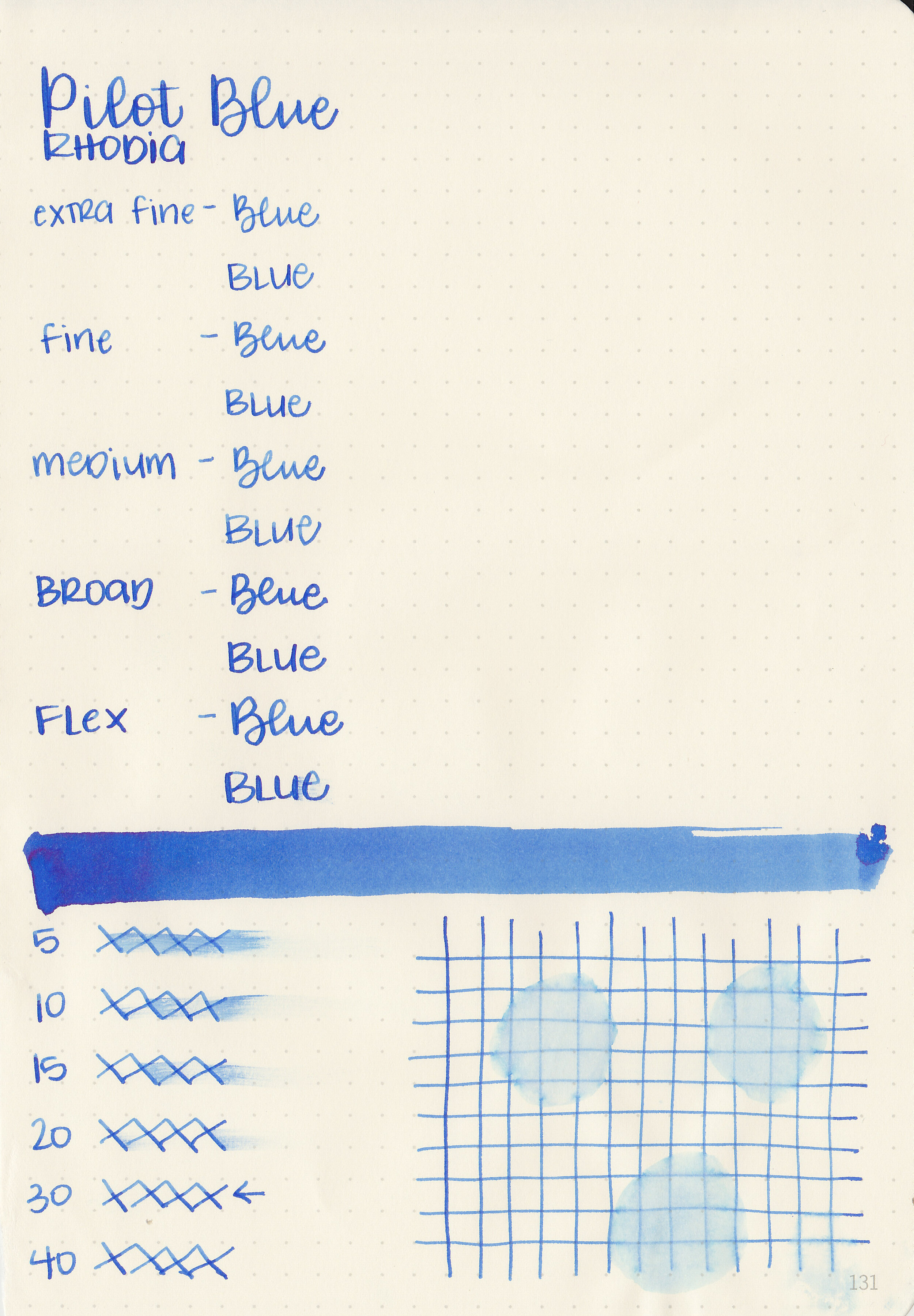
Dry time: 30 seconds
Water resistance: Low
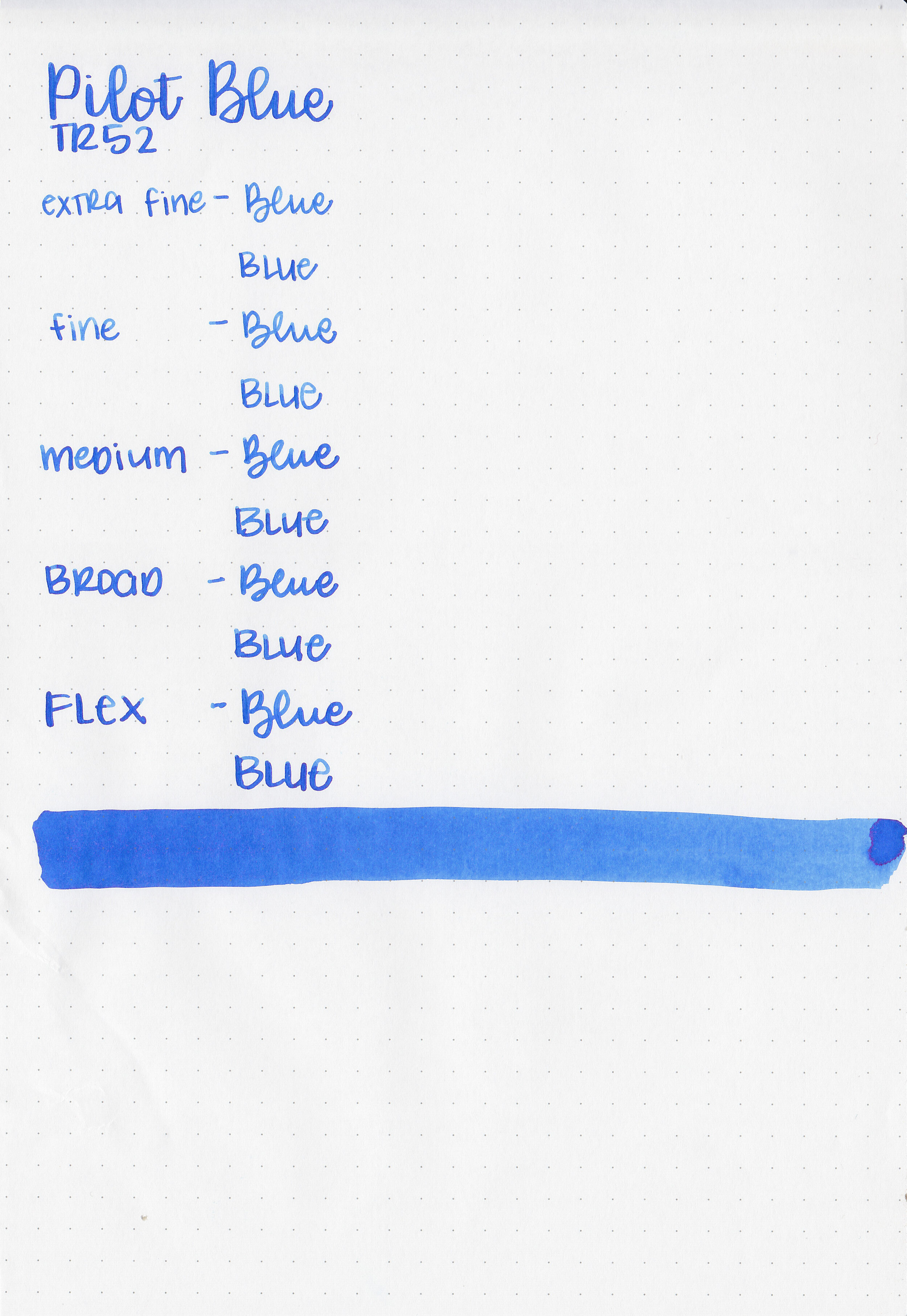
Feathering: None
Show through: Medium
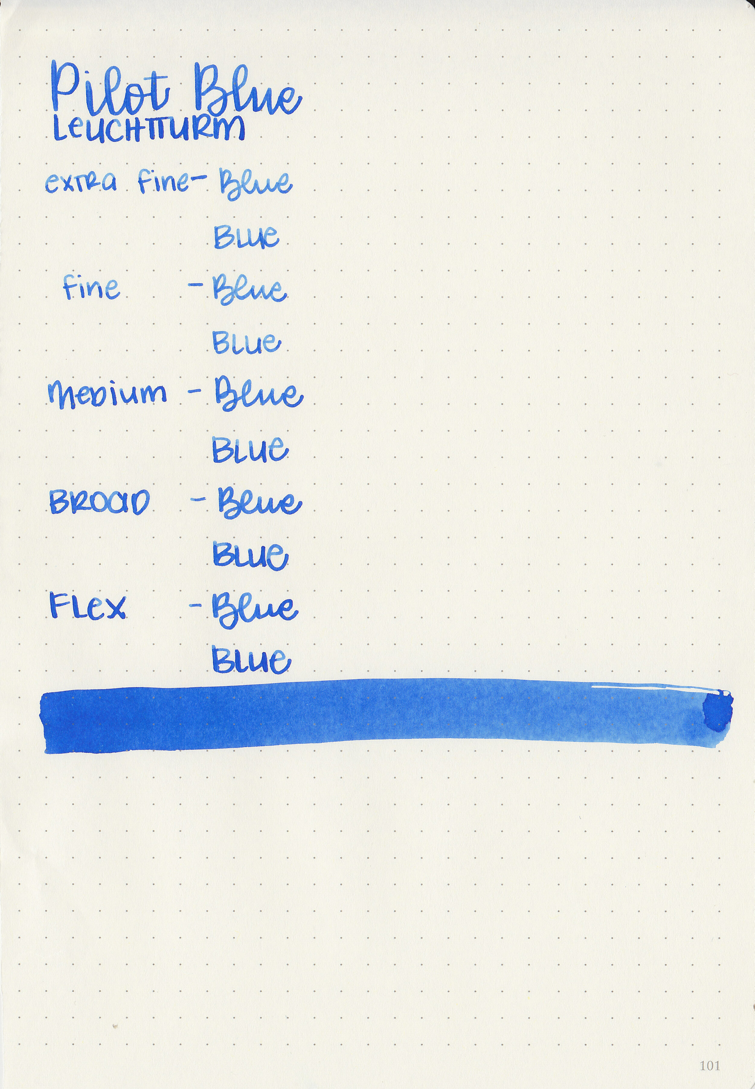
Bleeding: None
Other properties: medium shading, tiny sheen, and no shimmer. The sheen was only visible in large swabs on Tomoe River paper.
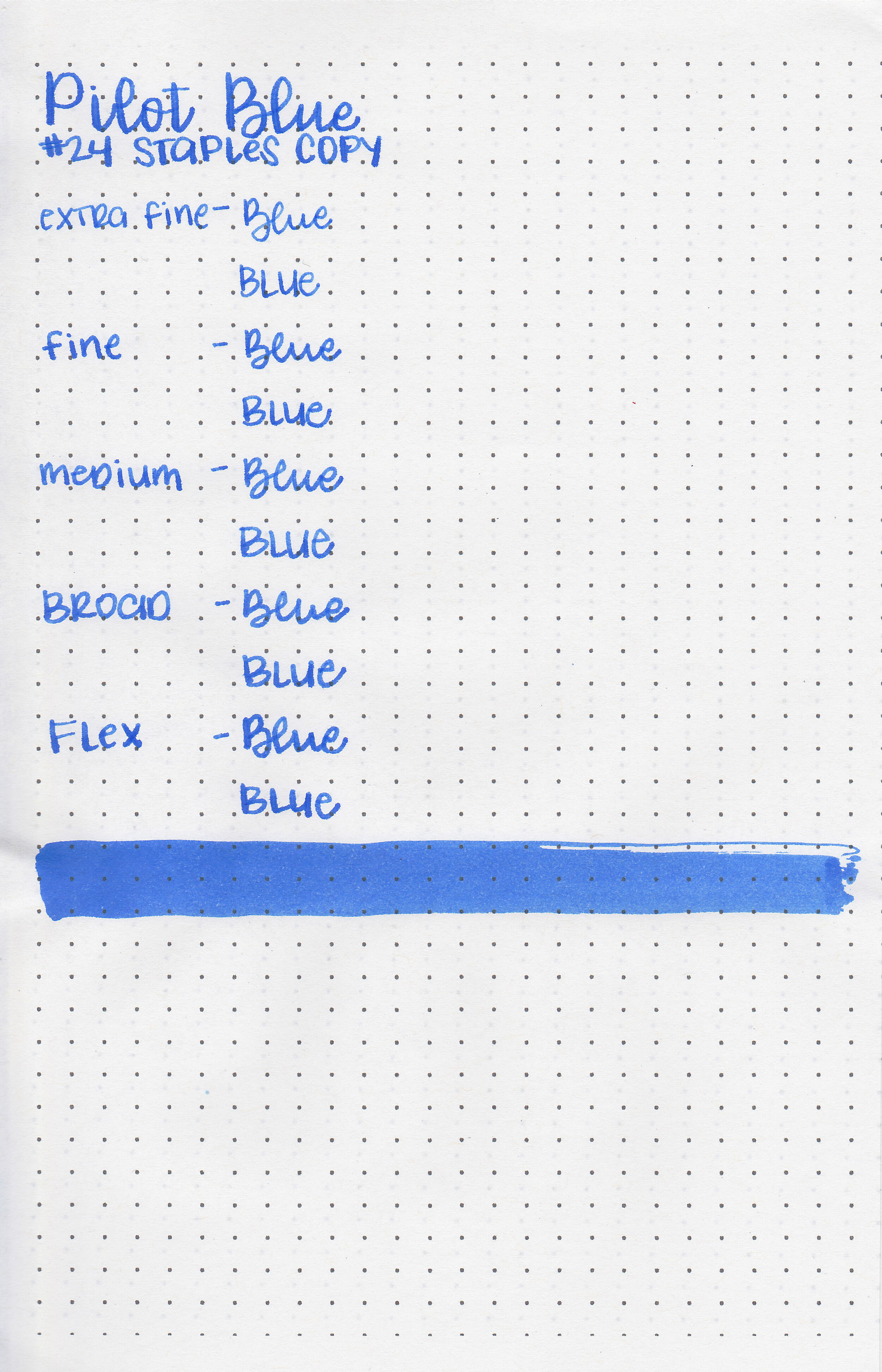
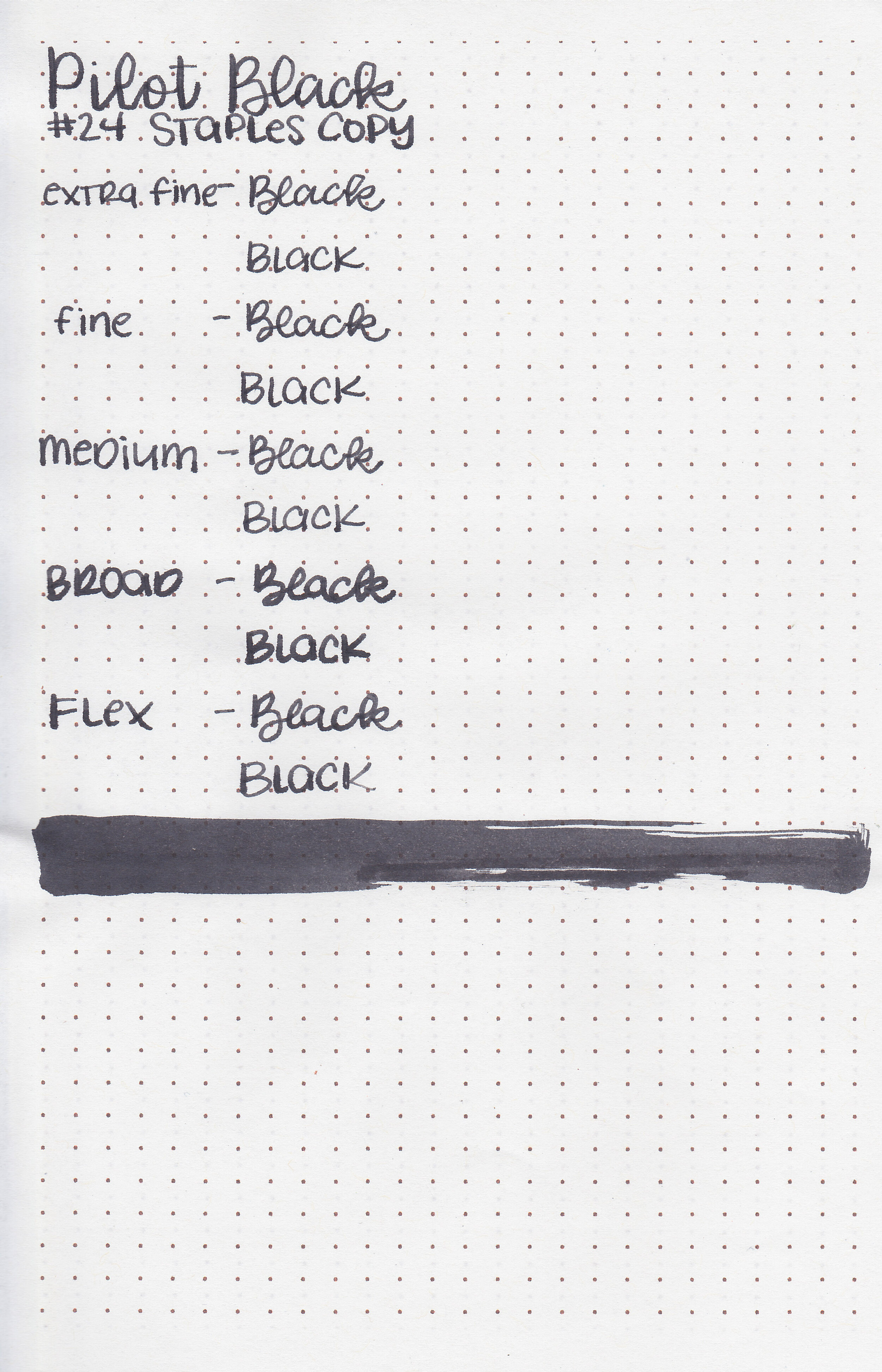
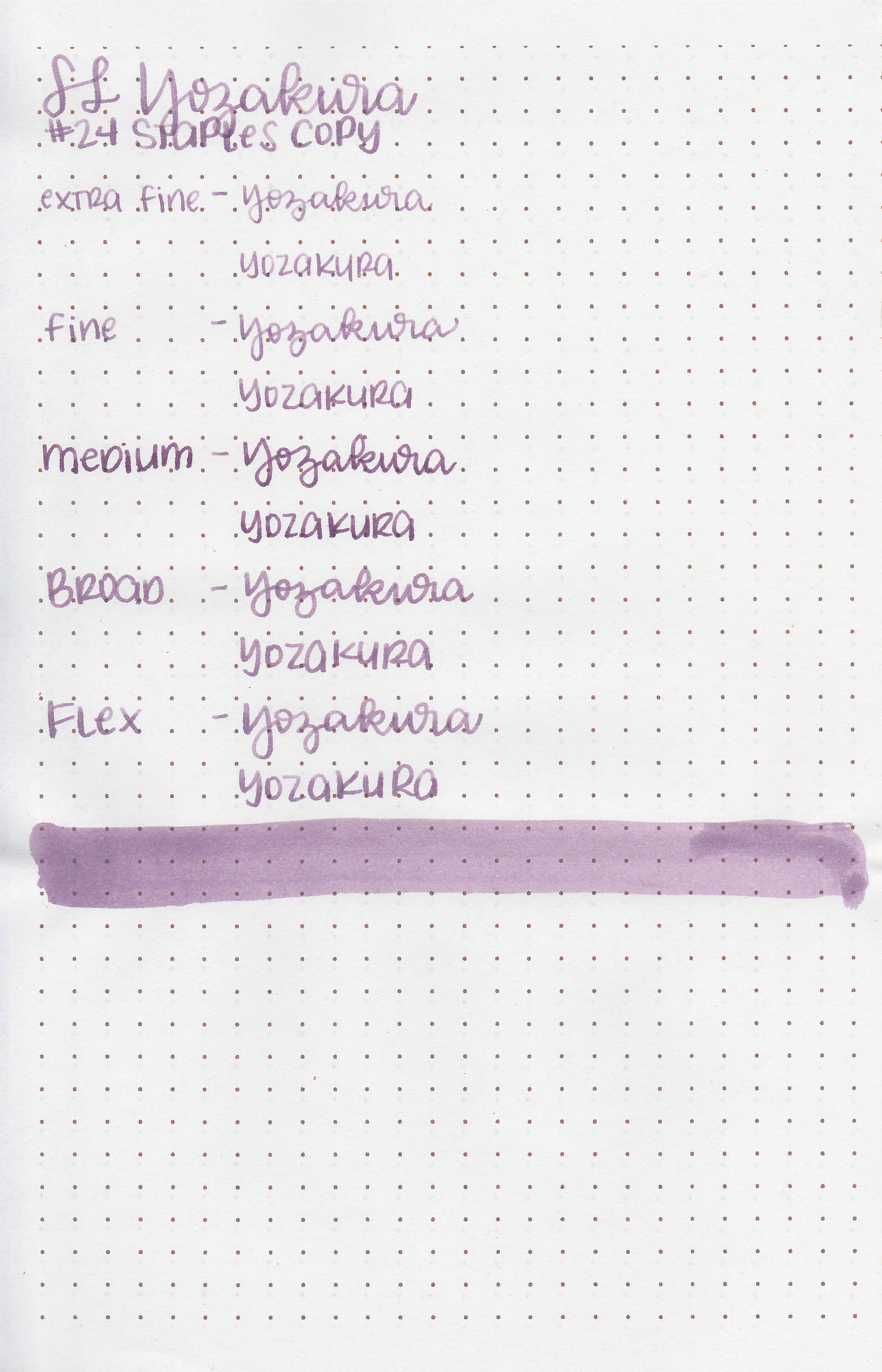
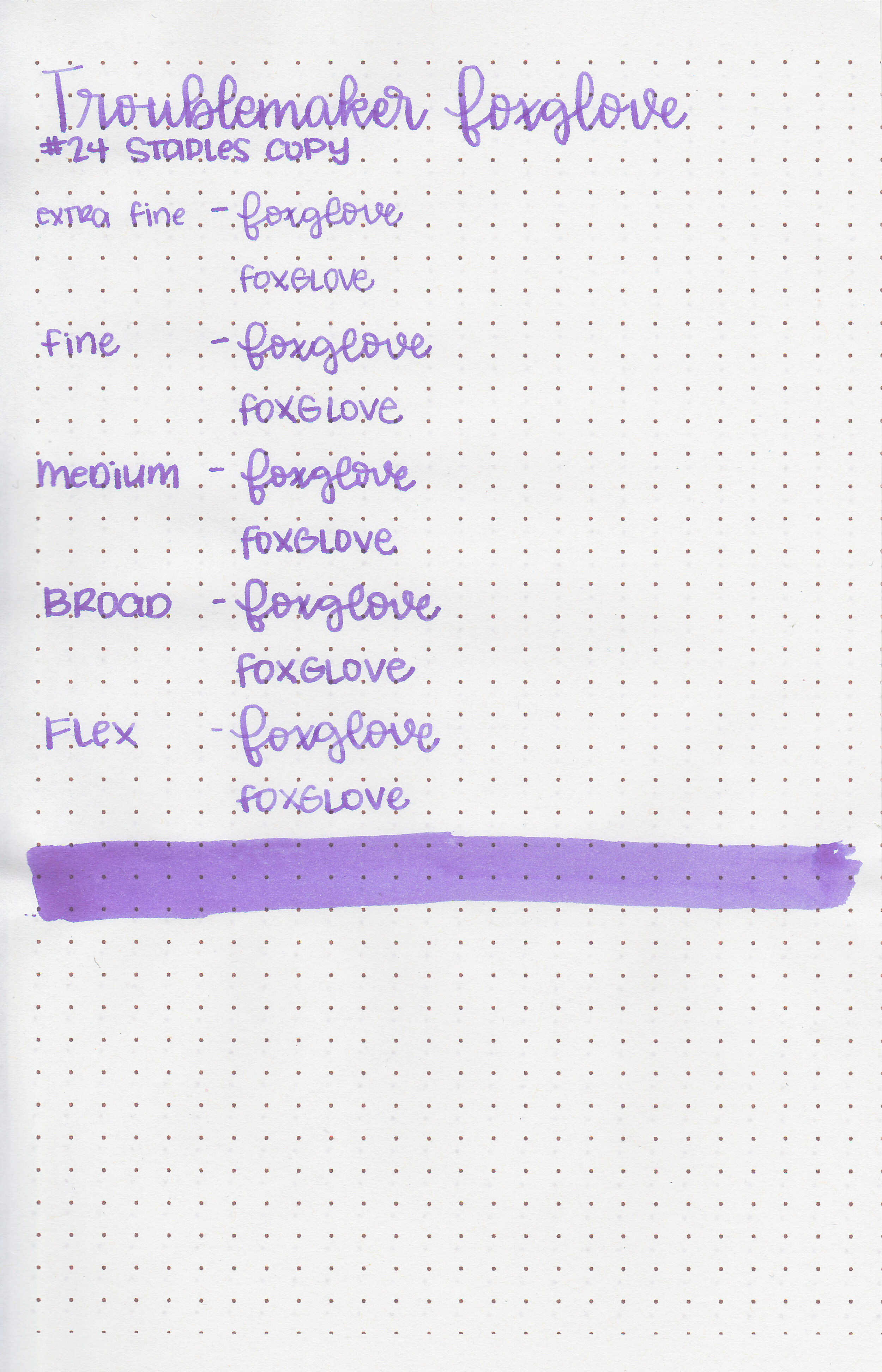
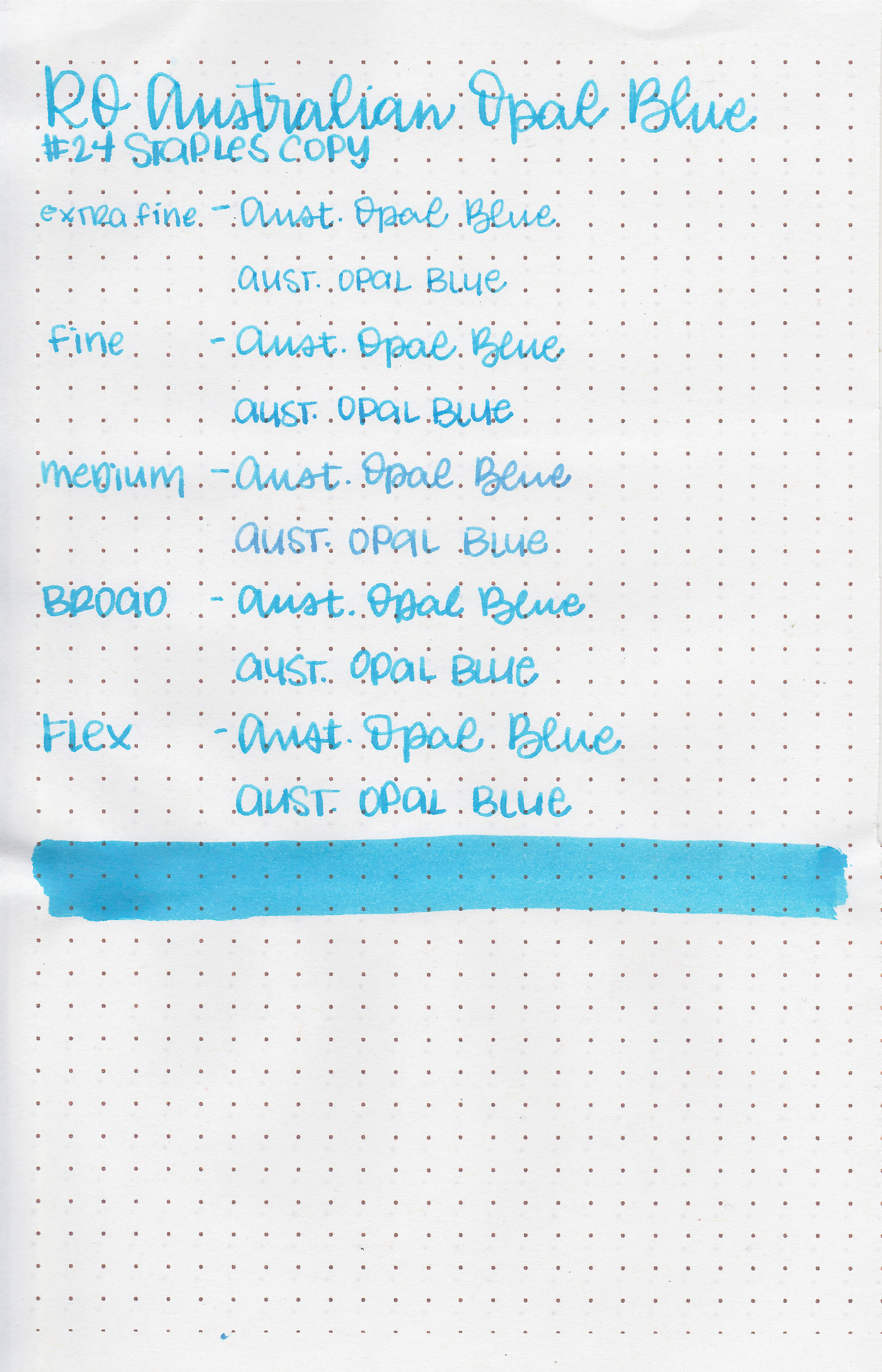
On Staples 24 lb copy paper there was some feathering and a few spots of bleeding.
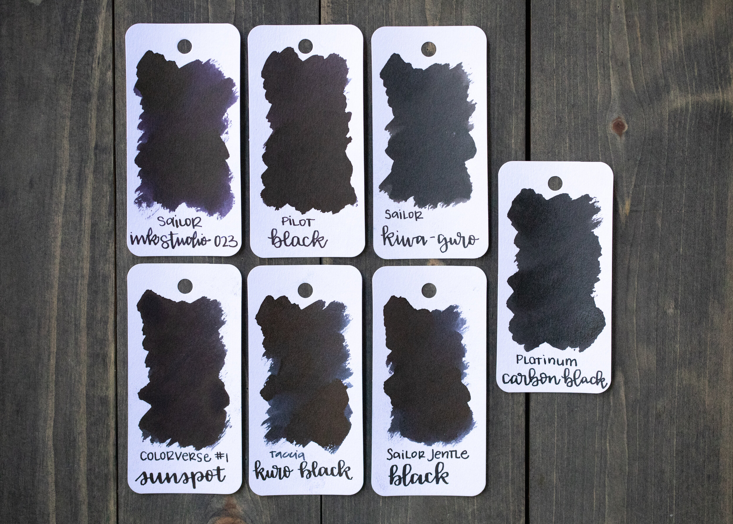
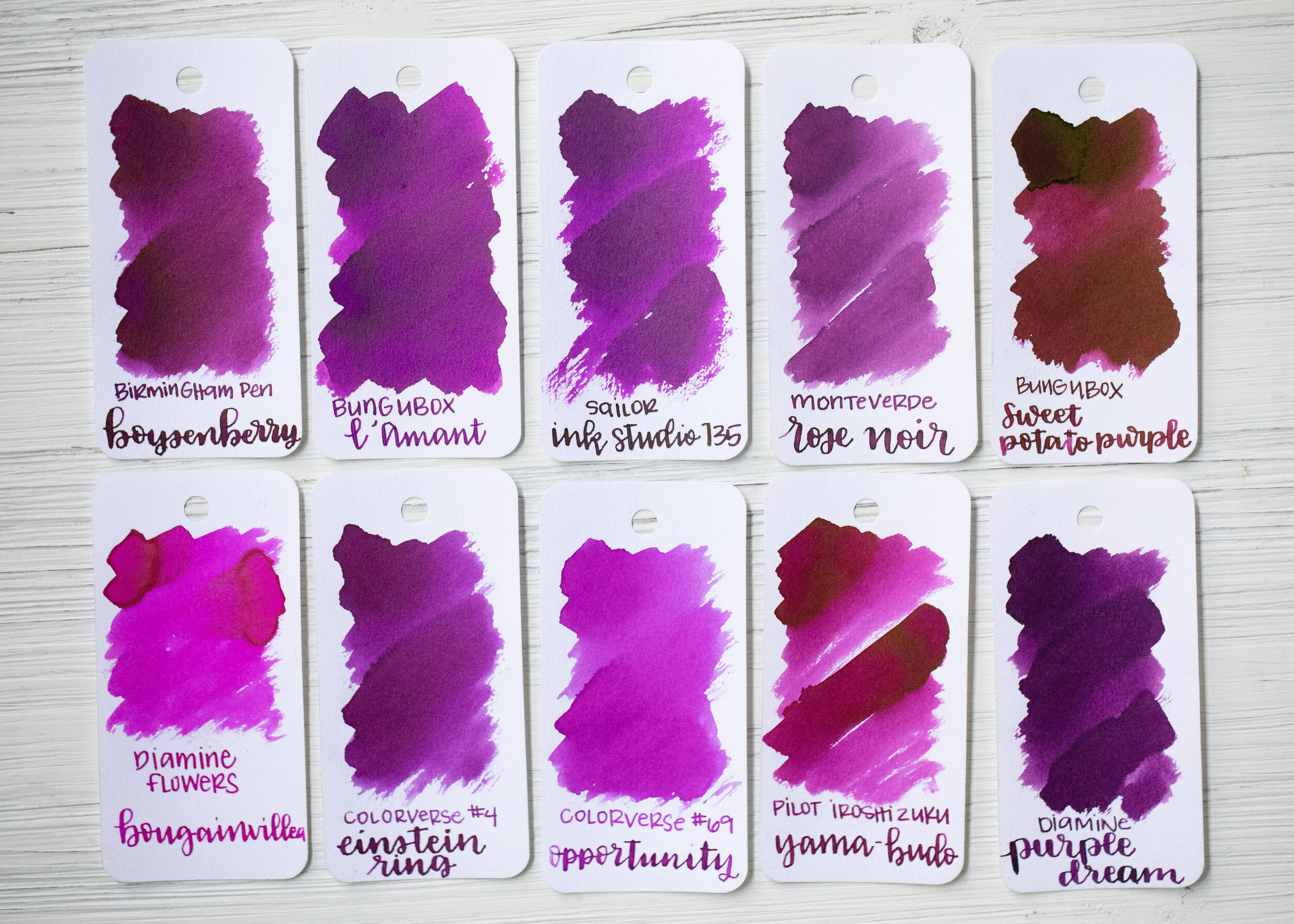
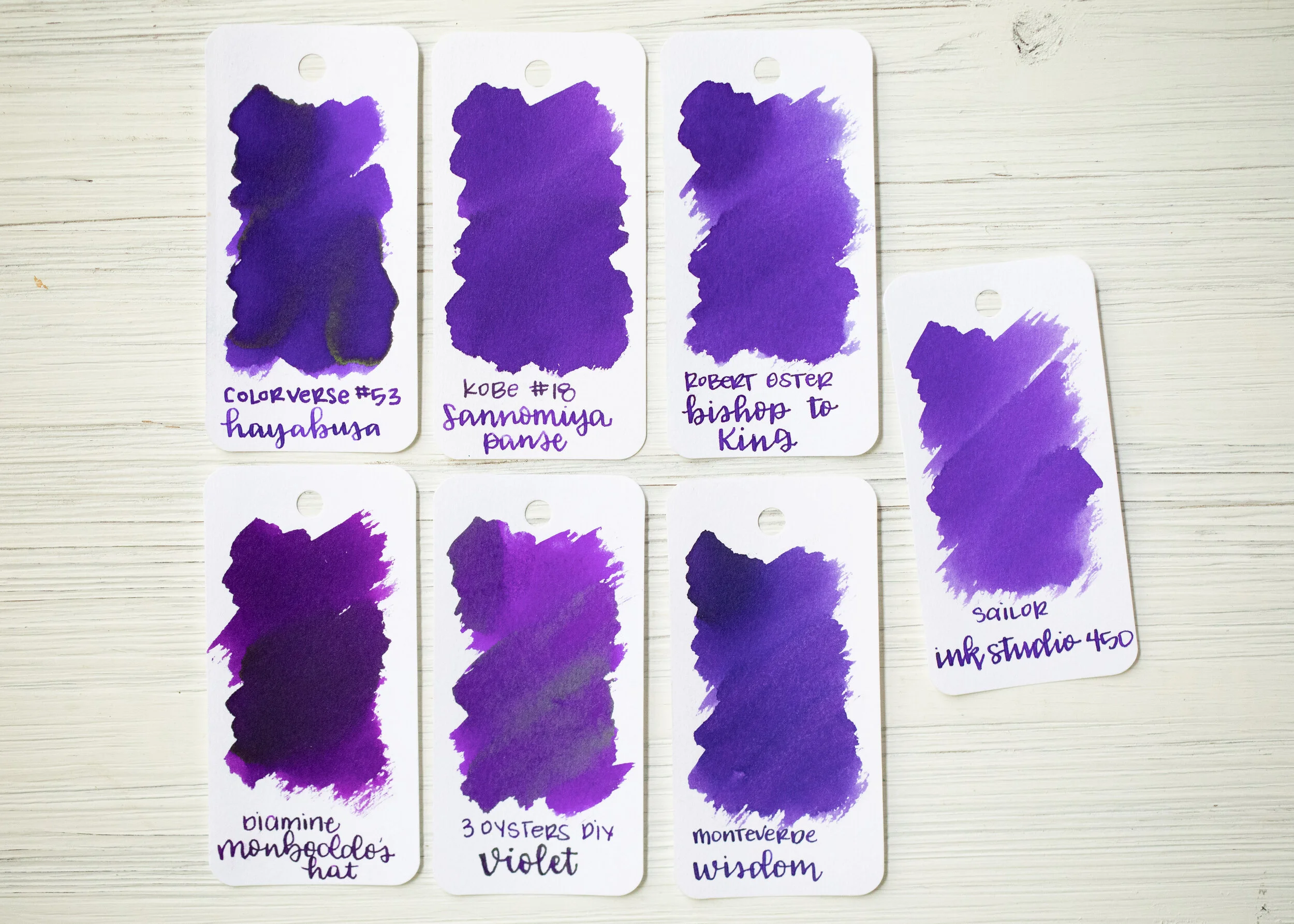
Comparison Swabs:

Pilot Blue is less vibrant than Pilot Iroshizuku Tsuyu-kusa. Click here to see the Pilot inks together, and click here to see the blue inks together.
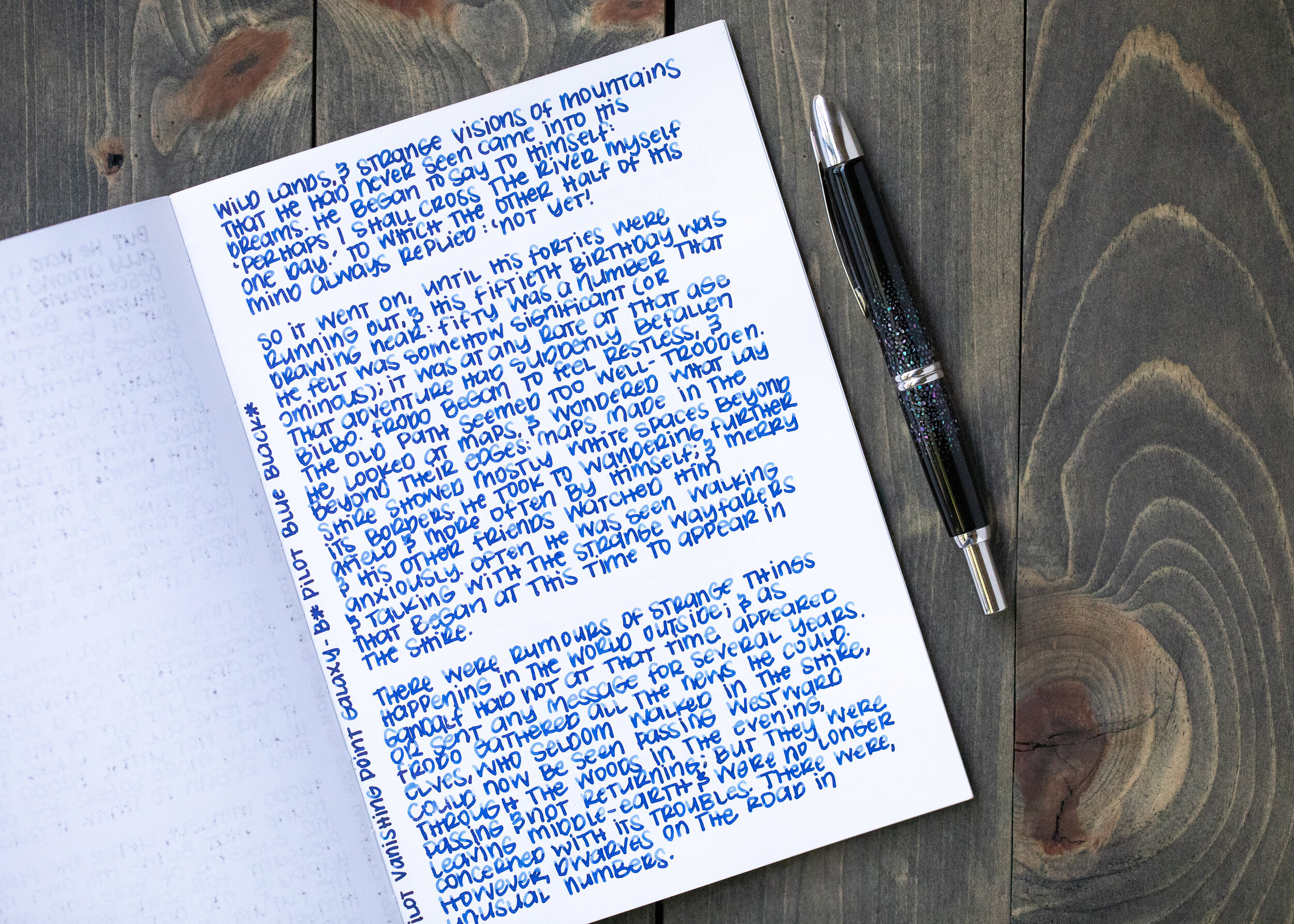
Longer writing:

I used a Montegrappa Copper Mule with a fine nib on a Yoseka A5 notebook. The ink had a slightly wet flow.
Overall, it’s a good basic blue. I found it to be just a little bit better behaved than Pilot Black or Blue Black. It is a large 70ml bottle so it will take me a long time to go through that much ink.
Disclaimer: I purchased this ink myself, and all photos and opinions are my own. This page does contain affiliate links but this post is not sponsored in any way.