Ink Review #1082: Callifolio Bleu Pacifique
/
I haven’t tried many Callifolio inks so today’s ink is Callifolio Bleu Pacifique. Thanks to the reader that sent this sample in for review! You can buy this ink at most retailers, including Vanness Pens.

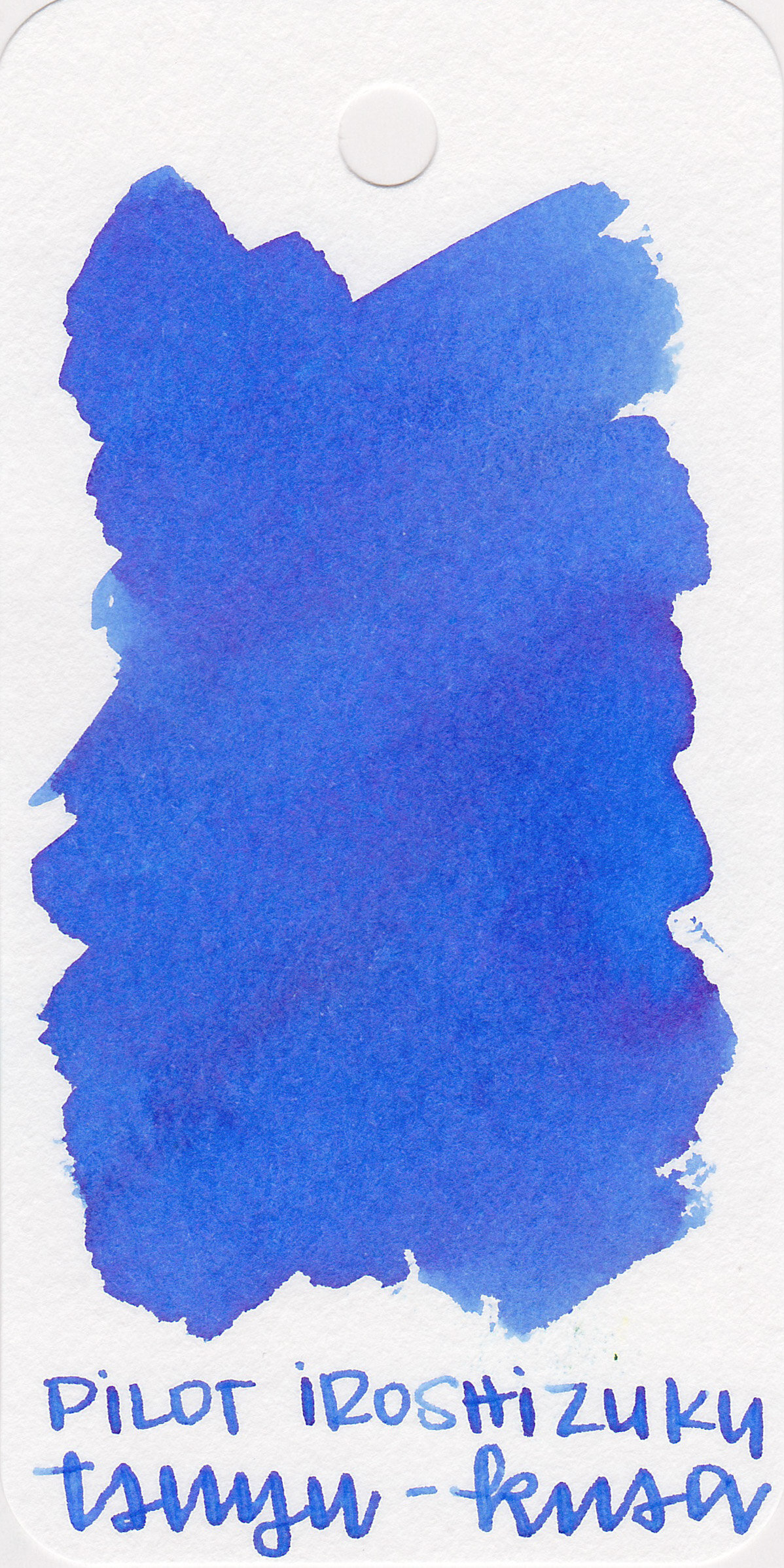
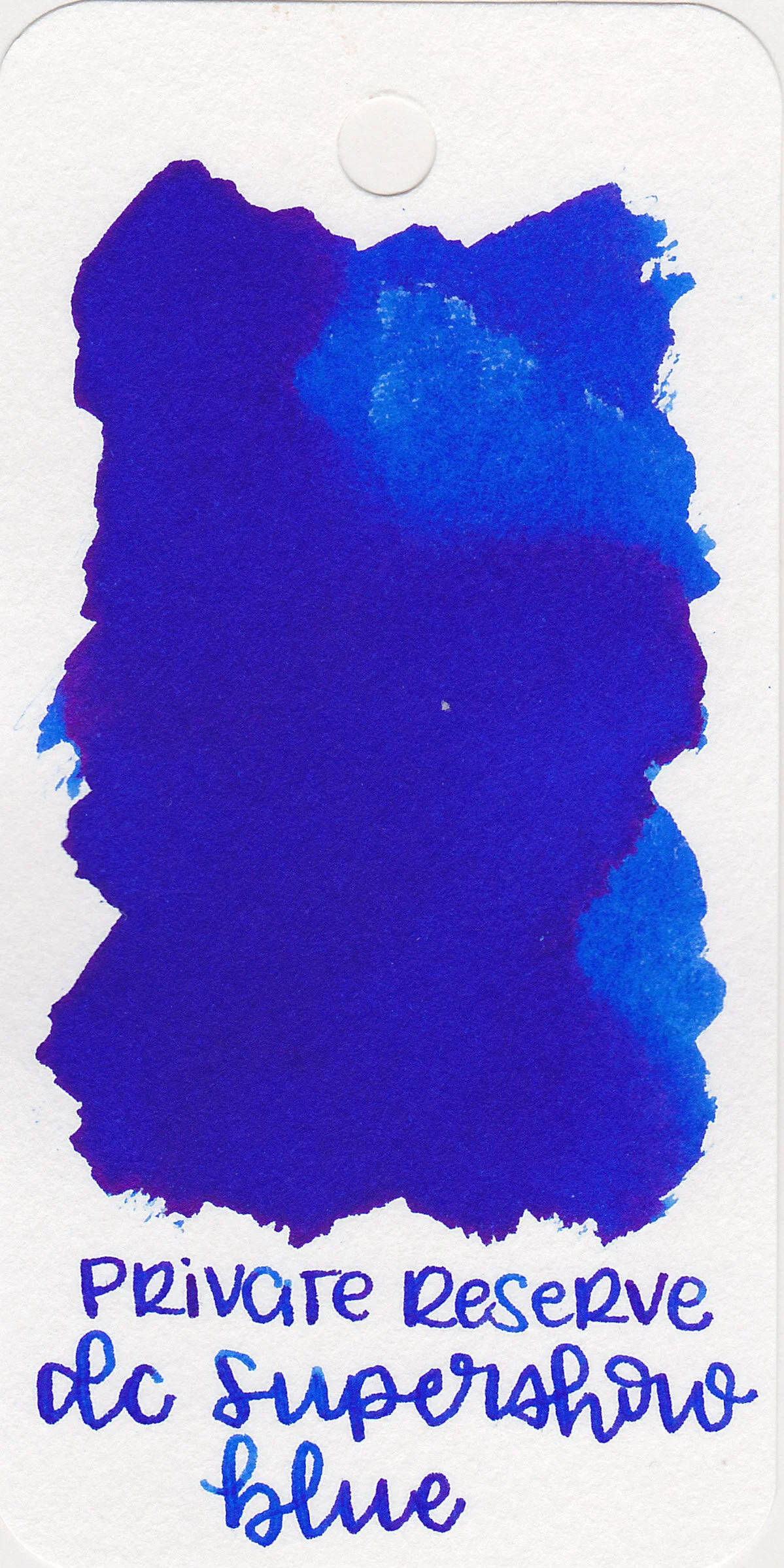
The color:
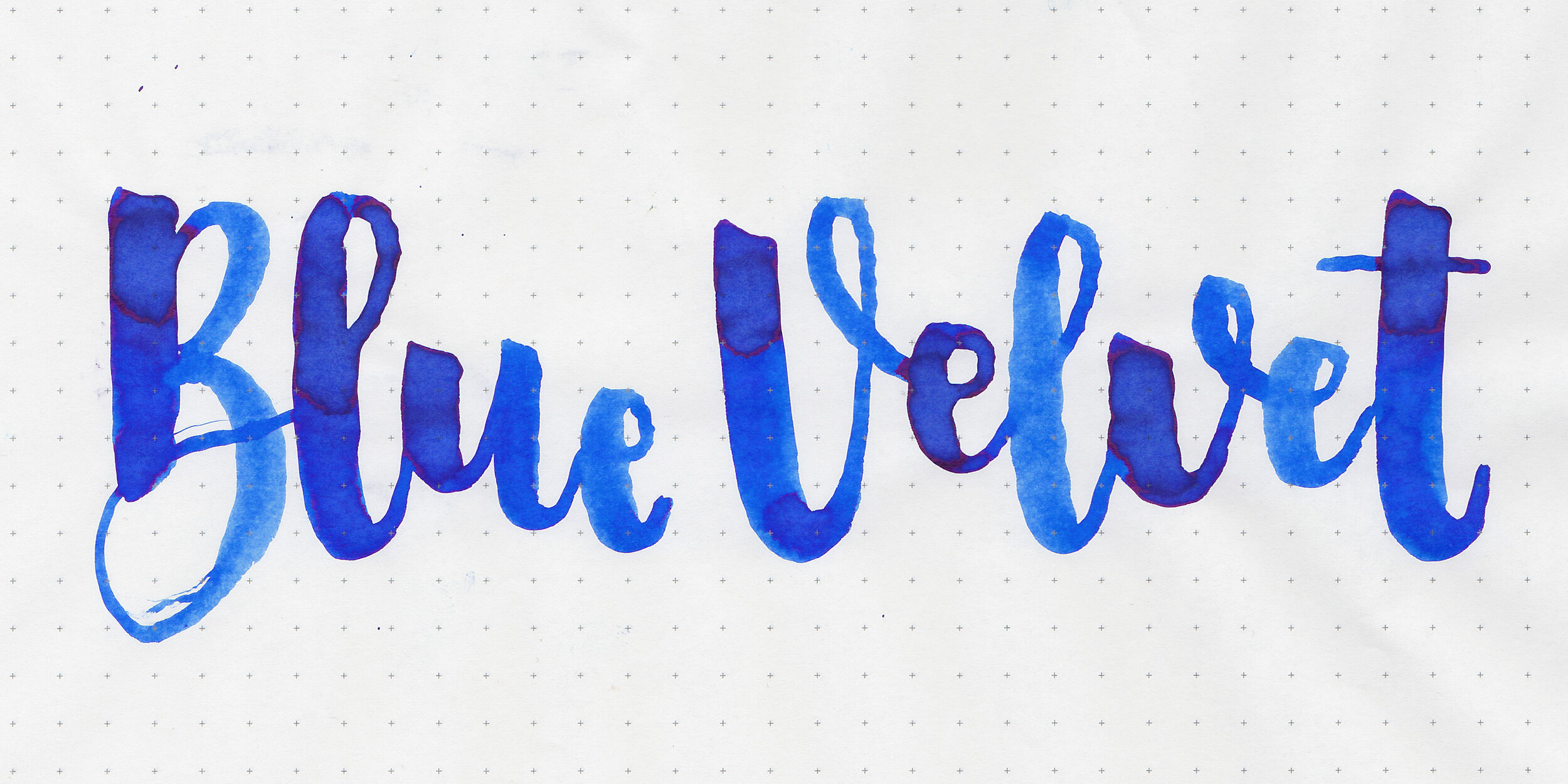
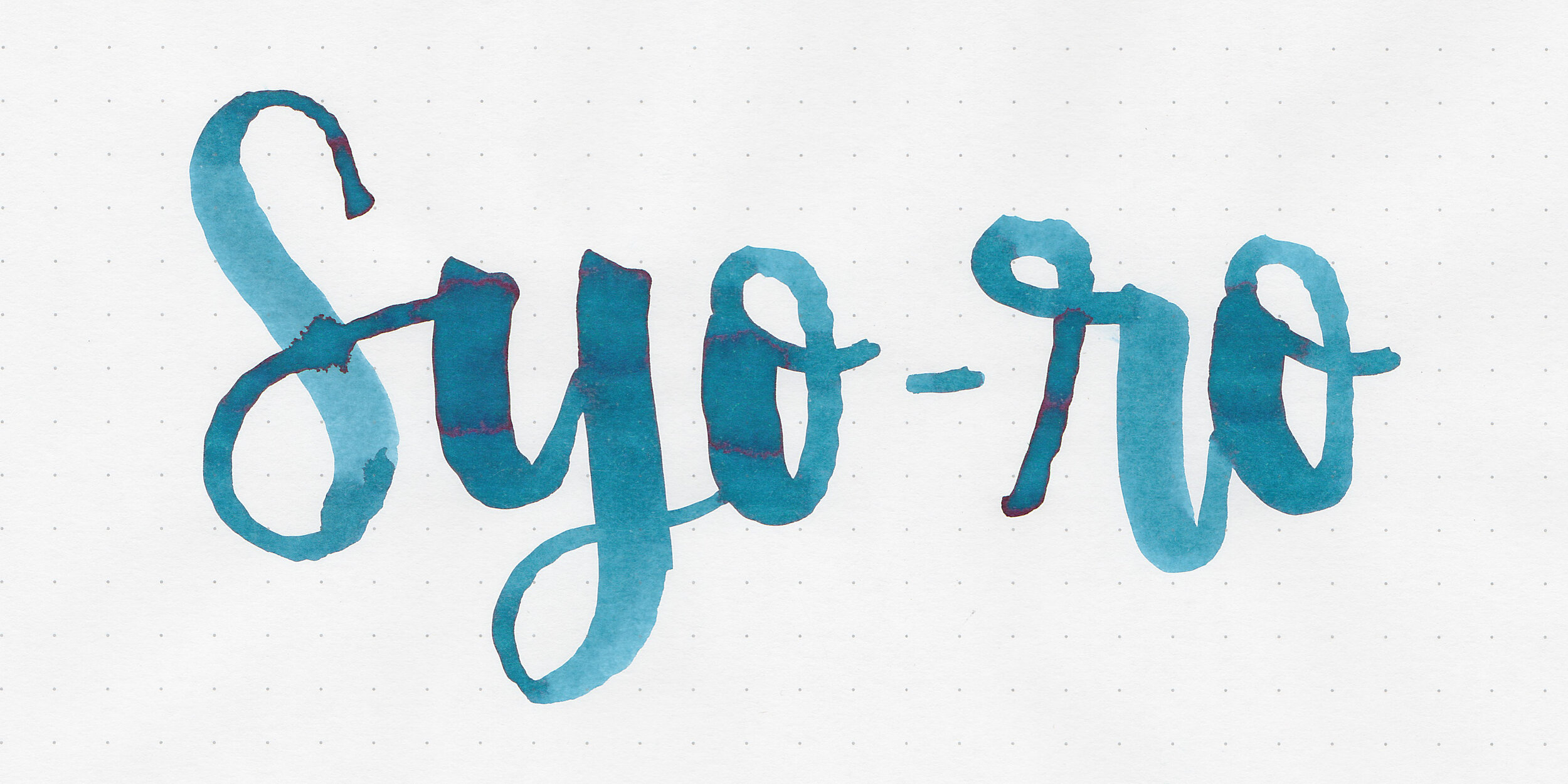
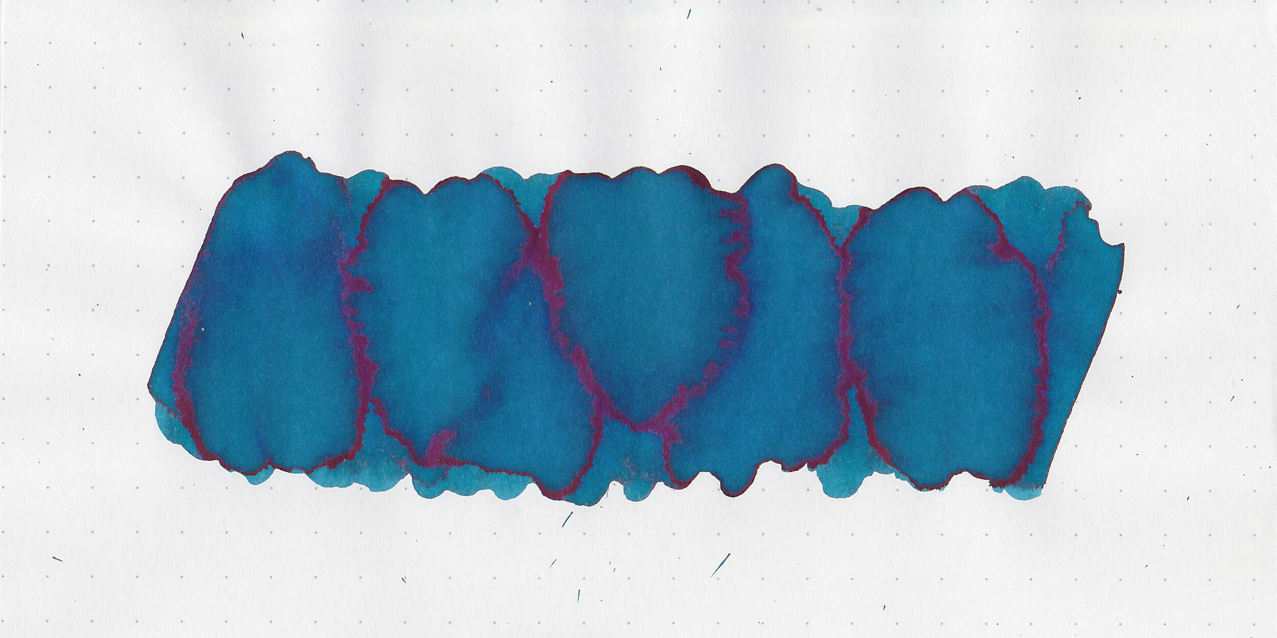
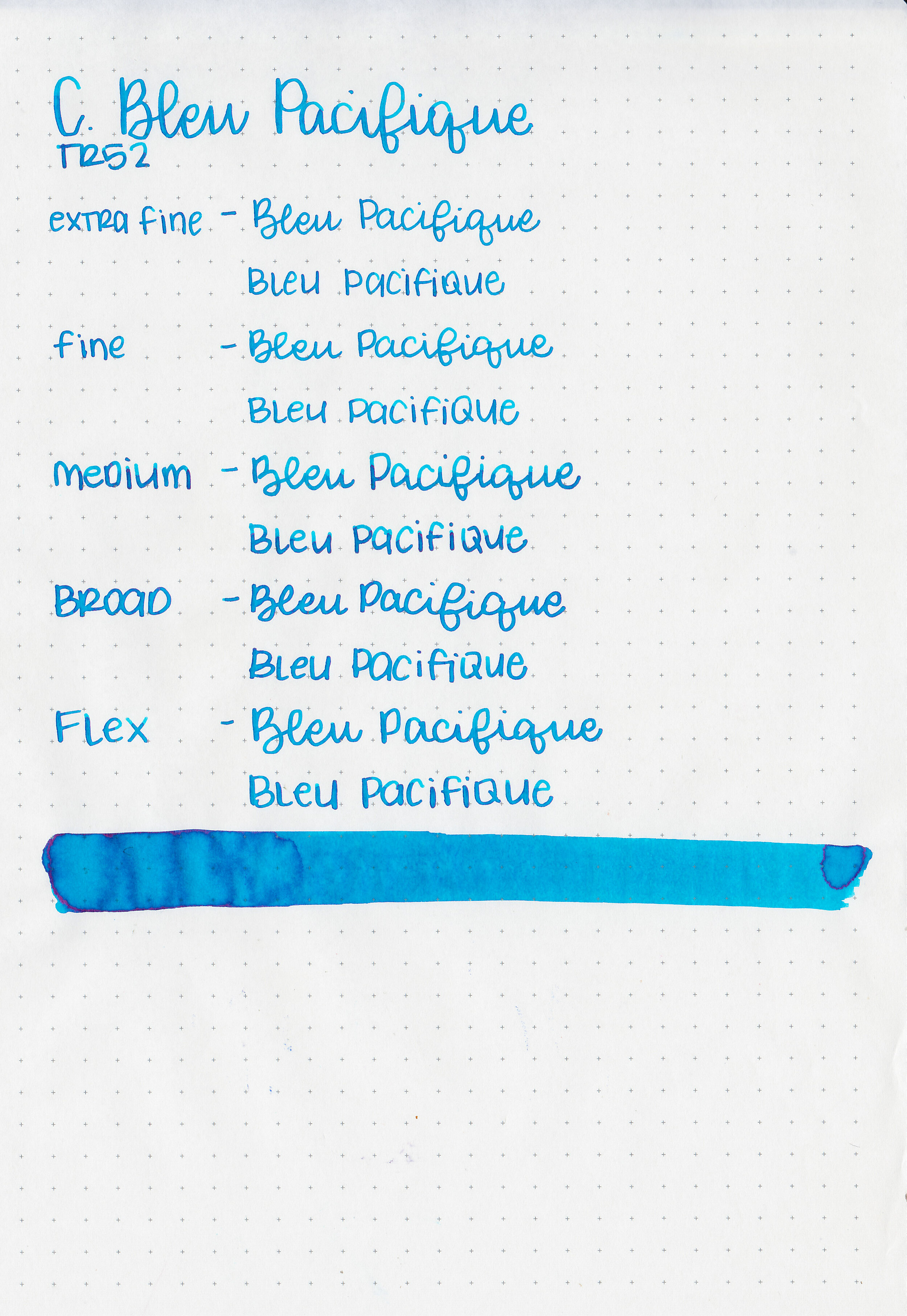
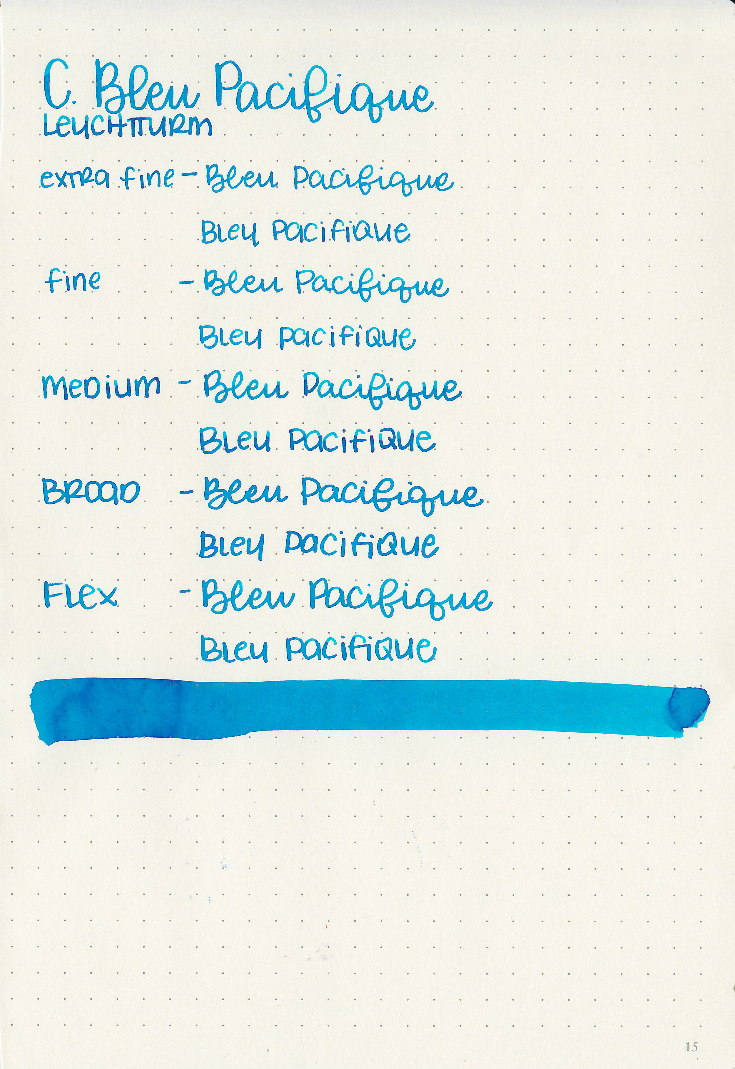
Bleu Pacifique is a vibrant medium turquoise.
Swabs:

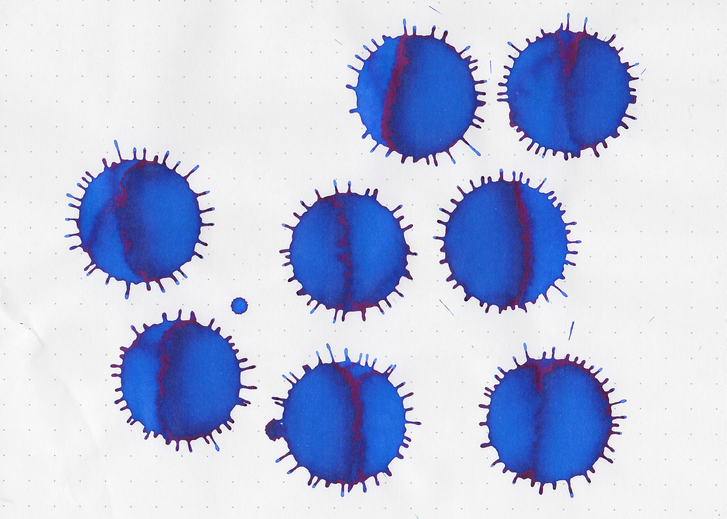
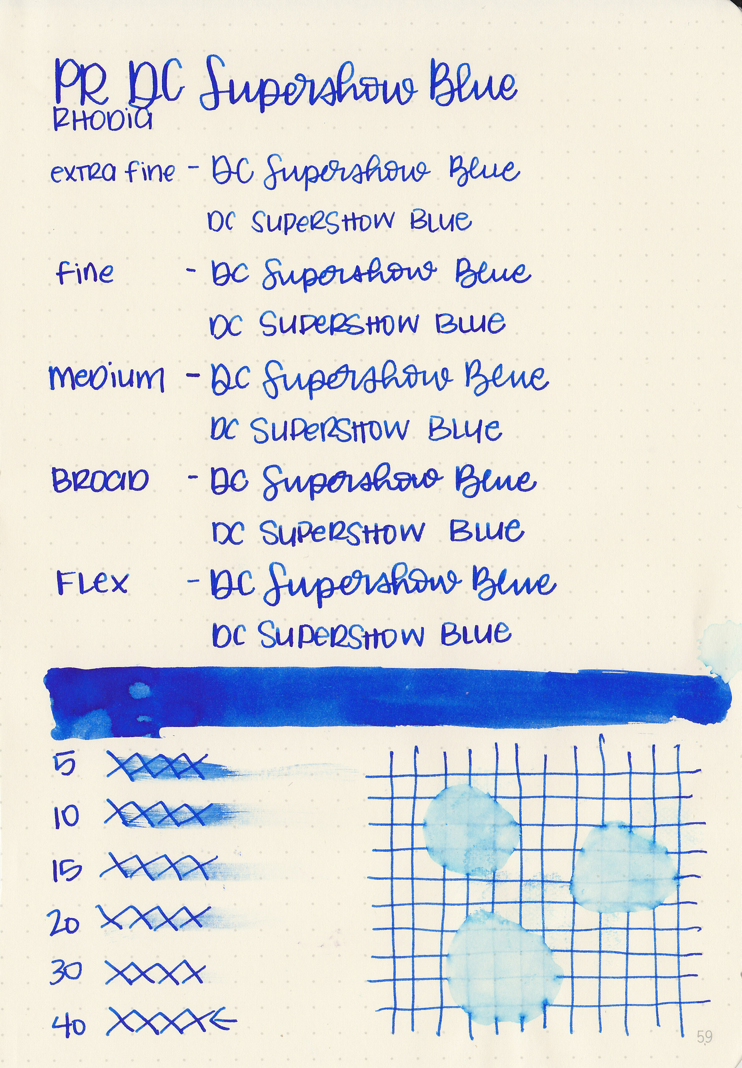
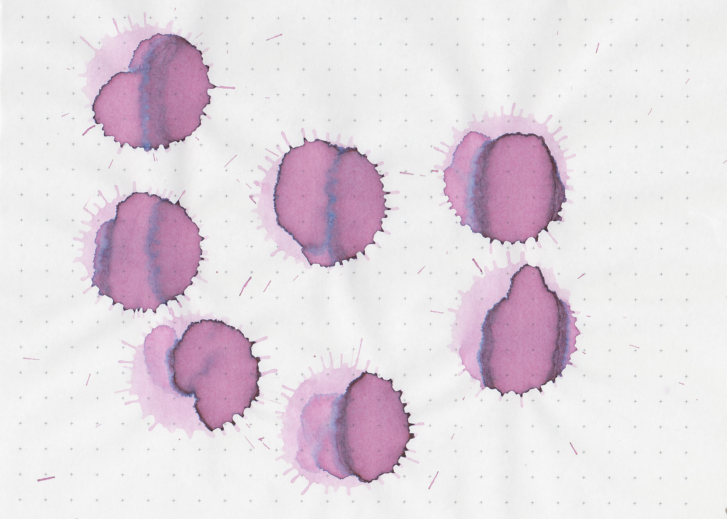
In large swabs on Tomoe River paper the ink has some pretty pink sheen.

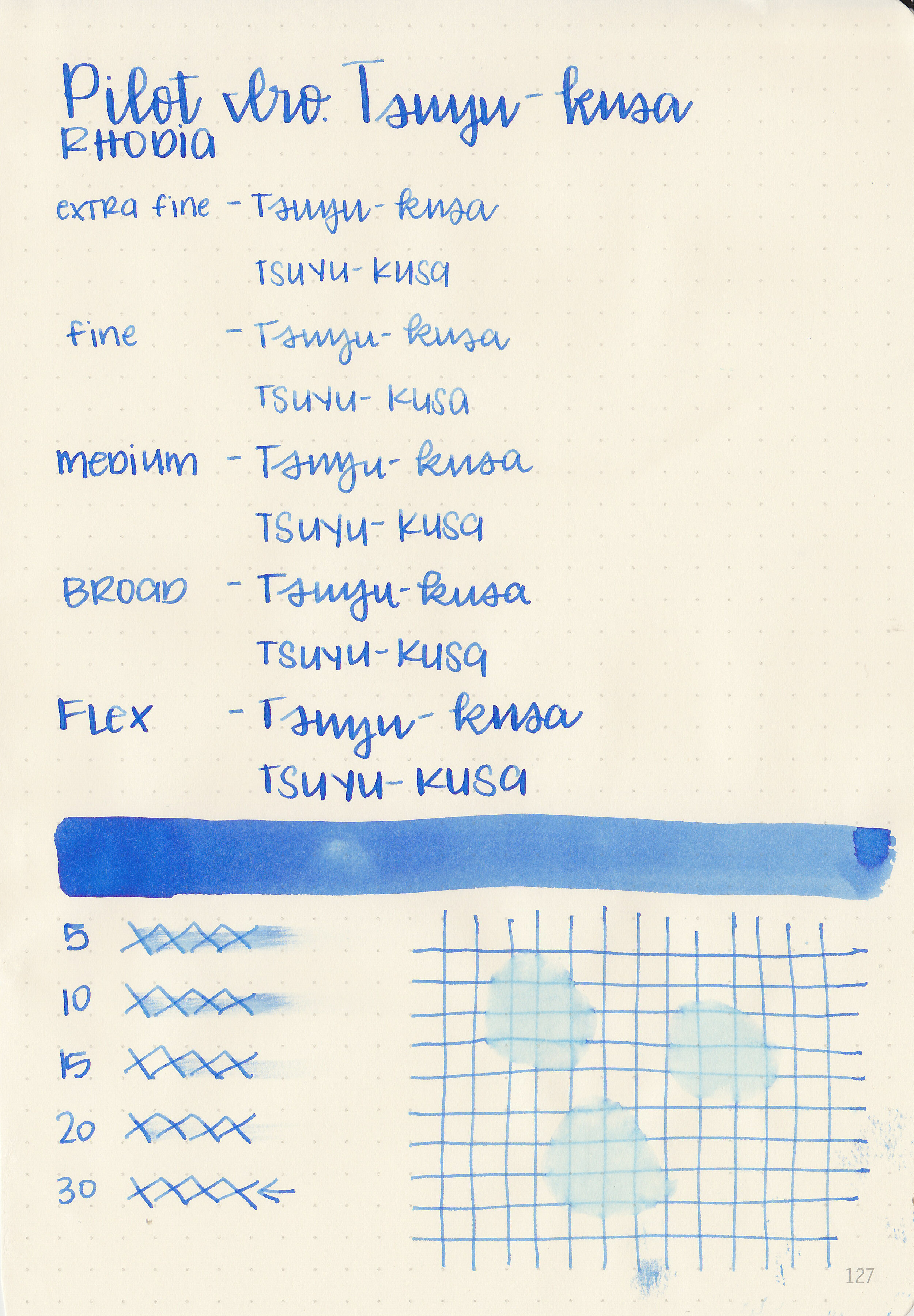
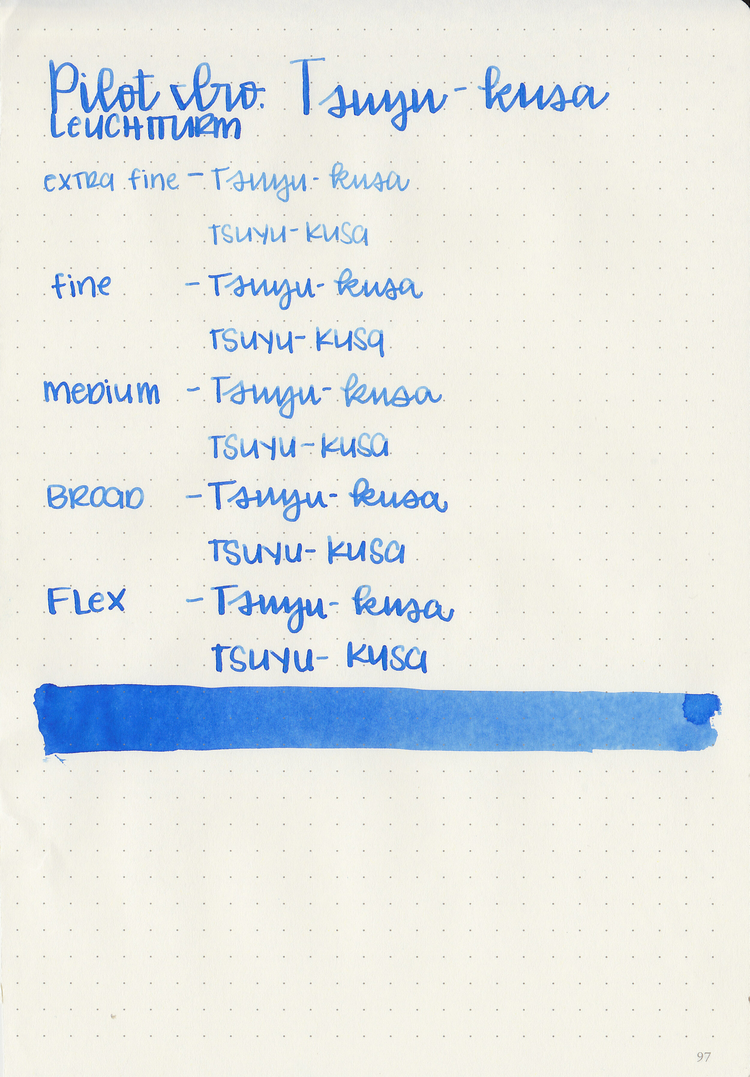
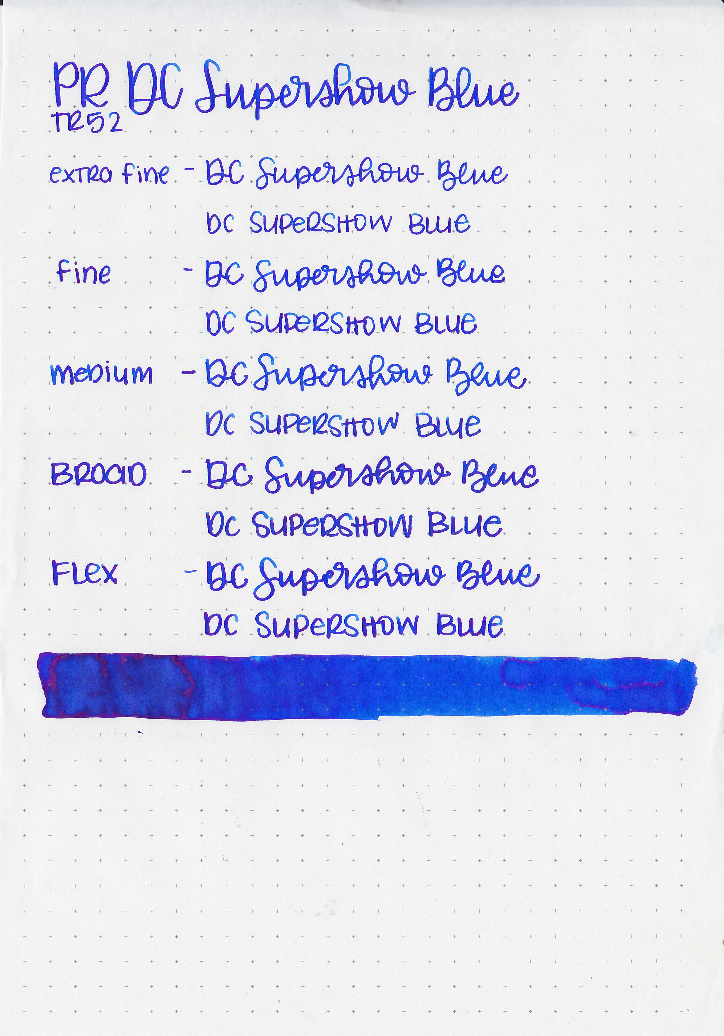
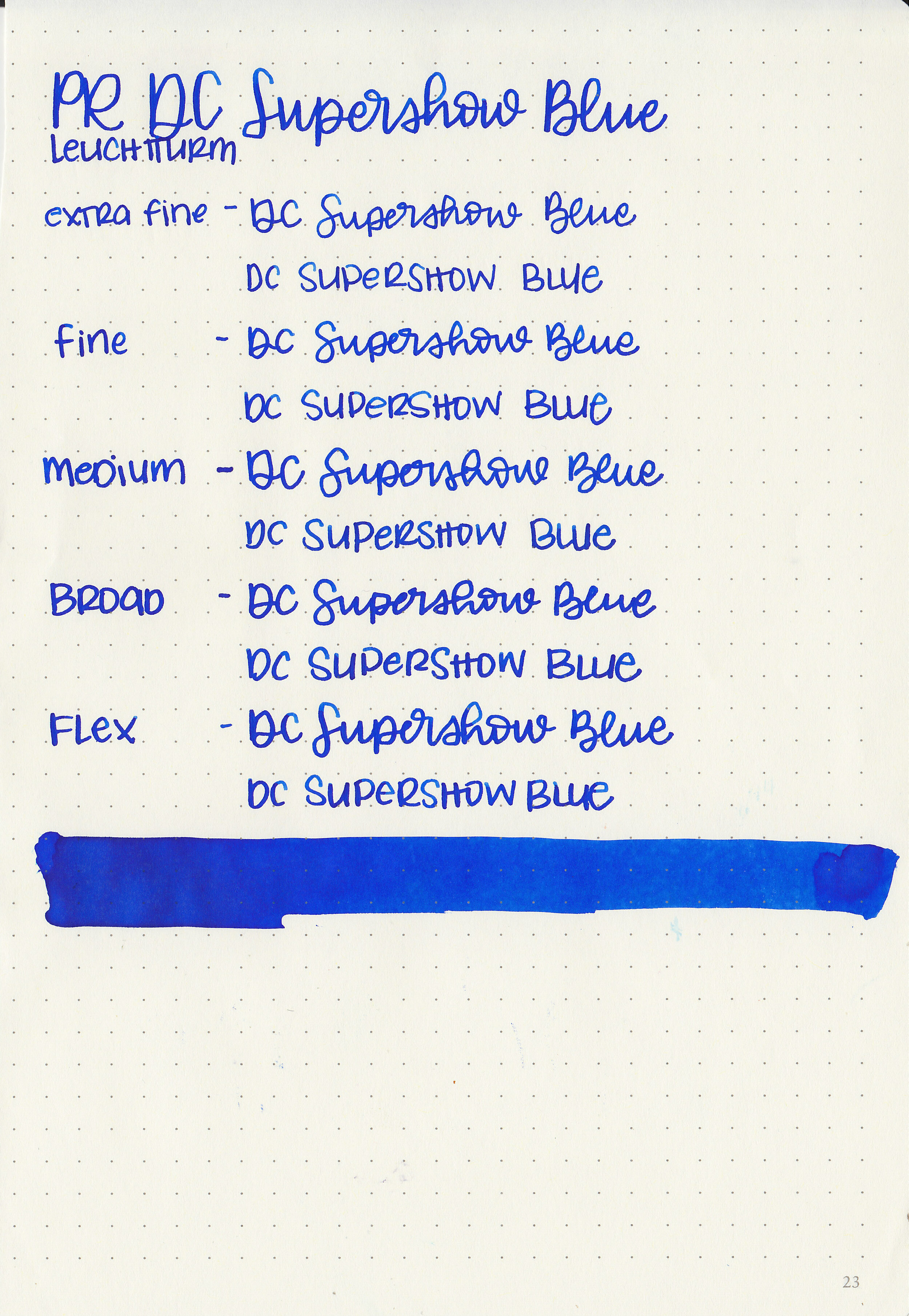
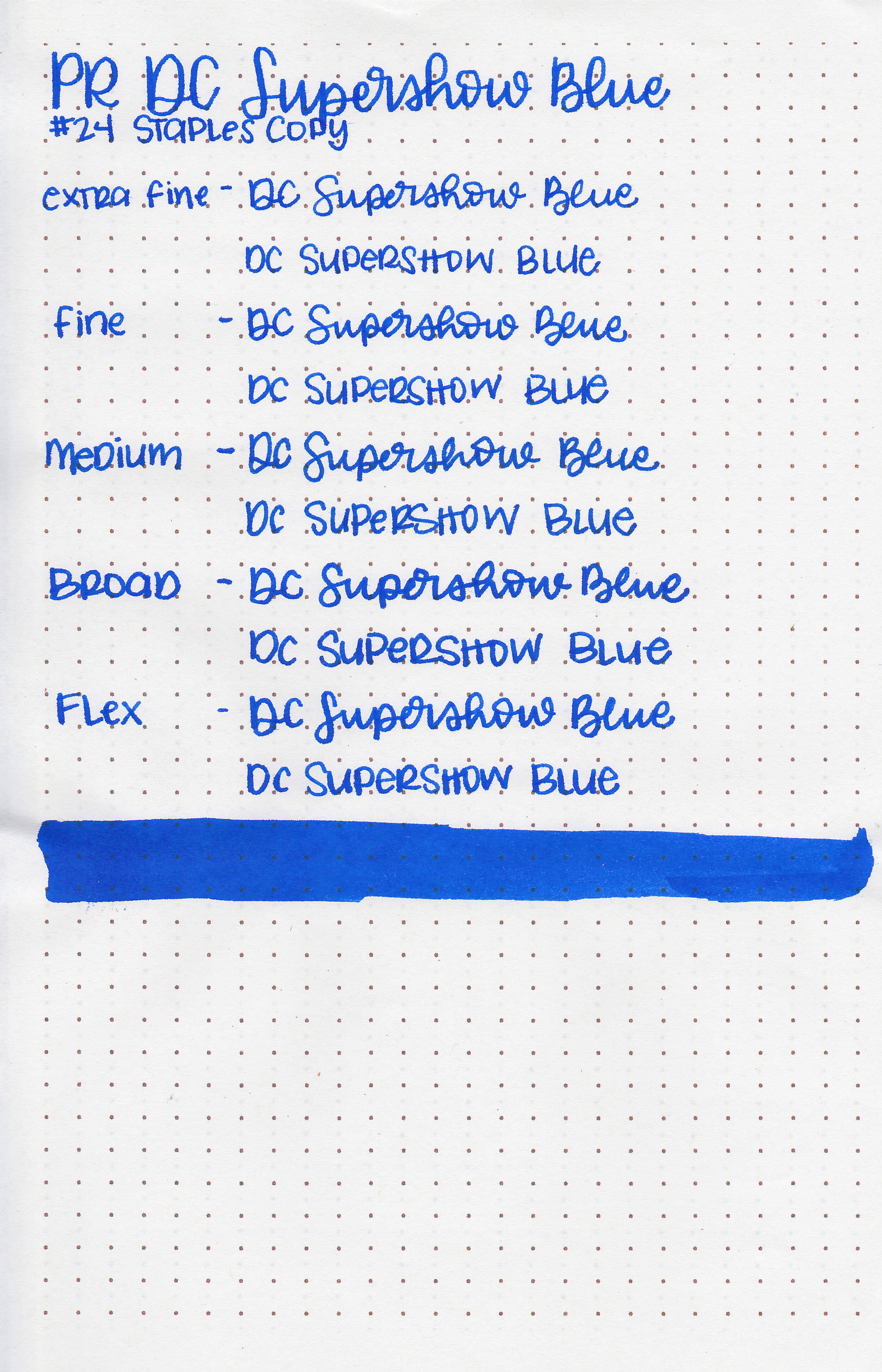
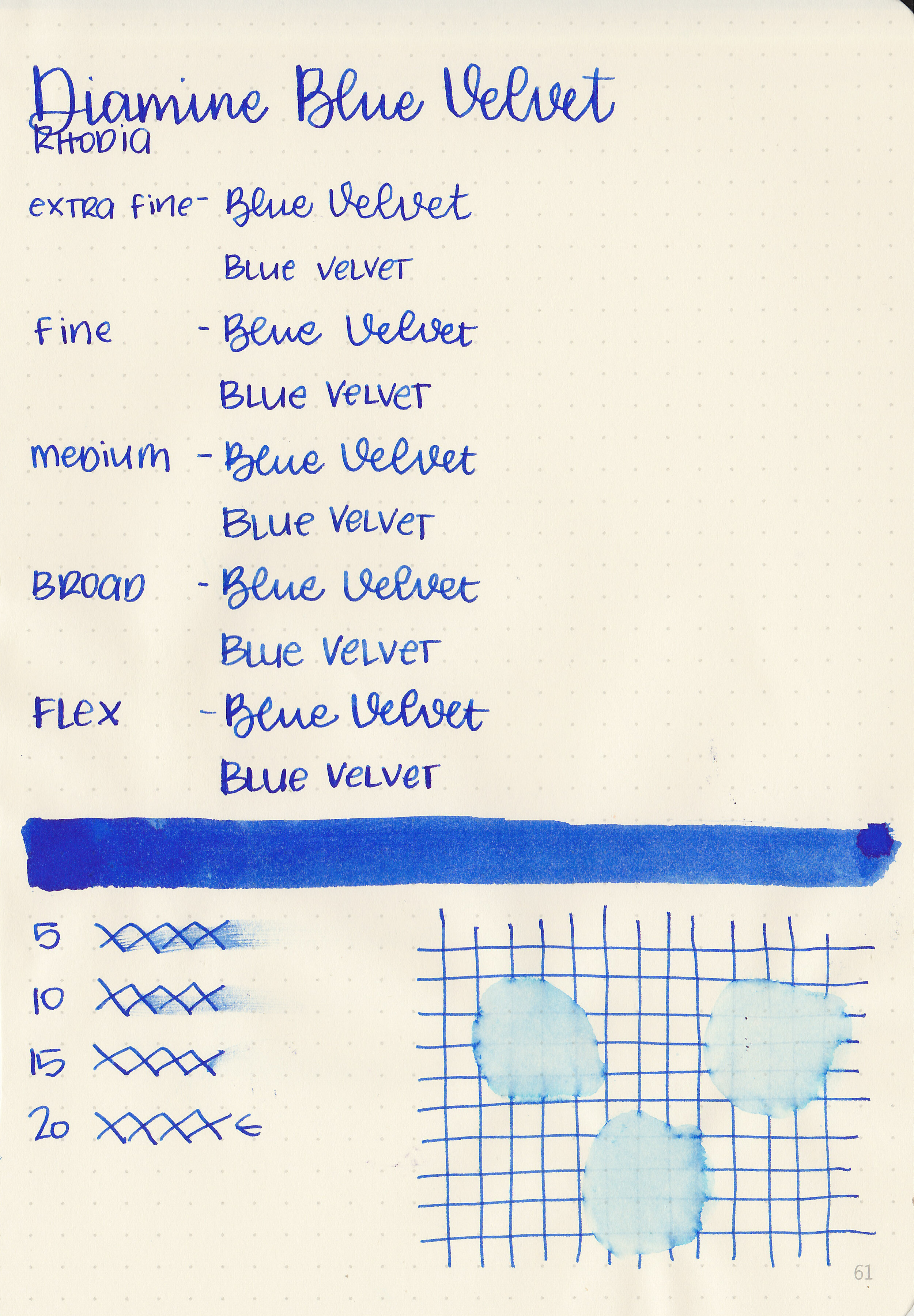
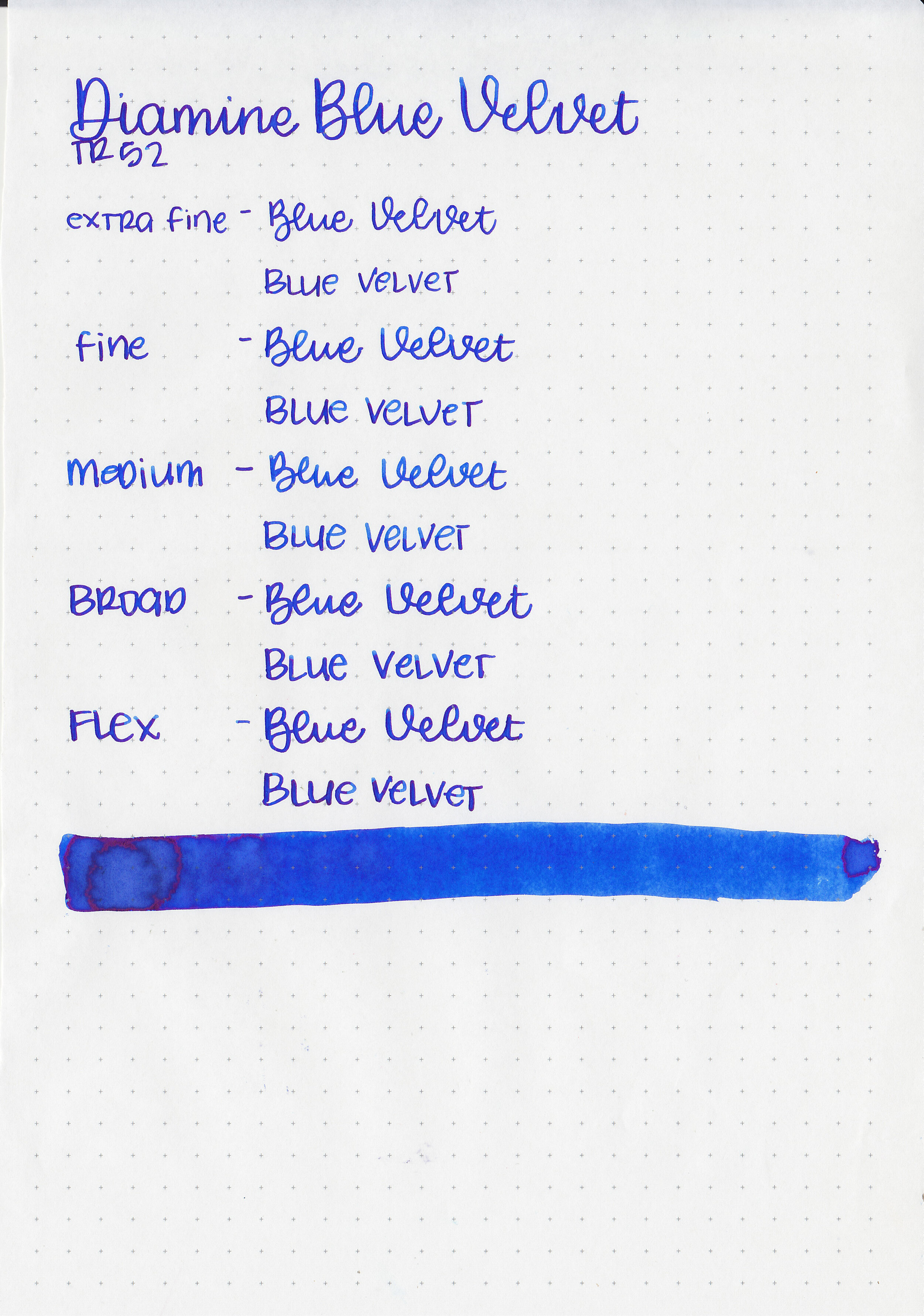
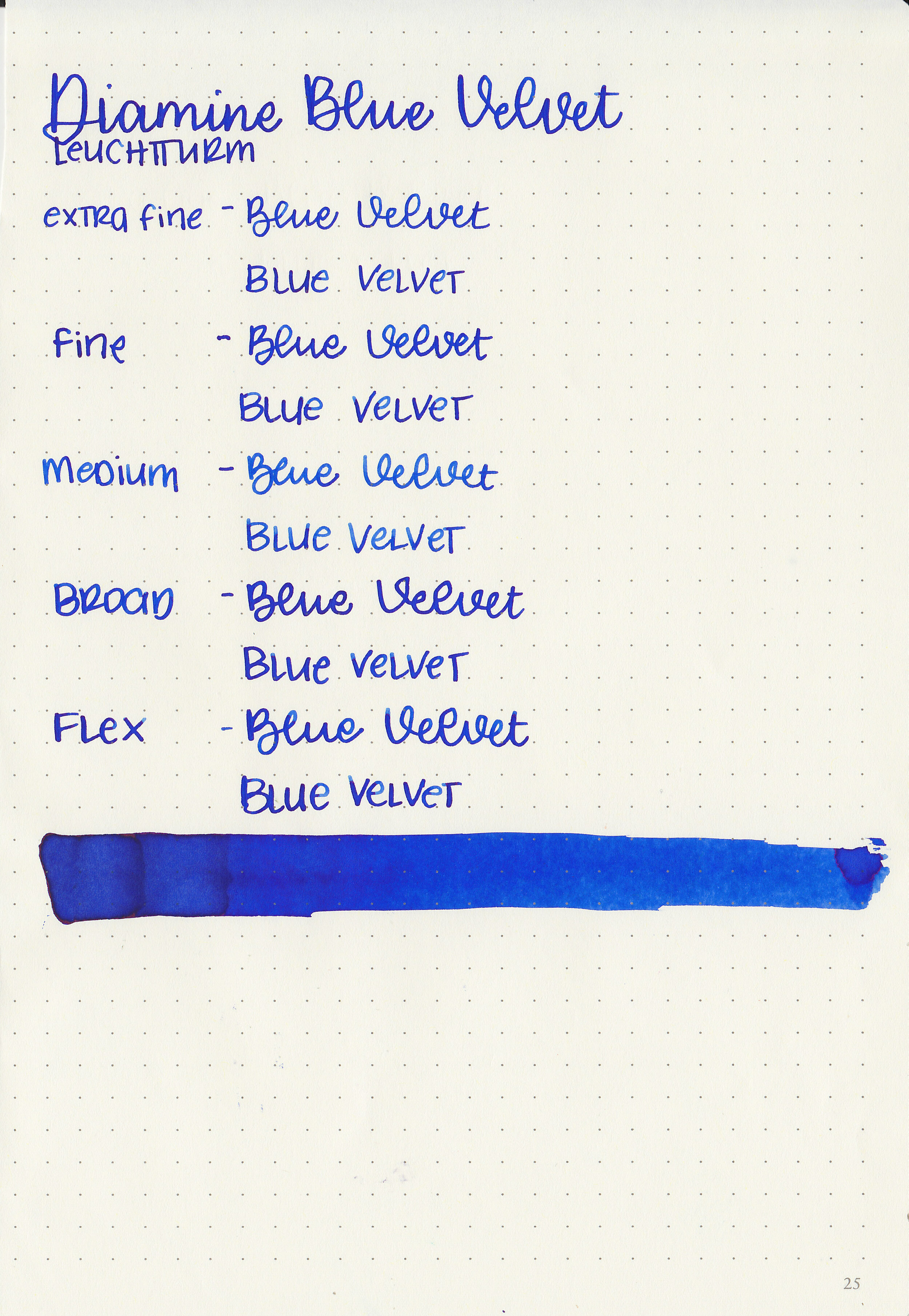
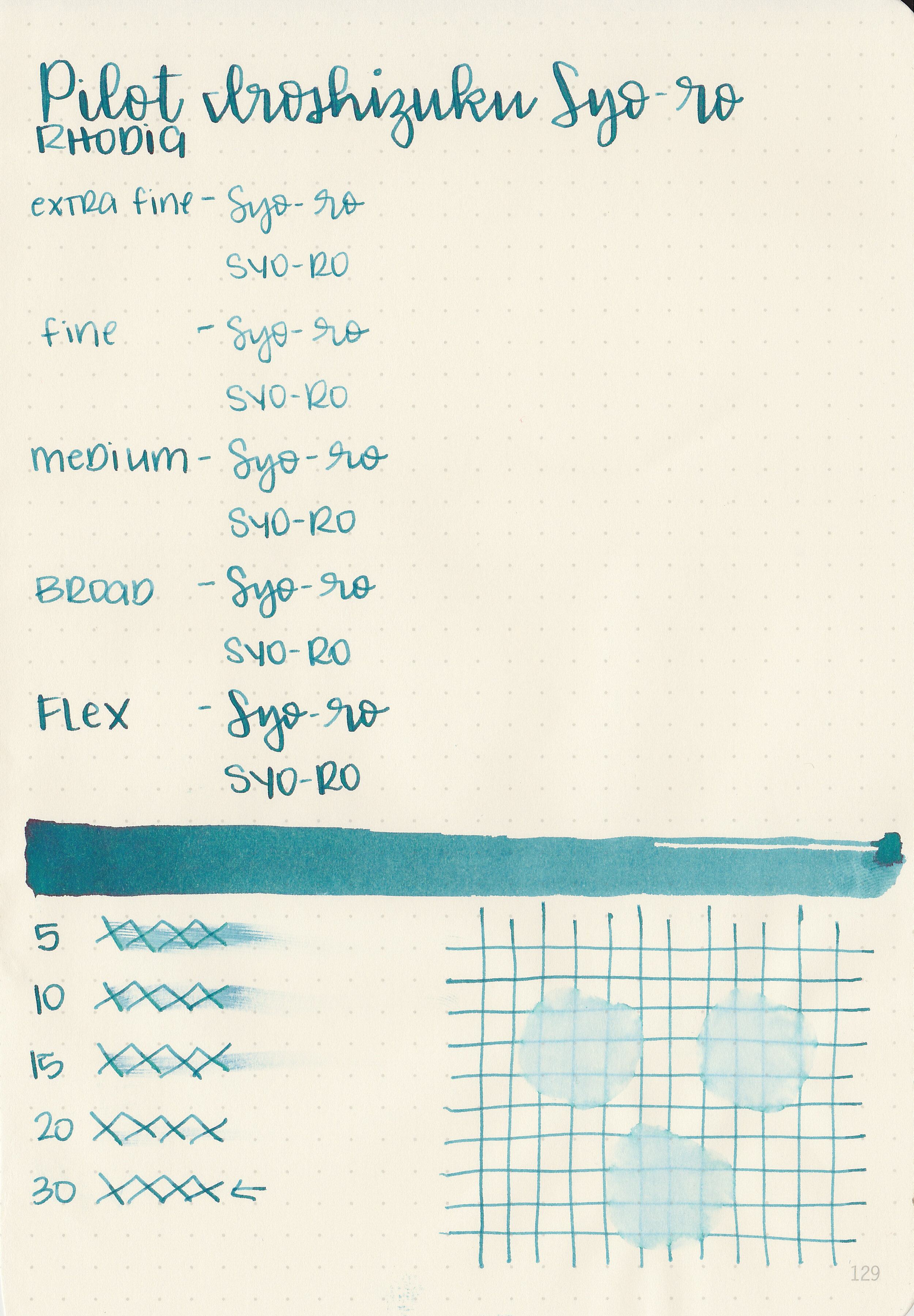
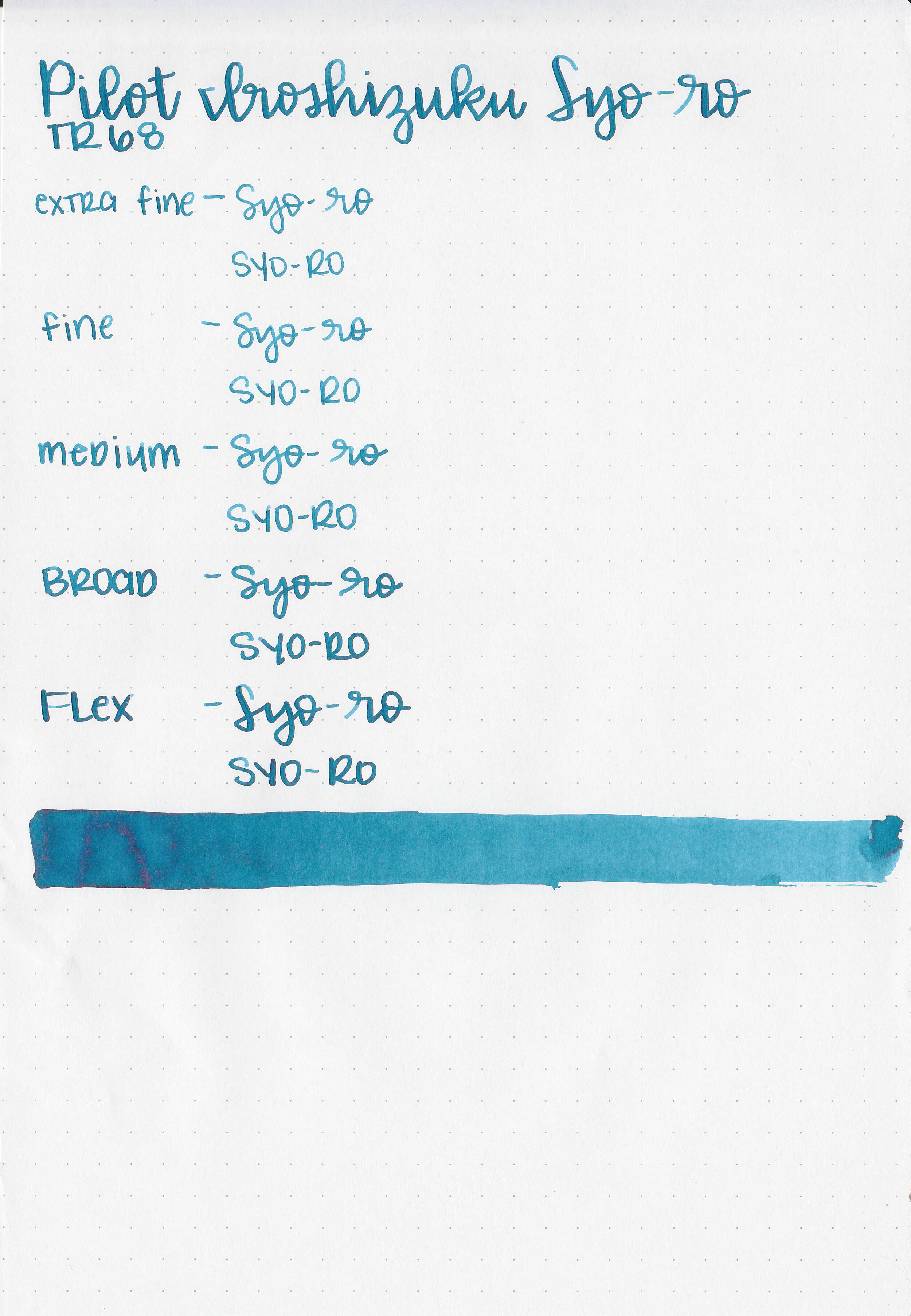
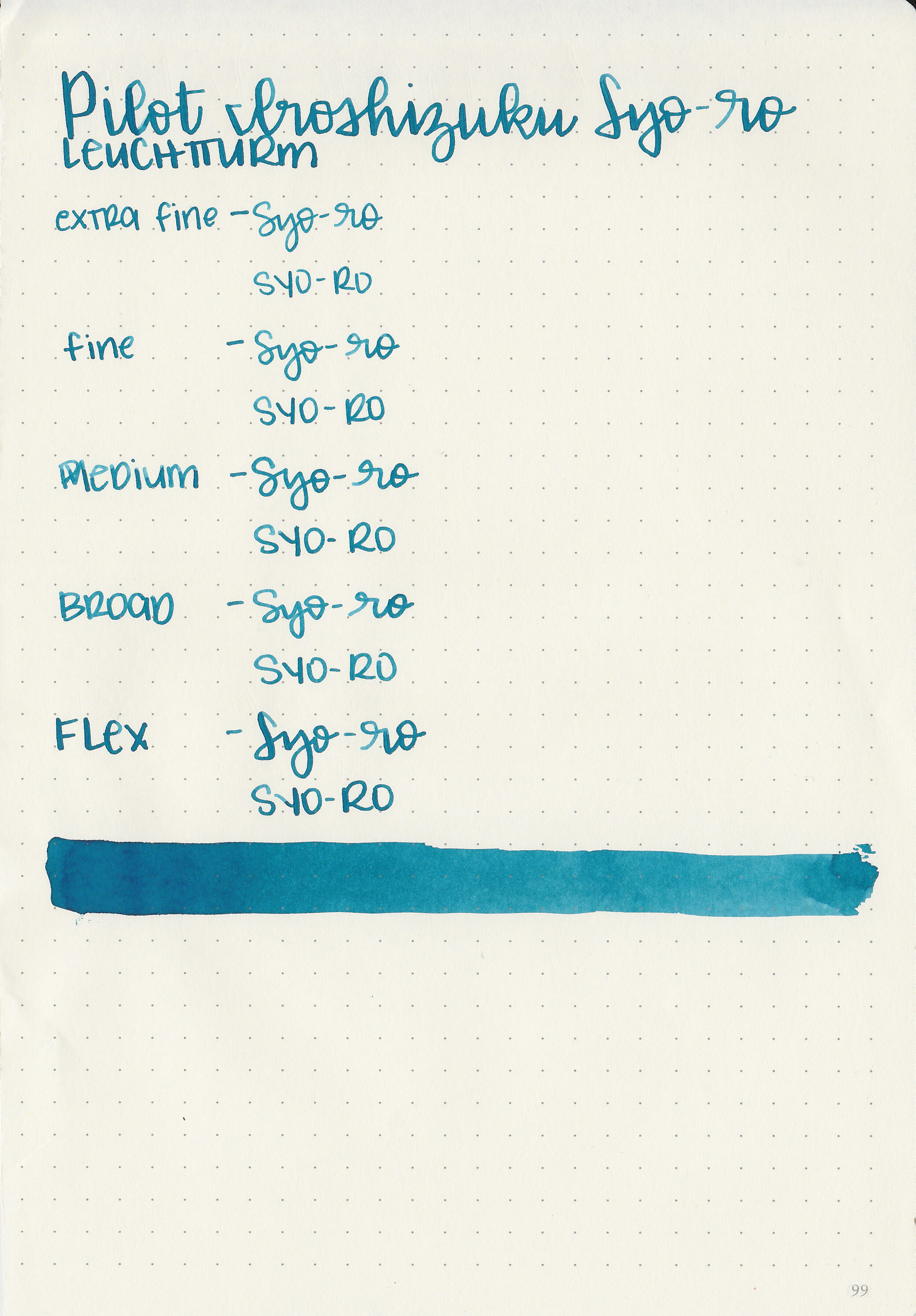
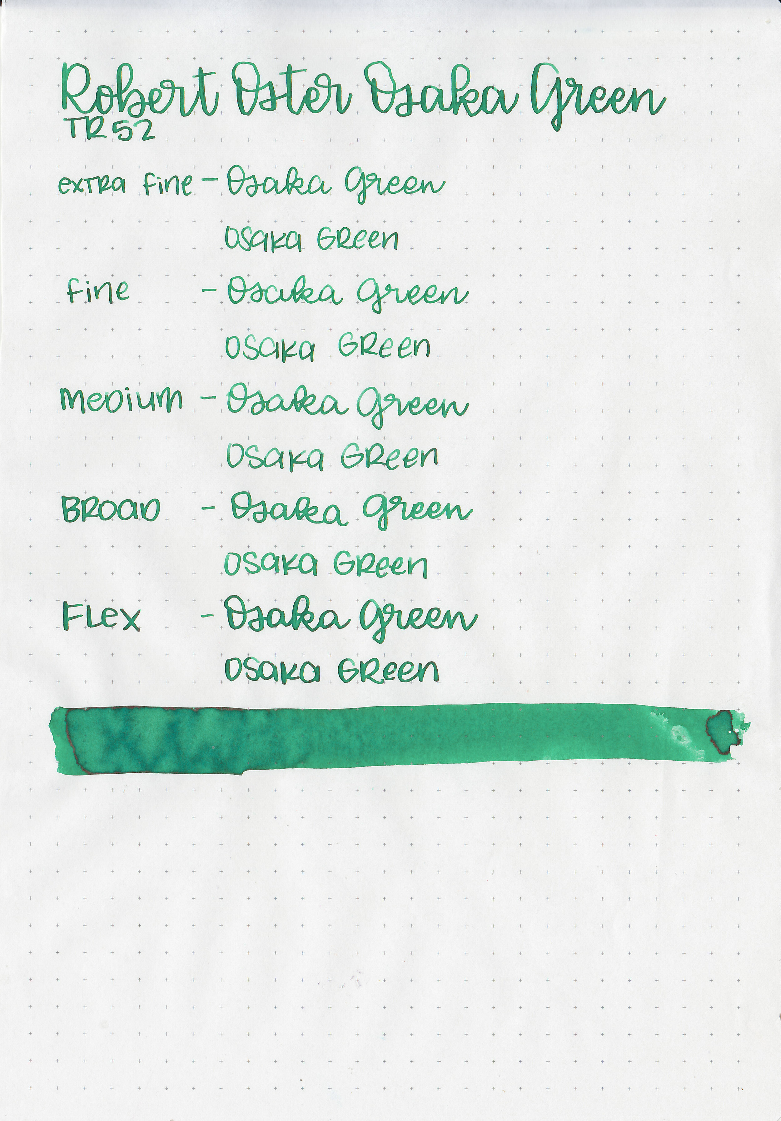
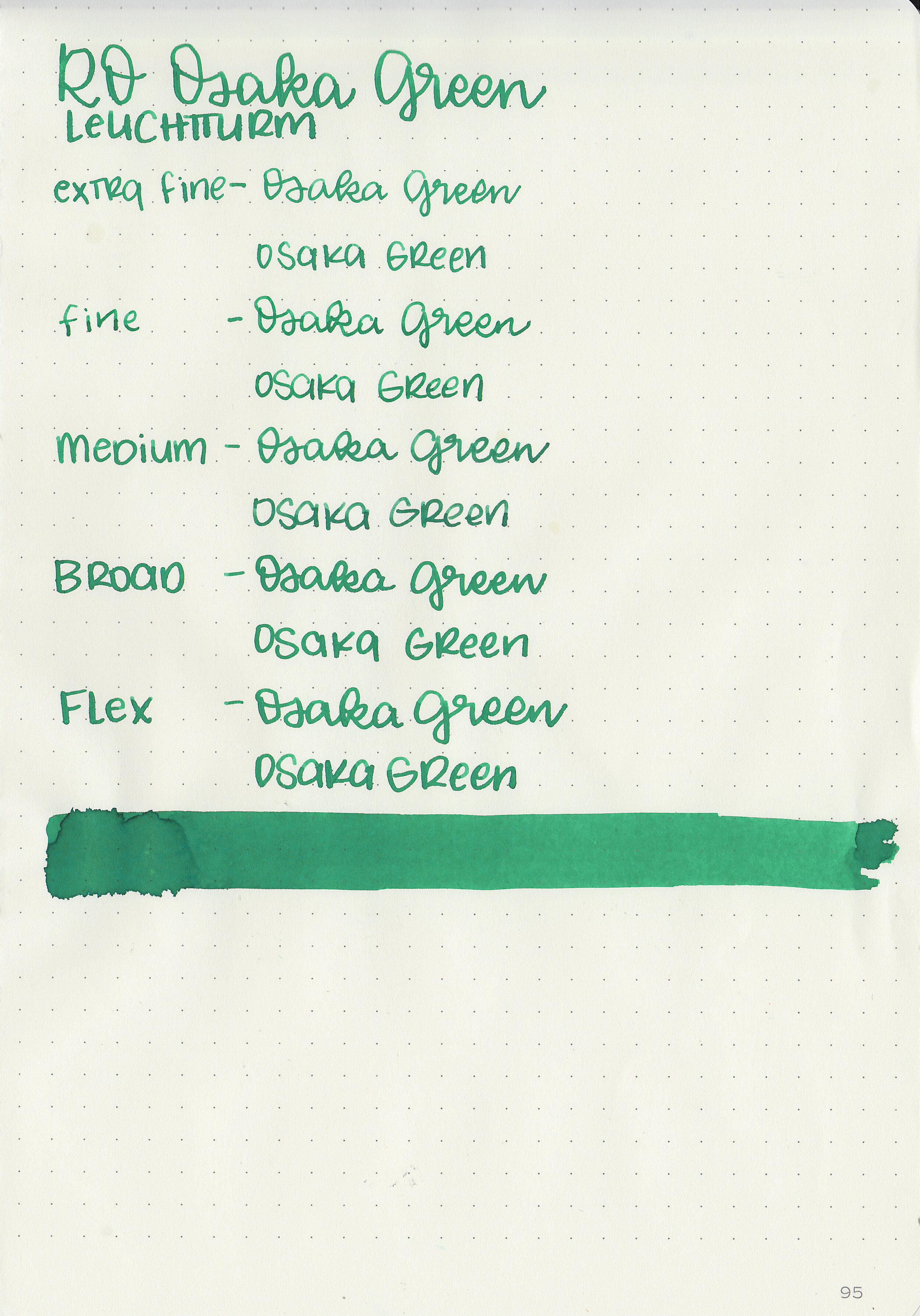
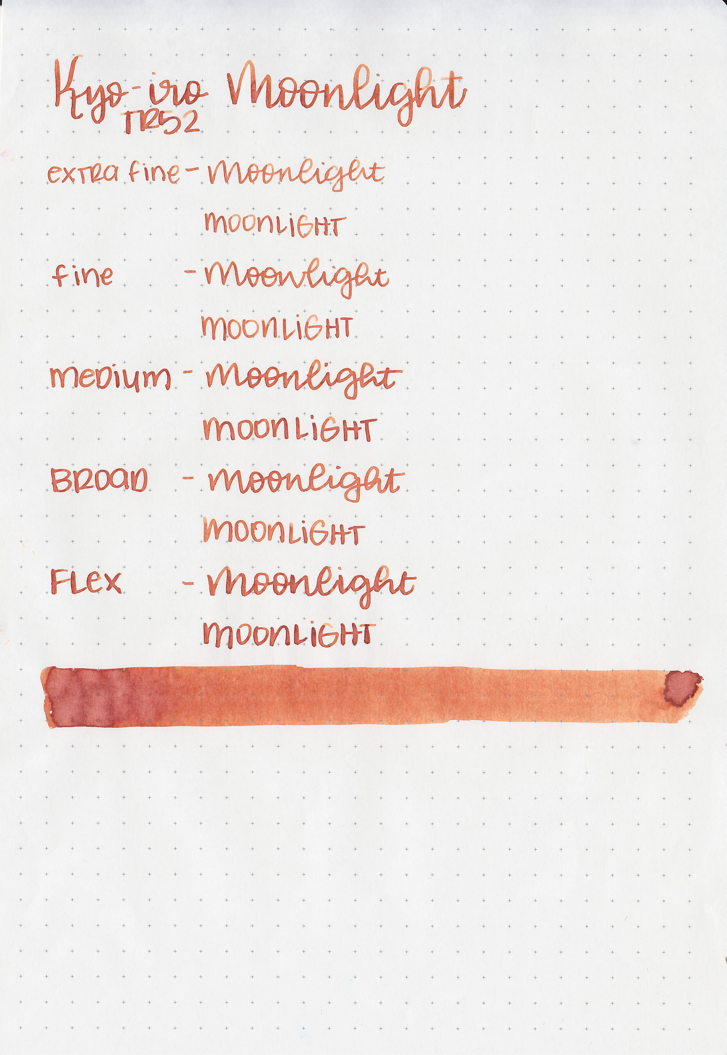
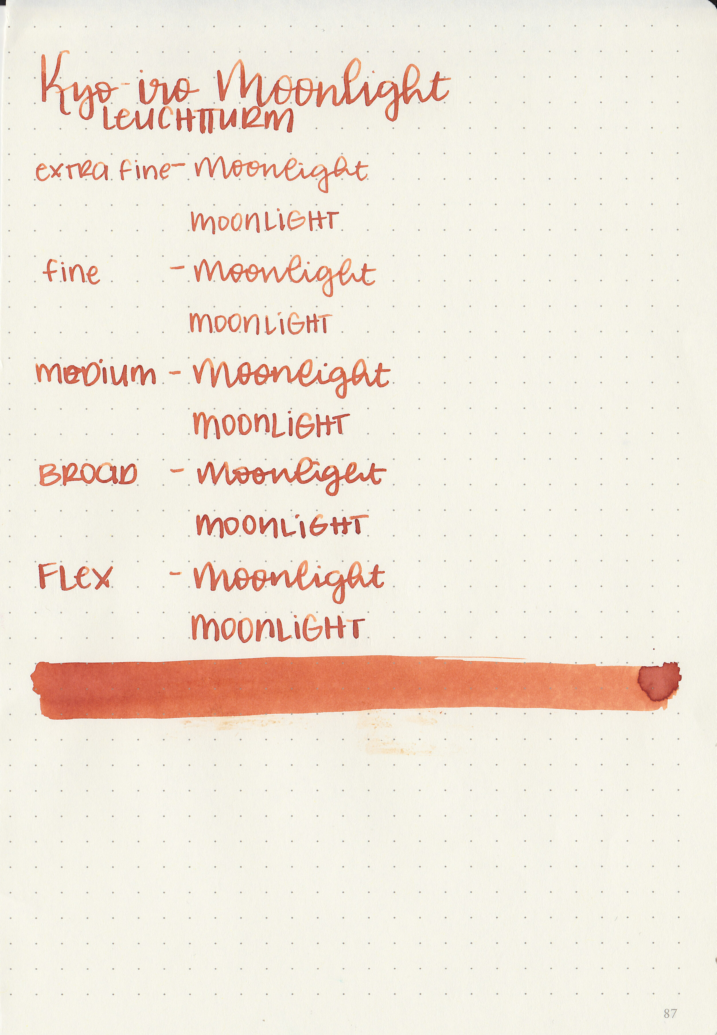
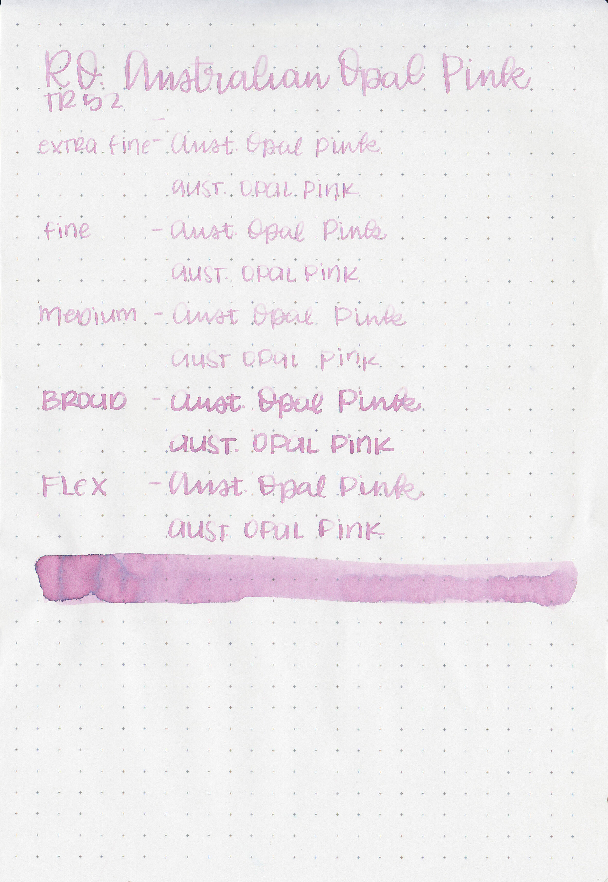
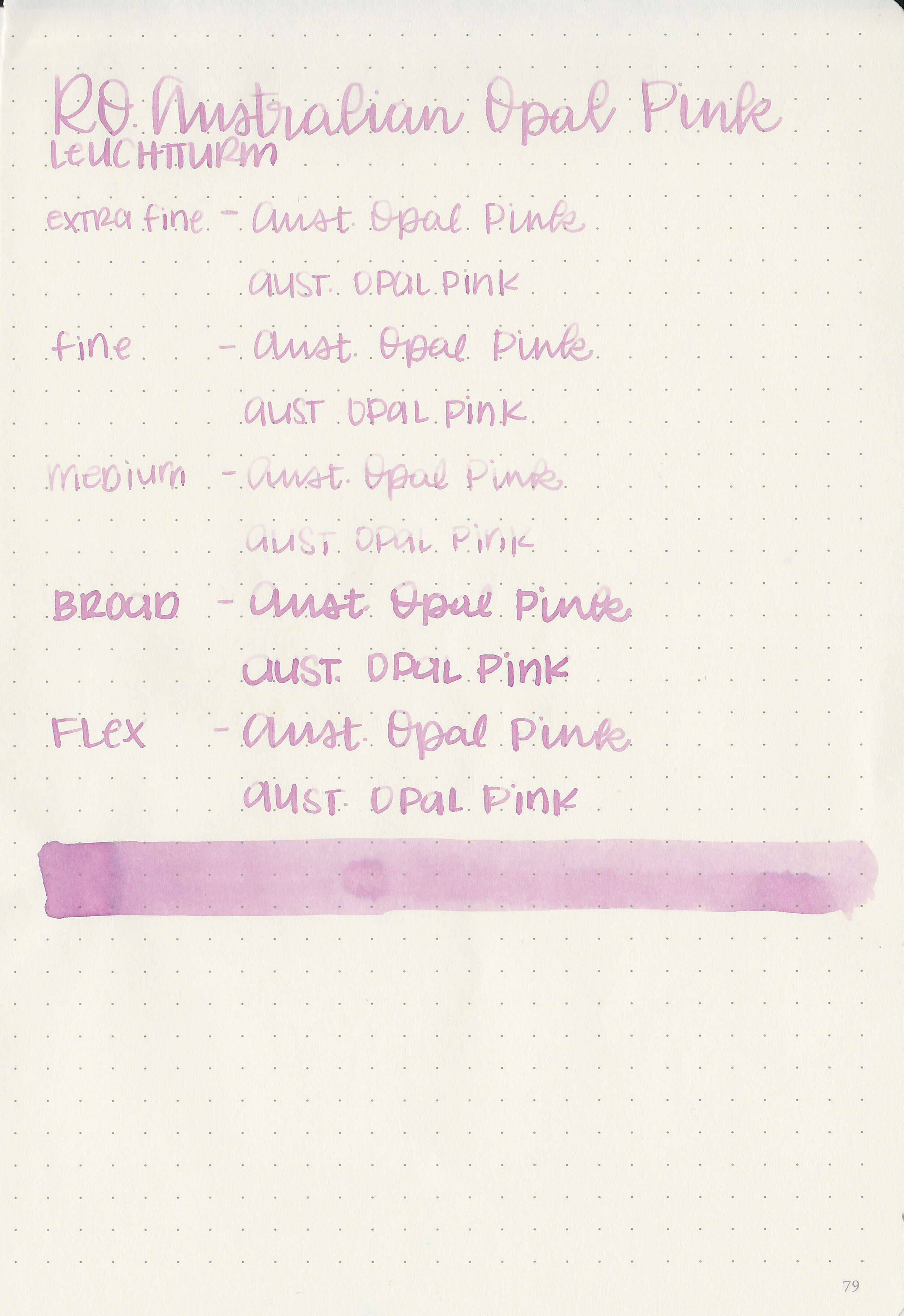
Writing samples:
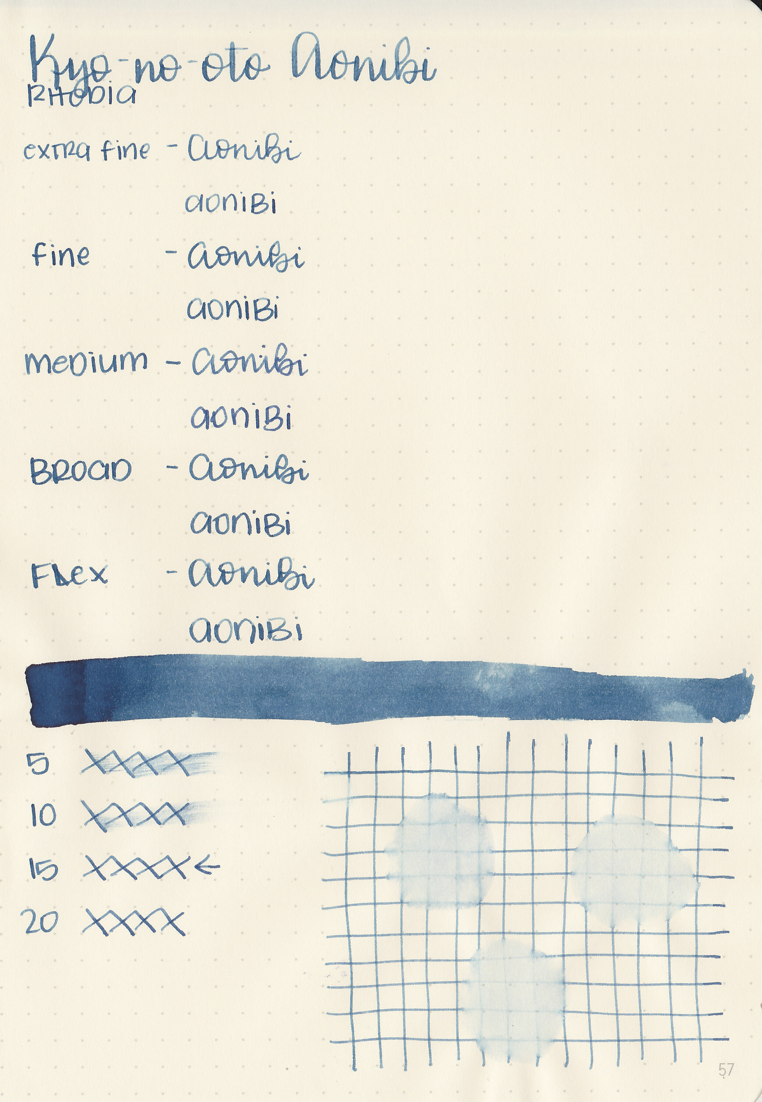
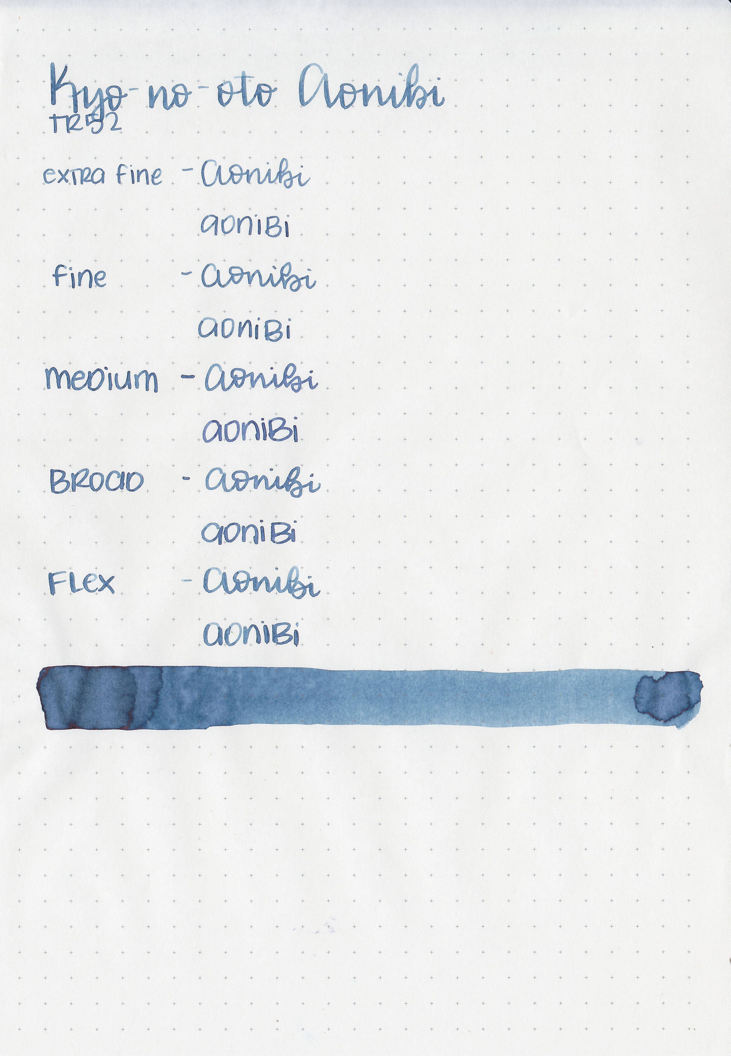
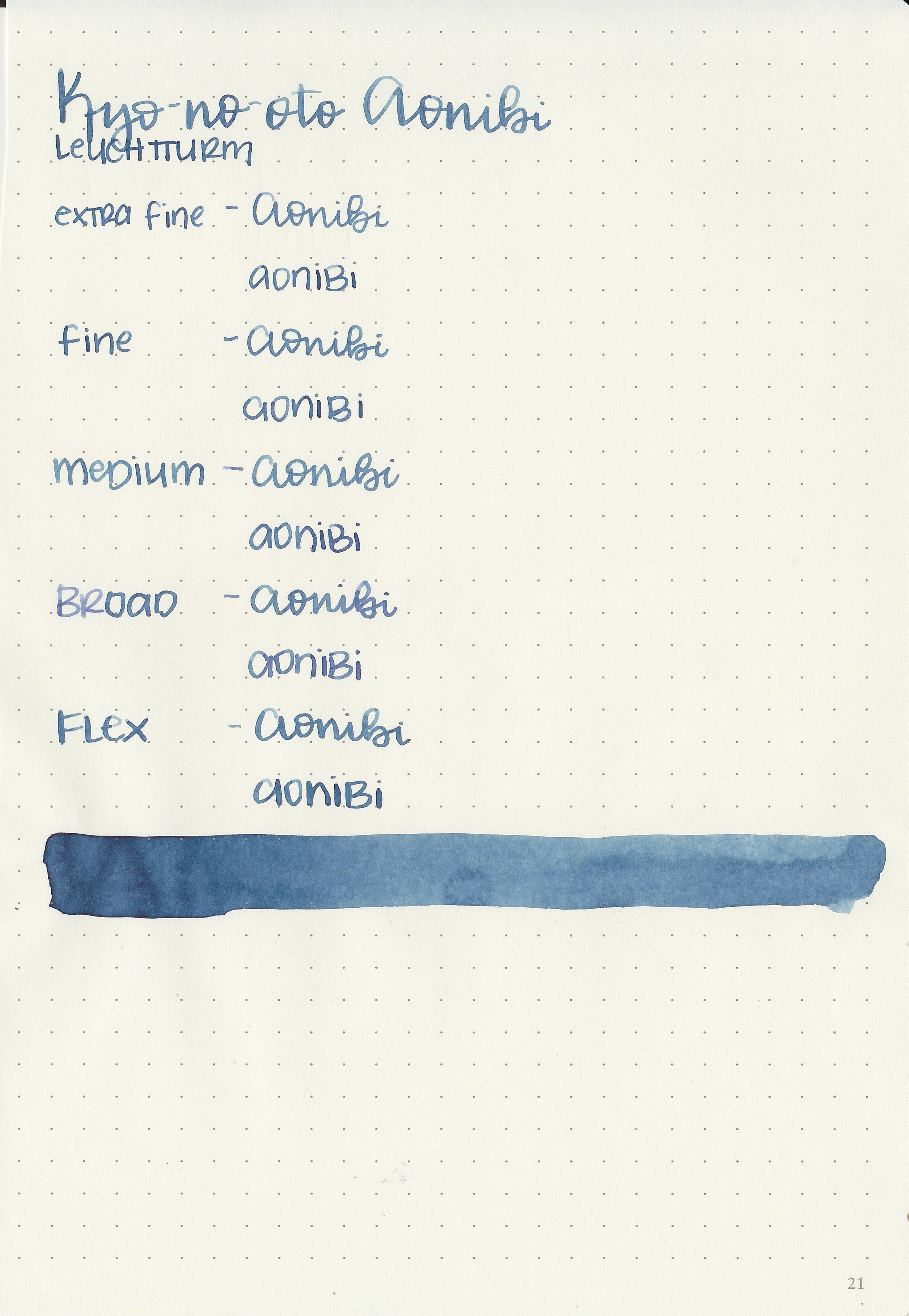
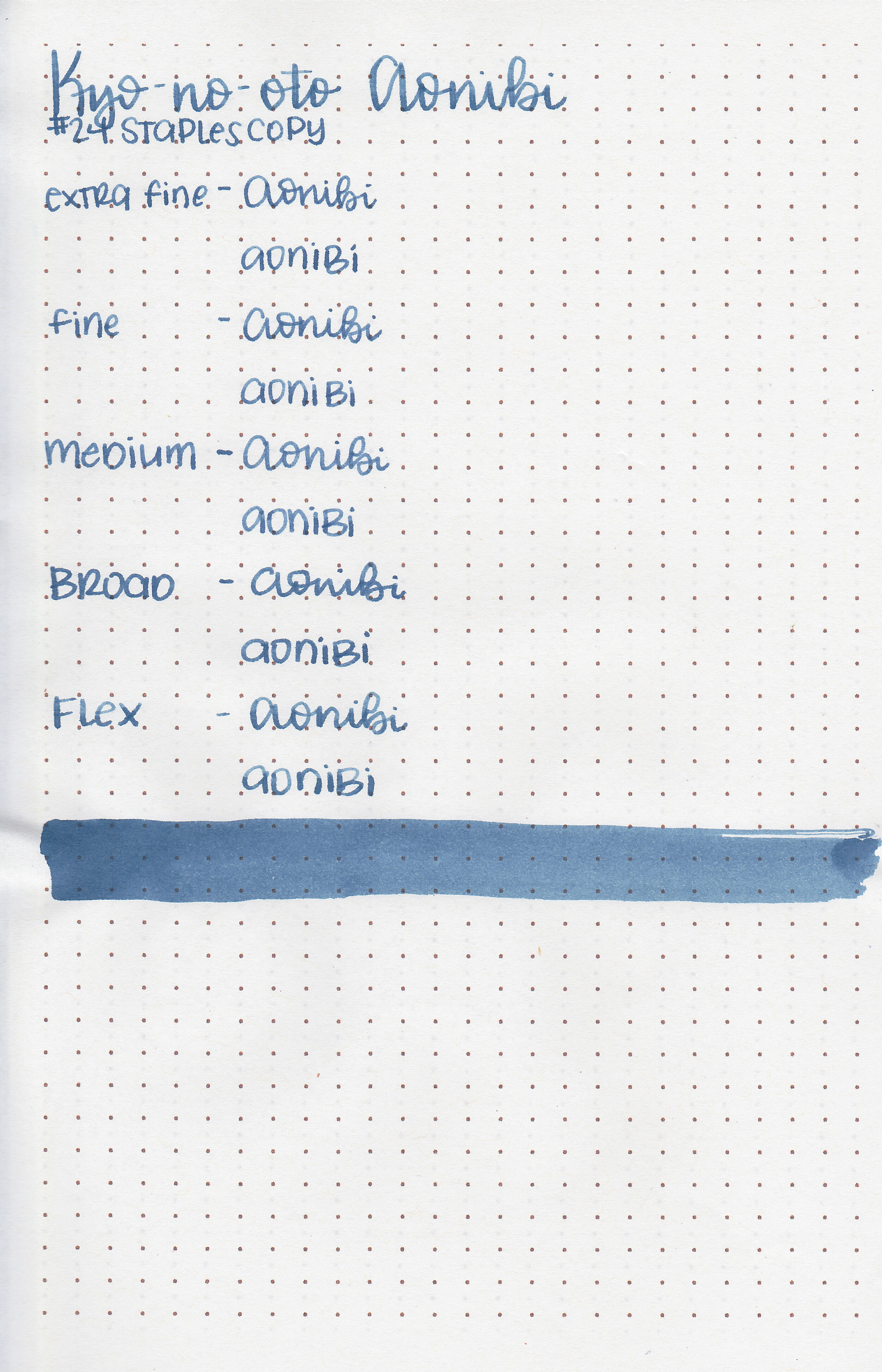
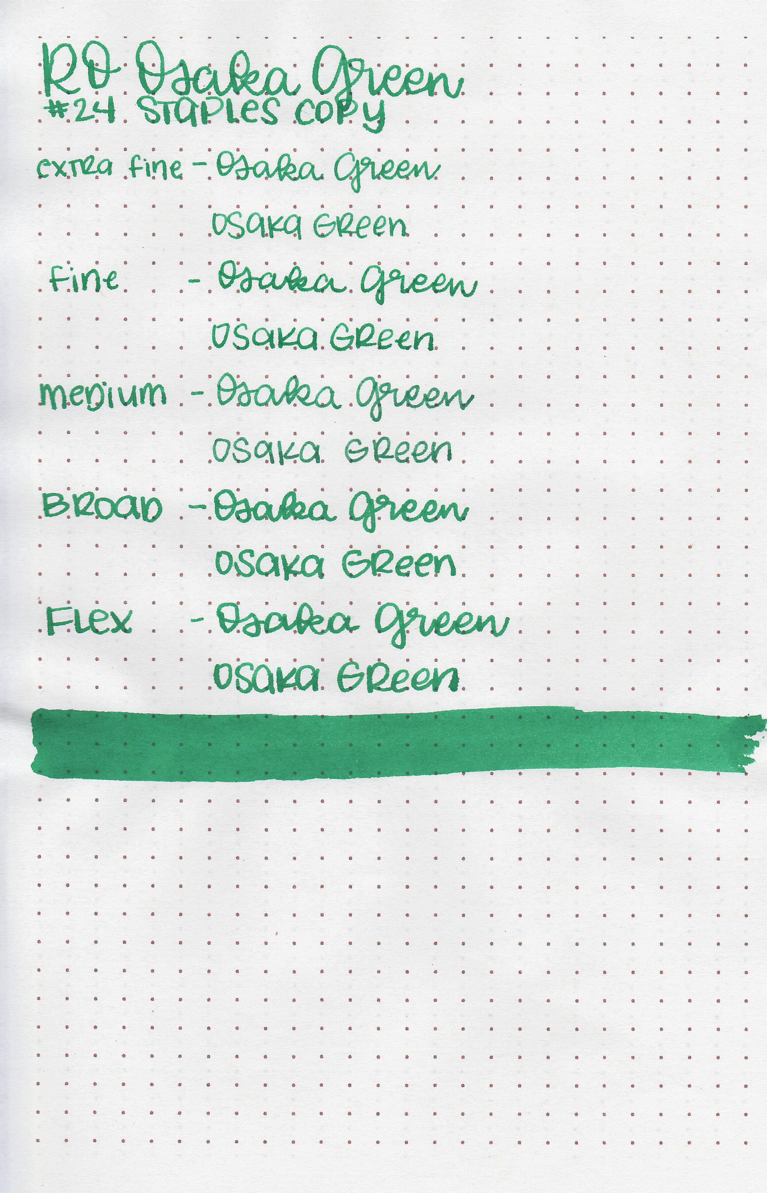
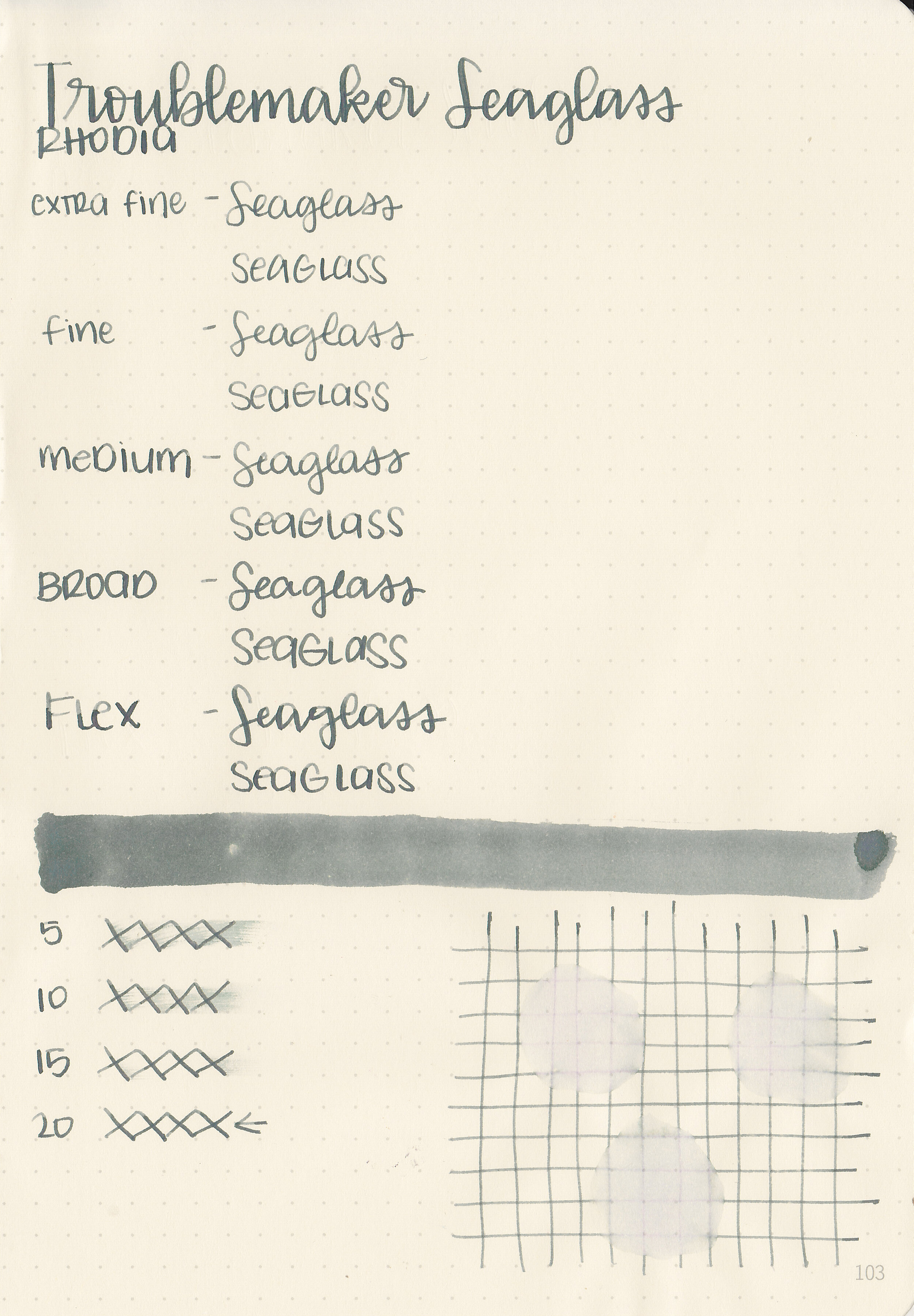
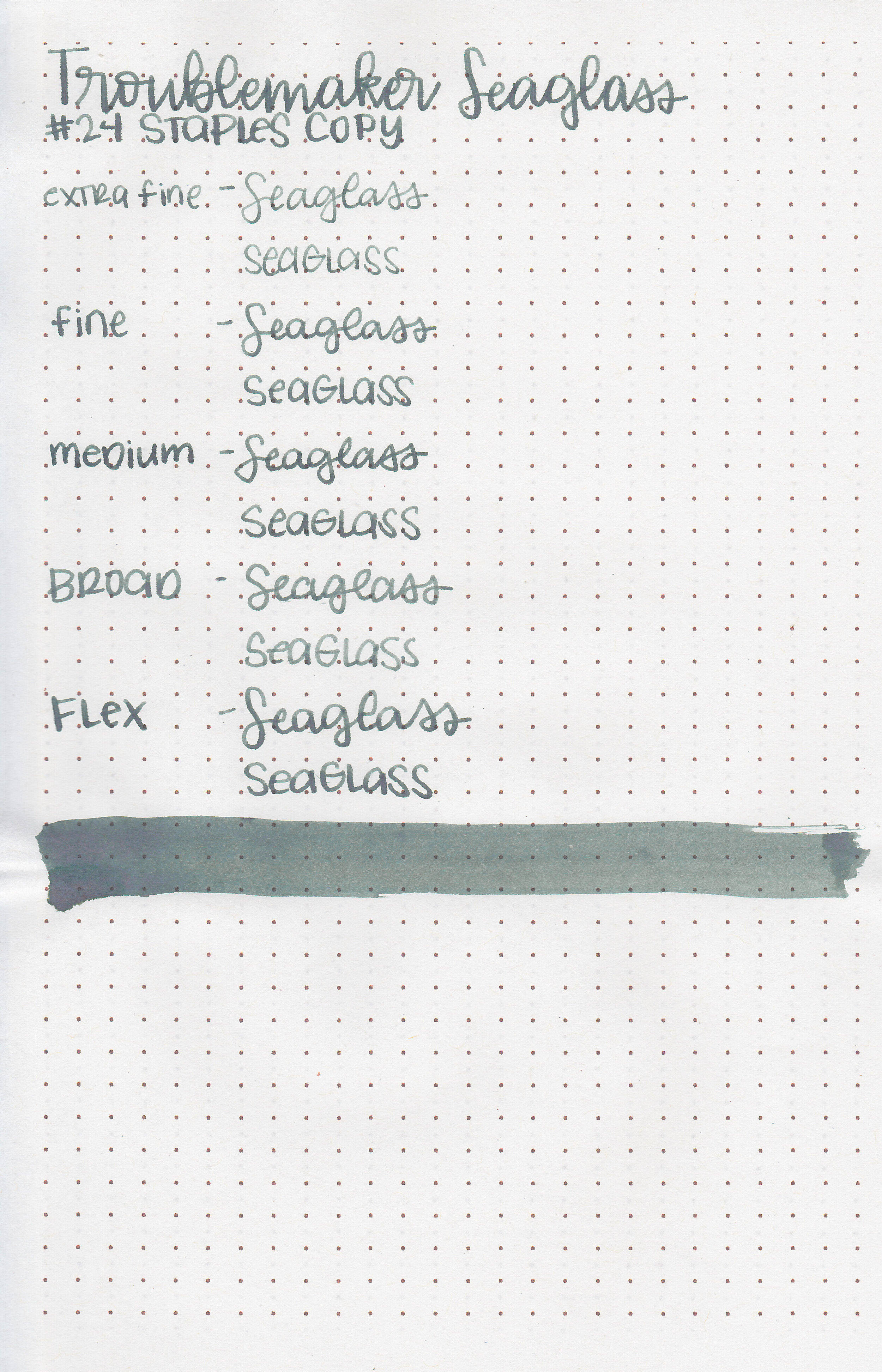
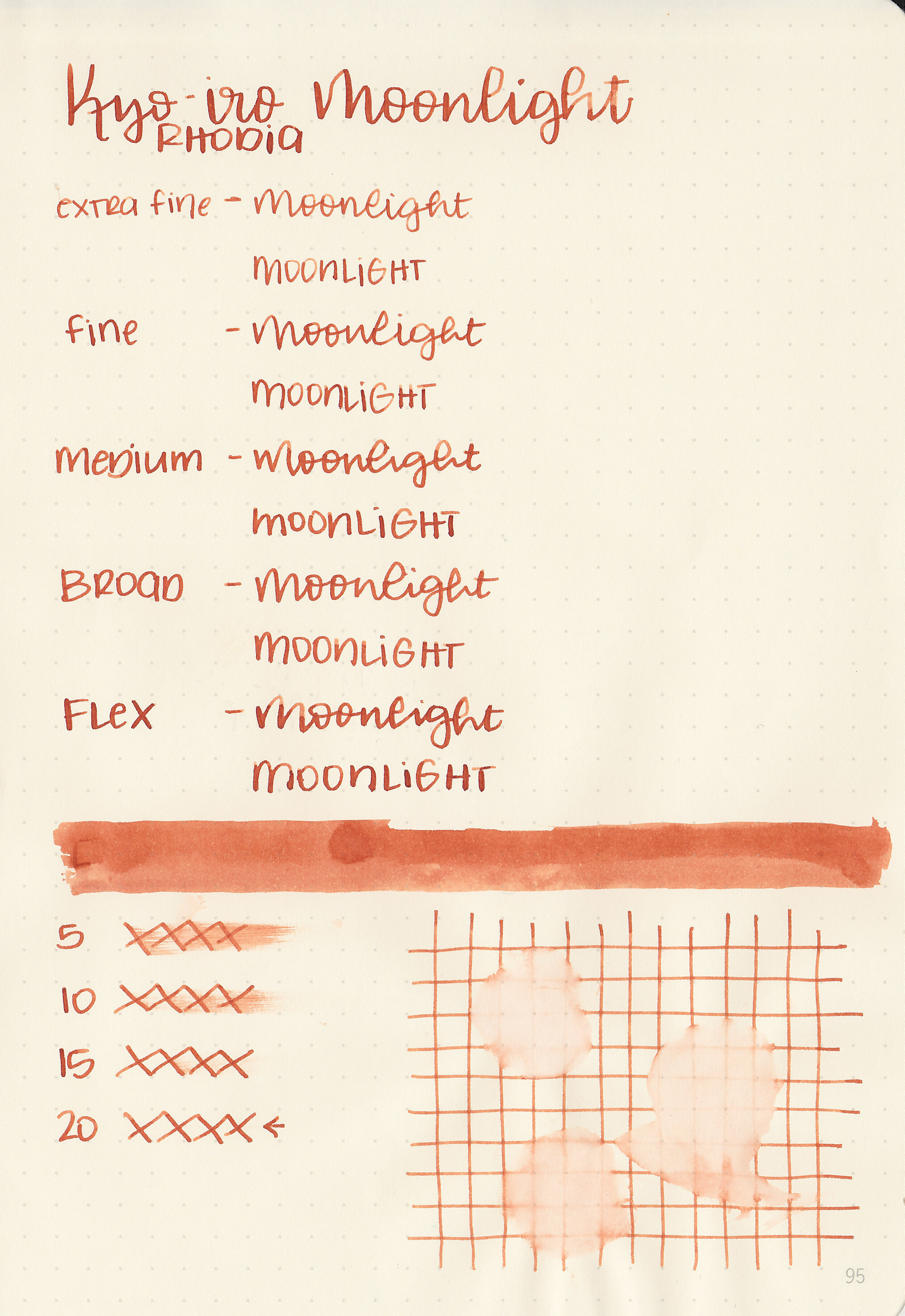
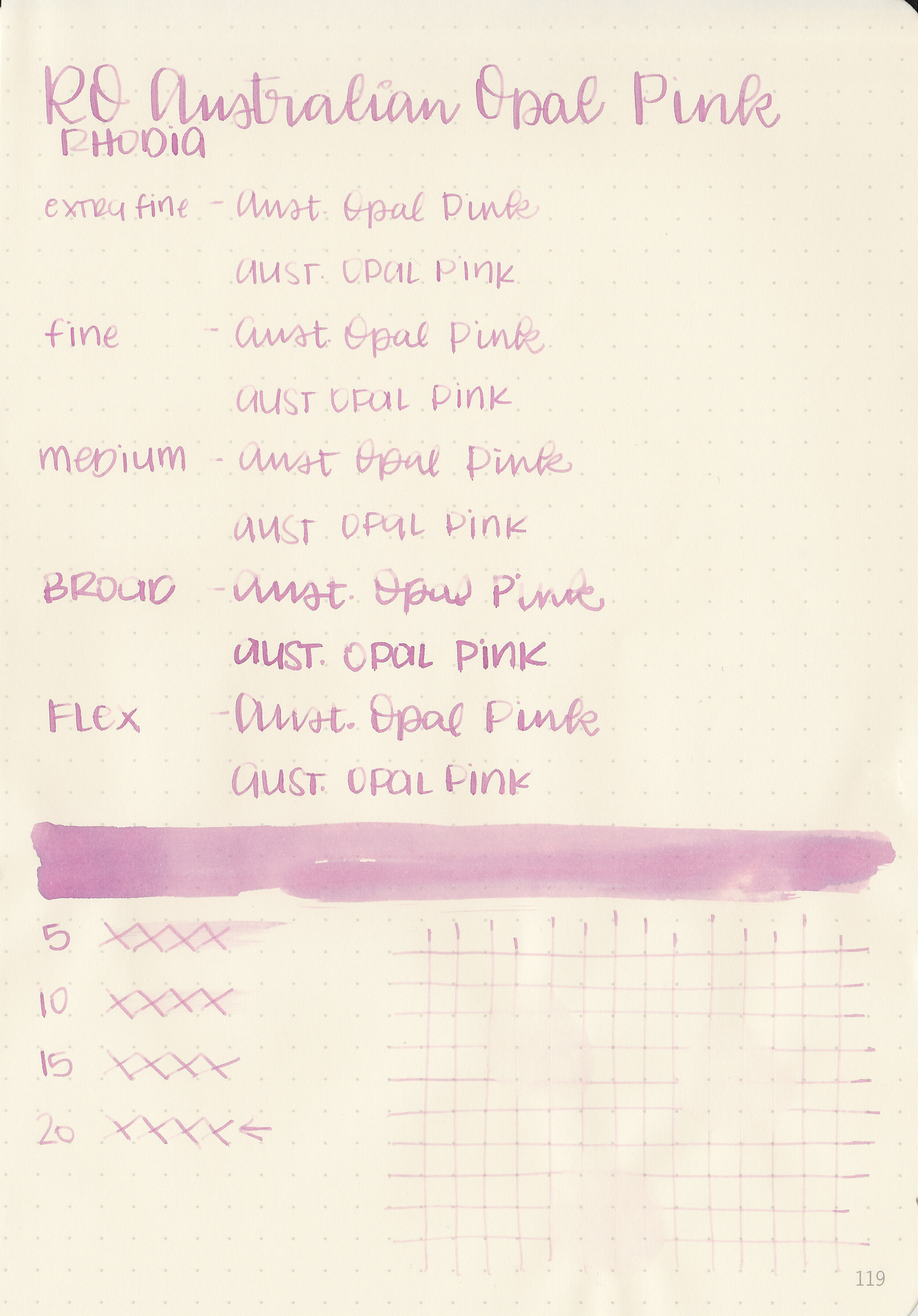
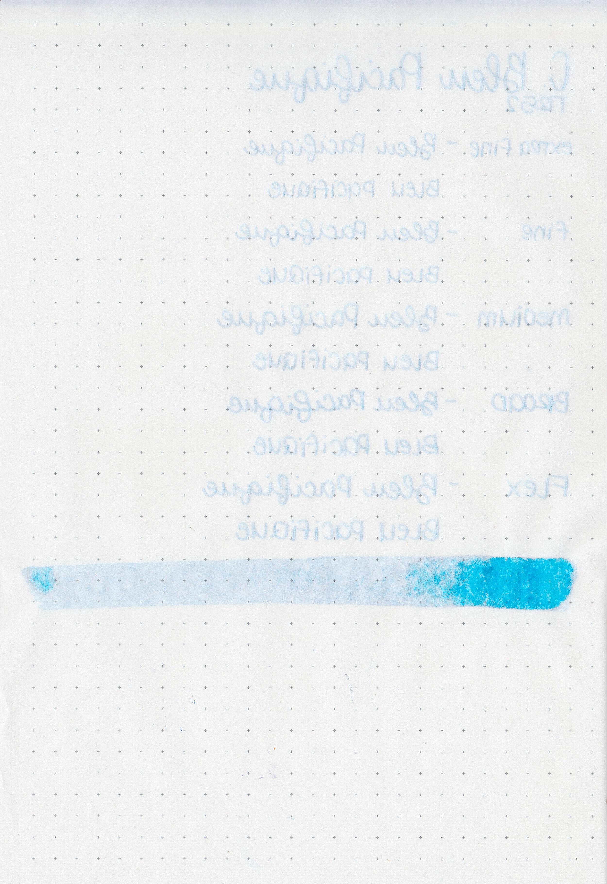
Let's take a look at how the ink behaves on fountain pen friendly papers: Rhodia, Tomoe River, and Leuchtturm.
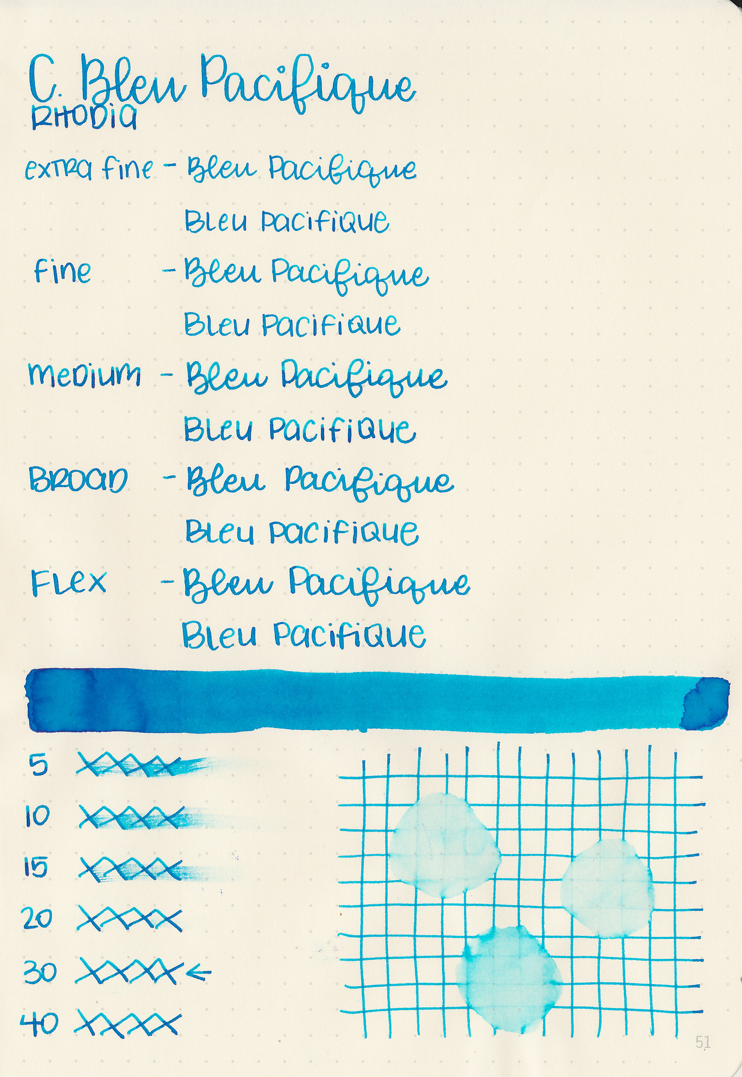
Dry time: 30 seconds
Water resistance: Low
Feathering: None
Show through: Medium
Bleeding: None
Other properties: medium shading, low sheen, and no shimmer. The sheen is only visible in large nibs on Tomoe River paper.
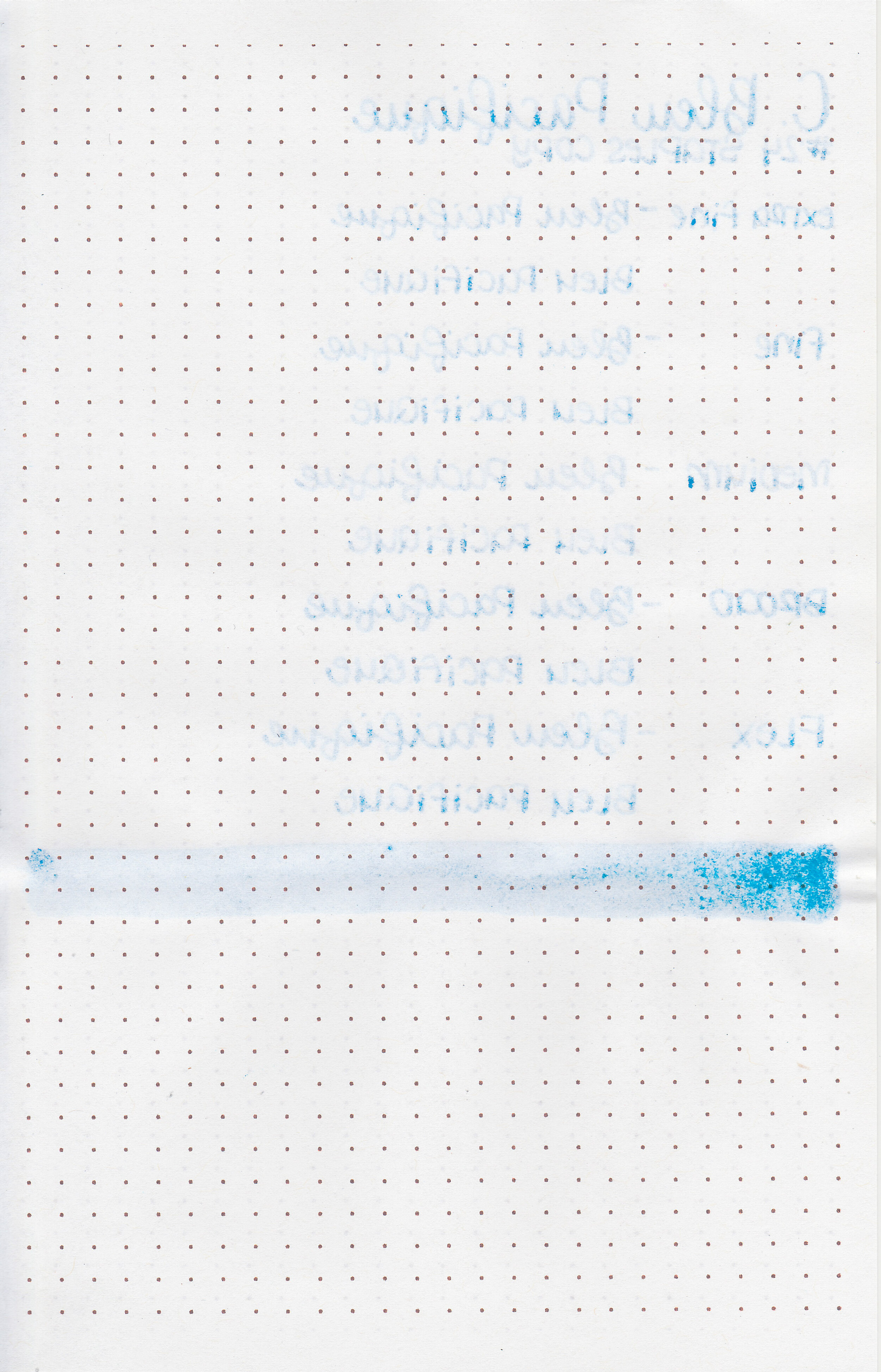

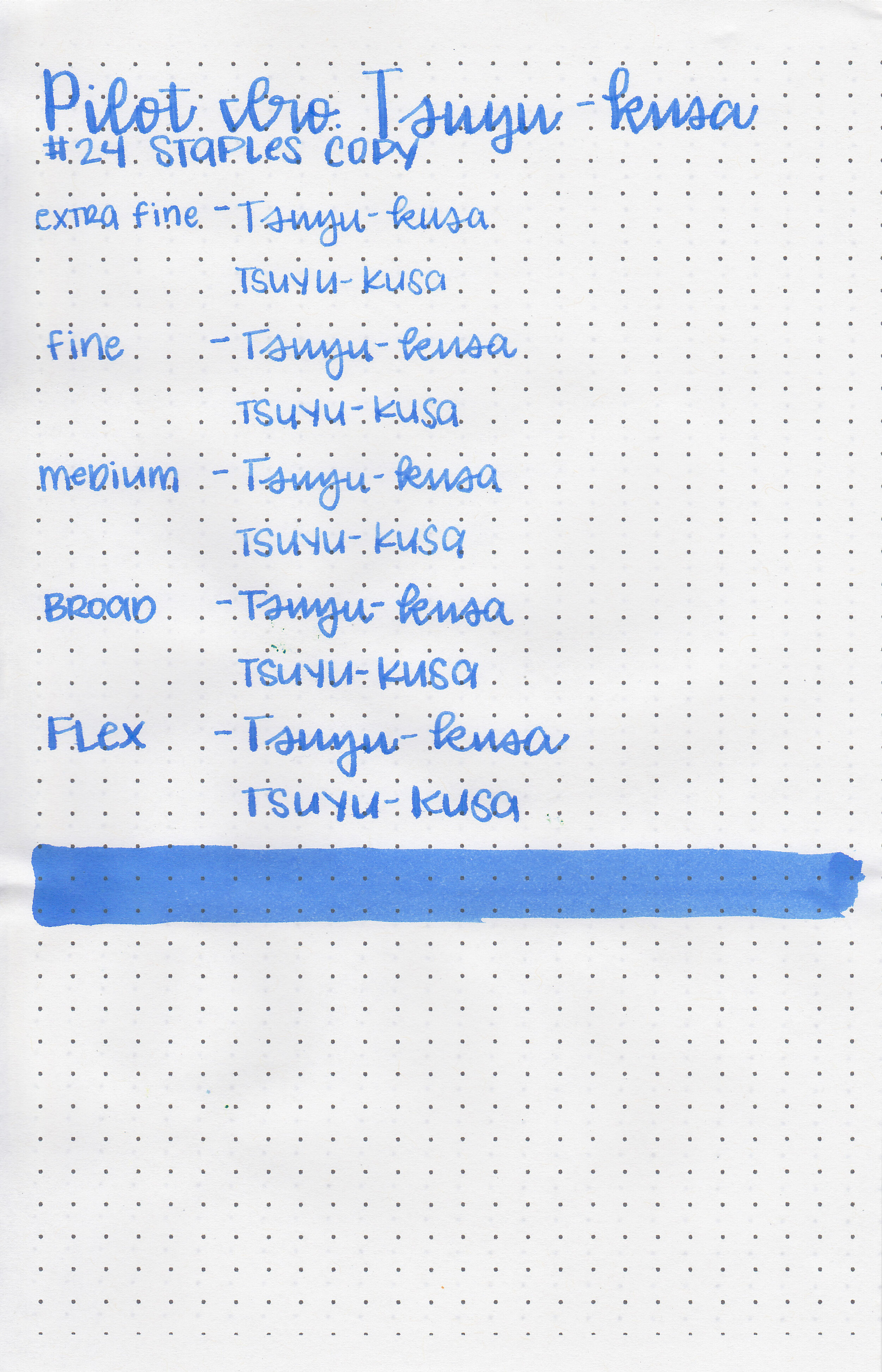
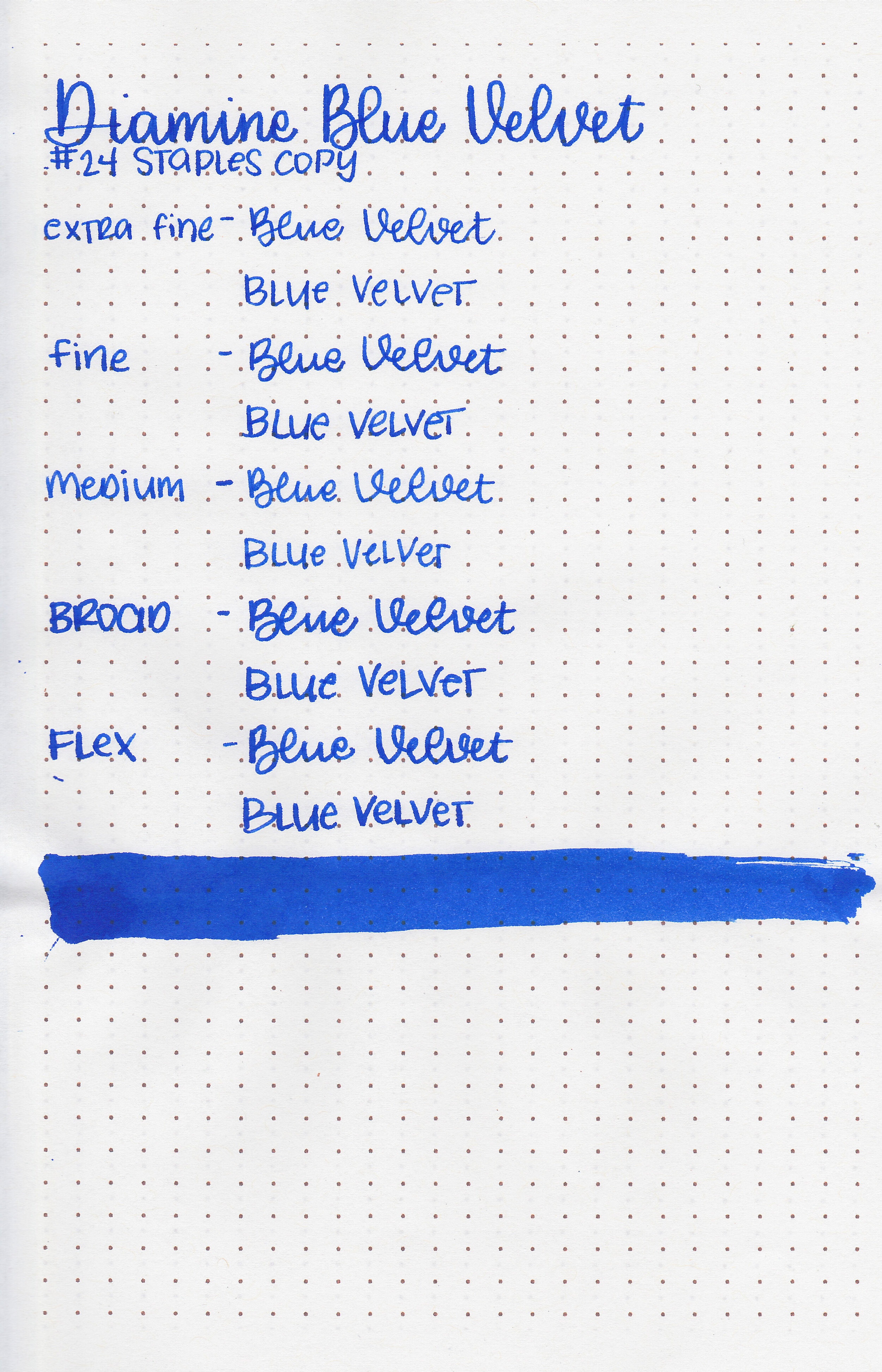
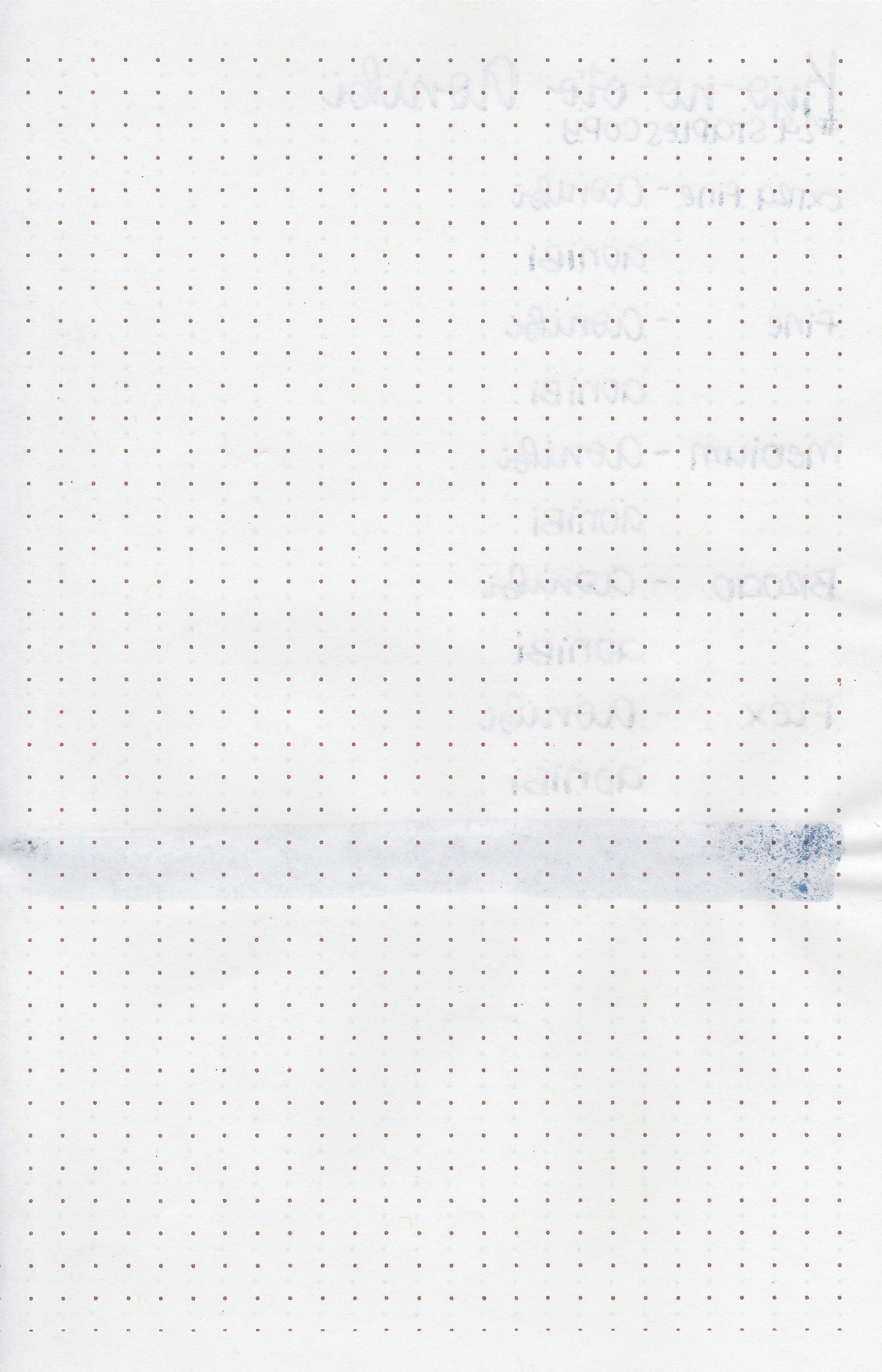
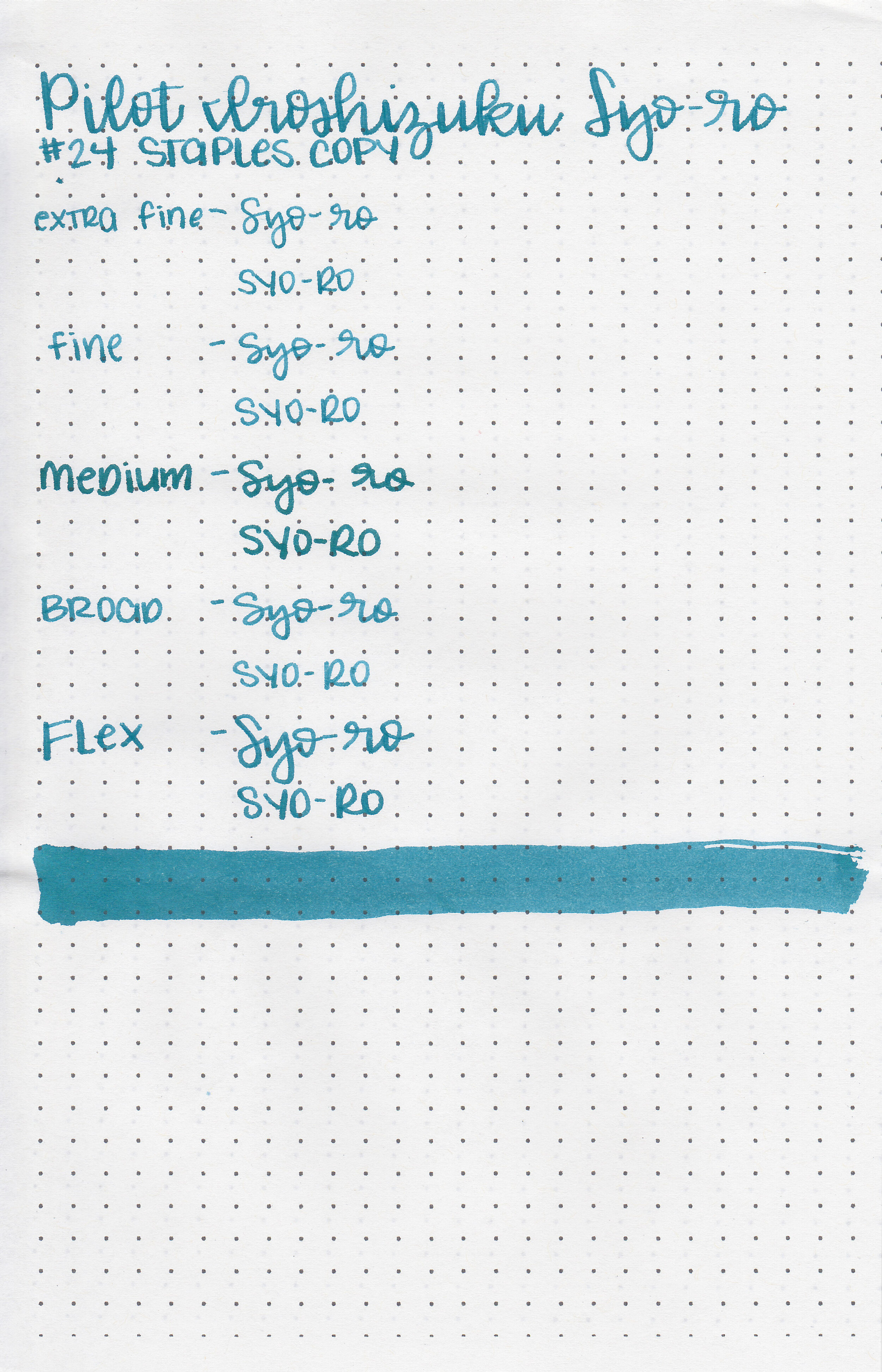
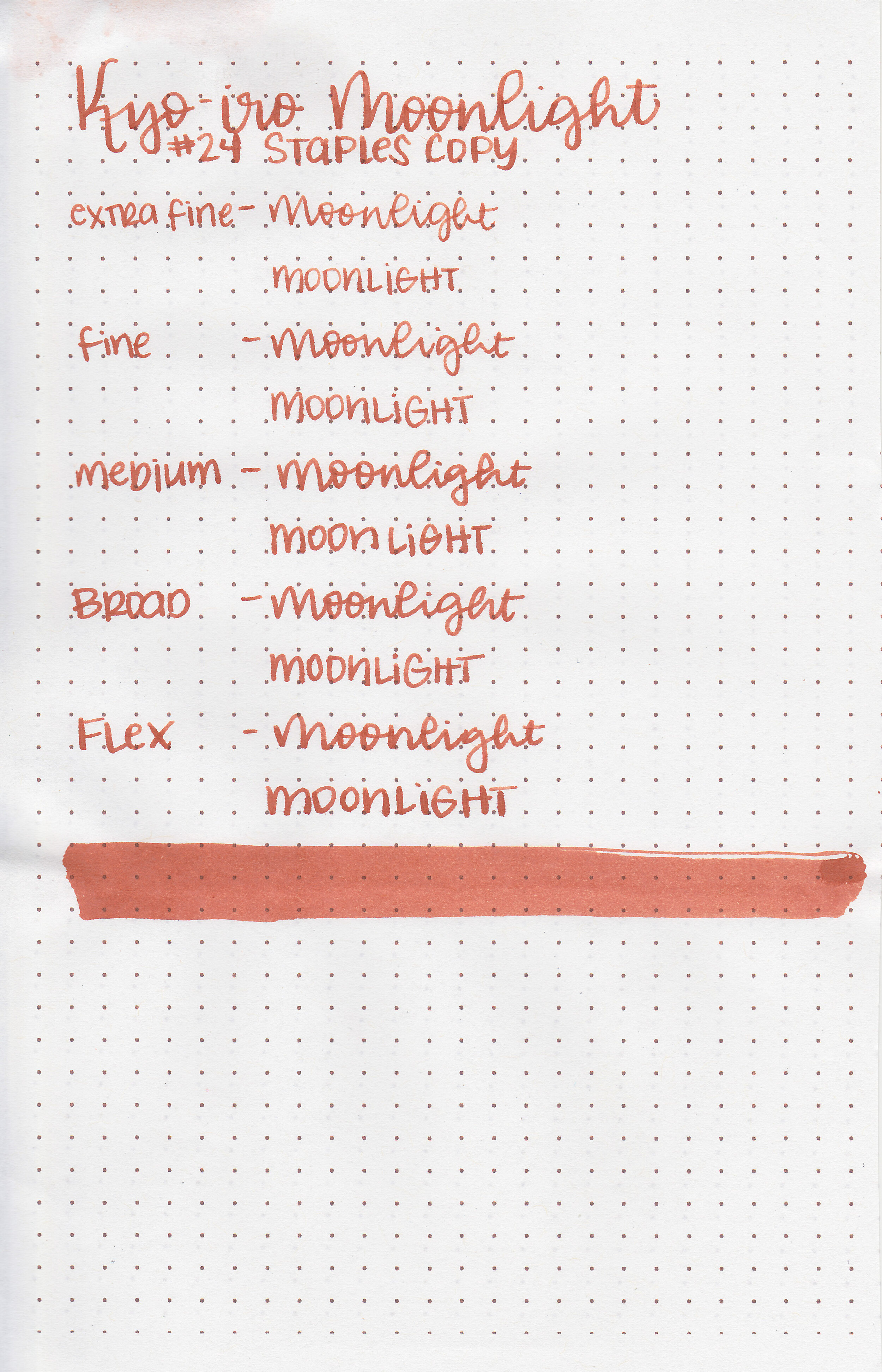
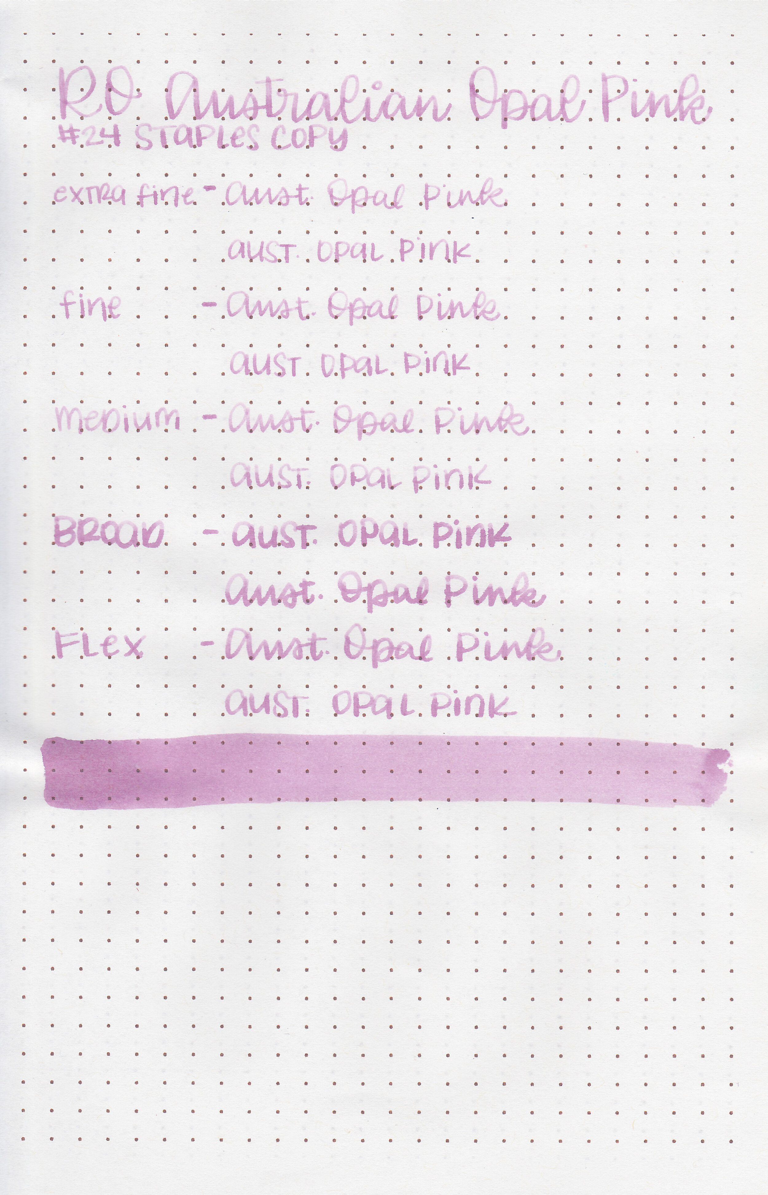
On Staples 24 lb copy paper there was some feathering and just a few dots of bleeding.
Comparison Swabs:

There are a lot of blues this color including Lamy Pacific Blue, Montblanc Unicef Blue, etc. Click here to see the blue inks together.
Longer writing:

I used a Lamy Al-star Pacific Blue with a medium nib on a Yoseka A5 notebook. The ink had a super dry flow. It was actually so dry that it completely dried up in the third paragraph. I couldn’t get it to re-start and had to prime the converter to get it going again.
Overall, this ink is a great color but there are a lot of inks this color already. It’s also so dry I couldn’t write a whole page without it completely drying up, so it’s a no for me.
Disclaimer: This ink was provided by a reader for the purpose of this review. All photos and opinions are my own. This page does not contain affiliate links and this post is not sponsored in any way.