Ink Review #906 Redux: Diamine Triple Chocolate
/
Diamine Triple Chocolate was first released as part of the 2019 Inkvent Calendar, but is now available on its own as part of the Blue Collection. You can find this ink for sale at Pen Chalet (aff. link) or Vanness Pens.

The color:
Triple Chocolate is an unsaturated, cool-tone brown.
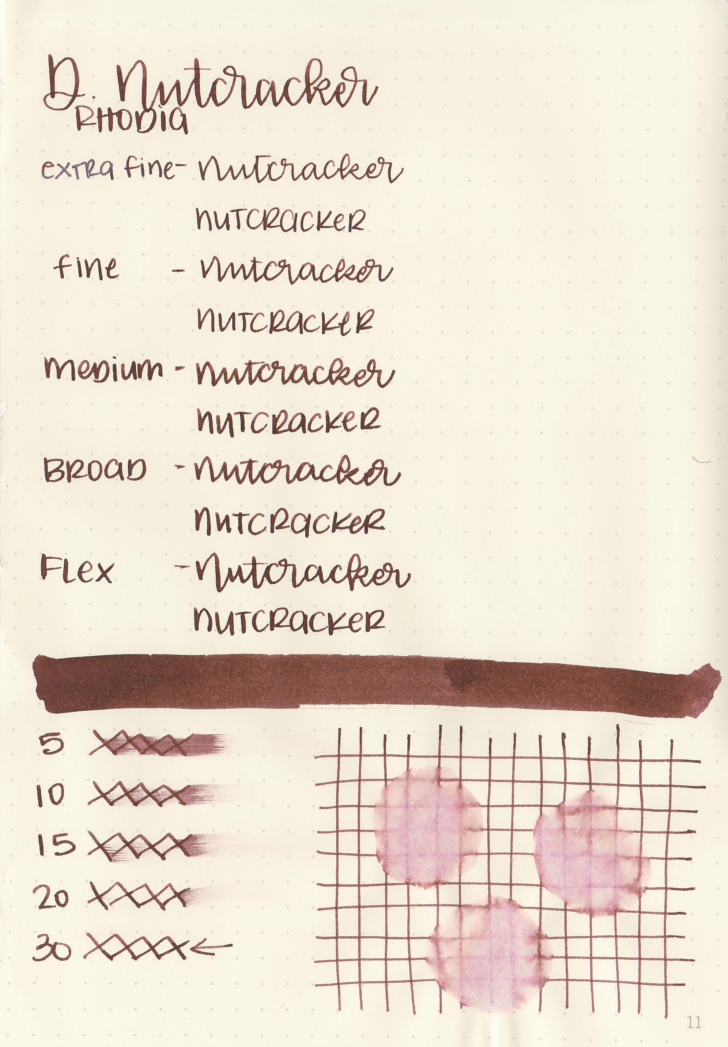
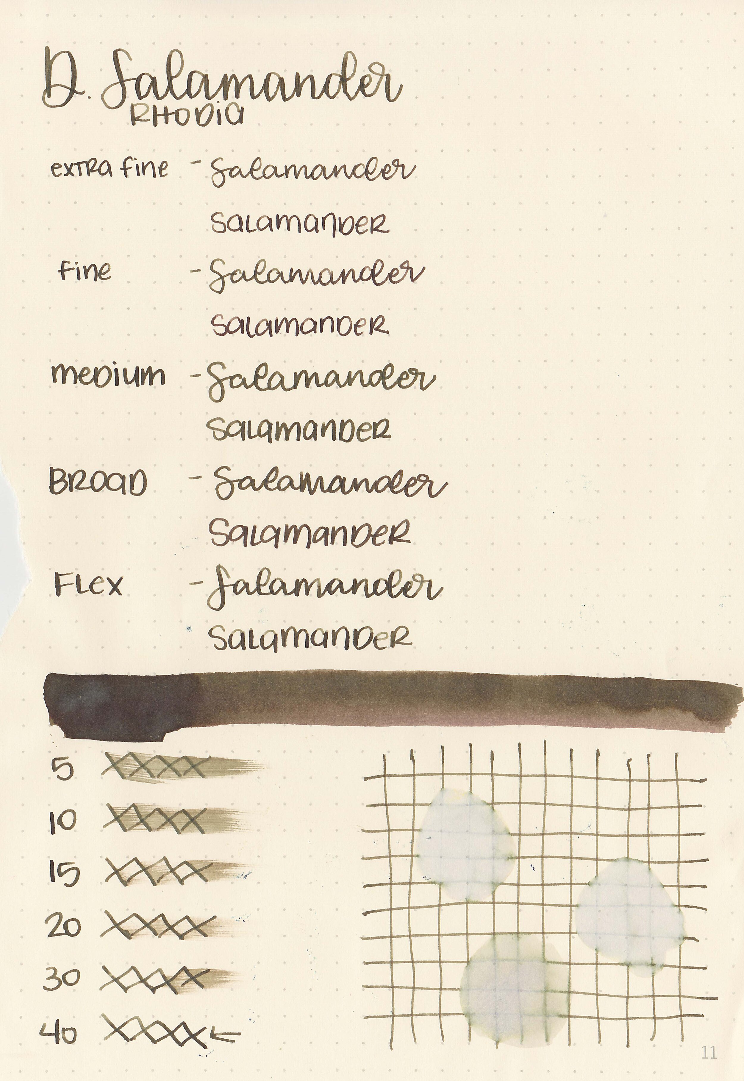
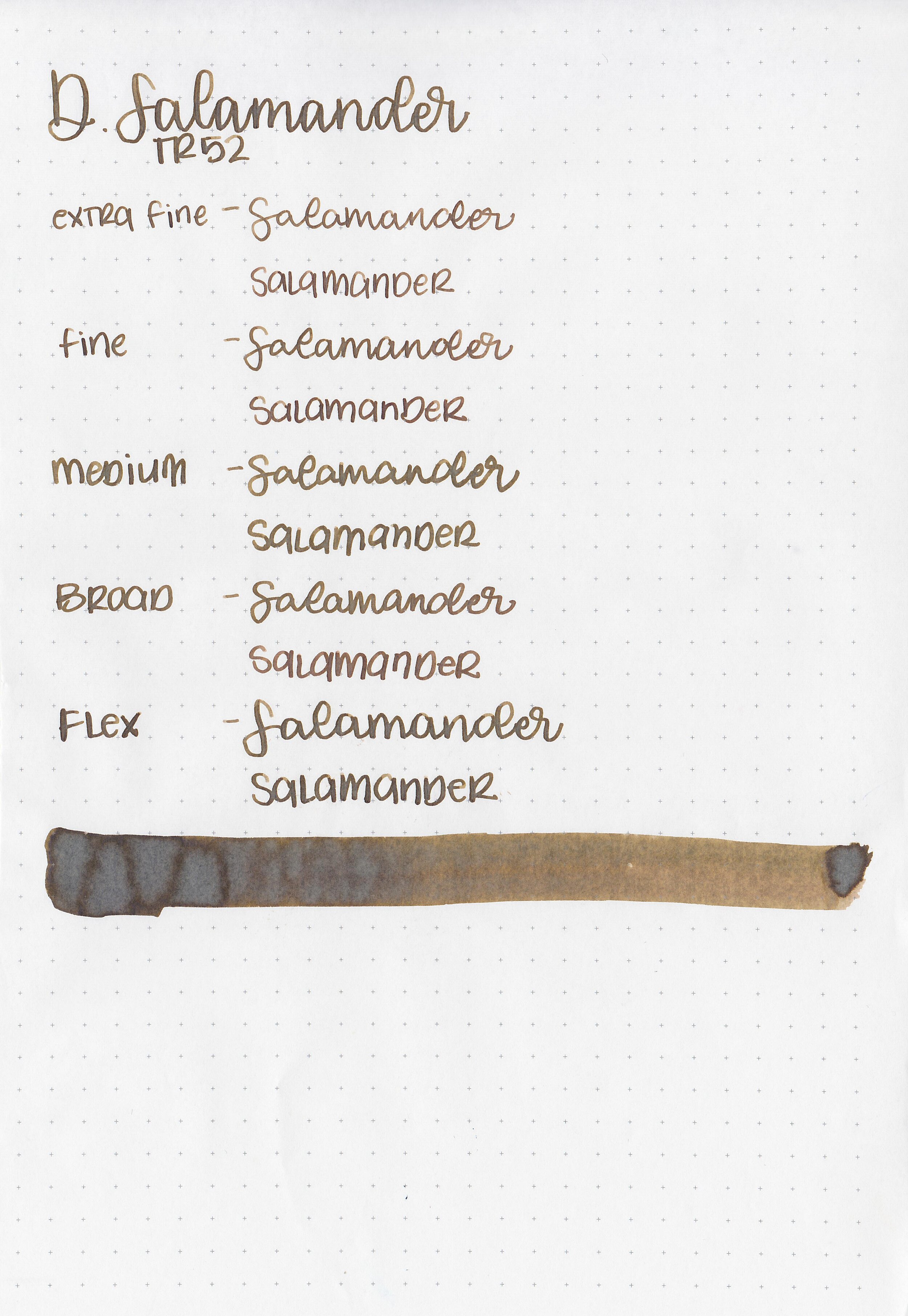
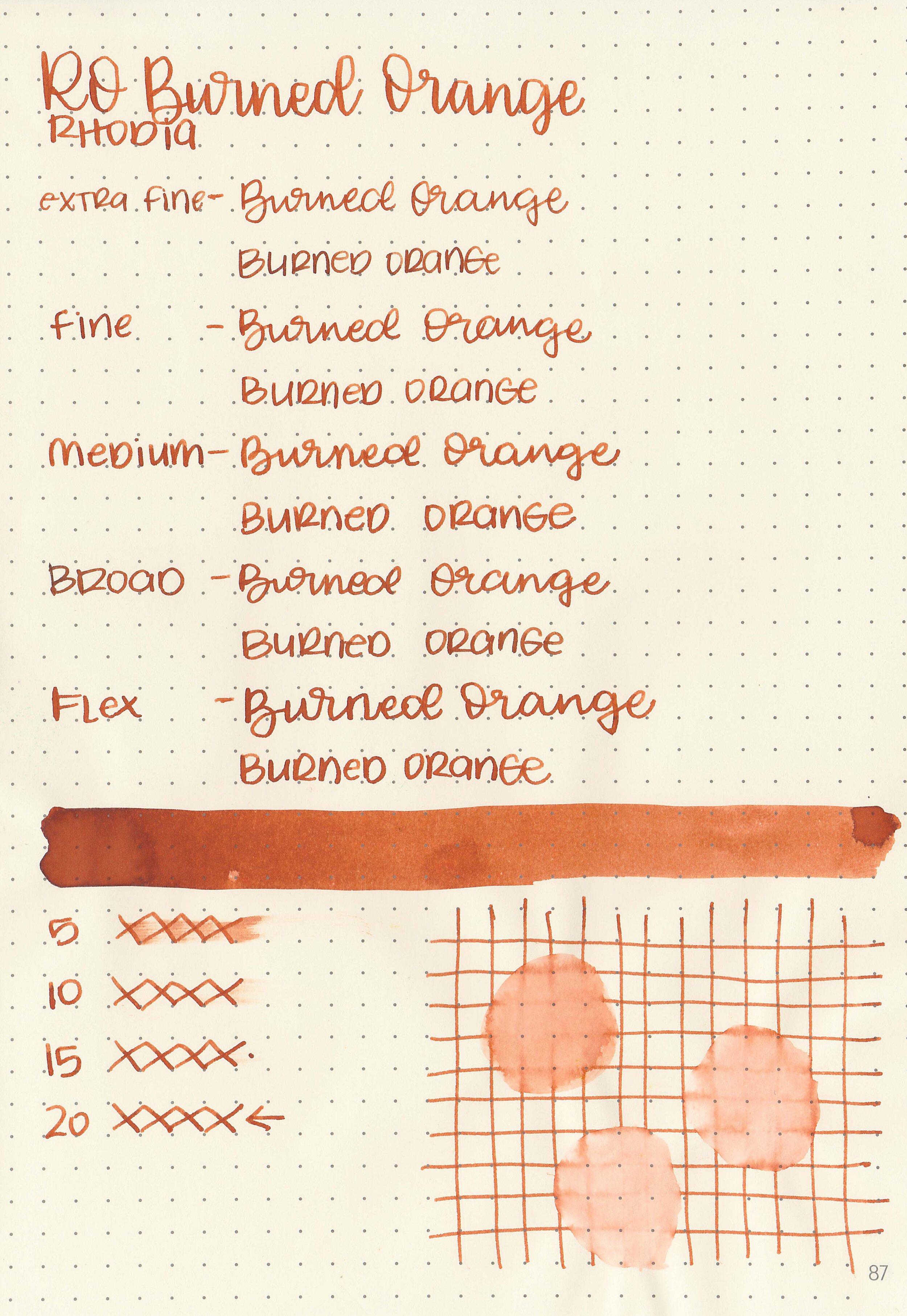
Swabs:

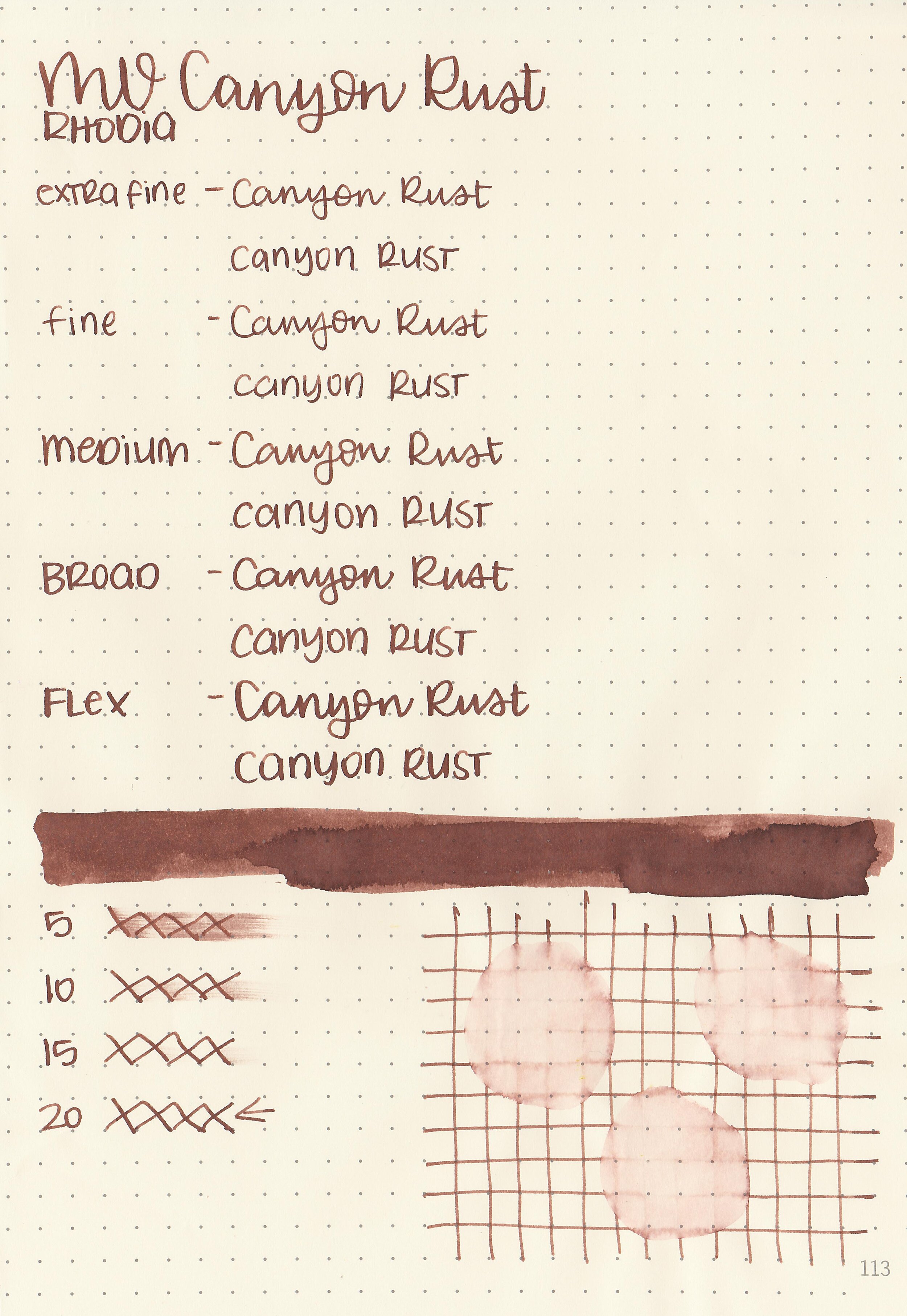
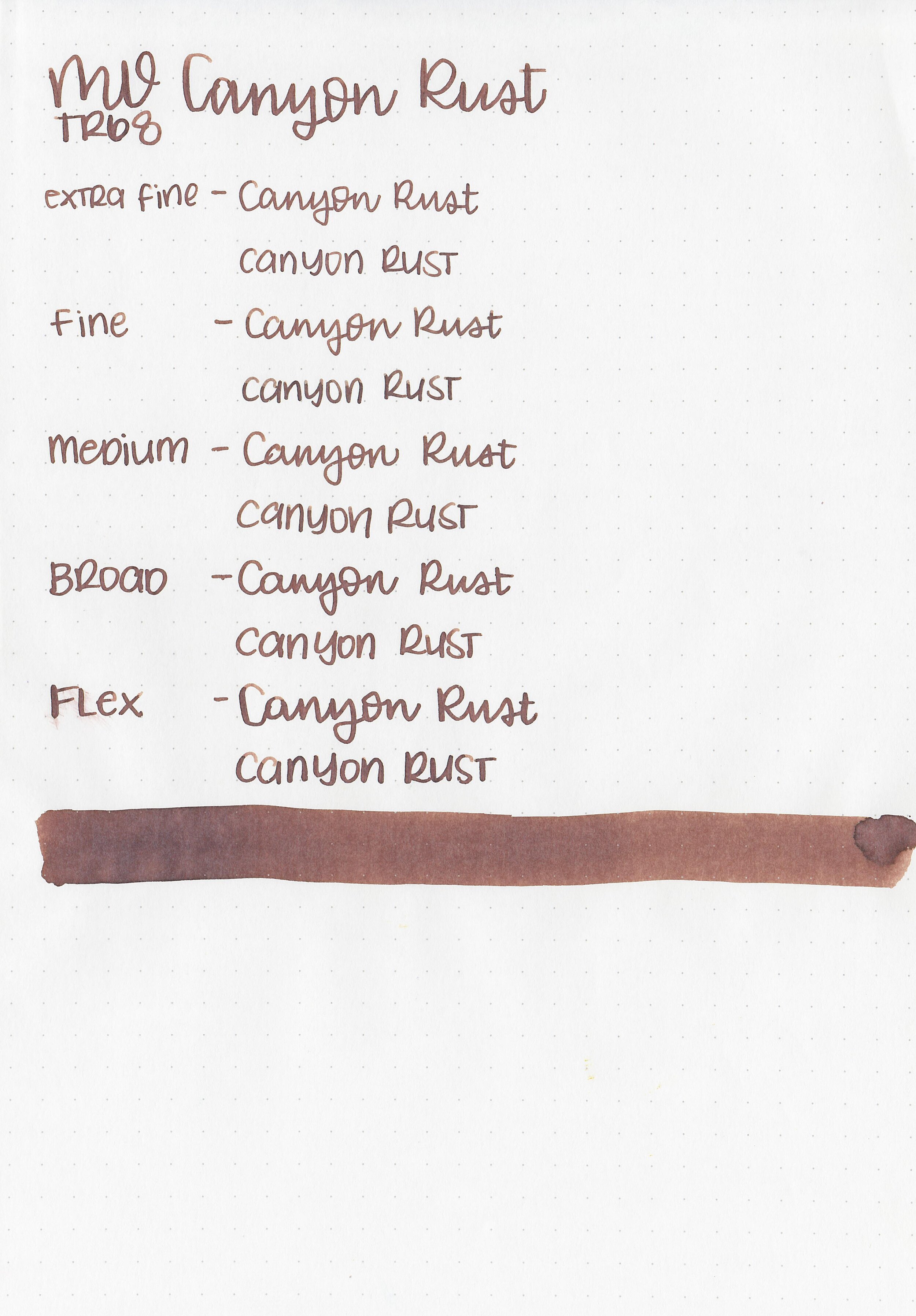
In large swabs on Tomoe River paper the ink has some shading and some black sheen.

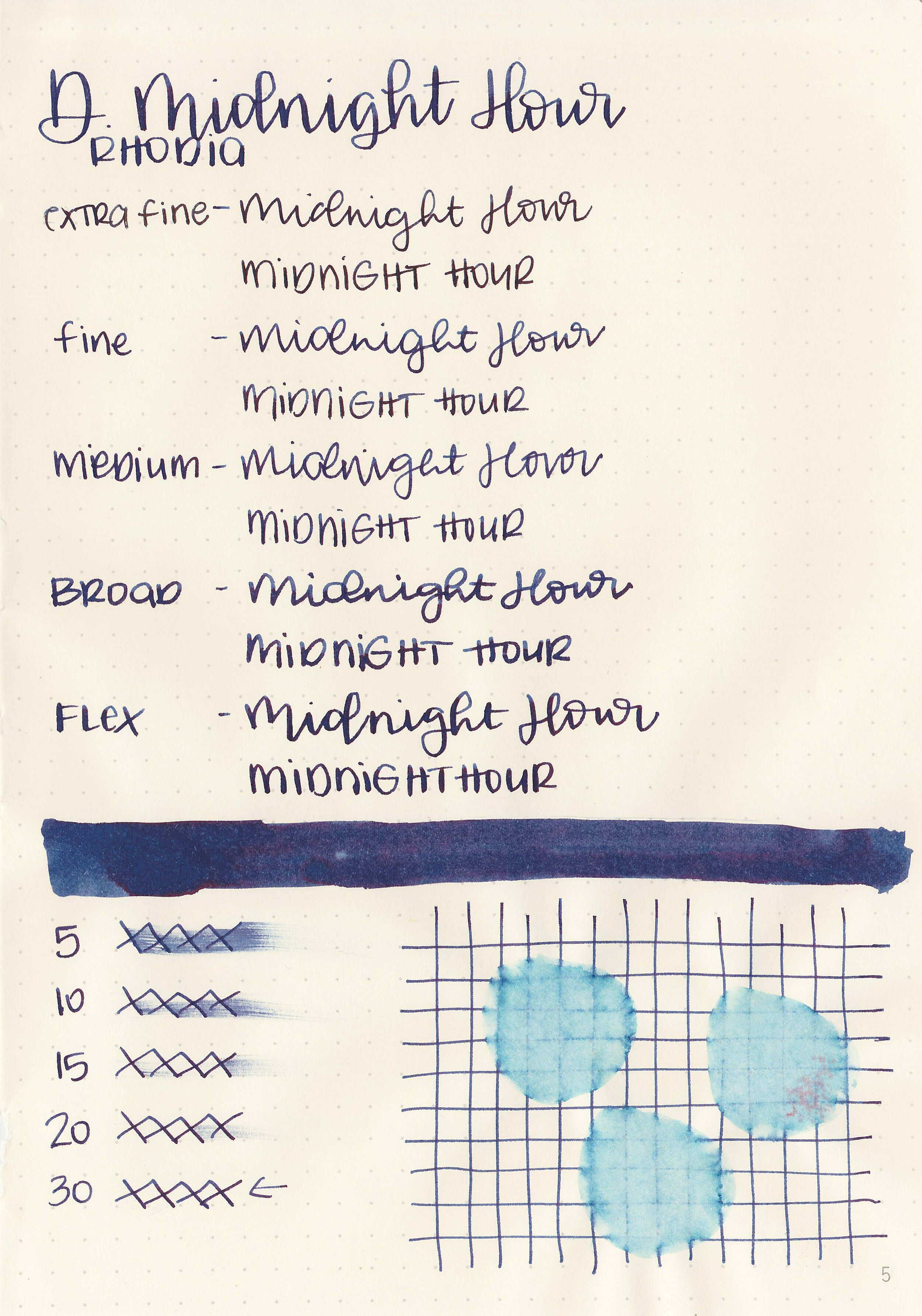
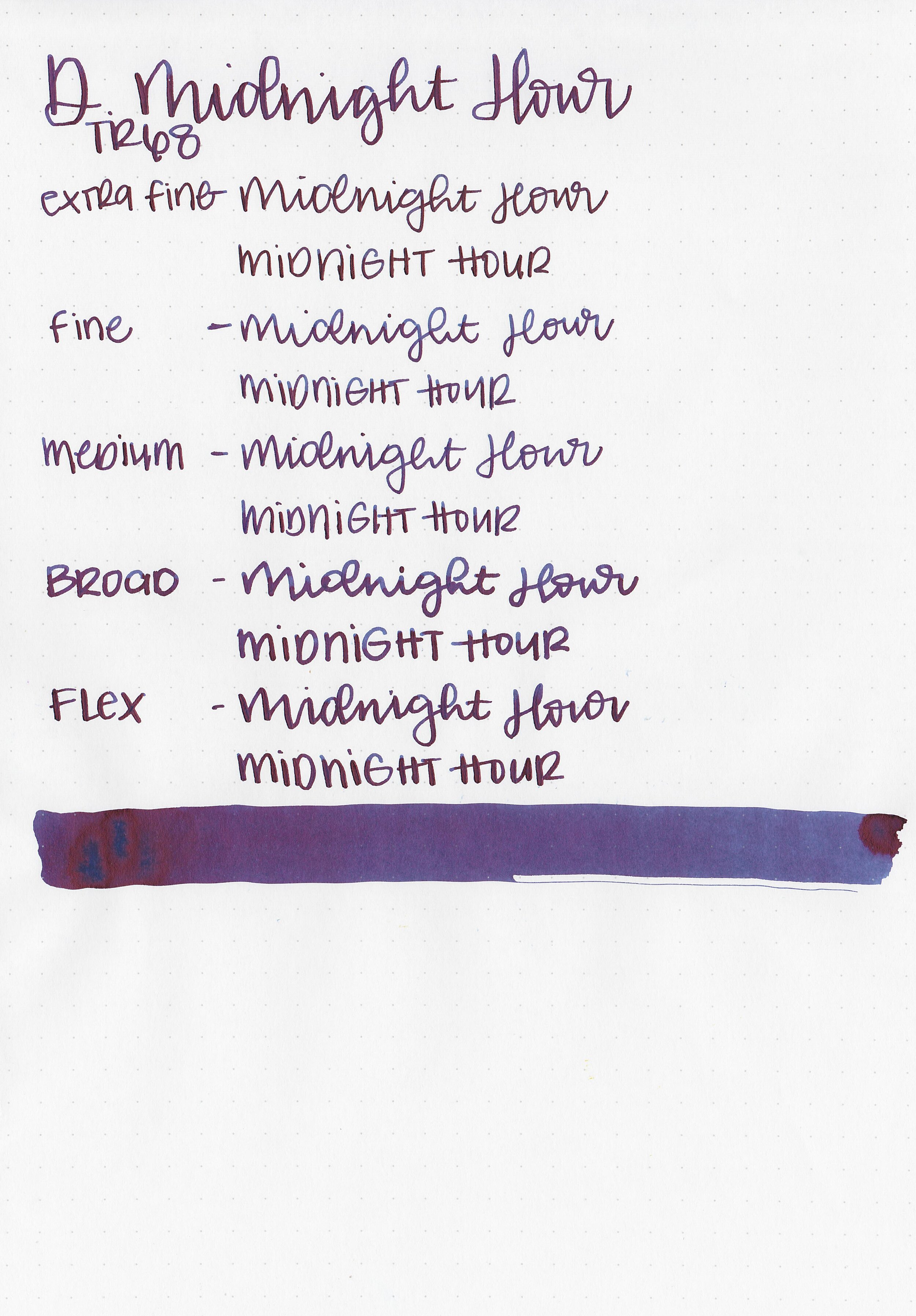
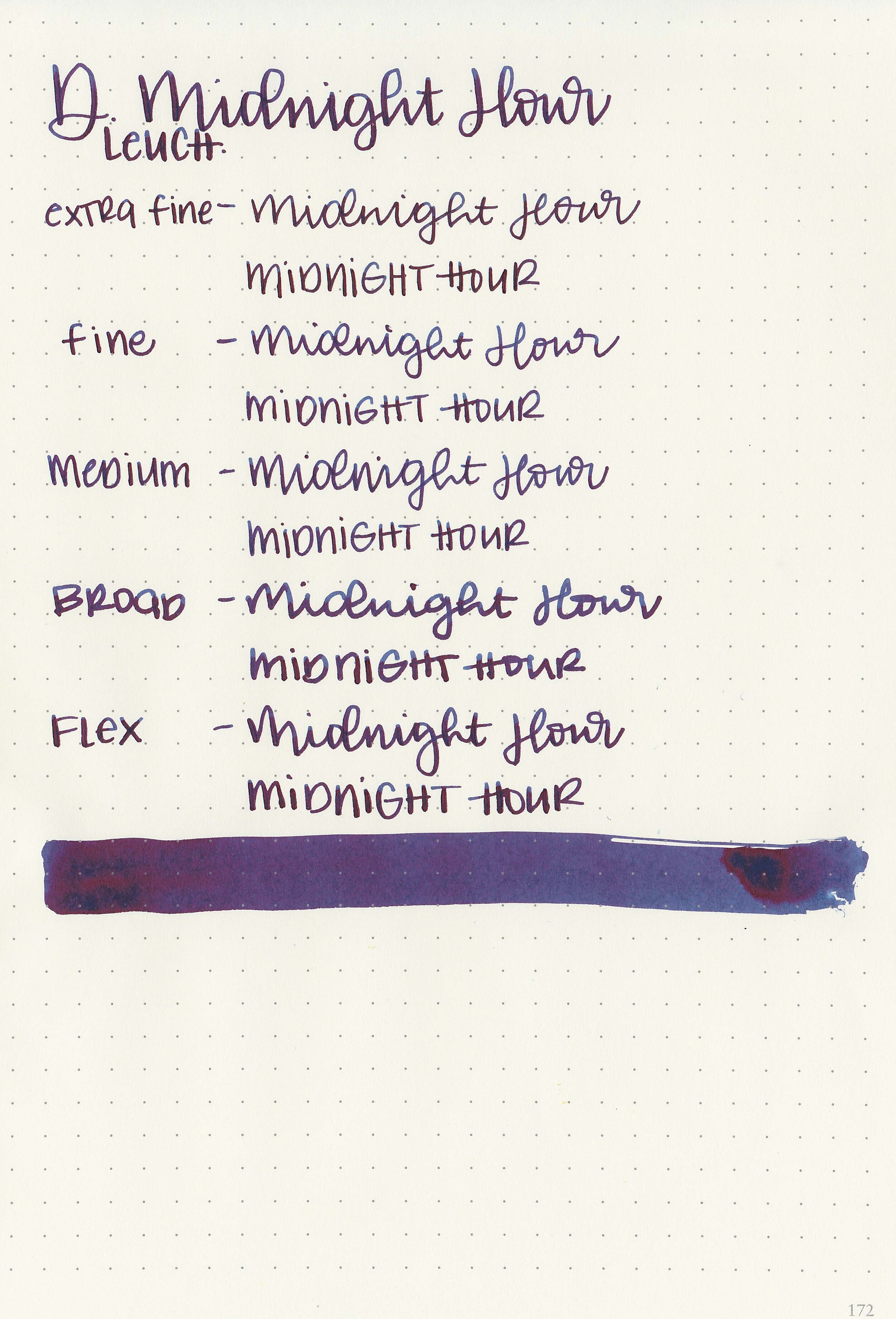
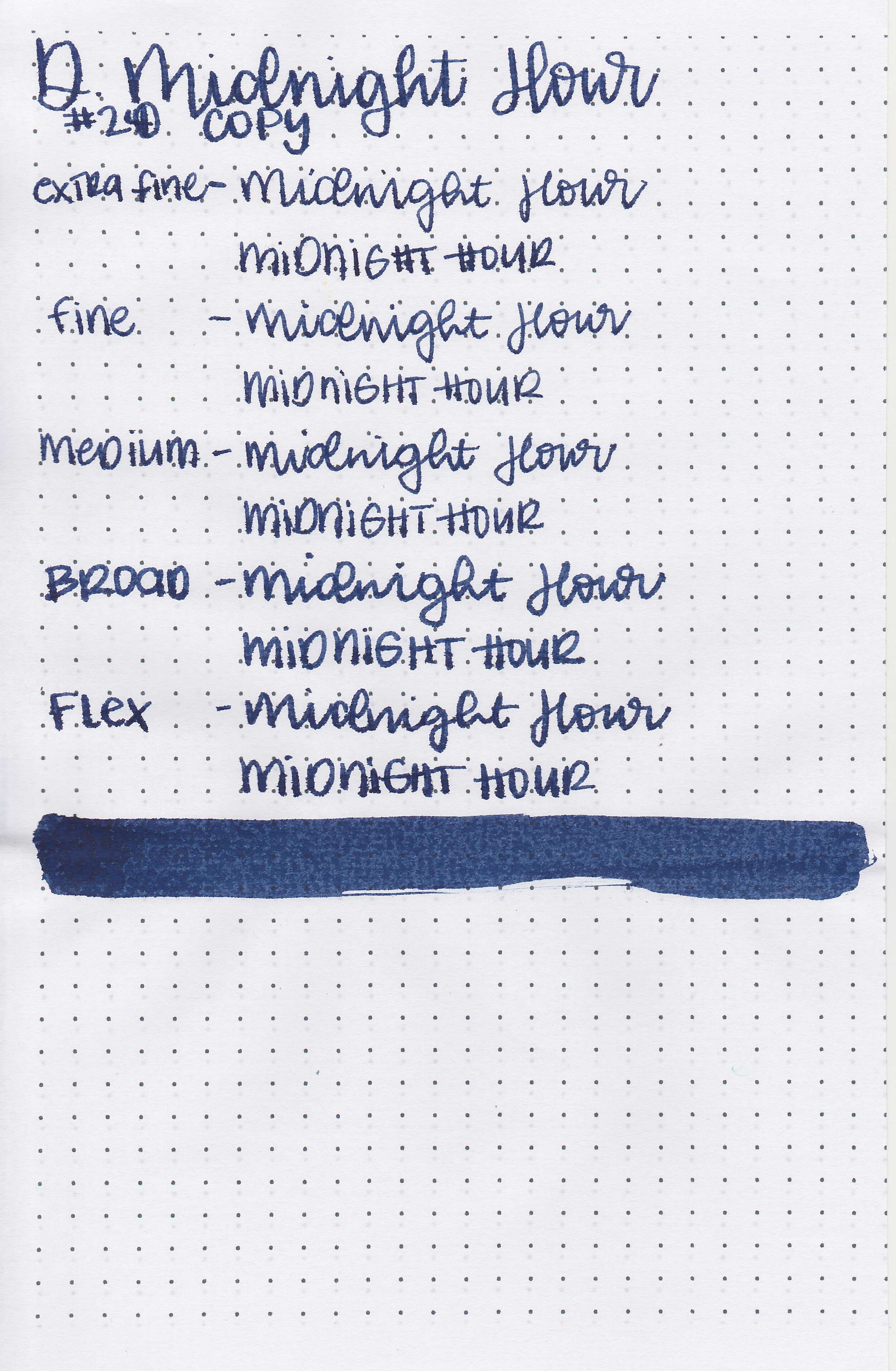
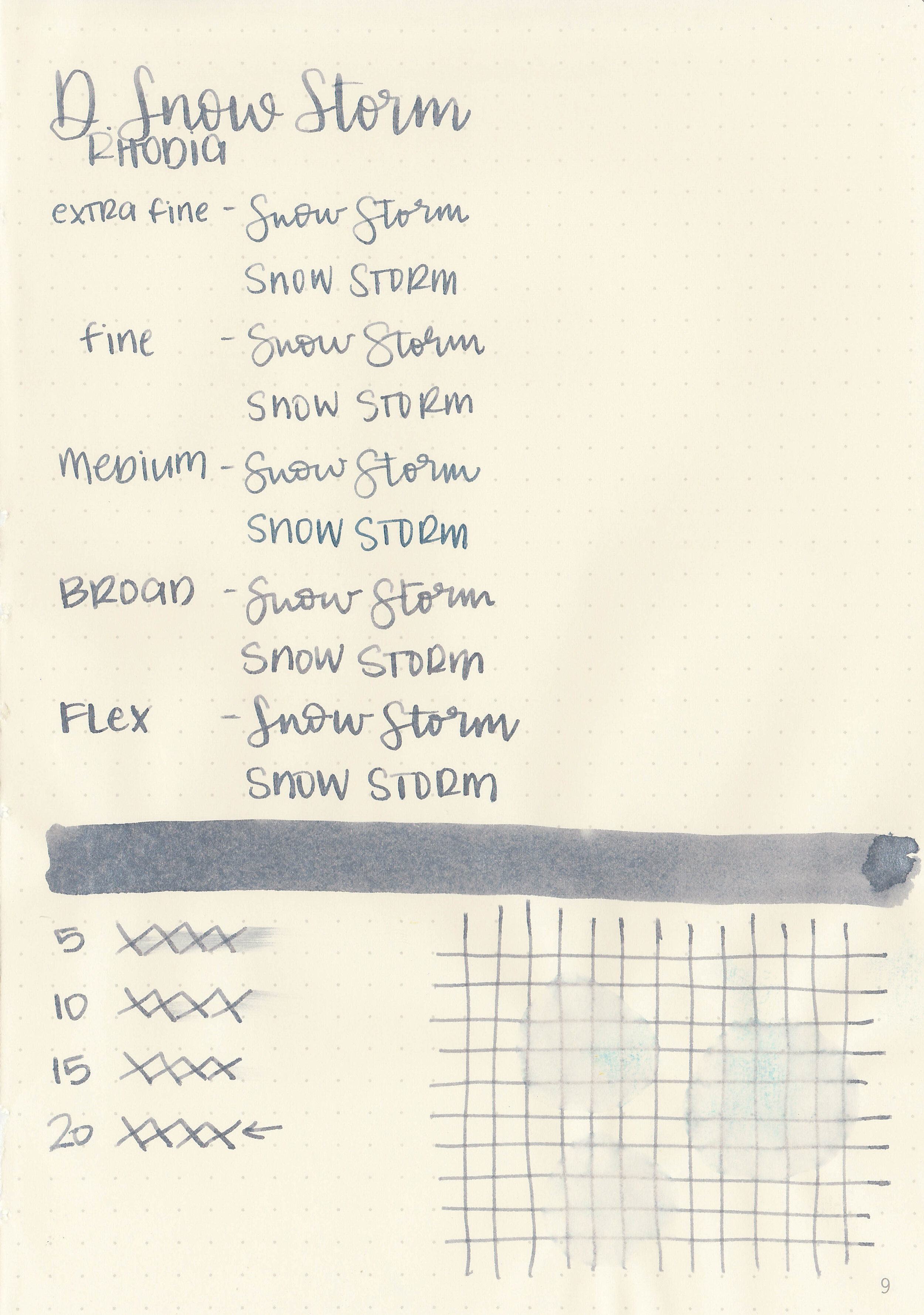
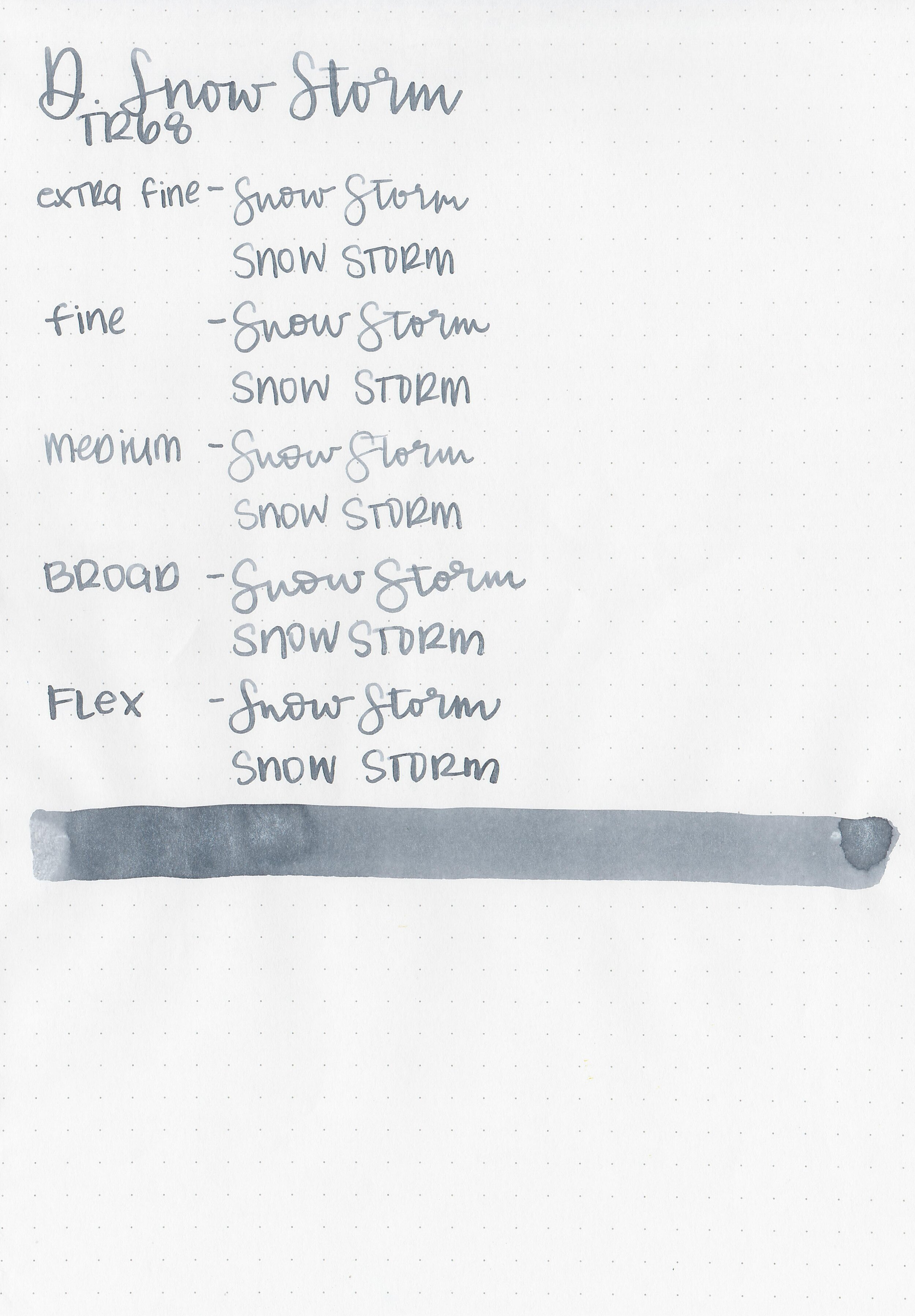
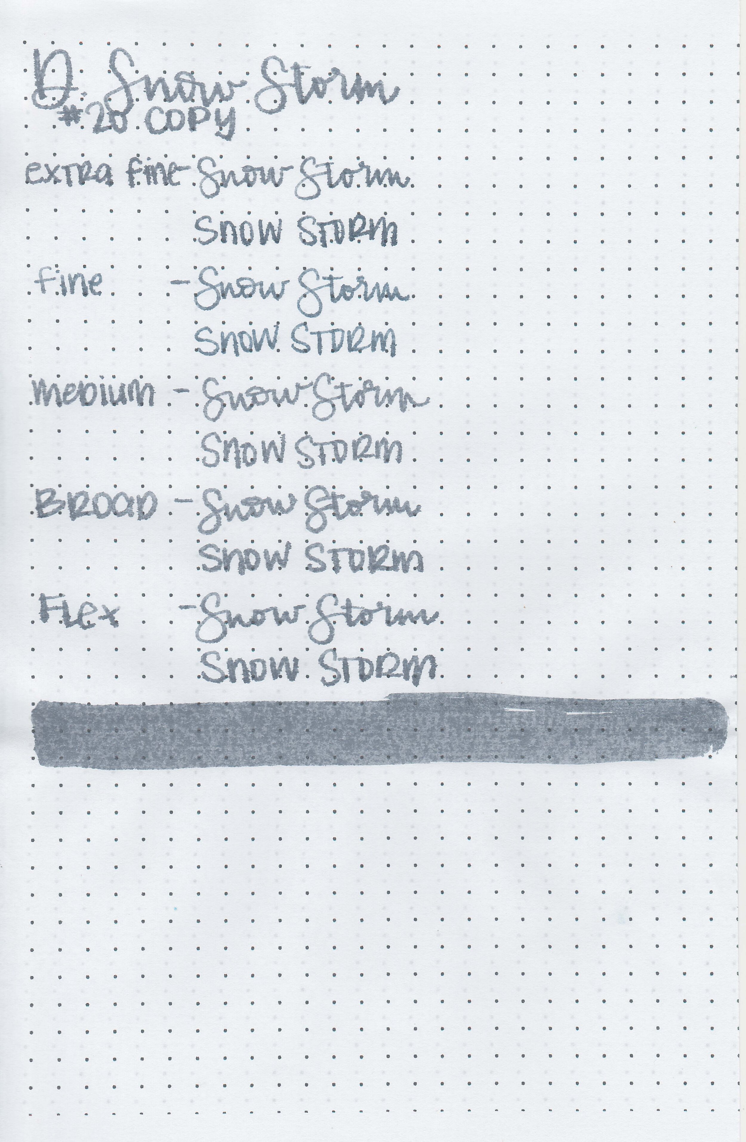
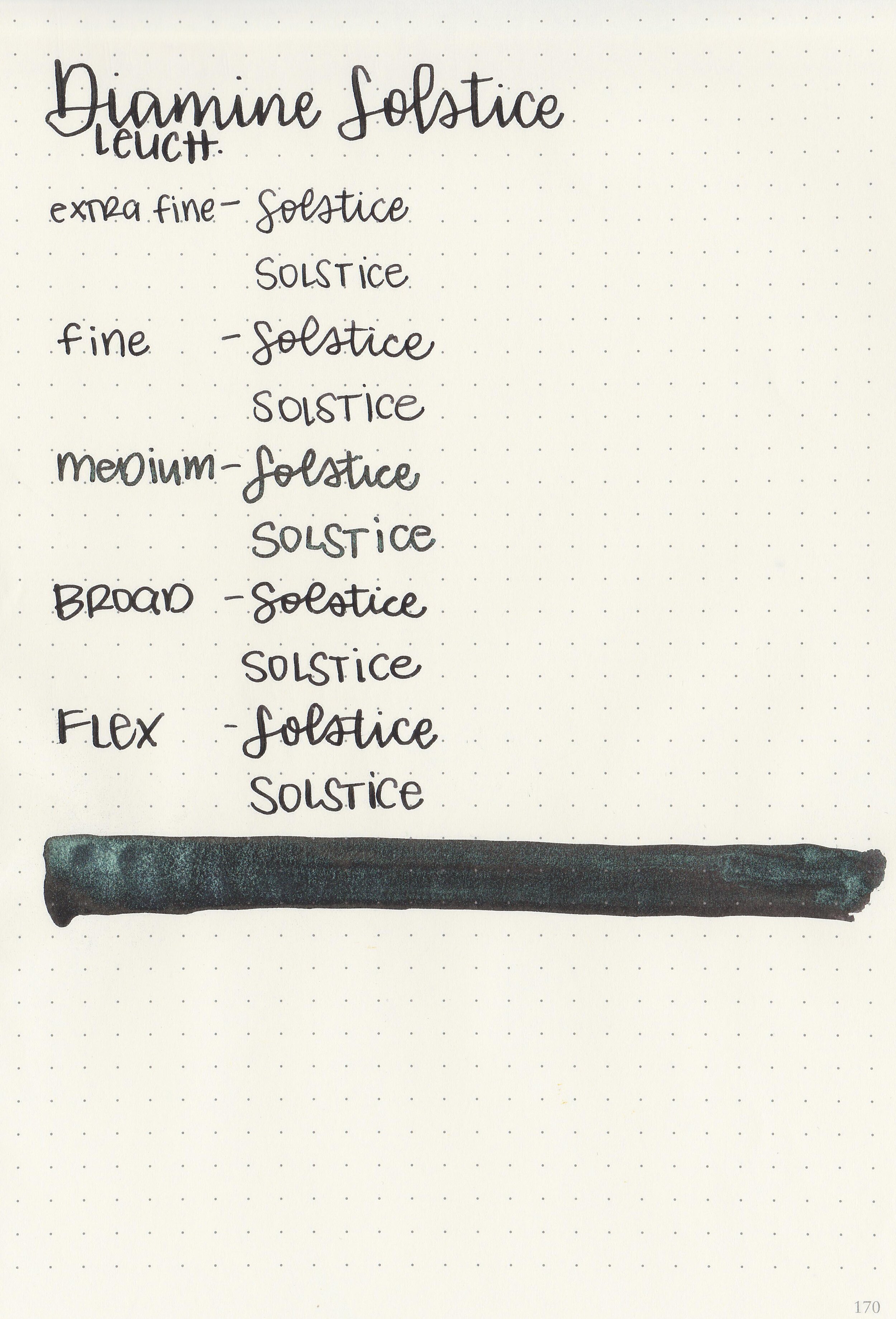
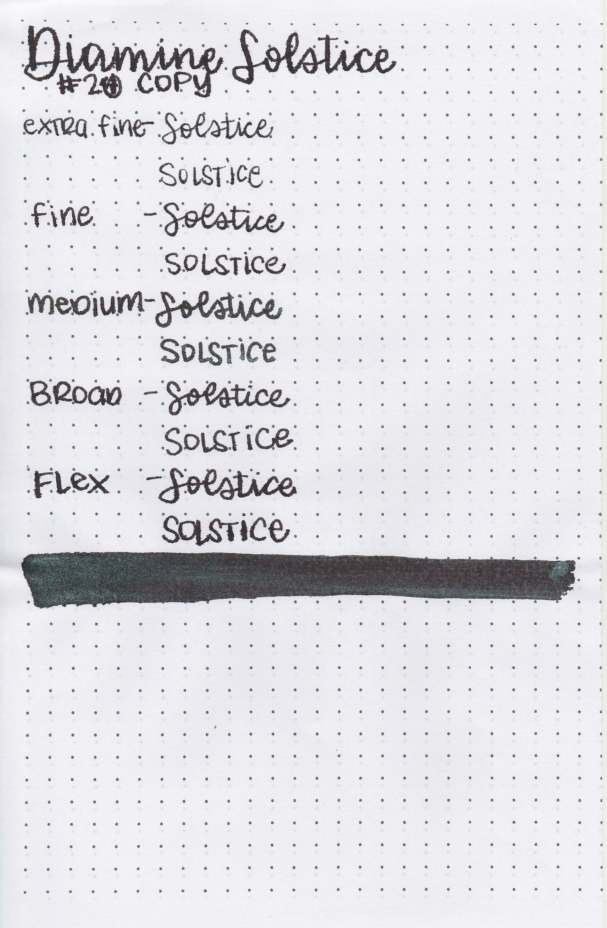
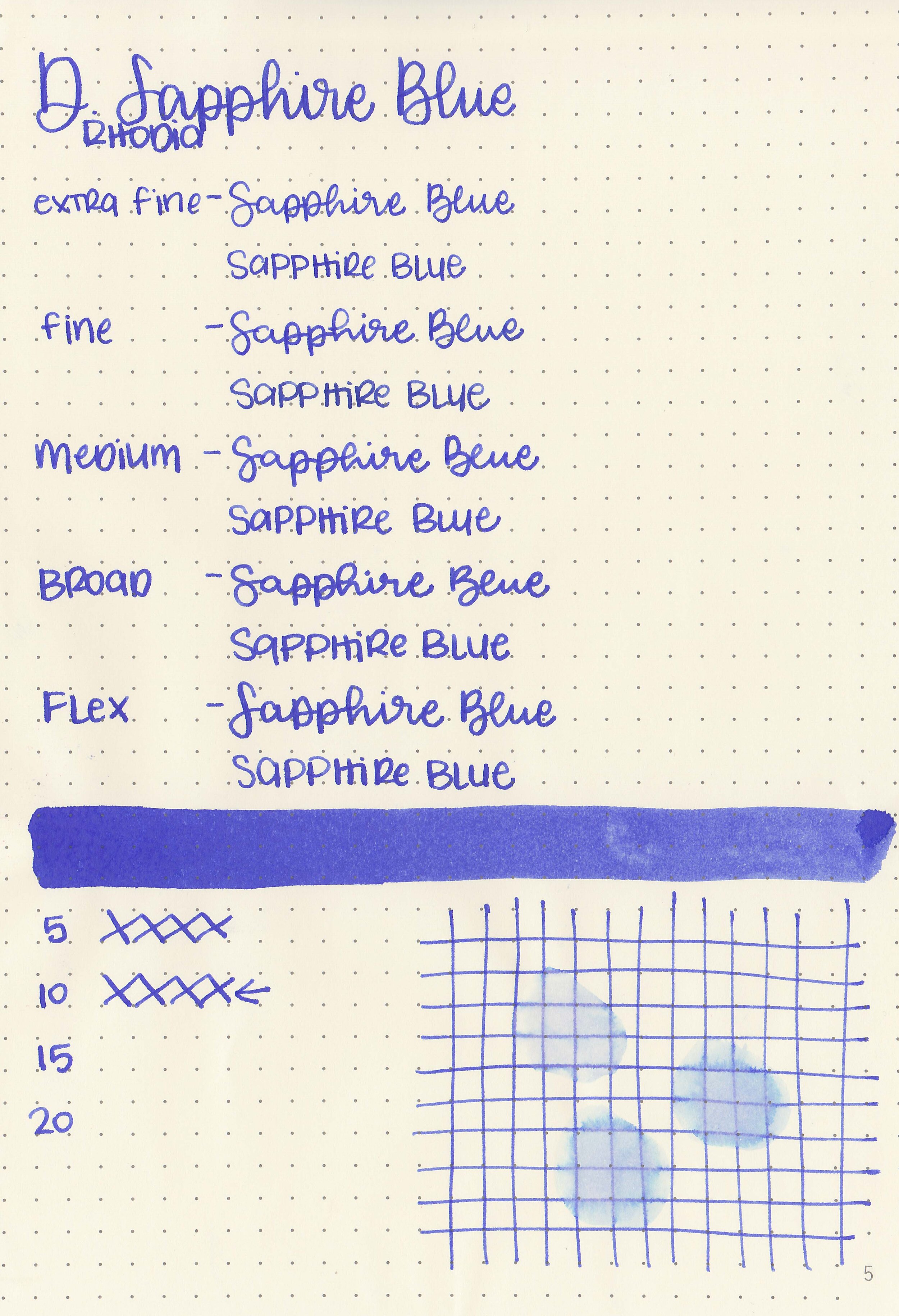
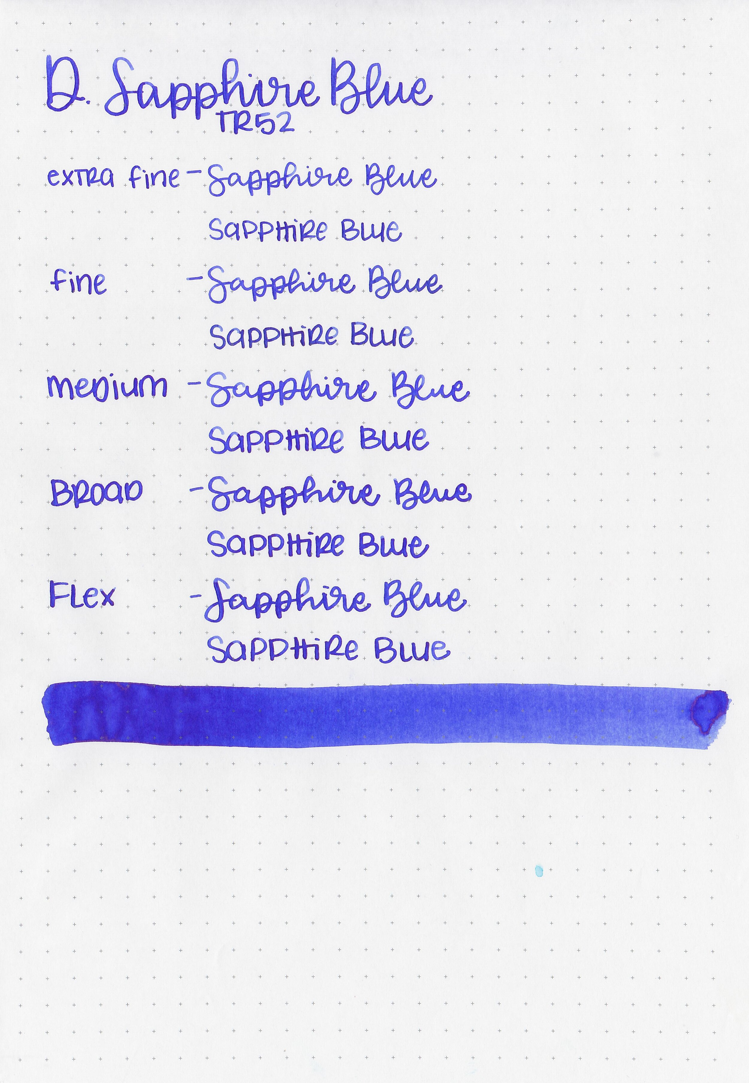
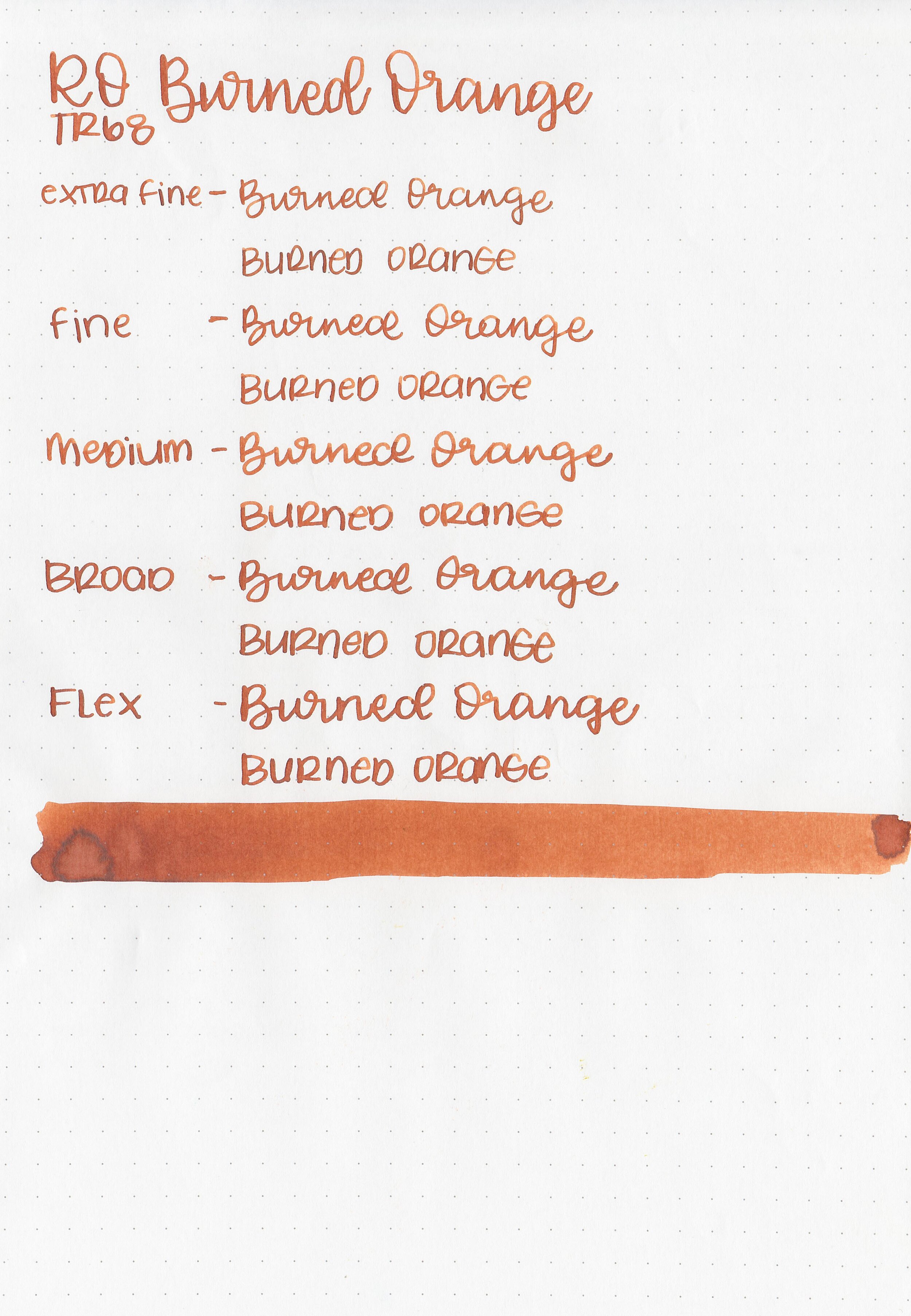
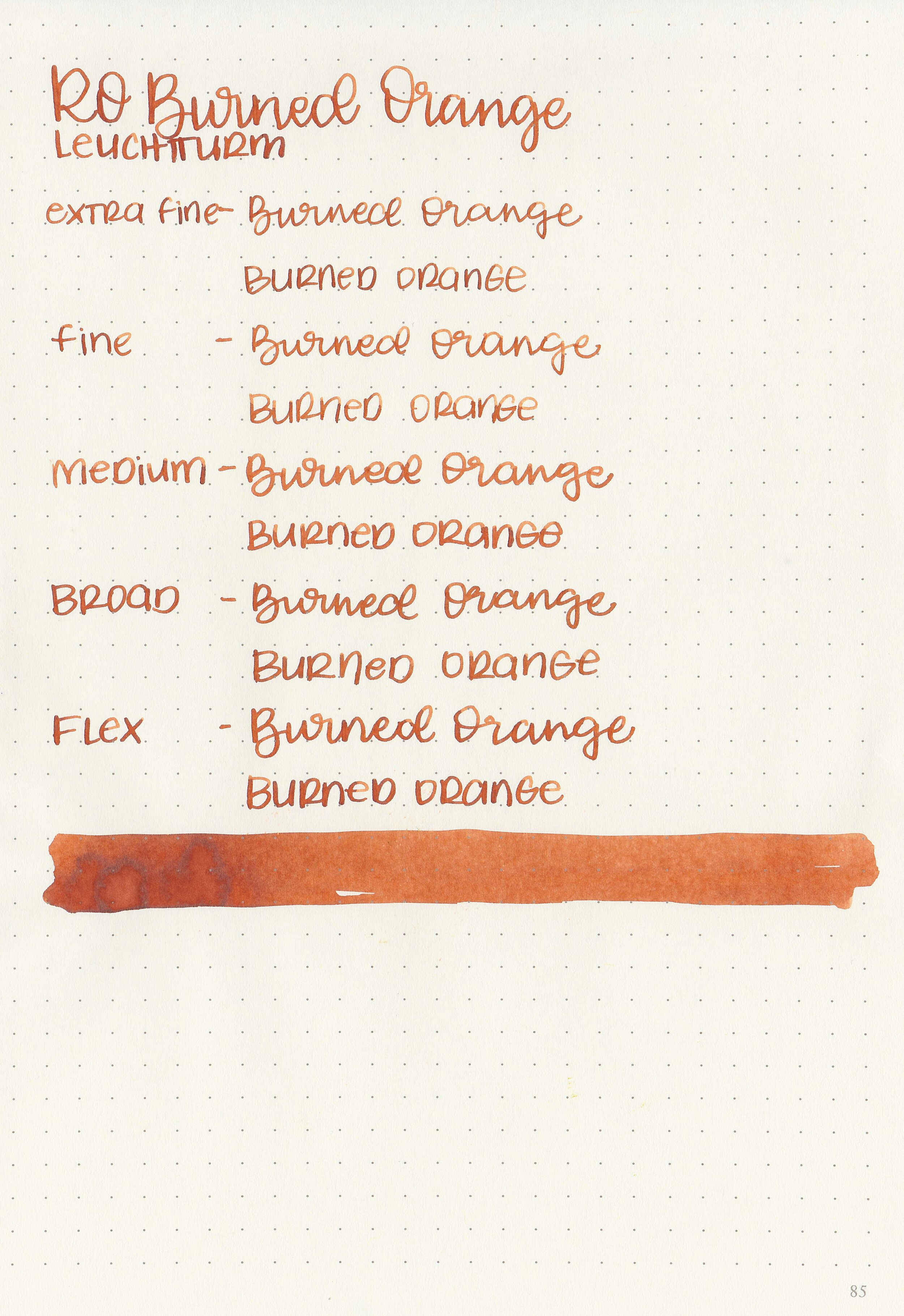
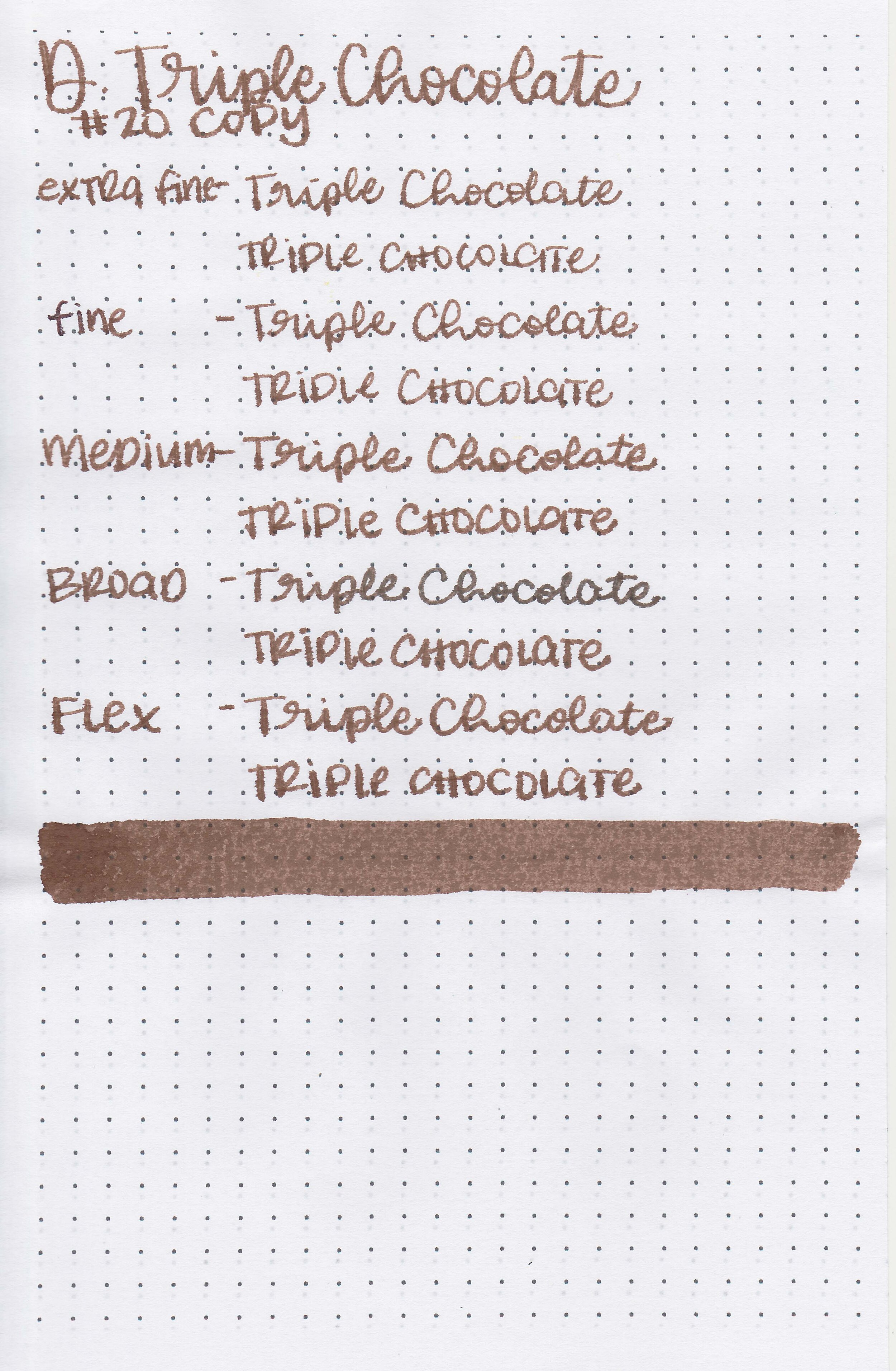
Writing samples:
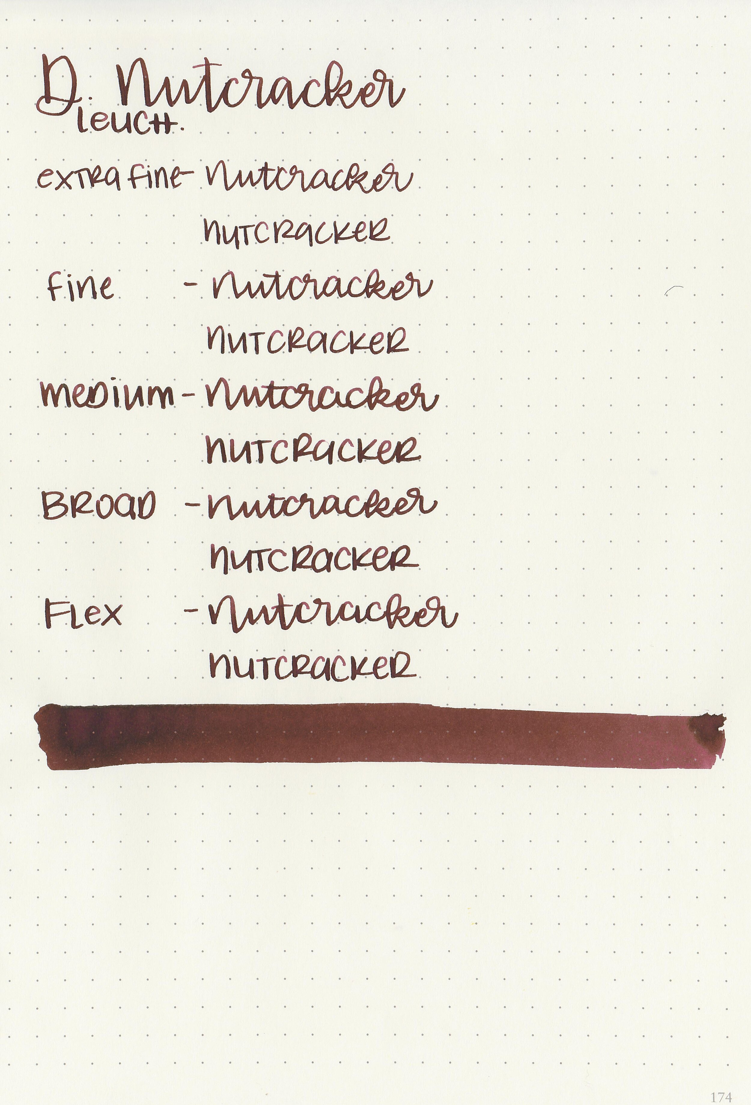
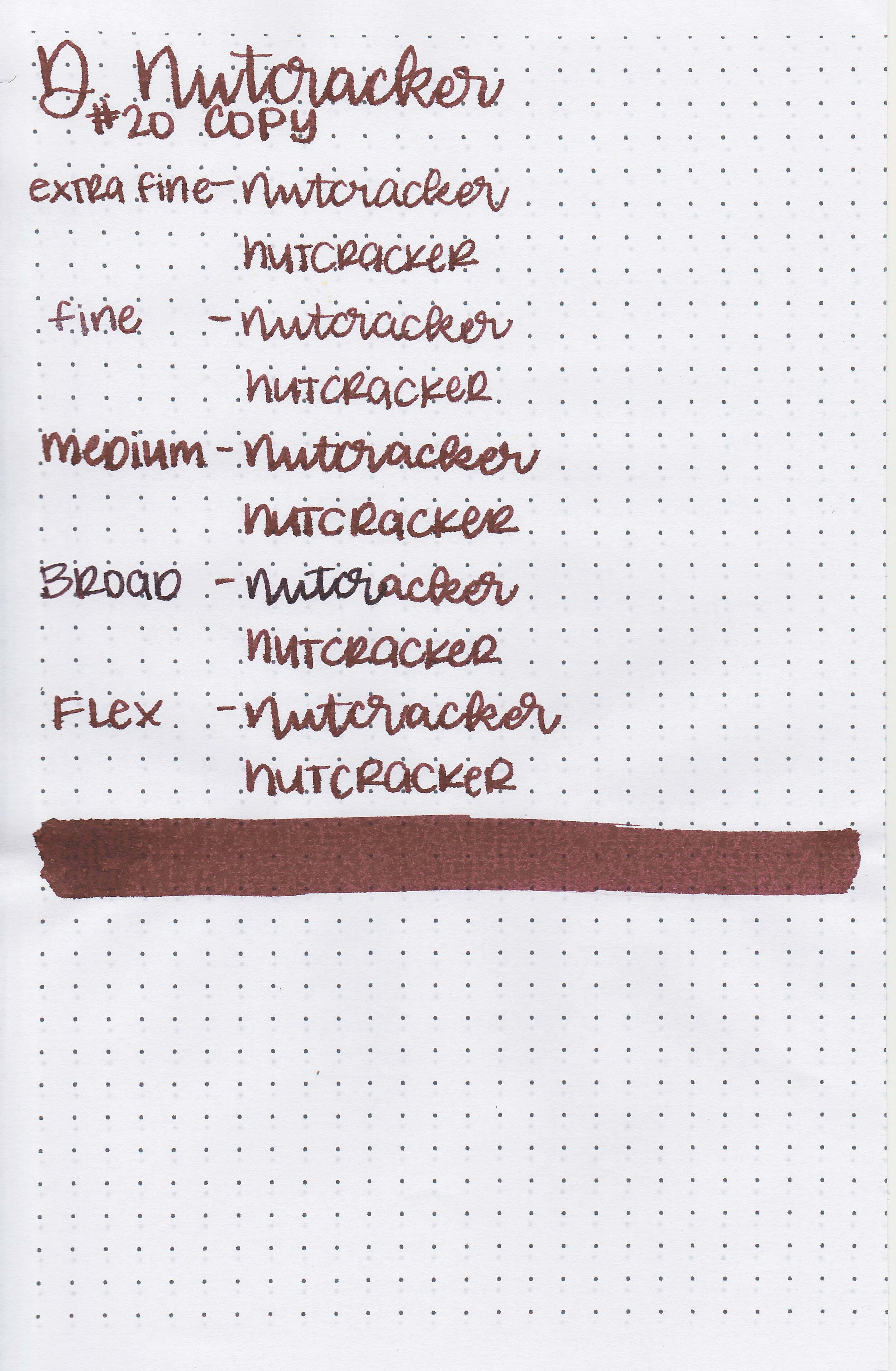
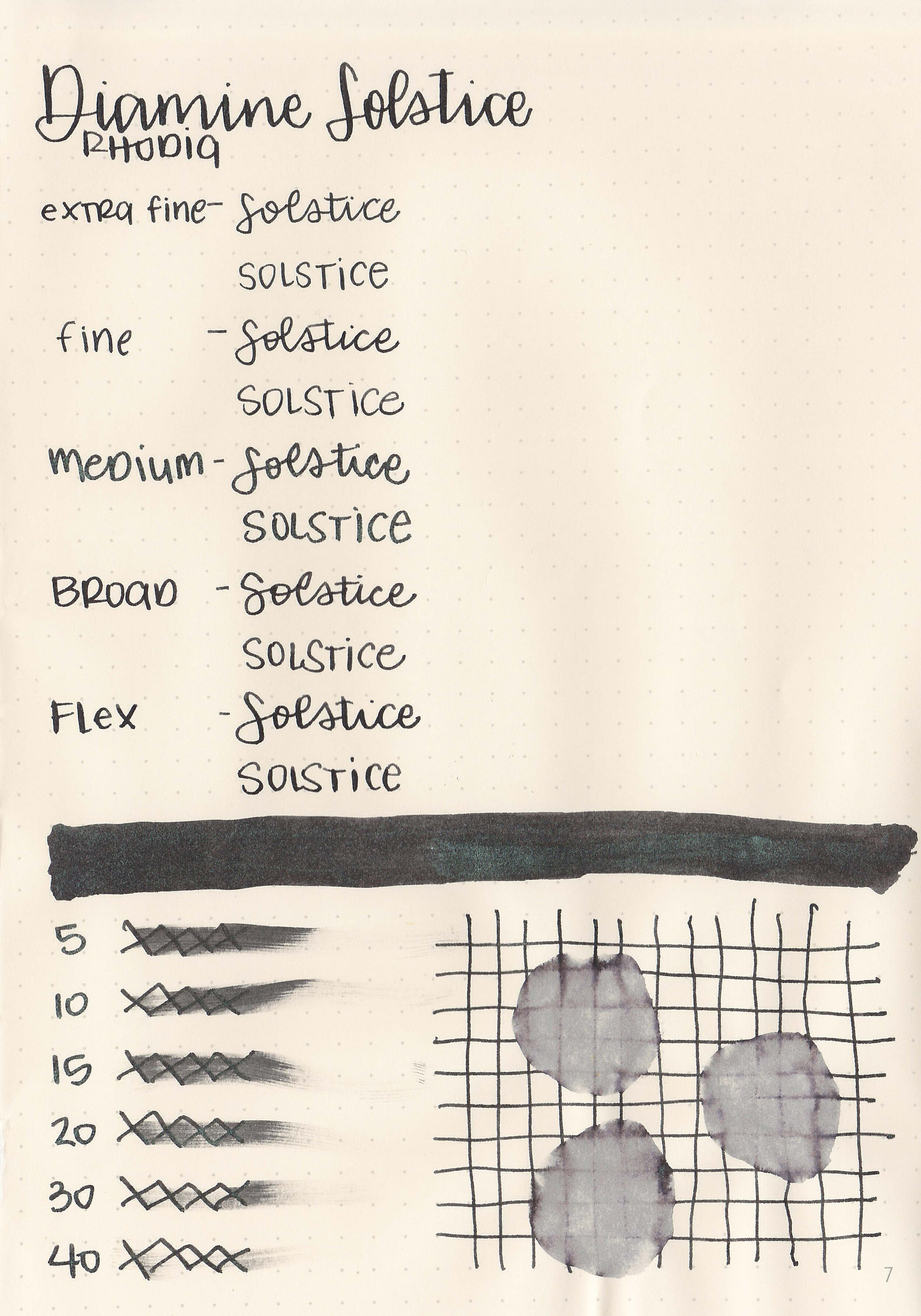
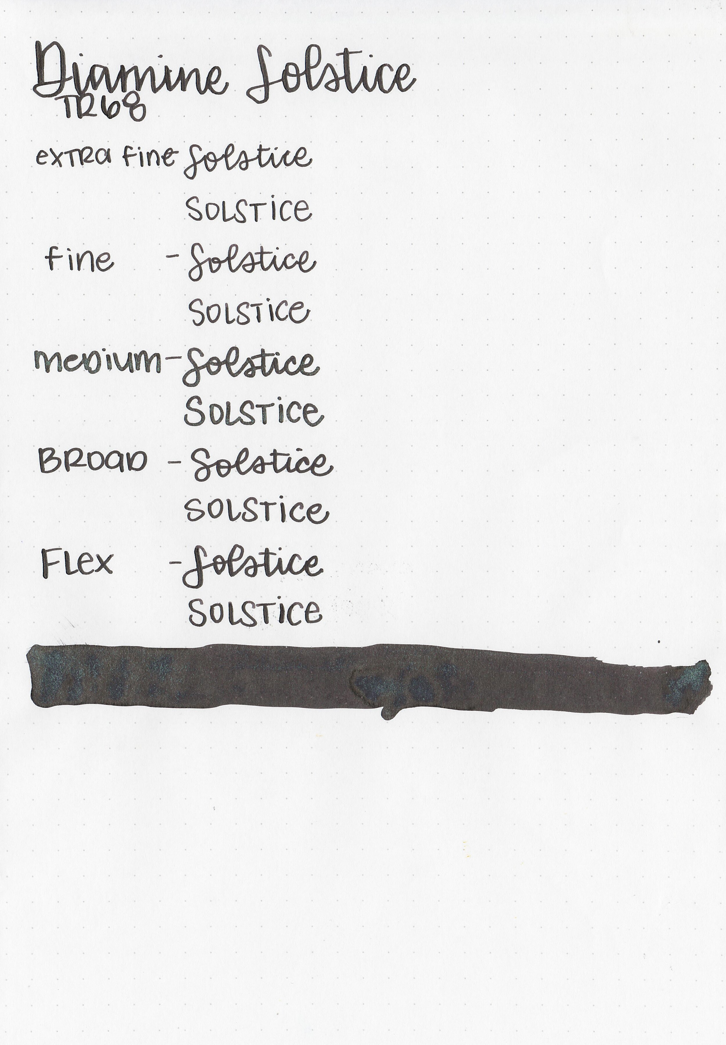
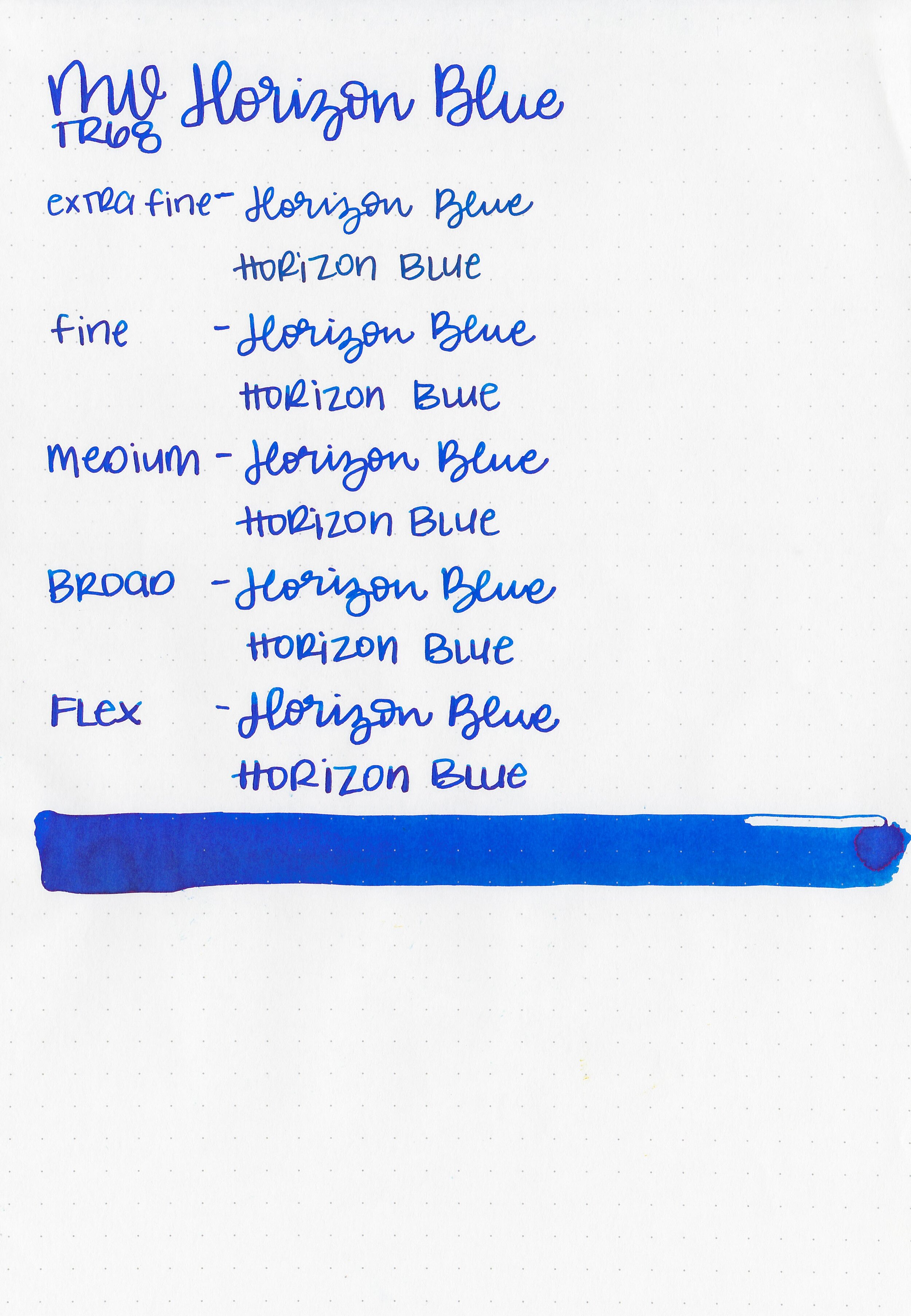
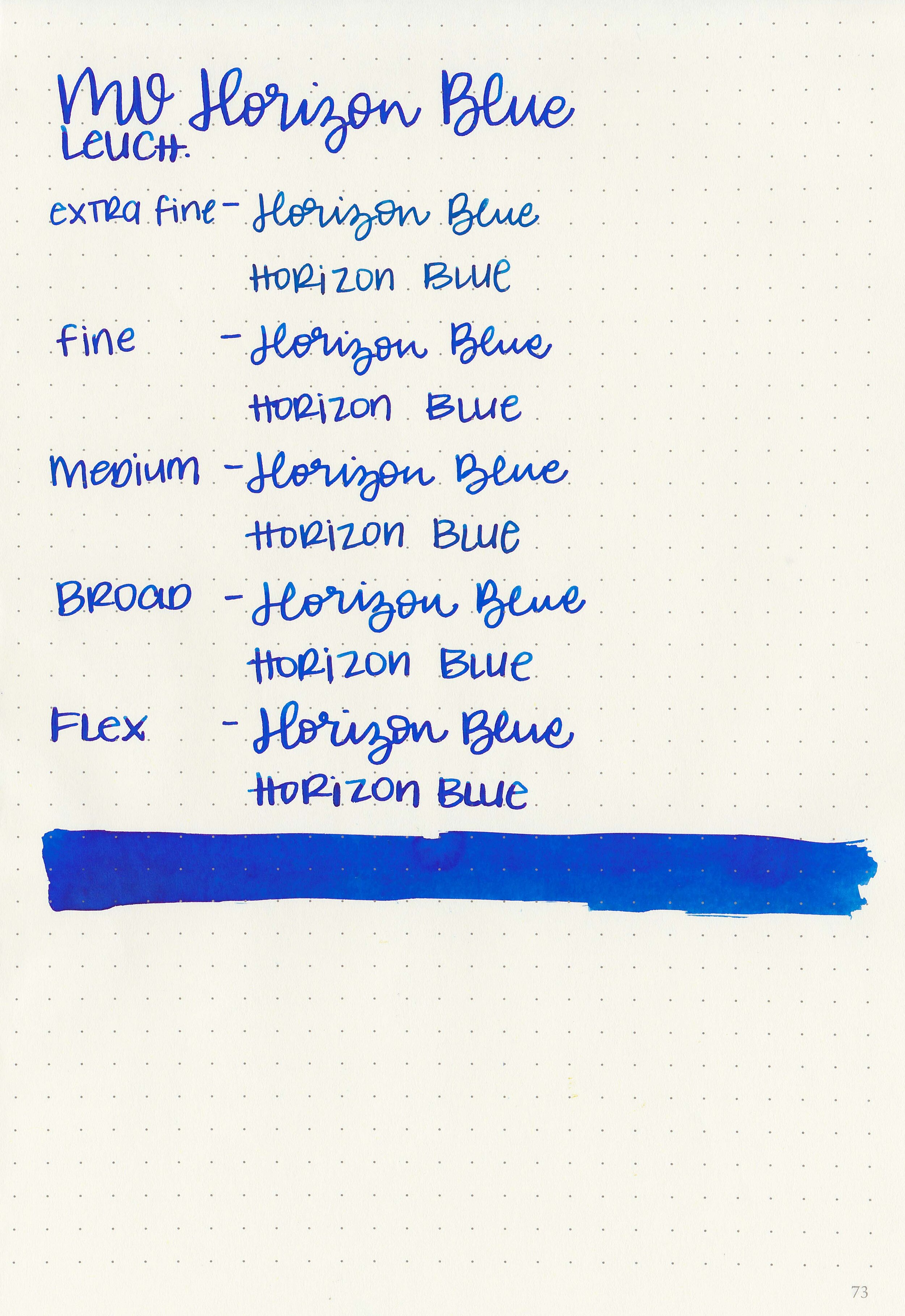
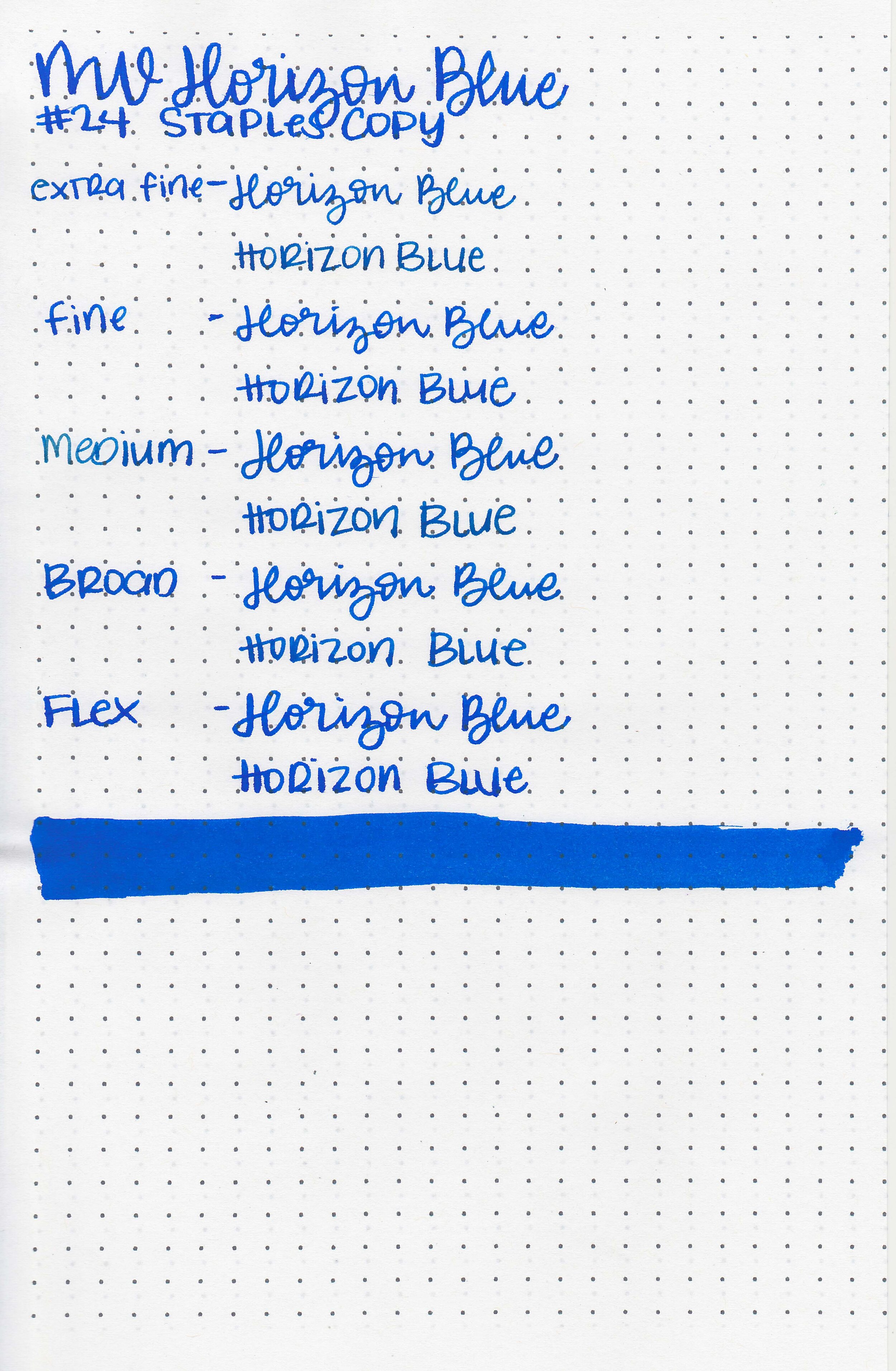
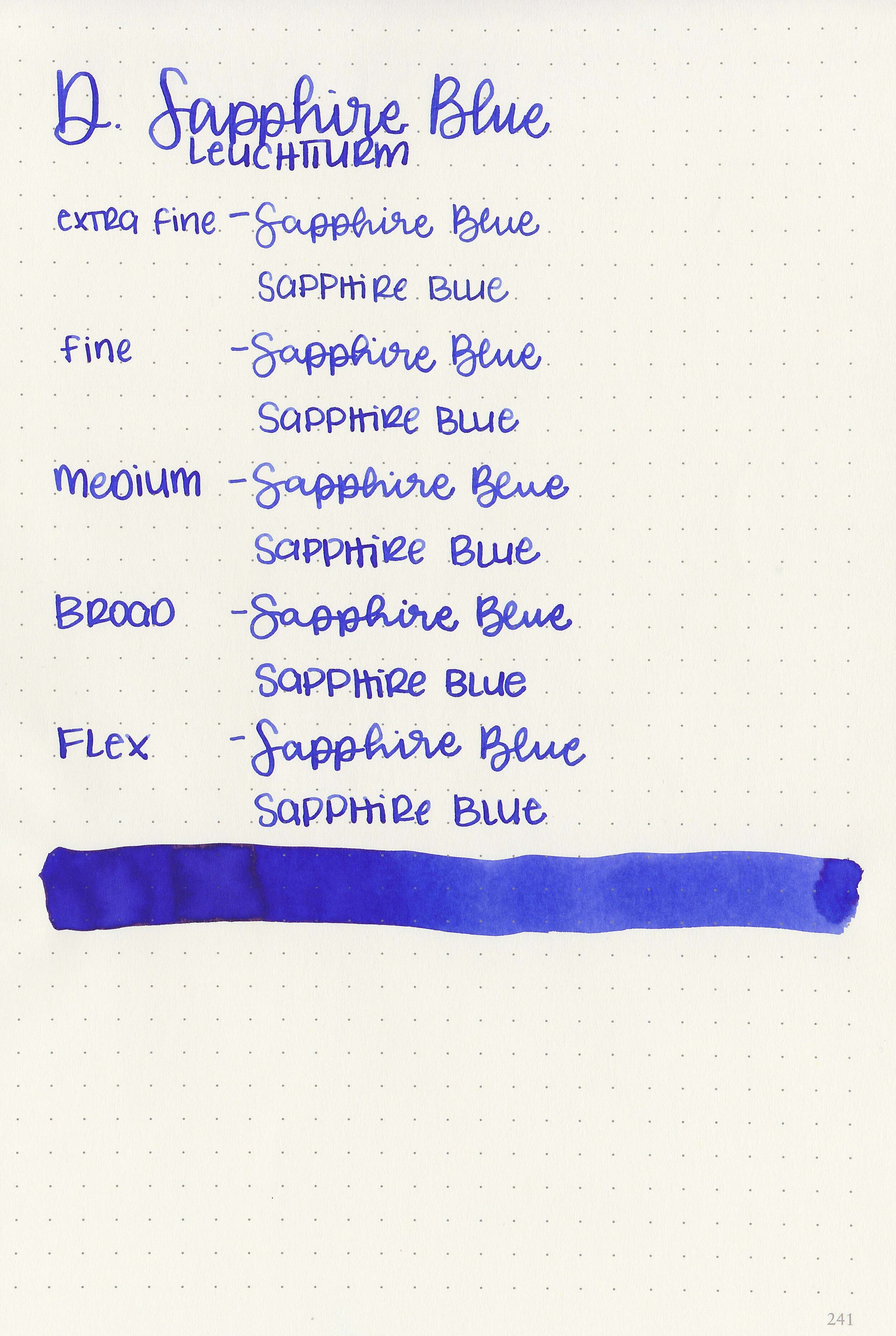
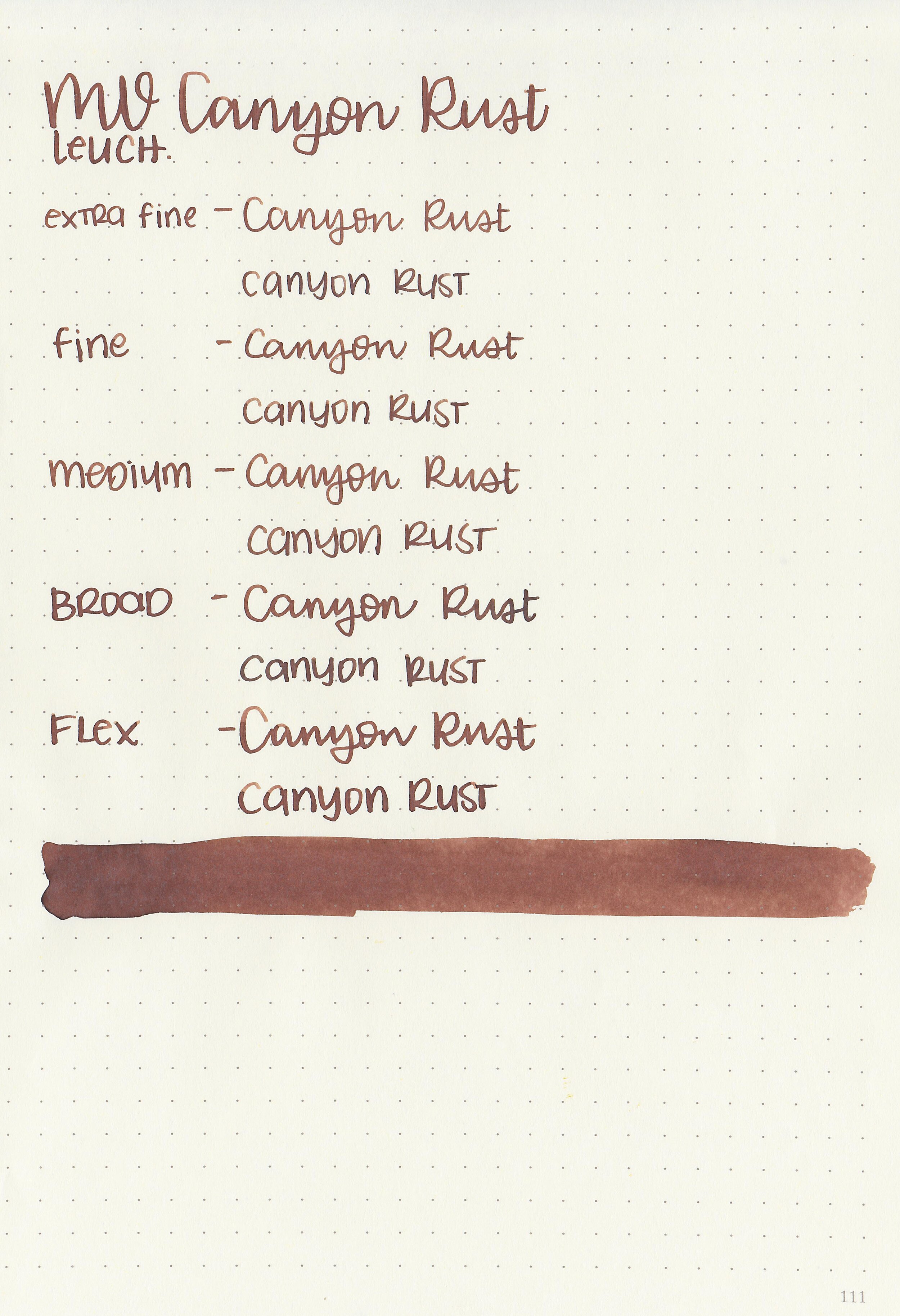
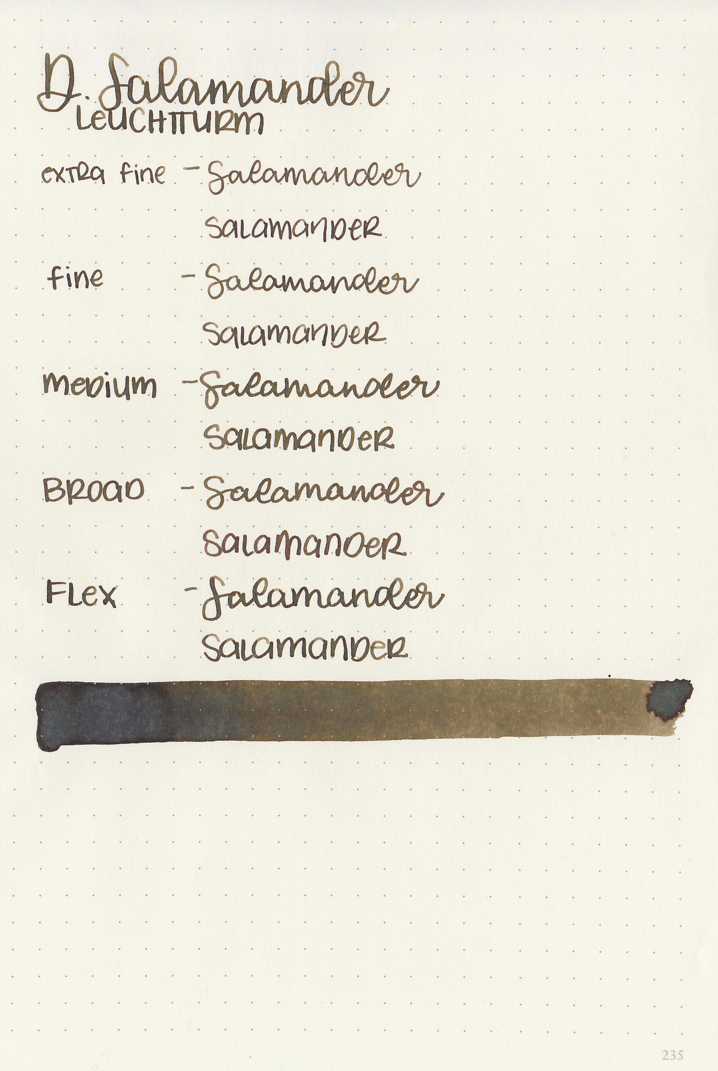
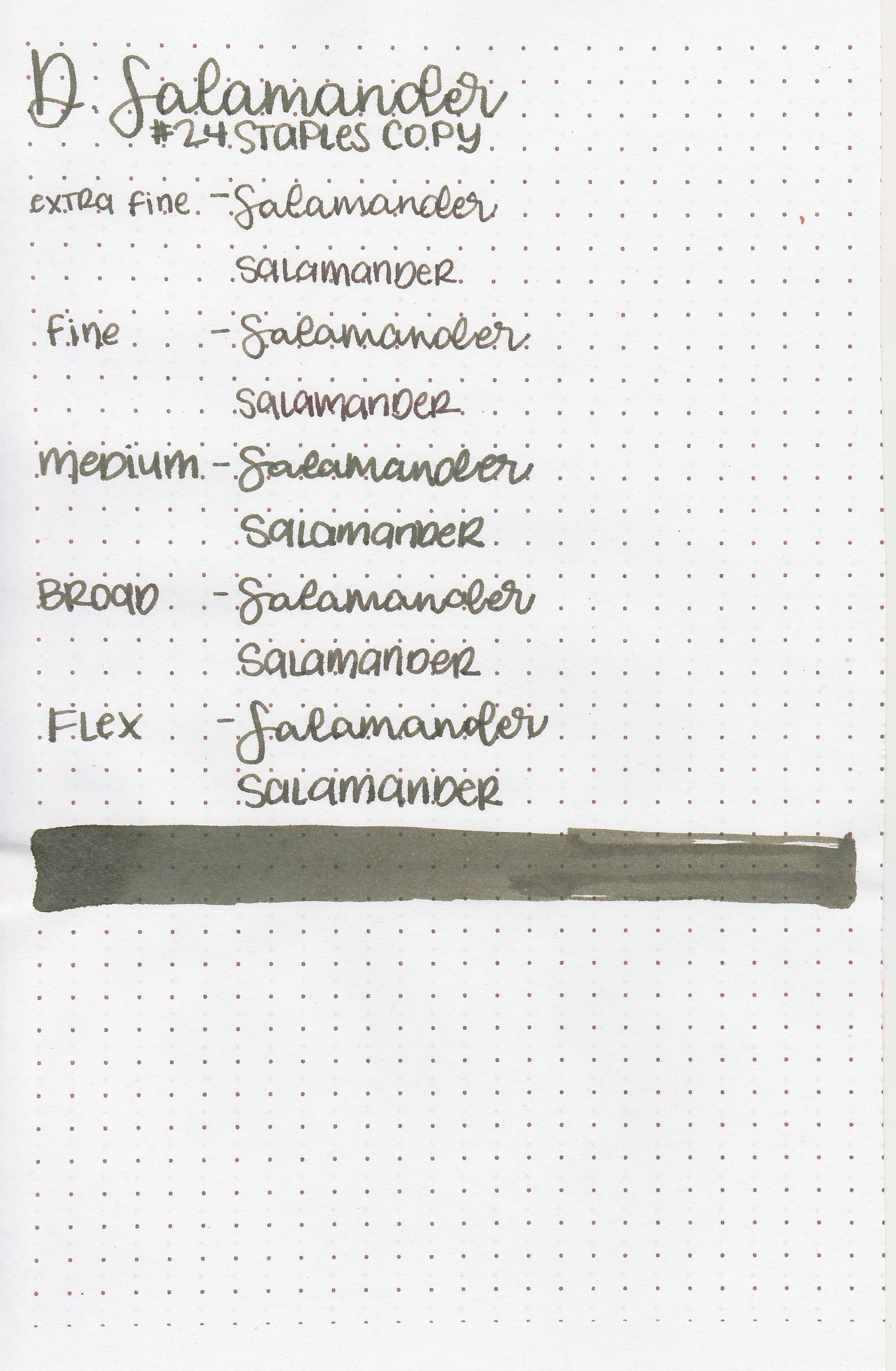
Let's take a look at how the ink behaves on fountain pen friendly papers: Rhodia, Tomoe River, and Leuchtturm.
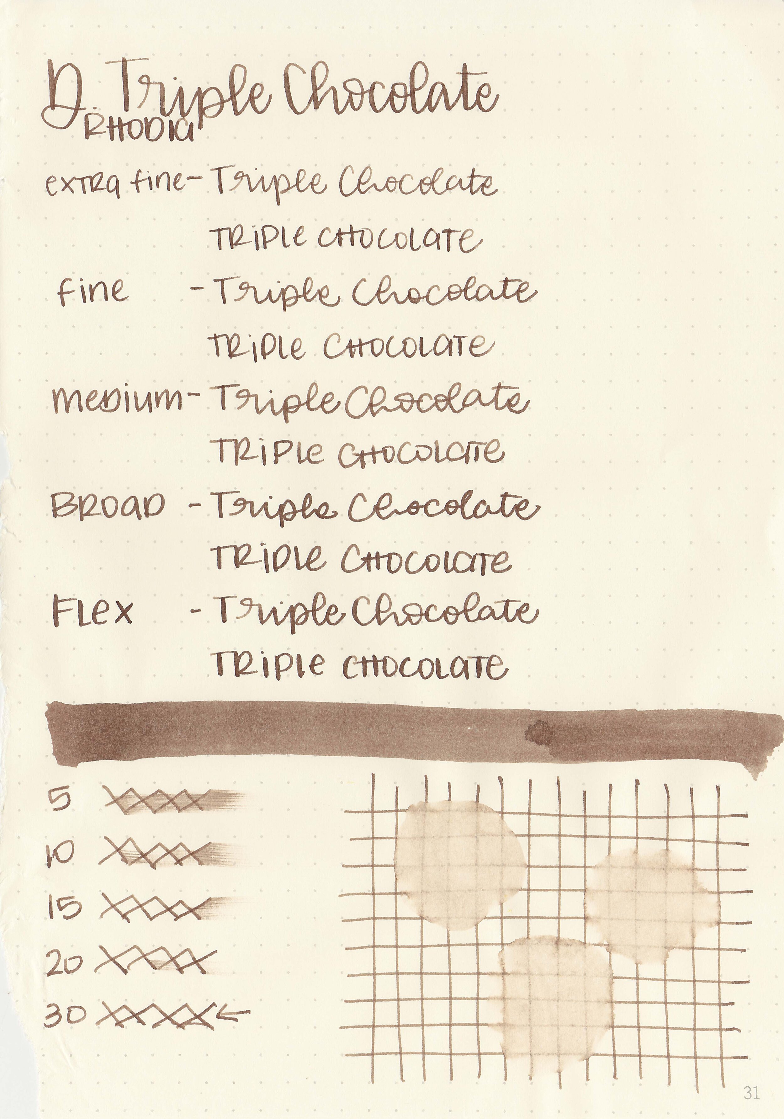
Dry time: 30 seconds
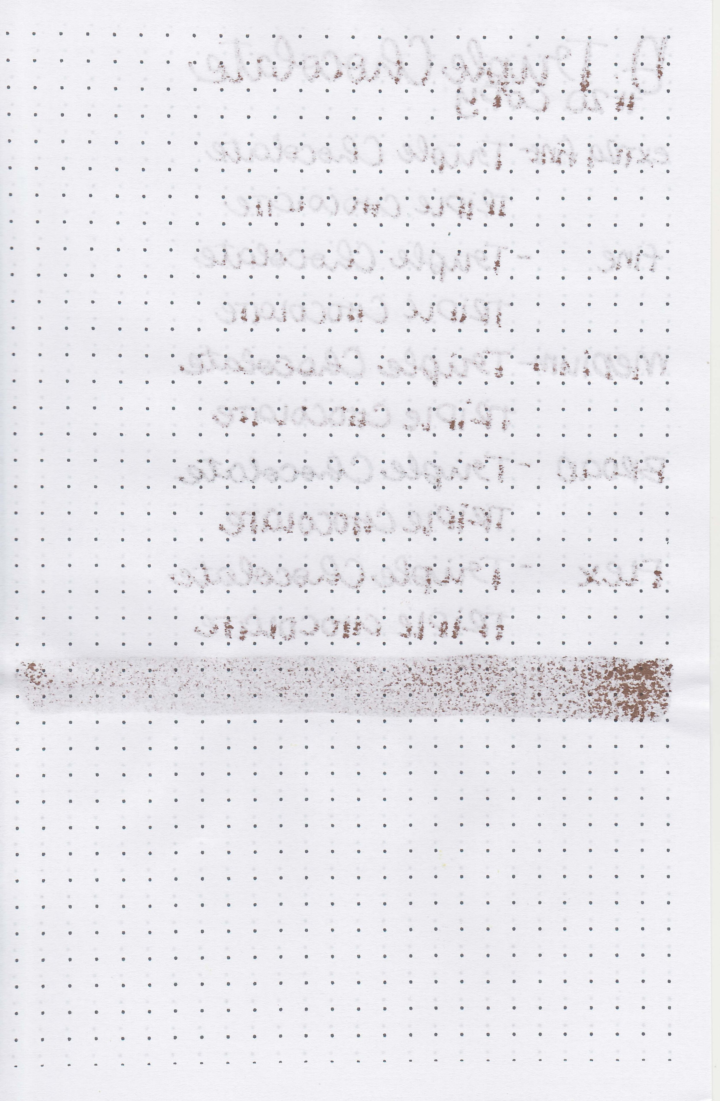
Water resistance: Low
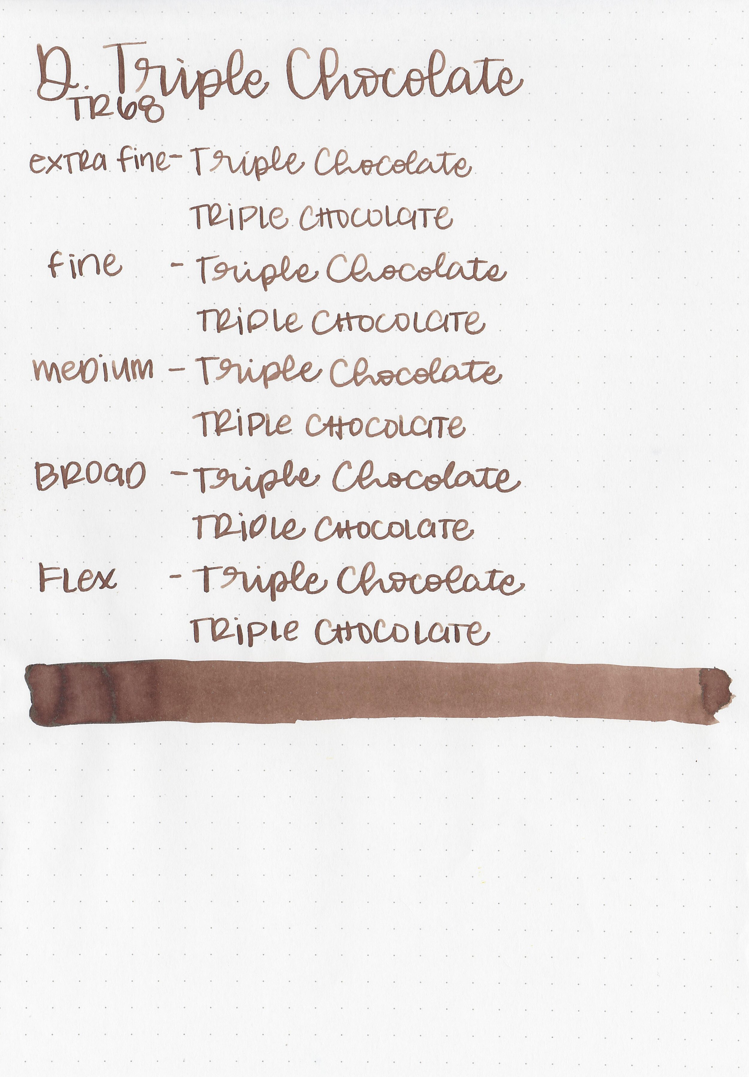
Feathering: None
Show through: Medium
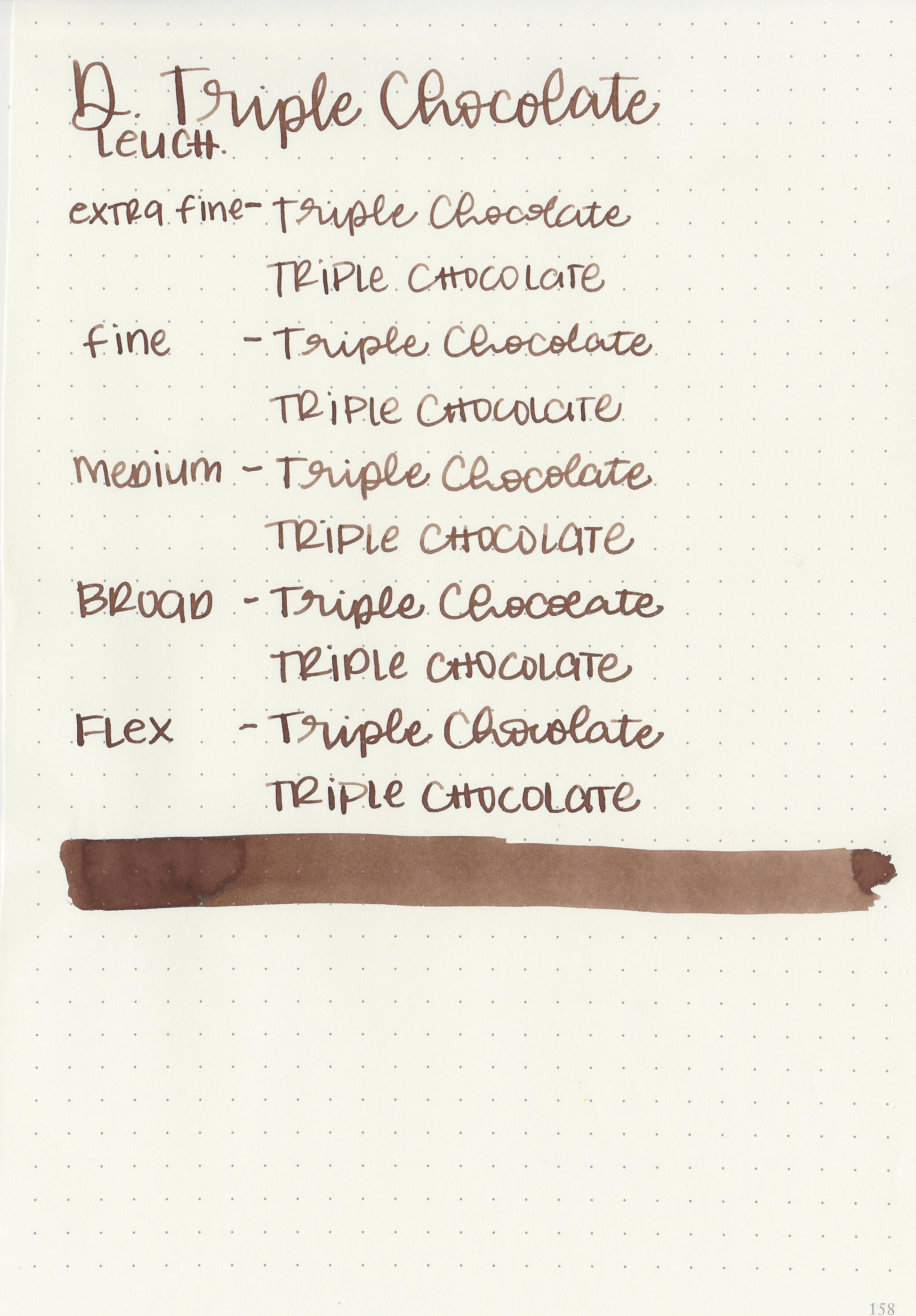
Bleeding: None
Other properties: medium shading, tiny black sheen, and no shimmer. The sheen was only visible in large swabs on Tomoe River Paper.
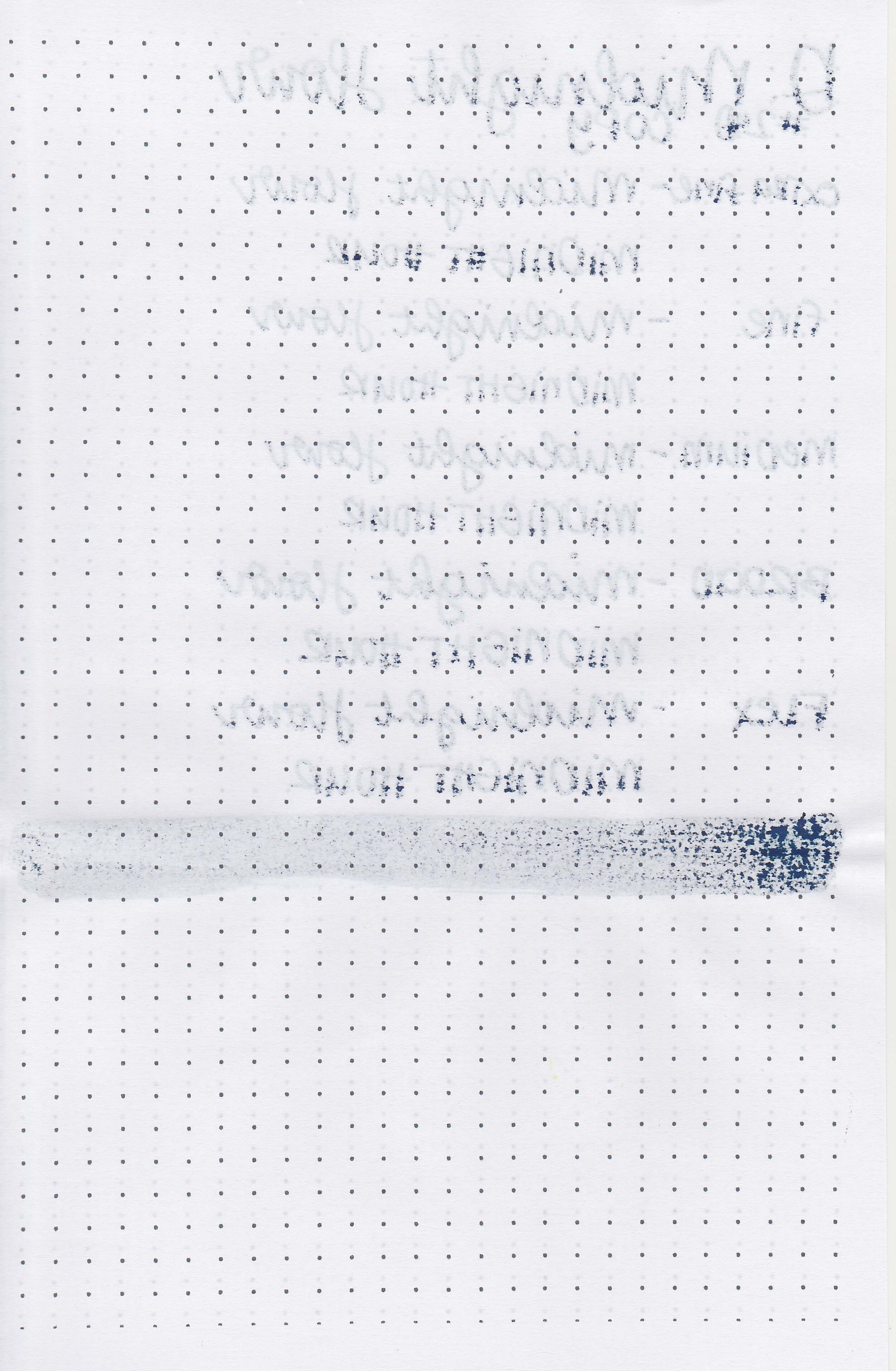
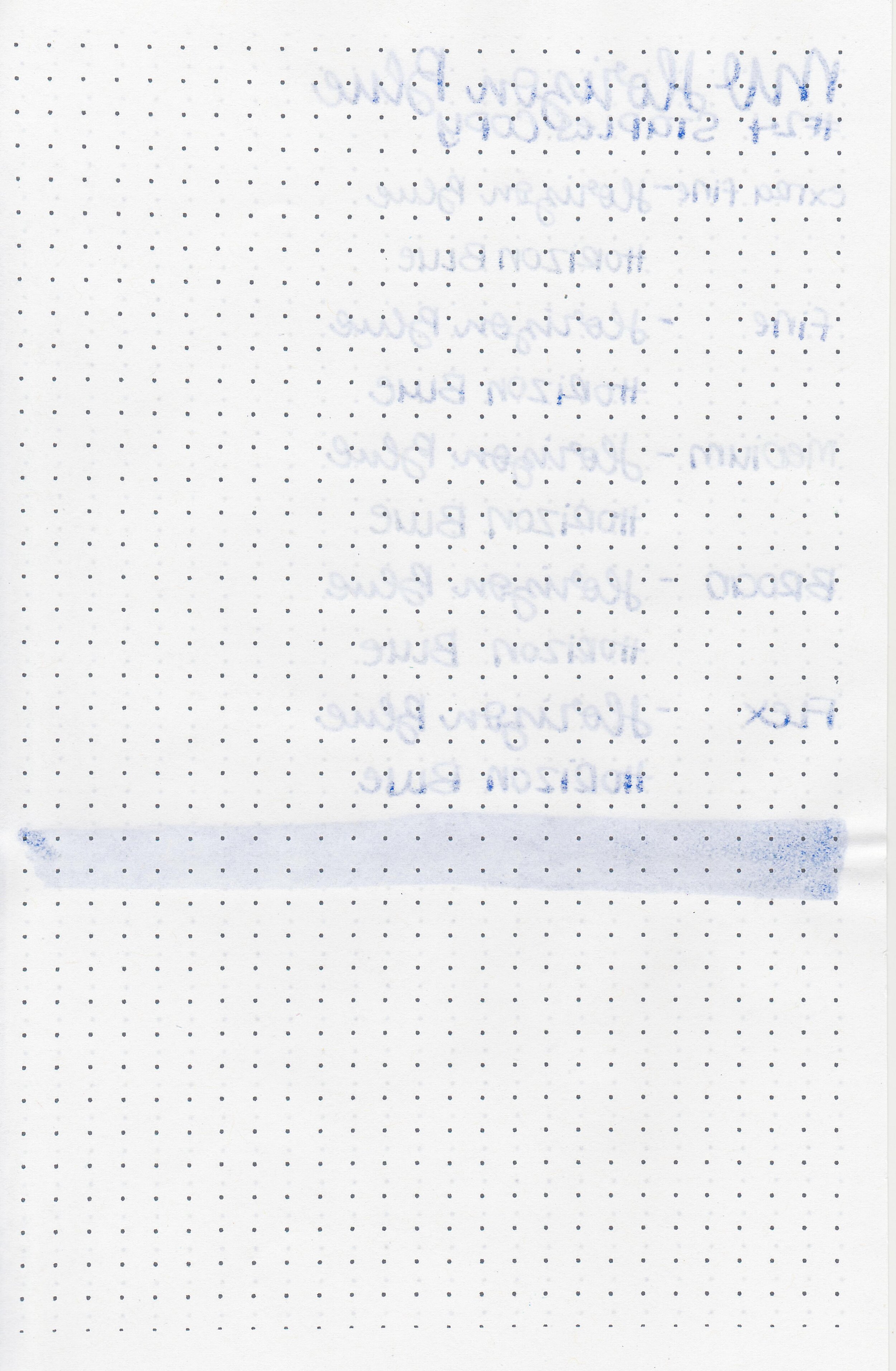
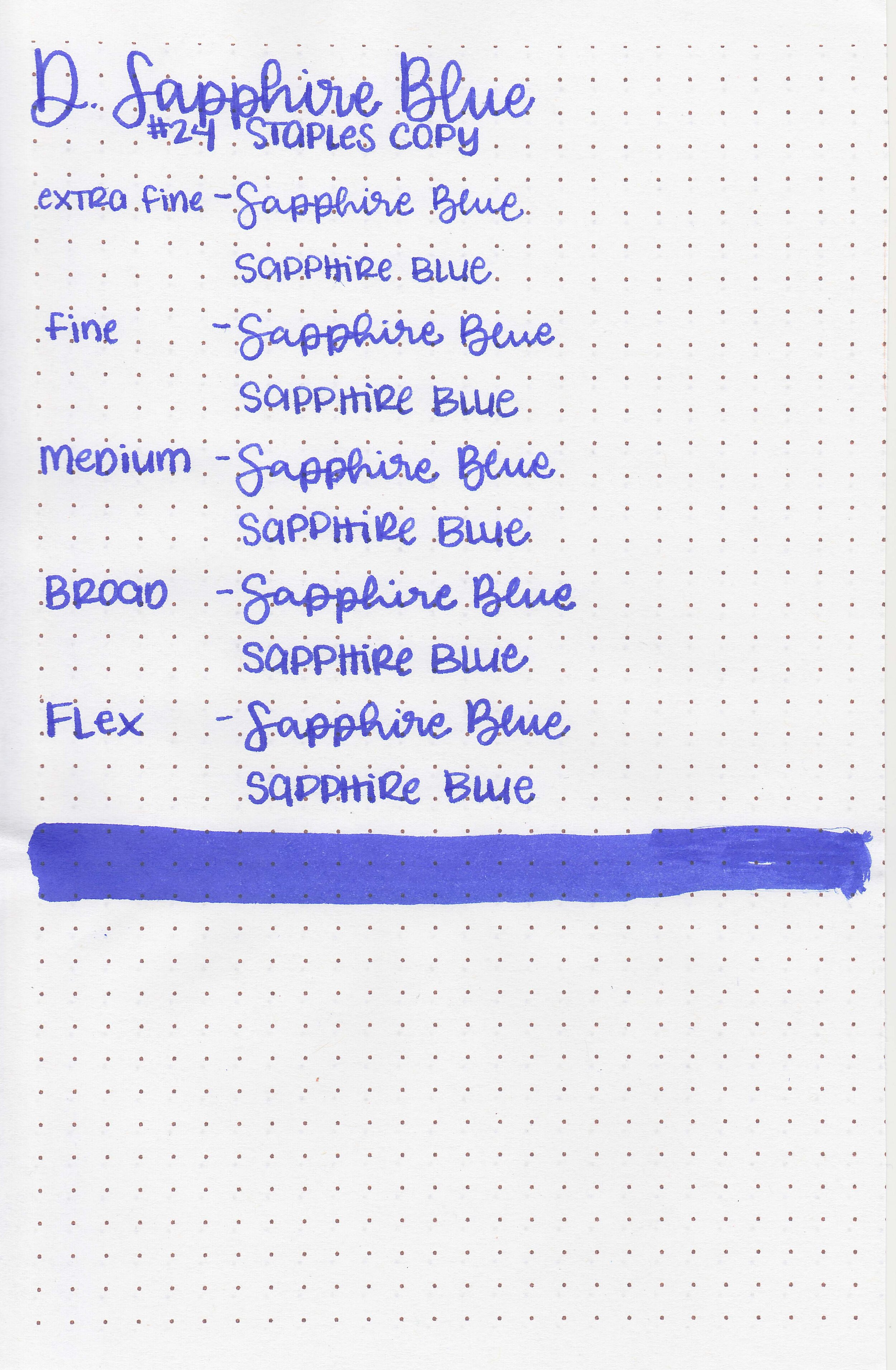
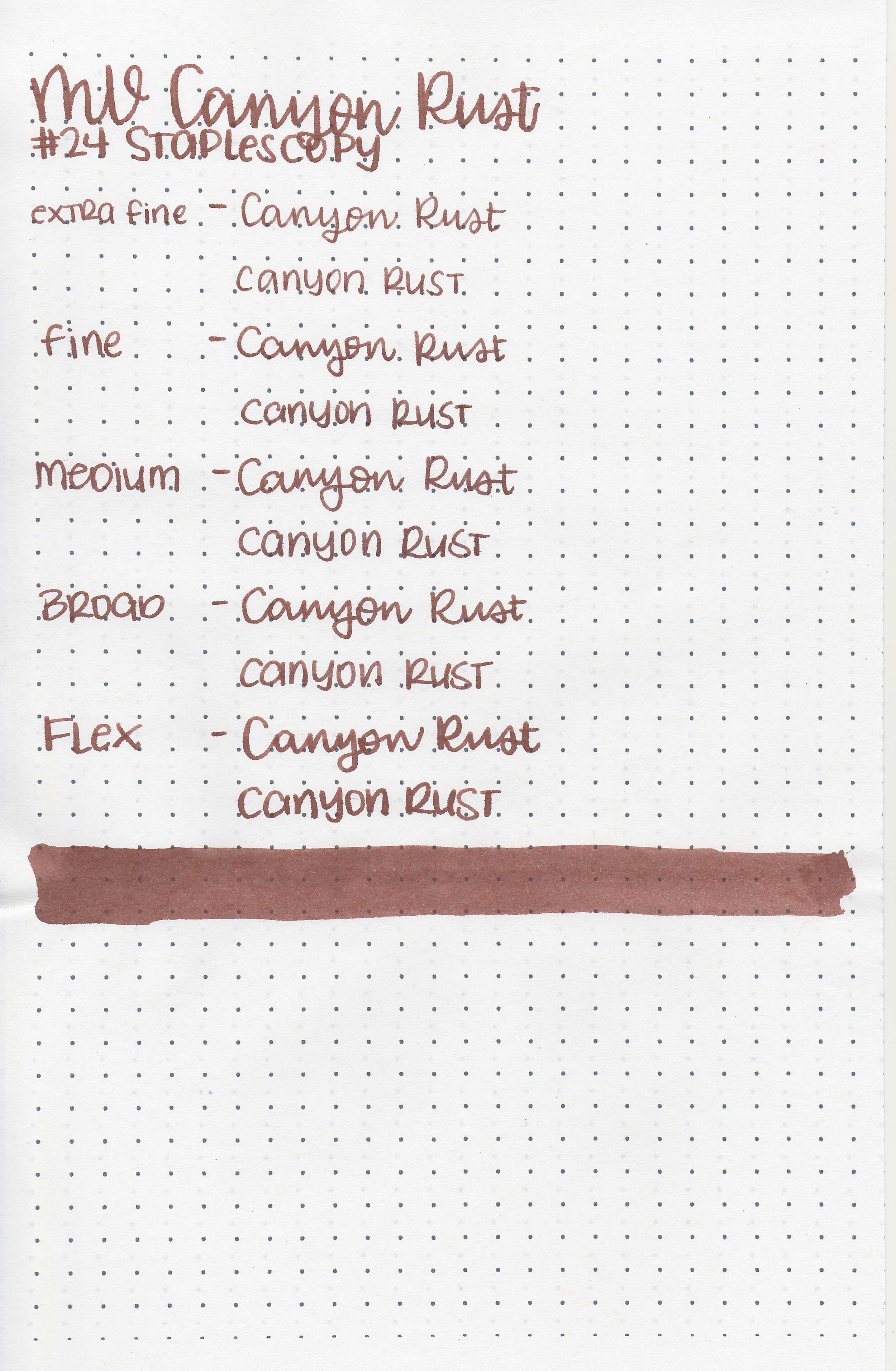
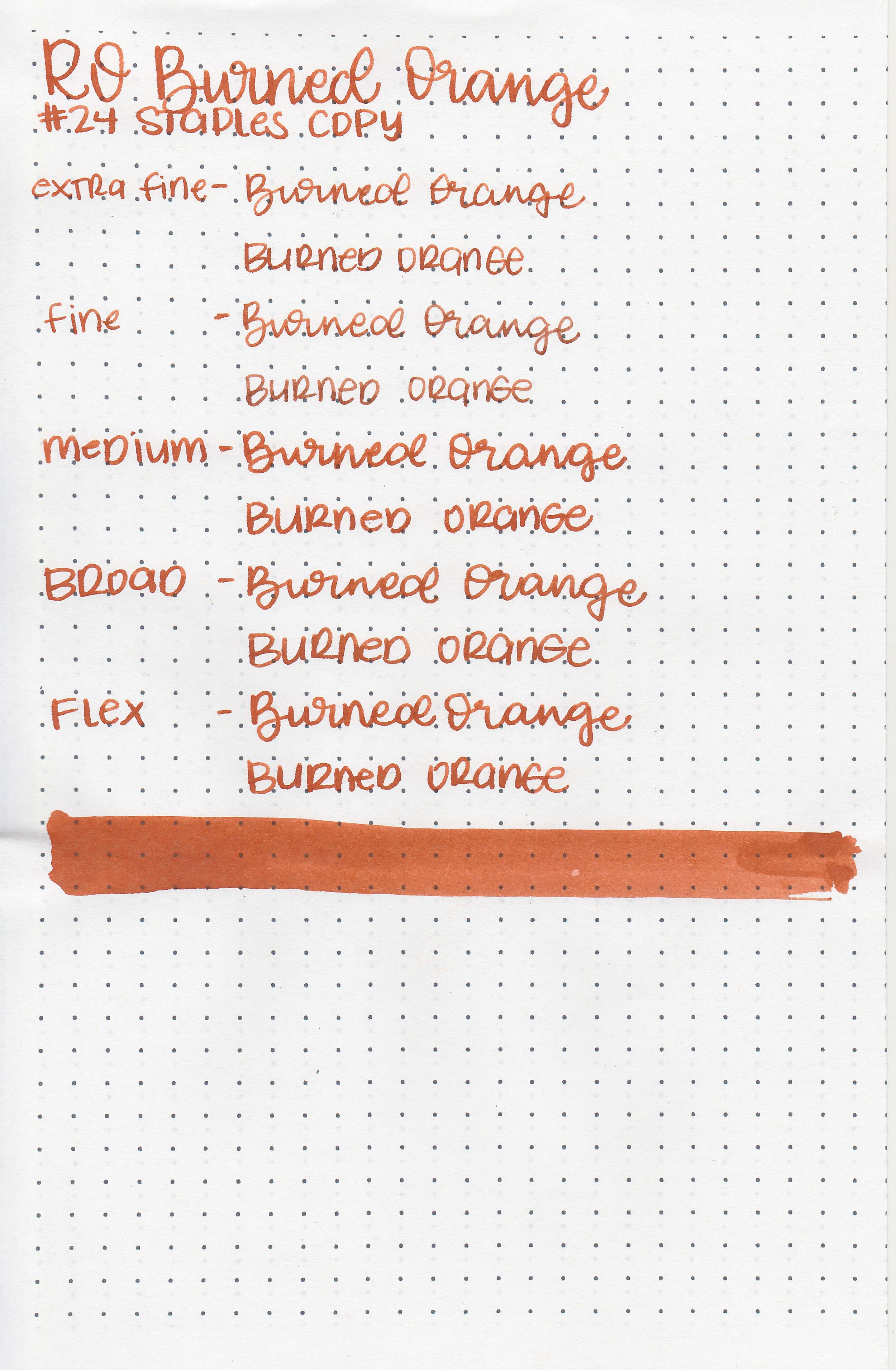
On Staples 24 lb copy paper there was some feathering and bleeding in most nib sizes.
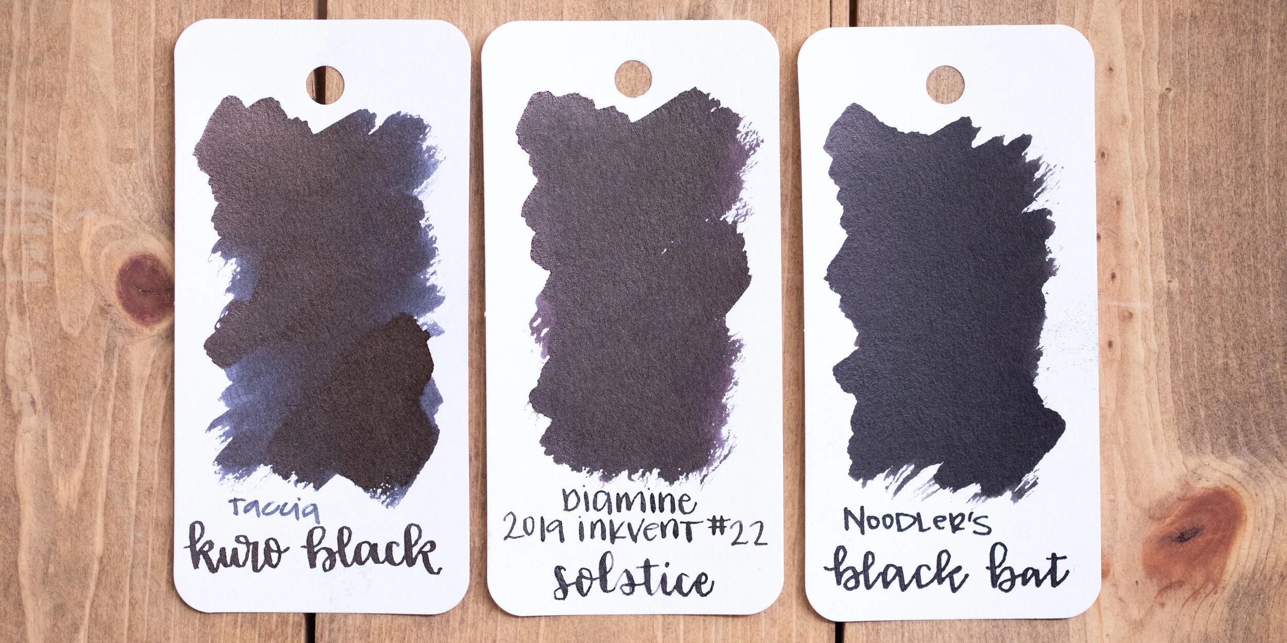
Comparison Swabs:

Triple Chocolate is closest to Pilot Iroshizuku Tsukushi, but it’s not a great match. Click here to see the Diamine inks together, and click here to see the brown inks together.
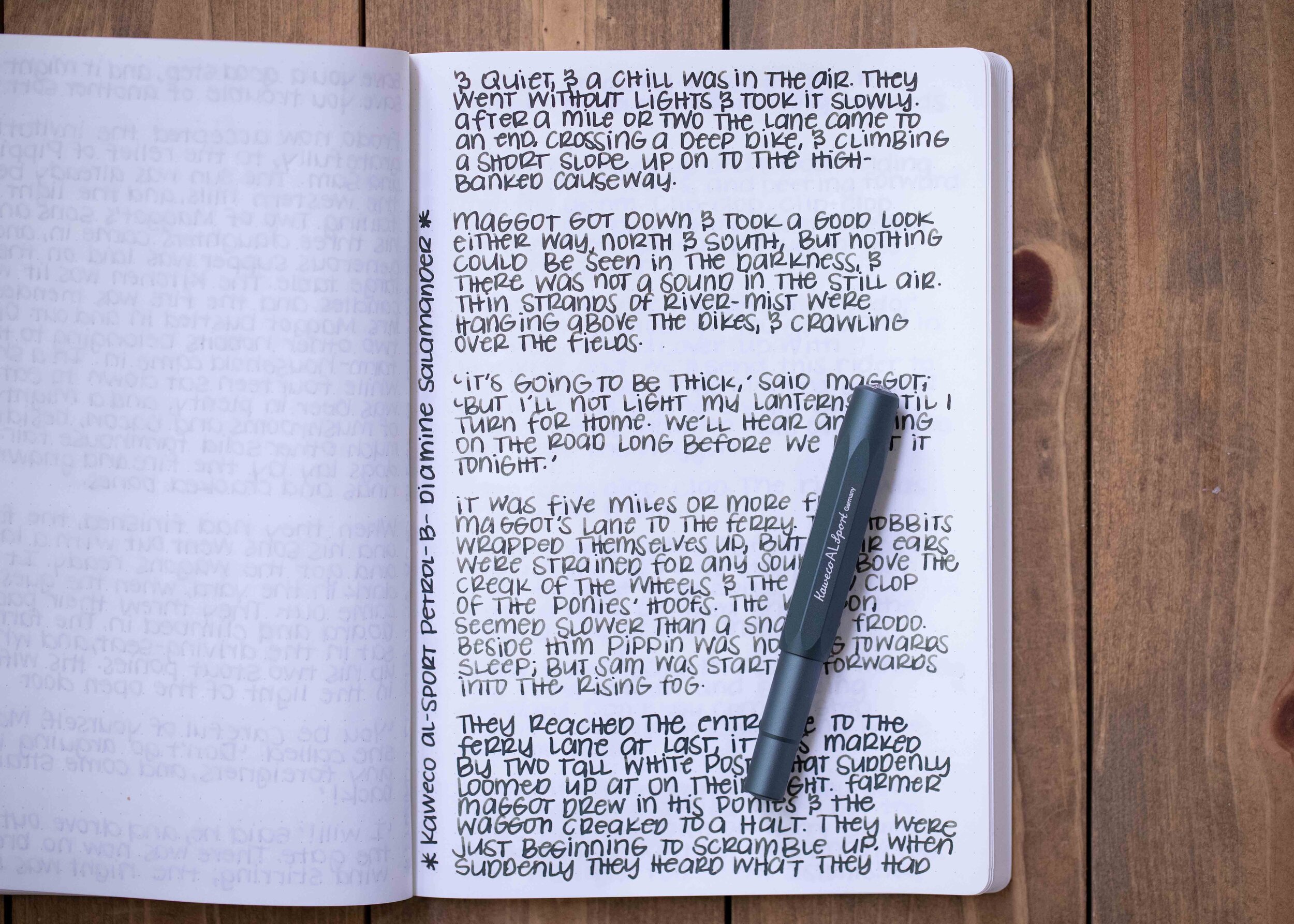
Longer writing:

I used a Franklin-Christoph 46 in Autumn Oak with a medium nib on a Taroko Enigma notebook. The ink had a slightly dry flow.
Overall, I’m not in love with it-the flow is just too dry for me. I prefer Pilot Iroshizuku Tsukushi over this ink.
Disclaimer: I purchased this ink myself, and all photos and opinions are my own. This page does contain affiliate links but this post is not sponsored in any way.