Ink Review #2575: De Atramentis Pearlescent Green
/
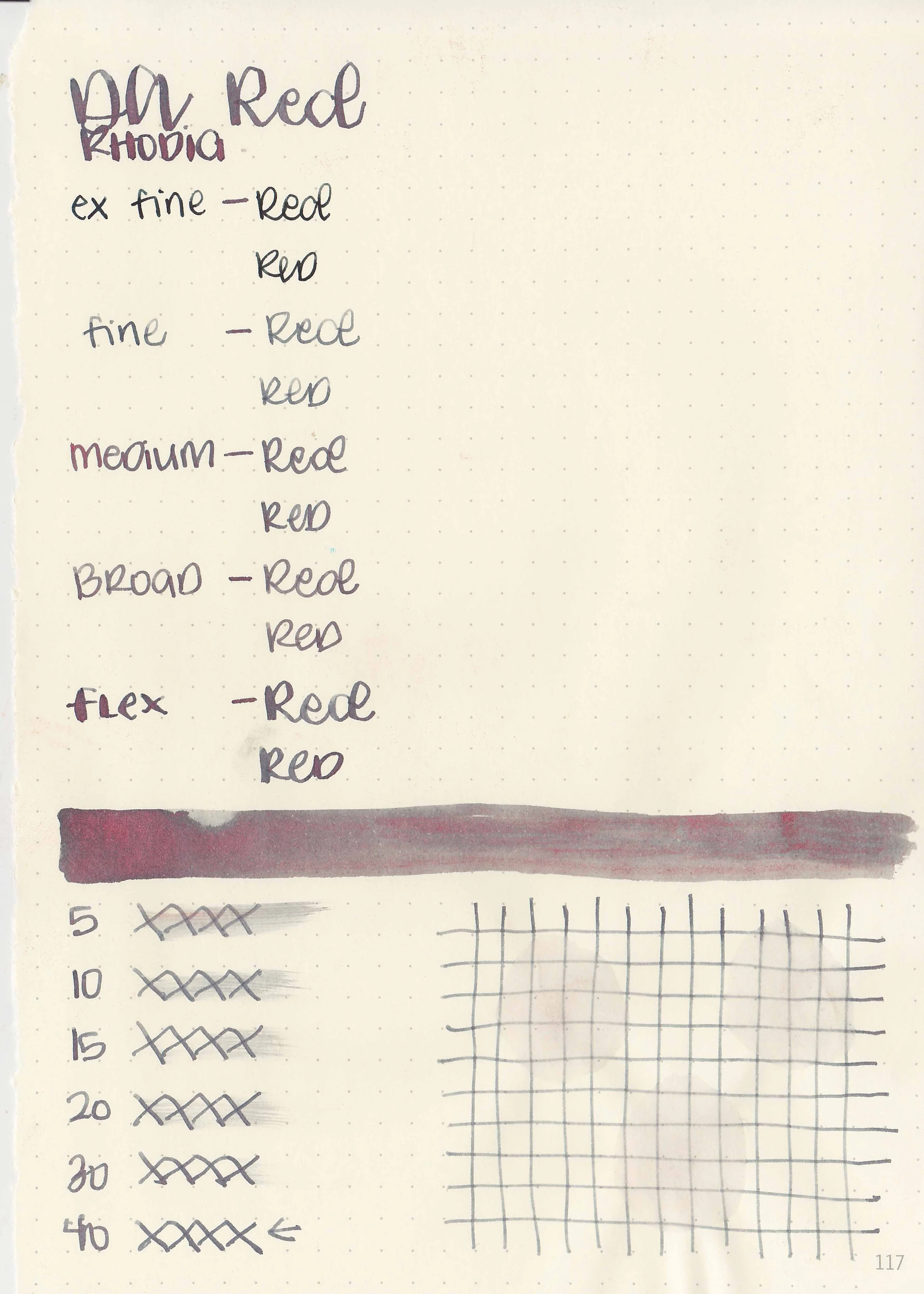
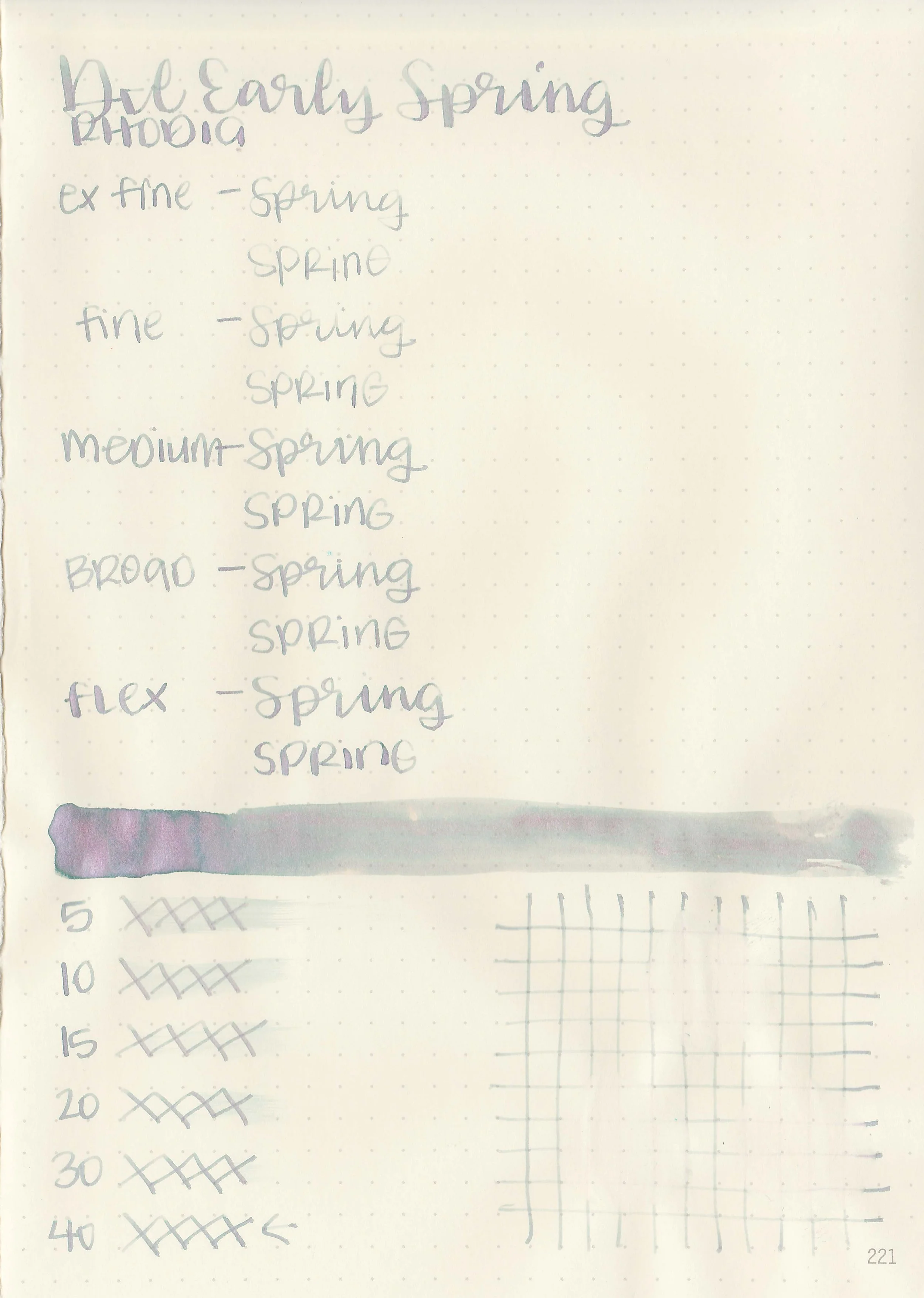
De Atramentis Pearlescent Green, like the Pearlescent Red from yesterday is from De Atramentis’s shimmer collection called the Pearlescents. The name of this one is confusing because usually the De Atramentis Pearlescent inks are named after their base color and then their shimmer color, Velvet Black Copper for example. The base color of Pearlescent Green is grey with red shimmer, so this ink should have been named Grey Green instead of Pearlescent Green. You can find this ink for sale at most retailers including Vanness Pens.

The color:
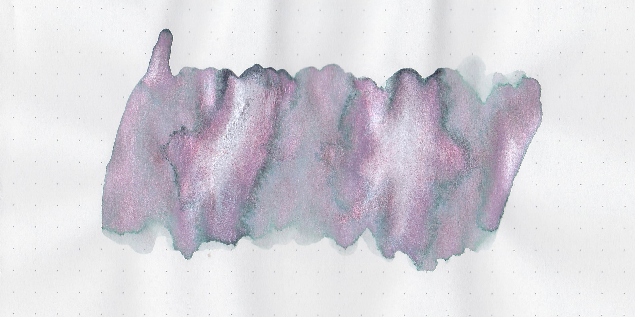
Pearlescent Green is a neutral grey with green shimmer.
*For my swab cards I use a Col-o-ring by Skylab Letterpress, a medium Pilot Ishime and a Mabie Todd Swan.
Swabs:

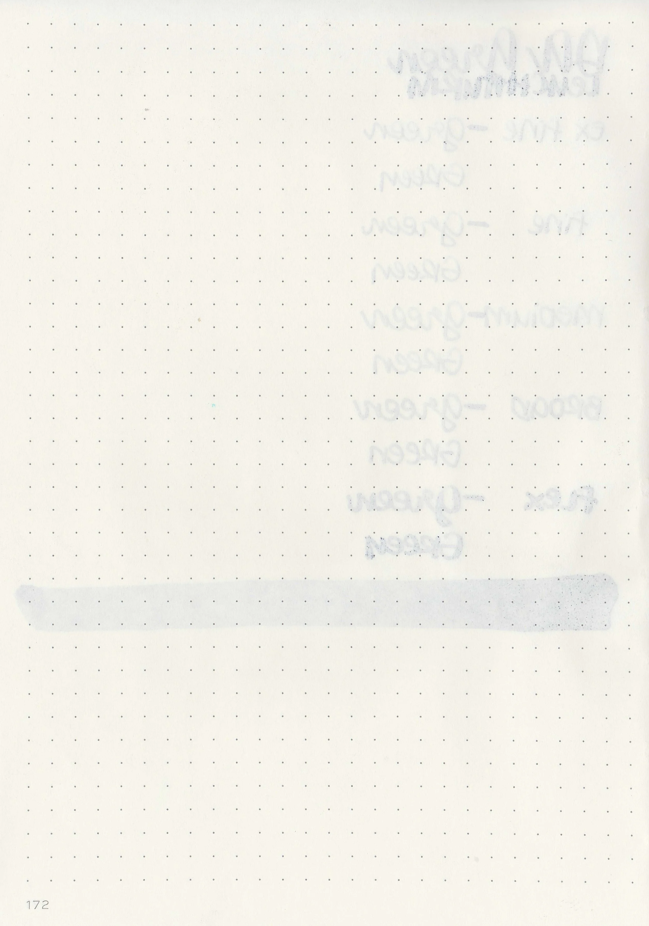
In large swabs on Tomoe River paper you can see lots of shimmer-a ridiculous amount really.

Writing samples:
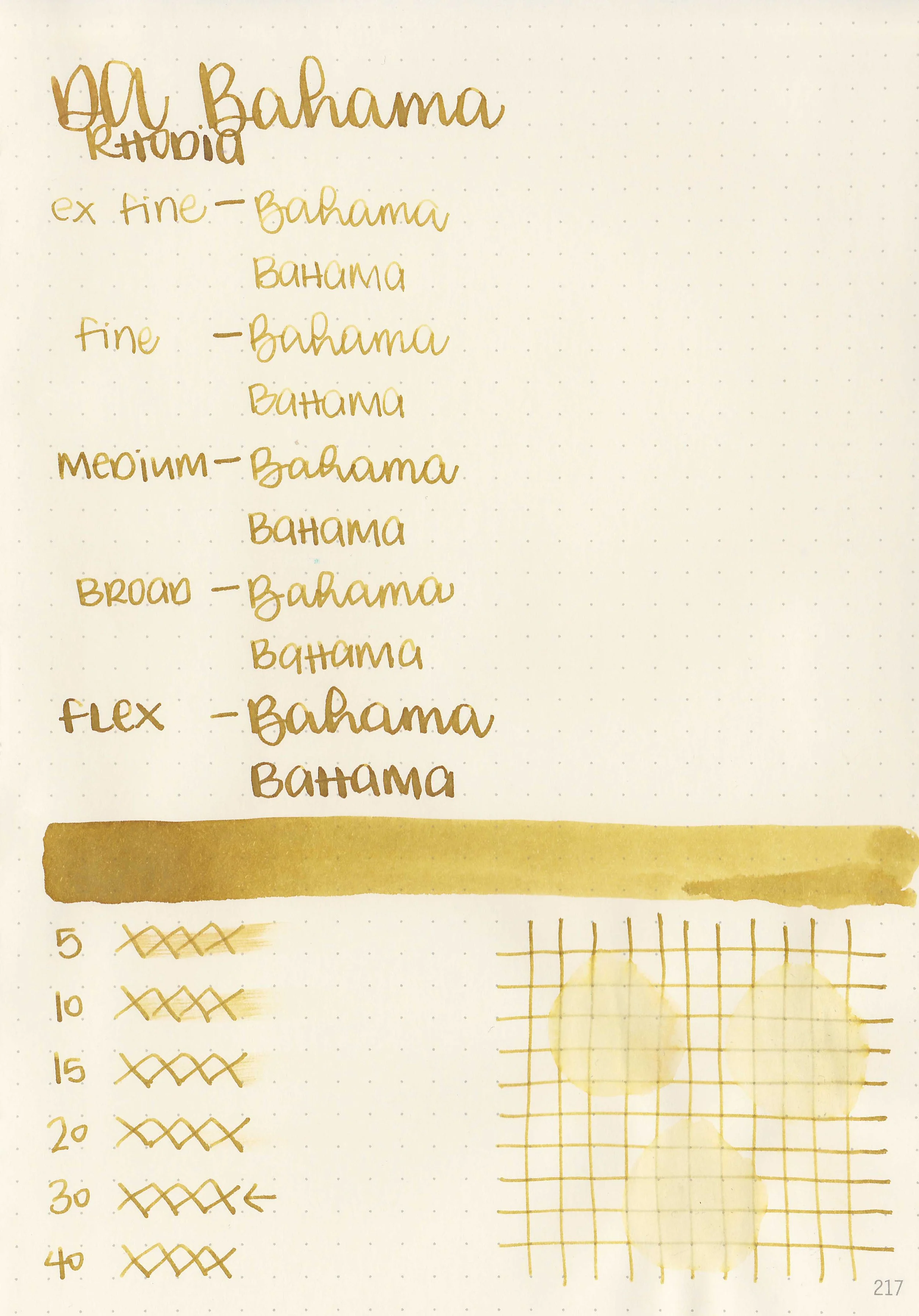
Let's take a look at how the ink behaves on fountain pen friendly papers: Rhodia, Tomoe River, and Leuchtturm.
*For my writing samples I use:
Vintage Mabie Todd Swan (flex nib)
Taroko Enigma notebooks (68gsm TR)


Dry time: 20 seconds
Water resistance: Medium

Feathering: None
Show through: Medium

Bleeding: None
Other properties: medium shading, no sheen, and green shimmer.


On 20 lb copy paper the ink had some feathering and bleeding in the larger nib sizes.
Comparison Swabs:
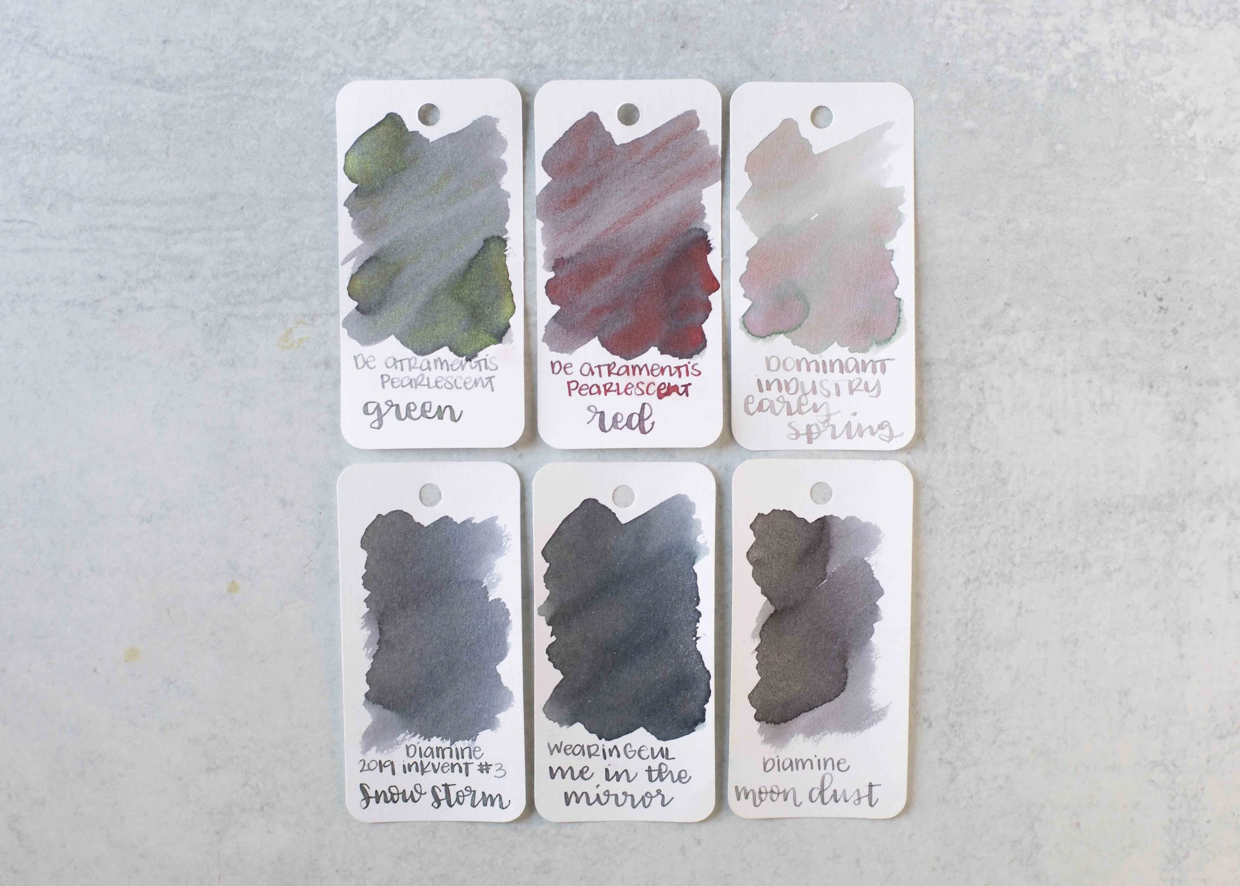
Pearlescent Green is the same base color as De Atramentis Pearlescent Red. Click here to see the grey inks together.
Longer Writing:

I used a Kaweco Al-sport Red with a medium nib on a Taroko Enigma notebook. The ink has a dry flow.
Overall, just like yesterday’s Pearlescent Red, I did not enjoy this ink. Like the other Pearlescent inks I’ve tried this ink had a lot of hard starts and clogging. The shimmer does not stay put-it flakes off and gets on anything around it. It simply has too much shimmer.
Thanks to all my Patrons! I couldn’t do these reviews without you! You can find my Patreon page here.
Disclaimer: All photos and opinions are my own. This page does not contain affiliate links and this post is not sponsored.