July Favorites

I can’t believe July is halfway over! There’s just a handful of weeks before the kids go back to school. I’ve spent most of the summer working, playing with my kids and swimming. I’ve had some requests to share my current favorites so here ya go!

Pens:

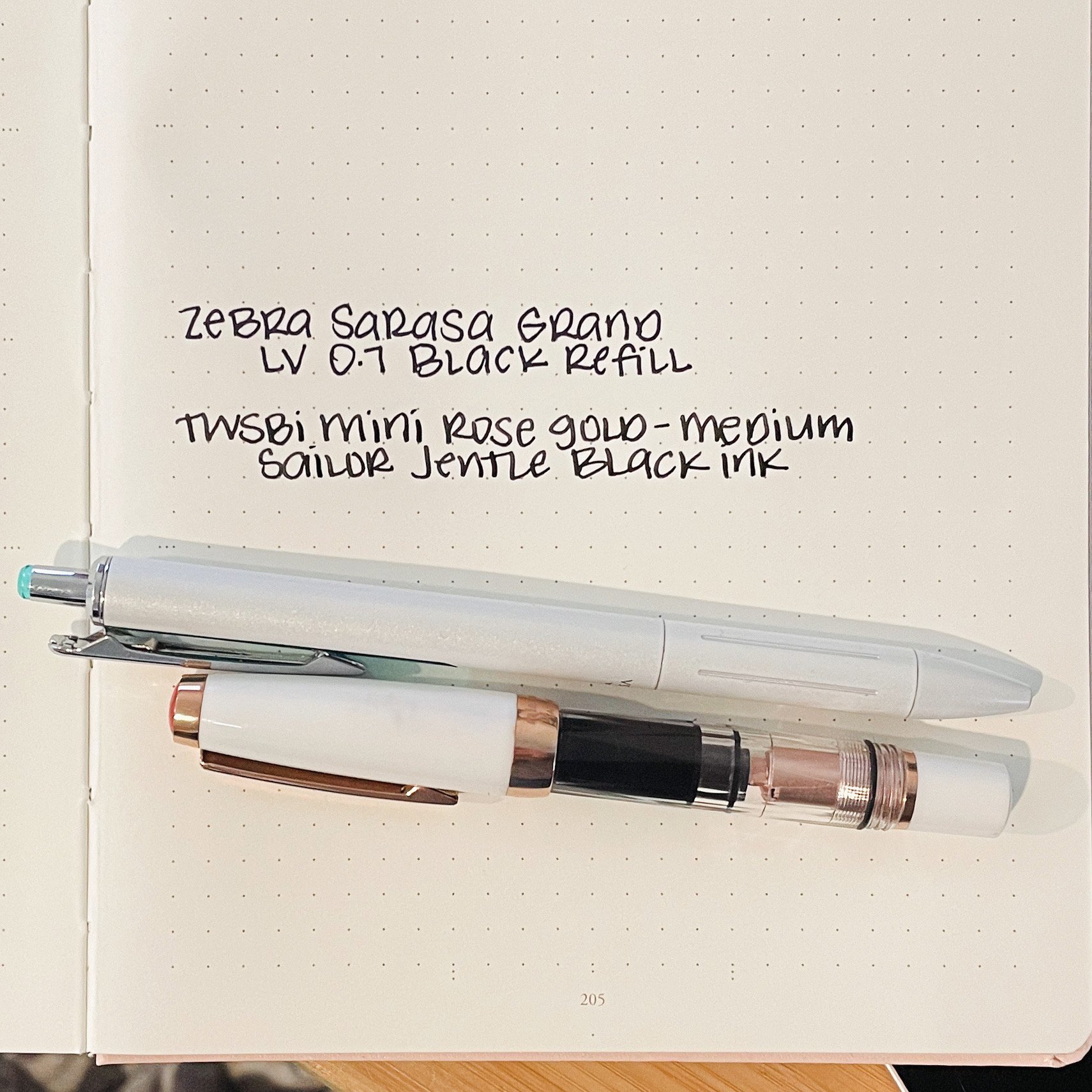
TWSBI Mini Rose Gold with a medium nib (version 1): I don’t love TWSBI pens in general, but I do own a lot of them because the nibs are pretty good and they are affordable. They are great for testing out inks but I don’t usually use them for my everyday writing. There’s something about the TWSBI Eco that doesn’t sit in my hand well-I do prefer the Eco-T over the standard Eco. This TWSBI Mini when posted, however, is the perfect fit for my hand. The nib is smooth and the perfect size-not too broad and not too fine.

Zebra Sarasa Grand in White (aff. link) with a Zebra Sarasa Dry 0.7 refill: This has become my daily writer that sits on my desk. I use it 10,000 times a day, and my kids frequently steal it off my desk. Sometimes I have to hunt them down to get it back. I’ve used up 2 of these refills in the last month-I use them that much.

Nagasawa Decimo Original Gradation Kaigon Stone Gray with Rhodium Trim: Wow that pen name is a mouthful. I love how pretty and neutral this pen is-I don’t have enough neutral pens. As much as I love the Pilot Vanishing Point, I’ve kinda fallen in love with the Decimo just a little bit more. I love how slim it is-it makes it more comfortable for me during long writing sessions.

Inks:

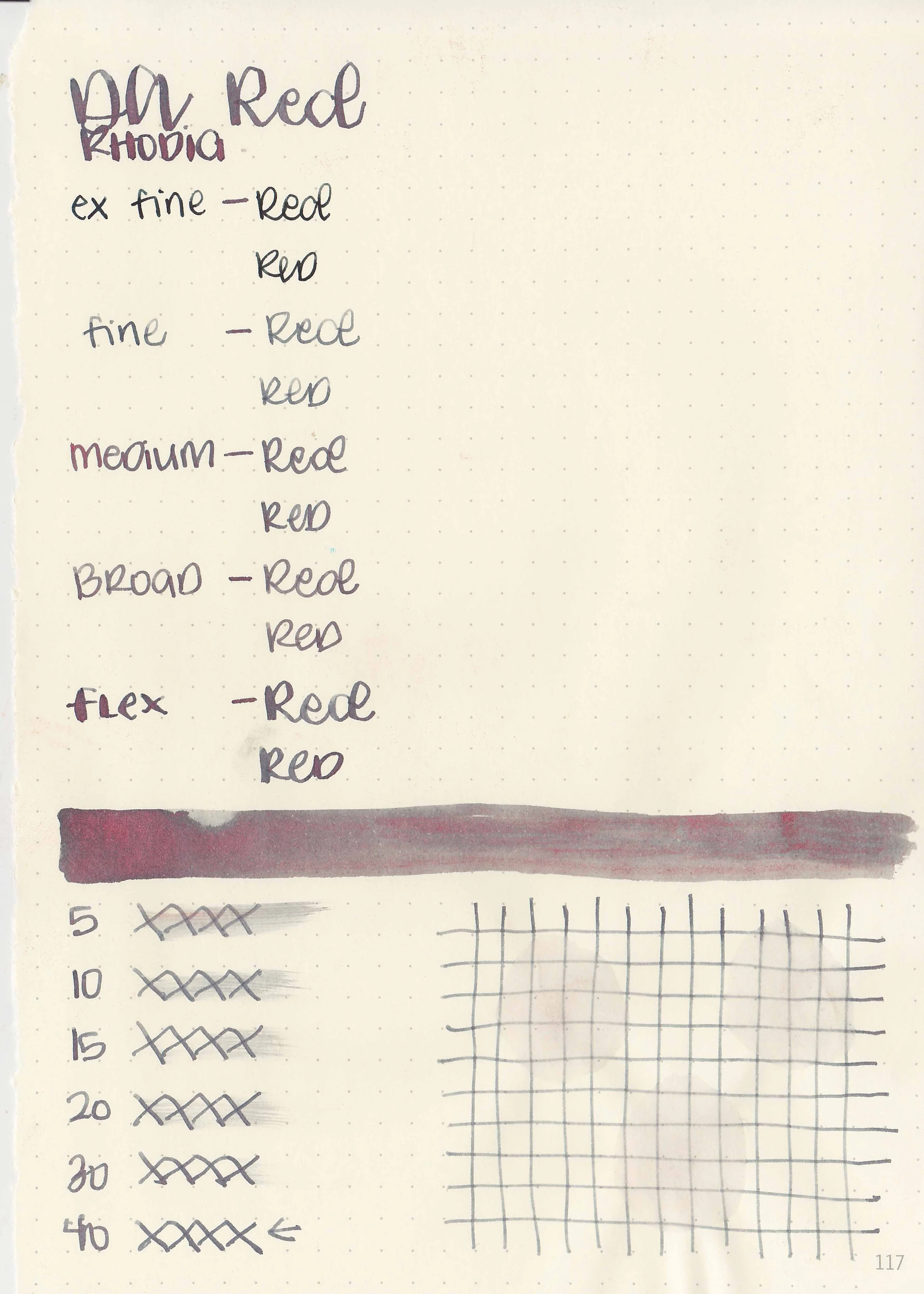
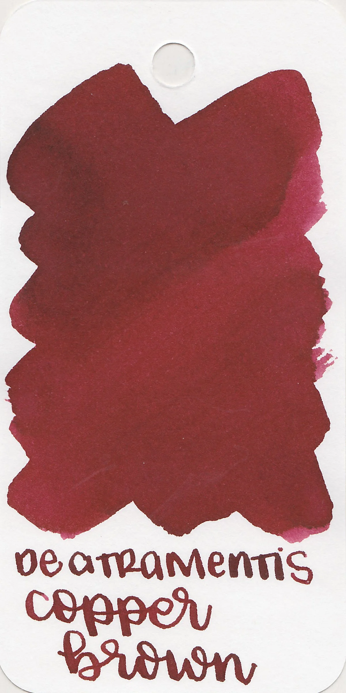
Sailor Jentle Black: This is going to be the first ink that I empty the entire bottle. I love this ink so much. I currently have it in three different pens just because I enjoy it that much. You can see in the photo above where I compared it to some of my other favorite black inks.

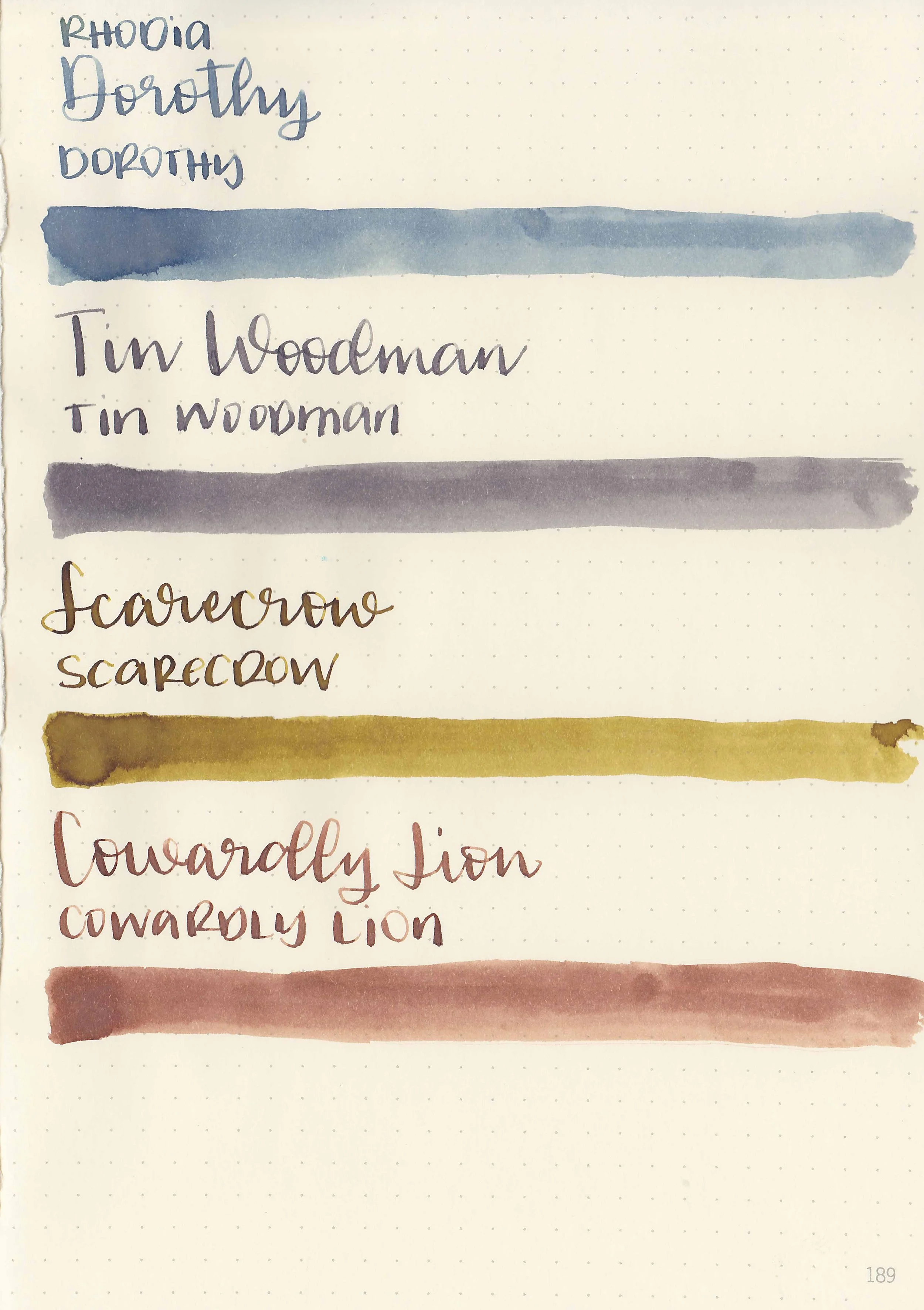
I’ve been color coding my notes a lot this month, so I have almost every color in the rainbow inked up. I do need to add a blue black ink in there. I love all of these inks.

Paper:

Levenger Circa Midway: I have been planner jumping for years. Years! I’ve tried everything from Hobonichi to Erin Condren. I tried a Levenger Circa notebook like 8 years ago and didn’t love it-I felt like the pages came out too easy and it was too hard to turn the book over on itself. Someone suggested that I try heavier paper with metal rings so I decided to take a leap and give it a try. I got the Midway size, which is 1/8 of an inch off of Happy Planner Classic size, and upgraded it to 1 1/2 inch aluminum rings.

It arrived the last day of June and I quickly printed off dividers and planner pages so I could use it for One Book July, which it turns out I stink at. I tried a lot of different styles-I tried 6 different planner daily pages until I found the one that really works for me. So far I’m using it as a combo planner/bullet journal and I’m really enjoying it. It’s just the right size. I’m using HP 32 lb paper in it, which isn’t my absolute favorite-it’s a little too glassy for my taste, but it holds up to fountain pens well and I’ve yet to find a better copy paper since they discontinued my favorites. I still need to do another Copy Paper Conundrum post part 2 (you can find the first one here), so in the comments let me know what your favorite copy paper is so I can test them out!

Taroko Breeze Notebook: I love these notebooks so freaking much! I’ve got three ones going right now and they all have been really great quality. I’ve abused this one so much and the binding has held up beautifully.

Currently:

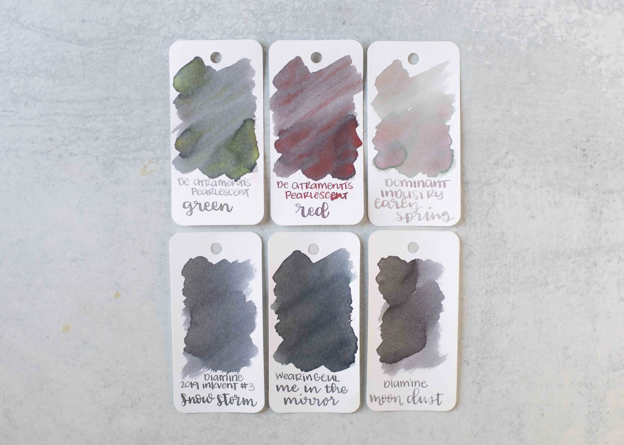
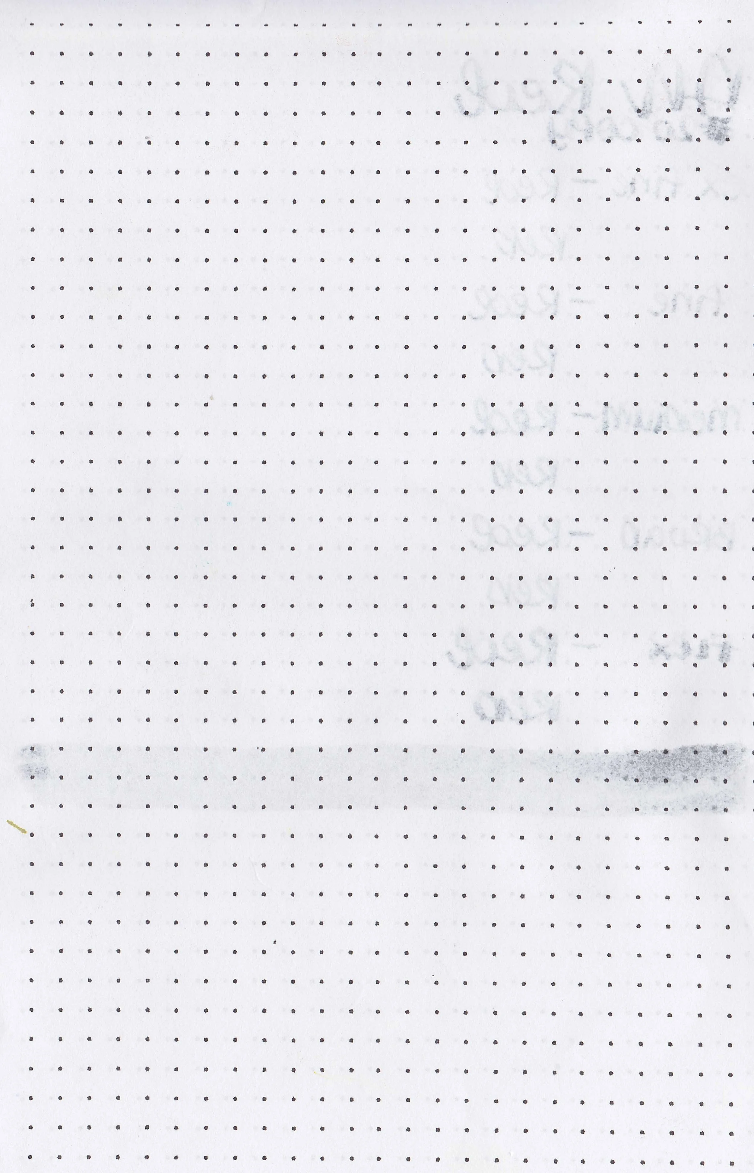
This month I’ve been working on organizing my swabs (I use the Col-o-ring by Skylab Letterpress). My swabs have been a mess for months (it’s seriously bad as the photo above shows). I had them sorted by main color, so when I do a review I have to sort through 350 blue swabs to find the similar colors. I finally got around to breaking them up into smaller categories like light red, medium red, dark red, red-violet, cherry red, etc. Hopefully this makes the review process a little faster. I’ll do a blog post about the process soon, but you can find more photos of the process on my Instagram page.

Most Recent Purchase:

I finally broke down and ordered another Lamy 2000 during the Endless Pen 4th of July sale. Years ago I purchased a Lamy 2000 Makrolon and a Lamy 2000 Black Amber together when I was still new to fountain pens. The Makrolon was an EF nib and I hated it as soon as I tried it, so I sold it. The Black Amber had a fine nib that I didn’t like either, but it ended up having some pitting near the nib so I couldn’t sell it, and I still have it. I wanted to try one with a medium nib but wasn’t sure I wanted to buy one just to try it, but I finally just pulled the plug and purchased one. It arrived just this week and so far I like the nib, but the nib is broader than the other Lamy medium nibs I have. It does have a bit of a sweet spot, but I can deal with that. I like the size of the pen and that it doesn’t have a screw cap.

Wish List:

I have a few things on my wish list-things I’m thinking about purchasing soon. Here’s a few things I’m looking at:

Esterbrook Model J Blackberry Ebonite Fountain: I’ve purchased a few Esterbook Esties, both the standard and oversize and so far I’ve had a good experience with the brand. I’ve fallen out of love with the Estie however, and ended up selling all but one of them (If anyone is looking to buy an Esterbrook Estie Maraschino with a broad nib let me know). I’m looking at trying the Model J to see if I like it better. I love the hammered band on the body. I’m trying to decide between the Violet and the Blackberry colors.

I know this pen isn’t available yet, but I’m seriously debating ordering it once it becomes available. I have the BENU Talisman in Cat’s Eye and absolutely love it. It fits my hand well, has a smooth nib and is a cool color. Most of the BENU pens are way too flashy for me, but this one is a bit more subdued and perfect for the autumn season.

Clairefontaine Fontaine Aquapad Watercolor Paper: I love using watercolor paper for playing with ink and to my knowledge this is a new product for Clairfontaine. I want to try it out and make some ink charts with it.

Each year I’ve reviewed the inks in the Inkvent Calendar and I’m interested in this year’s edition.

Other Thinks I’m Enjoying:

SBREBrown’s What I've Learned in Thirteen Years of Reviews Video: I’ve been a long time fan of Stephen’s and appreciate his views on making reviews.

I have the first two Half Baked Harvest cookbooks and absolutely love them. Not only are the recipes wonderful but the photography is amazing. I can’t wait until this new one comes out in November.

Flourished Hope’s The 5 Part Journaling System That Changed My Life Completely (How to Journal): I appreciated her take on journaling since I’m trying to improve my system.

So that’s it-my favorites for July. What are you loving this month? Let me know in the comments below!

Disclaimer: All opinions are my own. This page does contain two affiliates link for Amazon and this post is not sponsored.

Ink Review #2576: De Atramentis Slate Grey

Today’s ink is De Atramentis Slate Grey. You can find this ink for sale at most retailers including Vanness Pens.

The color:

Slate Grey is an unsaturated purple grey.

*For my swab cards I use a Col-o-ring by Skylab Letterpress, a medium Pilot Ishime and a Mabie Todd Swan.

Swabs:

In large swabs on Tomoe River paper the ink has just a little bit of shading where the ink pooled.

Writing samples:

Let's take a look at how the ink behaves on fountain pen friendly papers: Rhodia, Tomoe River, and Leuchtturm.

*For my writing samples I use:

Dry time: 20 seconds

Water resistance: Medium

Feathering: None

Show through: Medium

Bleeding: None

Other properties: no shading, no sheen, and no shimmer.

On 20 lb copy paper the ink had some feathering and bleeding in the larger nib sizes.

Comparison Swabs:

Slate Grey isn’t remotely close to any of these other inks, but Krishna Pencil is a similar purple-grey. Click here to see the grey inks together.

Longer Writing:

I used a Kaweco Al-sport Akkerman Navy with a medium nib on a Taroko Enigma notebook. The ink has a wet flow.

Overall, I could take or leave this ink. I like the wet flow and it’s well-behaved, but it’s very purple compared to other grey inks.

Thanks to all my Patrons! I couldn’t do these reviews without you! You can find my Patreon page here.

Disclaimer: All photos and opinions are my own. This page does not contain affiliate links and this post is not sponsored.

Ink Review #2575: De Atramentis Pearlescent Green

De Atramentis Pearlescent Green, like the Pearlescent Red from yesterday is from De Atramentis’s shimmer collection called the Pearlescents. The name of this one is confusing because usually the De Atramentis Pearlescent inks are named after their base color and then their shimmer color, Velvet Black Copper for example. The base color of Pearlescent Green is grey with red shimmer, so this ink should have been named Grey Green instead of Pearlescent Green. You can find this ink for sale at most retailers including Vanness Pens.

The color:

Pearlescent Green is a neutral grey with green shimmer.

*For my swab cards I use a Col-o-ring by Skylab Letterpress, a medium Pilot Ishime and a Mabie Todd Swan.

Swabs:

In large swabs on Tomoe River paper you can see lots of shimmer-a ridiculous amount really.

Writing samples:

Let's take a look at how the ink behaves on fountain pen friendly papers: Rhodia, Tomoe River, and Leuchtturm.

*For my writing samples I use:

Dry time: 20 seconds

Water resistance: Medium

Feathering: None

Show through: Medium

Bleeding: None

Other properties: medium shading, no sheen, and green shimmer.

On 20 lb copy paper the ink had some feathering and bleeding in the larger nib sizes.

Comparison Swabs:

Pearlescent Green is the same base color as De Atramentis Pearlescent Red. Click here to see the grey inks together.

Longer Writing:

I used a Kaweco Al-sport Red with a medium nib on a Taroko Enigma notebook. The ink has a dry flow.

Overall, just like yesterday’s Pearlescent Red, I did not enjoy this ink. Like the other Pearlescent inks I’ve tried this ink had a lot of hard starts and clogging. The shimmer does not stay put-it flakes off and gets on anything around it. It simply has too much shimmer.

Thanks to all my Patrons! I couldn’t do these reviews without you! You can find my Patreon page here.

Disclaimer: All photos and opinions are my own. This page does not contain affiliate links and this post is not sponsored.

Ink Review #2574: De Atramentis Pearlescent Red

De Atramentis Pearlescent Red is from De Atramentis’s shimmer collection called the Pearlescents. The name of this one is confusing because usually the De Atramentis Pearlescent inks are named after their base color and then their shimmer color, Velvet Black Copper for example. The base color of Pearlescent Red is grey with red shimmer, so this ink should have been named Grey Red instead of Pearlescent Red. You can find this ink for sale at most retailers including Vanness Pens.

The color:

Pearlescent Red is a neutral grey with red shimmer.

*For my swab cards I use a Col-o-ring by Skylab Letterpress, a medium Pilot Ishime and a Mabie Todd Swan.

Swabs:

In large swabs on Tomoe River paper you can see lots of shimmer-a ridiculous amount really.

Writing samples:

Let's take a look at how the ink behaves on fountain pen friendly papers: Rhodia, Tomoe River, and Leuchtturm.

*For my writing samples I use:

Dry time: 40 seconds

Water resistance: Medium

Feathering: None

Show through: Medium

Bleeding: None

Other properties: medium shading, no sheen, and red shimmer.

On 20 lb copy paper the ink had some feathering and bleeding in the larger nib sizes.

Comparison Swabs:

Pearlescent Red is the same base color as De Atramentis Pearlescent Green. Click here to see the grey inks together.

Longer Writing:

I used a Kaweco Al-sport Red with a medium nib on a Taroko Enigma notebook. The ink has a dry flow.

Overall, I did not enjoy this ink. Like the other Pearlescent inks I’ve tried this ink had a lot of hard starts and clogging. The shimmer does not stay put-it flakes off and gets on anything around it. It simply has too much shimmer.

Thanks to all my Patrons! I couldn’t do these reviews without you! You can find my Patreon page here.

Disclaimer: All photos and opinions are my own. This page does not contain affiliate links and this post is not sponsored.

Ink Review #2573: Dominant Industry Early Spring

Today’s ink is Dominant Industry Early Spring. You can find this ink for sale at most retailers including Vanness Pens.

The color:

Early Spring is a light grey that shades to green with pink shimmer.

*For my swab cards I use a Col-o-ring by Skylab Letterpress, a medium Pilot Ishime and a Mabie Todd Swan.

Swabs:

In large swabs on Tomoe River paper you can see both the green shading and the pink shimmer.

Writing samples:

Let's take a look at how the ink behaves on fountain pen friendly papers: Rhodia, Tomoe River, and Leuchtturm.

*For my writing samples I use:

Dry time: 40 seconds

Water resistance: Low

Feathering: None

Show through: Medium

Bleeding: None

Other properties: low shading, no sheen, and pink shimmer.

On 20 lb copy paper the ink had some feathering and bleeding in the larger nib sizes.

Comparison Swabs:

Early Spring is much lighter than these other grey shimmer inks. Click here to see the grey inks together.

Longer Writing:

I used a Leonardo Mother of Pearl with a medium nib on a Taroko Enigma notebook. The ink has a dry flow.

Overall, I love the color in large swabs-it shows the green shading and pink shimmer, but hardly any of that shading shows up in writing. It’s also very pale and hard to read, so this isn’t an ink for me.

Thanks to all my Patrons! I couldn’t do these reviews without you! You can find my Patreon page here.

Disclaimer: All photos and opinions are my own. This page does not contain affiliate links and this post is not sponsored.

Wearingeul Wizard of Oz Inks

Let’s look at four inks from the Wearingeul Wizard of Oz inks. You can finds these inks for sale at a lot of retailers, including Vanness Pens.

Swabs:

Left to right: Tin Woodman, Cowardly Lion, Scarecrow and Dorothy.

Writing samples:

Let's take a look at how the ink behaves on fountain pen friendly papers: Rhodia, Tomoe River, and Leuchtturm.

Dry Time: 30-80 seconds

Water Resistance: Low-Medium

Feathering: None

Show through: Medium

Bleeding: None

Other properties: Low-Medium Shading

On Walmart Pen + Gear copy paper there was some feathering in every nib size and some bleeding.

Comparison Swabs:

Tin Woodman is closest to Dominant Industry Downpour.

Cowardly Lion is lighter than Pilot Iroshizuku Tsukushi.

Scarecrow is darker than Inkebara Deer Brown.

Dorothy is closest to Ackerman 07 Koninginn Elnach.

Longer Writing:

I used a Taroko Enigma notebook. Dorothy, Tin Woodman and Cowardly Lion had dry flows. Scarecrow had an average flow.

Overall, I love the theme of these inks-it makes them more interesting. I don’t love the dry flow though, so these aren’t inks I need full bottles of.

Disclaimer: All photos and opinions are my own. This page does not contain affiliate links, and is not sponsored in any way.

July Tropical Ink Palettes

It’s the first Sunday of July, so it’s time for some new ink palettes! This month I decided to focus on a tropical theme. These flowers are gorgeous, and all sorts of pretty pinks. Paper Plume Garden District Azalea has been a longtime favorite of mine.

I always think of fruit in the summer. I love all five of these, they’re so bright and cheerful!

My brother and sister-in-law have a few parrots, so I decided to include one this month. Octopus Red Koala is one of my new favorite red inks.

Out of these five, I love KWZ El Dorado the most. It’s a readable yellow with a lot of character.

What inks are you using in July? Let me know in the comments below!

Disclaimer: All opinions are my own. This post is not sponsored.

Ink Review #2568: De Atramentis Yellow Brown

Let’s look at De Atramentis Standard Yellow Brown. This ink is also available in a scented version called Waffle. I got my sample from Vanness Pens, but they no longer carry it. You can find Waffle at De Atramentis’s website.

The color:

Yellow Brown is right in-between a yellow and a brown.

*For my swab cards I use a Col-o-ring by Skylab Letterpress, a medium Pilot Ishime and a Mabie Todd Swan.

Swabs:

In large swabs on Tomoe River paper the ink looks more brown than it did on the Col-o-ring swab.

Writing samples:

Let's take a look at how the ink behaves on fountain pen friendly papers: Rhodia, Tomoe River, and Leuchtturm.

*For my writing samples I use:

Dry time: 40 seconds

Water resistance: Medium

Feathering: None

Show through: Medium

Bleeding: None

Other properties: medium shading, no sheen, and no shimmer.

On 20 lb copy paper the ink had some feathering and bleeding in the larger nib sizes.

Comparison Swabs:

Yellow Brown is closest to Sailor Ink Studio 670. Click here to see the brown inks together.

Longer Writing:

I used a Pelikan M400 White Tortoise with a medium nib on a Taroko Enigma notebook. The ink has a wet flow.

Overall, this is a nice color. It’s dark enough to be easily read, which I appreciate. I love the shading and that it’s affordable.

Thanks to all my Patrons! I couldn’t do these reviews without you! You can find my Patreon page here.

Disclaimer: All photos and opinions are my own. This page does not contain affiliate links and this post is not sponsored.

Ink Review #2567: De Atramentis Bahama Brown

Today’s ink is De Atramentis Standard Bahama Brown. This ink is also known as Friedrich Engels. You can find this ink for sale at most retailers including Vanness Pens.

The color:

Bahama Brown is a medium yellow-brown.

*For my swab cards I use a Col-o-ring by Skylab Letterpress, a medium Pilot Ishime and a Mabie Todd Swan.

Swabs:

In large swabs on Tomoe River paper the ink looks less yellow than it did on the Col-o-ring swab.

Writing samples:

Let's take a look at how the ink behaves on fountain pen friendly papers: Rhodia, Tomoe River, and Leuchtturm.

*For my writing samples I use:

Dry time: 30 seconds

Water resistance: Low

Feathering: None

Show through: Medium

Bleeding: None

Other properties: medium shading, no sheen, and no shimmer.

On 20 lb copy paper the ink had some feathering and bleeding in the larger nib sizes.

Comparison Swabs:

Bahama Brown is lighter than Robert Oster Muddy Sand, and darker than Pilot Iroshizuku Ina-ho. Click here to see the brown inks together.

Longer Writing:

I used a Kaweco Al-sport Dutch Pen Show with a medium nib on a Taroko Enigma notebook. The ink has a wet flow.

Overall, this color is a bit unique-I only have one a little lighter and one a little darker, there’s not a lot of inks that are similar. It’s well-behaved and affordable!

Thanks to all my Patrons! I couldn’t do these reviews without you! You can find my Patreon page here.

Disclaimer: All photos and opinions are my own. This page does not contain affiliate links and this post is not sponsored.

Ink Review #2566: De Atramentis Copper Brown

Let’s take a look at De Atramentis Standard Copper Brown. This ink is also known as: City Rome, Zodiac Capricorn, Rune GEBO, and Chinese Zodiac Snake. You can find this ink for sale at most retailers including Vanness Pens.

The color:

Brown is a deep red-brown, almost a burgundy red.

*For my swab cards I use a Col-o-ring by Skylab Letterpress, a medium Pilot Ishime and a Mabie Todd Swan.

Swabs:

In large swabs on Tomoe River paper the ink looks less red and a little more purple than it did on the Col-o-ring swab.

Writing samples:

Let's take a look at how the ink behaves on fountain pen friendly papers: Rhodia, Tomoe River, and Leuchtturm.

*For my writing samples I use:

Dry time: 30 seconds

Water resistance: Low

Feathering: None

Show through: Medium

Bleeding: None

Other properties: medium shading, no sheen, and no shimmer.

On 20 lb copy paper the ink had some feathering and bleeding in the larger nib sizes.

Comparison Swabs:

Copper Brown is a little more red than Taccia Hokusai Benitsuchi. Click here to see the brown inks together.

Longer Writing:

I used a Sailor PGS Supernova Red with a broad nib on a Taroko Enigma notebook. The ink has a wet flow.

Overall, this is a lovely ink for the fall season. It’s really close to red, just a tiny bit more brown.

Thanks to all my Patrons! I couldn’t do these reviews without you! You can find my Patreon page here.

Disclaimer: All photos and opinions are my own. This page does not contain affiliate links and this post is not sponsored.