Festive December Ink Palettes

It’s the first of December, so it’s time for some new ink palettes! It’s started snowing occasionally here in Eastern Washington, and I both love and hate the snow. I love seeing it and walking in it but I hate driving in it. I actually love all five of these inks, but Robert Oster Tranquility is always a stand-out for me.

Every December I make gingerbread houses with my kids, and it always involves a lot of frosting. Diamine Silver Fox is an ink I use often-I just love the color, but I enjoy it the most in wetter nibs since it can be pale in smaller nib sizes.

I am woefully behind on my Christmas presents list. I need to get cracking on it. I love Diamine Sherwood Green, it’s a wonderful green for the holidays.

My daughter decided that she wanted the Christmas tree put up on her birthday in November, so our tree has been up for a while. I love Diamine Espresso’s coloring. It’s a fabulous brown ink.

What inks are you using for the holidays? Let me know in the comments below!

Disclaimer: All opinions are my own. This post is not sponsored.

Ink Review #2664: KWZ Fields of Barley

Let’s take a look at KWZ Fields of Barley from the All that Glitters collection. You can find this ink at most retailers including Vanness Pens. Thanks to KWZ for sending this ink over for review!

The color:

Fields of Barley is an emerald green with gold shimmer.

*For my swab cards I use a Col-o-ring by Skylab Letterpress, a medium Pilot Ishime and a Mabie Todd Swan.

Swabs:

In large swabs on Tomoe River paper the ink has so much shimmer! The shimmer does a great job of staying in suspension though.

Writing samples:

Let's take a look at how the ink behaves on fountain pen friendly papers: Rhodia, Tomoe River, and Leuchtturm.

*For my writing samples I use:

Dry time: 40 seconds

Water resistance: Low

Feathering: None

Show through: Medium

Bleeding: None

Other properties: no shading, no sheen, and gold shimmer.

On 20 lb copy paper the ink had some feathering and bleeding in the larger nib sizes.

Comparison Swabs:

Fields of Barley is closest to Diamine Golden Ivy. Click here to see the green inks together.

Longer Writing:

I used a Pelikan M600 Vibrant Green with a fine nib on a Taroko Enigma notebook. The ink has an average flow.

Overall, I really enjoyed this ink. Like KWZ Jurassic Treasure that I reviewed yesterday, I love how small the shimmer is and how well it stays in suspension-I only had to shake the pen at the beginning of the page and the shimmer stayed consistent throughout the rest of the page. This ink is a perfect green to use for holiday cards.

Thanks to all my Patrons! I couldn’t do these reviews without you! You can find my Patreon page here.

Disclaimer: This product was provided by KWZ for the purpose of this review. All photos and opinions are my own. This page does not contain affiliate links and this post is not sponsored.

Ink Review #2663: KWZ Jurassic Treasure

Today’s ink is KWZ Jurassic Treasure from the All that Glitters collection. This color is so hard to photograph correctly-you’ve been warned. After a lot of editing the images still aren’t quite right. In this post, the color is most accurate in the comparison photo. The color is right in-between gold and green and some of these images make it seem more green than it is. You can find this ink at most retailers including Vanness Pens! Thanks to KWZ for sending this ink over for review!

The color:

Again, the color is right in-between gold and green with lots of gold shimmer.

*For my swab cards I use a Col-o-ring by Skylab Letterpress, a medium Pilot Ishime and a Mabie Todd Swan.

Swabs:

In large swabs on Tomoe River paper the ink has so much shimmer! The shimmer does a great job of staying in suspension though!

Writing samples:

Let's take a look at how the ink behaves on fountain pen friendly papers: Rhodia, Tomoe River, and Leuchtturm.

*For my writing samples I use:

Dry time: 30 seconds

Water resistance: Low

Feathering: None

Show through: Medium

Bleeding: None

Other properties: no shading, no sheen, and gold shimmer.

On 20 lb copy paper the ink had some feathering and bleeding in the larger nib sizes.

Comparison Swabs:

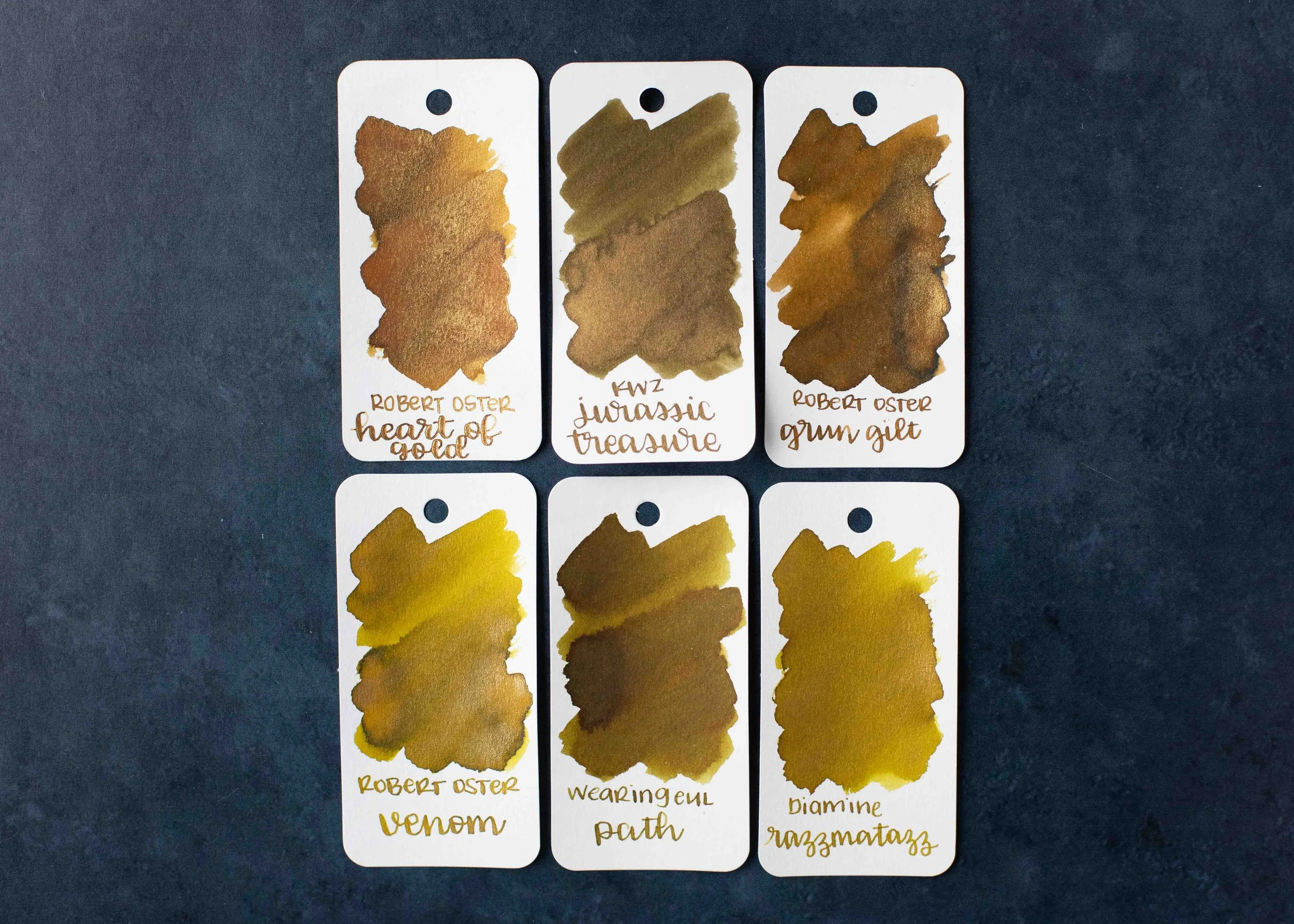
Out of all the comparison swabs I have Jurassic Treasure is closest to the golds. It seems closest to Wearingeul Path but it’s not a great match. Click here to see the yellow inks together.

Longer Writing:

I used a Lamy Safari Savannah with a broad nib on a Taroko Enigma notebook. The ink has an average flow.

Overall, I really love this ink. The color is super interesting and unusual-I don’t have any other inks that quite match the color. I love how small the shimmer is and how well it stays in suspension-I only had to shake the pen at the beginning of the page and the shimmer stayed consistent throughout the whole page. I absolutely recommend this ink.

Thanks to all my Patrons! I couldn’t do these reviews without you! You can find my Patreon page here.

Disclaimer: This product was provided by KWZ for the purpose of this review. All photos and opinions are my own. This page does not contain affiliate links and this post is not sponsored.

Ink Review #2662: KWZ Firecracker

KWZ Firecracker is from the “All That Glitters” collection. You can find this ink at some retailers including Vanness Pens.

The color:

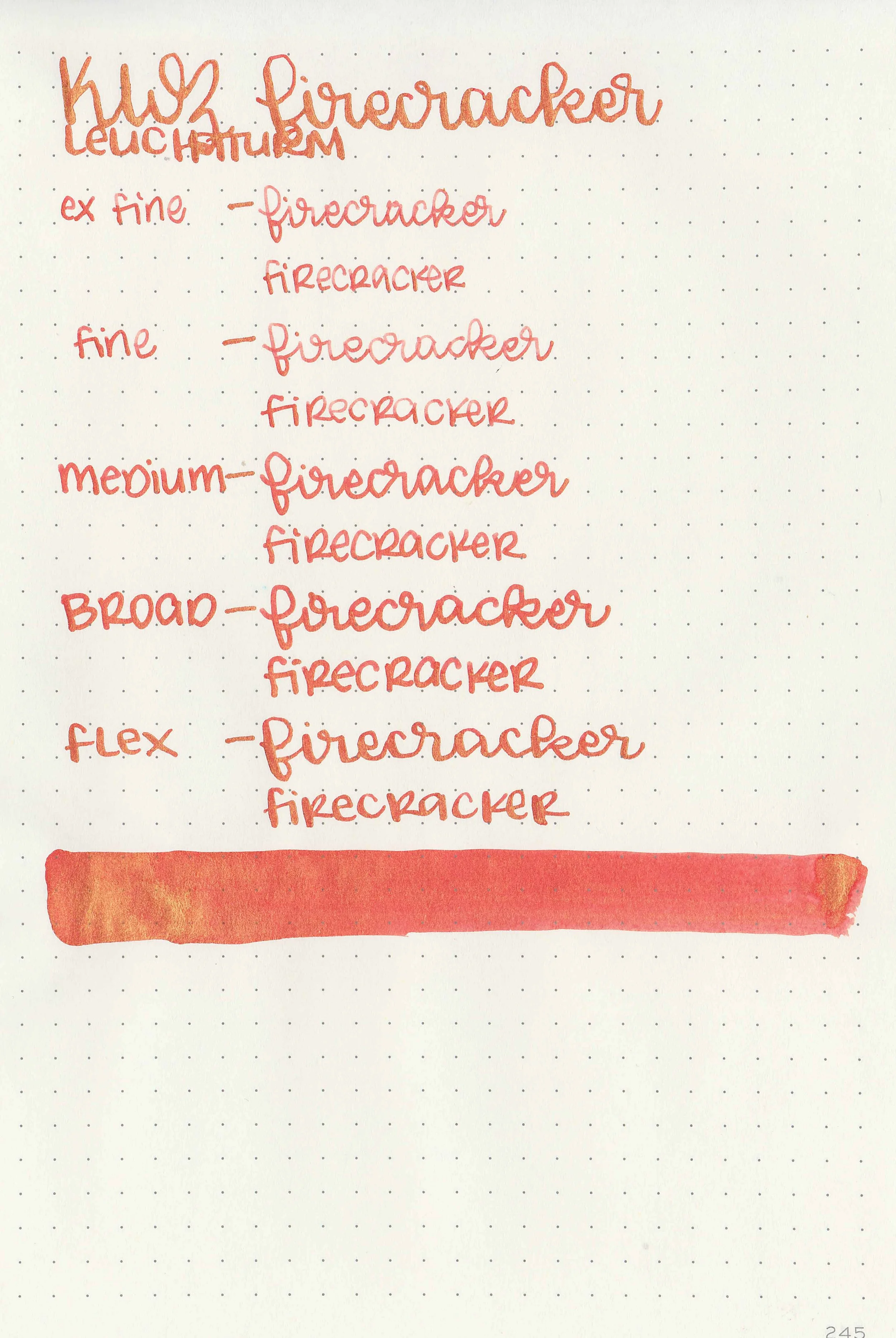
Firecracker is a bright medium red with lots of gold shimmer.

*For my swab cards I use a Col-o-ring by Skylab Letterpress, a medium Pilot Ishime and a Mabie Todd Swan.

Swabs:

In large swabs on Tomoe River paper you can see just how much gold shimmer there is, but the shimmer is smaller than other brands, so it flows much better than the average shimmer ink.

Writing samples:

Let's take a look at how the ink behaves on fountain pen friendly papers: Rhodia, Tomoe River, and Leuchtturm.

*For my writing samples I use:

Dry time: 40 seconds

Water resistance: Low

Feathering: None

Show through: Medium

Bleeding: None

Other properties: no shading, no sheen, and gold shimmer.

On 20 lb copy paper the ink had some feathering and some bleeding in the larger nib sizes.

Comparison Swabs:

Firecracker is closest to De Atramentis Camelian Red Bronze . Click here to see the red inks together.

Longer Writing:

I used a Pilot VP Coral with a medium nib on a Taroko Enigma notebook. The ink has an average flow.

Overall, I really love this ink. I love the smaller shimmer that flows really well. I love that I don’t have to agitate the pen as much as when using other brands’ shimmer inks because the shimmer stays in suspension better. Robert Oster Red Gold has been my favorite red ink with gold shimmer, but Firecracker gives Red Gold a run for its money. I think this just might be my new favorite red/gold combo! This ink is absolutely worth a try!

Thanks to all my Patrons! I couldn’t do these reviews without you! You can find my Patreon page here.

Disclaimer: All photos and opinions are my own. This page does not contain affiliate links and this post is not sponsored.

Ink Review #2661: Ferris Wheel Press Knitted Nettle

Ferris Wheel Press Knitted Nettle is from the Wild Swans collection. You can find this ink for sale at Ferris Wheel Press and Vanness Pens.

The color:

Knitted Nettle is a petrol teal-green with pink shimmer.

*For my swab cards I use a Col-o-ring by Skylab Letterpress, a medium Pilot Ishime and a Mabie Todd Swan.

Swabs:

In large swabs on Tomoe River paper the ink has some red sheen along with pink shimmer.

Writing samples:

Let's take a look at how the ink behaves on fountain pen friendly papers: Rhodia, Tomoe River, and Leuchtturm.

*For my writing samples I use:

Dry time: 30 seconds

Water resistance: Low

Feathering: None

Show through: Medium

Bleeding: Low

Other properties: low shading, low red sheen, and pink shimmer.

On 20 lb copy paper the ink had some feathering and bleeding in the larger nib sizes.

Comparison Swabs:

Knitted Nettle is closest to Diamine Best Wishes. Click here to see the teal inks together.

Longer Writing:

I used a Kaweco Sport Transparent Teal with a medium nib on a Taroko Enigma notebook. The ink has a slightly dry flow.

Overall, The color of this ink is a bit unusual-I only have one ink that’s similar. It’s nice and readable, even in smaller nib sizes. I do wish the flow was a bit wetter.

Thanks to all my Patrons! I couldn’t do these reviews without you! You can find my Patreon page here.

Disclaimer: All photos and opinions are my own. This page does not contain affiliate links and this post is not sponsored.

Ink Review #2660: Ferris Wheel Press The Sad Charade

Today’s ink is Ferris Wheel Press The Sad Charade. You can find this ink for sale at Ferris Wheel Press and Vanness Pens.

The color:

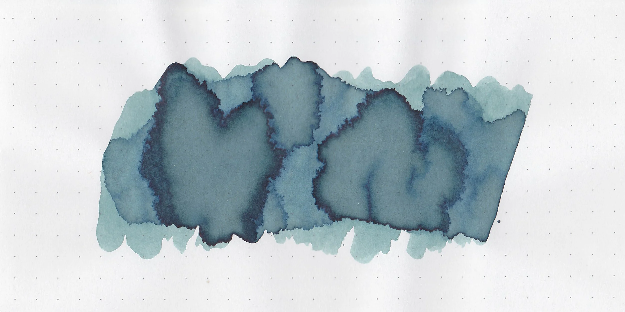
The Sad Charade is hard to quantify. It’s not quite blue, not quite grey and not quite green. It’s right in the middle of all three.

*For my swab cards I use a Col-o-ring by Skylab Letterpress, a medium Pilot Ishime and a Mabie Todd Swan.

Swabs:

In large swabs on Tomoe River paper the ink looks more blue than it does on the Col-o-ring swab.

Writing samples:

Let's take a look at how the ink behaves on fountain pen friendly papers: Rhodia, Tomoe River, and Leuchtturm.

*For my writing samples I use:

Dry time: 20 seconds

Water resistance: Low

Feathering: None

Show through: Medium

Bleeding: None

Other properties: low shading, no sheen, and no shimmer.

On 20 lb copy paper the ink had feathering in all nib sizes and some bleeding.

Comparison Swabs:

The Sad Charade isn’t close to any other inks I have. Click here to see the blue inks together.

Longer Writing:

I used a Kaweco Al-sport Petrol, with a medium nib on a Taroko Enigma notebook. The ink has a slightly dry flow.

Overall, this color is really unique-I don’t have anything else quite like it. I do wish the flow was wetter because the slightly dry flow can make the ink hard to read in smaller nib sizes.

Thanks to all my Patrons! I couldn’t do these reviews without you! You can find my Patreon page here.

Disclaimer: All photos and opinions are my own. This page does not contain affiliate links and this post is not sponsored.

Ink Review #2659: Wearingeul Tsukuyomi

Wearingeul Tsukuyomi is from the World Myth collection. You can find this ink for sale at most retailers including Vanness Pens.

The color:

Tsukuyomi is a pale lilac purple.

*For my swab cards I use a Col-o-ring by Skylab Letterpress, a medium Pilot Ishime and a Mabie Todd Swan.

Swabs:

In large swabs on Tomoe River paper the ink looks bluer than it does on the Col-o-ring swab.

Writing samples:

Let's take a look at how the ink behaves on fountain pen friendly papers: Rhodia, Tomoe River, and Leuchtturm.

*For my writing samples I use:

Dry time: 30 seconds

Water resistance: Low

Feathering: None

Show through: Medium

Bleeding: None

Other properties: low shading, no sheen, and no shimmer.

On 20 lb copy paper the ink had some feathering and a tiny bit of bleeding in the larger nib sizes.

Comparison Swabs:

Tsukuyomi is a bit lighter than Diamine A Toe In The Ocean. Click here to see the purple inks together.

Longer Writing:

I used a Lamy Al-star Pacific Blue with a medium nib on a Taroko Enigma notebook. The ink has a dry flow.

Overall, while I like the color in swabs, it’s just too pale and dry in writing for me. In long writing it started out okay with a fresh fill, but after a few lines it just becomes pale and unreadable.

Thanks to all my Patrons! I couldn’t do these reviews without you! You can find my Patreon page here.

Disclaimer: All photos and opinions are my own. This page does not contain affiliate links and this post is not sponsored.

Ink Review #2658: Rohrer and Klingner Alt-bordeaux

Rohrer and Klingner Alt-Bordeaux is from the standard collection. You can find this ink for sale at most retailers including Vanness Pens.

The color:

Alt-bordeaux is an unsaturated violet.

*For my swab cards I use a Col-o-ring by Skylab Letterpress, a medium Pilot Ishime and a Mabie Todd Swan.

Swabs:

In large swabs on Tomoe River paper the ink is more saturated than on the Col-o-ring swab.

Writing samples:

Let's take a look at how the ink behaves on fountain pen friendly papers: Rhodia, Tomoe River, and Leuchtturm.

*For my writing samples I use:

Dry time: 60 seconds

Water resistance: Low

Feathering: None

Show through: Medium

Bleeding: None

Other properties: medium shading, no sheen, and no shimmer.

On 20 lb copy paper the ink had some bleeding and feathering in the larger nib sizes.

Comparison Swabs:

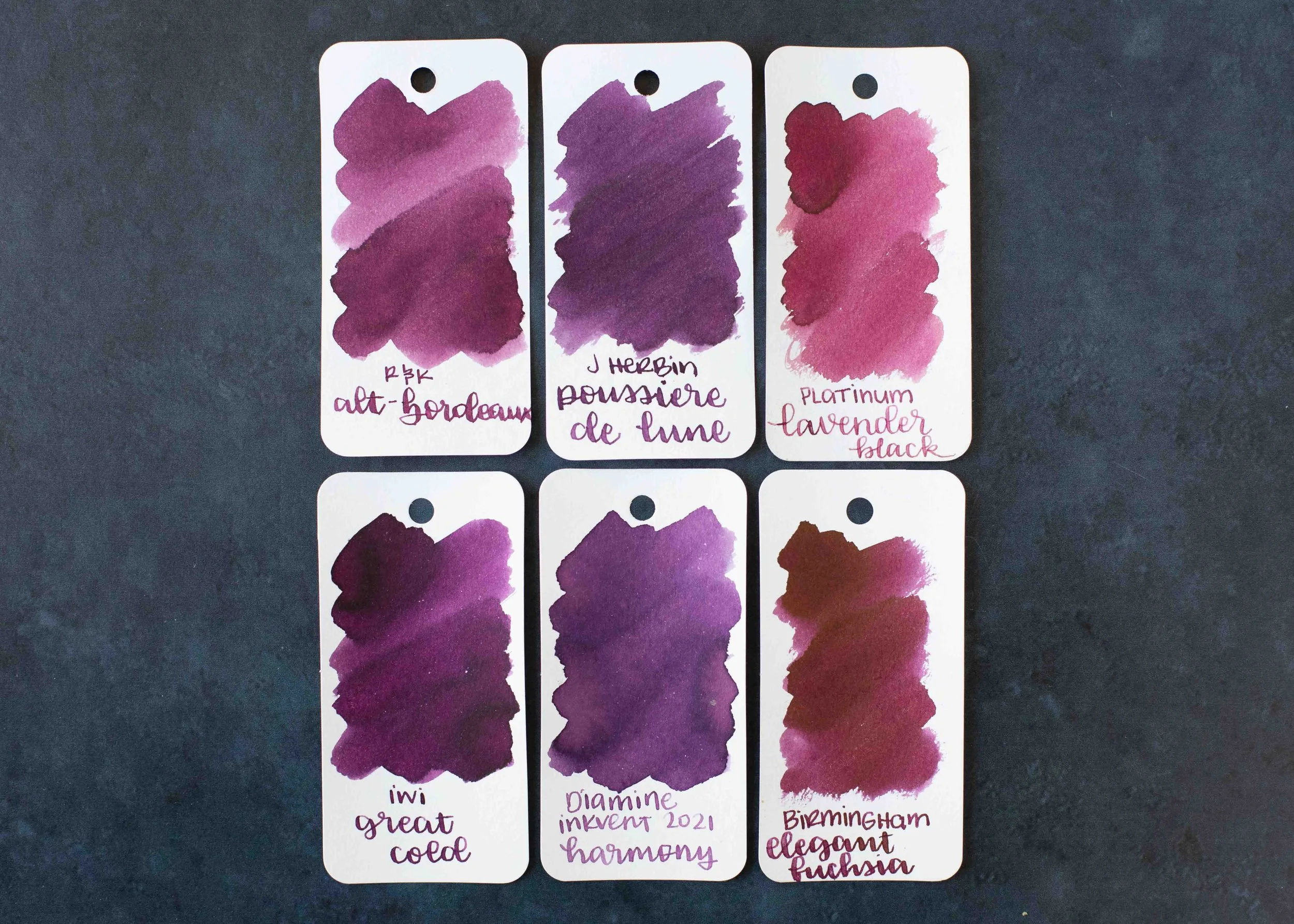
Alt-bordeaux is darker and more purple than Platinum Lavender Black, but lighter and less saturated than IWI Great Cold. Click here to see the purple inks together.

Longer Writing:

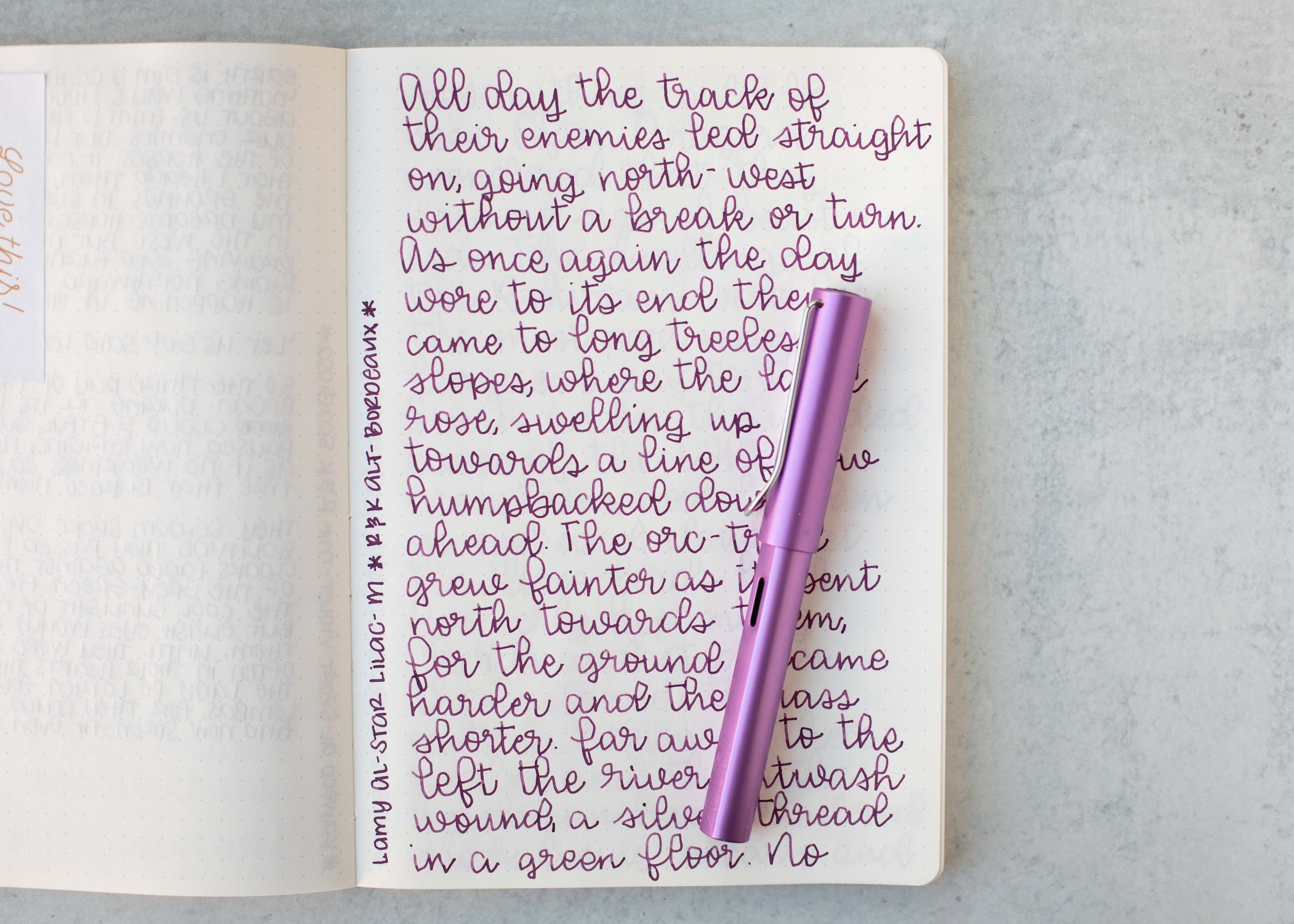
I used a Kaweco Al-sport Lilac with a medium nib on a Taroko Enigma notebook. The ink has an average flow.

Overall, this is a great ink-well behaved, affordable, and even has some nice shading!

Thanks to all my Patrons! I couldn’t do these reviews without you! You can find my Patreon page here.

Disclaimer: All photos and opinions are my own. This page does not contain affiliate links and this post is not sponsored.

Ink Review #2657: Rohrer and Klingner Cassia

Rohrer and Klingner Cassia is from the standard collection. You can find this ink for sale at most retailers including Vanness Pens.

The color:

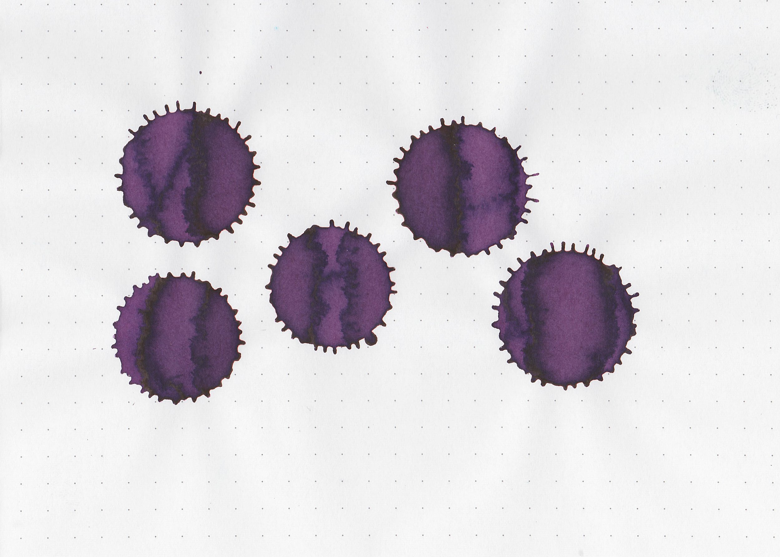
Cassia is a vibrant purple.

*For my swab cards I use a Col-o-ring by Skylab Letterpress, a medium Pilot Ishime and a Mabie Todd Swan.

Swabs:

In large swabs on Tomoe River paper the ink has some pretty green sheen.

Writing samples:

Let's take a look at how the ink behaves on fountain pen friendly papers: Rhodia, Tomoe River, and Leuchtturm.

*For my writing samples I use:

Dry time: 30 seconds

Water resistance: Medium

Feathering: None

Show through: Medium

Bleeding: None

Other properties: medium shading, low green sheen, and no shimmer.

On 20 lb copy paper the ink had some bleeding and feathering in the larger nib sizes.

Comparison Swabs:

Cassia is darker than Waterman Tender Purple, but lighter than Private Reserve Purple Mojo. Click here to see the purple inks together.

Longer Writing:

I used a Kaweco Al-sport Purple with a medium nib on a Taroko Enigma notebook. The ink has an average flow.

Overall, this is a lovely ink. I really enjoyed using it, and it’s at a great price point too!

Thanks to all my Patrons! I couldn’t do these reviews without you! You can find my Patreon page here.

Disclaimer: All photos and opinions are my own. This page does not contain affiliate links and this post is not sponsored.

Ink Review #2656: Colorverse a Lib

Colorverse a Lib is from the Project Volume 5 collection. You can find this ink for sale at most retailers including Vanness Pens.

The color:

a Lib is a pale lilac purple.

*For my swab cards I use a Col-o-ring by Skylab Letterpress, a medium Pilot Ishime and a Mabie Todd Swan.

Swabs:

In large swabs on Tomoe River paper the ink looks much darker than it does in writing.

Writing samples:

Let's take a look at how the ink behaves on fountain pen friendly papers: Rhodia, Tomoe River, and Leuchtturm.

*For my writing samples I use:

Dry time: 40 seconds

Water resistance: Low

Feathering: None

Show through: Medium

Bleeding: None

Other properties: medium shading, no sheen, and no shimmer.

On 20 lb copy paper the ink had some feathering and bleeding in the larger nib sizes.

Comparison Swabs:

a Lib is closest to Wearingeul Tsukuyomi. Click here to see the purple inks together.

Longer Writing:

I used a Lamy Safari Violet with a medium nib on a Taroko Enigma notebook. The ink has a dry flow.

Overall, the color is interesting, and I like it in large swabs, but in writing the shading can be too light, which makes it hard to read.

Thanks to all my Patrons! I couldn’t do these reviews without you! You can find my Patreon page here.

Disclaimer: All photos and opinions are my own. This page does not contain affiliate links and this post is not sponsored.