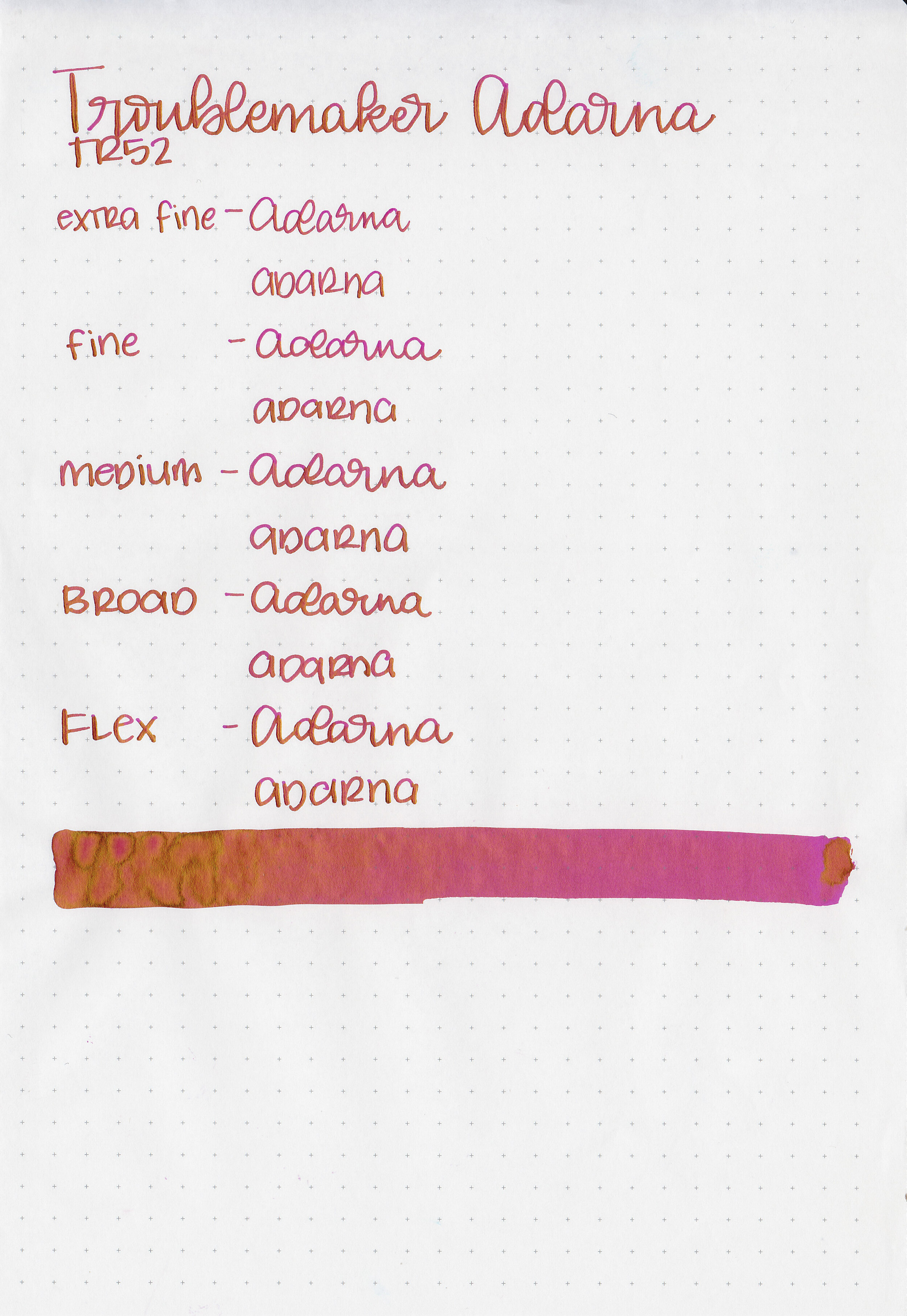
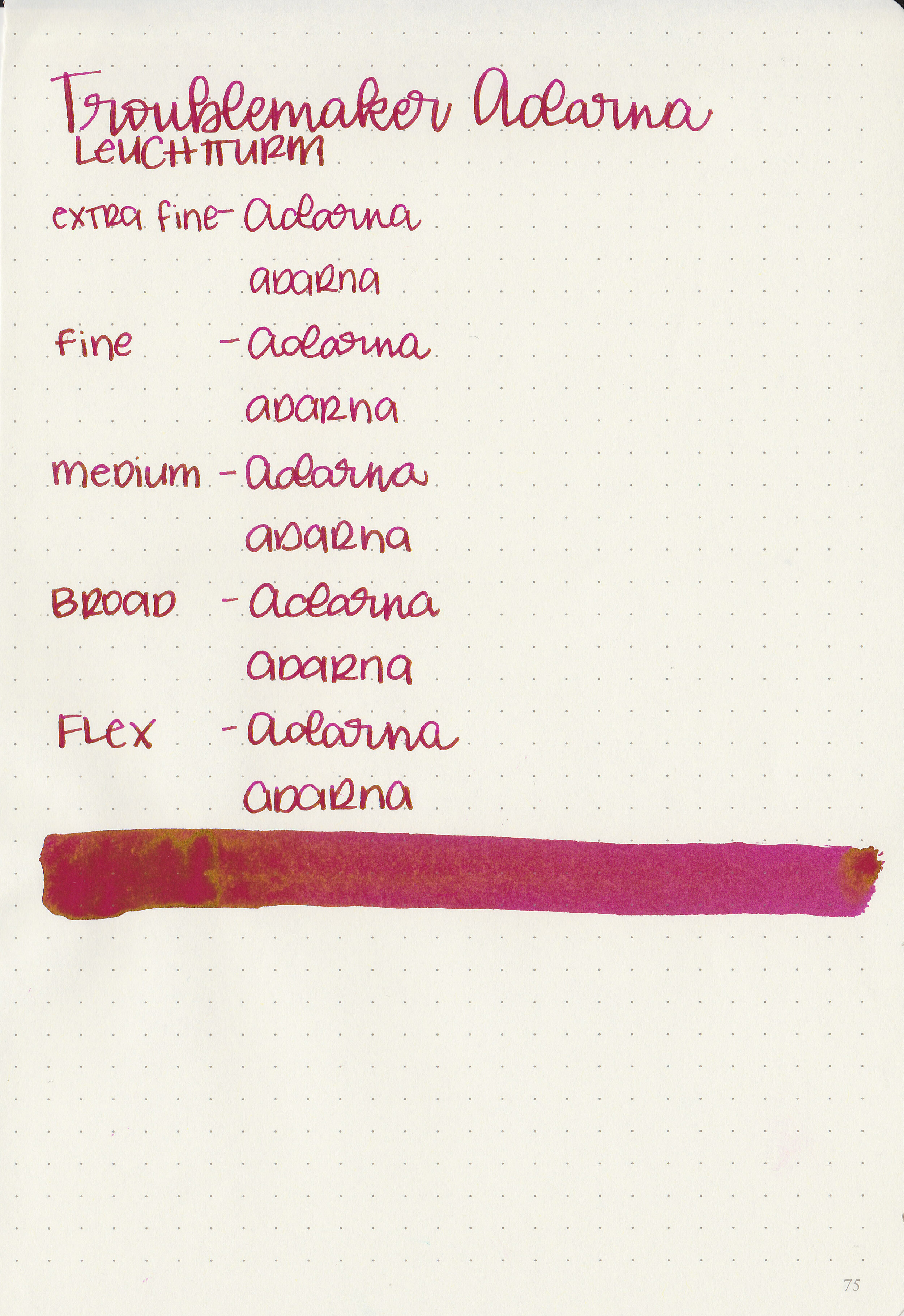
Ink Review #1075: Troublemaker Seaglass
/
Shigure Inks has quickly become one of my favorite retailers-they are a great place to buy Troublemaker inks in the US. They recently sent me a few Troublemaker inks to try out, starting with Sea Glass.

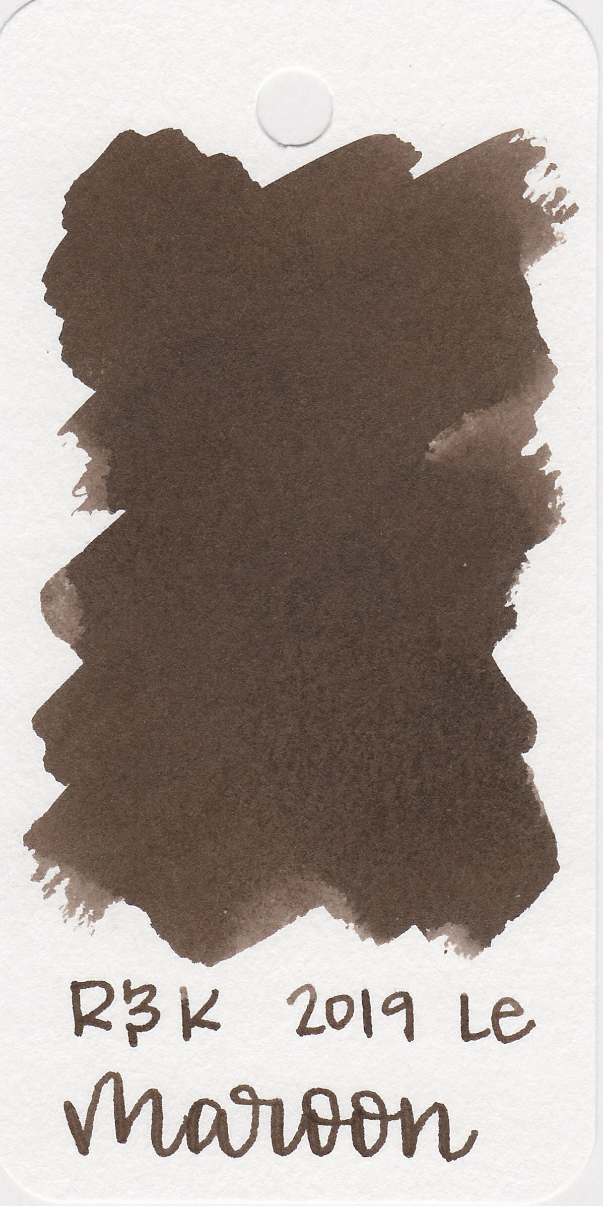
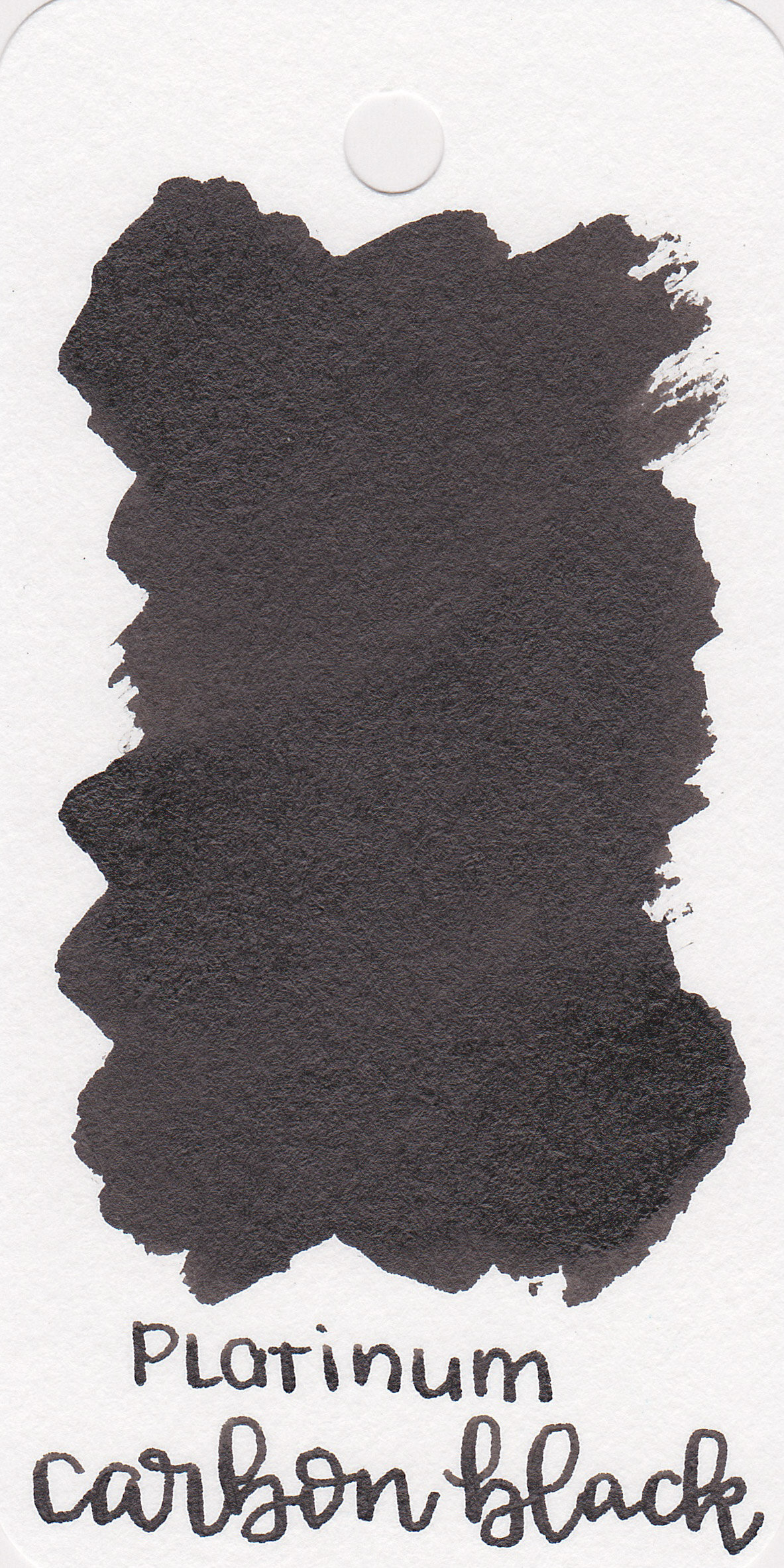
The color:
Sea Glass is a medium but very unsaturated green.
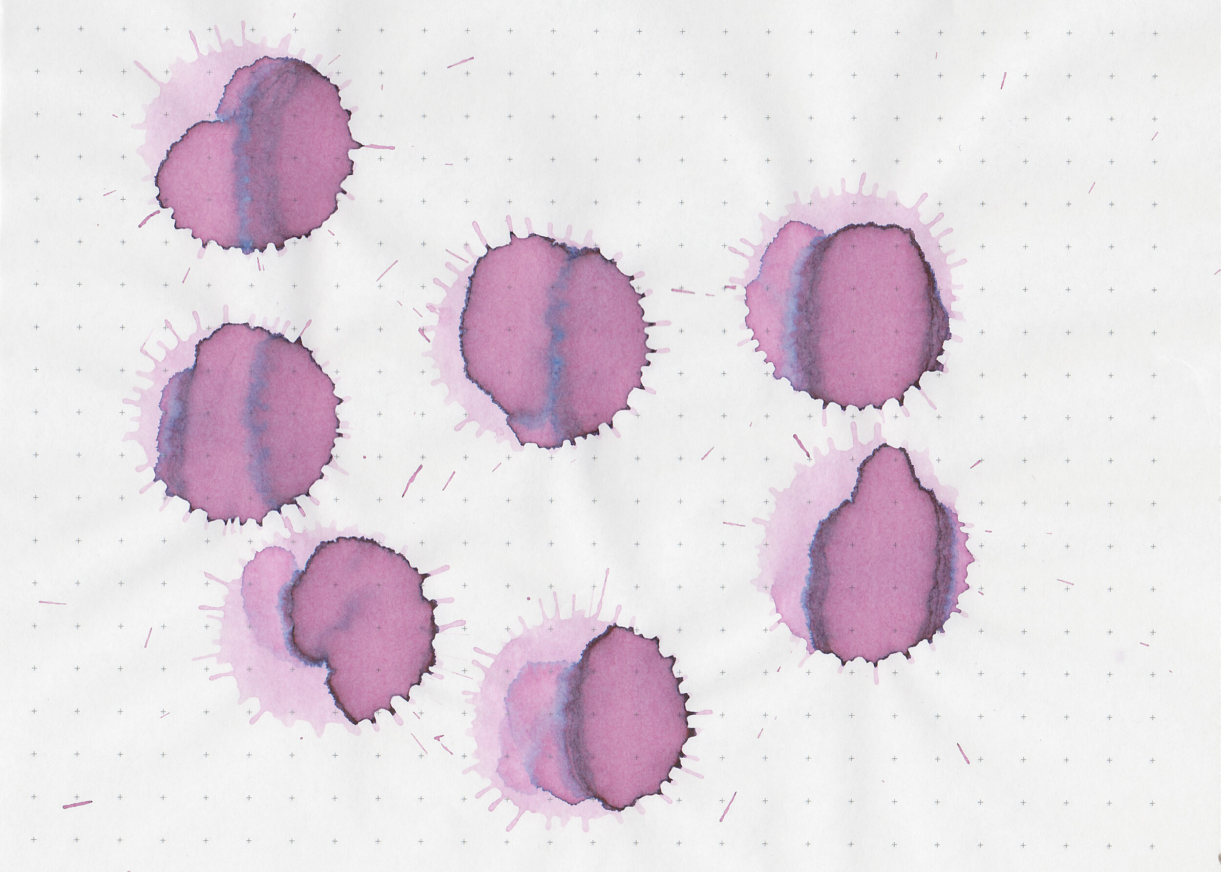
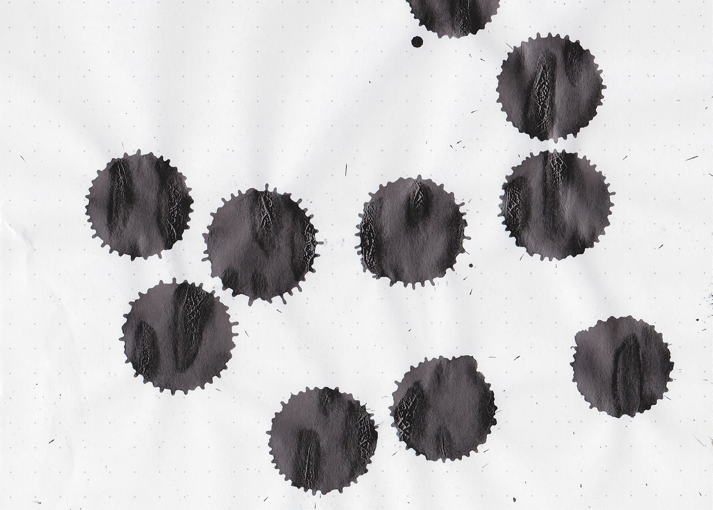
Swabs:

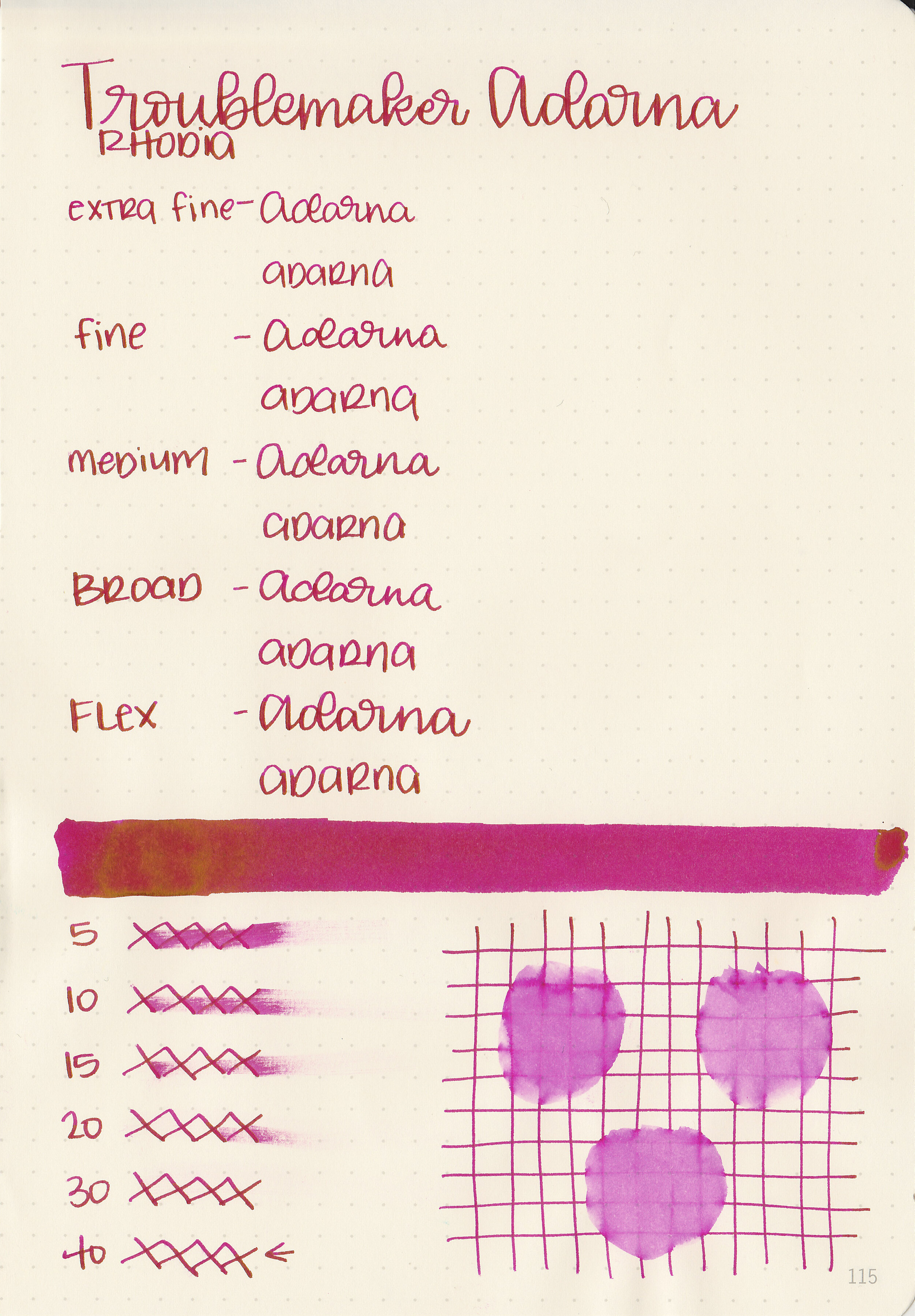
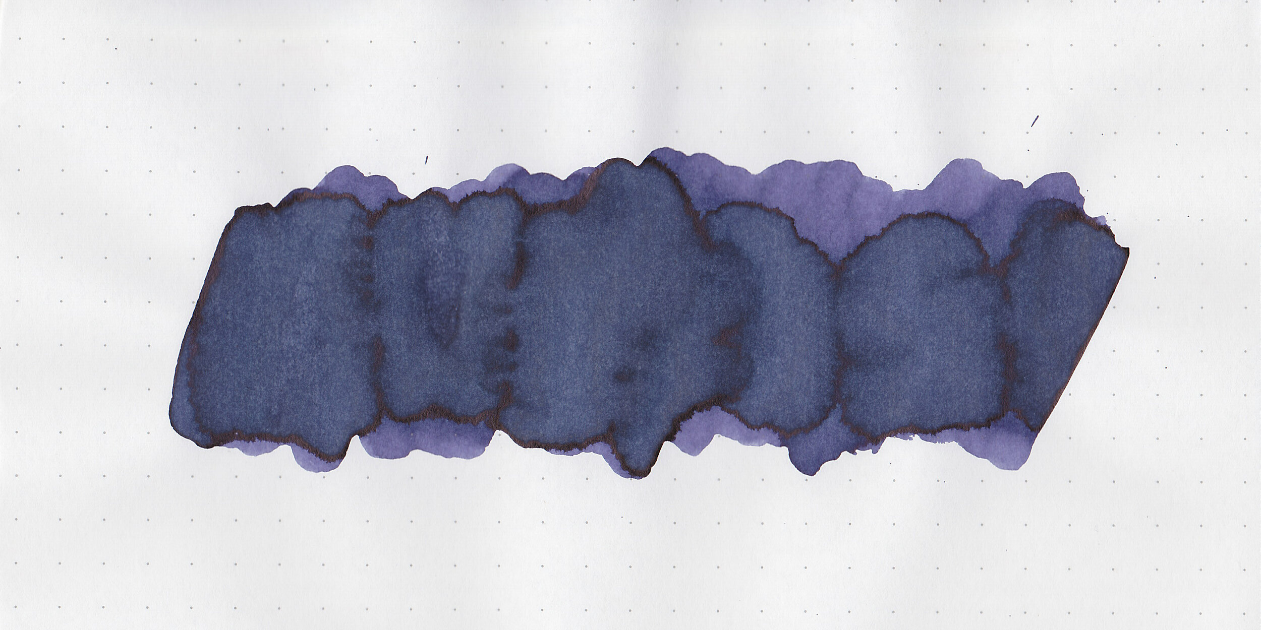
In large swabs on Tomoe River paper the ink shades from green to brown pink and blue.

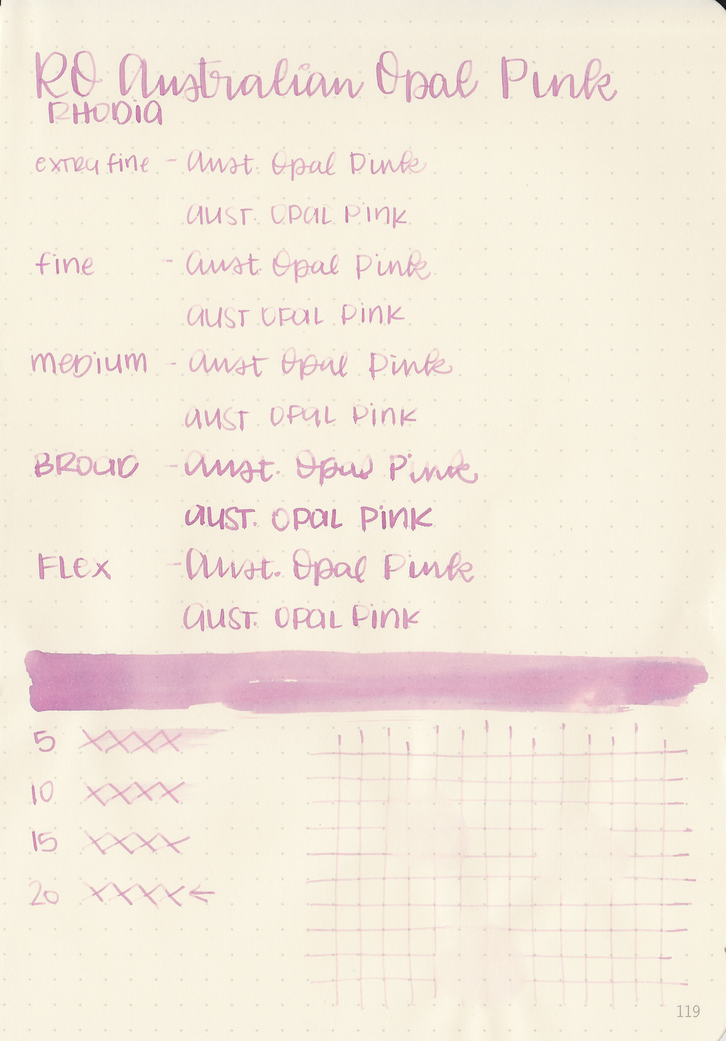
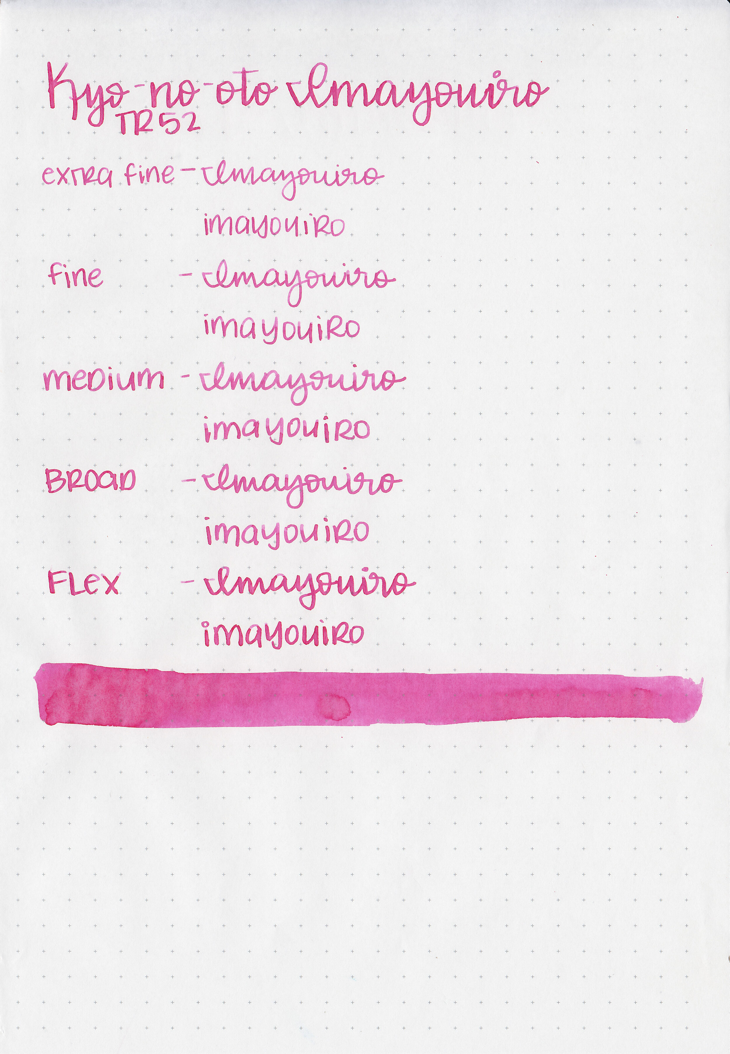
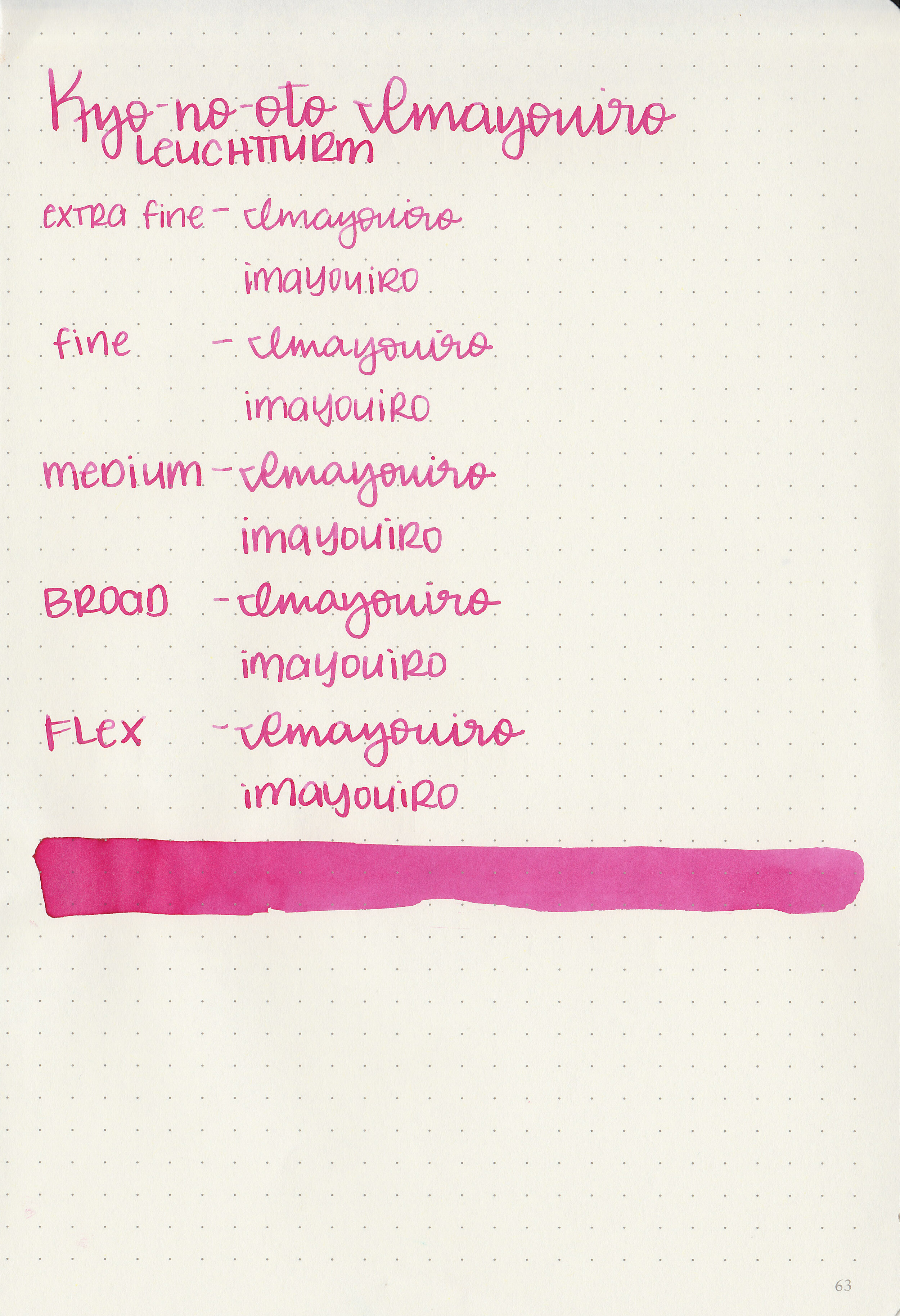
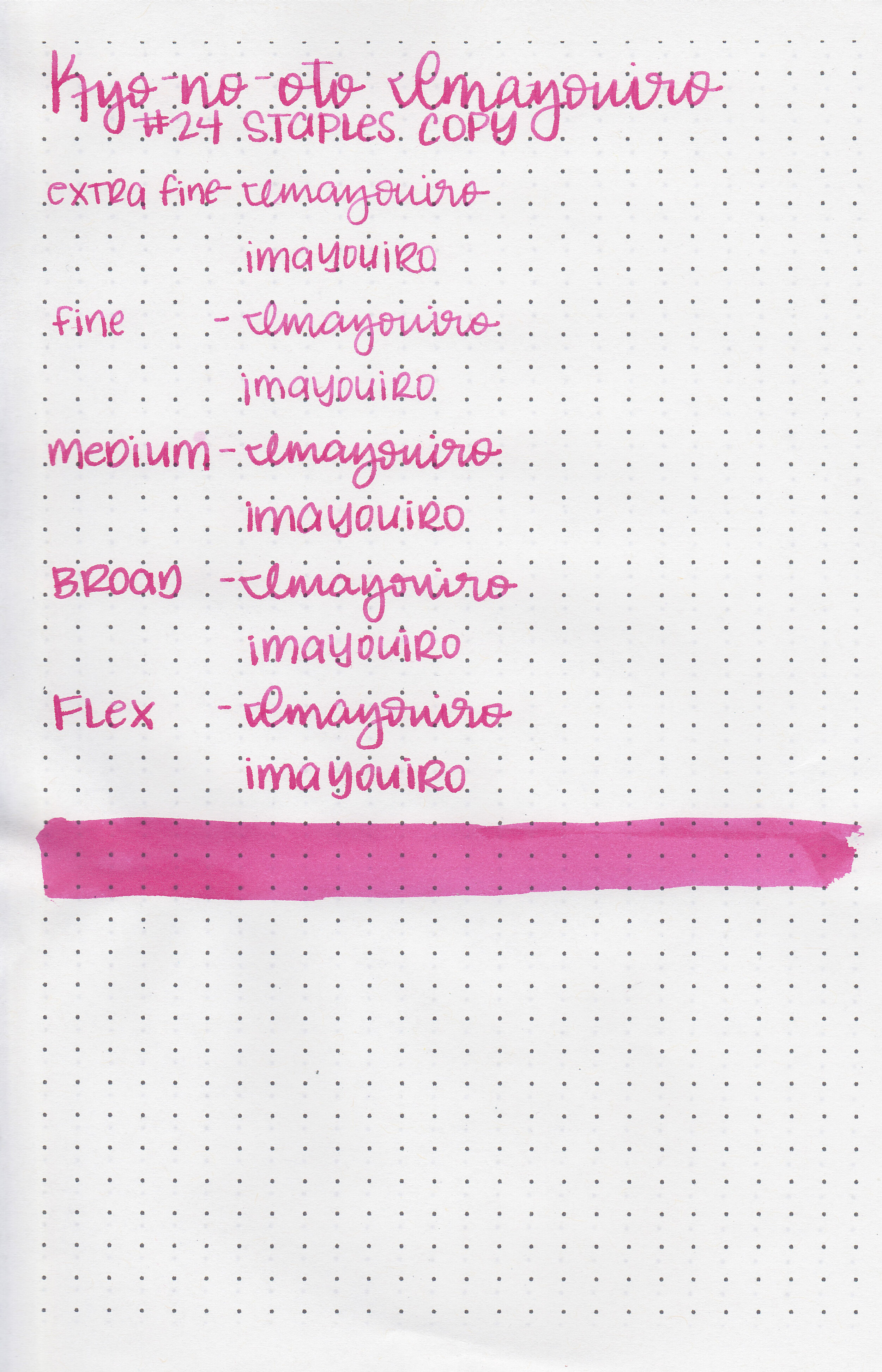
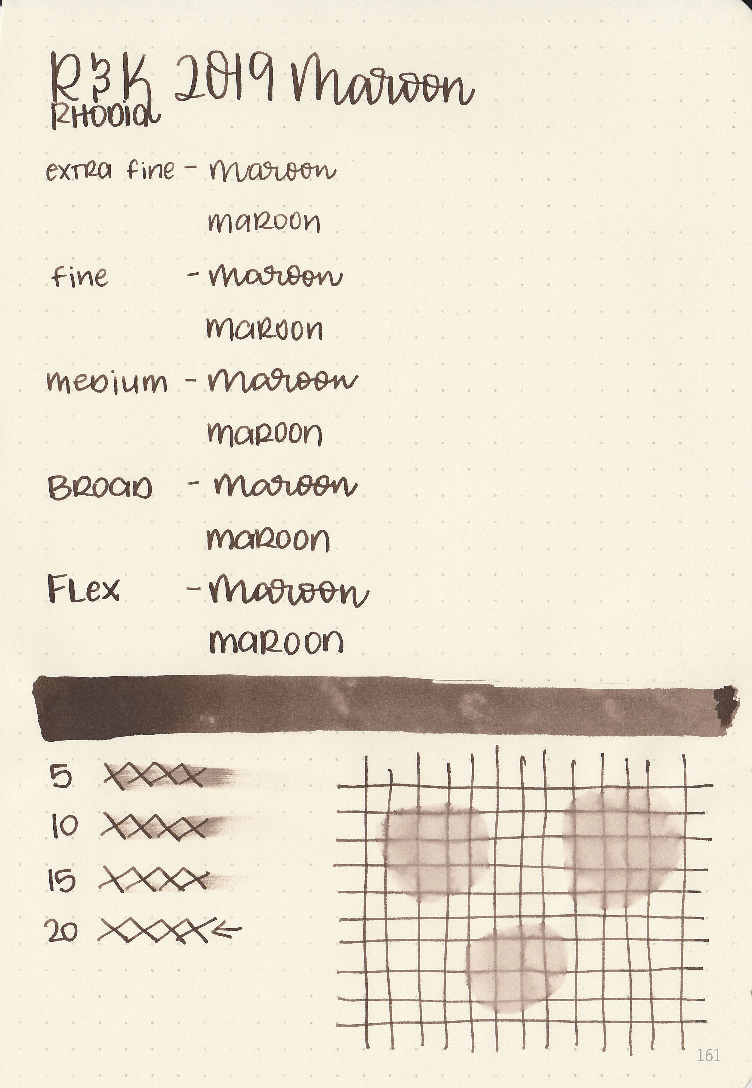
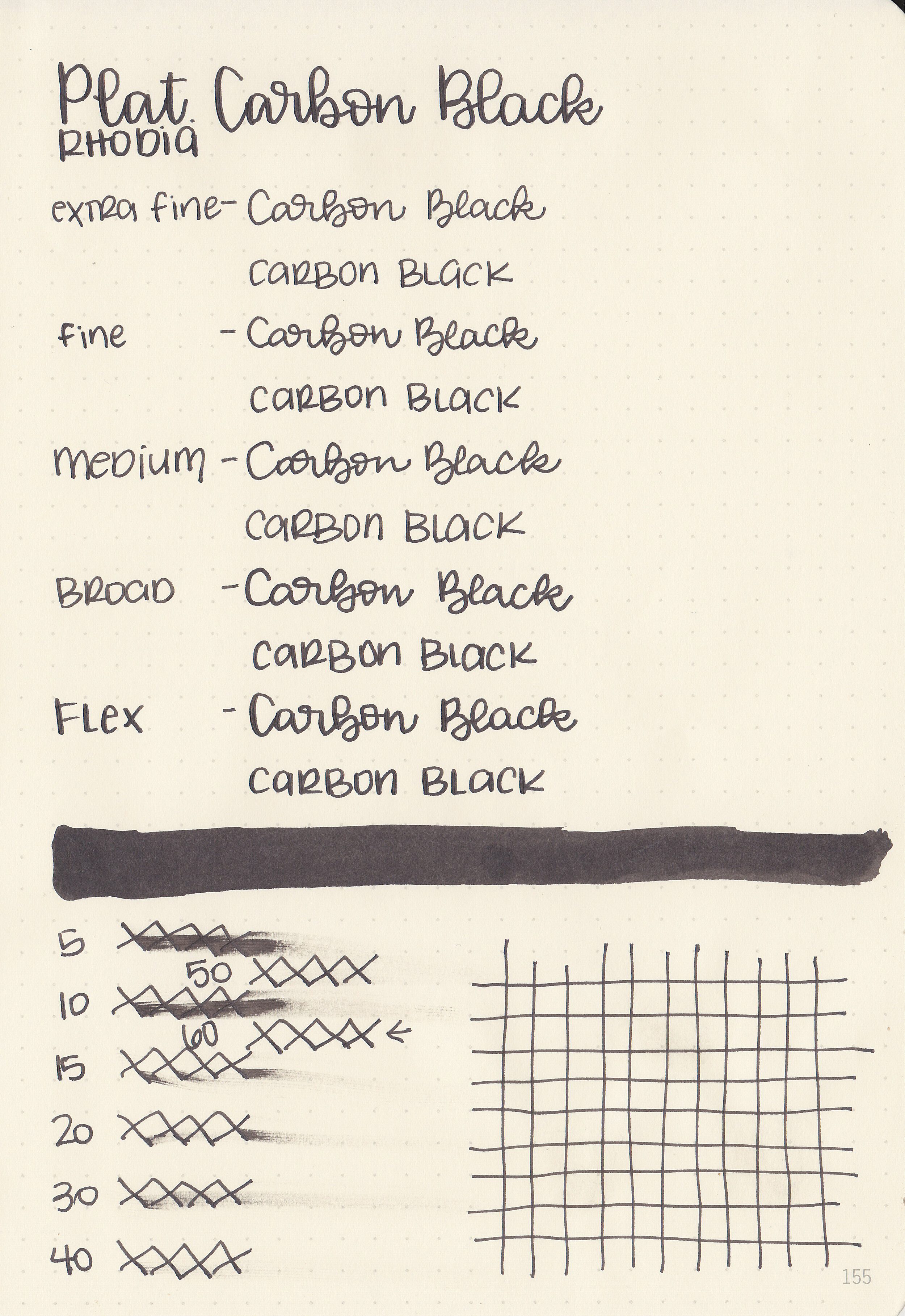
Writing samples:
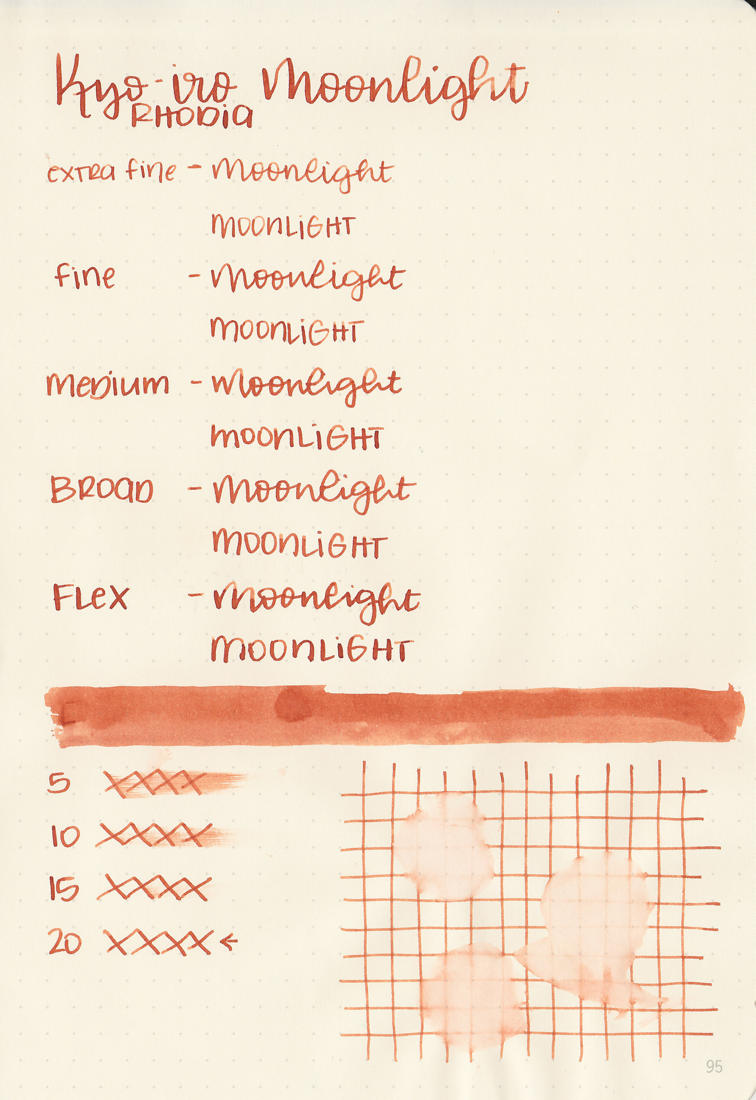
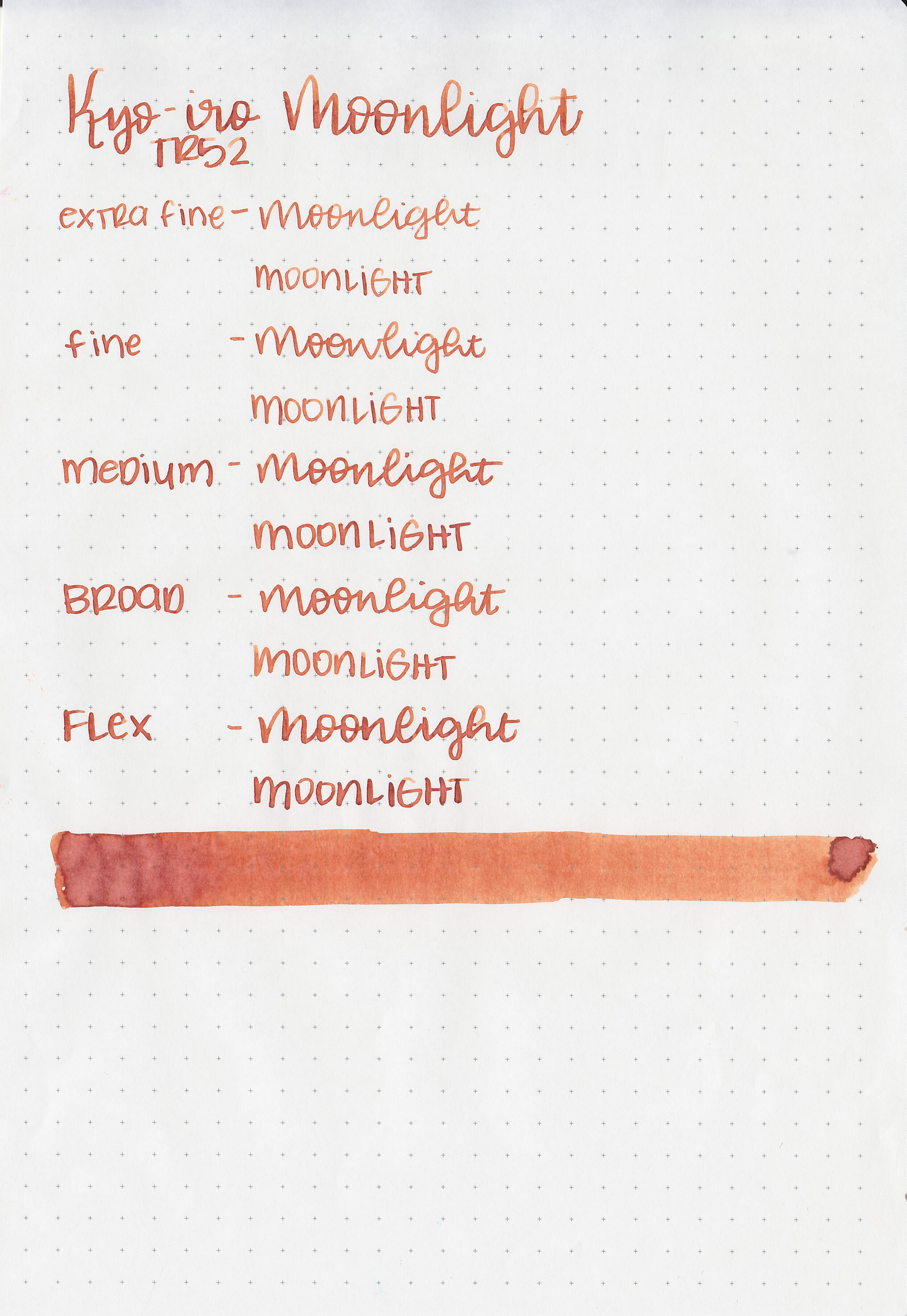
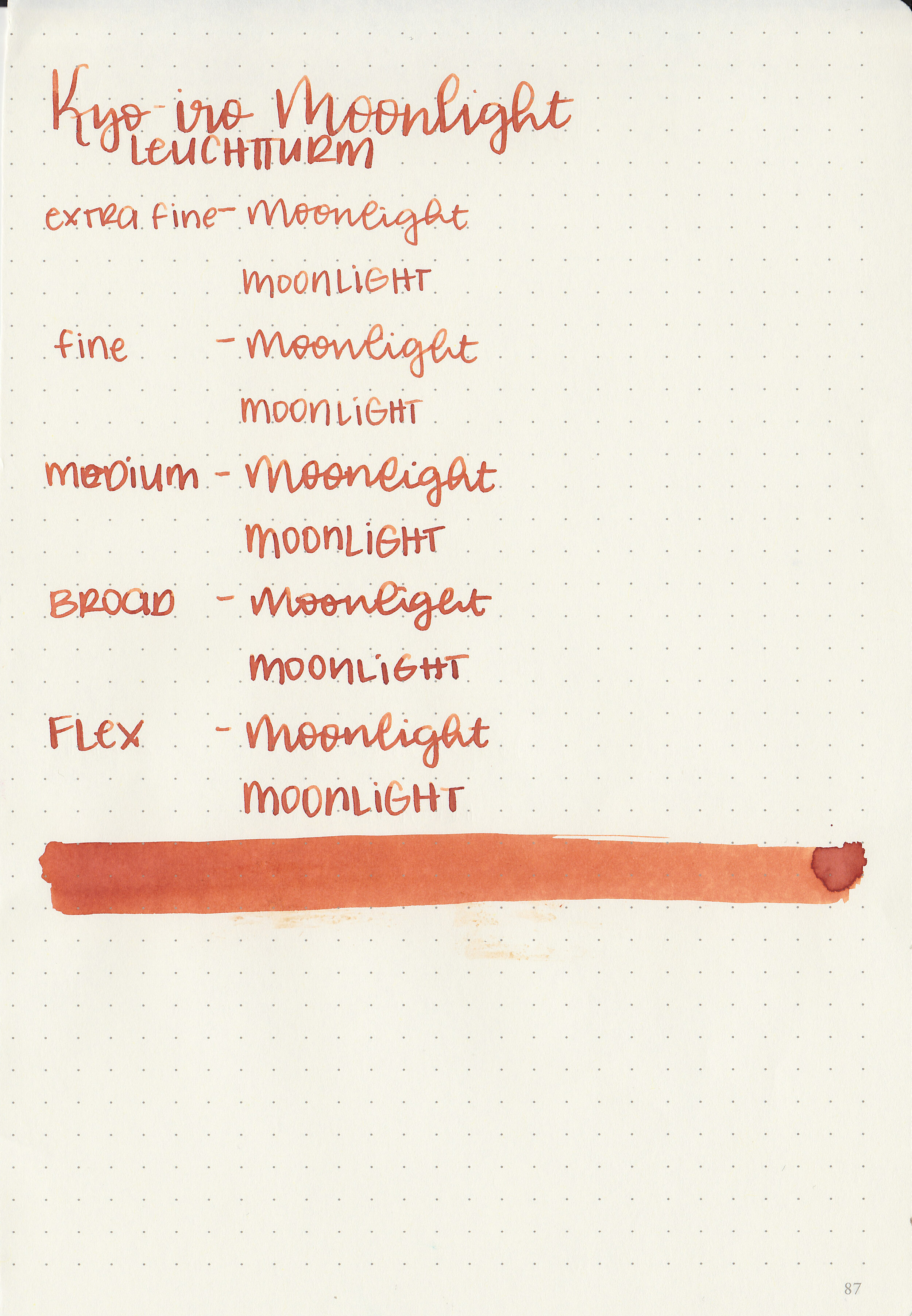
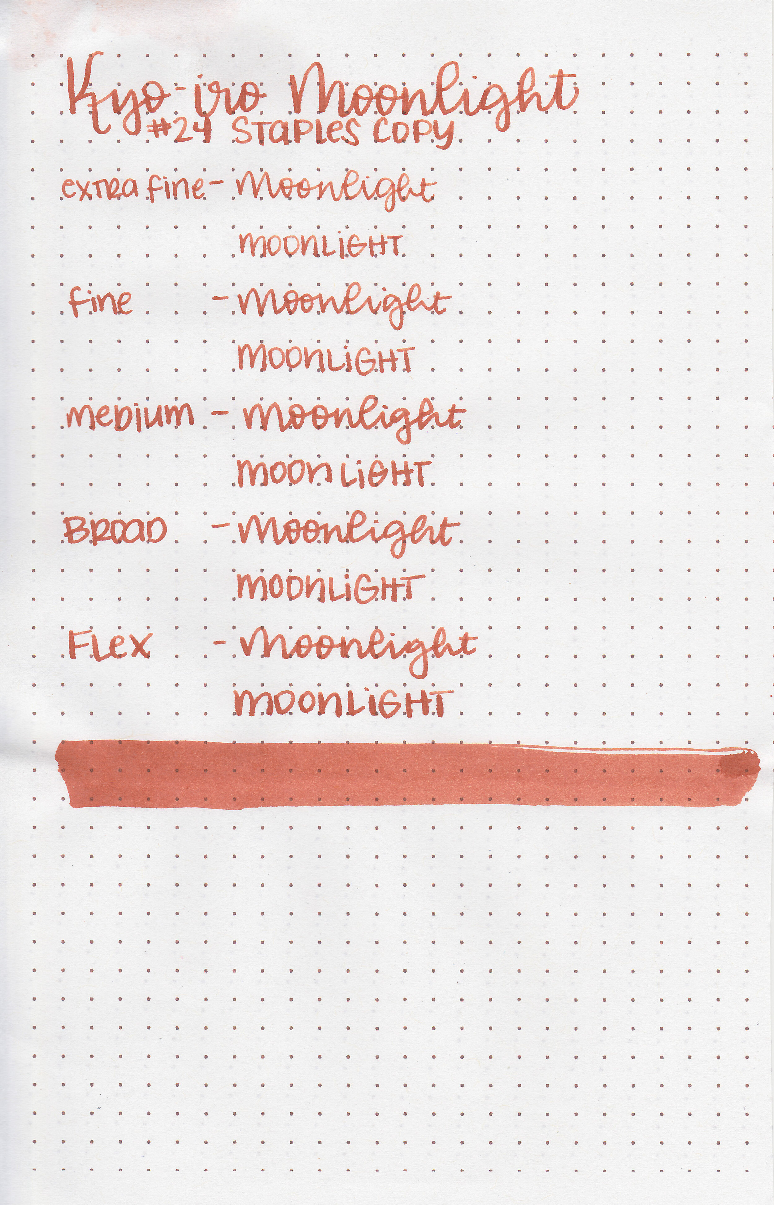
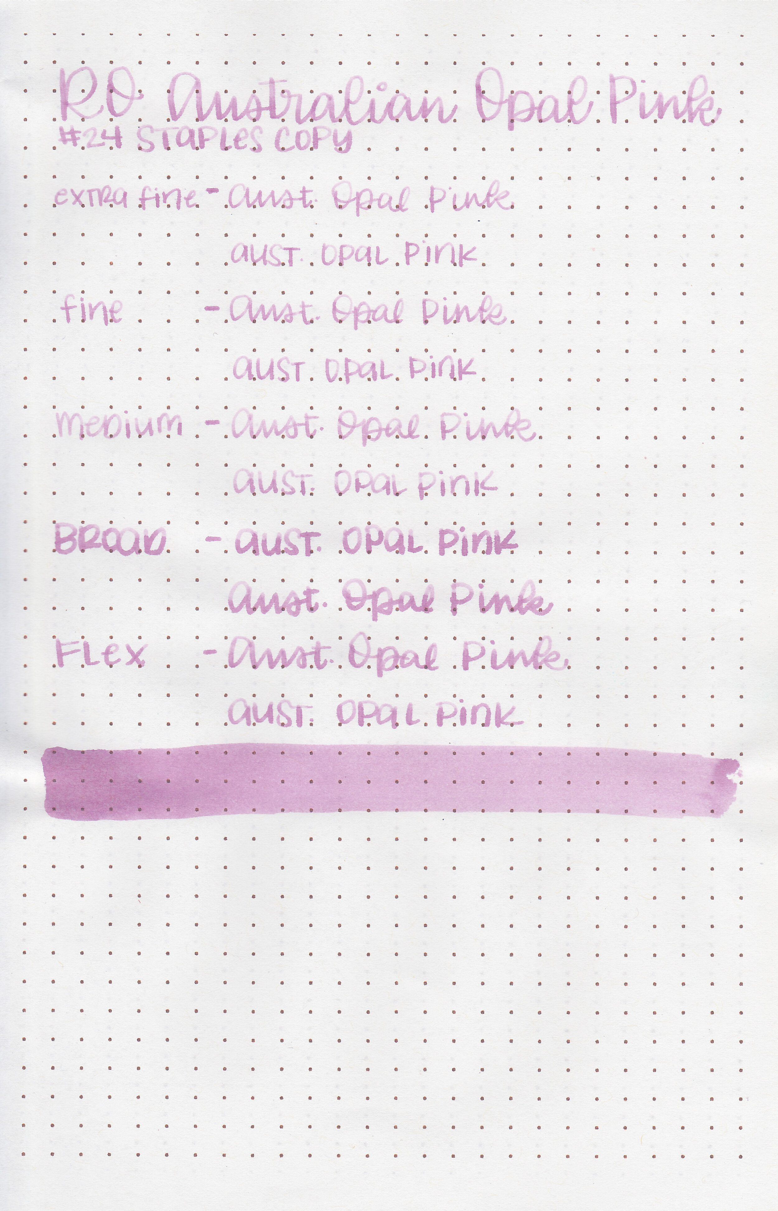
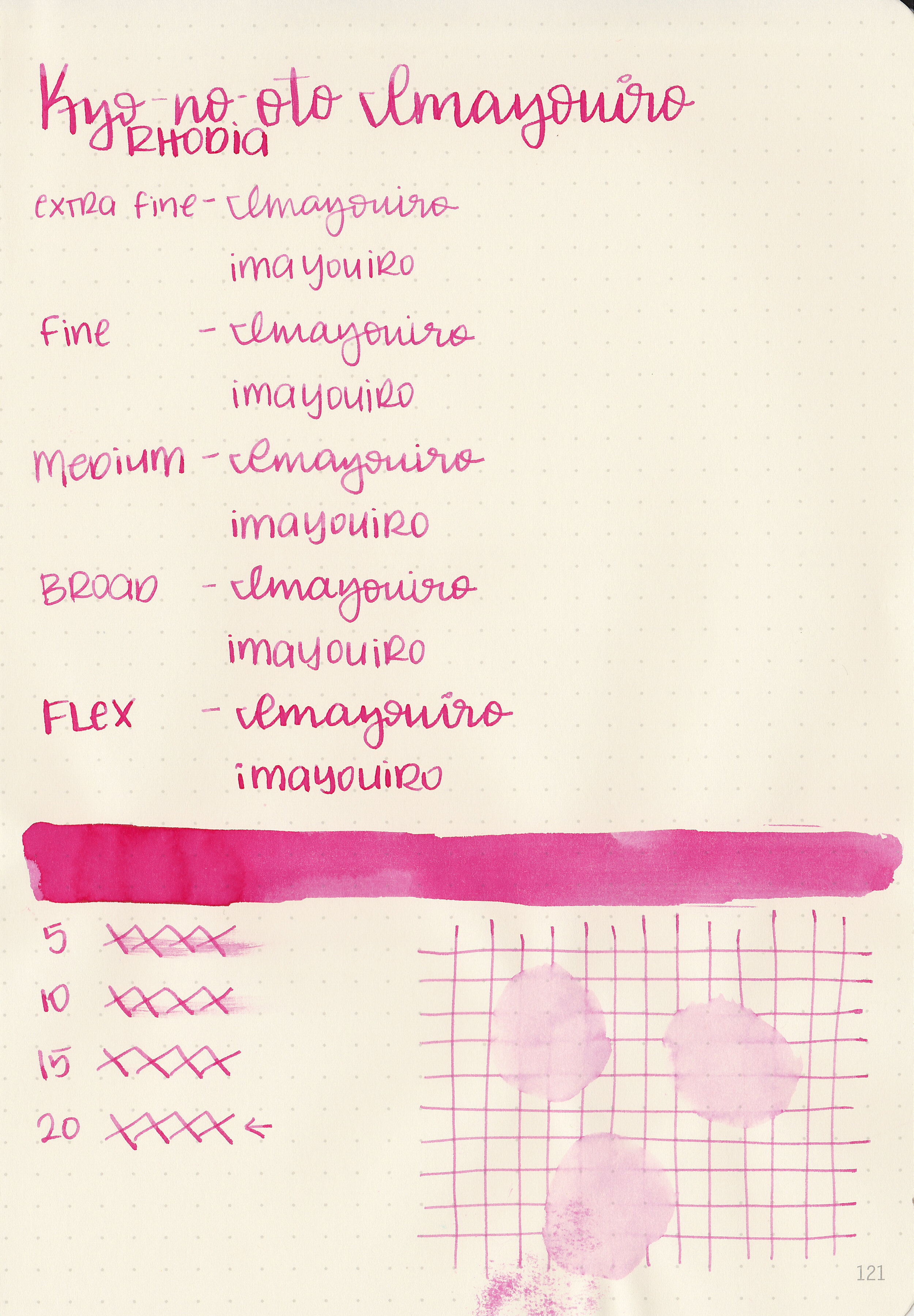
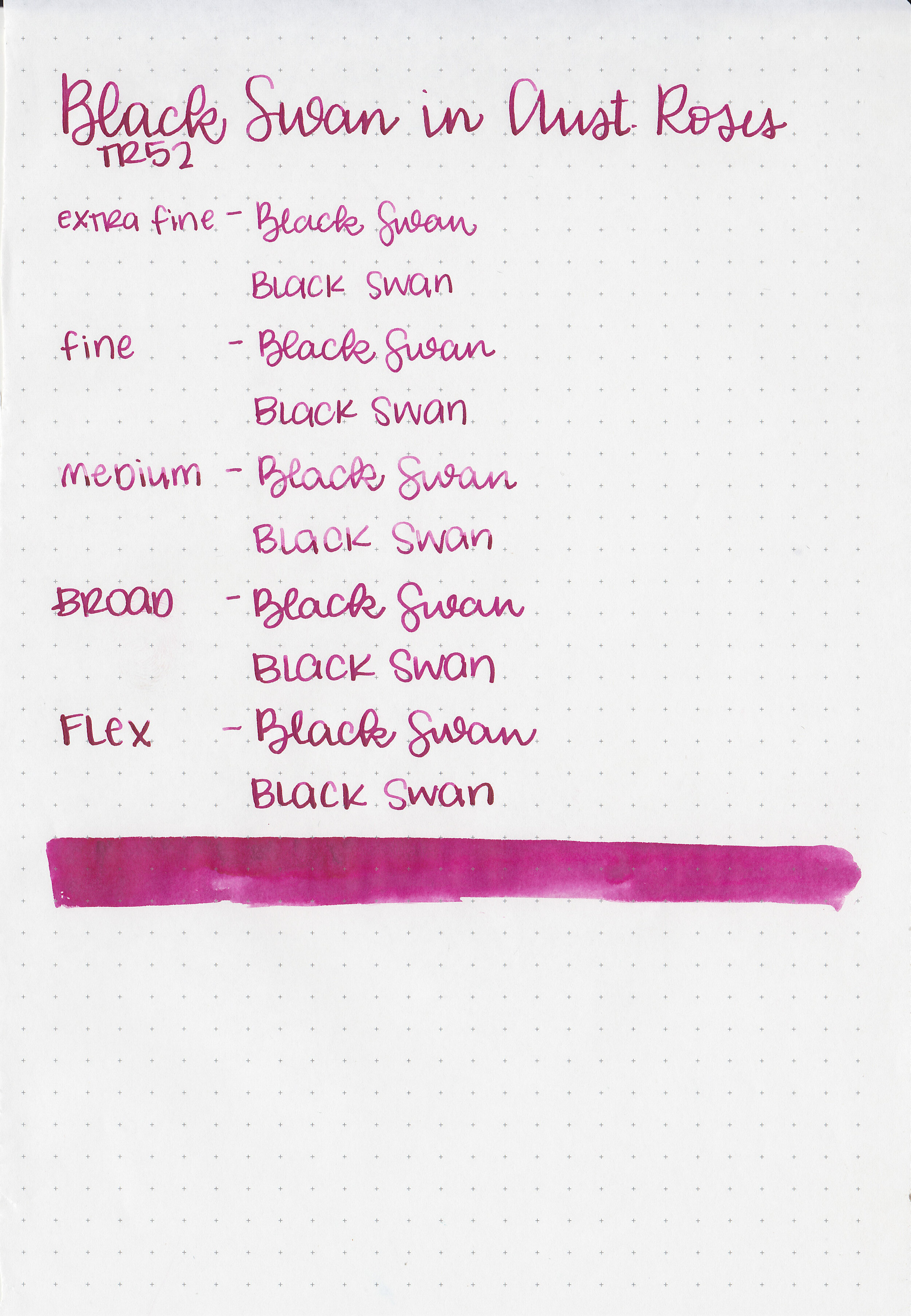
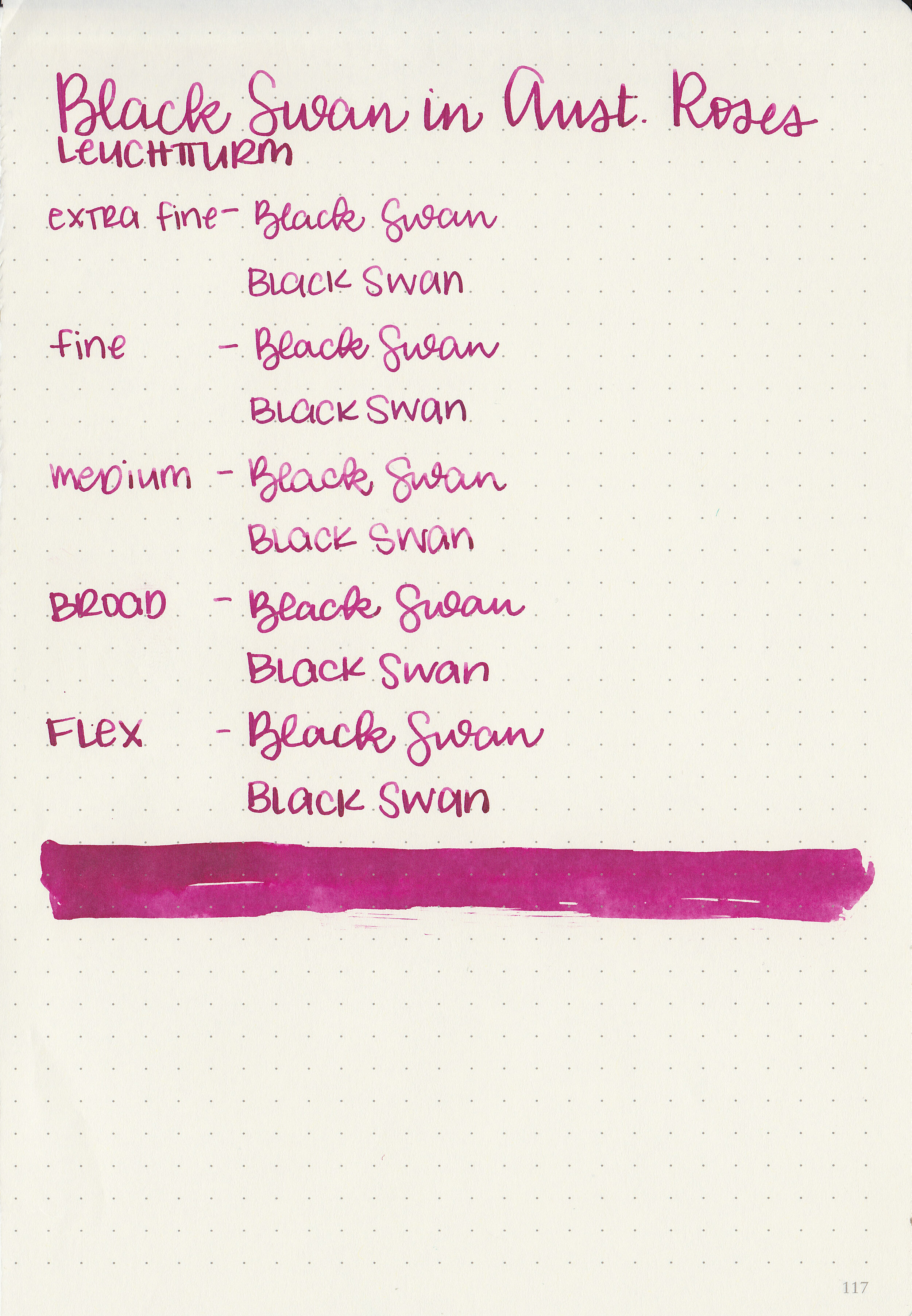
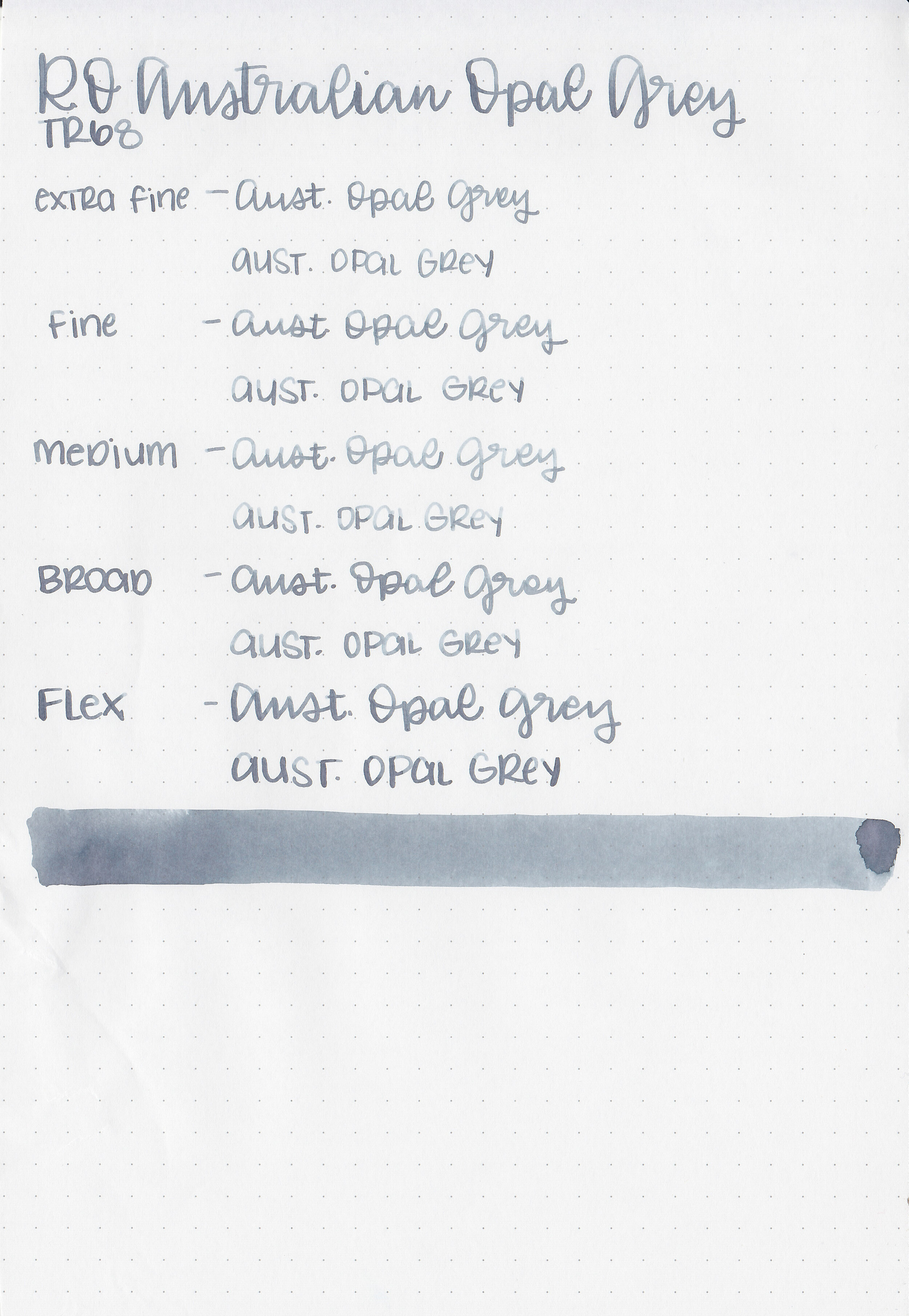
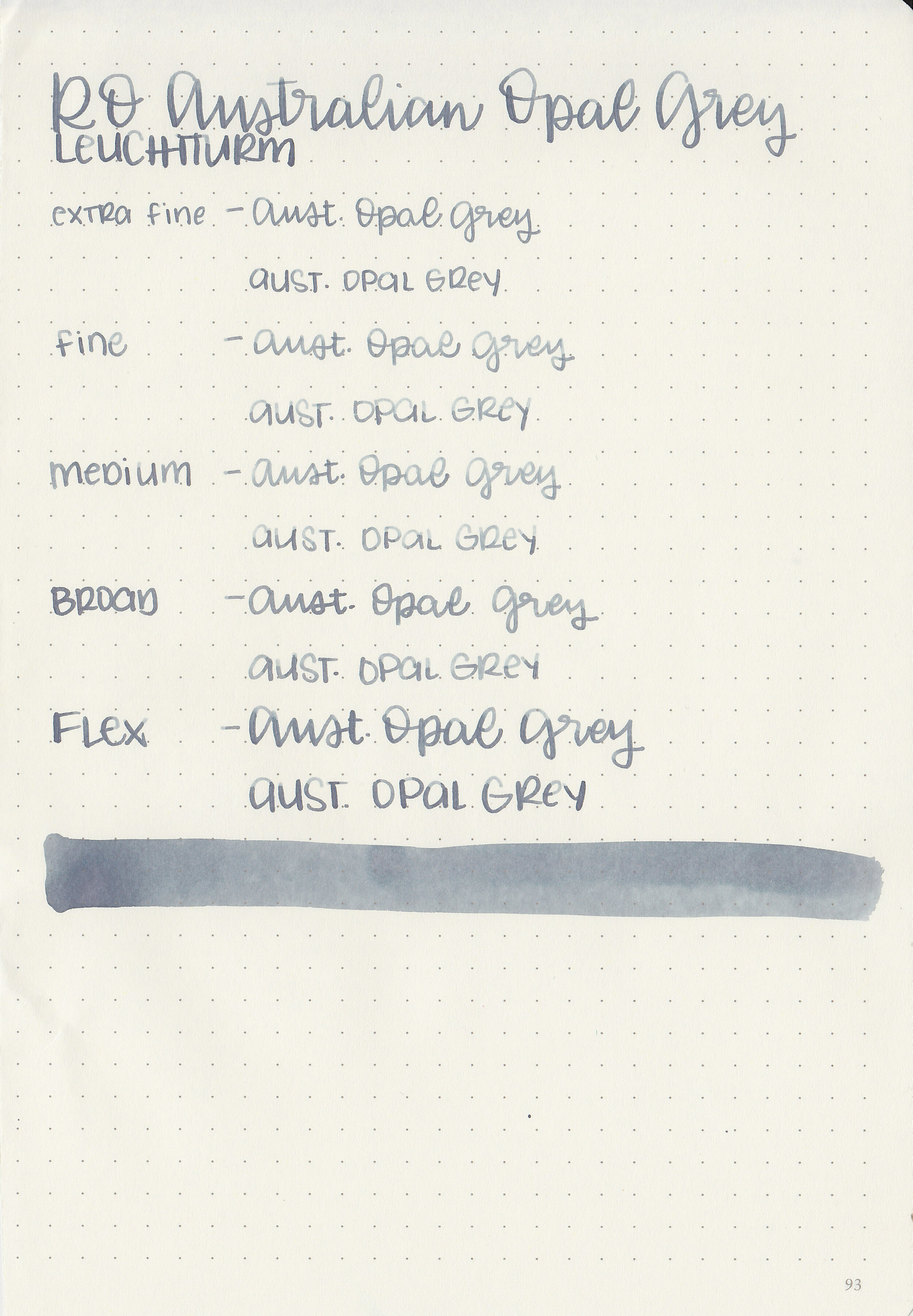
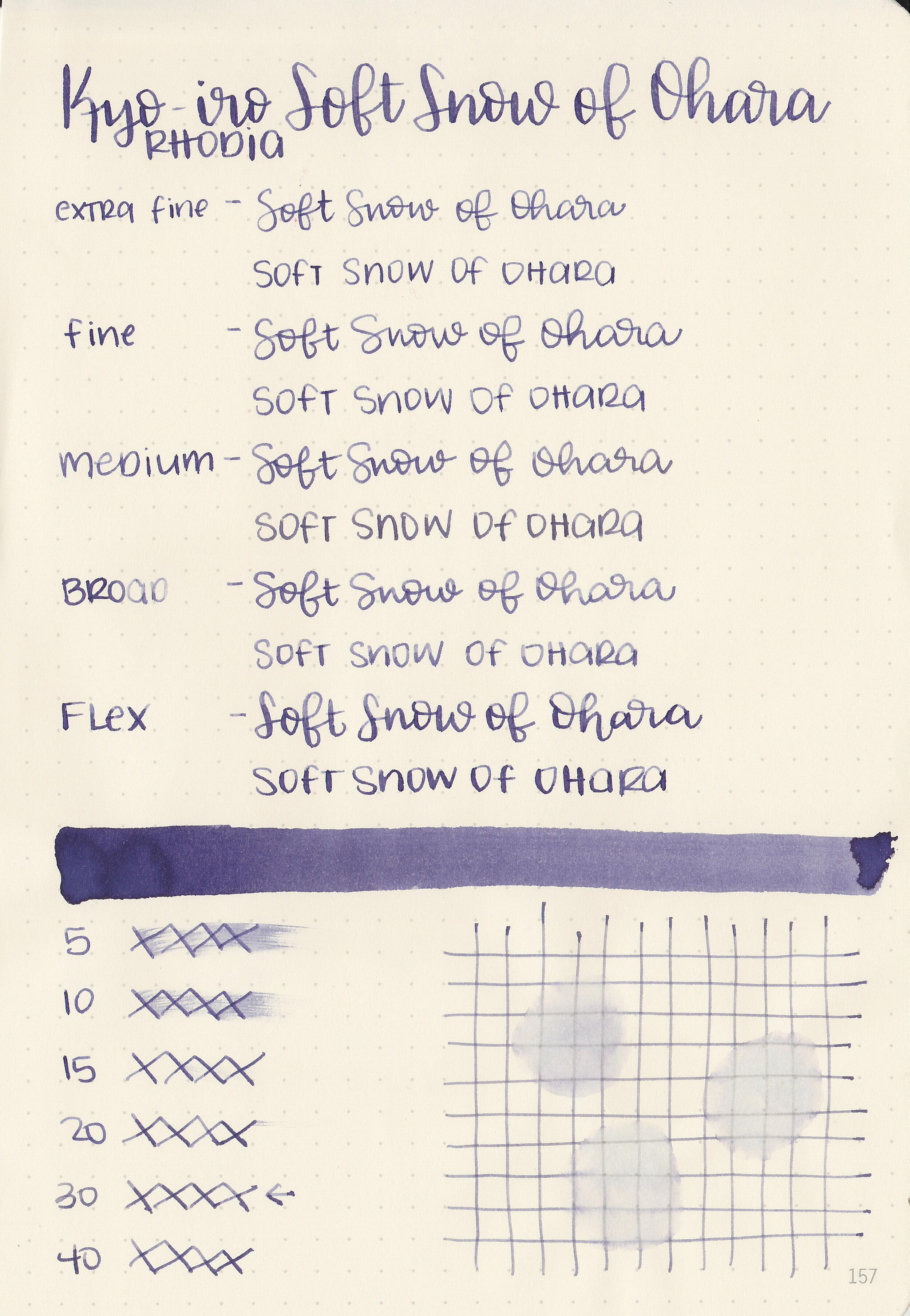
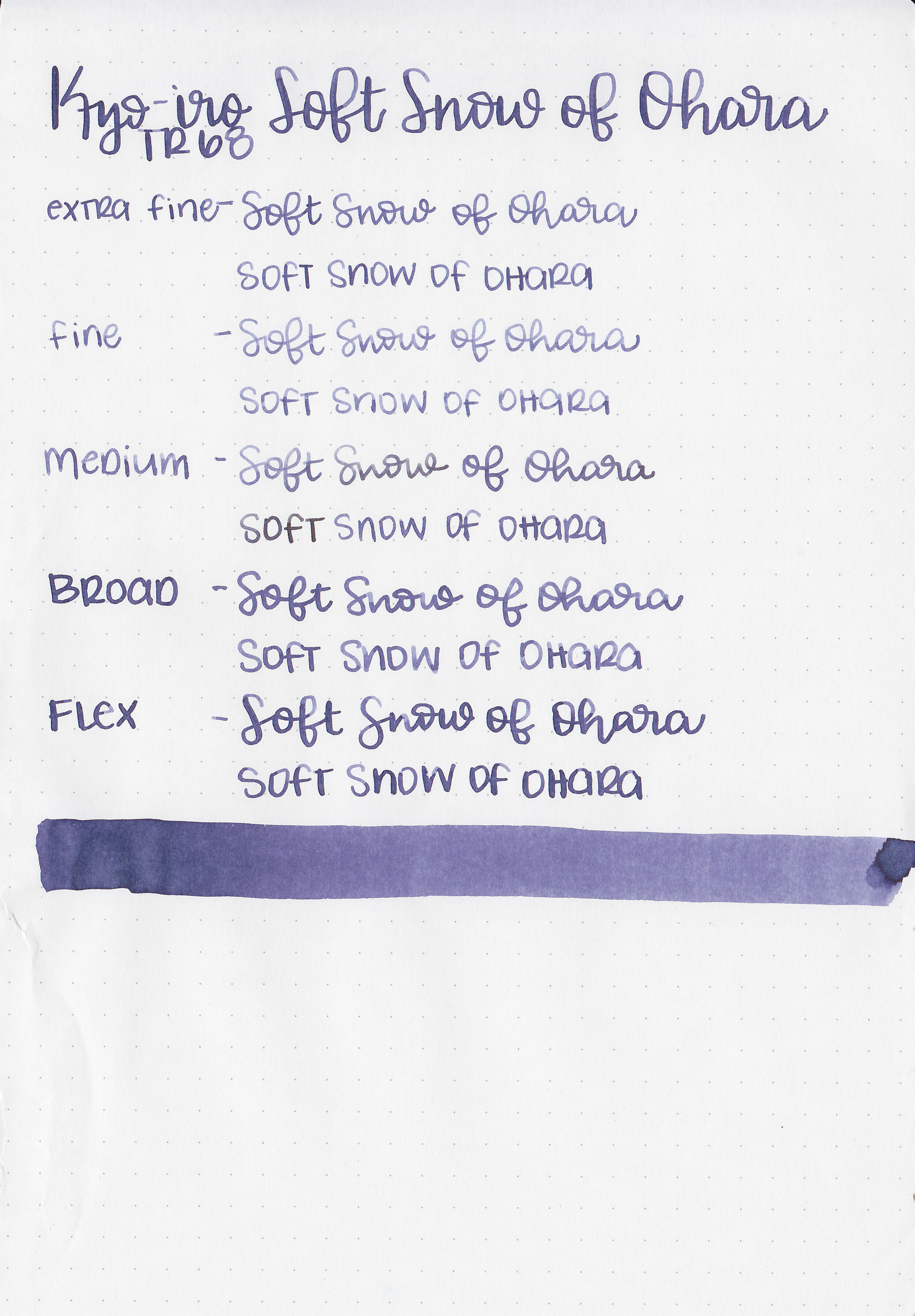
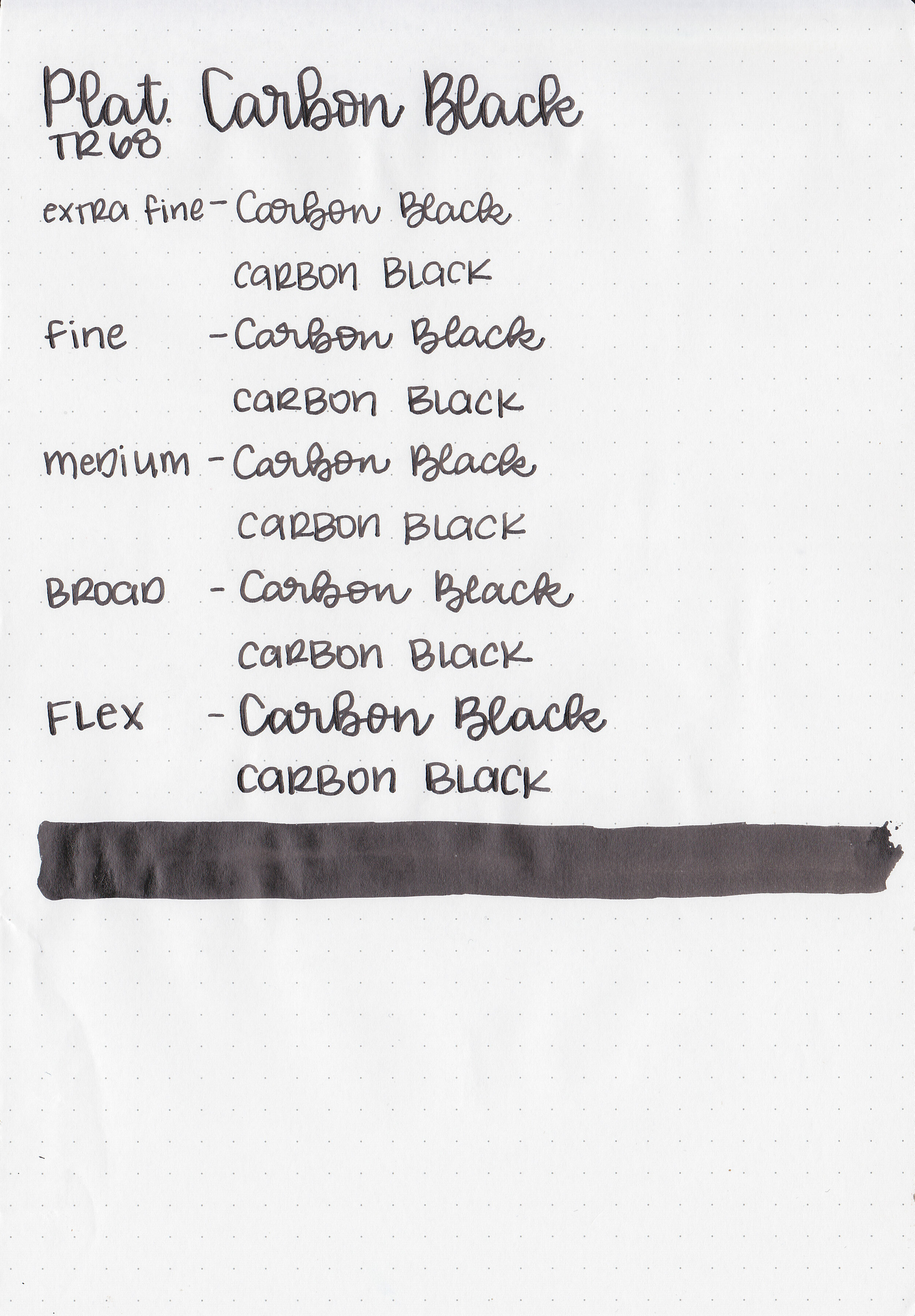
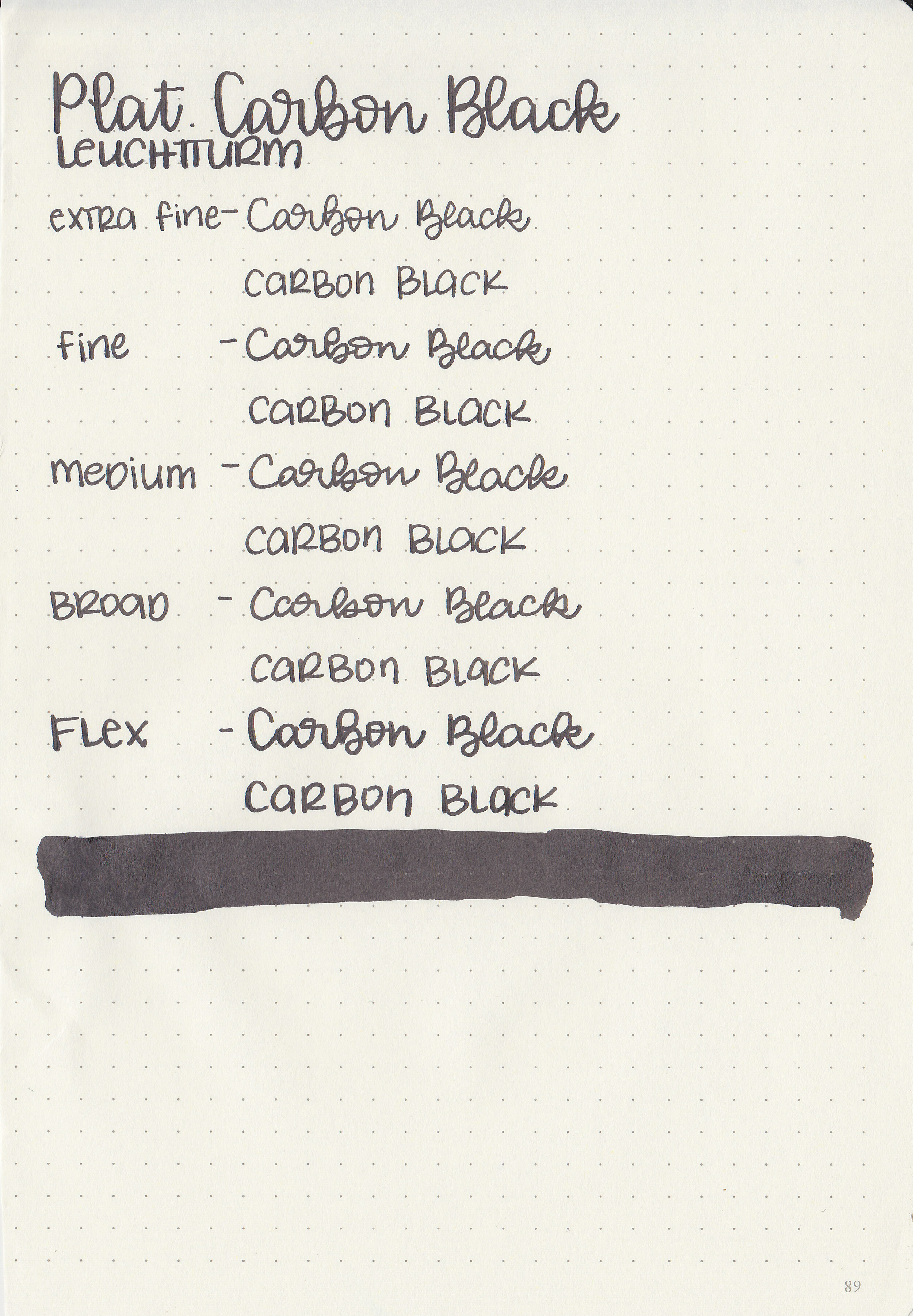
Let's take a look at how the ink behaves on fountain pen friendly papers: Rhodia, Tomoe River, and Leuchtturm.
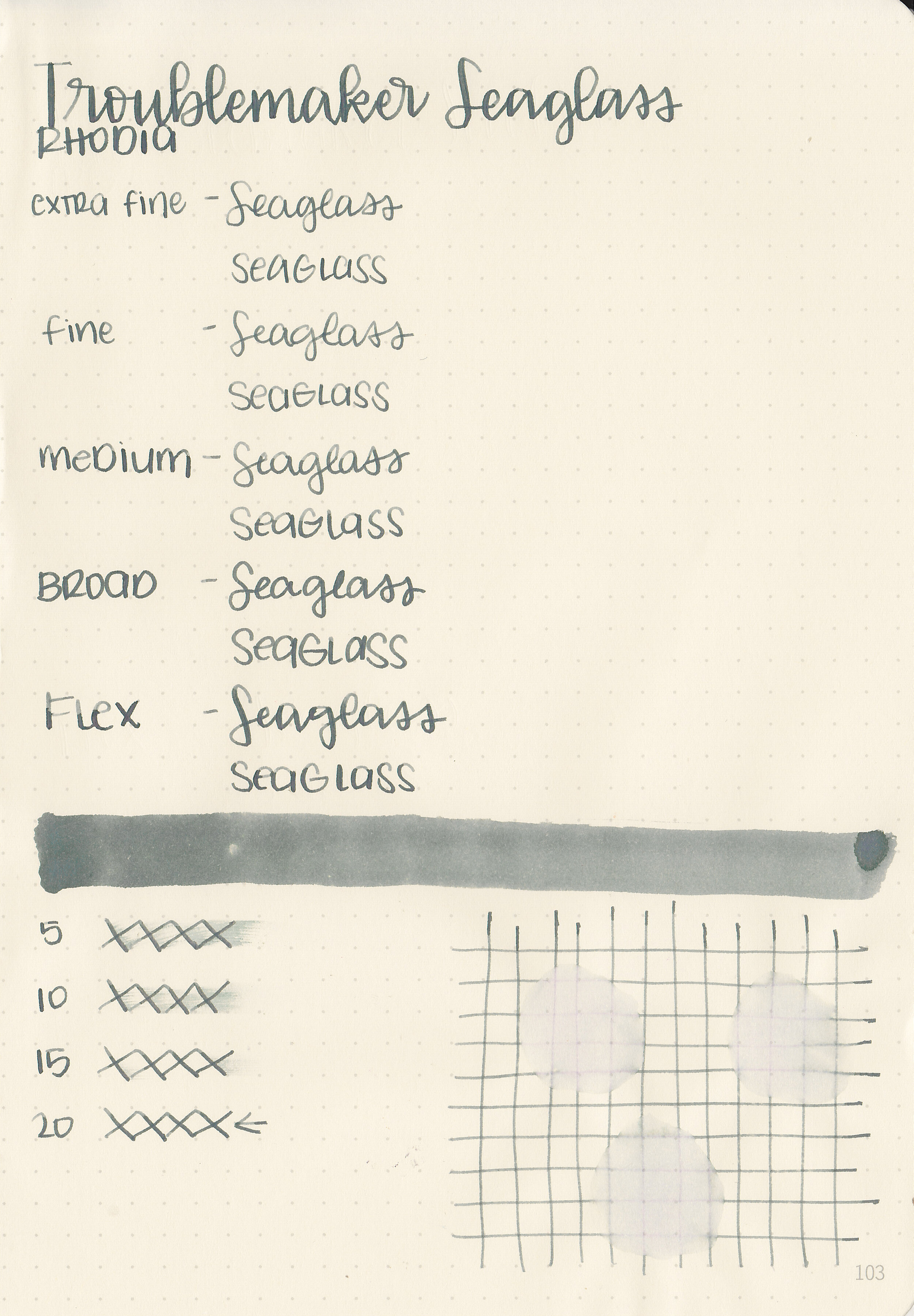
Dry time: 20 seconds
Water resistance: Low
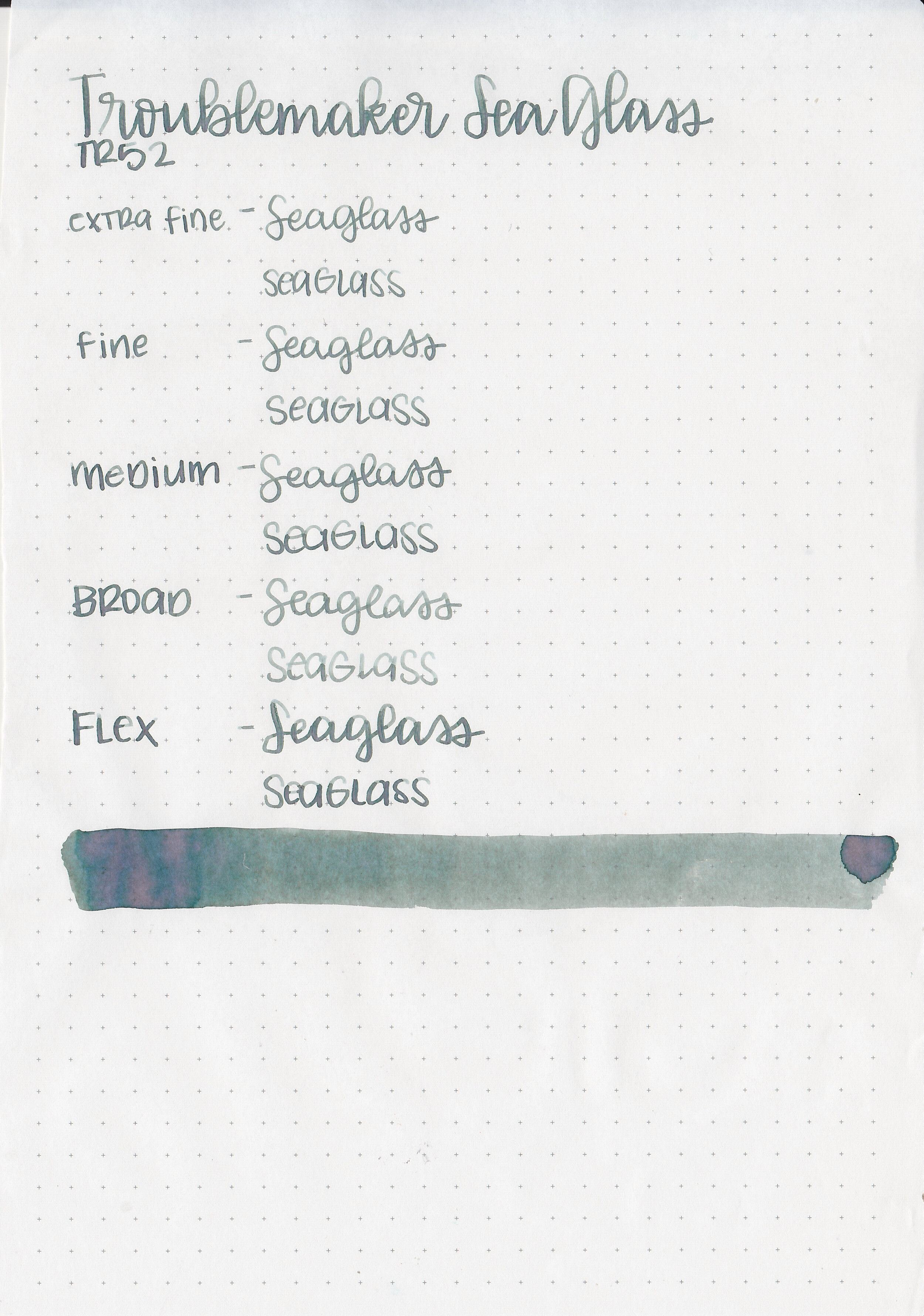
Feathering: None
Show through: Medium
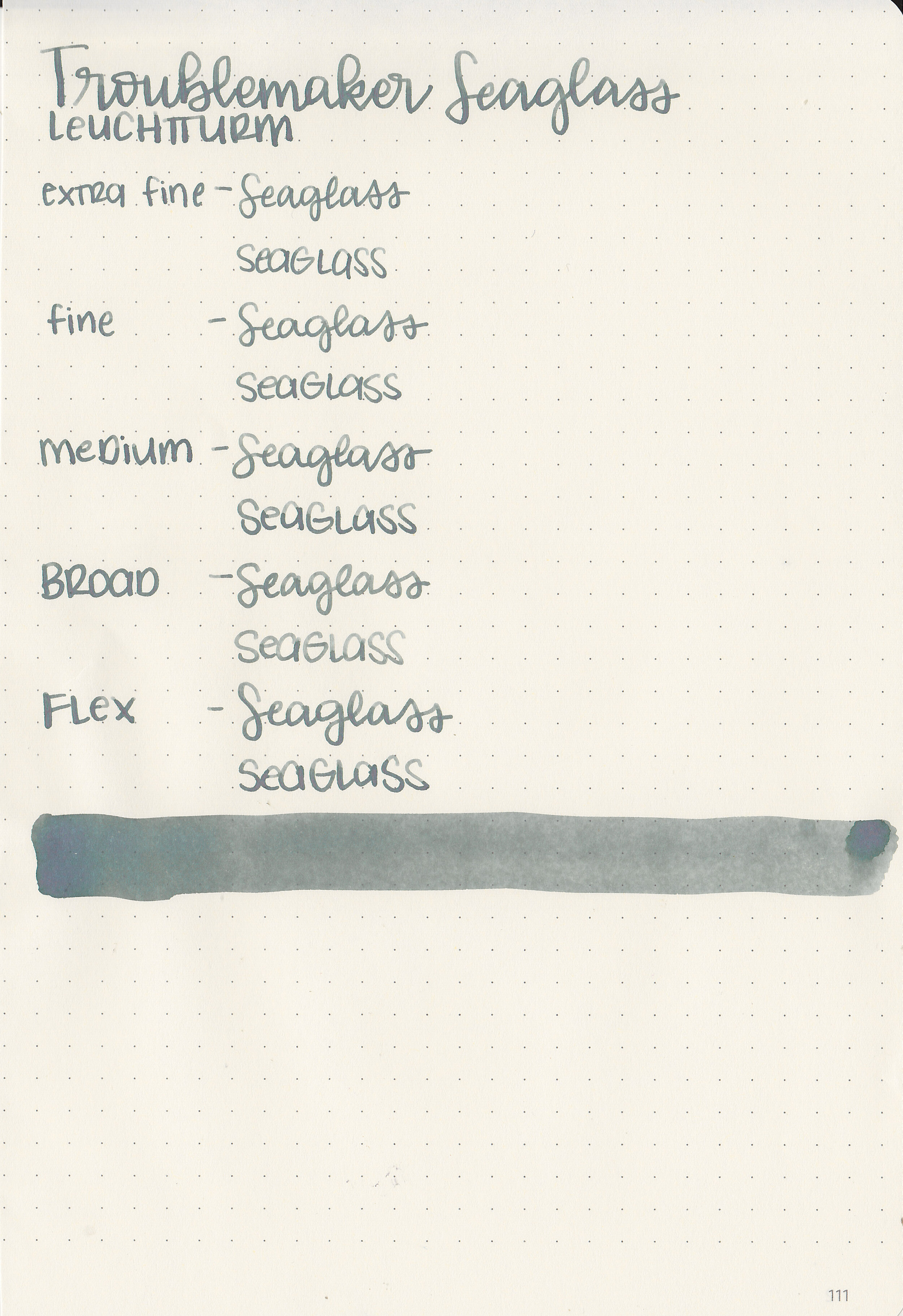
Bleeding: None
Other properties: high shading, no sheen, and no shimmer.
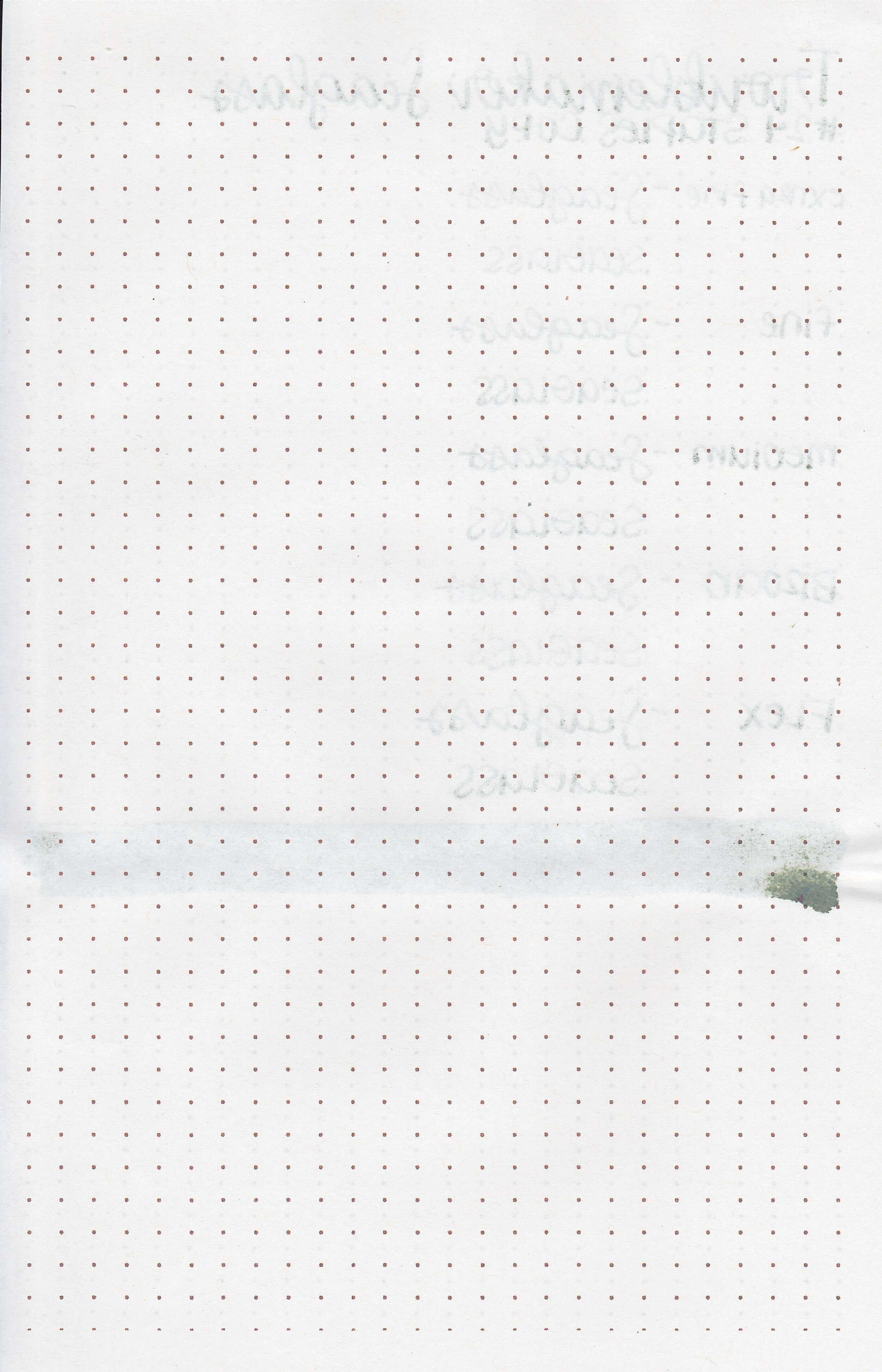
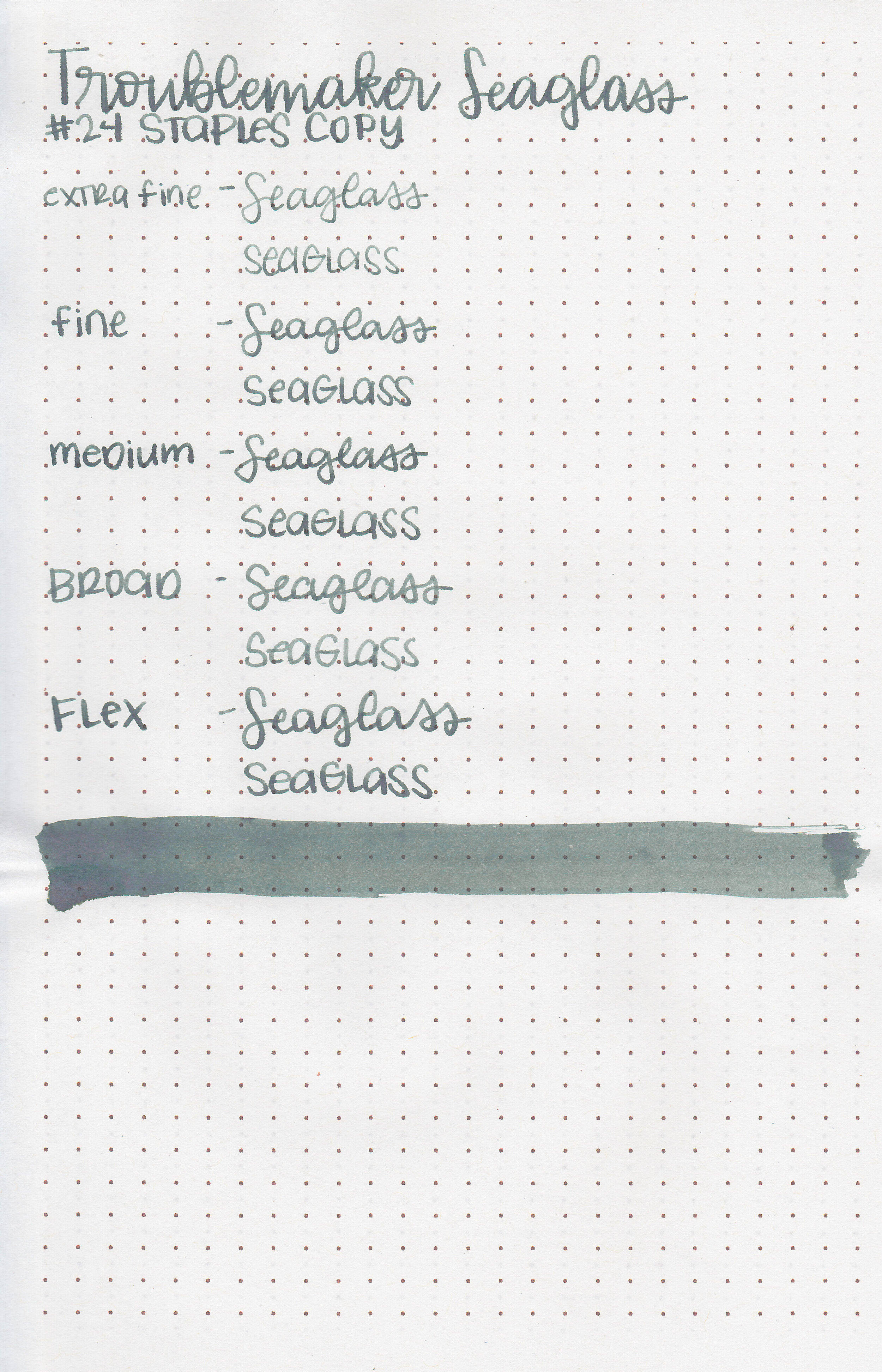
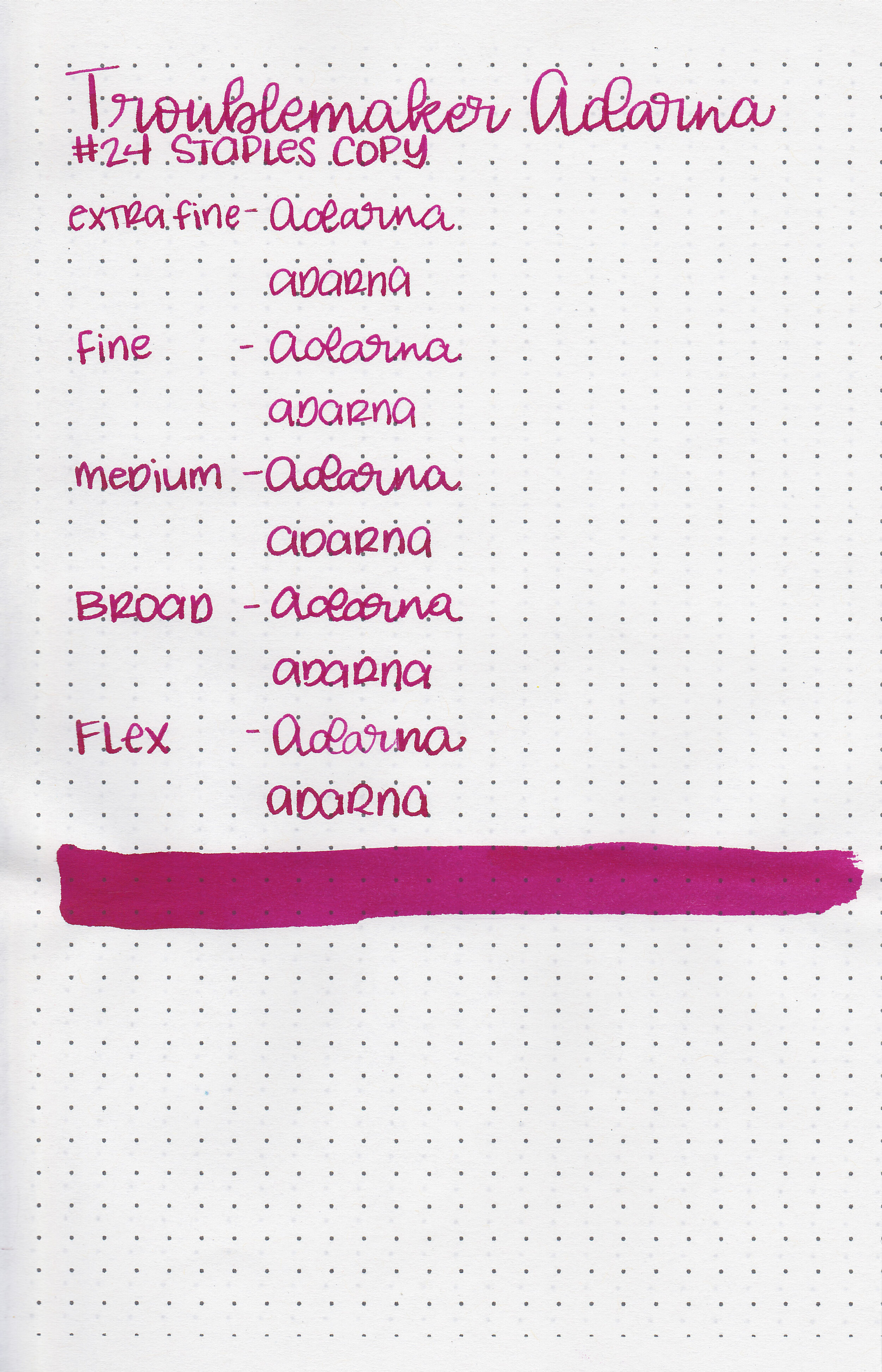
On Staples 24 lb copy paper there was some feathering but no bleeding.
Comparison Swabs:

Sea Glass is less brown than Troublemaker Kelp Tea. It’s similar to Tono & Lims Fukushima, but Fukushima doesn’t have the multi-color shading. Click here to see the Troublemaker inks together, and click here to see the green inks together.
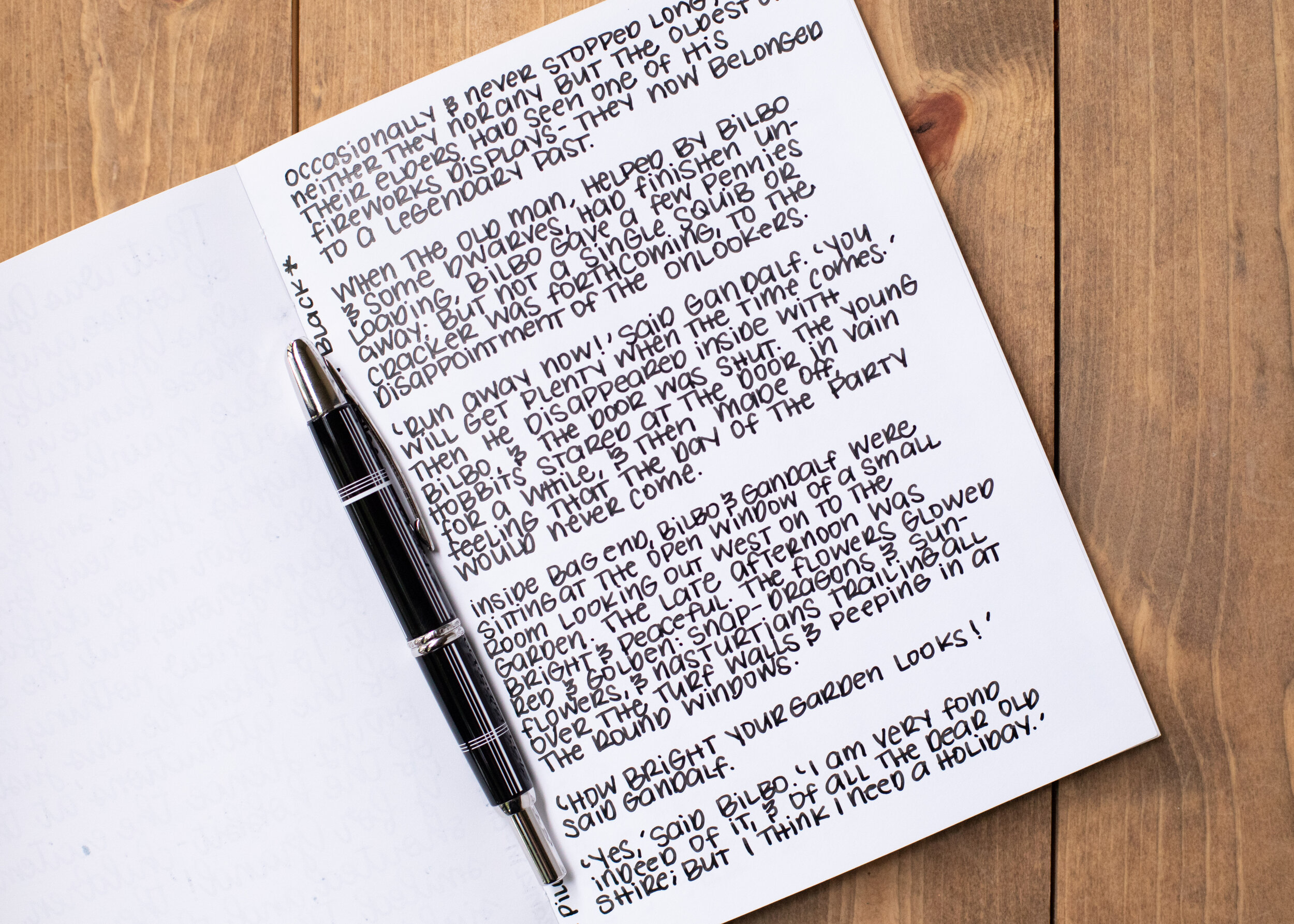
Longer writing:

I used a TWSBI Eco Transparent Green with a medium nib on a Yoseka A5 notebook. The ink had a dry flow. Some of the shading was way too light to read comfortably.
Overall, I love the shading it has in large swabs, but it shades so light in writing that it’s hard to read. It also has a dry flow which caused some inconsistent writing. This one is a solid “meh” for me-I could take it or leave it.
Disclaimer: This ink was provided by Shigure Ink for the purpose of this review. All photos and opinions are my own. This page does not contain affiliate links and this post is not sponsored in any way.