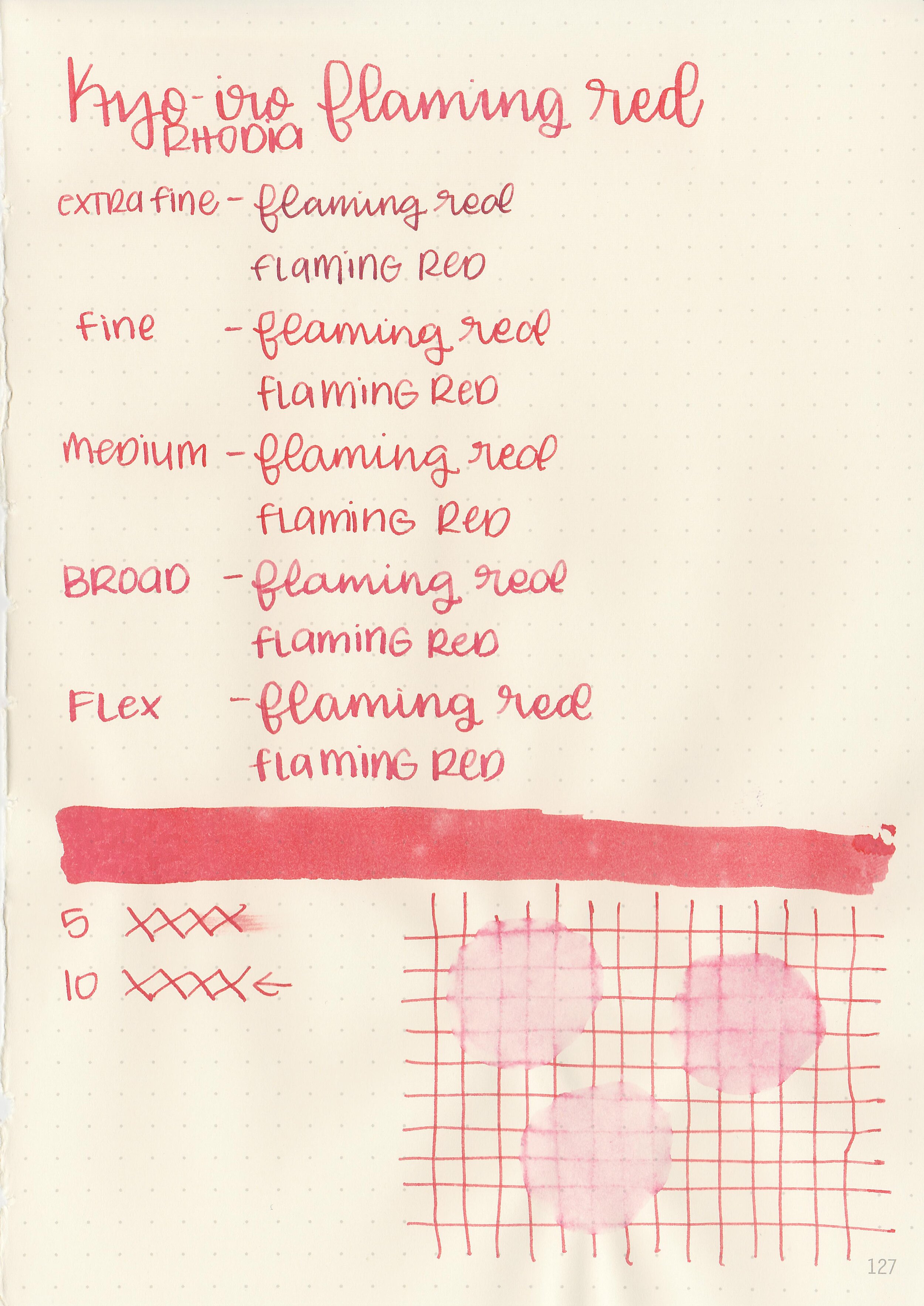
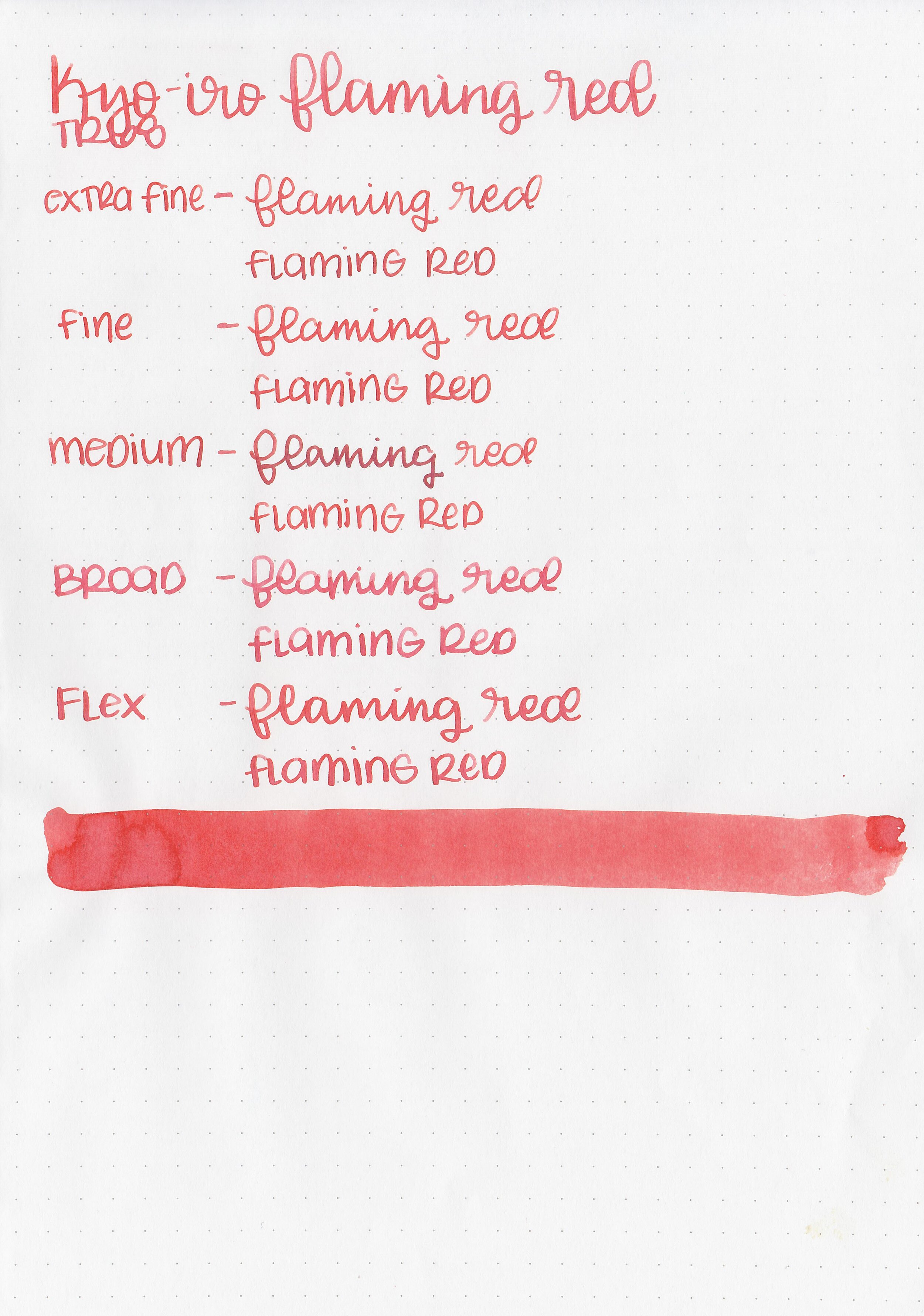
Ink Review #1410: Noodler's American Eel Black

nood-eel-black-2.jpg

Noodler’s American Eel Black is a lubricated bulletproof ink. Thanks to the reader that sent this ink in for review! You can find this ink for sale at most retailers including Pen Chalet (aff. link) and Vanness Pens.
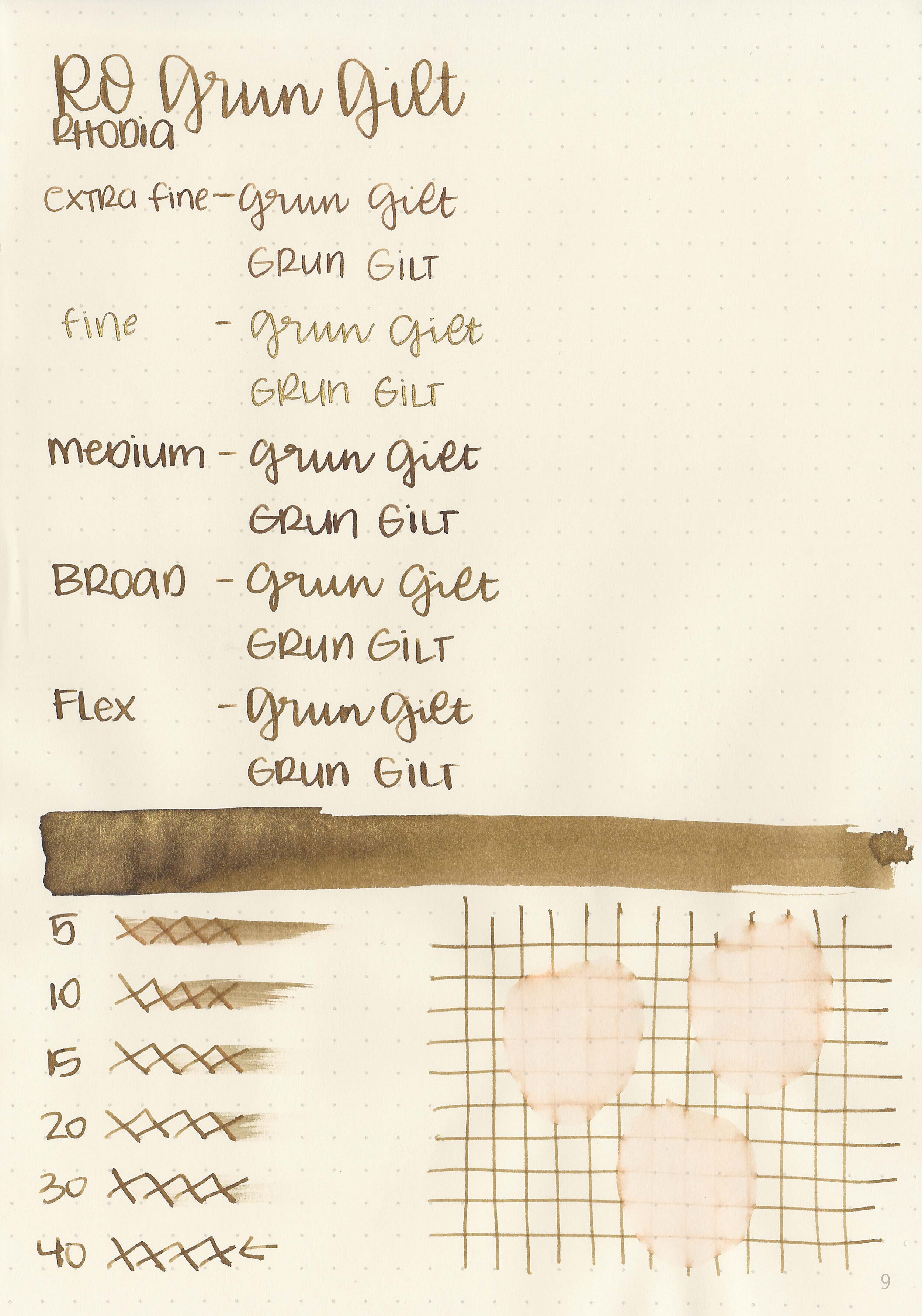
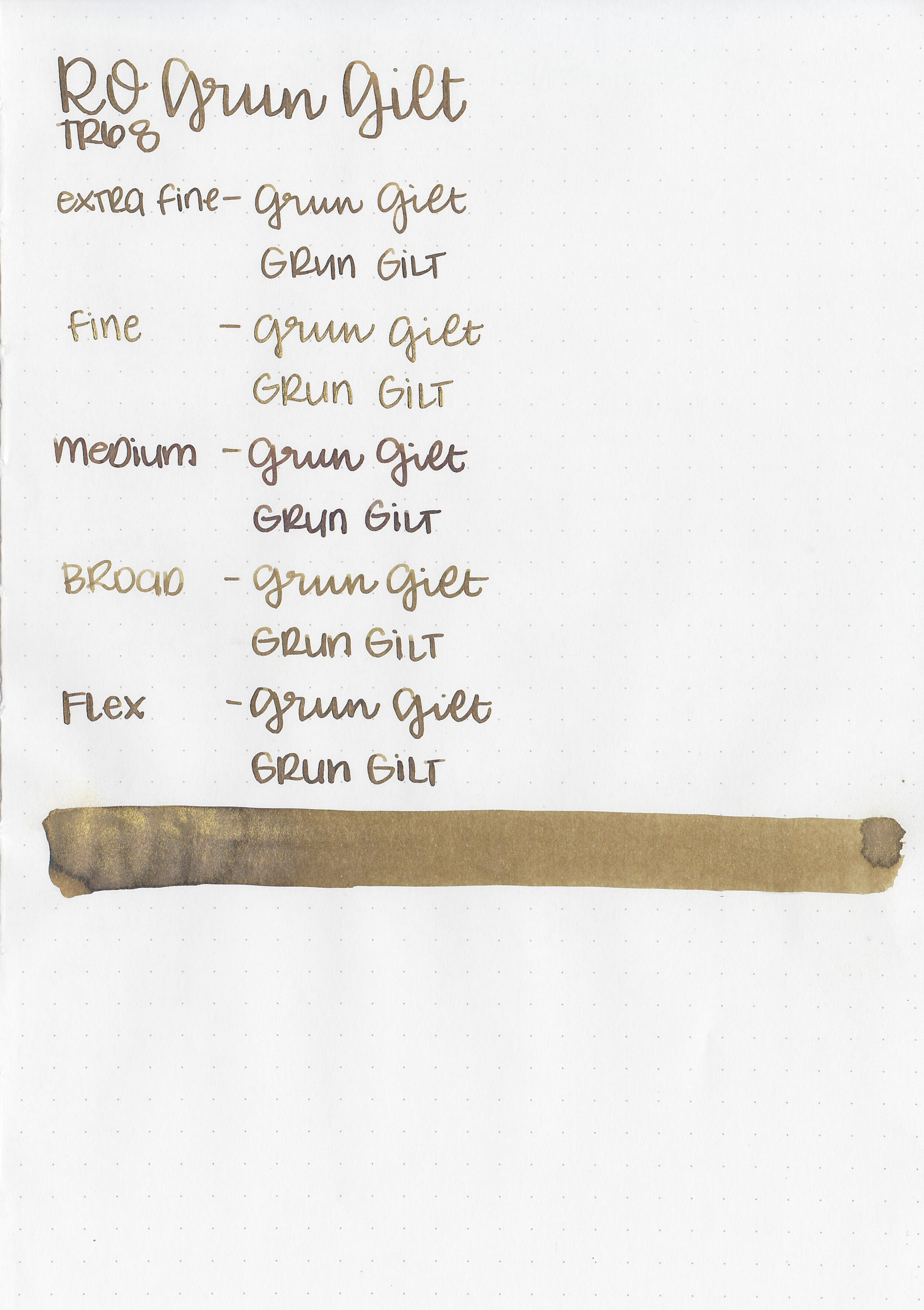
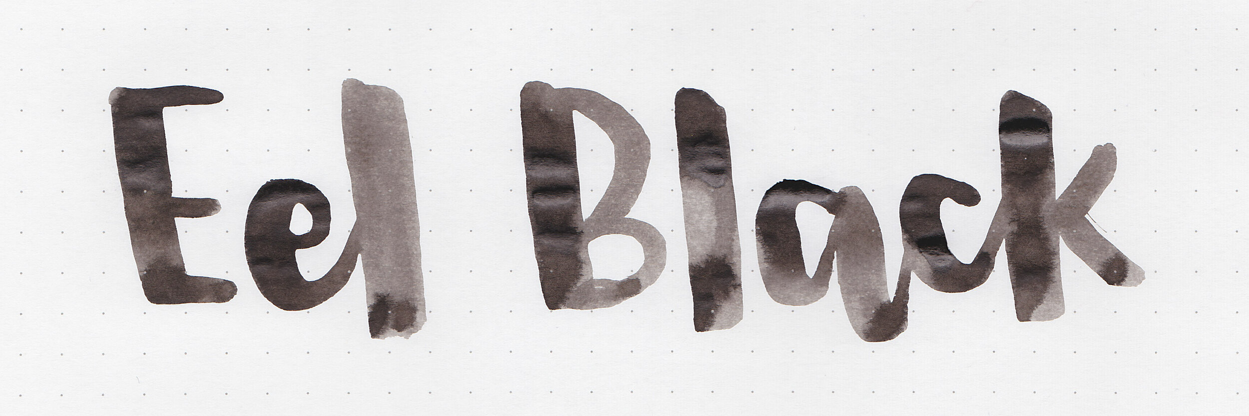
nood-eel-black-1.jpg

The color:

Eel Black is a medium black with a brown undertone.
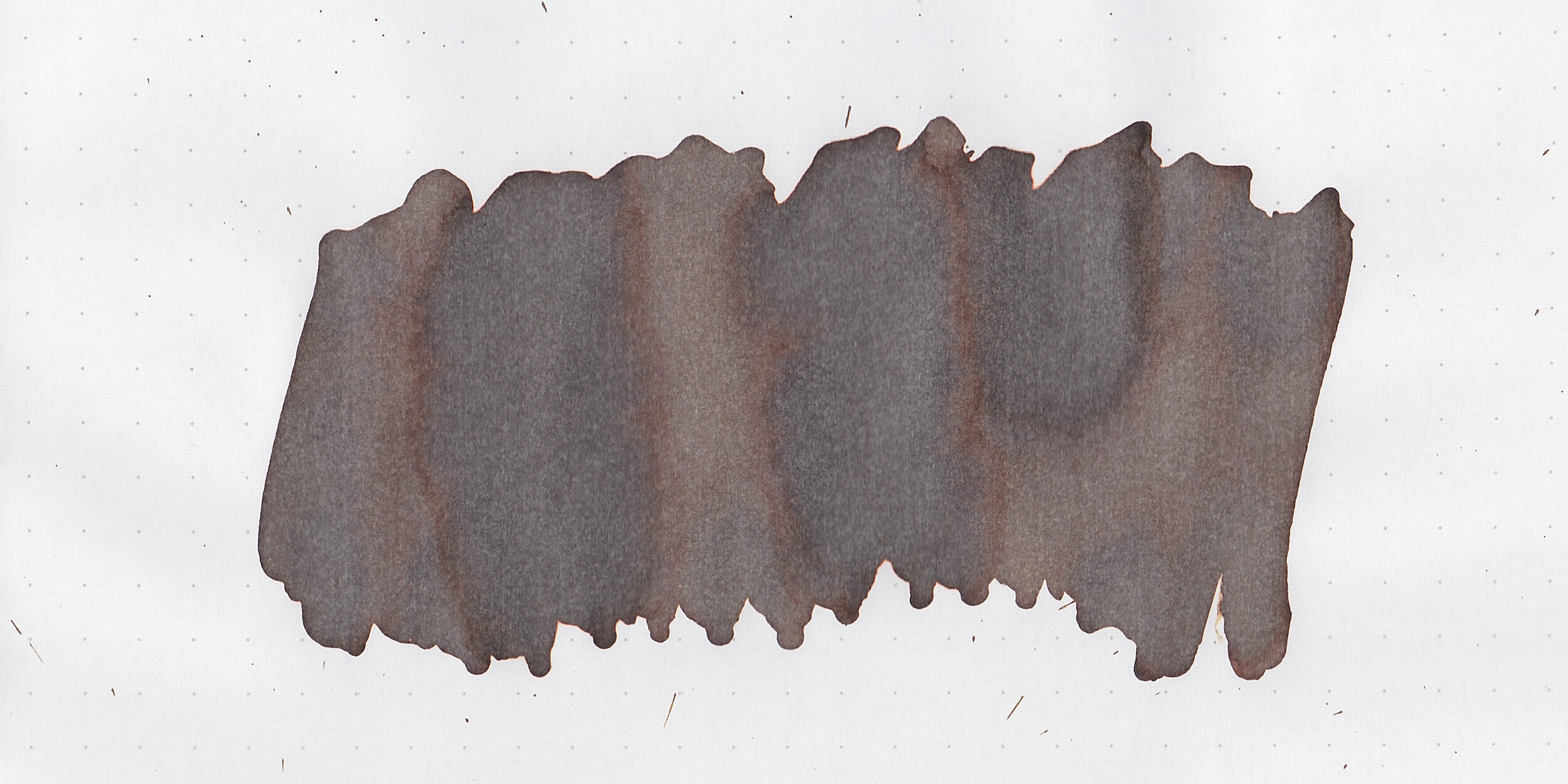
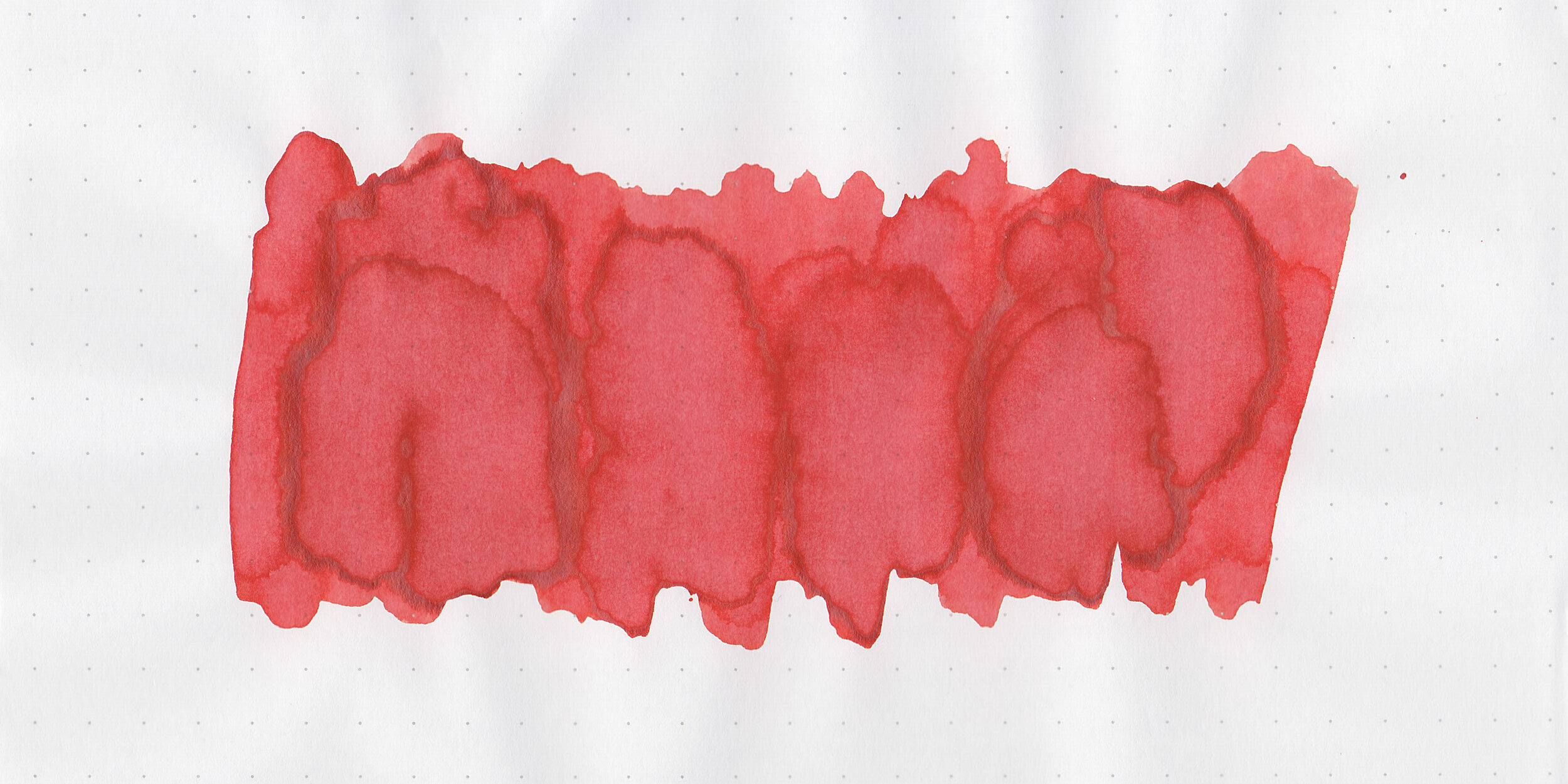
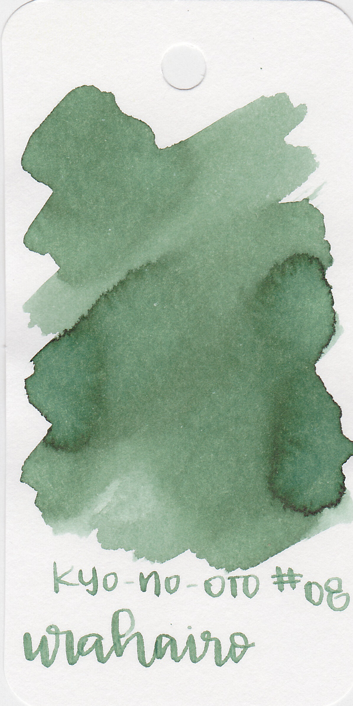
Swabs:

nood-eel-black-11.jpg

In large swabs on Tomoe River paper the ink has a bit of shading. This page has been drying for 8 days and the ink is still wet.
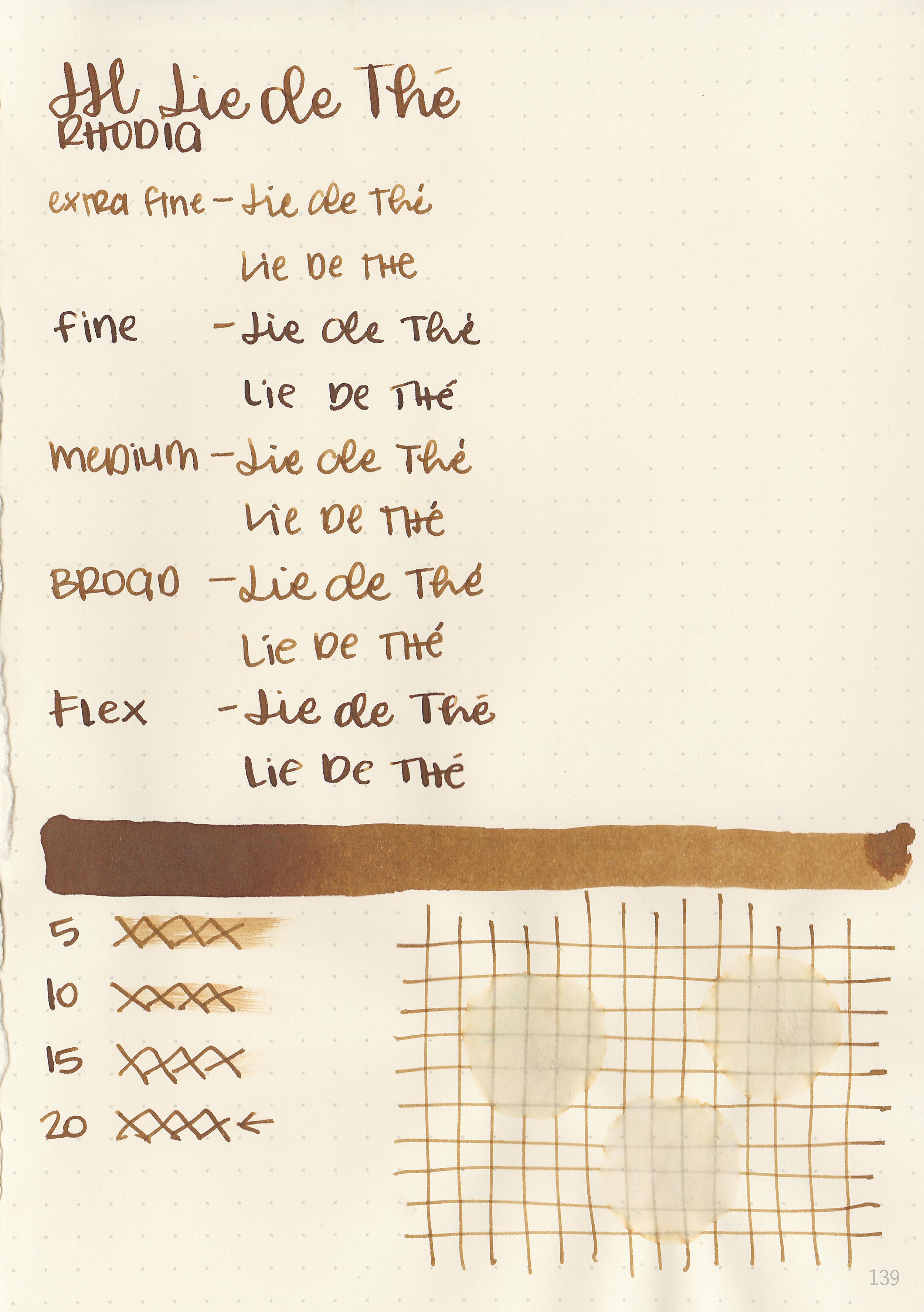
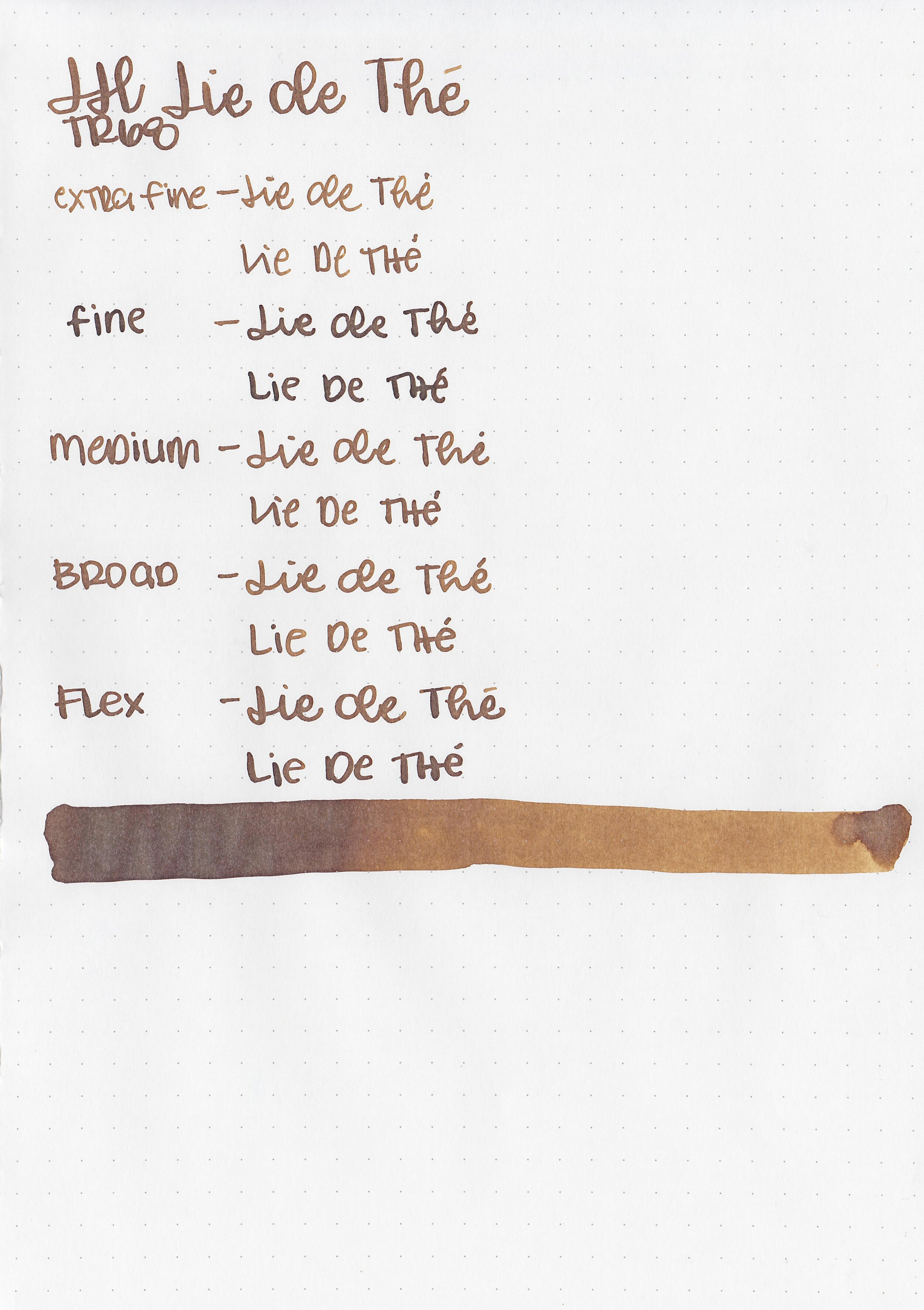
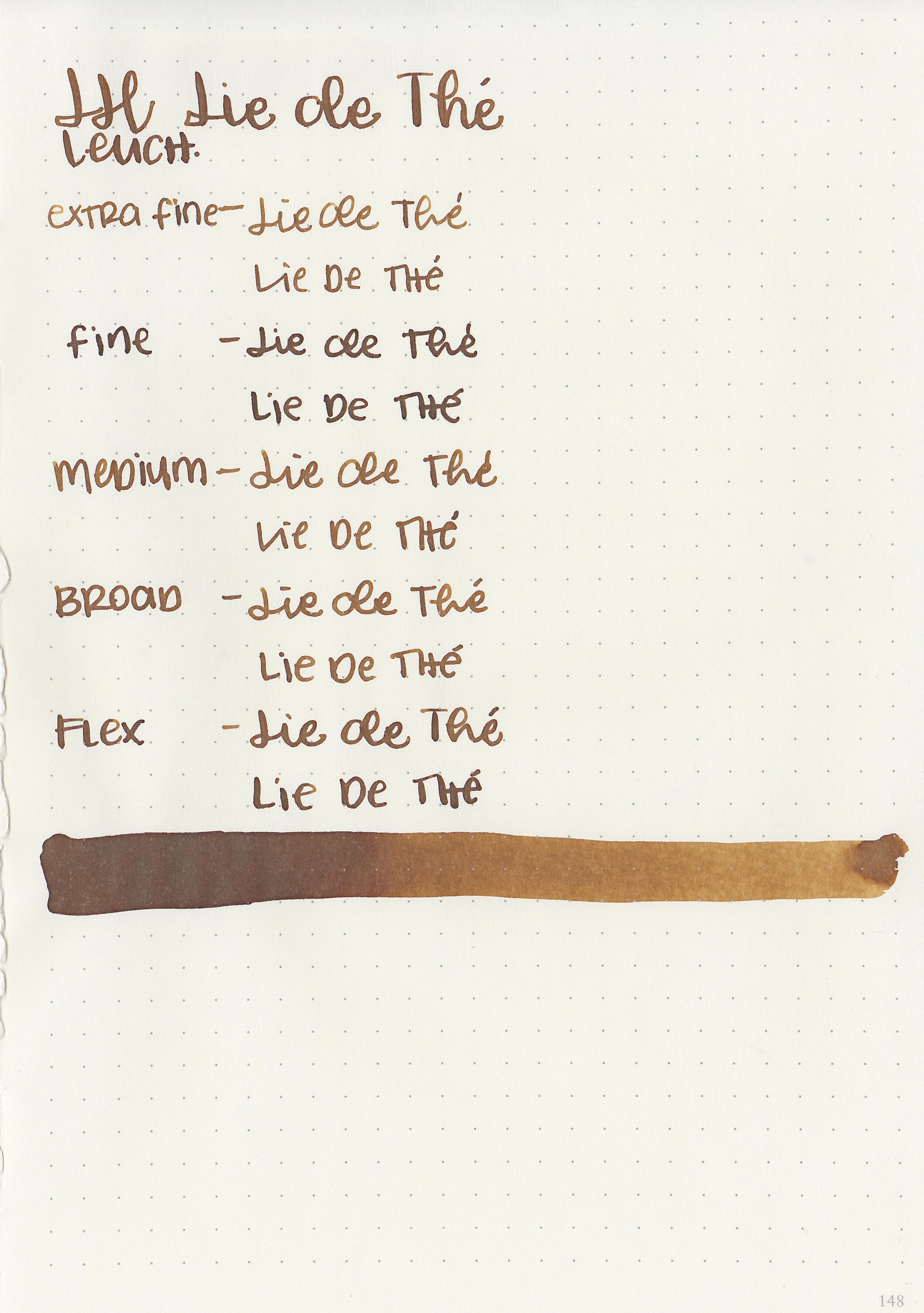
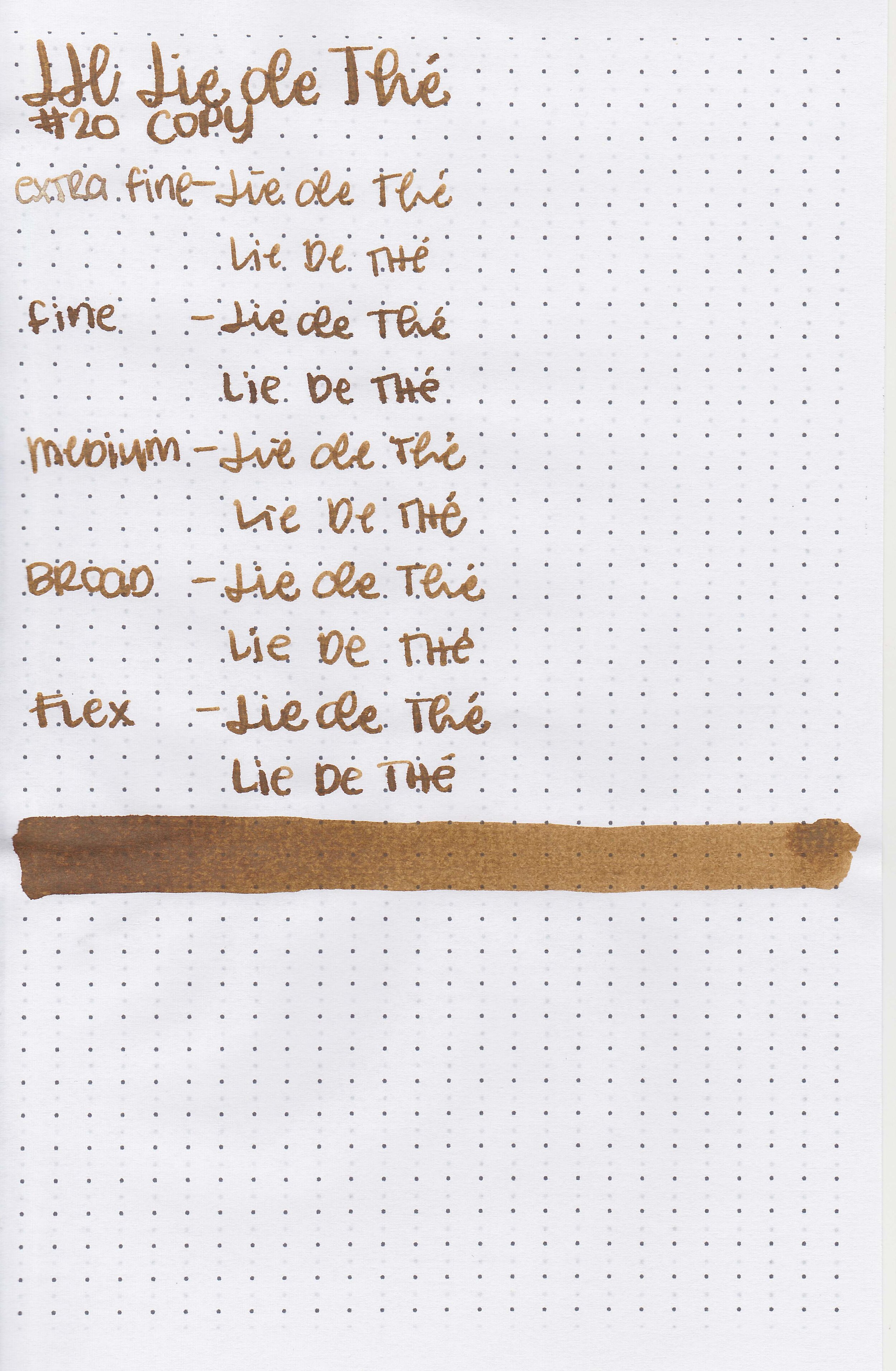
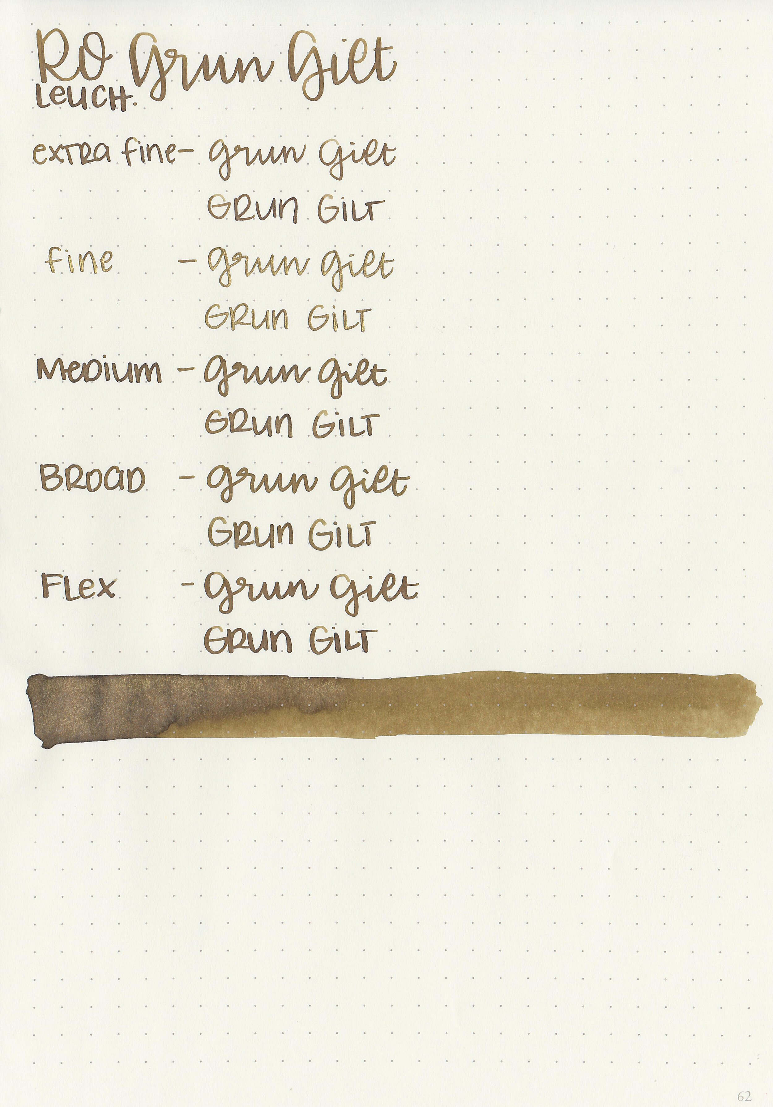
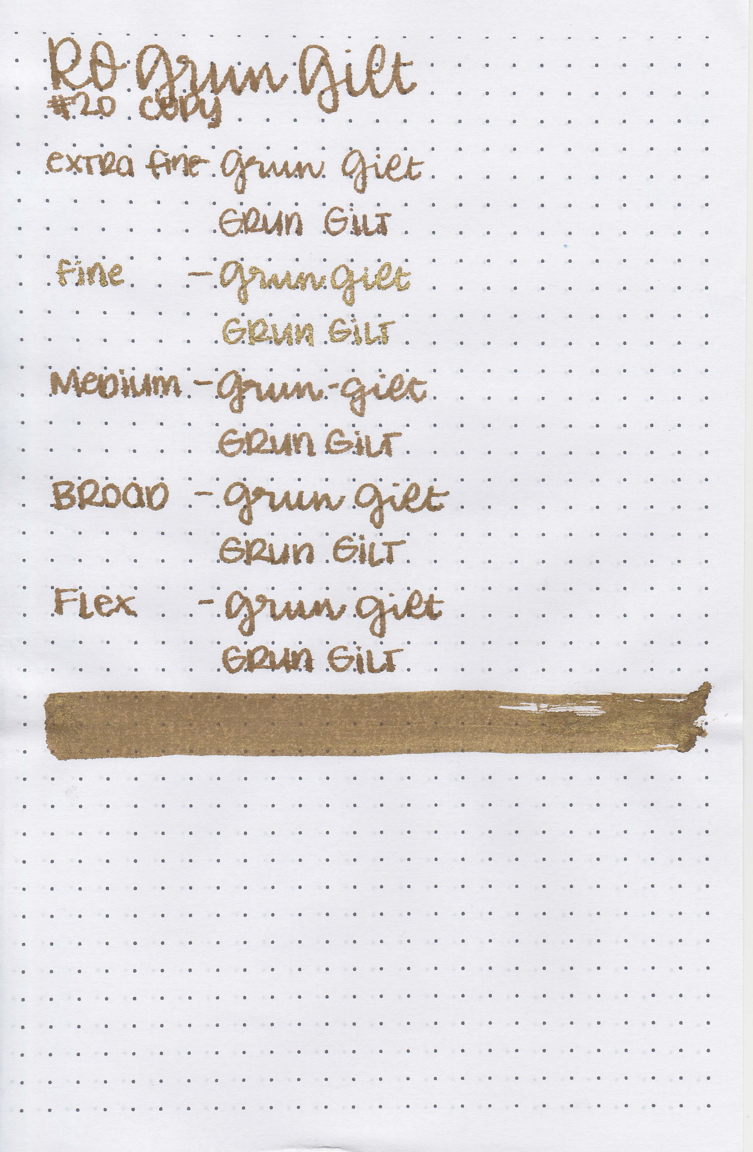
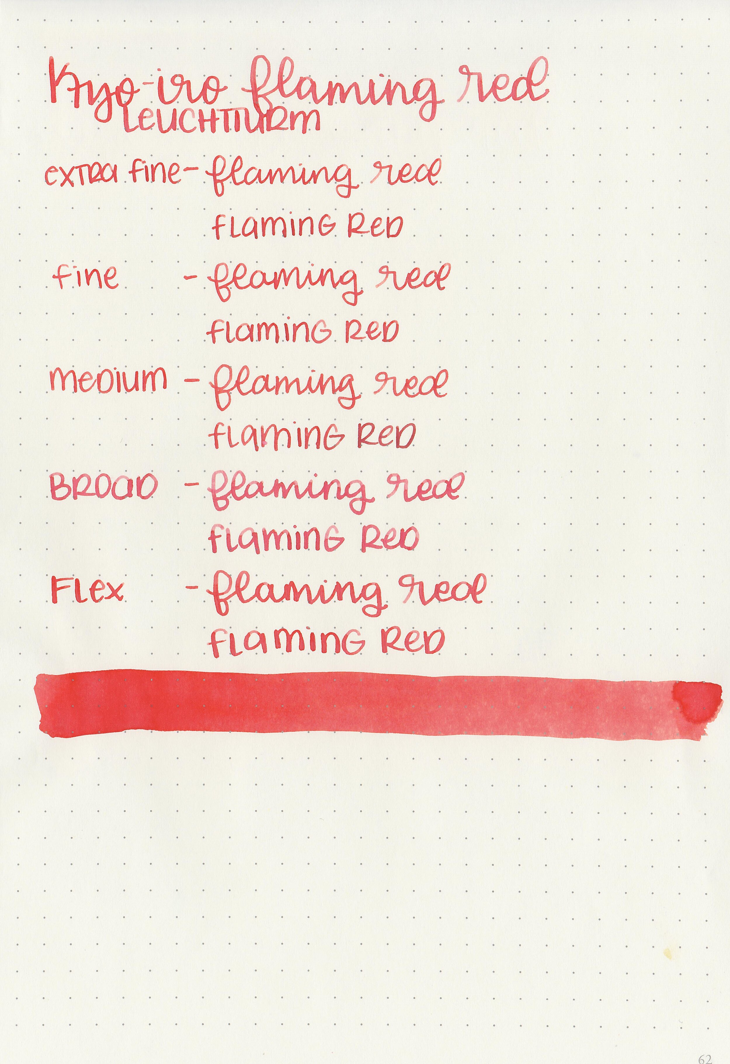
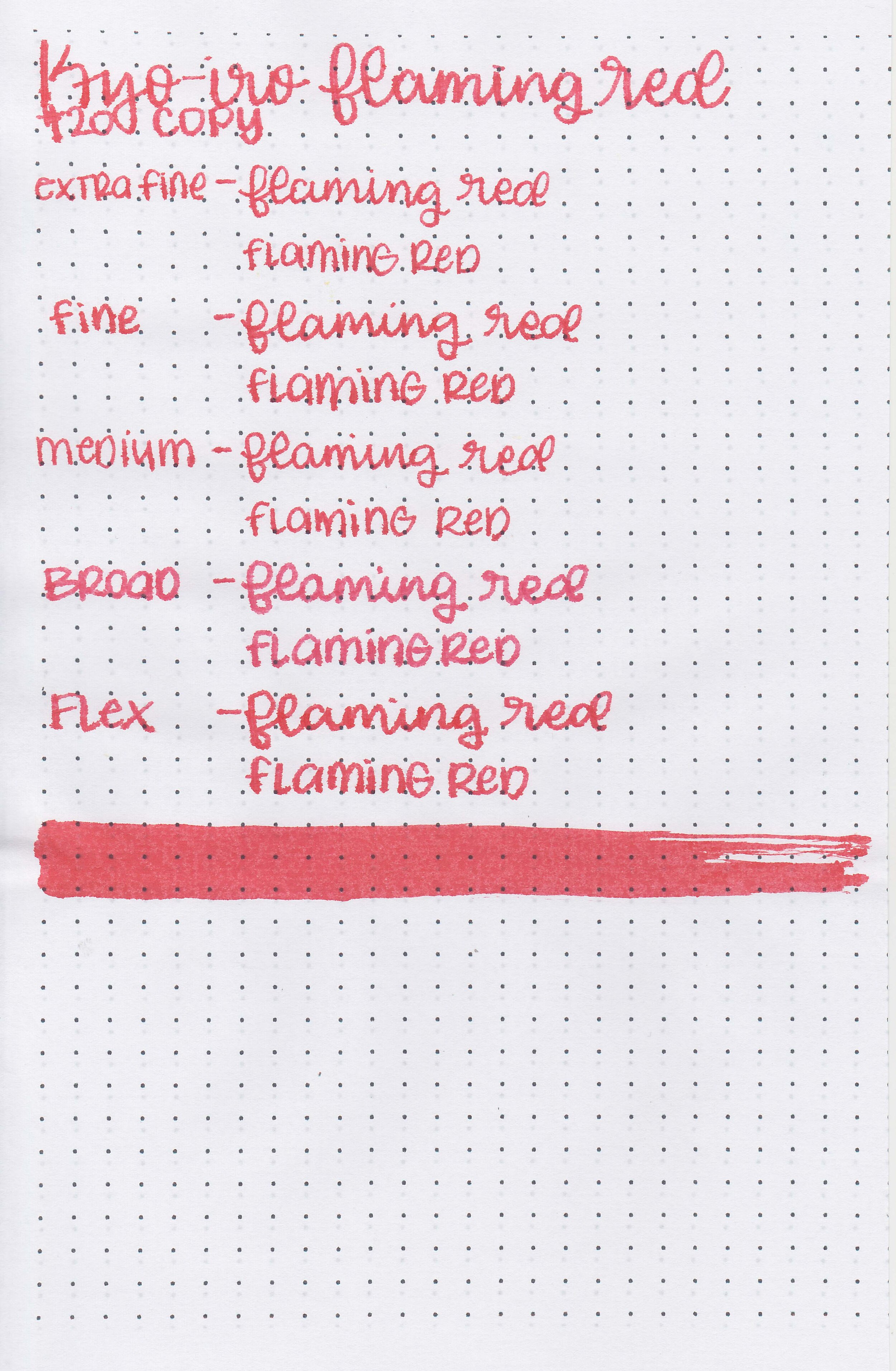
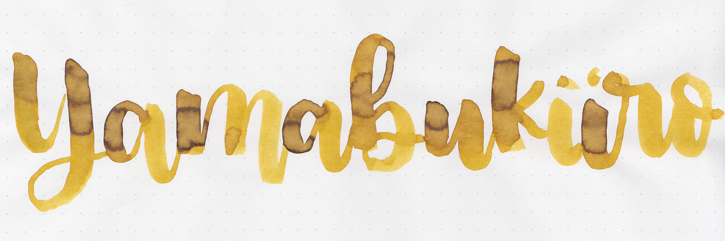
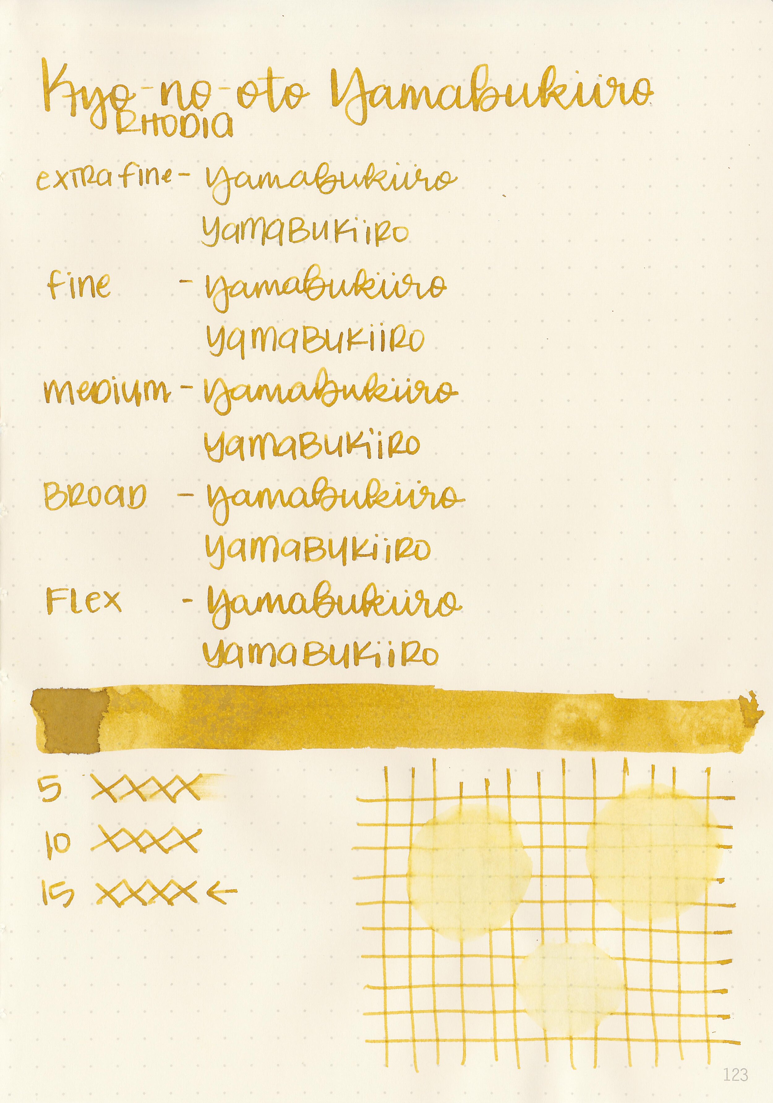
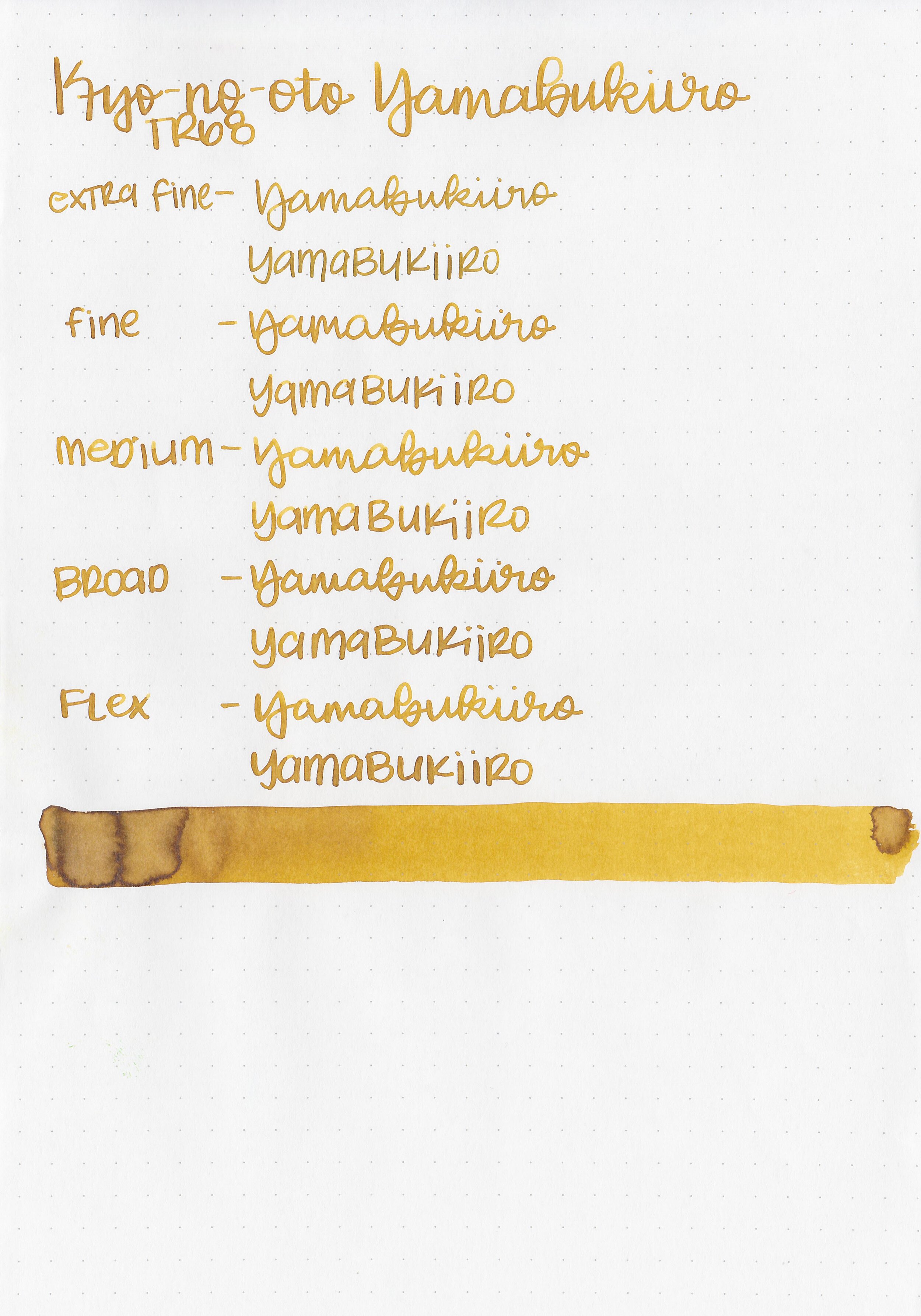
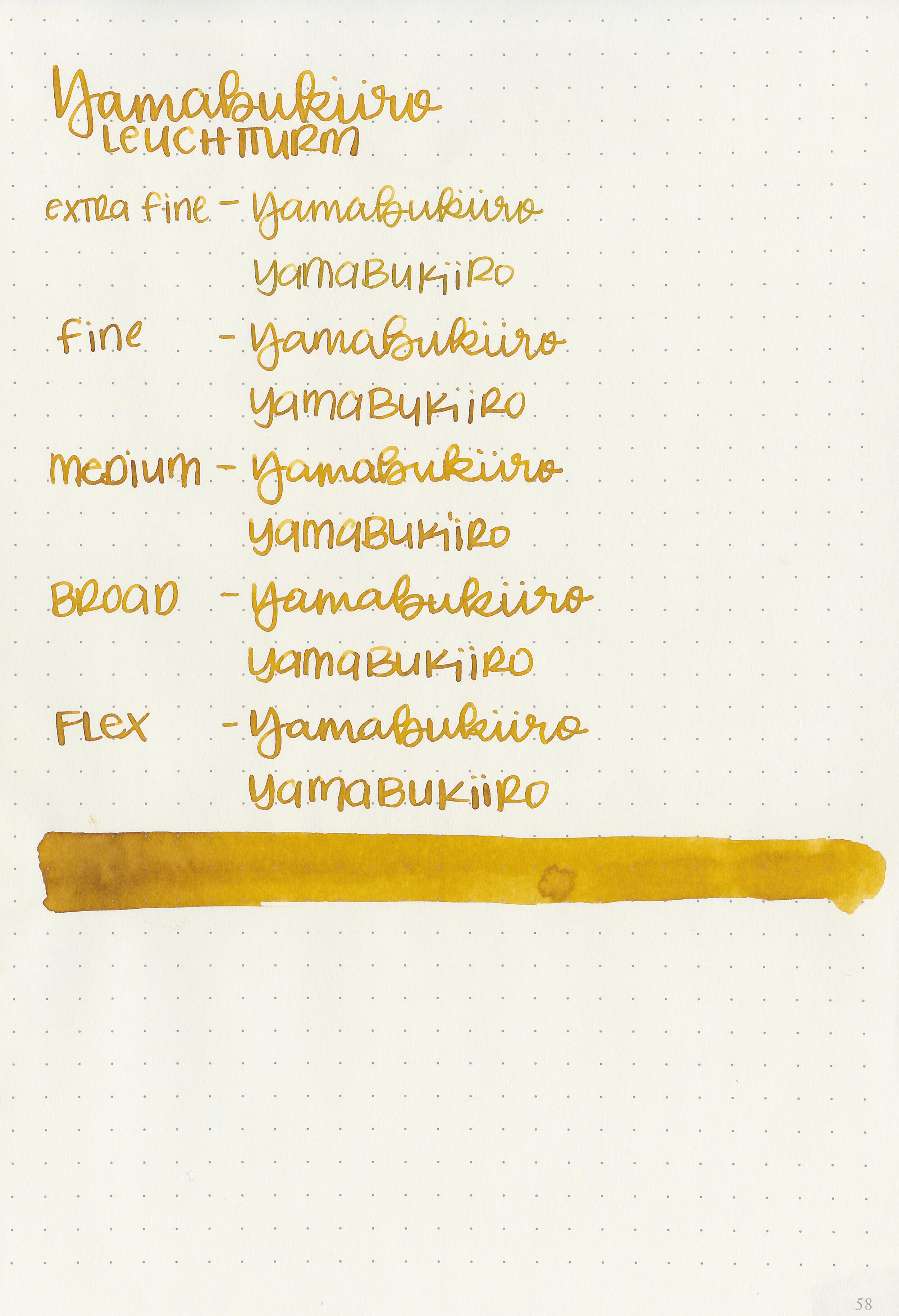
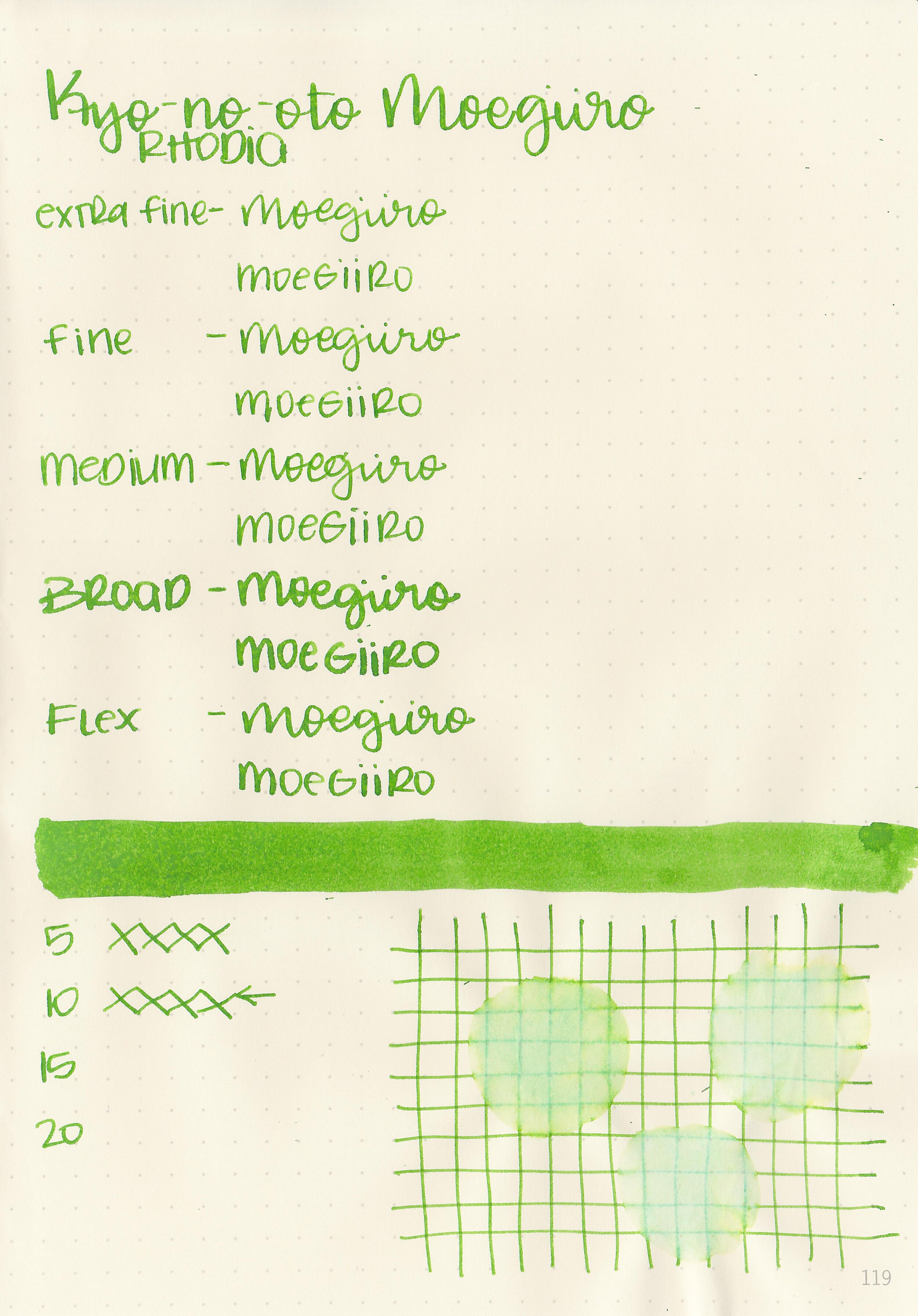
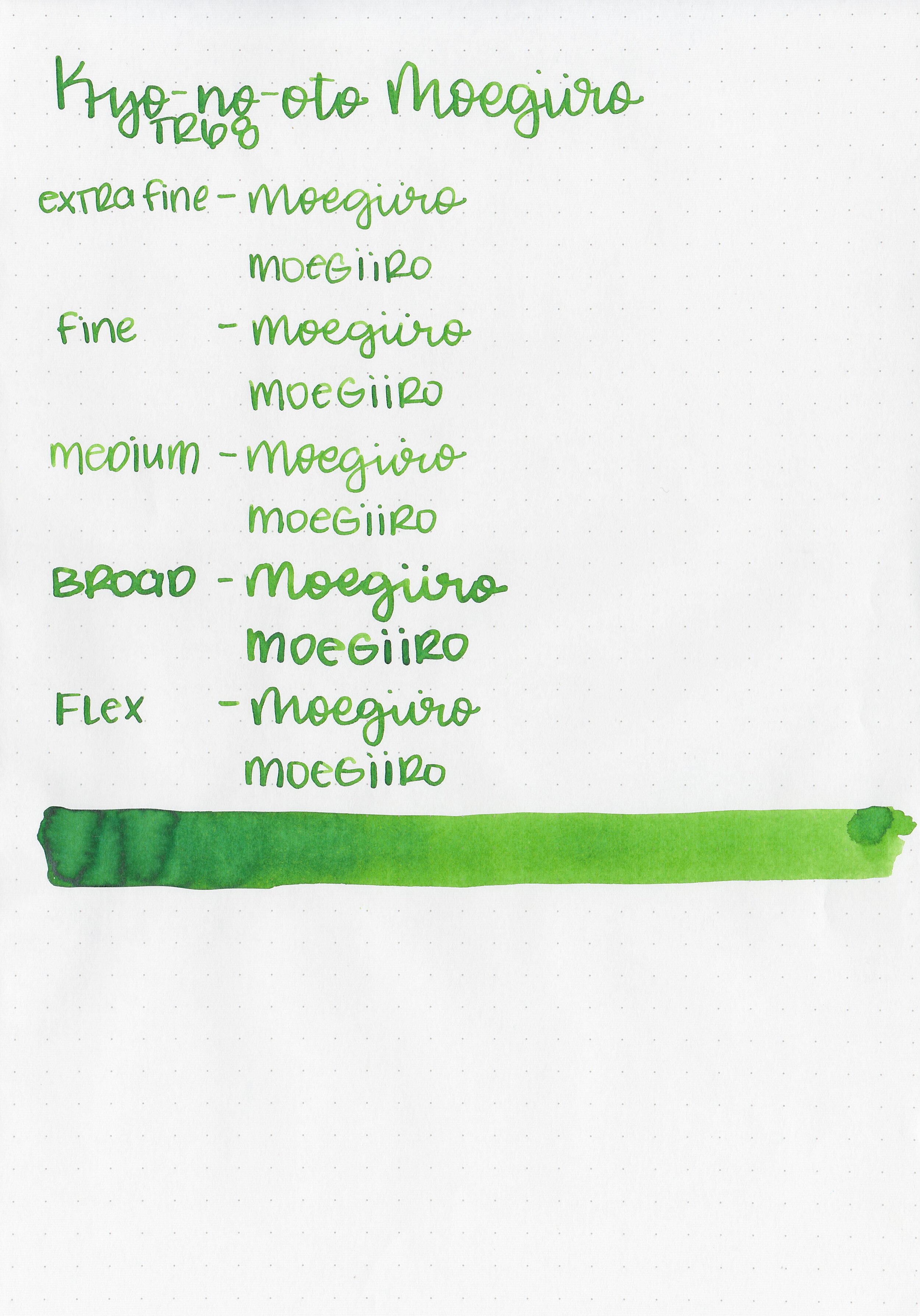
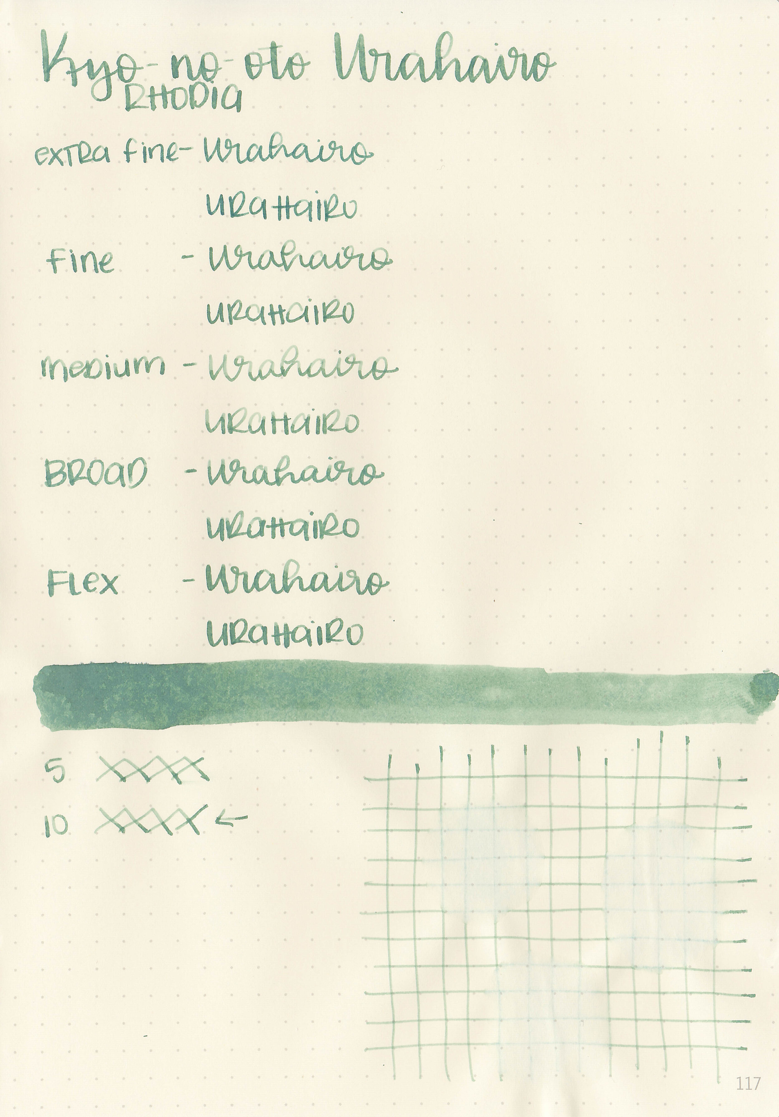
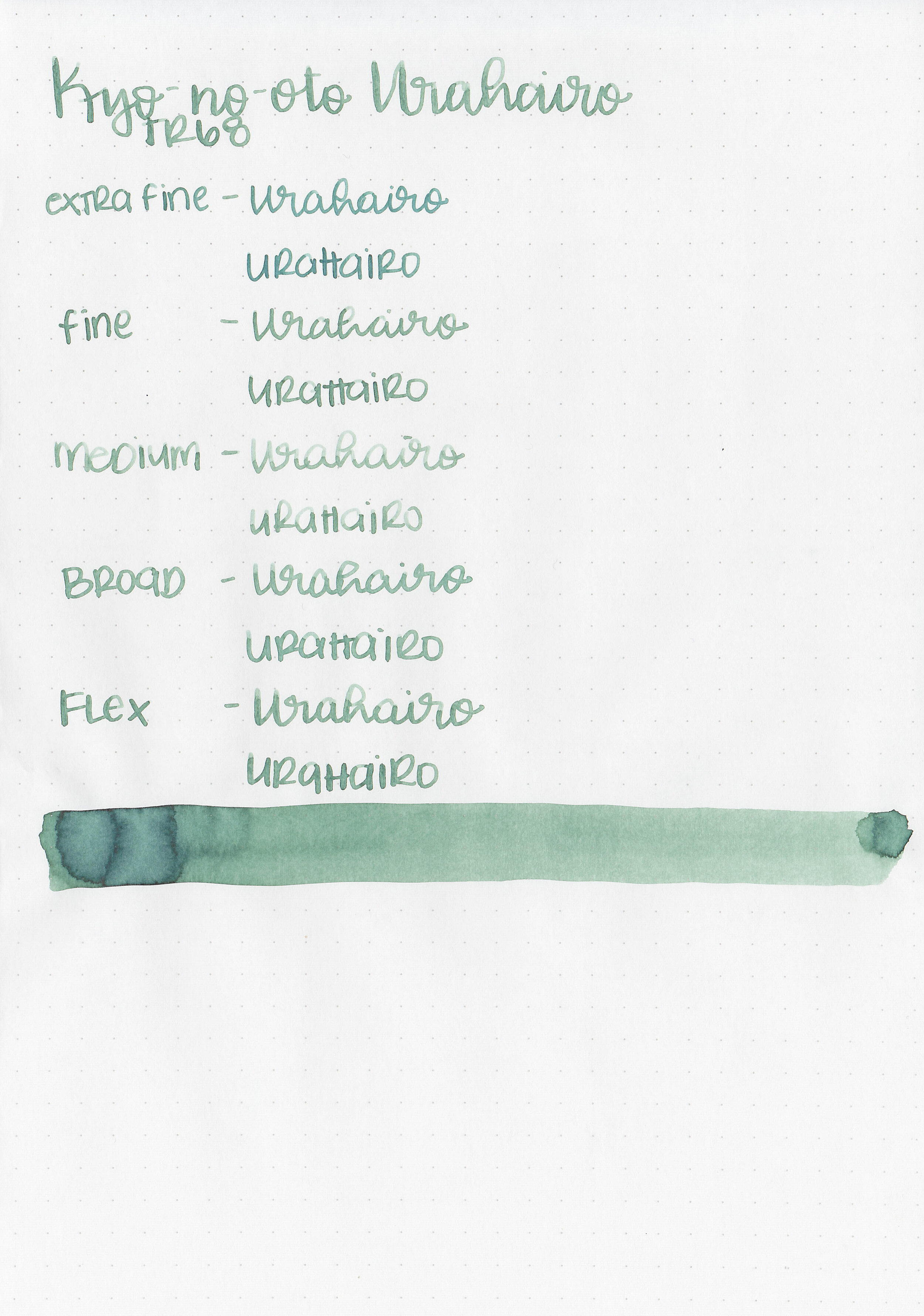
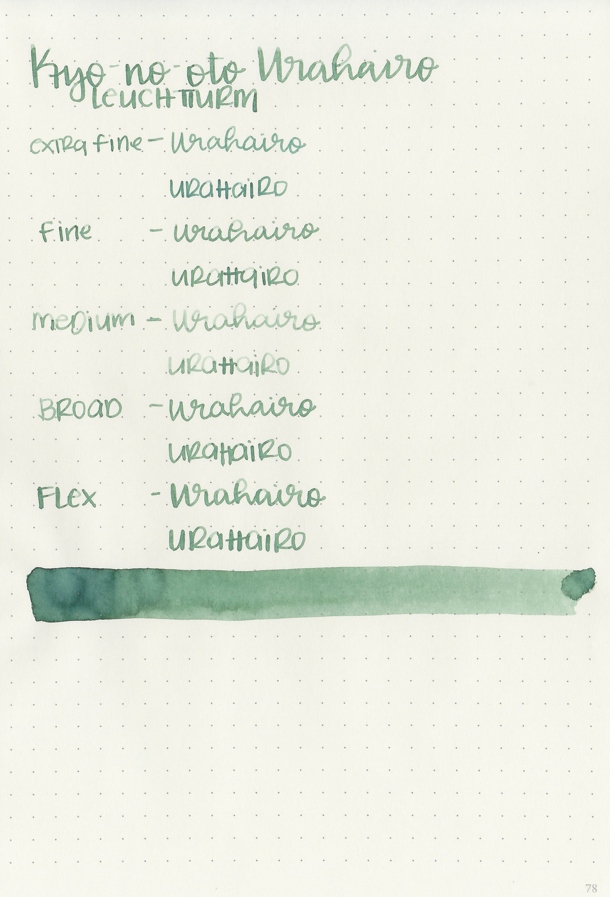
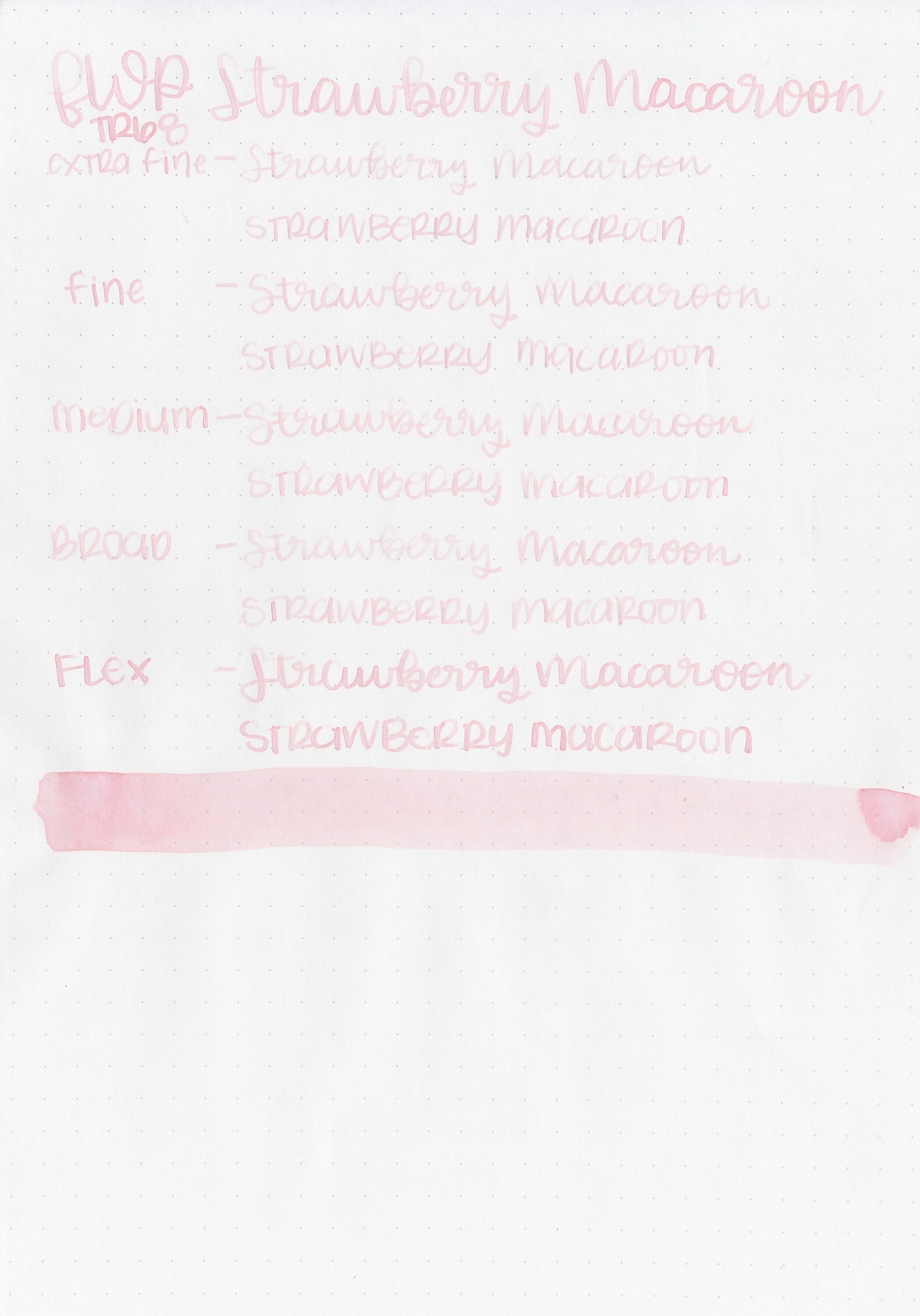
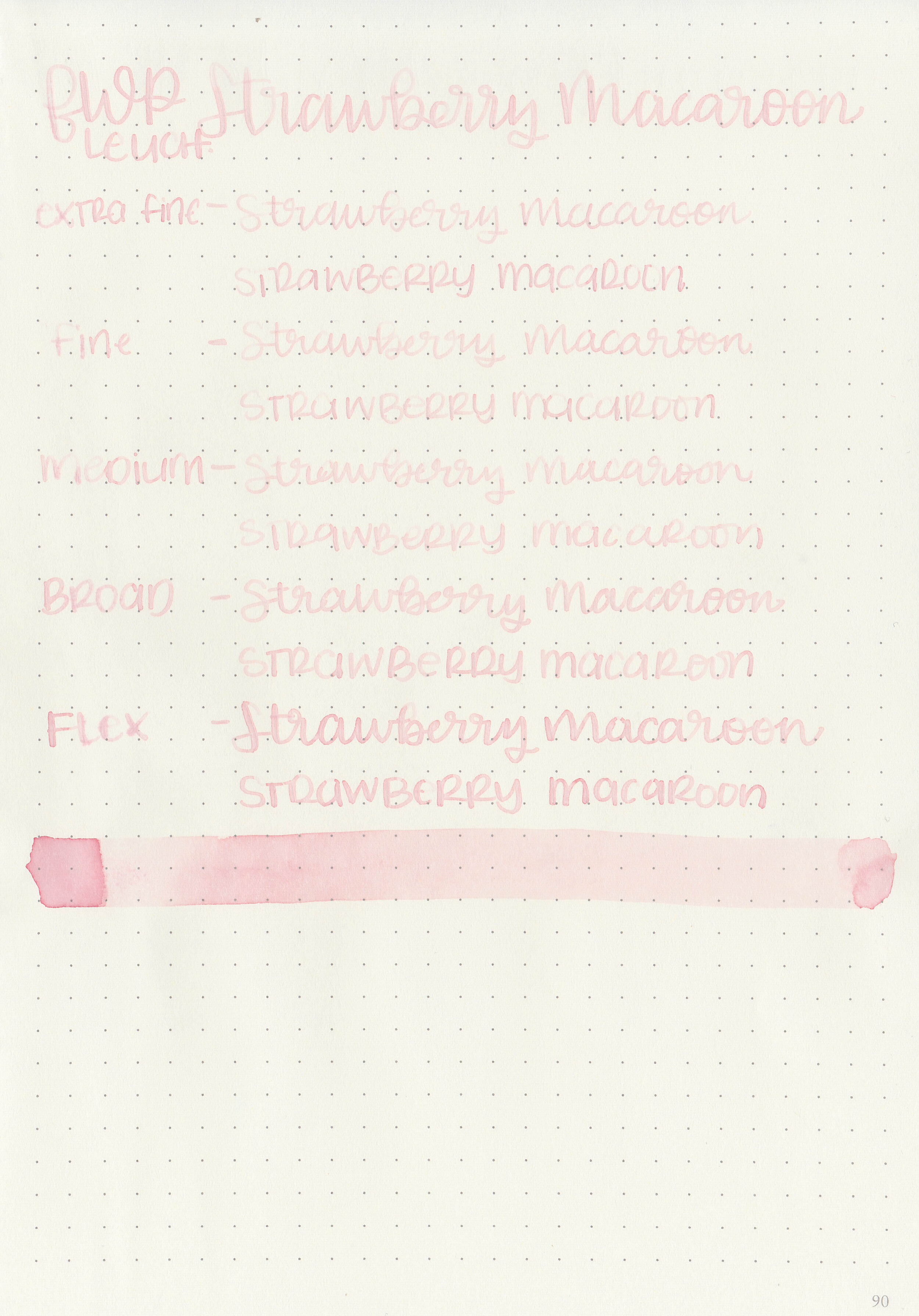
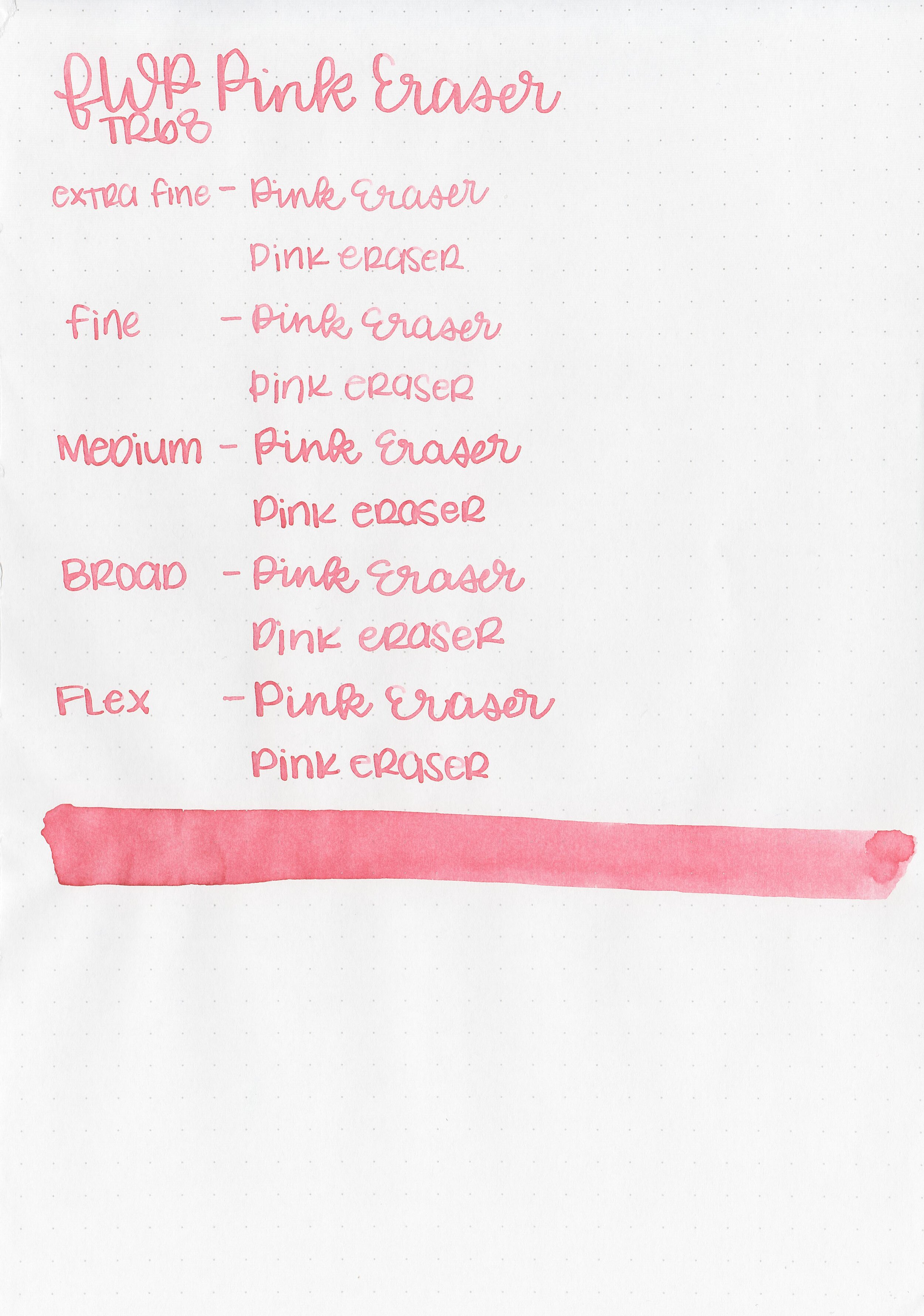
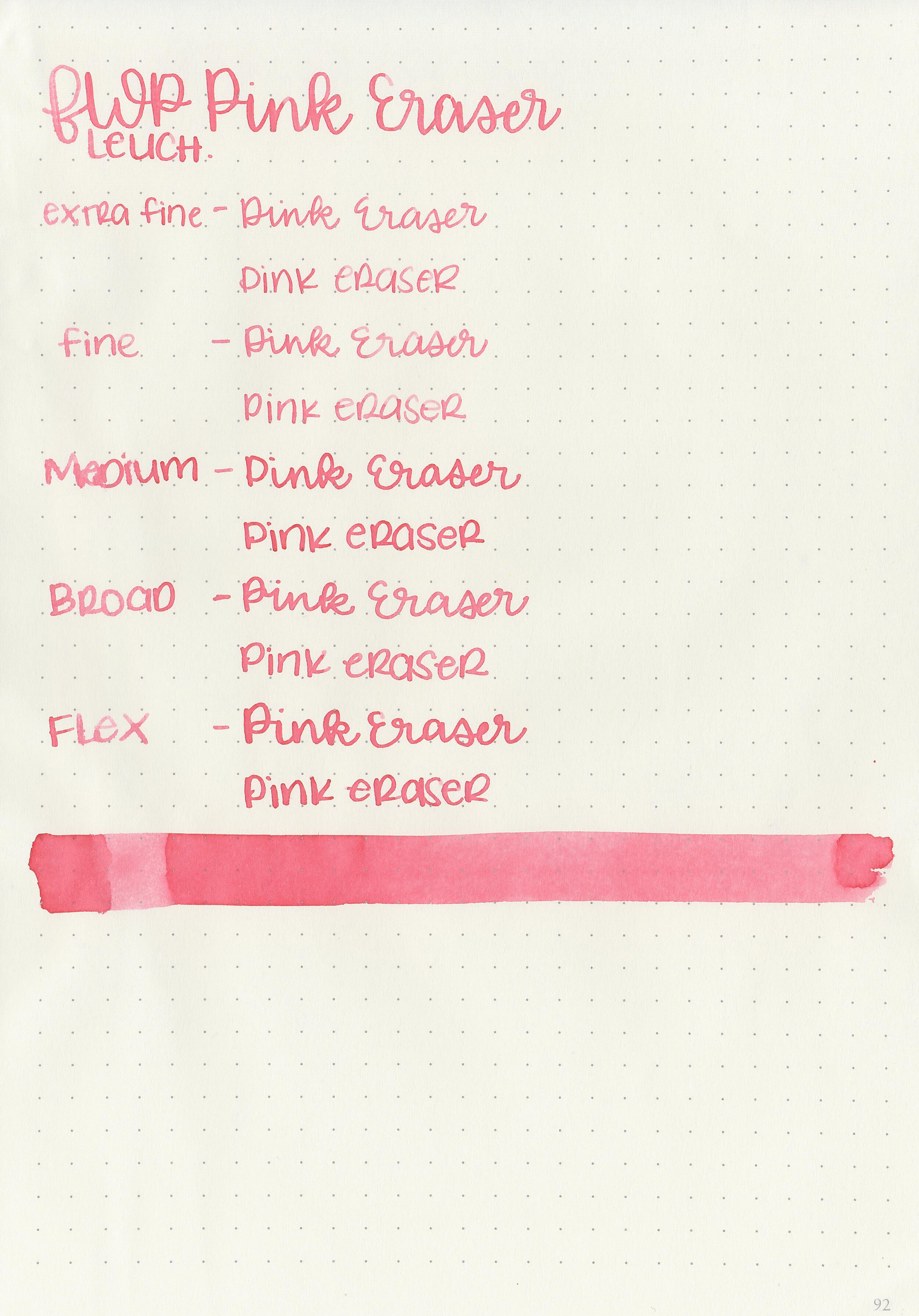
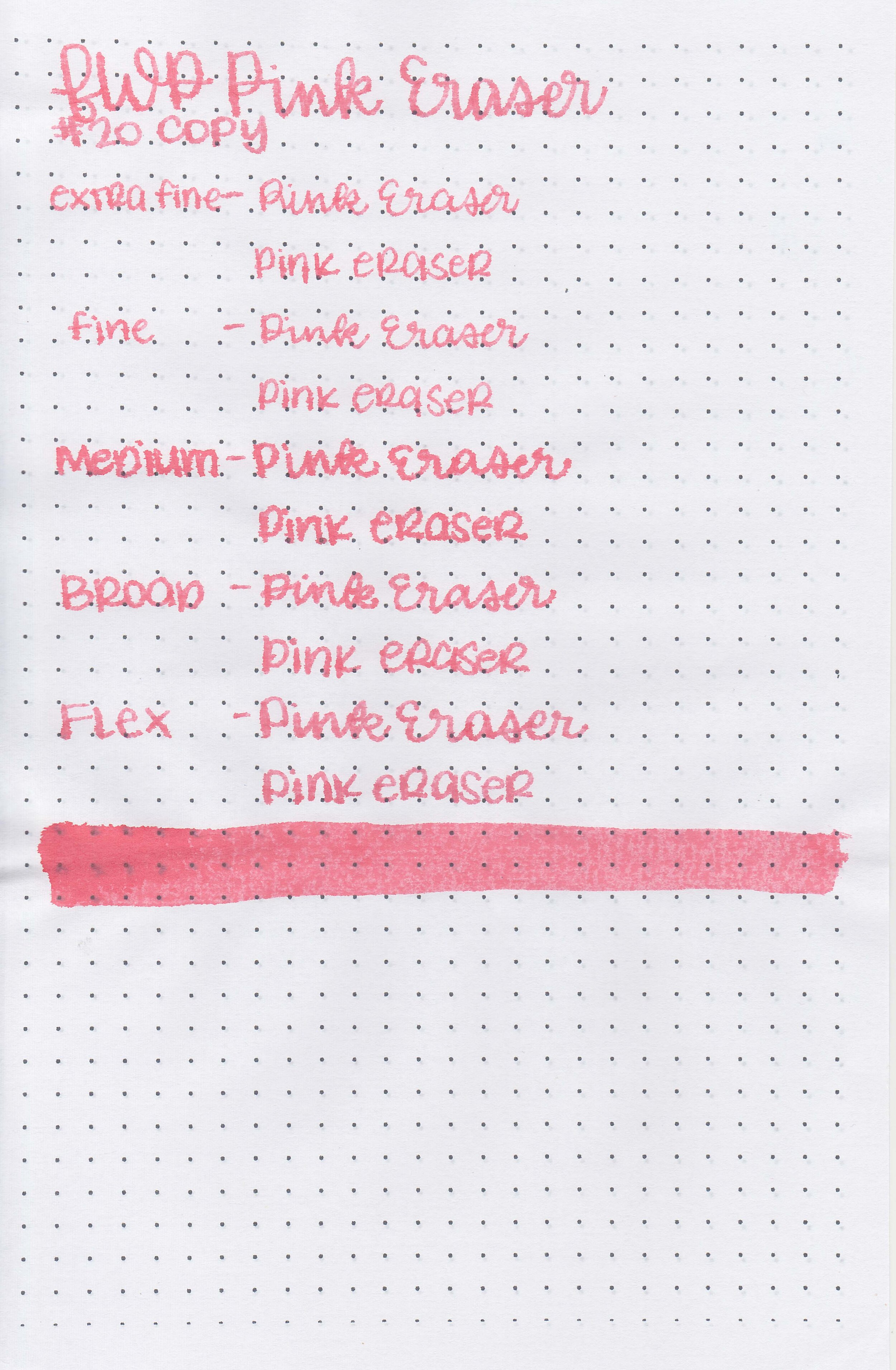
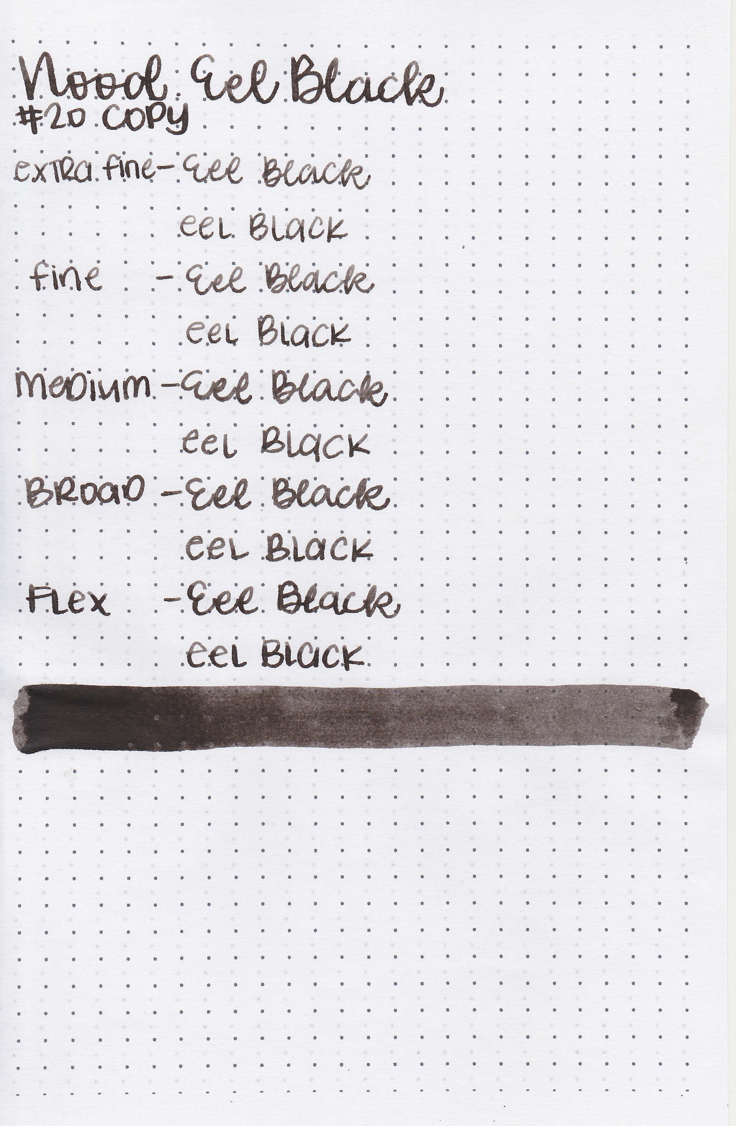
nood-eel-black-12.jpg

Writing samples:

Let's take a look at how the ink behaves on fountain pen friendly papers: Rhodia, Tomoe River, and Leuchtturm.

Dry time: 40 seconds

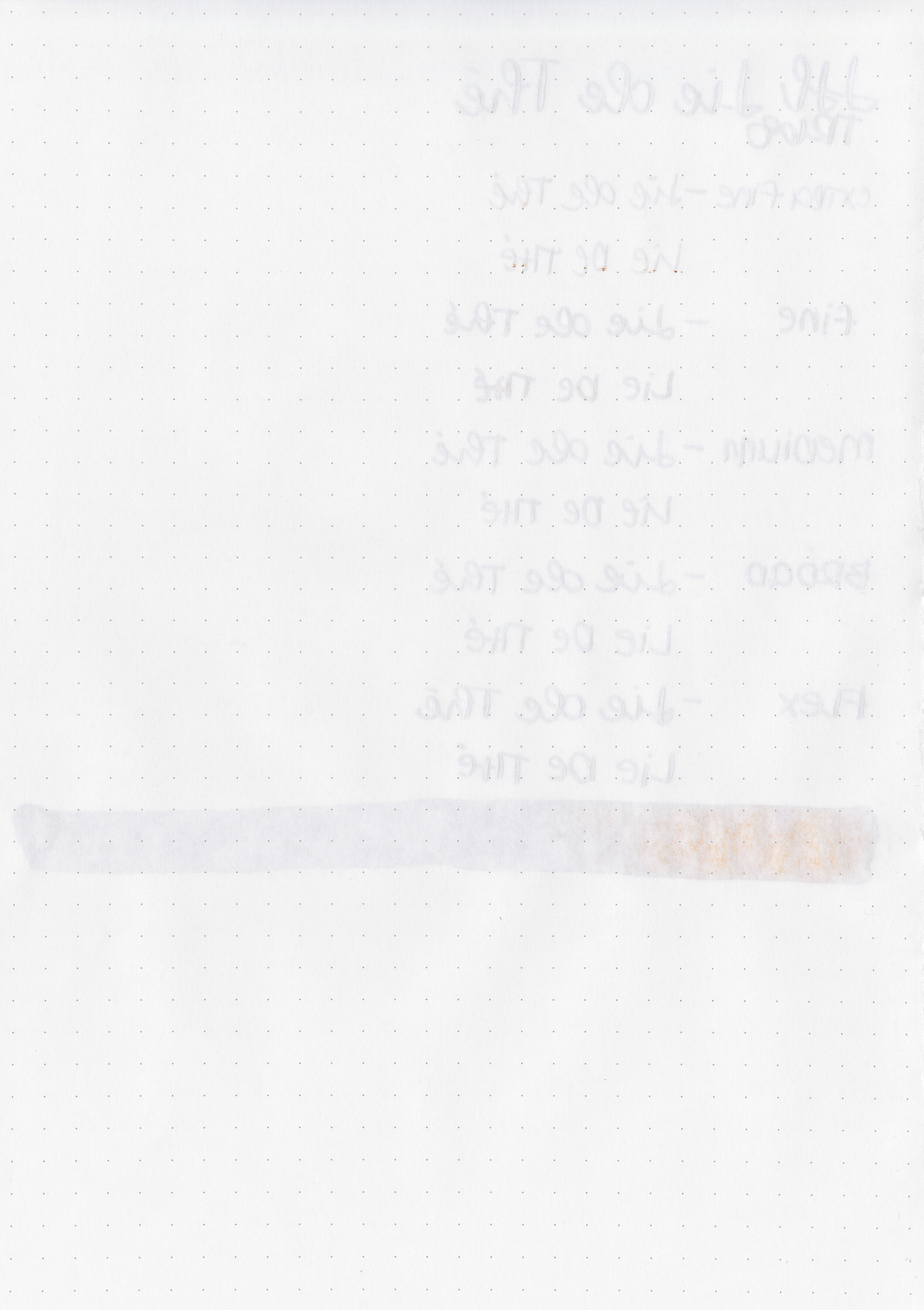
Water resistance: High
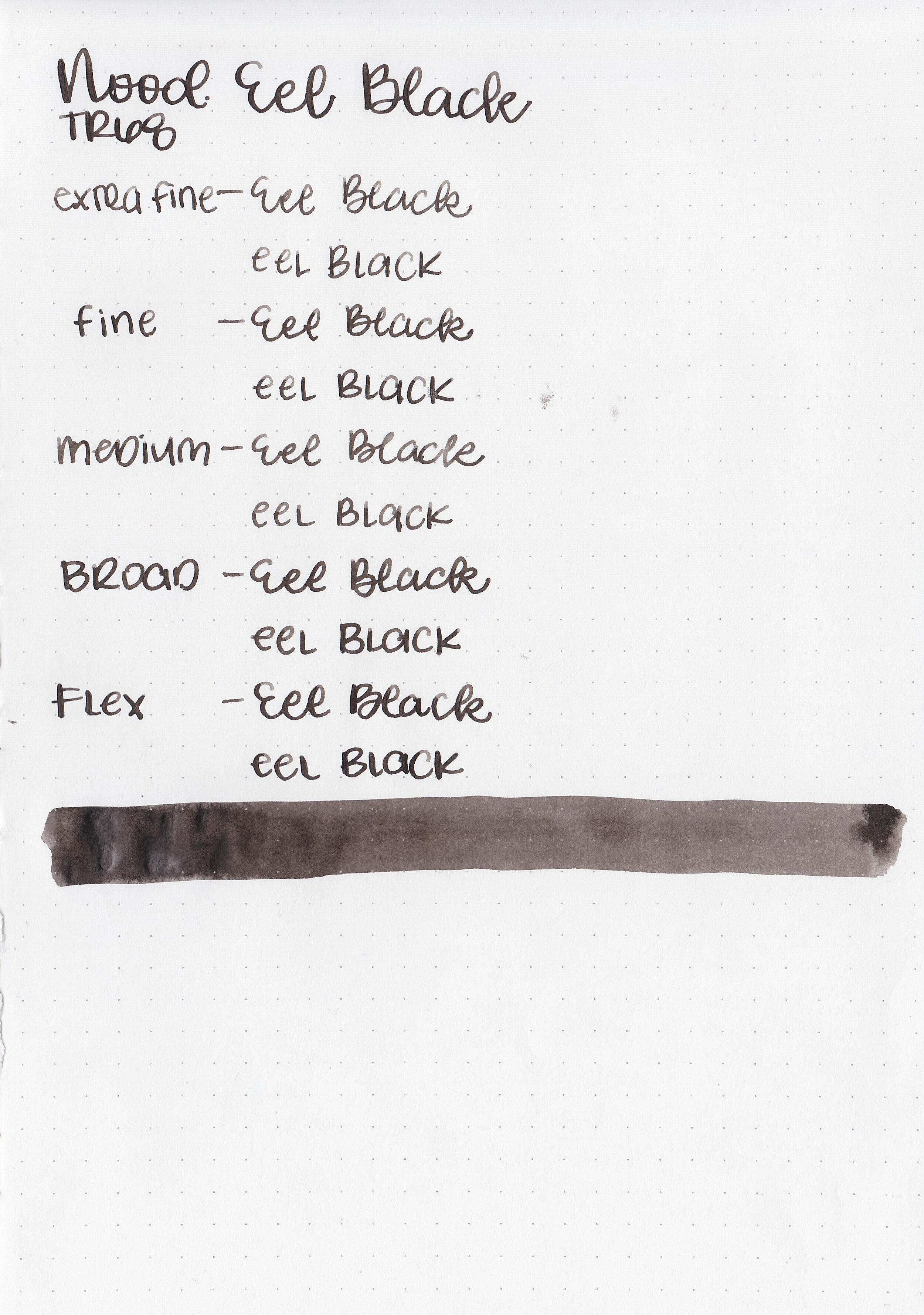
Feathering: None

Show through: Medium

Bleeding: None

Other properties: low shading, no sheen, and no shimmer.

On Staples 24 lb copy paper there was some feathering in most nib sizes but no bleeding.
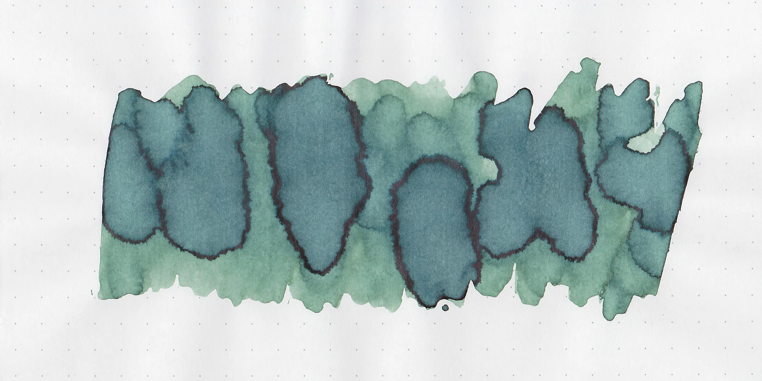
Comparison Swabs:

nood-eel-black-s-1.jpg

Eel Black is darker than Noodler’s Black. Click here to see the Noodler’s inks together, and click here to see the black inks together.

Longer writing:

nood-eel-black-w-1.jpg

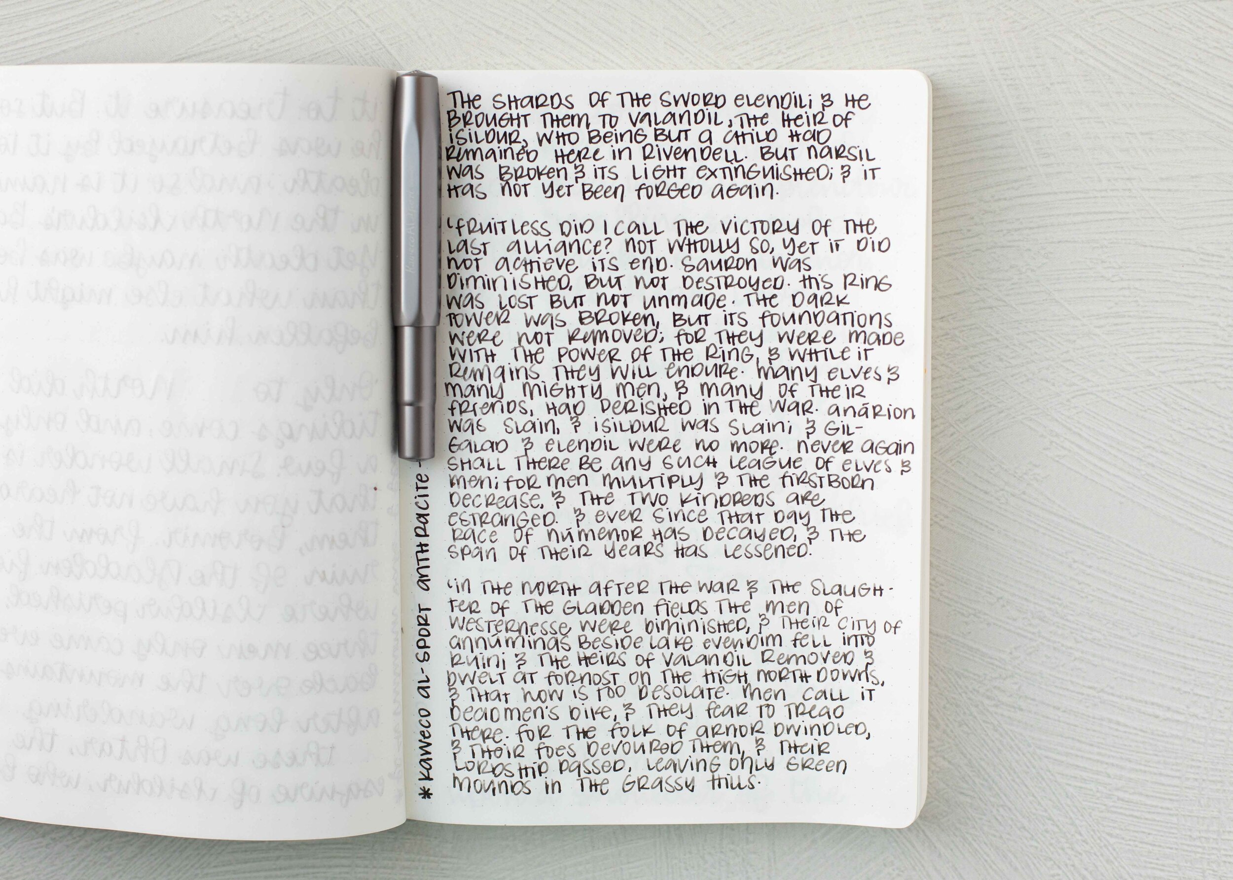
I used a Kaweco Al-sport Anthracite with a medium nib on a Taroko Enigma notebook. The ink had a wet flow at the beginning but the longer I wrote the more dry it became. It doesn’t feel very lubricated to me.

Overall, I appreciate that this ink is water-resistant but I don’t love the flow. It’s supposed to be lubricated but it doesn’t feel that way in longer writing.

Disclaimer: All photos and opinions are my own. This page does contain affiliate links but this post is not sponsored in any way.

Ink Review #1409: J Herbin Lie de The

jh-lie-de-the-2.jpg

J Herbin Lie de The is from J Herbin’s standard lineup. Thanks to the reader that sent this ink in for review! You can find this ink for sale at Pen Chalet (aff. link) or Vanness Pens.

jh-lie-de-the-1.jpg

The color:

Lie de The is a medium warm-tone brown.

Swabs:

jh-lie-de-the-3.jpg

In large swabs on Tomoe River paper the ink looks much cooler-toned.

jh-lie-de-the-4.jpg

Writing samples:

Let's take a look at how the ink behaves on fountain pen friendly papers: Rhodia, Tomoe River, and Leuchtturm.

Dry time: 20 seconds

Water resistance: Medium

Feathering: None

Show through: Medium

Bleeding: None

Other properties: low shading, no sheen, and no shimmer.

On Staples 24 lb copy paper there was some feathering and bleeding in all nib sizes.

Comparison Swabs:

jh-lie-de-the-s-1.jpg

Lie de The is warmer than most of these browns. Click here to see the J Herbin inks together, and click here to see the brown inks together.

Longer writing:

jh-lie-de-the-w-1.jpg

I used a Franklin-Christoph 46 in Autumn Oak with a fine flex nib on a Taroko Enigma notebook. The ink had a dry flow which caused some skips, hard starts and twice the feed dried completely up and had to be primed.

Overall, I don’t love this ink simply based on the dry flow issues. The color is nice but it just doesn’t work for me.

Disclaimer: All photos and opinions are my own. This page does contain affiliate links but this post is not sponsored in any way.

Ink Review #1408: Robert Oster Grun Gilt

ro-grun-gilt-2.jpg

Robert Oster Grun Gilt is from the Shake ‘N’ Shimmy collection. You can find this ink for sale at Pen Chalet (aff. link) or Vanness Pens.

ro-grun-gilt-1.jpg

The color:

Grun Gilt is a deep golden brown.

Swabs:

ro-grun-gilt-3.jpg

In large swabs on Tomoe River paper the ink has plenty of gold shimmer.

ro-grun-gilt-4.jpg

Writing samples:

Let's take a look at how the ink behaves on fountain pen friendly papers: Rhodia, Tomoe River, and Leuchtturm.

Dry time: 40 seconds

Water resistance: Low

Feathering: None

Show through: Medium

Bleeding: None

Other properties: low shading, no sheen, and gold shimmer.

On Staples 24 lb copy paper there was some feathering and bleeding in all nib sizes.

Comparison Swabs:

ro-grun-gilt-s-1.jpg

Grun Gilt is a little bit deeper than Robert Oster Heart of Gold. Click here to see the Robert Oster inks together, and click here to see the yellow inks together.

Longer writing:

ro-grun-gilt-w-1.jpg

I used an Kaweco Al-sport Gold with a fine nib on a Taroko Enigma notebook. The ink had a dry flow.

Overall, this ink is very close to Robert Oster Heart of Gold (which I actually like better than this one) so you probably don’t need both. It’s just a little dry but other than that it’s well behaved.

Disclaimer: All photos and opinions are my own. This page does contain affiliate links but this post is not sponsored in any way.

Ink Review #1407: Kyo-iro 03 Fushimi's Flaming Red

kyo-flaming-red-2.jpg

Today’s ink is Kyo-iro 03 Fushimi’s Flaming Red. You can find this ink for sale at Pen Chalet (aff. link) and Vanness Pens.

kyo-flaming-red-1.jpg

The color:

Flaming Red is a bright red that leans just a bit towards orange.

Swabs:

kyo-flaming-red-3.jpg

In large swabs on Tomoe River paper the ink is a little darker than in writing.

kyo-flaming-red-4.jpg

Writing samples:

Let's take a look at how the ink behaves on fountain pen friendly papers: Rhodia, Tomoe River, and Leuchtturm.

Dry time: 10 seconds

Water resistance: Medium

Feathering: Low

Show through: Medium

Bleeding: Low

Other properties: low shading, no sheen, and no shimmer.

On Staples 24 lb copy paper there was some feathering and bleeding in all nib sizes.

Comparison Swabs:

kyo-flaming-red-s-1.jpg

There are a lot of similar reds out there including Diamine Poppy Red and Robert Oster Direct Sun. Click here to see the Kyoto inks together, and click here to see the red inks together.

Longer writing:

kyo-flaming-red-w-1.jpg

I used a Sailor Pro Gear Slim Supernova Red with a broad nib on a Taroko Enigma notebook. The ink had a super dry flow.

Overall, there are a lot of red inks out there that are very similar to this color. There’s nothing about it that stands out from the crowd.

Disclaimer: All photos and opinions are my own. This page does contain affiliate links but this post is not sponsored in any way.

Ink Review #1406: Kyo-no-oto 04 Yamabukiiro

kyo-yamabukiiro-2.jpg

Let’s go with a less common Kyoto ink today: Kyo-no-oto 04 Yamabukiiro. You can find this ink for sale at Pen Chalet (aff. link) and Vanness Pens.

kyo-yamabukiiro-1.jpg

The color:

Yamabukiiro is a dark mustard yellow.

Swabs:

kyo-yamabukiiro-3.jpg

In large swabs on Tomoe River paper the ink is darker.

kyo-yamabukiiro-4.jpg

Writing samples:

Let's take a look at how the ink behaves on fountain pen friendly papers: Rhodia, Tomoe River, and Leuchtturm.

Dry time: 15 seconds

Water resistance: Low

Feathering: Low

Show through: Medium

Bleeding: None

Other properties: low shading, tiny black sheen, and no shimmer.

On Staples 24 lb copy paper there was some feathering and bleeding in all nib sizes.

Comparison Swabs:

kyo-yamabukiiro-s-1.jpg

Yamabukiiro is a little bit darker than Robert Oster Aussie Gold and a little bit lighter than Vinta La Paz and 3 Oysters Mustard. Click here to see the Kyoto inks together, and click here to see the yellow inks together.

Longer writing:

kyo-yamabukiiro-w-1.jpg

I used a Lamy Al-star Bronze with a medium nib on a Taroko Enigma notebook. The ink had a super dry flow.

Overall, I love the color of this ink, it’s perfect for fall. It is very dry and could use a bit of help from White Lightning.

Disclaimer: All photos and opinions are my own. This page does contain affiliate links but this post is not sponsored in any way.

Ink Review #1405: Kyo-no-oto 03 Kokeiro

kyo-kokeiro-2.jpg

I’m a bit stuck on Kyoto inks this week so let’s continue with Kyo-no-oto 03 Kokeiro. You can find this ink for sale at Pen Chalet (aff. link) and Vanness Pens.

kyo-kokeiro-1.jpg

The color:

Kokeiro is a medium chartreuse green.

Swabs:

kyo-kokeiro-3.jpg

In large swabs on Tomoe River paper the ink is darker, more of an olive green.

kyo-kokeiro-4.jpg

Writing samples:

Let's take a look at how the ink behaves on fountain pen friendly papers: Rhodia, Tomoe River, and Leuchtturm.

Dry time: 10 seconds

Water resistance: Medium

Feathering: None

Show through: Medium

Bleeding: Low

Other properties: medium shading, tiny grey sheen, and no shimmer.

On Staples 24 lb copy paper there was some feathering and bleeding in all nib sizes.

Comparison Swabs:

kyo-kokeiro-s-1.jpg

Kokeiro is closest to Robert Oster Chartreuse. Click here to see the Kyoto inks together, and click here to see the green inks together.

Longer writing:

kyo-kokeiro-w-1.jpg

I used a Lamy Al-star Green with a broad nib on a Taroko Enigma notebook. The ink had a super dry flow.

Overall, like other Kyoto inks I like this ink best in a wet broad nib. I love the shading on this ink but frankly Chartreuse isn’t my favorite color. I think this color looks best in the larger swabs rather than in writing so this ink isn’t one I need a full bottle of.

Disclaimer: All photos and opinions are my own. This page does contain affiliate links but this post is not sponsored in any way.

Ink Review #1404: Kyo-no-oto 08 Moegiiro

kyo-moegiiro-2.jpg

Kyo-no-oto 08 Moegiiro is the replacement of Kyo-no-oto 08 Urahairo which we reviewed yesterday. You can find this ink for sale at Pen Chalet (aff. link) and Vanness Pens.

kyo-moegiiro-1.jpg

The color:

Moegiiro is a bright lime green.

Swabs:

kyo-moegiiro-3.jpg

In large swabs on Tomoe River paper the ink is darker where it pooled and has some black sheen.

kyo-moegiiro-4.jpg

Writing samples:

Let's take a look at how the ink behaves on fountain pen friendly papers: Rhodia, Tomoe River, and Leuchtturm.

Dry time: 10 seconds

Water resistance: Medium

Feathering: Low

Show through: Medium

Bleeding: Low

Other properties: medium shading, tiny black sheen, and no shimmer.

On Staples 24 lb copy paper there was some feathering in all nib sizes.

Comparison Swabs:

kyo-moegiiro-s-1.jpg

Moegiiro is darker than Diamine Kelly Green and brighter than Sailor Ink Studio 867. Click here to see the Kyoto inks together, and click here to see the green inks together.

Longer writing:

kyo-moegiiro-w-1.jpg

I used a Pelikan M600 Vibrant Green with a broad nib on a Taroko Enigma notebook. The ink had a super dry flow.

Overall, like other Kyoto inks I like this ink best in a wet broad nib. It’s very dry and could benefit from a drop of White Lighting, it’s a lovely bright color though.

Disclaimer: I purchased this ink myself and all photos and opinions are my own. This page does contain affiliate links but this post is not sponsored in any way.

Ink Review #1403: Kyo-no-oto 08 Urahairo

kyo-urahairo-2.jpg

Kyo-no-oto 08 Urahairo was originally released in Fall 2018. I find it so confusing when Kyoto gives two inks the same number. I understand that when they run out of stock of the first one they create another one and use the same number, so we will look at Kyo-no-oto 08 Moegiiro tomorrow. You can find this ink for sale at Vanness Pens.

kyo-urahairo-1.jpg

The color:

Urahairo is a pale sage green.

Swabs:

kyo-urahairo-3.jpg

In large swabs on Tomoe River paper the ink is darker where it pooled.

kyo-urahairo-4.jpg

Writing samples:

Let's take a look at how the ink behaves on fountain pen friendly papers: Rhodia, Tomoe River, and Leuchtturm.

Dry time: 10 seconds

Water resistance: Low

Feathering: Low

Show through: Medium

Bleeding: Low

Other properties: medium shading, tiny black sheen, and no shimmer.

On Staples 24 lb copy paper there was some feathering in all nib sizes.

Comparison Swabs:

kyo-urahairo-s-1.jpg

I don’t have a close match for Urahairo, most of these are cooler toned except Robert Oster Lemongrass, which is warmer. Click here to see the Kyoto inks together, and click here to see the green inks together.

Longer writing:

kyo-urahairo-w-1.jpg

I used a TWSBI Eco Transparent Green with a medium nib on a Taroko Enigma notebook. The ink had a super dry flow.

Overall, I like this ink best in a wet broad nib. It’s very dry and could benefit from a drop of White Lighting. It can also be a bit pale in the smaller nib sizes.

Disclaimer: I purchased this ink myself and all photos and opinions are my own. This page does does not contain affiliate links and this post is not sponsored in any way.

Ink Review #1402: Ferris Wheel Press Strawberry Macaron

fwp-strawberry-macaroon-2.jpg

Ferris wheel Press Strawberry Macaron is from FWP’s Spring 2020 collection. You can find this ink for sale at Vanness Pens.

fwp-strawberry-macaroon-1.jpg

The color:

Strawberry Macaron is an extremely light baby pink.

Swabs:

fwp-strawberry-macaroon-3.jpg

In large swabs on Tomoe River paper the ink looks a little darker, more visible.

fwp-strawberry-macaroon-4.jpg

Writing samples:

Let's take a look at how the ink behaves on fountain pen friendly papers: Rhodia, Tomoe River, and Leuchtturm.

Dry time: 15 seconds

Water resistance: Low

Feathering: None

Show through: Medium

Bleeding: None

Other properties: low shading, no sheen, and no shimmer.

On Staples 24 lb copy paper there was some feathering but no bleeding.

Comparison Swabs:

fwp-strawberry-macaroon-s-1.jpg

Strawberry Macron is warmer toned than Octopus Fluids Cherry Blossom and much lighter than Sailor Jentle Peche. Click here to see the FWP inks together, and click here to see the pink inks together.

Longer writing:

fwp-strawberry-macaroon-w-1.jpg

I used a Franklin-Christoph 45L Salmon Glow with a medium nib on a Taroko Enigma notebook. The ink had a dry flow.

Overall, this ink is way too light for me to use for anything but art. It’s a solid no for me.

Disclaimer: All photos and opinions are my own. This page does not contain affiliate links and this post is not sponsored in any way.

Ink Review #1401: Ferris Wheel Press Pink Eraser

fwp-pink-eraser-2.jpg

Ferris wheel Press Pink Eraser is from FWP’s Spring 2020 collection. You can find this ink for sale at Vanness Pens.

fwp-pink-eraser-1.jpg

The color:

Pink Eraser is the perfect name for this ink-it’s the color of most pencil erasers.

Swabs:

fwp-pink-eraser-3.jpg

In large swabs on Tomoe River paper the ink looks less saturated.

fwp-pink-eraser-4.jpg

Writing samples:

Let's take a look at how the ink behaves on fountain pen friendly papers: Rhodia, Tomoe River, and Leuchtturm.

Dry time: 50 seconds

Water resistance: Low

Feathering: None

Show through: Medium

Bleeding: Low

Other properties: low shading, no sheen, and no shimmer.

On Staples 24 lb copy paper there was some feathering and bleeding in the larger nib sizes.

Comparison Swabs:

fwp-pink-eraser-s-1.jpg

Pink Eraser is closest to Robert Oster Sushi. Click here to see the FWP inks together, and click here to see the pink inks together.

Longer writing:

fwp-pink-eraser-w-1.jpg

I used a TWSBI Eco Pink with a medium nib on a Taroko Enigma notebook. The ink had a dry flow.

Overall, it’s more readable than some of the other light pinks I’ve tried lately like PenBBS Xu Zhimo, but it’s still a bit too light in some of the smaller nib sizes. I like this ink best in a wet broad nib,

Disclaimer: All photos and opinions are my own. This page does not contain affiliate links and this post is not sponsored in any way.