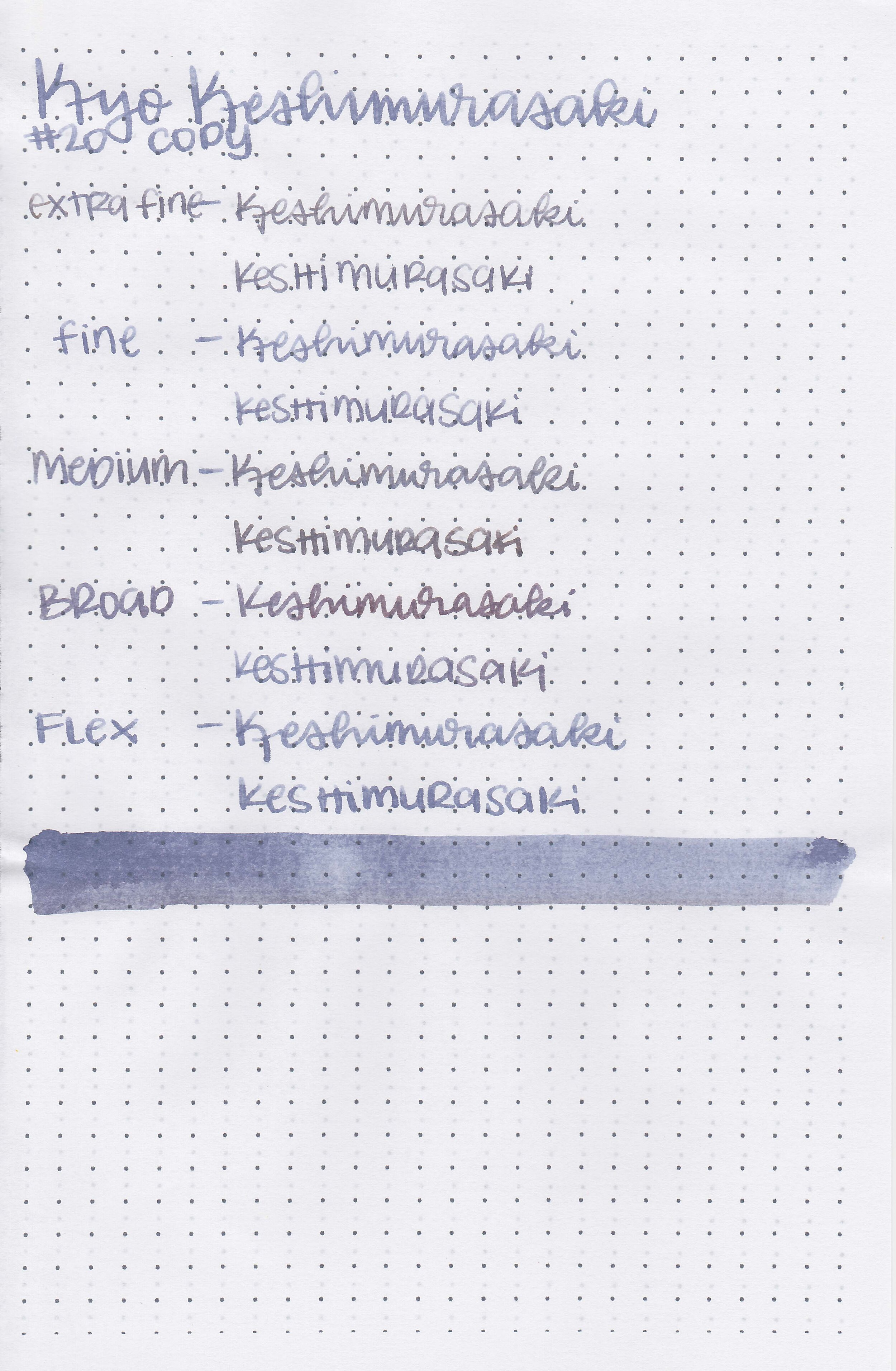
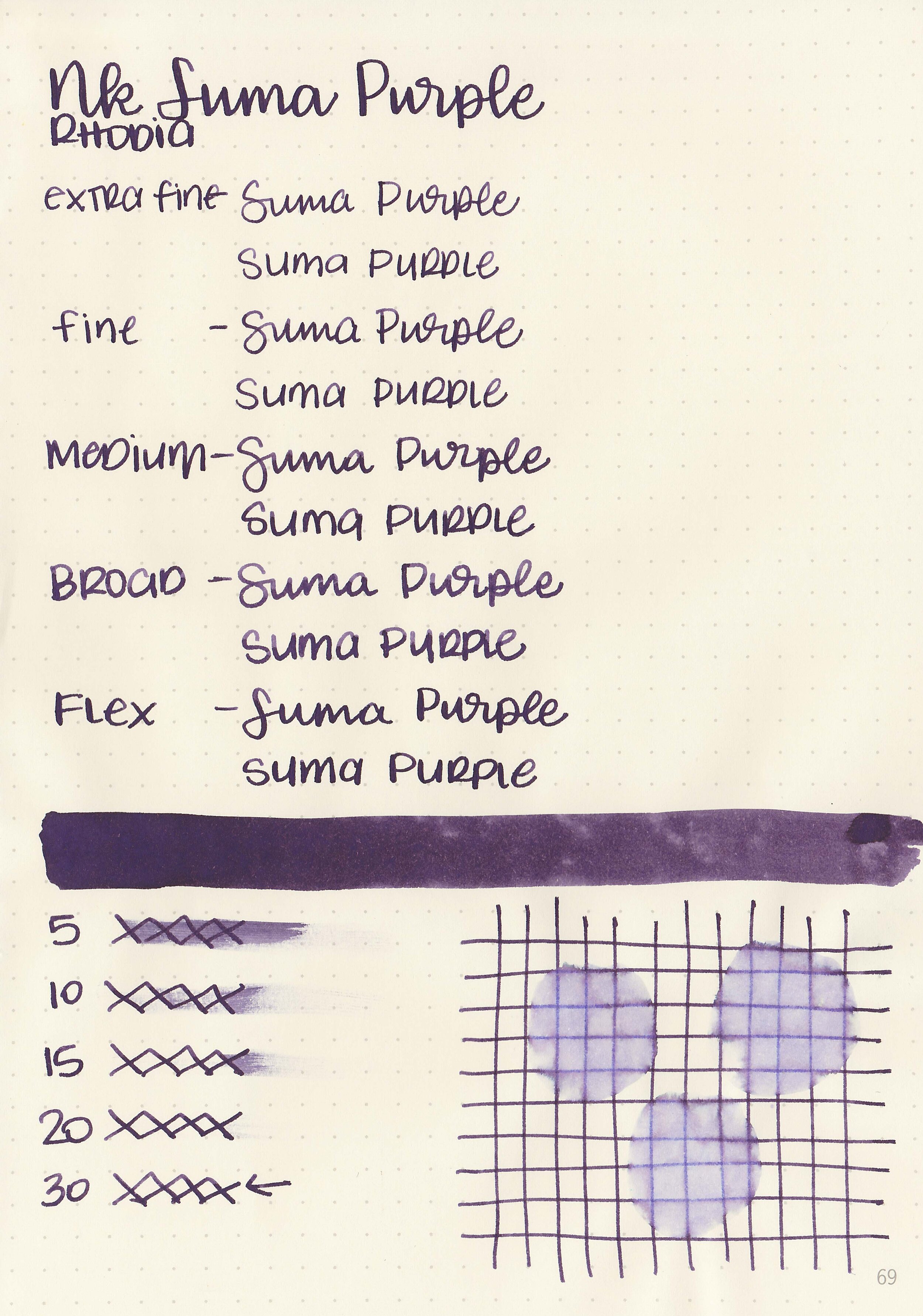
Ink Review #1487: PenBBS 128 Santorini
/
PenBBS 128 Santorini is from Season 11 and comes in 60ml bottles. I purchased my sample of ink from Vanness Pens. According to the Vanness website: “This ink is reminiscent of St. Gerasimos Christian Church, the famous blue domed church on the island of Santorini, Greece which is featured on the label.”

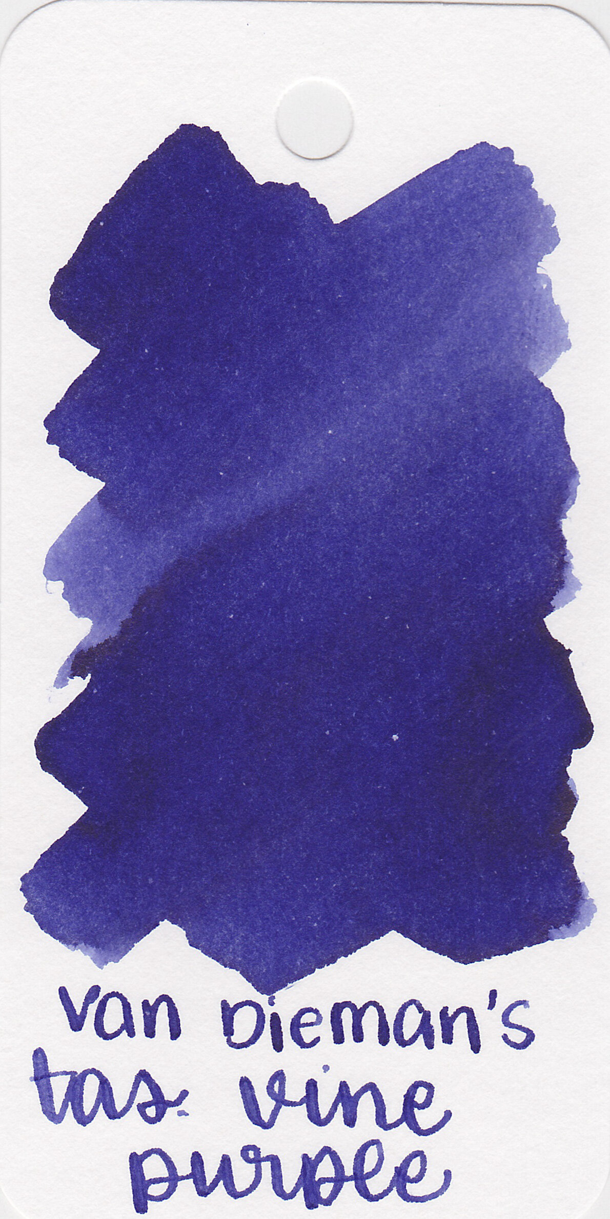
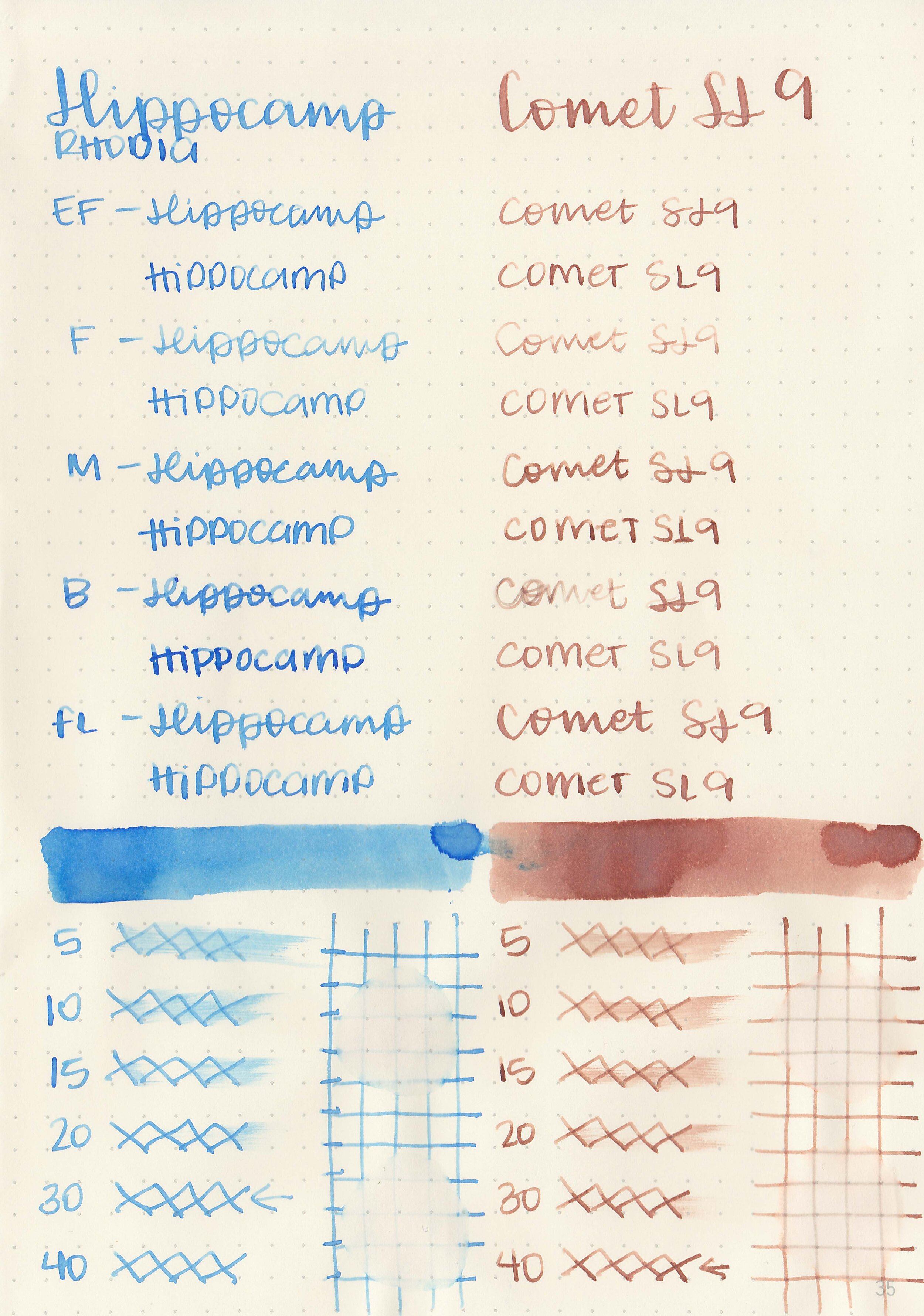
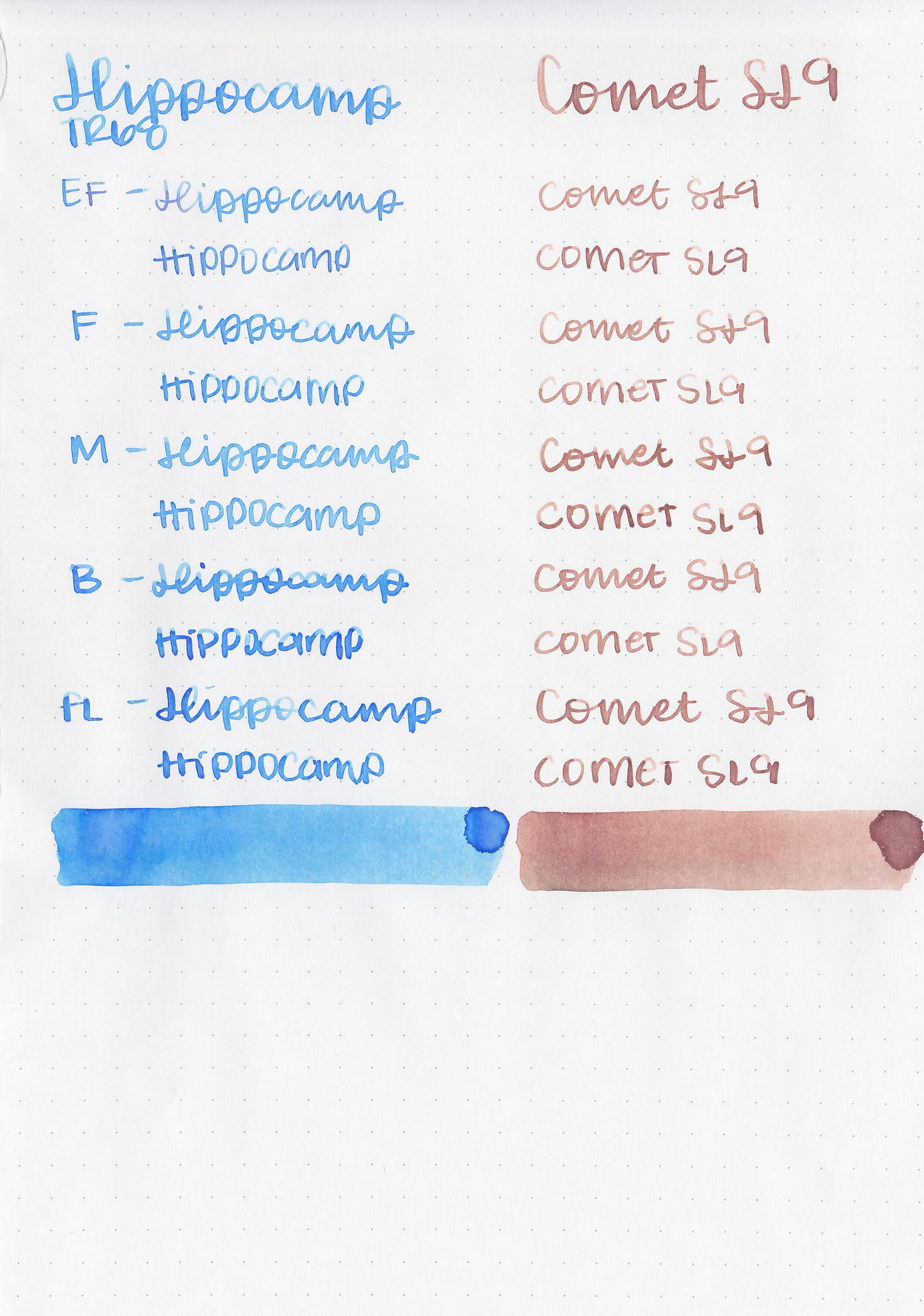
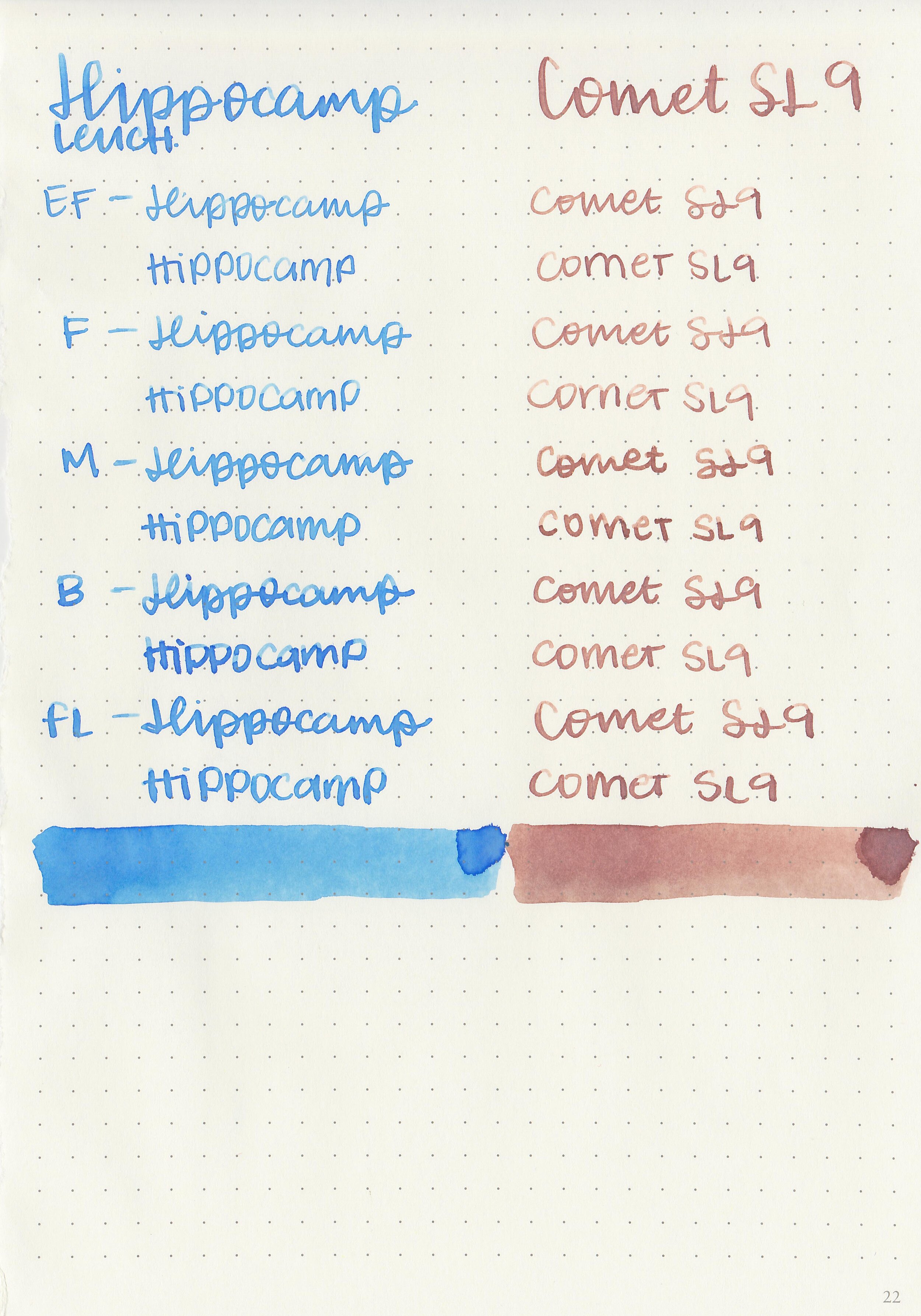
The color:
Santorini is a bright ocean blue.
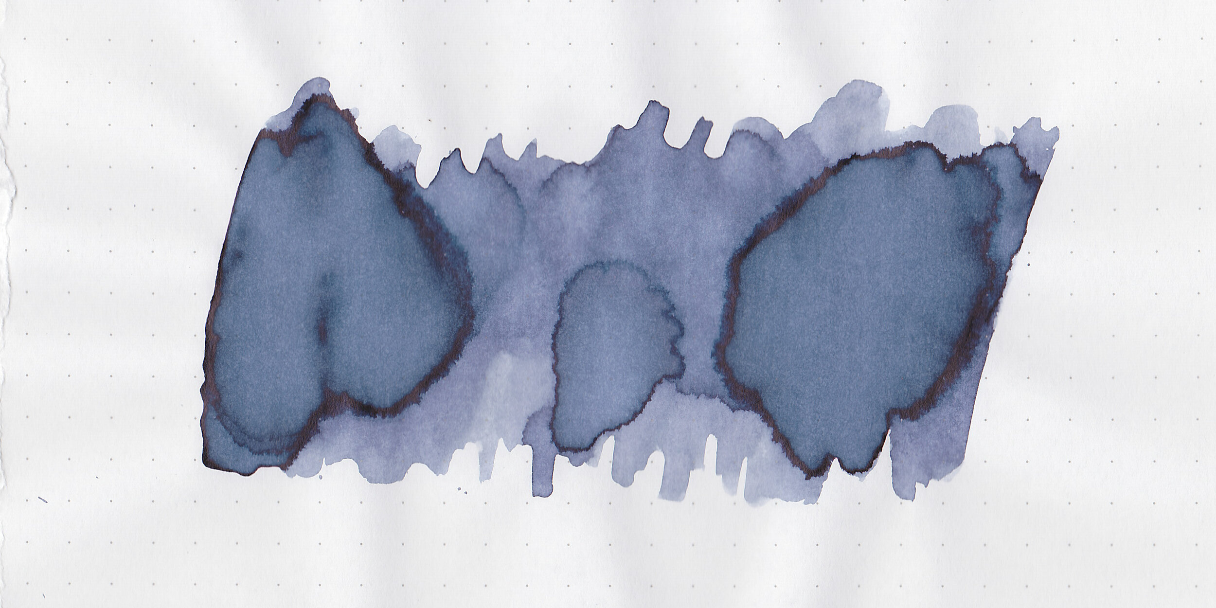
Swabs:

In large swabs on Tomoe River paper the ink looks a bit brighter with some pretty sheen.

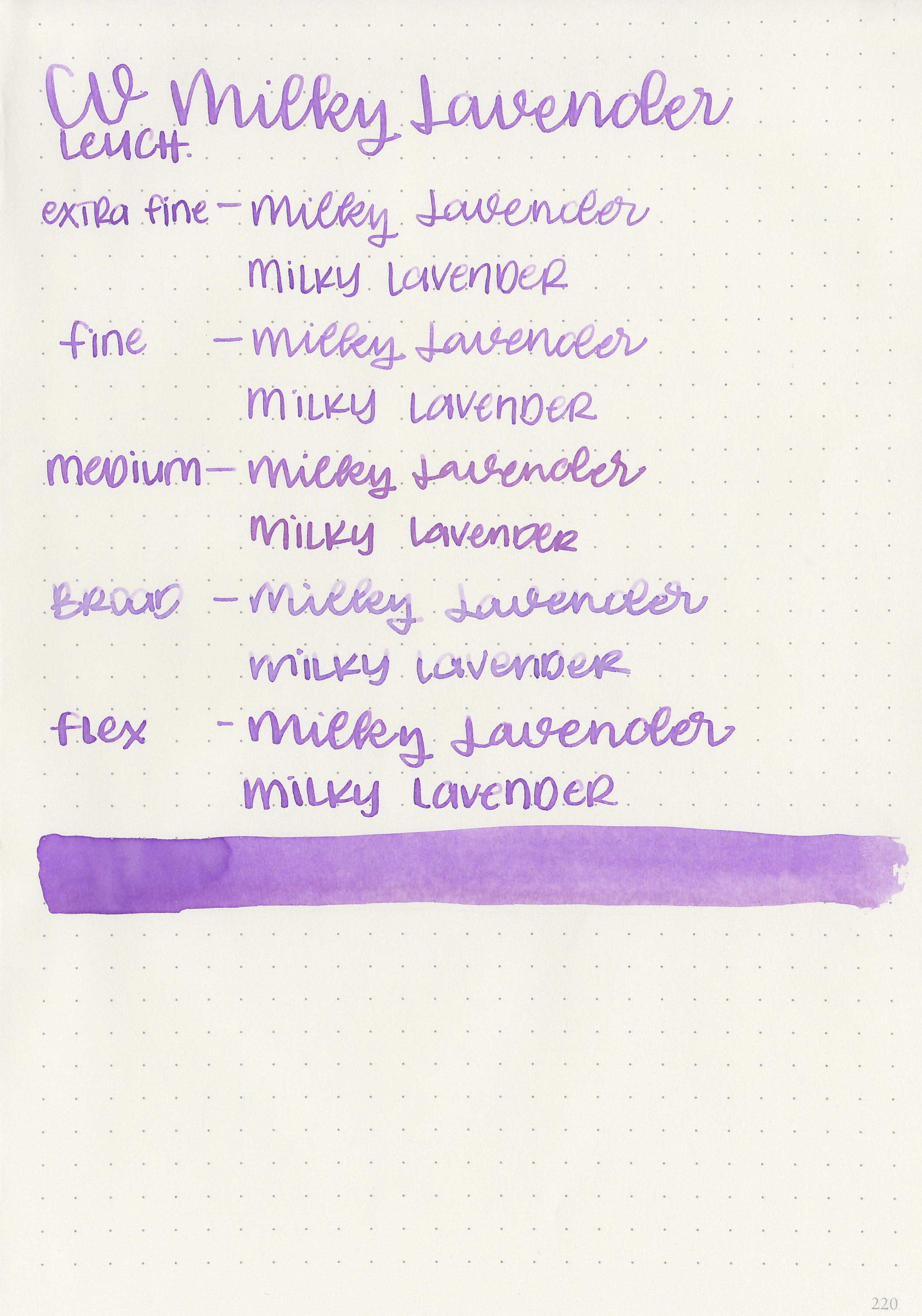
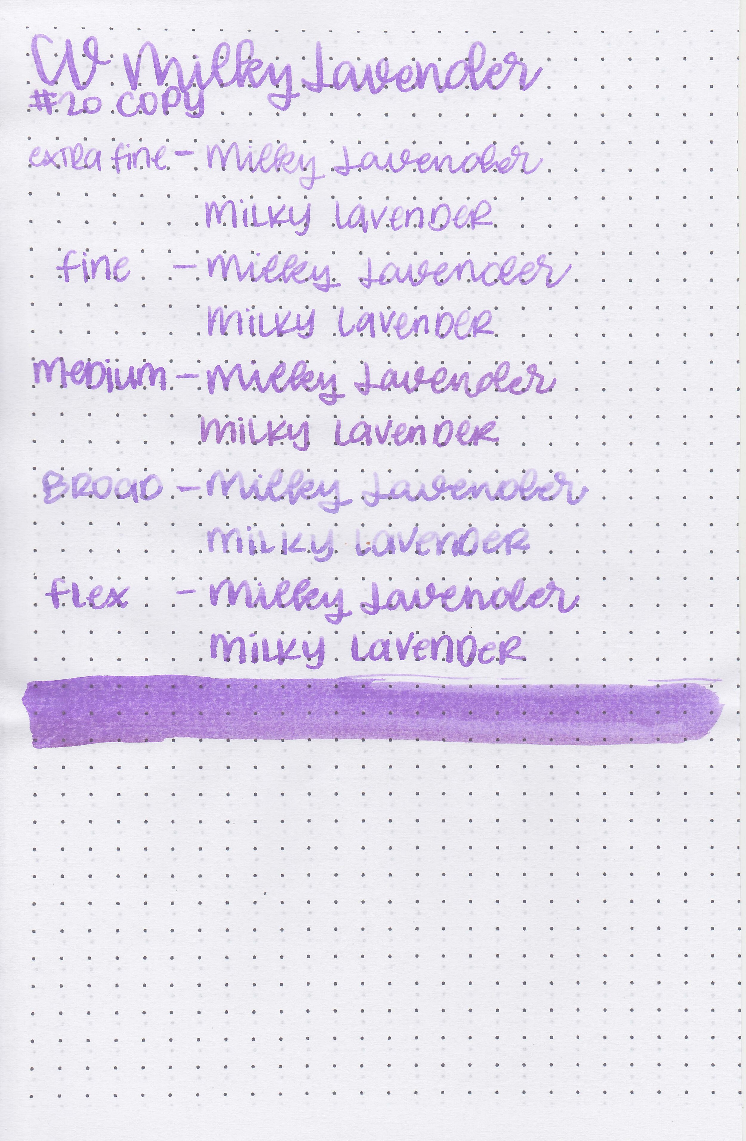
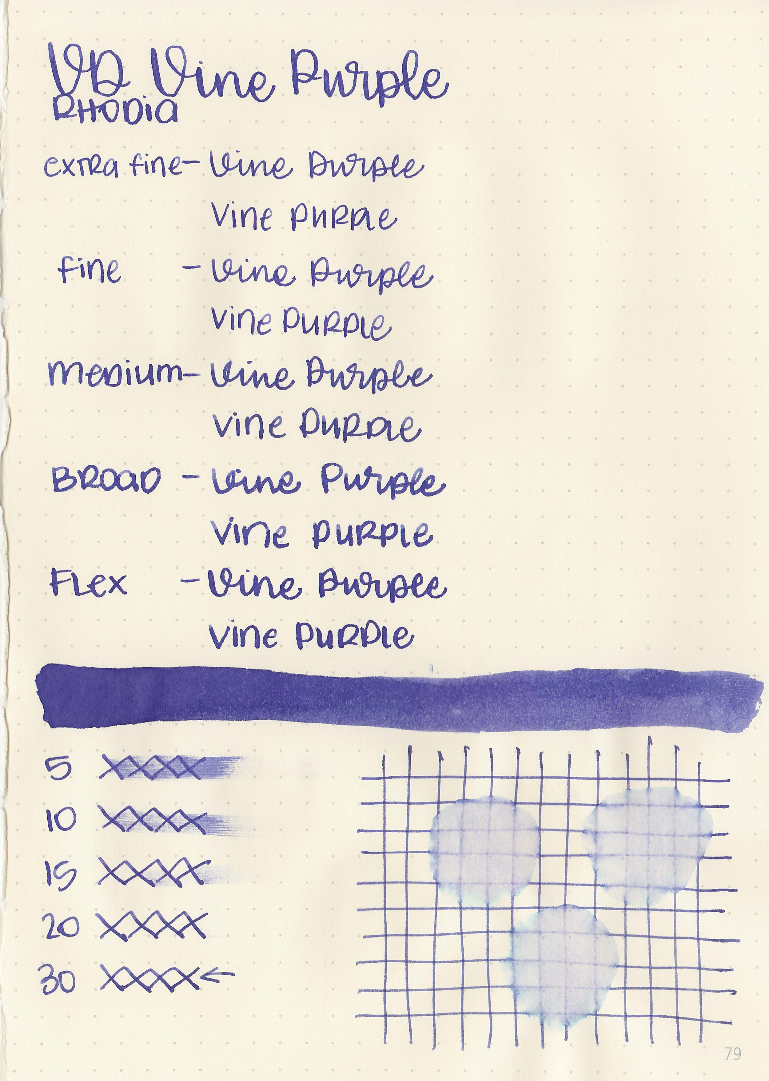
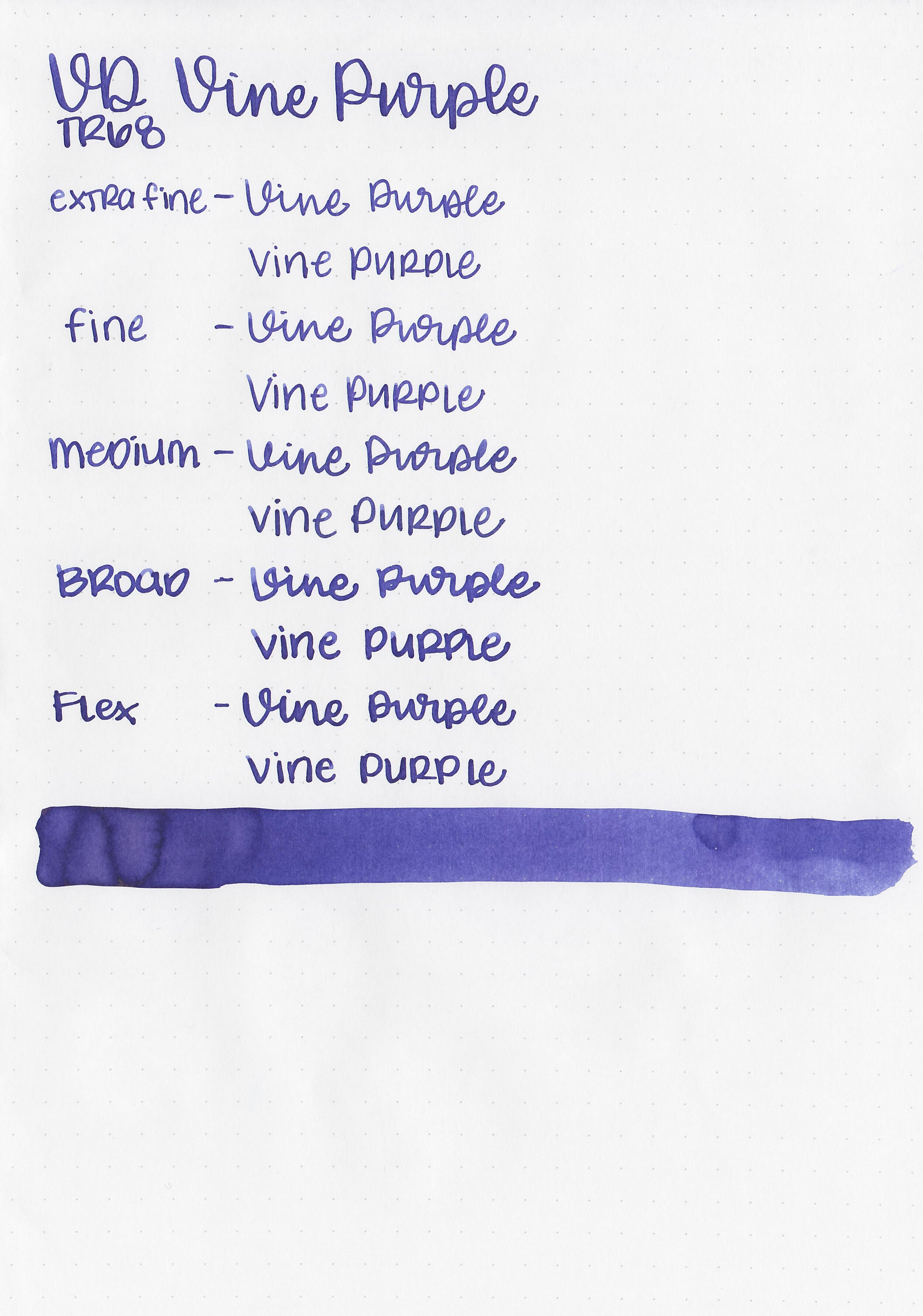
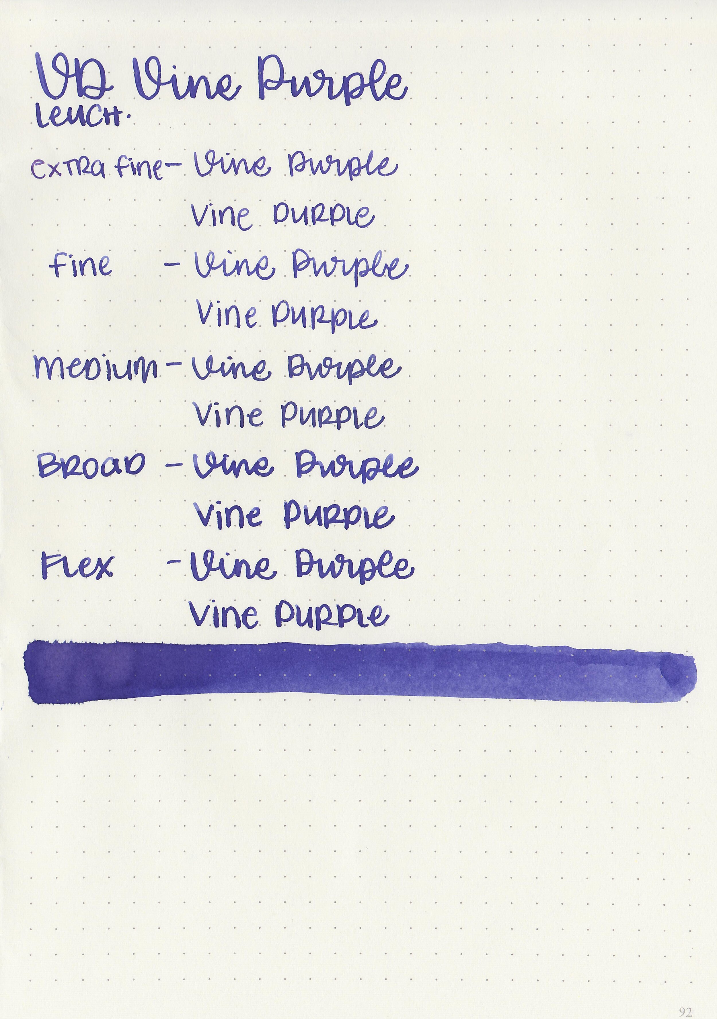
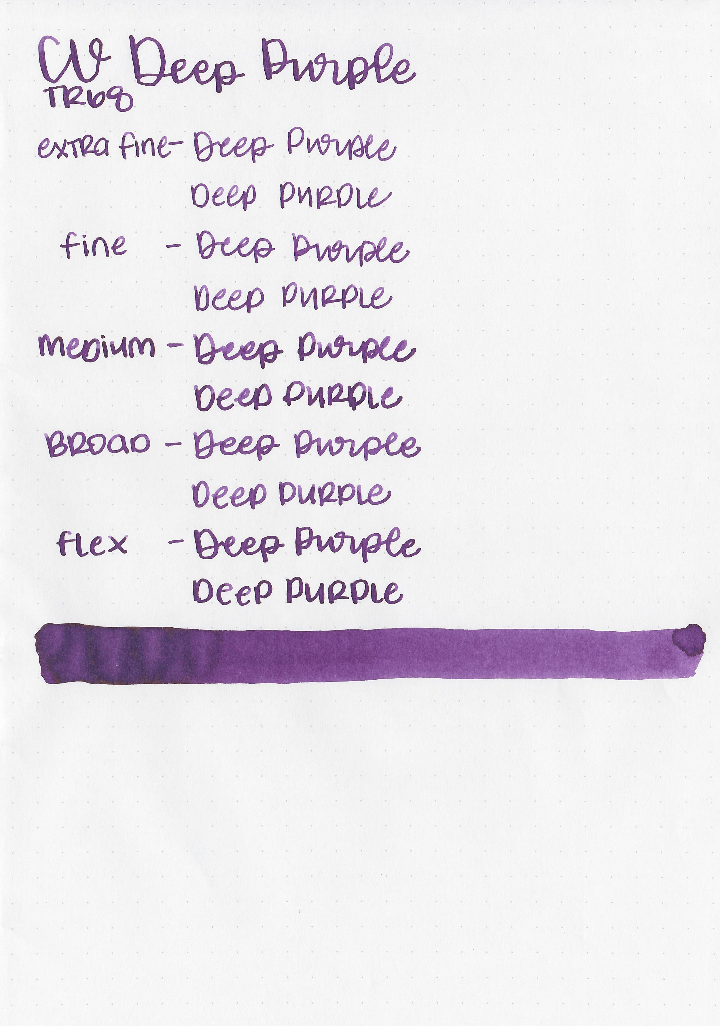
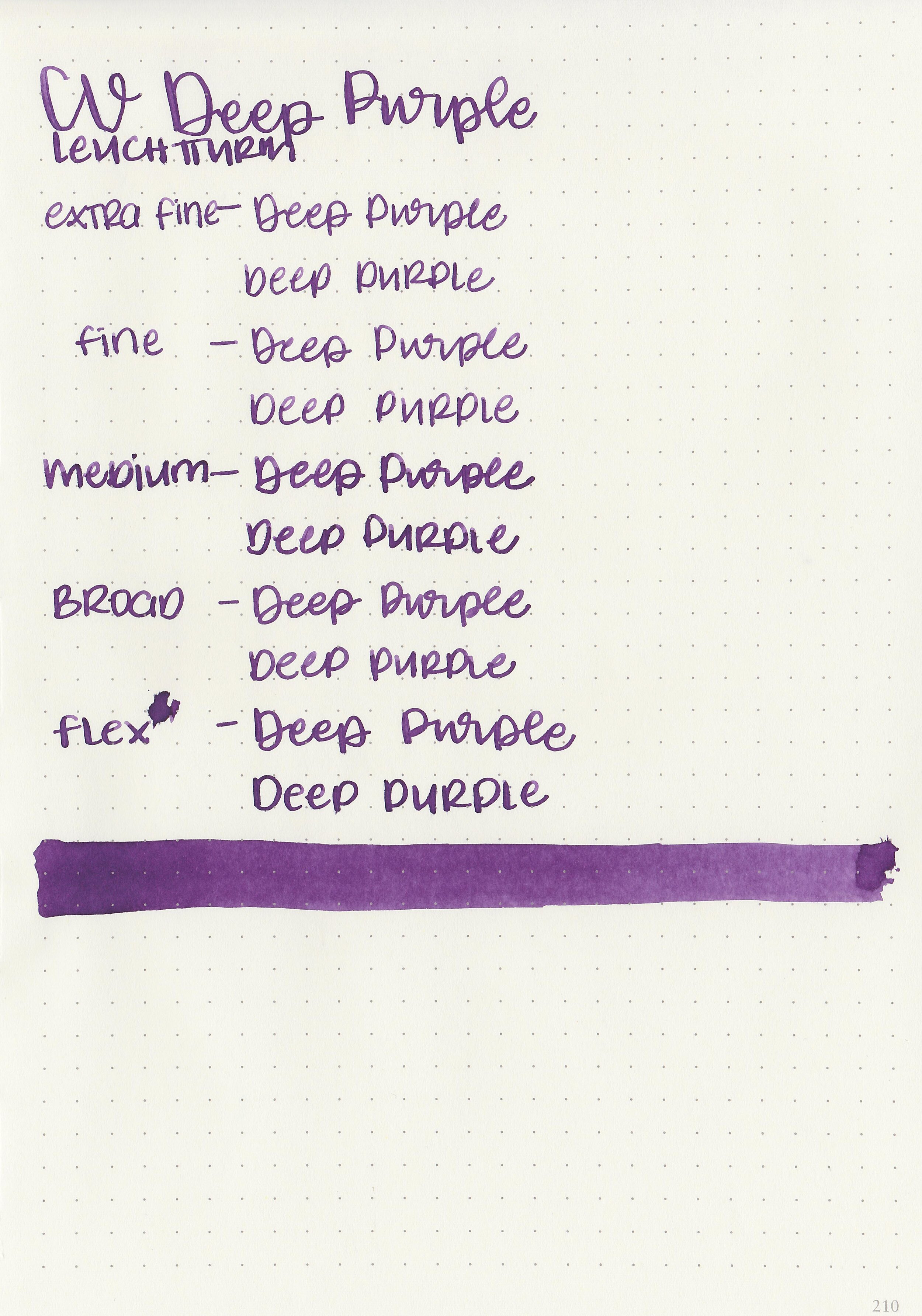
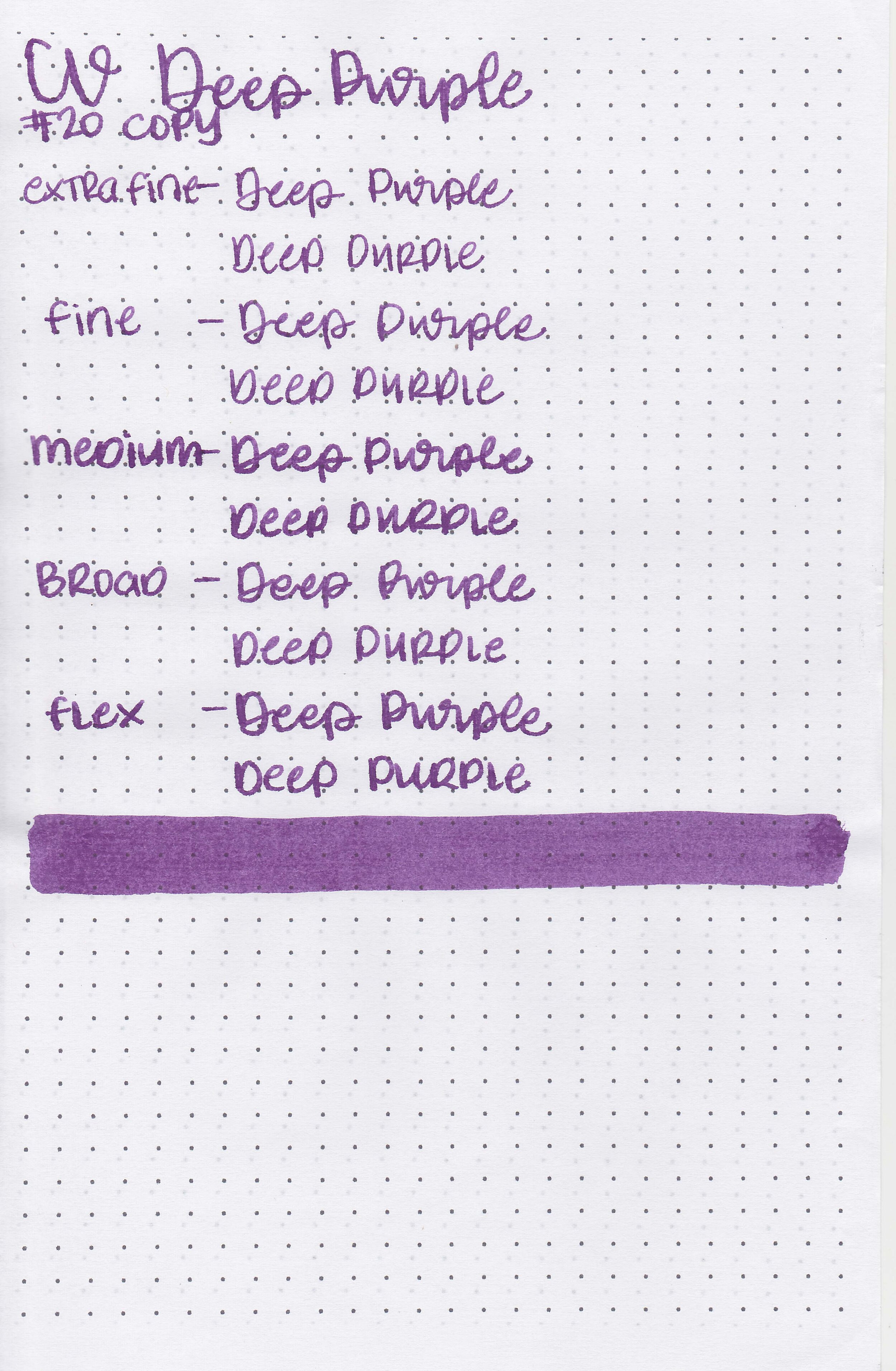
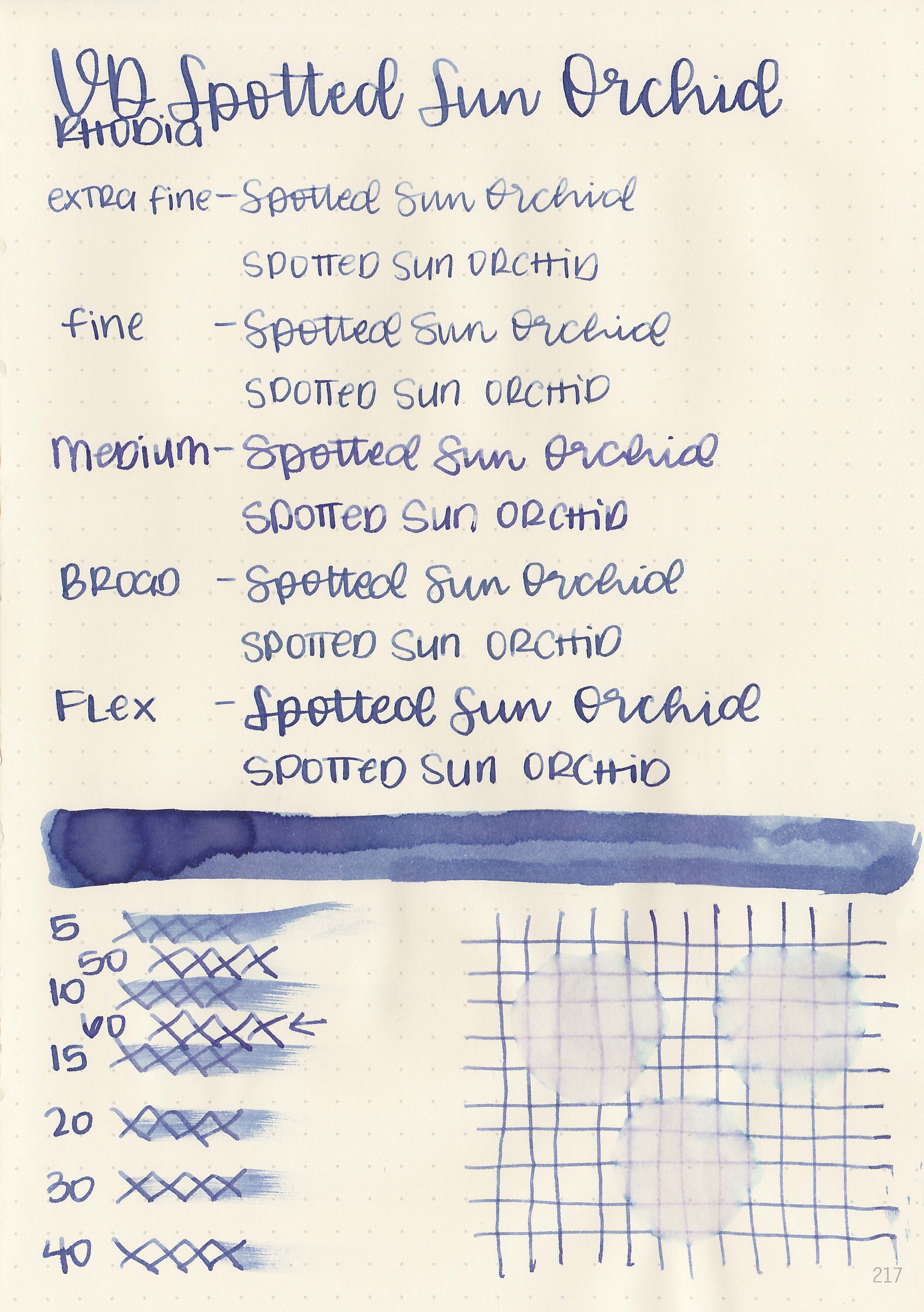
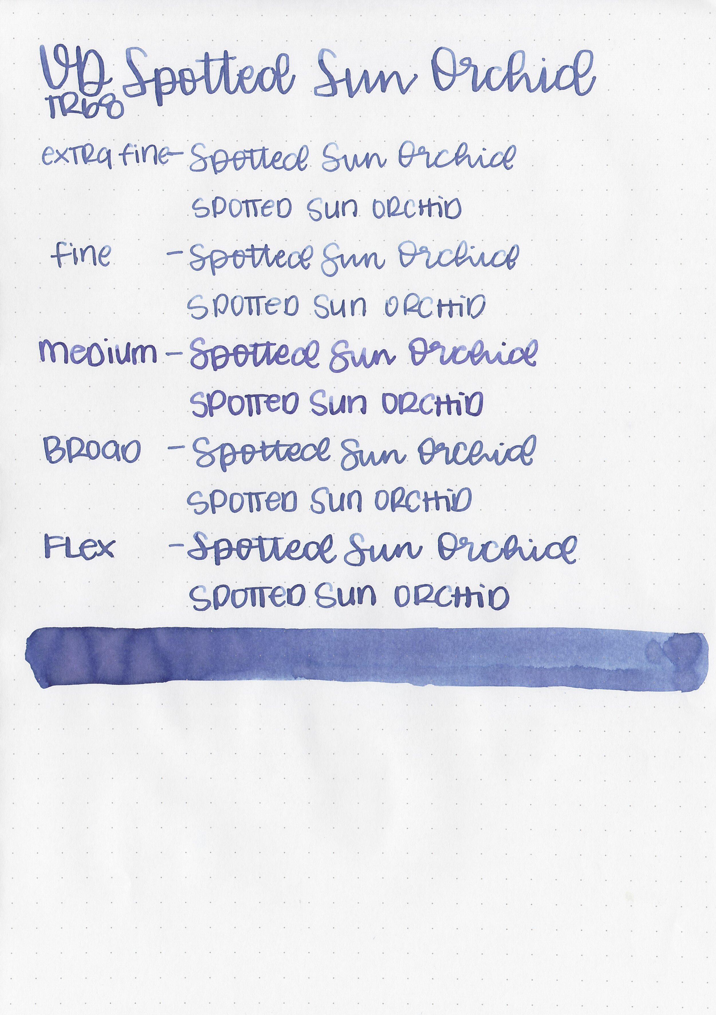
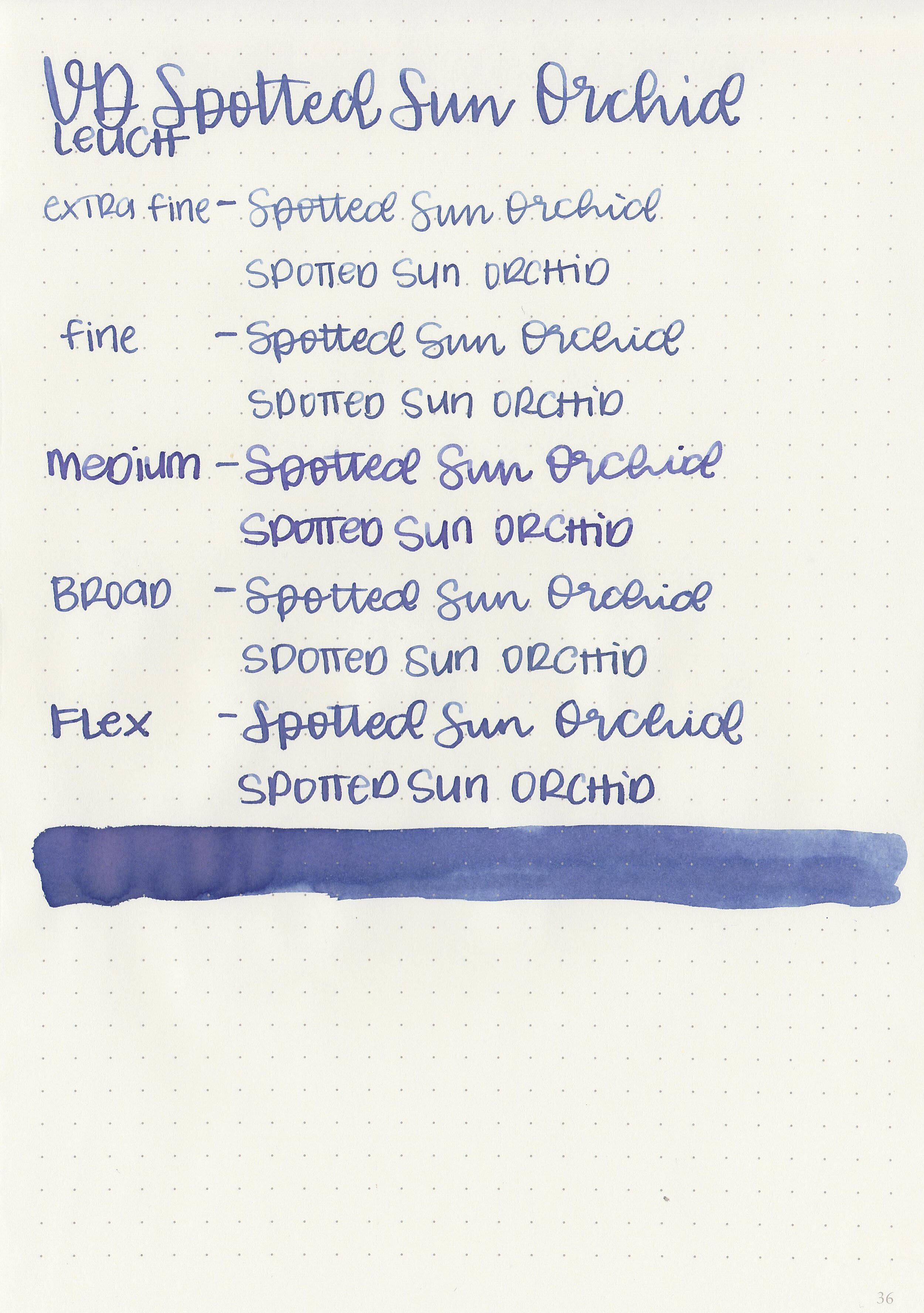
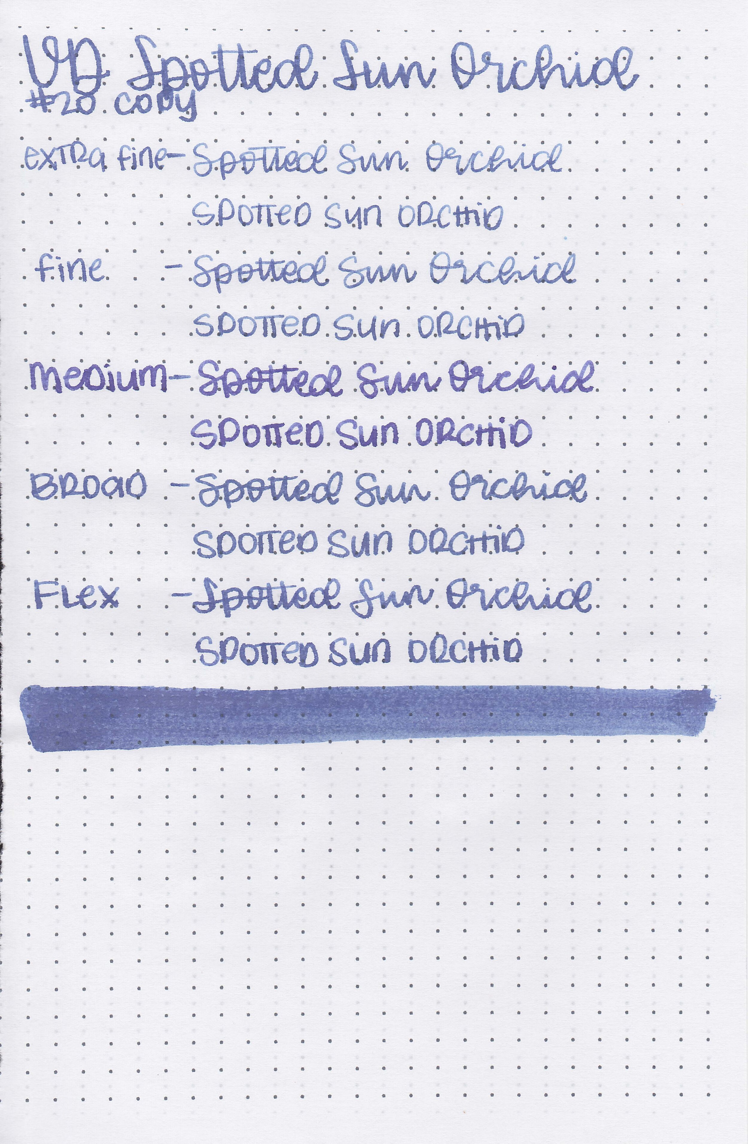
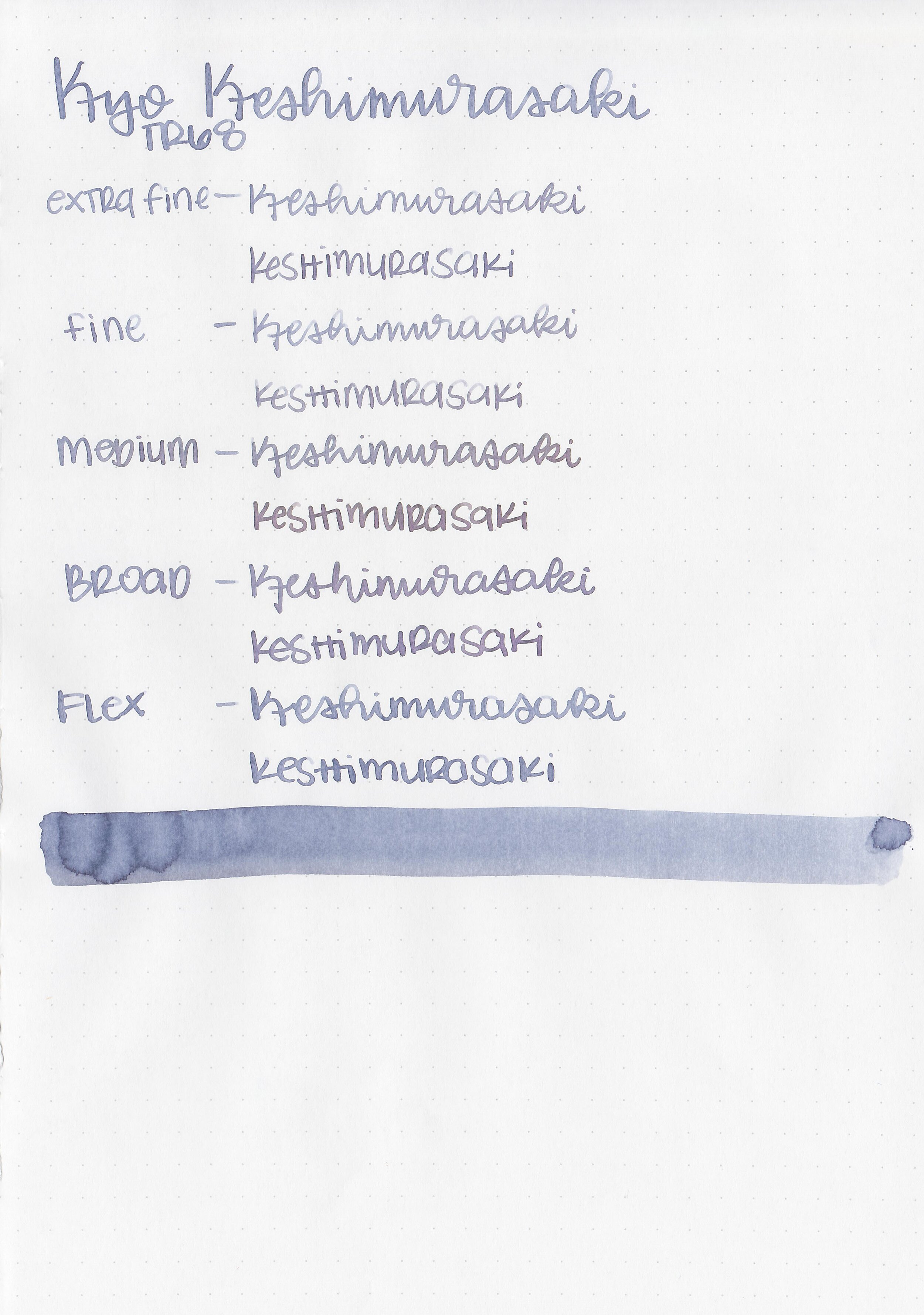
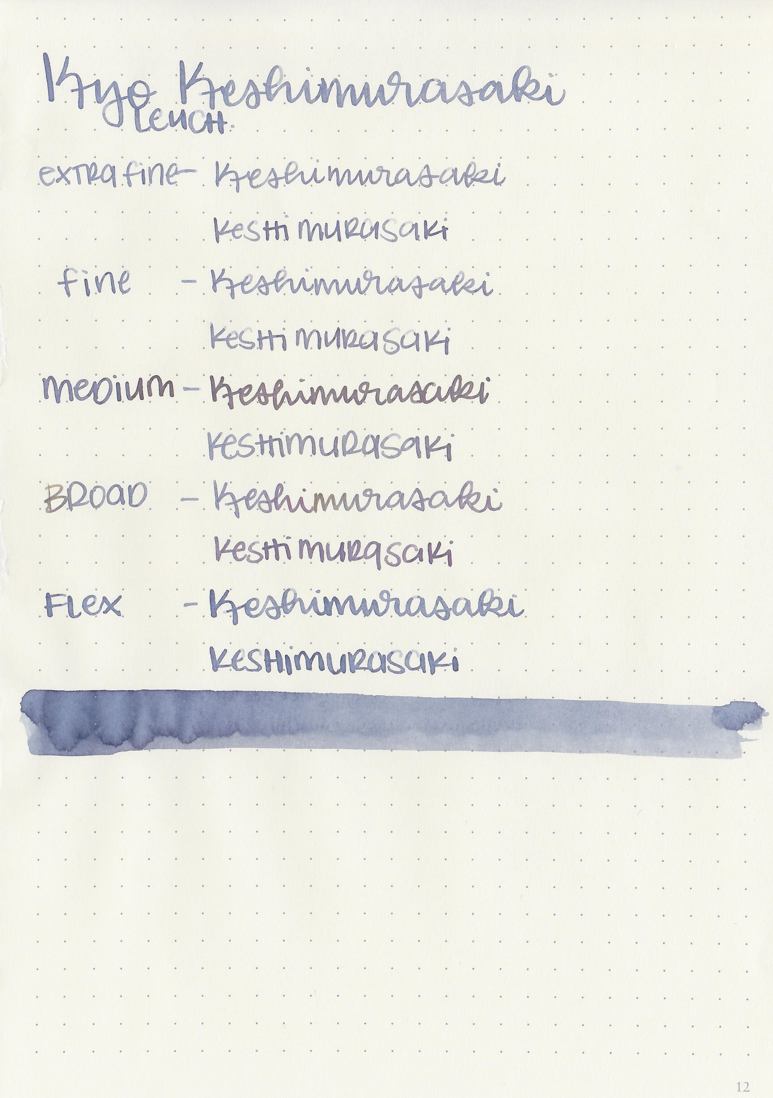
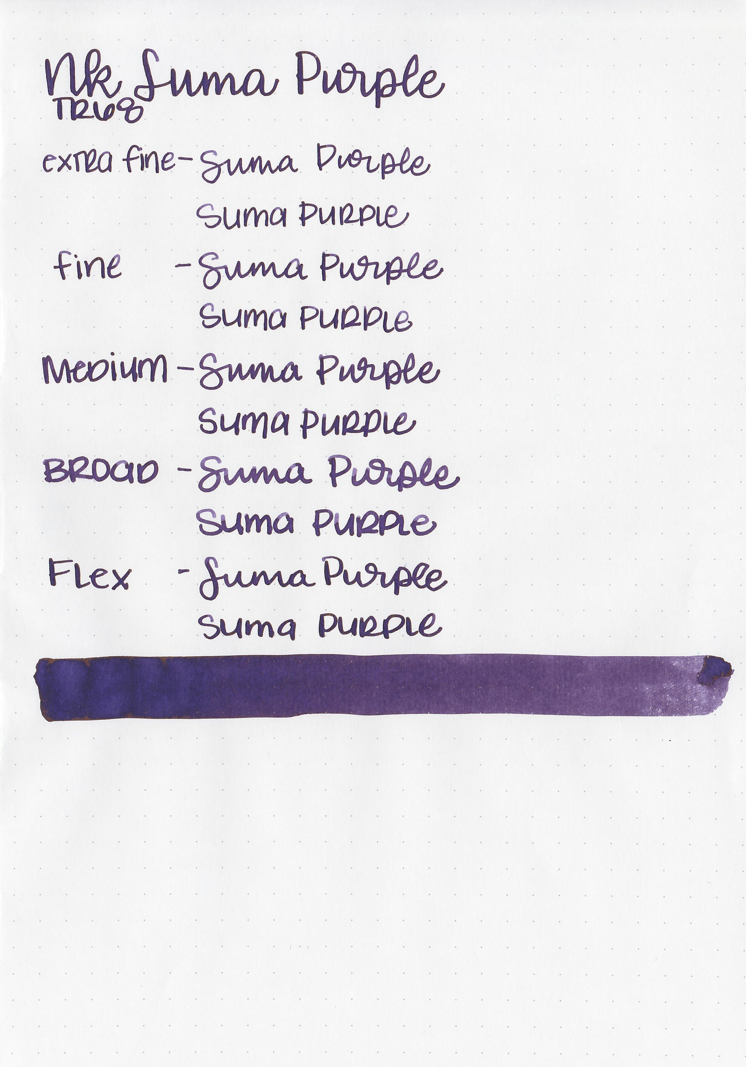
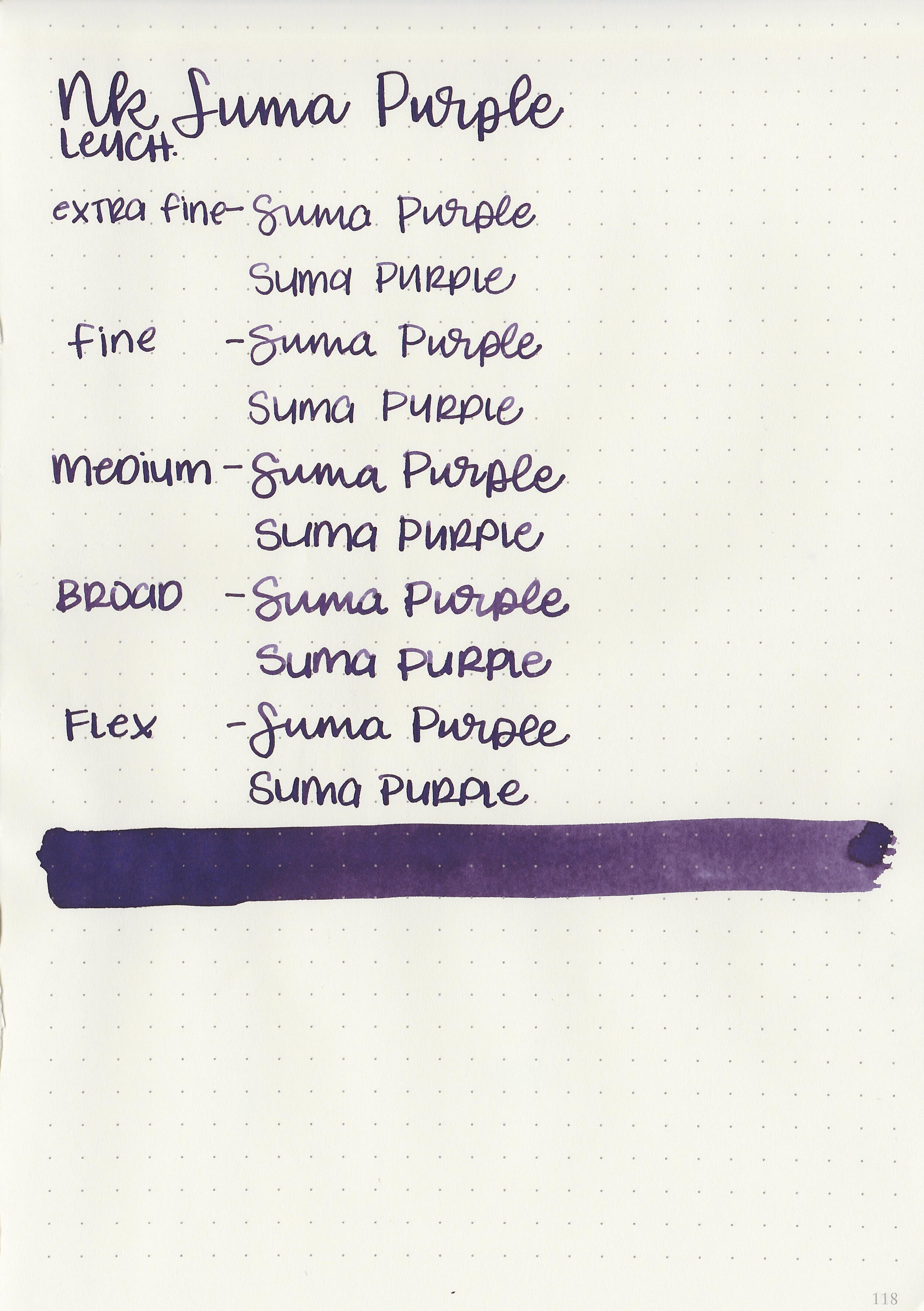
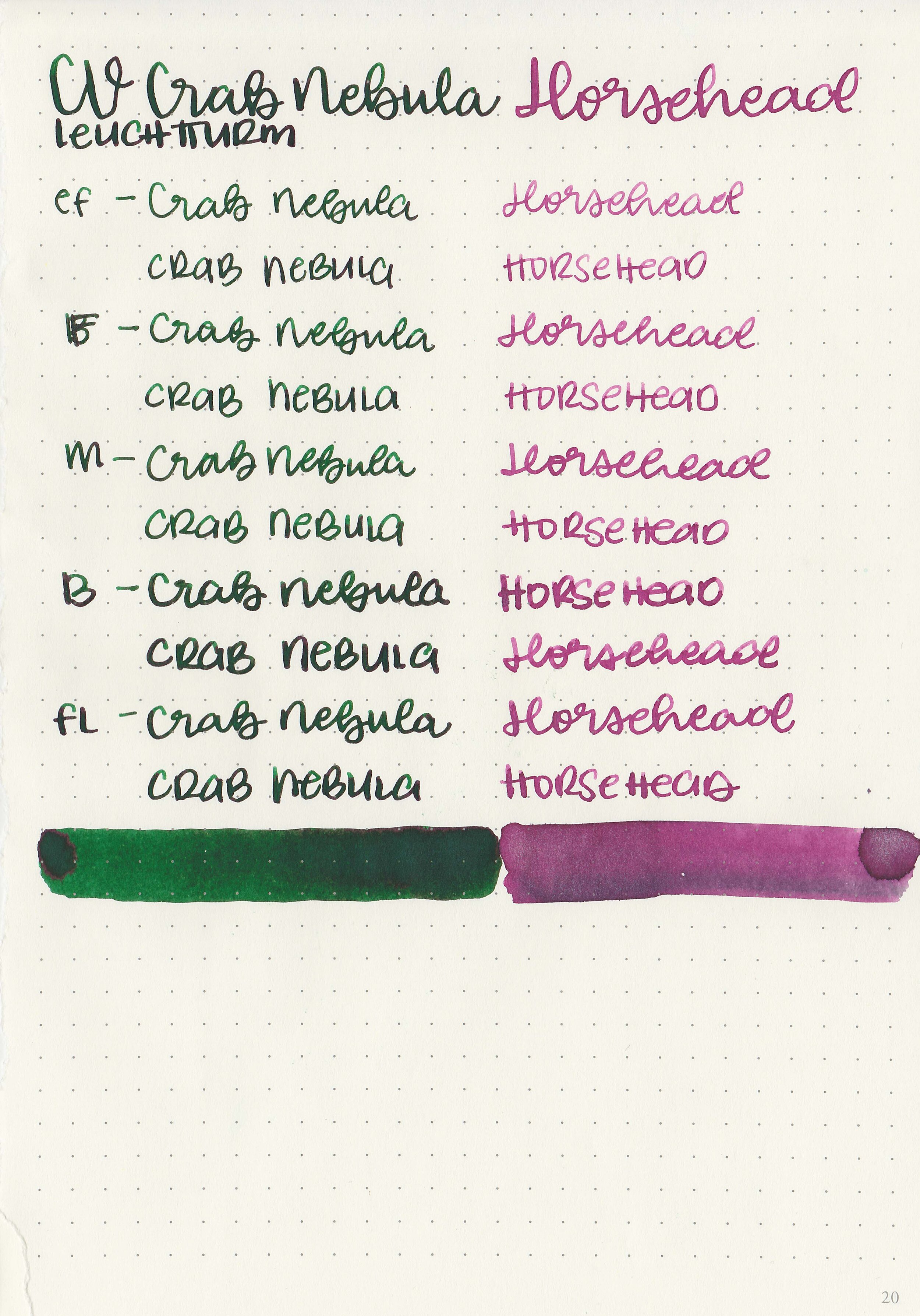
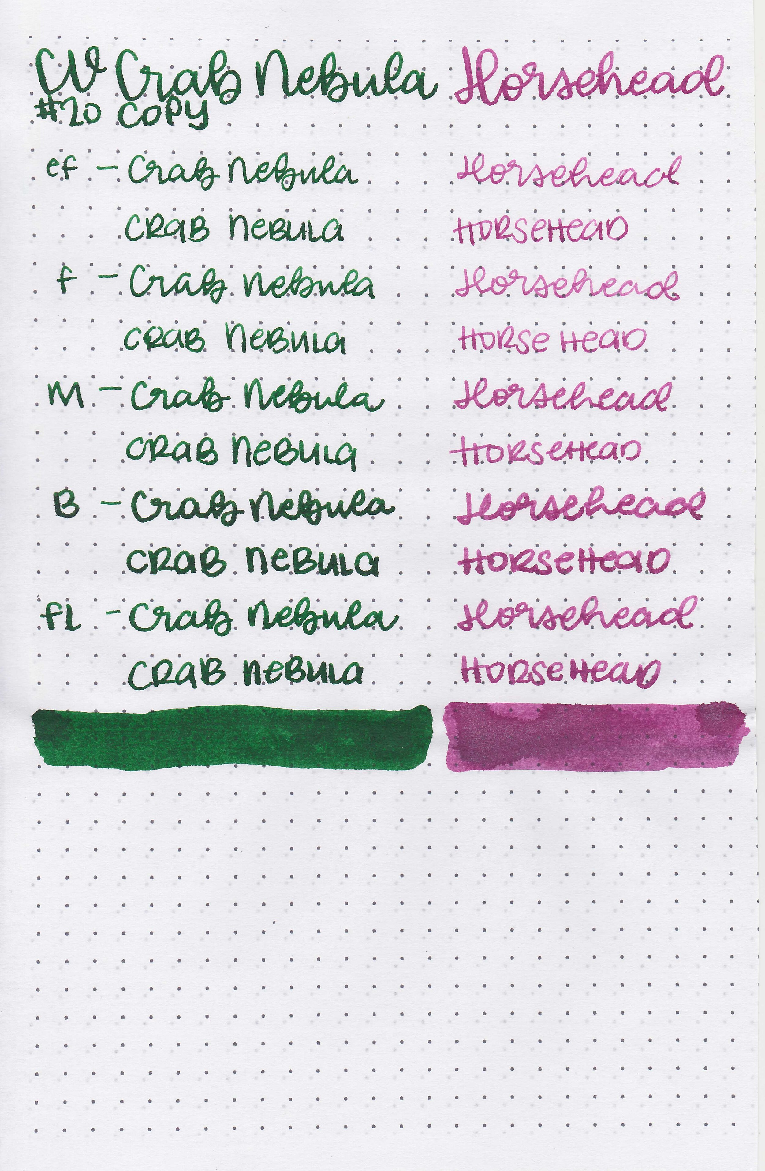
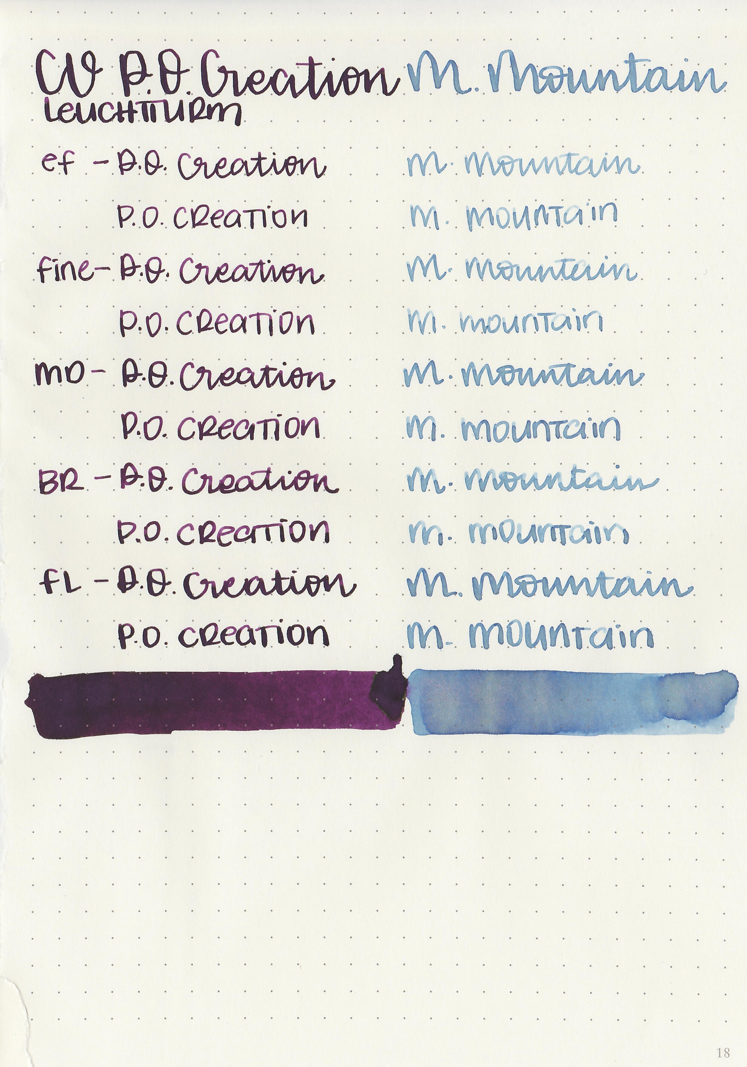
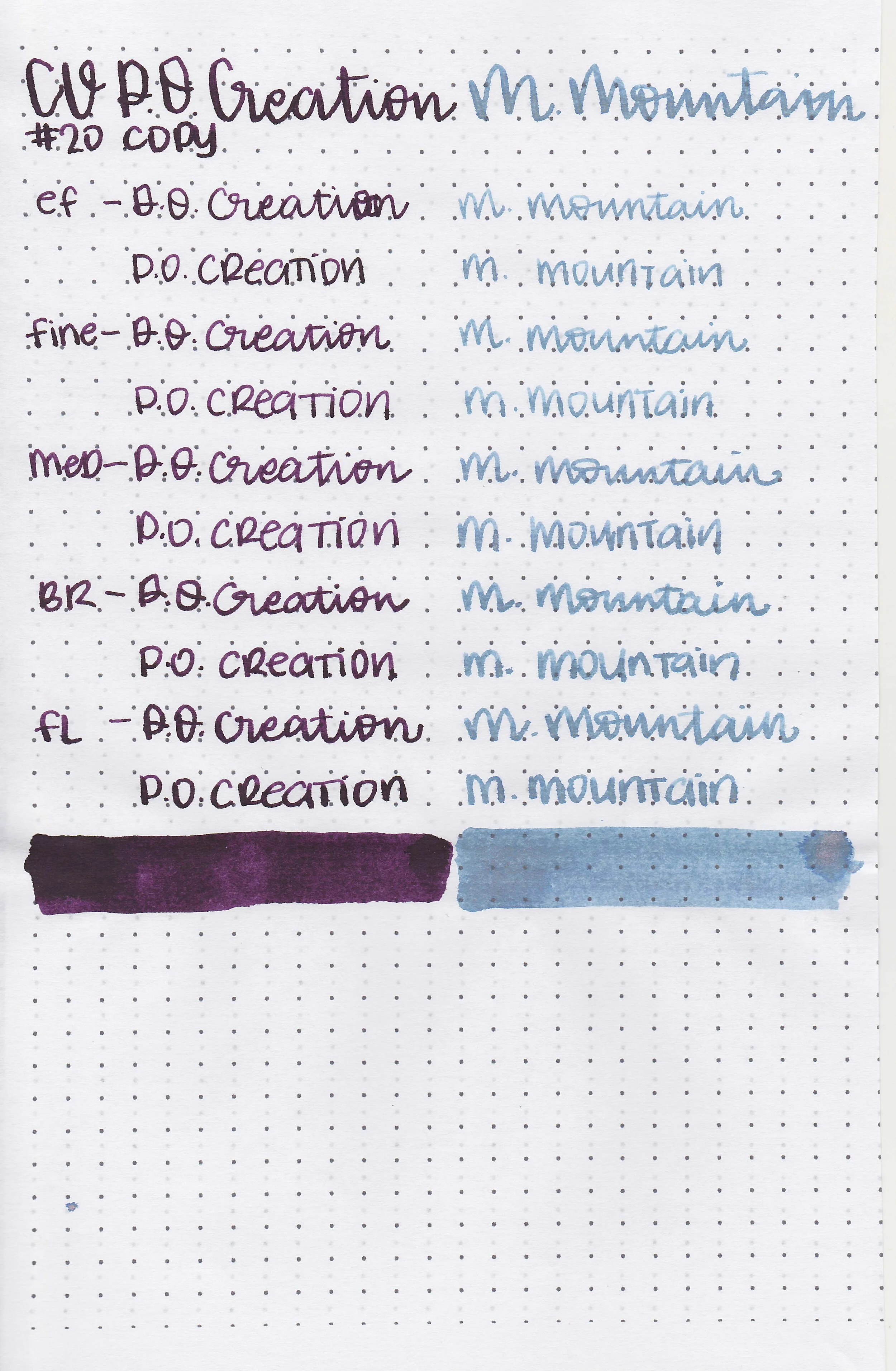
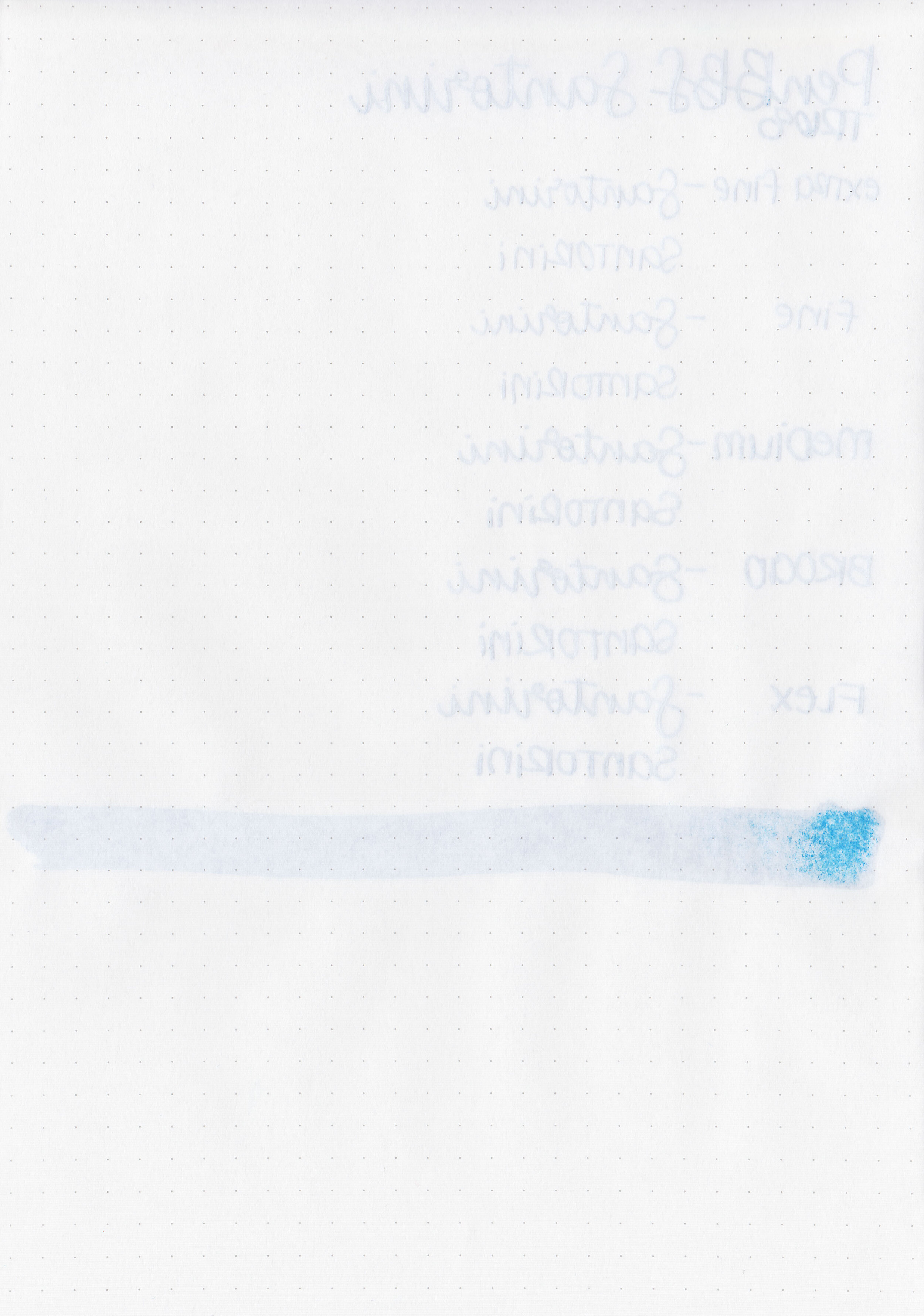
Writing samples:
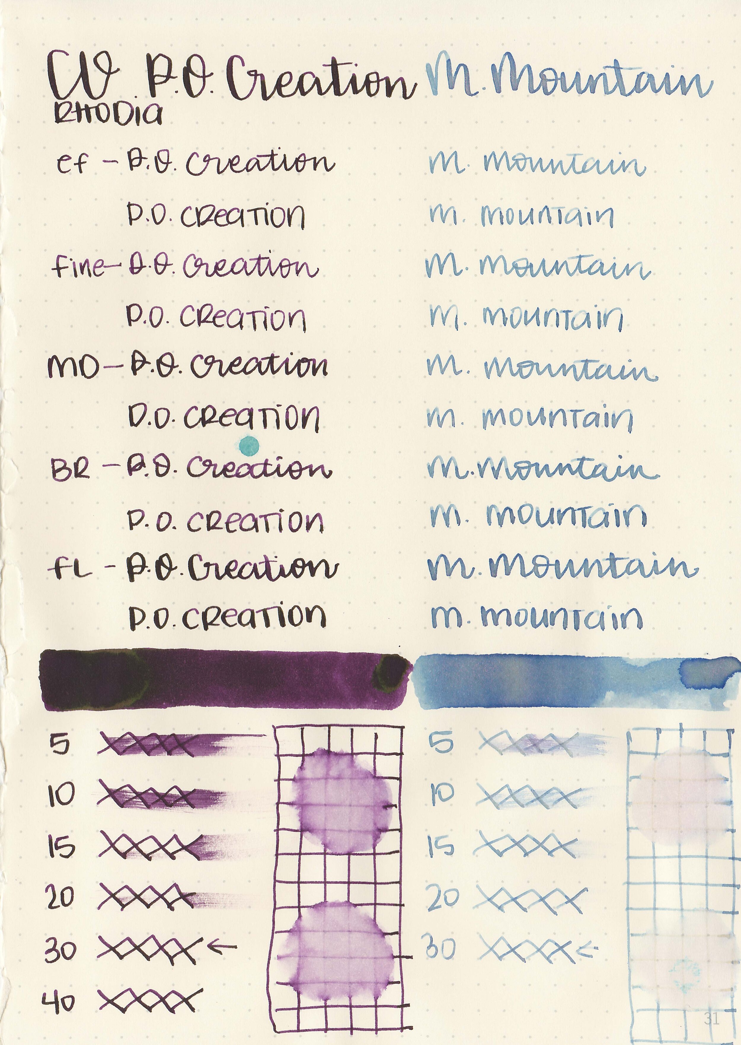
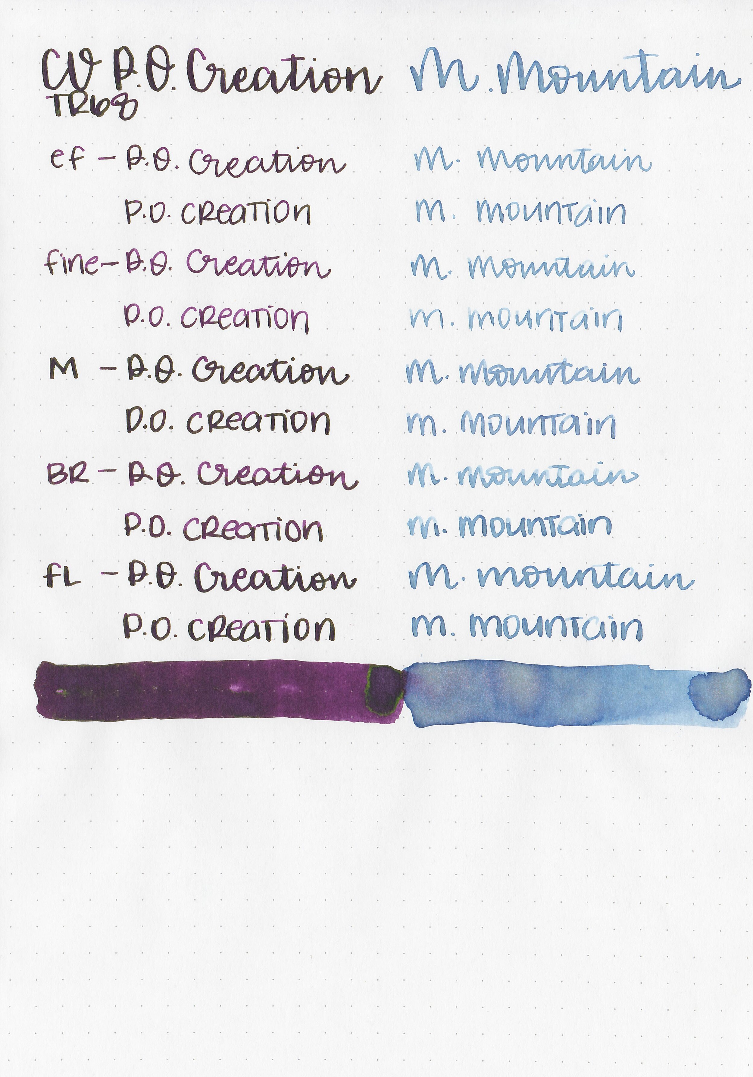
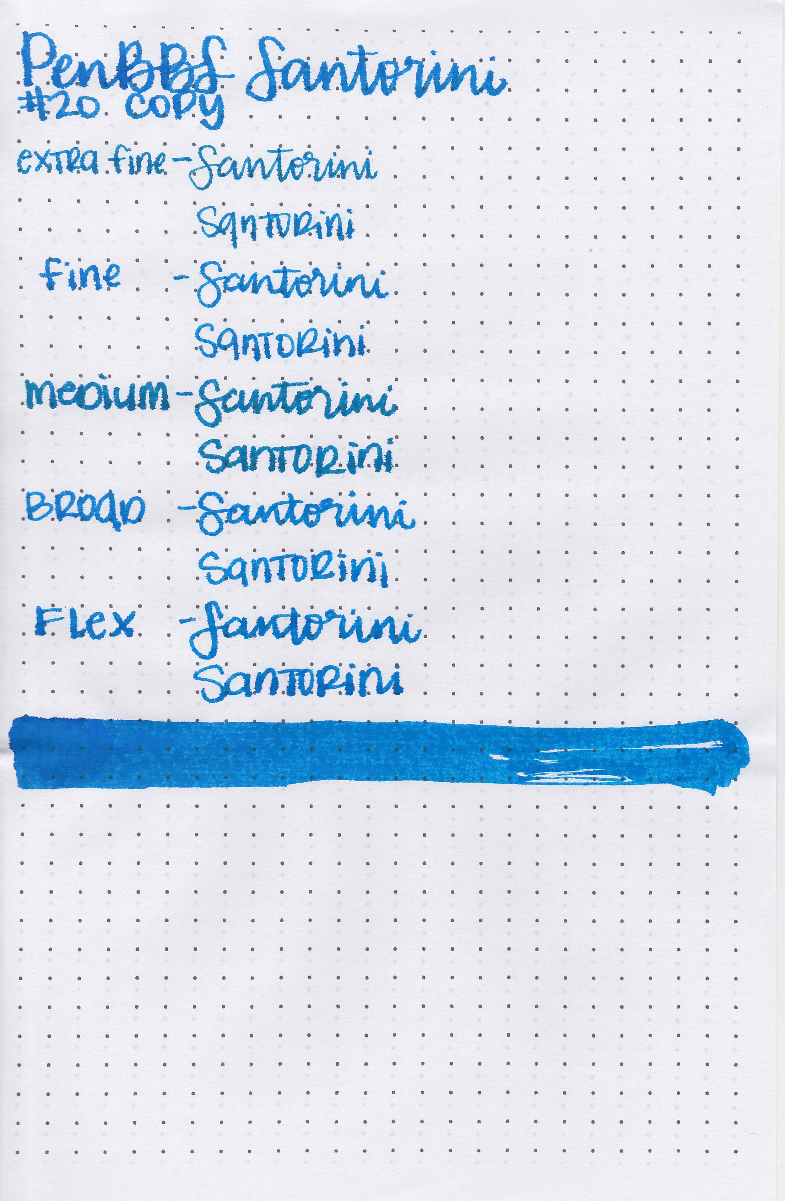
Let's take a look at how the ink behaves on fountain pen friendly papers: Rhodia, Tomoe River, and Leuchtturm.
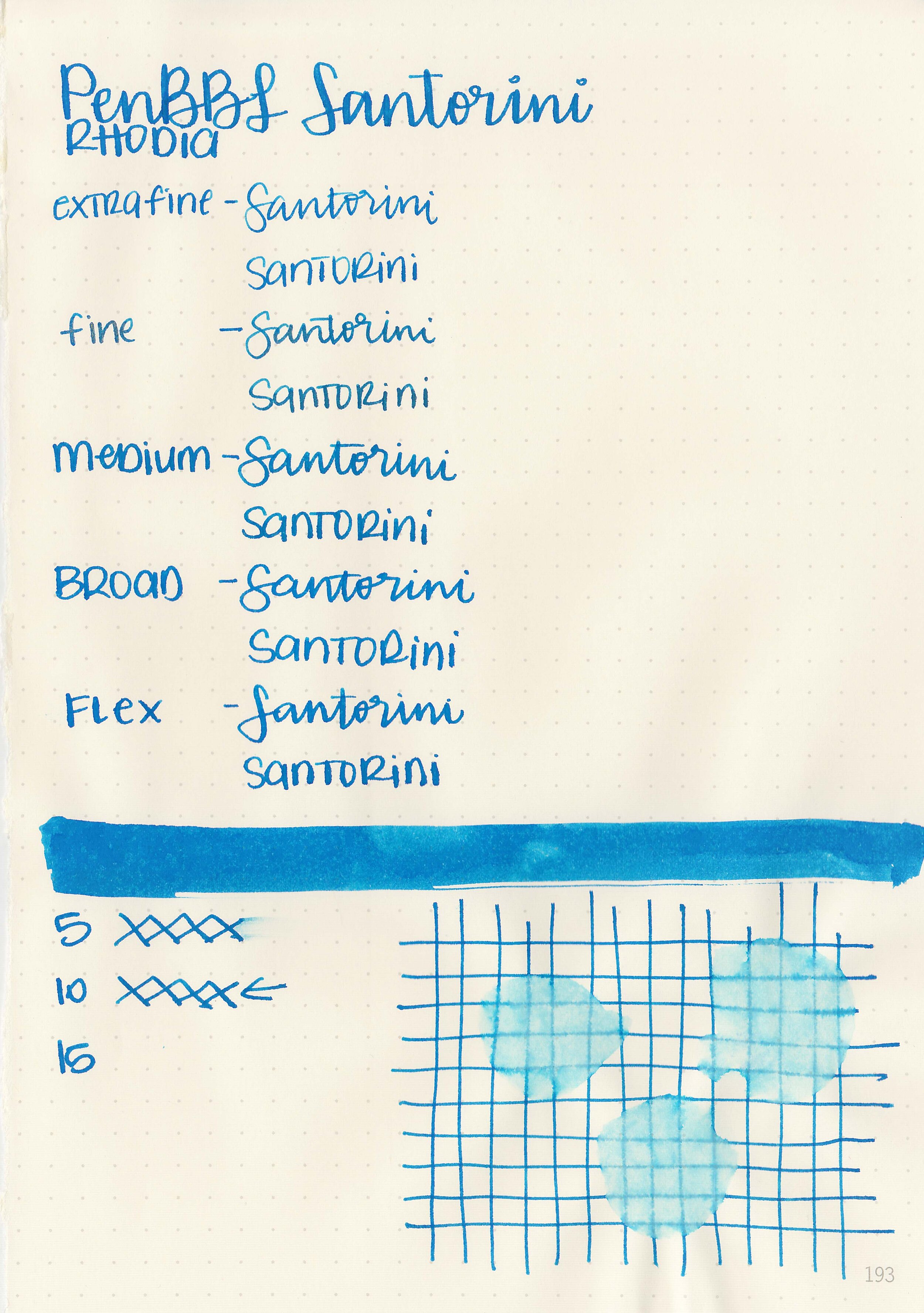
Dry time: 10 seconds
Water resistance: Medium
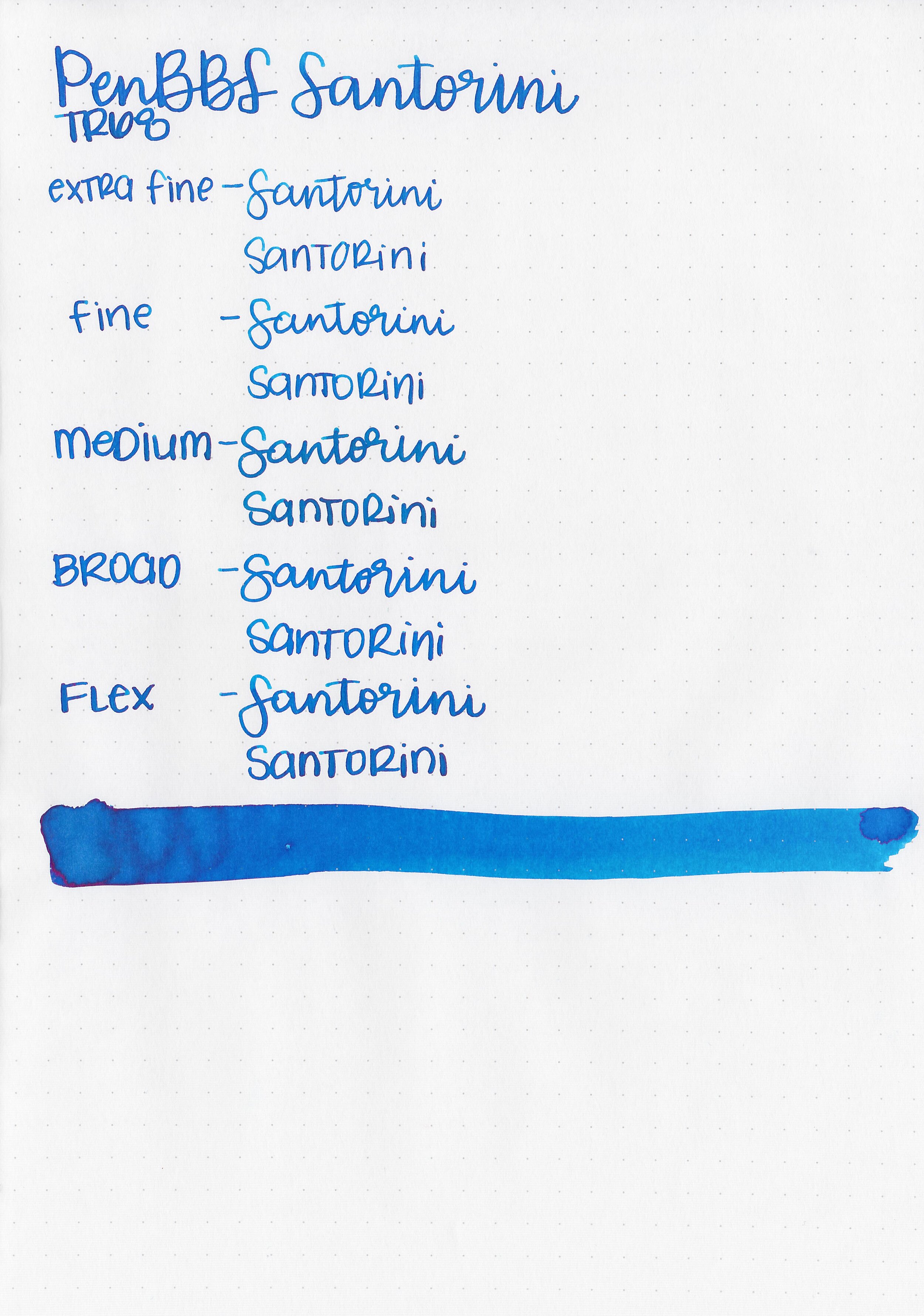
Feathering: Medium
Show through: Medium
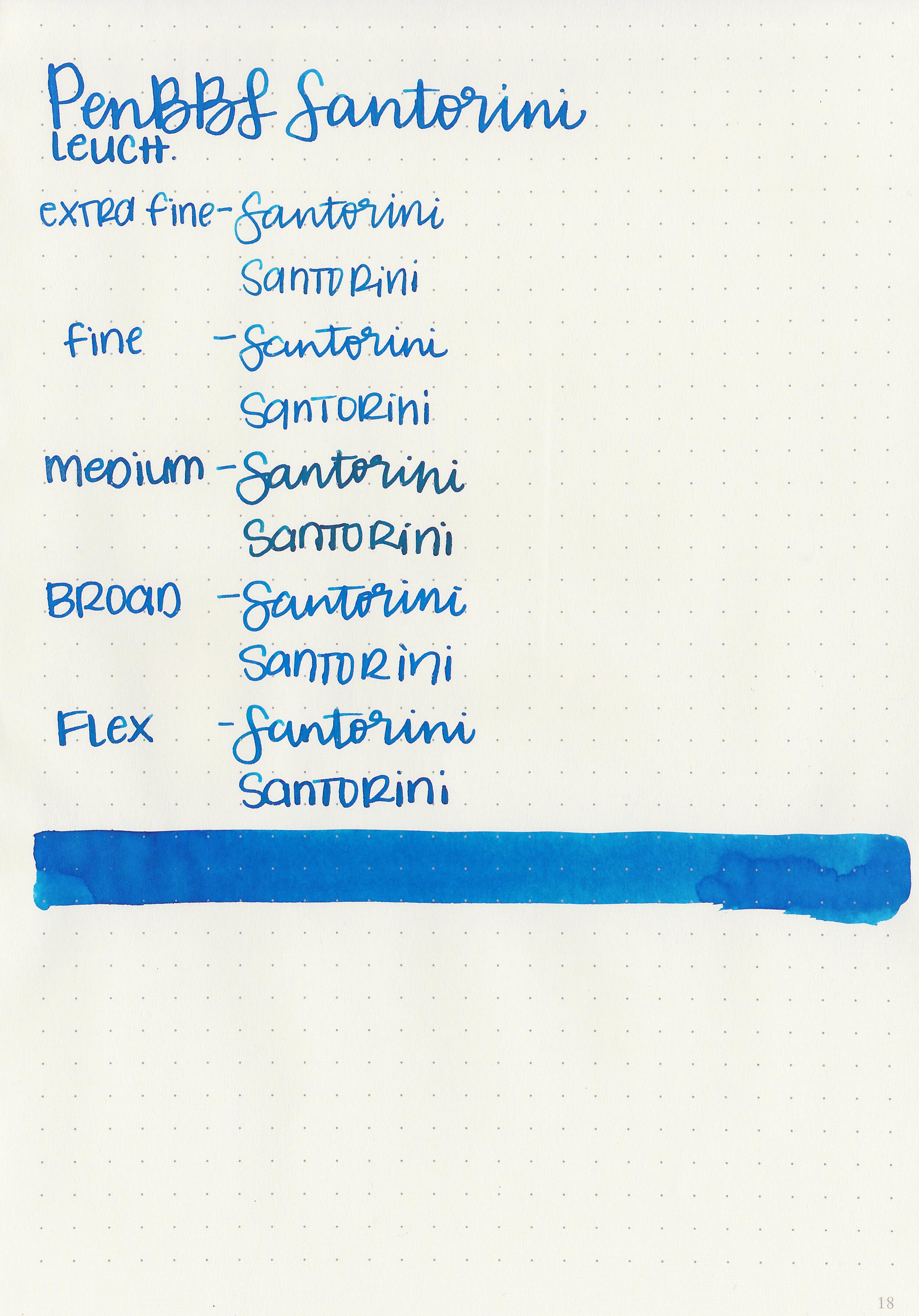
Bleeding: Medium
Other properties: medium shading, low pink sheen, and no shimmer.
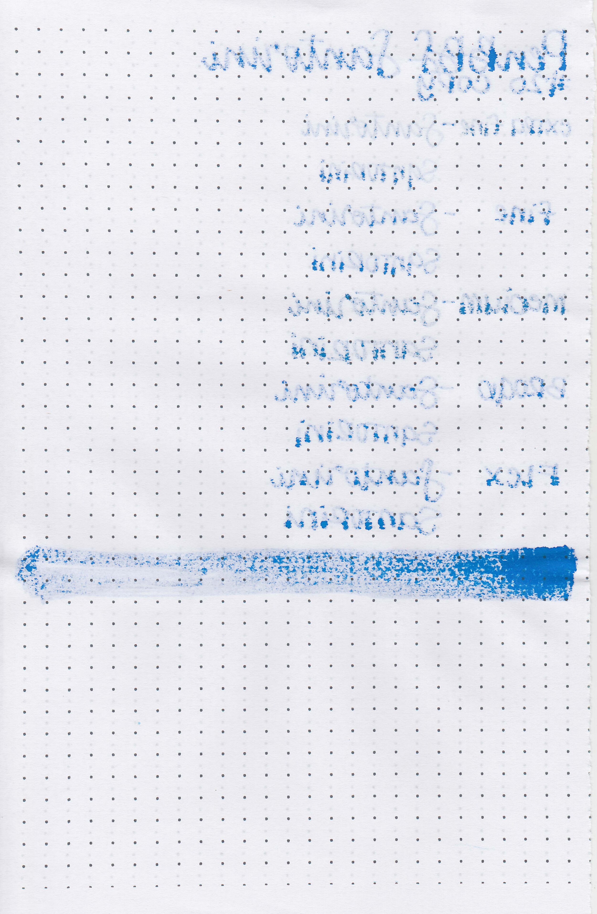
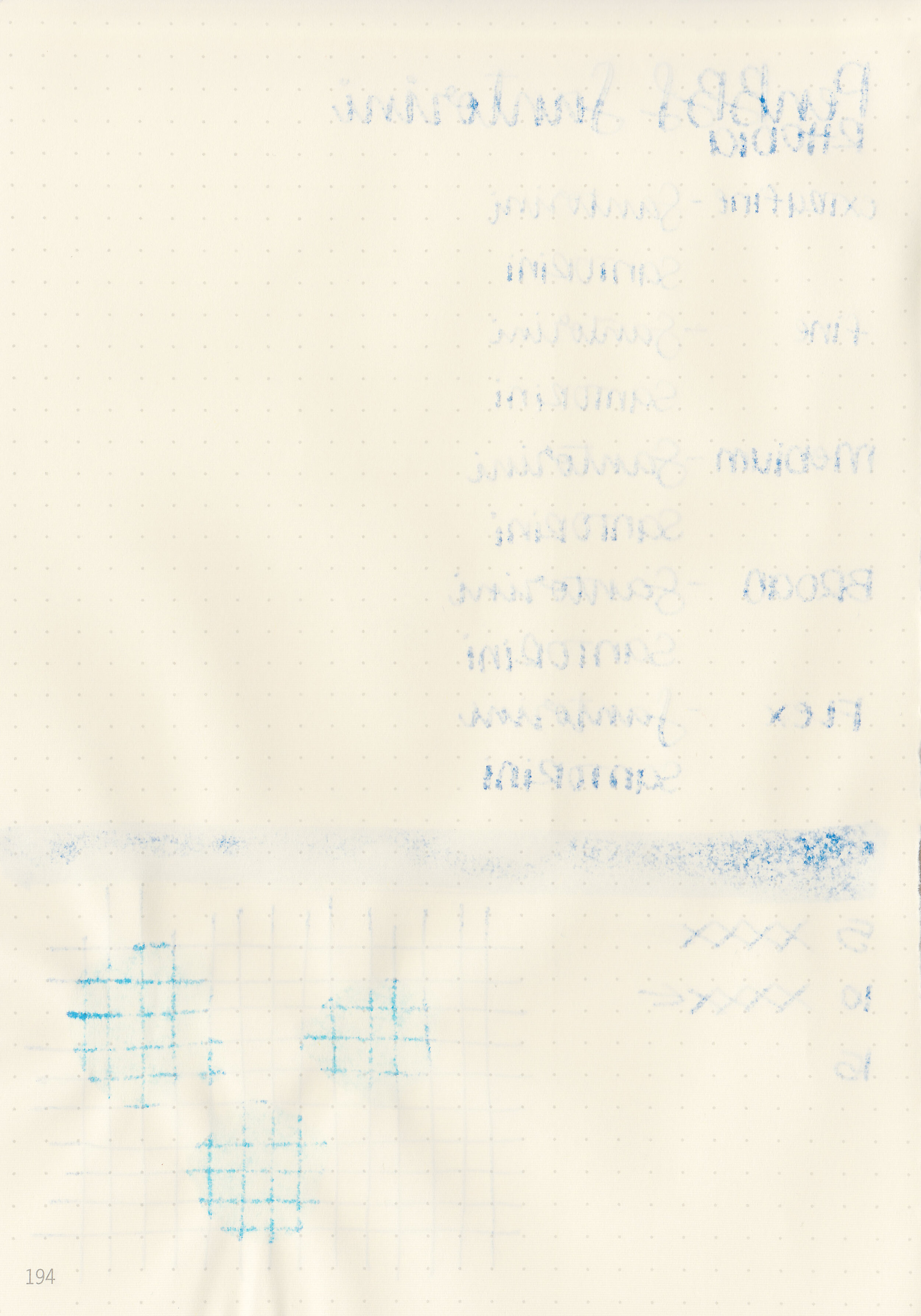
On Staples 24 lb copy paper there was a lot feathering and bleeding in all nib sizes.
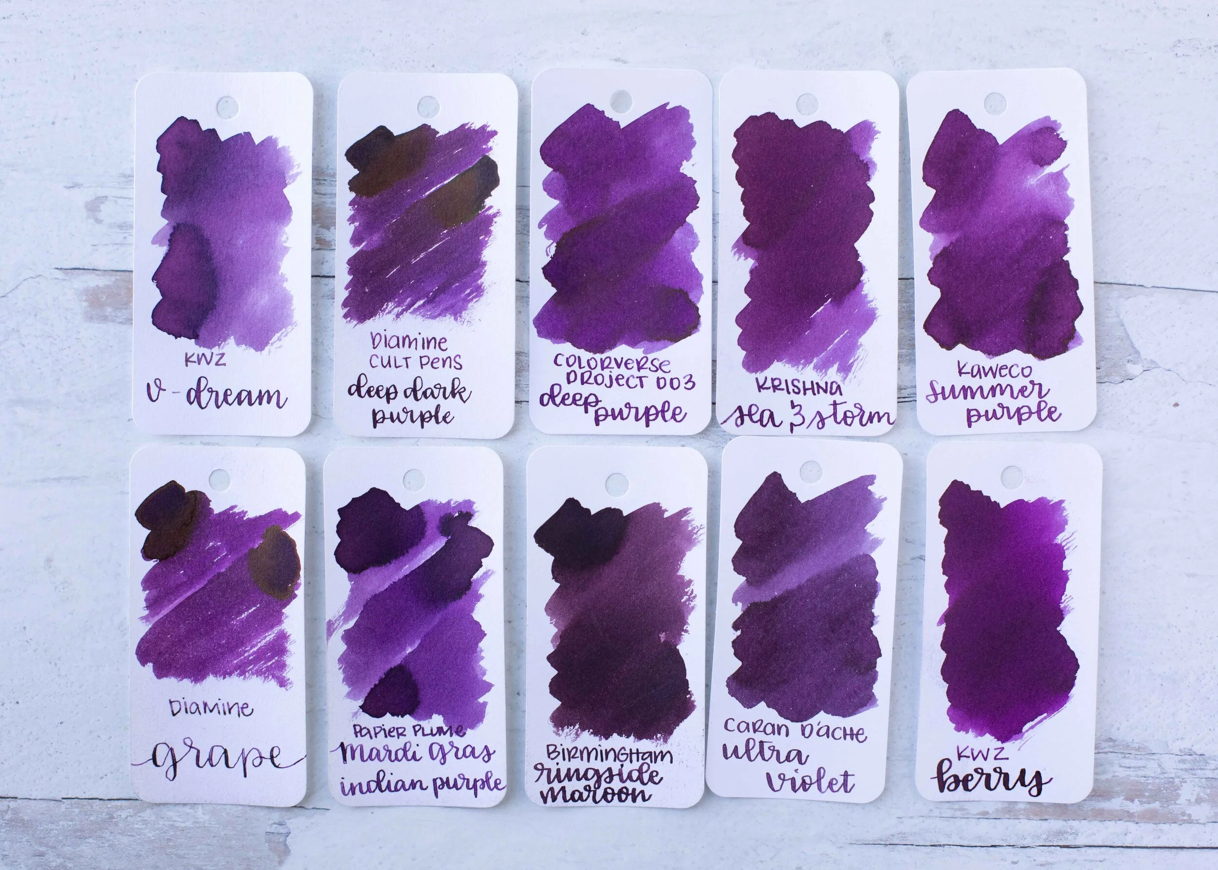
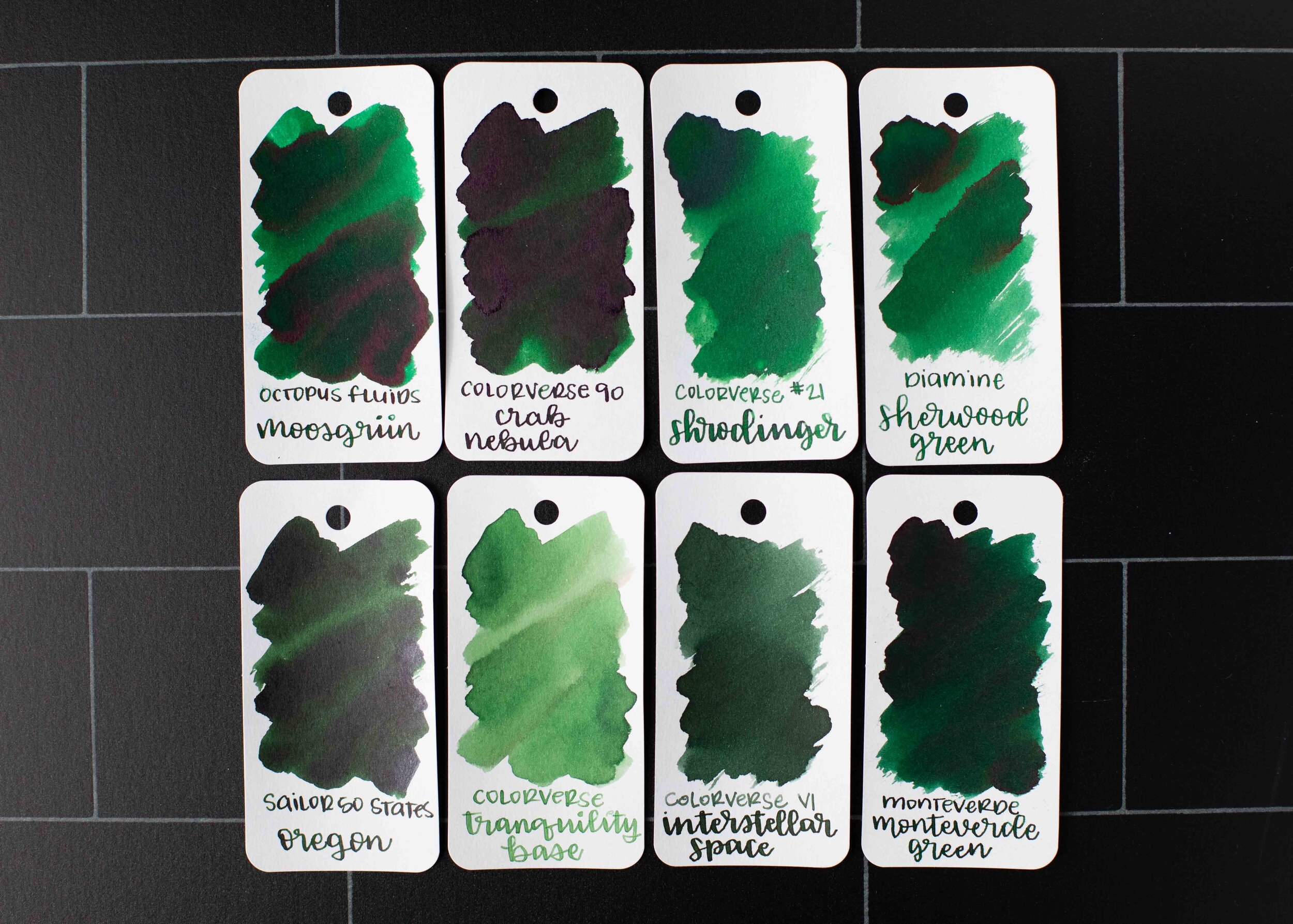
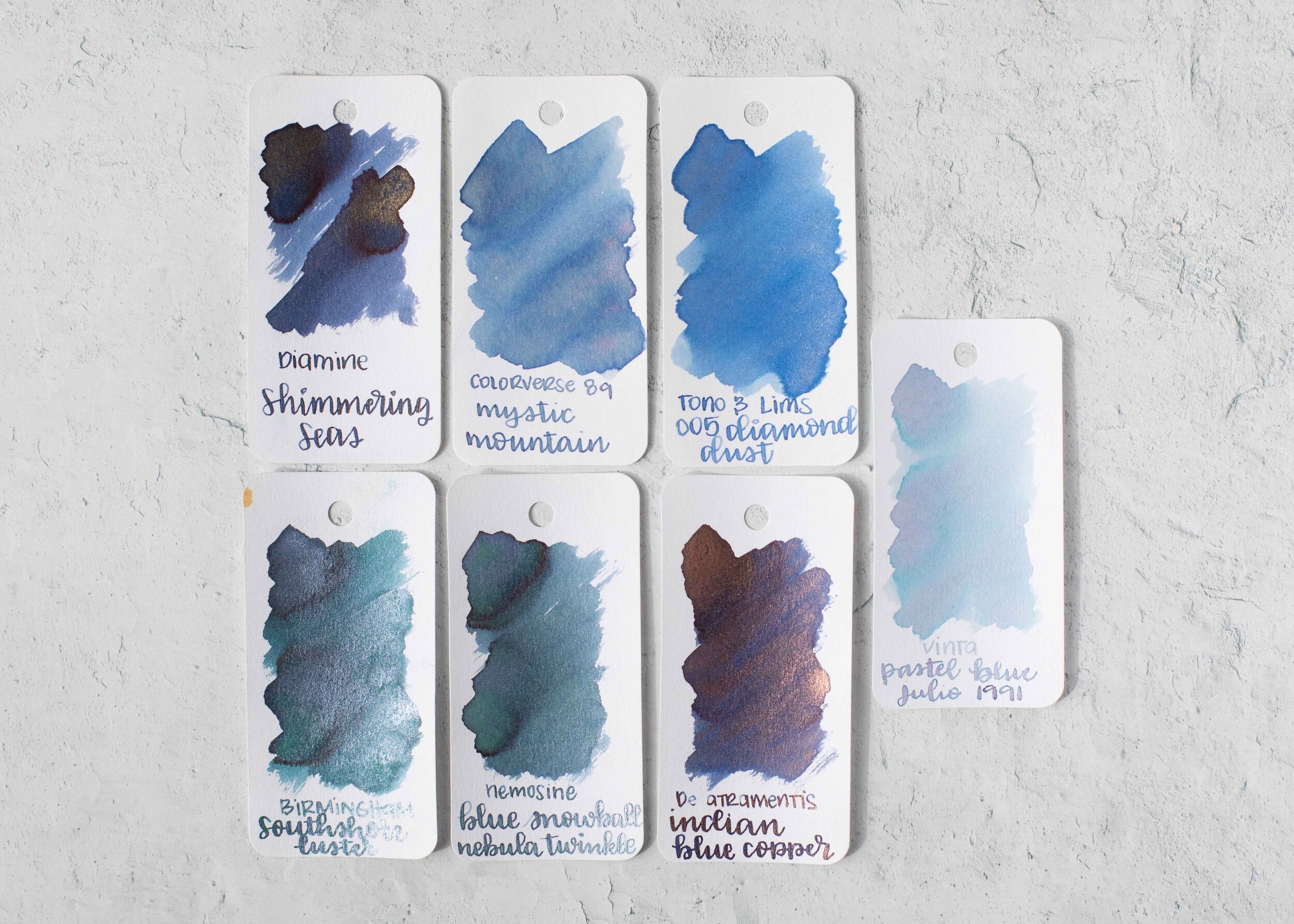
Comparison Swabs:

Santorini is close to Colorverse Supernova. Click here to see the PenBBS inks together, and click here to see the blue inks together.
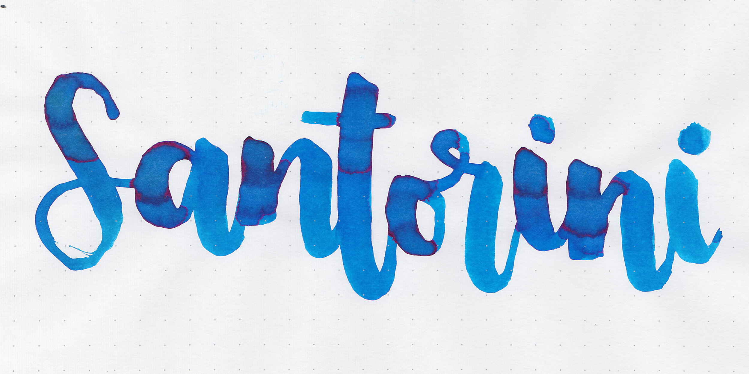
Longer writing:

I used a Pilot Vanishing Point Crossed Lines with a medium nib on a Taroko Enigma notebook. The ink had an average flow.
Overall, the color is nice and it dries quickly but there is way too much feathering and bleeding for me, especially when there are so many blue ink colors available. It’s just not the right blue ink for me.
Disclaimer: I purchased this ink myself. All photos and opinions are my own. This page does not contain affiliate links and this post is not sponsored.