Ink Review #1496: Diamine Writer's Blood
/
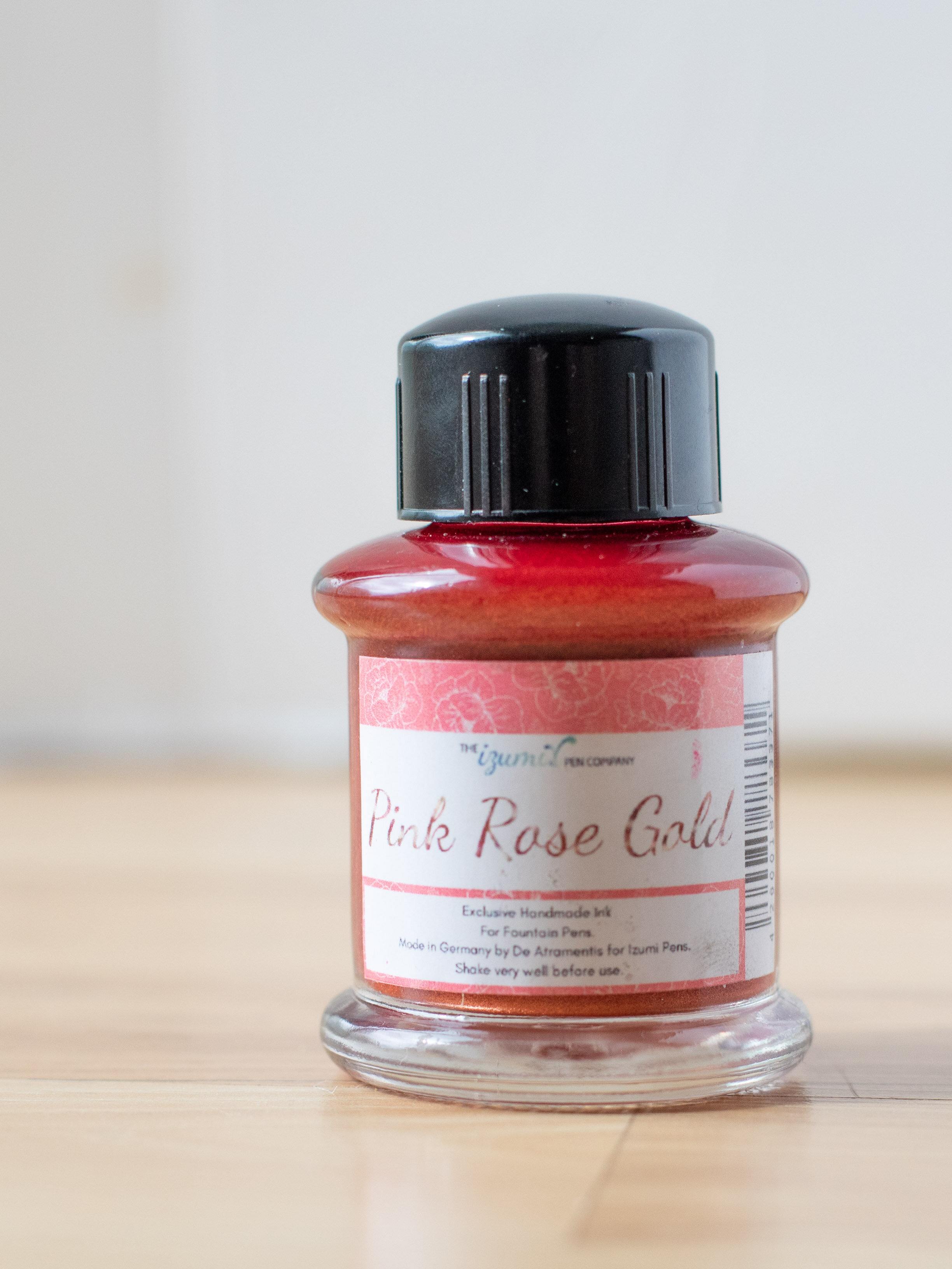
Diamine Writer’s Blood was created for the members of r/fountainpens on Reddit. This Reddit group also came up with Earl Grey and Aurora Borealis. I purchased my bottle of ink from Pen Chalet (aff. link).

The color:
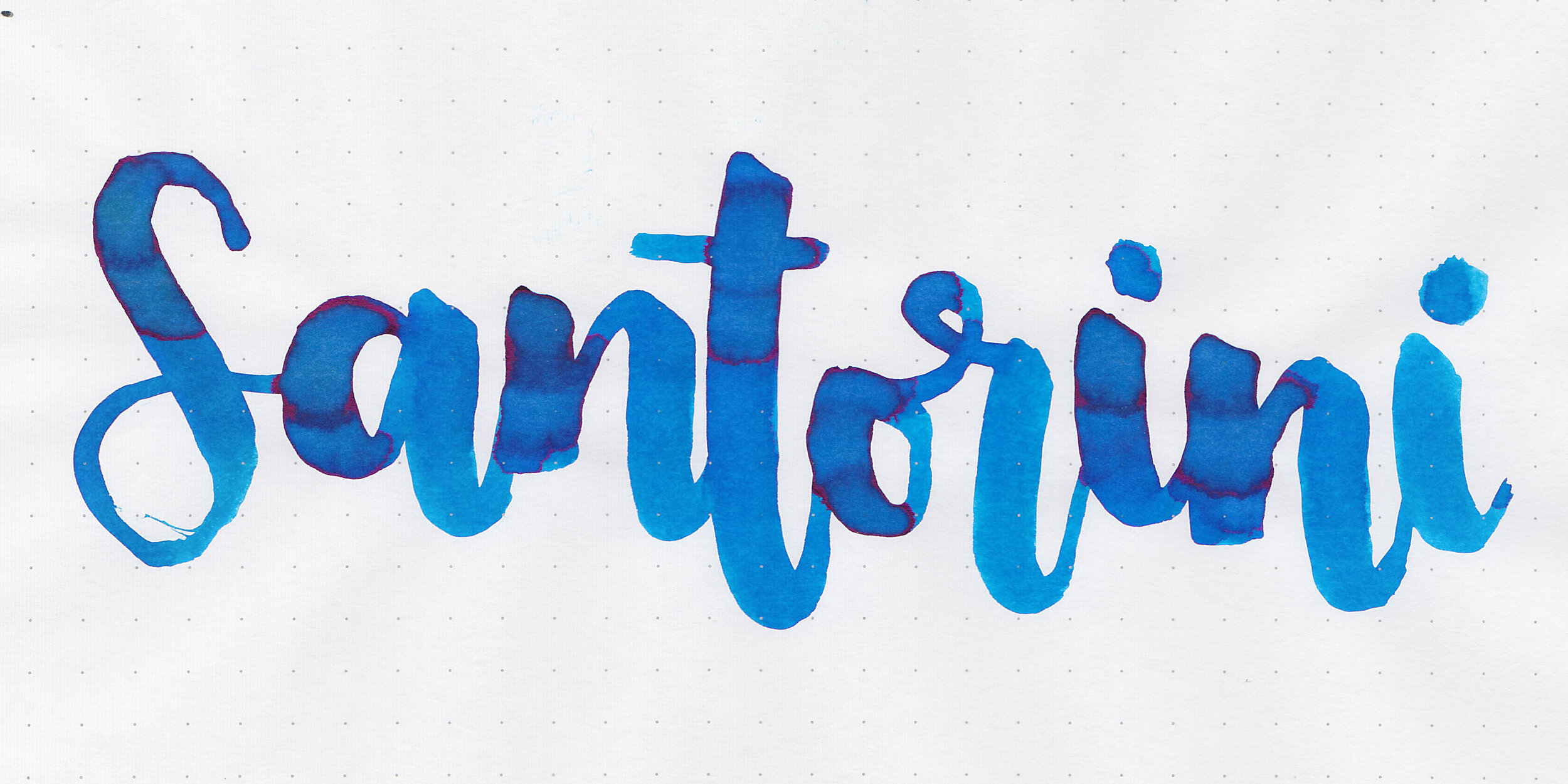
Writer’s Blood is a deep Bordeaux red.
Swabs:

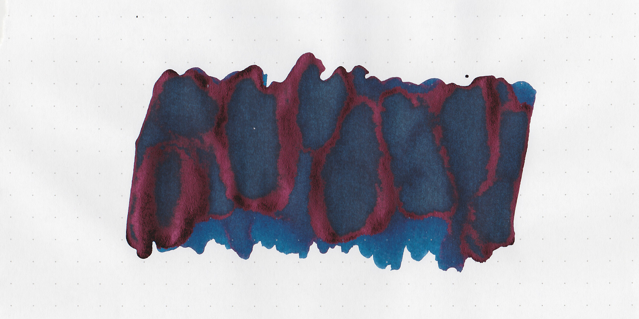
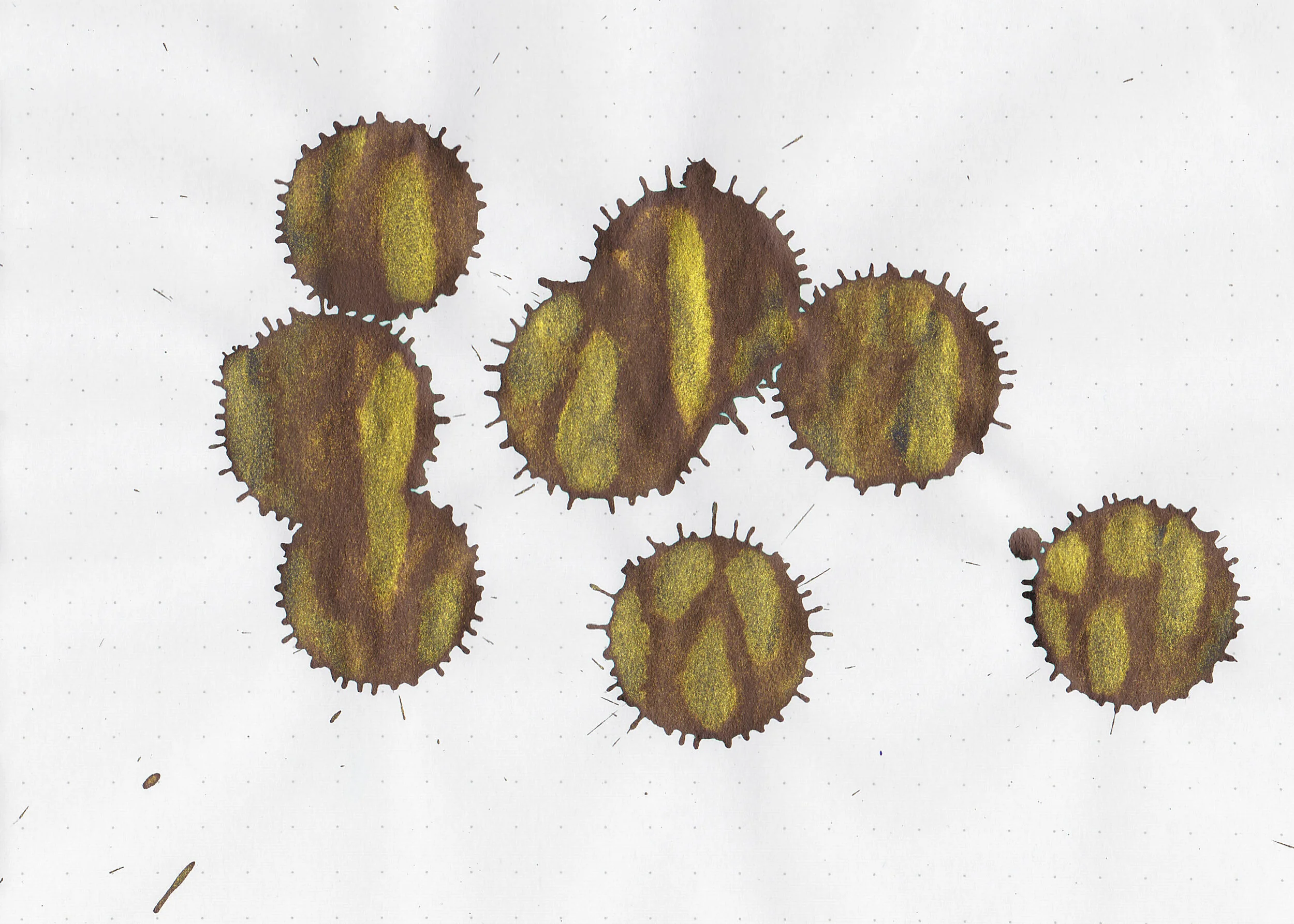
In large swabs on Tomoe River paper the ink is very dark, almost purple.

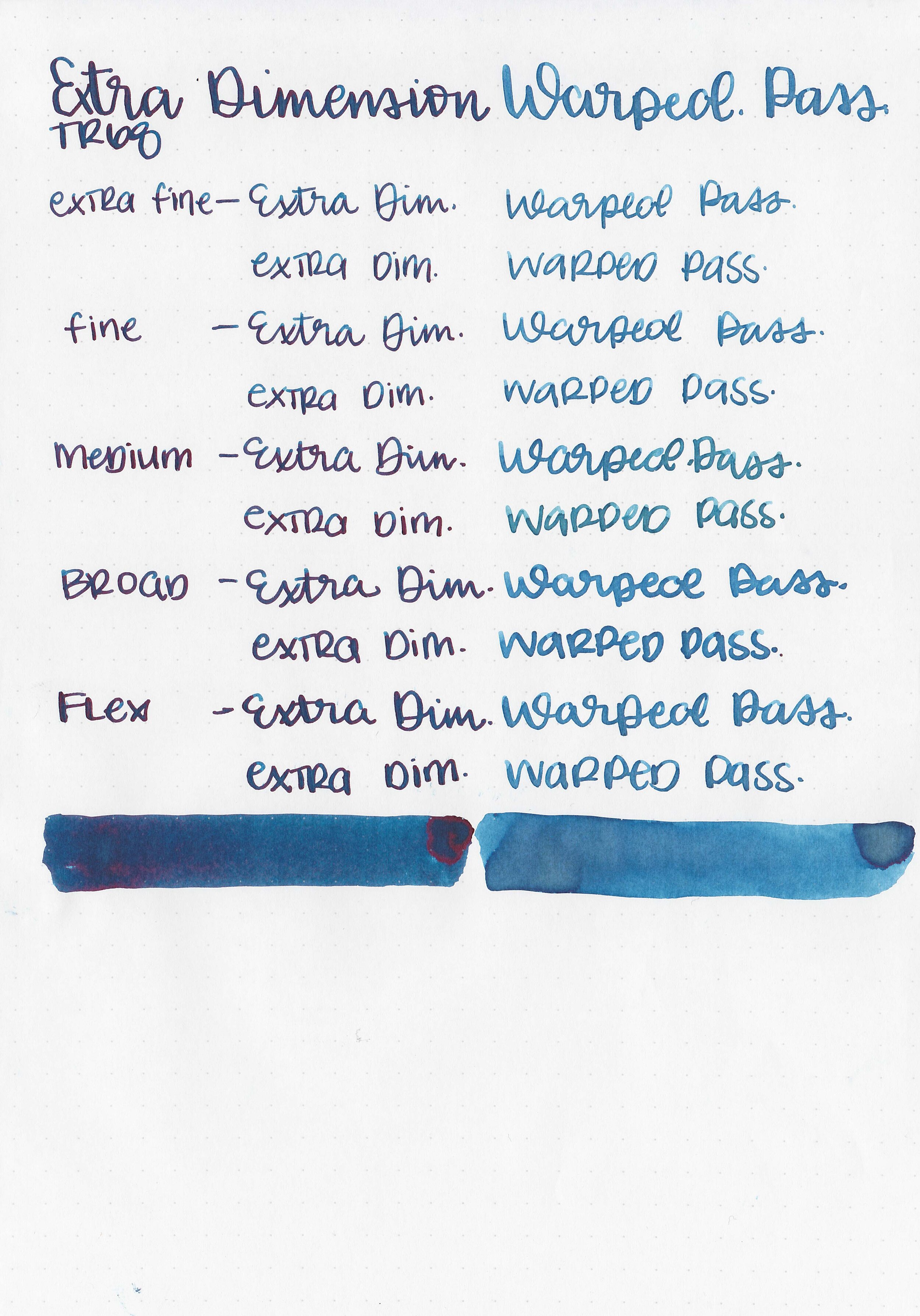
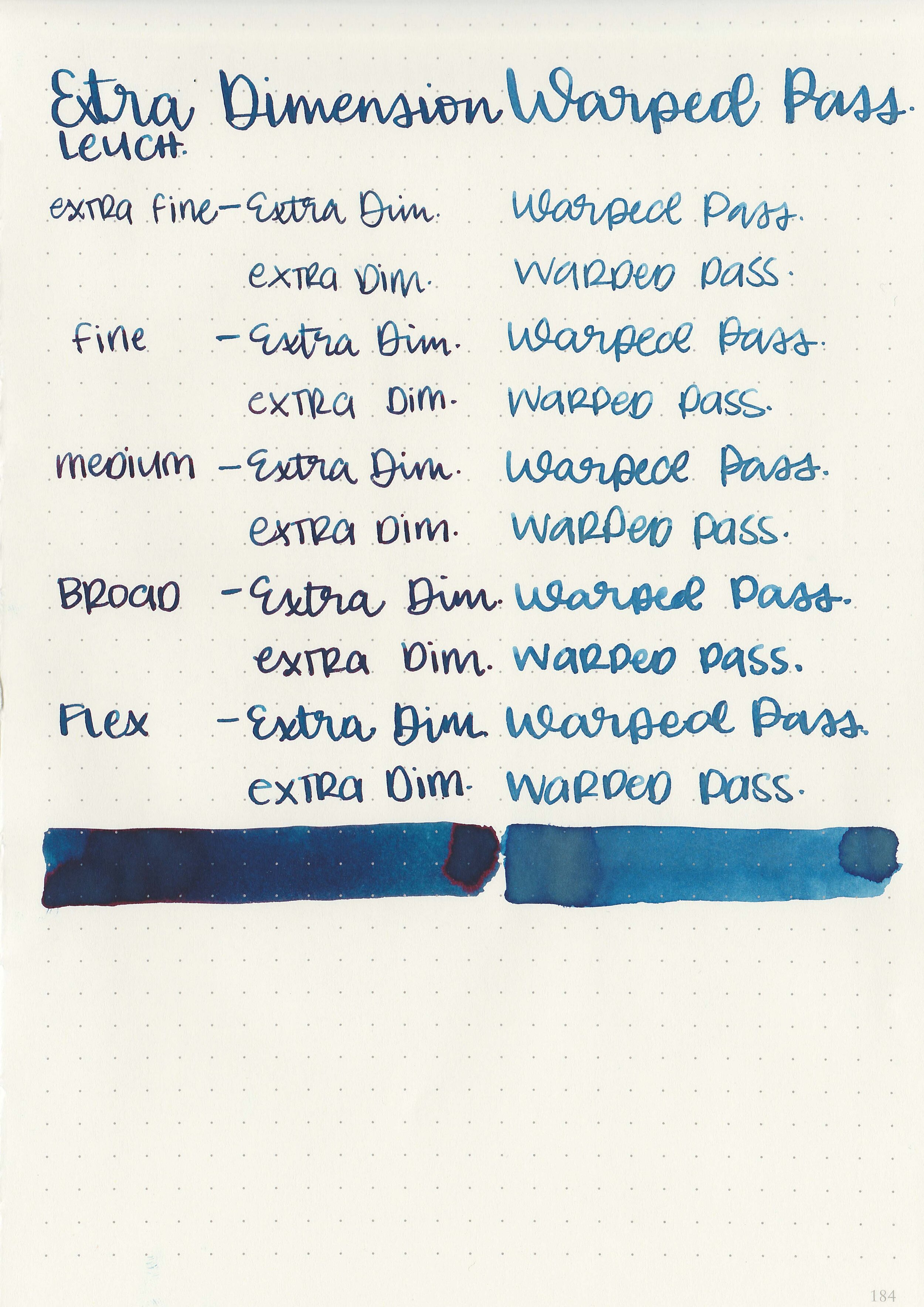
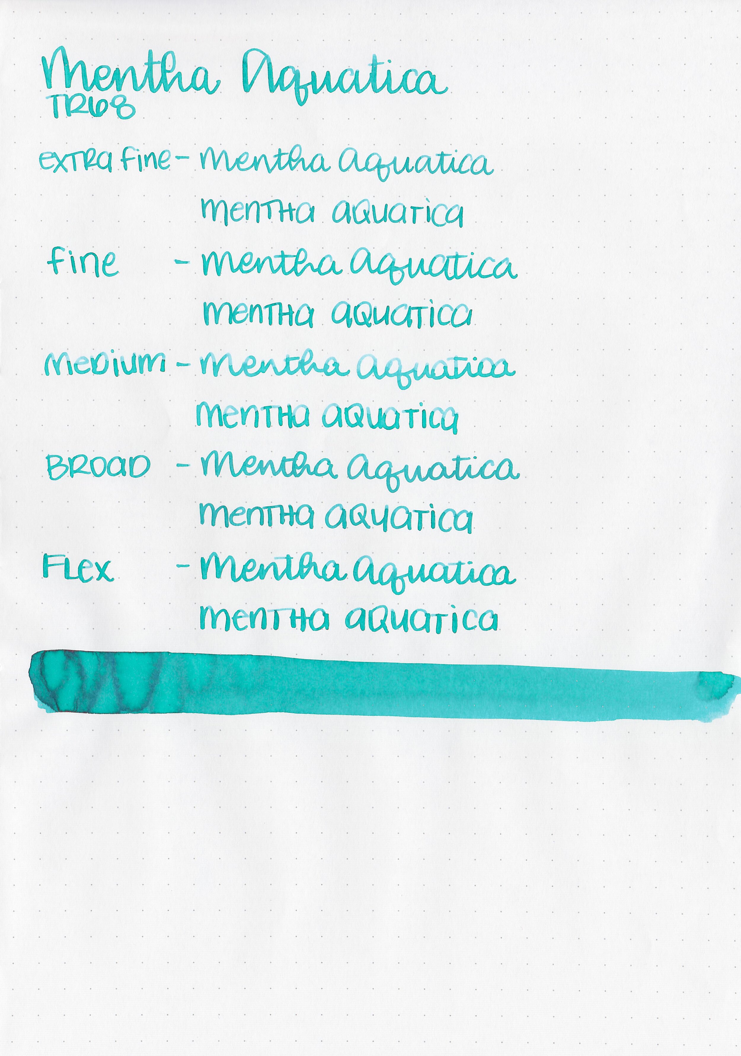
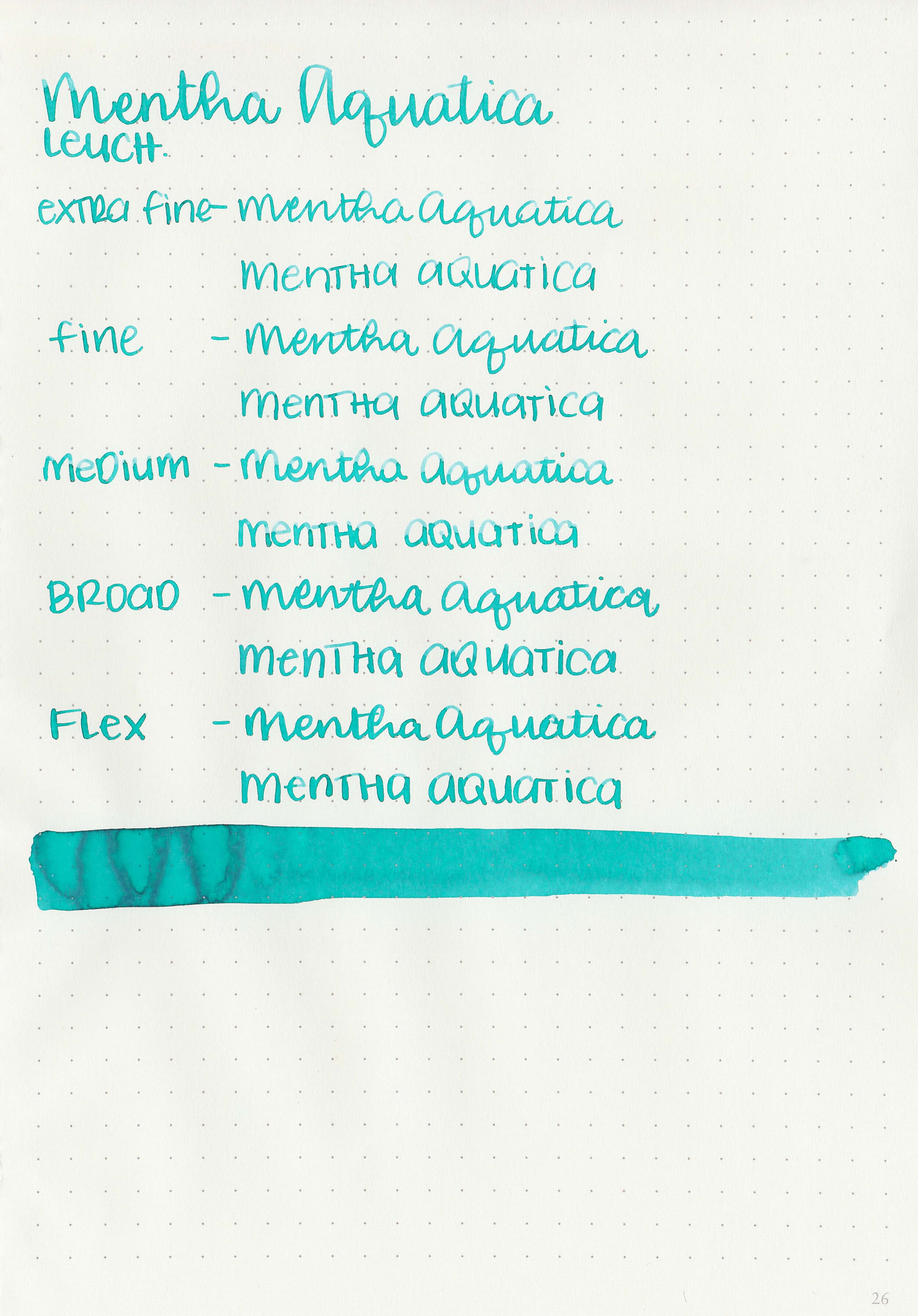
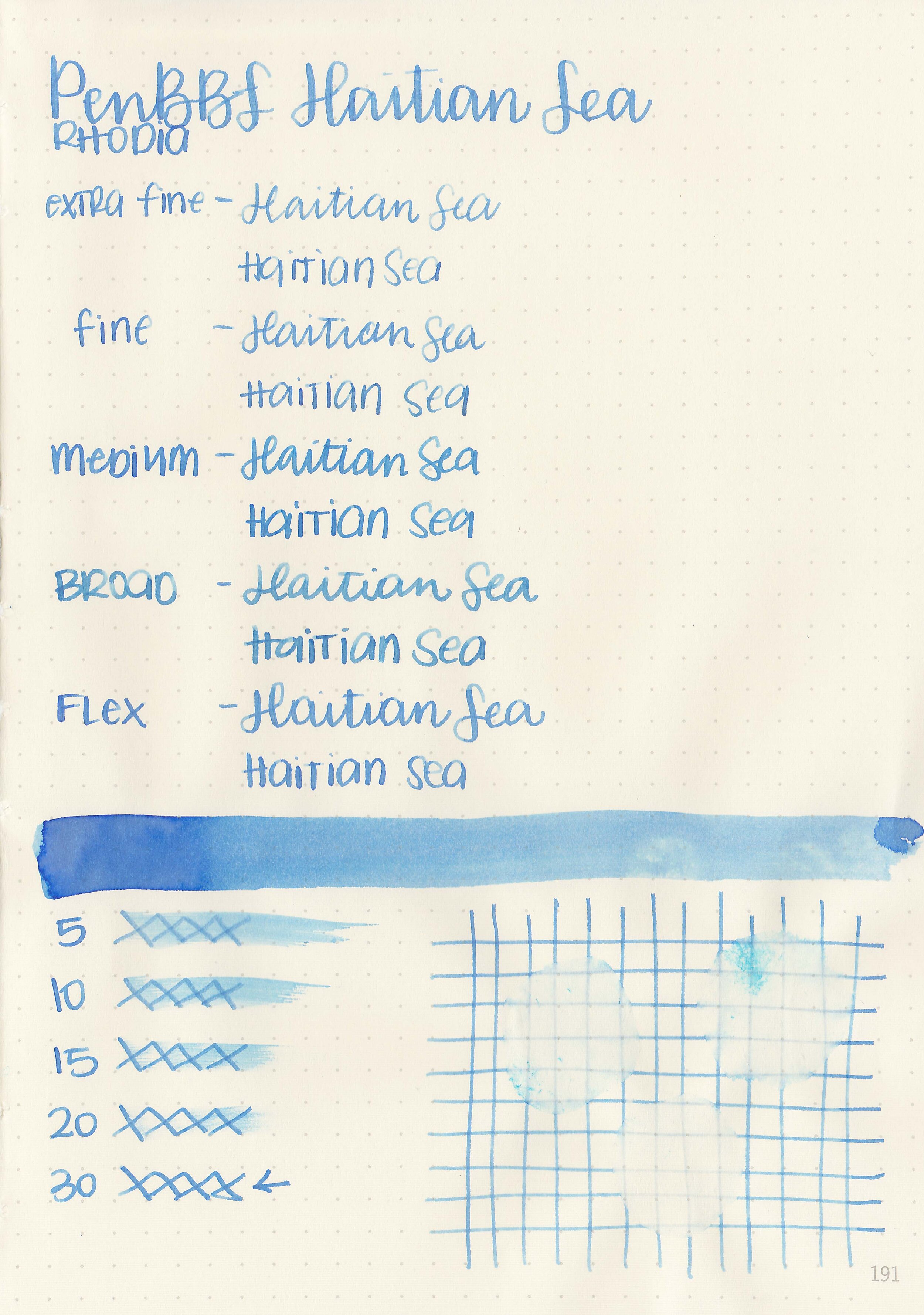
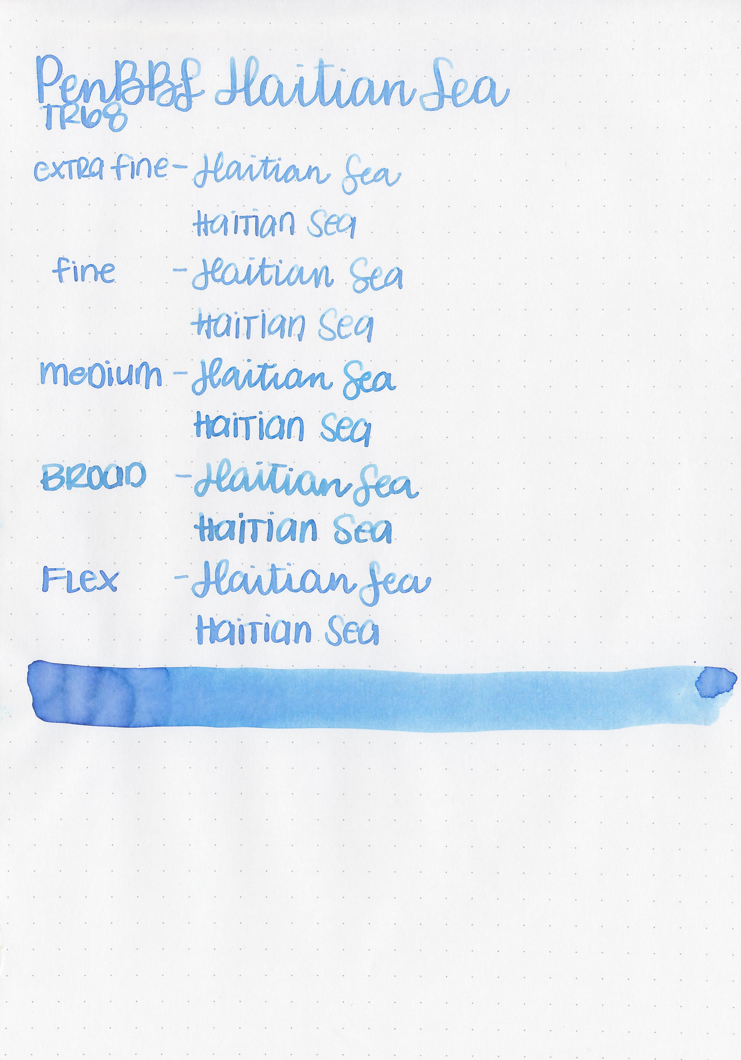
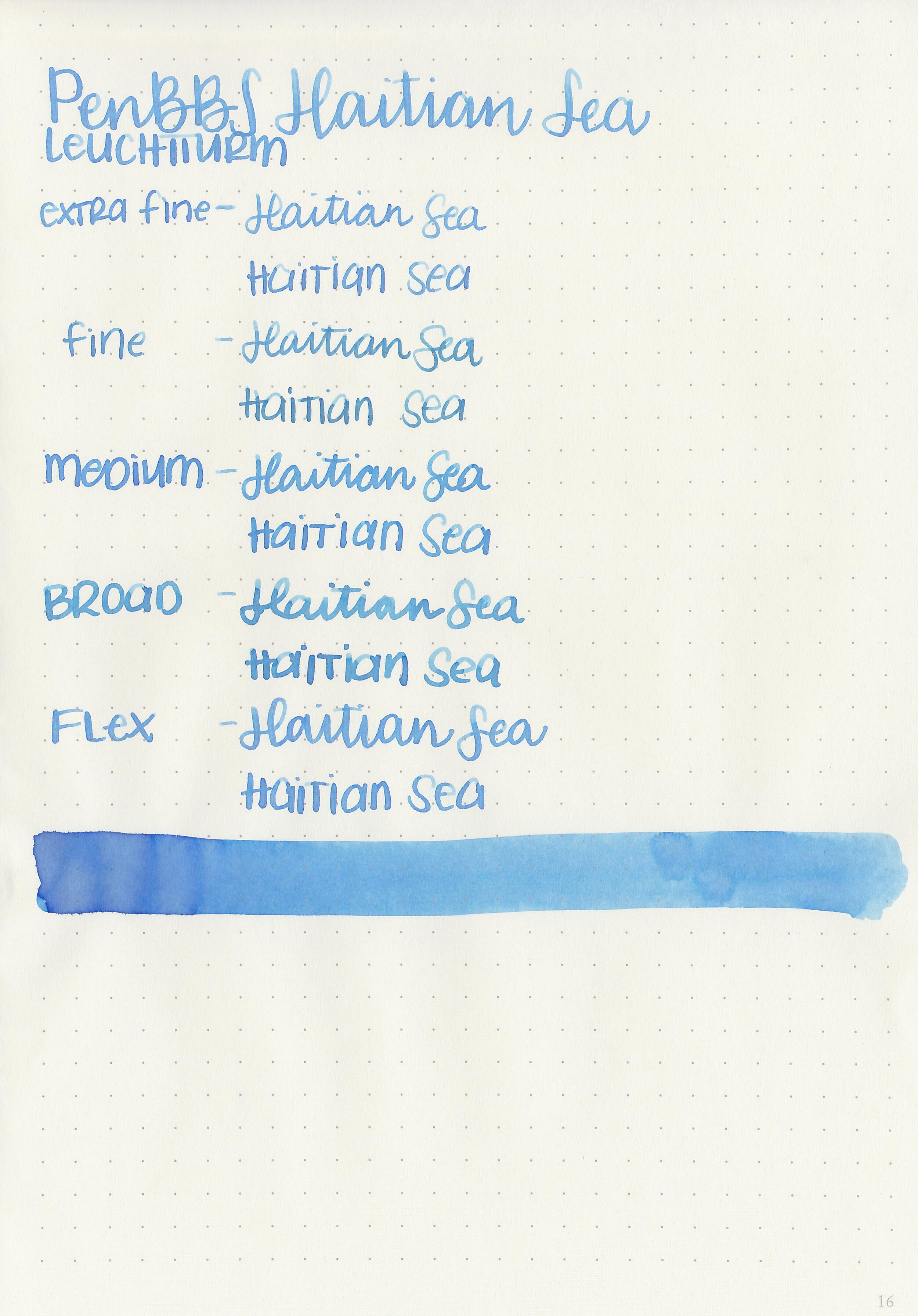
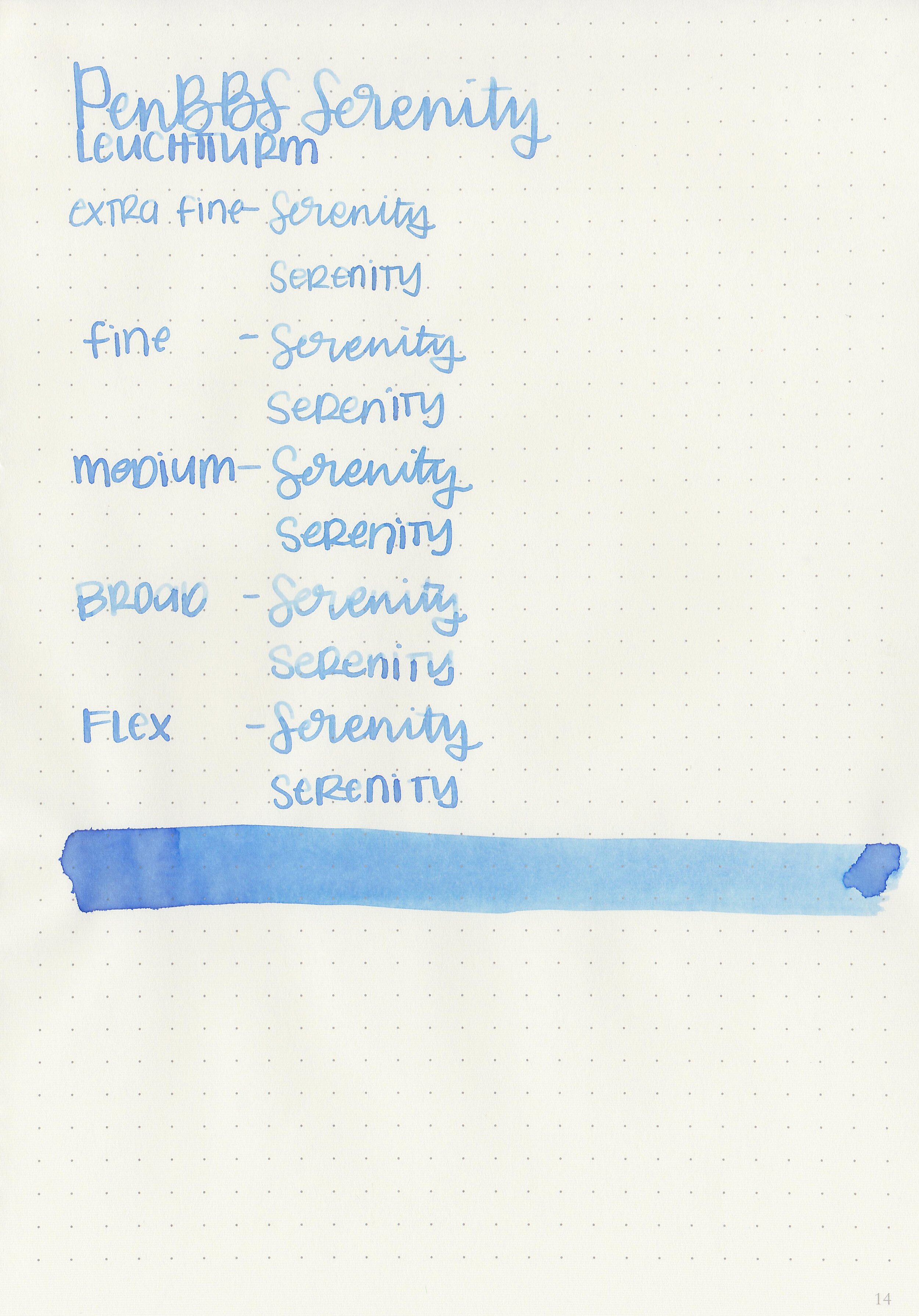
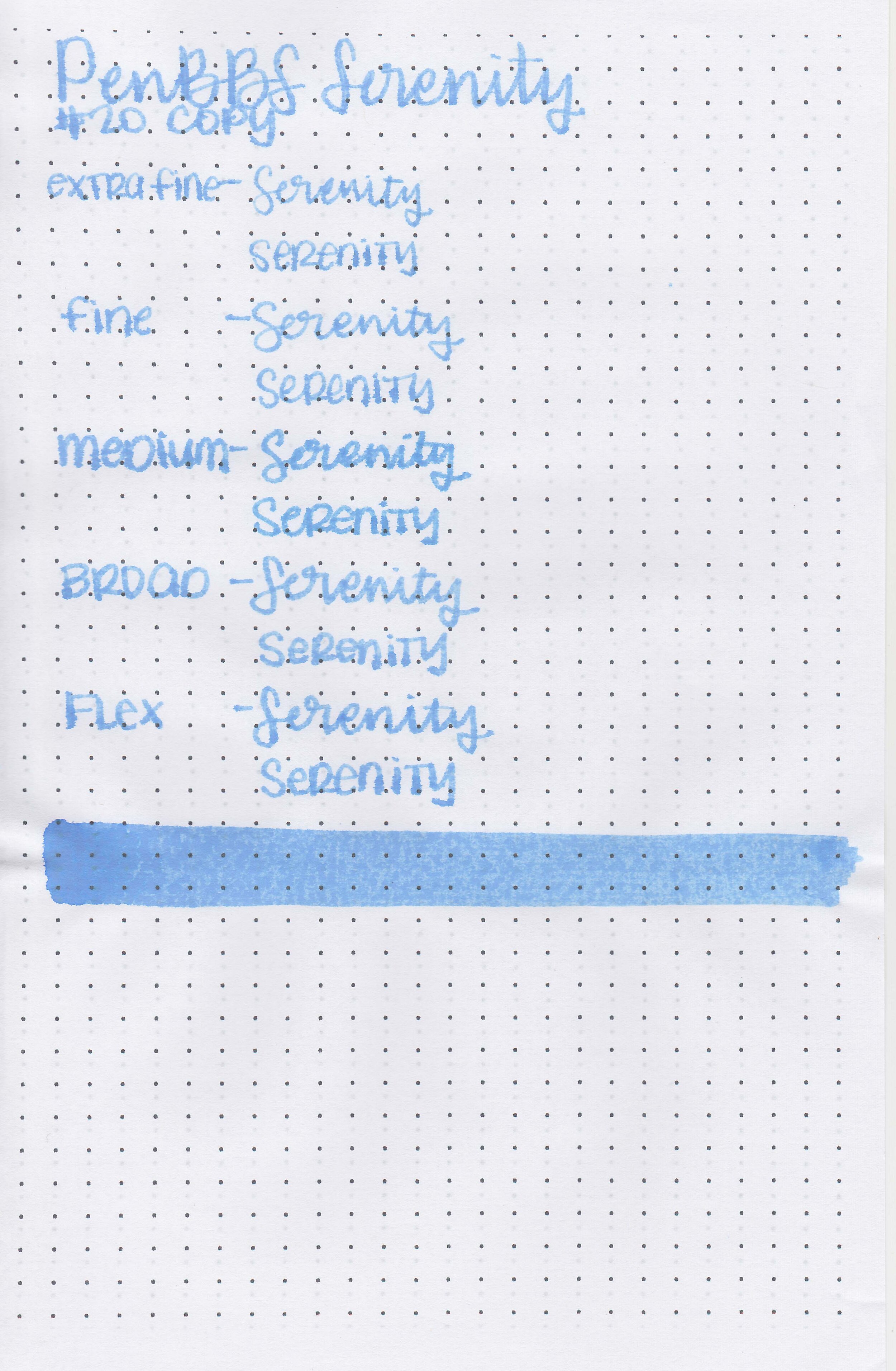
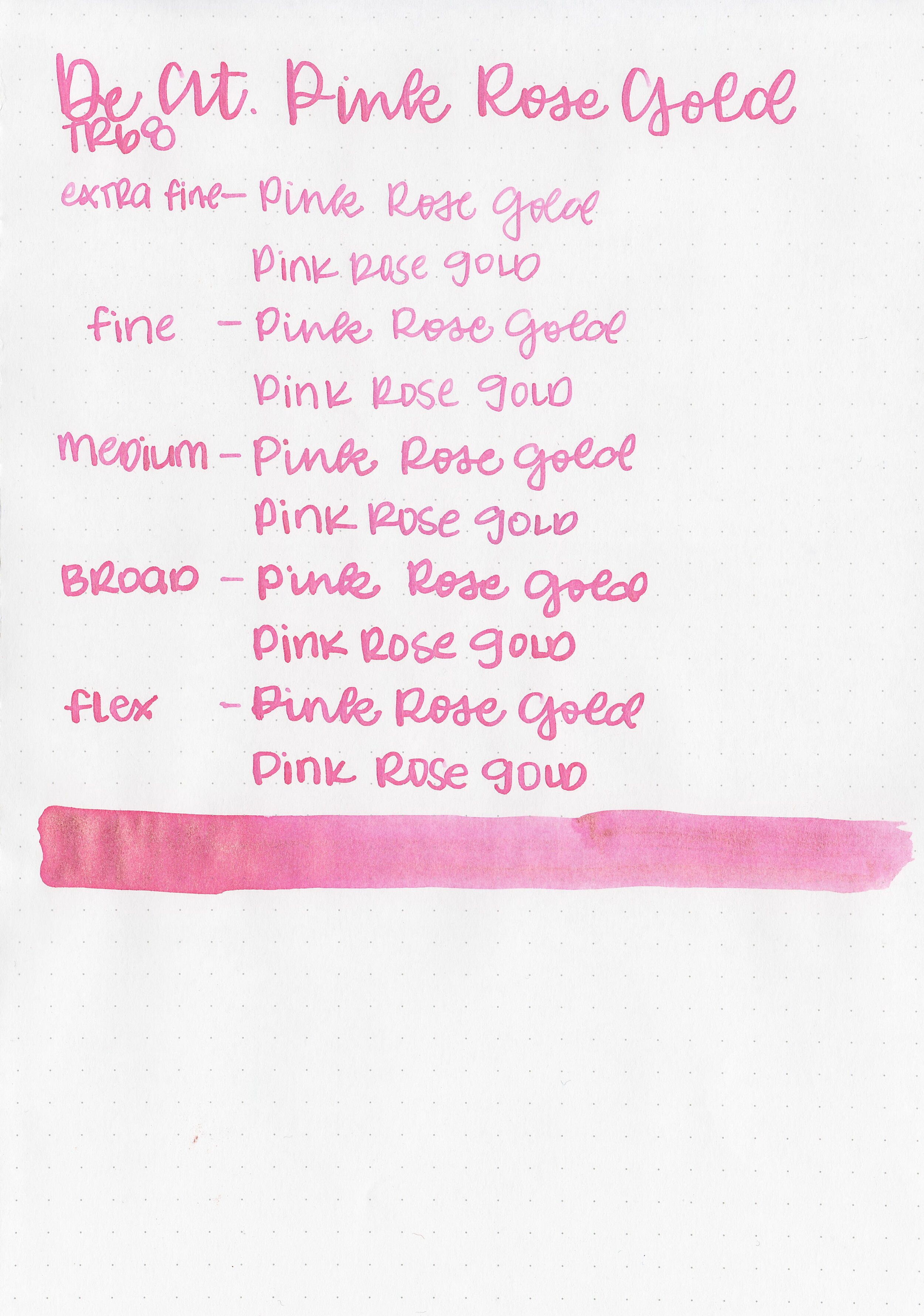
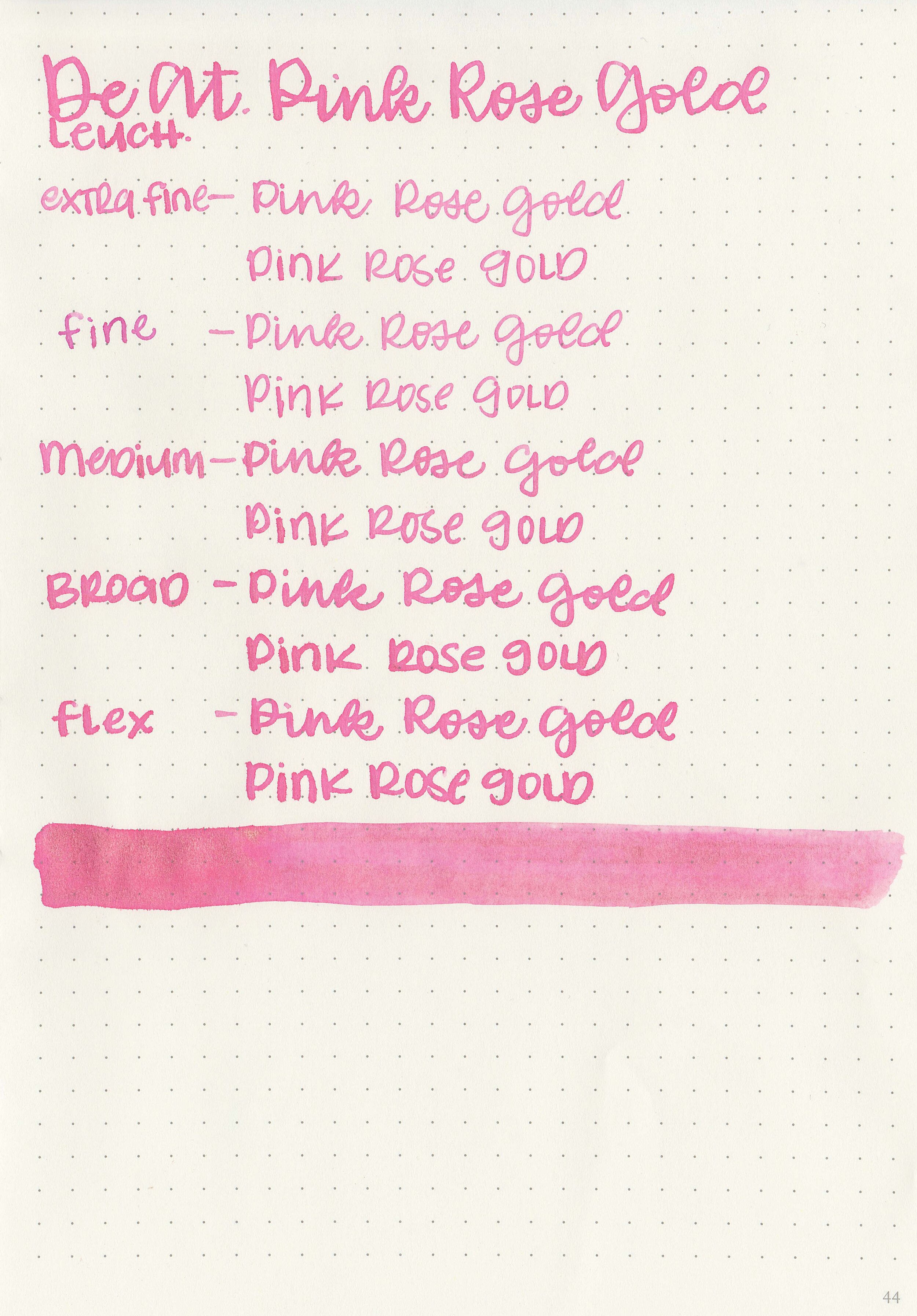
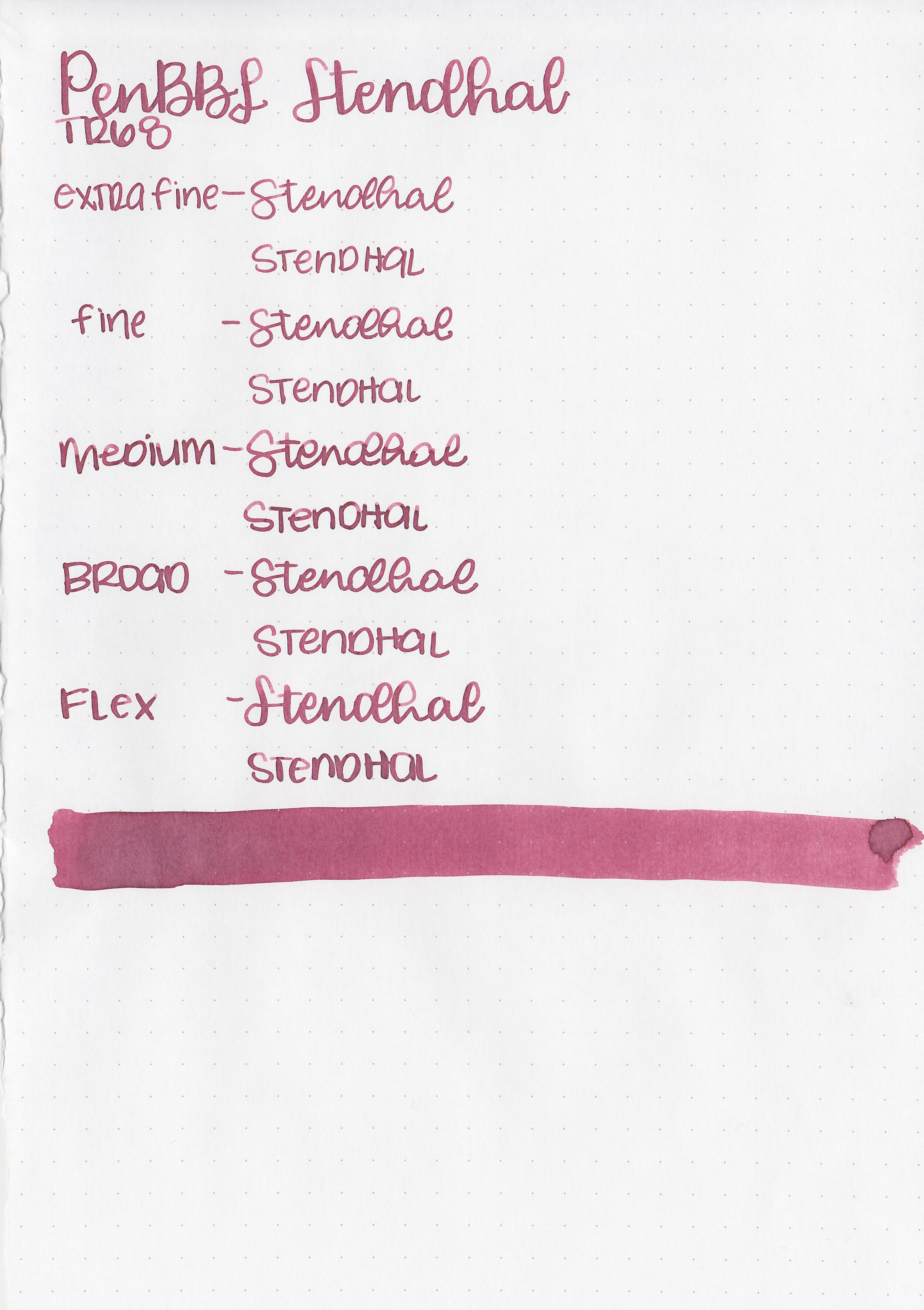
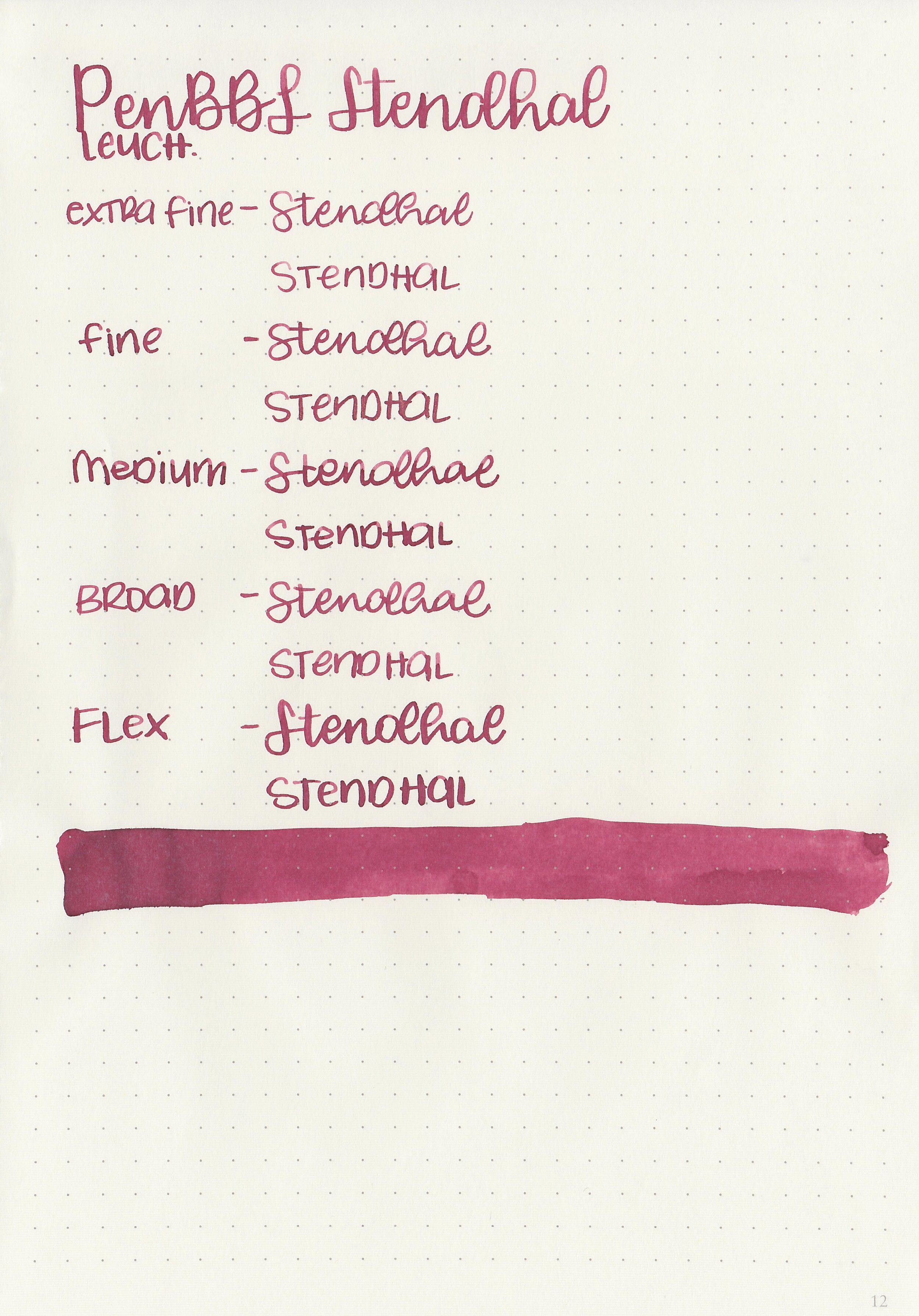
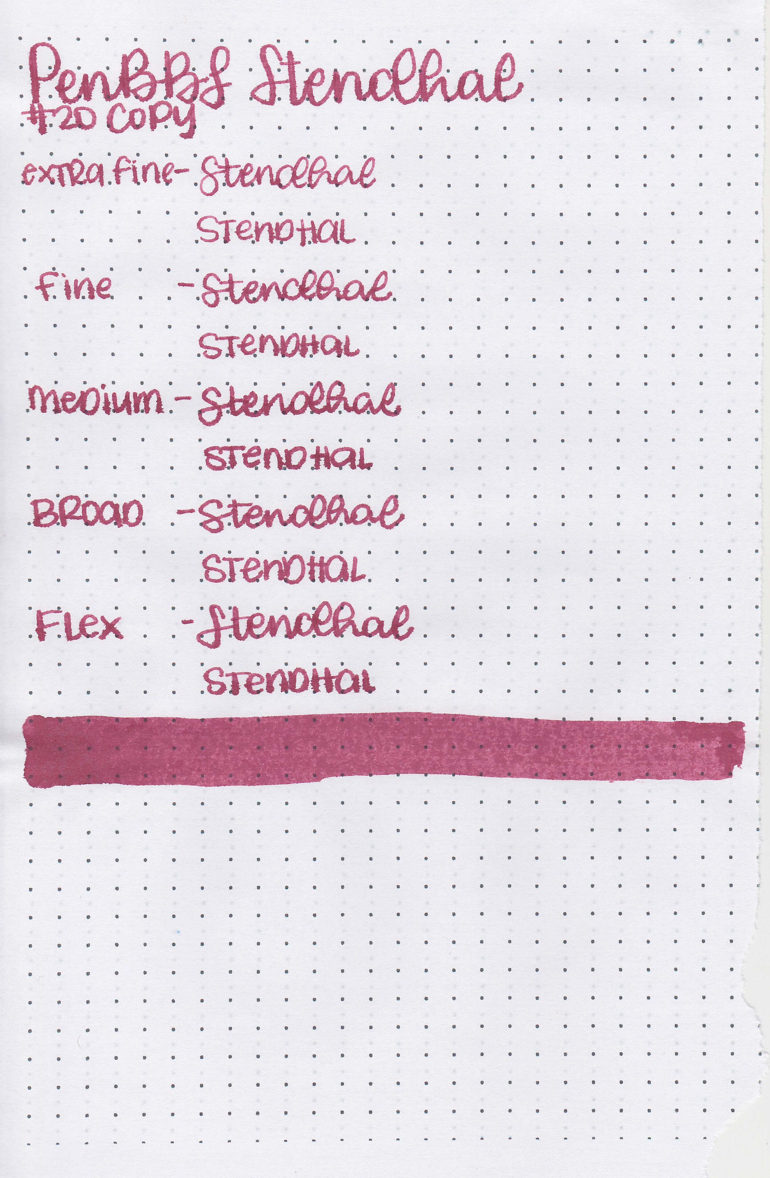
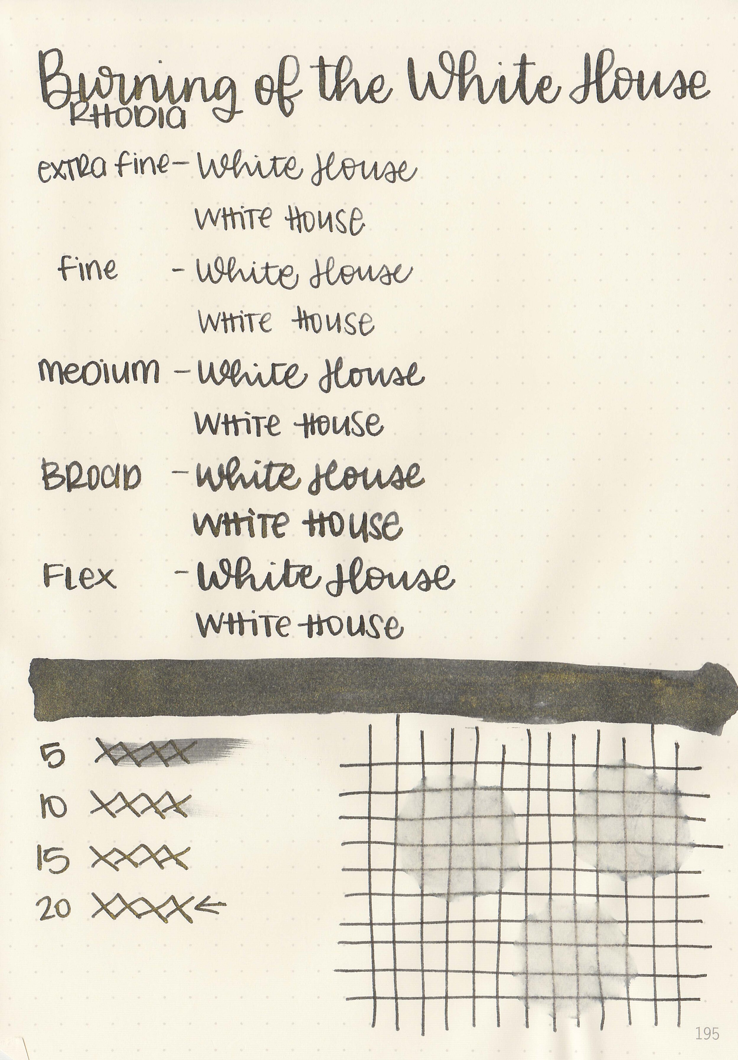
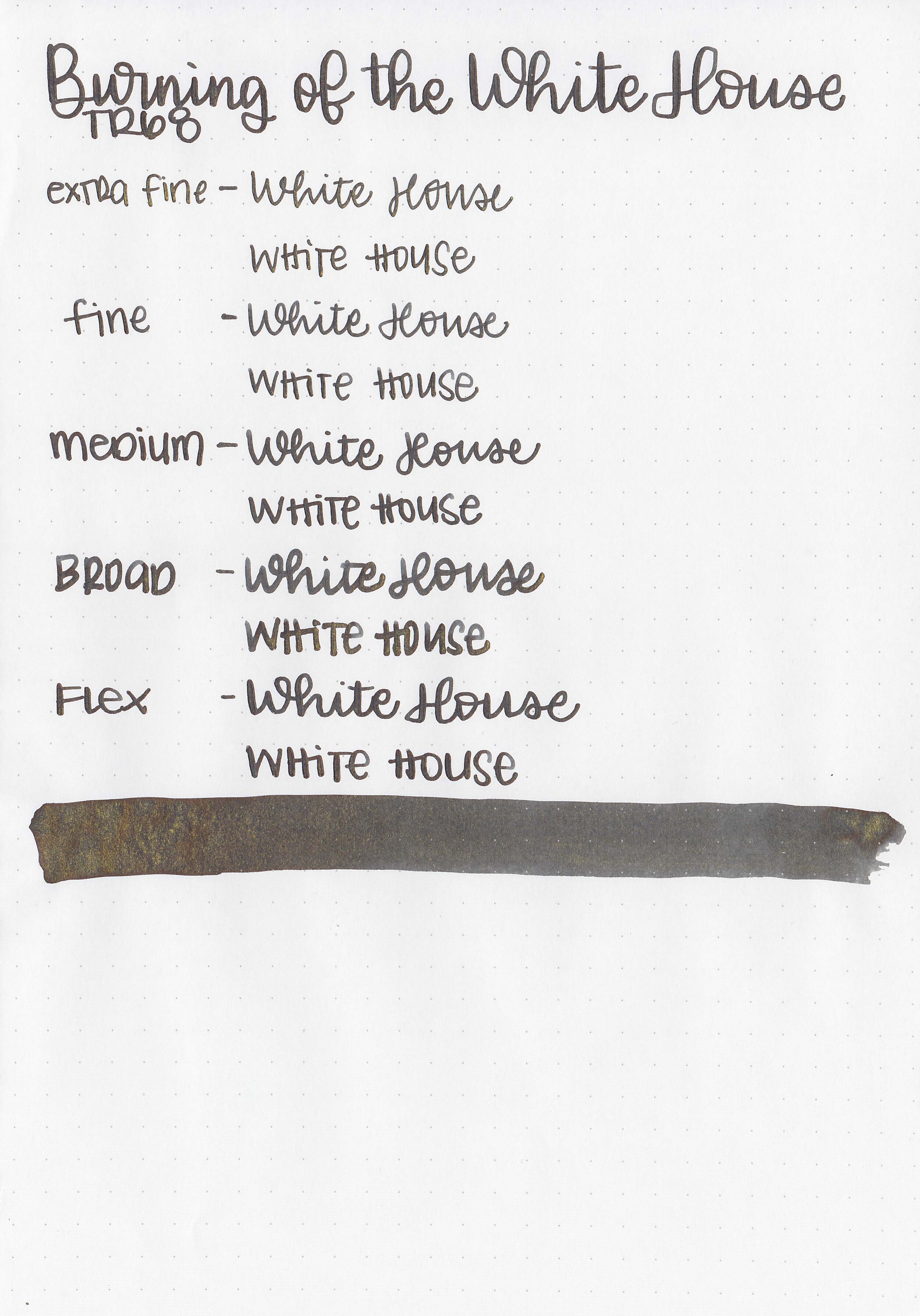
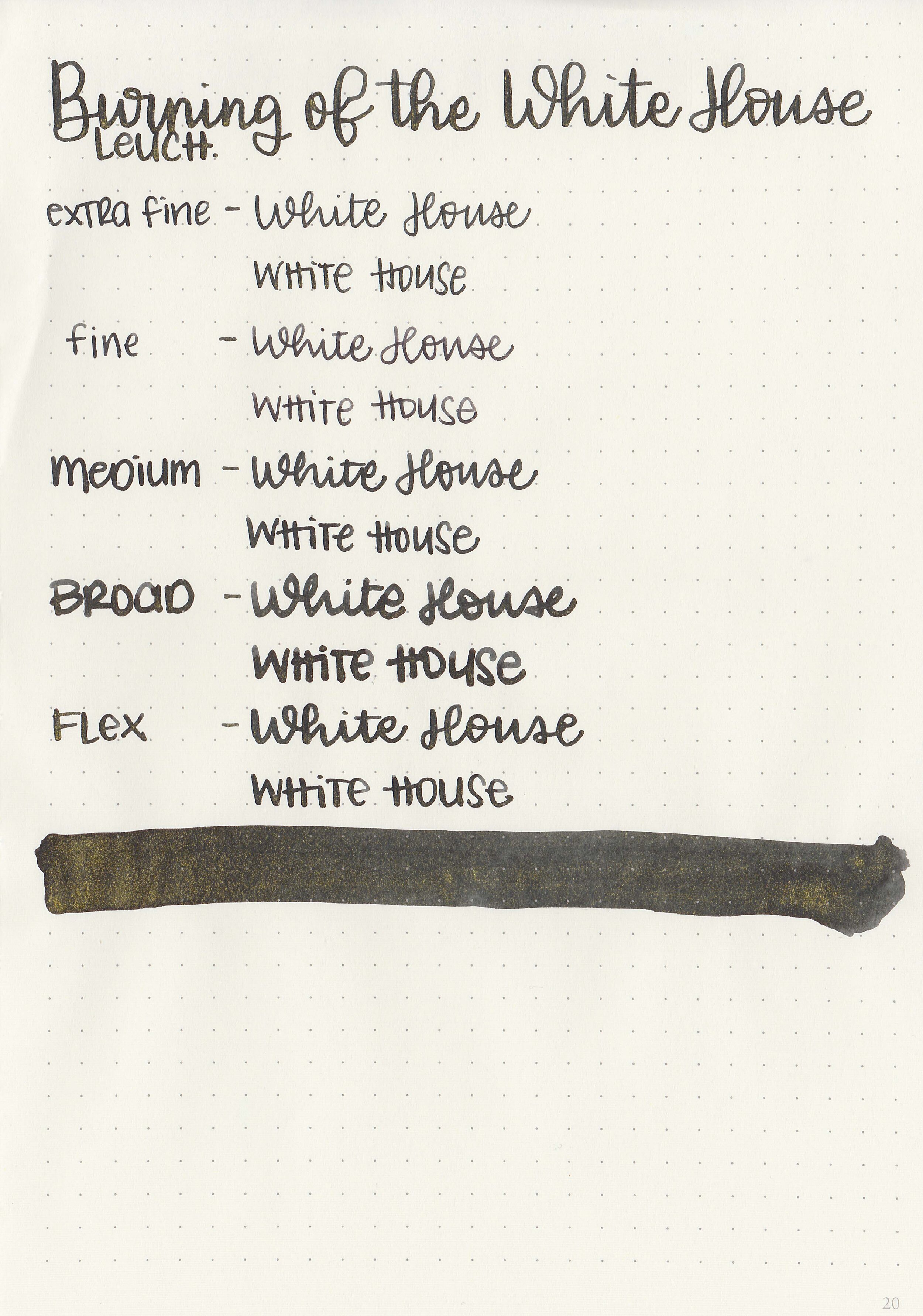
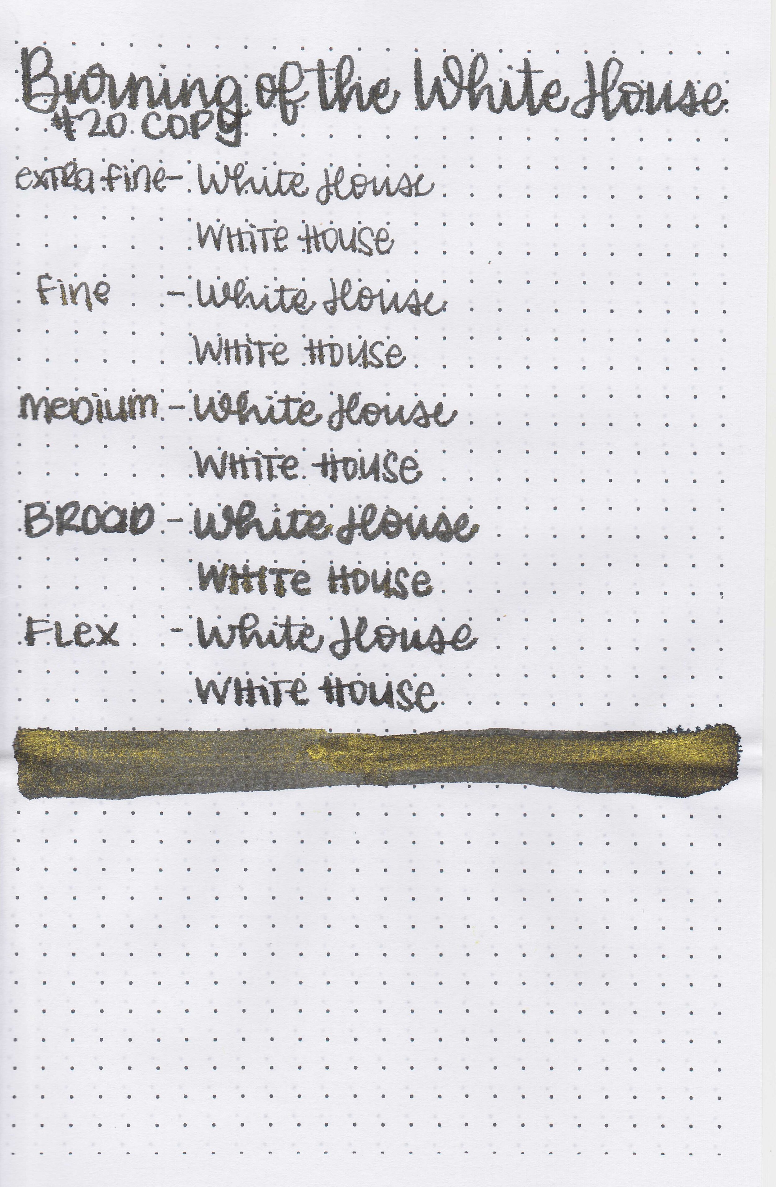
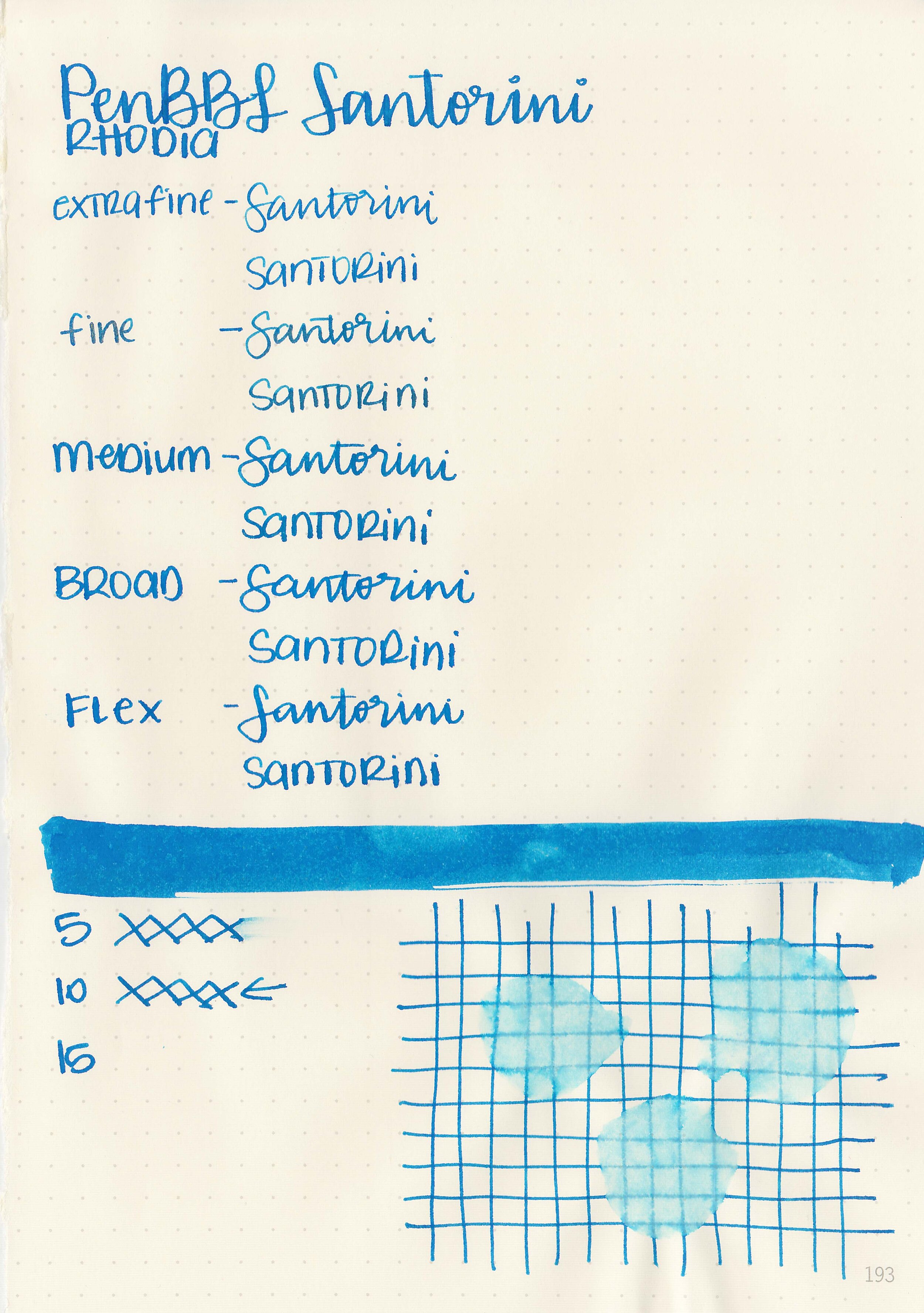
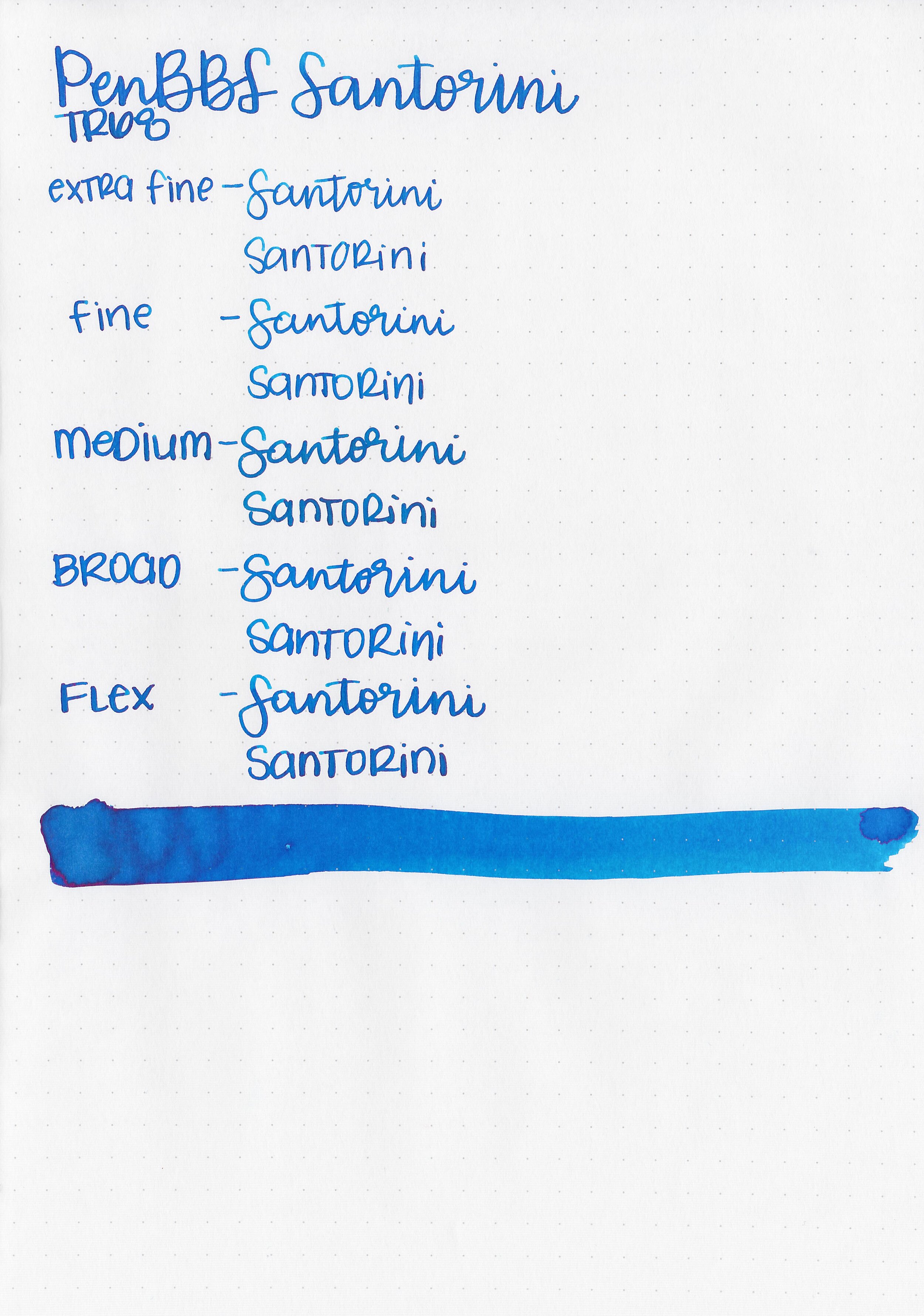
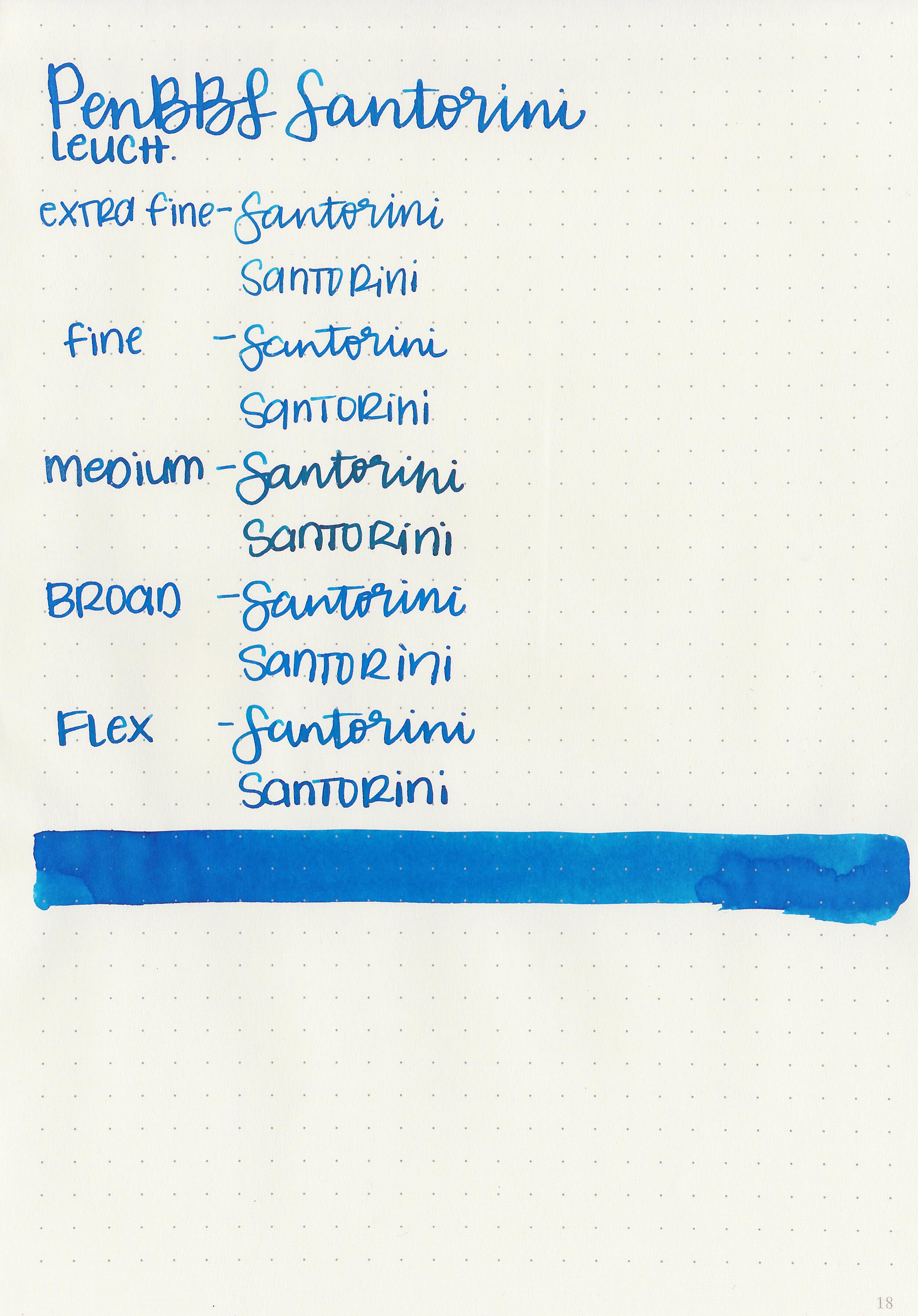
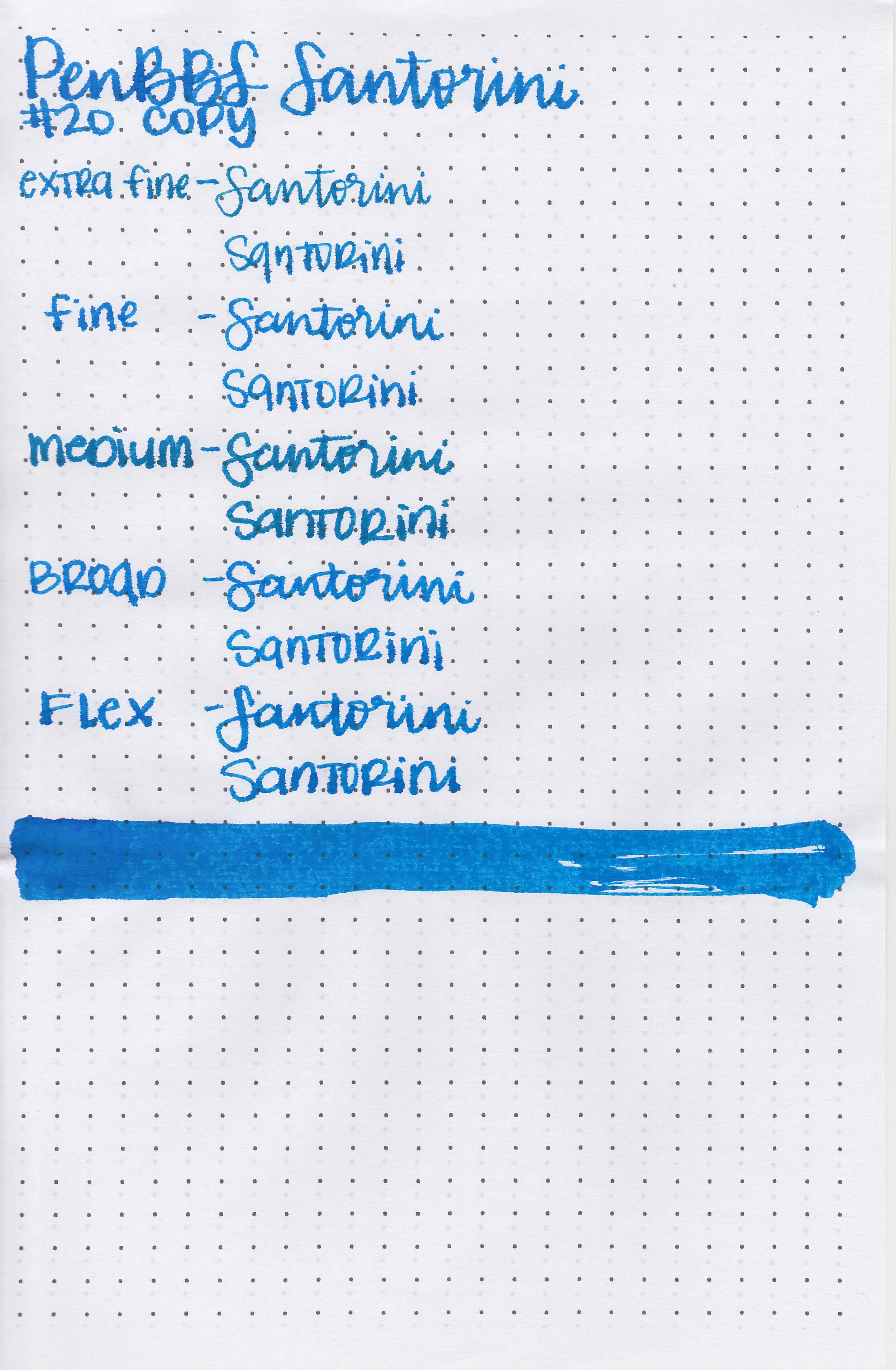
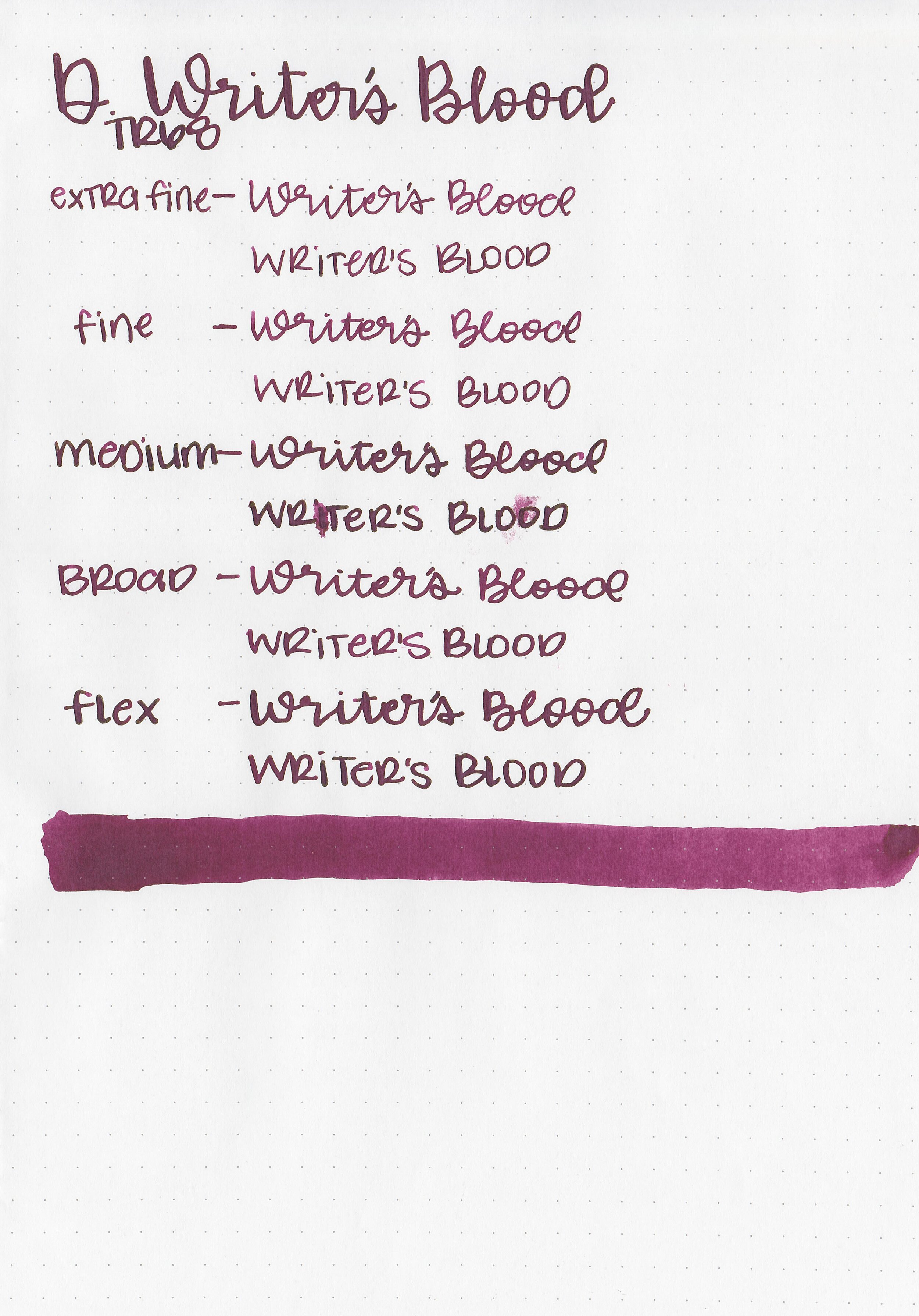
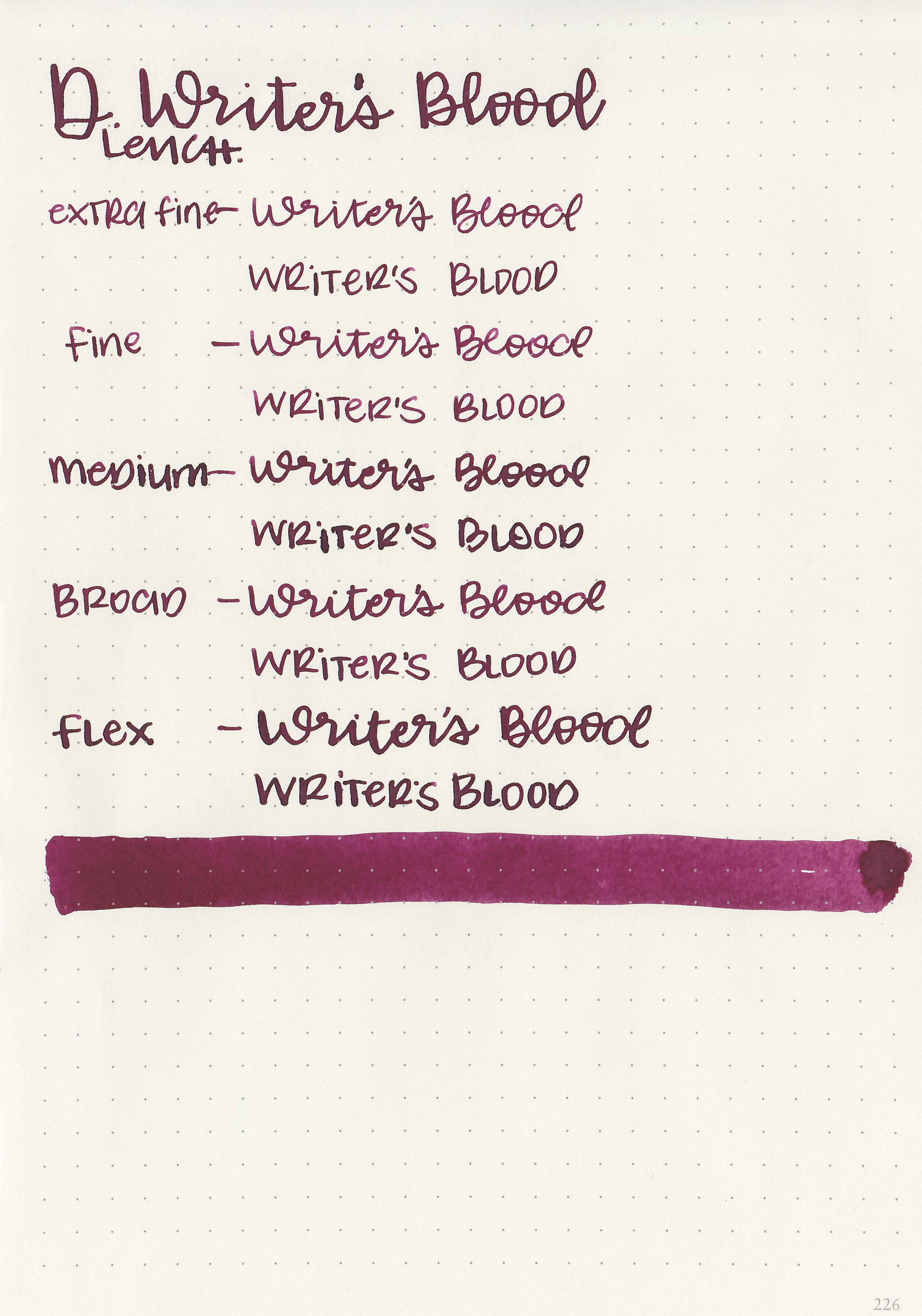
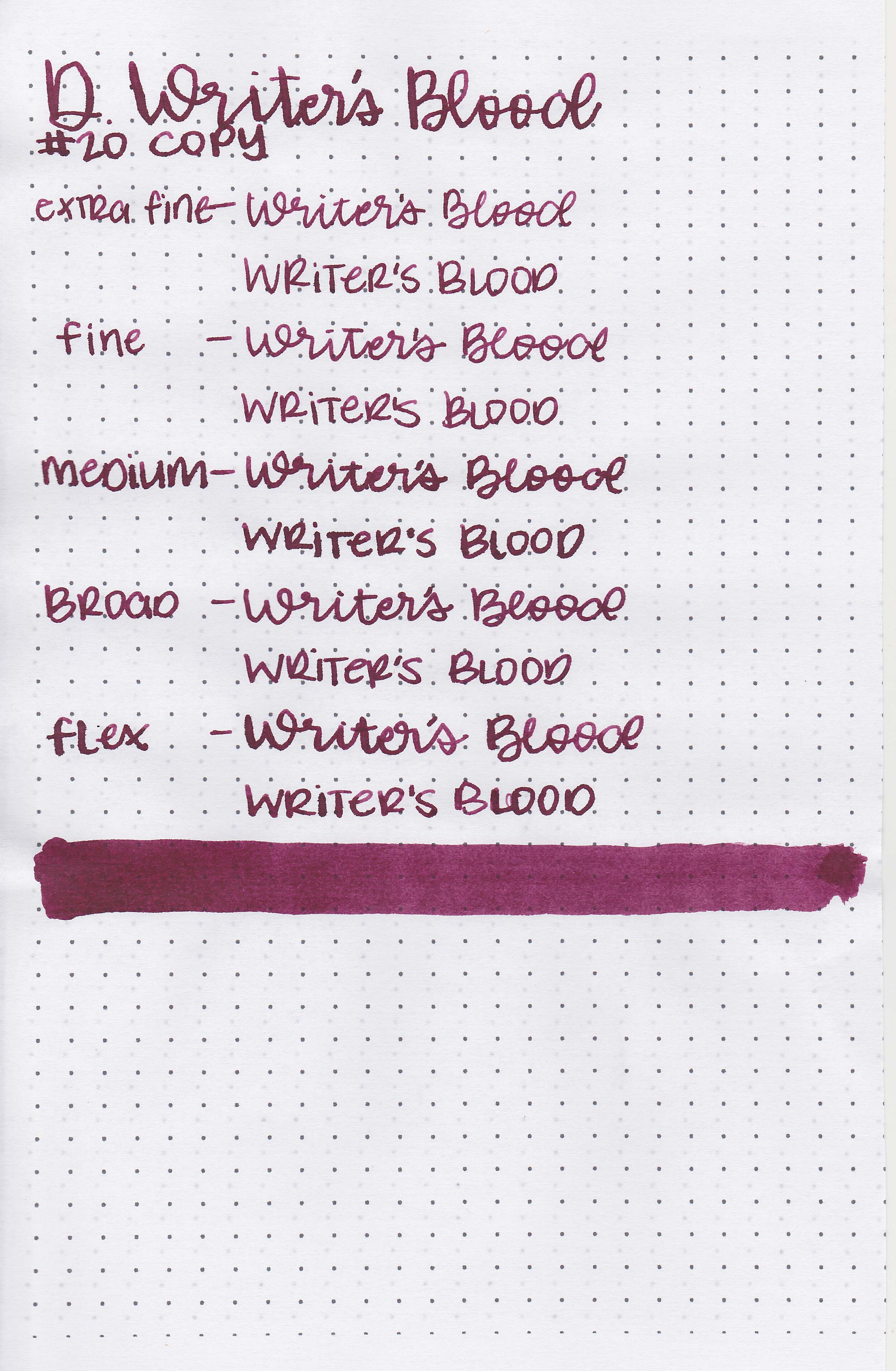
Writing samples:
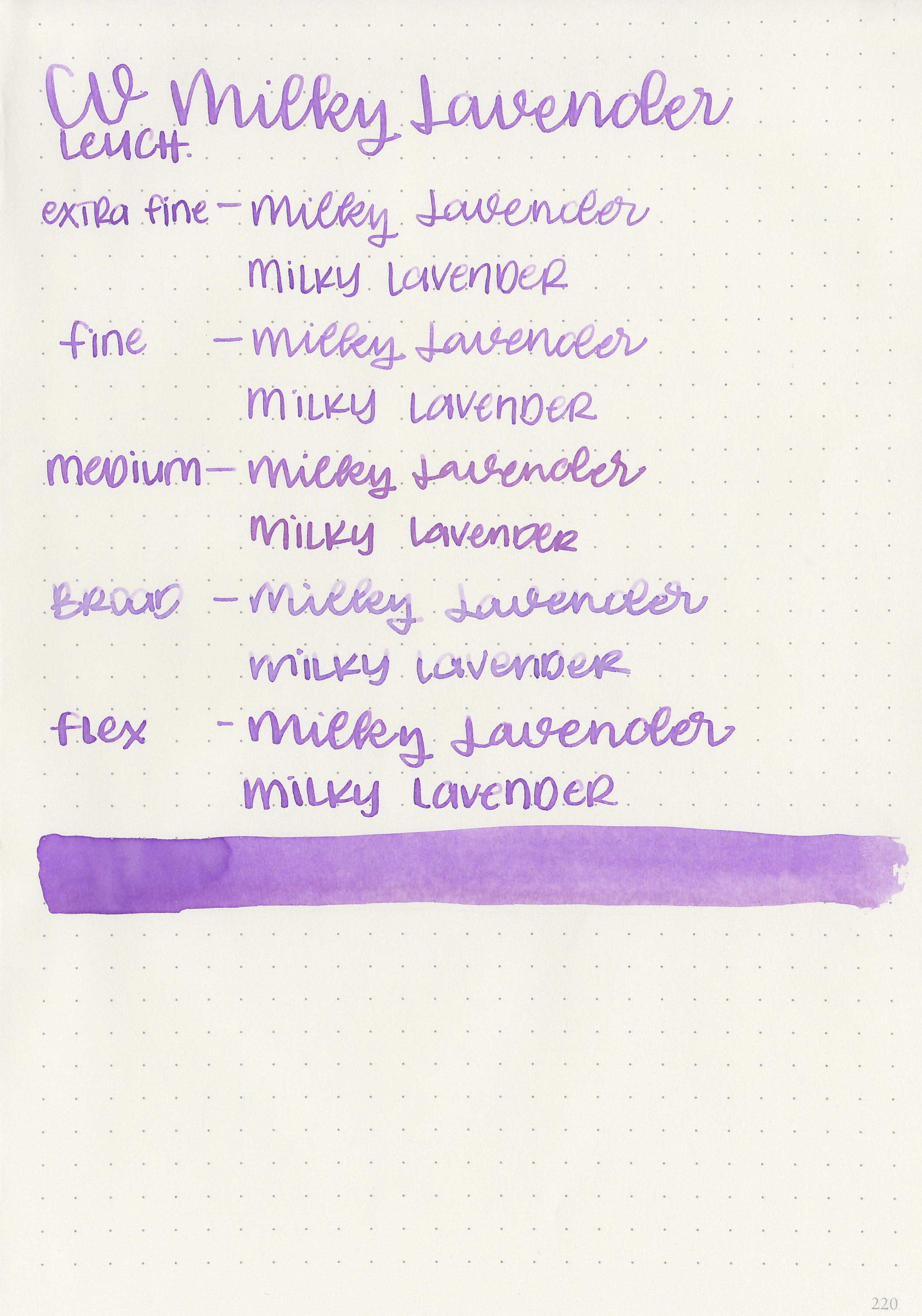
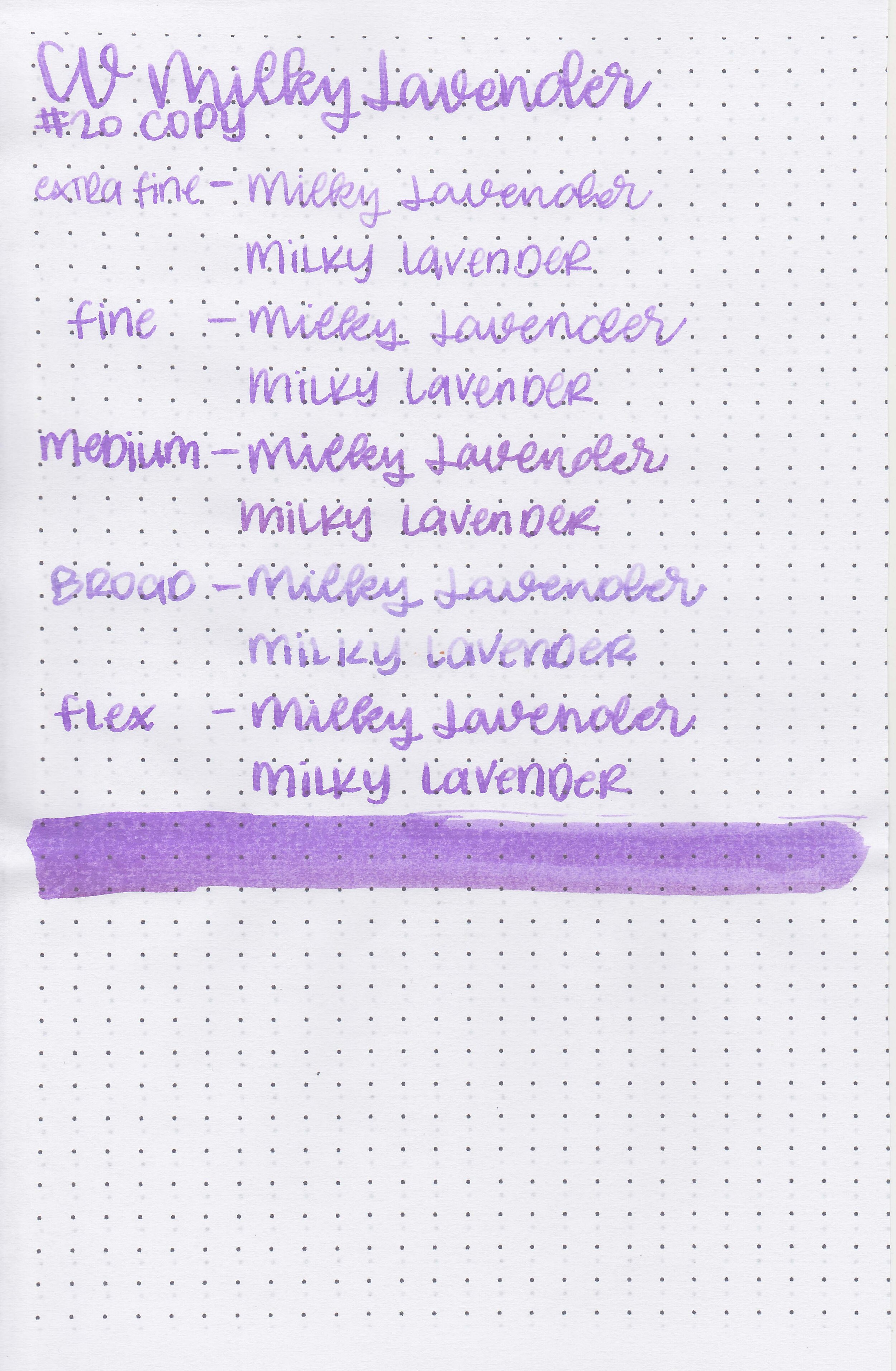
Let's take a look at how the ink behaves on fountain pen friendly papers: Rhodia, Tomoe River, and Leuchtturm.
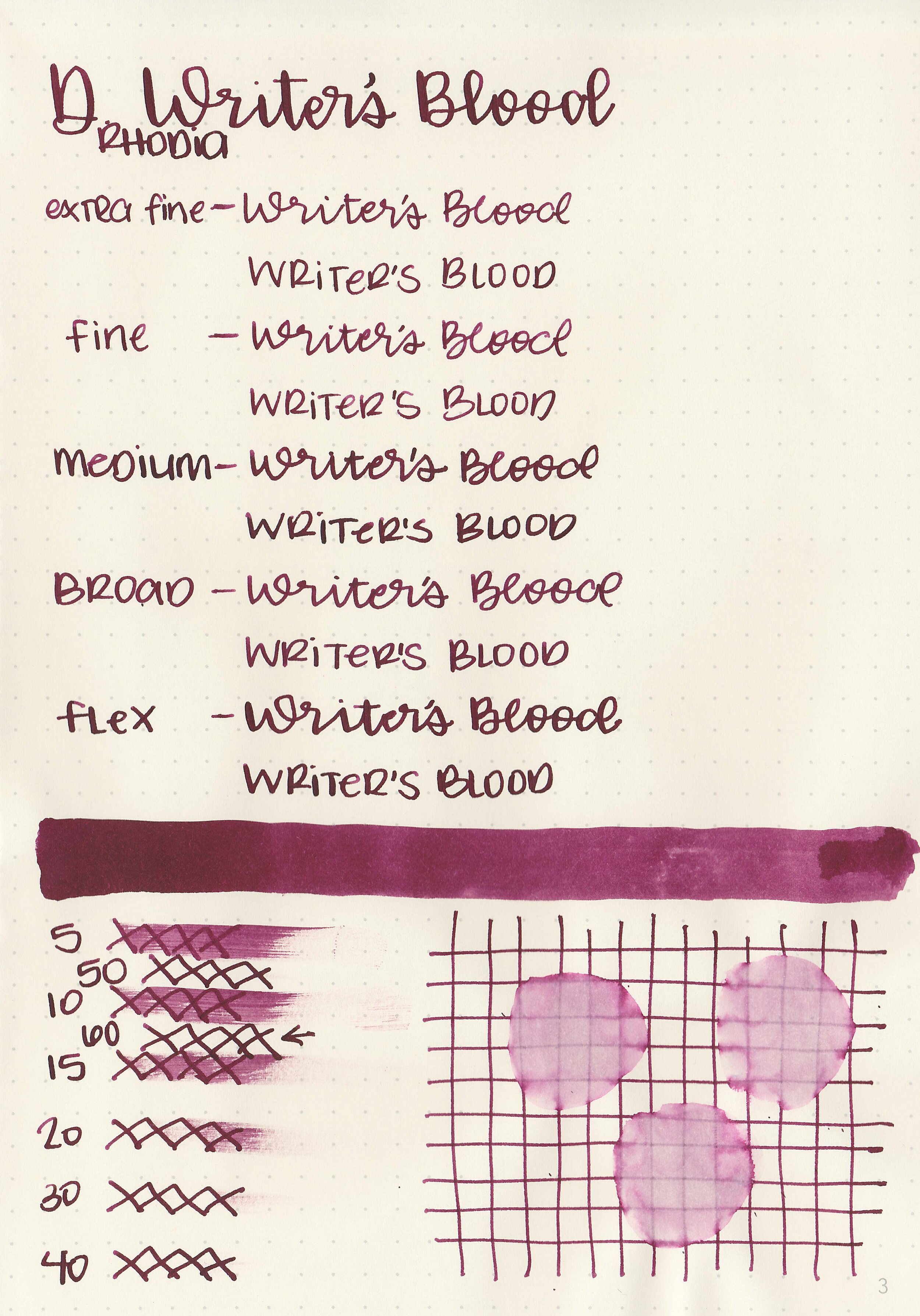
Dry time: 60 seconds
Water resistance: Medium
Feathering: Low
Show through: Medium
Bleeding: None
Other properties: low shading, low bronze sheen, and no shimmer.
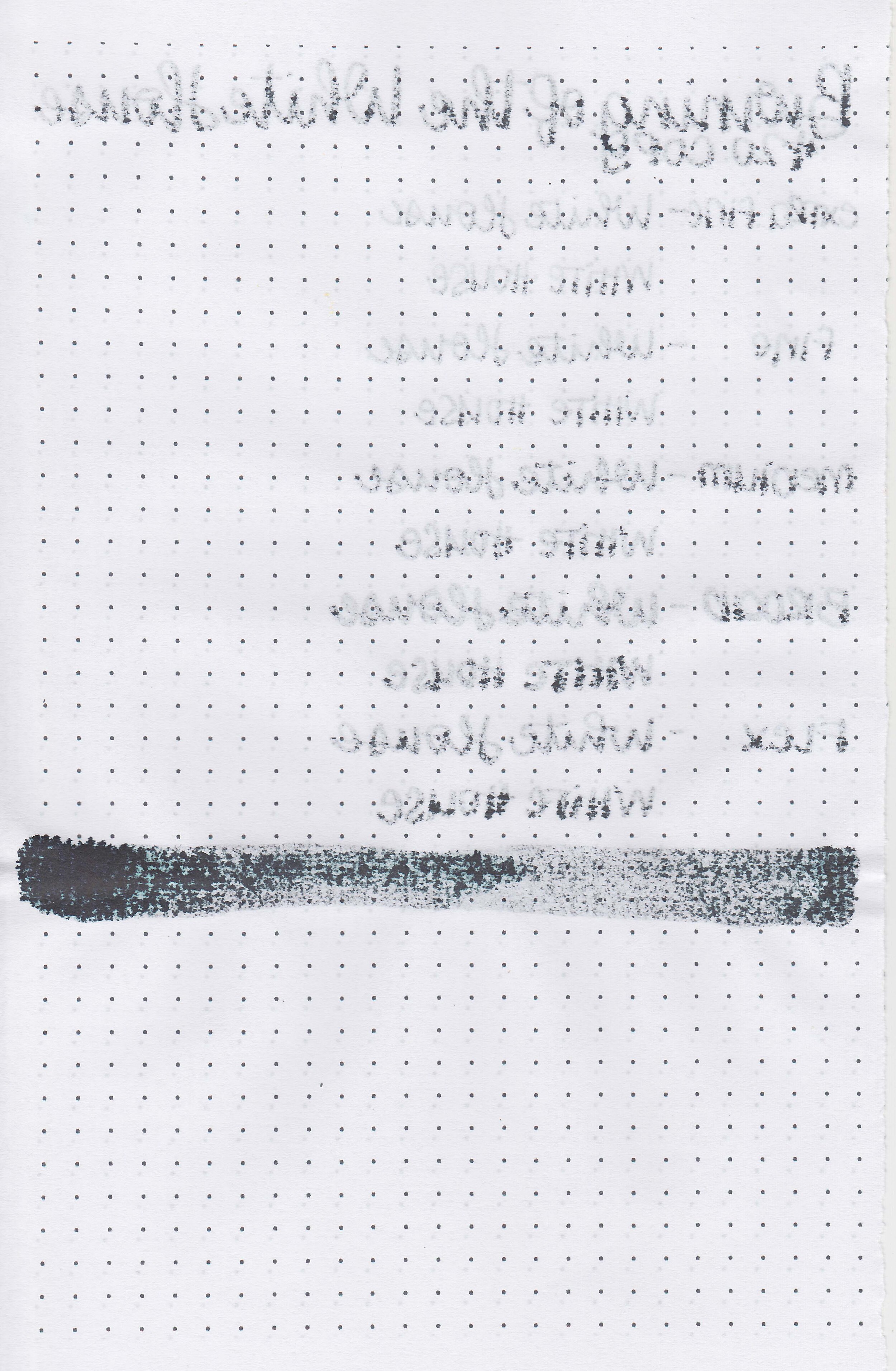
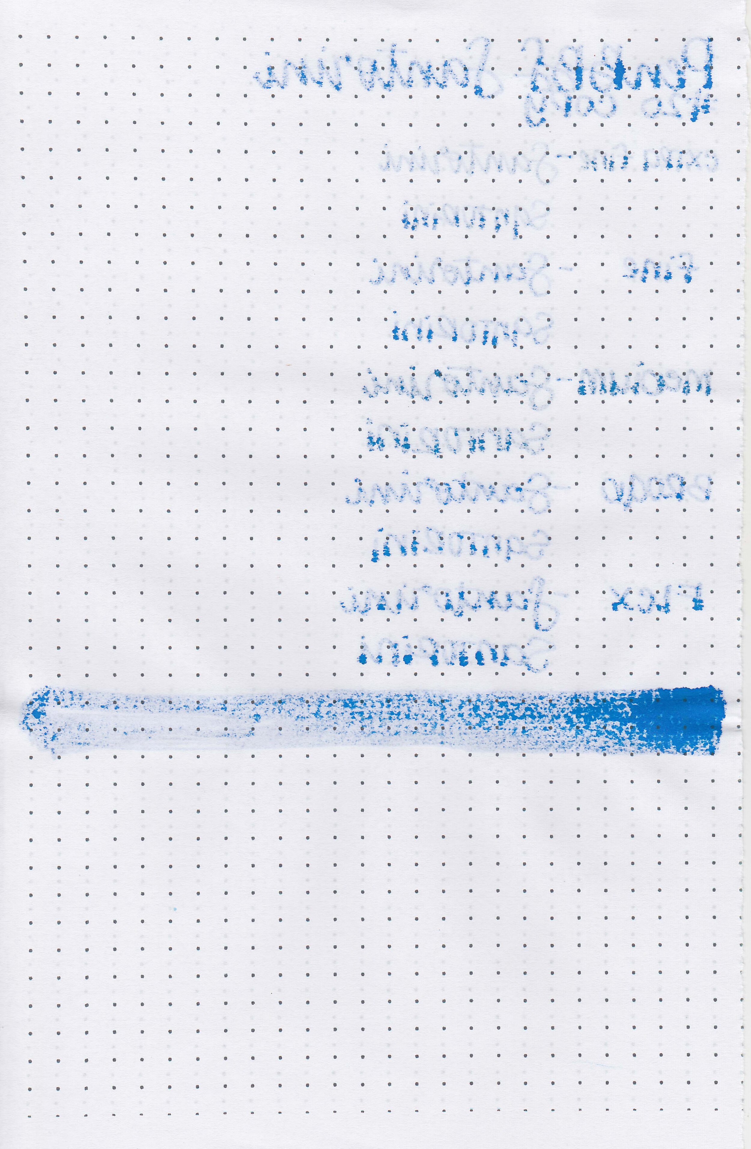
On Staples 24 lb copy paper there was a lot feathering and bleeding in all nib sizes.
Comparison Swabs:
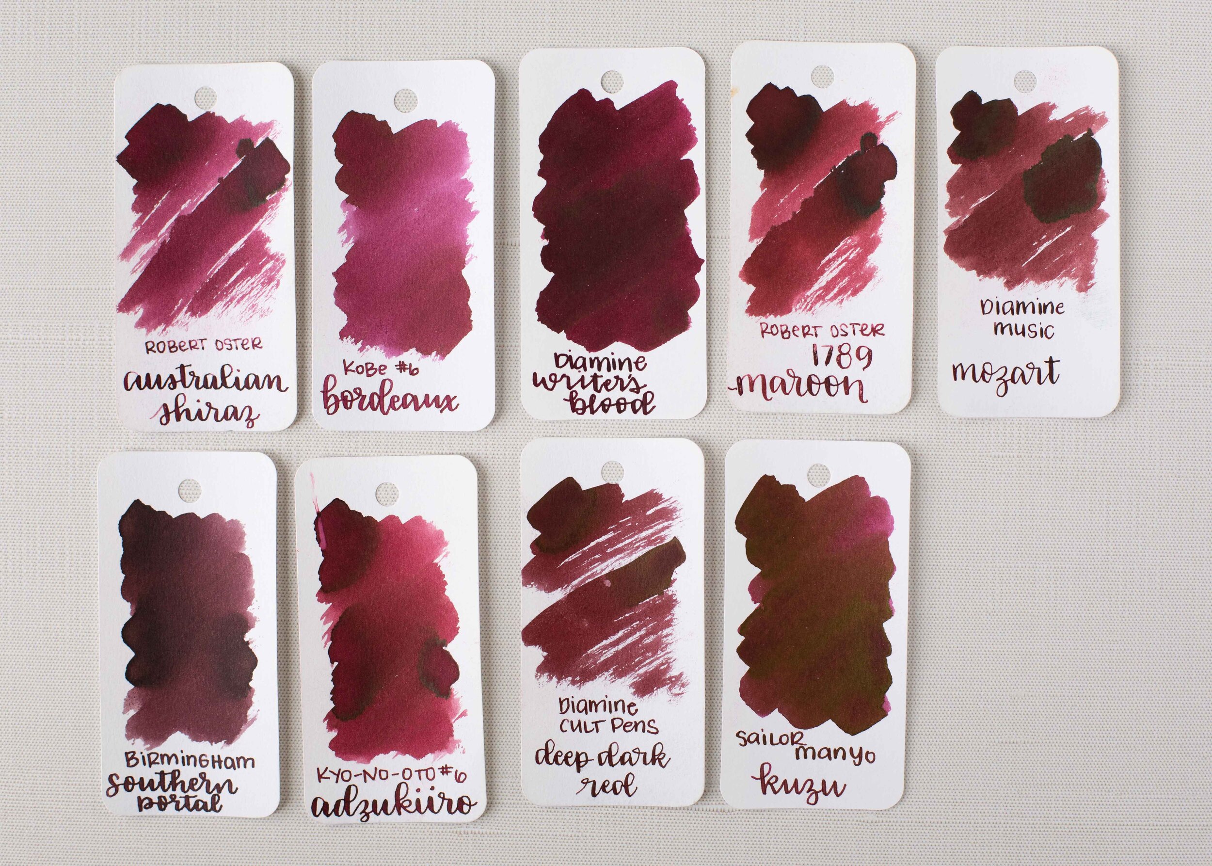
Writer’s Blood is closest to Sailor Manyo Kuzu. Click here to see the Diamine inks together, and click here to see the red inks together.
Longer writing:

I used a Pilot Custom 74 Merlot with a medium nib on a Taroko Enigma notebook. The ink had a wet flow.
Overall, I love how wet this ink is but unfortunately it can take a full minute to dry. It’s a nice dark office-appropriate color.
Disclaimer: I purchased this ink myself and all photos and opinions are my own. This page does contain affiliate links but this post is not sponsored.