Ink Review #1408: Robert Oster Grun Gilt
/
Robert Oster Grun Gilt is from the Shake ‘N’ Shimmy collection. You can find this ink for sale at Pen Chalet (aff. link) or Vanness Pens.

The color:
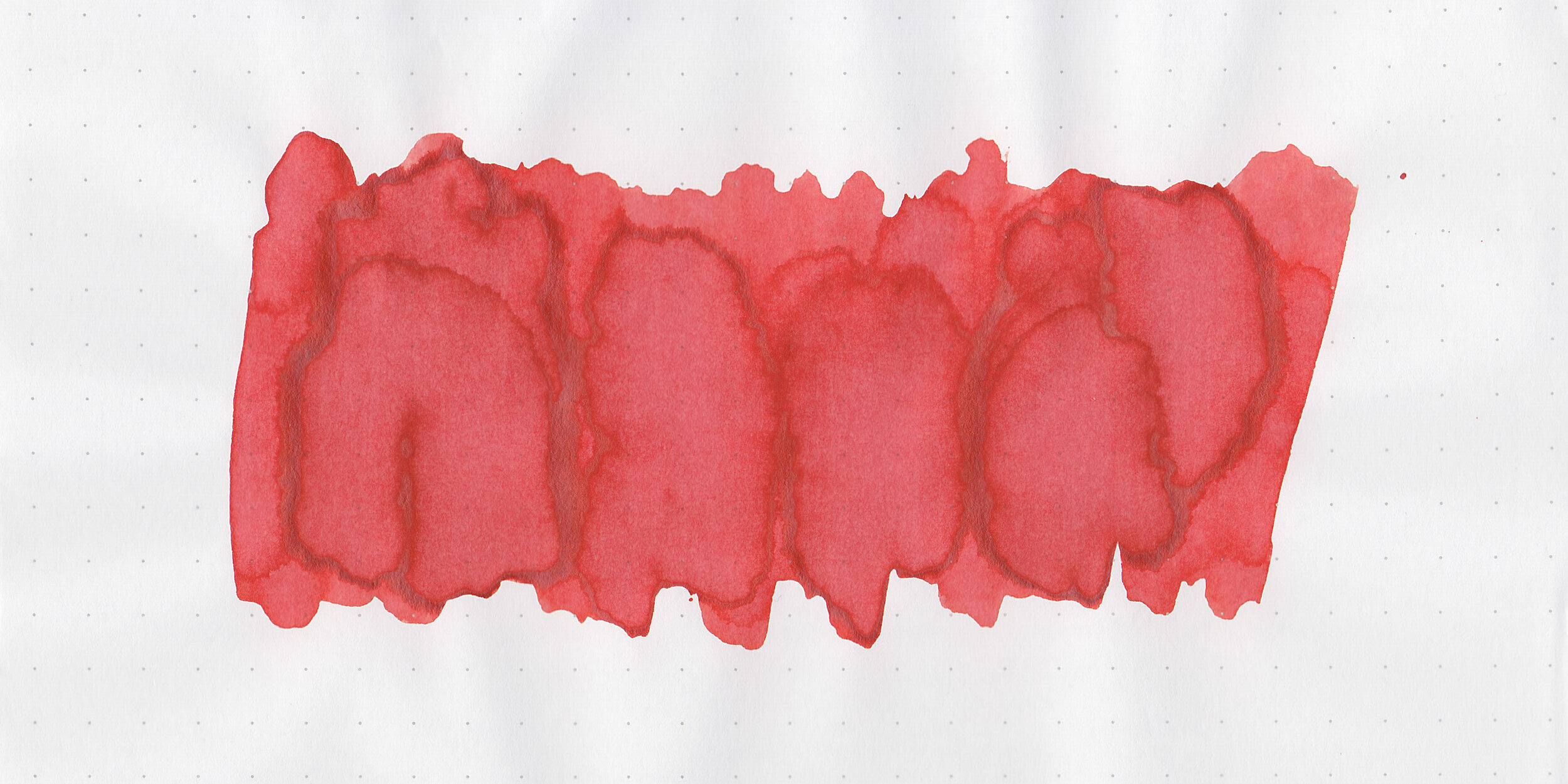
Grun Gilt is a deep golden brown.
Swabs:

In large swabs on Tomoe River paper the ink has plenty of gold shimmer.

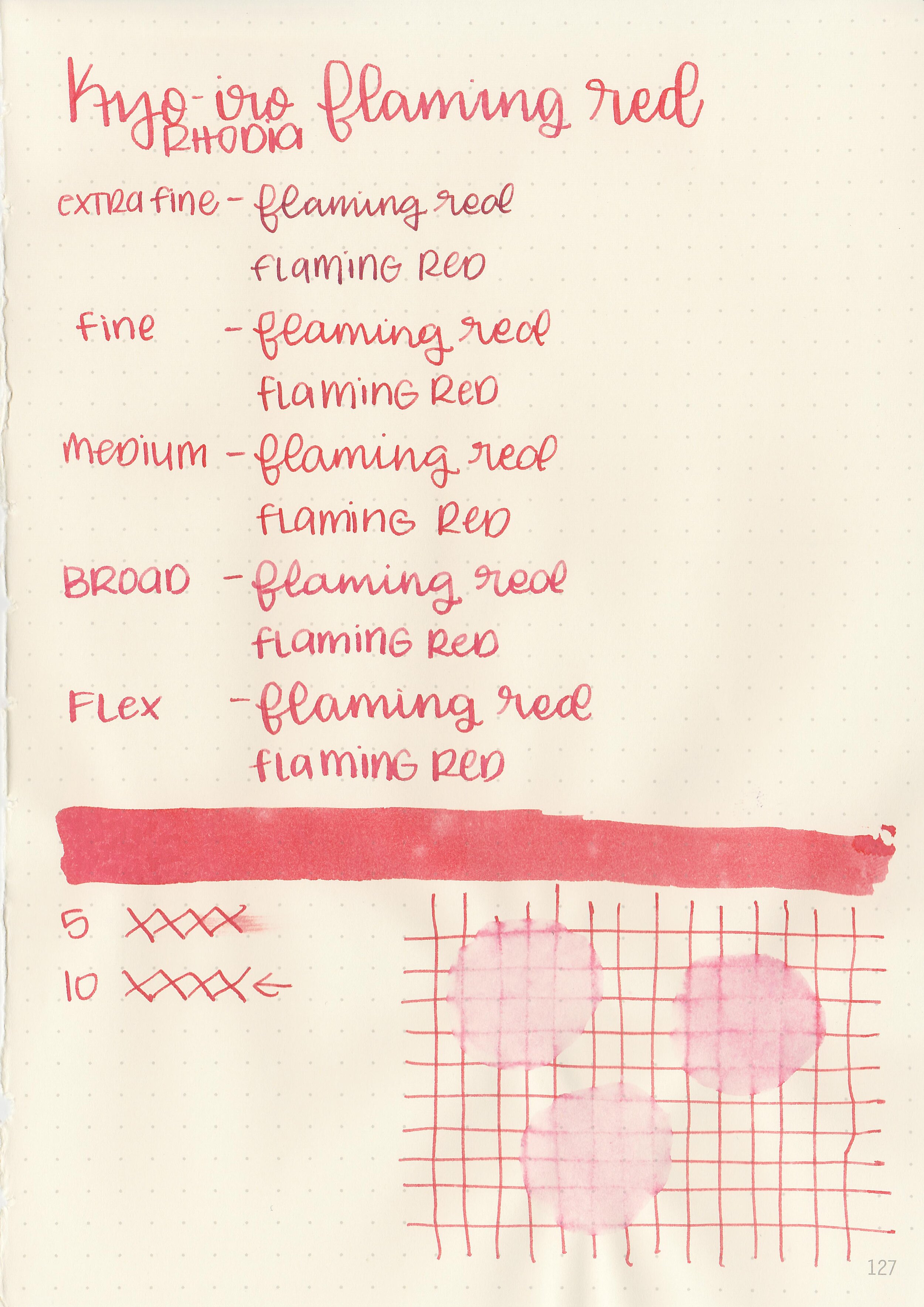
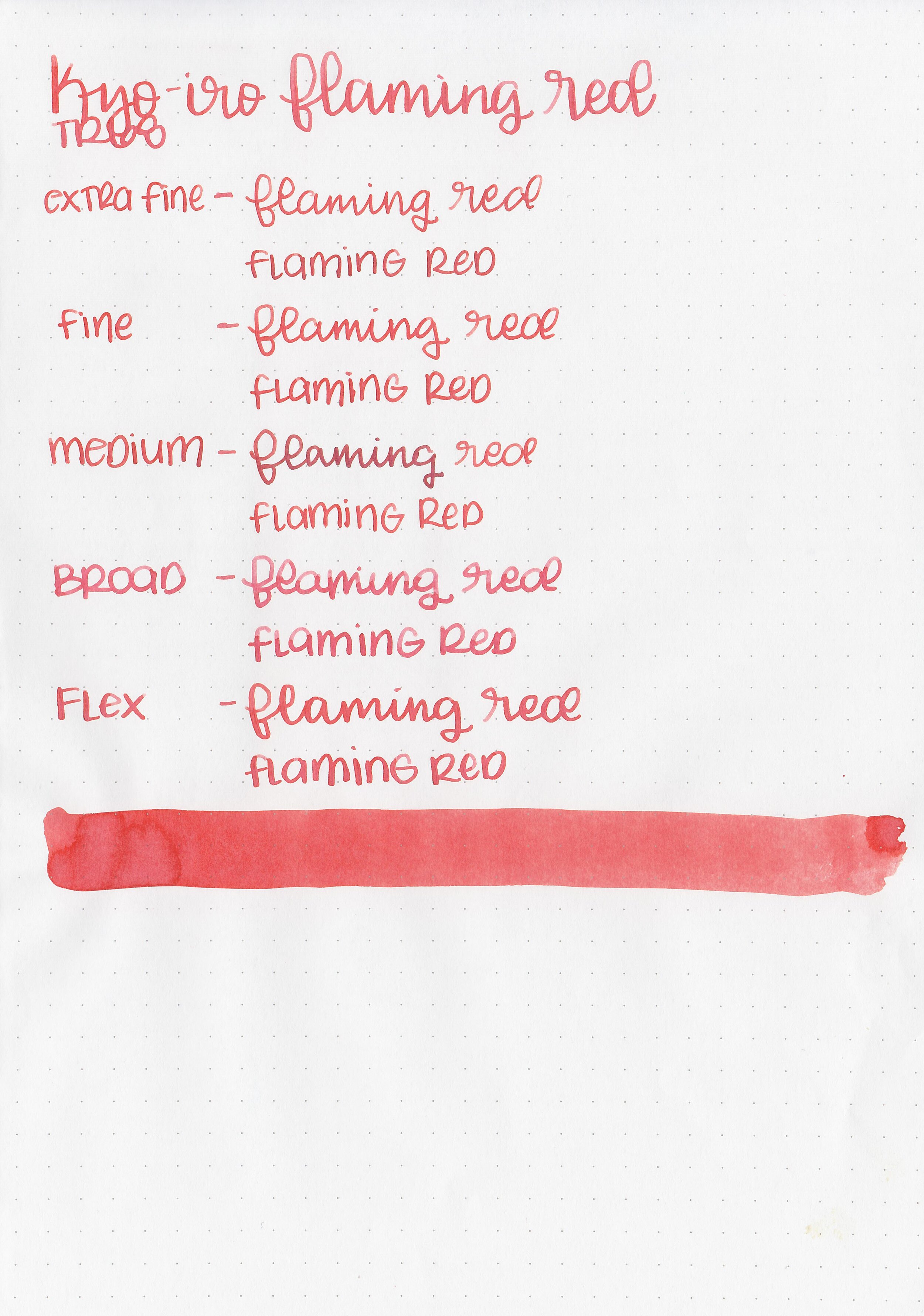
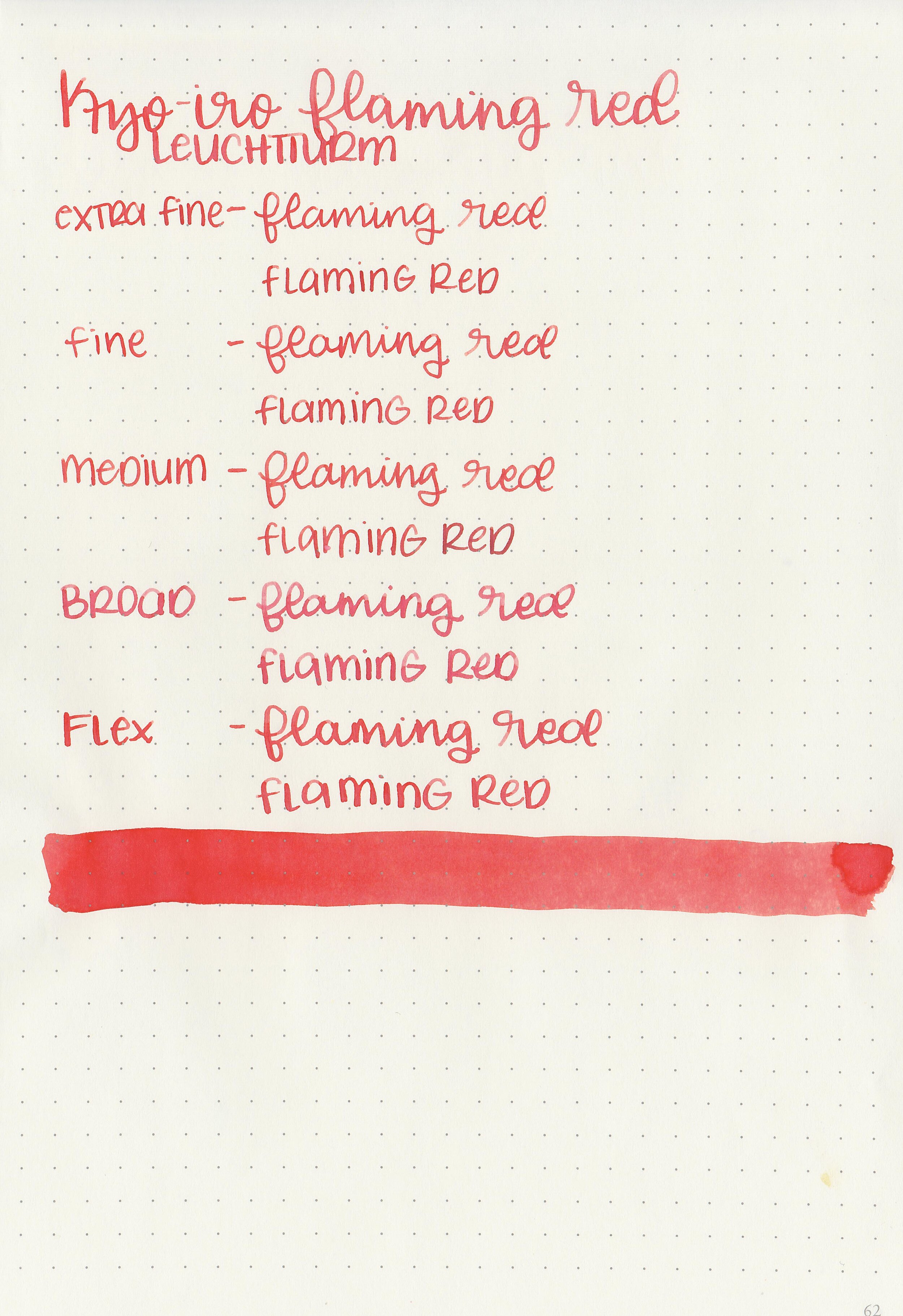
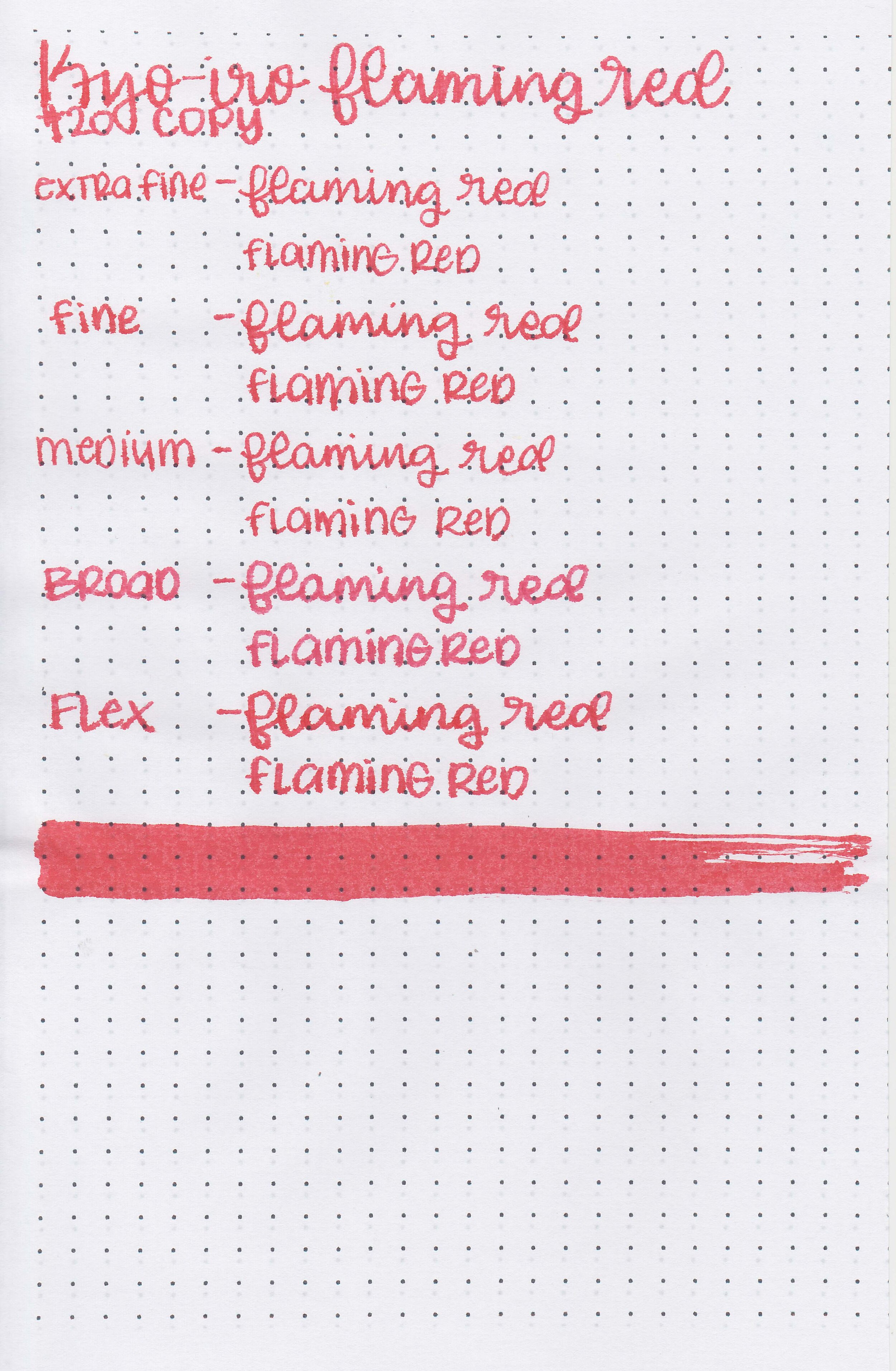
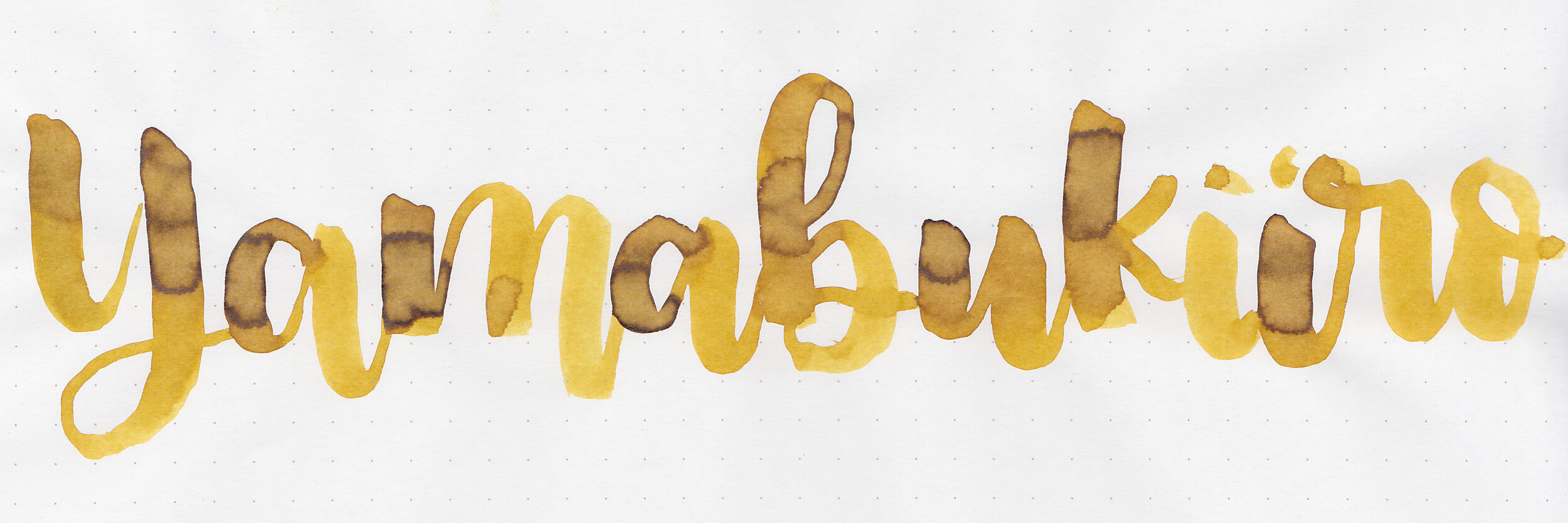
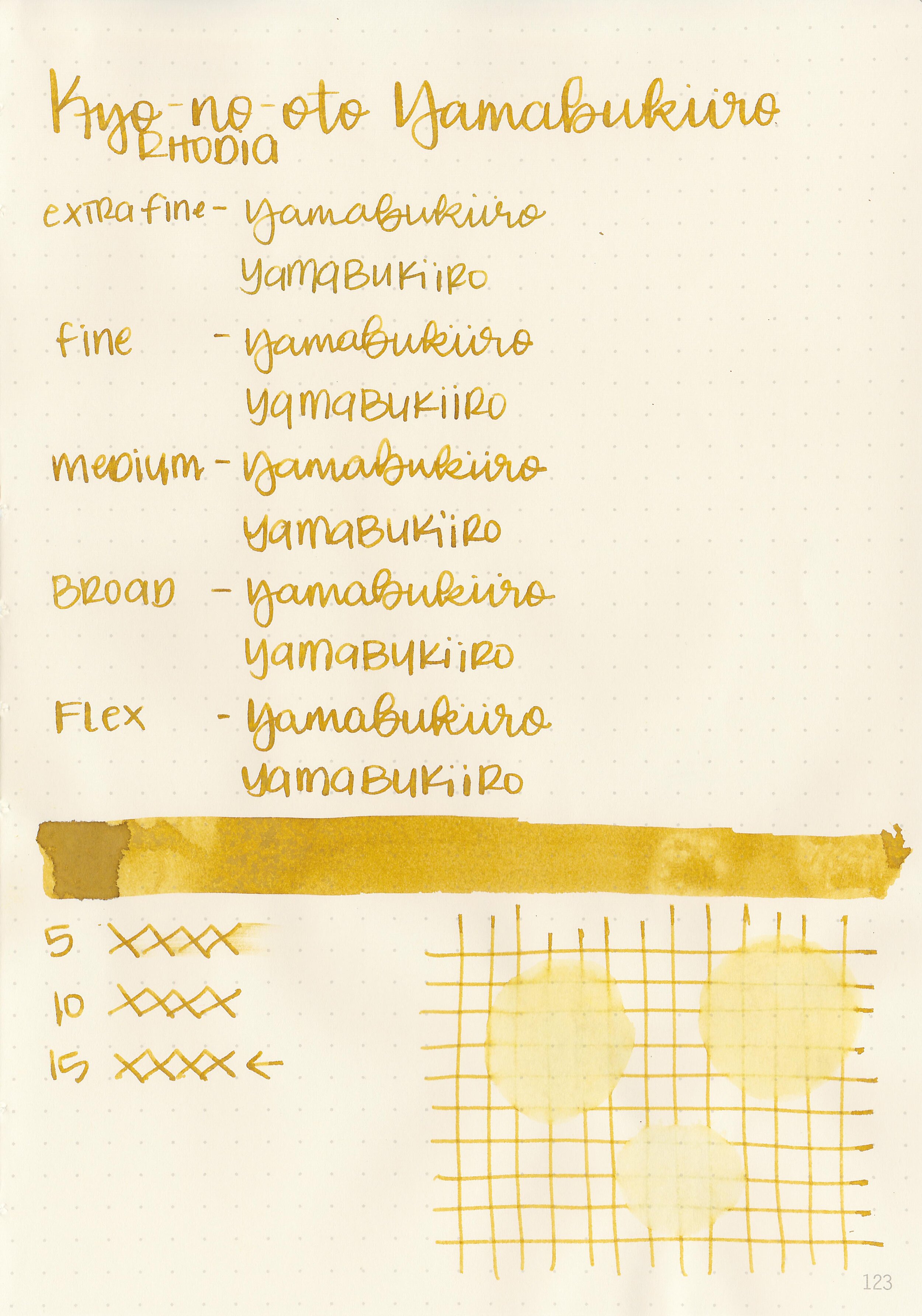
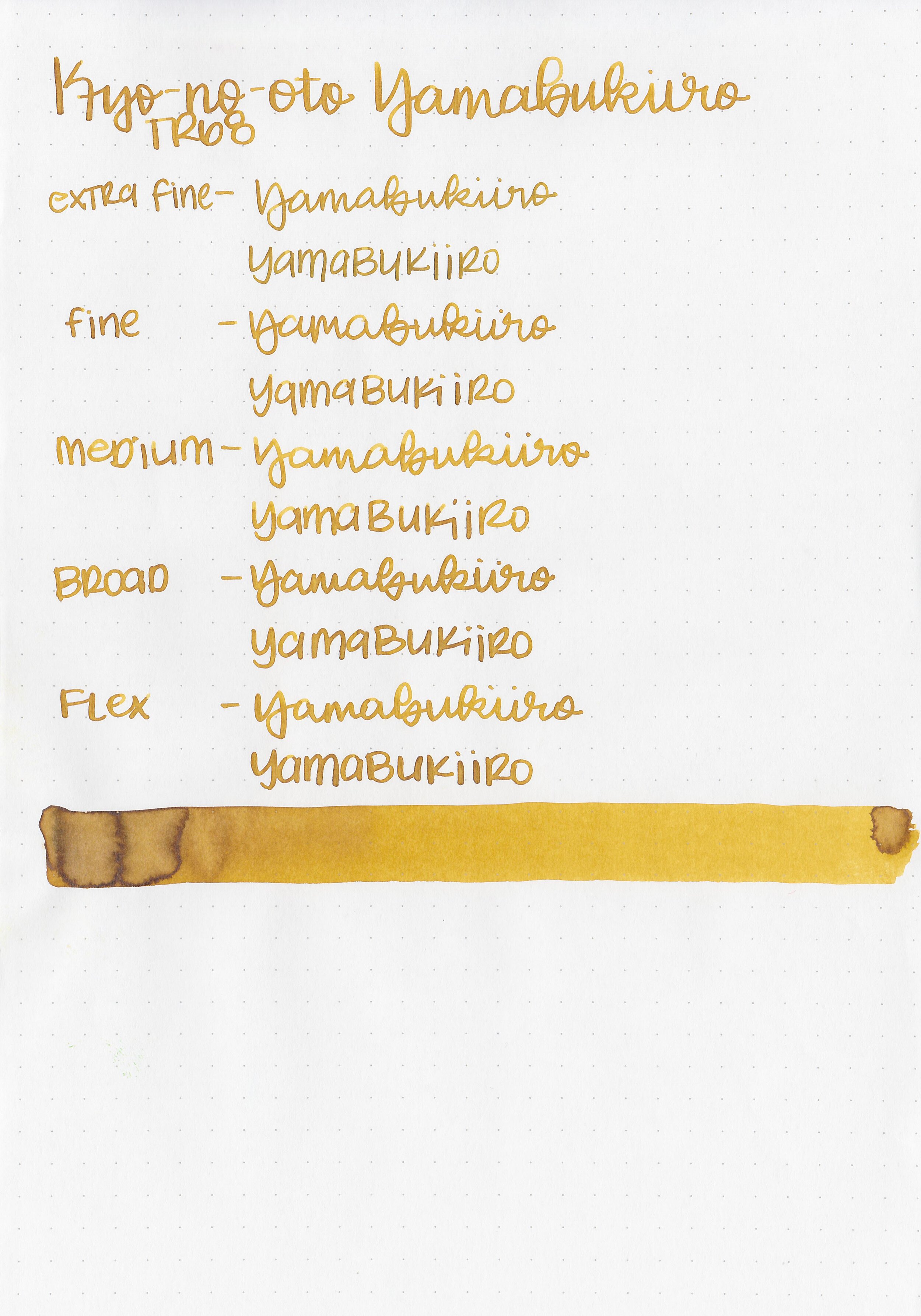
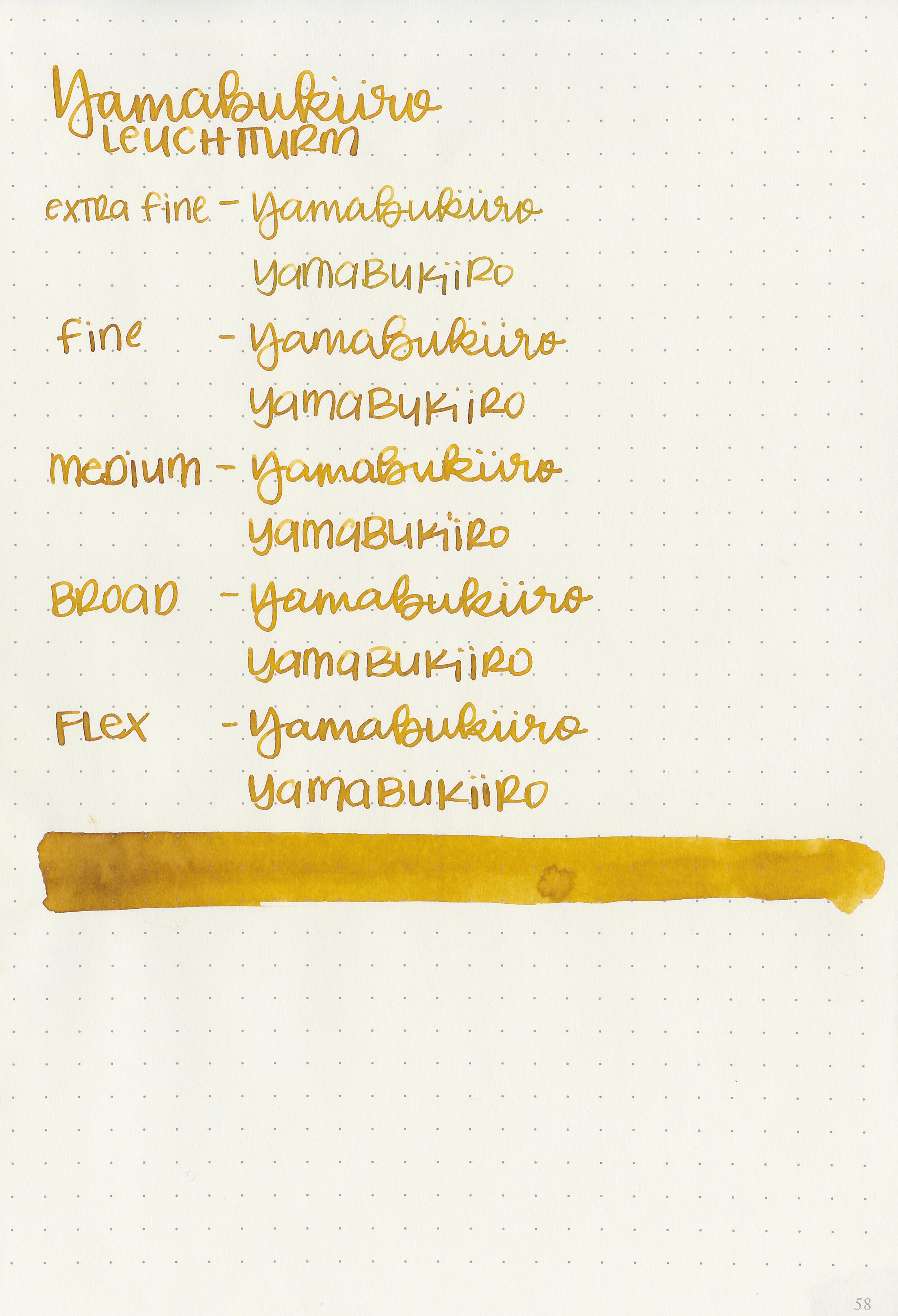
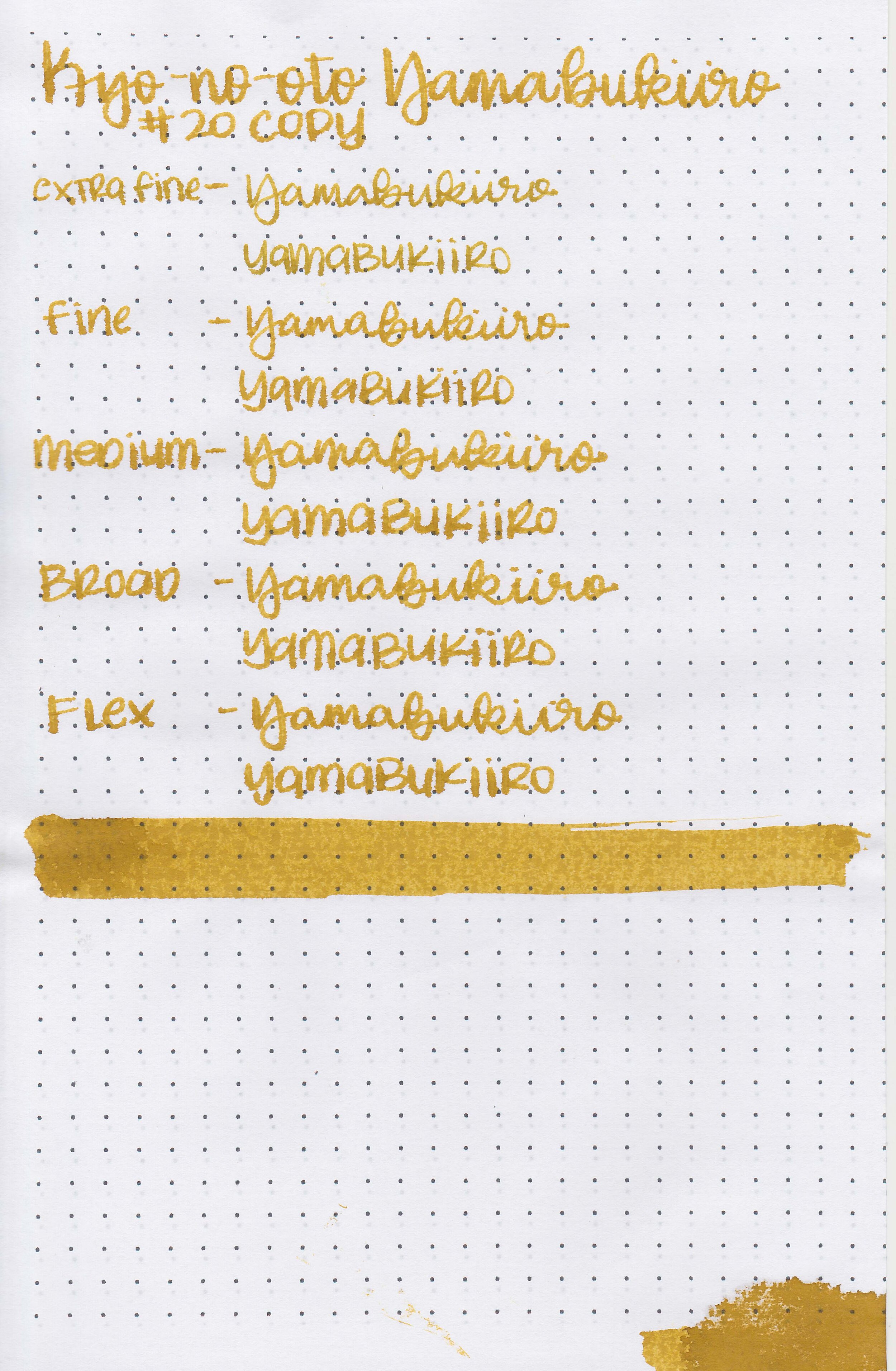
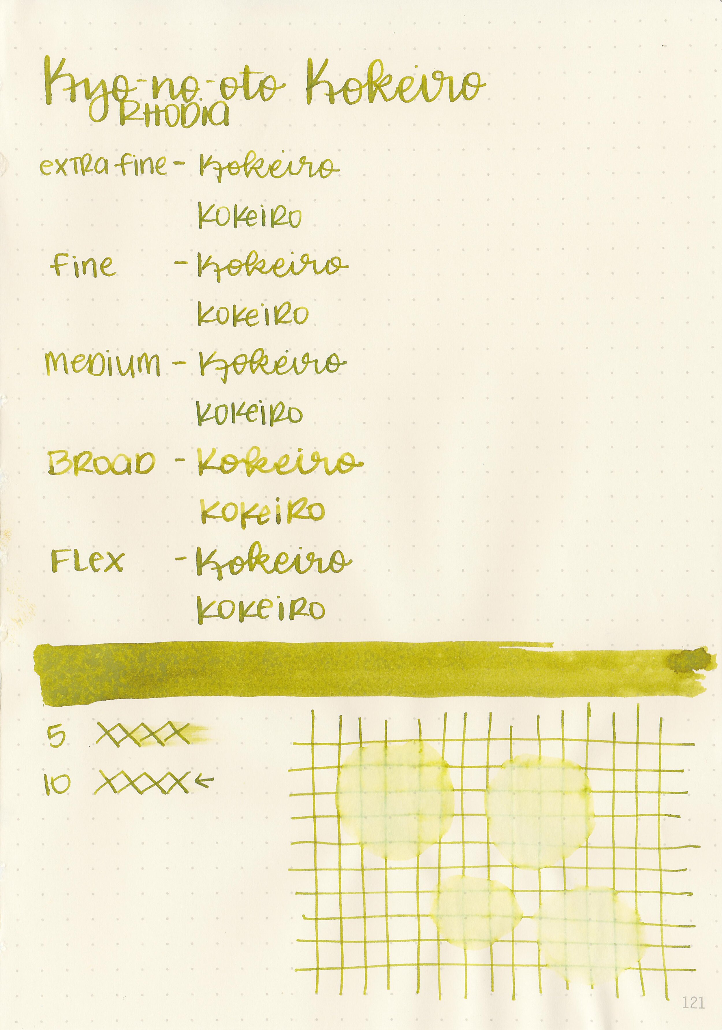
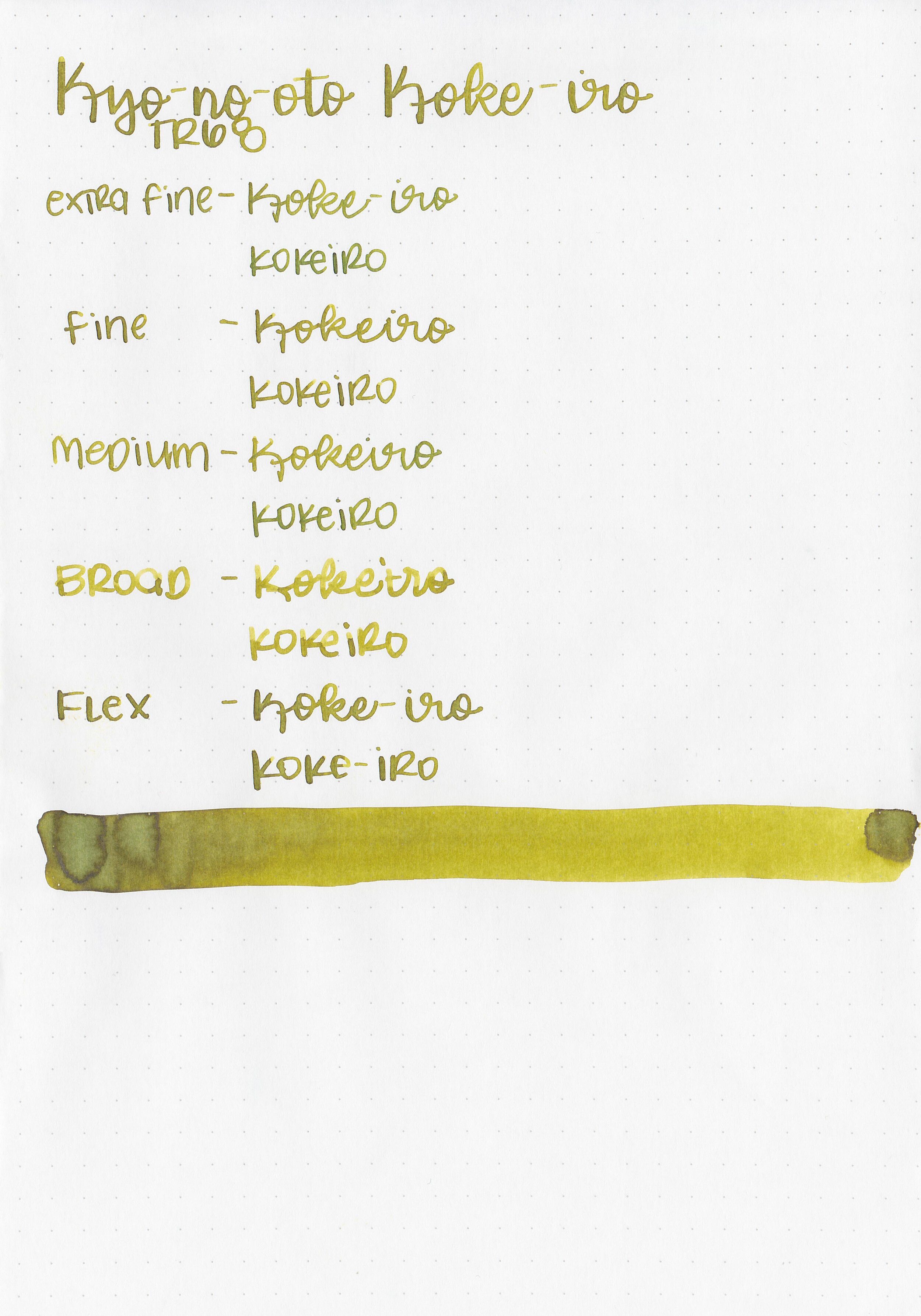
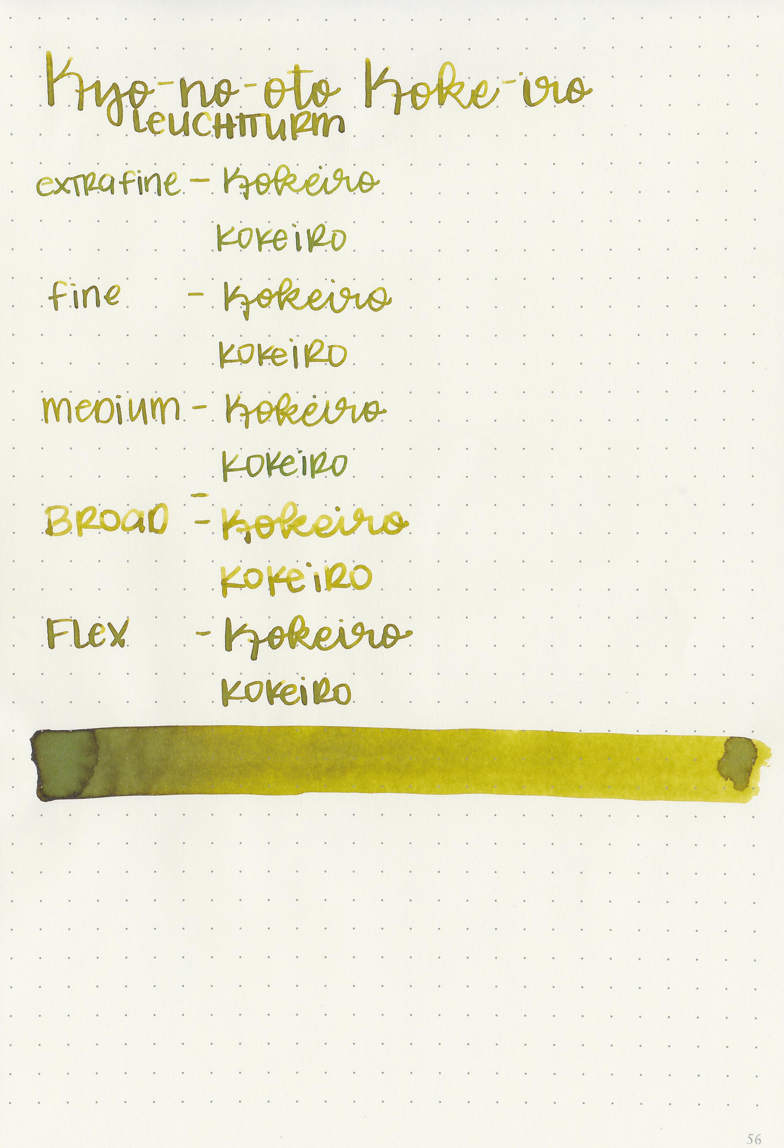
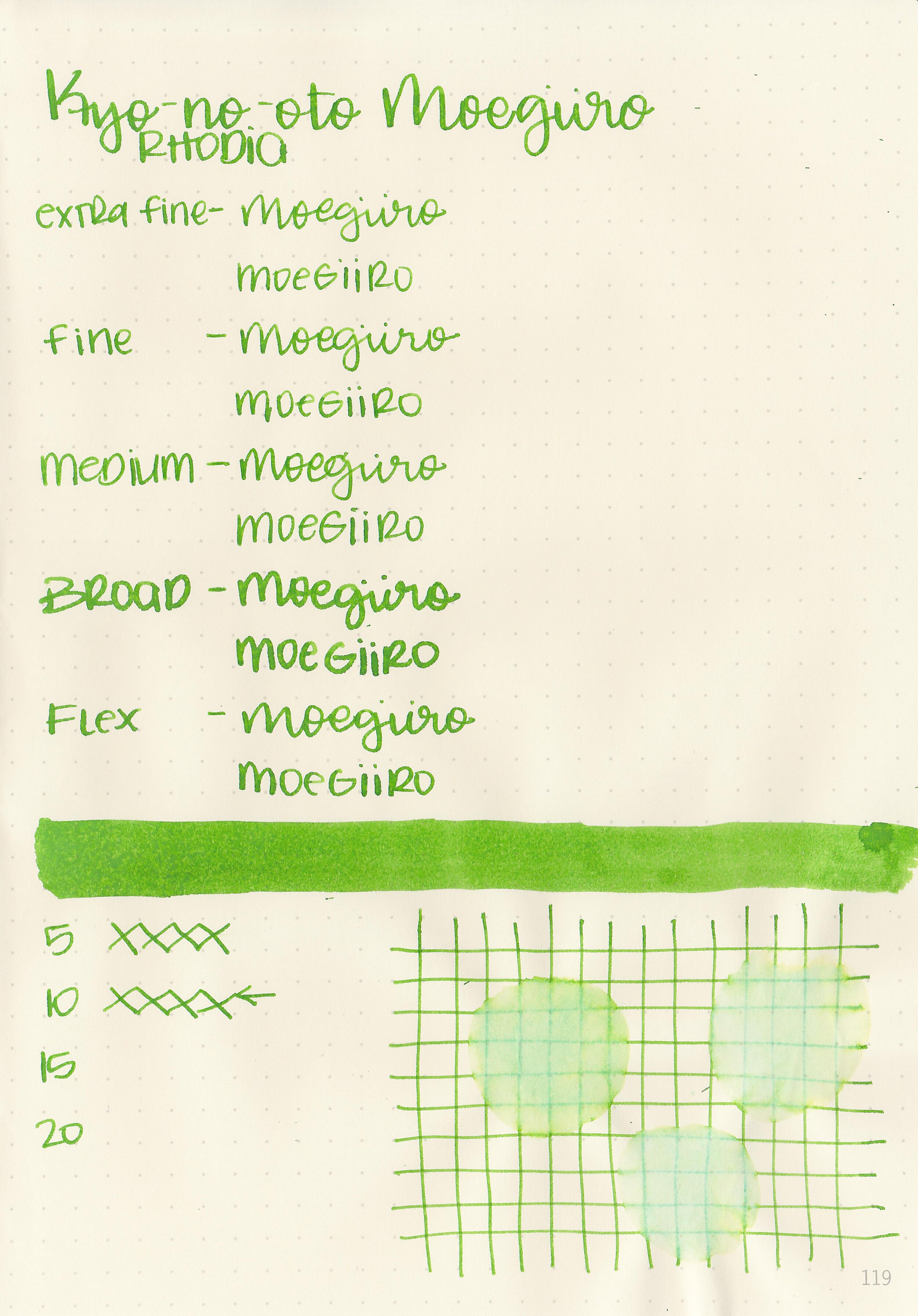
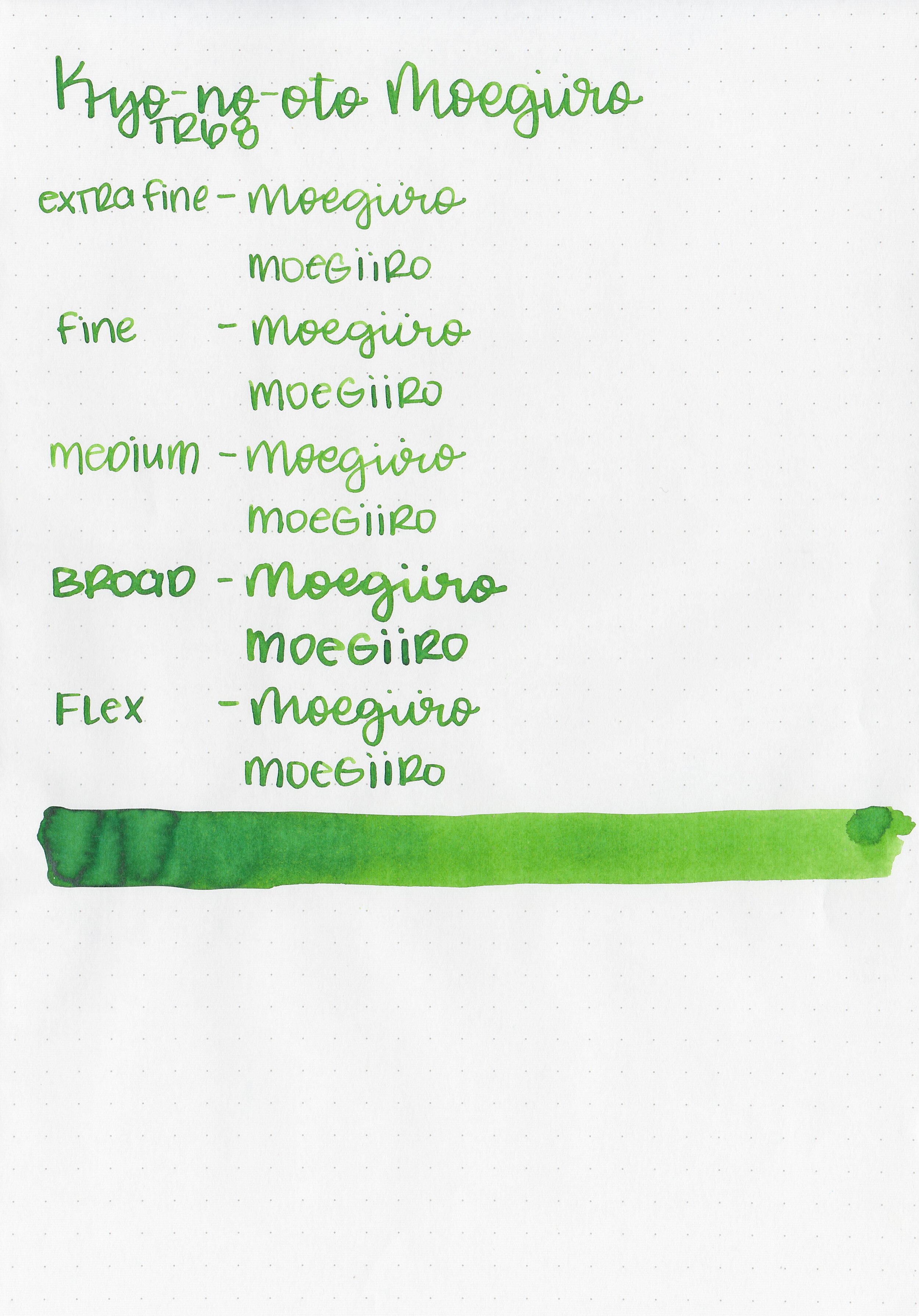
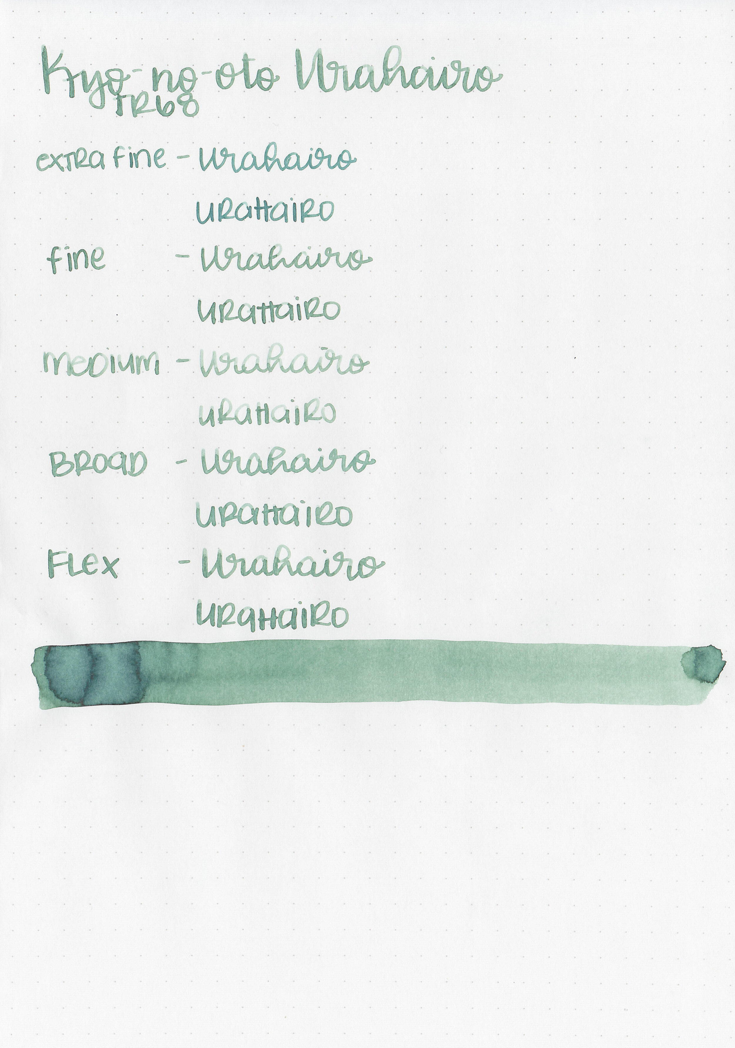
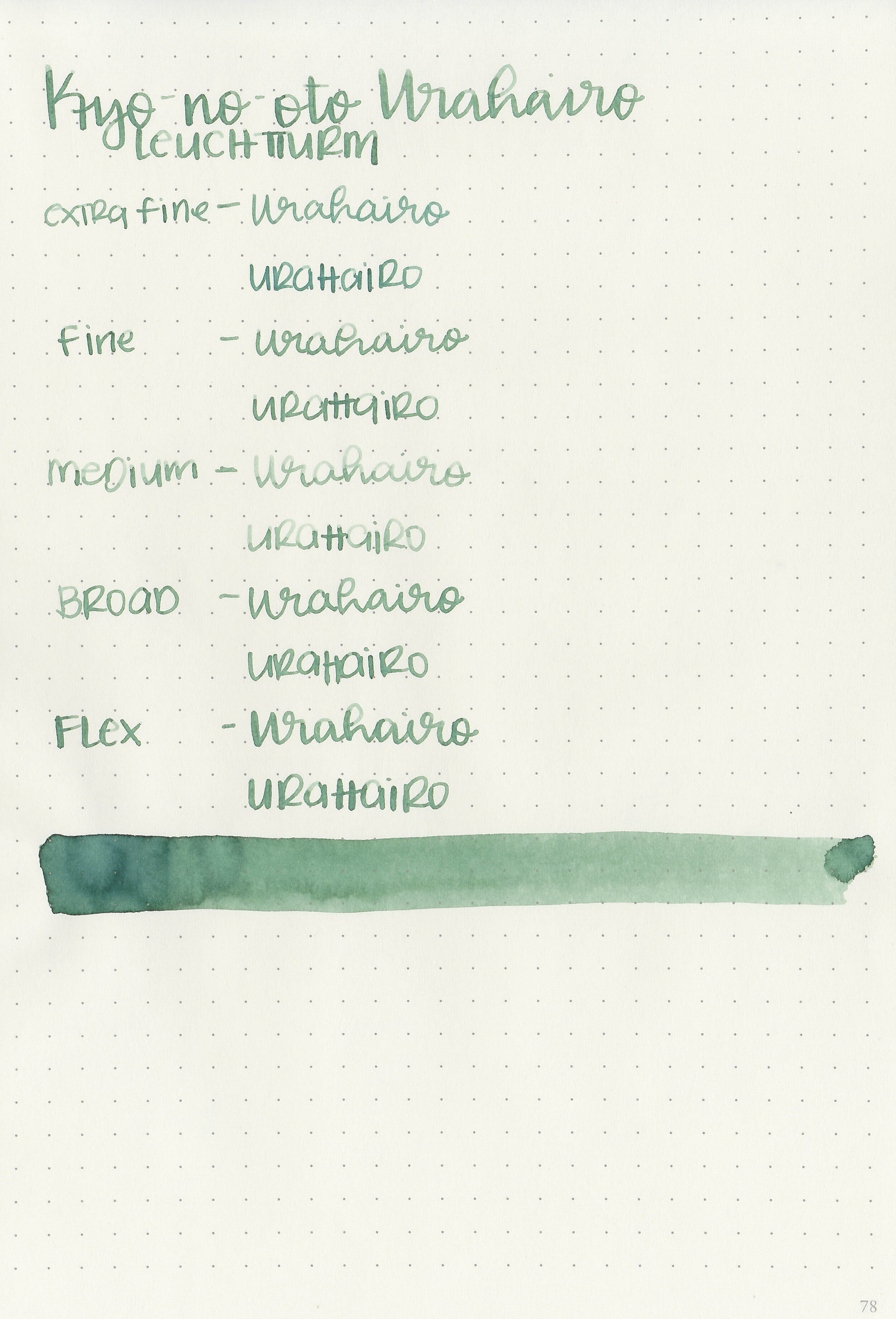
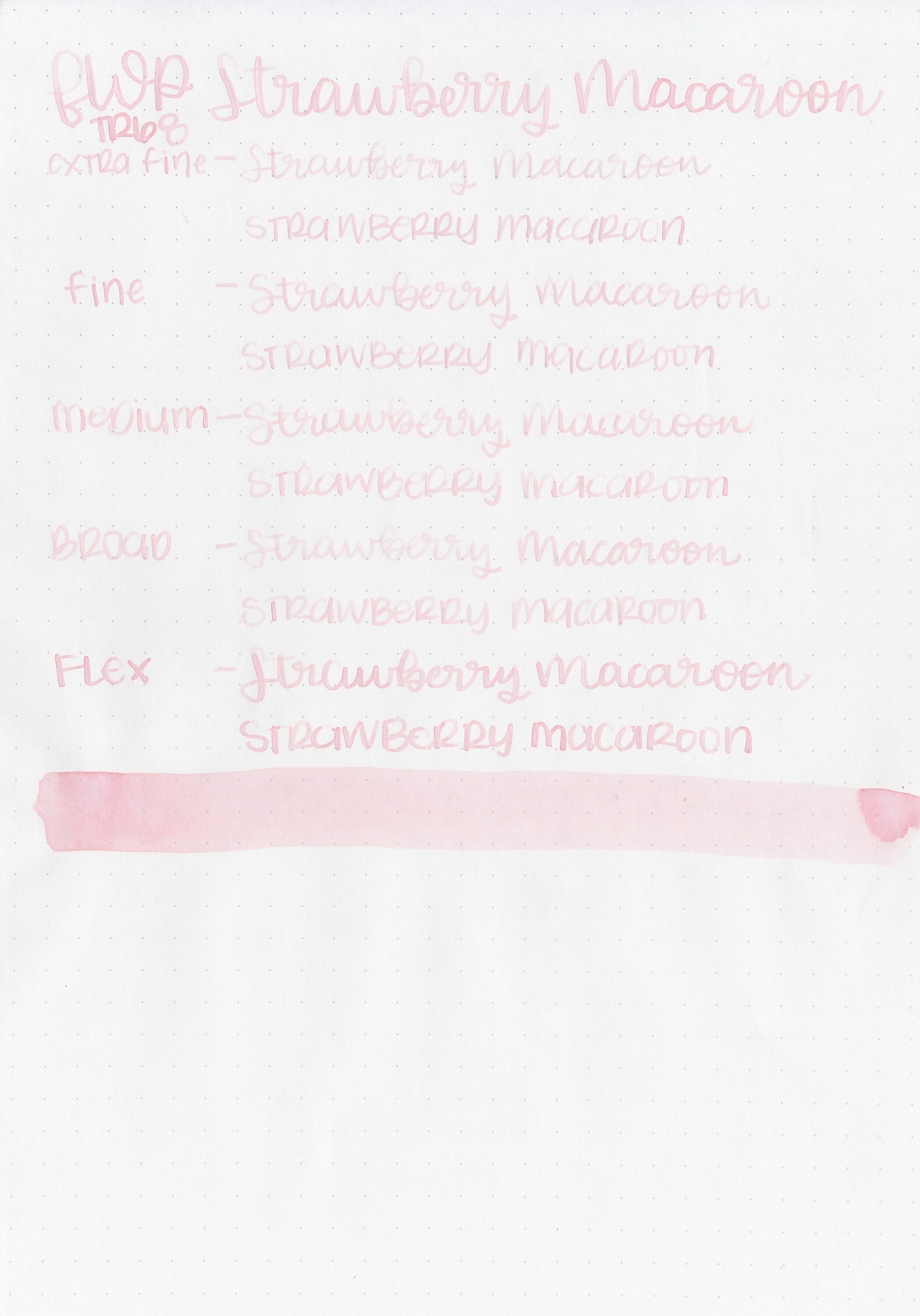
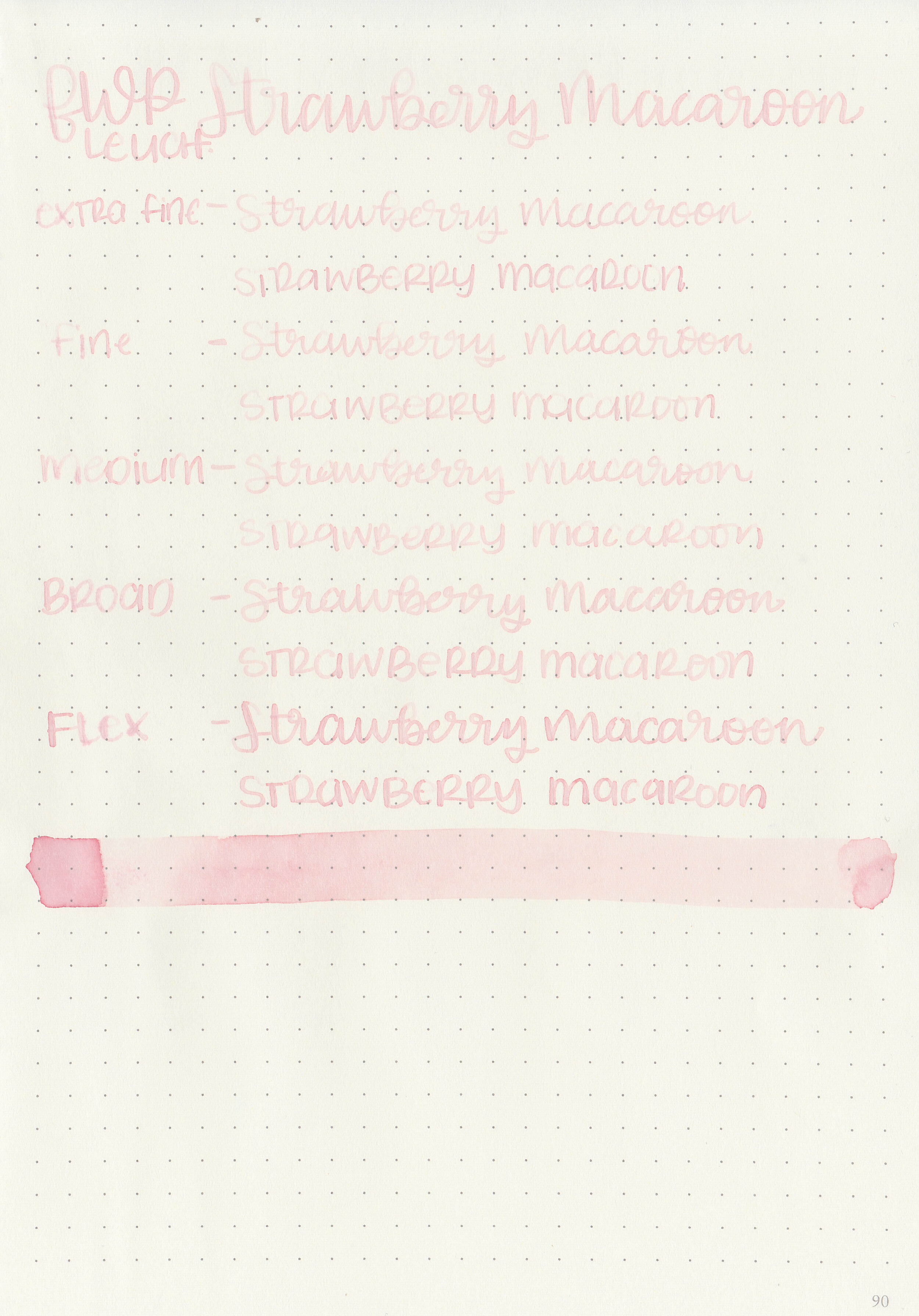
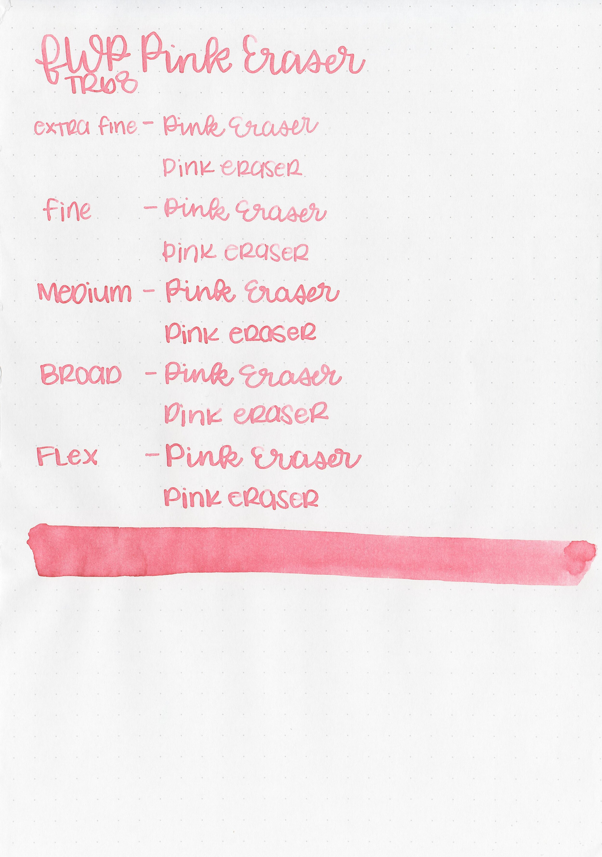
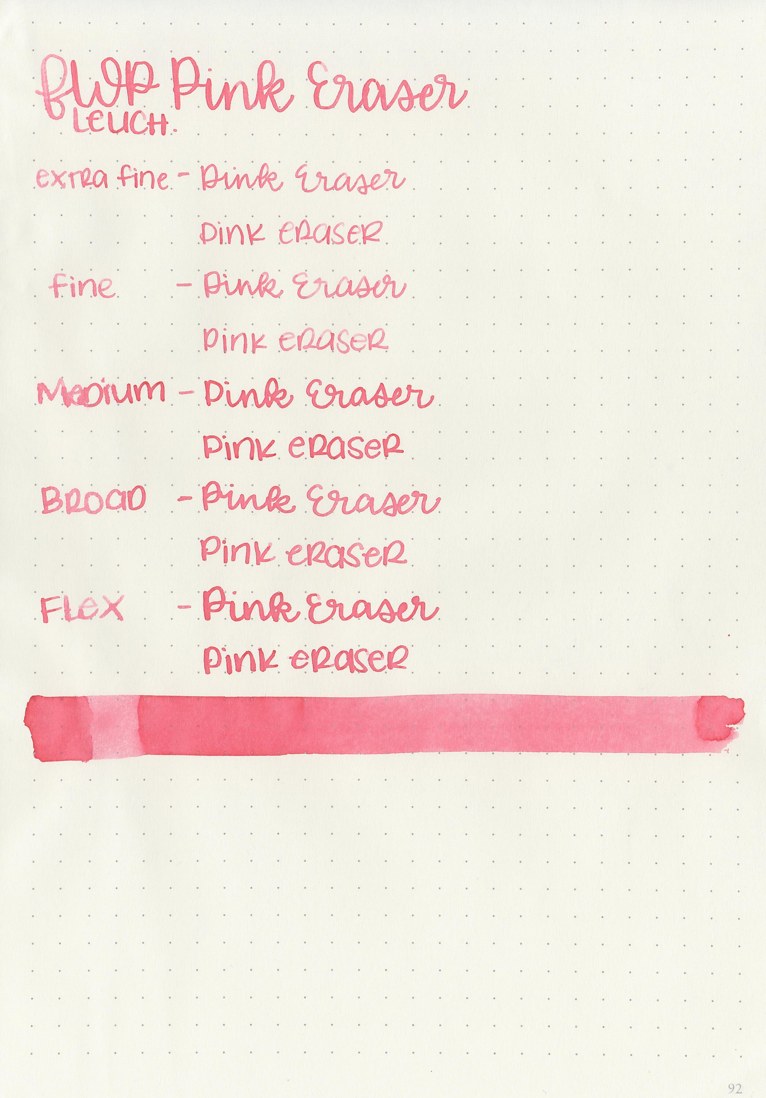
Writing samples:
Let's take a look at how the ink behaves on fountain pen friendly papers: Rhodia, Tomoe River, and Leuchtturm.
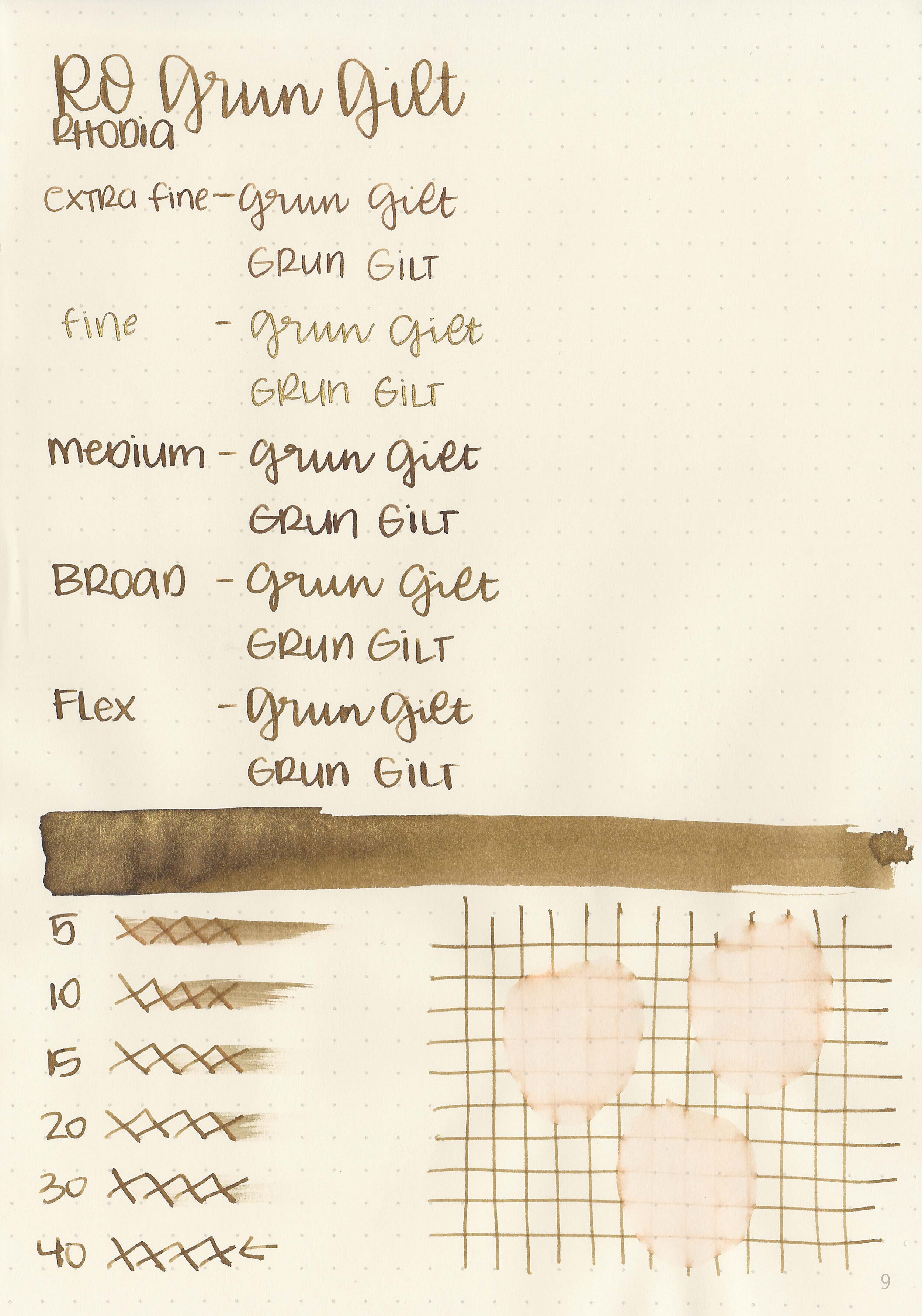
Dry time: 40 seconds
Water resistance: Low
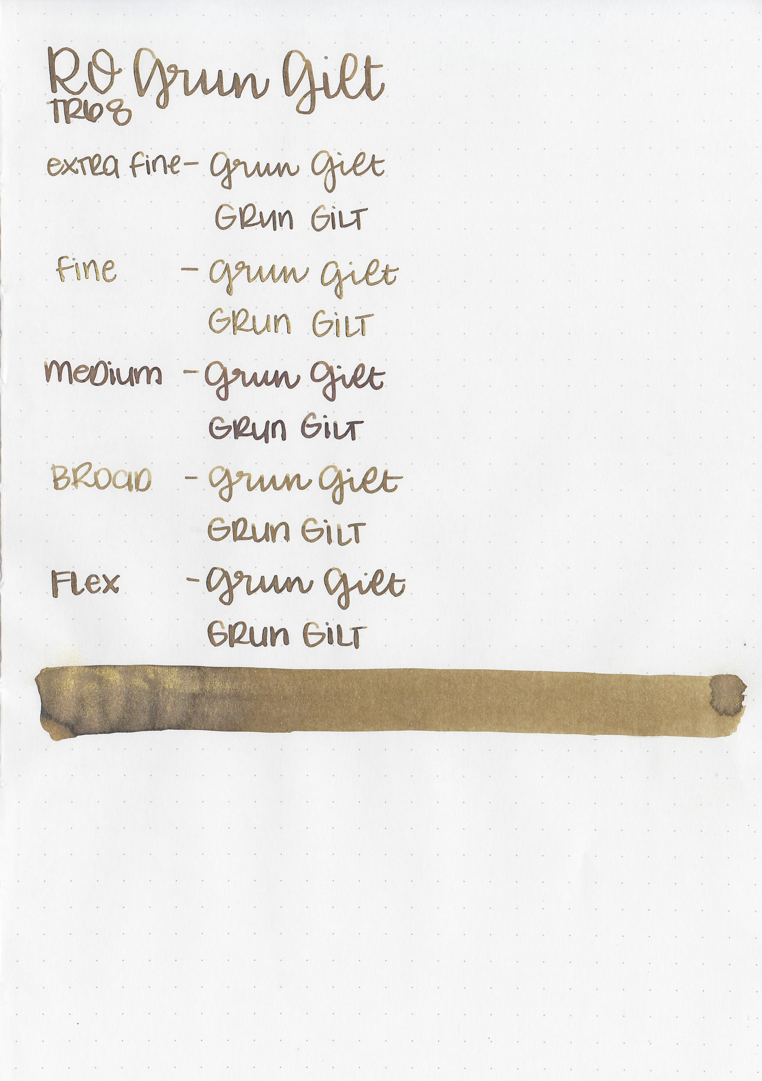
Feathering: None
Show through: Medium
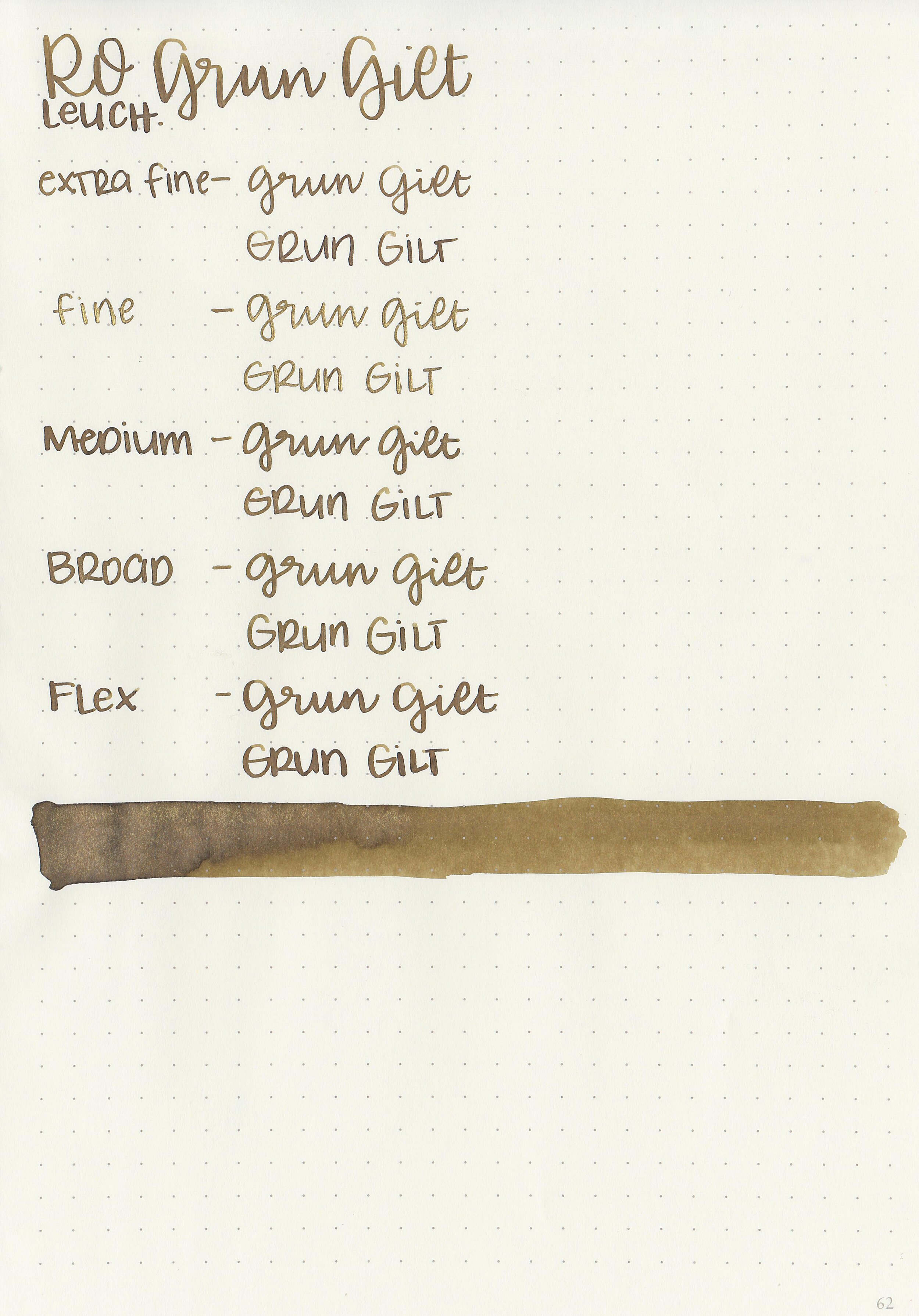
Bleeding: None
Other properties: low shading, no sheen, and gold shimmer.

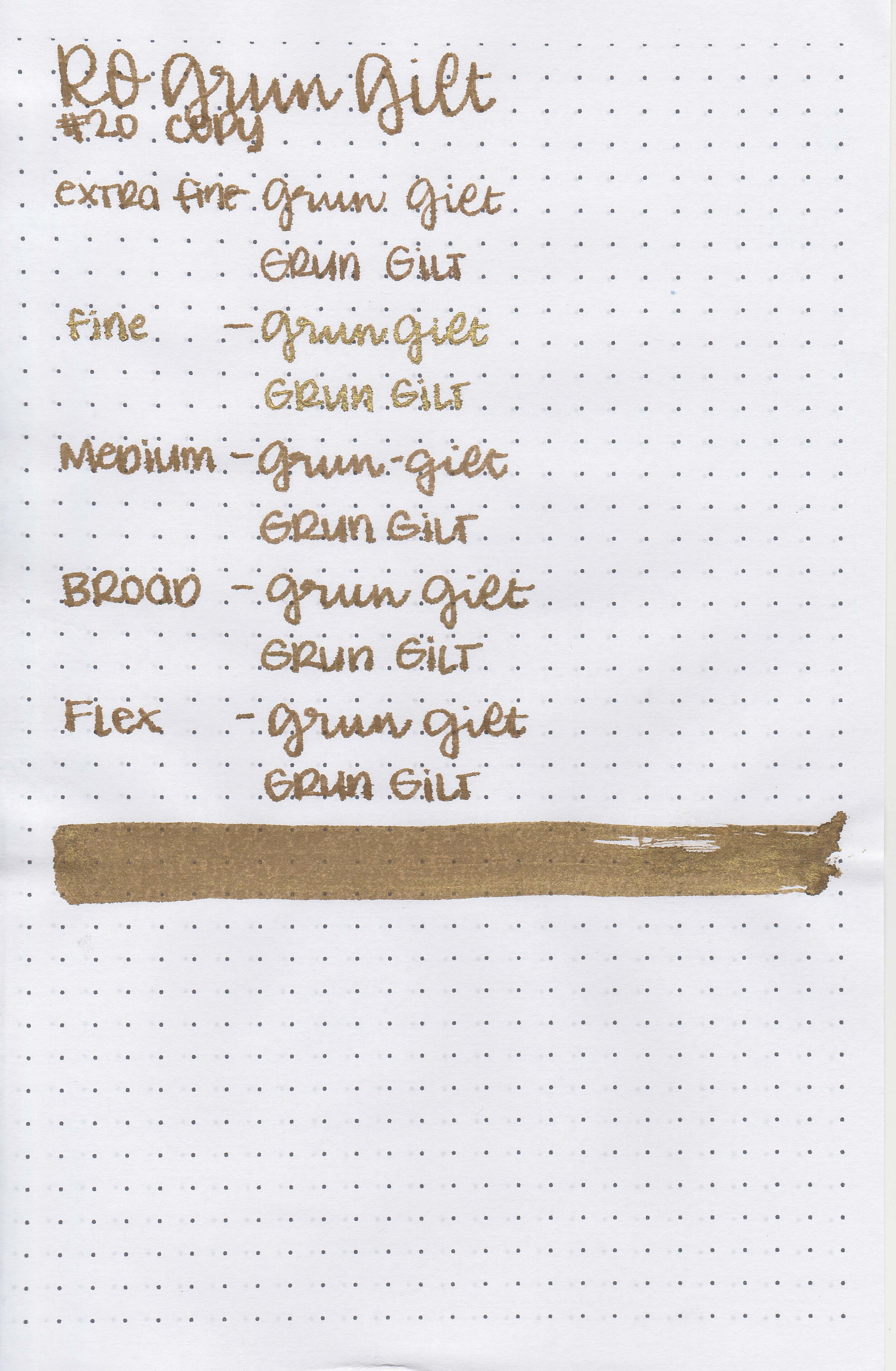
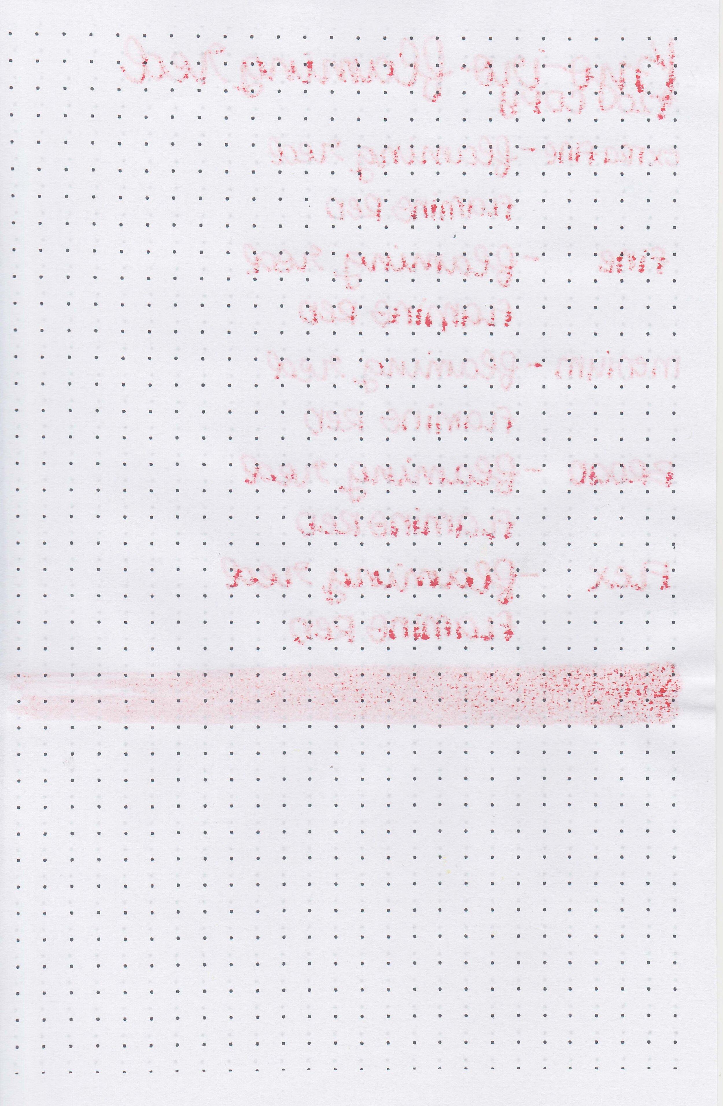
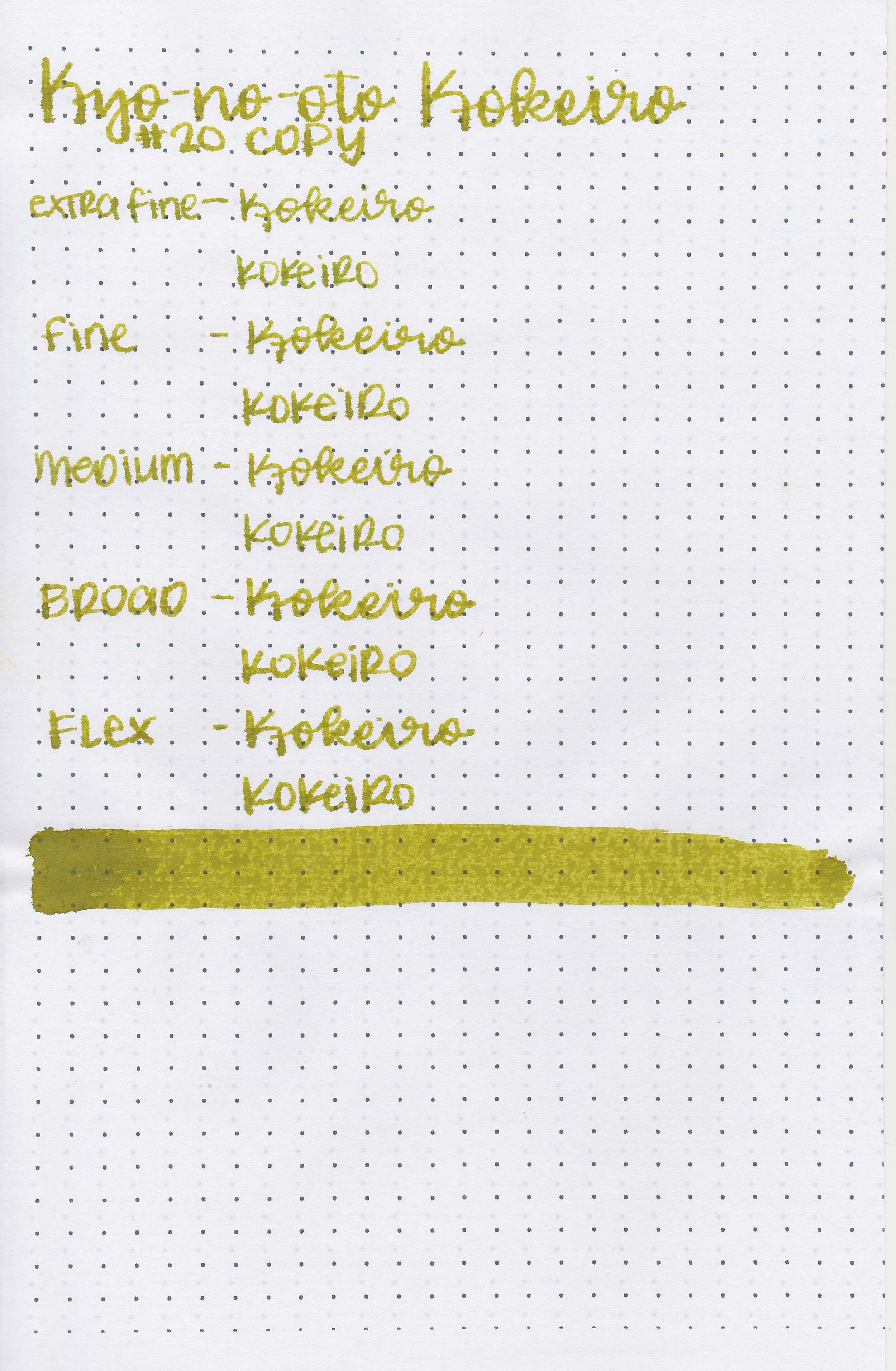
On Staples 24 lb copy paper there was some feathering and bleeding in all nib sizes.
Comparison Swabs:

Grun Gilt is a little bit deeper than Robert Oster Heart of Gold. Click here to see the Robert Oster inks together, and click here to see the yellow inks together.
Longer writing:

I used an Kaweco Al-sport Gold with a fine nib on a Taroko Enigma notebook. The ink had a dry flow.
Overall, this ink is very close to Robert Oster Heart of Gold (which I actually like better than this one) so you probably don’t need both. It’s just a little dry but other than that it’s well behaved.
Disclaimer: All photos and opinions are my own. This page does contain affiliate links but this post is not sponsored in any way.