Colorverse Pillars of Creation & Mystic Mountain

cv-pillars-creation-3.jpg

Colorverse Pillars of Creation & Mystic Mountain are from the new Colorverse Season 7: Eye on the Universe. When I first saw swabs for Season 7 I immediately knew these two were probably going to be my favorite. Pillars of Creation comes in a 65ml bottle and Mystic Mountain in a 15ml bottle. You can find this ink for sale at Pen Chalet.

Swabs:

cv-pillars-creation-s-5.jpg

Left to right: Pillars of Creation is a deep grape purple and Mystic Mountain is a light cornflower blue. As soon as I swabbed these myself Pillars of Creation immediately reminded me of Diamine Handel (which I love) so you will see them compared below.

cv-pillars-creation-4.jpg

In large swabs on Tomoe River paper, Pillars of Creation has some gorgeous green sheen, Mystic Mountain has lots of pink shimmer.

cv-pillars-creation-5.jpg

Writing samples:

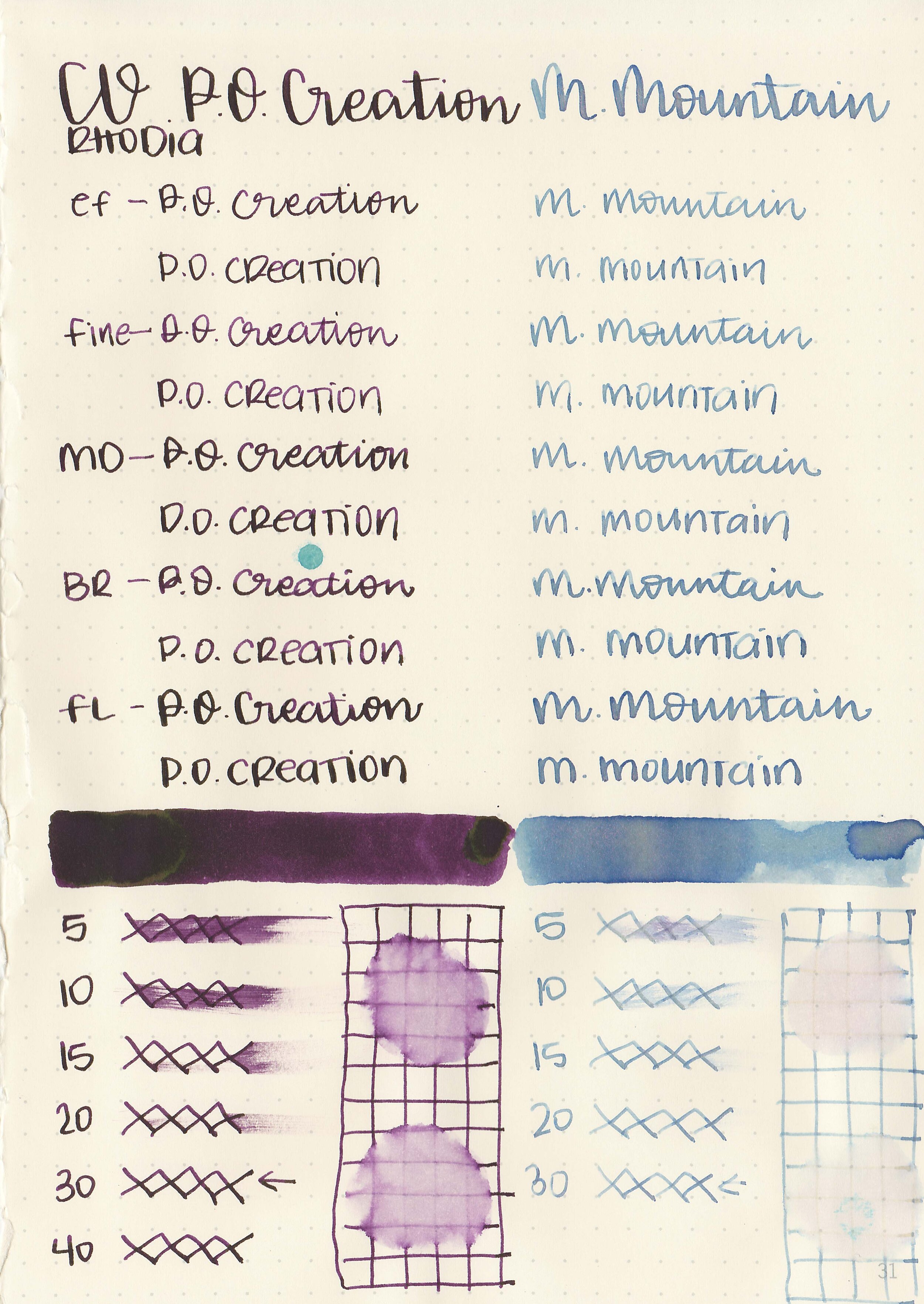
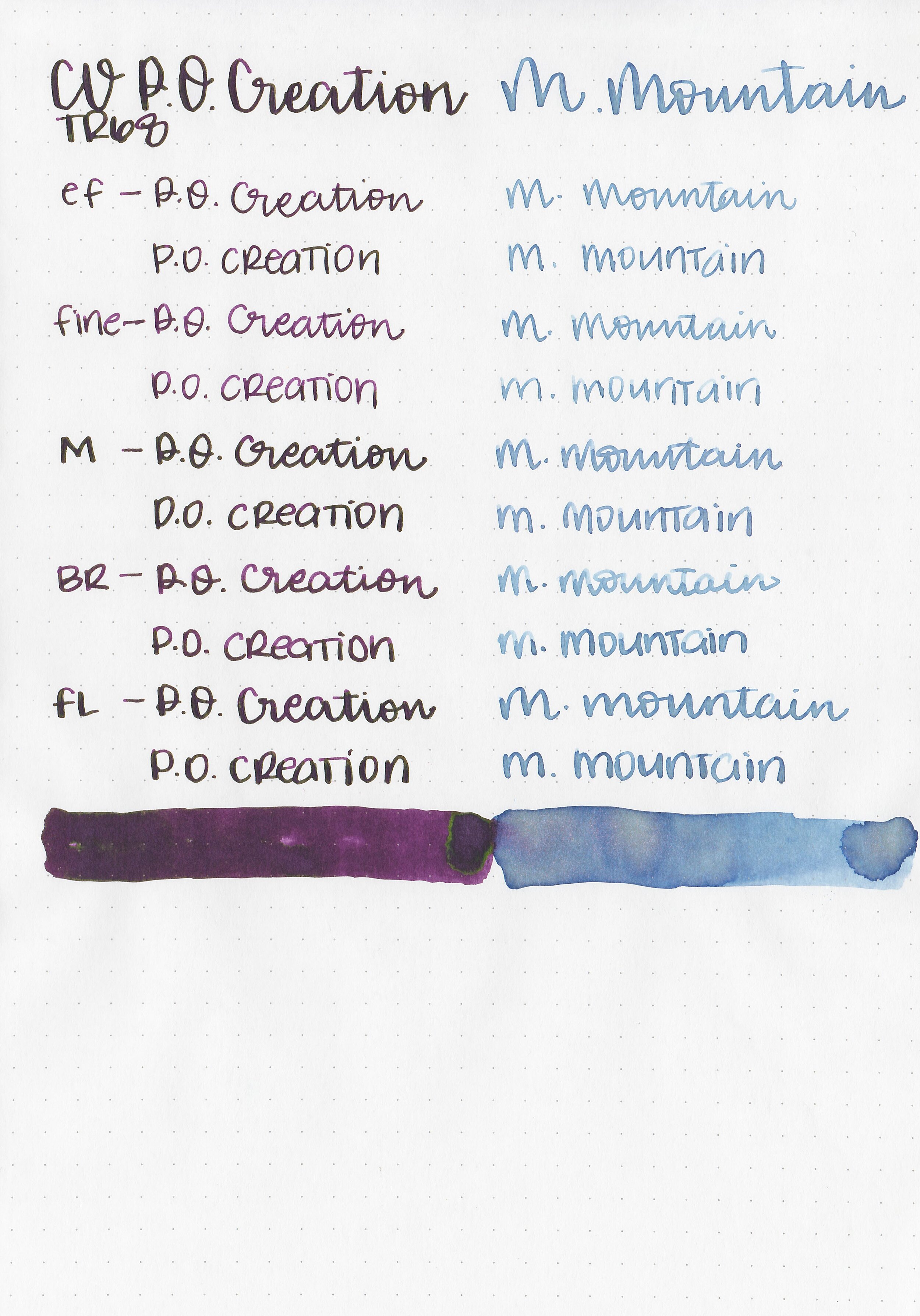
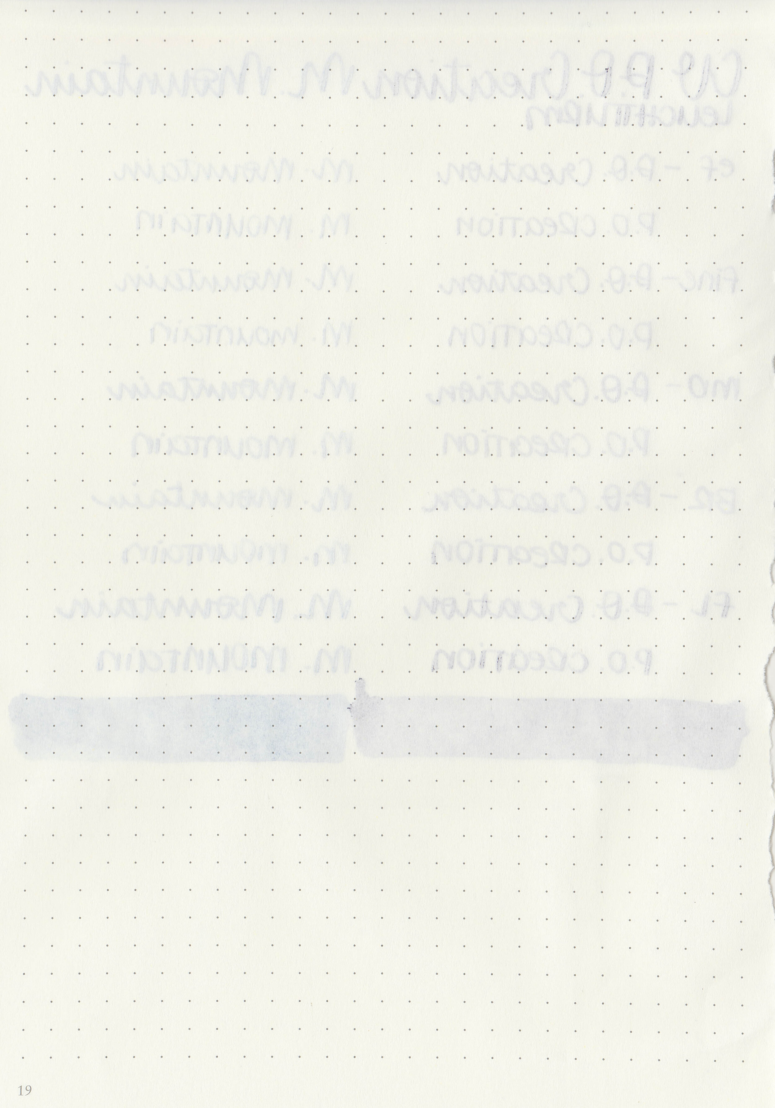
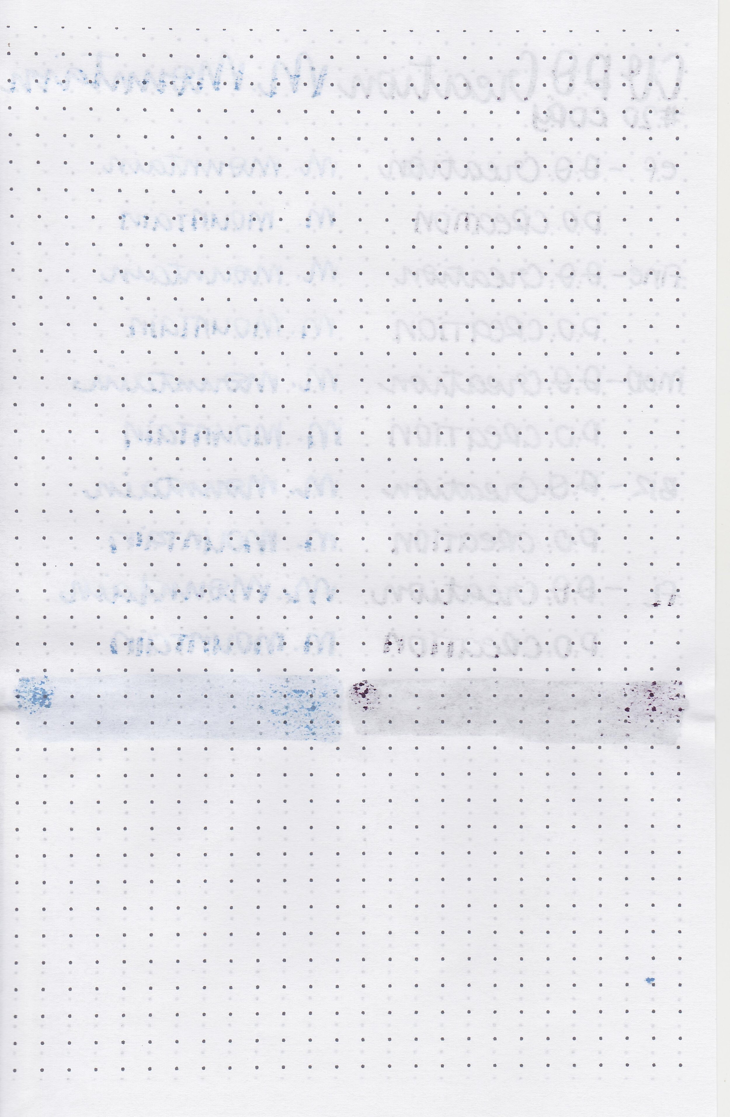
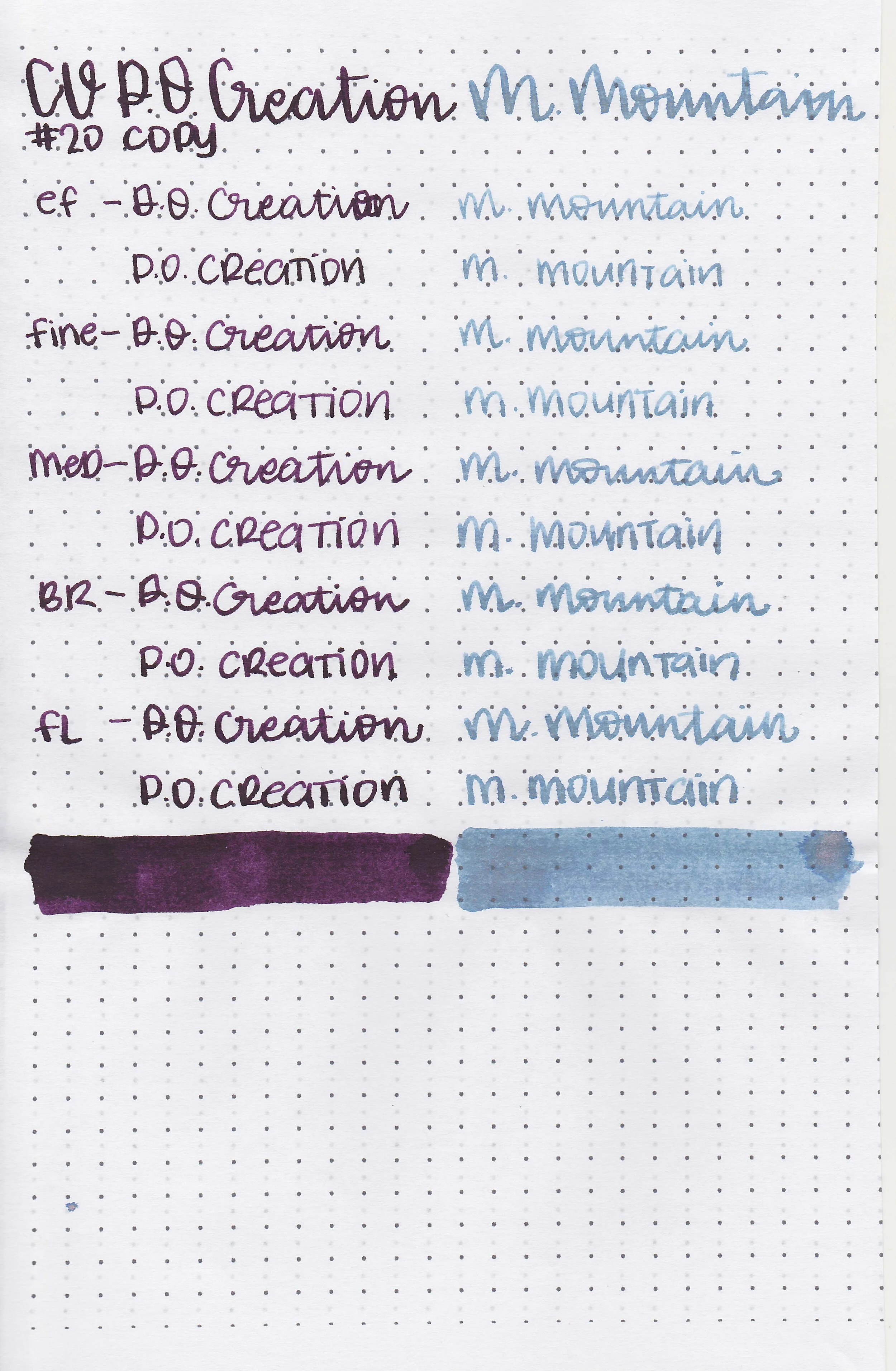
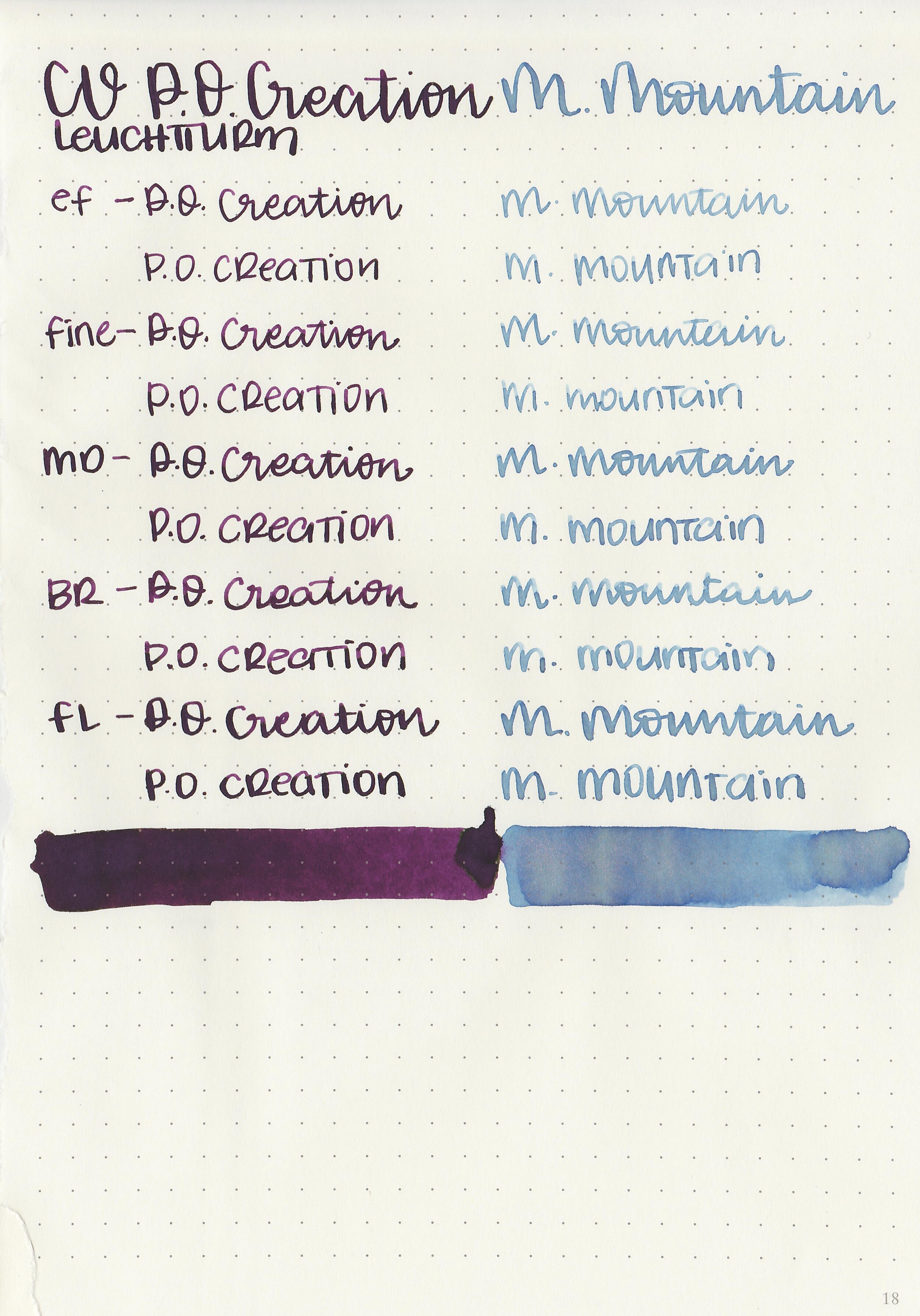
Let's take a look at how the ink behaves on fountain pen friendly papers: Rhodia, Tomoe River, and Leuchtturm.

Dry Time: 30 seconds

Water Resistance: Medium

Feathering: None

Show through: Medium

Bleeding: None

Other properties: medium shading (both), medium green sheen (Pillars) and pink shimmer (Mystic).

On Staples 24 lb copy paper there was lots of feathering in every nib size as well as some bleeding.

Comparison Swabs:

cv-pillars-creation-s-3.jpg

Pillars of Creation is darker than Diamine Handel, and similar to Diamine Merlot.

cv-pillars-creation-s-4.jpg

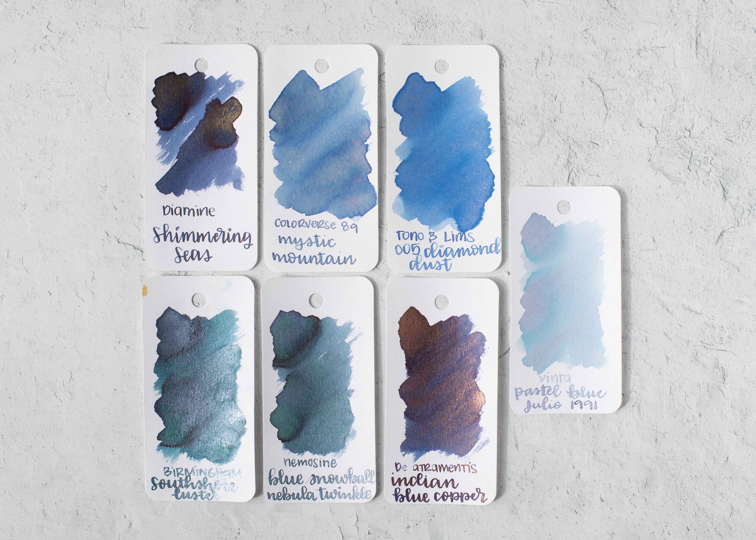
Mystic Mountain is lighter than Tono & Lims Diamond Dust but darker than Vinta Pastel Blue Julio 1991.

Longer Writing:

cv-pillars-creation-s-1.jpg

Pillars of Creation: I used a Platinum 3776 Nice Lavande with a broad nib on a Taroko Odyssey Notebook (Cosmo Air Light paper). The ink had an average flow.

cv-pillars-creation-s-2.jpg

Mystic Mountain: I used a TWSBI Eco-T Mint with a broad nib on a Taroko Odyssey Notebook (Cosmo Air Light paper). The ink had an average flow.

Overall, I absolutely love both of these inks. Pillars of Creation is my favorite though-the color is amazing, I love the shading and the green sheen and it performs well. Mystic Mountain can be a bit light in smaller nib sizes so I would stick to the larger nib sizes, but it’s the only blue ink I know of that a has pink shimmer as of right now. This ink set would be a perfect gift for anyone who likes unusual or interesting inks.

Disclaimer: I purchased these inks myself and all photos and opinions are my own. This page does contain affiliate links but this post is not sponsored in any way.

Colorverse Extreme Deep Field & NGC 1850

cv-deep-field-3.jpg

Colorverse Extreme Deep Field and NGC 1850 are from the new Colorverse Season 7: Eye on the Universe. Extreme Deep Field comes in a 65ml bottle and NGC 1850 in a 15ml bottle. You can find this ink for sale at Pen Chalet.

Swabs:

cv-deep-field-s-5.jpg

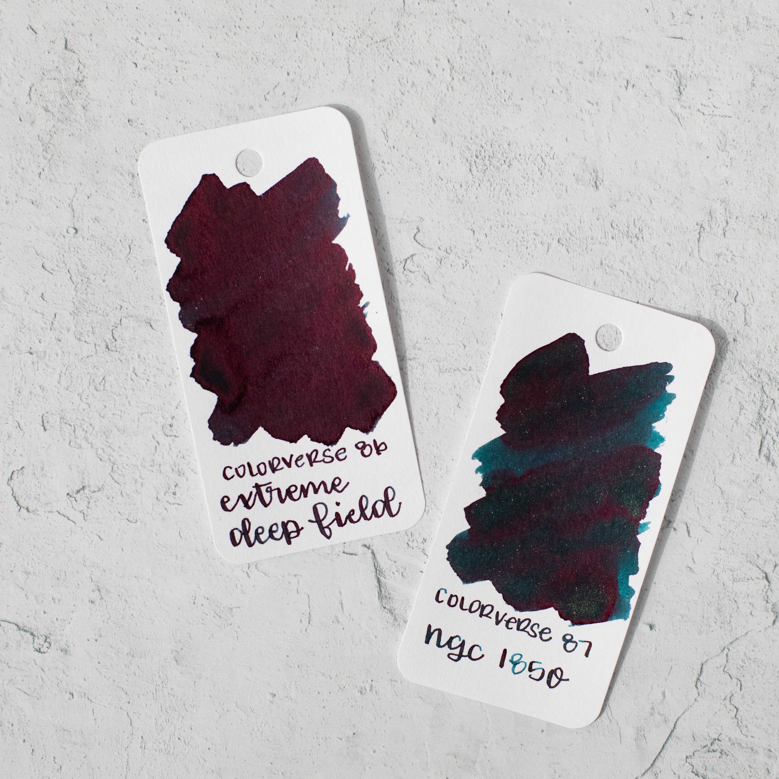
Left to right: Extreme Deep Field is a deep blue with sheen and NGC 1850 is a dark teal with sheen and shimmer.

cv-deep-field-4.jpg

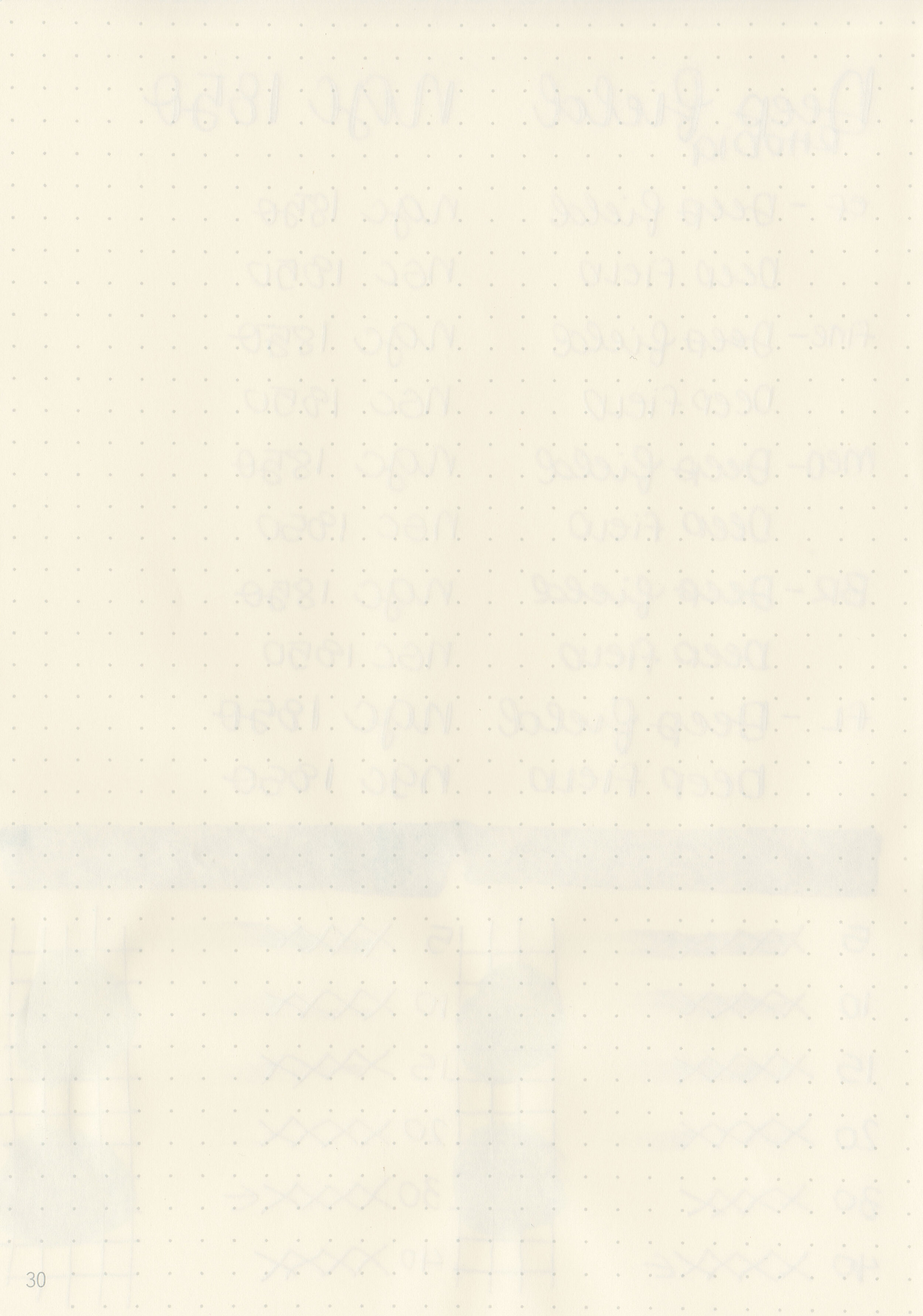
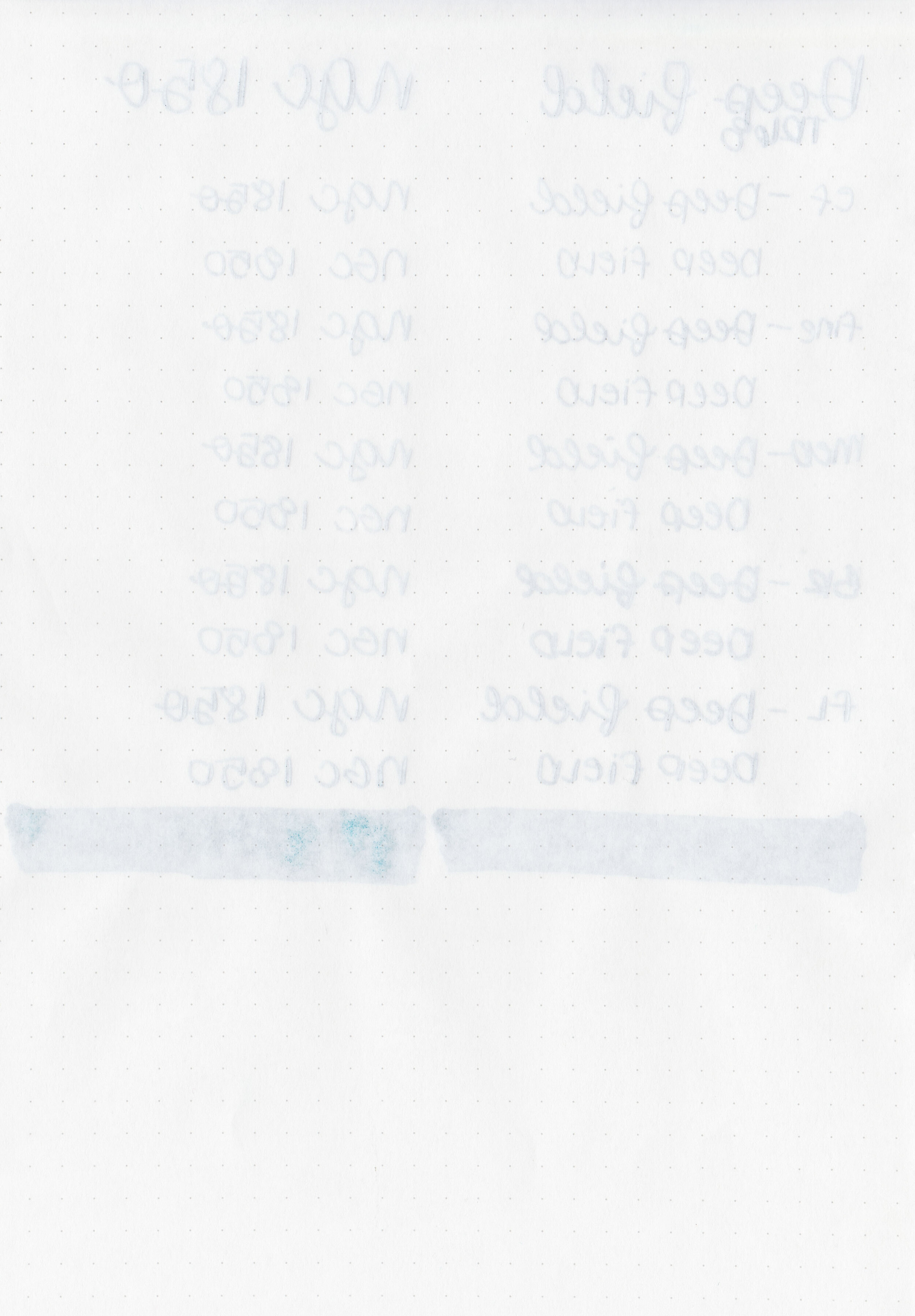
In large swabs on Tomoe River paper, Extreme Deep Field has some nice sheen.

cv-deep-field-5.jpg

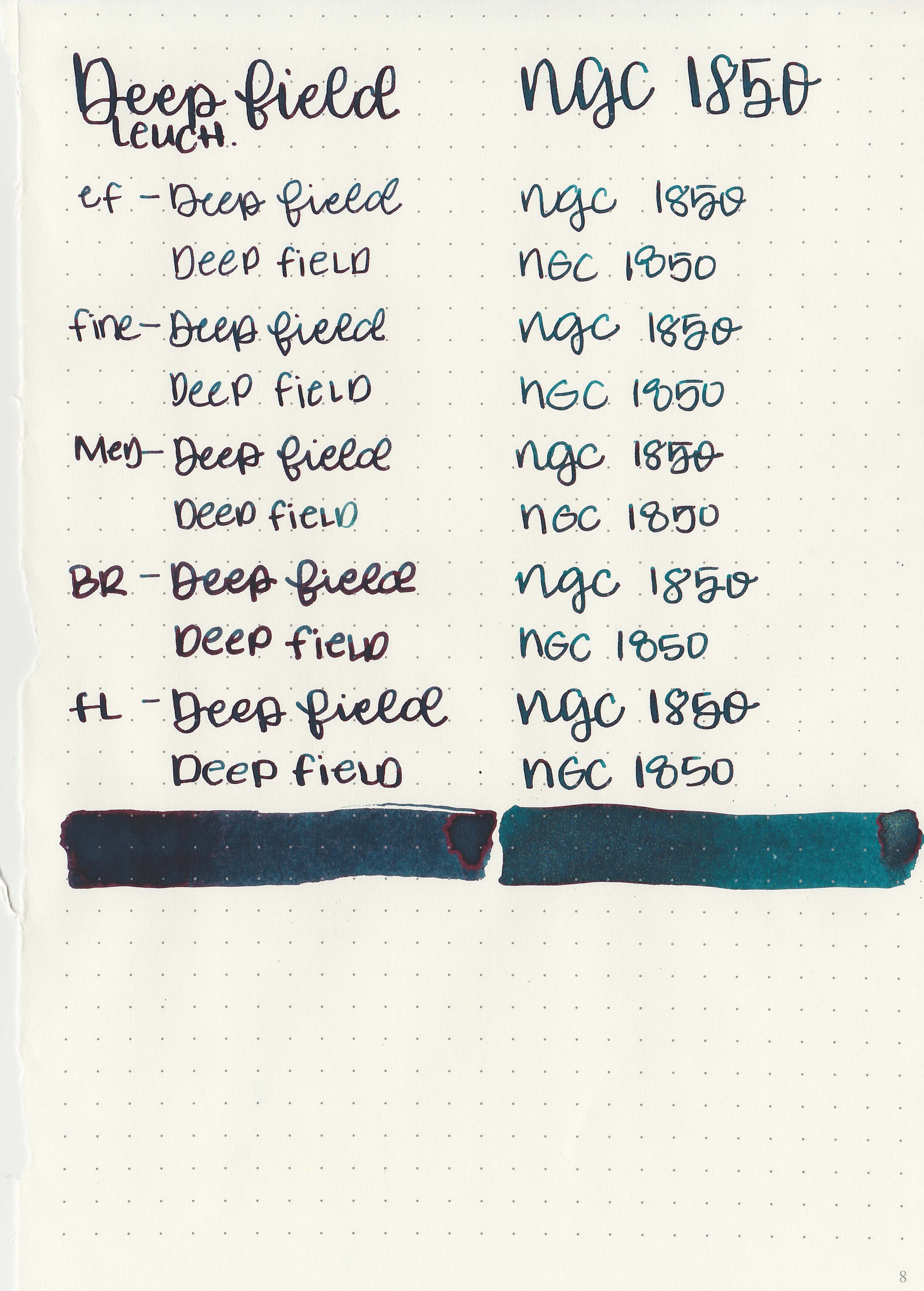
Writing samples:

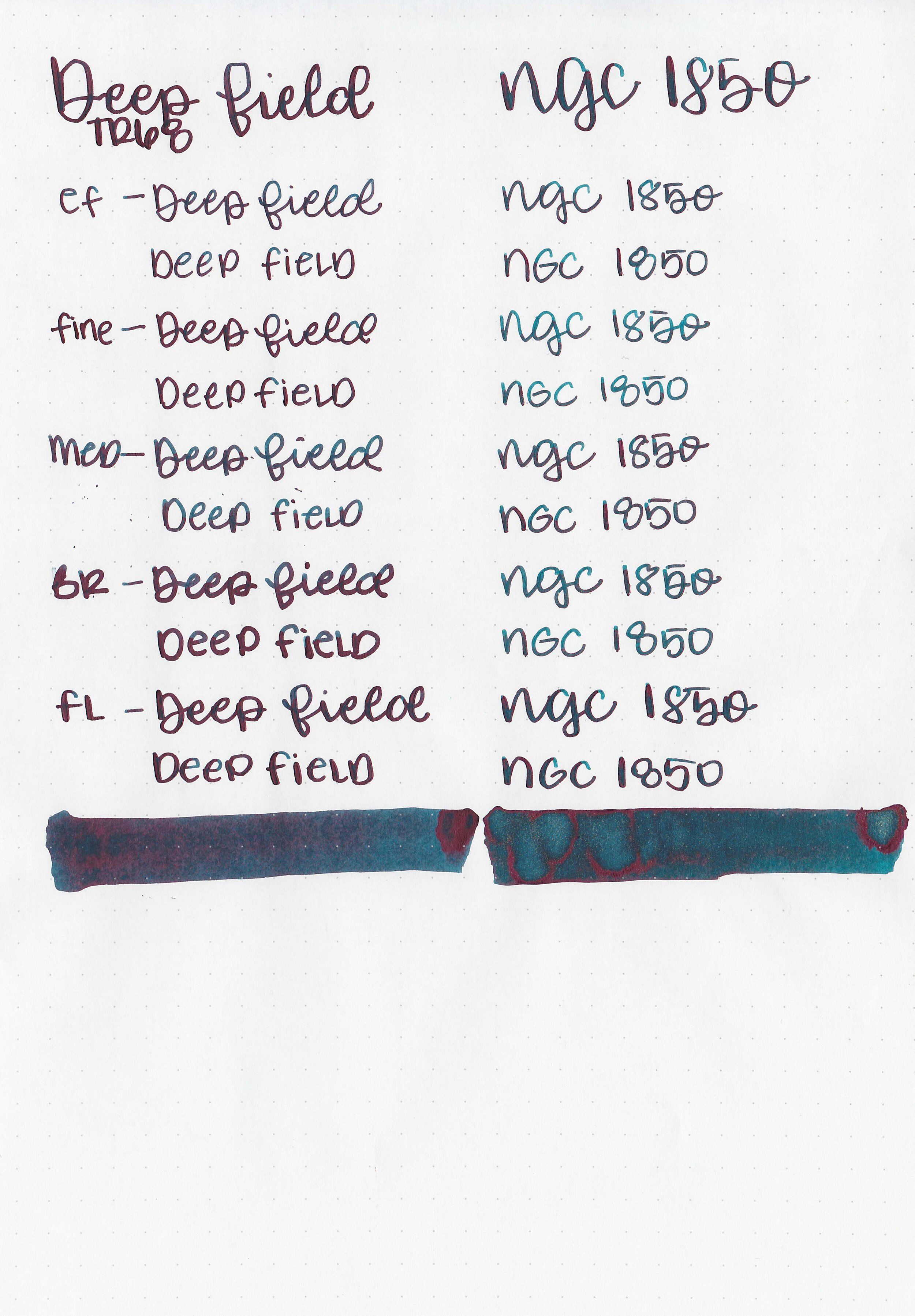
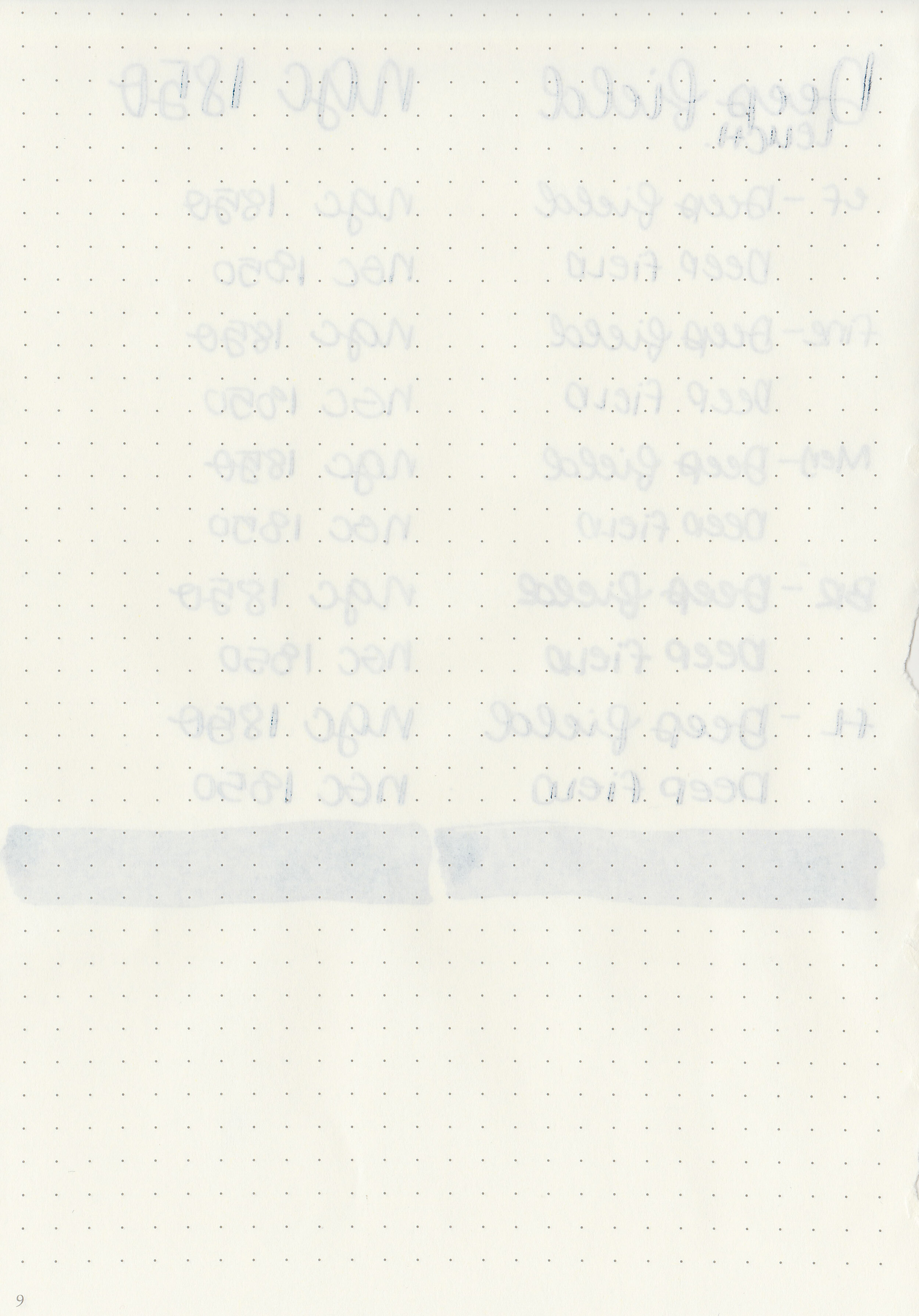
Let's take a look at how the ink behaves on fountain pen friendly papers: Rhodia, Tomoe River, and Leuchtturm.

Dry Time: 30-40 seconds

Water Resistance: Medium

Feathering: None

Show through: Medium

Bleeding: None

Other properties: no shadingmonster red sheen (both) and multi-colored shimmer (NGC).

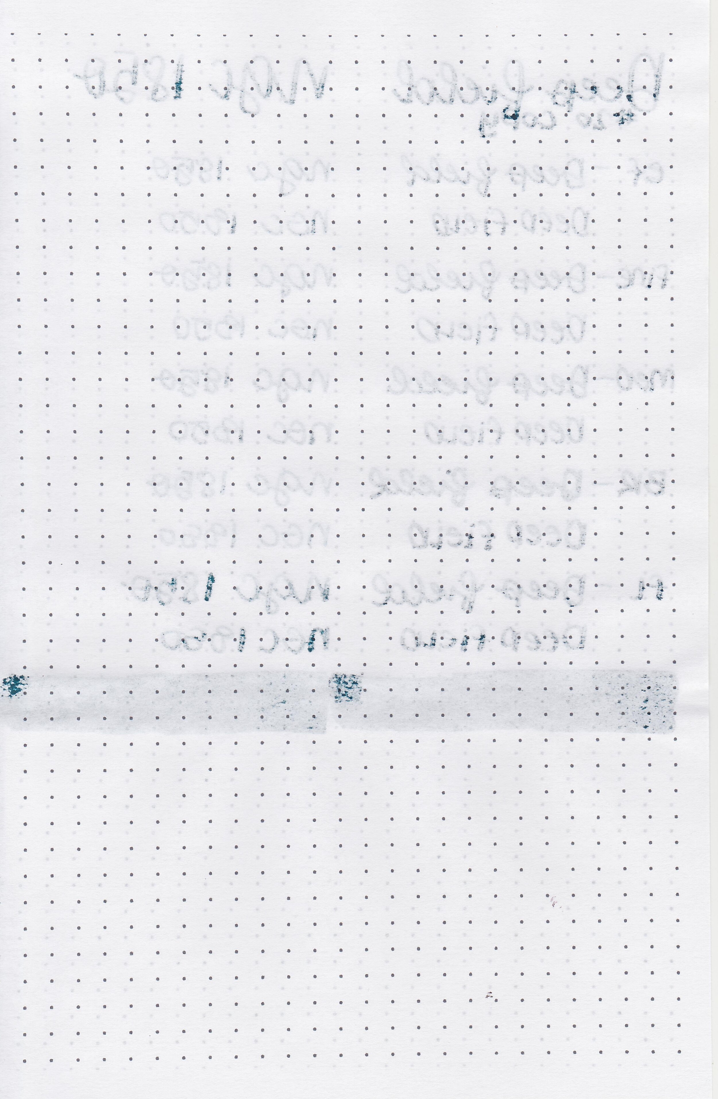
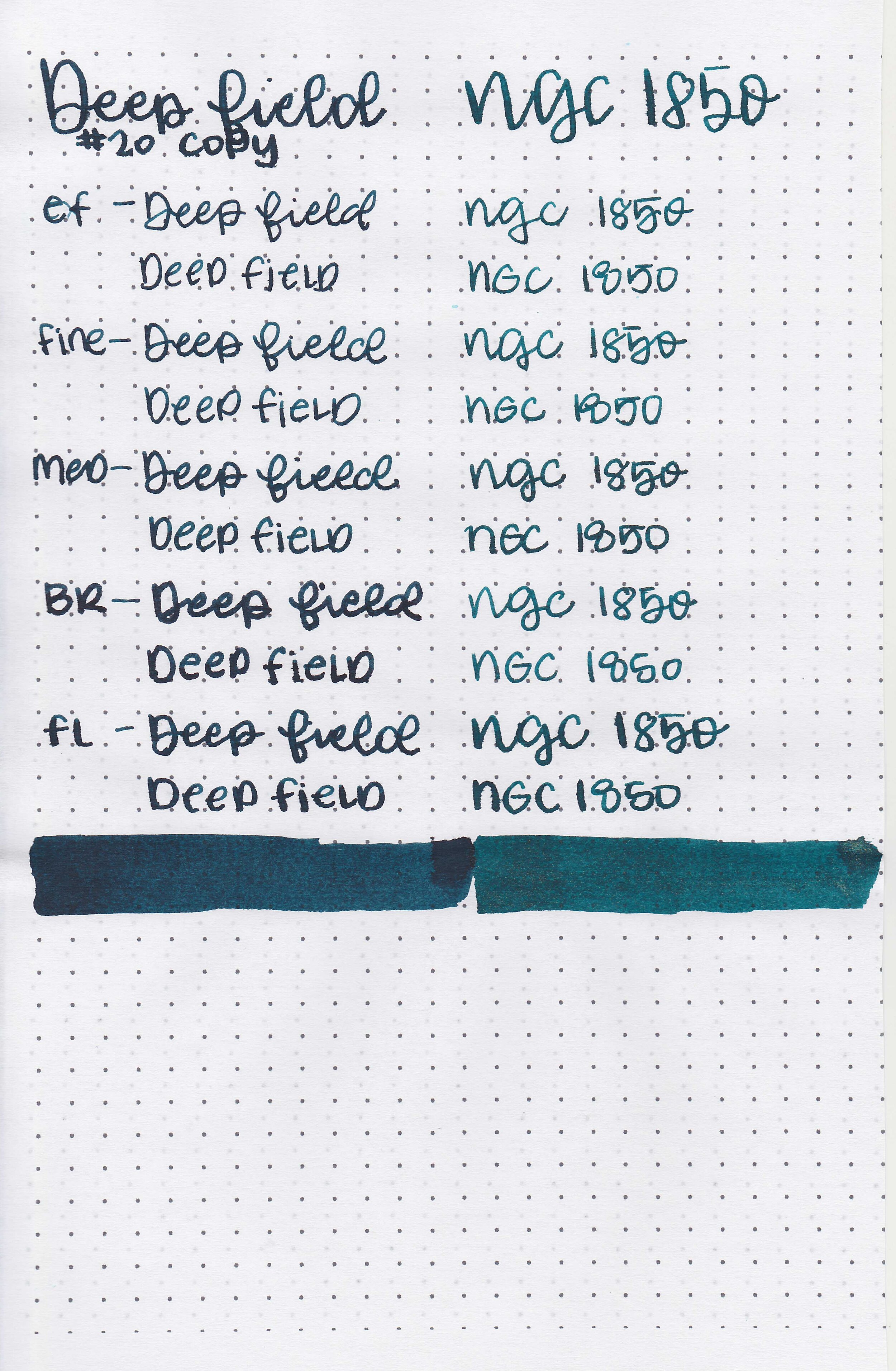
On Staples 24 lb copy paper there was lots of feathering in every nib size as well as some bleeding.

Comparison Swabs:

cv-deep-field-s-1.jpg

In longer writing, Deep Field is closest to Organics Studio Emerson.

cv-deep-field-s-2.jpg

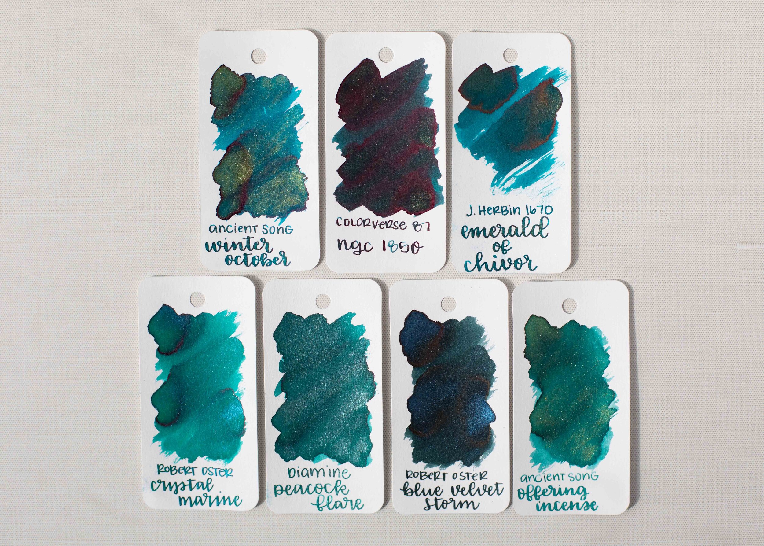
NGC is darker than J Herbin Emerald of Chivor but less green than Robert Oster Blue Velvet Storm.

Longer Writing:

cv-deep-field-s-3.jpg

Extreme Deep Field: I used a Franklin-Christoph 46 Blue Diamondcast with a broad nib on a Taroko Odyssey Notebook (Cosmo Air Light paper). The ink had an average flow.

cv-deep-field-s-4.jpg

NGC 1850: I used an Esterbrook Estie Oversize Peacock with a medium nib on a Taroko Odyssey Notebook (Cosmo Air Light paper). The ink had an average flow.

Overall, I enjoyed both of these inks. Both can be smeared if you try, but I didn’t notice any smearing in casual use. These are worth a try if you are looking for fun and interesting inks!

Disclaimer: I purchased these inks myself and all photos and opinions are my own. This page does contain affiliate links but this post is not sponsored in any way.

Colorverse SM 1 & Costar

cv-sm1-3.jpg

Colorverse recently released their new Season 7: Eye on the Universe. I immediately ordered most of them, so today let’s start with SM 1 & Costar. SM 1 comes in a 65ml bottle and Costar in a 15ml bottle. You can find this ink for sale at Pen Chalet.

Swabs:

cv-sm1-s-5.jpg

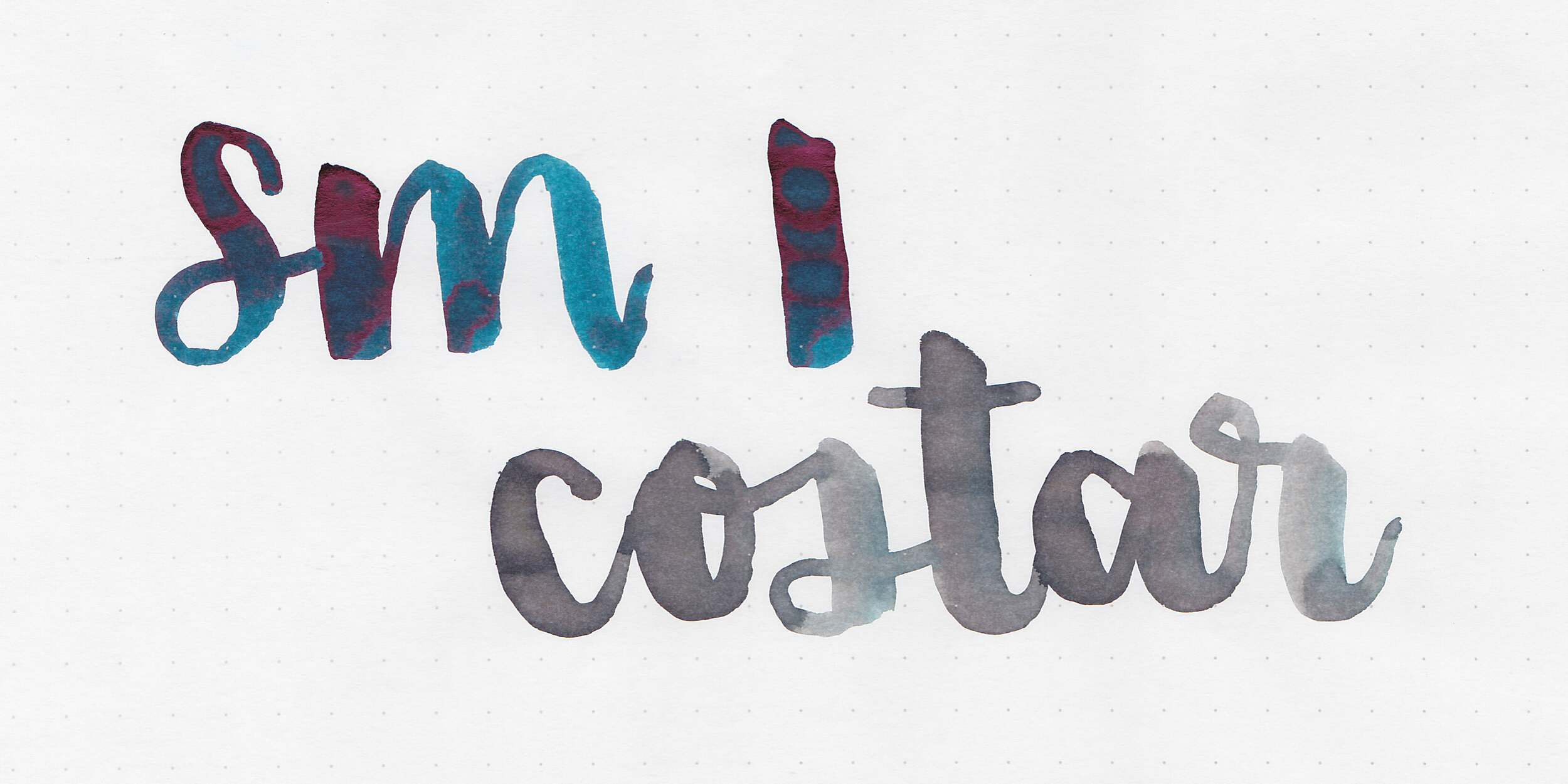
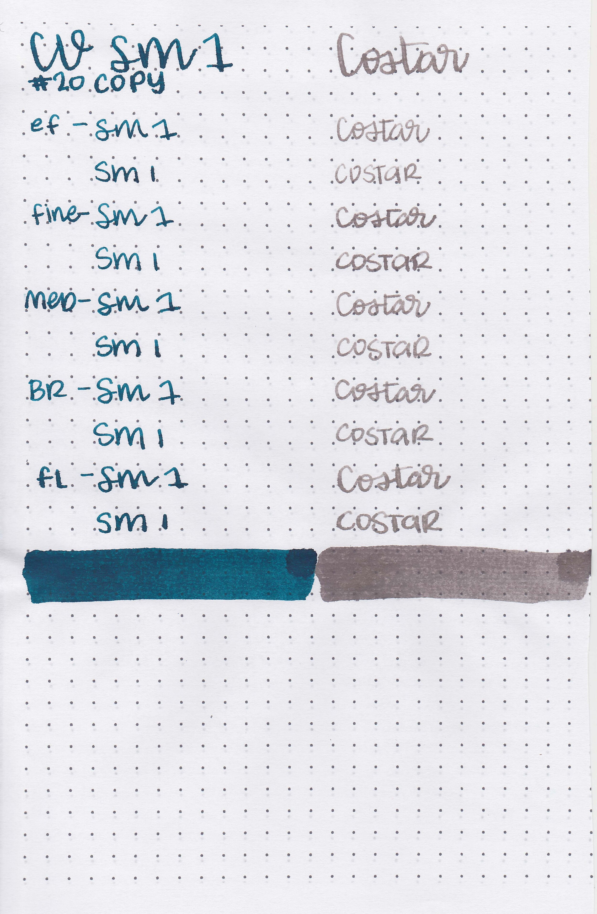
Left to right: SM 1 is a dark blue and Costar is a grey-brown.

cv-sm1-4.jpg

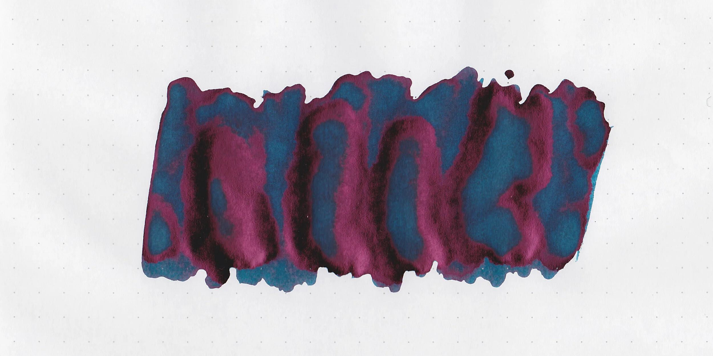
In large swabs on Tomoe River paper, SM 1 has lots of sheen.

cv-sm1-5.jpg

Writing samples:

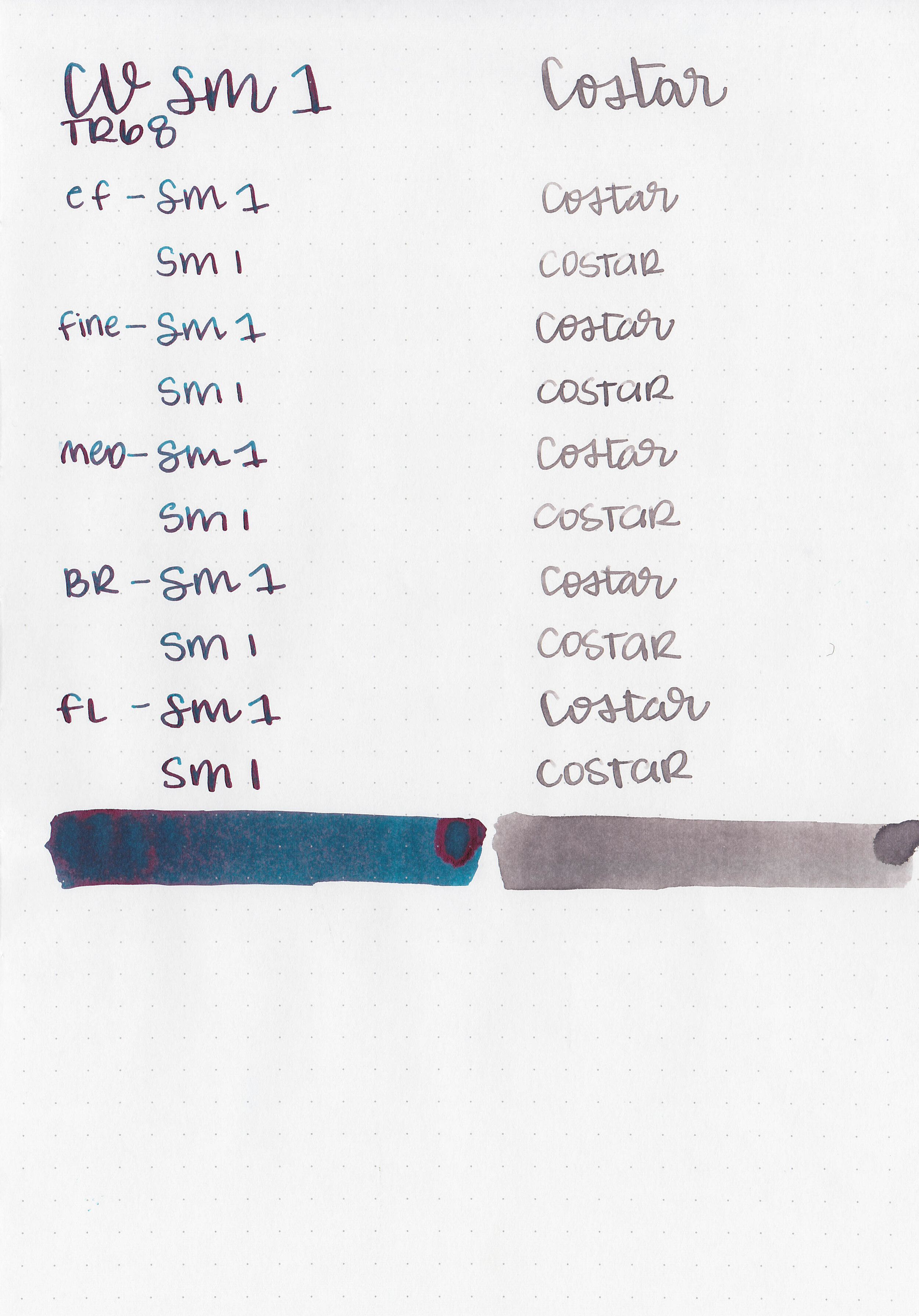
Let's take a look at how the ink behaves on fountain pen friendly papers: Rhodia, Tomoe River, and Leuchtturm.

Dry Time: 30-40 seconds

Water Resistance: Medium

Feathering: None

Show through: Medium

Bleeding: None

Other properties: medium shading (Costar), monster red sheen (SM 1) and no shimmer.

On Staples 24 lb copy paper there was lots of feathering in every nib size as well as some bleeding.

Comparison Swabs:

cv-sm1-s-3.jpg

In longer writing, SM 1 is closest to Troublemaker Blueberry.

cv-sm1-s-4.jpg

Costar is closest to Montblanc Tobacco Gray.

Longer Writing:

cv-sm1-s-1.jpg

SM 1: I used a Lamy Al-star Pacific Blue with a medium nib on a Taroko Odyssey Notebook (Cosmo Air Light paper). The ink had an average flow.

cv-sm1-s-2.jpg

Costar: I used a Pelikan M205 Moonstone with a fine nib on a Taroko Odyssey Notebook (Cosmo Air Light paper). The ink had an average flow.

Overall, I really like both of these inks. I love SM 1’s sheen and dark color and Costar’s grey shading. I’m glad I have full bottles of both because I plan on using them often. Stay tuned for the next few days to see more Colorverse Season 7!

Disclaimer: I purchased these inks myself and all photos and opinions are my own. This page does contain affiliate links but this post is not sponsored in any way.

Ink Review #1470: Van Dieman's Hanging Lake

vd-hanging-lake-2.jpg

We are going to do one more reader request ink today before moving on to some new releases: Van Dieman’s Hanging Lake from Van Dieman’s Wilderness collection. Thanks to the reader that sent this ink in for review! You can find this ink for sale at Pen Chalet (aff. link) and Vanness Pens.

vd-hanging-lake-1.jpg

The color:

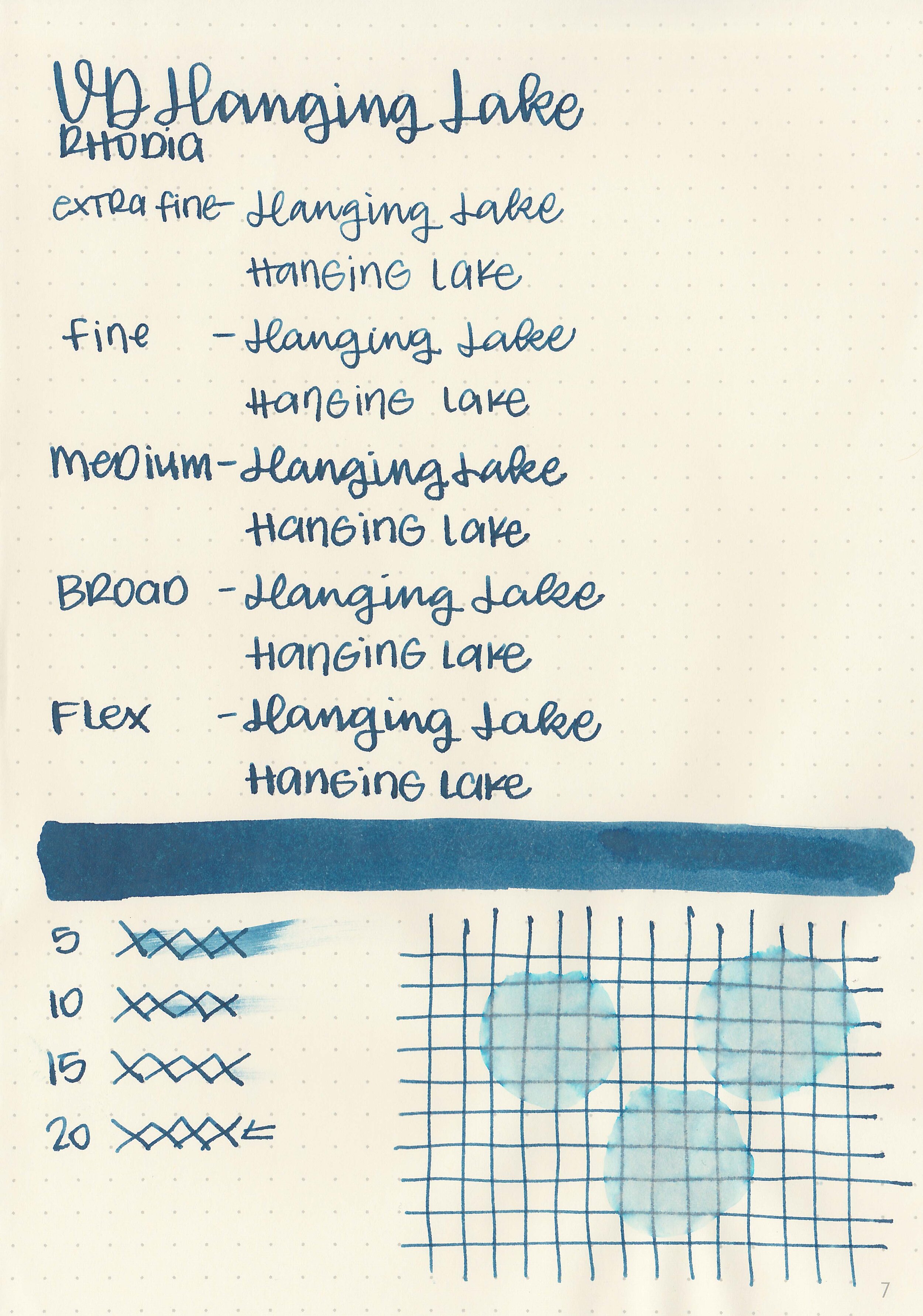
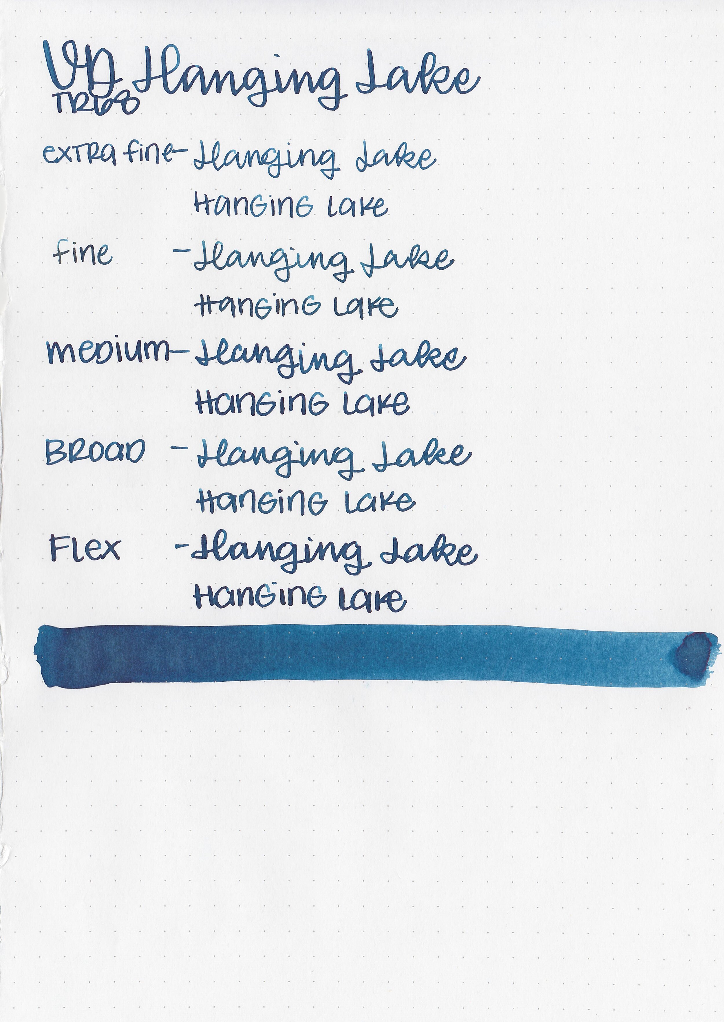
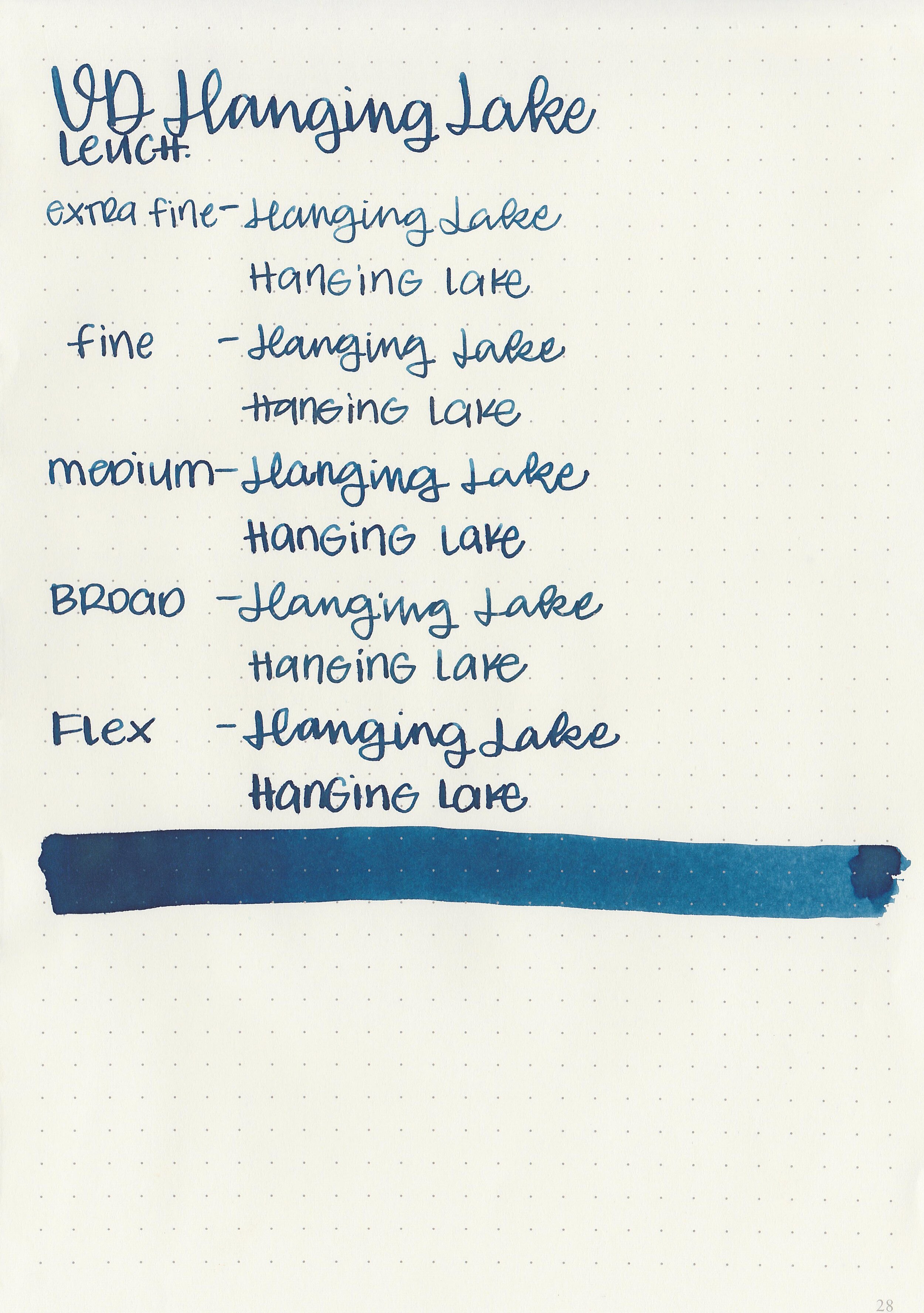
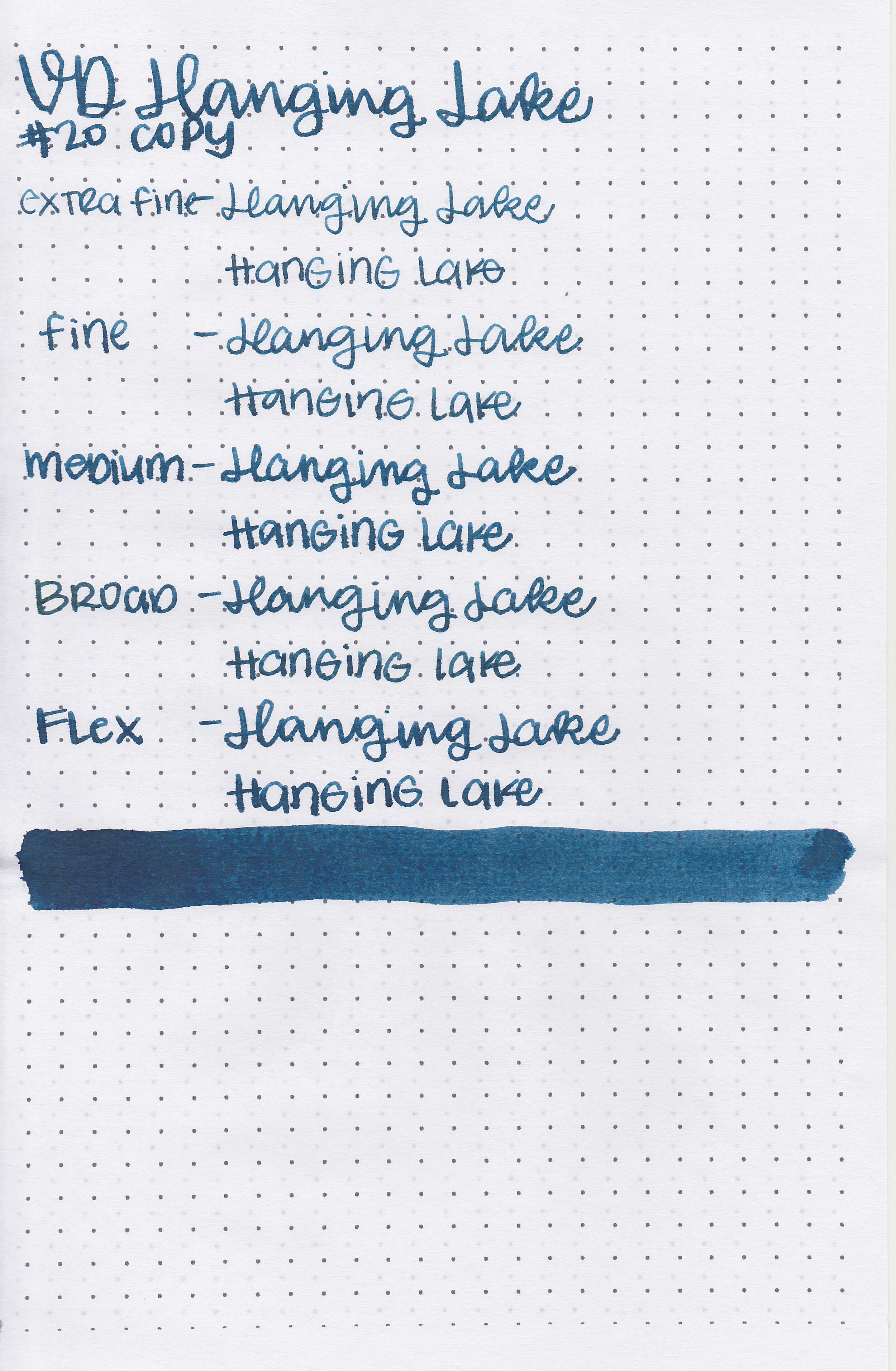
Hanging Lake is a medium blue-black ink.

Writing samples:

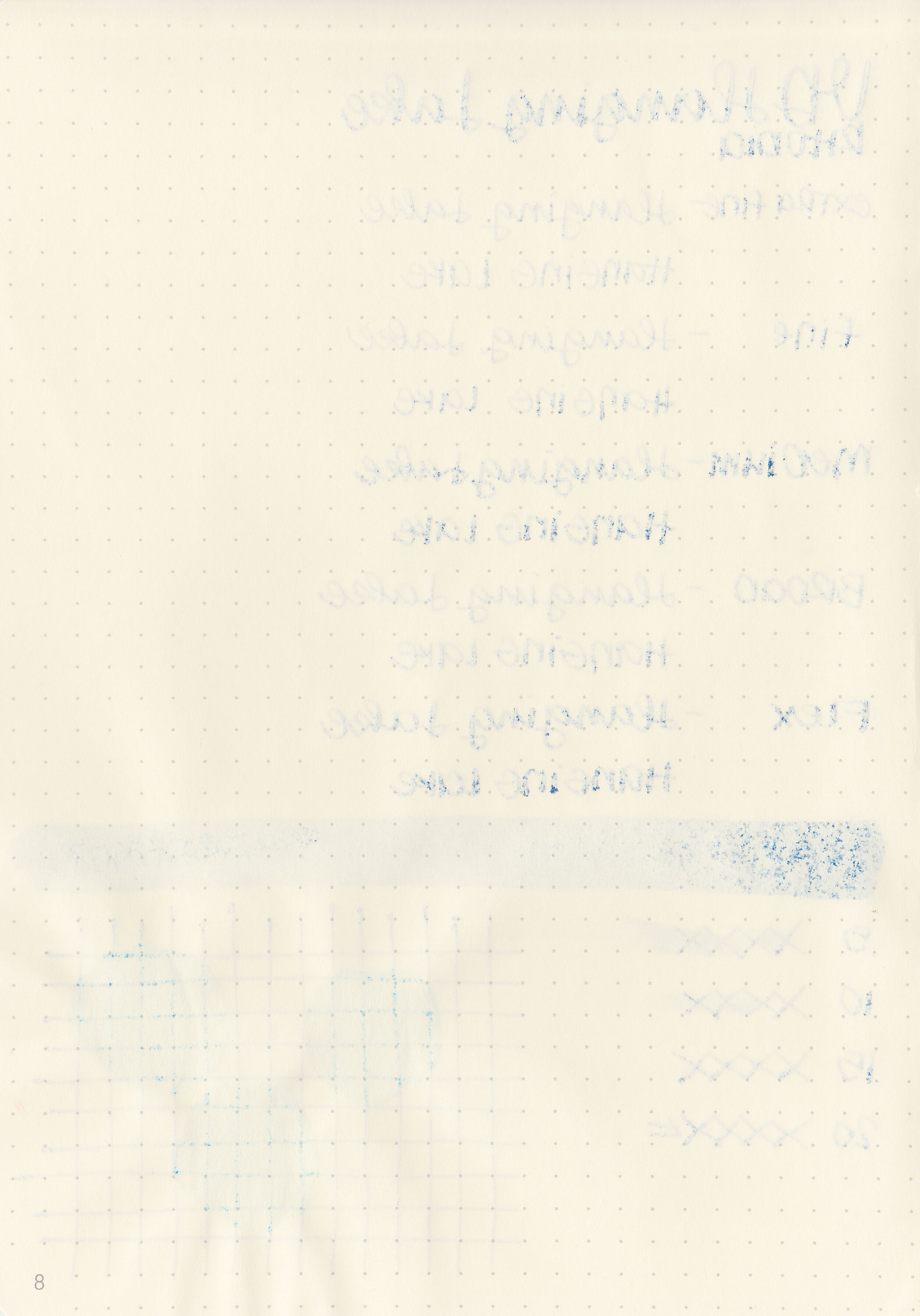
Let's take a look at how the ink behaves on fountain pen friendly papers: Rhodia, Tomoe River, and Leuchtturm.

Dry time: 20 seconds

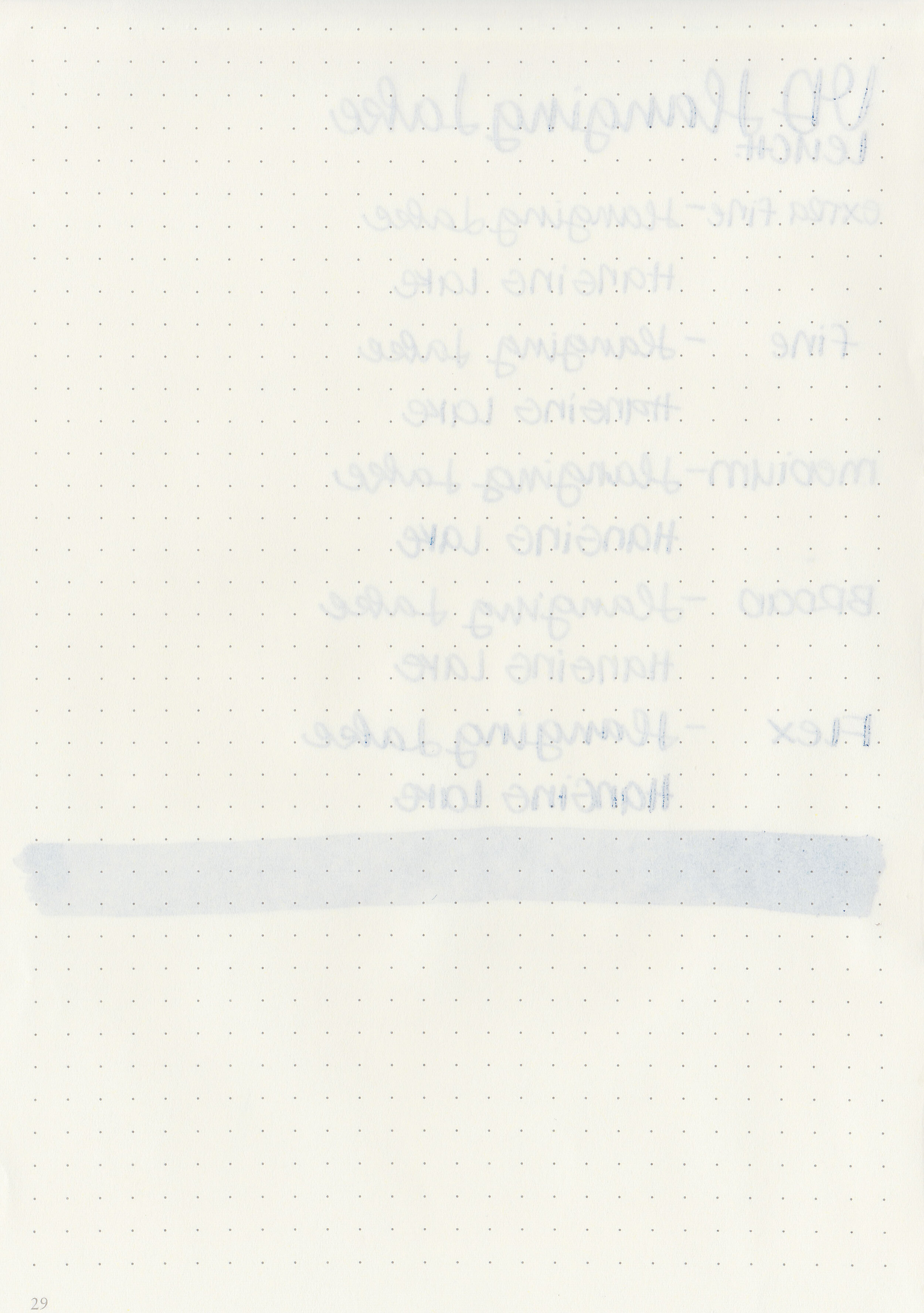
Water resistance: Medium

Feathering: High

Show through: Medium

Bleeding: Low

Other properties: low shading, no sheen, and no shimmer.

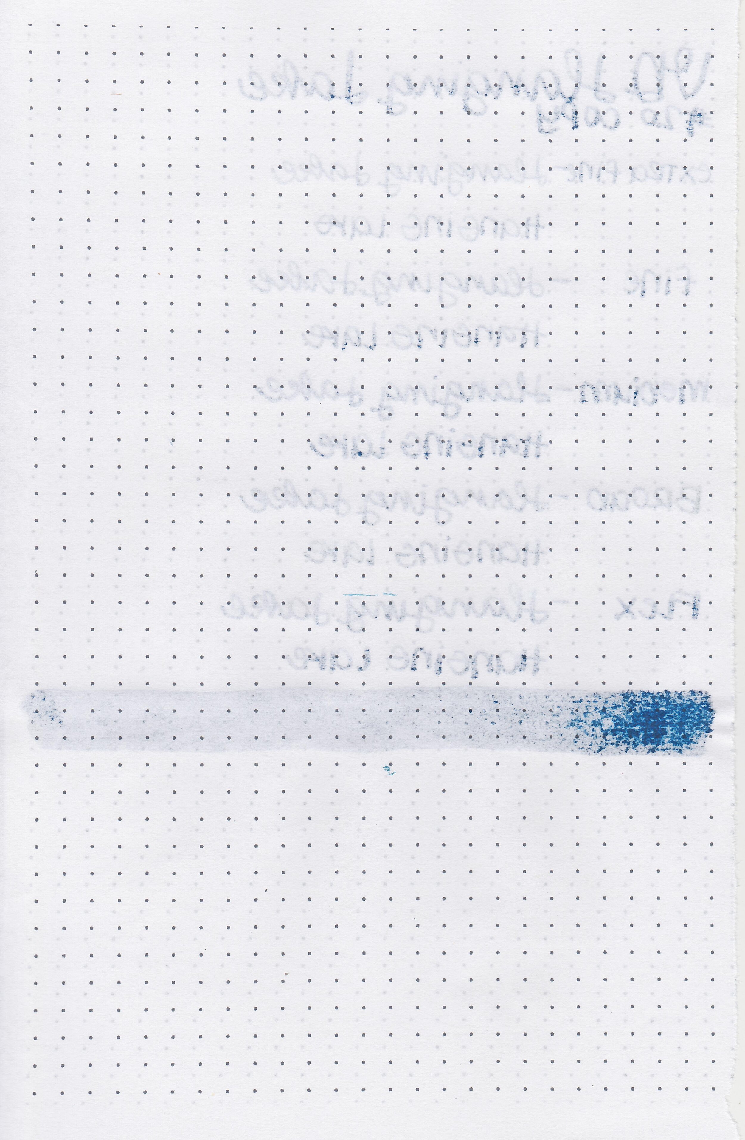
On Staples 24 lb copy paper there was some feathering and bleeding in all nib sizes.

Comparison Swabs:

vd-hanging-lake-s-1.jpg

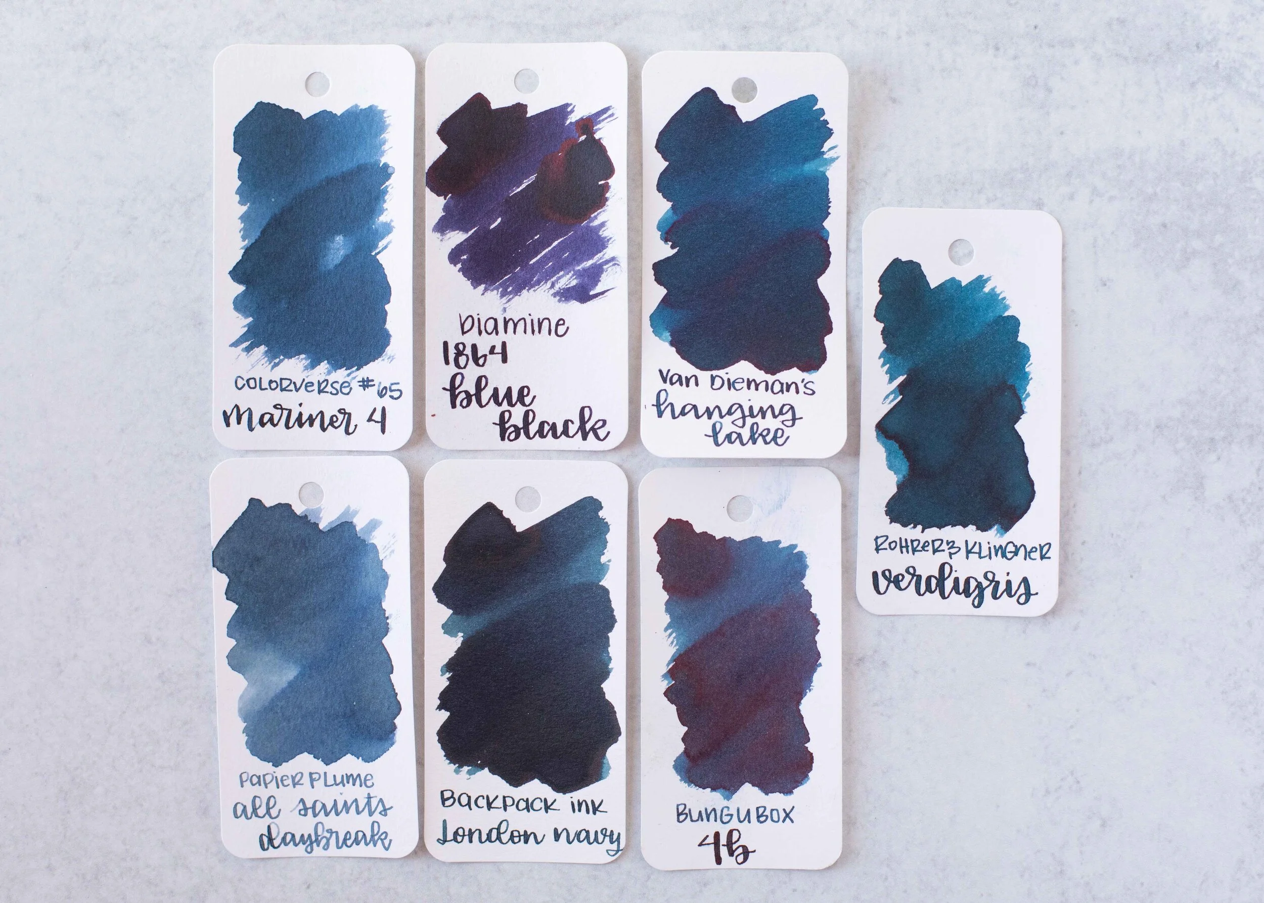
Hanging Lake is brighter than Colorverse Mariner 4. Click here to see the Van Dieman’s inks together, and click here to see the blue black inks together.

Longer writing:

vd-hanging-lake-w-1.jpg

I used a Montegrappa Elmo with a medium nib on a Taroko Enigma notebook. The ink had an average flow.

Overall, I wanted to like this ink because I love blue black inks, but the performance wasn’t quite there for me. There was way too much feathering and a bit more bleeding than I like. This one is a pass for me.

Disclaimer: This ink was provided by a reader for the purpose of this review. All photos and opinions are my own. This page does contain affiliate links but this post is not sponsored.

Ink Review #1469: Kobe 44 Sumaura Seaside Blue

nk-sumaura-seaside-2.jpg

Kobe 44 Sumaura Seaside Blue is from Kobe’s standard collection and is available in 50 ml bottles. Thanks to the reader that sent this ink in for review! You can find this ink for sale at Vanness Pens.

nk-sumaura-seaside-1.jpg

The color:

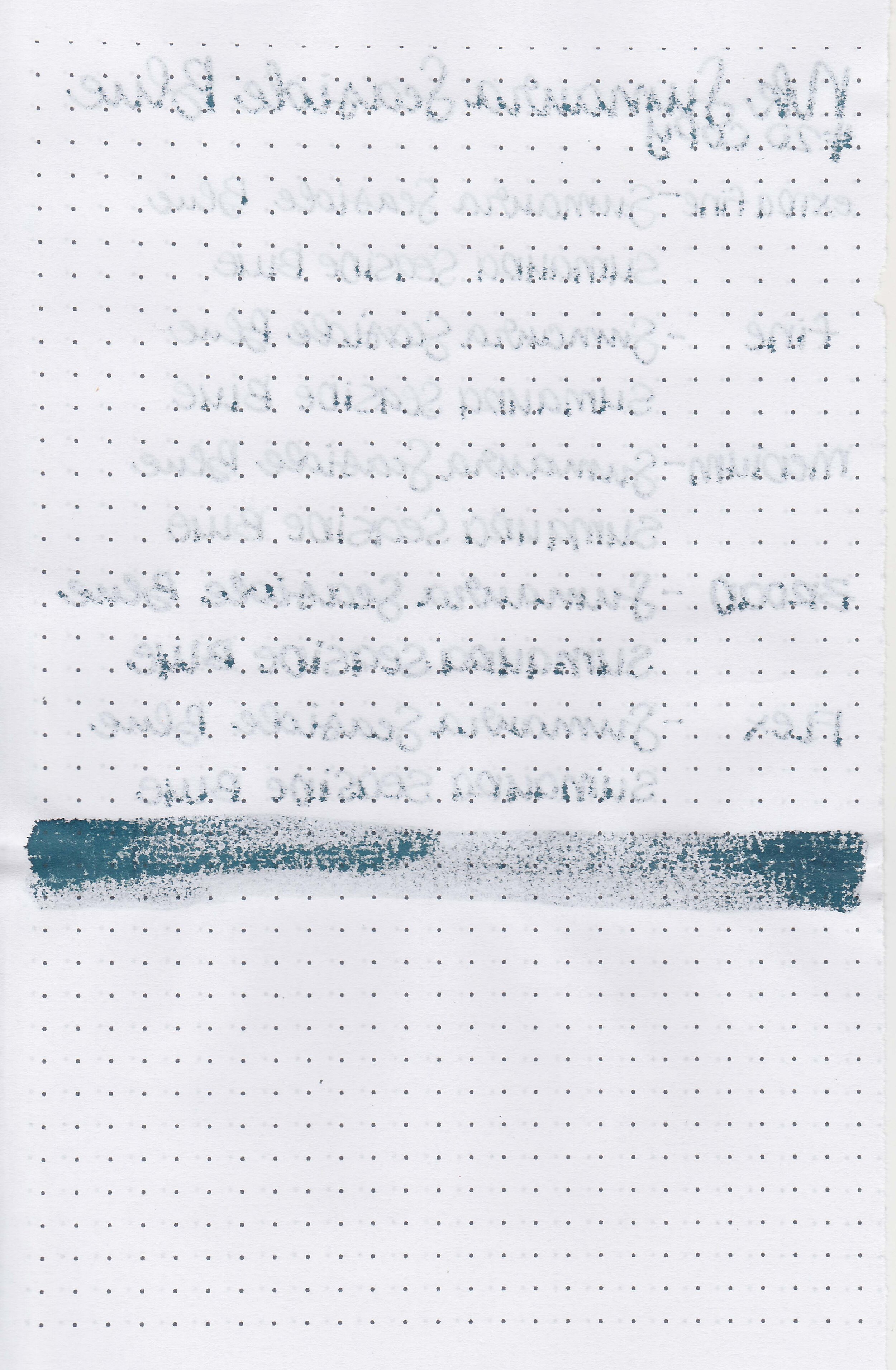
Sumaura is a deep teal.

Swabs:

nk-sumaura-seaside-3.jpg

In large swabs on Tomoe River paper the ink has a little red sheen.

nk-sumaura-seaside-4.jpg

Writing samples:

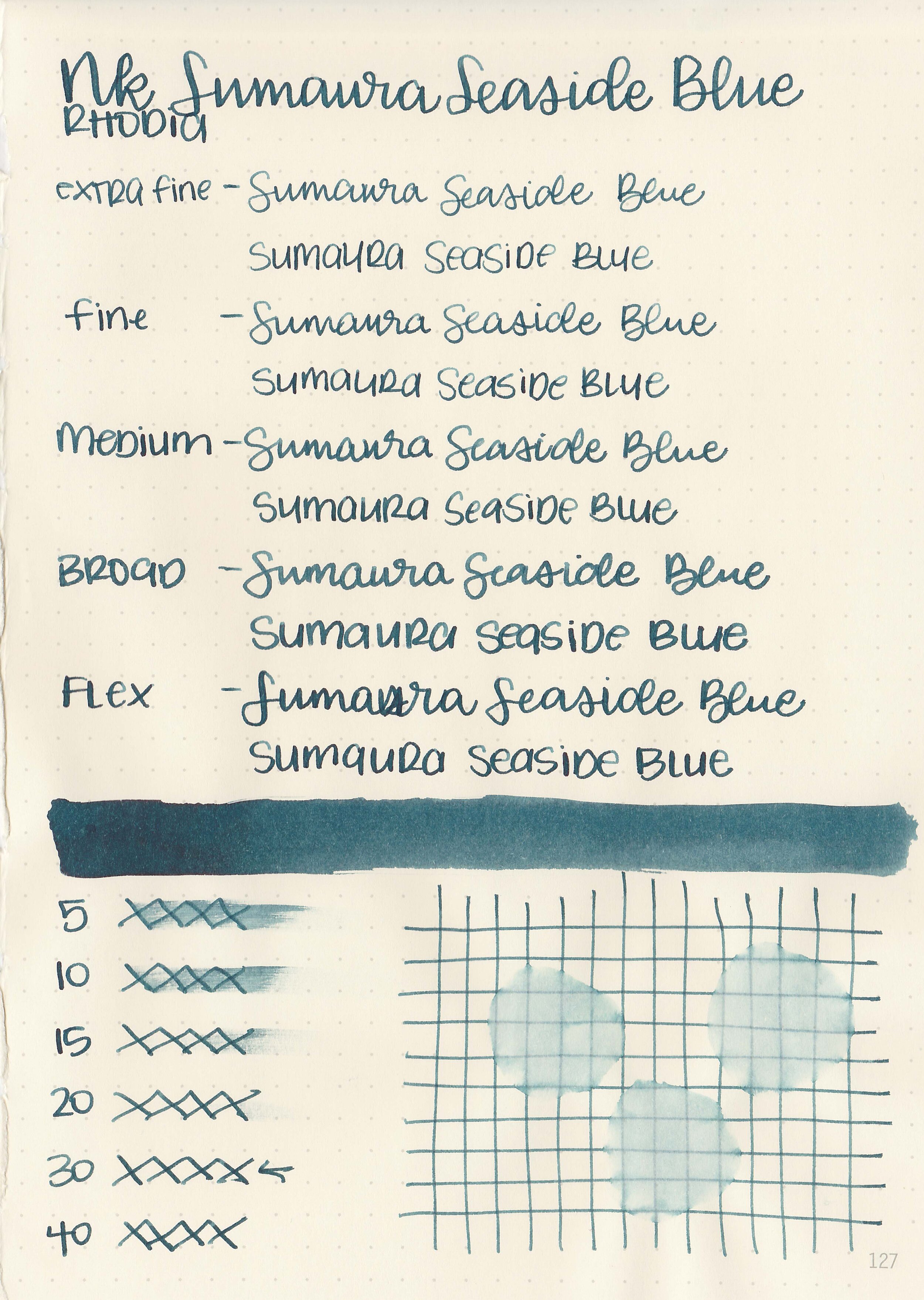
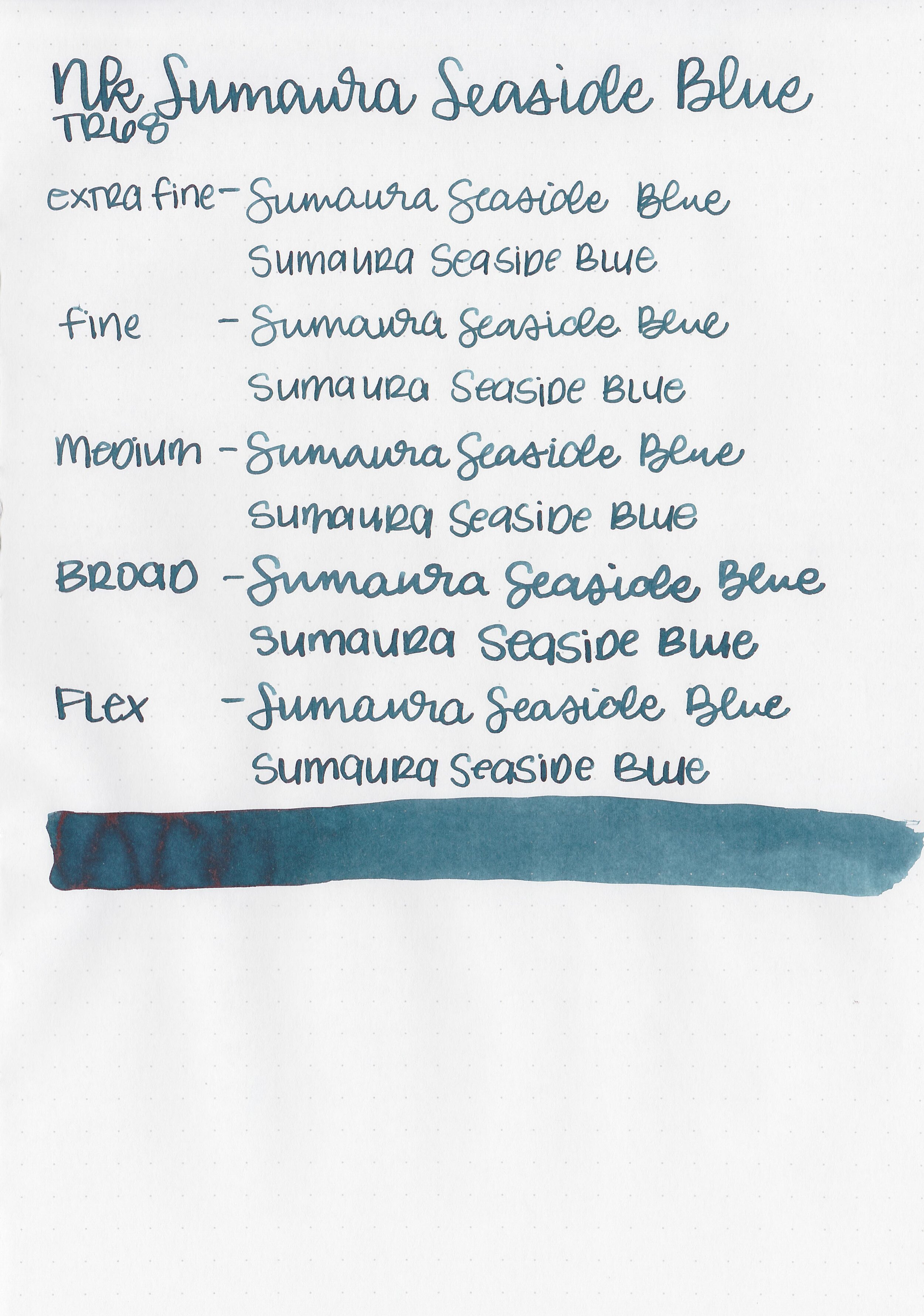
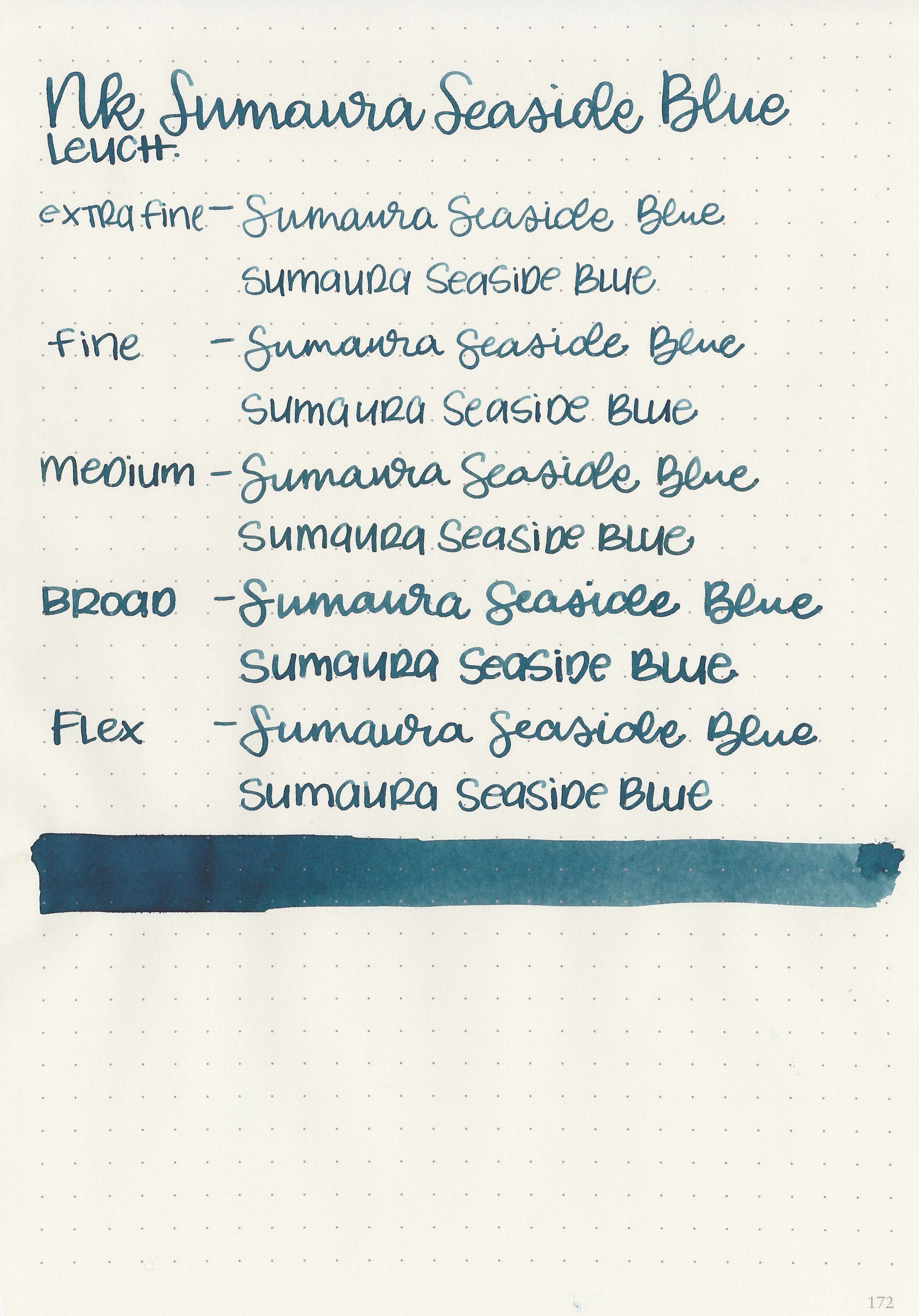
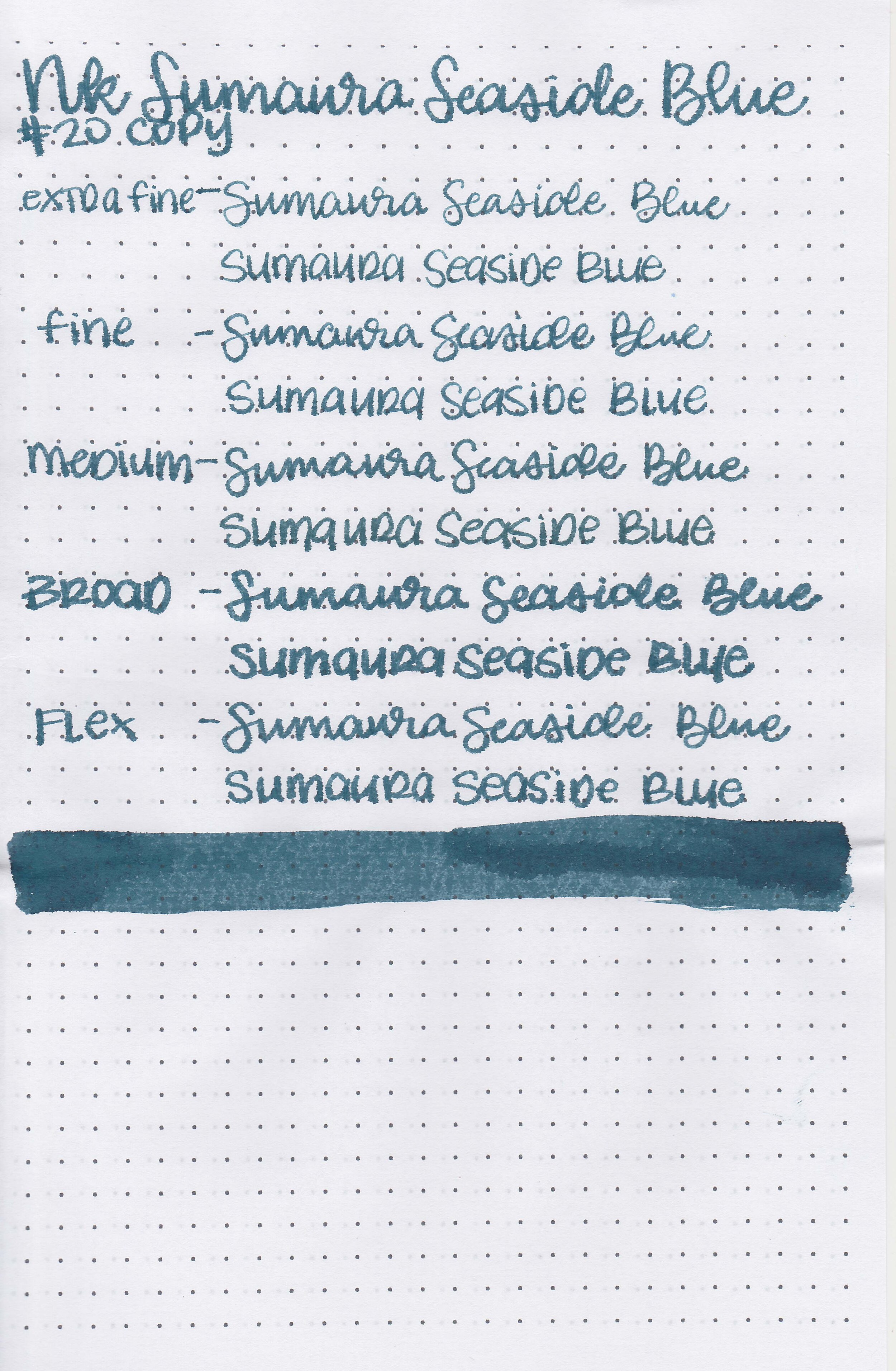
Let's take a look at how the ink behaves on fountain pen friendly papers: Rhodia, Tomoe River, and Leuchtturm.

Dry time: 30 seconds

Water resistance: Medium

Feathering: None

Show through: Medium

Bleeding: None

Other properties: low shading, low red sheen, and no shimmer.

On Staples 24 lb copy paper there was feathering and bleeding in all nib sizes.

Comparison Swabs:

nk-sumaura-seaside-s-1.jpg

Sumaura is more green than J Herbin Vert de Gris but not quite as green as Taccia Hokusai-sabimidori. Click here to see the Kobe inks together, and click here to see the teal inks together.

Longer writing:

nk-sumaura-seaside-w-1.jpg

I used a Pelikan M805 Ocean Swirl with a broad nib on a Taroko Enigma notebook. The ink had a wet flow.

Overall, I would give this ink 4 out of 5 stars. It’s well behaved, a lovely color and has a nice wet flow. I would absolutely use this ink often if I had a full bottle, but I don’t quite love it enough to need a full bottle since I already have so many inks.

Disclaimer: This ink was provided by a reader for the purpose of this review. All photos and opinions are my own. This page does not contain affiliate links and this post is not sponsored.

May Purples

2021-may-horses.jpg

It’s finally May! We spent this Saturday hiking the Wild Horses Monument near the Gorge in WA. My kids loved seeing all the horse statues and the view was amazing. I was so glad I had my phone so I could take a quick photo. I find myself reaching for Sailor Ink Studio 143 a lot this spring-it is such a nice color and has some fabulous shading too.

2021-may-wildflowers.jpg

I’m a sucker for the moody greens in this one! I have become a bit wary of Troublemaker inks-a few have stained my pens but I still enjoy using them (with some caution), especially this Seaglass.

2021-may-house.jpg

This one just makes me think of Pepto bismol, but I love the combo of pink, purple and teal!

2021-may-sky.jpg

I love Pilot Iroshizuku inks but since I’m always trying out new inks I don’t use my favorites as much as I would like. Ajisai is one of my long-time loves!

I hope everyone is having a great May! What’s your favorite ink today? Let me know in the comments below!

Disclaimer: All opinions are my own. This post does not contain affiliate links and is not sponsored in any way.
Ink Review #1468: Ferris Wheel Press Blue Cotton Candy

fwp-blue-cotton-candy-2.jpg

Ferris Wheel Press Blue Cotton Candy is from FWP’s Spring 2020 collection and is available in 38 and 85 ml bottles. Thanks to the reader that sent this ink in for review! You can find this ink for sale at Vanness Pens.
fwp-blue-cotton-candy-1.jpg

The color:

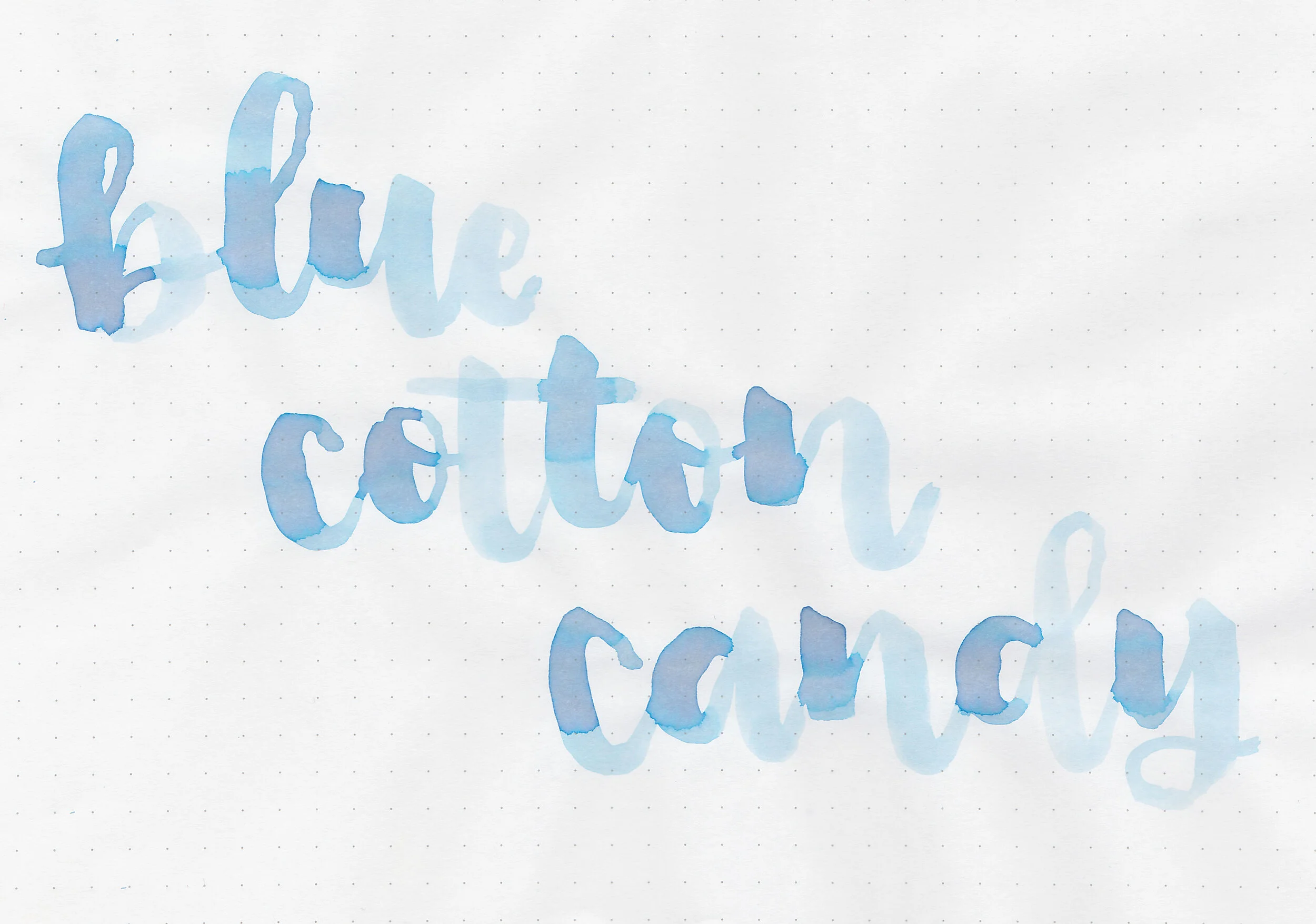
Blue Cotton Candy is a pale baby blue.

Swabs:

fwp-blue-cotton-candy-3.jpg

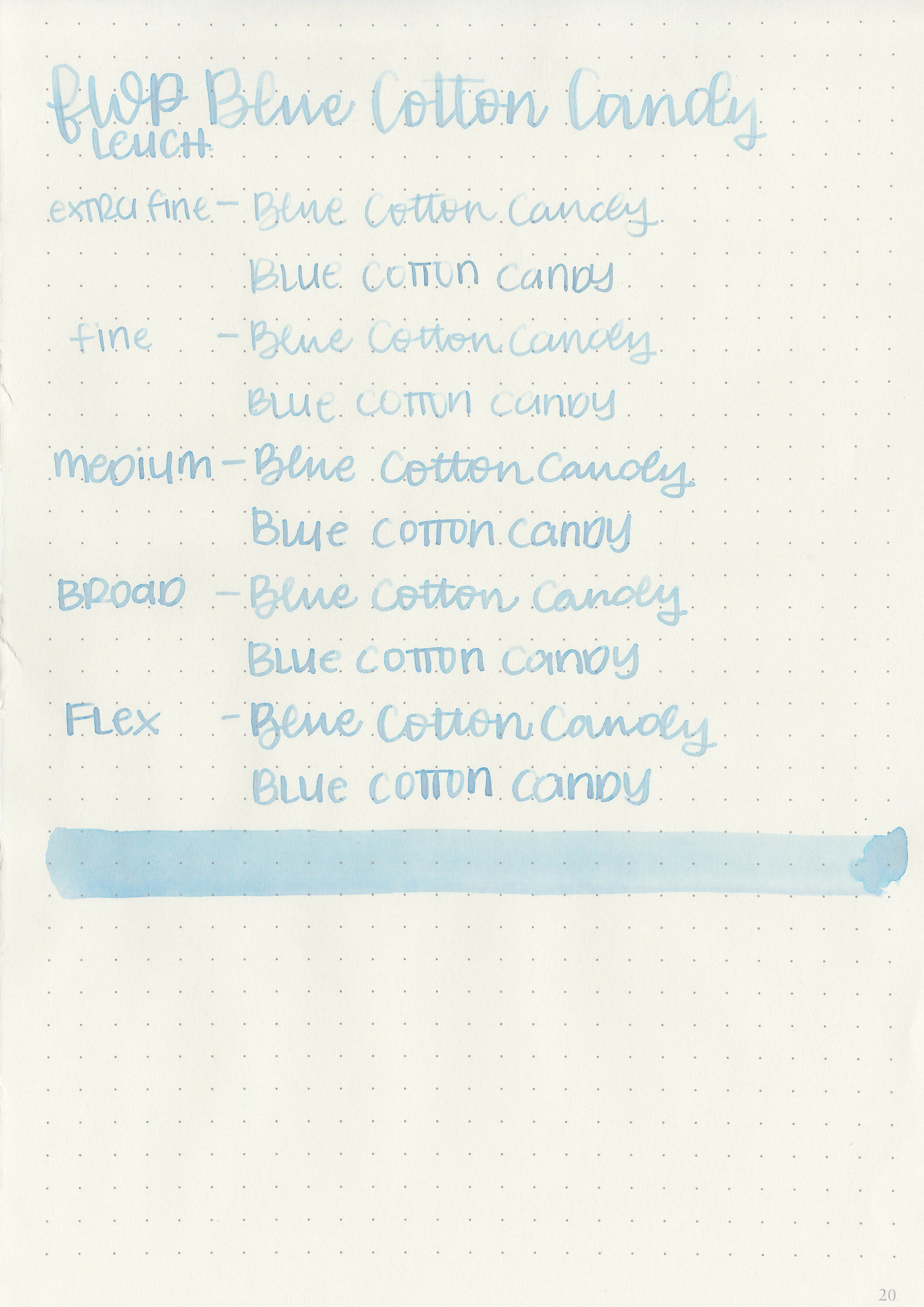
In large swabs on Tomoe River paper the ink has some interesting shading-from pale grey to bright blue.

fwp-blue-cotton-candy-4.jpg

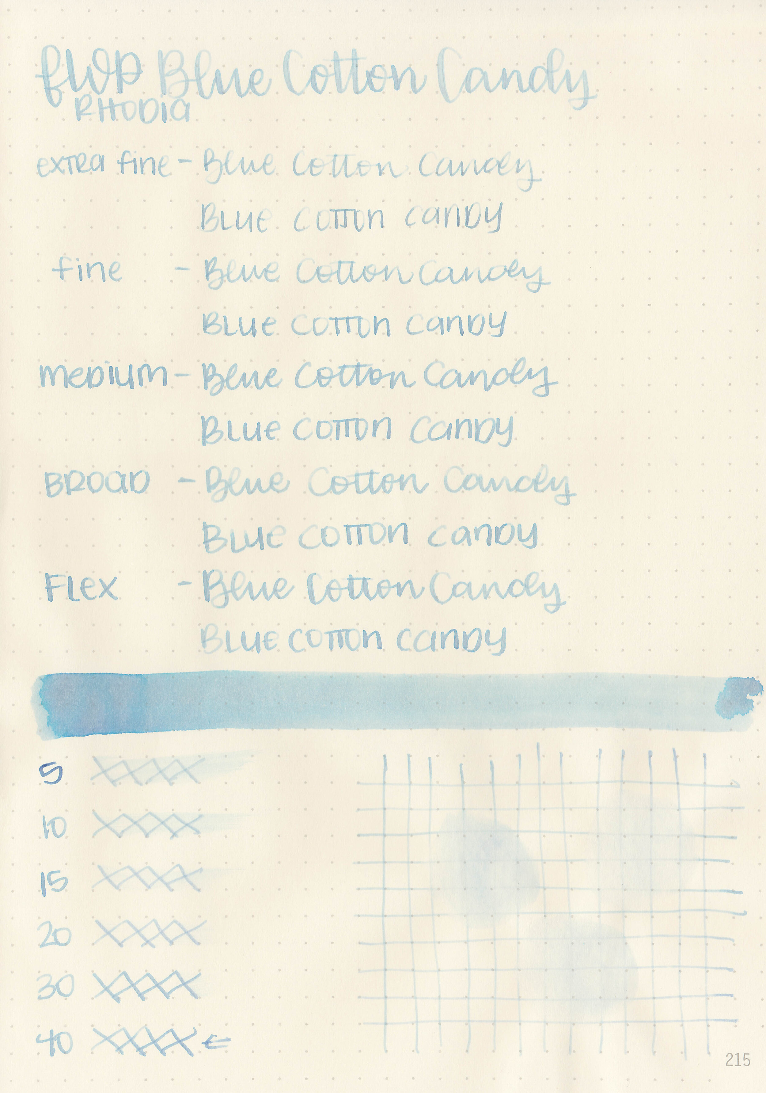
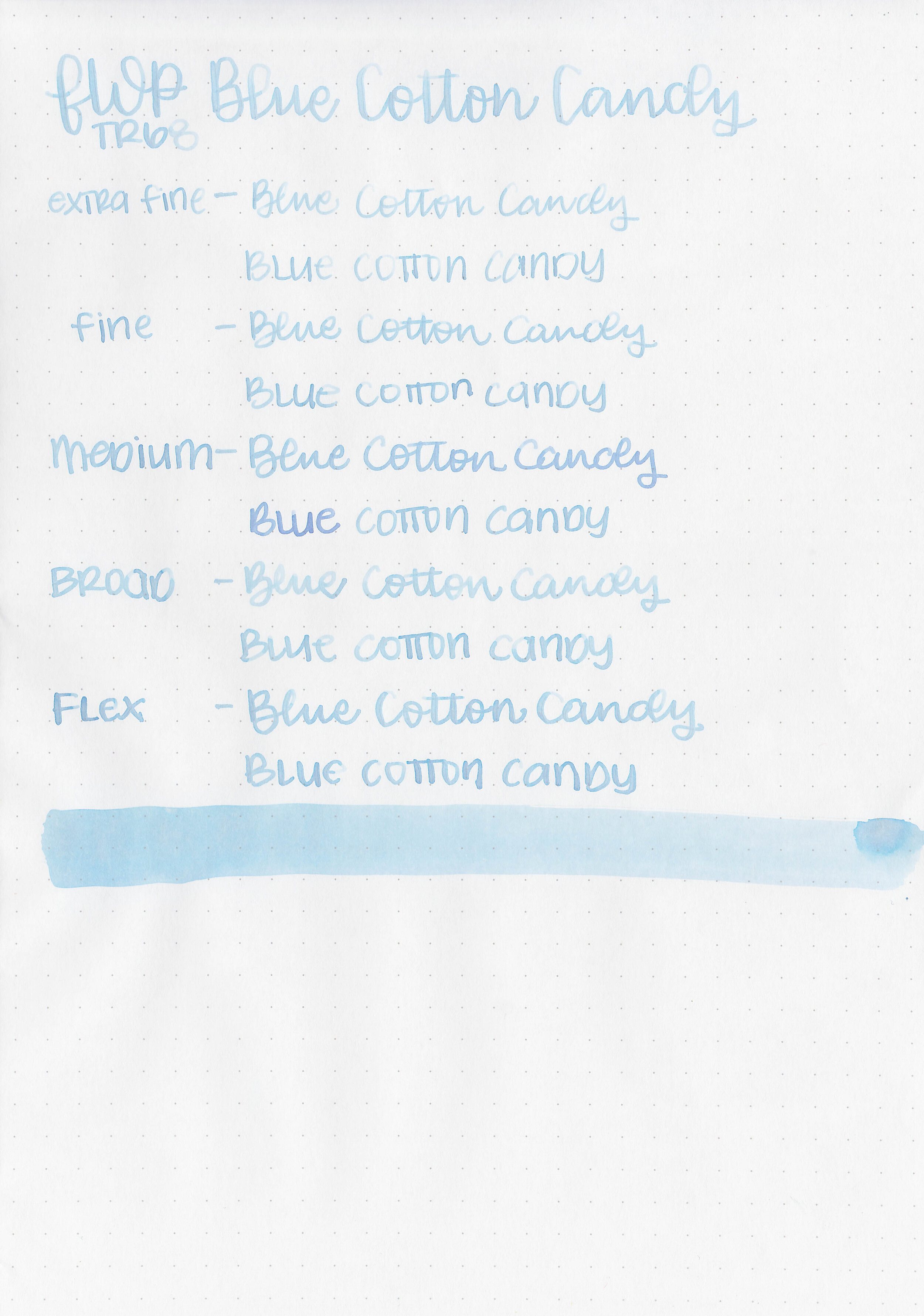
Writing samples:

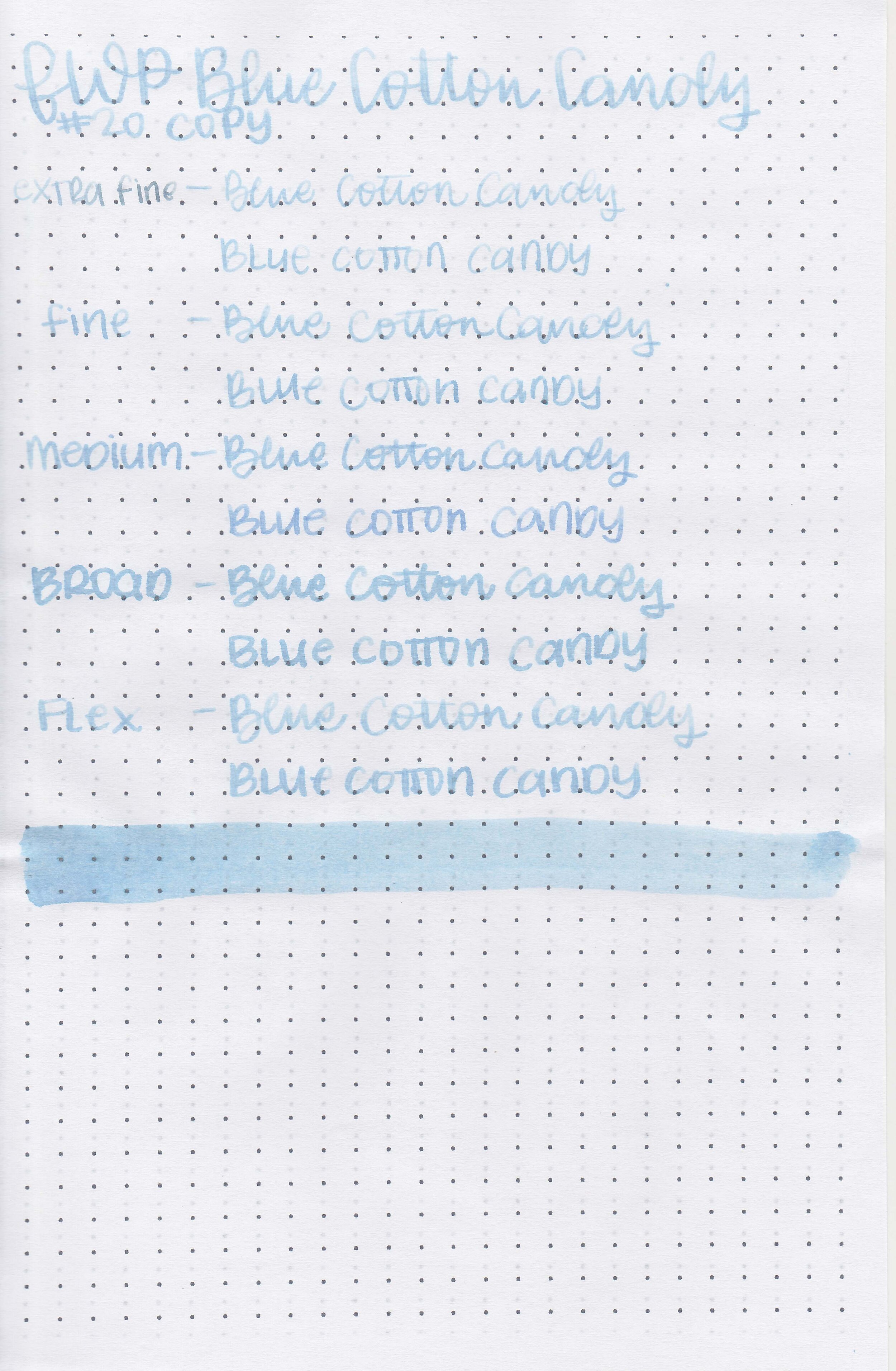
Let's take a look at how the ink behaves on fountain pen friendly papers: Rhodia, Tomoe River, and Leuchtturm.

Dry time: 40 seconds

Water resistance: Medium

Feathering: None

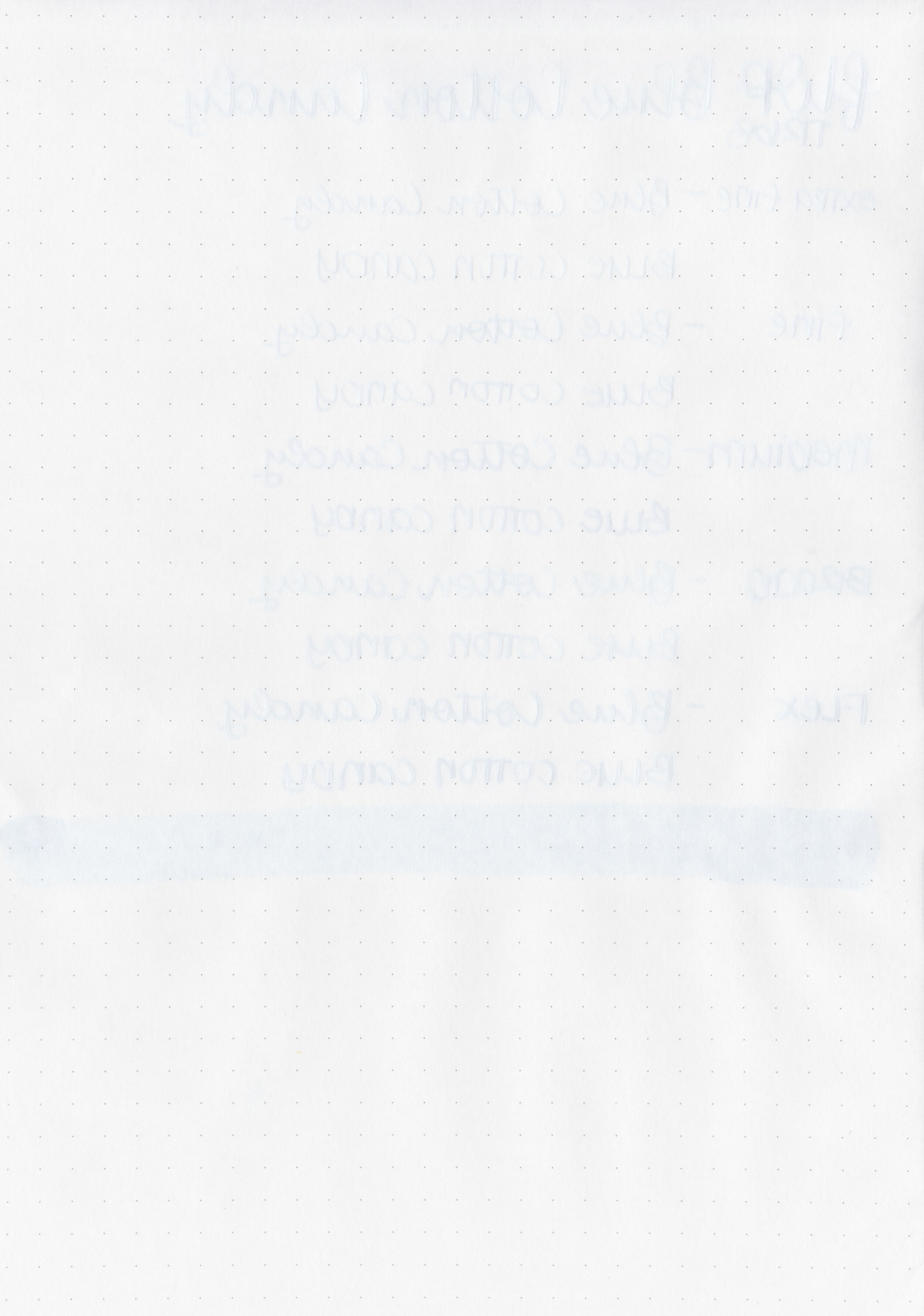
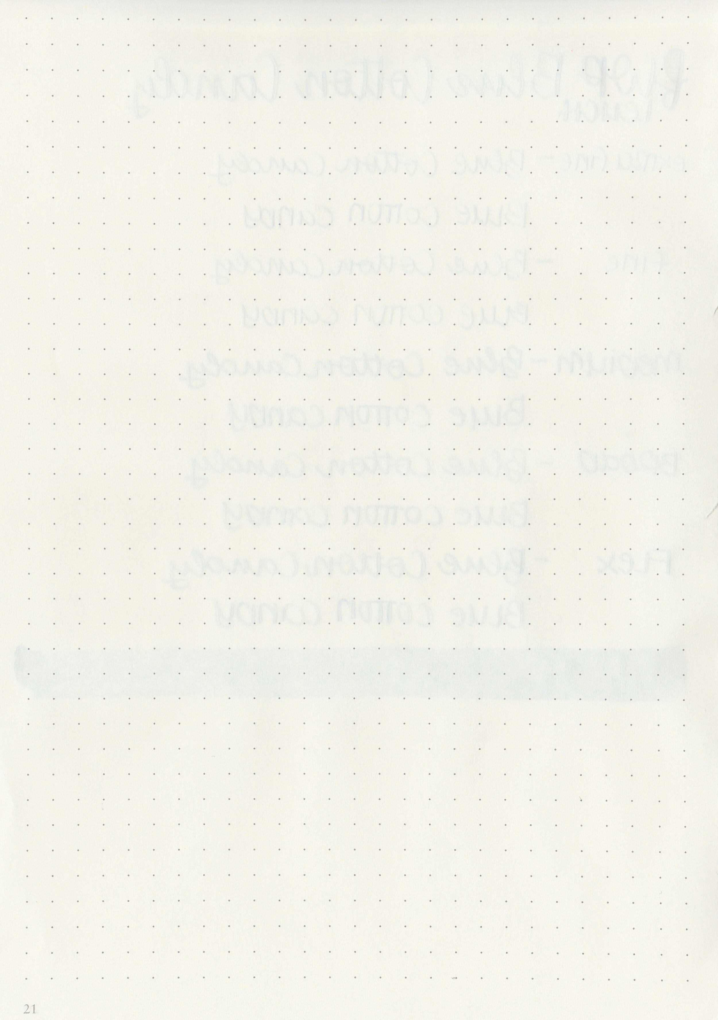
Show through: Medium

Bleeding: None

Other properties: medium shading, no sheen, and no shimmer.

On Staples 24 lb copy paper there was feathering in all nib sizes but no bleeding.

Comparison Swabs:

fwp-blue-cotton-candy-s-1.jpg

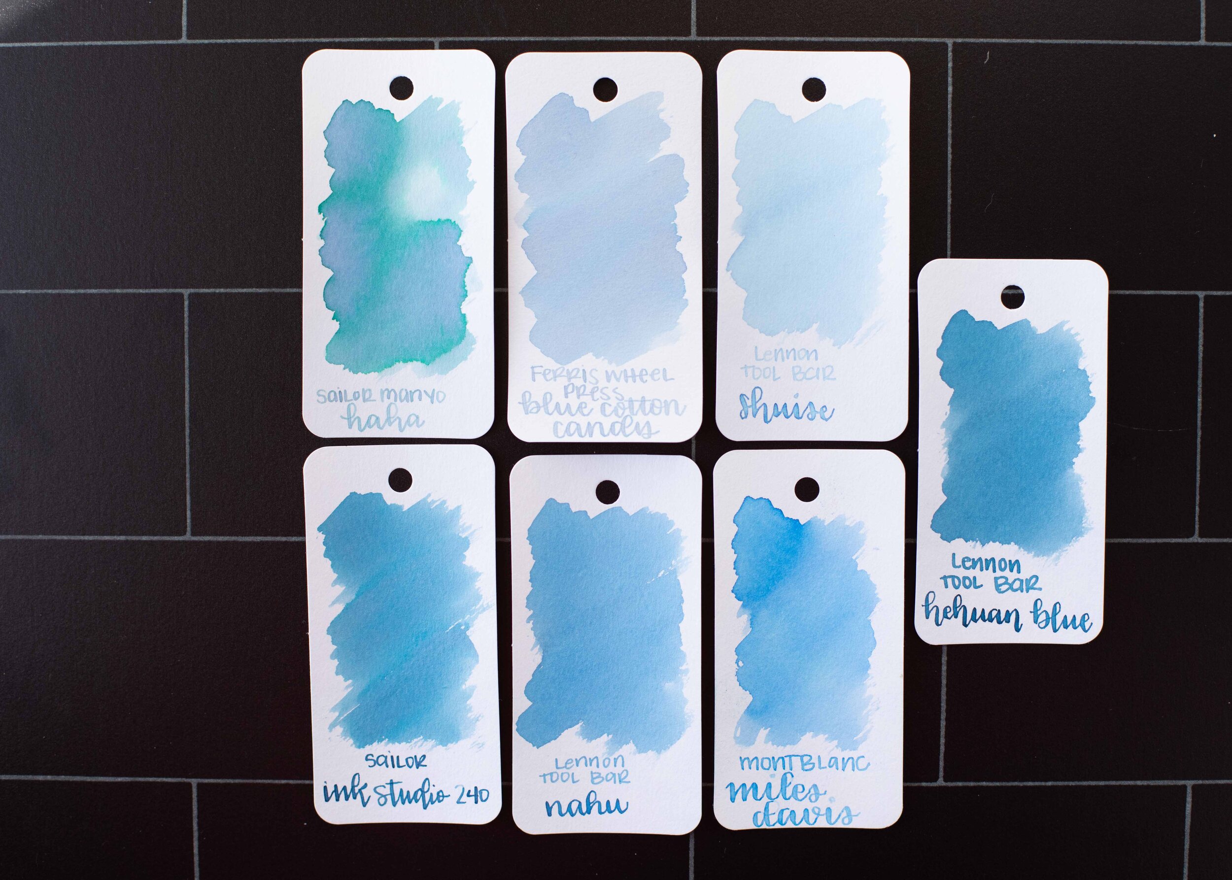
Blue Cotton Candy is a little darker than Lennon Tool Bar Shuise. Click here to see the Ferris Wheel Press inks together, and click here to see the blue inks together.

Longer writing:

fwp-blue-cotton-candy-w-1.jpg

I used a TWSBI Eco-T Mint with a broad nib on a Taroko Enigma notebook. The ink had a dry flow, you can see in the middle of the page where it got so dry I had to prime the feed a bit to keep it flowing and it quickly dried up again.

Overall, I like the color of this ink, but it’s way too dry and pale for me. It’s a little more tolerable when you add a drop of White Lightning (ink additive) to improve the flow, but it’s still too pale to be readable in most nib sizes.

Disclaimer: This ink was provided by a reader for the purpose of this review. All photos and opinions are my own. This page does not contain affiliate links and this post is not sponsored.

Ink Review #1467: Kobe 07 Kaikyou Blue

nk-kaikyou-blue-2.jpg

Kobe 07 Kaikyou Blue aka Strait Blue is from Kobe’s standard collection and is available in 50 ml bottles. Thanks to the reader that sent this ink in for review! You can find this ink for sale at Vanness Pens.

nk-kaikyou-blue-1.jpg

The color:

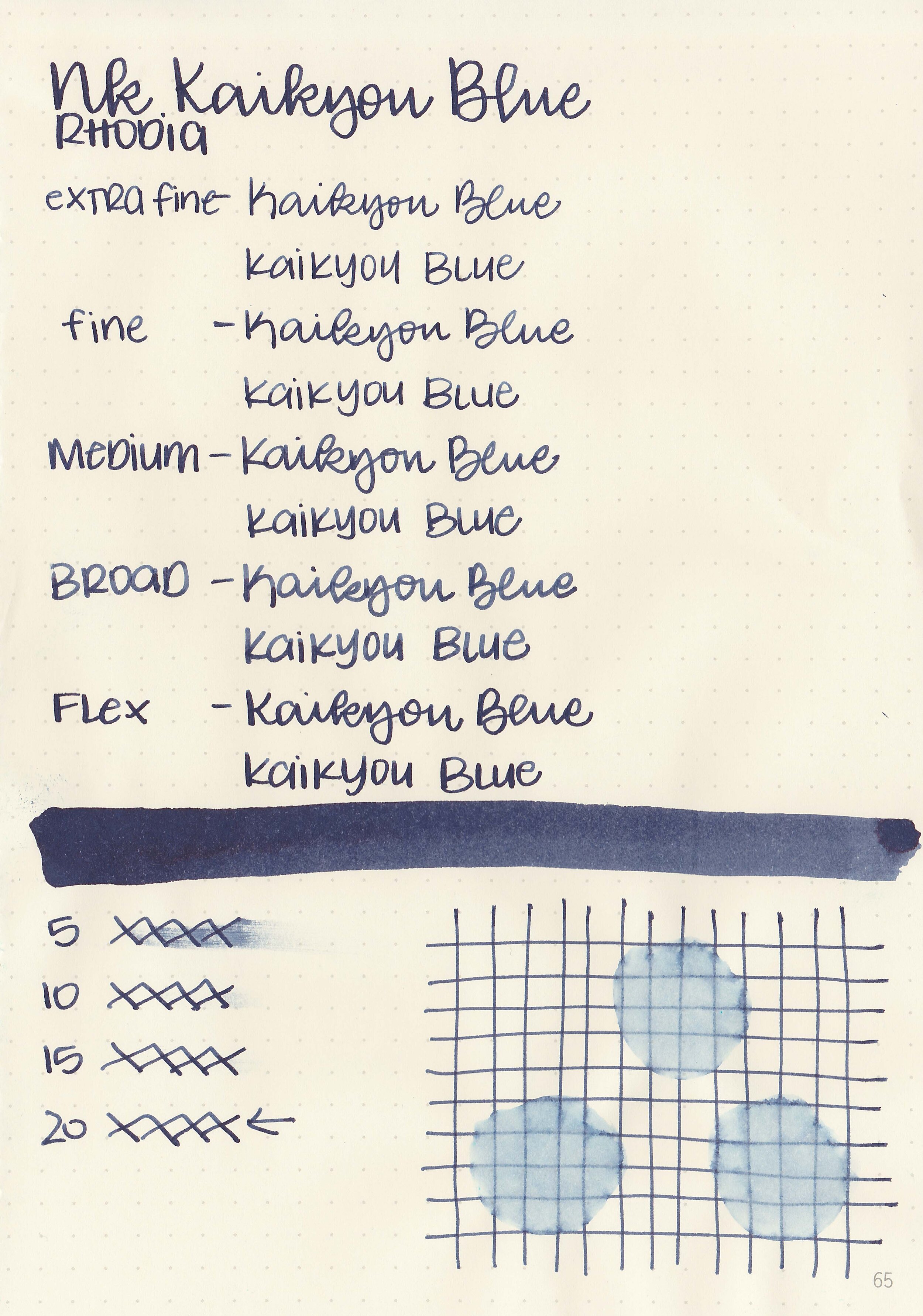
Kaikyou Blue is a dark blue-black ink.

Swabs:

nk-kaikyou-blue-3.jpg

In large swabs on Tomoe River paper the ink has some pretty coppery-red sheen.

nk-kaikyou-blue-4.jpg

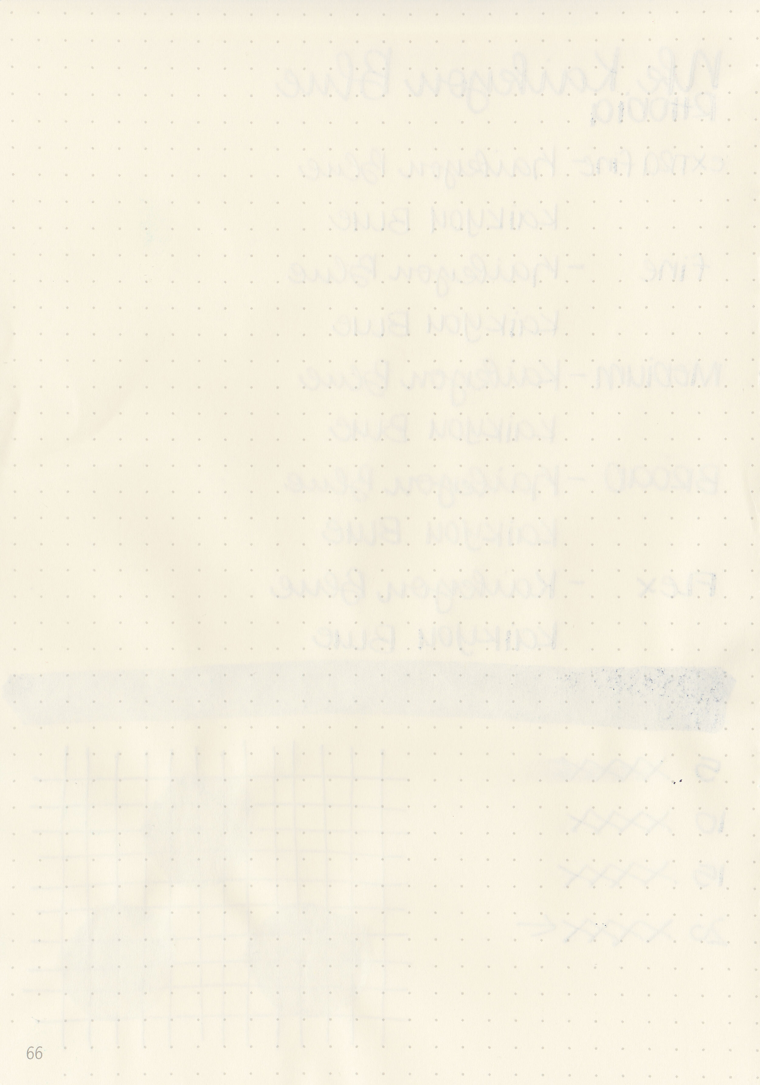
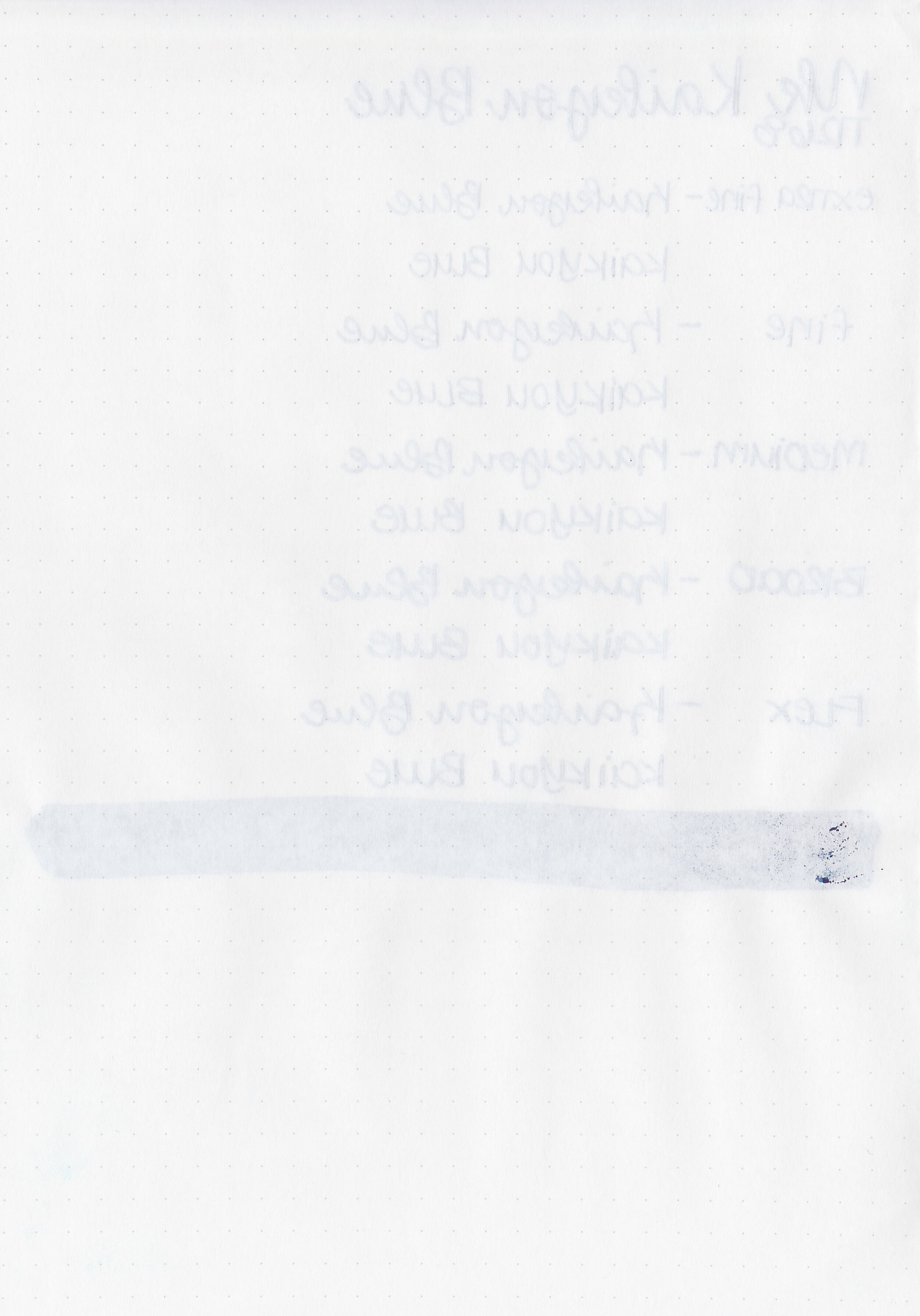
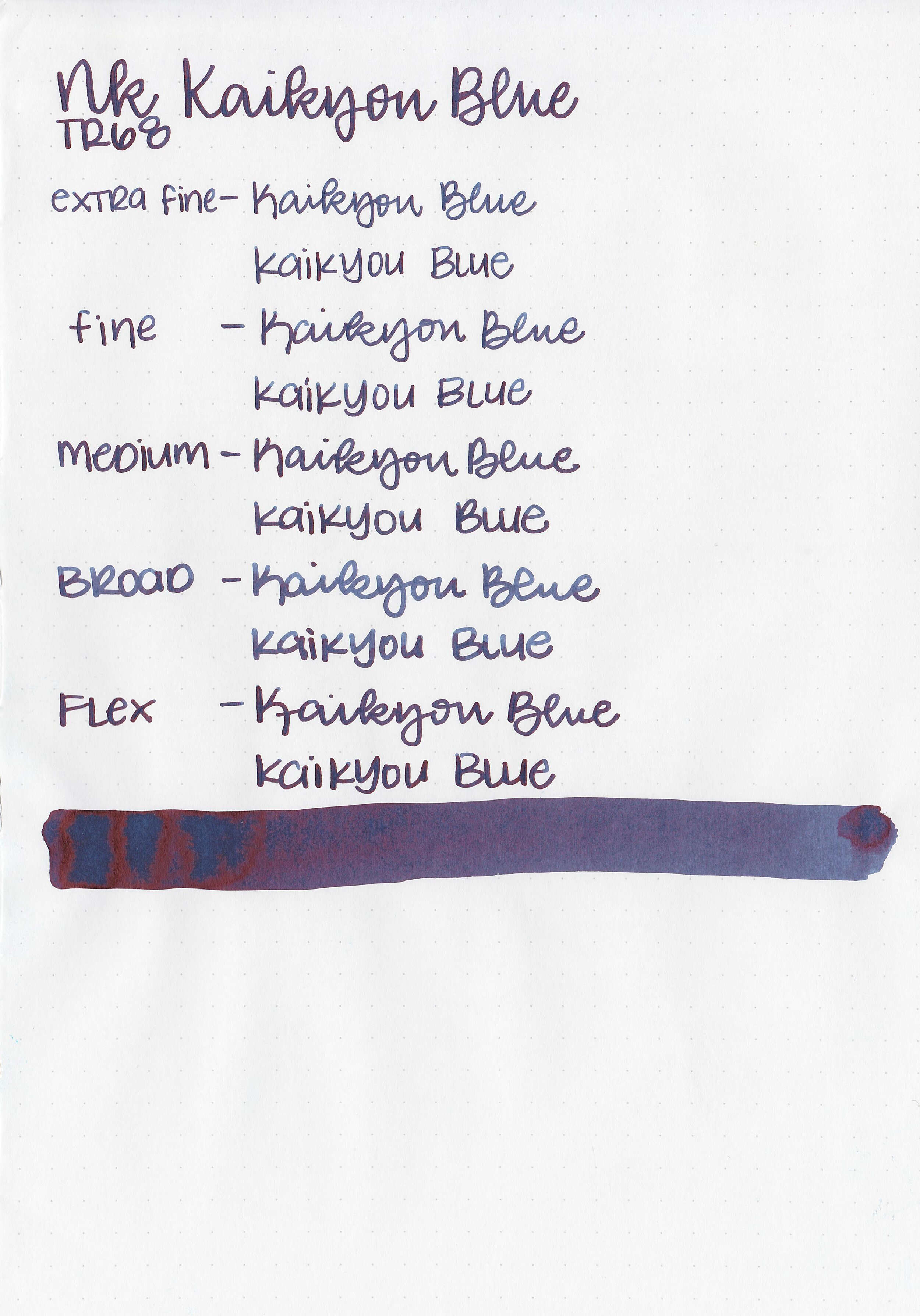
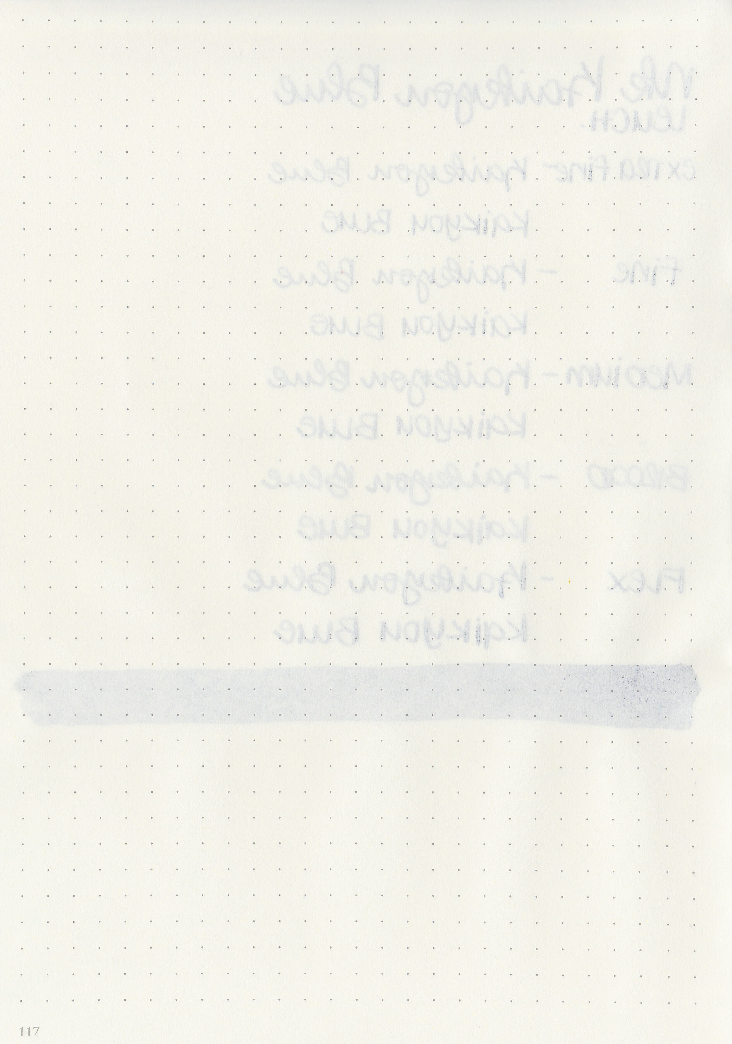
Writing samples:

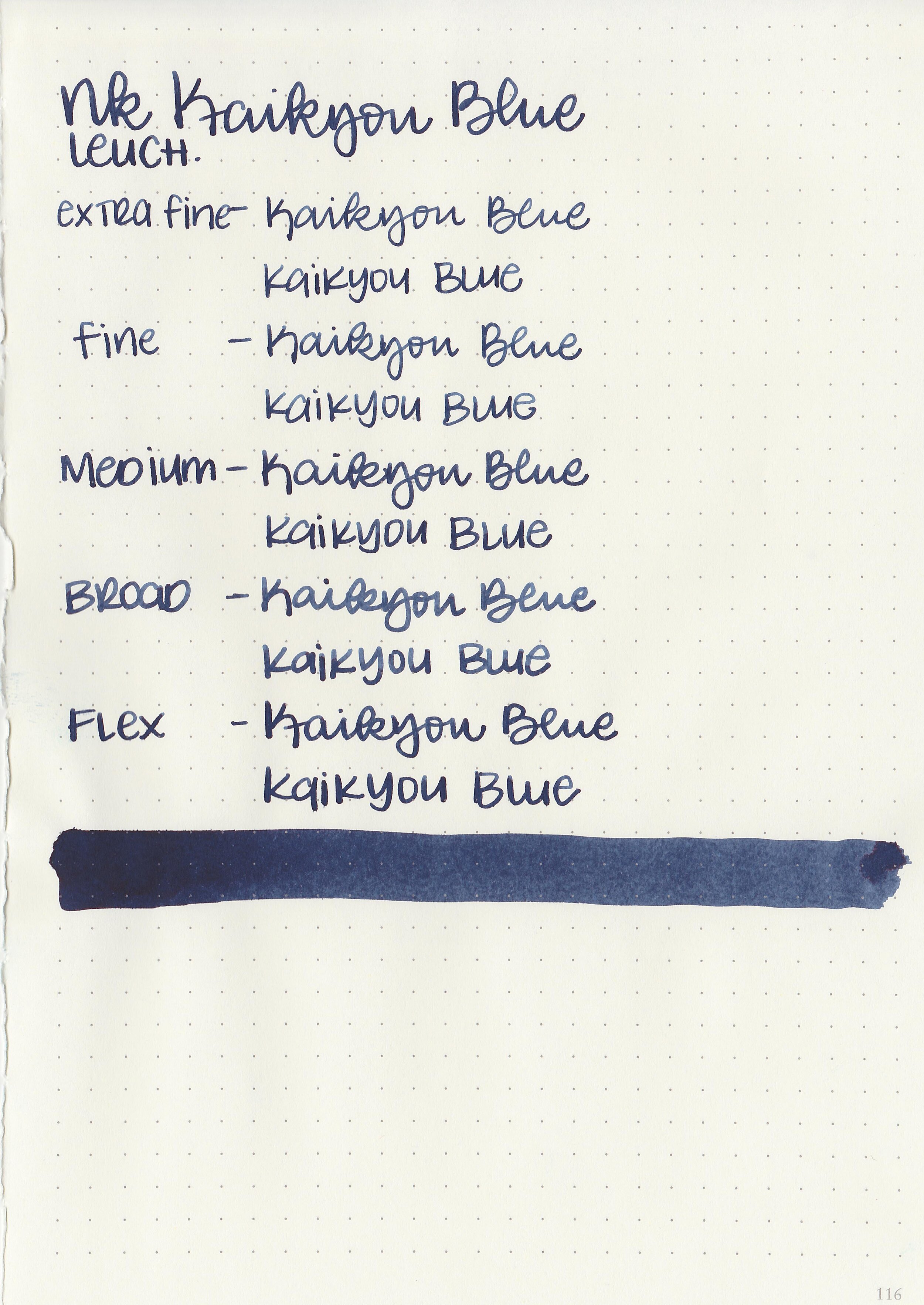
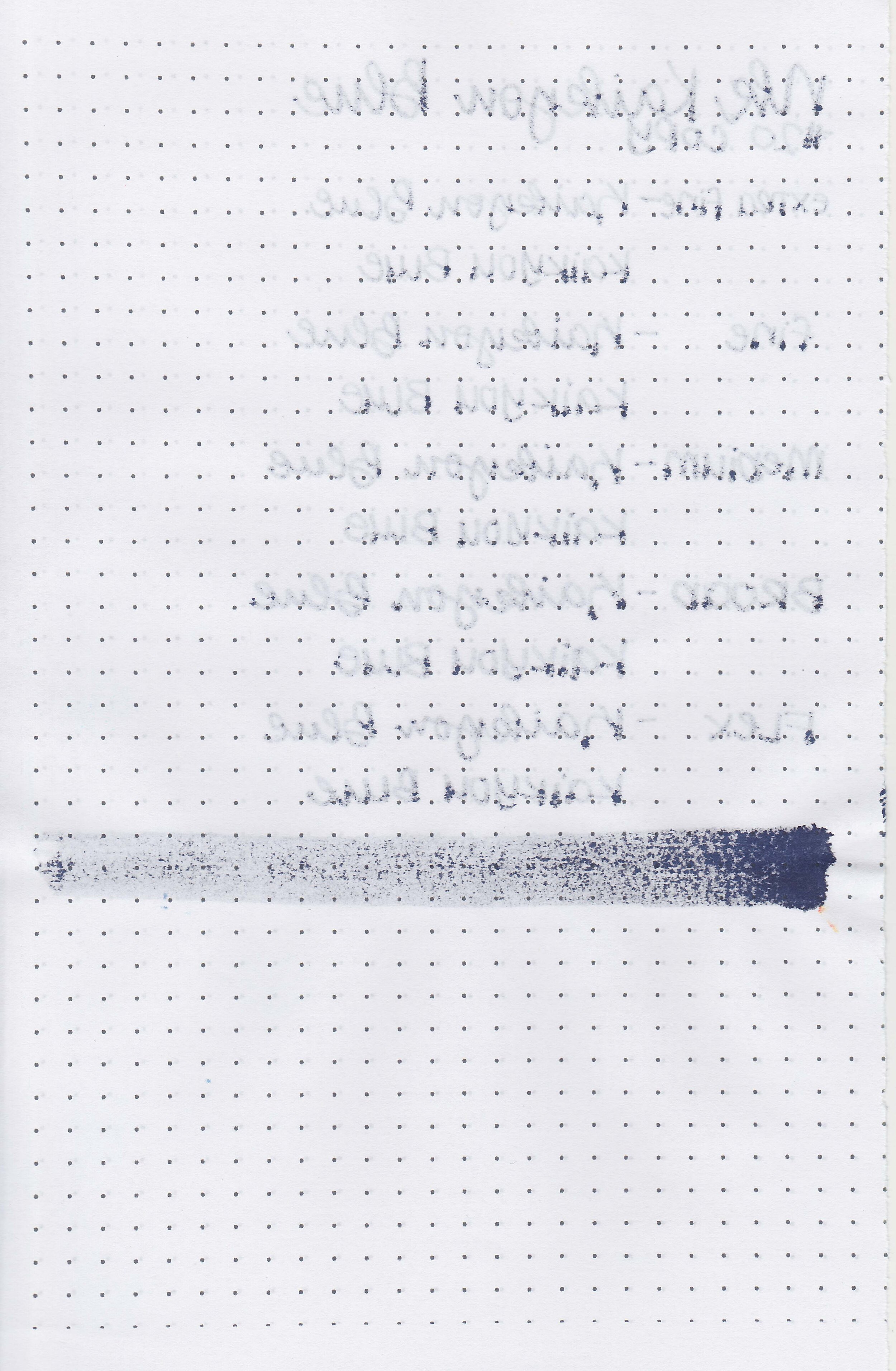
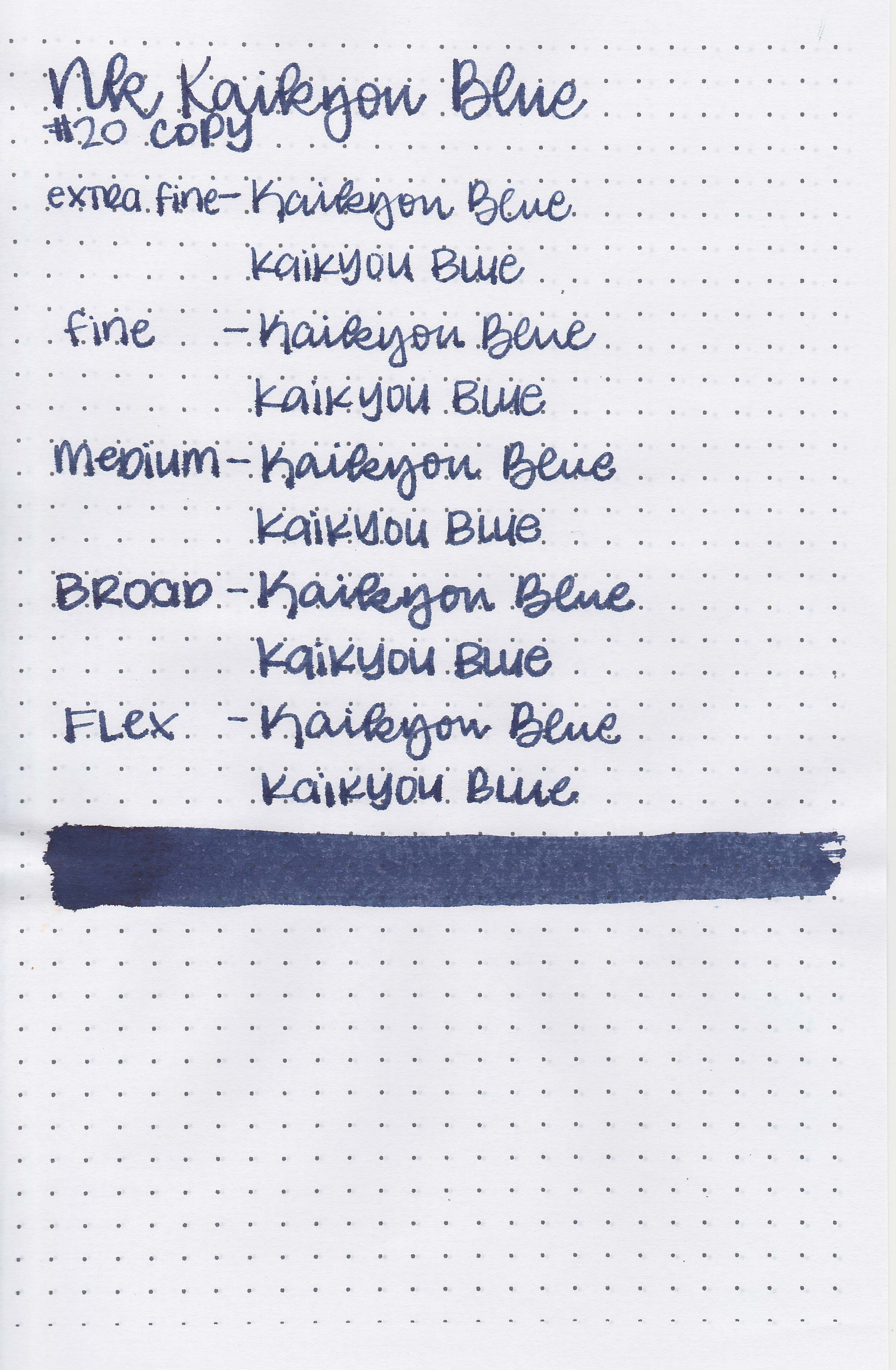
Let's take a look at how the ink behaves on fountain pen friendly papers: Rhodia, Tomoe River, and Leuchtturm.

Dry time: 20 seconds

Water resistance: Medium

Feathering: Low

Show through: Medium

Bleeding: None

Other properties: medium shading, high copper sheen, and no shimmer.

On Staples 24 lb copy paper there was feathering and bleeding in all nib sizes.

Comparison Swabs:

nk-kaikyou-blue-s-1.jpg

Kaikyou Blue is darker than Sailor Shimoyo. Click here to see the Kobe inks together, and click here to see the blue-black inks together.

Longer writing:

nk-kaikyou-blue-w-1.jpg

I used an Edison Collier Blue Steel with a broad nib on a Taroko Enigma notebook. The ink had a wet flow.

Overall, I really like this ink. It has a nice dark color as well as some shading, sheen and a nice wet flow. I would love to get a full bottle of this ink in the future!

Disclaimer: This ink was provided by a reader for the purpose of this review. All photos and opinions are my own. This page does not contain affiliate links and this post is not sponsored.

Ink Review #1466: Kobe 03 Kyu-kyoryuchi Sepia

nk-kyu-kyoryuchi-sepia-2.jpg

Kobe 03 Kyu-kyoryuchi Sepia aka The Old City Sepia is from Kobe’s standard collection and is available in 50 ml bottles. You can find this ink for sale at Vanness Pens.

nk-kyu-kyoryuchi-sepia-1.jpg

The color:

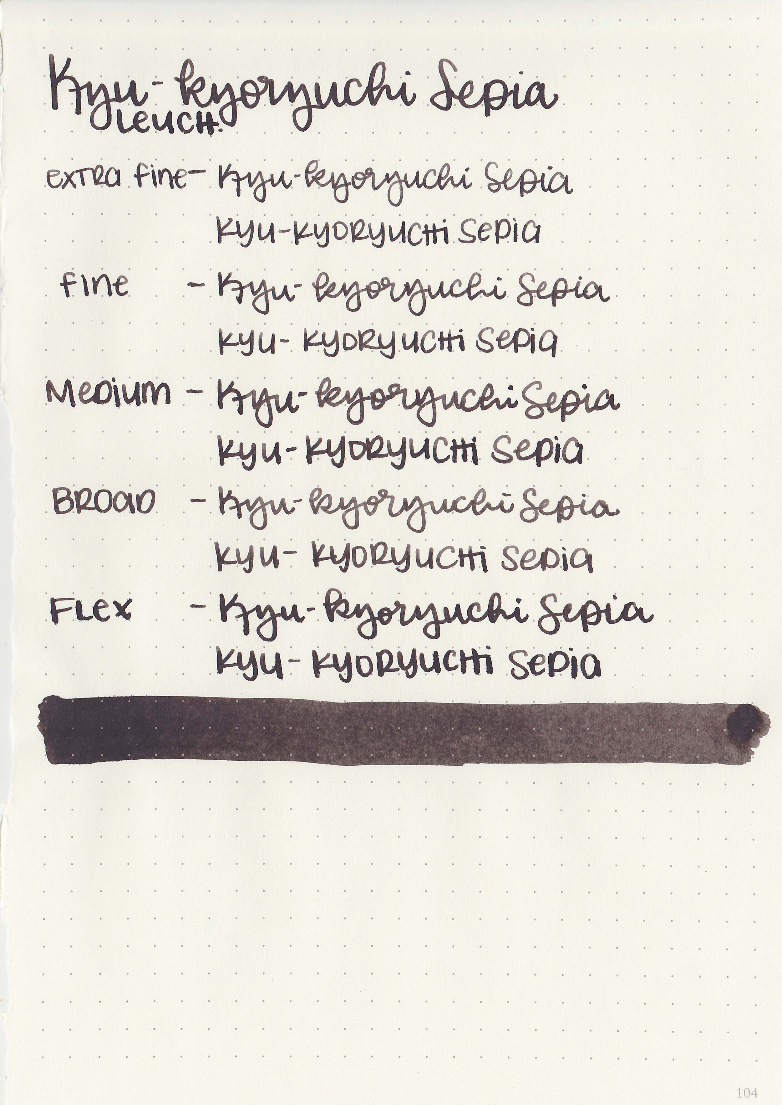
Kyu-kyoryuchi Sepia is a deep chocolate brown.

Swabs:

nk-kyu-kyoryuchi-sepia-3.jpg

In large swabs on Tomoe River paper the ink has some black sheen but only a little shading.

nk-kyu-kyoryuchi-sepia-4.jpg

Writing samples:

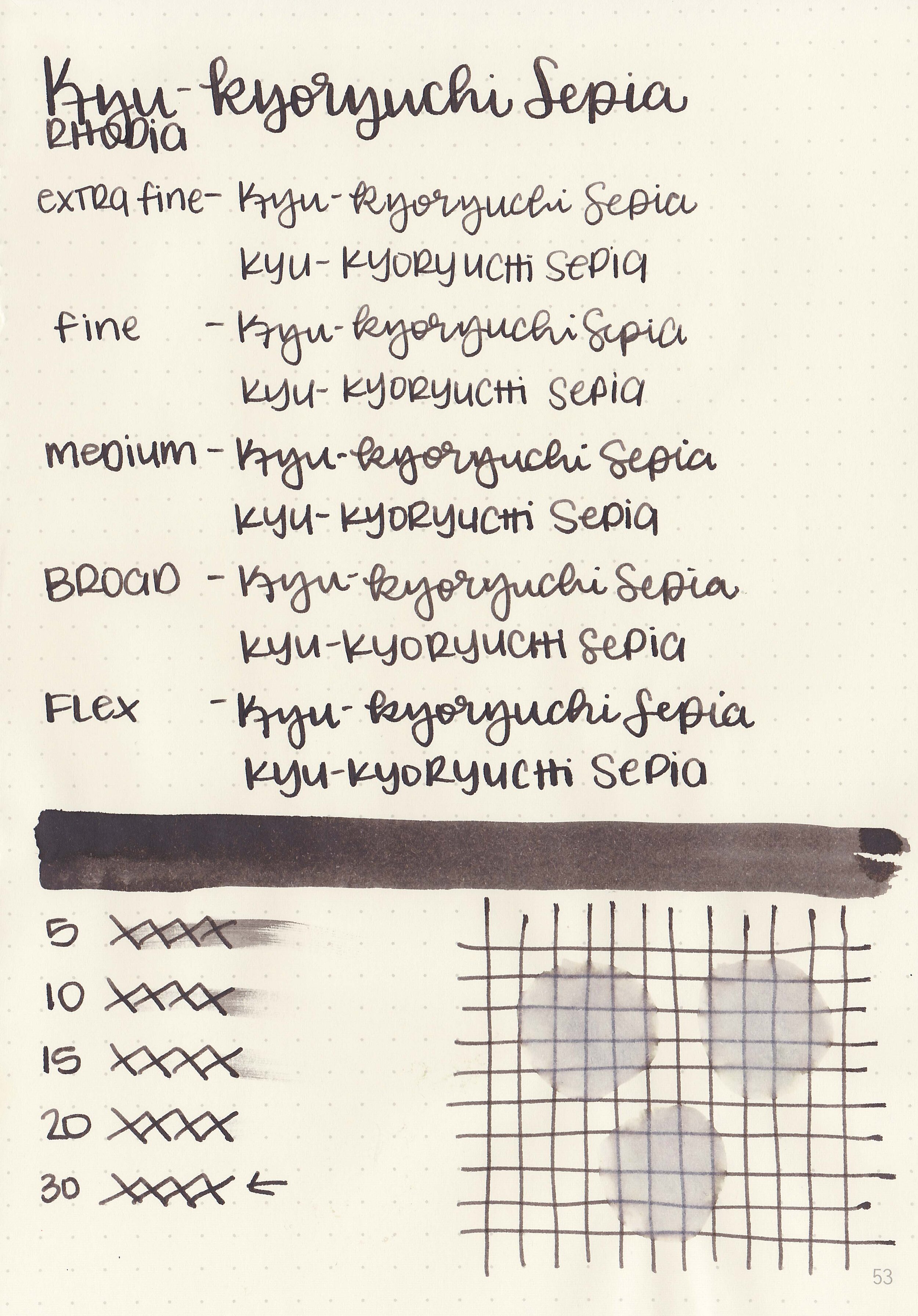
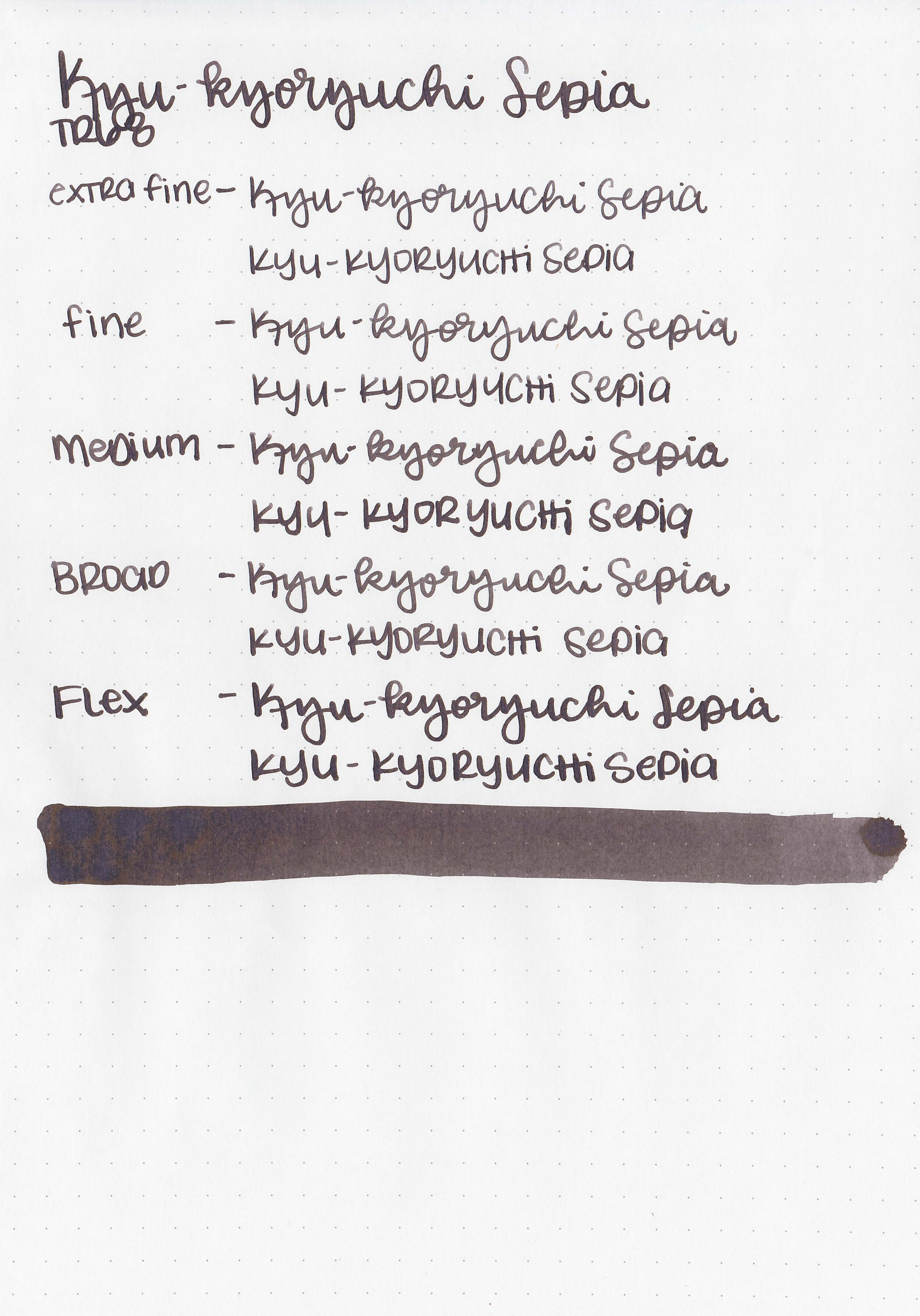
Let's take a look at how the ink behaves on fountain pen friendly papers: Rhodia, Tomoe River, and Leuchtturm.

Dry time: 30 seconds

Water resistance: Medium

Feathering: Low

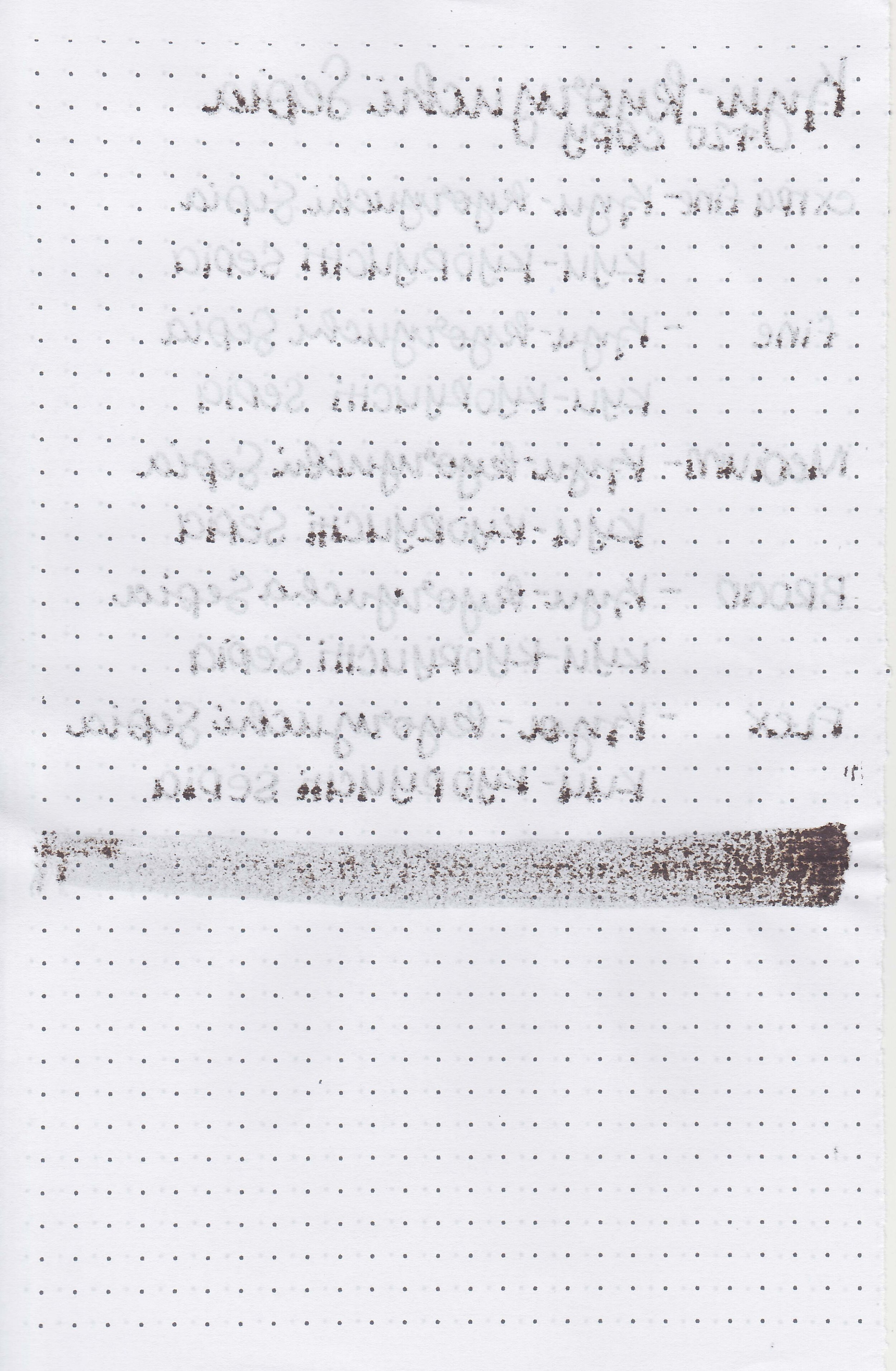
Show through: Medium

Bleeding: None

Other properties: low shading, low black sheen, and no shimmer.

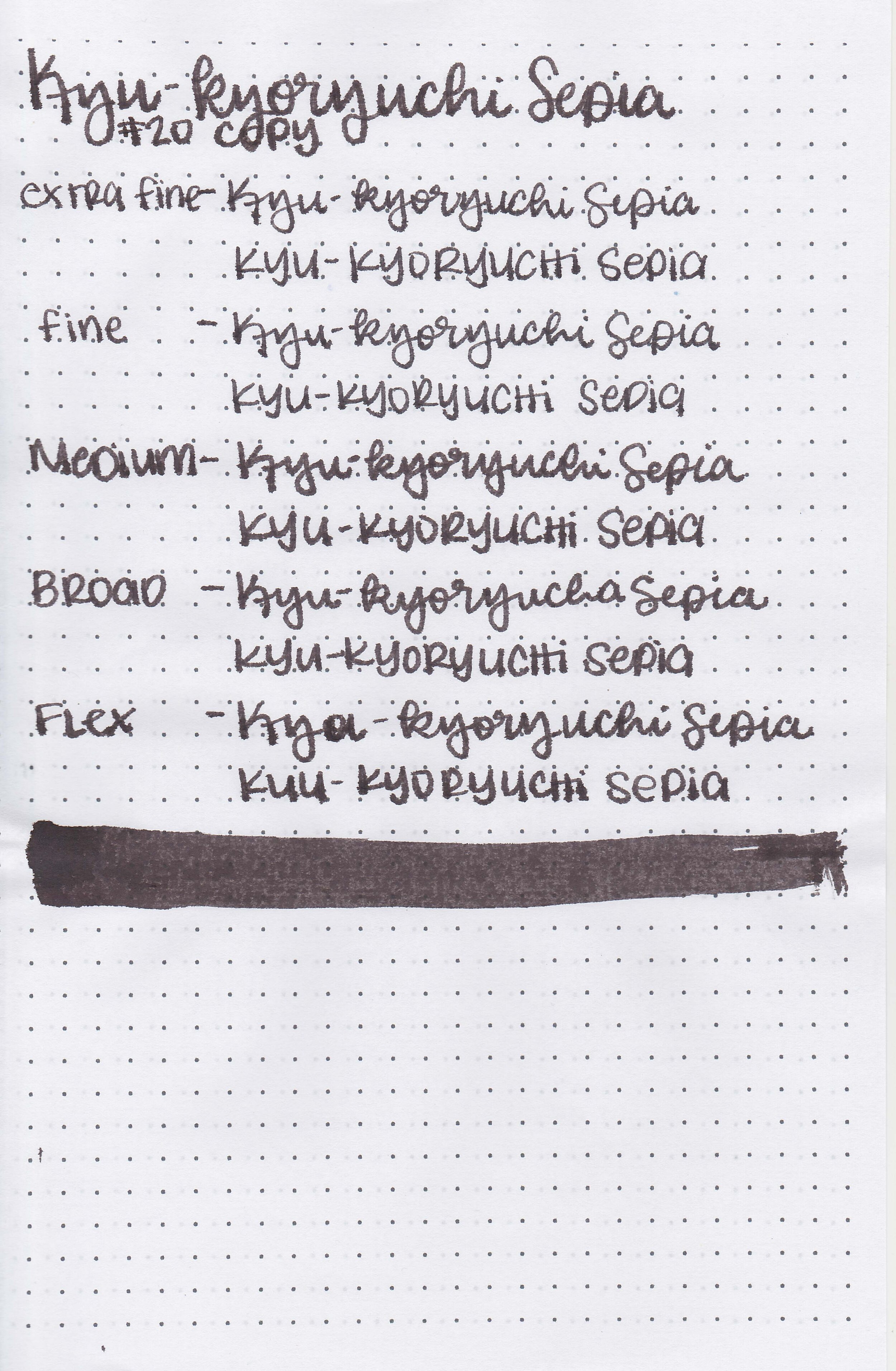
On Staples 24 lb copy paper there was feathering and bleeding in all nib sizes.

Comparison Swabs:

nk-kyu-kyoryuchi-sepia-s-1.jpg

Sepia is more saturated than Tono & Lims Coffee: Emerald Mountain. Click here to see the Kobe inks together, and click here to see the brown inks together.

Longer writing:

nk-kyu-kyooryuchi-sepia-w-1.jpg

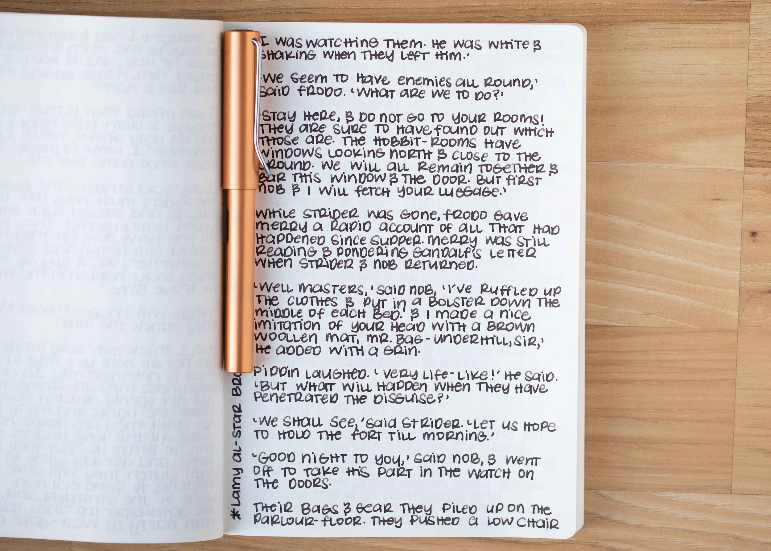
I used a Lamy Al-star Bronze with a medium nib on a Taroko Enigma notebook. The ink had a wet flow.

Overall, I liked this ink. It flows well and is a nice dark color, perfect for the fall and winter seasons, as well as being office appropriate.

Disclaimer: All photos and opinions are my own. This page does not contain affiliate links and this post is not sponsored.

Ink Review #1465: Cross Red

css-red-2.jpg

Aurora Red is from Cross’s standard collection and is available in 2 oz bottles. You can find this ink for sale at Vanness Pens.

css-red-1.jpg

The color:

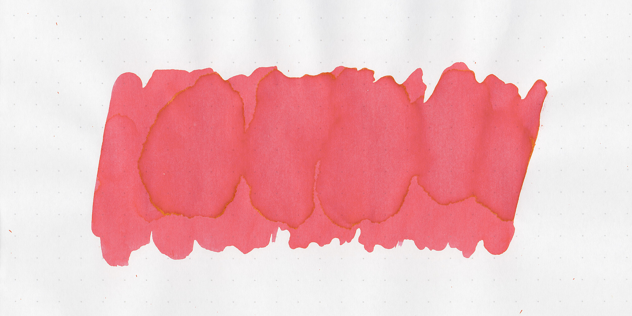
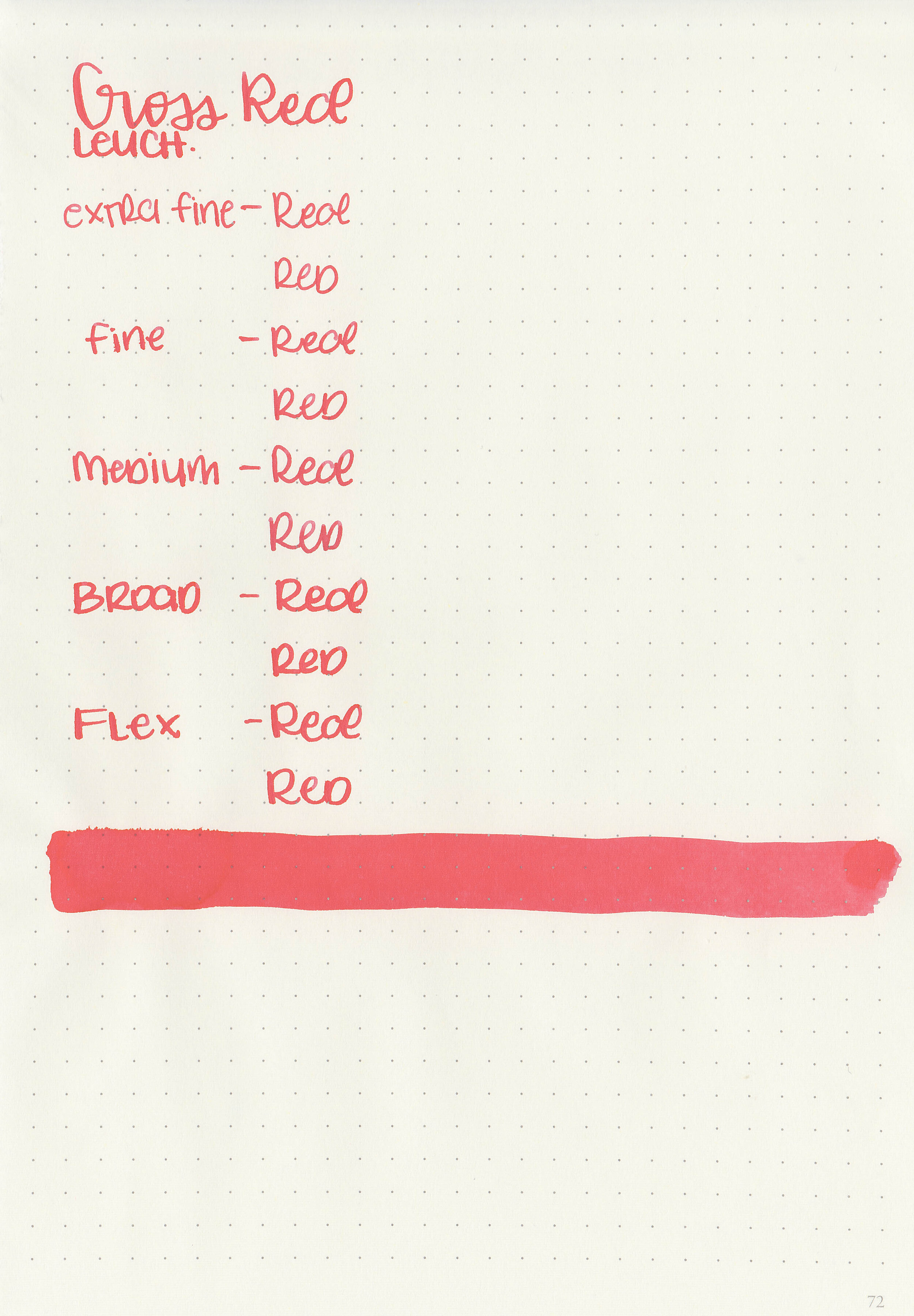
Red is a classic bright teacher red.

Swabs:

css-red-3.jpg

In large swabs on Tomoe River paper the ink looks less saturated than it does on the Col-o-ring swab above.

css-red-4.jpg

Writing samples:

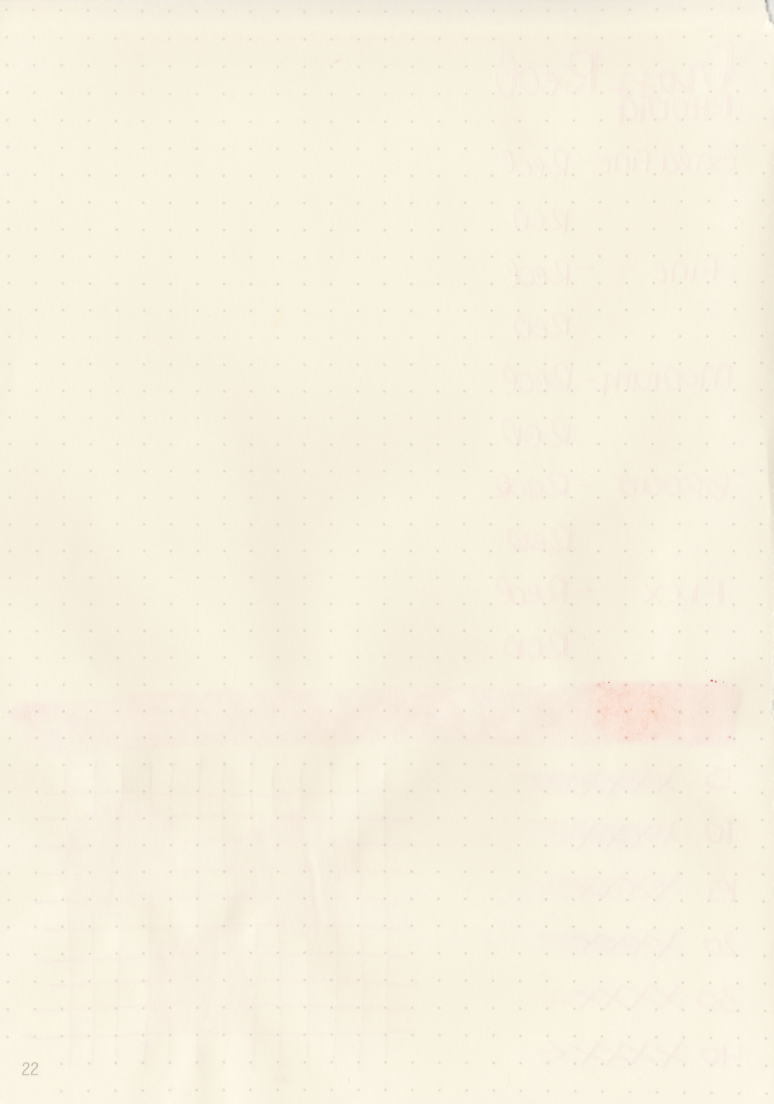
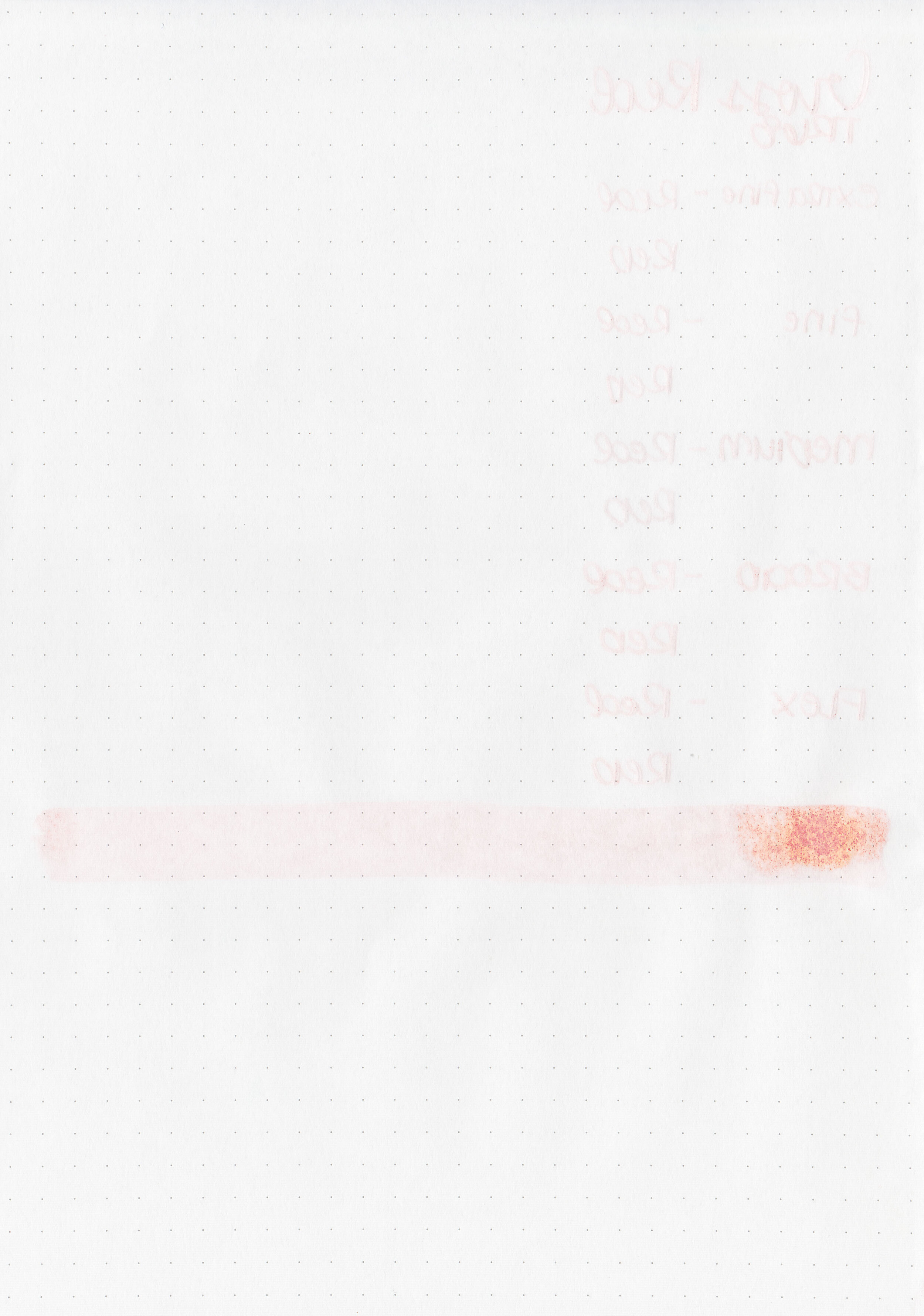
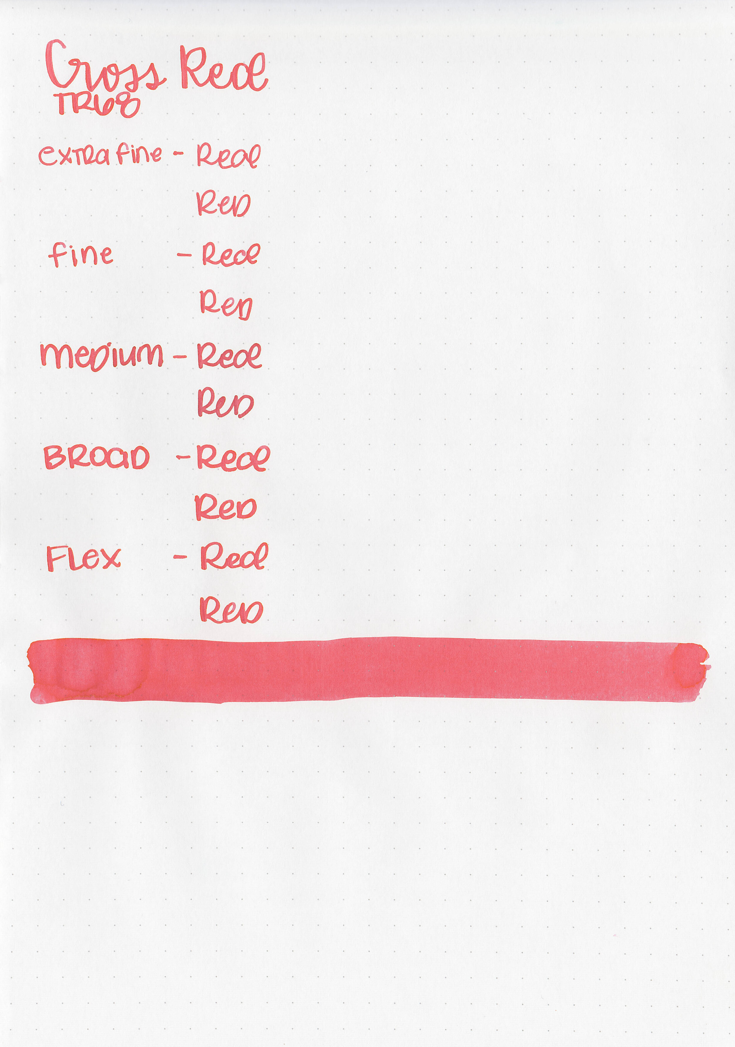
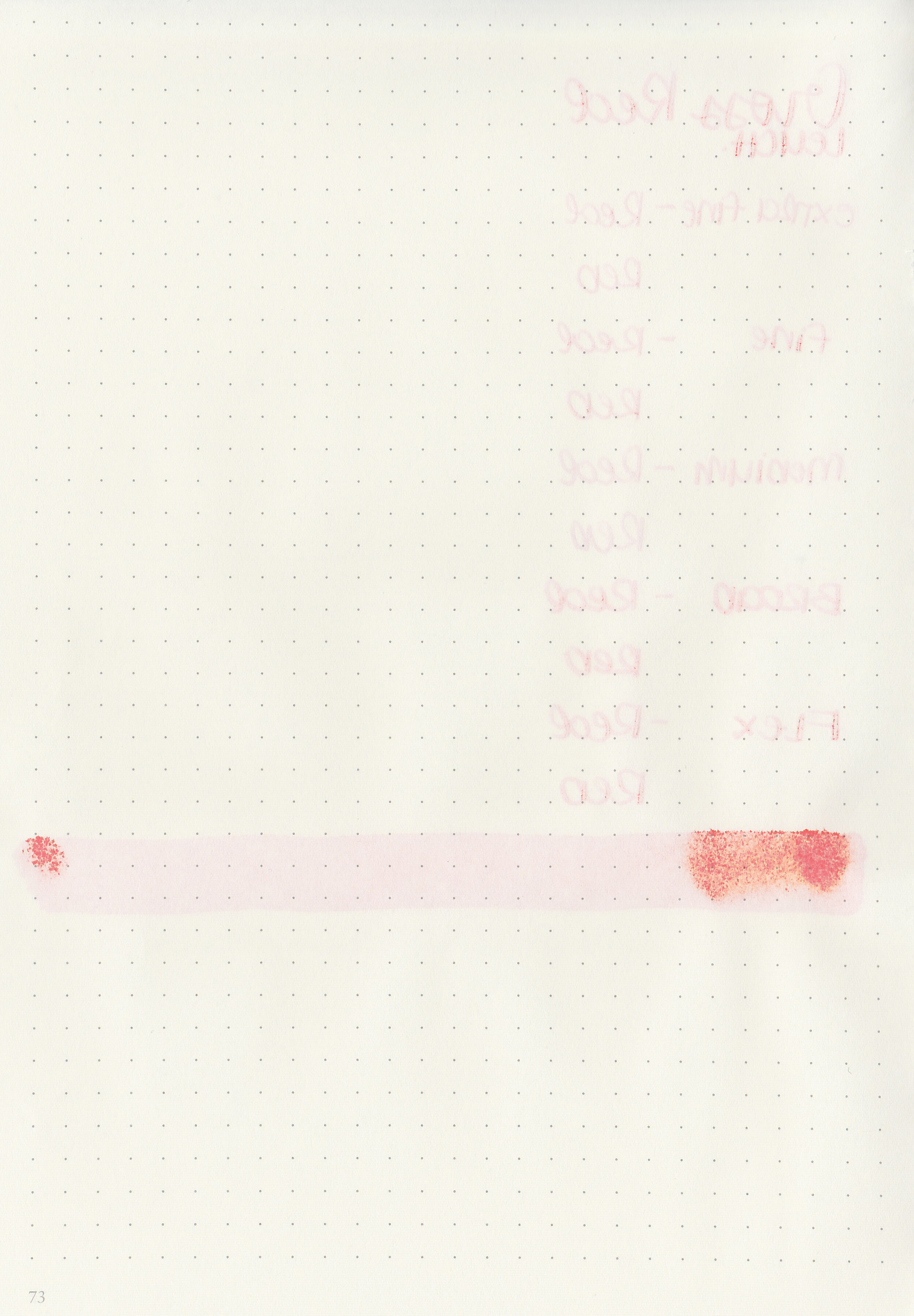
Let's take a look at how the ink behaves on fountain pen friendly papers: Rhodia, Tomoe River, and Leuchtturm.

Dry time: 40 seconds

Water resistance: Medium

Feathering: Low

Show through: Medium

Bleeding: None

Other properties: no shading, no sheen, and no shimmer.

On Staples 24 lb copy paper there was feathering and bleeding in all nib sizes.

Comparison Swabs:

css-red-s-1.jpg

Cross Red is a little more orange than Sailor Jentle Irori. Click here to see the Cross inks together, and click here to see the red inks together.

Longer writing:

css-red-w-1.jpg

I used an Esterbrook Estie Maraschino Red with a broad nib on a Taroko Enigma notebook. The ink had an average flow.

Overall, this is a nice classic red but there isn’t anything about it that wows me-no shading or sheen. It’s a good basic but not an ink I have a need for.

Disclaimer: All photos and opinions are my own. This page does not contain affiliate links and this post is not sponsored.