Ink Review #2594: KWZ Flame Red

KWZ Flame Red is from the KWZ Standard collection. You can find this ink for sale at most retailers including Vanness Pens.

The color:

Flame Red is an unsaturated medium red.

*For my swab cards I use a Col-o-ring by Skylab Letterpress, a medium Pilot Ishime and a Mabie Todd Swan.

Swabs:

In large swabs on Tomoe River paper it has some shading.

Writing samples:

Let's take a look at how the ink behaves on fountain pen friendly papers: Rhodia, Tomoe River, and Leuchtturm.

*For my writing samples I use:

Dry time: 60 seconds

Water resistance: Medium

Feathering: None

Show through: Medium

Bleeding: None

Other properties: medium shading, no sheen, and no shimmer.

On 20 lb copy paper the ink had some feathering and some bleeding in the larger nib sizes.

Comparison Swabs:

Flame Red is more vibrant than Inkebara Alice Red. Click here to see the red inks together.

Longer Writing:

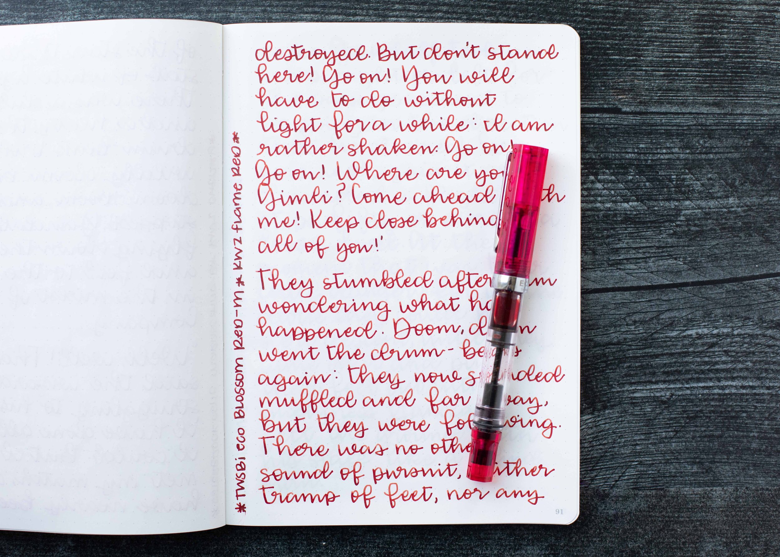
I used a TWSBI Eco Blossom Red with a medium nib on a Taroko Enigma notebook. The ink has an average flow.

Overall, I really enjoyed this ink. It's a great color for the fall and winter.

Thanks to all my Patrons! I couldn’t do these reviews without you! You can find my Patreon page here.

Disclaimer: All photos and opinions are my own. This page does not contain affiliate links and this post is not sponsored.

Ink Review #2593: KWZ Cherry

KWZ Cherry is from the KWZ Standard collection. You can find this ink for sale at most retailers including Vanness Pens.

The color:

Cherry is a medium merlot red.

*For my swab cards I use a Col-o-ring by Skylab Letterpress, a medium Pilot Ishime and a Mabie Todd Swan.

Swabs:

In large swabs on Tomoe River paper it has some shading.

Writing samples:

Let's take a look at how the ink behaves on fountain pen friendly papers: Rhodia, Tomoe River, and Leuchtturm.

*For my writing samples I use:

Dry time: 40 seconds

Water resistance: Medium

Feathering: None

Show through: Medium

Bleeding: None

Other properties: medium shading, no sheen, and no shimmer.

On 20 lb copy paper the ink had some feathering and some bleeding in the larger nib sizes.

Comparison Swabs:

Cherry is a little more vibrant than Pennonia Sour Cherry. Click here to see the red inks together.

Longer Writing:

I used an Esterbrook Estie Maraschino with a broad nib on a Taroko Enigma notebook. The ink has an average flow.

Overall, I really like this ink. It’s a good color, well behaved and has a good flow. It’s an all over great ink.

Thanks to all my Patrons! I couldn’t do these reviews without you! You can find my Patreon page here.

Disclaimer: All photos and opinions are my own. This page does not contain affiliate links and this post is not sponsored.

Kawco Sport Carmine Fude Nib

The Kaweco Sport Carmine is a Galen Leather Exclusive. The cap has Galen Leather printed on one side and Kaweco Sport on the other. Thanks to Galen Leather for sending this pen over for review!

This pen is 4.13 inches when closed, and 5.2 inches when posted. I prefer to use Kaweco Sports posted because the length is more comfortable for my hand.

The finial has the Kaweco logo in gold.

This pen is available in 16 different nib sizes, I have the fine fude nib.

With a fude the nib is bent upwards, creating a large surface to write with.

I prefer to use this nib with cursive writing, although it works fine with printing or reverse writing. The side stroke is wider than the down stroke.

This nib writes more like a marker than a fountain pen, which is really fun. The lower your writing angle is the wider the nib gets.

You can add a single or double zippered pen case to your pen purchase. I have the Double Zip in Carmine Red.

It’s the perfect size to hold two Kaweco pens comfortably. I love how well the case matches the pen.

Overall, I love Kaweco Sports-I have over 20 of them-I like them just that much. This one is a great color and I love the transparency. The fude nib is fun to write with and something different than the usual nibs available. I love the pen case that goes with it-I’ll use it often. I would absolutely recommend this pen and case, especially if you are looking for a fun nib!

Disclaimer: These products were provided by Galen Leather for the purpose of this review. All photos and opinions are my own. This post does not contain affiliate links and is not sponsored.

Ink Review #2592: De Atramentis Black

De Atramentis Black is from the Standard collection. This ink is also known as: Motorbike, Steam Locomotive, Halloween, Johannes Gutenberg, Cross Boys, Martin Luther, George Washington, Imperator Caesar Augustus, Acts of Murder Eifel, Fritz Reuter, Egyptian, Licorice and Durant. You can find these inks for sale at Vanness Pens.

The color:

Black is a medium black.

*For my swab cards I use a Col-o-ring by Skylab Letterpress, a medium Pilot Ishime and a Mabie Todd Swan.

Swabs:

In large swabs on Tomoe River paper the ink looks darker than it does on the Col-o-ring swab.

Writing samples:

Let's take a look at how the ink behaves on fountain pen friendly papers: Rhodia, Tomoe River, and Leuchtturm.

*For my writing samples I use:

Dry time: 30 seconds

Water resistance: Medium

Feathering: None

Show through: Medium

Bleeding: None

Other properties: no shading, no sheen, and no shimmer.

On 20 lb copy paper the ink worked pretty well, just a little bit of feathering and bleeding in the flex nib.

Comparison Swabs:

Black is a little bit lighter than these other black inks. Click here to see the black inks together.

Longer Writing:

I used a Kaweco Al-sport Anthracite with a medium nib on a Taroko Enigma notebook. The ink has a wet flow.

Overall, this is a good basic black. It’s not the darkest black ink out there, but it’s a good medium black.

Thanks to all my Patrons! I couldn’t do these reviews without you! You can find my Patreon page here.

Disclaimer: All photos and opinions are my own. This page does not contain affiliate links and this post is not sponsored.

Ink Review #2591: Papier Plume Oyster Grey

Today’s ink is Papier Plume Oyster Grey. You can find this ink at Papier Plume’s website or Vanness Pens. Thanks to the reader who sent this ink in for review!

The color:

Oyster Grey is a deep grey with a blue undertone.

*For my swab cards I use a Col-o-ring by Skylab Letterpress, a medium Pilot Ishime and a Mabie Todd Swan.

Swabs:

In large swabs on Tomoe River paper the ink looks very dark.

Writing samples:

Let's take a look at how the ink behaves on fountain pen friendly papers: Rhodia, Tomoe River, and Leuchtturm.

*For my writing samples I use:

Dry time: 30 seconds

Water resistance: Medium

Feathering: None

Show through: Medium

Bleeding: None

Other properties: low shading, no sheen, and no shimmer.

On 20 lb copy paper the ink had some feathering and bleeding in the larger nib sizes.

Comparison Swabs:

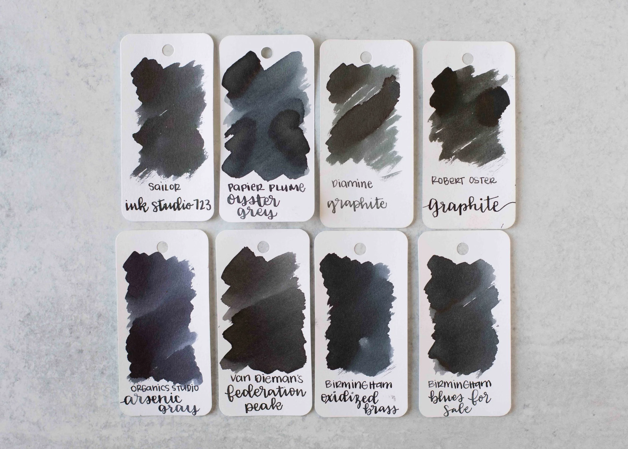
Oyster Grey is closest to Birmingham Oxidized Brass. Click here to see the grey inks together.

Longer Writing:

I used a Pilot Custom 823 Smoke with a broad nib on a Taroko Enigma notebook. The ink has an average flow.

Overall, this is a good solid dark grey ink. It’s dark enough to be easily read and well behaved.

Thanks to all my Patrons! I couldn’t do these reviews without you! You can find my Patreon page here.

Disclaimer: All photos and opinions are my own. This page does not contain affiliate links and this post is not sponsored.

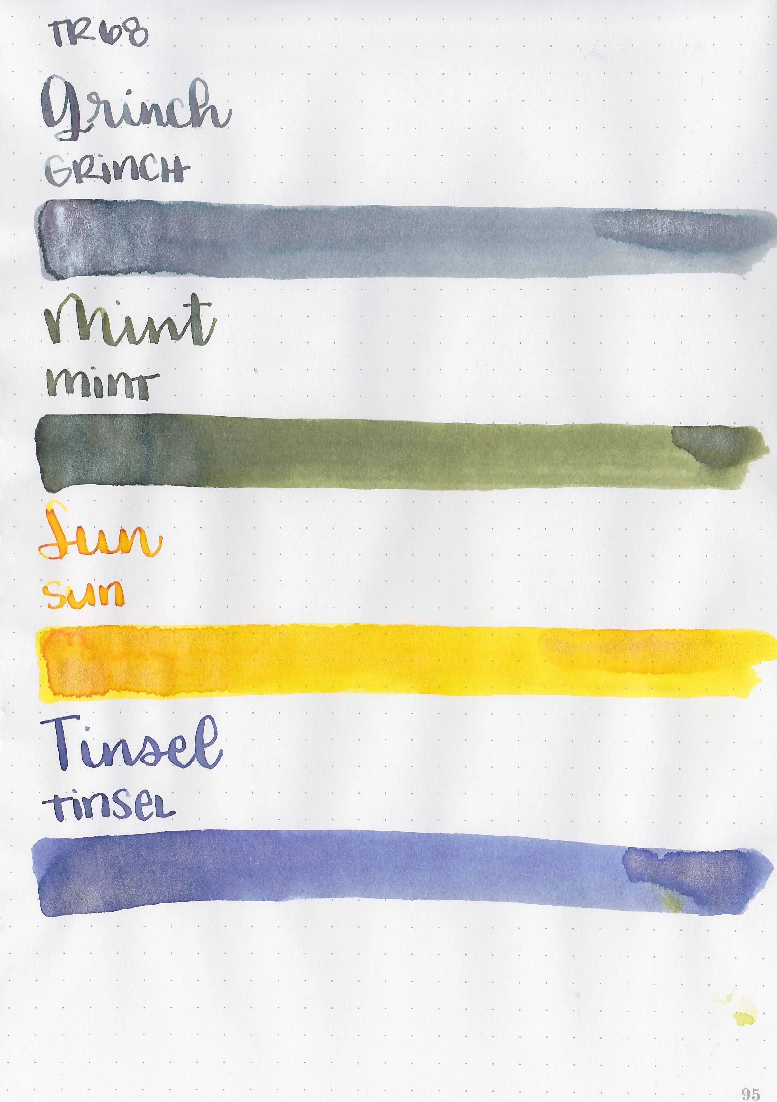
Robert Oster Holiday 2023

I am absurdly late with this post, but let’s take a look at Robert Oster’s Holiday 2023 collection. You can finds these inks for sale at a Vanness Pens.

Swabs:

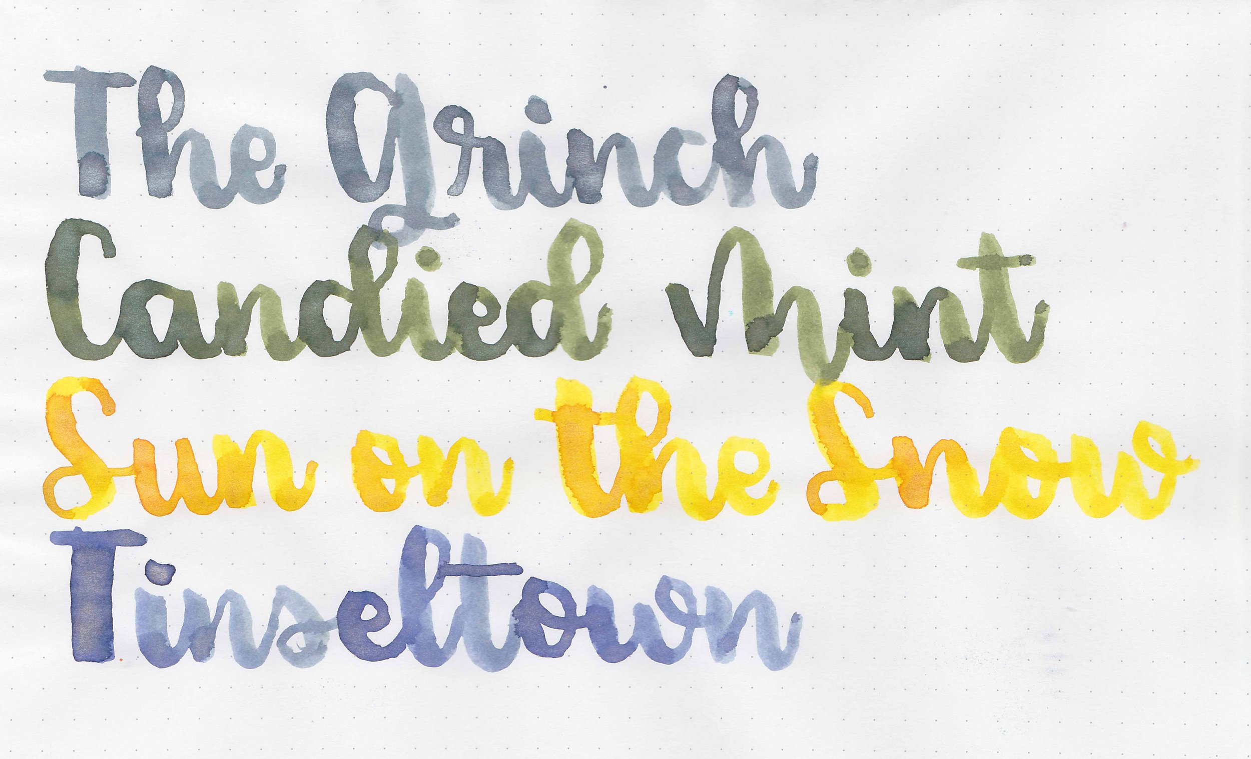
Left to right: The Grinch, Sun on the Snow, Candied Mint, and Tinsel Town.

Writing samples:

Let's take a look at how the ink behaves on fountain pen friendly papers: Rhodia, Tomoe River, and Leuchtturm.

Dry Time: 40-50 seconds

Water Resistance: Low

Feathering: None

Show through: Medium

Bleeding: None

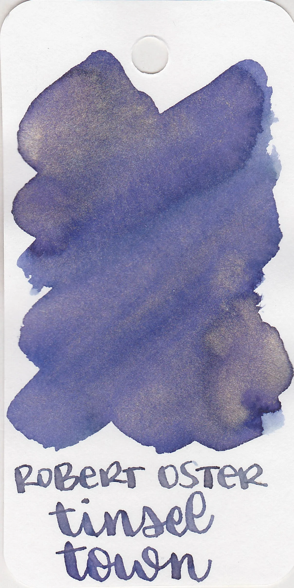
Other properties: All have medium shading and shimmer. The Grinch has silver shimmer. Candied Mint has green shimmer. Sun on the Snow has gold shimmer. Tinseltown has bronze shimmer.

On Walmart Pen + Gear copy paper there was some feathering in every nib size and a few dots of bleeding.

Comparison Swabs:

The Grinch is closest to Vinta Nahan.

Sun on the Snow is closest to Van Dieman’s Golden Orb Web.

Candied Mint isn’t super close to any of these, but it’s probably closes to Ferris Wheel Press Brilliant Beanstalk.

Tinseltown is less blue than J Herbin 1670 Violet Imperial.

Longer Writing:

I used a Taroko Enigma notebook. All three had slightly dry flows.

Overall, these are lovely inks. I didn’t have any issues with clogging or hard starts. These are absolutely worth a try. I think The Grinch is my favorite out of the four.

Disclaimer: All photos and opinions are my own. This page does not contain affiliate links, and is not sponsored in any way.

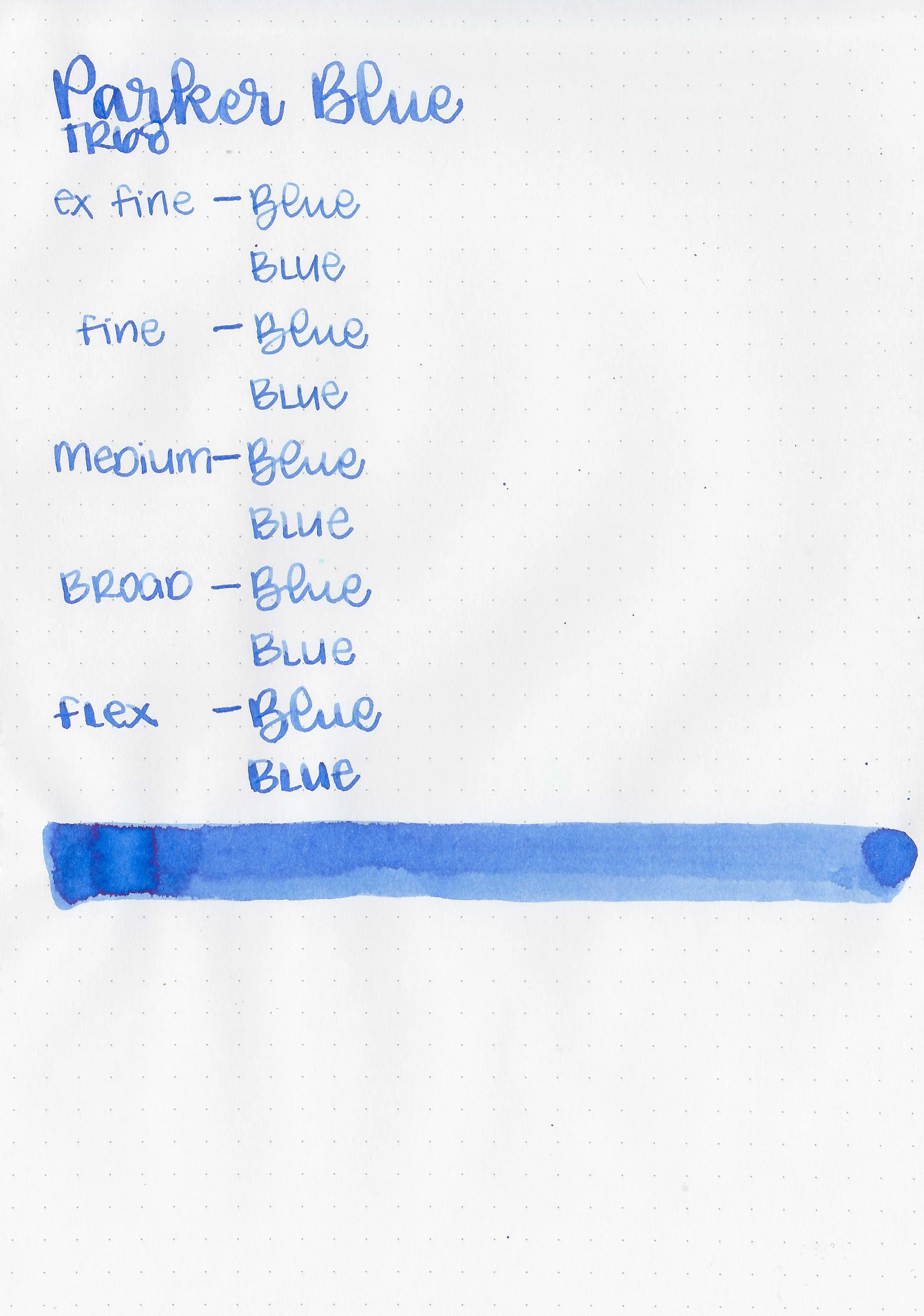
Ink Review #2586: Parker Quink Blue

Parker Quink Blue is a classic fountain pen ink. You can find this ink for sale at most retailers including Vanness Pens.

The color:

Blue is a traditional medium blue ink.

*For my swab cards I use a Col-o-ring by Skylab Letterpress, a medium Pilot Ishime and a Mabie Todd Swan.

Swabs:

In large swabs on Tomoe River paper the ink has a little bit of coppery sheen.

Writing samples:

Let's take a look at how the ink behaves on fountain pen friendly papers: Rhodia, Tomoe River, and Leuchtturm.

*For my writing samples I use:

Dry time: 40 seconds

Water resistance: Medium

Feathering: None

Show through: Medium

Bleeding: None

Other properties: low shading, tiny copper sheen, and no shimmer.

On 20 lb copy paper the ink had some feathering in all nib sizes and a few dots of bleeding.

Comparison Swabs:

There are so many similar inks to Parker Blue, including Lamy Blue. Click here to see the blue inks together.

Longer Writing:

I used a Pelikan M200 Blue Marbled with a medium nib on a Taroko Enigma notebook. The ink has an average flow.

Overall, this is a really good traditional ink. It’s a classic for a reason.

Thanks to all my Patrons! I couldn’t do these reviews without you! You can find my Patreon page here.

Disclaimer: All photos and opinions are my own. This page does not contain affiliate links and this post is not sponsored.

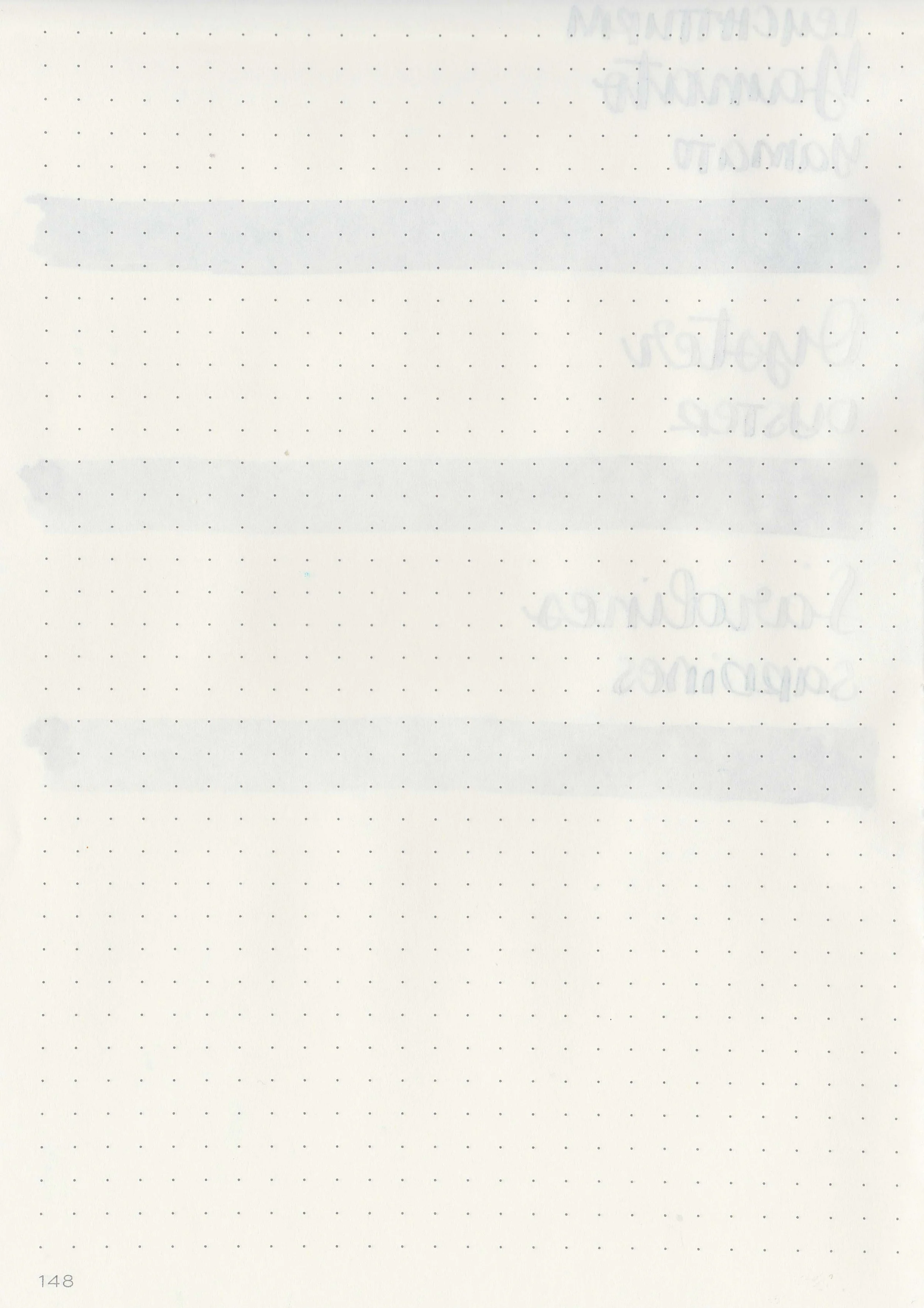
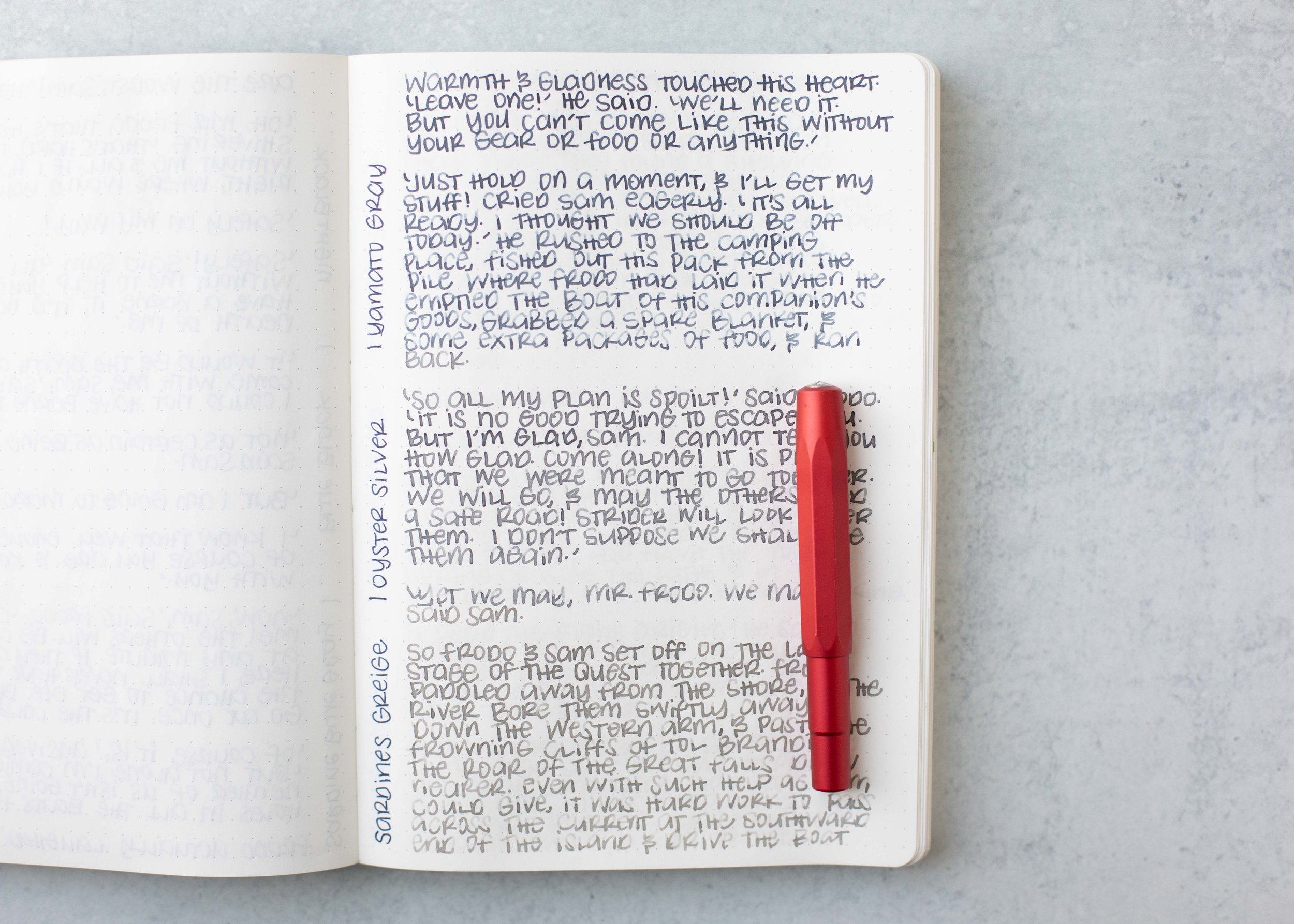
Color Traveler Grey Inks

Today let’s take a look at three grey inks from Color Traveler: Yamato Gray, Oyster Silver and Sardines Griege. You can finds these inks for sale at a Vanness Pens.

Swabs:

Left to right: Yamato Gray, Oyster Silver and Sardines Griege.

Writing samples:

Let's take a look at how the ink behaves on fountain pen friendly papers: Rhodia, Tomoe River, and Leuchtturm.

Dry Time: 30-50 seconds

Water Resistance: Low

Feathering: None

Show through: Medium

Bleeding: None

Other properties: All have medium shading.

On Walmart Pen + Gear copy paper there was some feathering in every nib size and a few dots of bleeding.

Comparison Swabs:

Yamato Gray is closest to 3 Oysters Cool Gray.

Oyster Silver is closest to Pelikan Edelstein Moonstone, Sardines Greige is close to Octopus Fluids Pebble Stone.

Longer Writing:

I used a Taroko Enigma notebook. All three had average flows.

Overall, these are good inks. Yamato Gray is my favorite out of the three but I like all three.

Disclaimer: All photos and opinions are my own. This page does not contain affiliate links, and is not sponsored in any way.

Ink Review #2582: Robert Oster Rust Orange

The color:

Rust Orange is a deep red-orange.

*For my swab cards I use a Col-o-ring by Skylab Letterpress, a medium Pilot Ishime and a Mabie Todd Swan.

Swabs:

In large swabs on Tomoe River paper the ink has some shading.

Writing samples:

Let's take a look at how the ink behaves on fountain pen friendly papers: Rhodia, Tomoe River, and Leuchtturm.

*For my writing samples I use:

Dry time: 40 seconds

Water resistance: Low

Feathering: None

Show through: Medium

Bleeding: None

Other properties: medium shading, no sheen, and no shimmer.

On 20 lb copy paper the ink had some feathering and bleeding in the larger nib sizes.

Comparison Swabs:

Rust Orange is lighter than Robert Oster Orange Zest but darker than Robert Oster Fire on Fire. Click here to see the orange inks together.

Longer Writing:

I used an Edison Collier Persimmon Swirl with a medium nib on a Taroko Enigma notebook. The ink has a slightly dry flow.

Overall, I love the color. Robert Oster does a great job with his inks and this one is no exception.

Thanks to all my Patrons! I couldn’t do these reviews without you! You can find my Patreon page here.

Disclaimer: This product was provided by Galen Leather for the purpose of this review. All photos and opinions are my own. This page does not contain affiliate links and this post is not sponsored.

Wet vs Dry Inks

One of the questions I get the most is what’s the difference between wet and dry inks so it’s finally time to tackle the issue.

Wet Inks:

Wet inks put down more ink on the page than average or dry inks. They often have lubricants added like Sailor or Monteverde’s ITF technology. So many people tout wet inks as having the most shading, but often wet inks put down too much ink on the page to show the difference between the light and dark part of the ink. Monteverde, Pilot, De Atramentis, and KWZ are wet brands overall in my experience.

If you have a dry nib and want it to feel more of an average flow you can use a wet ink to tame the dry nib a bit. Some wet inks will spread out on the page as you write and they are more likely to bleed through the page. If your ink is too wet, you can add some distilled water to dry it up a bit.

Let’s look at some wet examples:

monteverde documental blue

pilot iroshizuku ajisai

de atramentis emerald green

kwz discovery green

Dry Inks:

Dry inks put down less ink on the page than average or wet inks. They have more water content than other inks, which makes the ink sink down into the page faster and therefore seem dryer as you write. In my experience there are a lot of brands that are dry overall: Callifolio, Ferris Wheel Press, Kyoto TAG, L’Artisan Pastillier, Papier Plume, Pelikan, Platinum Classic inks and Troublemaker.

Dry inks often have the most shading, especially chromoshaders/duo shaders. They don’t spread out on the page like some wet inks do. In general dry inks are better for left handers since they usually dry faster than wet inks. I have found that when I write a whole page with a dry ink that the further down the page I get the drier the ink gets. Occasionally a dry ink will become so dry by the middle of the page that I have to prime the feed a bit to keep it writing.

If I put a dry ink in a wet pen it can feel average (like Pelikan 4001 in a Pelikan nib), but then if I use a paper that sucks up ink more than average than the ink can feel extra dry. Here’s an example: a Pelikan M600 medium nib full of Kyo-no-oto Hisoku on Midori MD can feel awfully dry to me even though I’m using a wet pen. If your ink is too dry and you want it wetter, you can add a drop of an ink additive like White Lighting, which will lubricate it and make it flow better.

Let’s look at some dry examples:

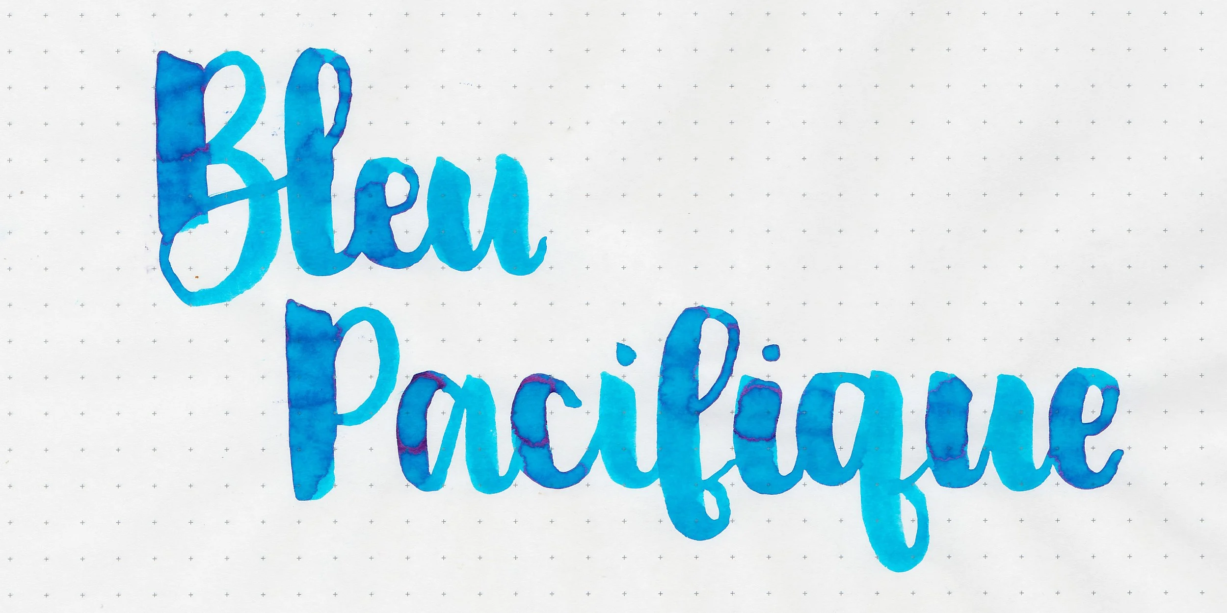
callifolio bleu pacifique

ferris wheel press blue cotton candy

kyo-no-oto ochiguri-iro

papier plume bloody pumpkin

pelikan 4001 violet

platinum classic lavender black

troublemaker foxglove

Wet and dry inks can be such a subjective thing because they can feel different based on paper, pen and nib. My personal preference is to use wet or slightly wet inks because I prefer a smooth flow.

Disclaimer: All photos and opinions are my own. This page does not contain affiliate links and is not sponsored.