Ink Review #2581: Wearingeul Anna Karenina
/
Wearingeul Anna Karenina is from the World Literature collection. You can find this ink for sale at most retailers including Vanness Pens.

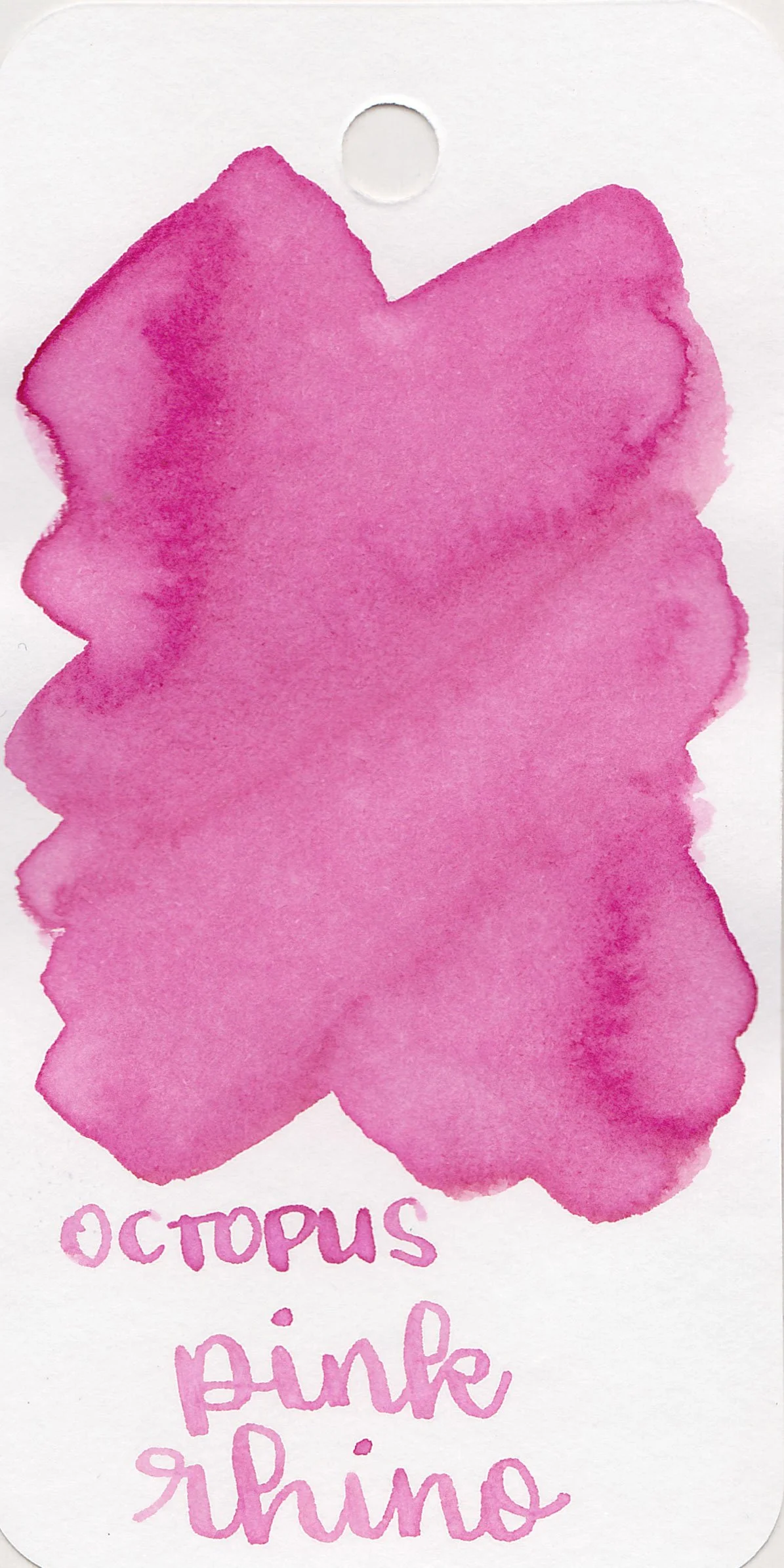
The color:
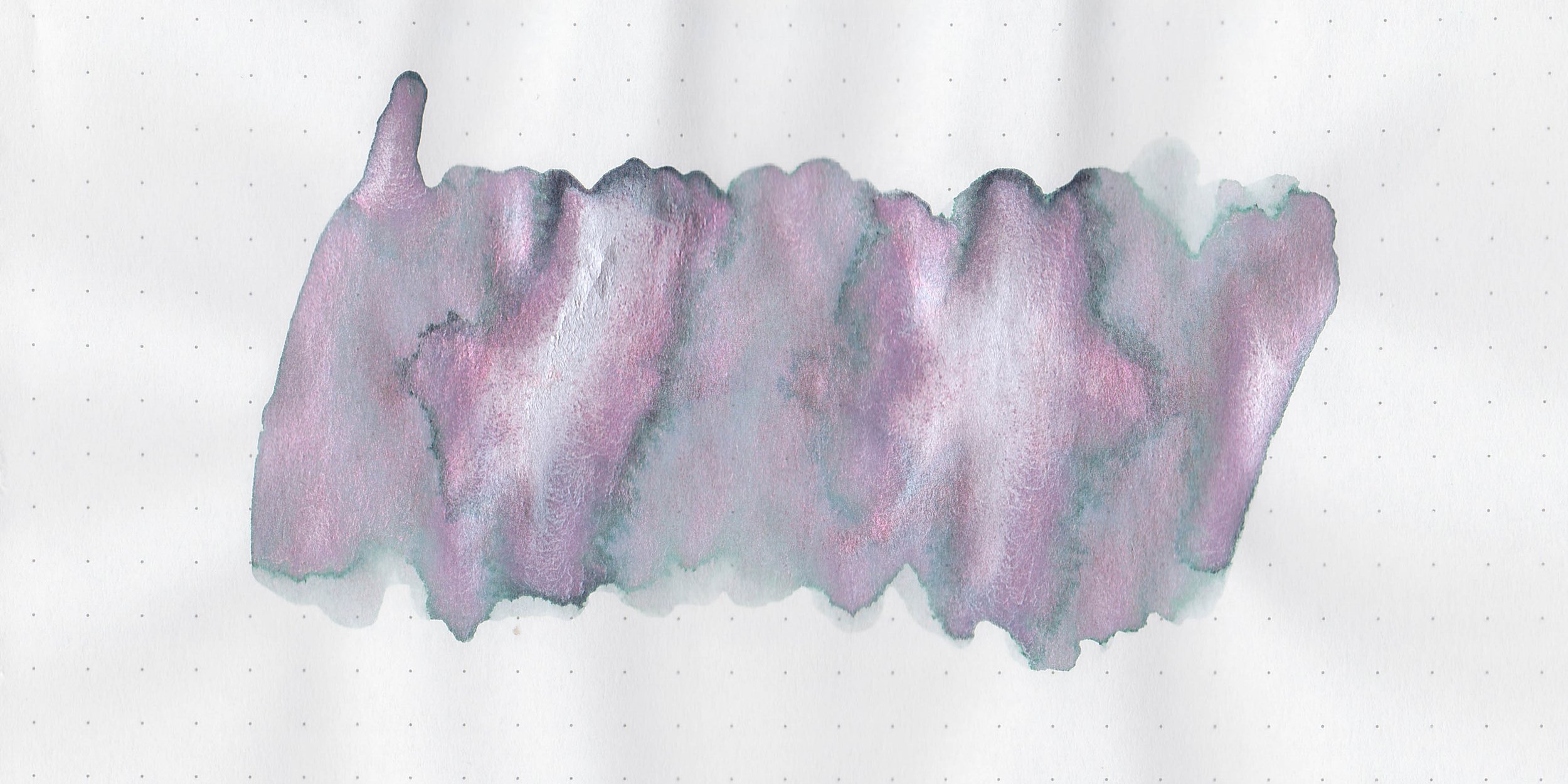
Anna Karenina is a burgundy red with red shimmer.
*For my swab cards I use a Col-o-ring by Skylab Letterpress, a medium Pilot Ishime and a Mabie Todd Swan.
Swabs:

In large swabs on Tomoe River paper the ink has lots of shimmer but it’s hard to see in the photo.

Writing samples:
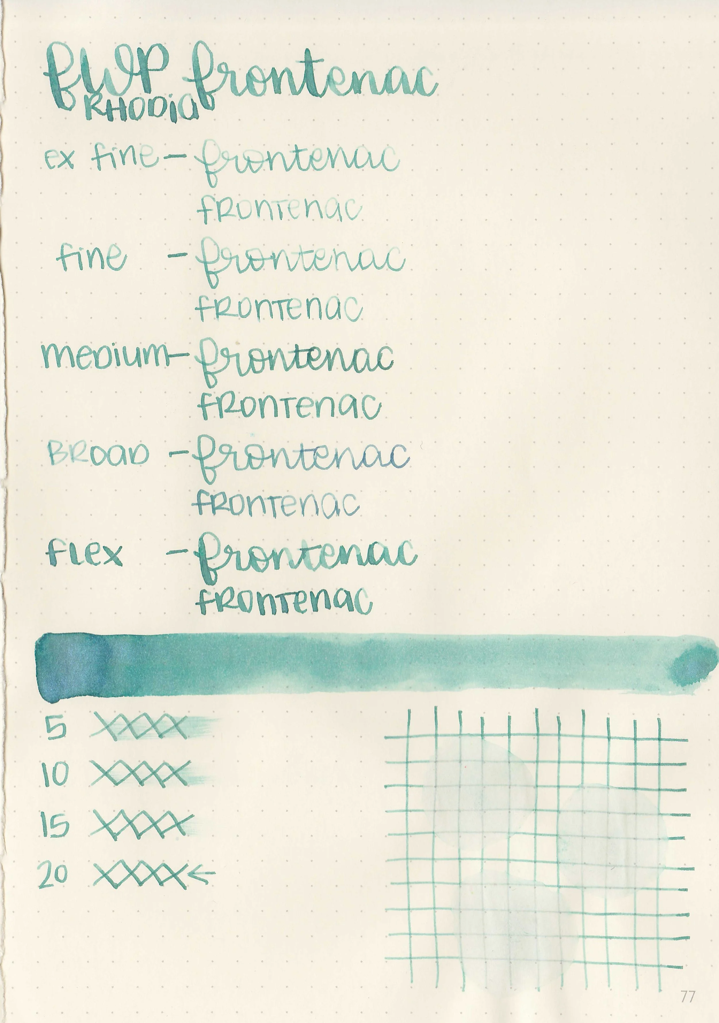
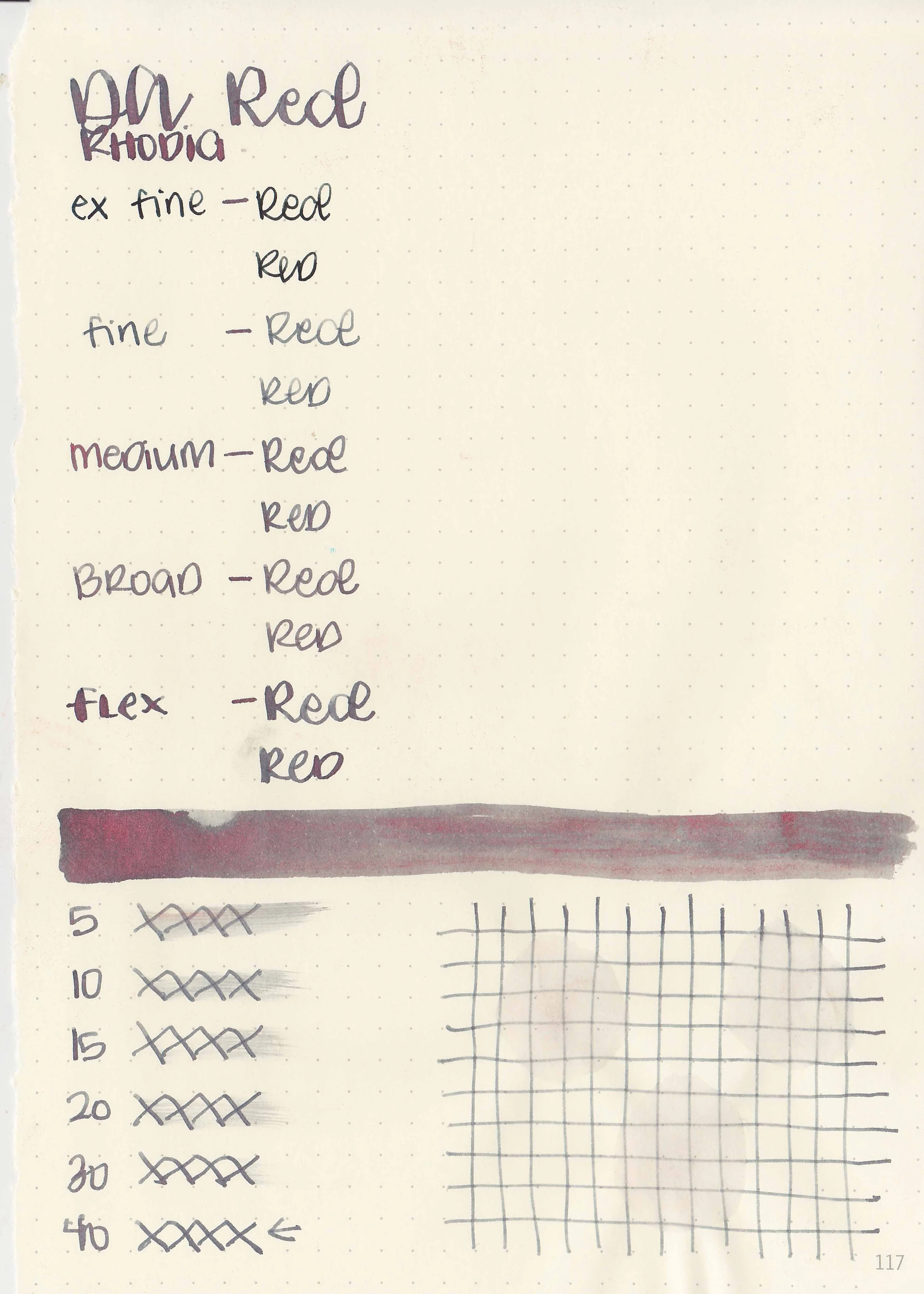
Let's take a look at how the ink behaves on fountain pen friendly papers: Rhodia, Tomoe River, and Leuchtturm.
*For my writing samples I use:
Vintage Mabie Todd Swan (flex nib)
Taroko Enigma notebooks (68gsm TR)


Dry time: 30 seconds
Water resistance: Medium


Feathering: None
Show through: Medium


Bleeding: None
Other properties: low shading, no sheen, and red shimmer.


On 20 lb copy paper the ink had some feathering and some bleeding in the larger nib sizes.
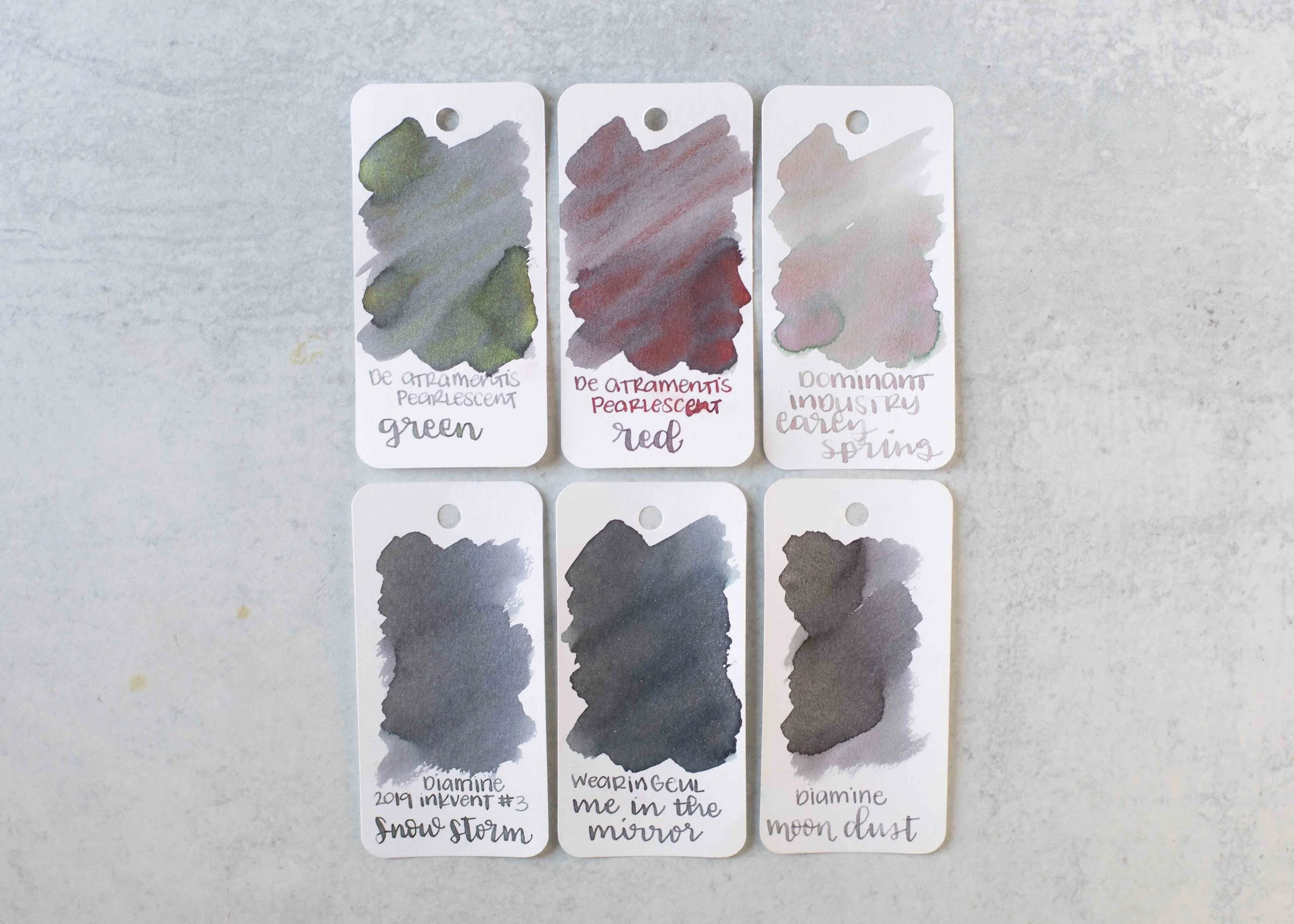
Comparison Swabs:

Anna Karenina is closest to Diamine All the Best. Click here to see the red inks together.
Longer Writing:

I used a Pelikan M205 Star Ruby with a fine nib on a Taroko Enigma notebook. The ink has an dry flow.
Overall, I like the color but the flow is too dry for me. The only other red ink with red shimmer that I know of is Diamine Bah Humbug, so it’s not a very common combo.
Thanks to all my Patrons! I couldn’t do these reviews without you! You can find my Patreon page here.
Disclaimer: All photos and opinions are my own. This page does not contain affiliate links and this post is not sponsored.