TWSBI 1791 Inks

tws-1791-7.jpg

TWSBI has been around for a while as a pen brand, but they recently branched out into inks as well. Their first inks are a set of 6, which can be purchased together or individually. I purchased my set of inks from Lemur Ink.

tws-1791-s-5.jpg

The inks come in a nice box, but it’s made of cardboard and it needs the paper band to keep it closed.

tws-1791-s-3.jpg

The bottles are 18ml glass with red plastic lids.

Swabs:

tws-1791-s-6.jpg

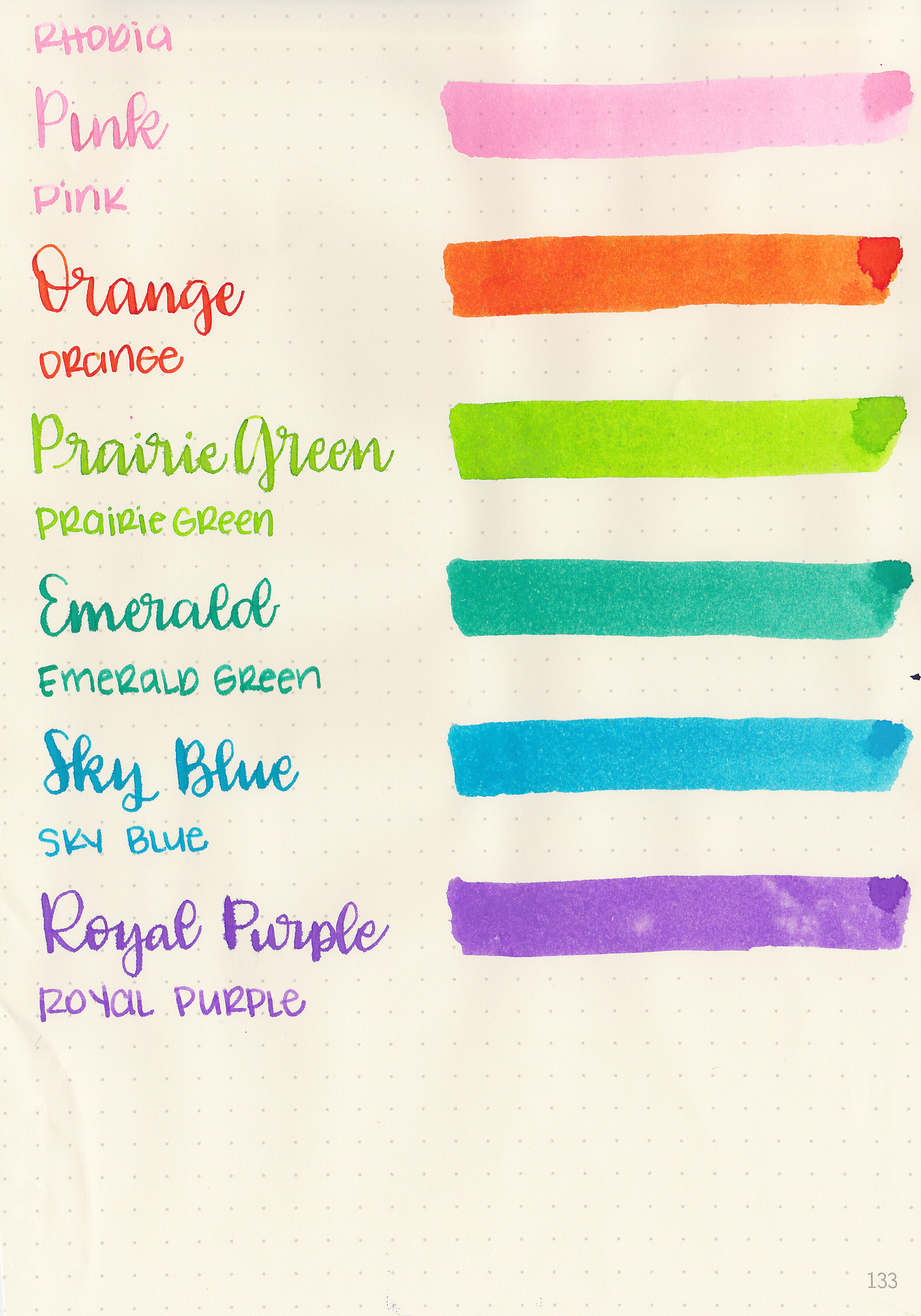
Left to right: Pink, Orange, Prairie Green, Emerald Green, Sky Blue, Royal Purple.

Writing samples:

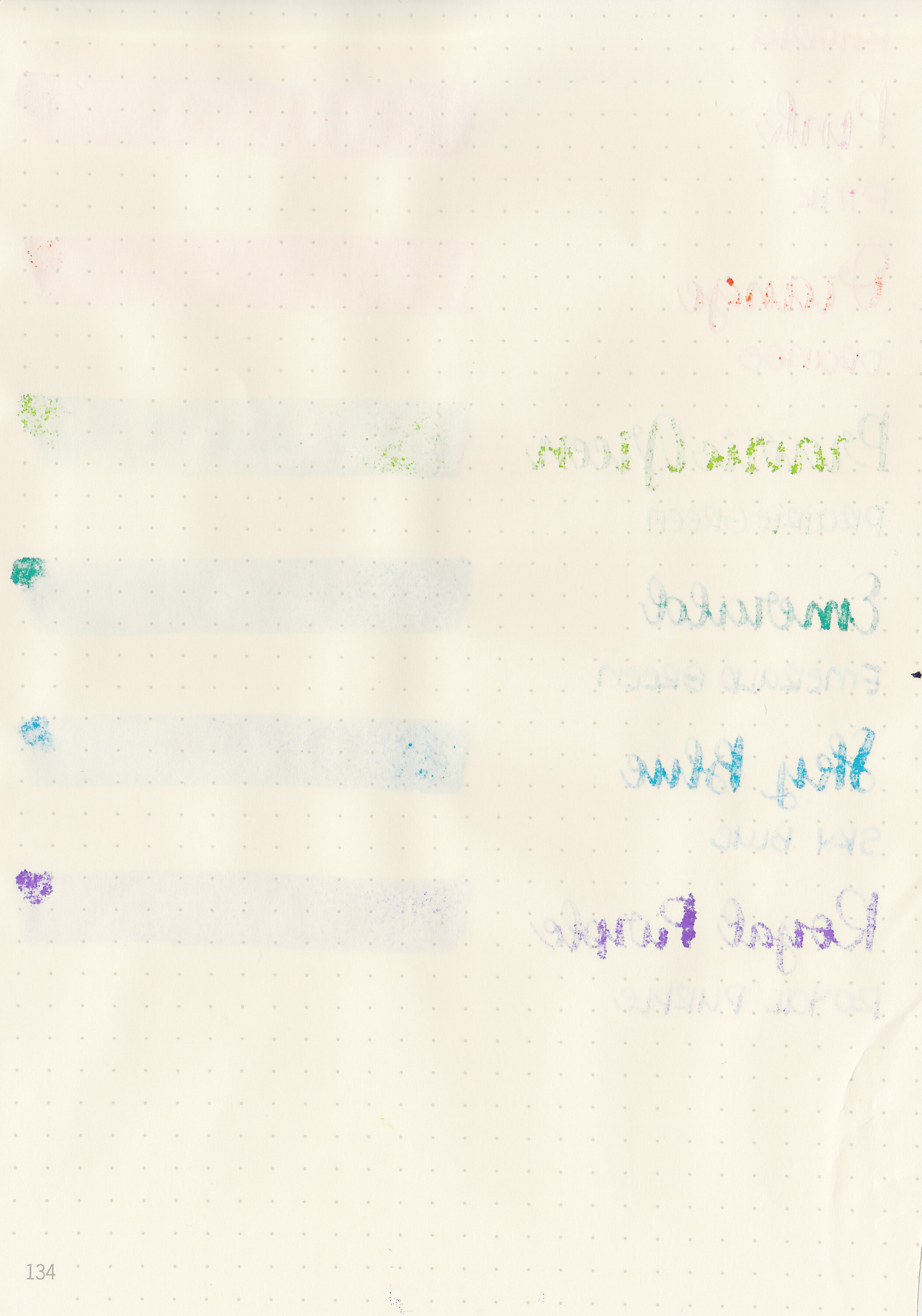
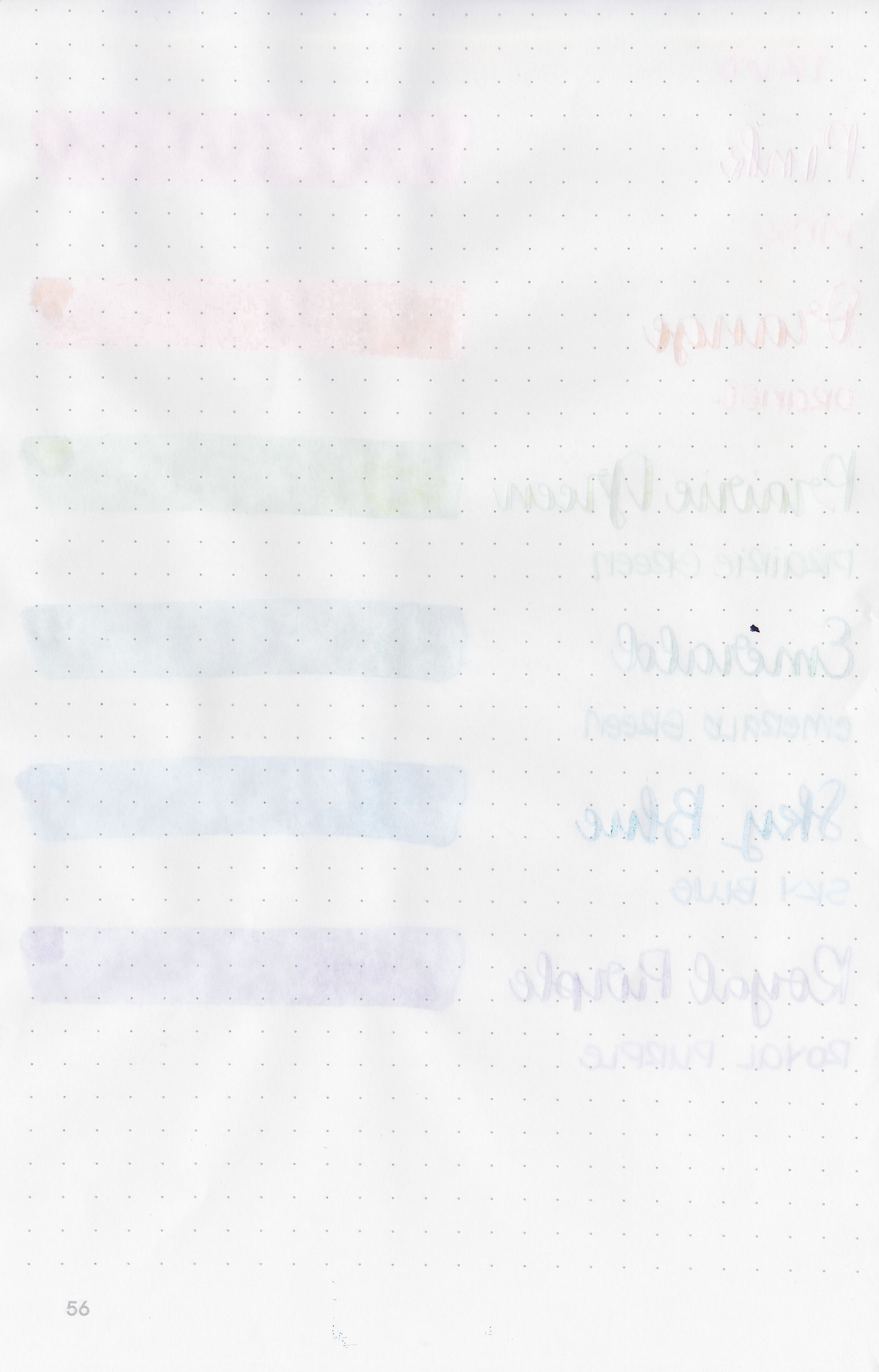
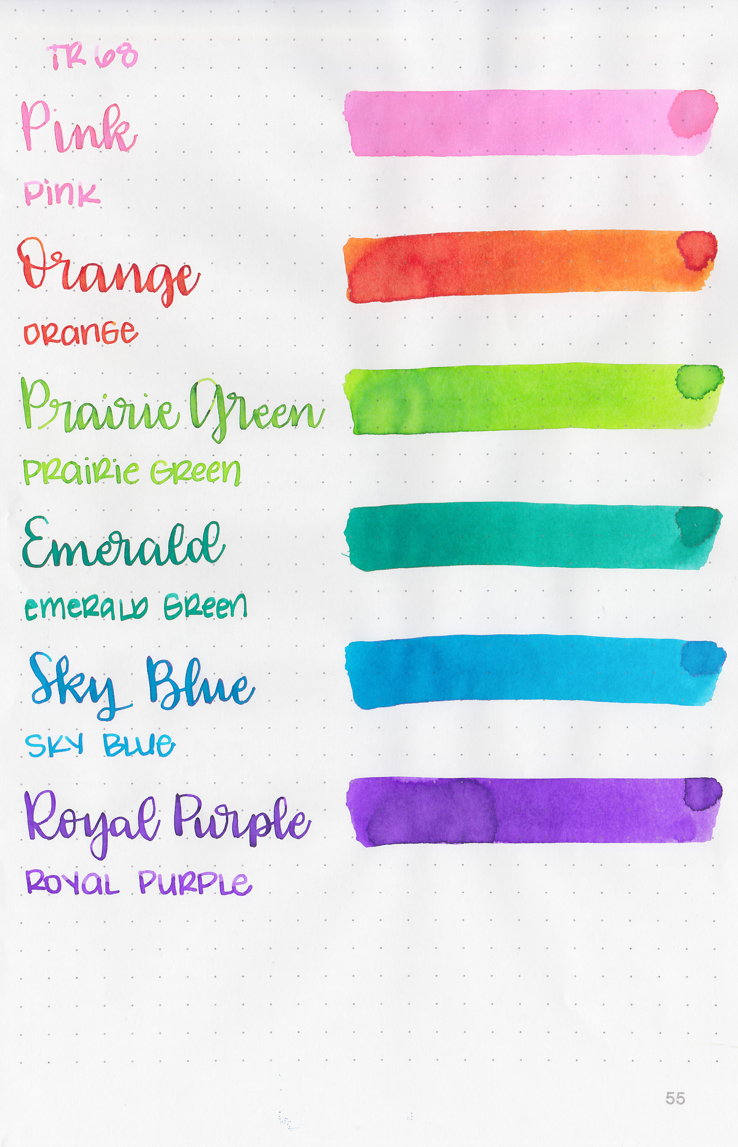
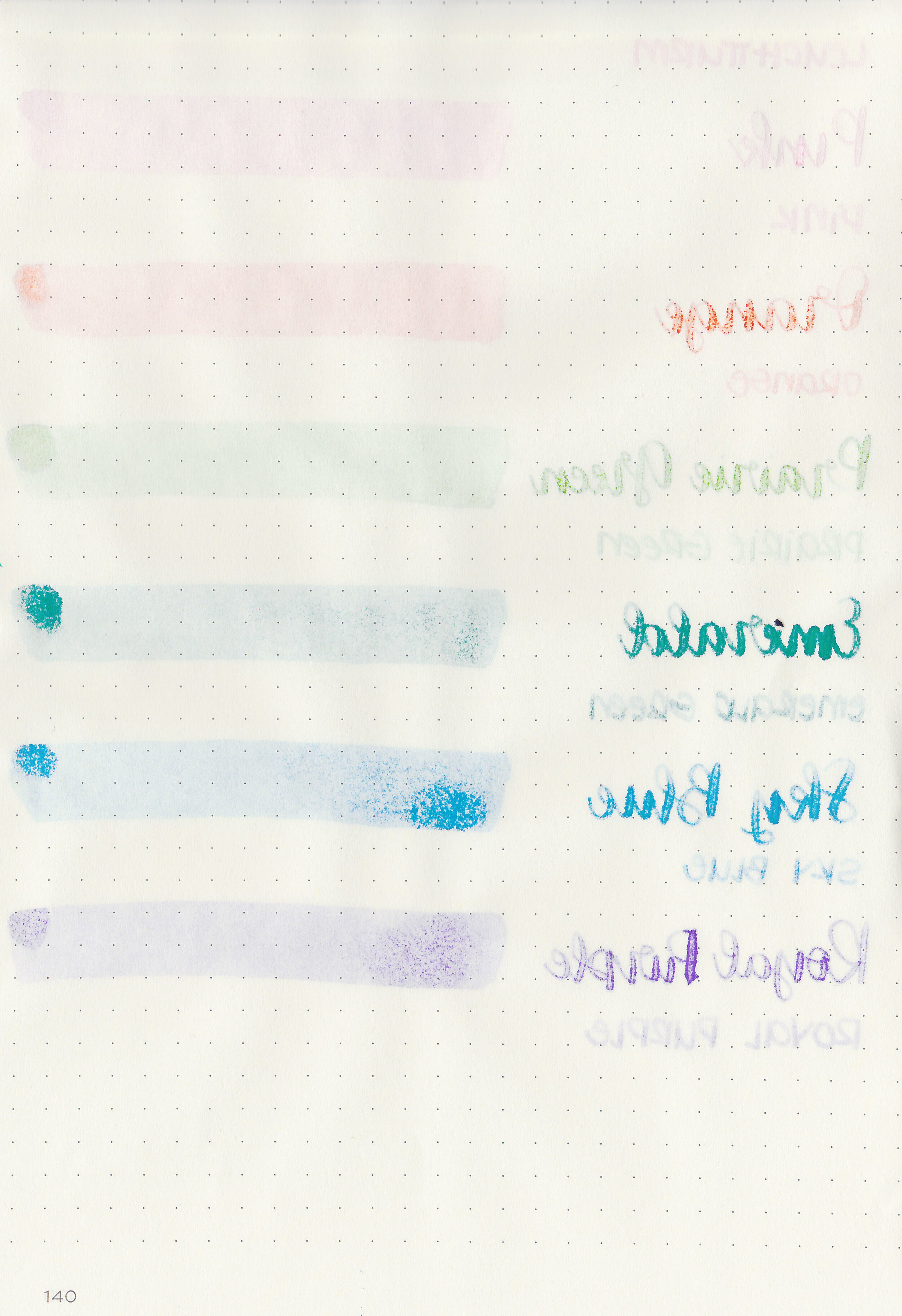
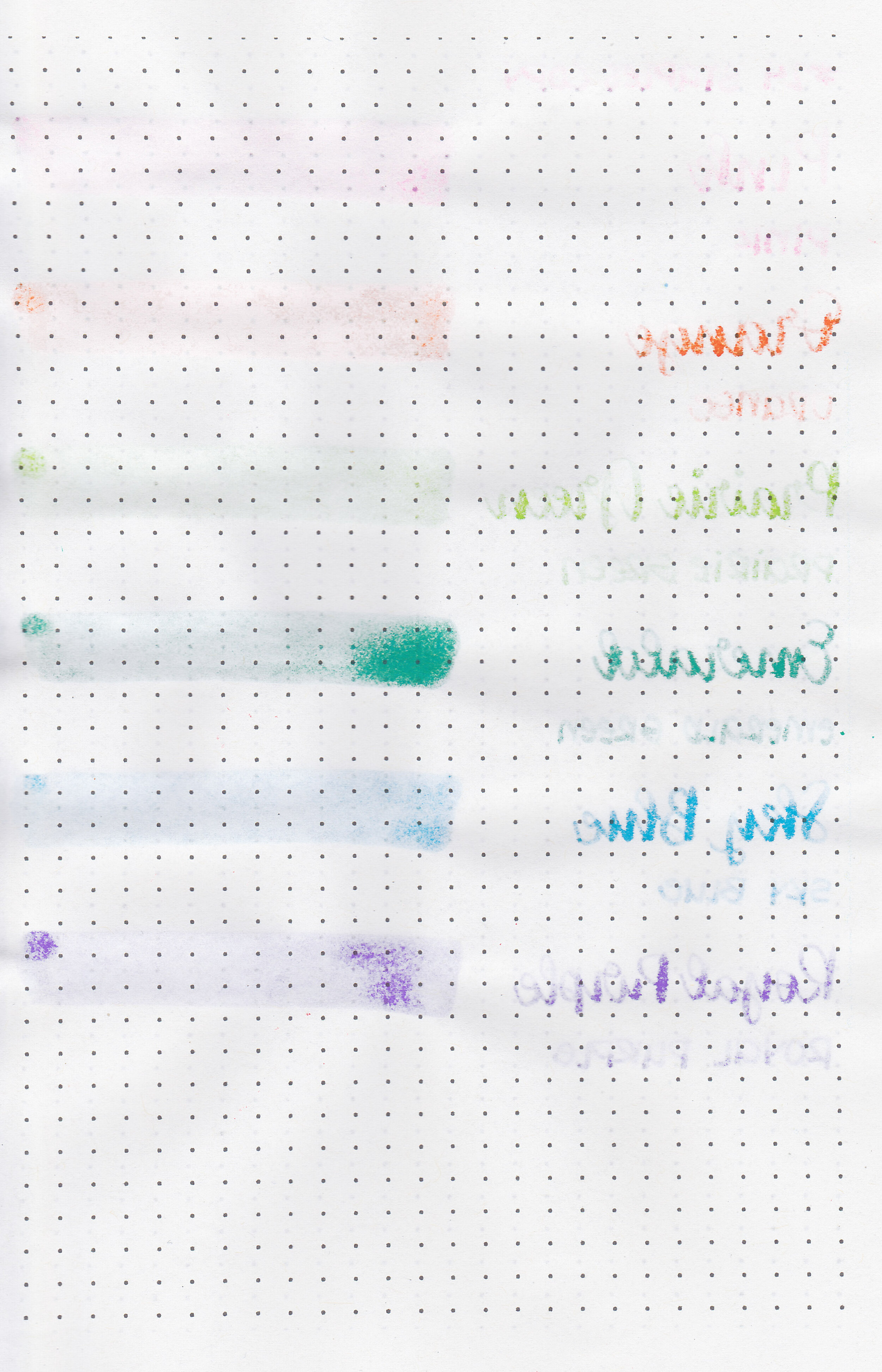
Let's take a look at how the ink behaves on fountain pen friendly papers: Rhodia, Tomoe River, and Leuchtturm.

Water resistance: Low

Feathering: Low-there was a little bit of feathering in the flex nib.

Show through: Medium

Bleeding: Low-there is some bleeding in the flex nib.

Other properties: low shadingno sheen, and no shimmer.

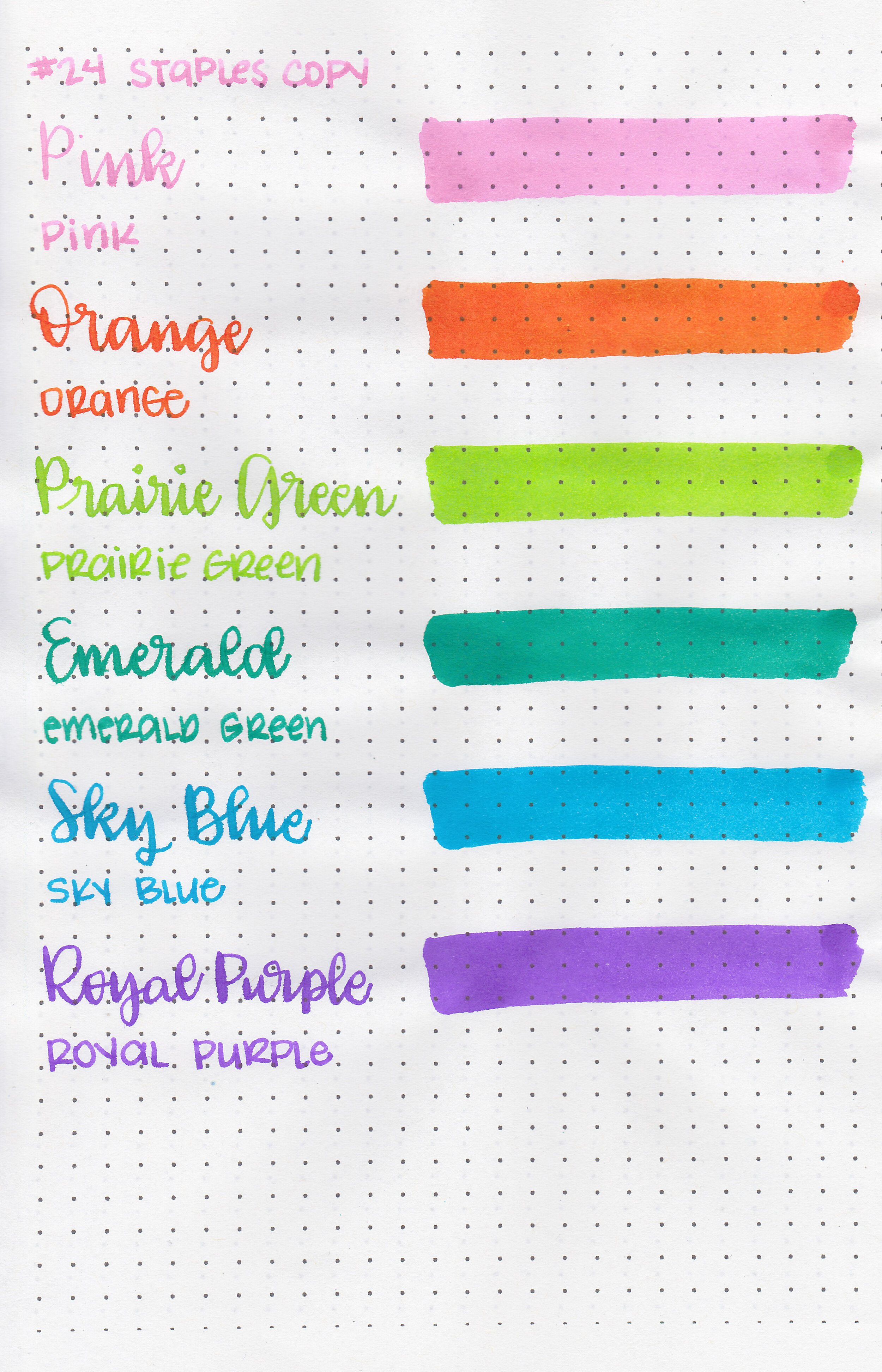
On Staples 24 lb copy paper there was lots of feathering in every nib size as well as bleeding, so I would not recommend these inks for cheap paper.

Comparison Swabs:

tws-1791-s-8.jpg

Pink is similar to both Sailor Ink Studios 130 and Sailor Jentle Sakura-Mori. Orange is close to Diamine Sunset. Prairie Green is darker than Diamine Jade Green but warmer than Monteverde Key Lime Pie. Emerald Green is cooler than Colorverse Arabella but warmer than Diamine Cool Green. Sky Blue is similar to Taccia Sora Sky Blue. Royal Purple is similar to Taccia Murasaki Purple.

tws-1791-s-1.jpg
tws-1791-s-2.jpg

I used a Lochby Lined Blank A5 notebook (Tomoe River 68gsm). All of the inks had a wetter than average flow, almost a bit thin.

Overall, I enjoyed these inks. The ink is a bit thin, which makes it flow a bit wet, but I prefer wet inks anyway. The colors are nice, but Pink is light, too light in the smaller nibs. I would reserve Pink for broad nibs, but the others are dark enough for all nib sizes.

Disclaimer: I purchased these inks myself, and all photos and opinions are my own. This page does not contain affiliate links, and is not sponsored in any way.

Review #886: KWZ V-Dream

kwz-v-dream-5.jpg

Over the past year I’ve grown to love KWZ inks. I love that they do so many exclusive inks. KWZ V-Dream is a Vitstyle exclusive. Thanks to Vitstyle for sending the ink over for review!

kwz-v-dream-4.jpg

The color:

V-Dream is a medium dusky purple. I would almost call it a wisteria purple.

Swabs:

kwz-v-dream-6.jpg

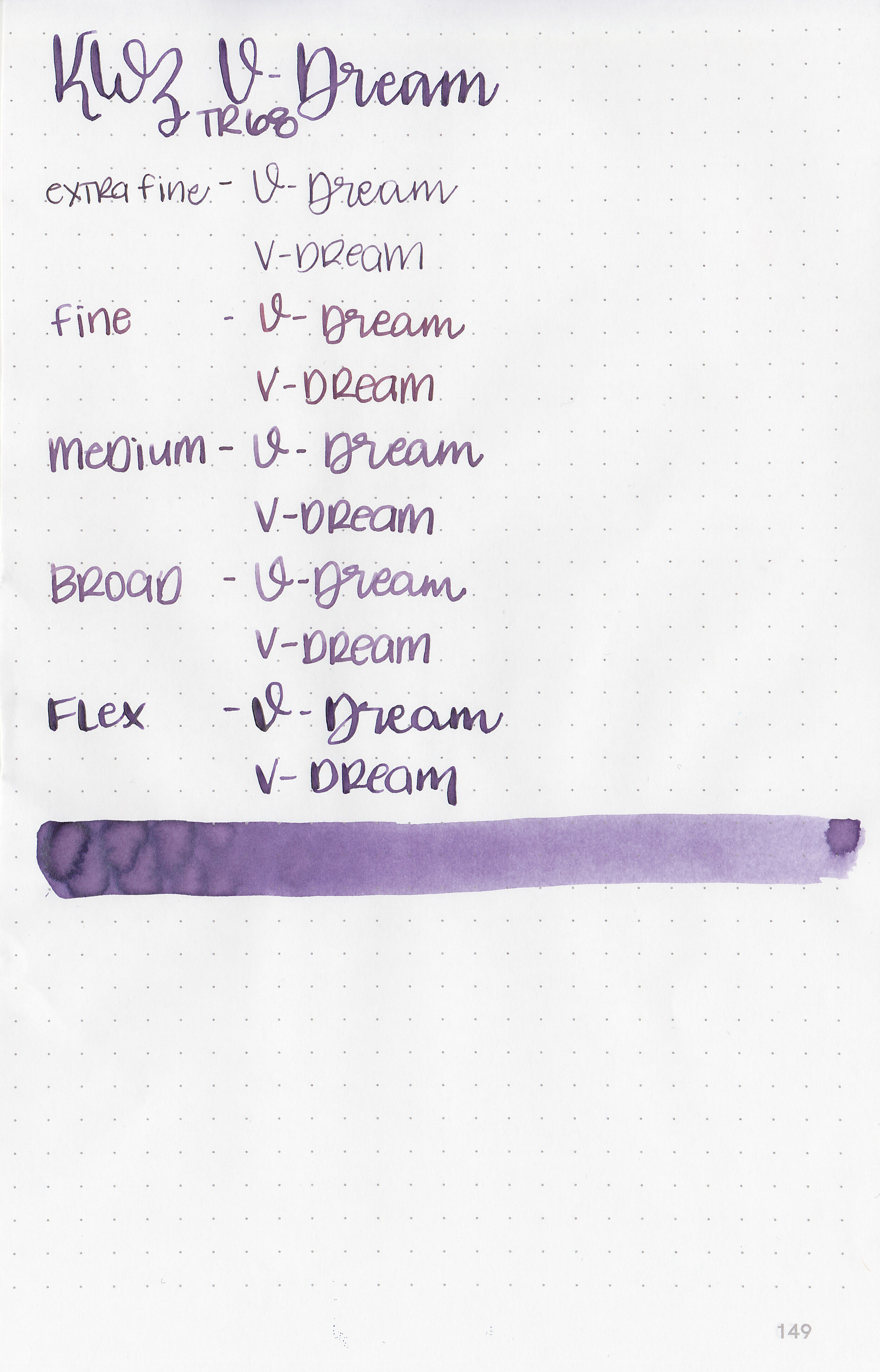
In large swabs on Tomoe River paper the ink looks has some pretty shading but no sheen.

kwz-v-dream-7.jpg

Writing samples:

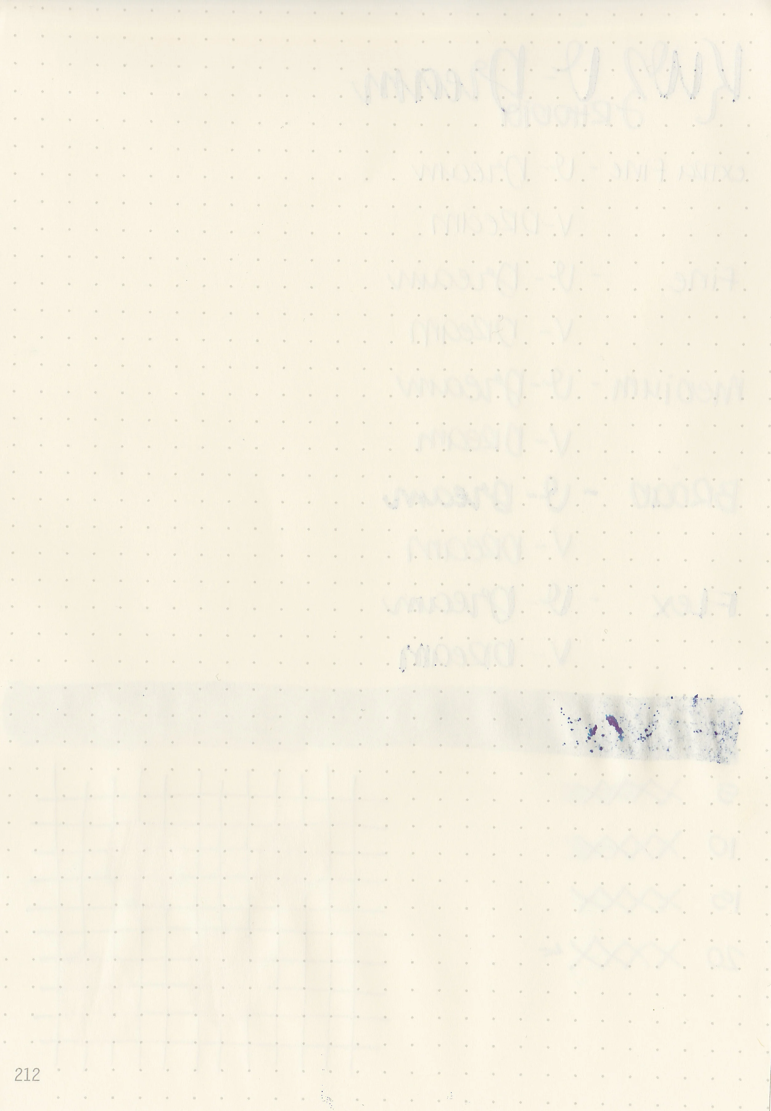
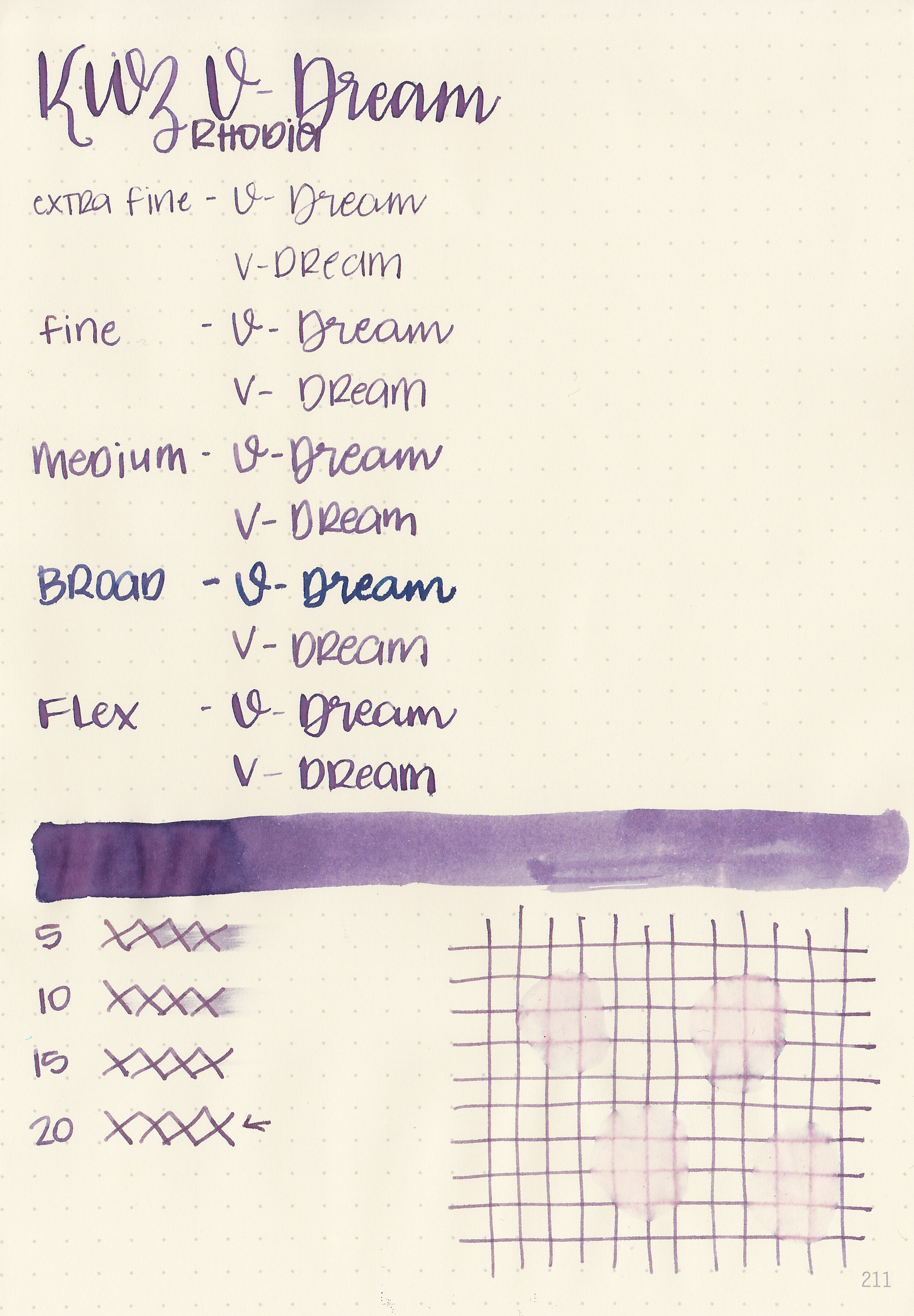
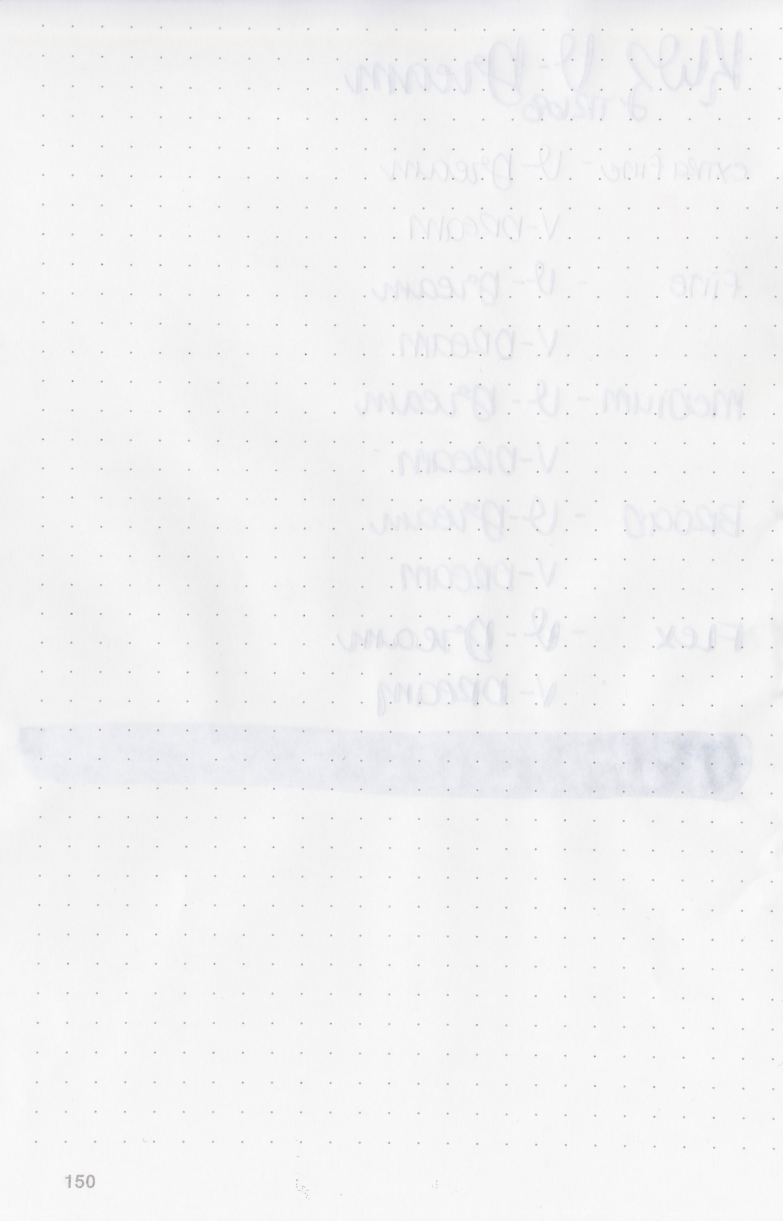
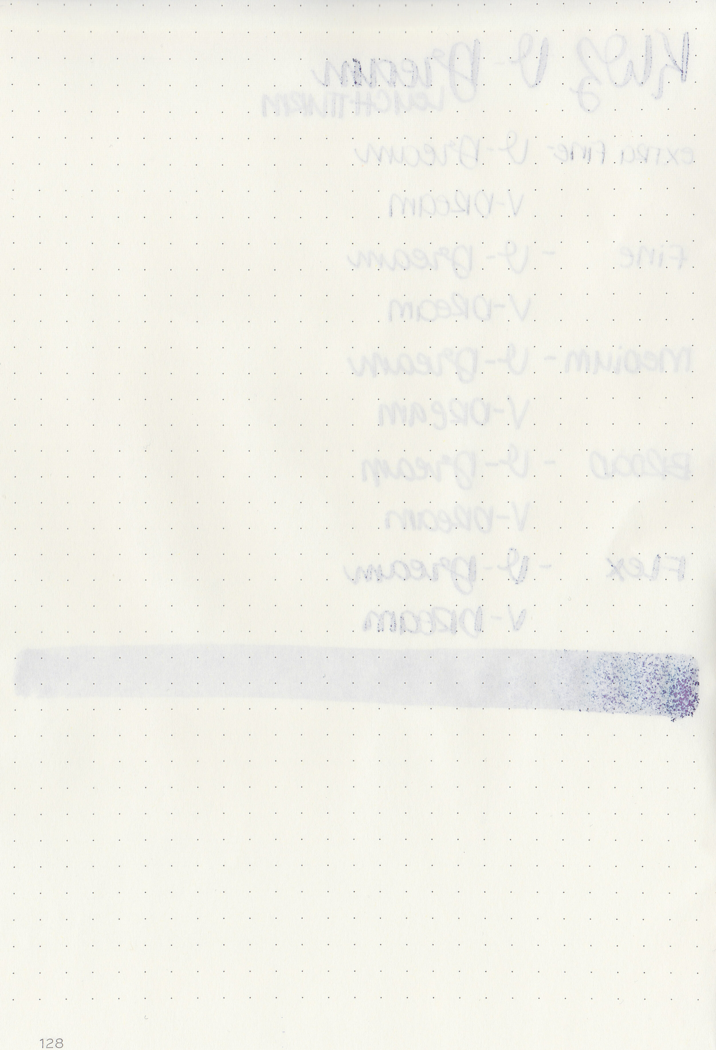
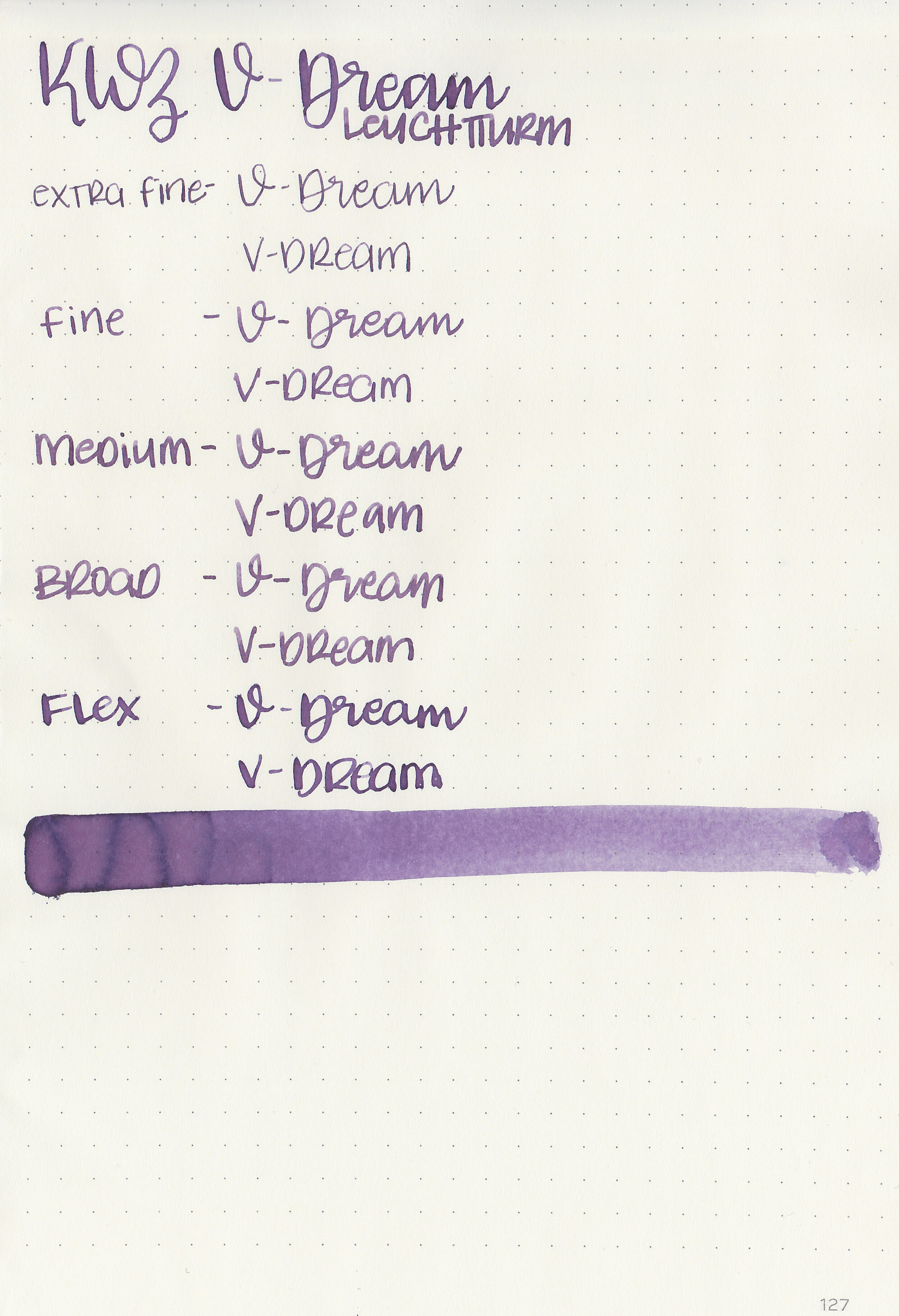
Let's take a look at how the ink behaves on fountain pen friendly papers: Rhodia, Tomoe River, and Leuchtturm.

Dry time: 20 seconds

Water resistance: Low

Feathering: None

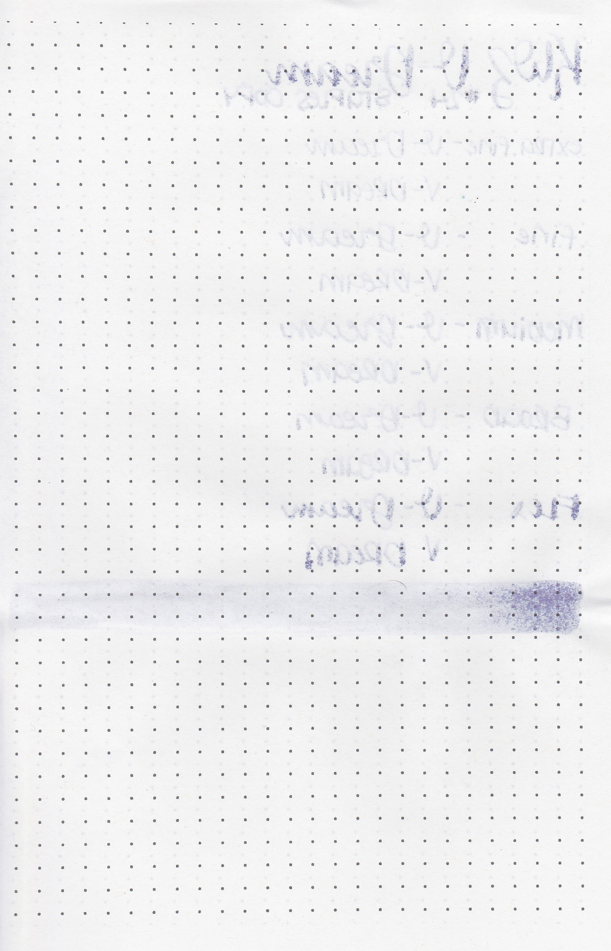
Show through: Medium

Bleeding: None

Other properties: low shading, no sheen, and no shimmer.

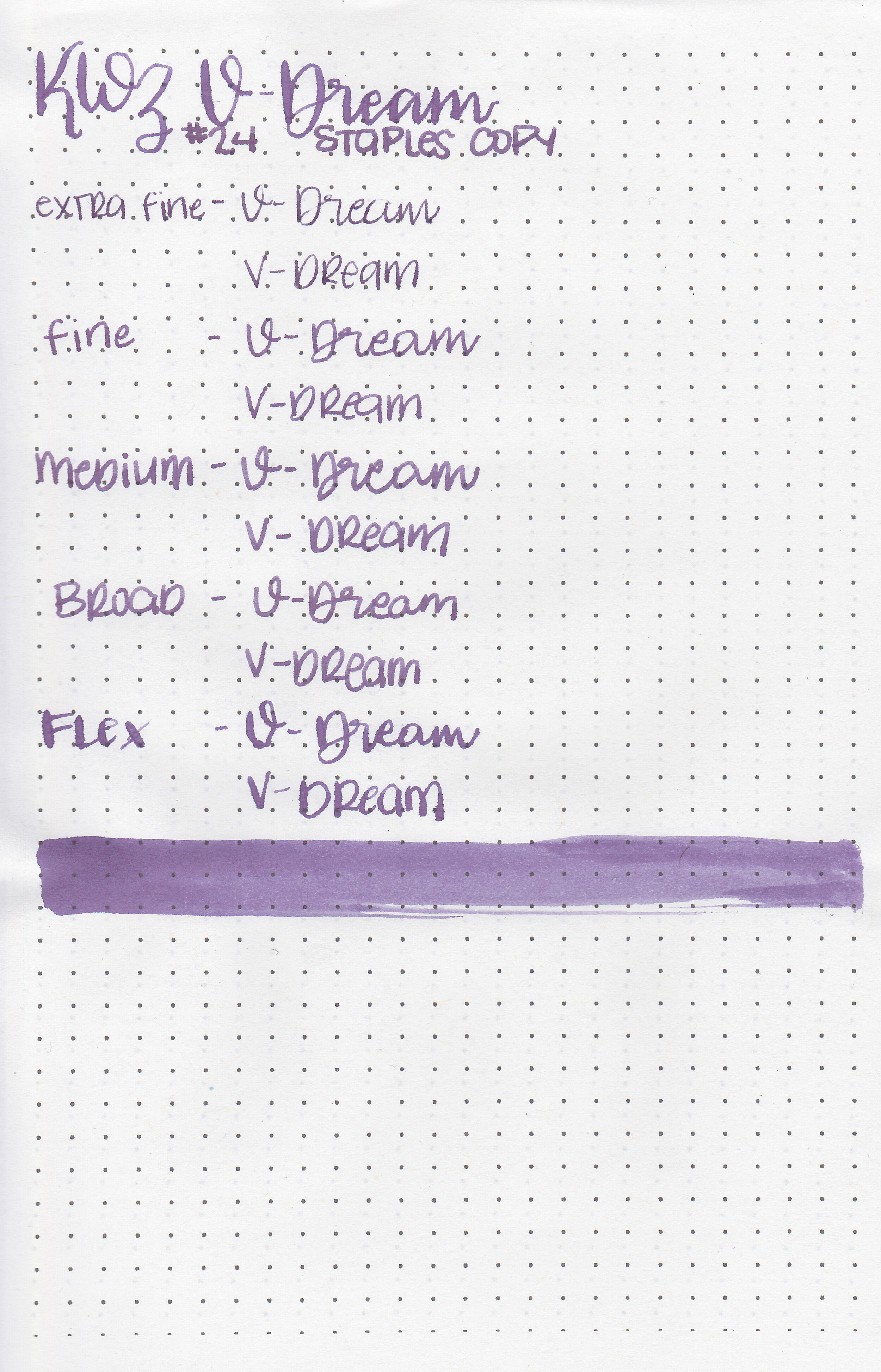
On Staples 24 lb copy paper there was feathering in every nib size and just a little bit of bleeding in the flex nib.

Comparison Swabs:

kwz-v-dream-3.jpg

V-Dream is a bit darker than Diamine Amazing Amethyst and a bit lighter than Sailor Ink Studio 452. Click here to see the KWZ inks together, and click here to see the purple inks together.

Longer writing:

kwz-v-dream-2.jpg

I used a custom Bonecrusher Studios pen fitted with a Regalia Writing Labs Crossflex nib on a Lochby A5 Lined Refill-Tomoe River 68gsm. The ink had a a wetter than average flow.

Overall, I like this ink. I love the dusky purple color, the wet flow and it’s very well behaved. The color is great for the winter season.

Disclaimer: This product was provided by Vitstyle for the purpose of this review. All photos and opinions are my own. This page does not contain affiliate links, and this post is not sponsored in any way.
Ink Review #885: Berlin Notebook Blue No. 1

bn-blue-no1-2.jpg

Berlin Notebook Blue No. 1 was designed by painter Viktor Walter. This ink is hand made in Germany and designed to work on recycled and copy papers. This ink is available in both a standard 30ml bottle and a small 5ml travel bottle. Thanks to Berlin Notebook for sending the ink over for review.

bn-blue-no1-1.jpg

The color:

Blue No. 1 is a bright saturated blue with some dark red sheen.

Swabs:

bn-blue-no1-11.jpg

In large swabs on Tomoe River paper the ink shows off its pretty sheen.

bn-blue-no1-12.jpg

Writing samples:

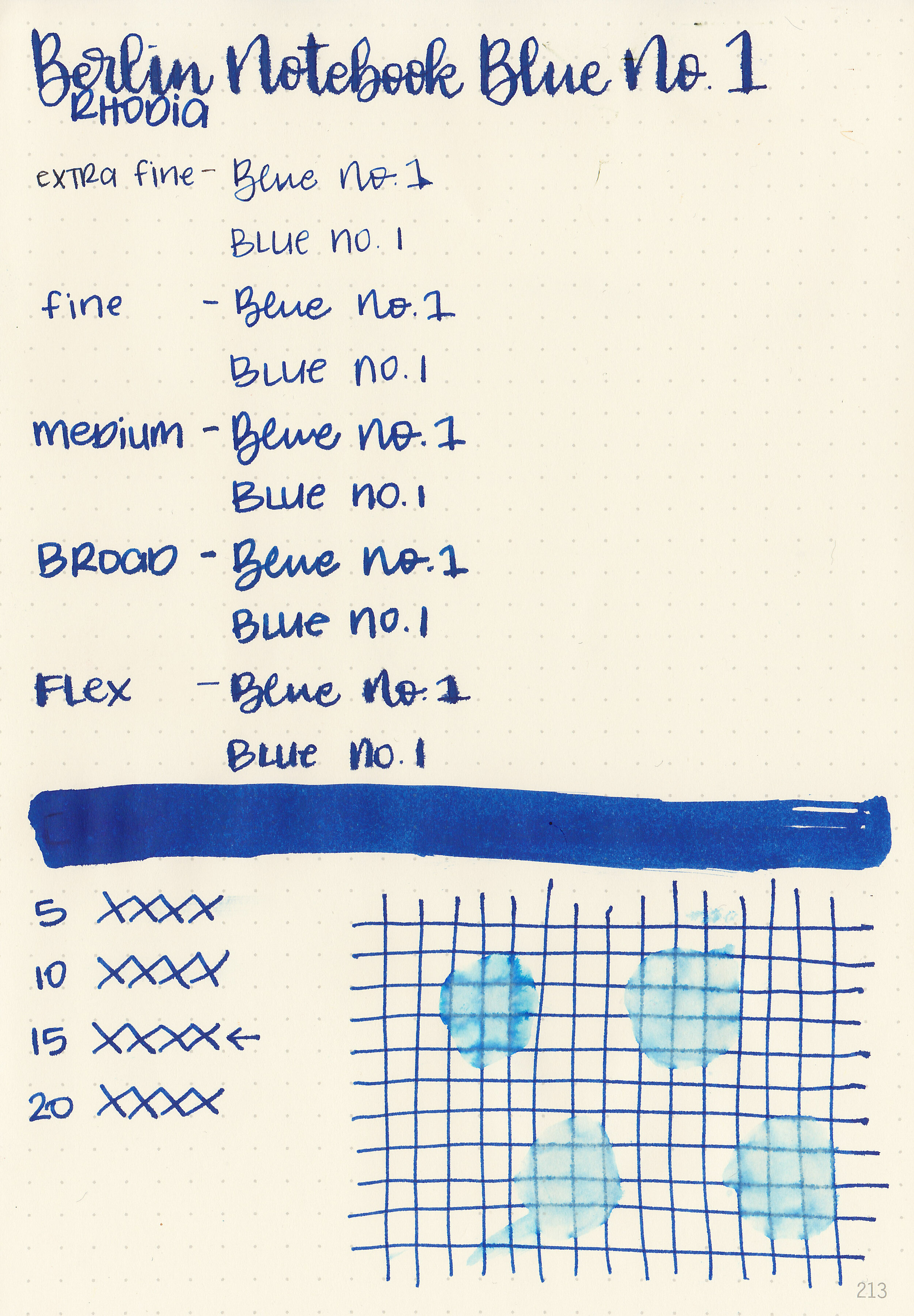
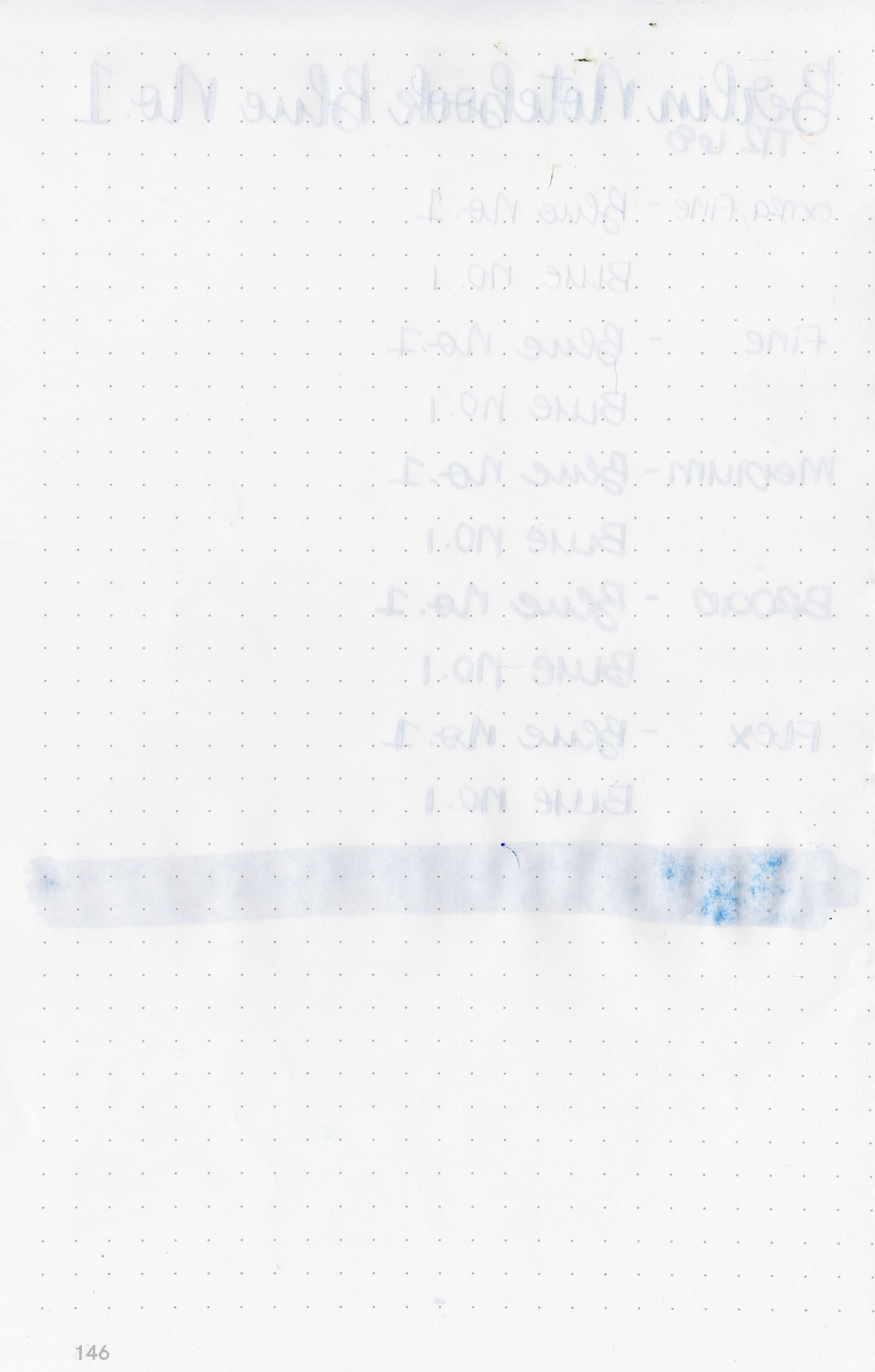
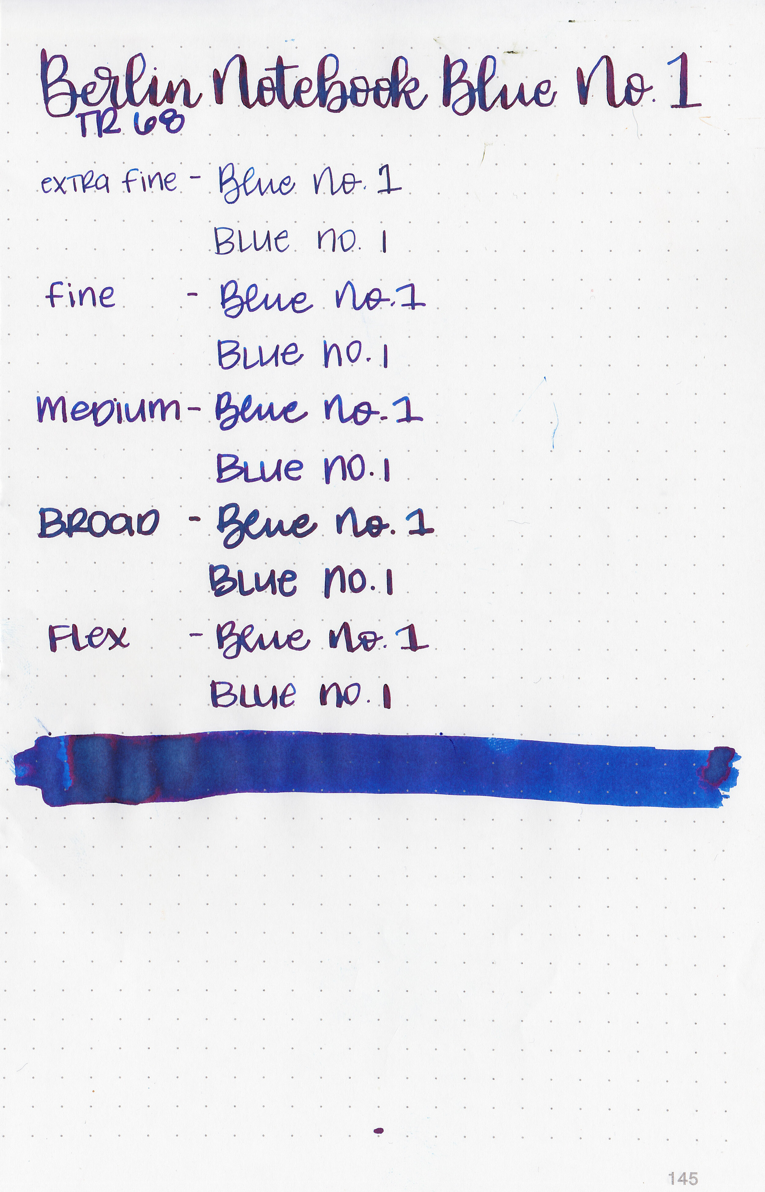
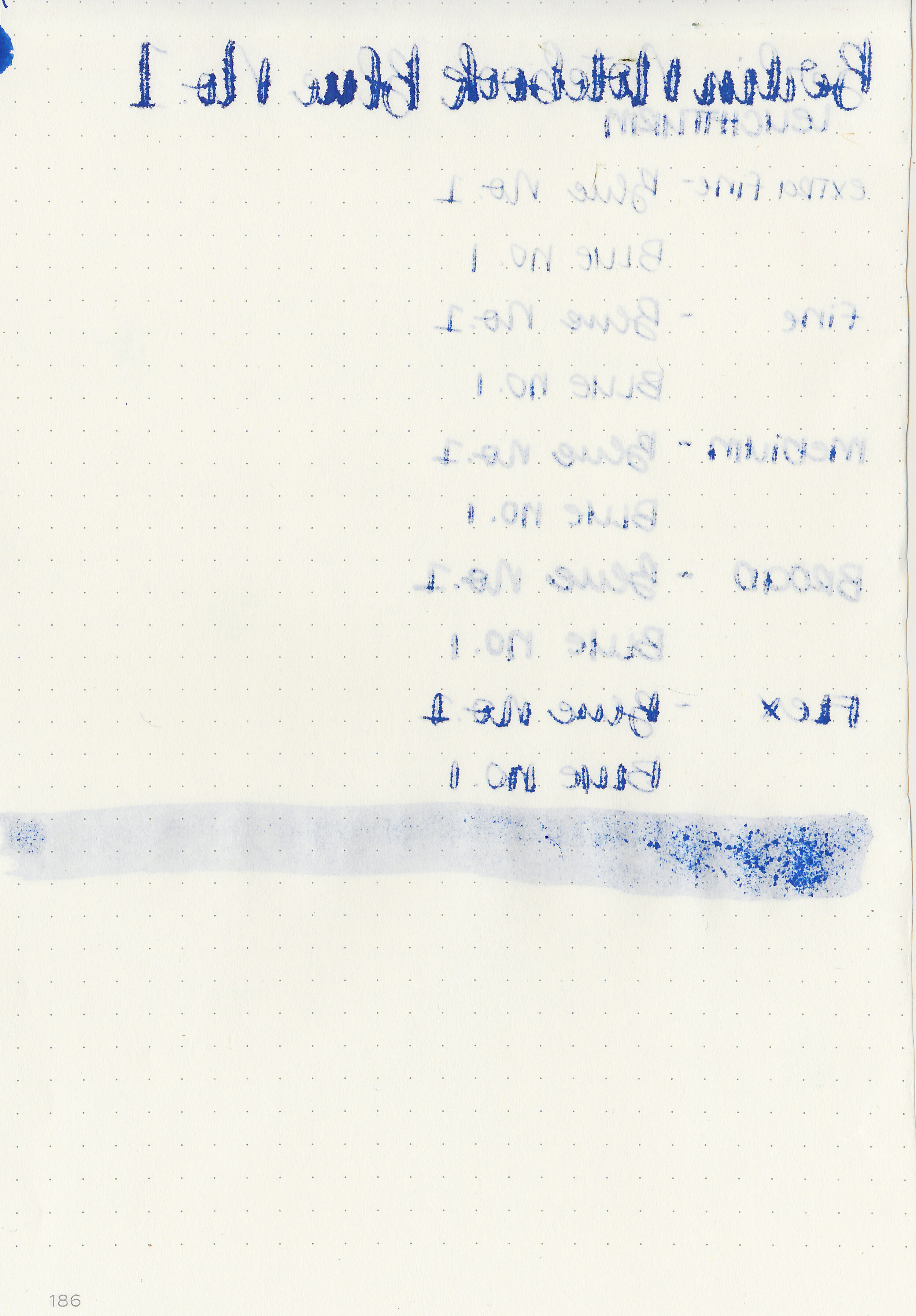
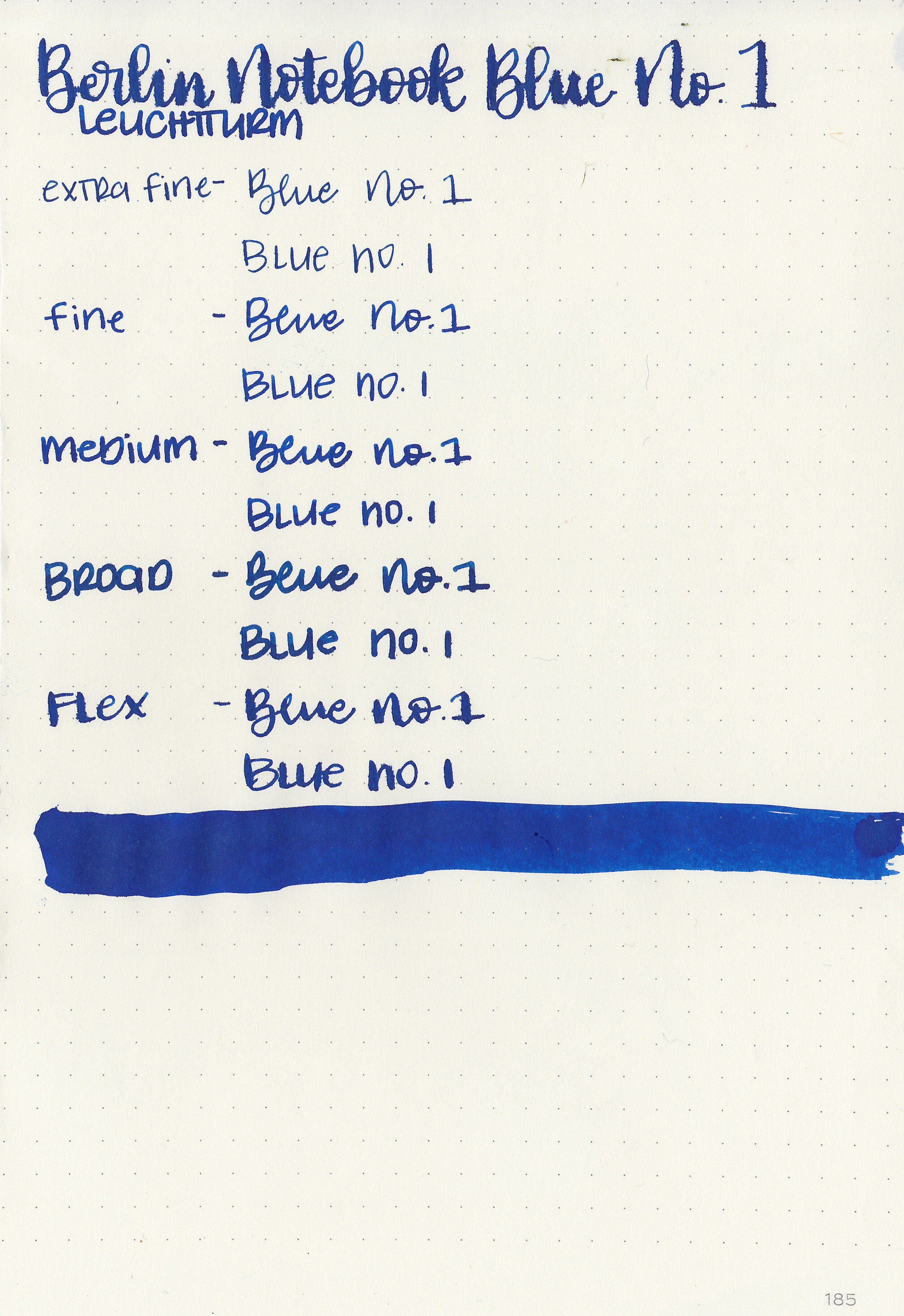
Let's take a look at how the ink behaves on fountain pen friendly papers: Rhodia, Tomoe River, and Leuchtturm.

Dry time: 15 seconds

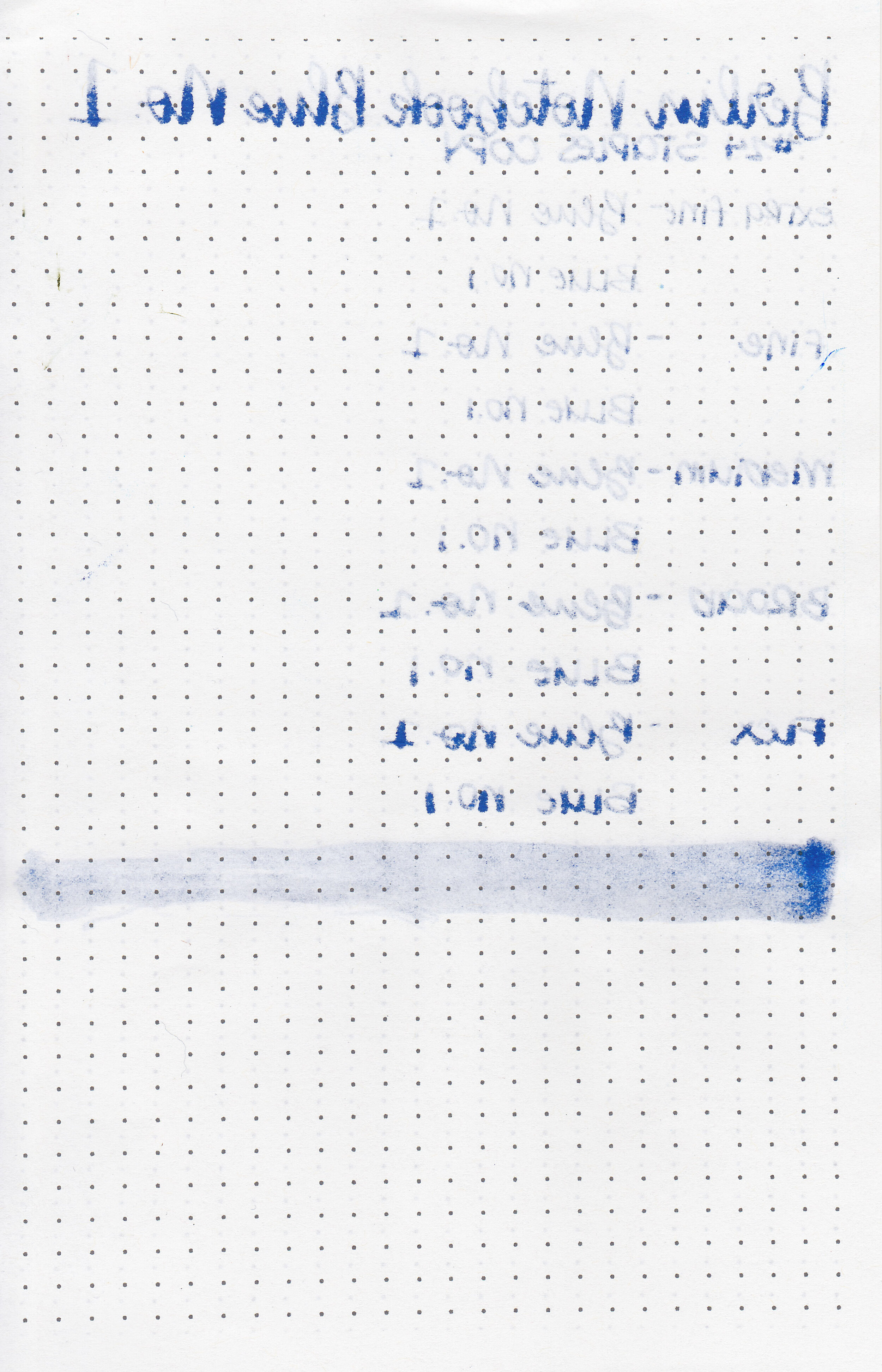
Water resistance: Low

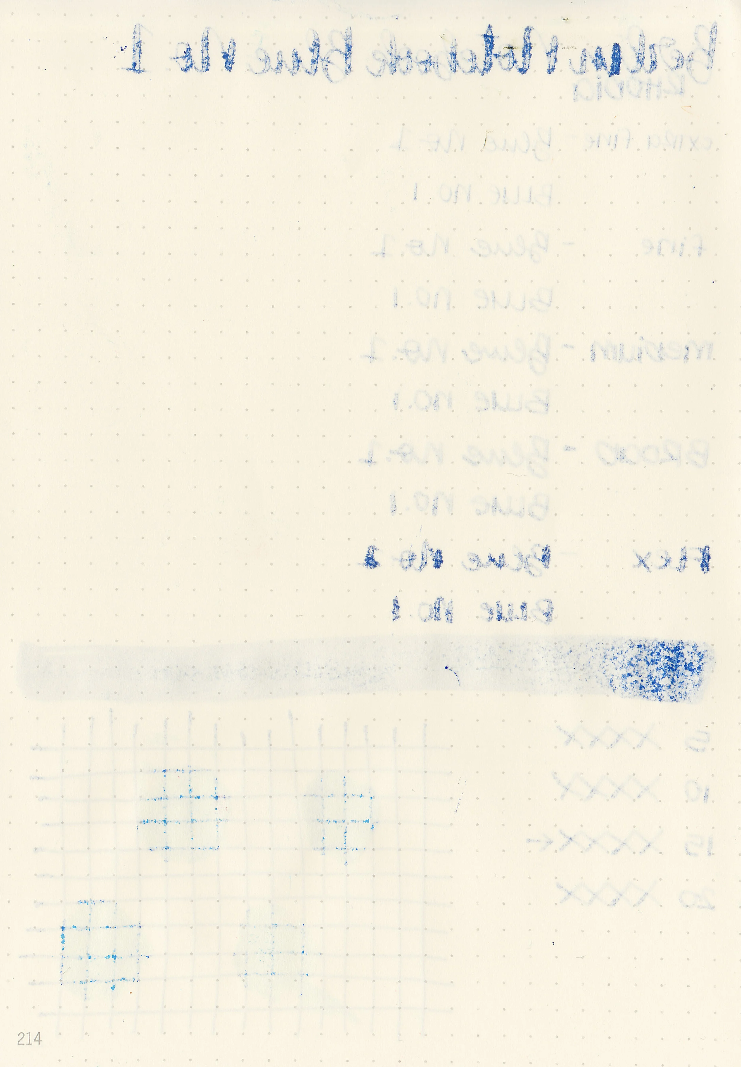
Feathering: Medium-high-there was feathering in every nib size on Rhodia and Leuchtturm.

Show through: Medium

Bleeding: Medium-there was bleeding in every nib size on Leuchtturm and most nib sizes on Rhodia.

Other properties: medium shading, medium sheen, and no shimmer.

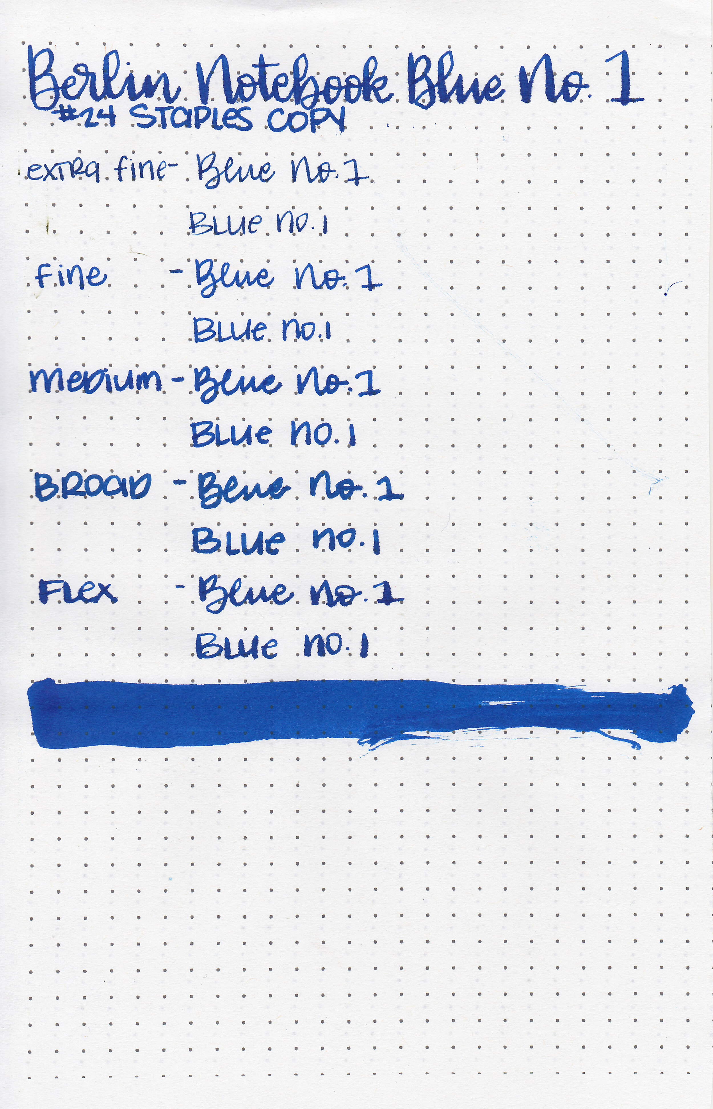
On Staples 24 lb copy paper there was feathering and bleeding in every nib size.

Comparison Swabs:

bn-blue-no1-s-1.jpg

Blue No. 1 is similar to Monteverde Ocean Noir. Click here to see the blue inks together.

Longer writing:

bn-blue-no1-s-2.jpg

I used a broad Pelikan M805 Vibrant Blue on a Lochby A5 Lined Refill-Tomoe River 68gsm. The ink had a wetter than average flow.

Overall, while I love the color of this ink, there’s a bit more feathering and bleeding than I prefer. It dries fast which is great, but is also rather smeary and smudgy. This paper performs the best on Tomoe River paper (as most inks do). Second best on the cheapest copy paper, but there is still a little feathering and bleeding. It feathers and bleeds on Leuchtturm and Rhodia in almost every pen and nib size I tried it in.

Disclaimer: This product was provided by Berlin Notebook for the purpose of this review. All photos and opinions are my own. This page does not contain affiliate links, and this post is not sponsored in any way.