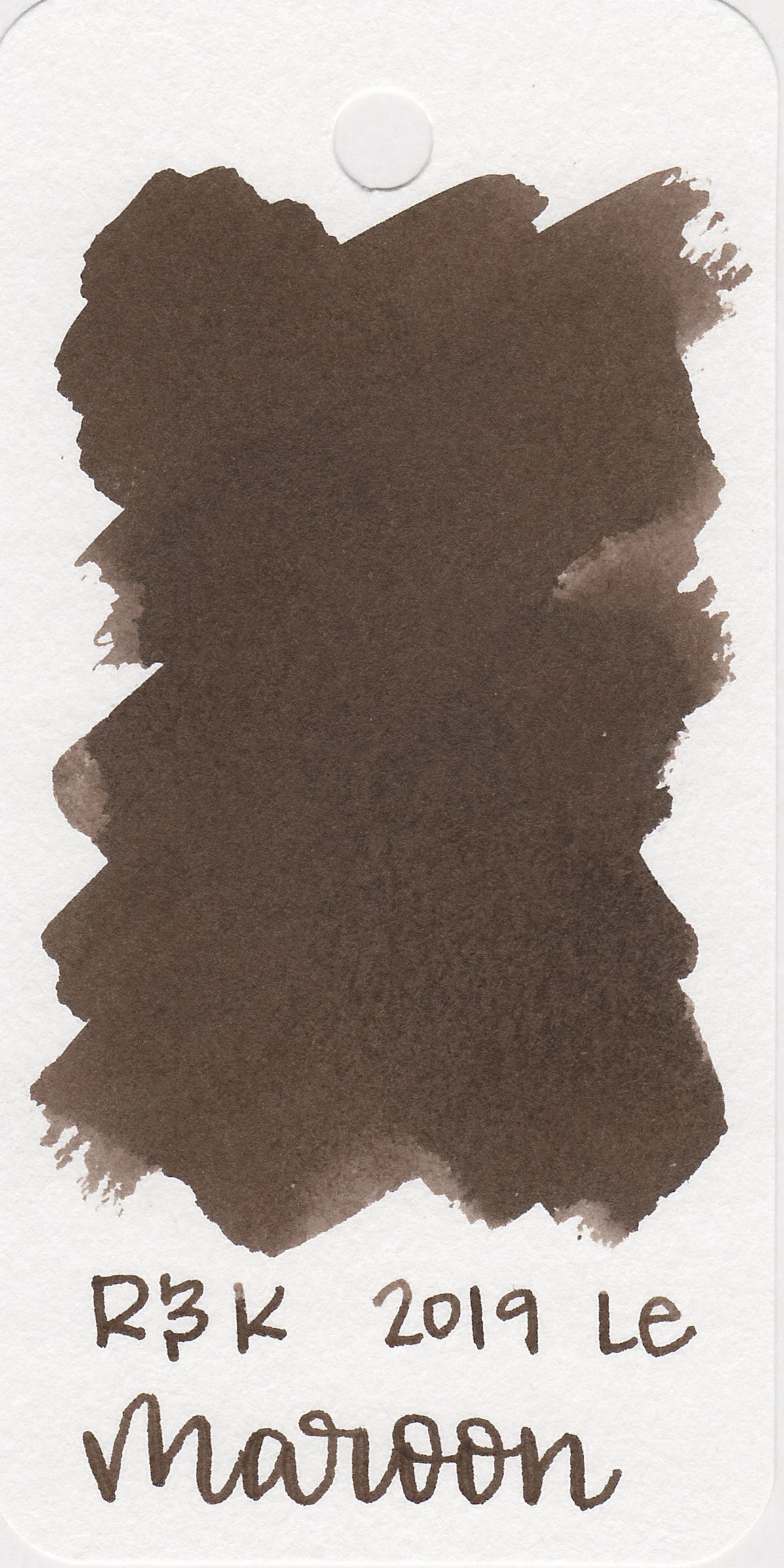
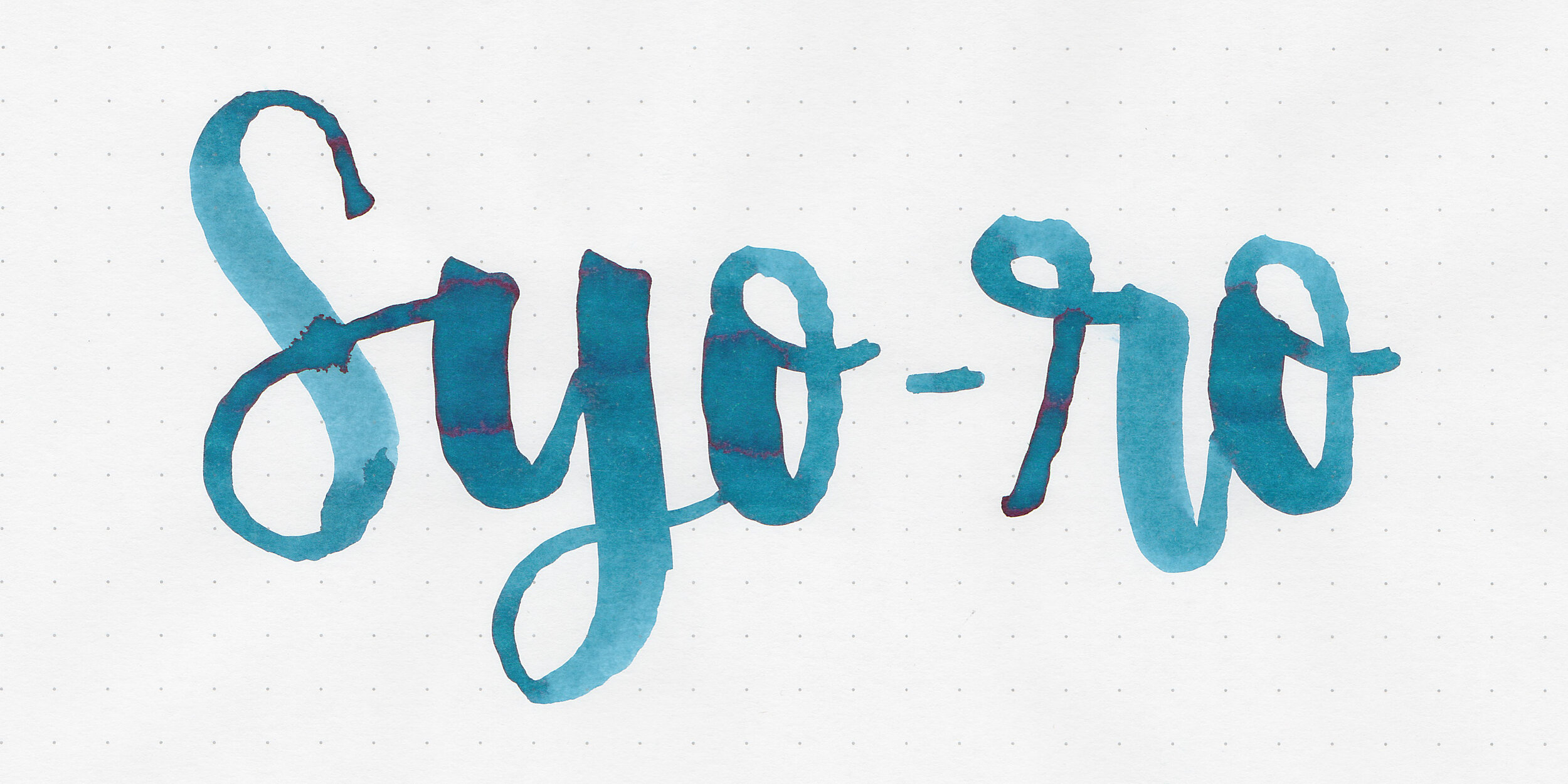
Ink Review #1077: Pilot Iroshizuku Syo-ro
/
I’m getting close to finishing up all of the Pilot Iroshizuku inks, so today’s ink is Pilot Iroshizuku Syo-ro aka Dew on Pine Tree. Thanks to the reader that sent a sample in for review! You can find this ink for sale at most retailers including Pen Chalet.

The color:
Syo-ro is a pretty, dark teal.
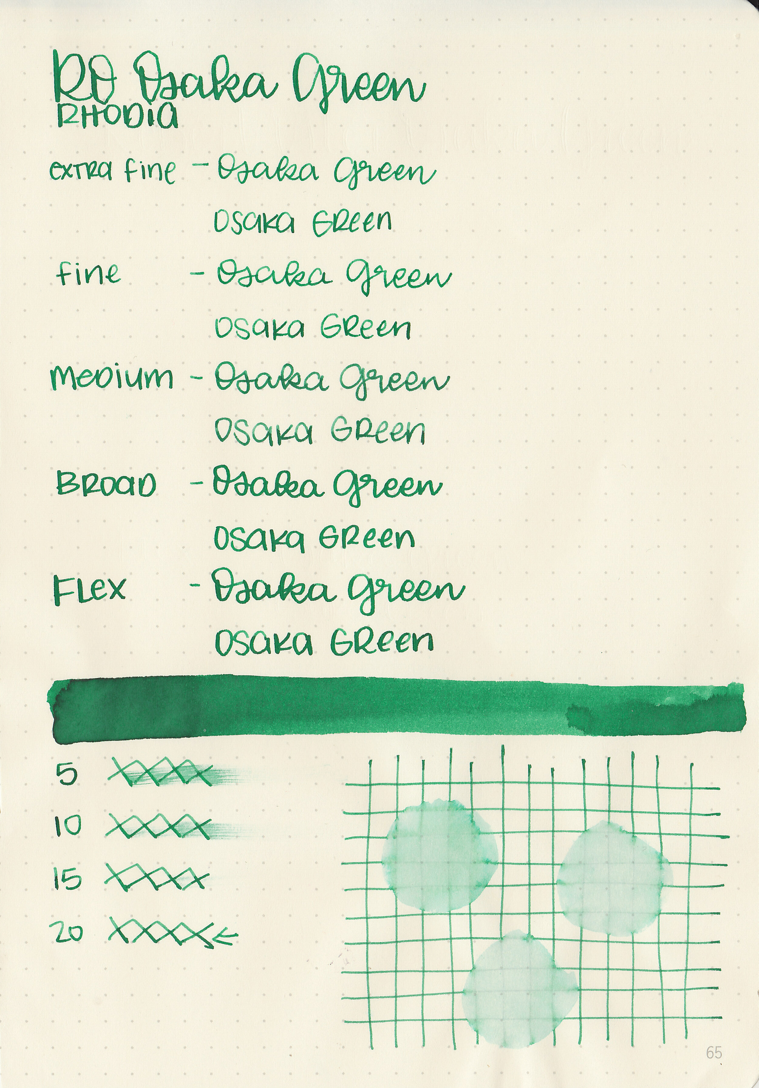
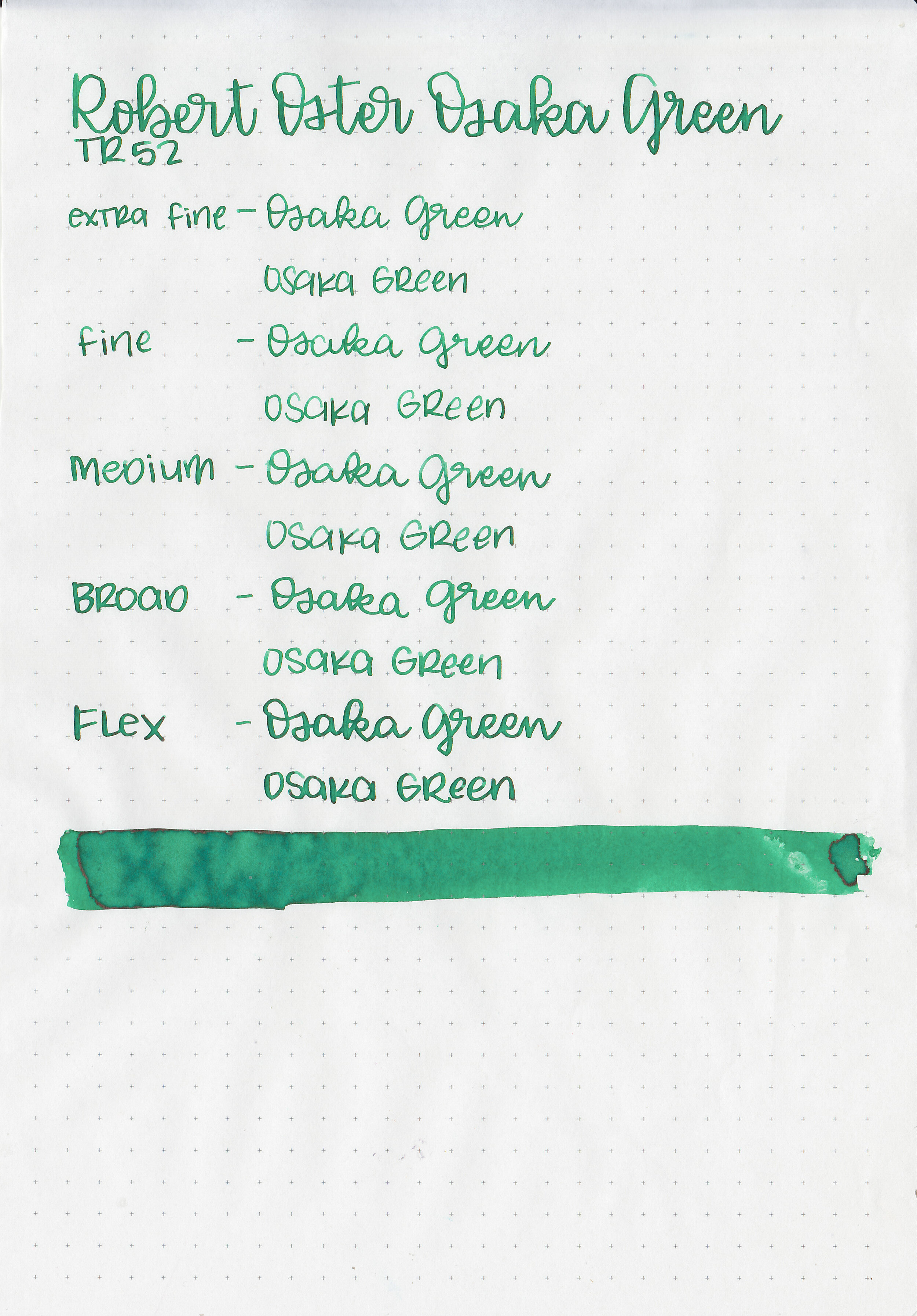
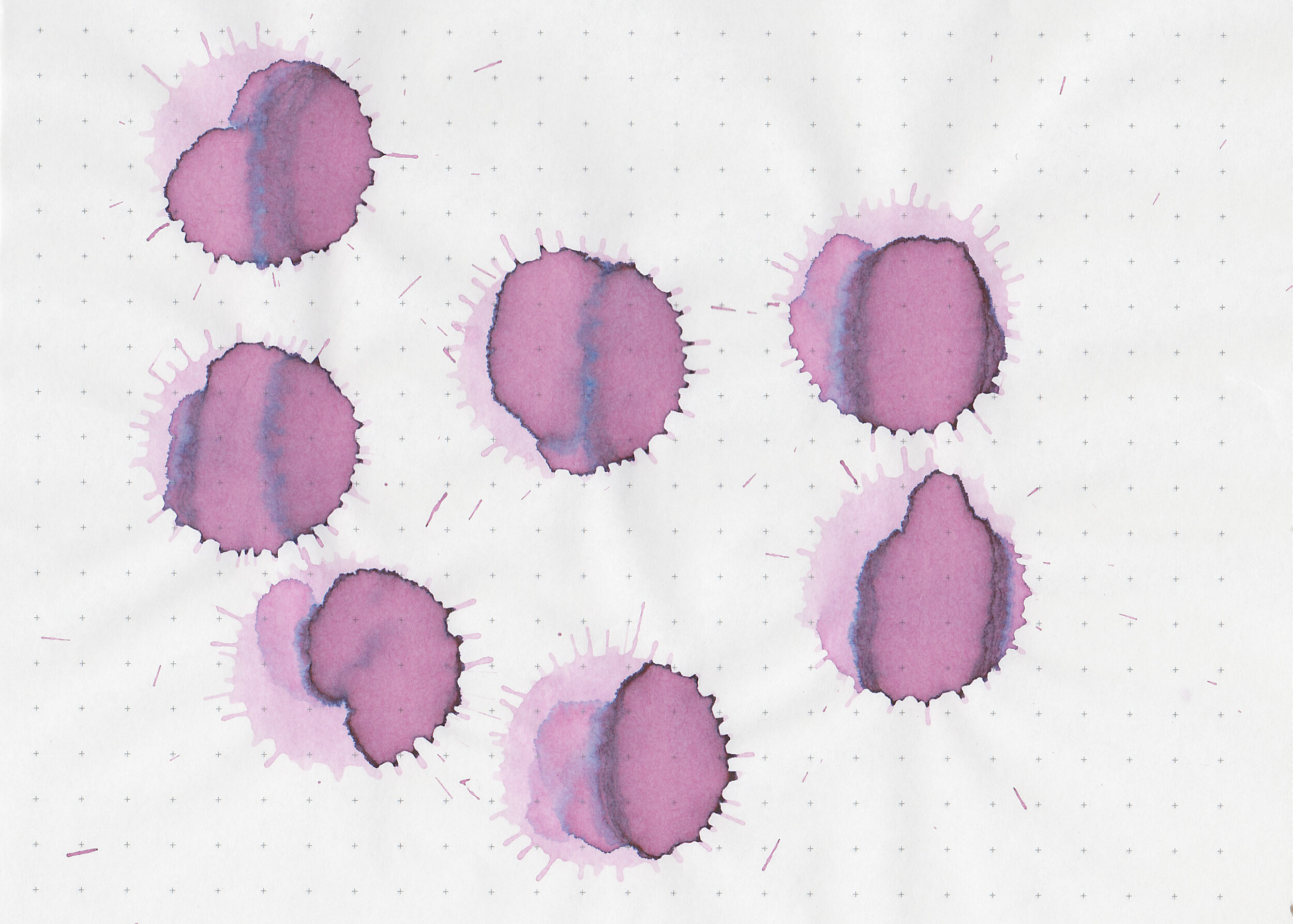
Swabs:
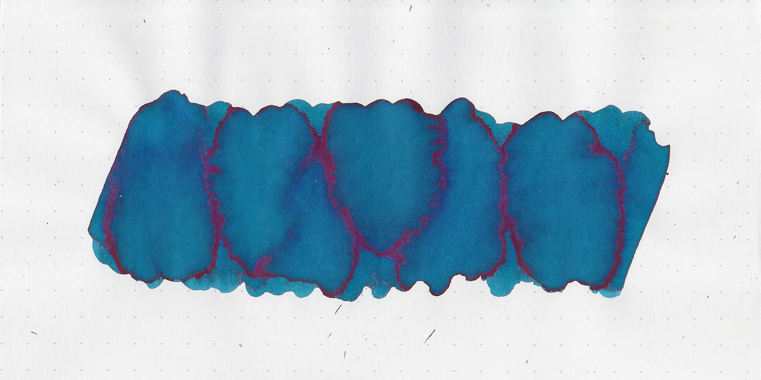
In large swabs on Tomoe River paper the ink looks more blue, and has some red sheen.

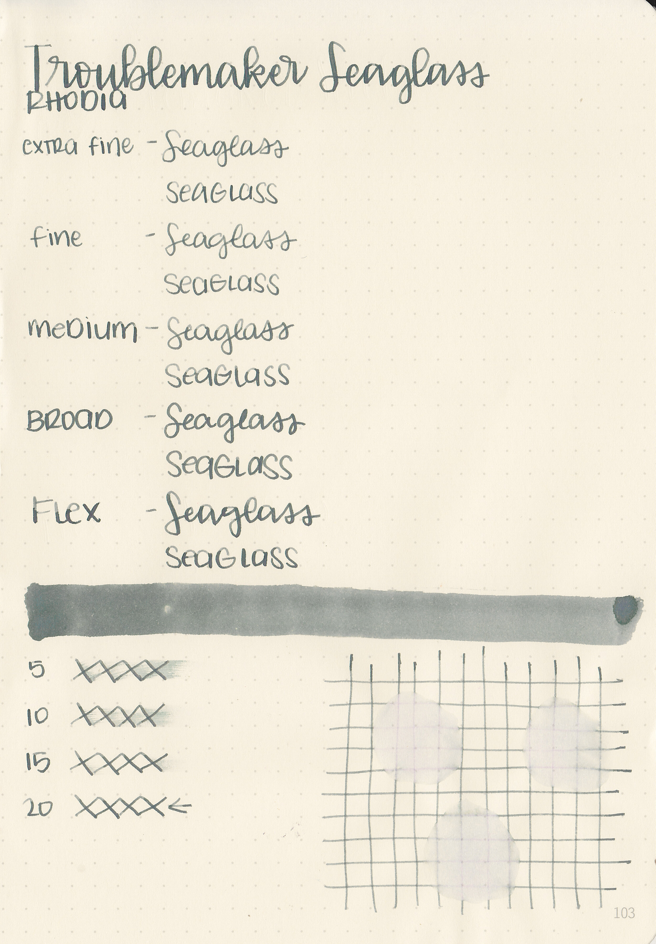
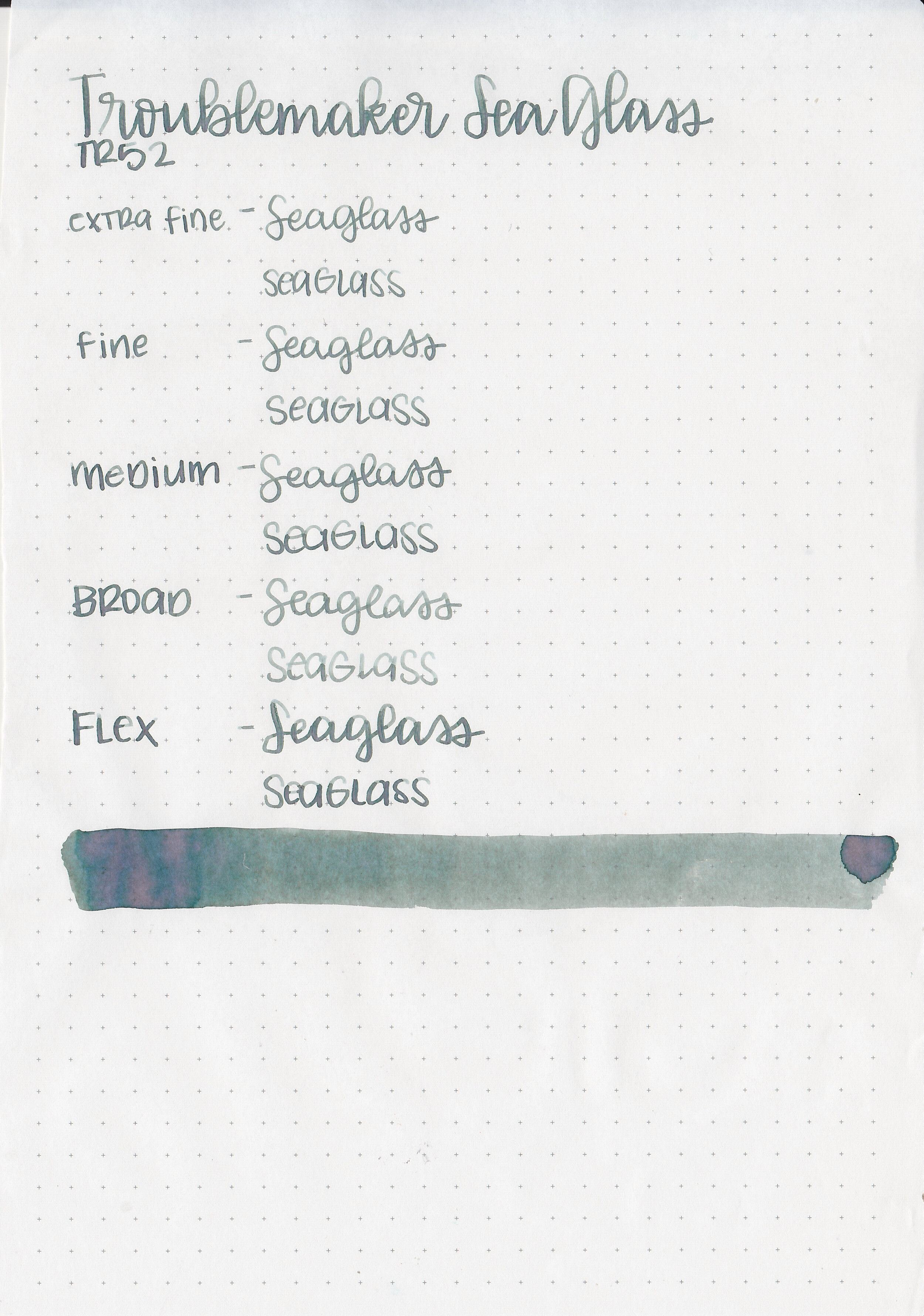
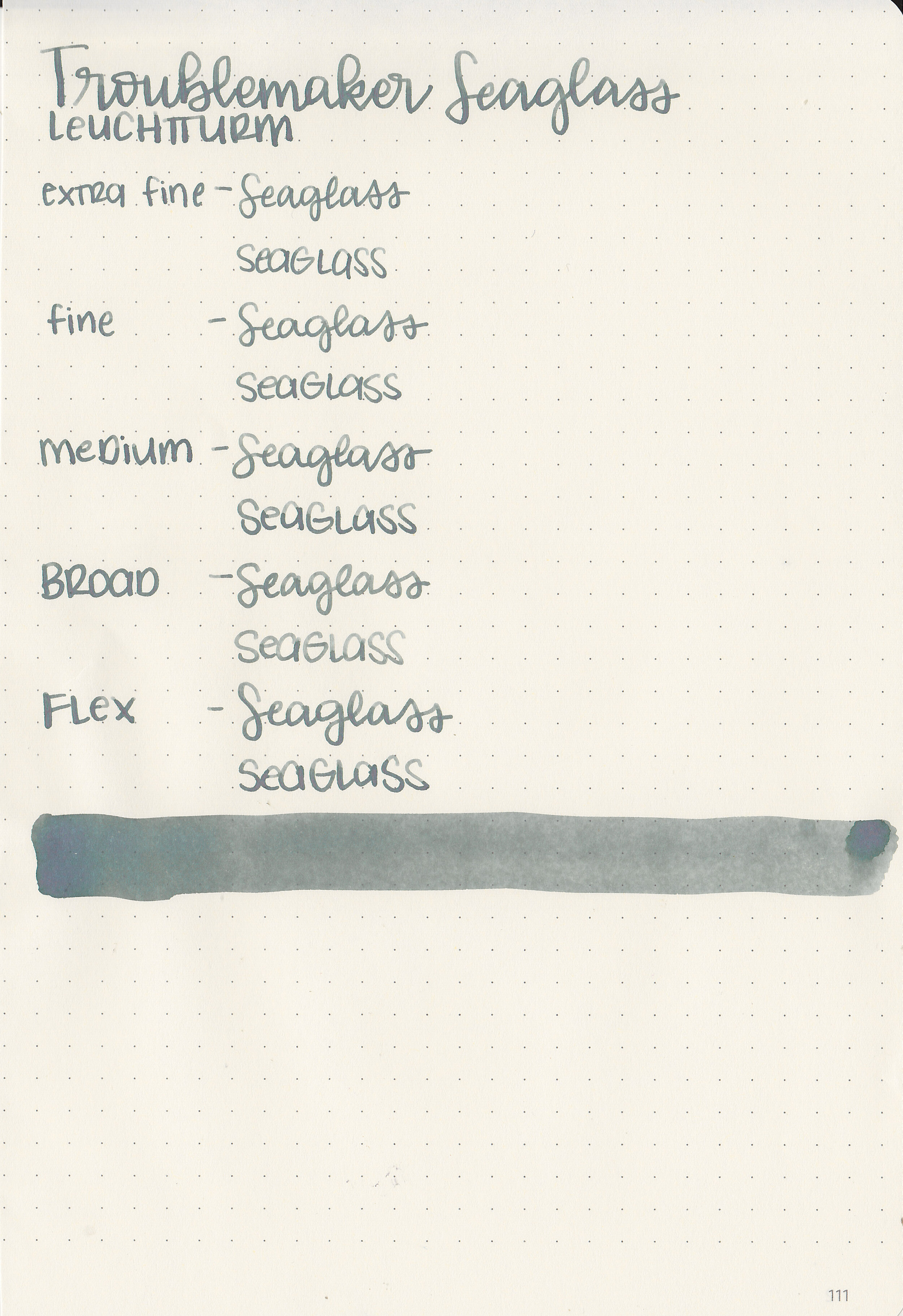
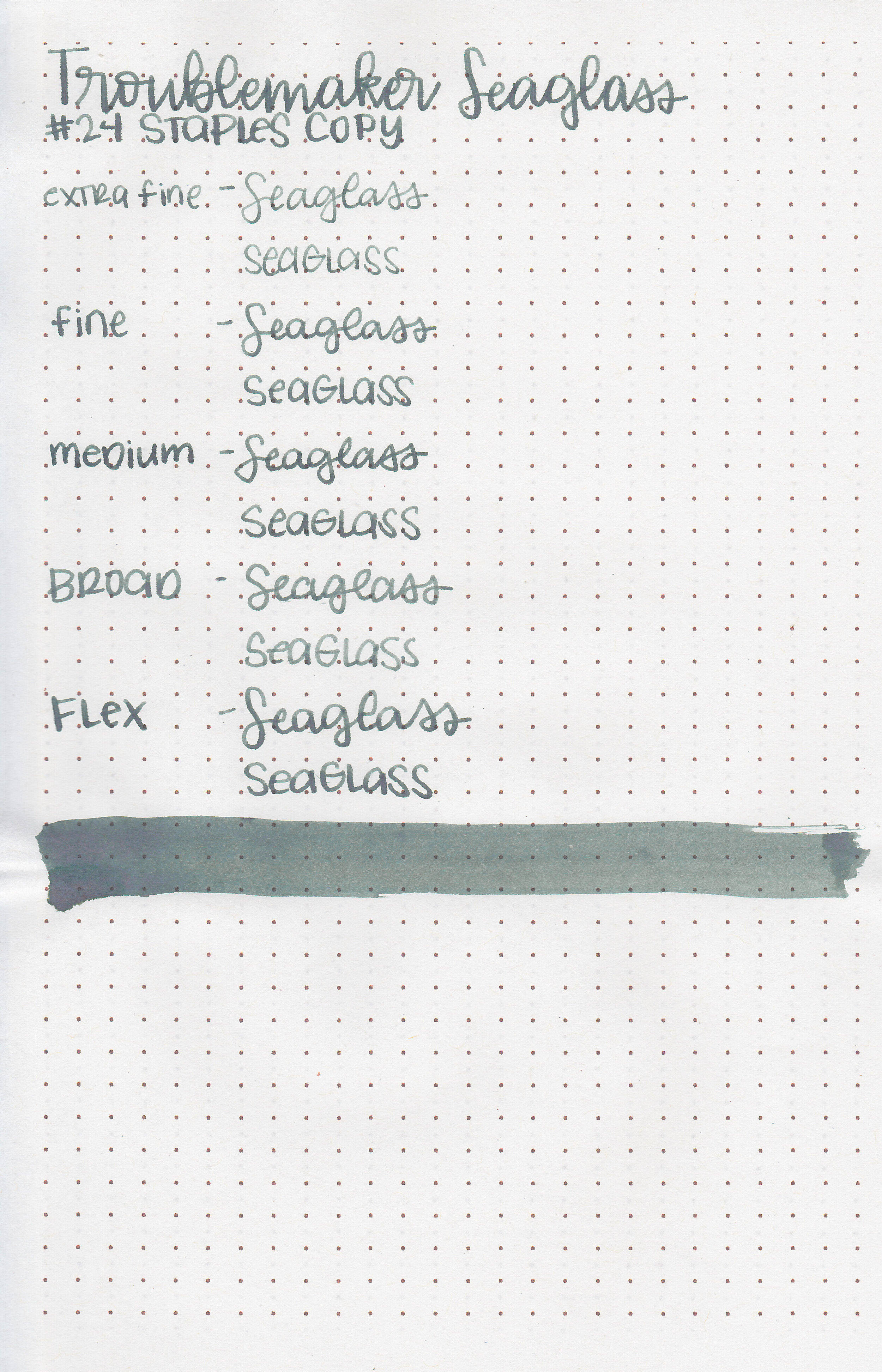
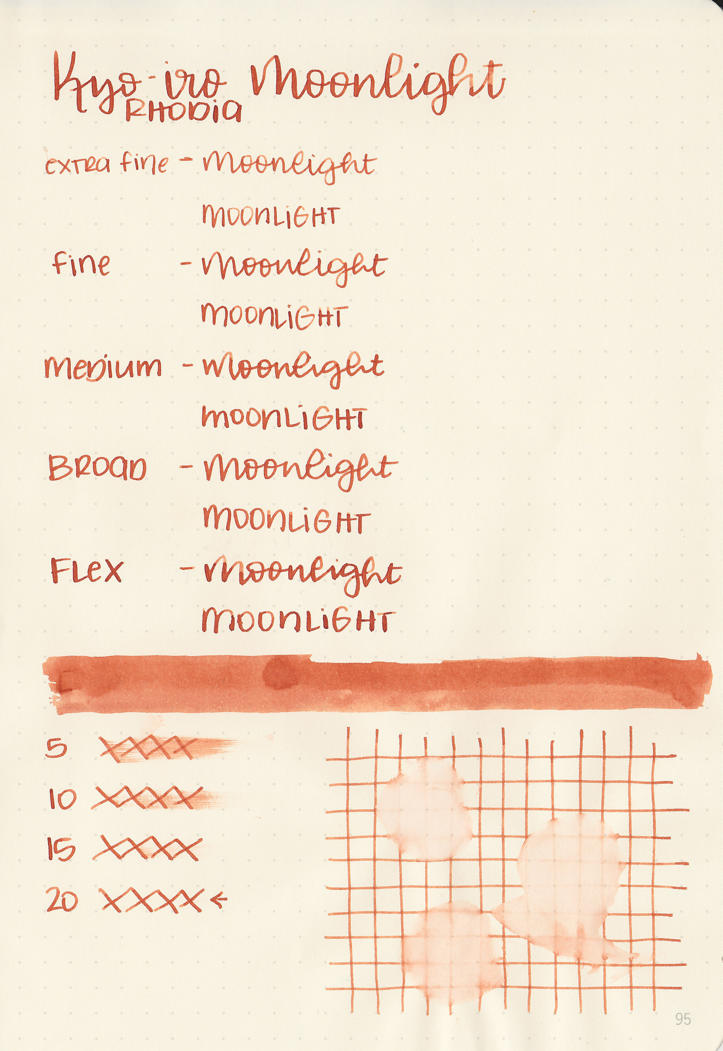
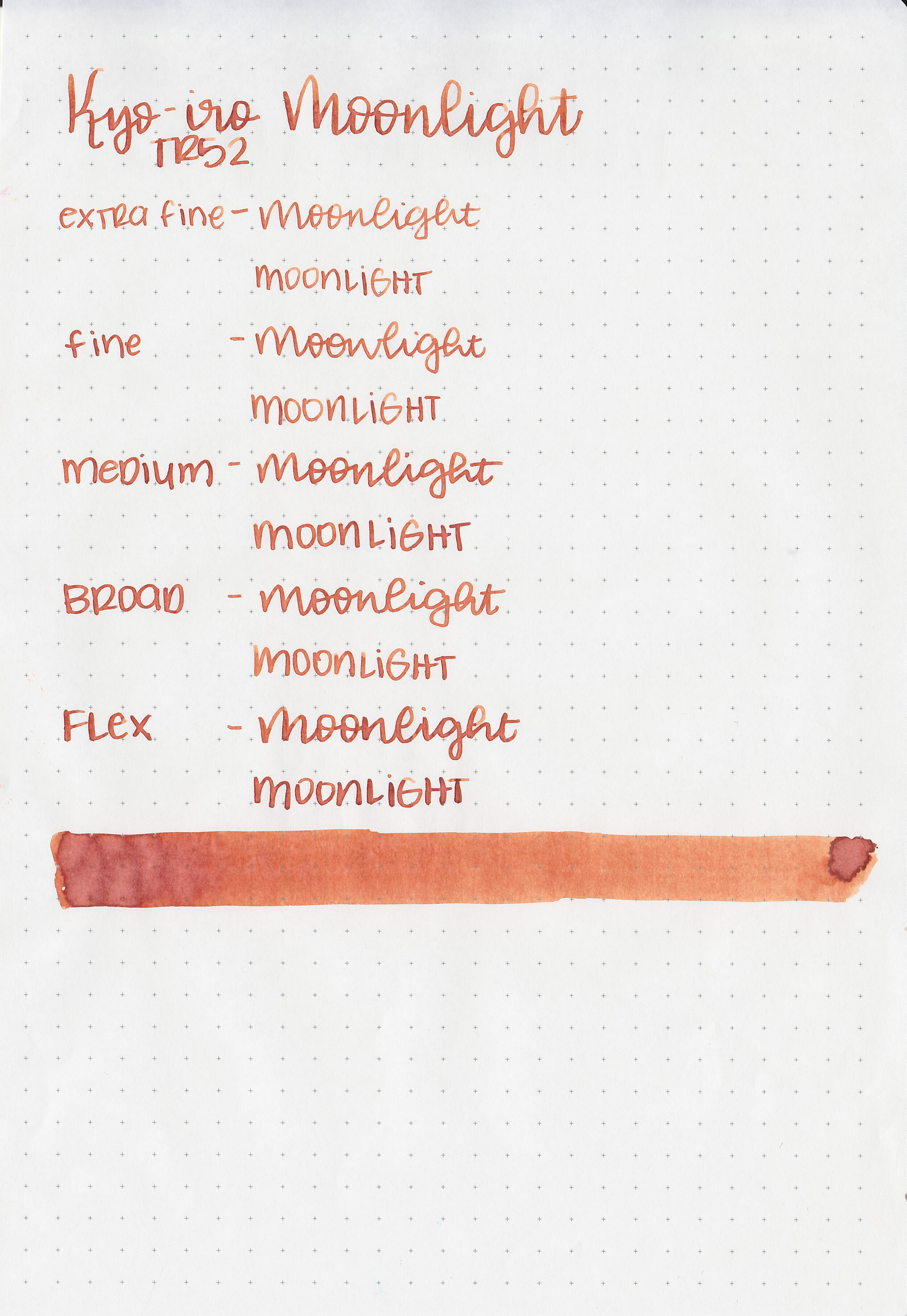
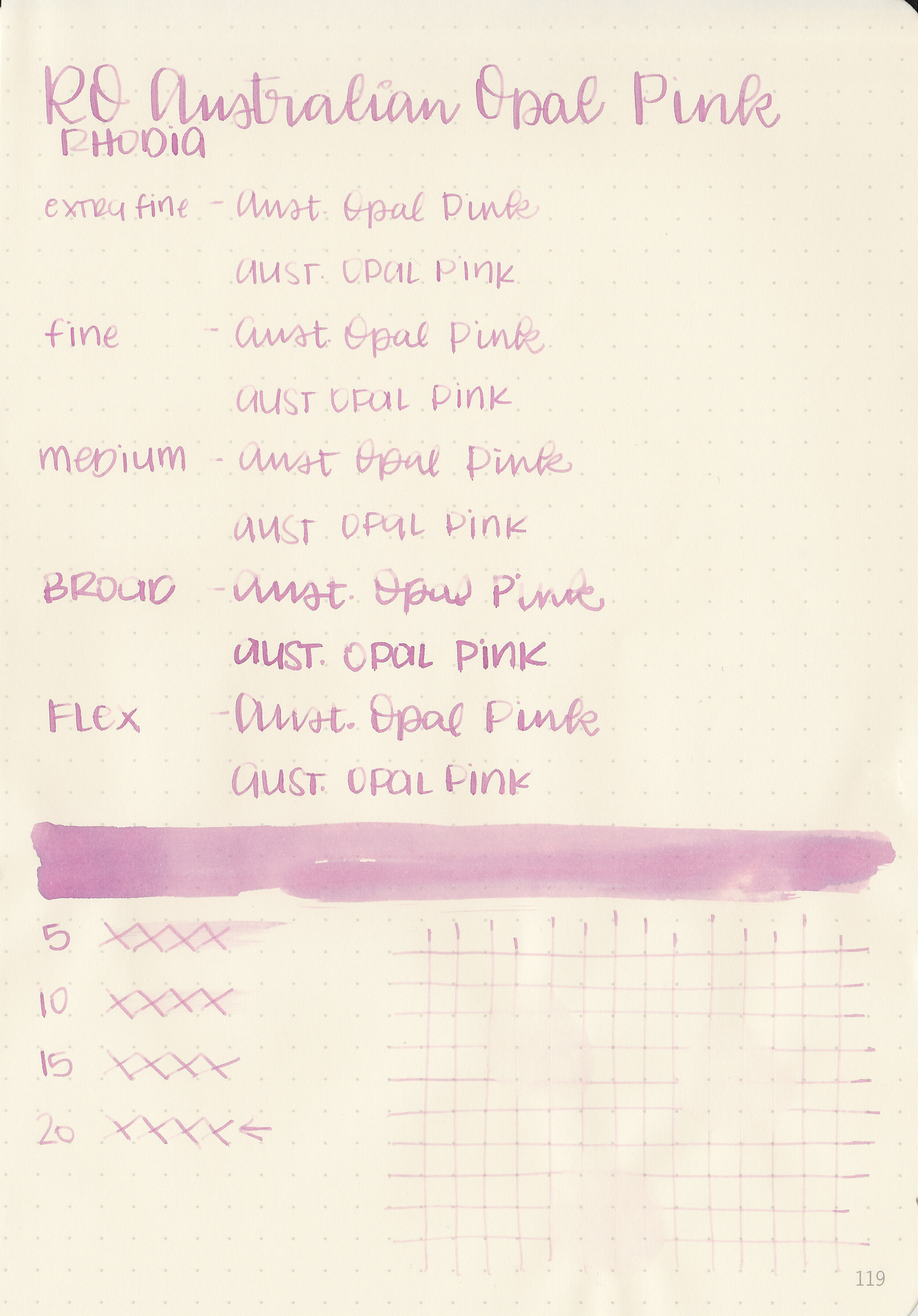
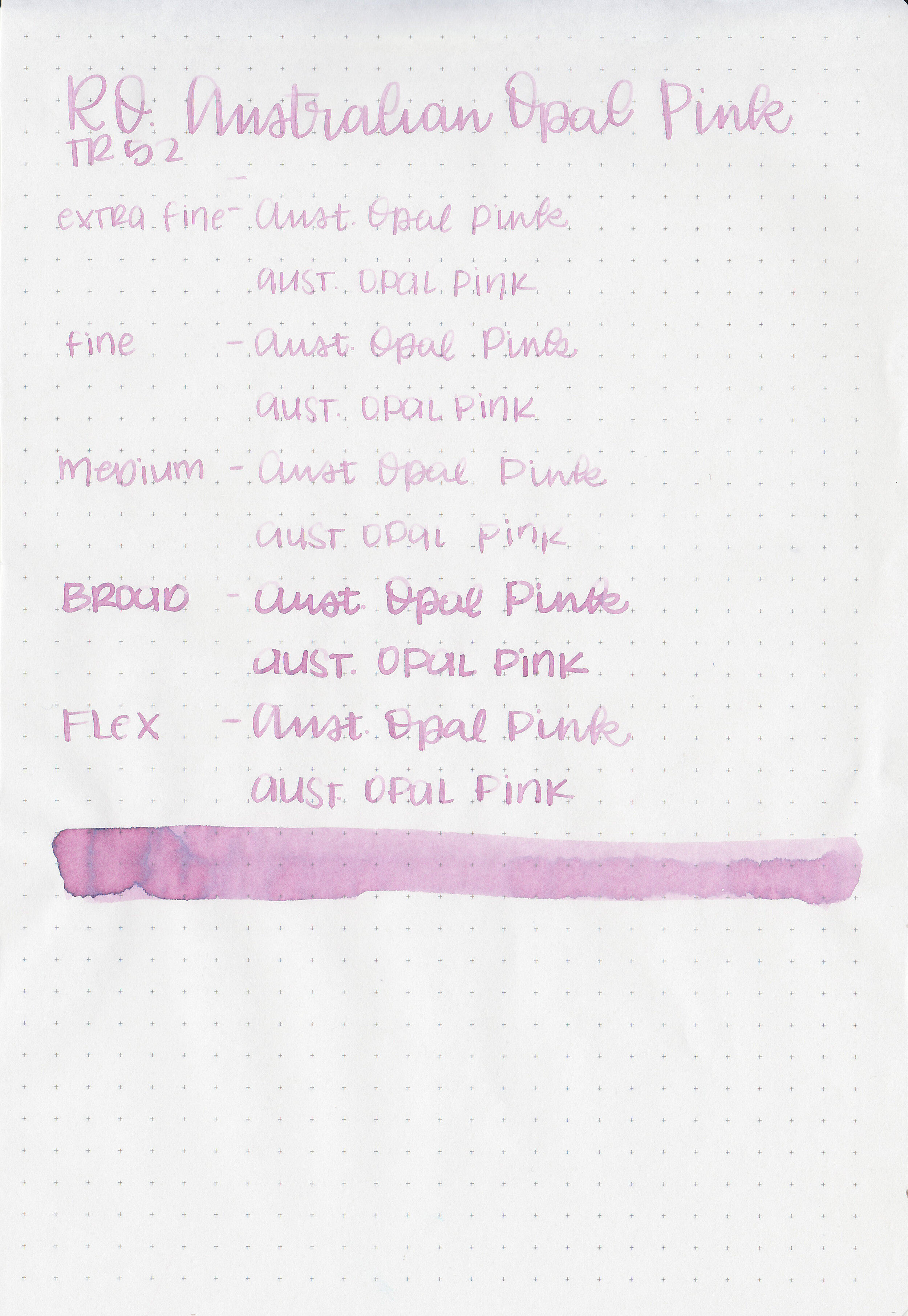
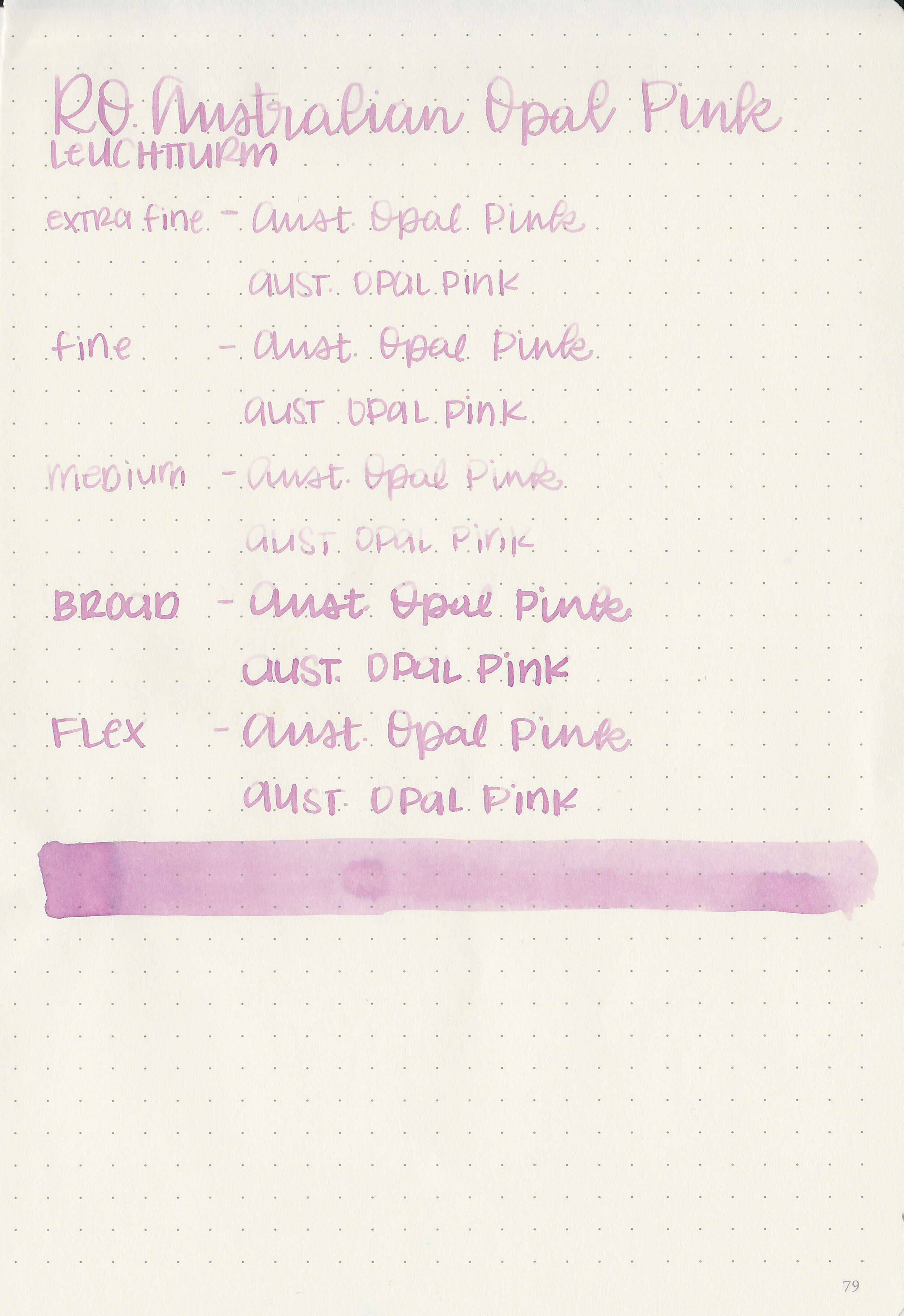
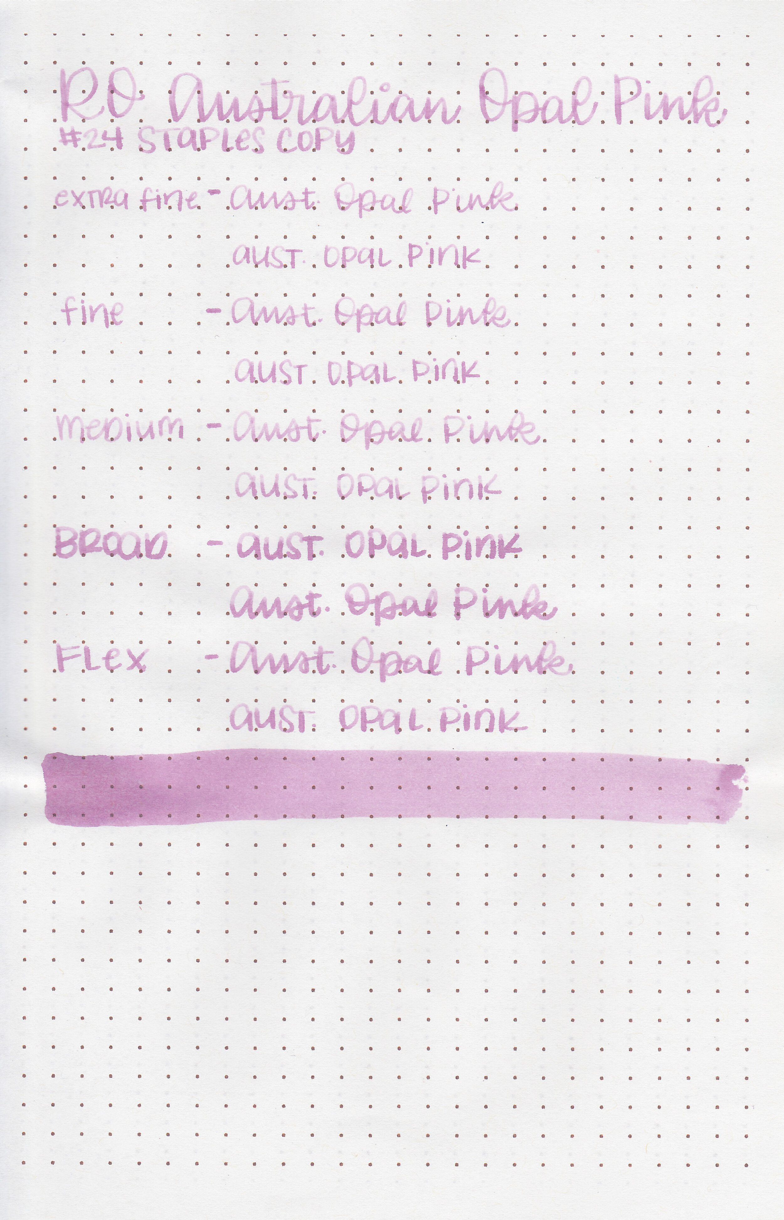
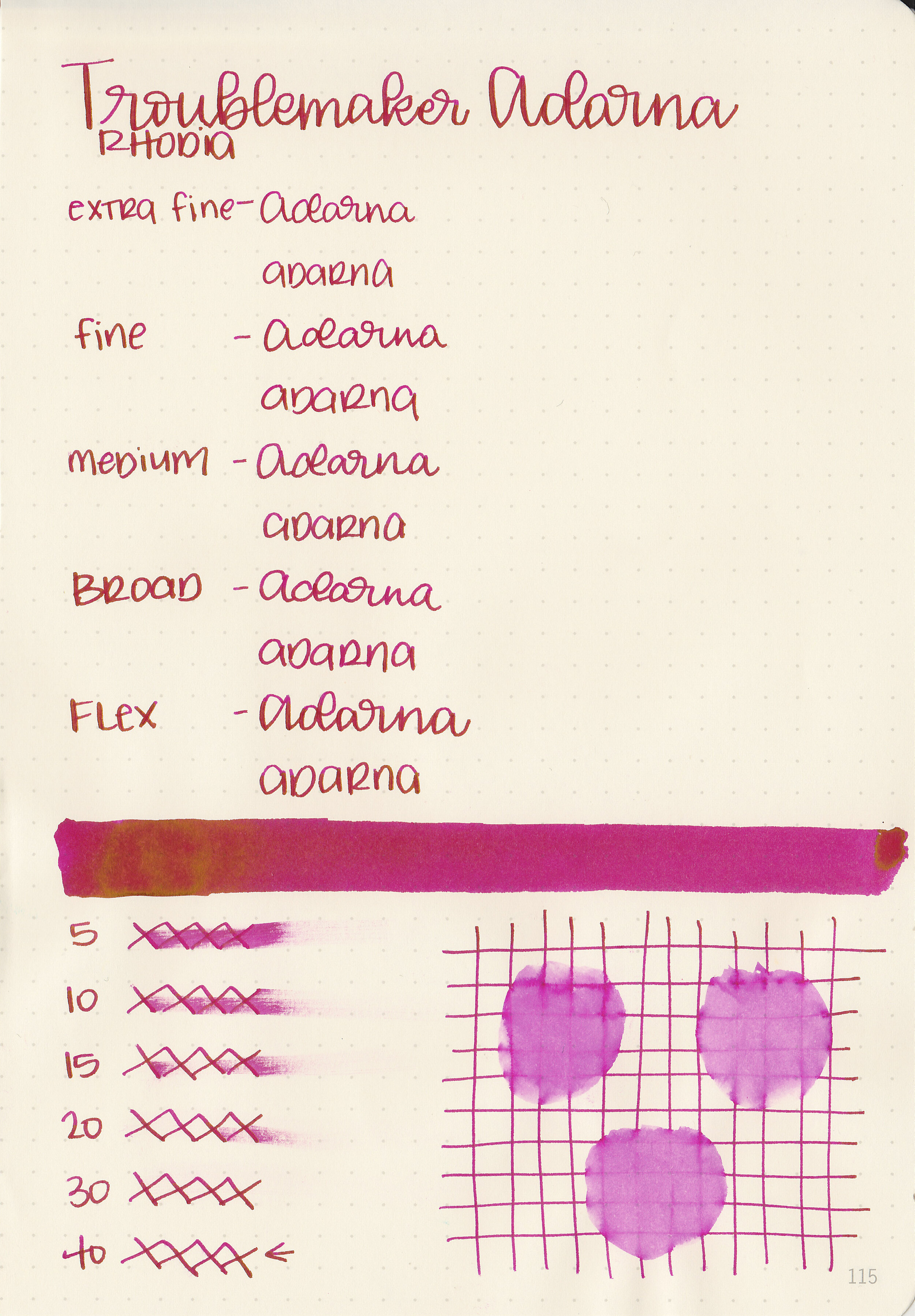
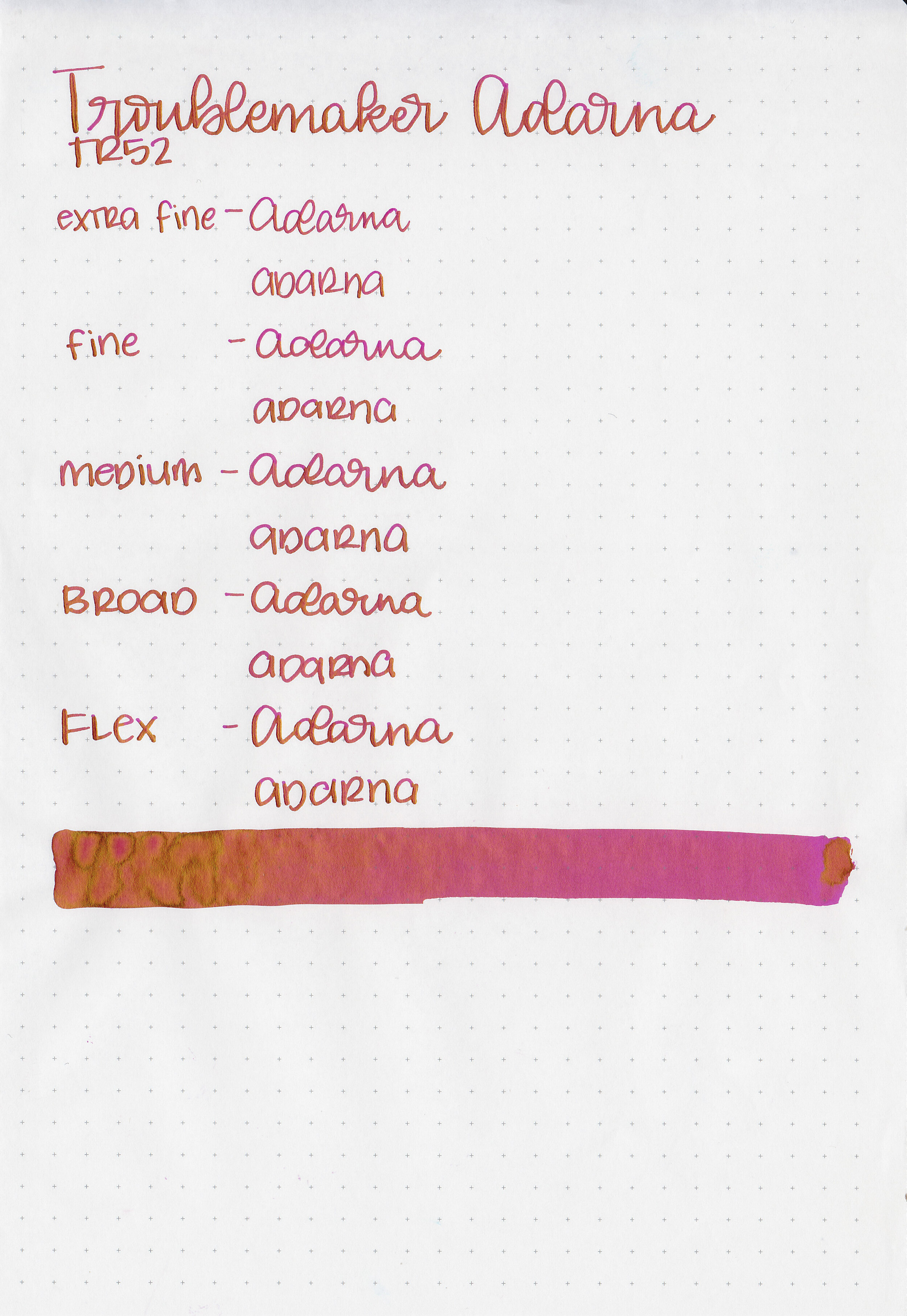
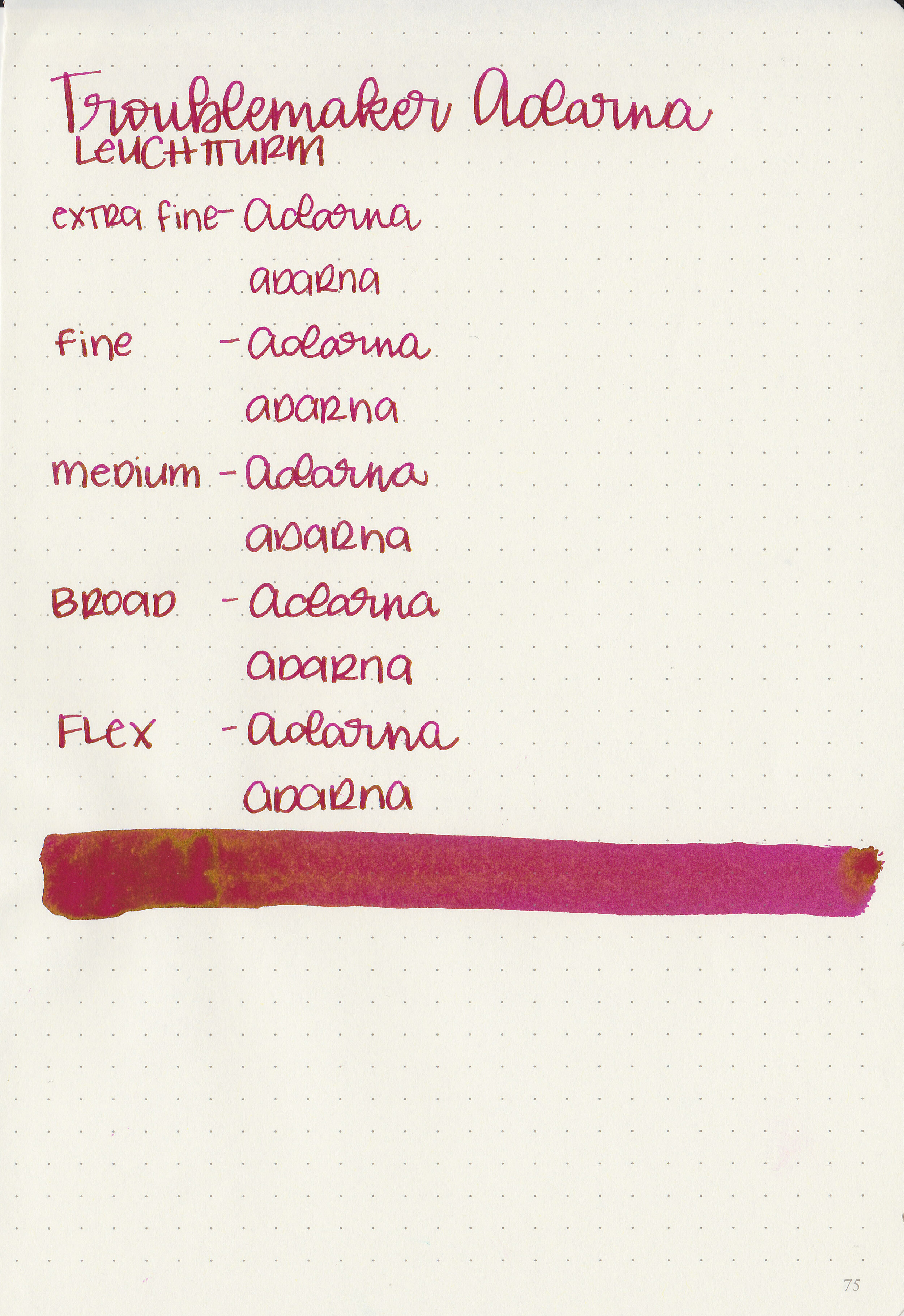
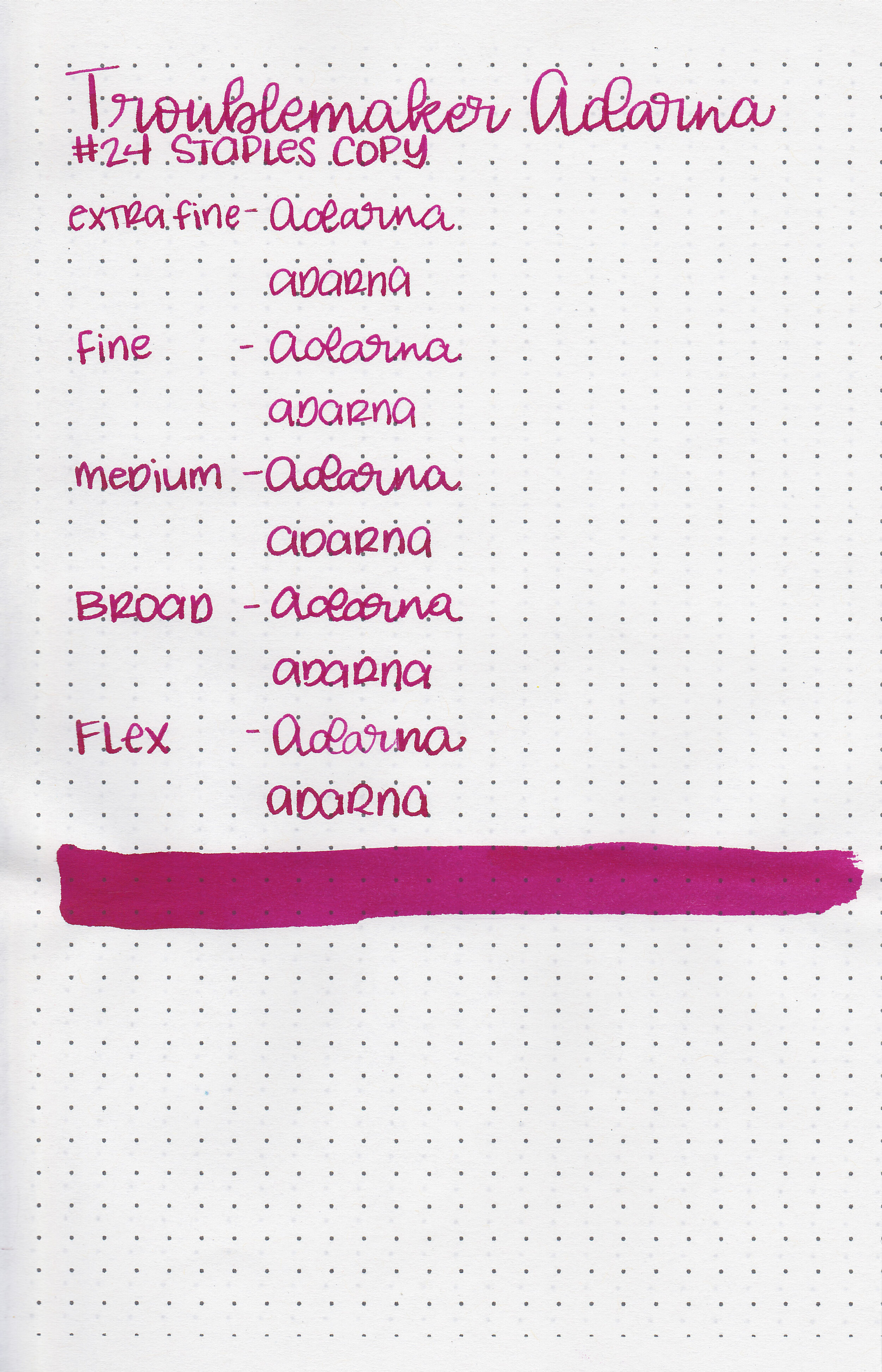
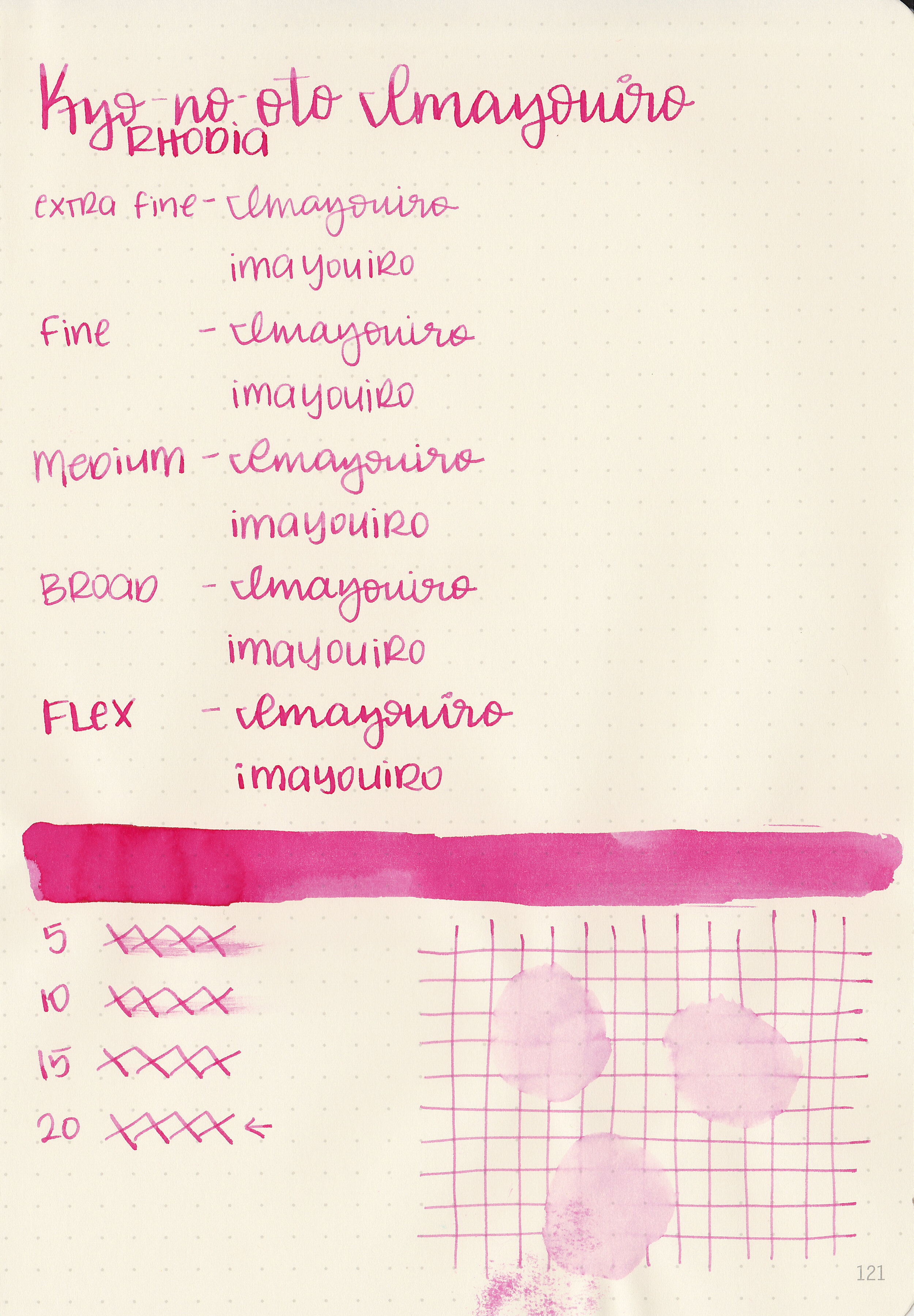
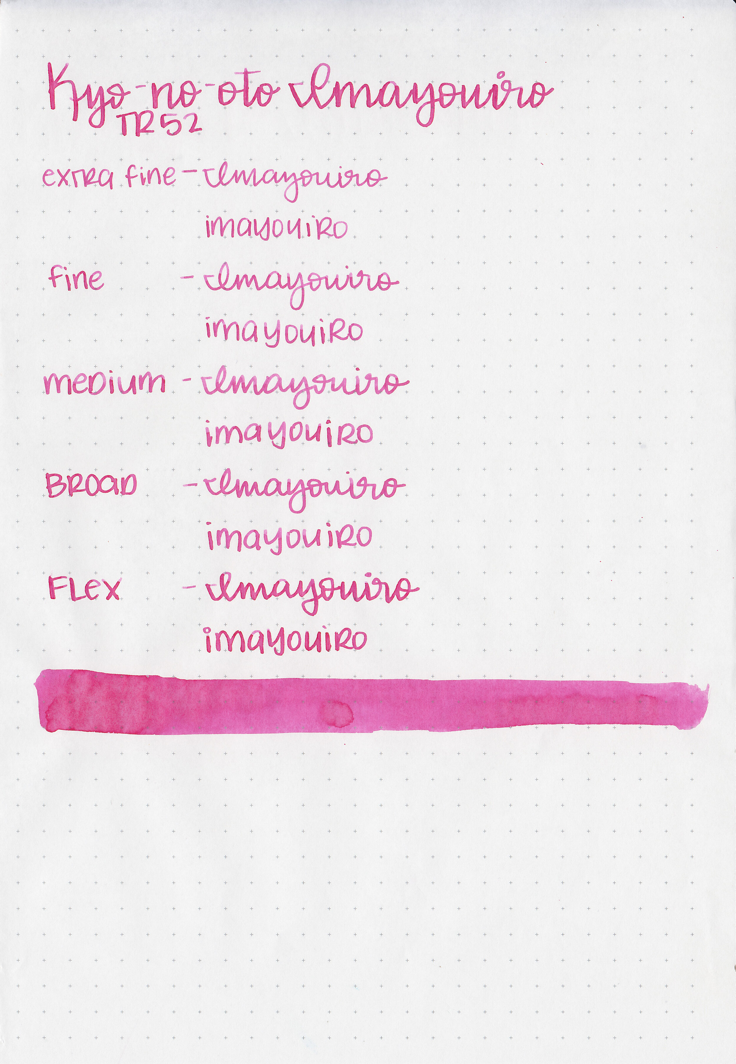
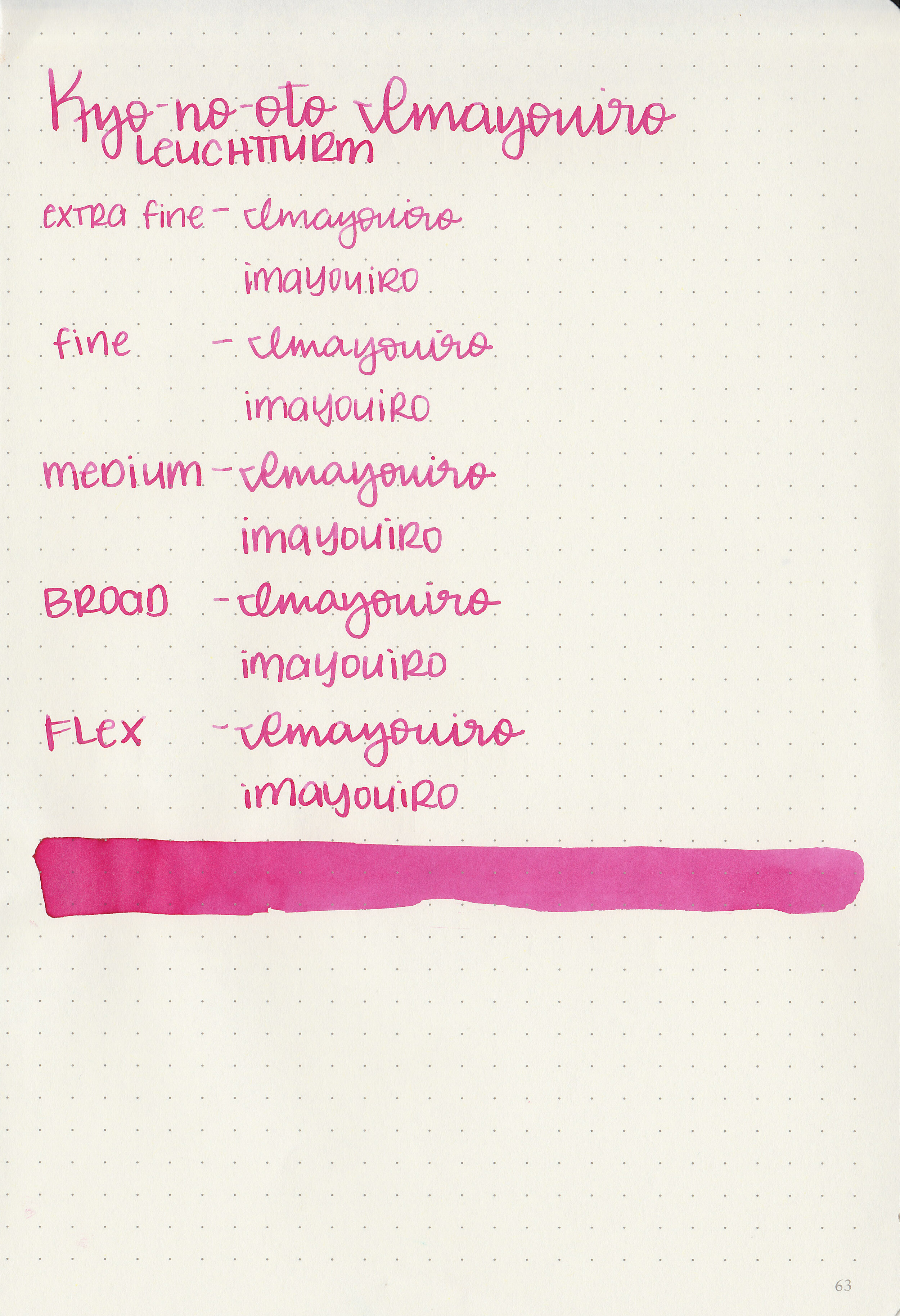
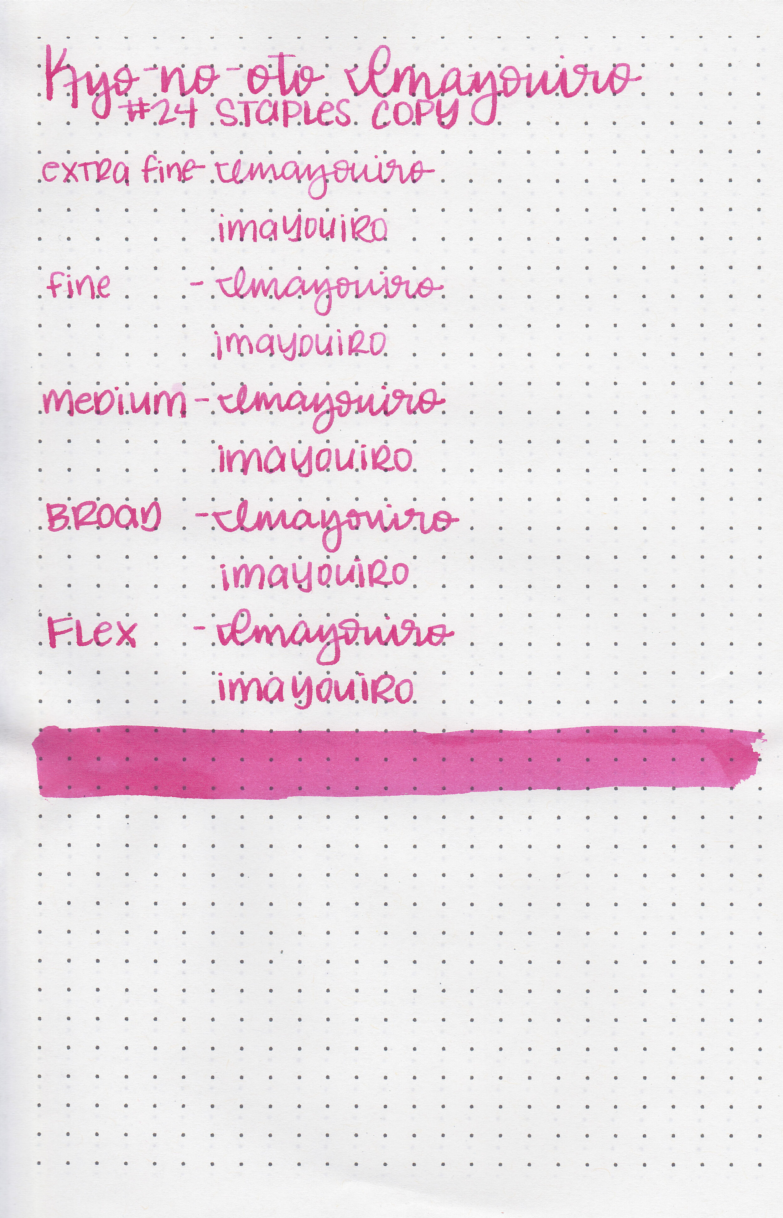
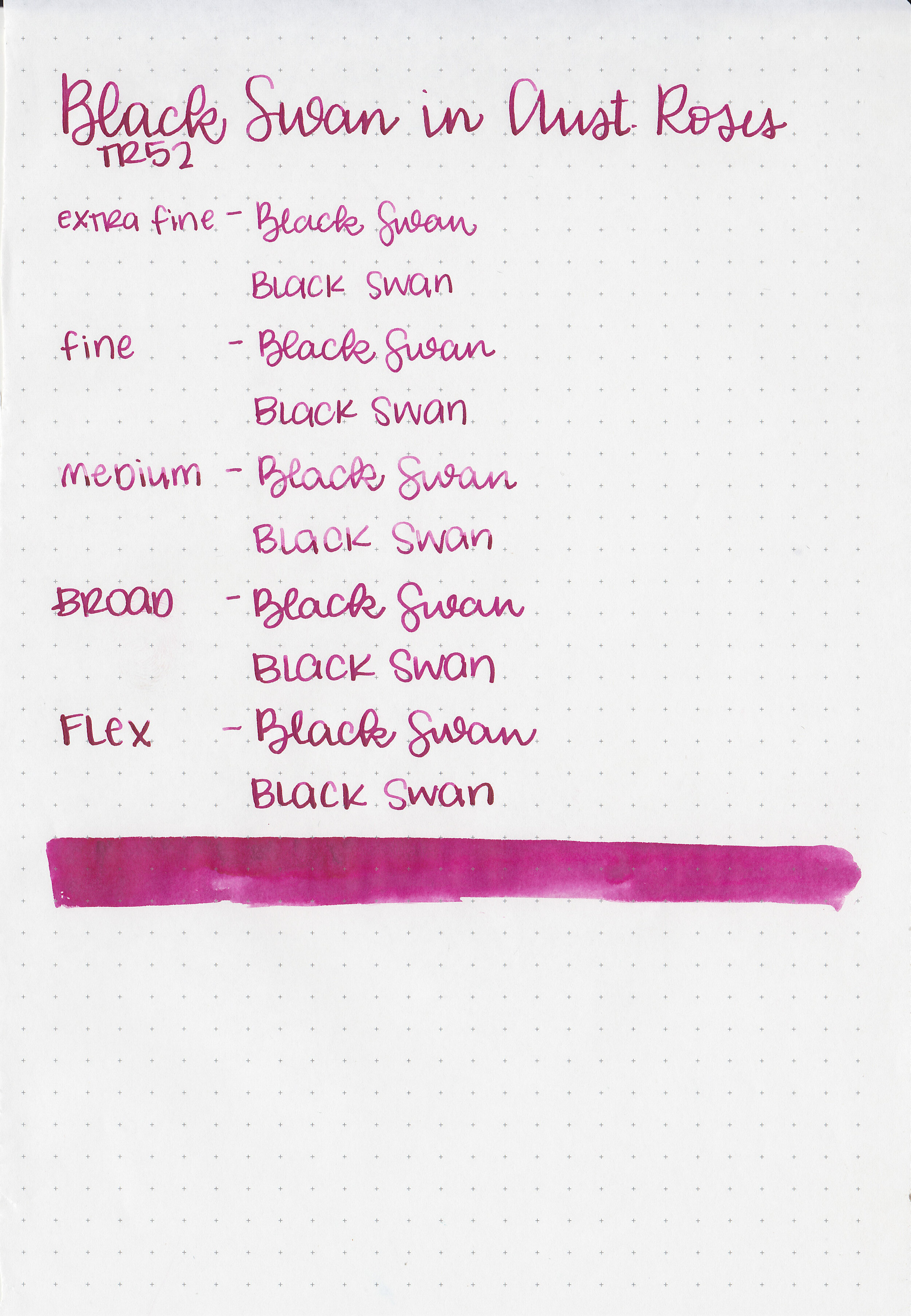
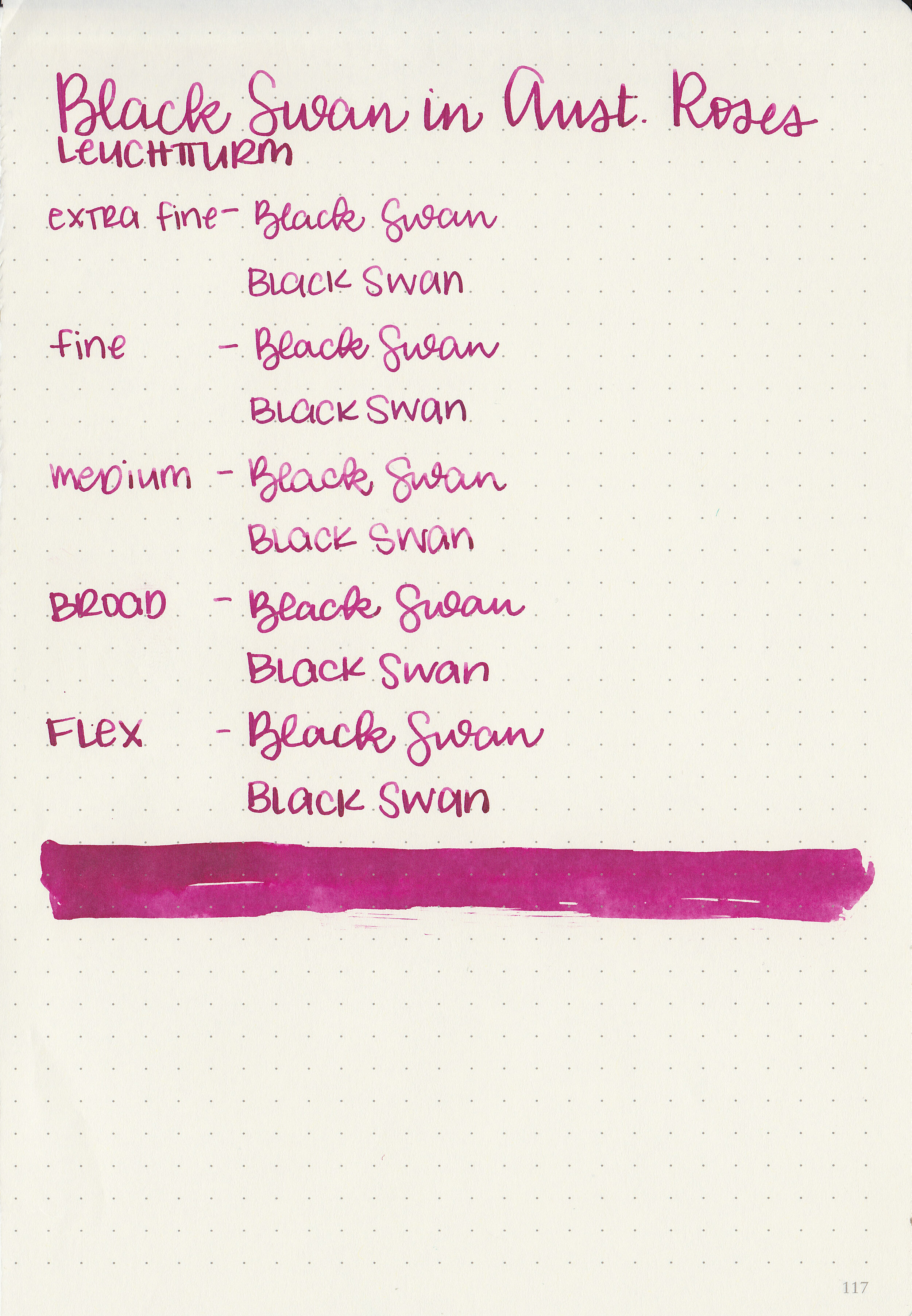
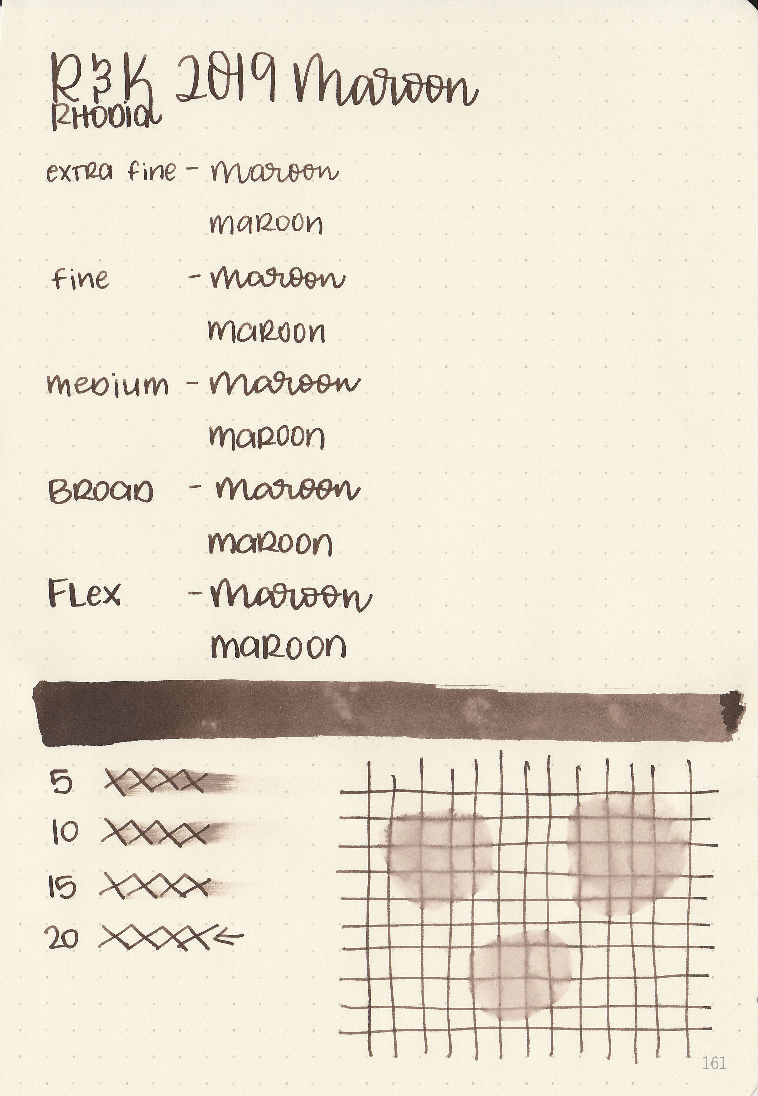
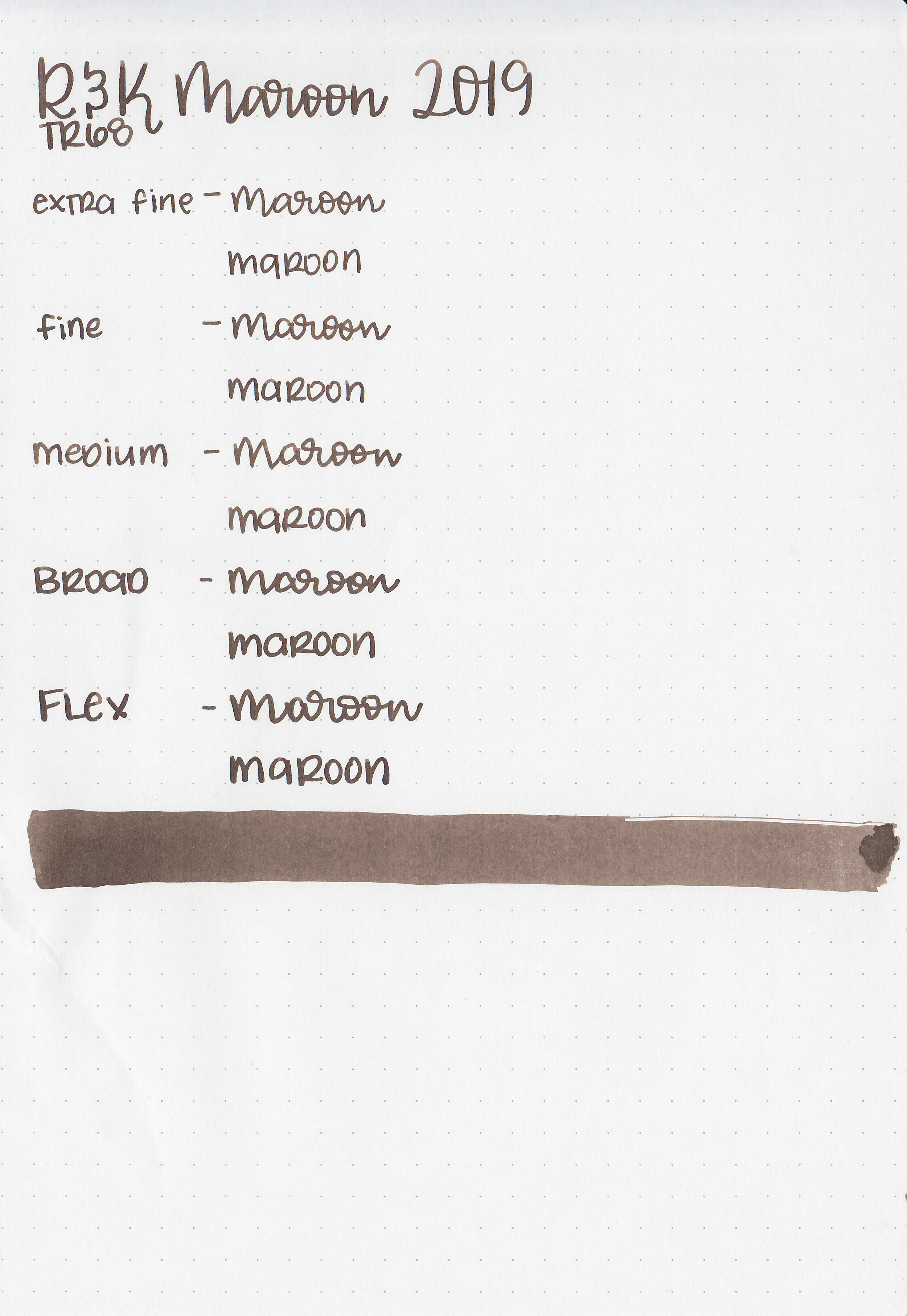
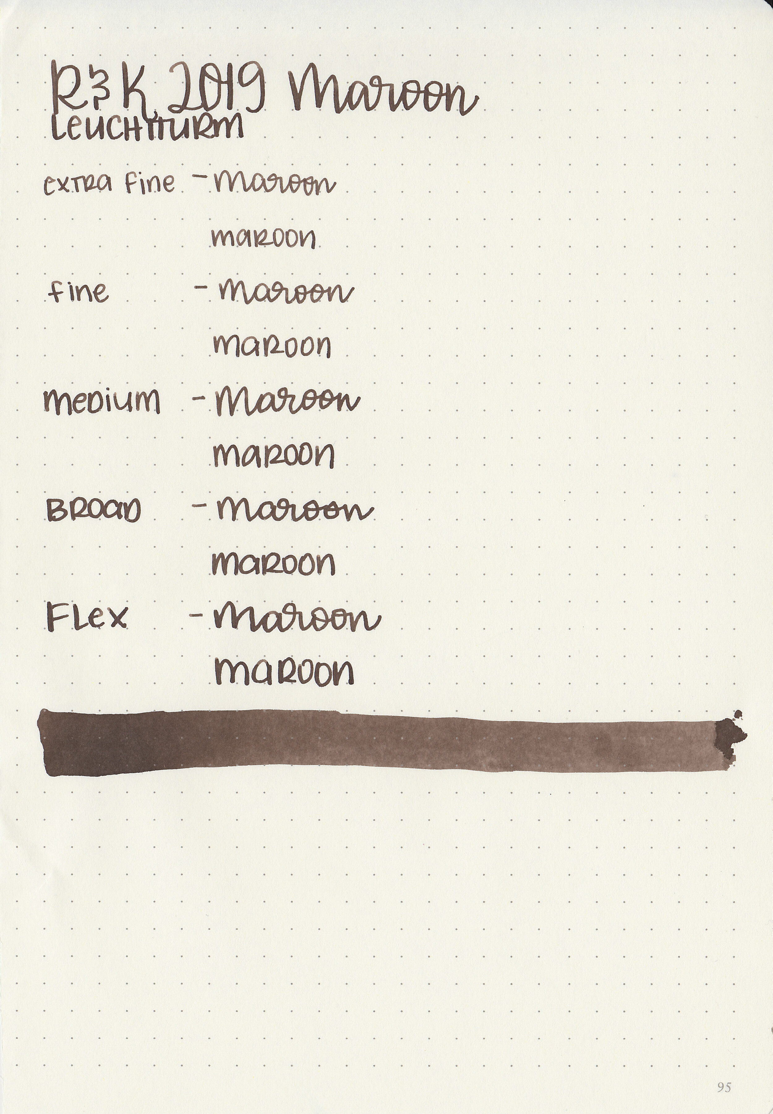
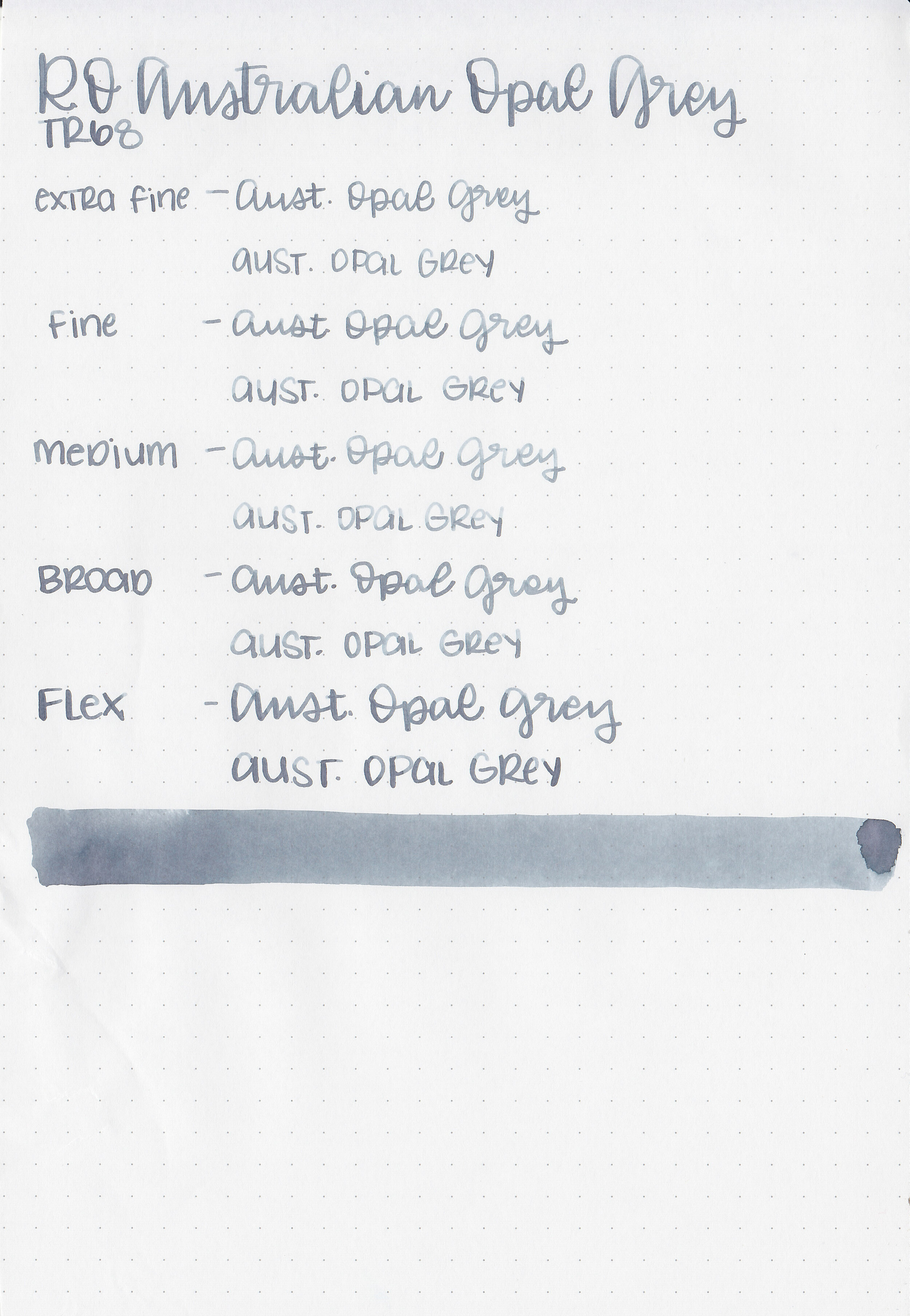
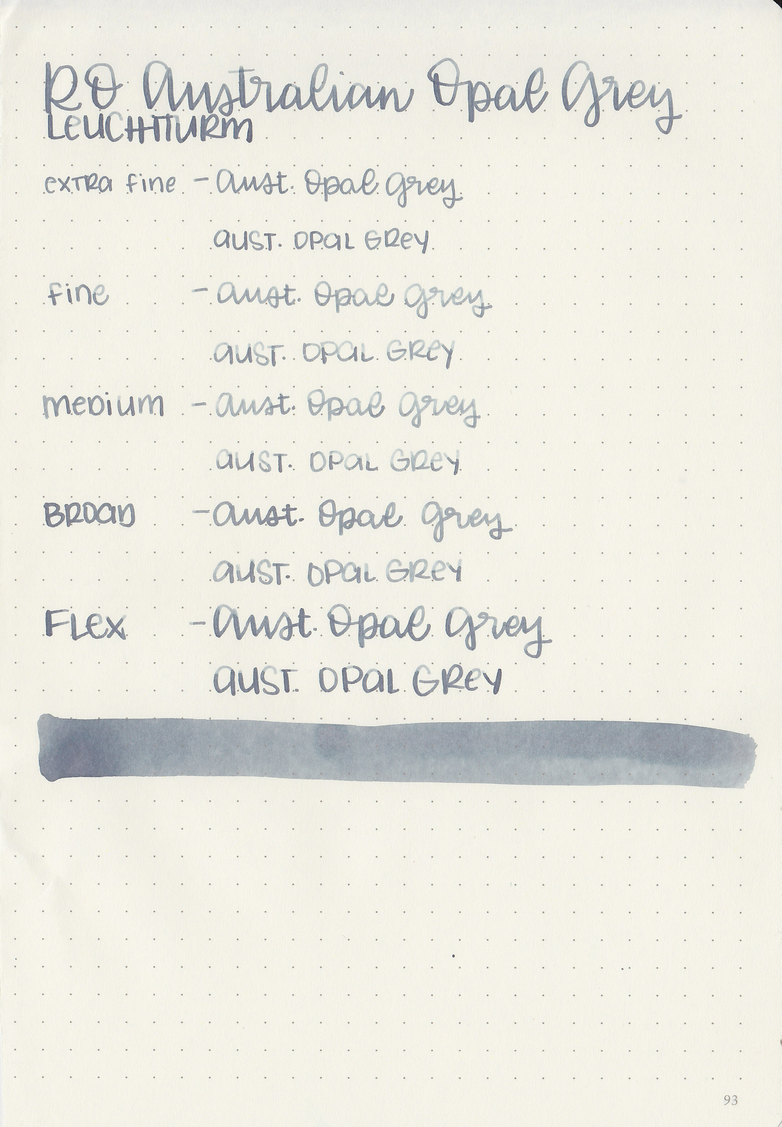
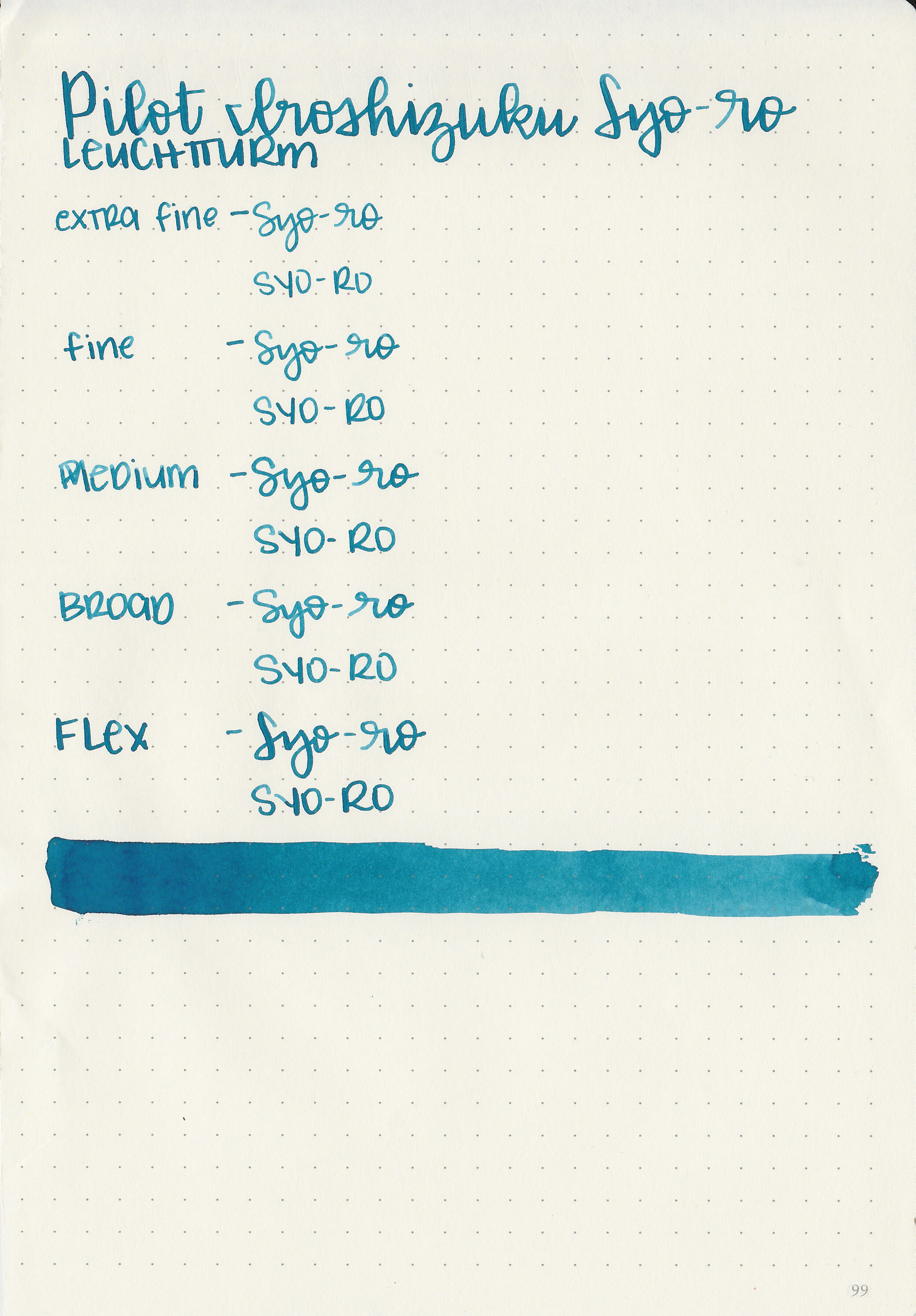
Writing samples:
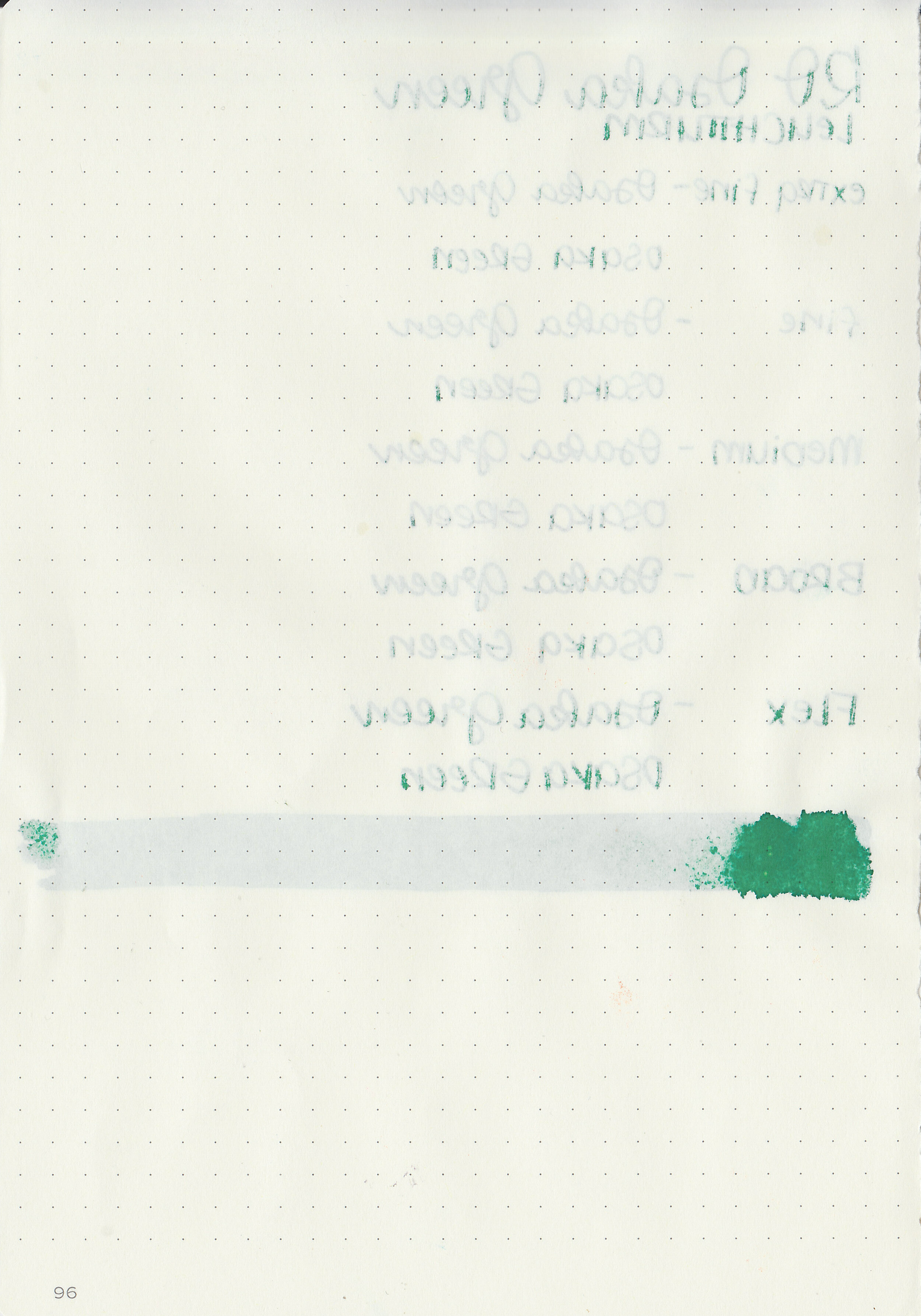
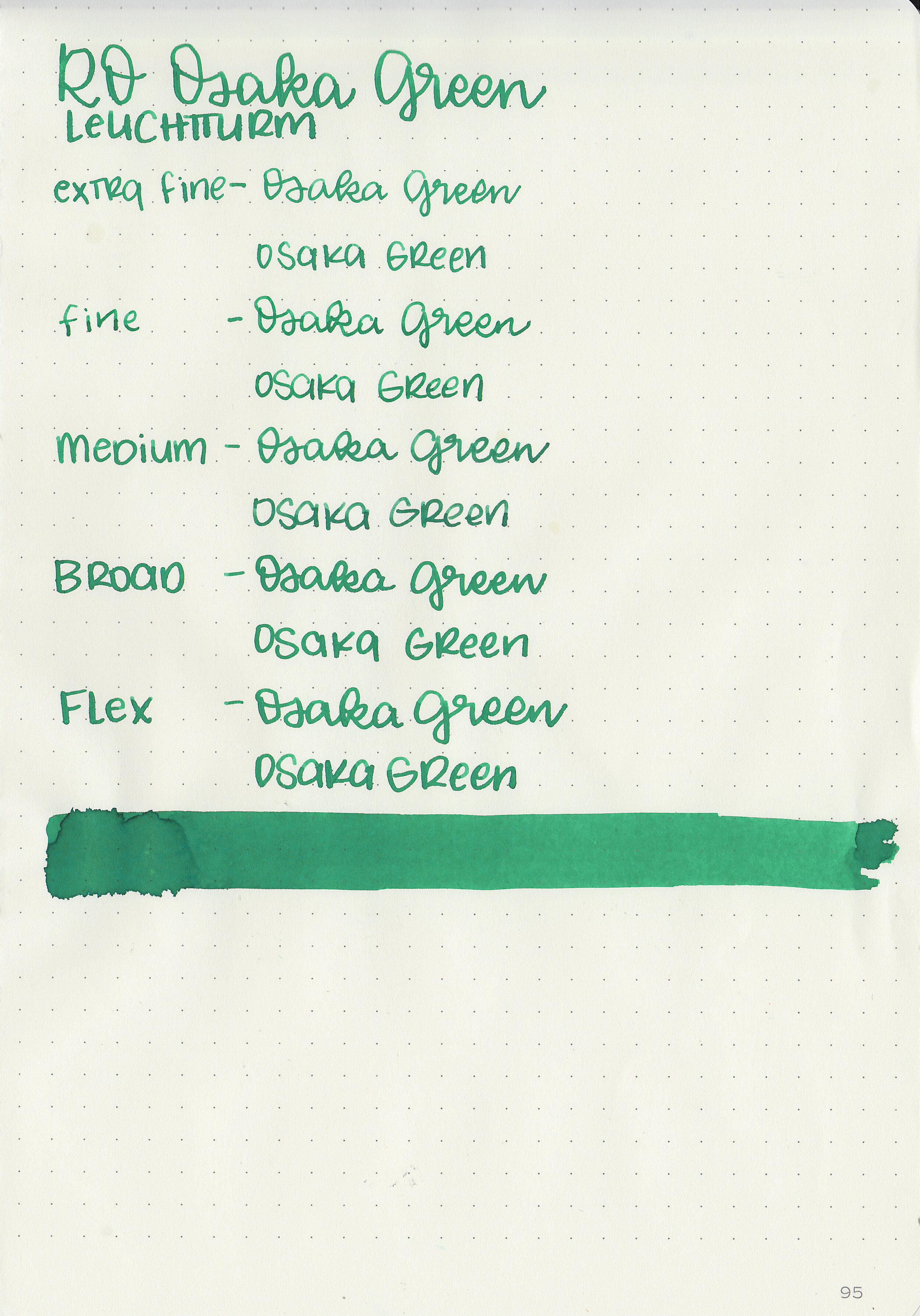
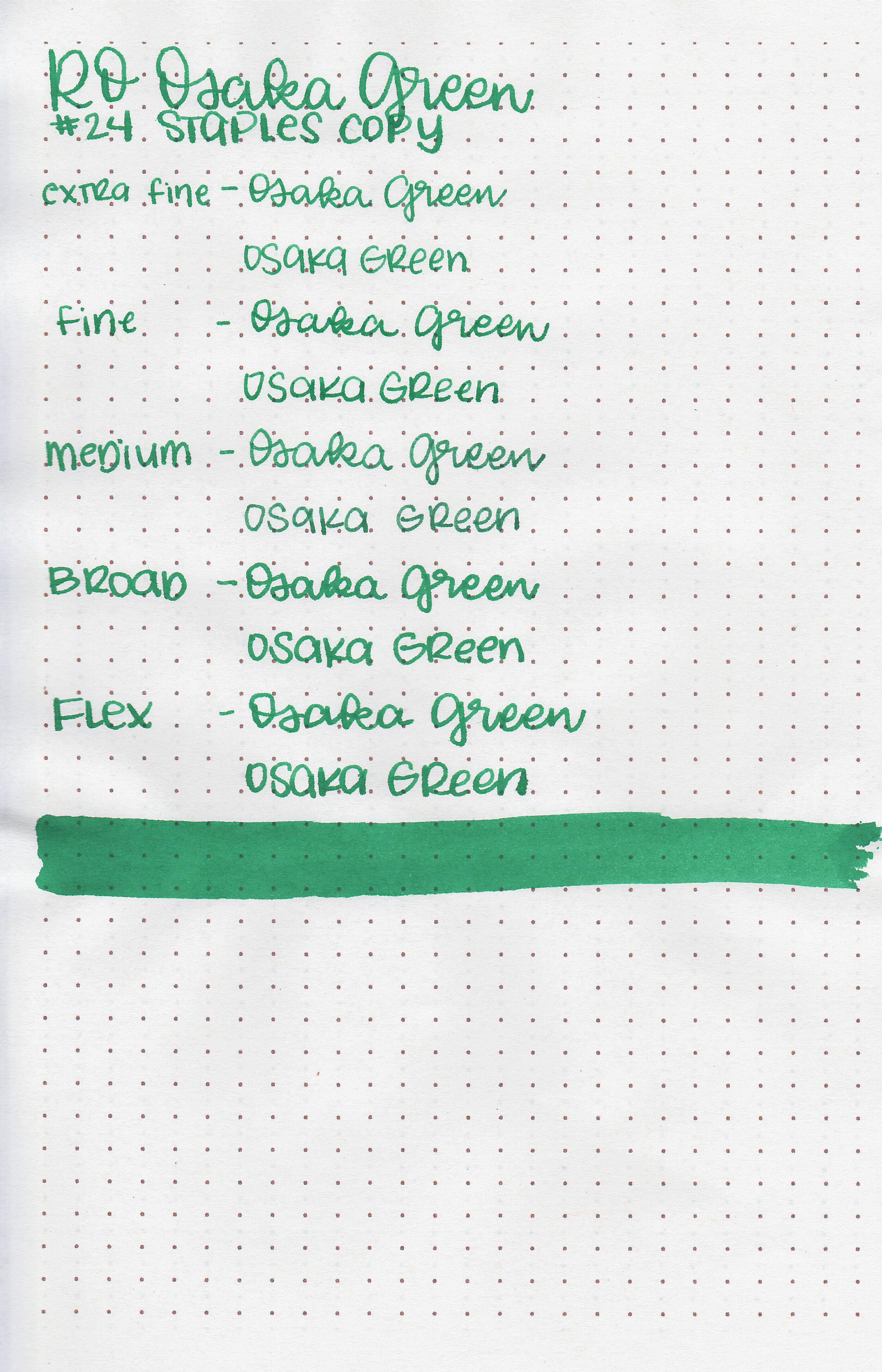
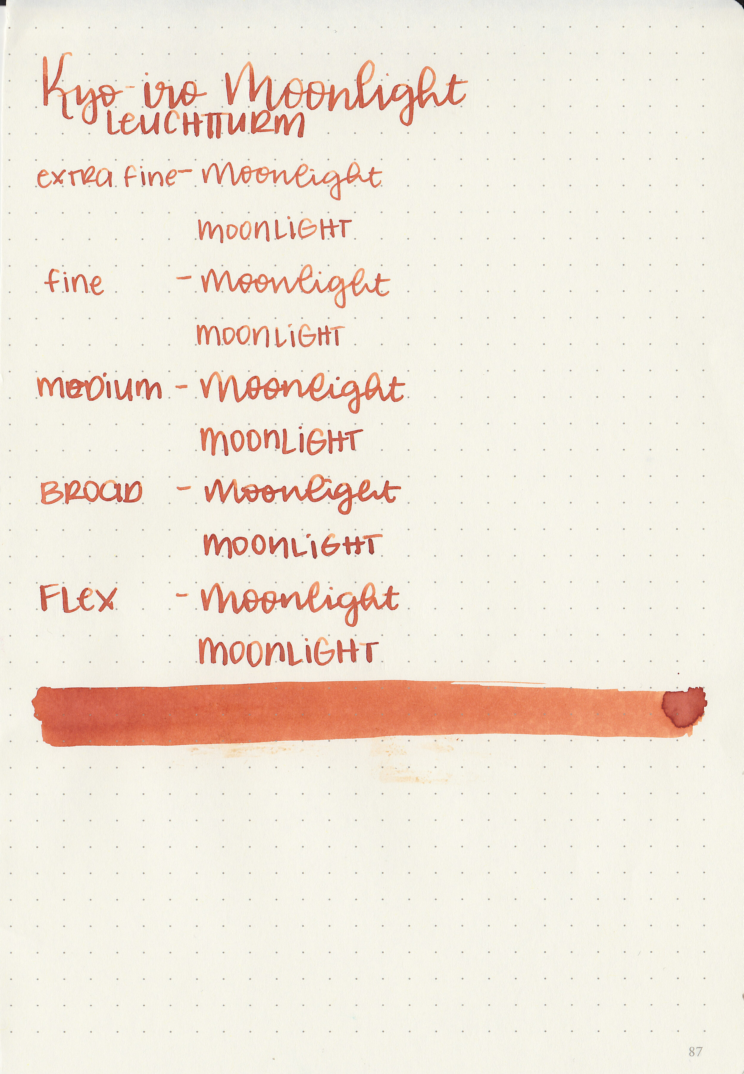
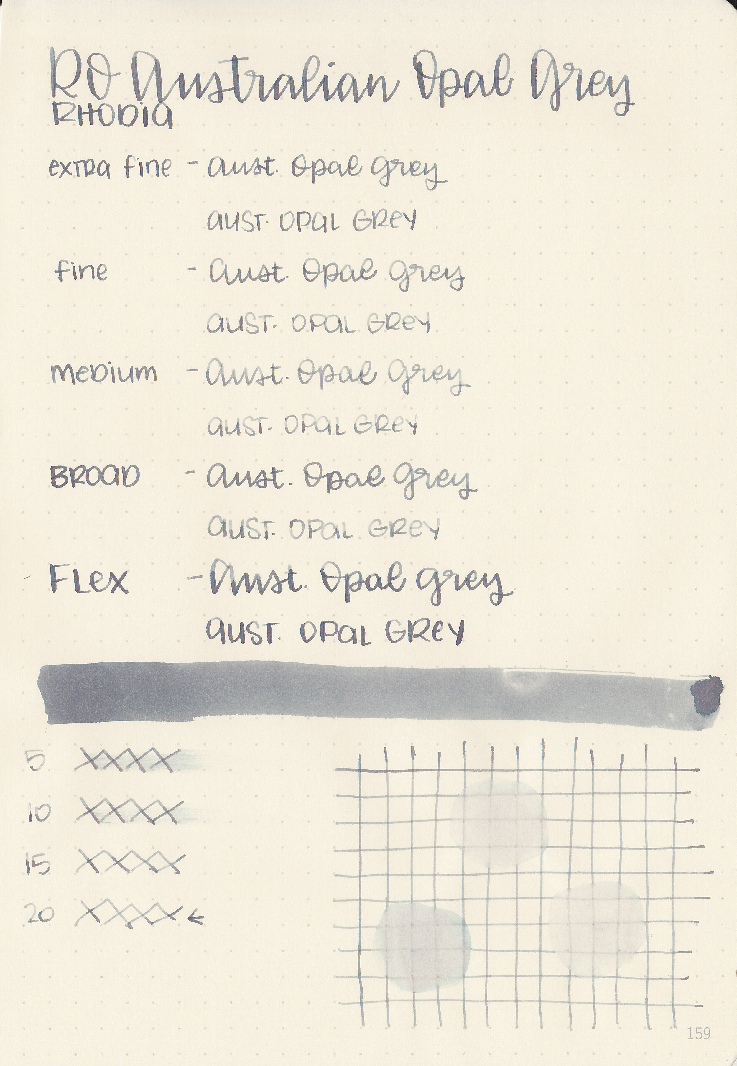
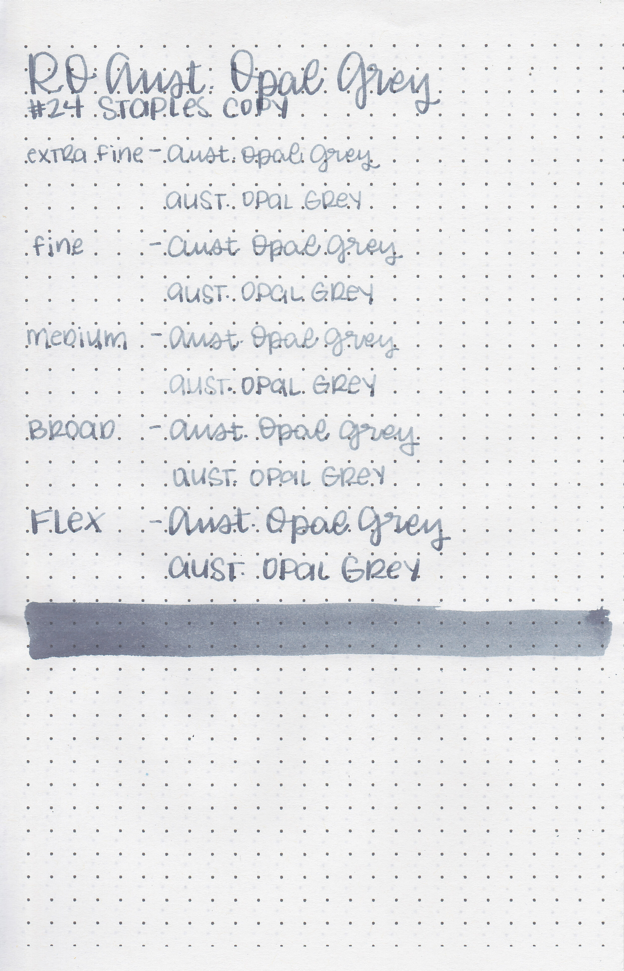
Let's take a look at how the ink behaves on fountain pen friendly papers: Rhodia, Tomoe River, and Leuchtturm.
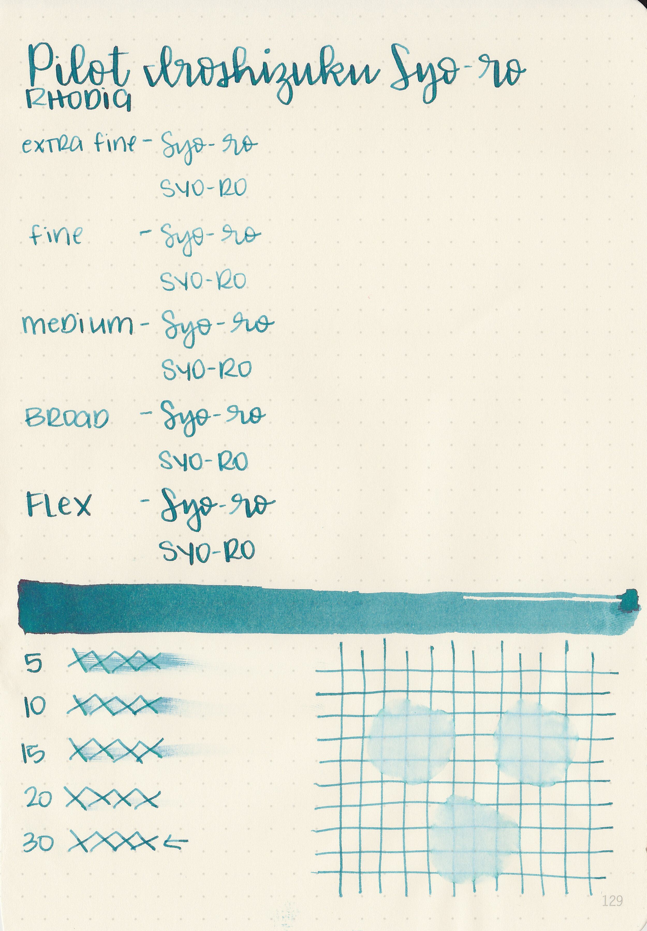
Dry time: 30 seconds
Water resistance: Low
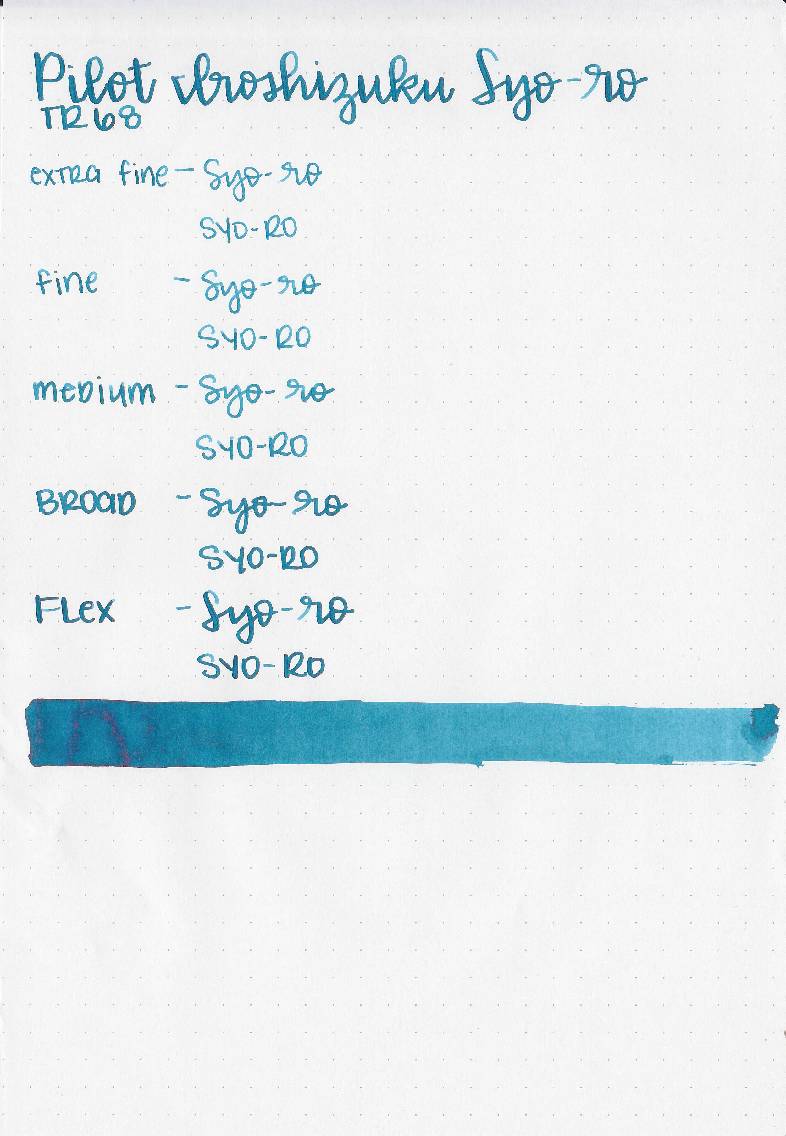
Feathering: None
Show through: Medium
Bleeding: None
Other properties: medium shading, low sheen, and no shimmer.
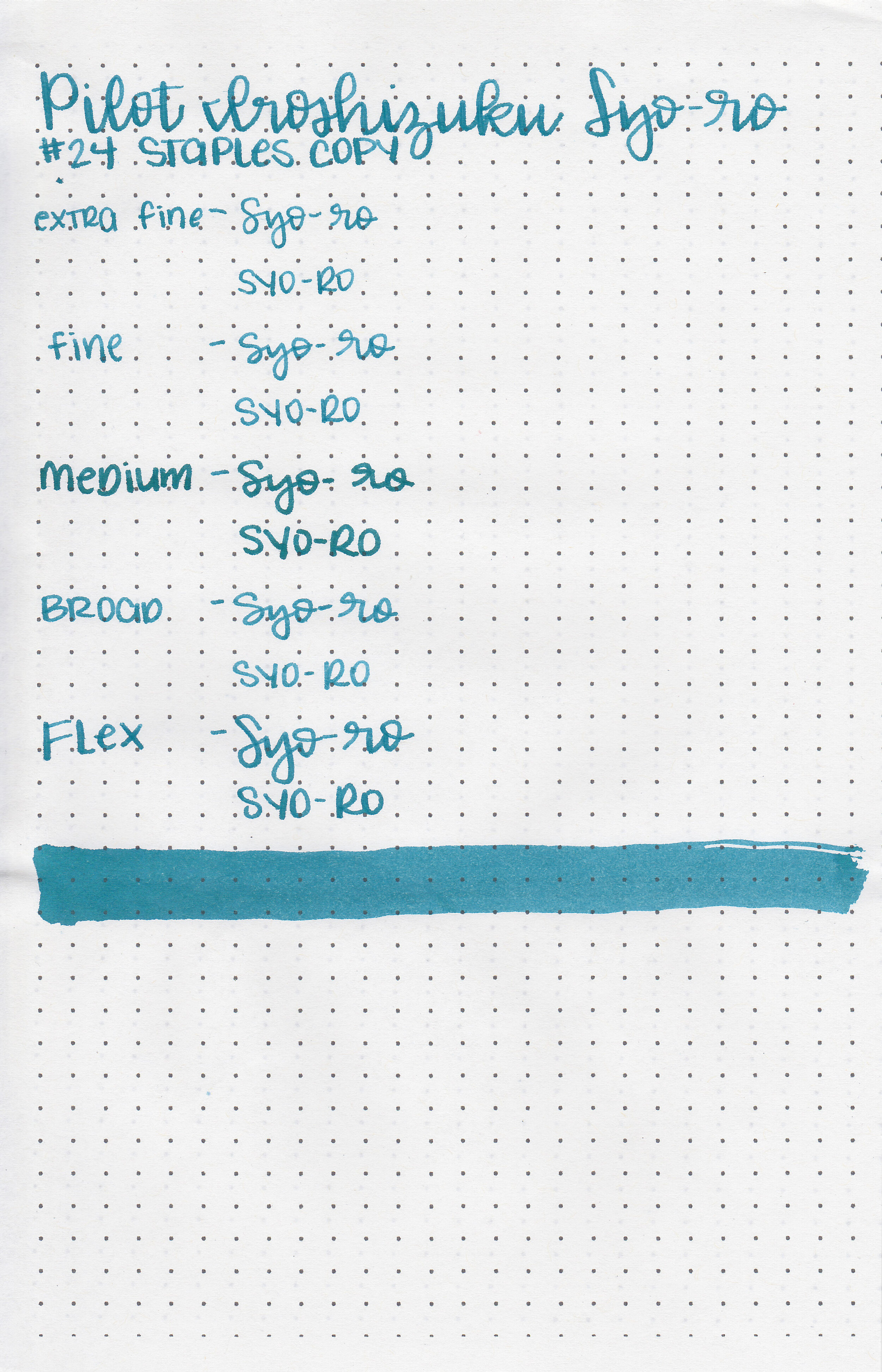
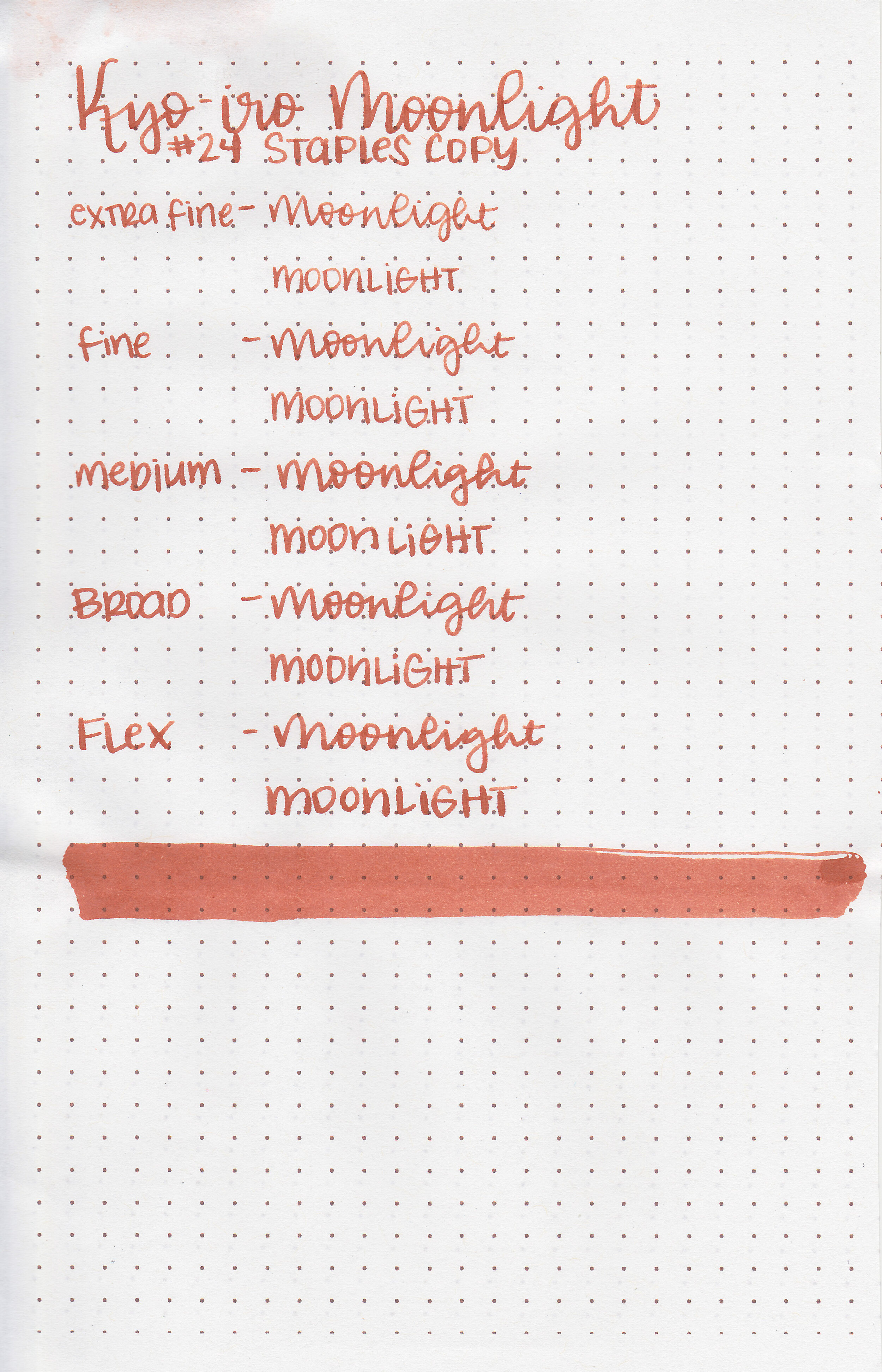
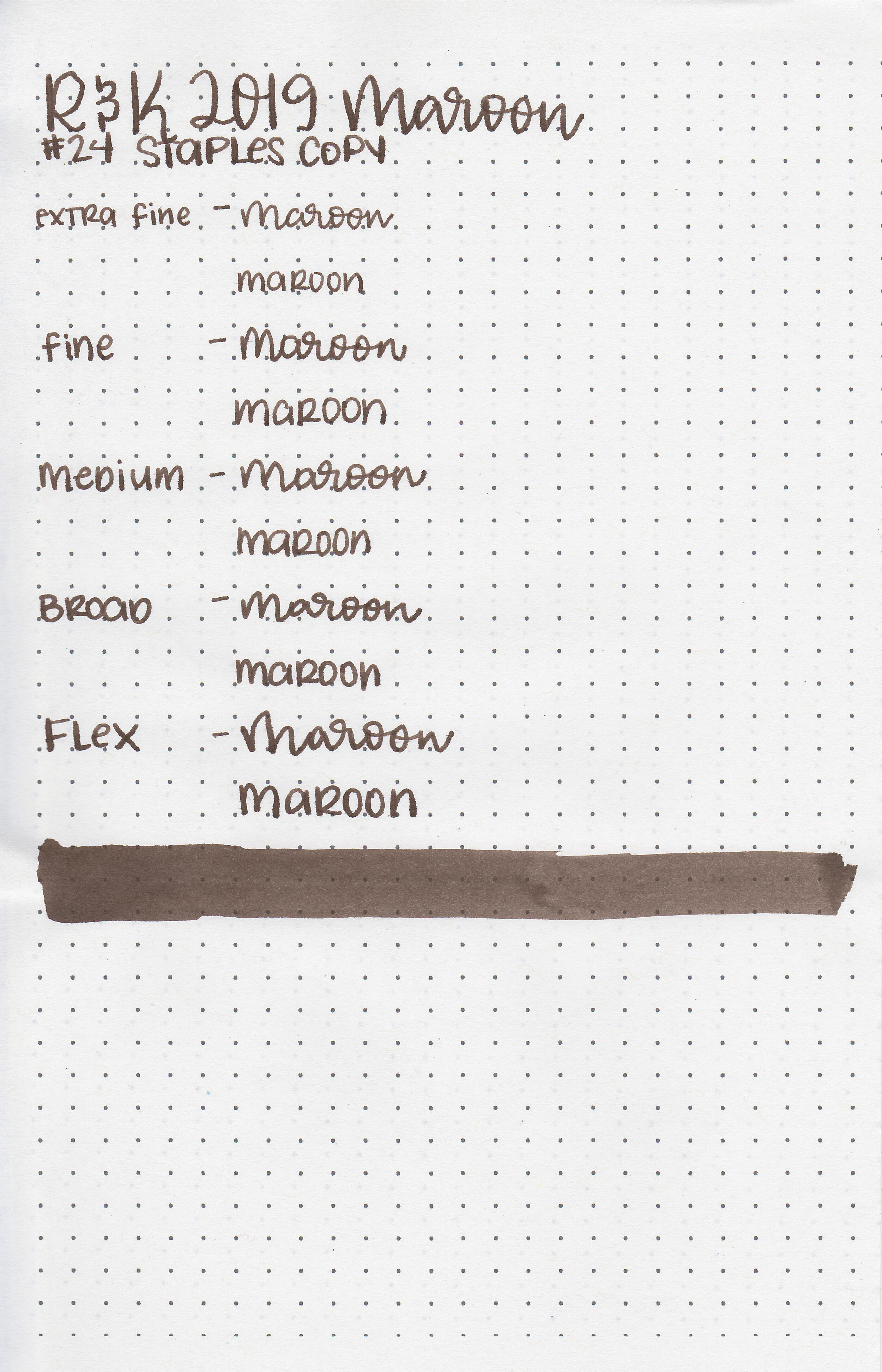
On Staples 24 lb copy paper there was some feathering but no bleeding.
Comparison Swabs:

Syo-ro is a bit darker than Ku-jaku, and a bit more blue than Sailor Ink Studio 664. Click here to see the Pilot inks together, and click here to see the teal inks together.
Longer writing:
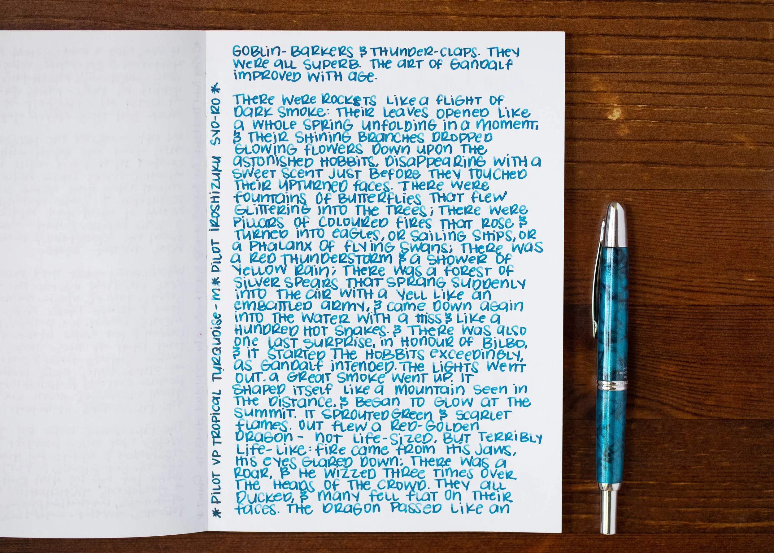
I used a Pilot Vanishing Point Tropical Turquoise with a medium nib on a Yoseka A5 notebook. The ink had a wet flow. It matches this pen well.
Overall, I really like this ink. It has a nice wet flow and beautiful teal color. I’m adding a full bottle to my wish list!
Disclaimer: This ink was provided by a pen friend for the purpose of this review. All photos and opinions are my own. This page does contain affiliate links but this post is not sponsored in any way.