Ink Review #1482: Kyo-no-oto 09 Keshimurasaki
/
Kyo-no-oto 09 Keshimurasaki. It’s available in 40 ml bottles. You can find this ink for sale at Vanness Pens.

The color:
Keshimurasaki is a pale purple-grey.
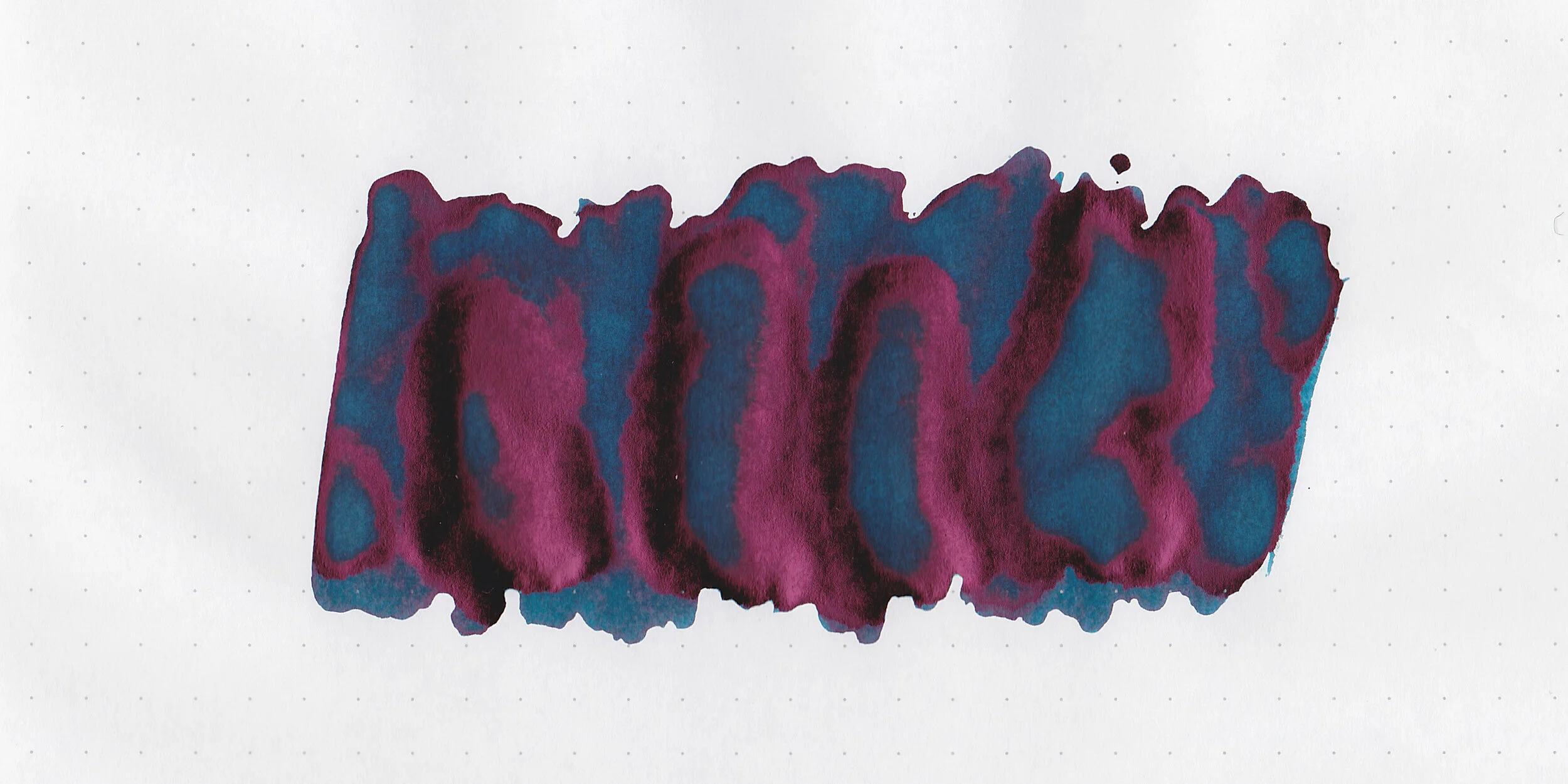
Swabs:
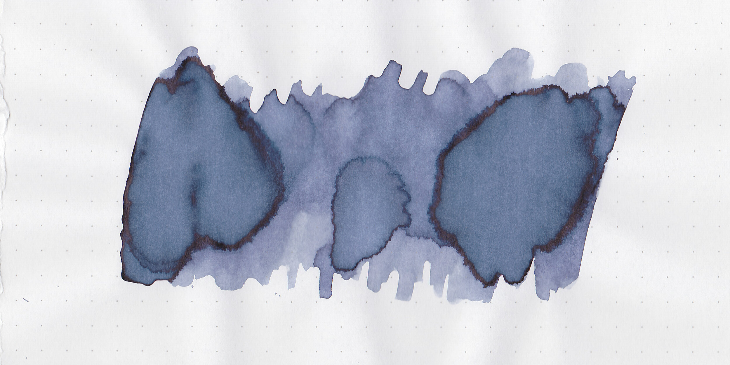
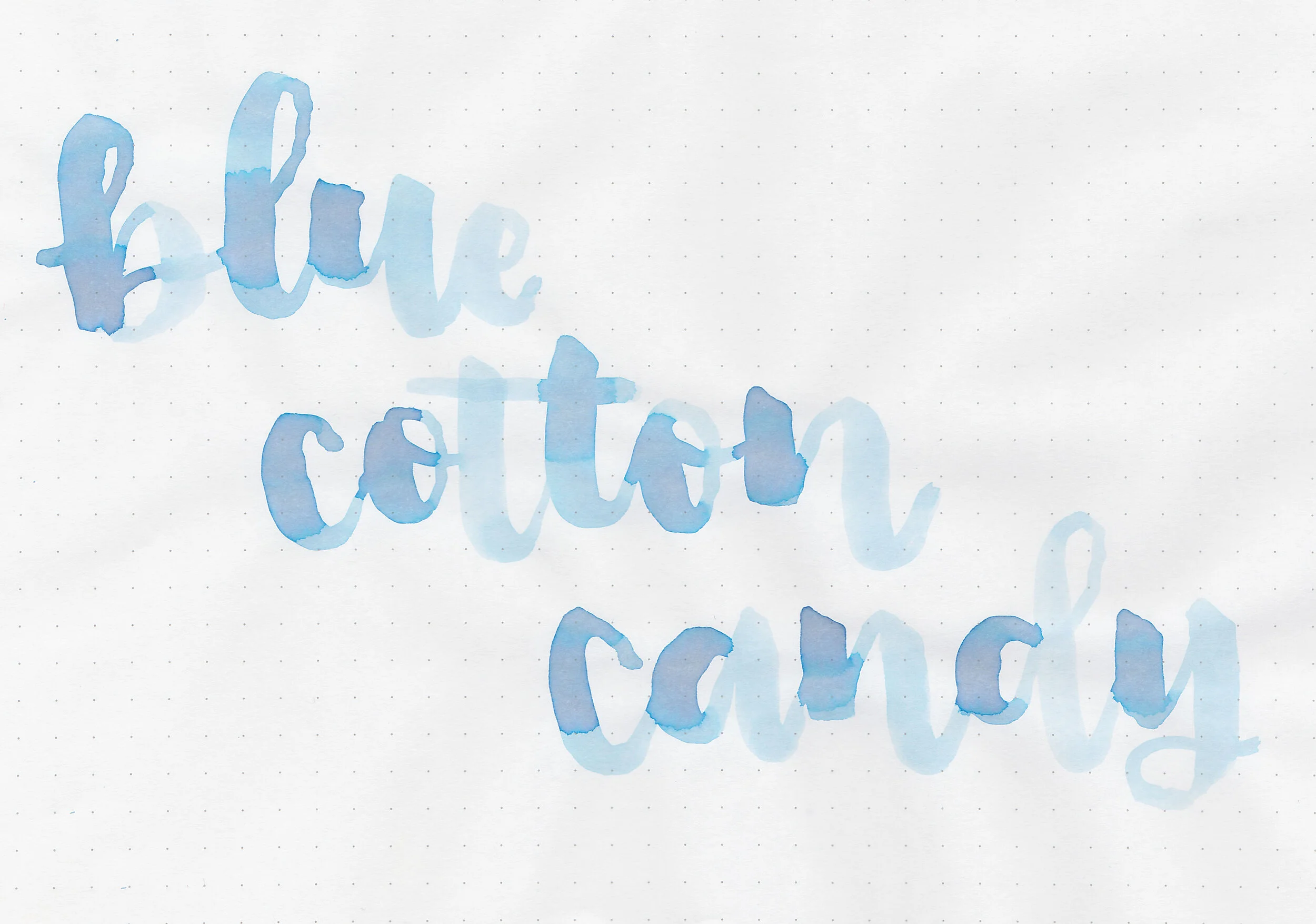
In large swabs on Tomoe River paper the ink has some pretty shading.

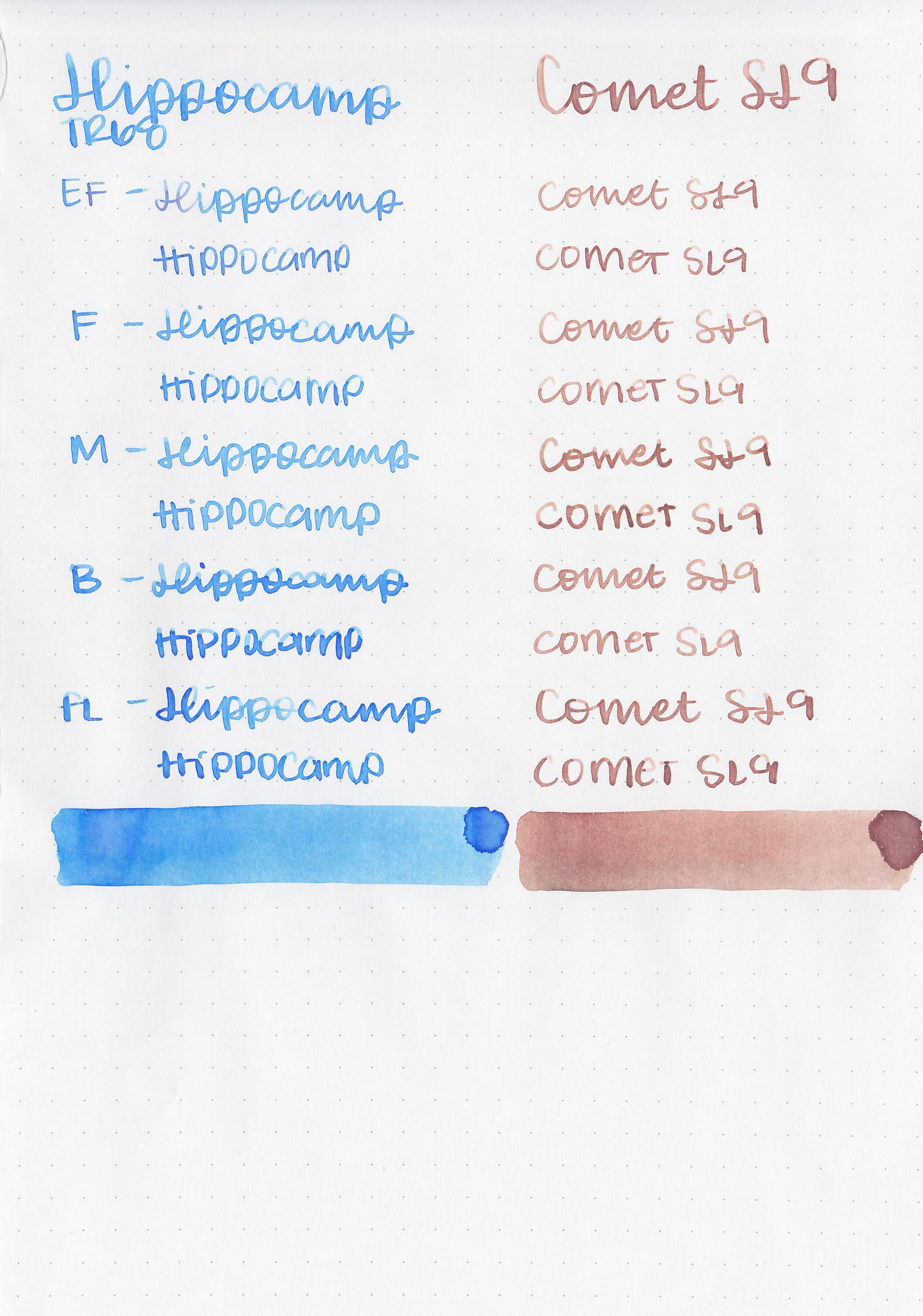
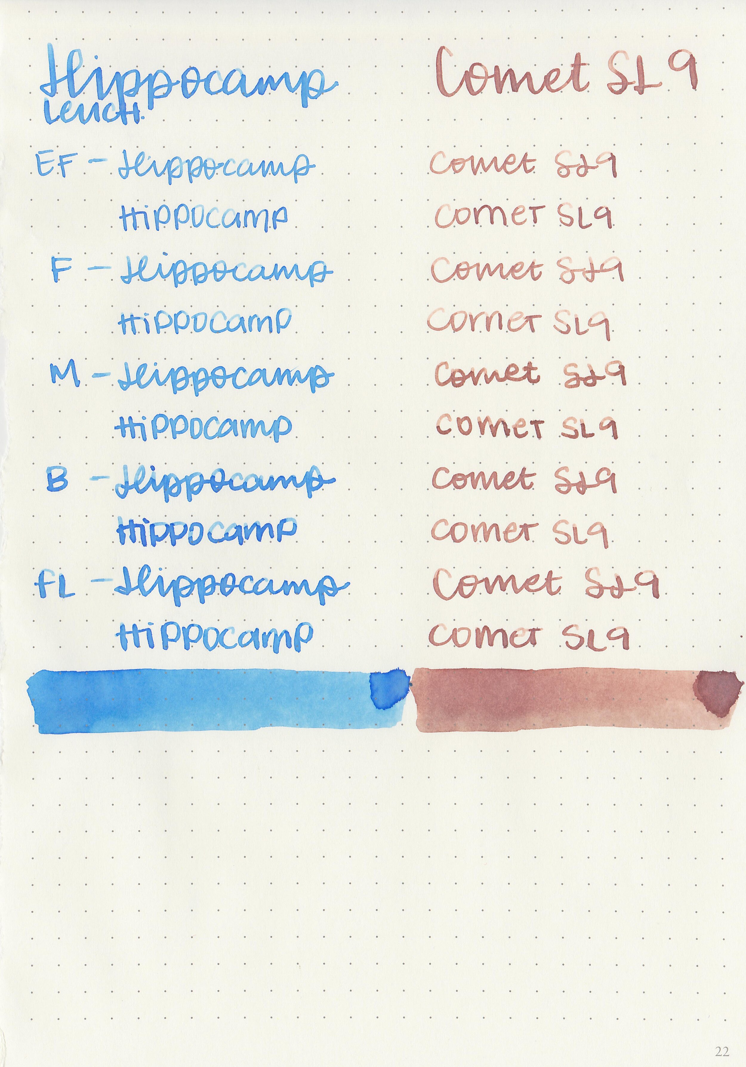
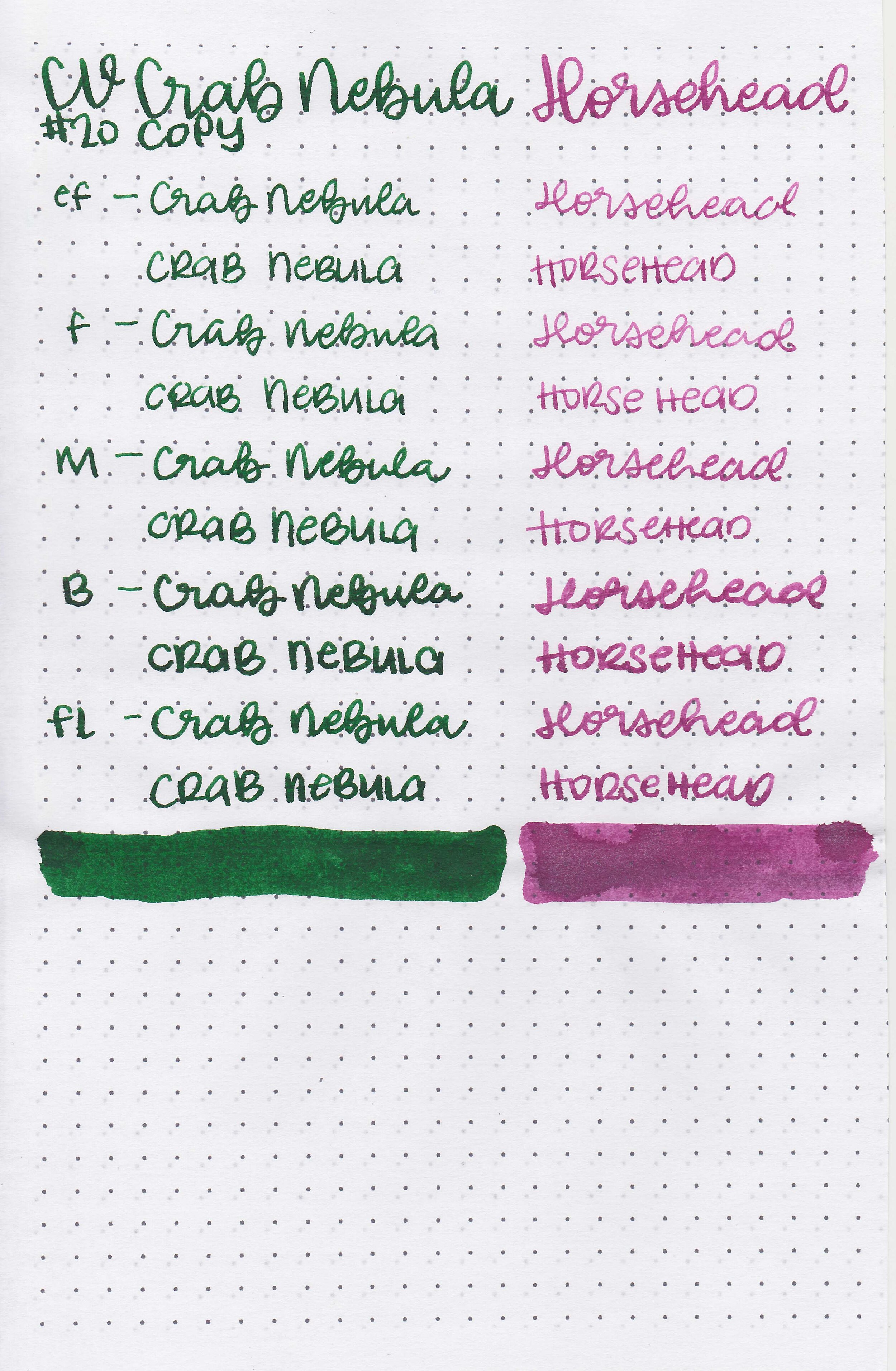
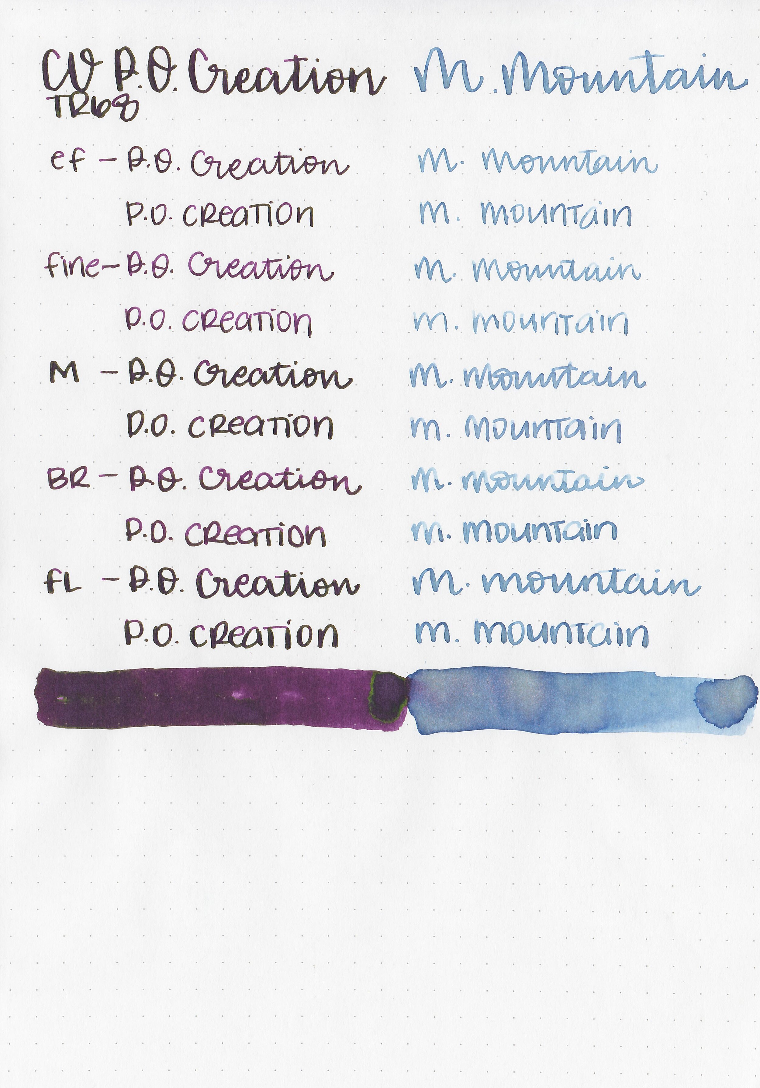
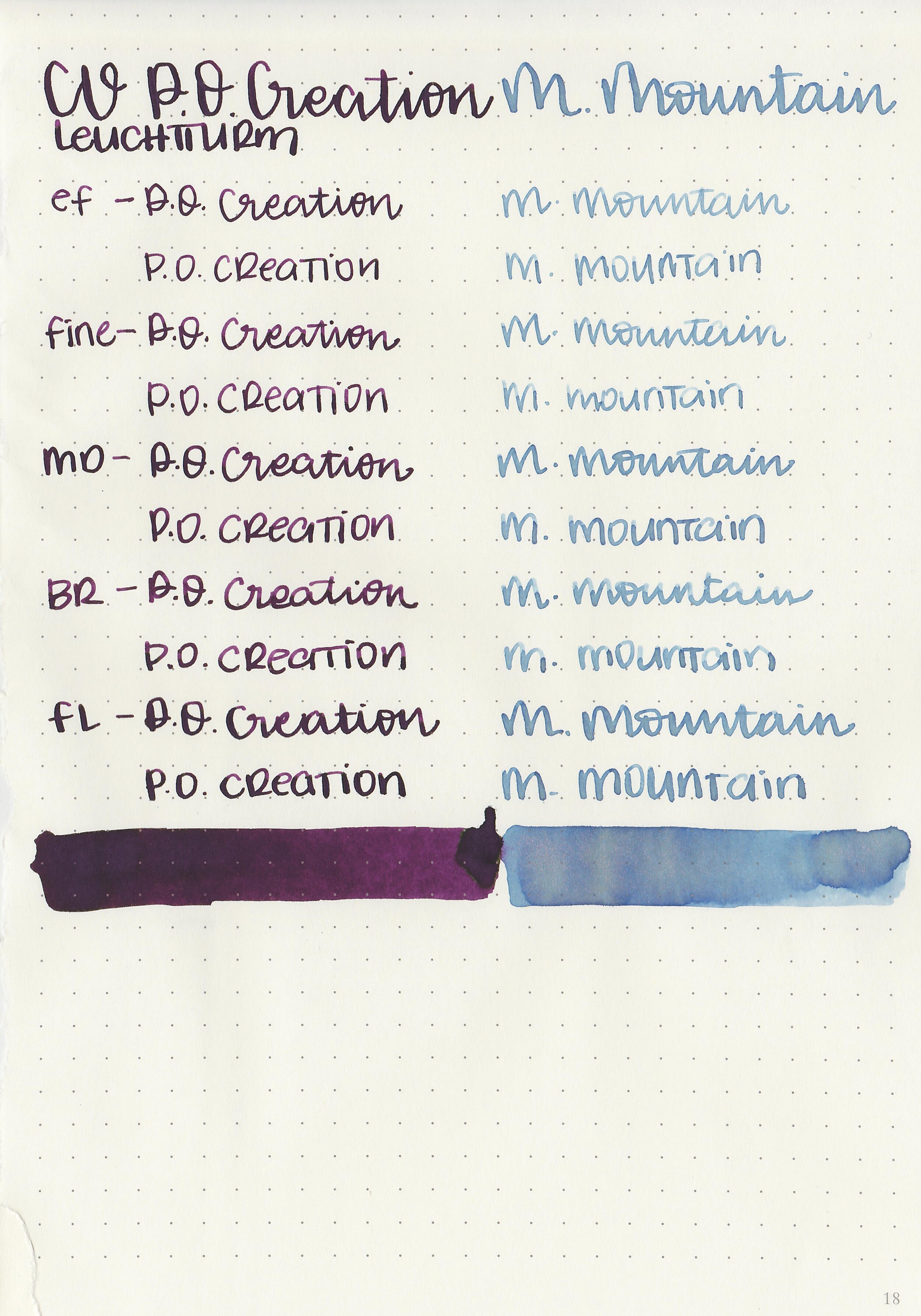
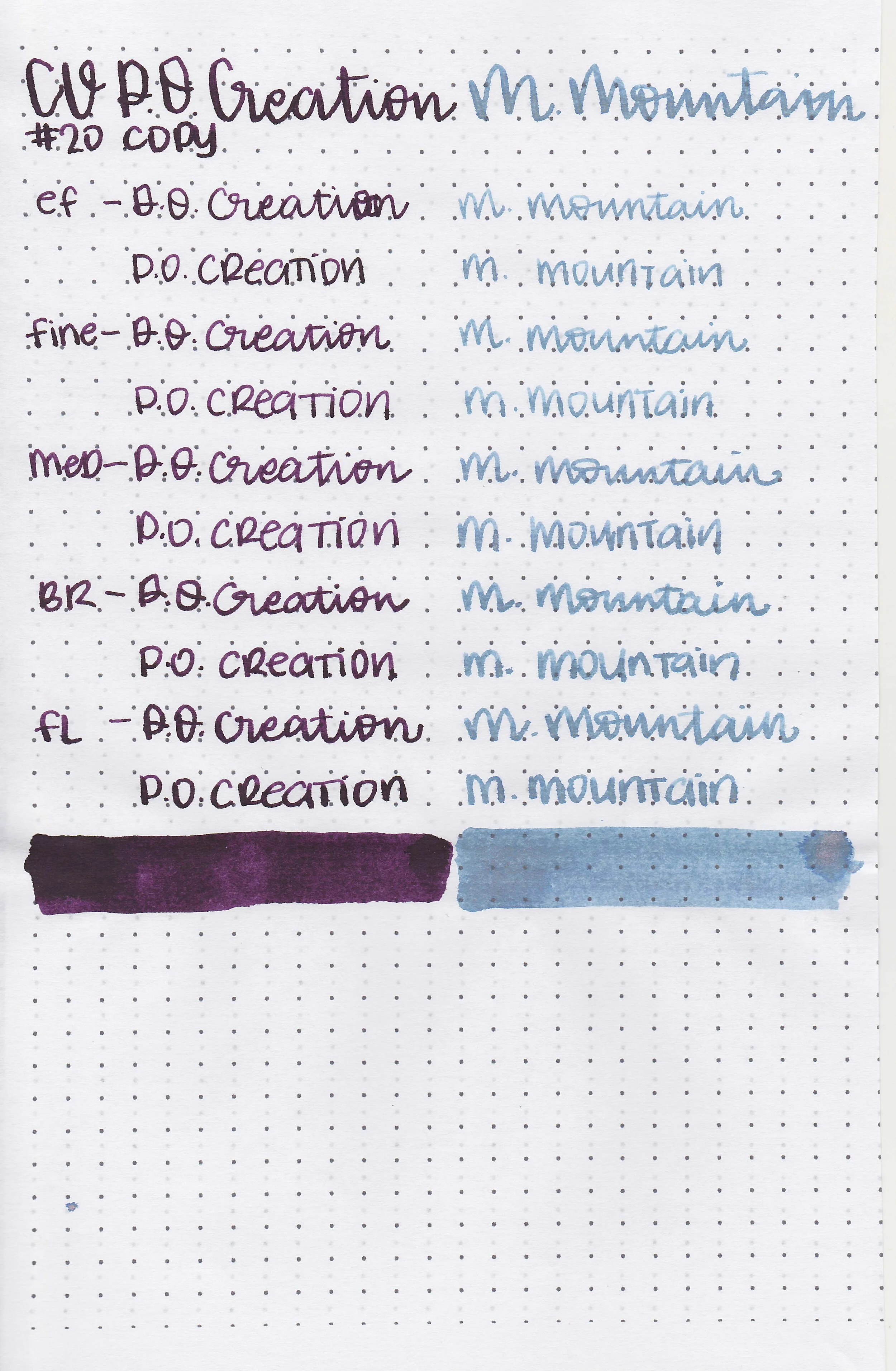
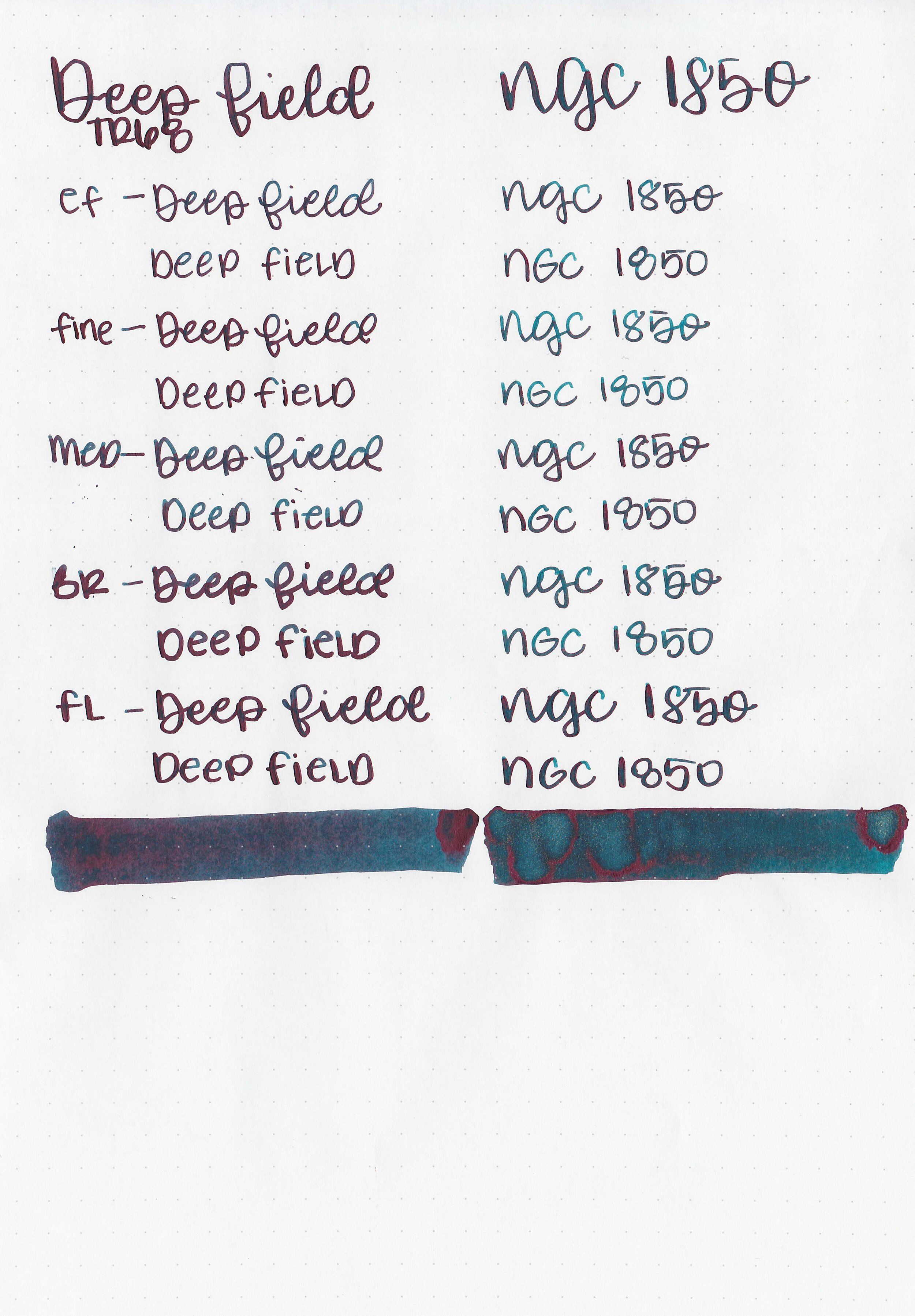
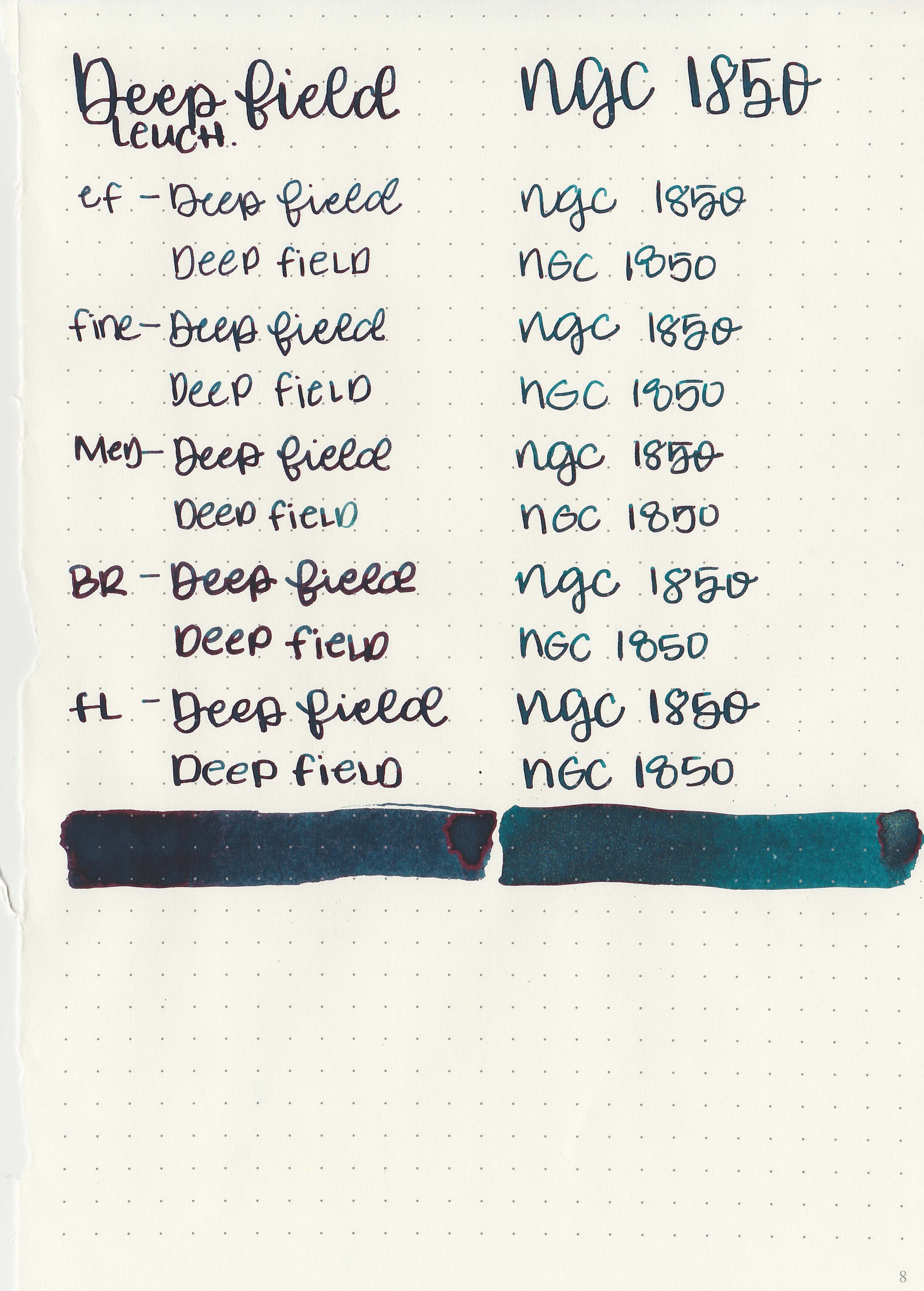
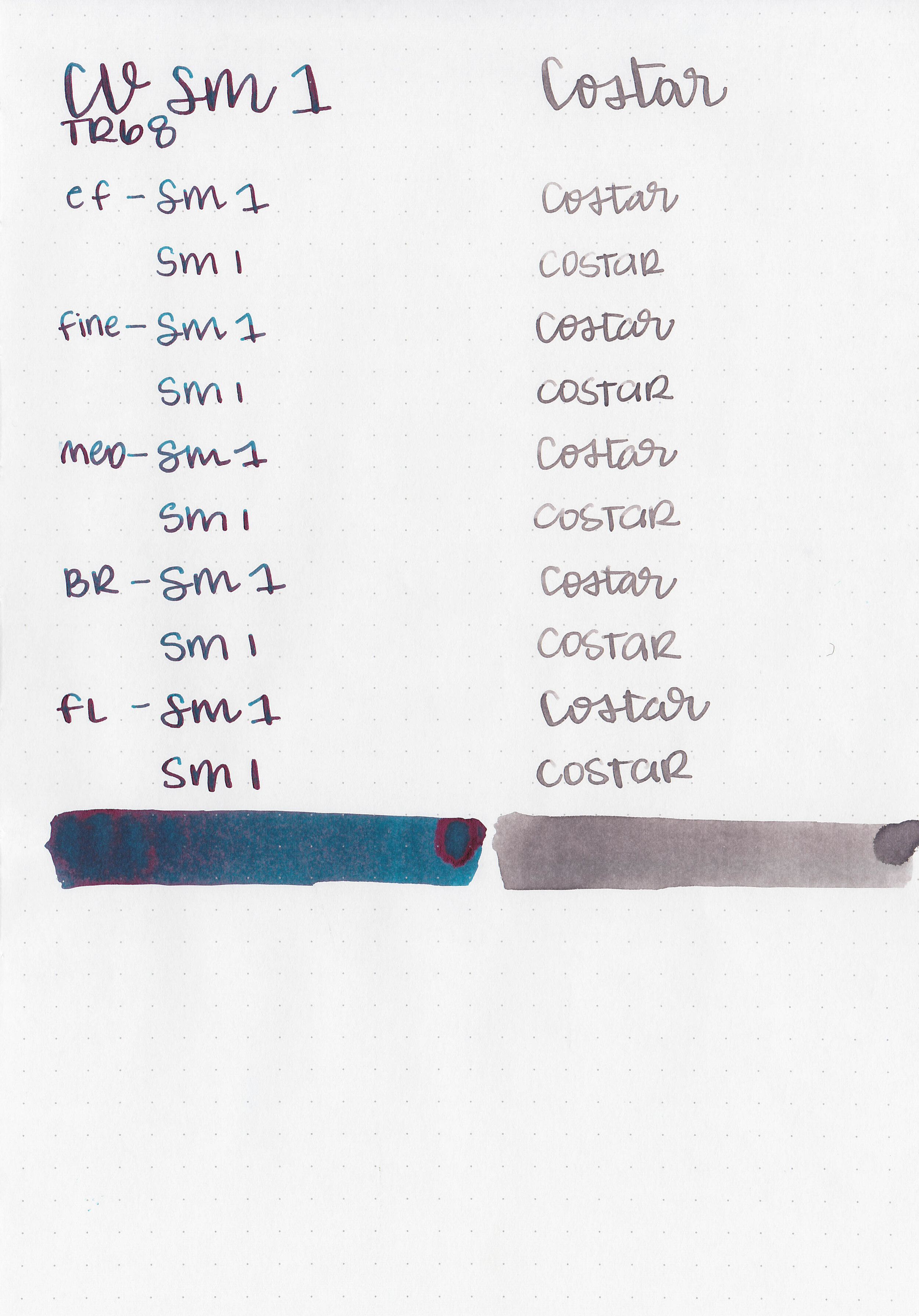
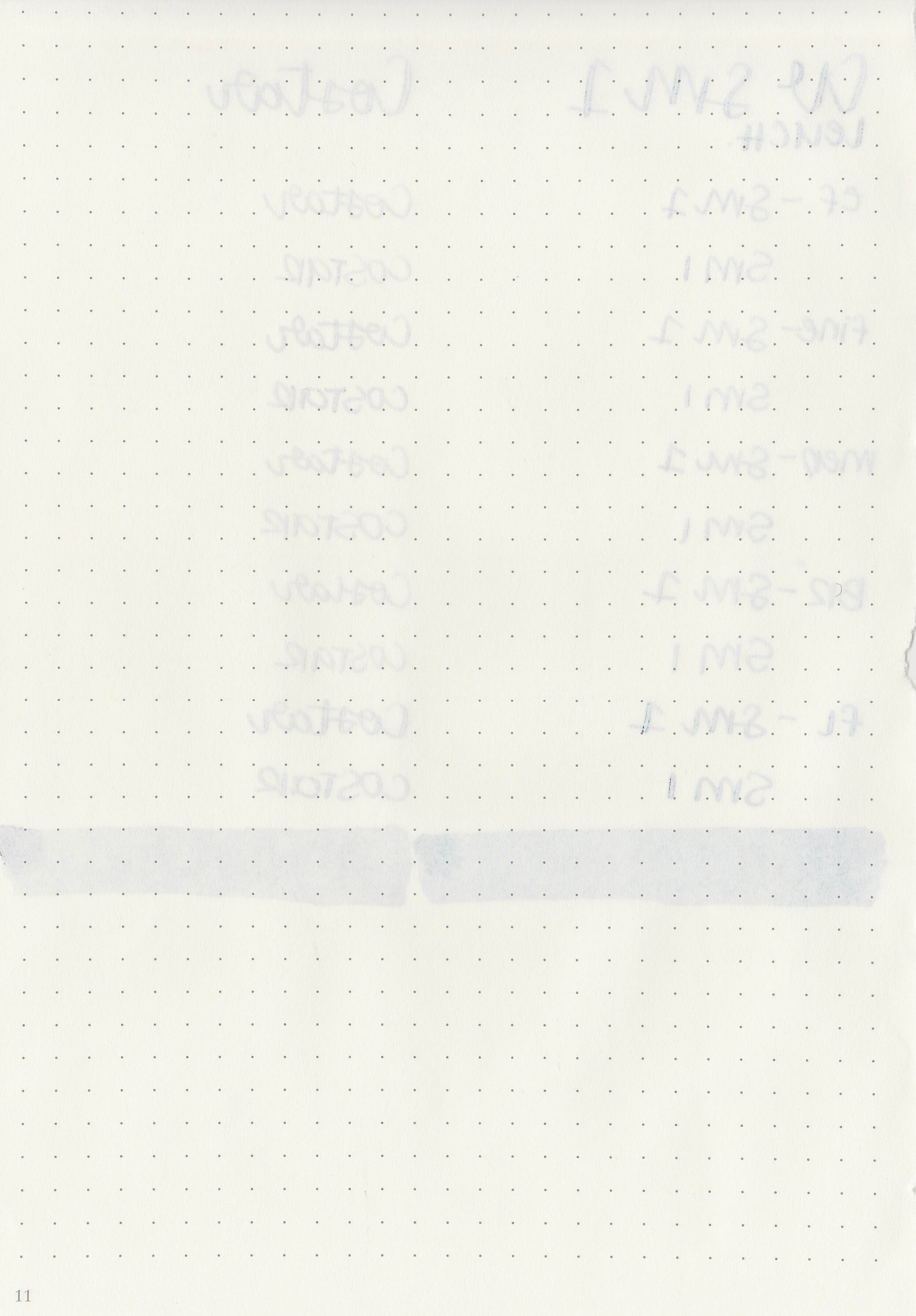
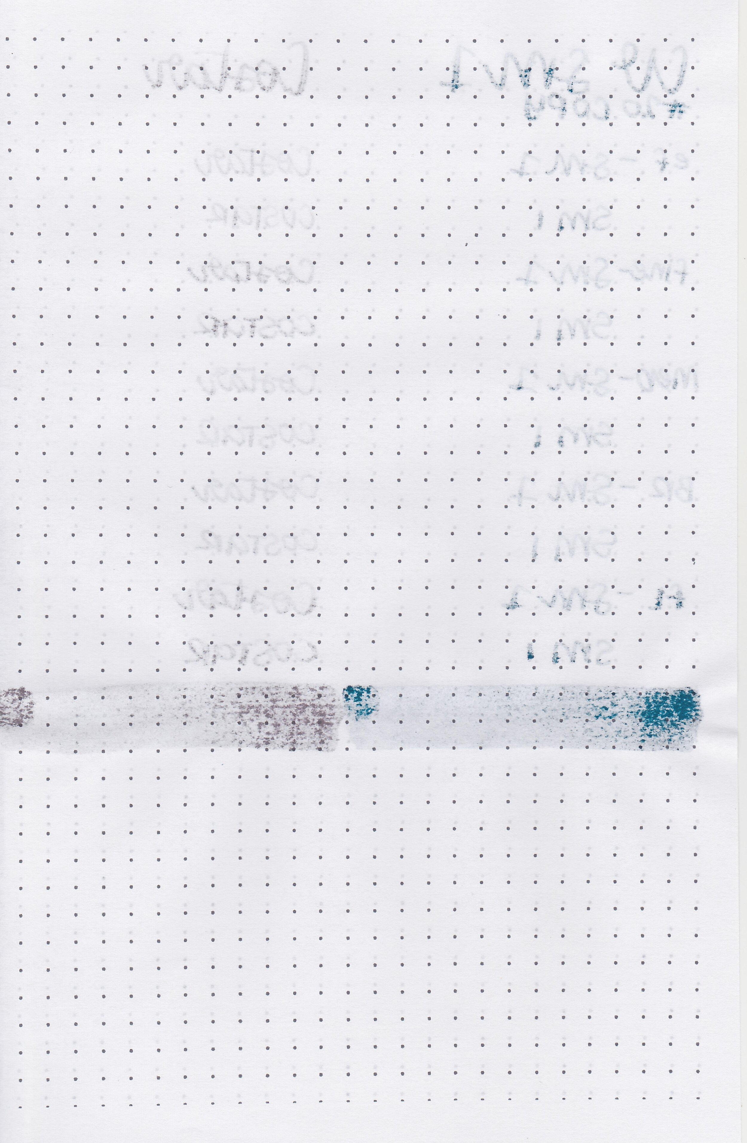
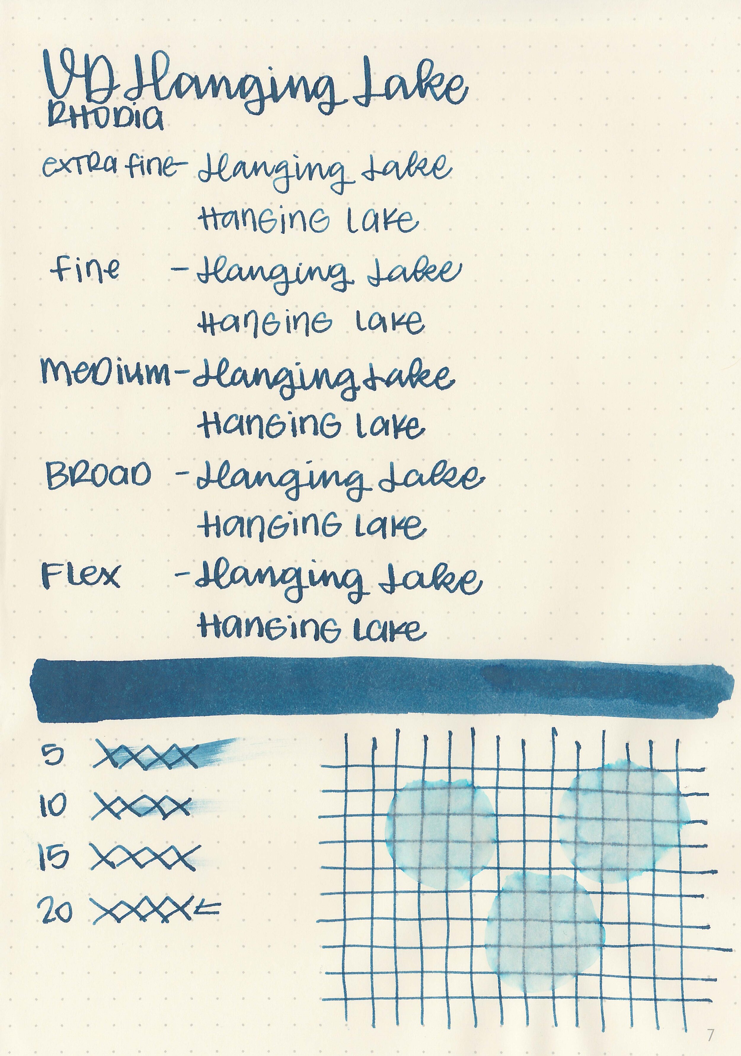
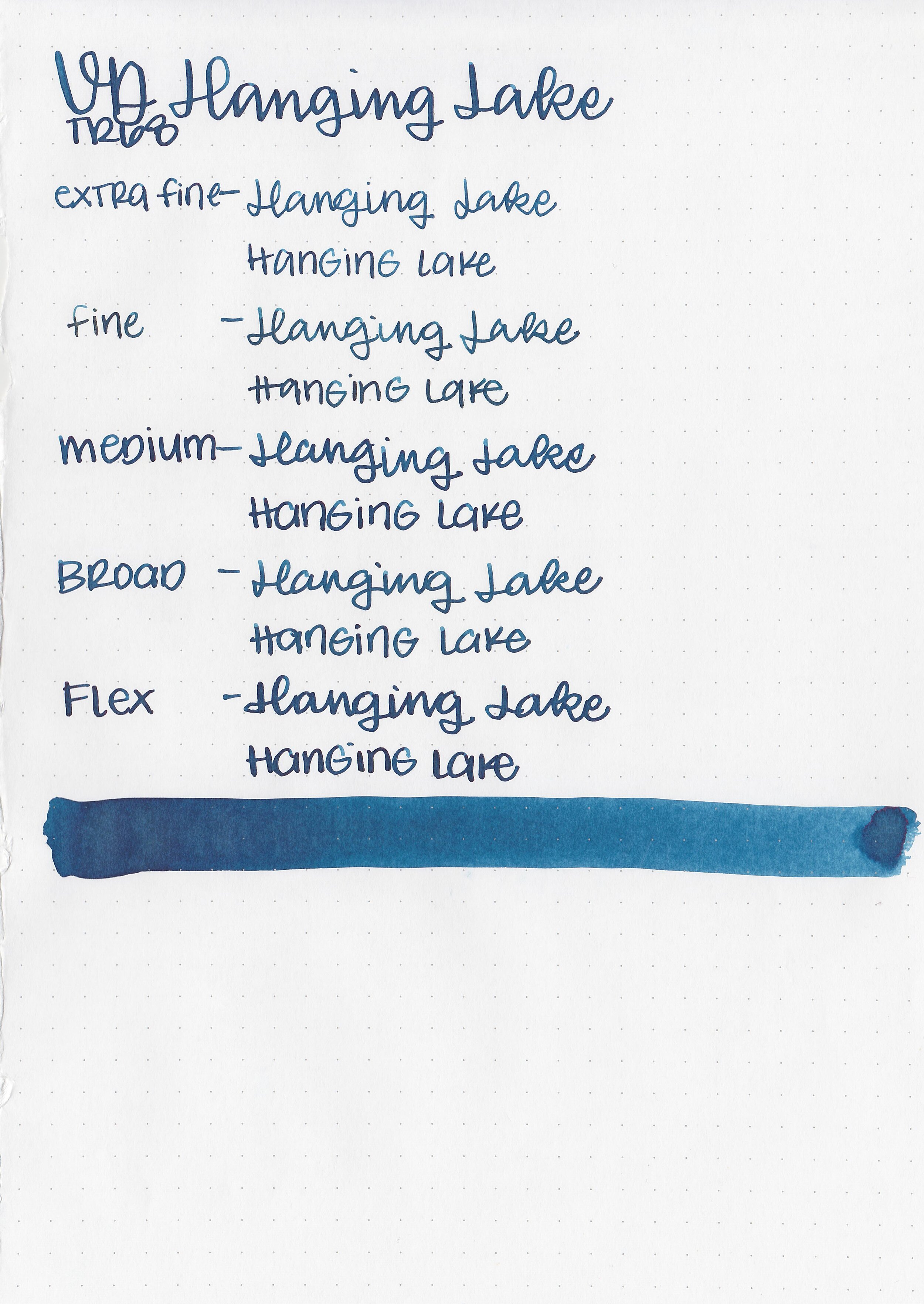
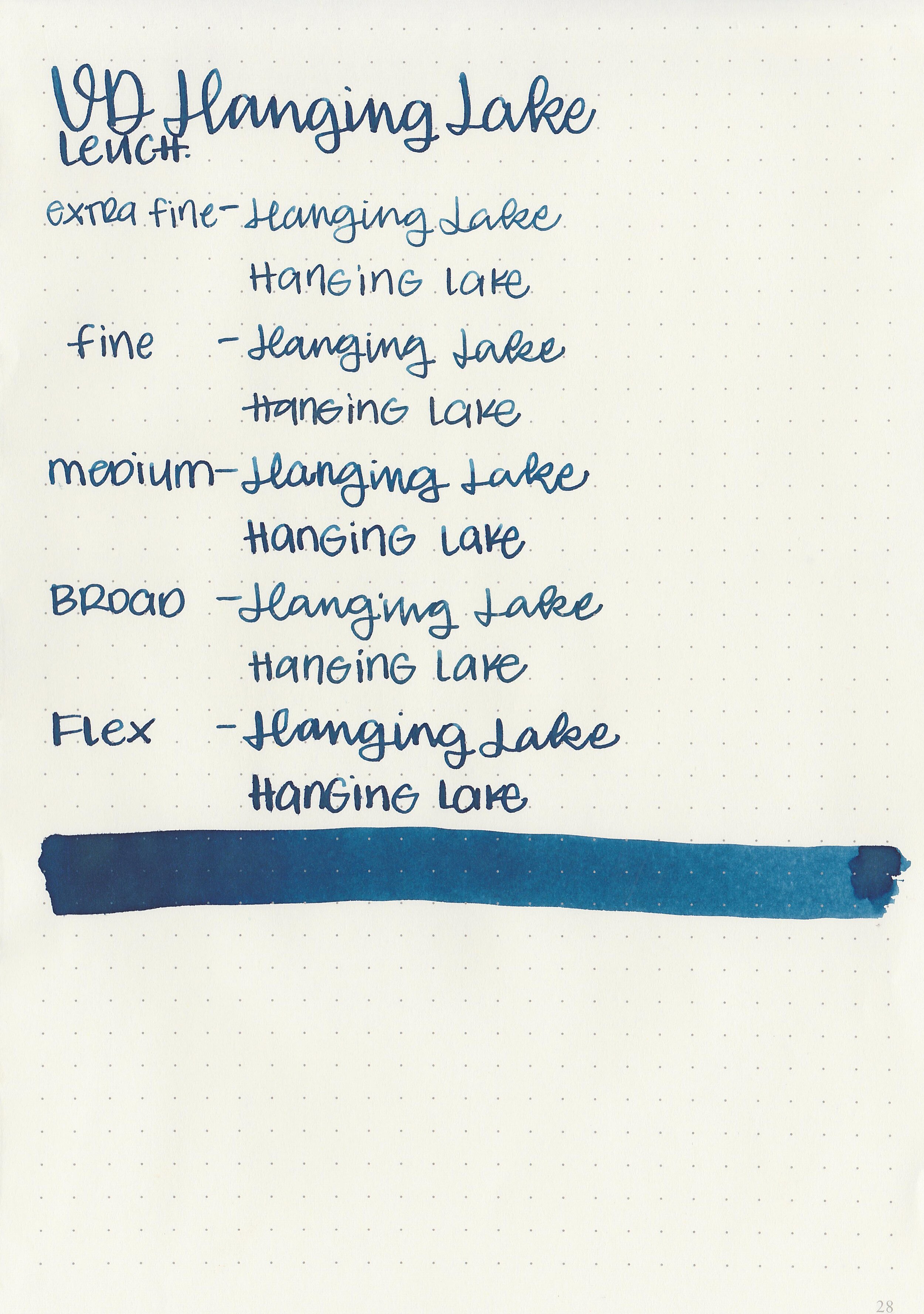
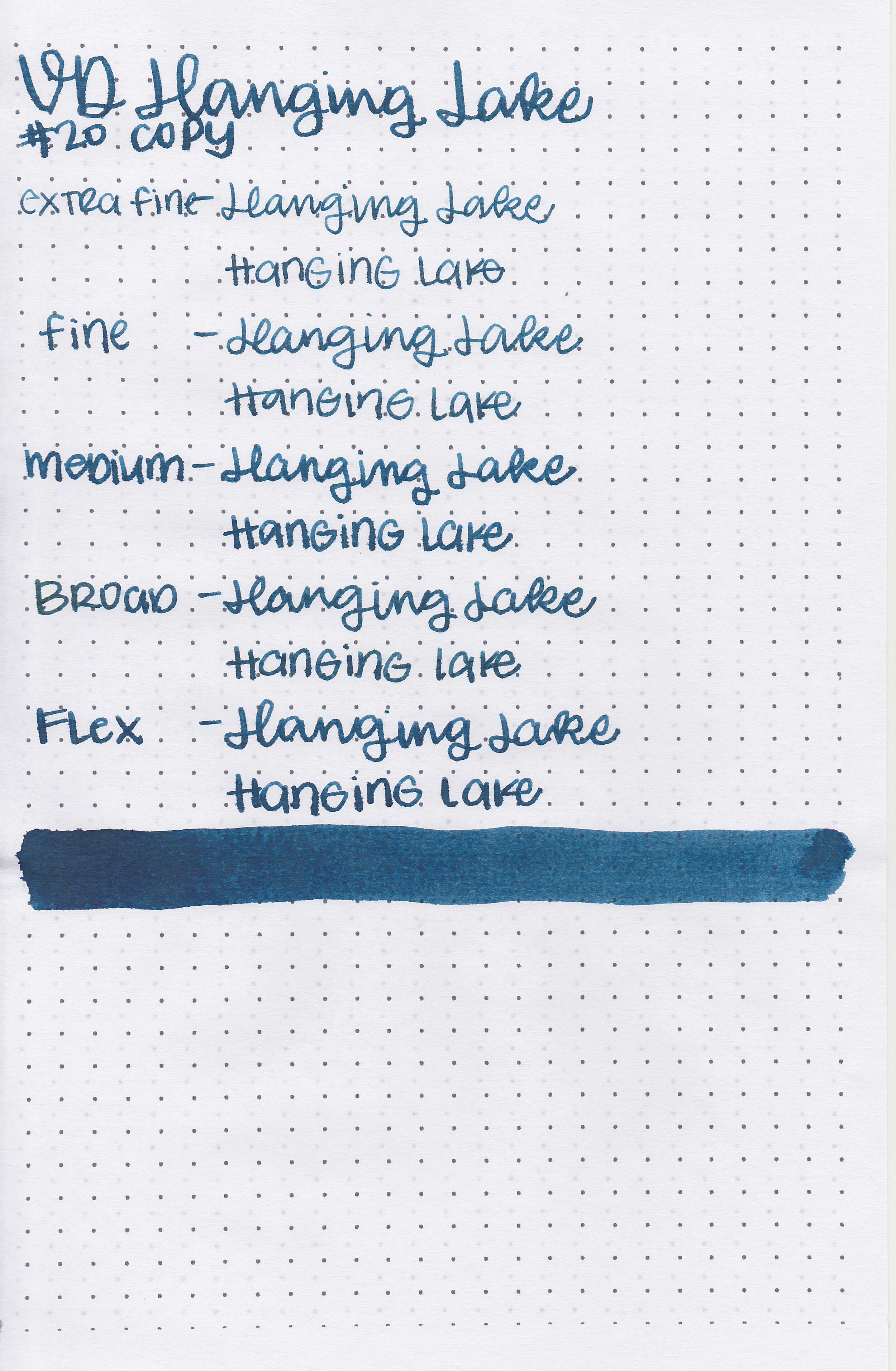
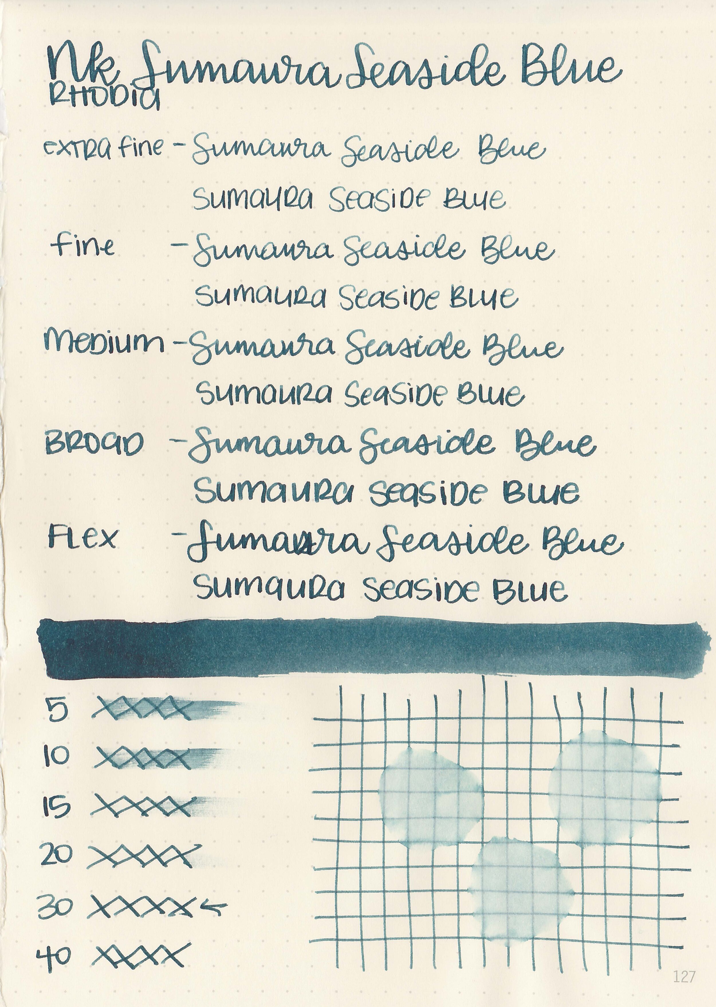
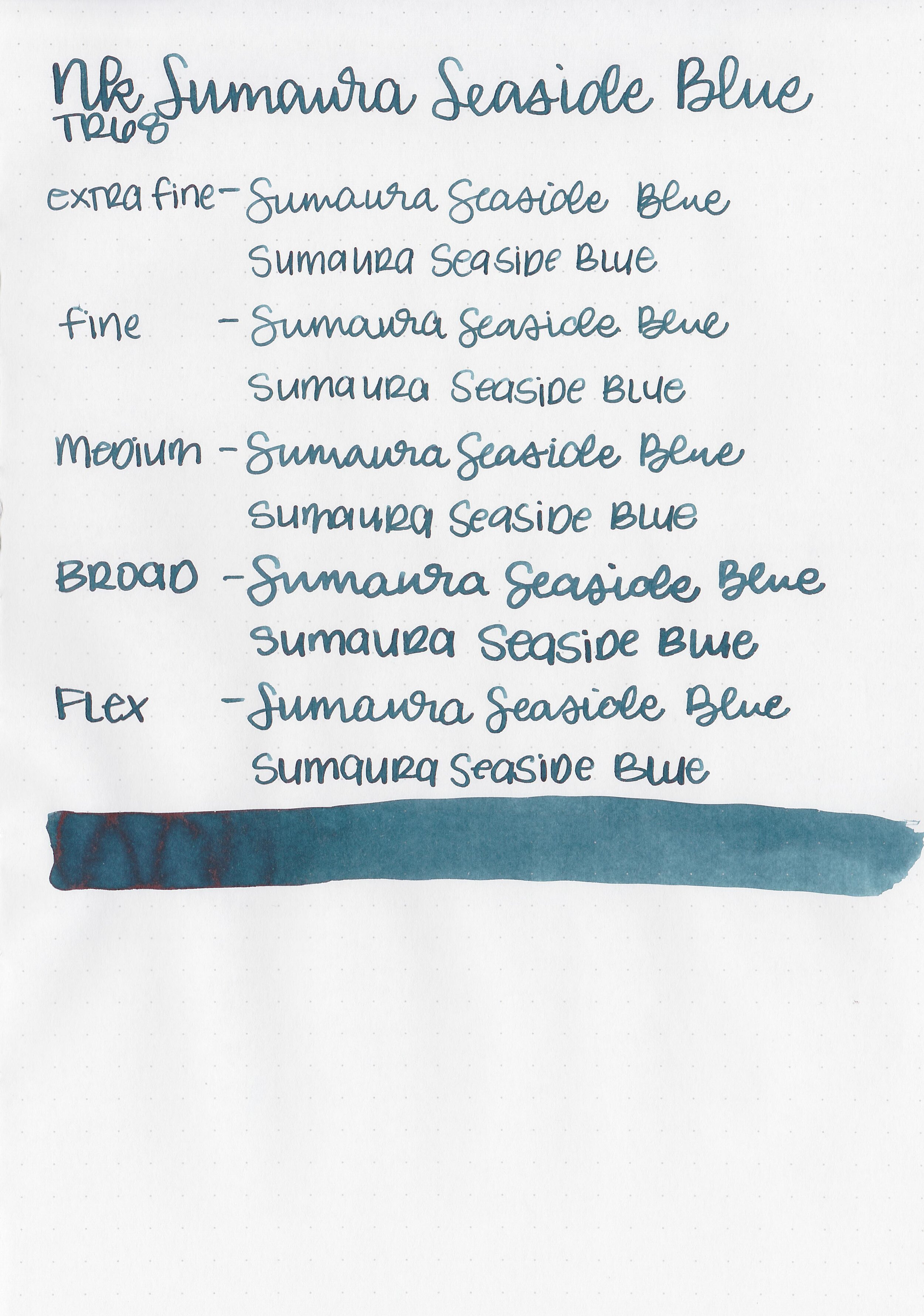
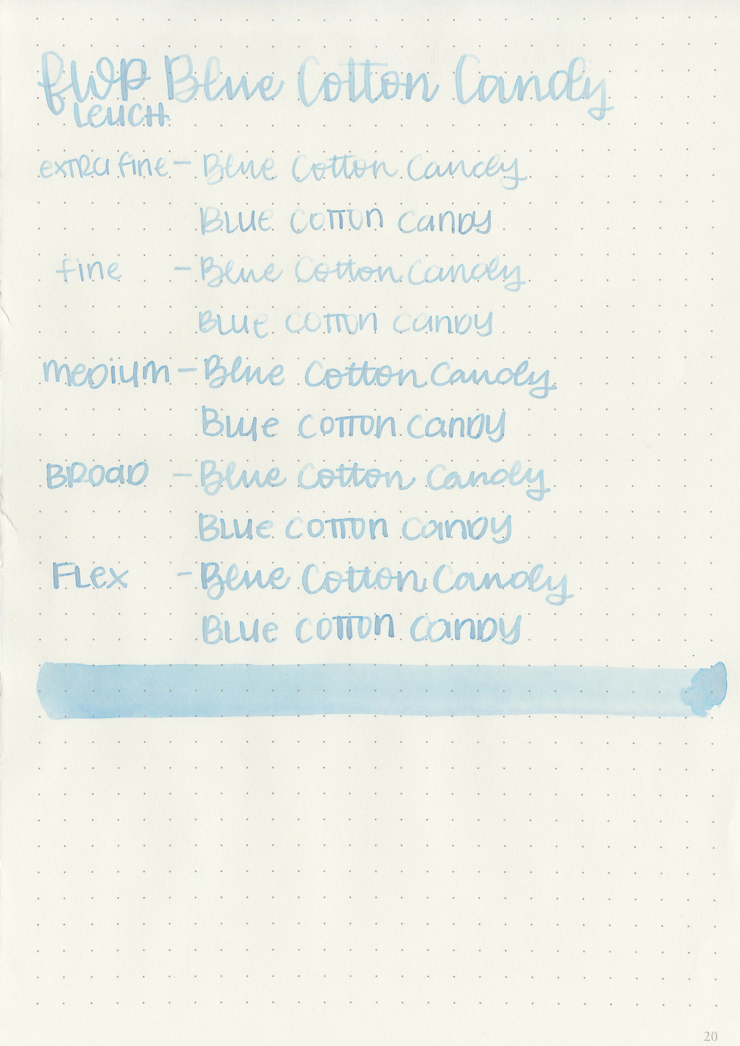
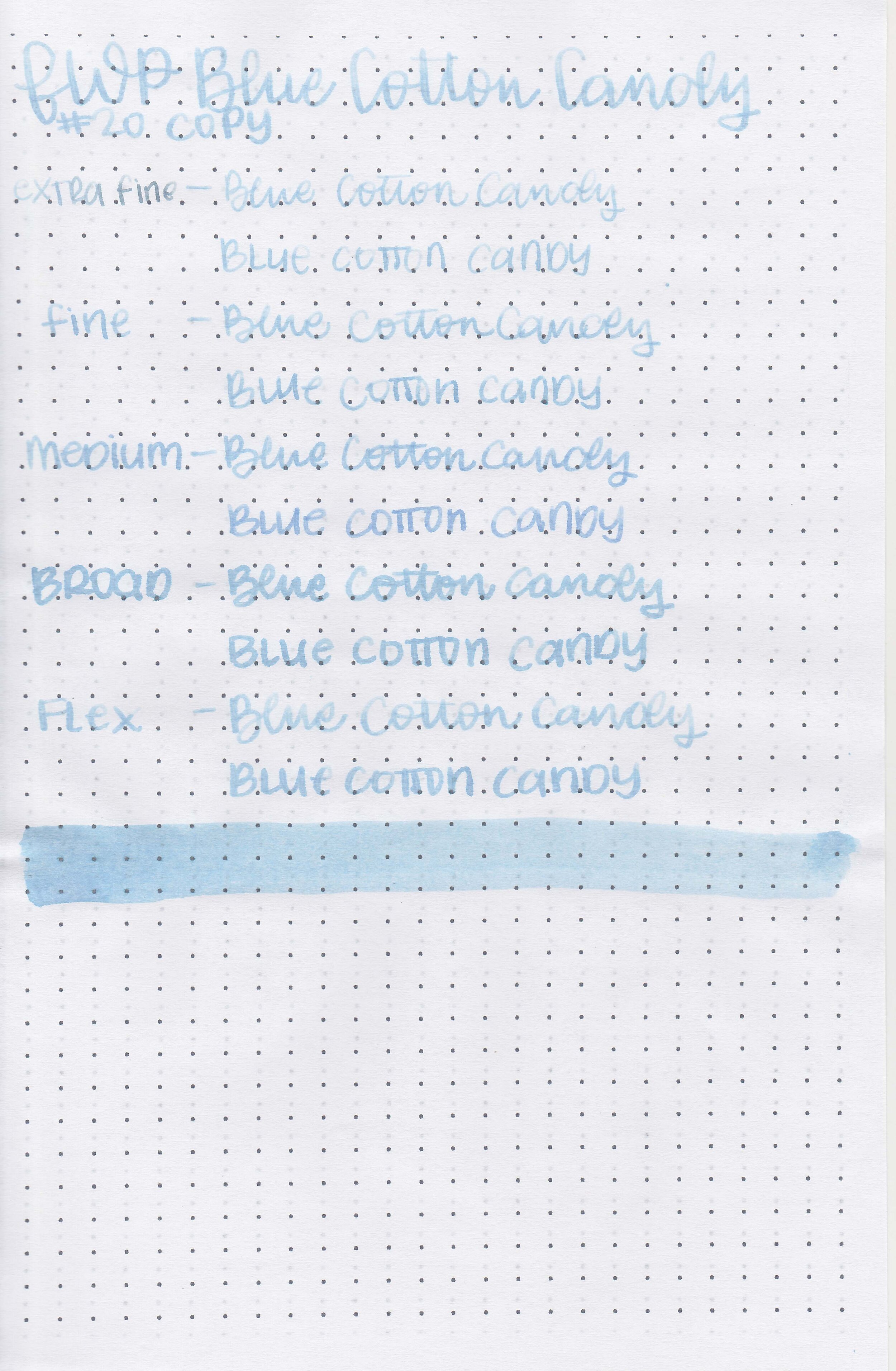
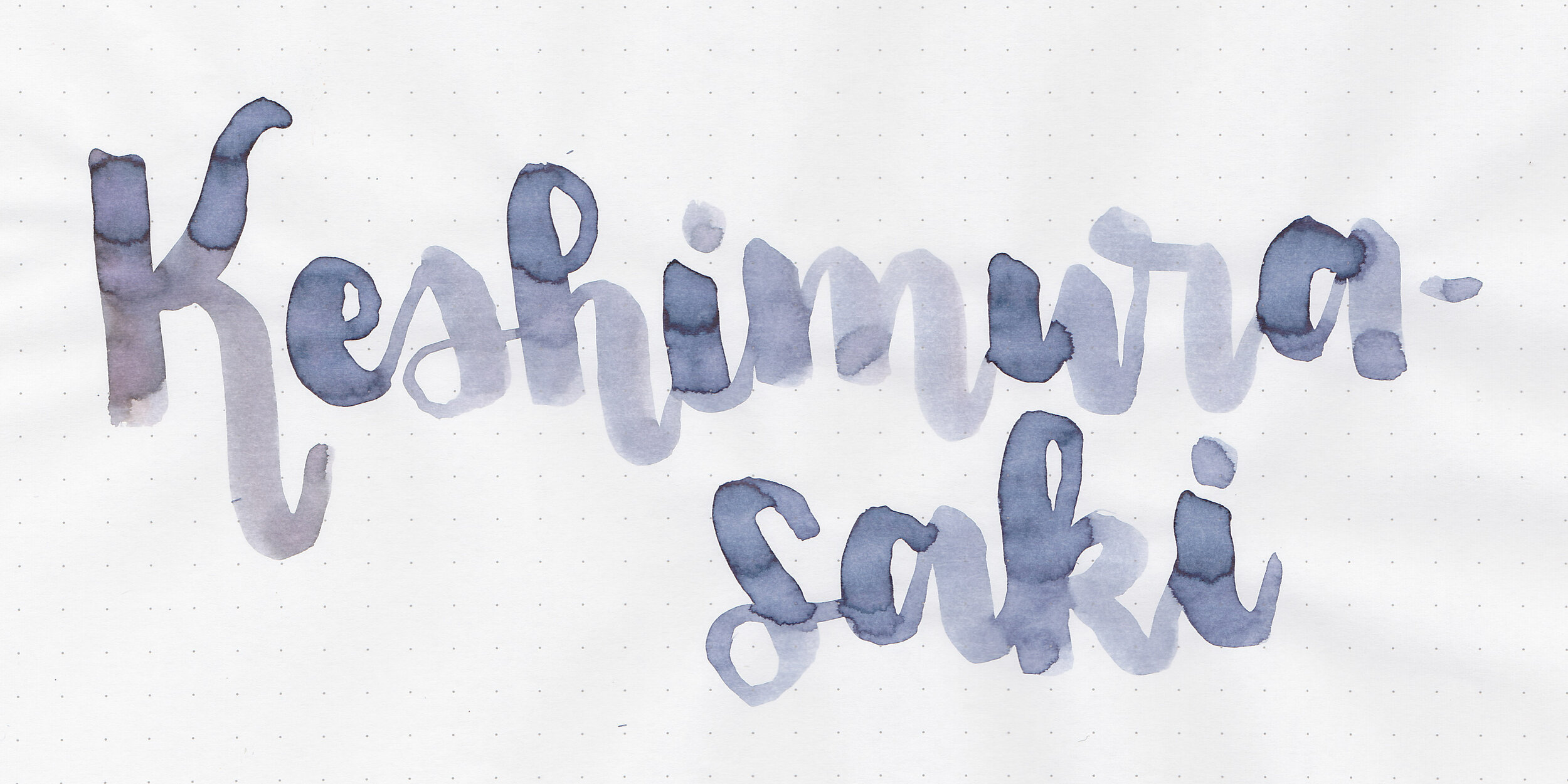
Writing samples:
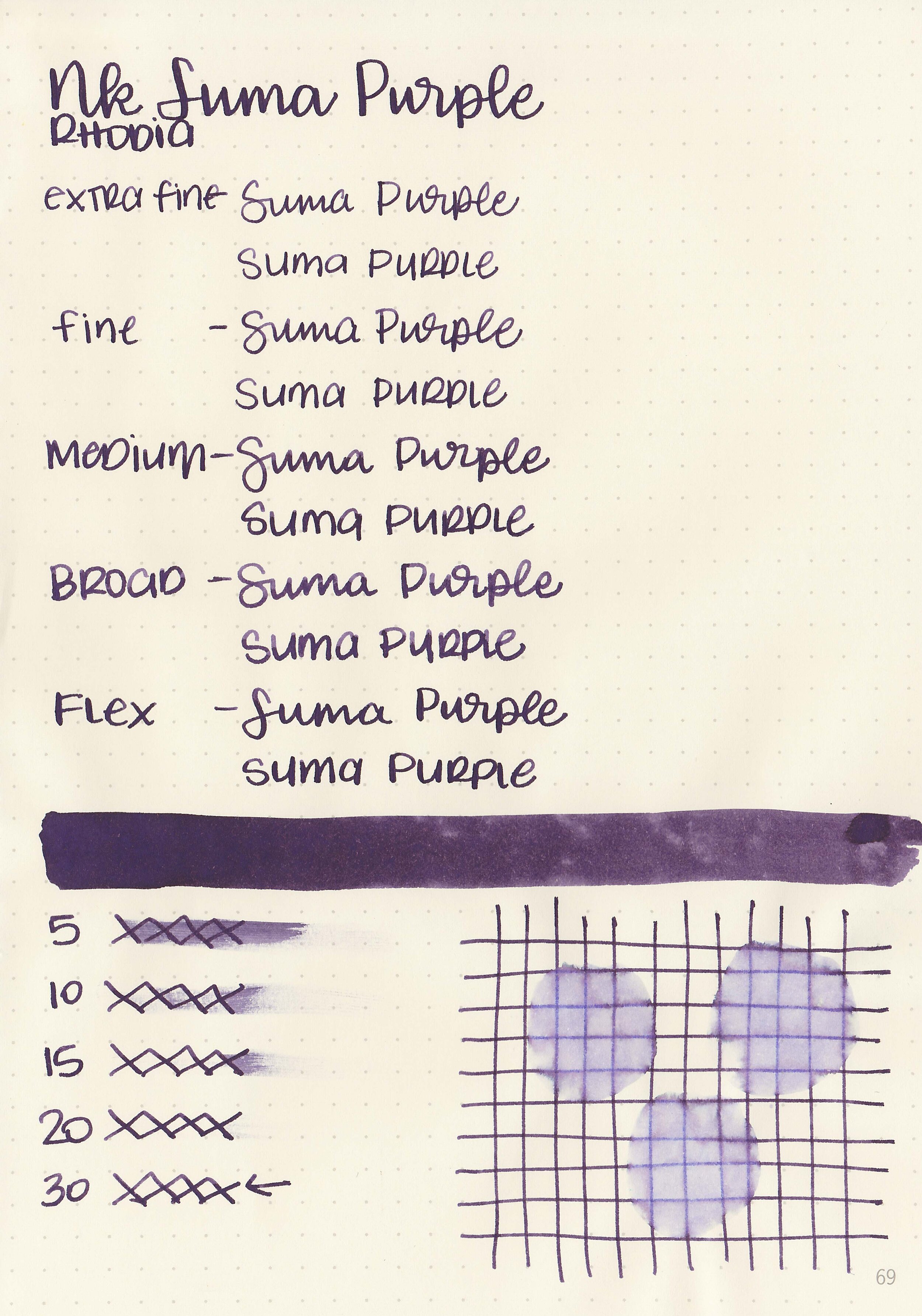
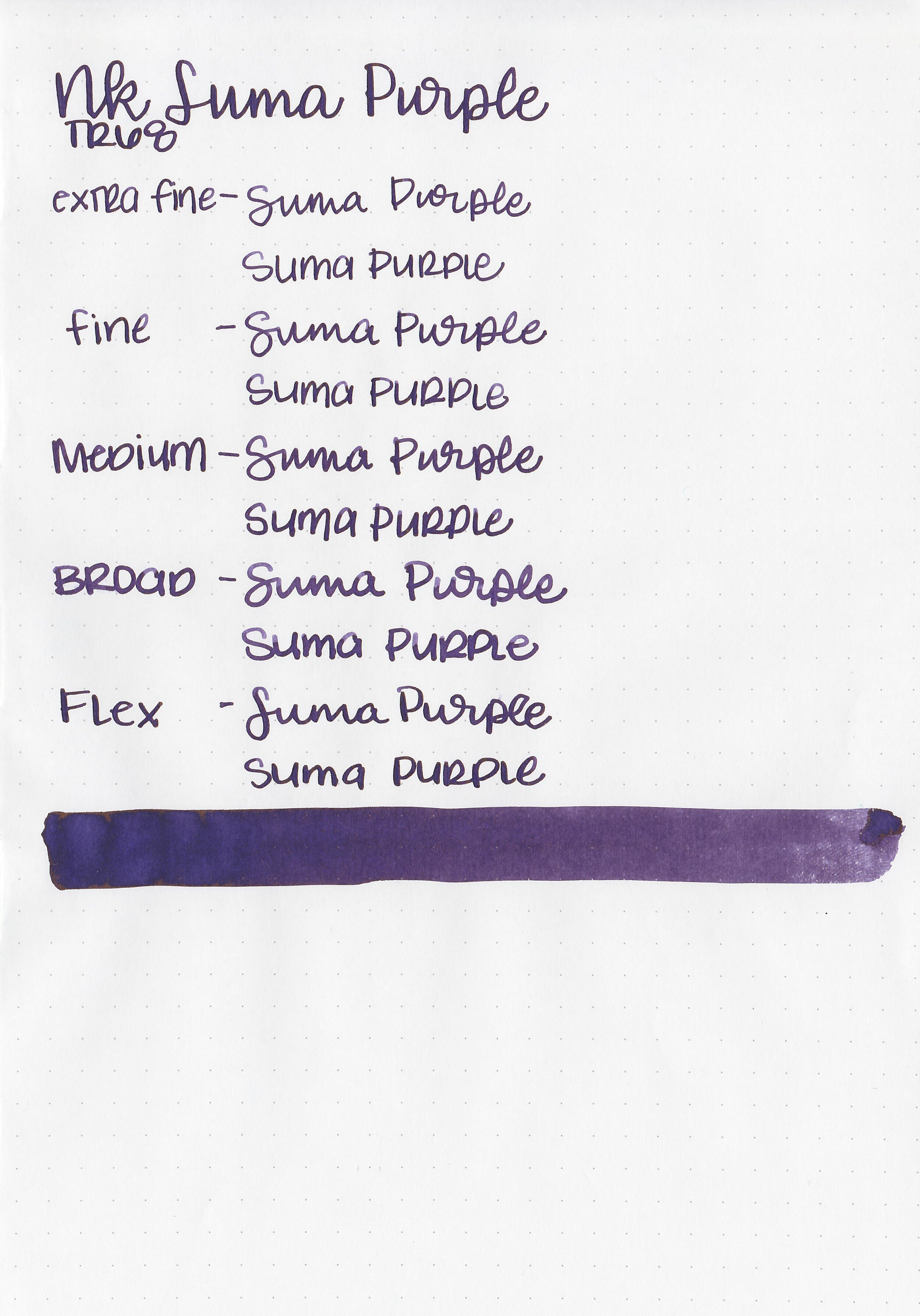
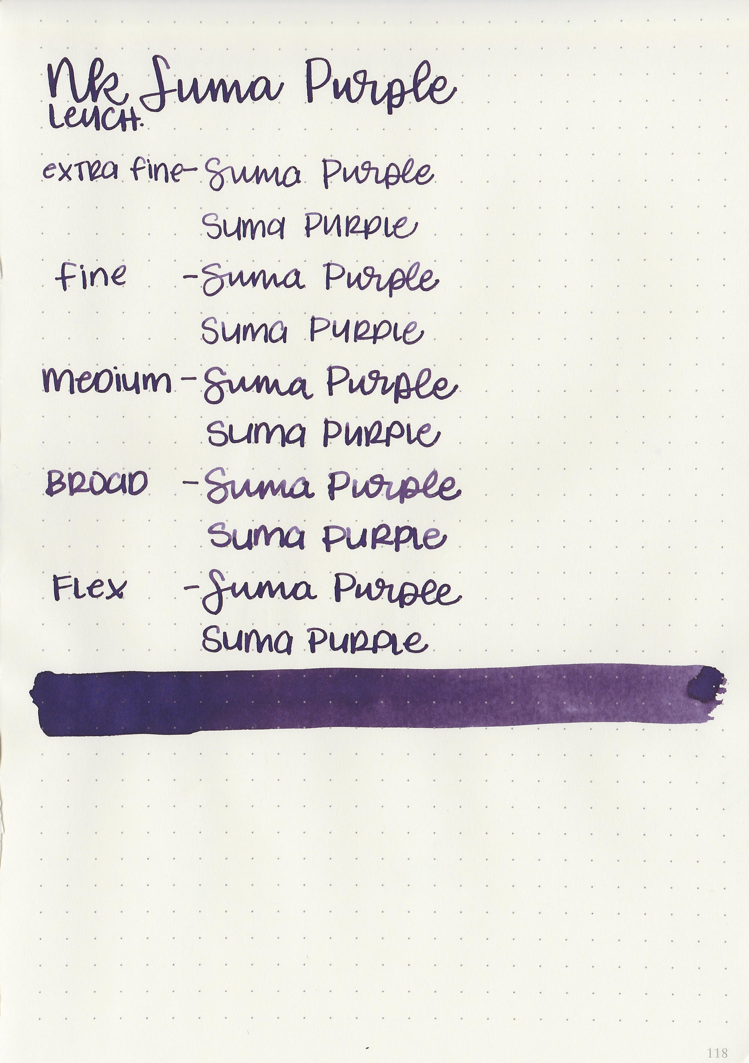
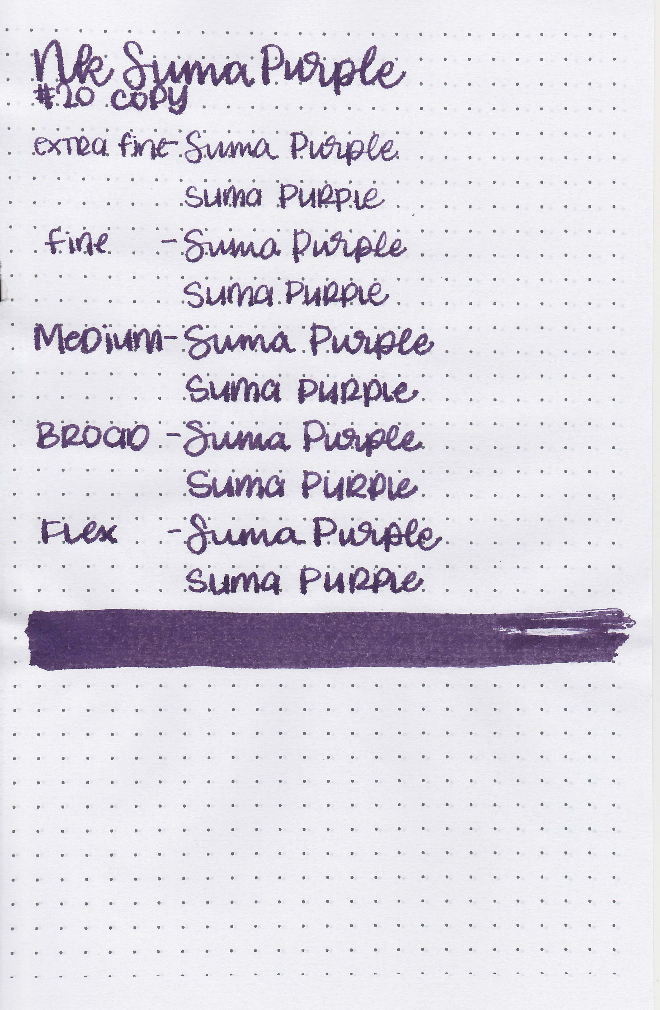
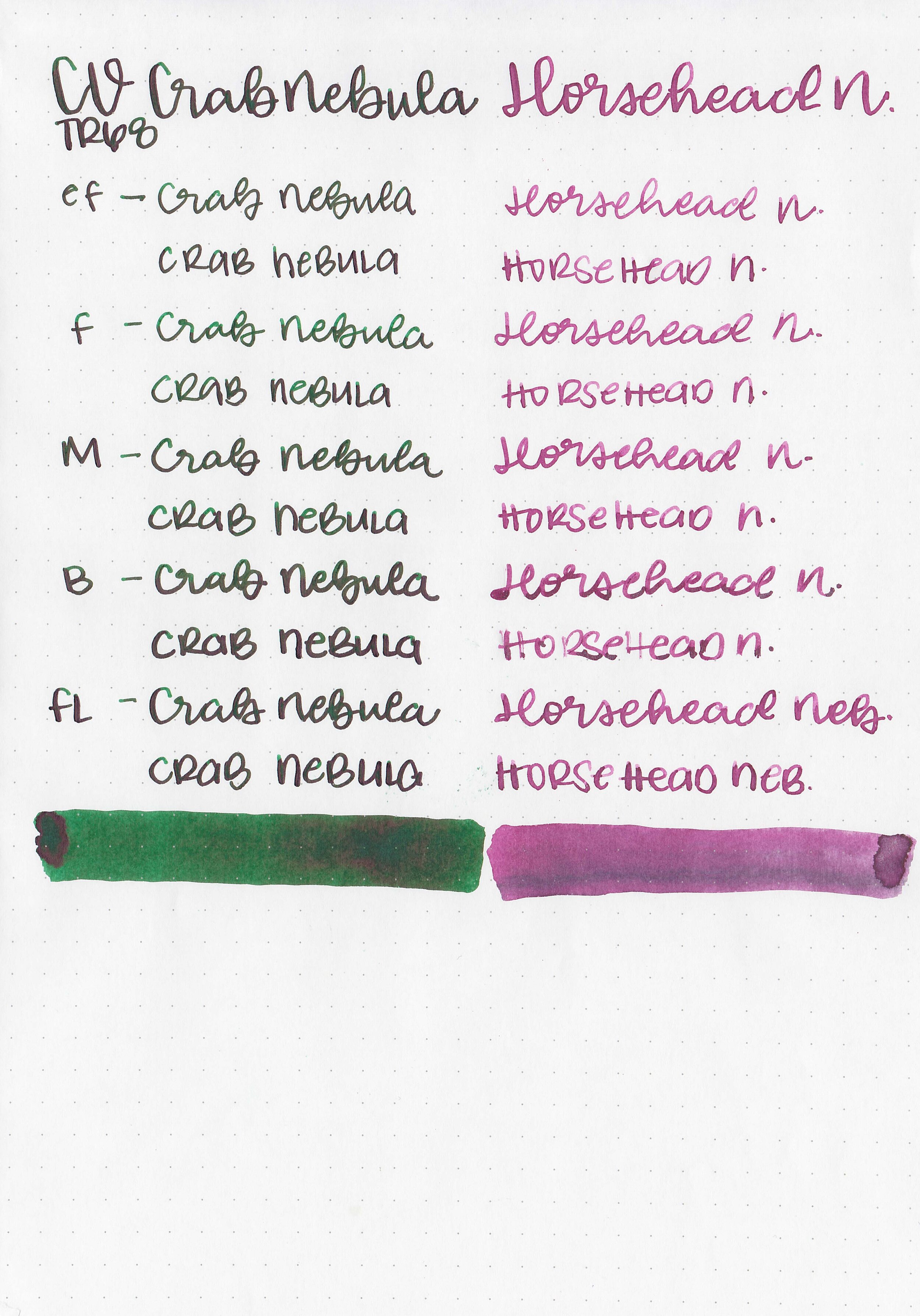
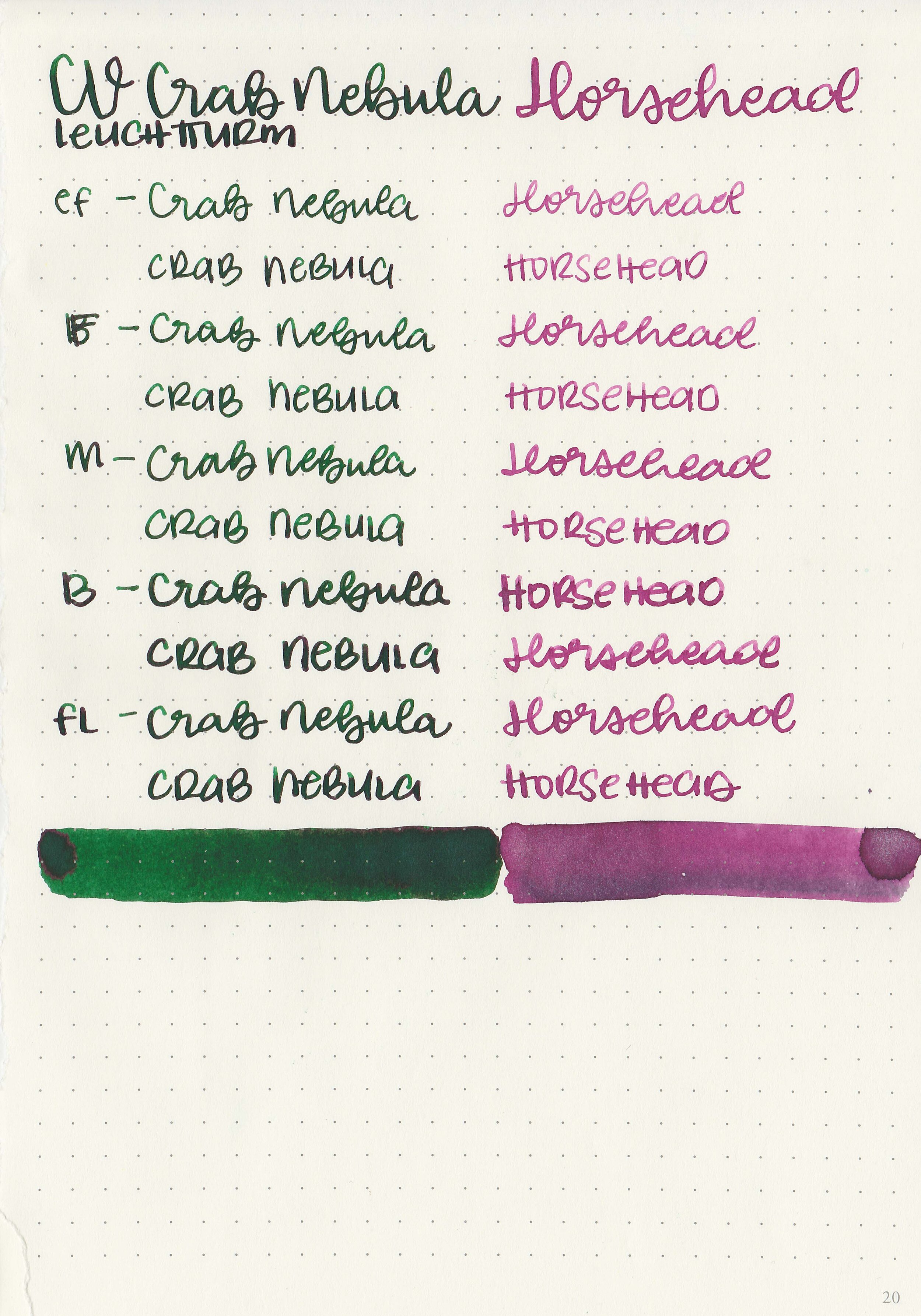
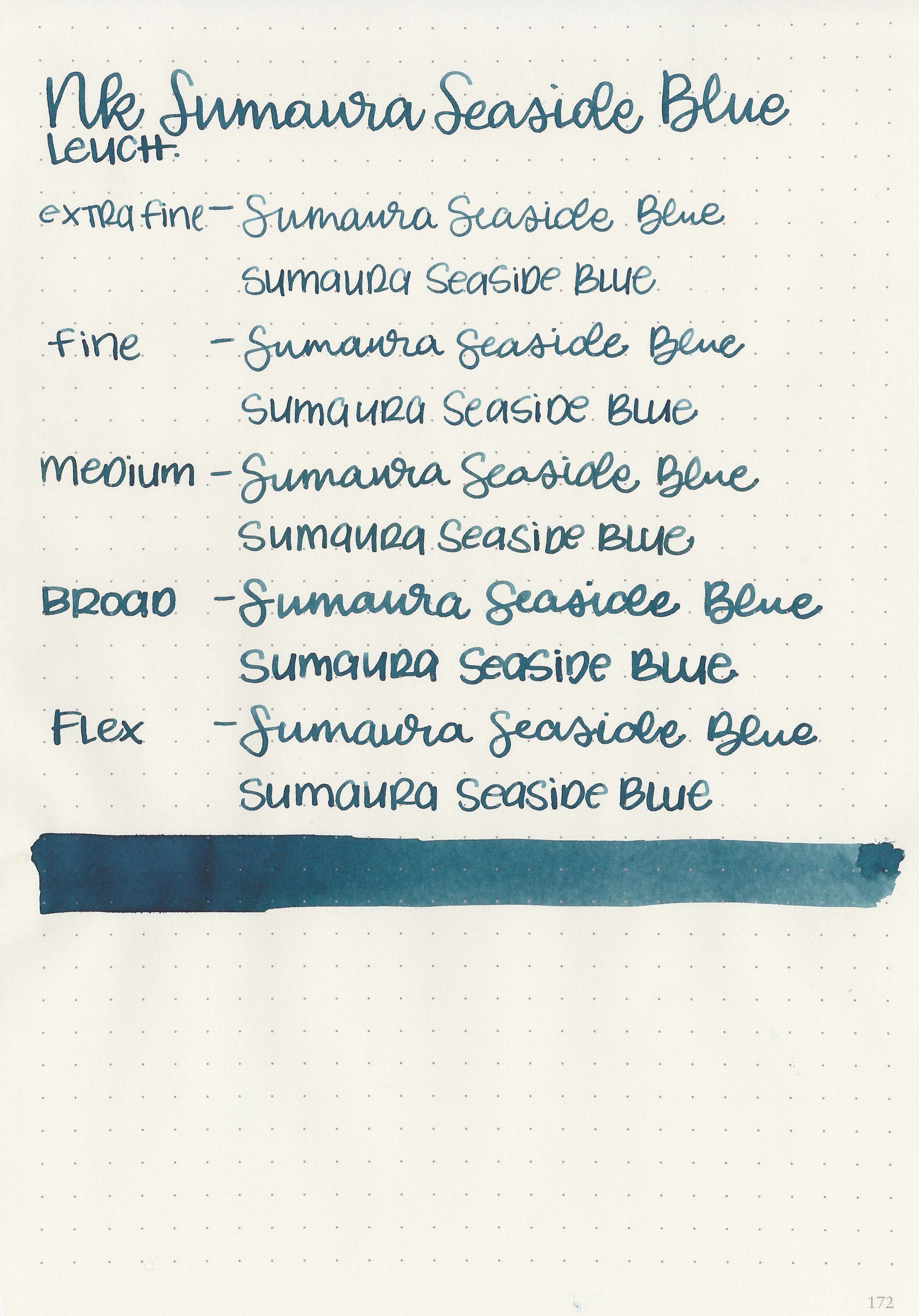
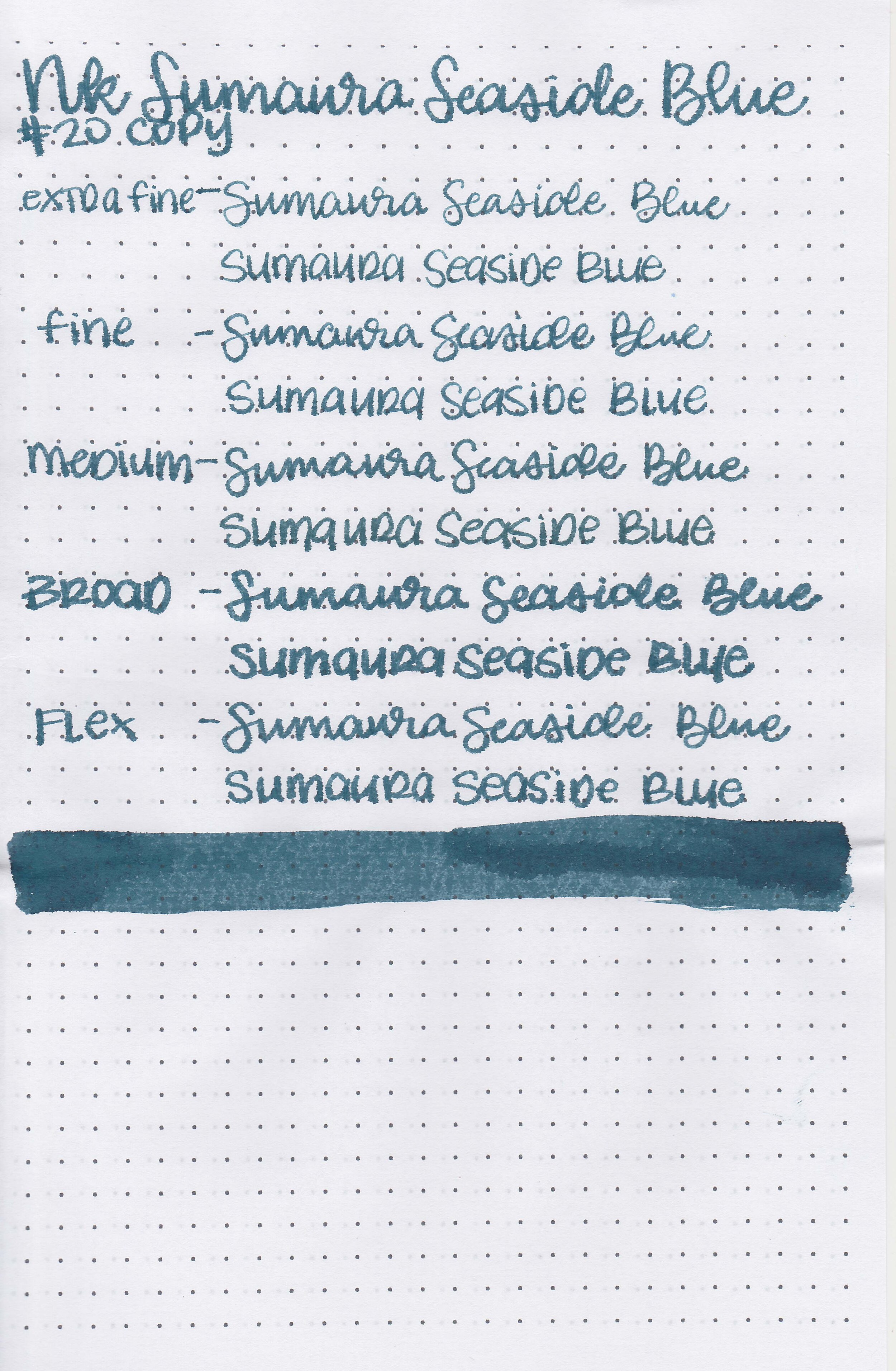
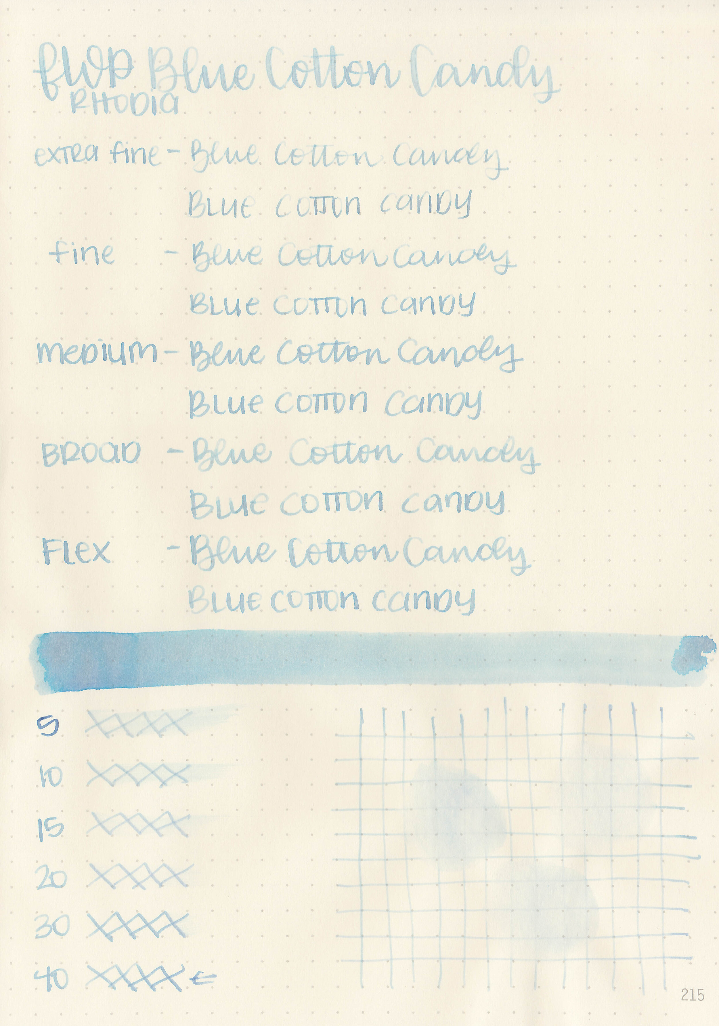
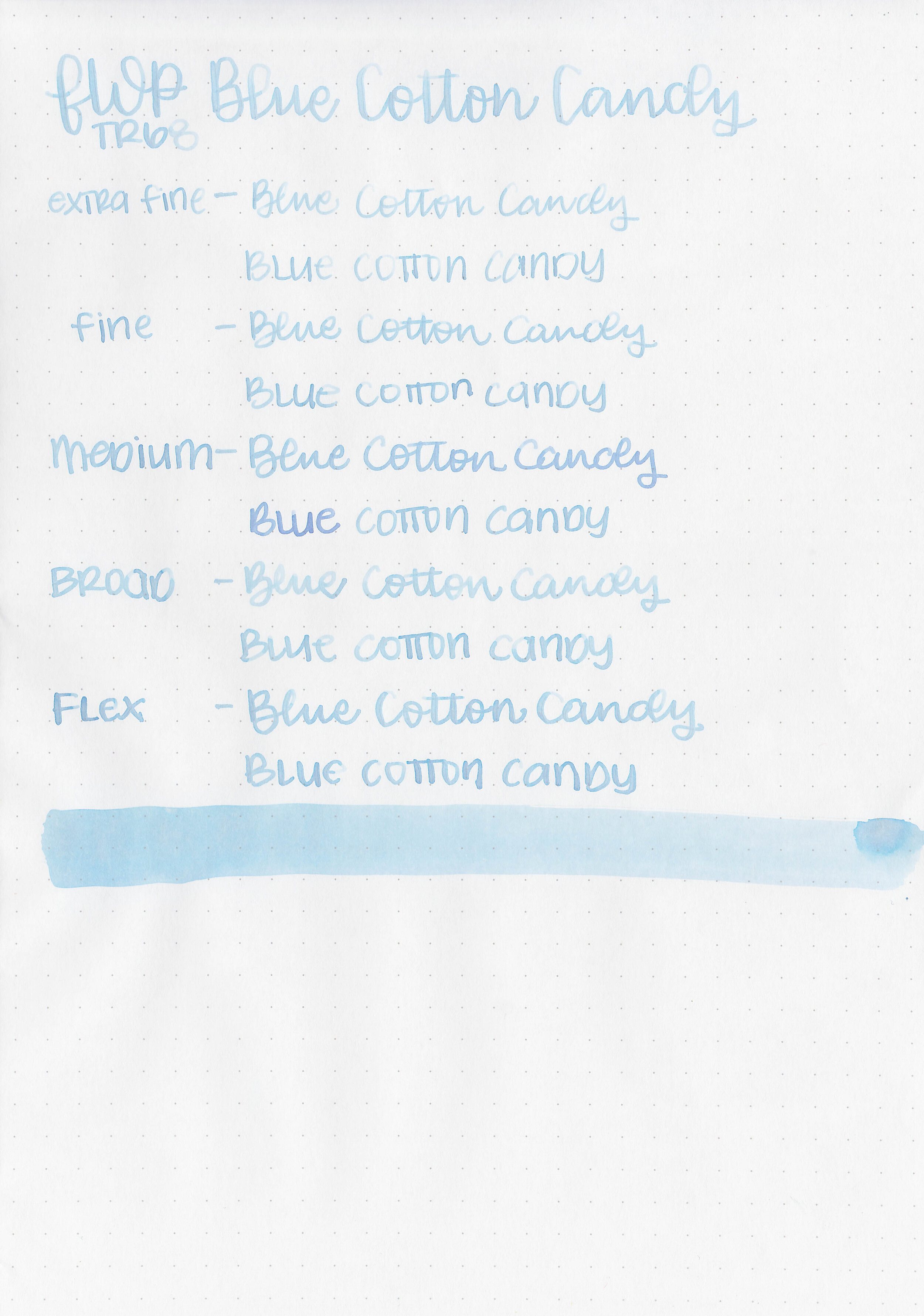
Let's take a look at how the ink behaves on fountain pen friendly papers: Rhodia, Tomoe River, and Leuchtturm.
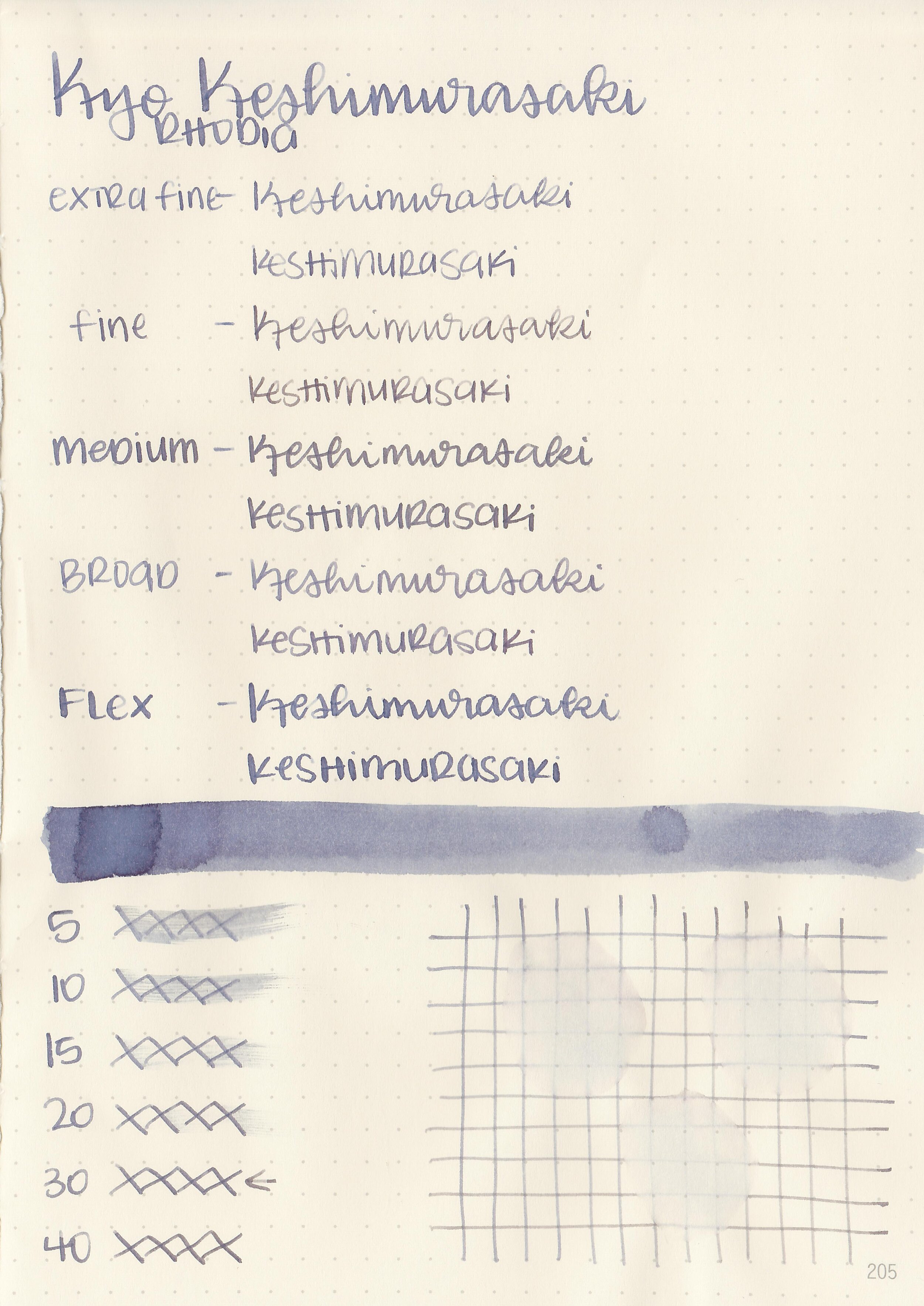
Dry time: 30 seconds
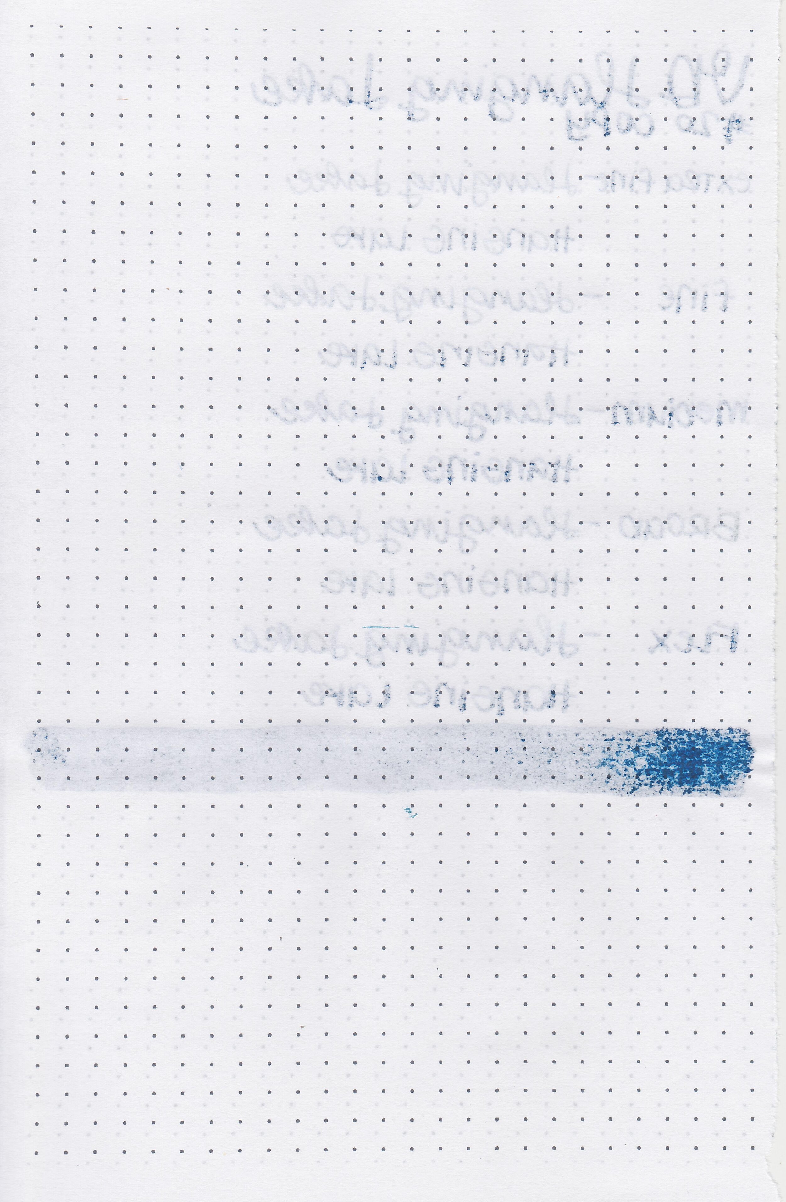
Water resistance: Low
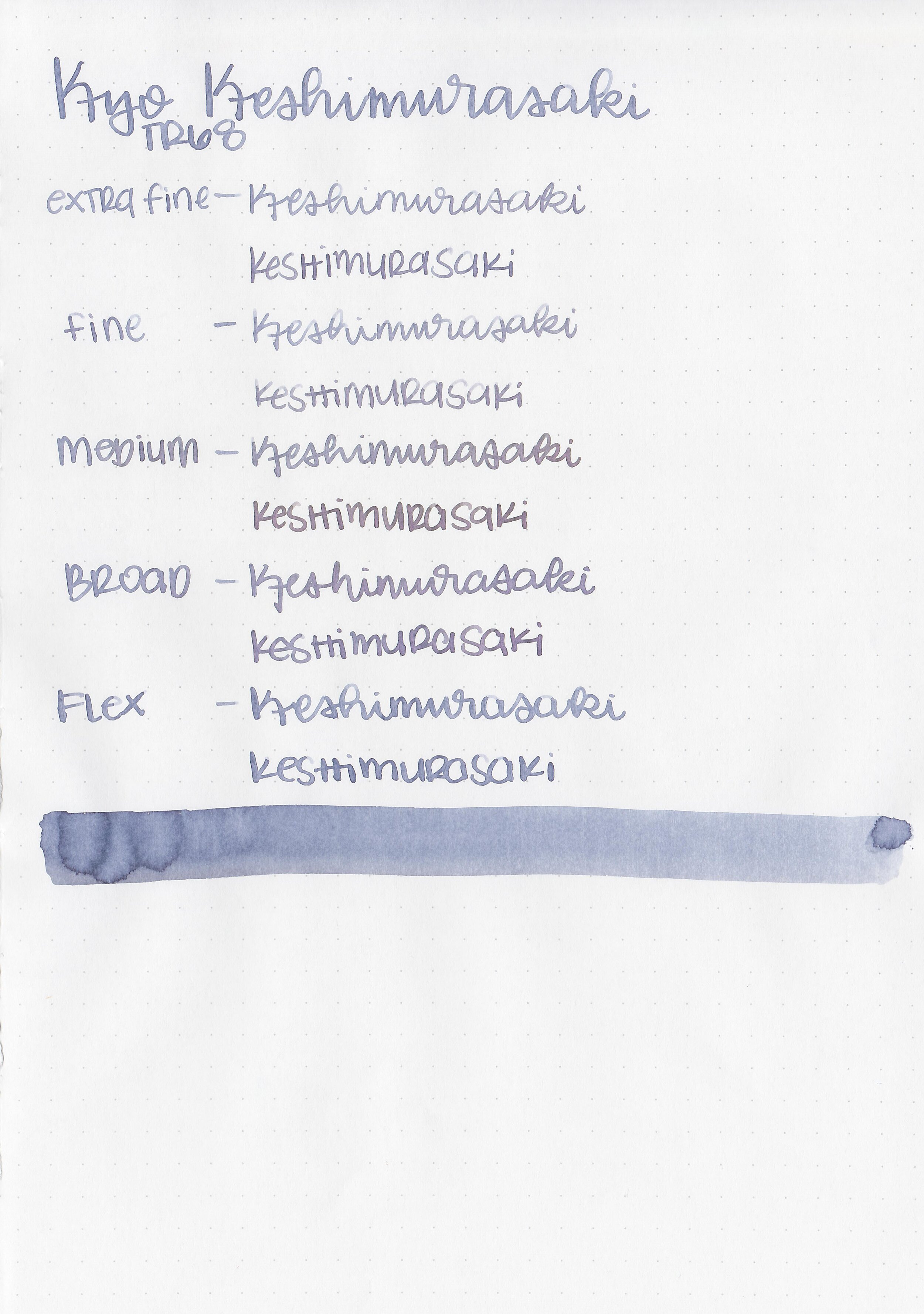
Feathering: None
Show through: Medium
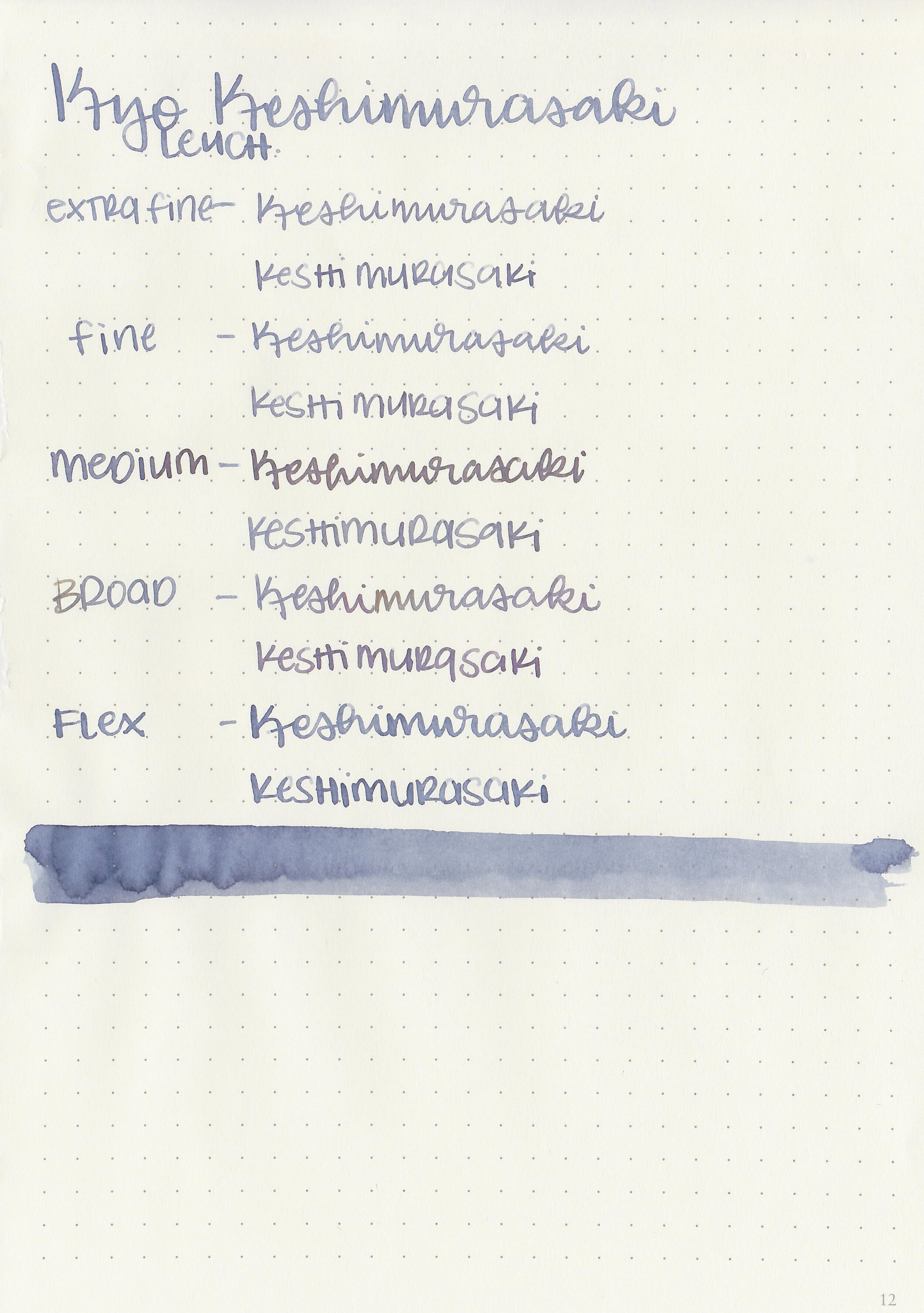
Bleeding: None
Other properties: medium shading, tiny grey sheen, and no shimmer.
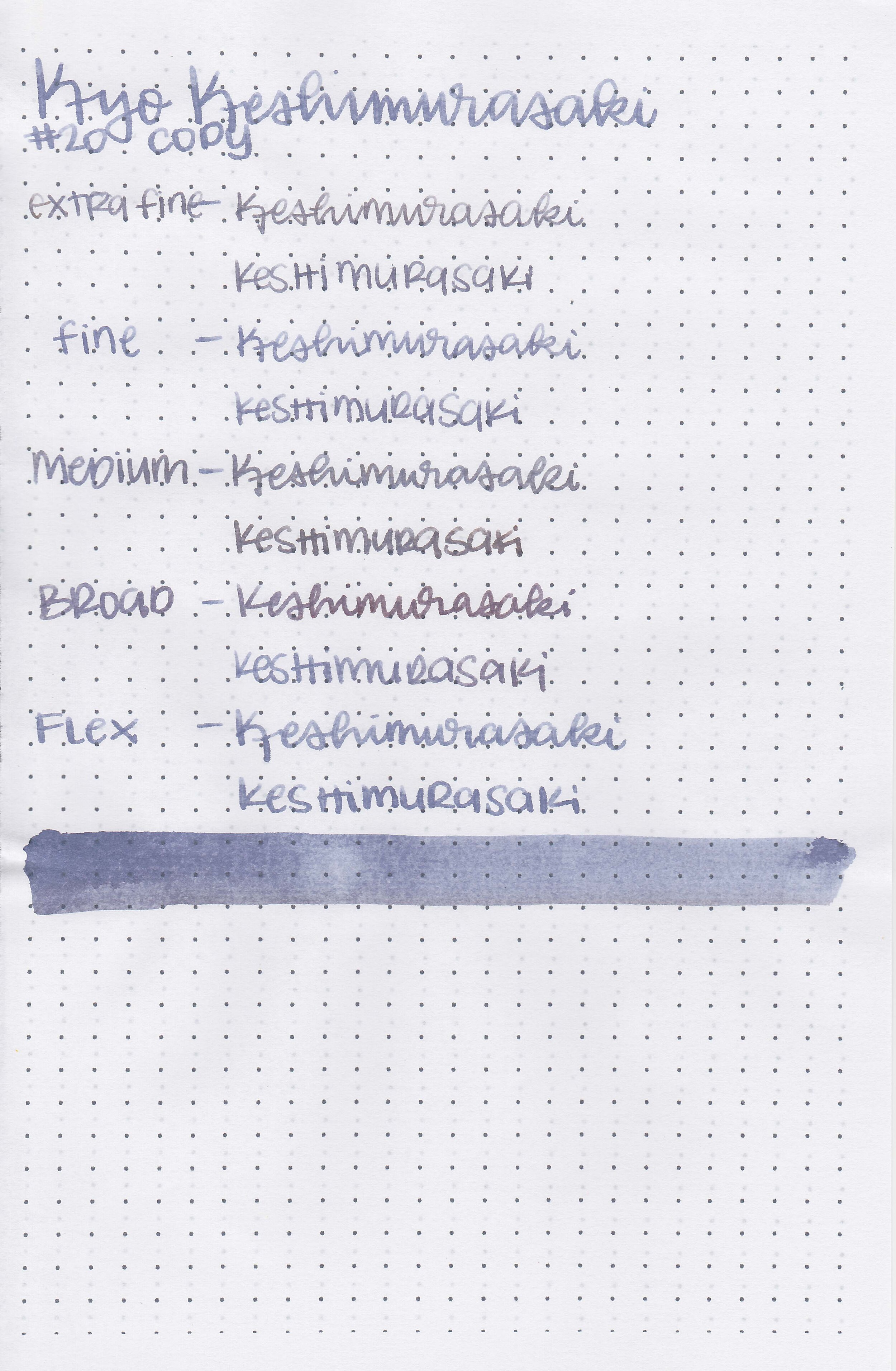
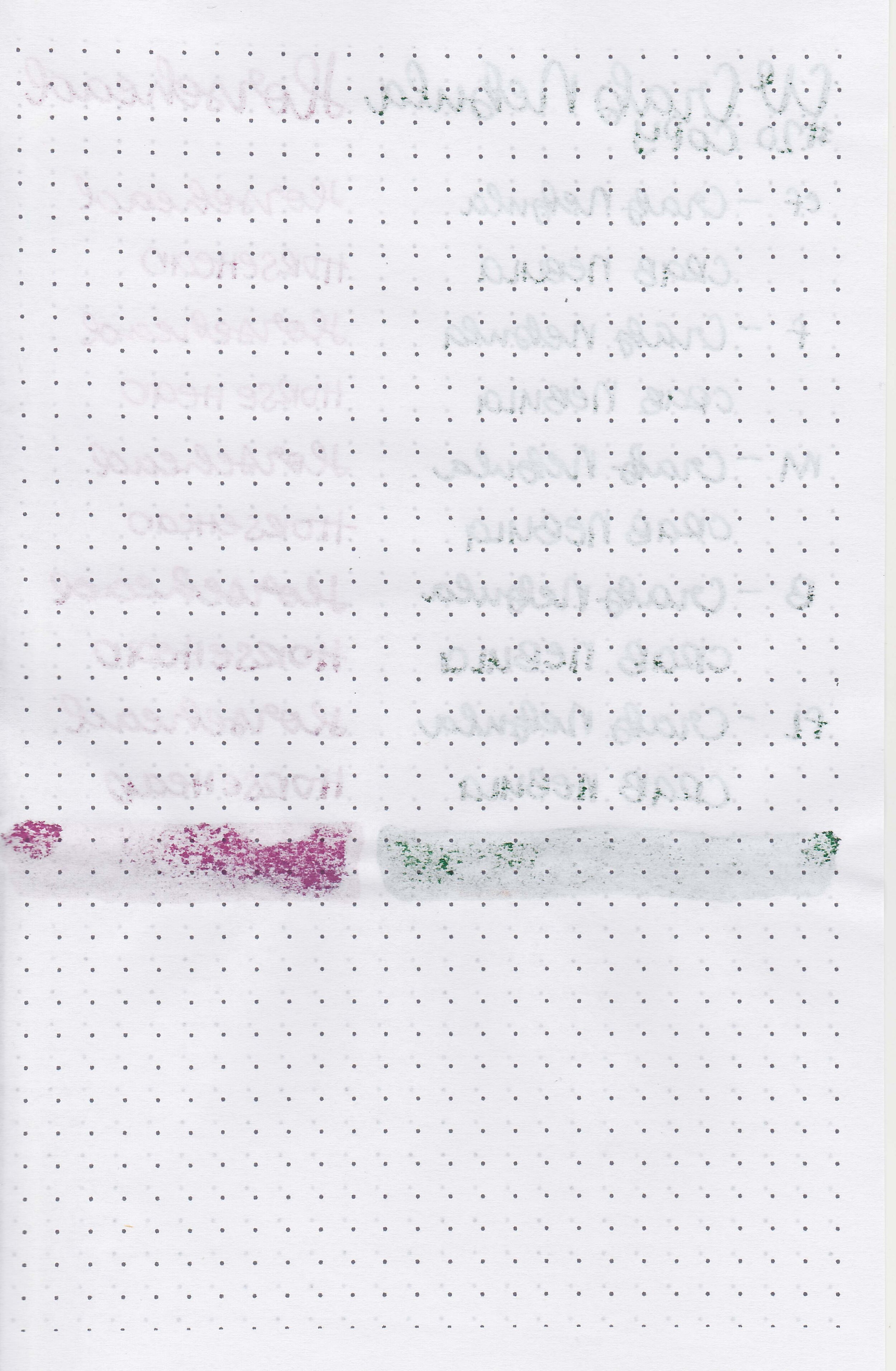
On Staples 24 lb copy paper there was feathering in all nib sizes but no bleeding.
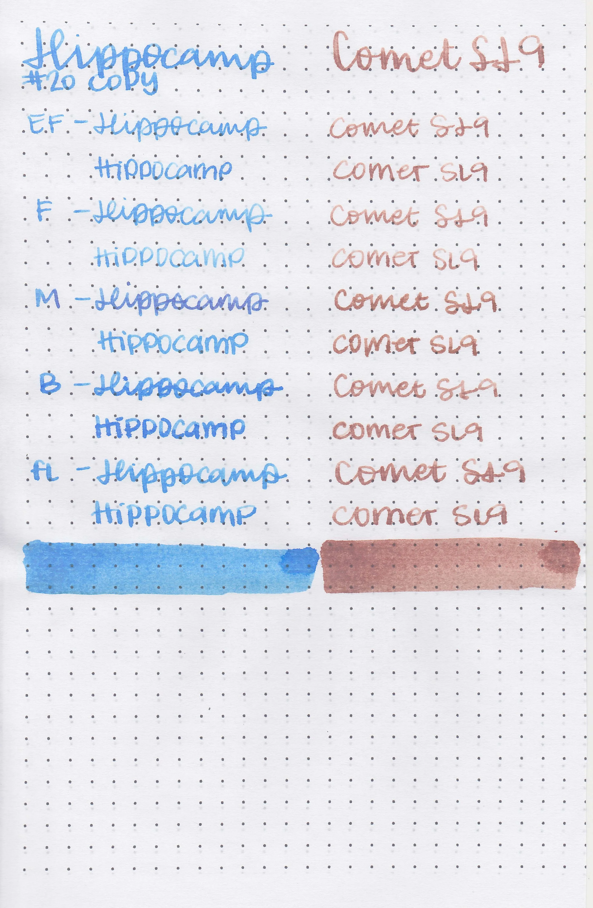
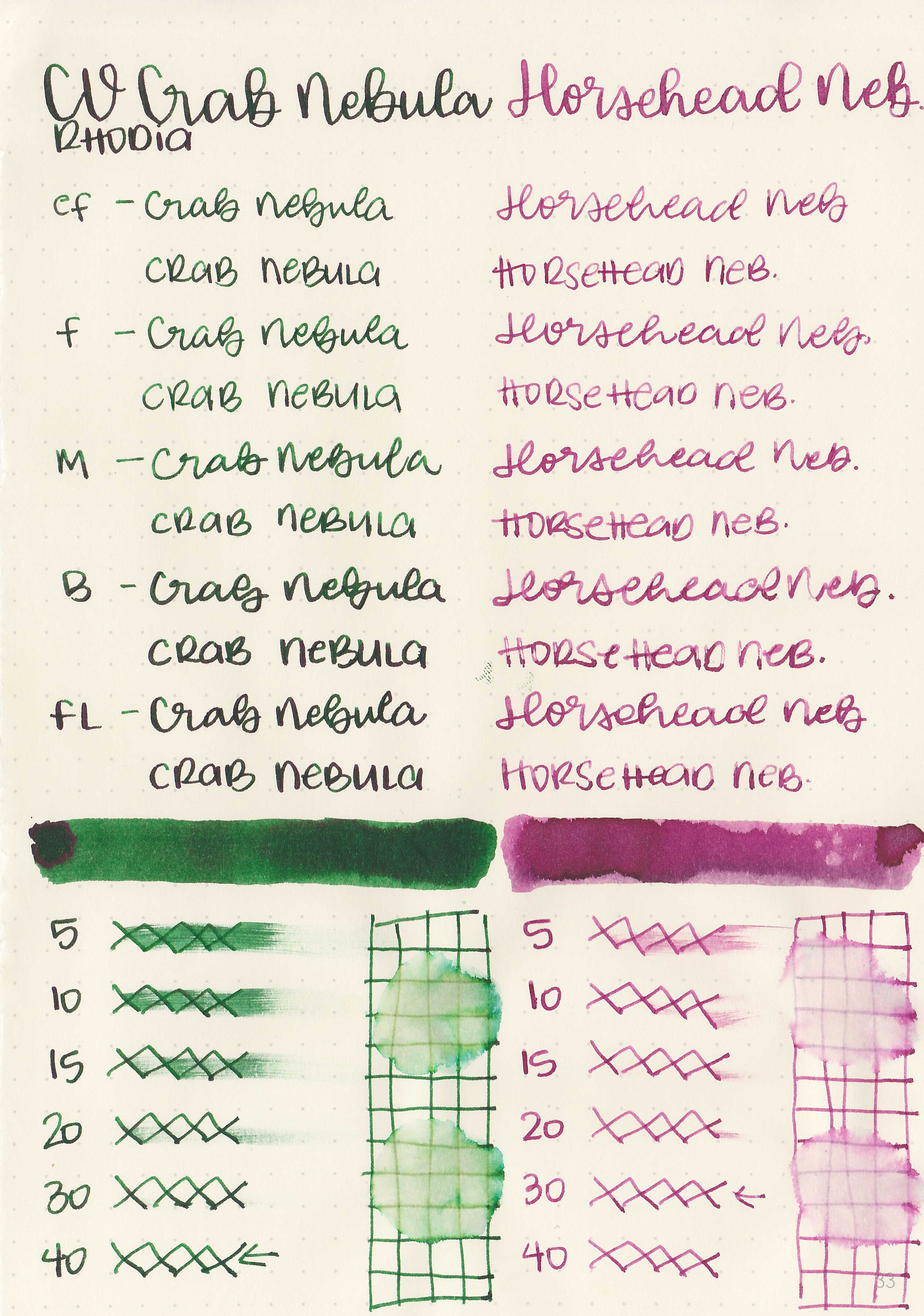
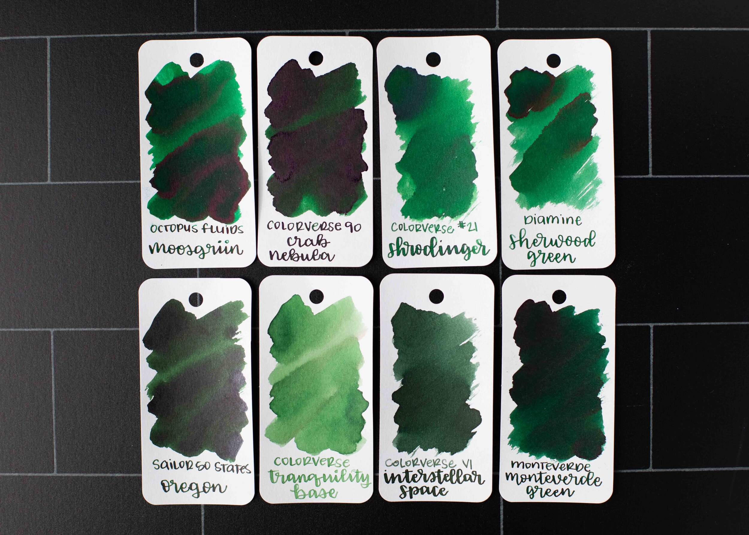
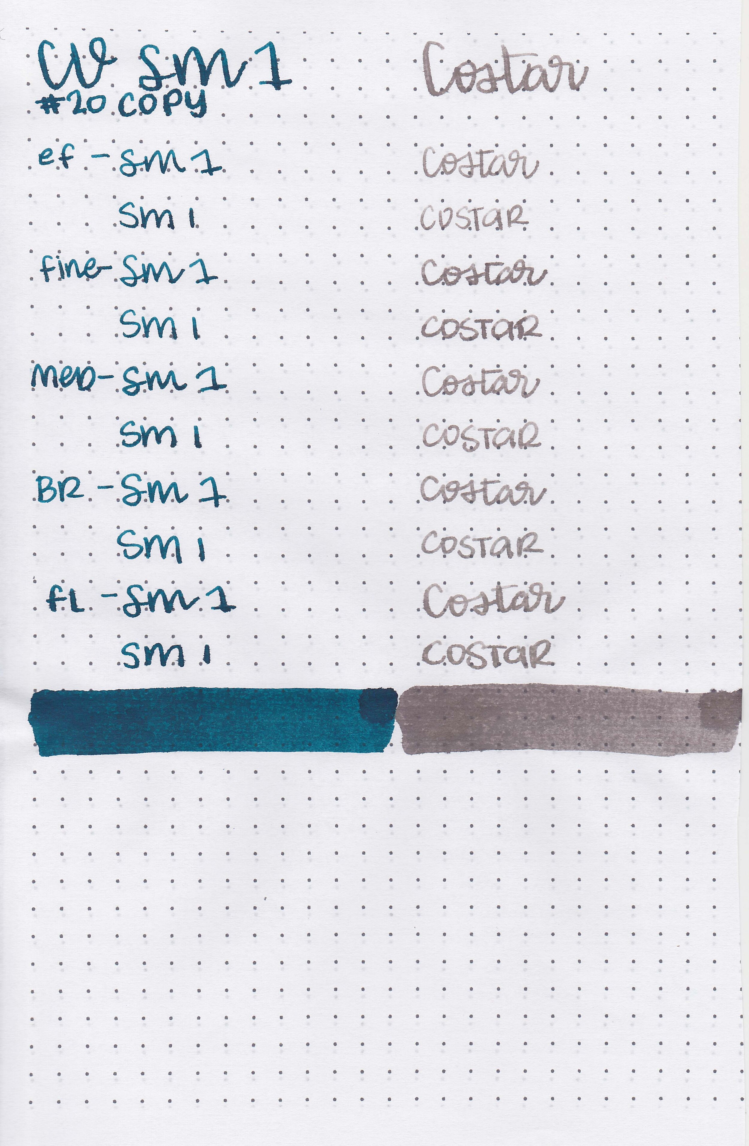
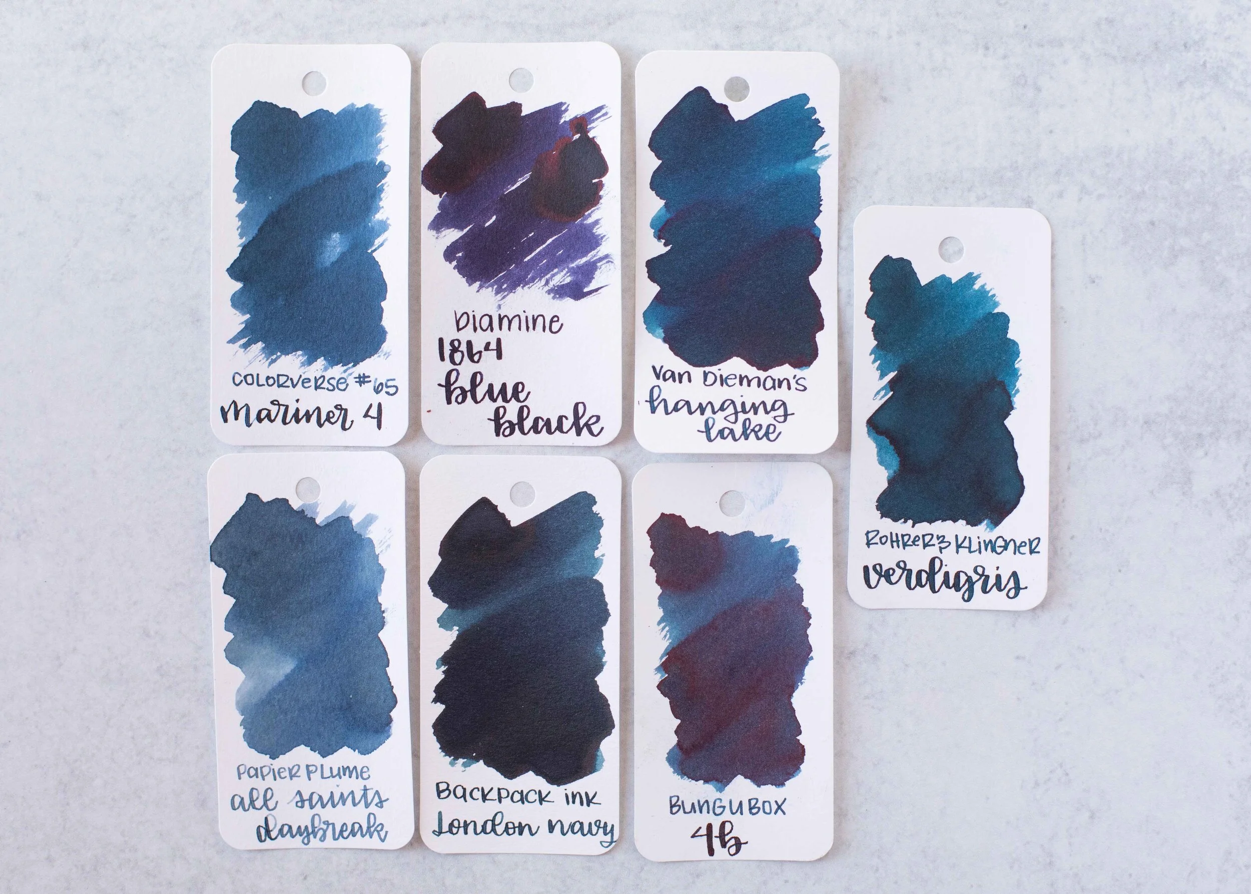
Comparison Swabs:

Keshimurasaki is a lighter than Diamine Vivaldi. Click here to see the Kyoto inks together, and click here to see the purple inks together.
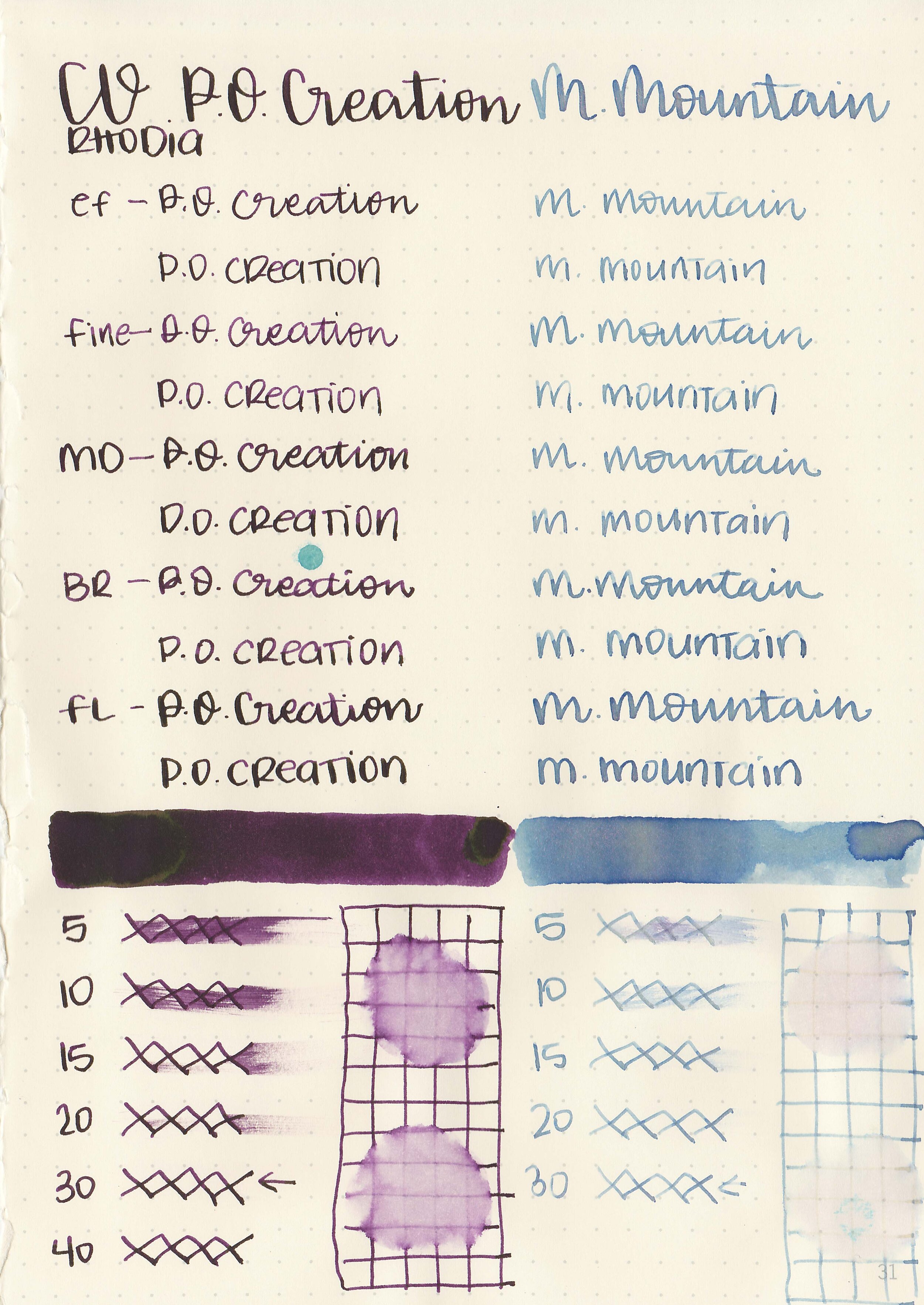
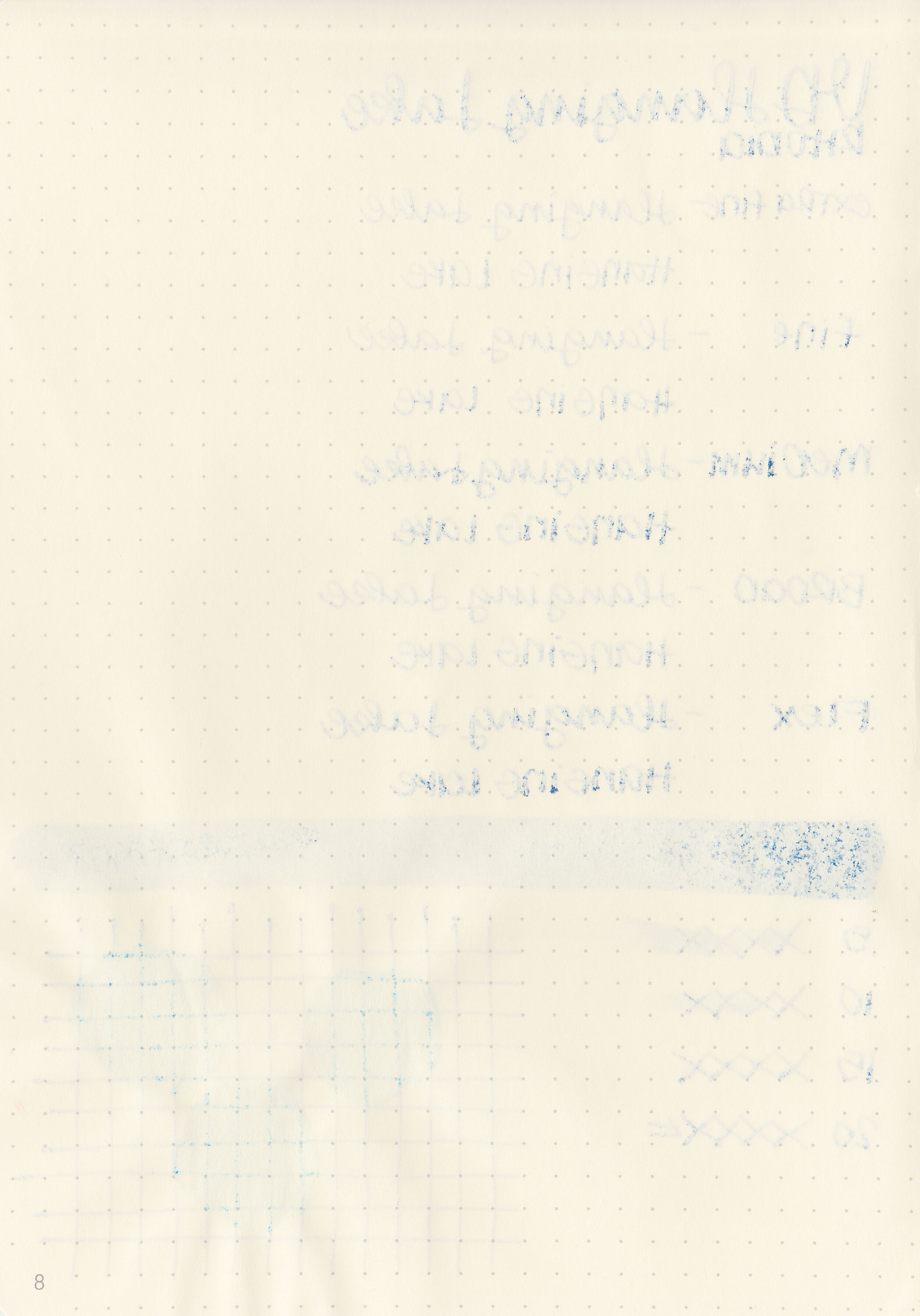
Longer writing:

I used a Sailor Pro Gear Slim Purple Cosmos with a zoom nib on a Taroko Enigma notebook. The ink had a dry flow.
Overall, it’s a lovely purple-grey ink but the flow is very dry. I added a drop of White Lightning (ink additive) to it after doing all the writing samples for this review and liked it much better that way.
Disclaimer: All photos and opinions are my own. This page does not contain affiliate links and this post is not sponsored.