Ink Review #1485: Van Dieman's Tasmania Vine Purple
/
Van Dieman’s Tasmania Vine Purple is from the Colours of Tasmania series and comes in 30ml bottles. You can find this ink for sale at Pen Chalet (aff. link) or Vanness Pens.
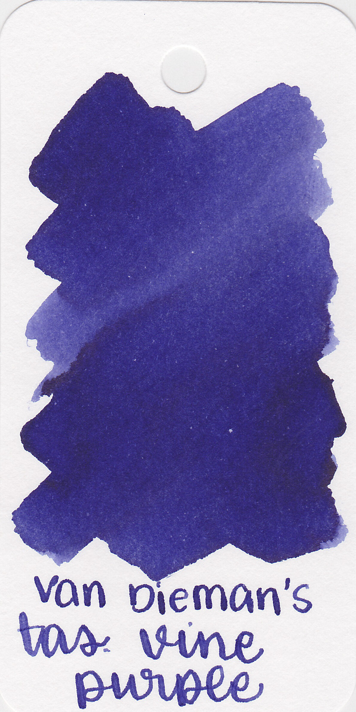
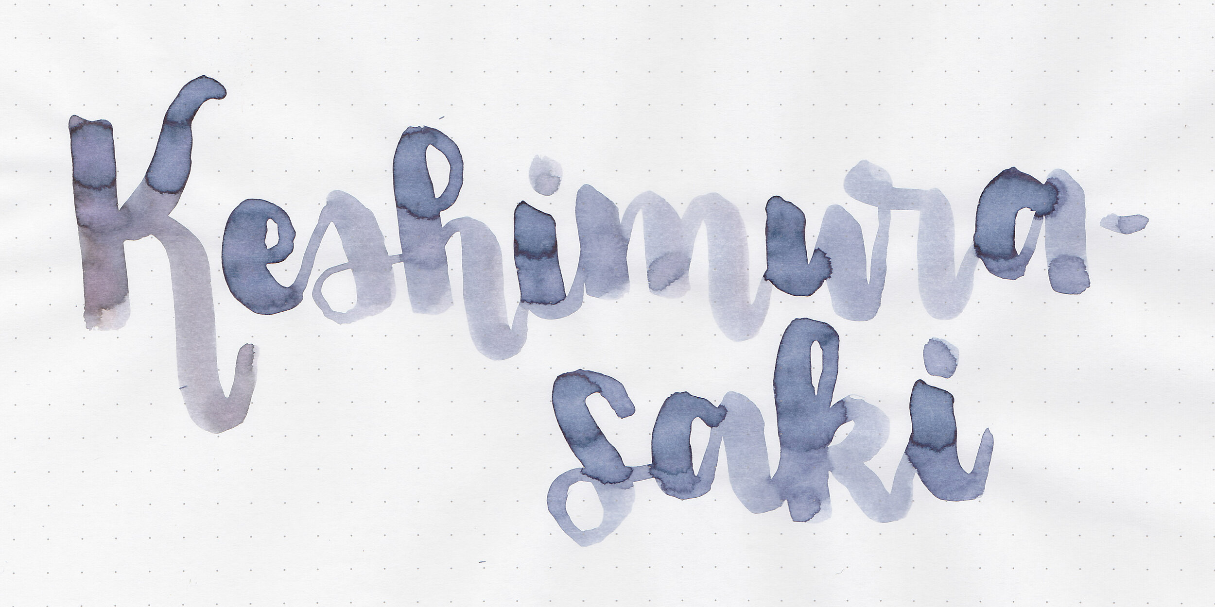
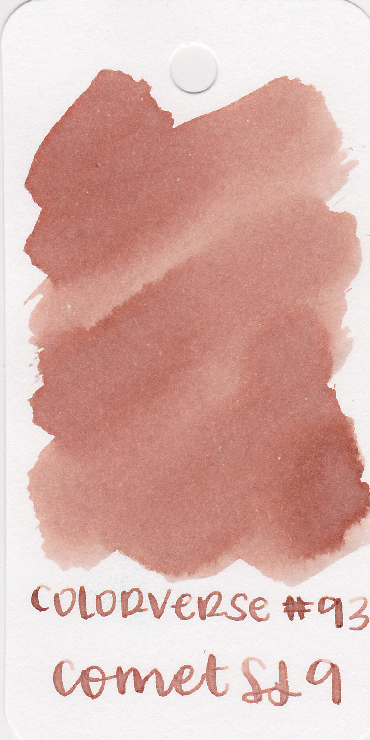
The color:
Vine Purple is a deep blue violet.
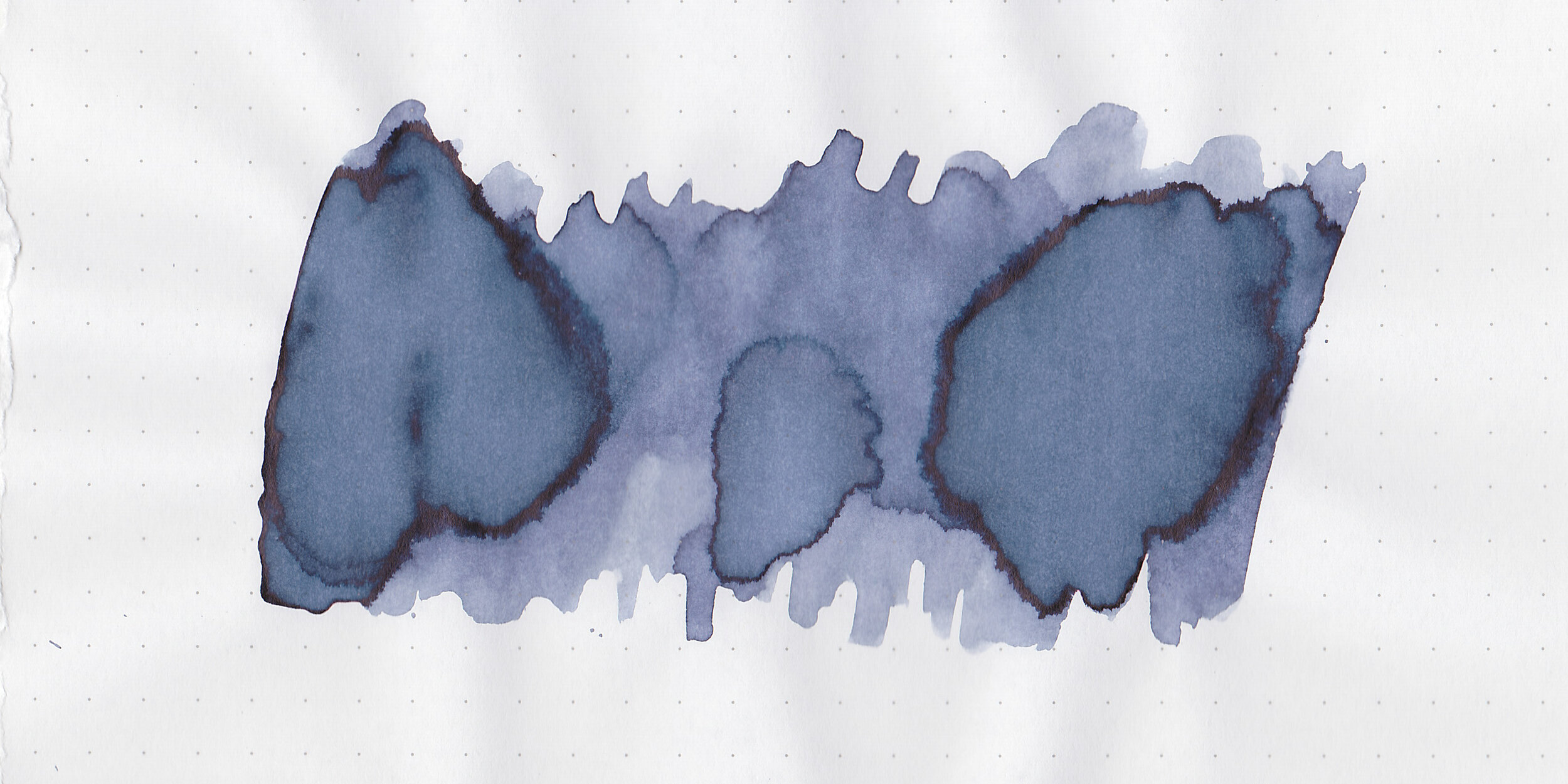
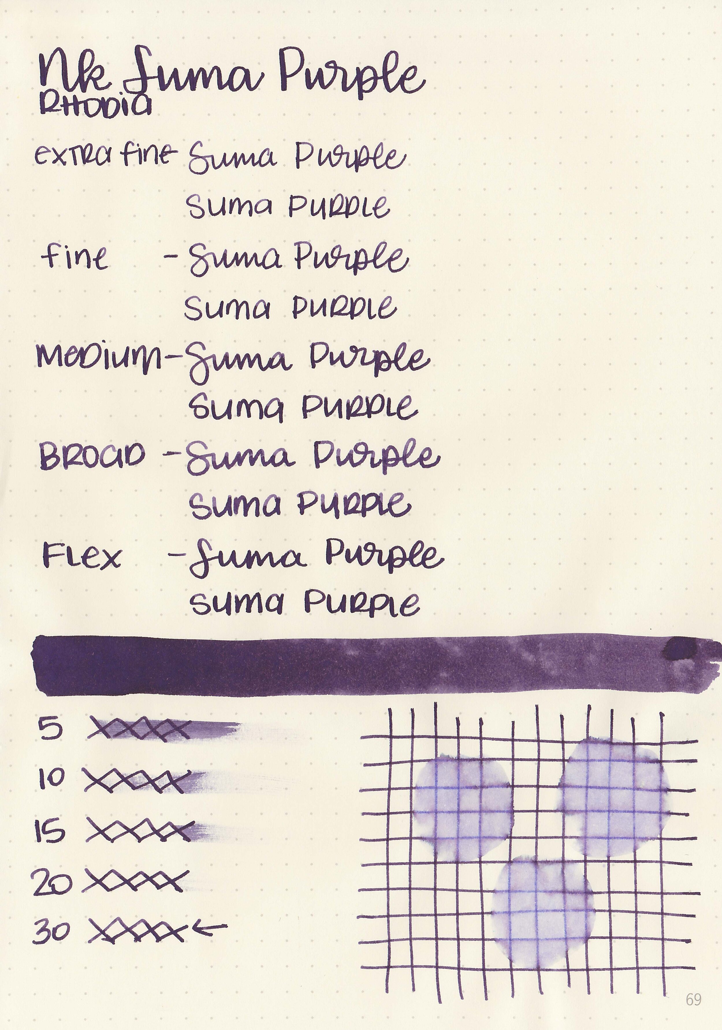
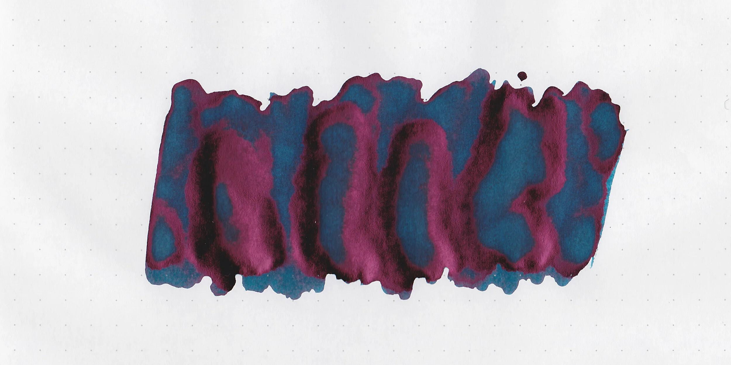
Swabs:

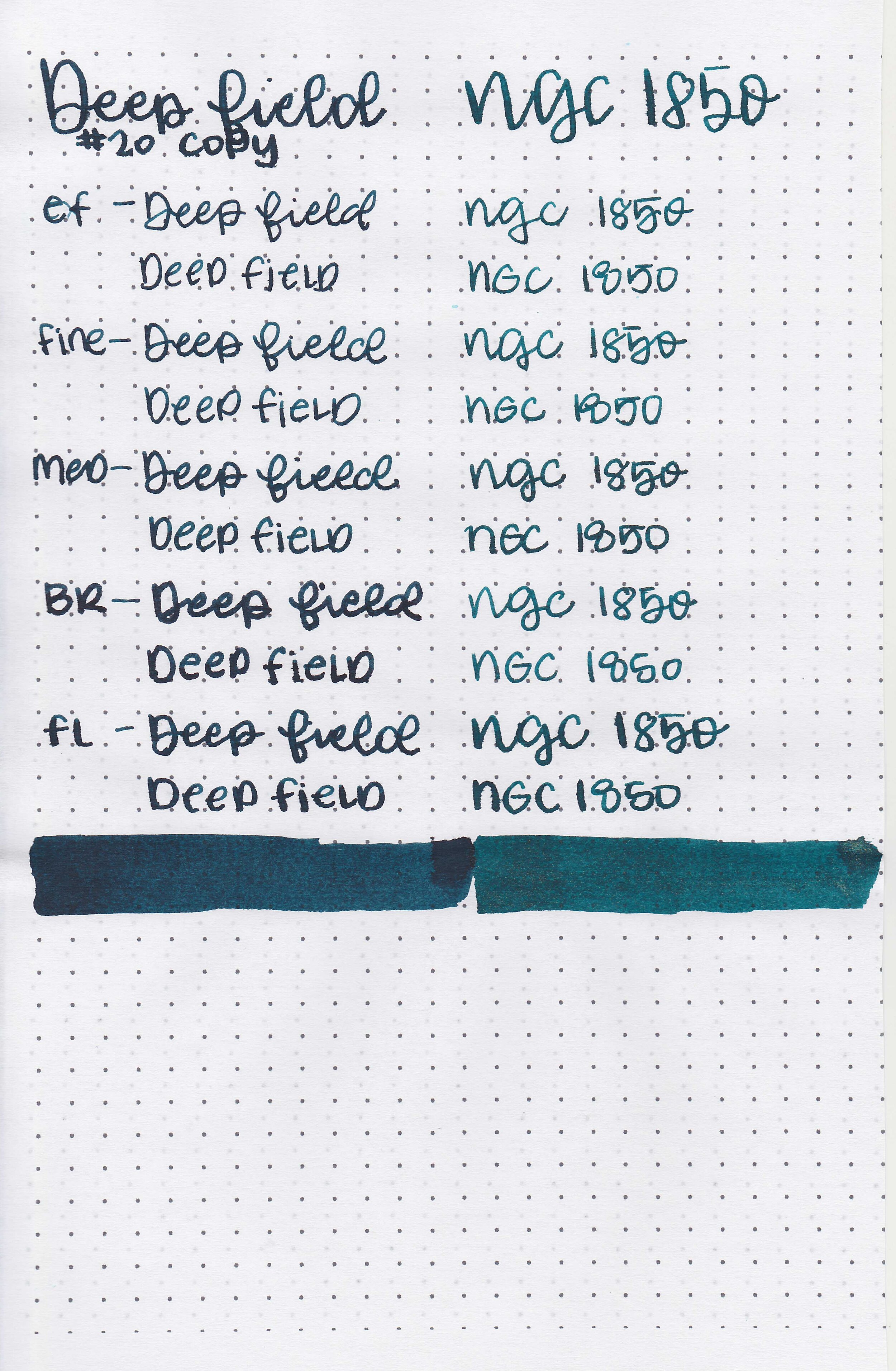
In large swabs on Tomoe River paper the ink looks less saturated.

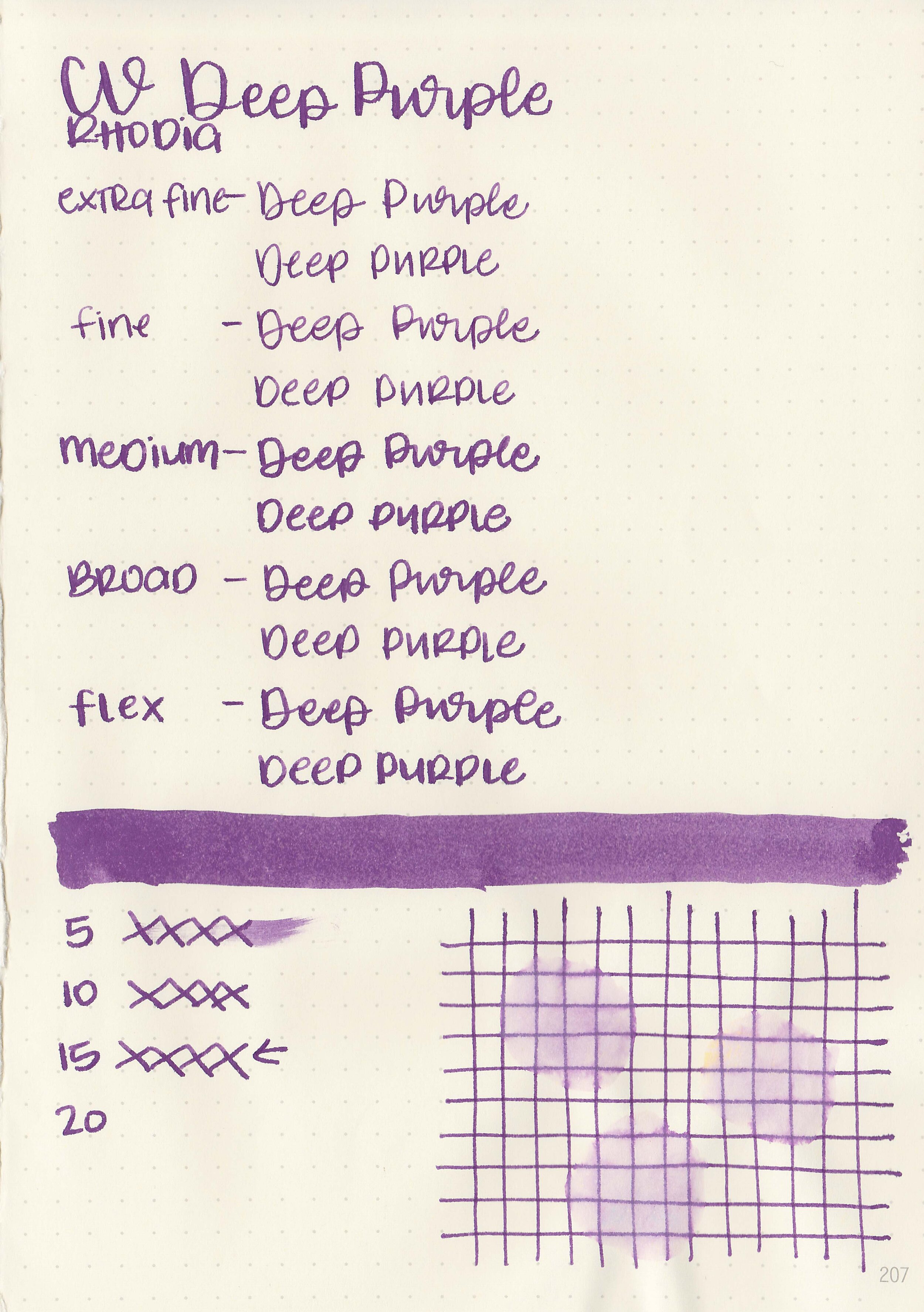
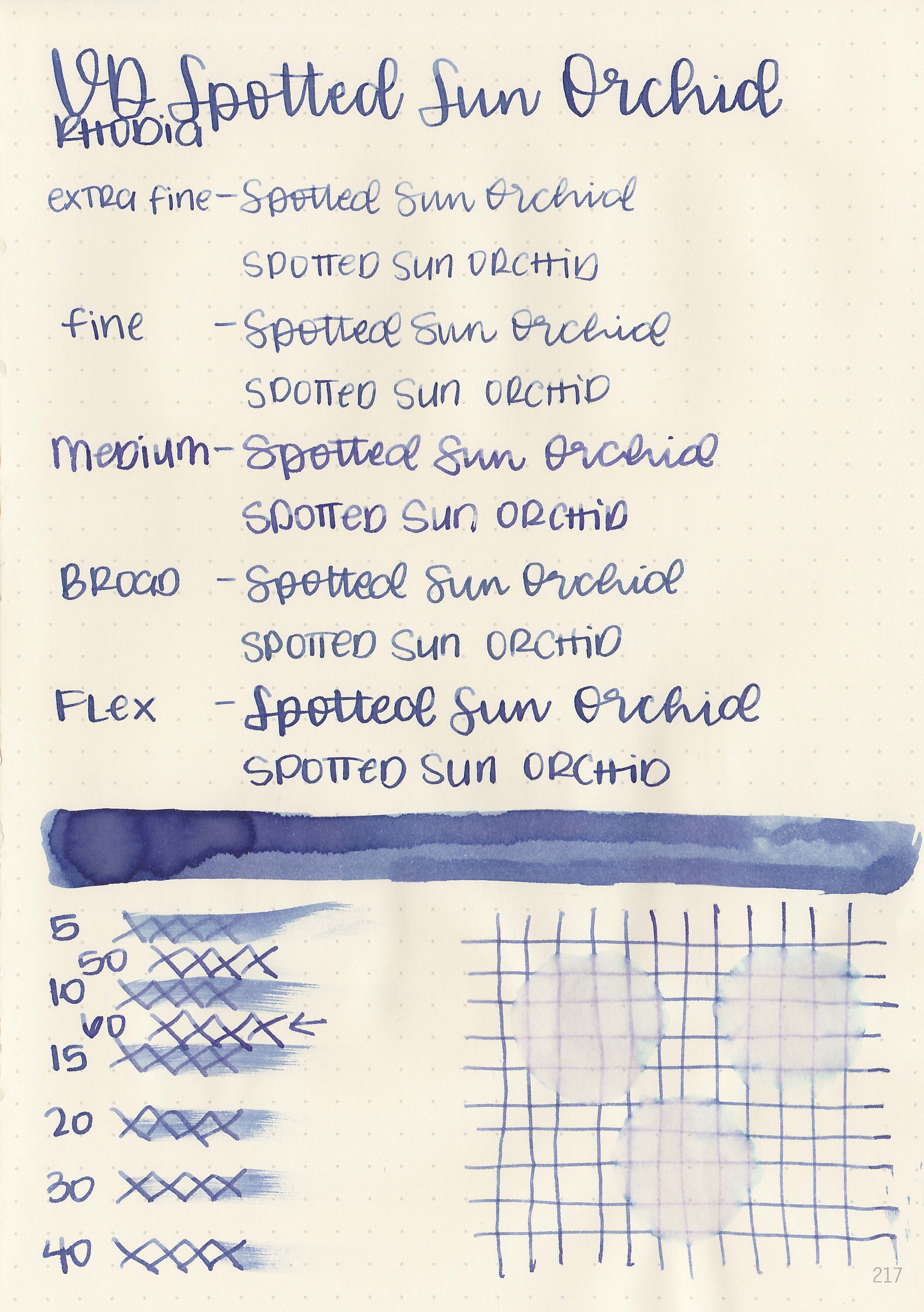
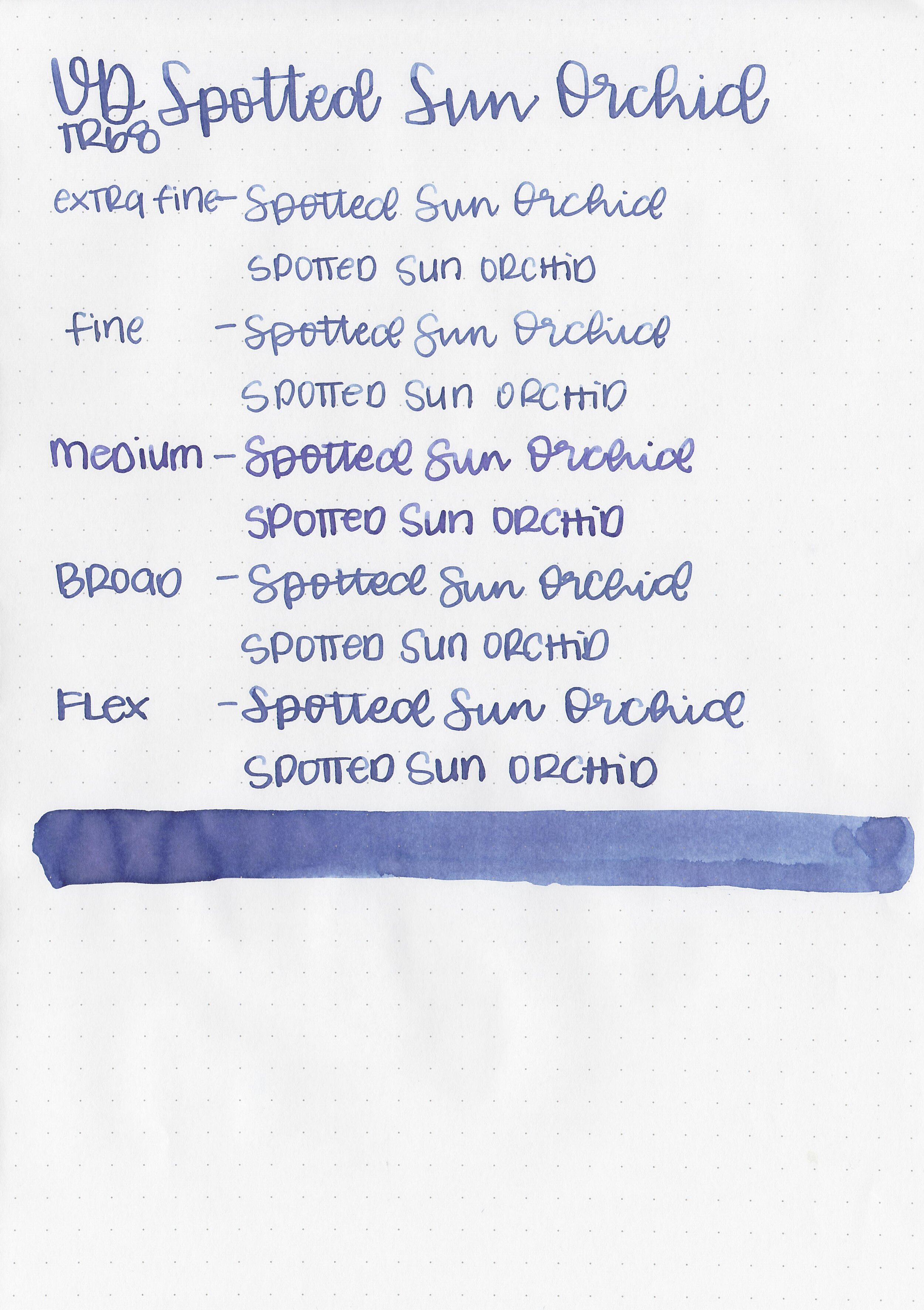
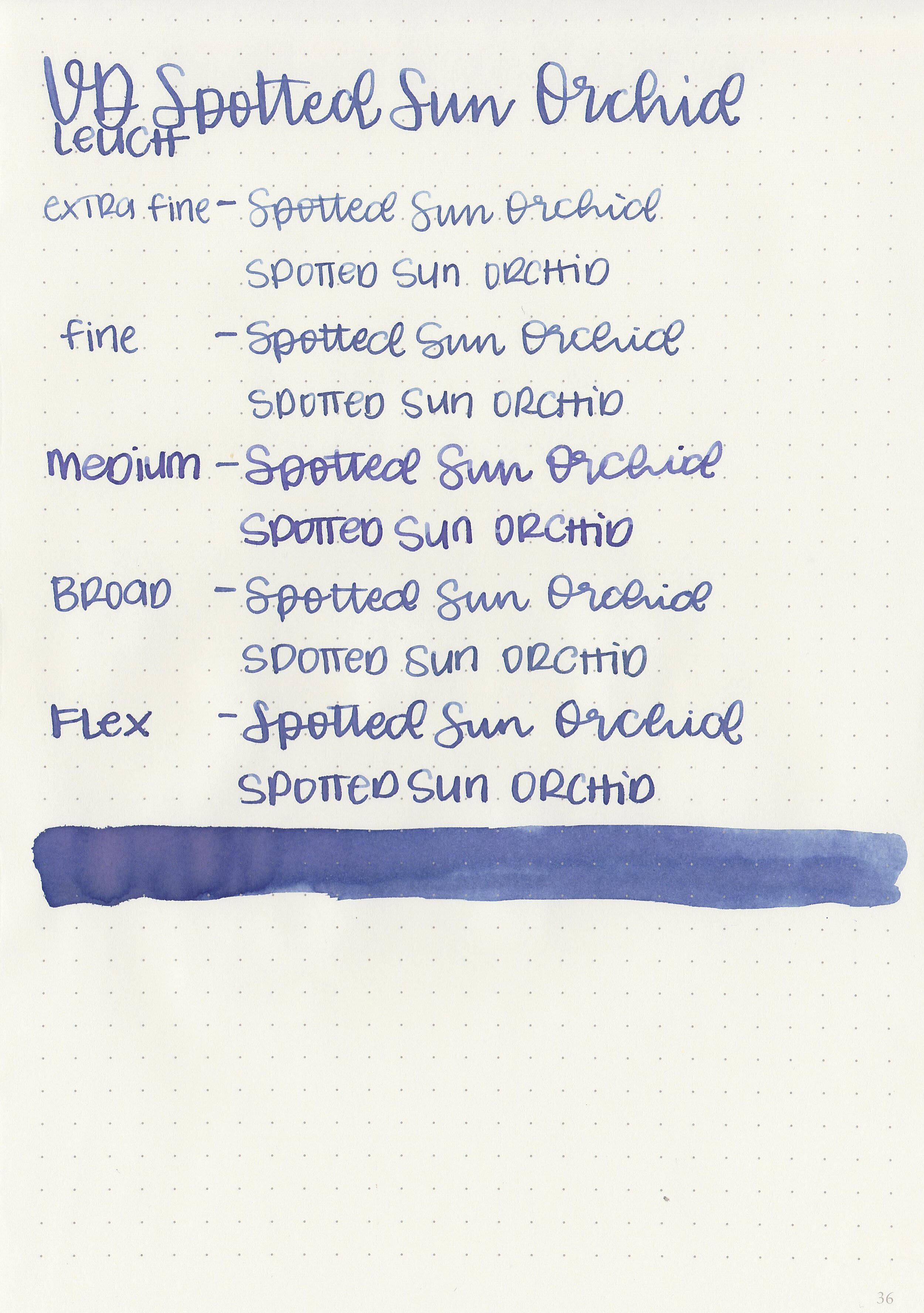
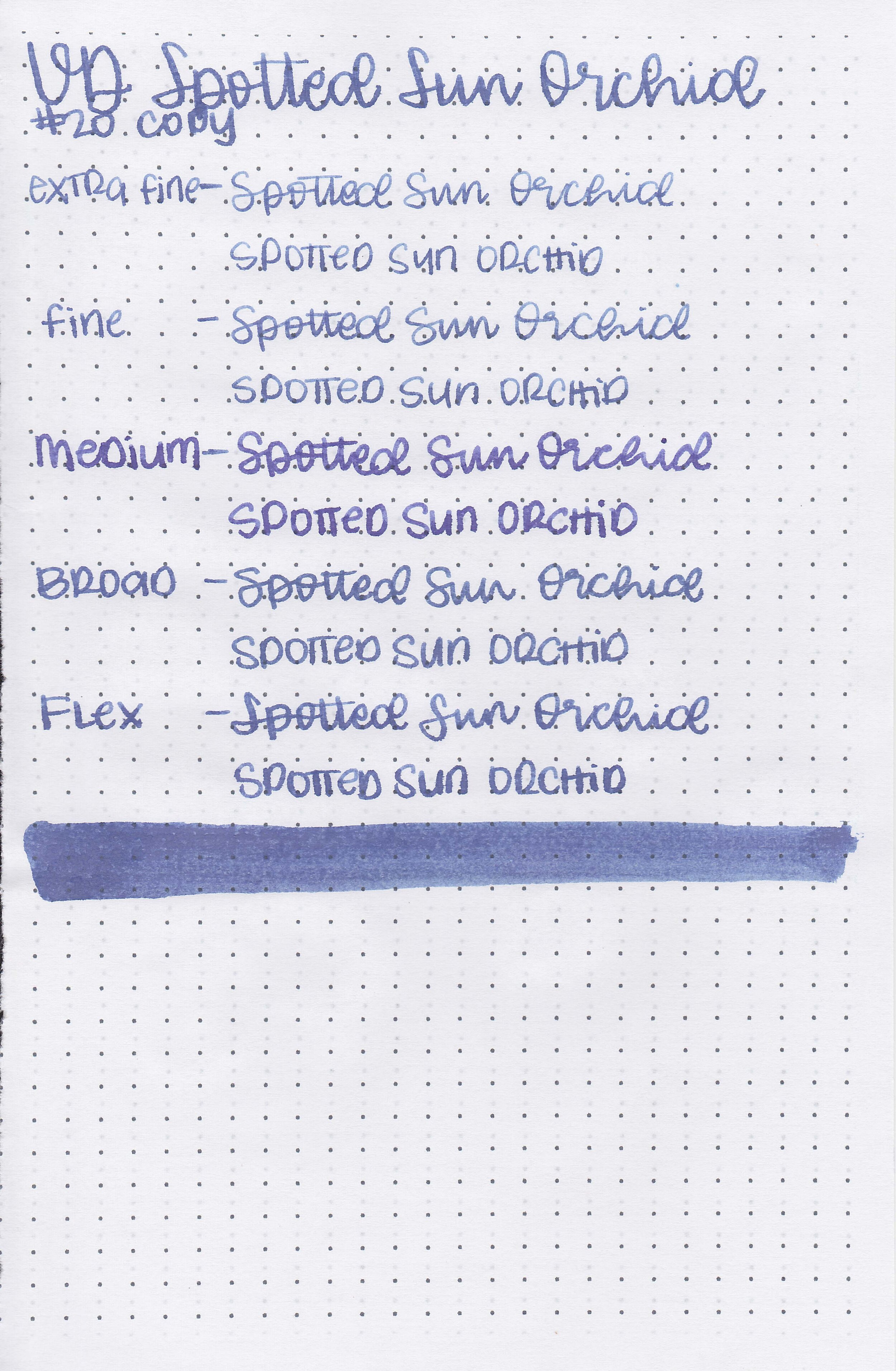
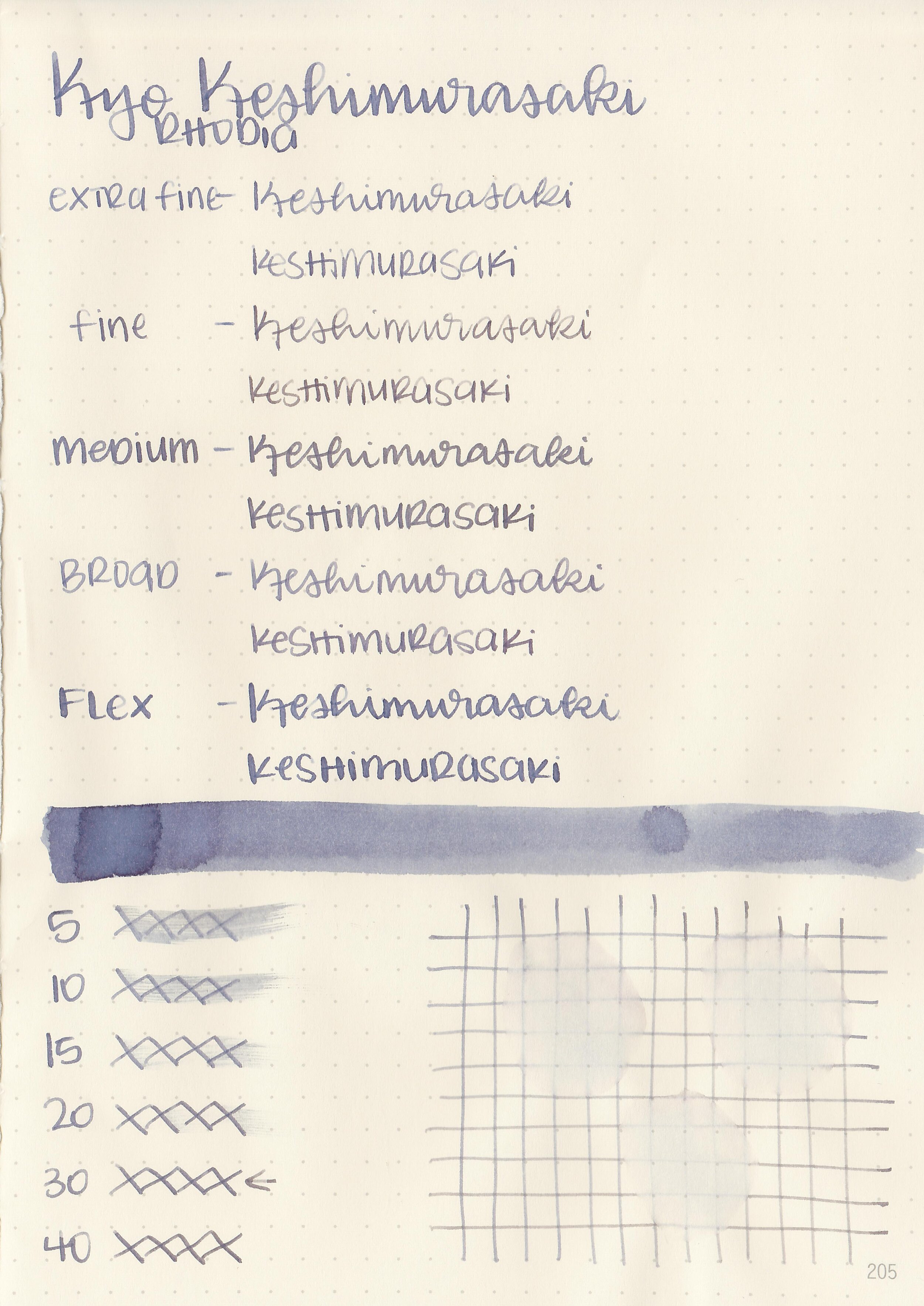
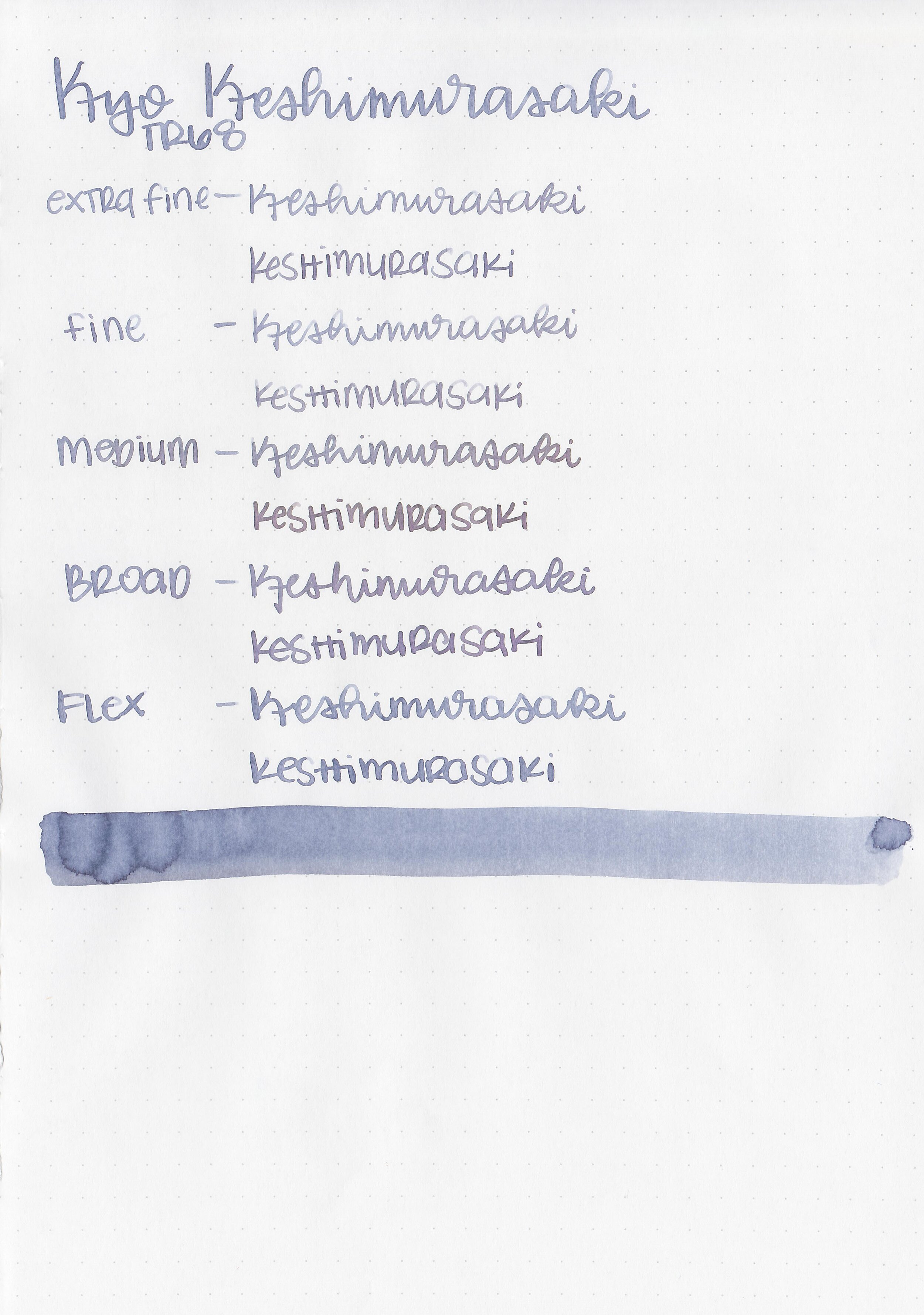
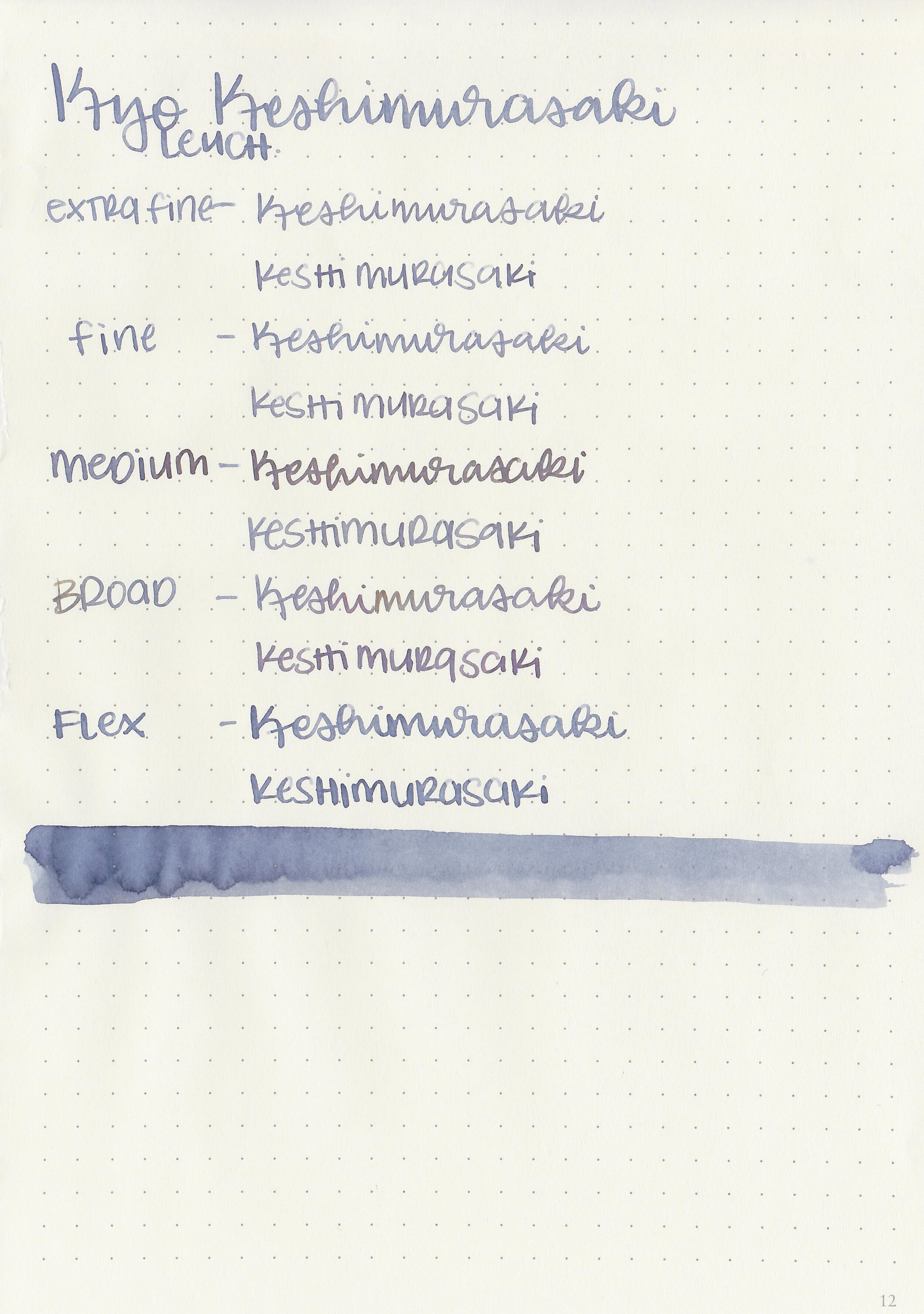
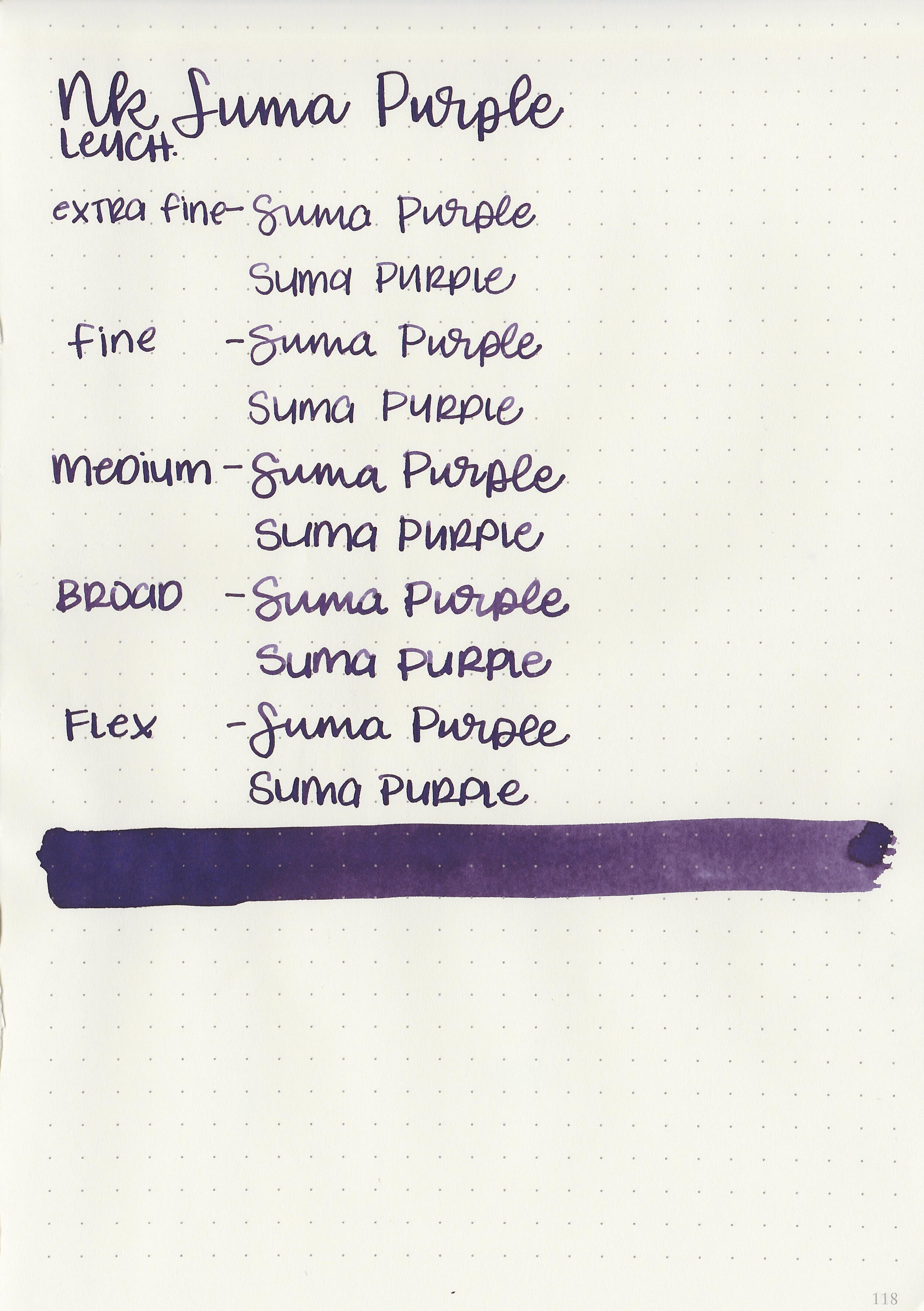
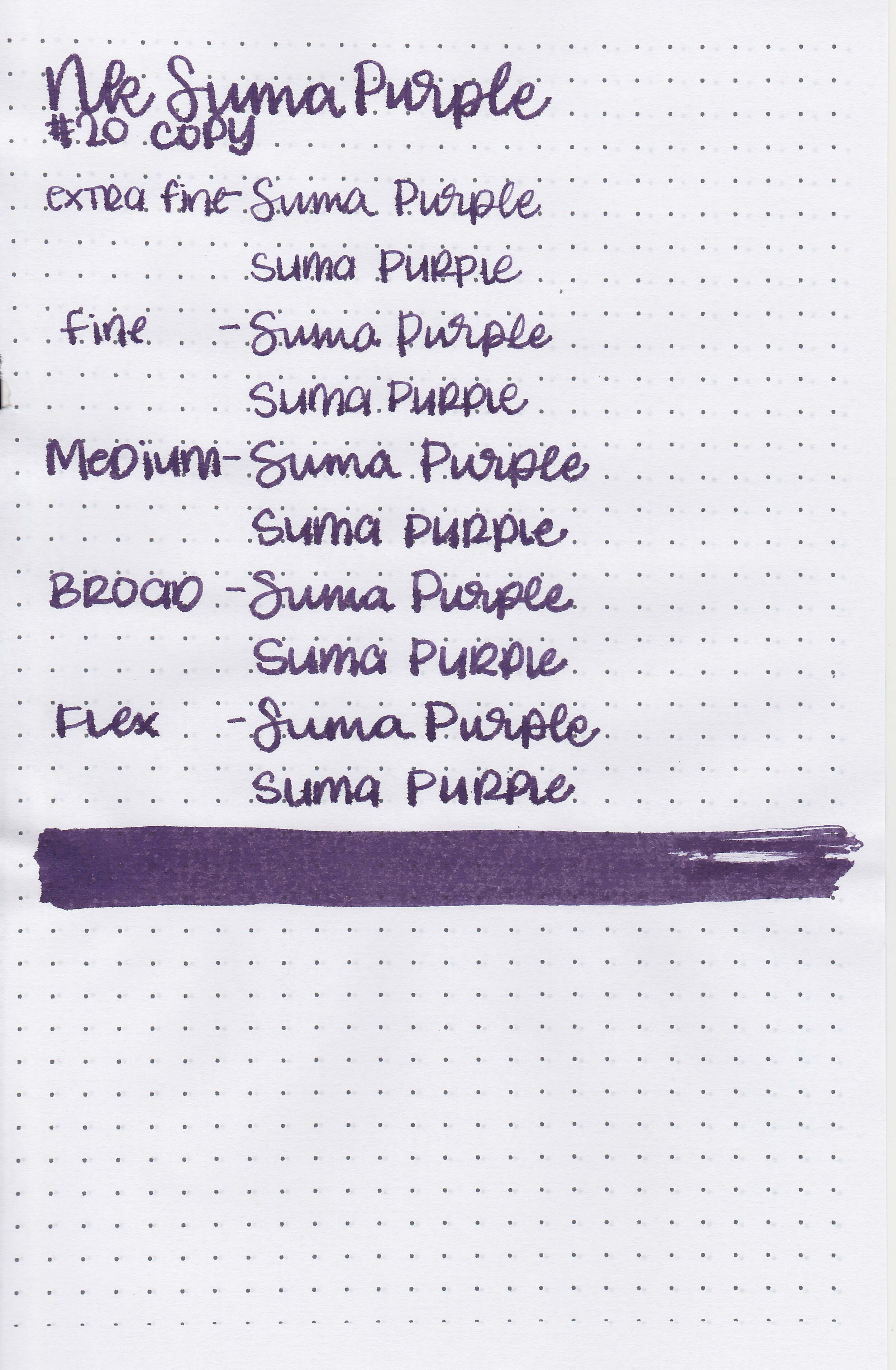
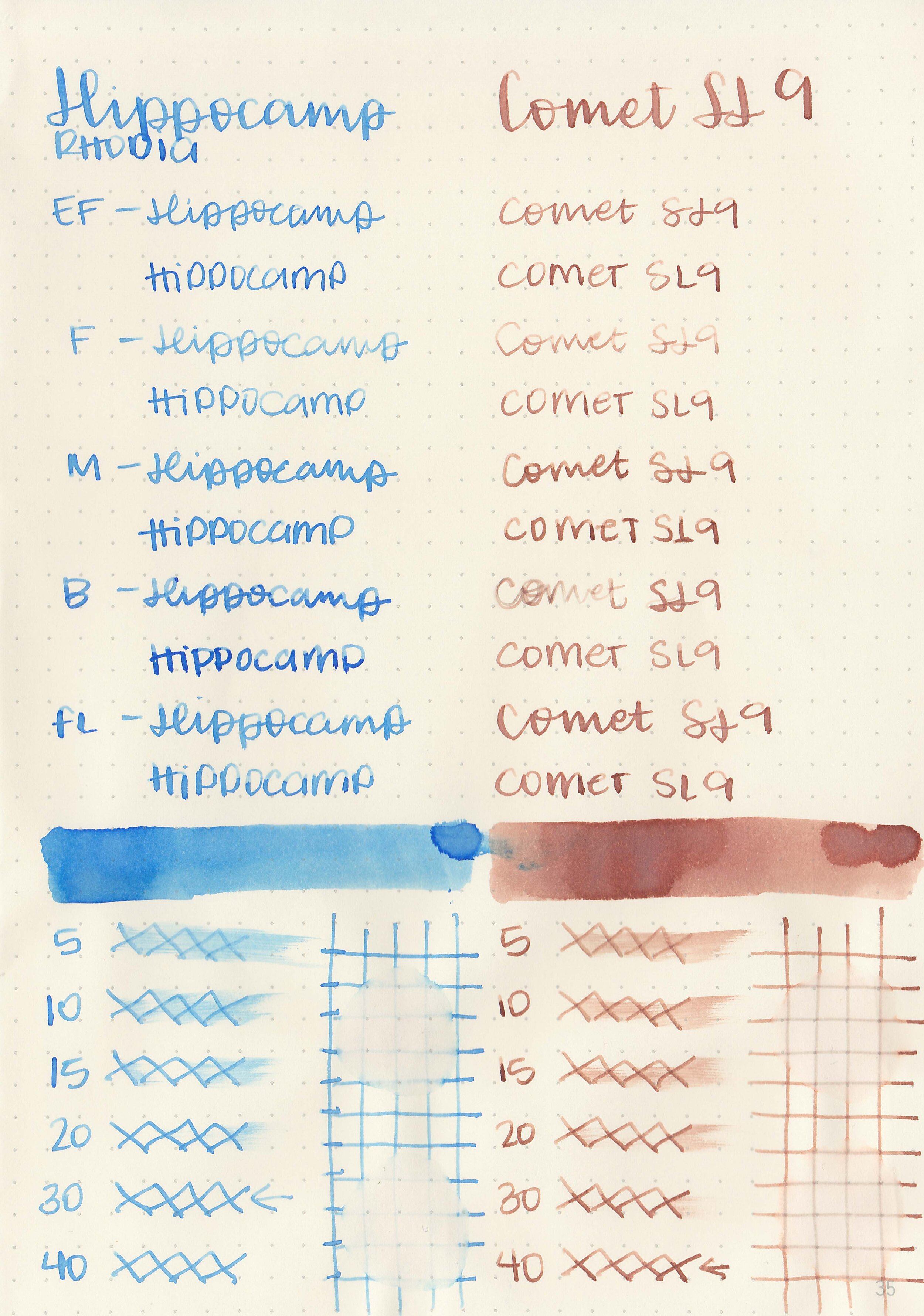
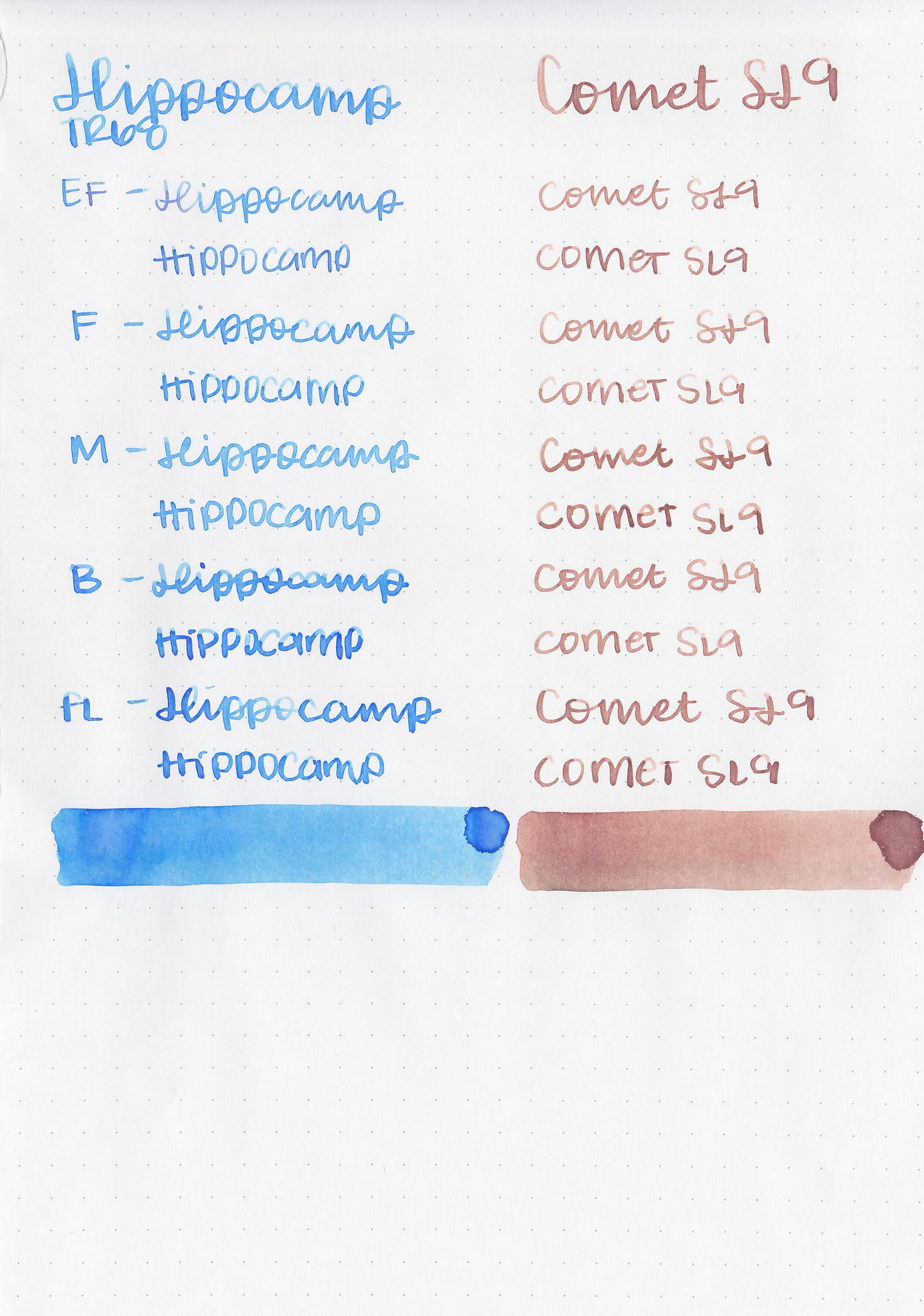
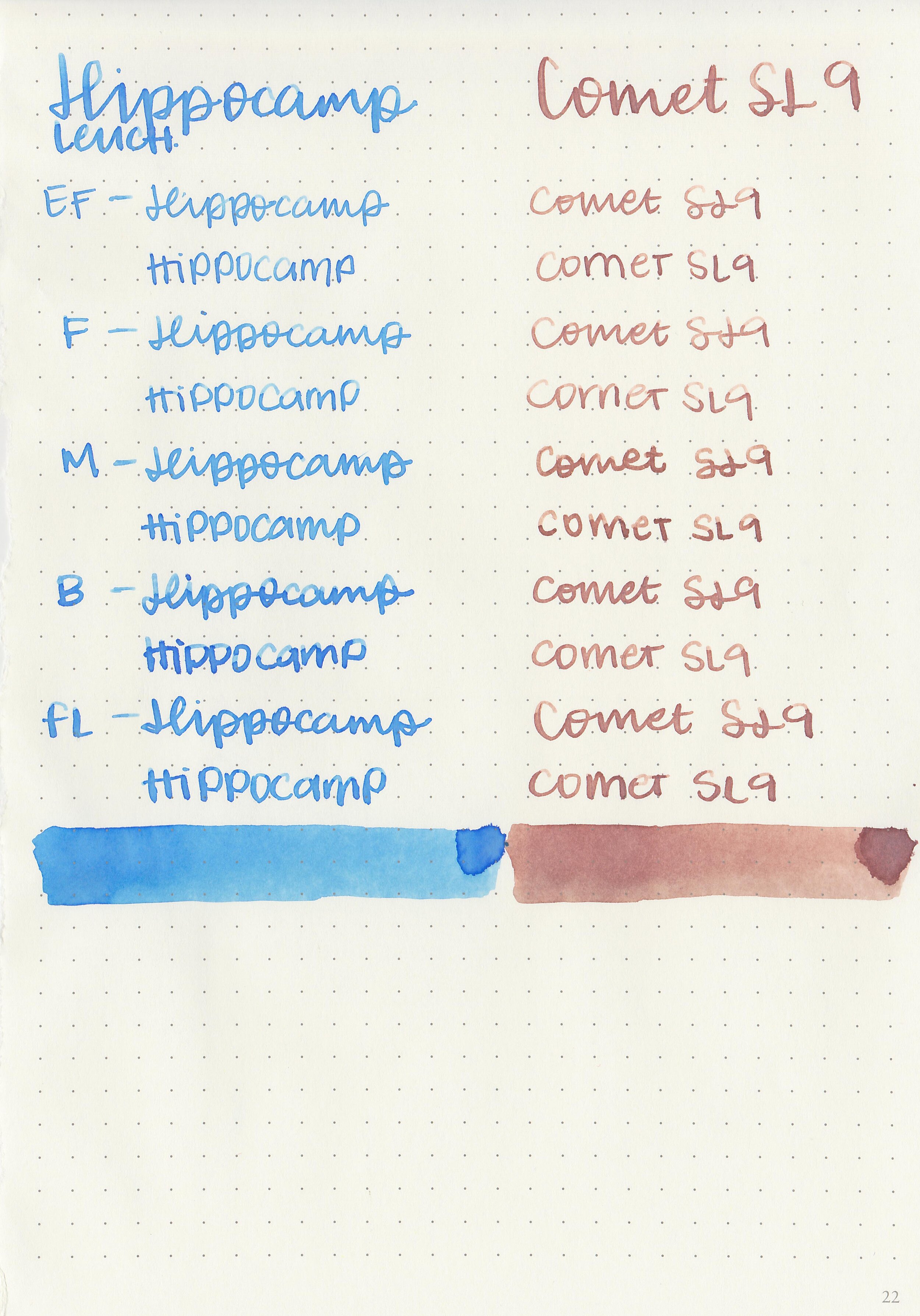
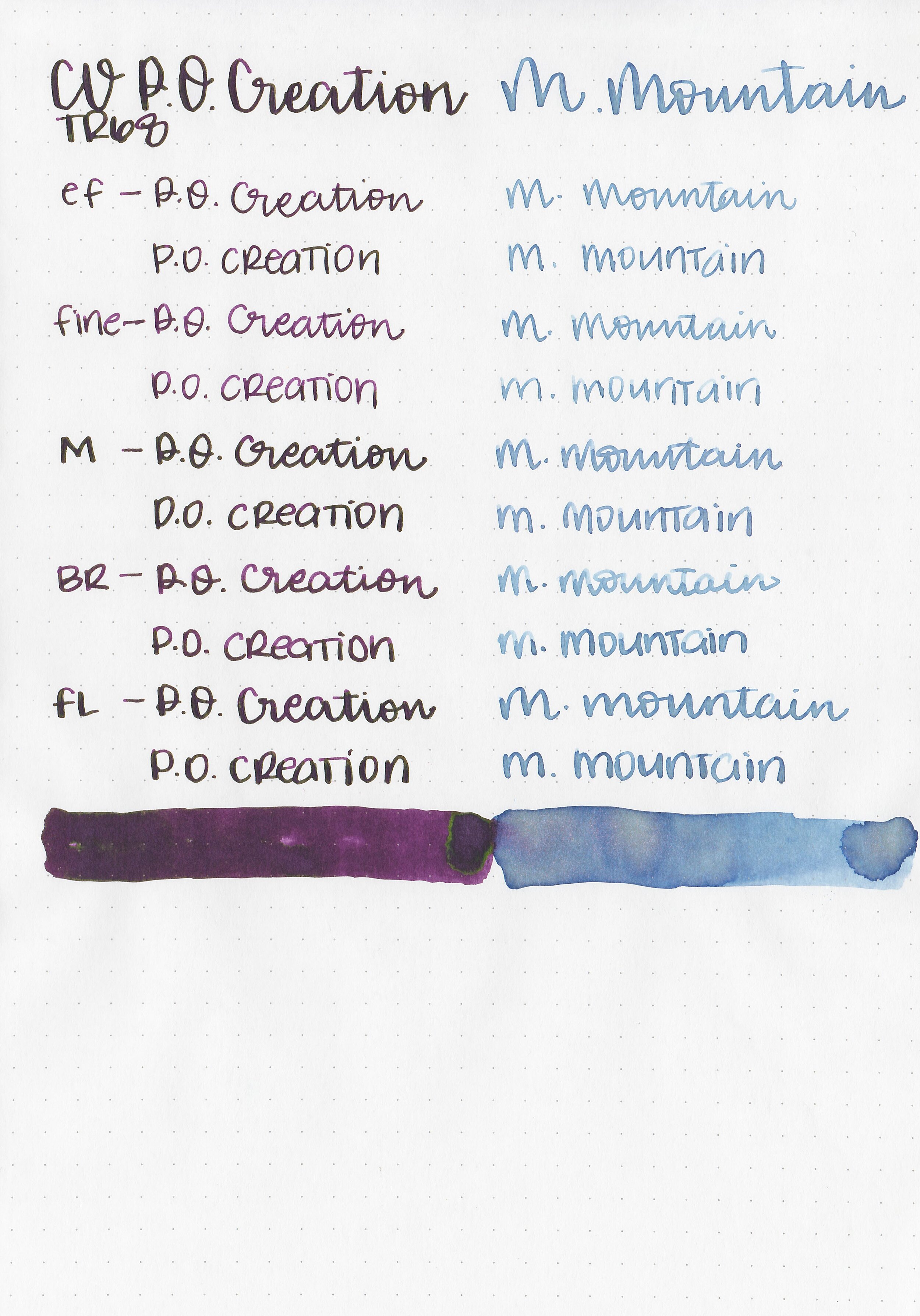
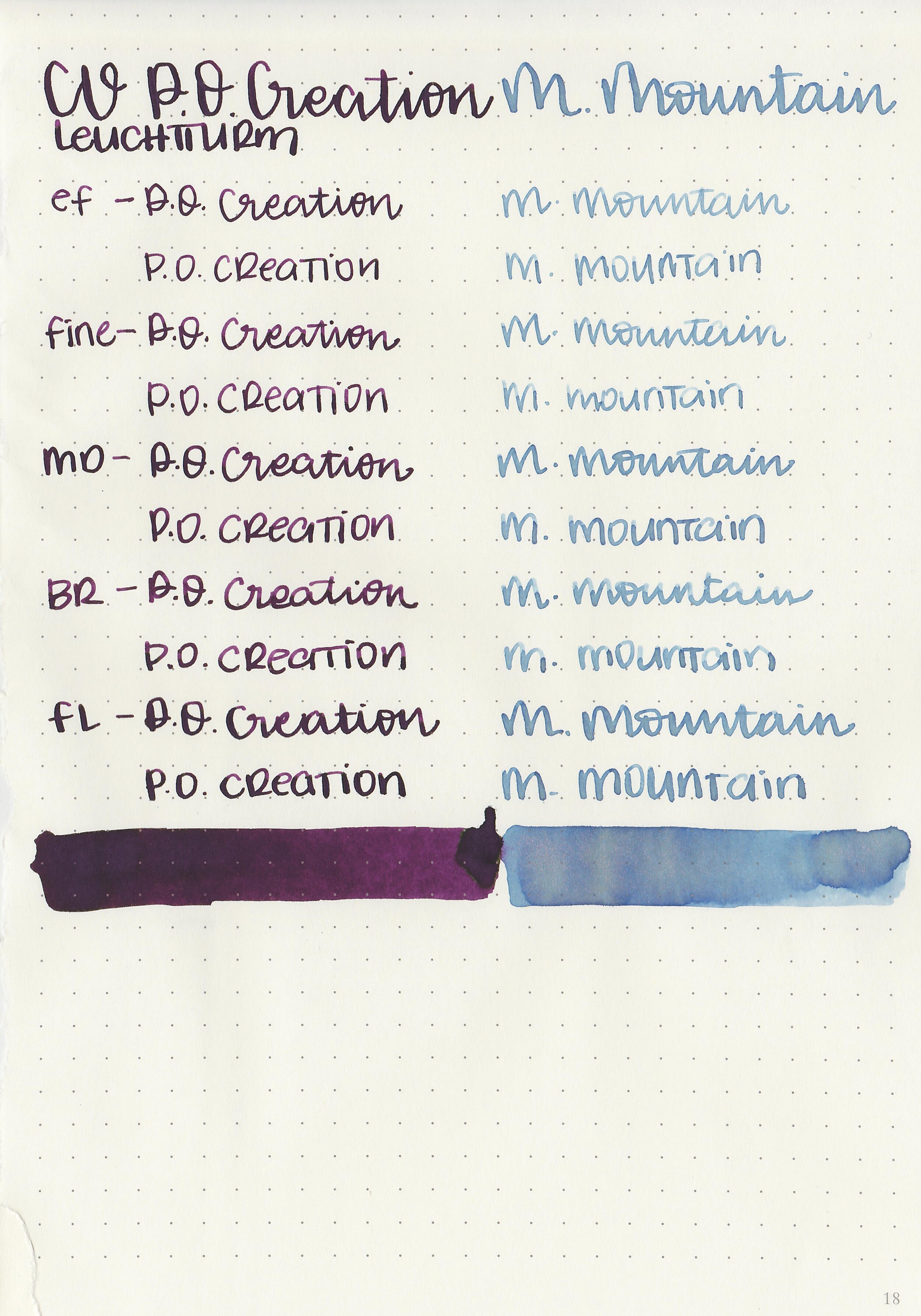
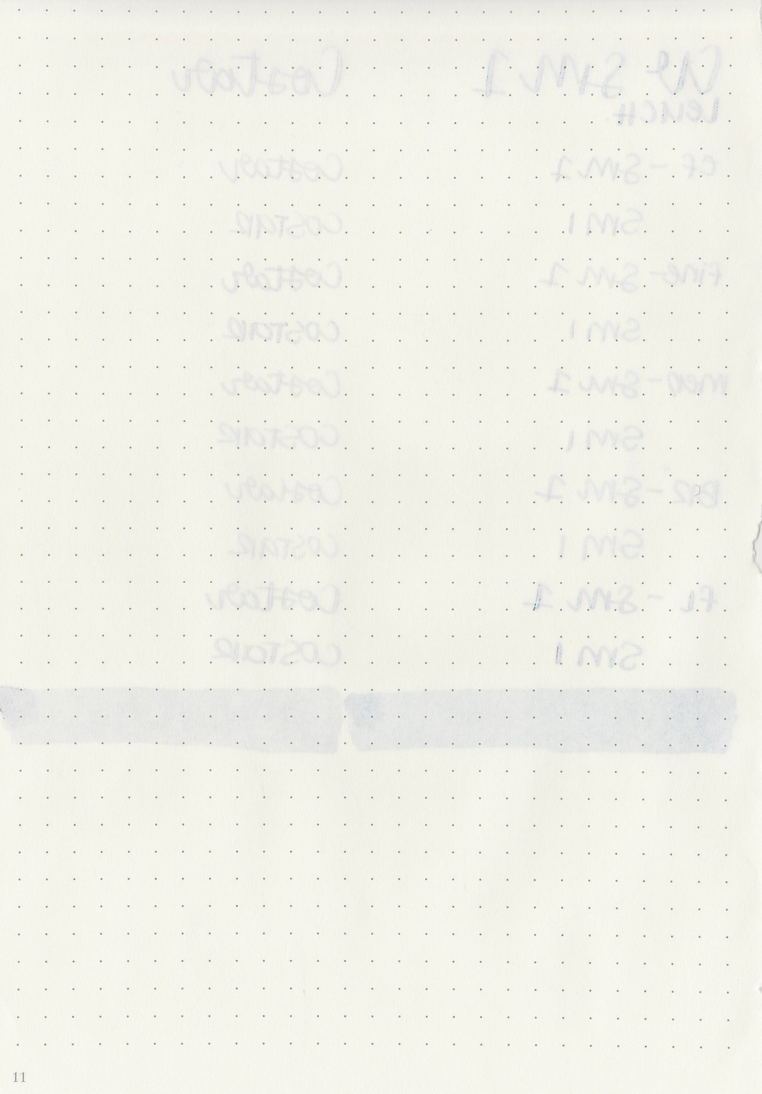
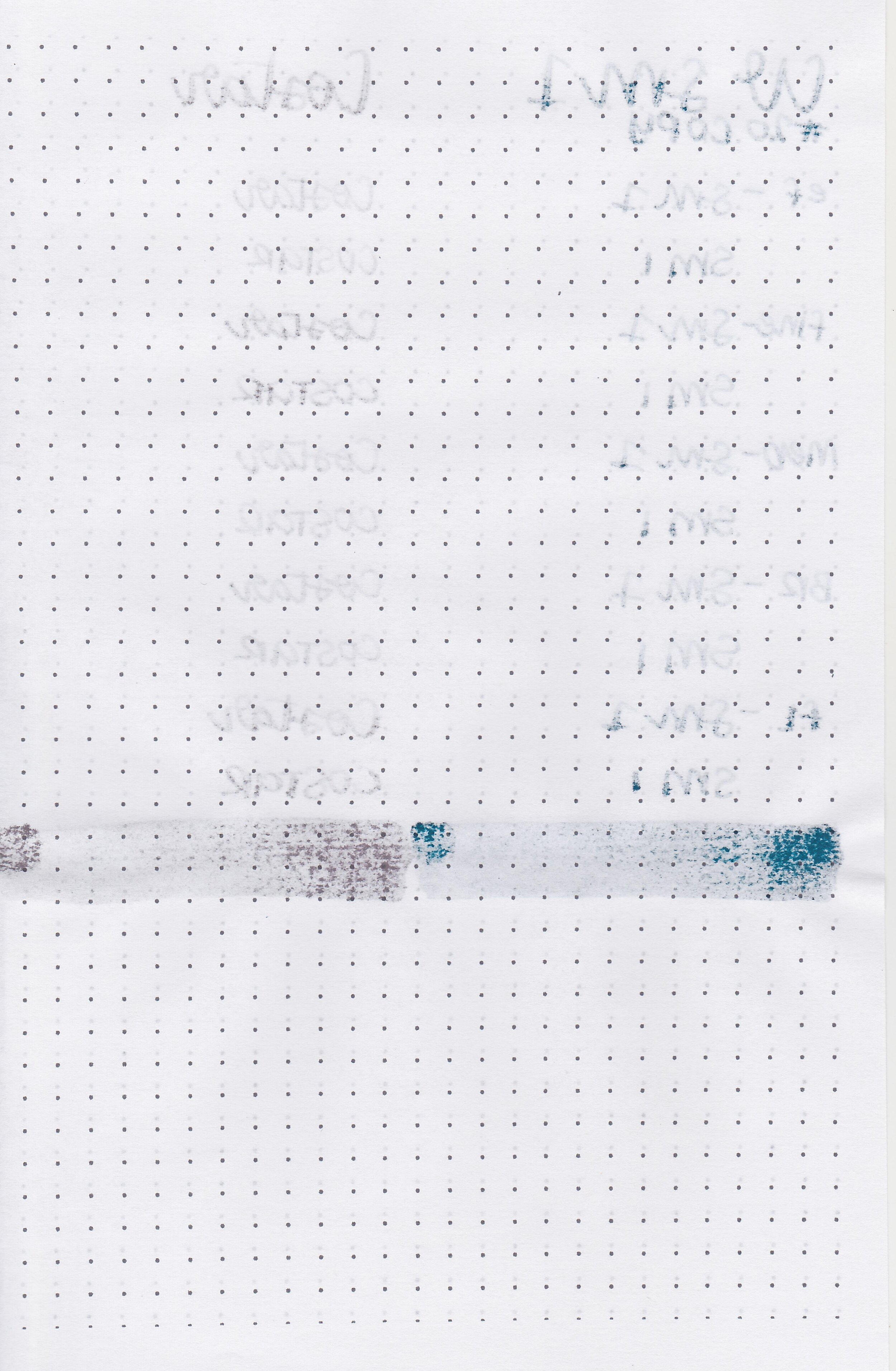
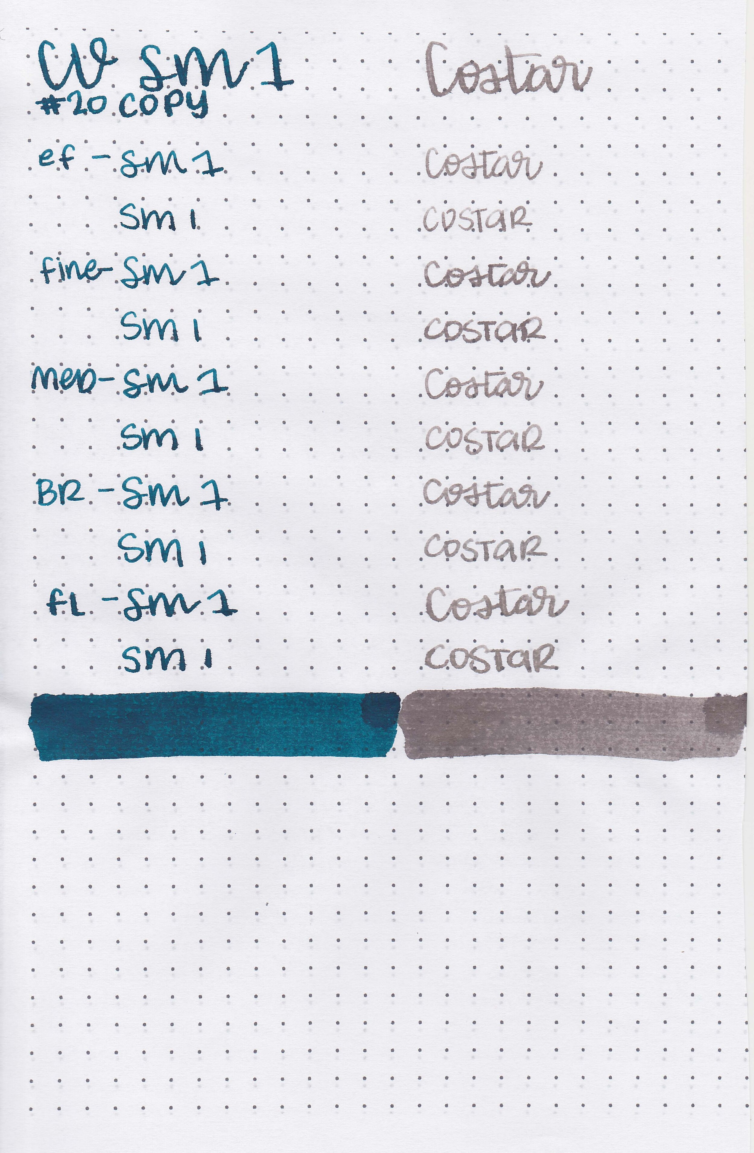
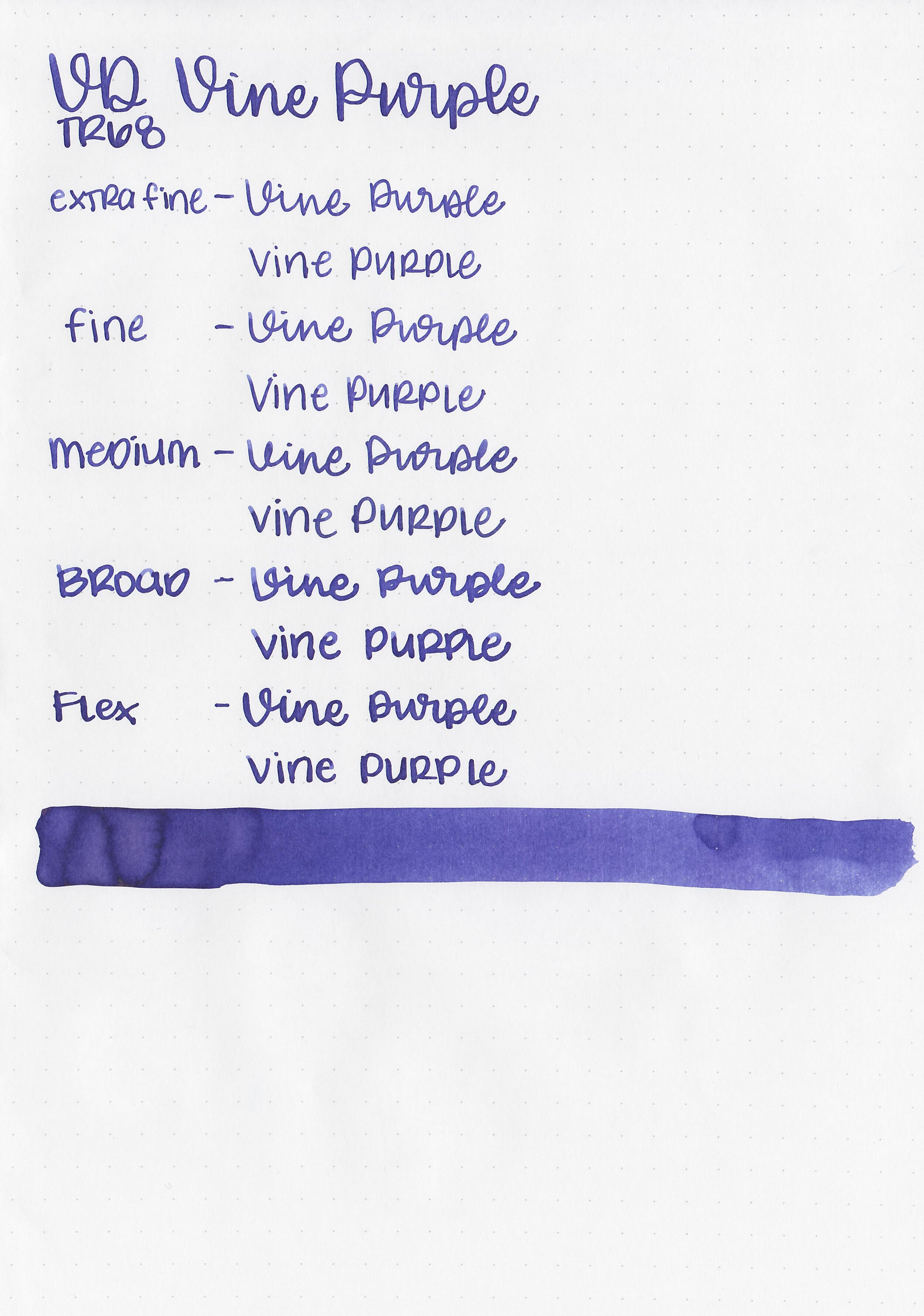
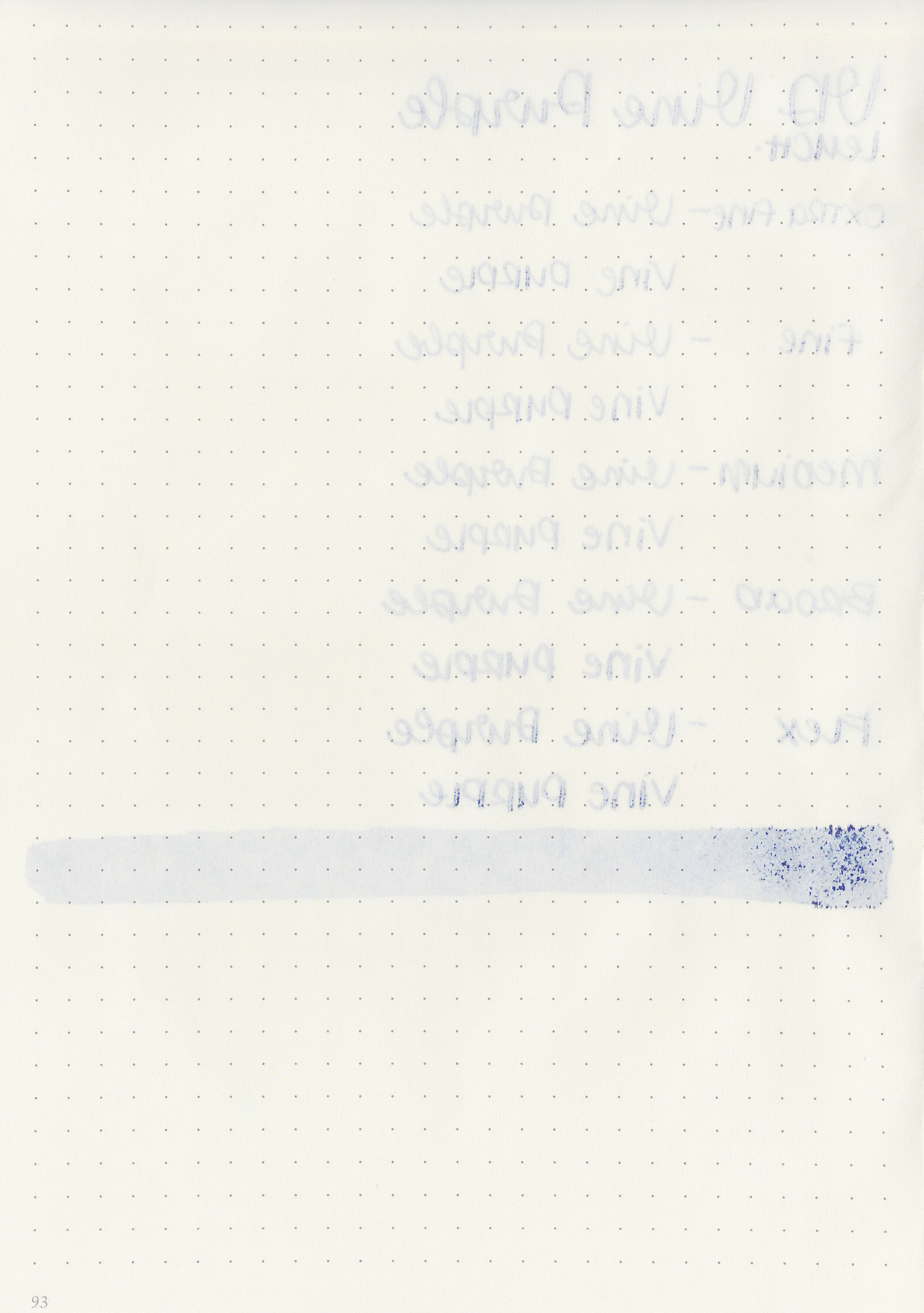
Writing samples:
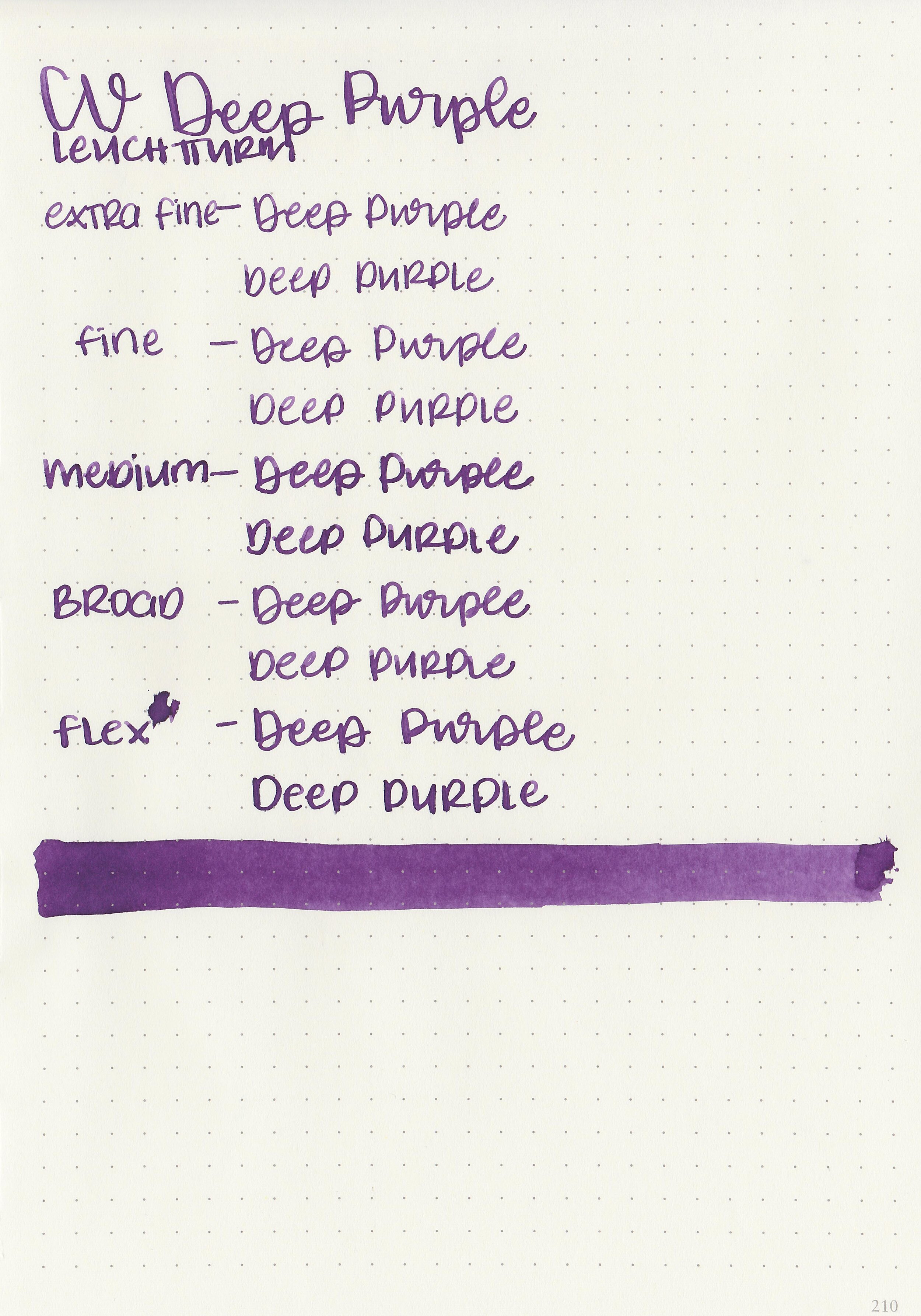
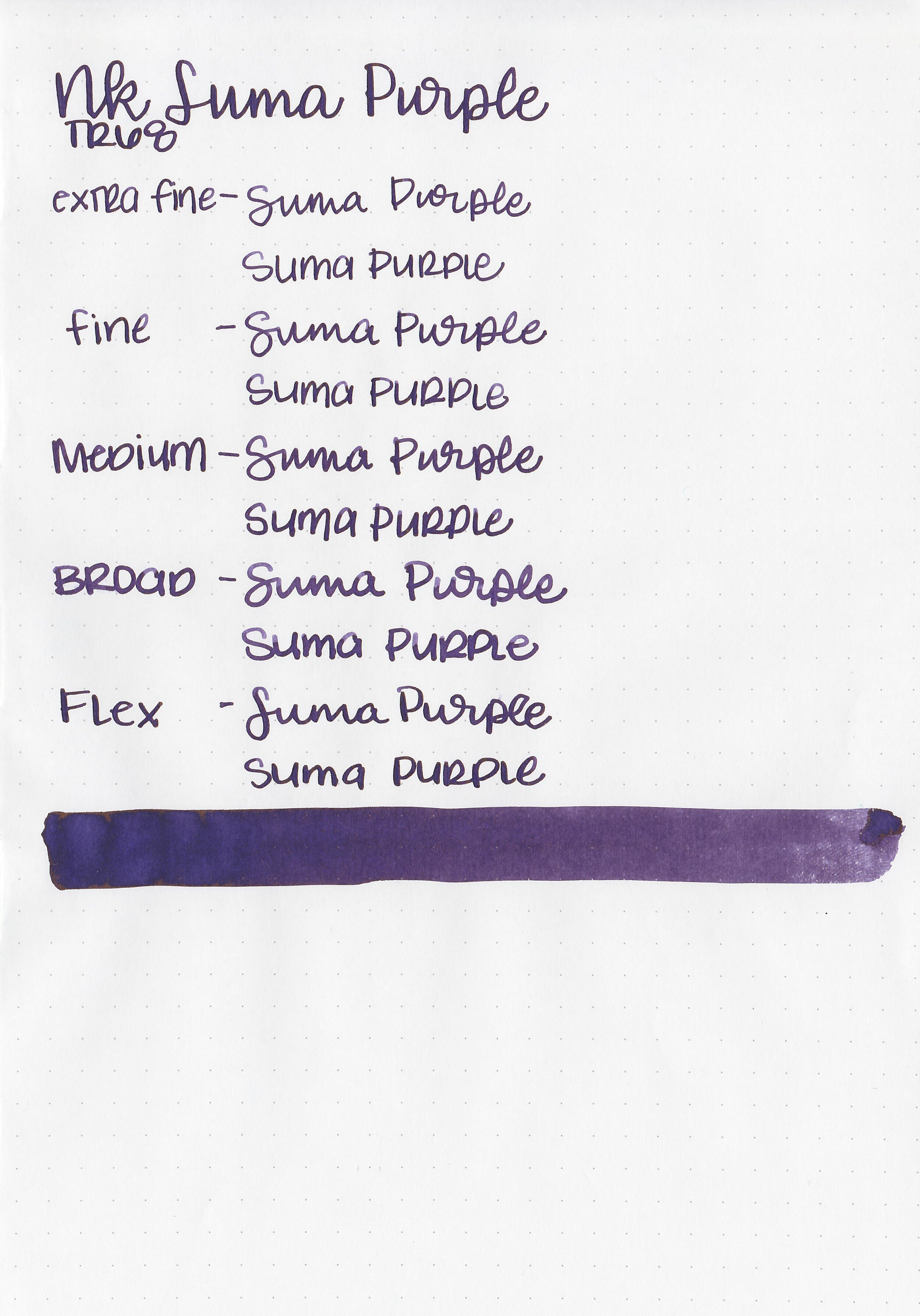
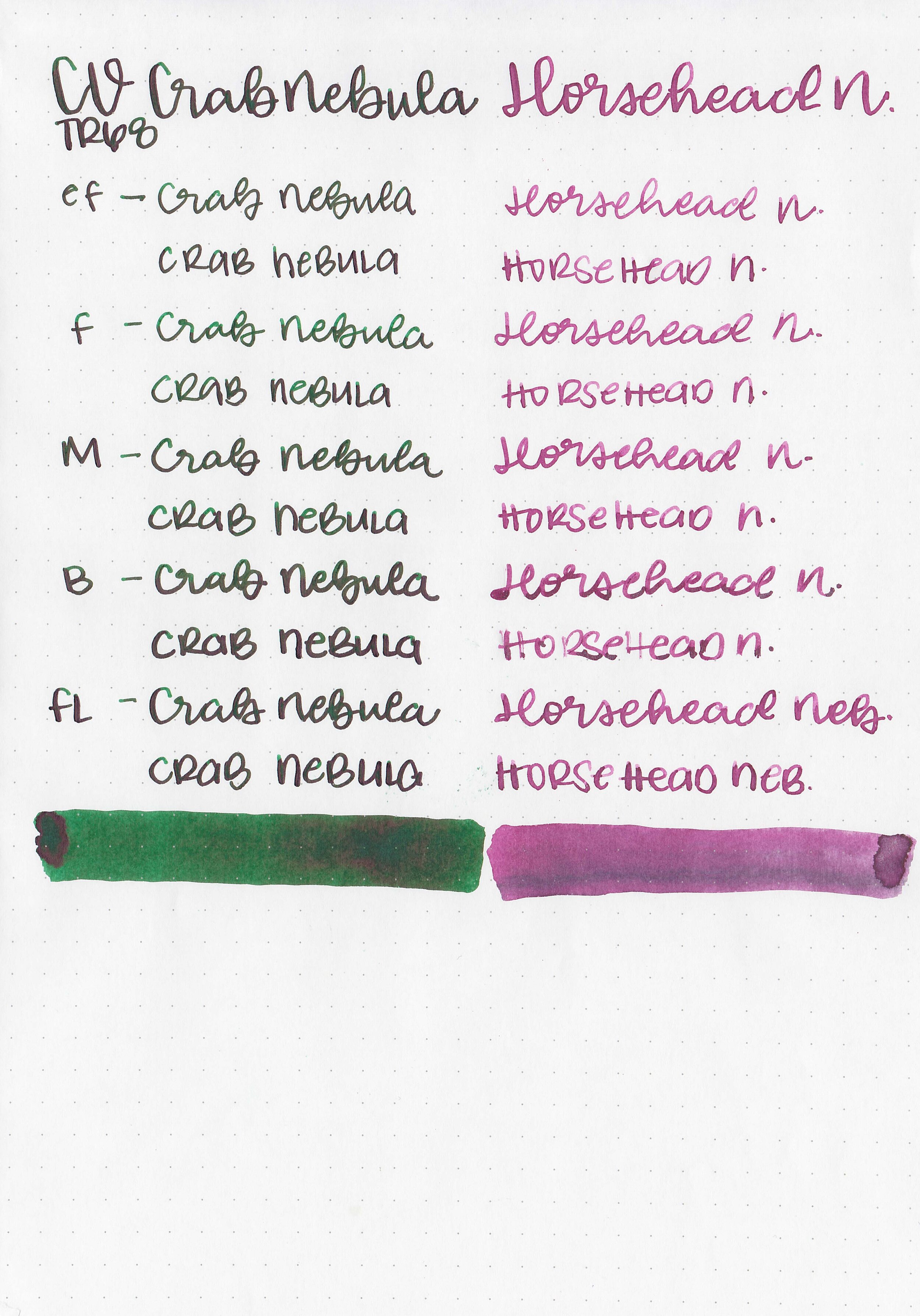
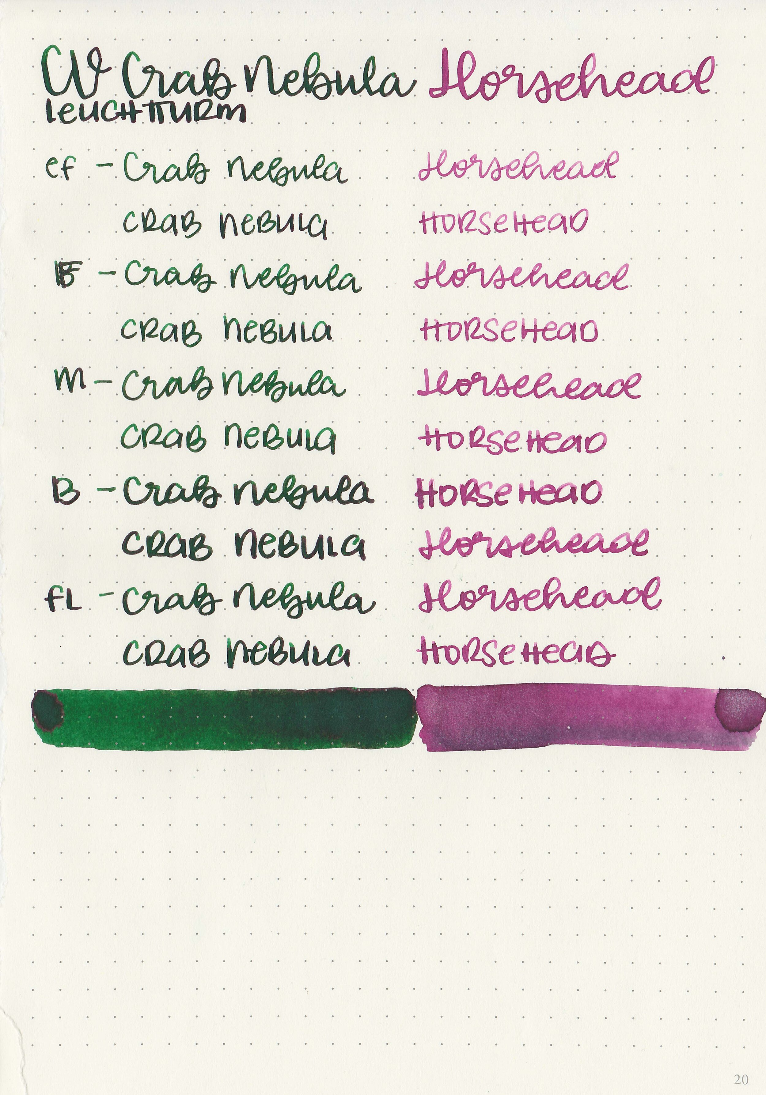
Let's take a look at how the ink behaves on fountain pen friendly papers: Rhodia, Tomoe River, and Leuchtturm.
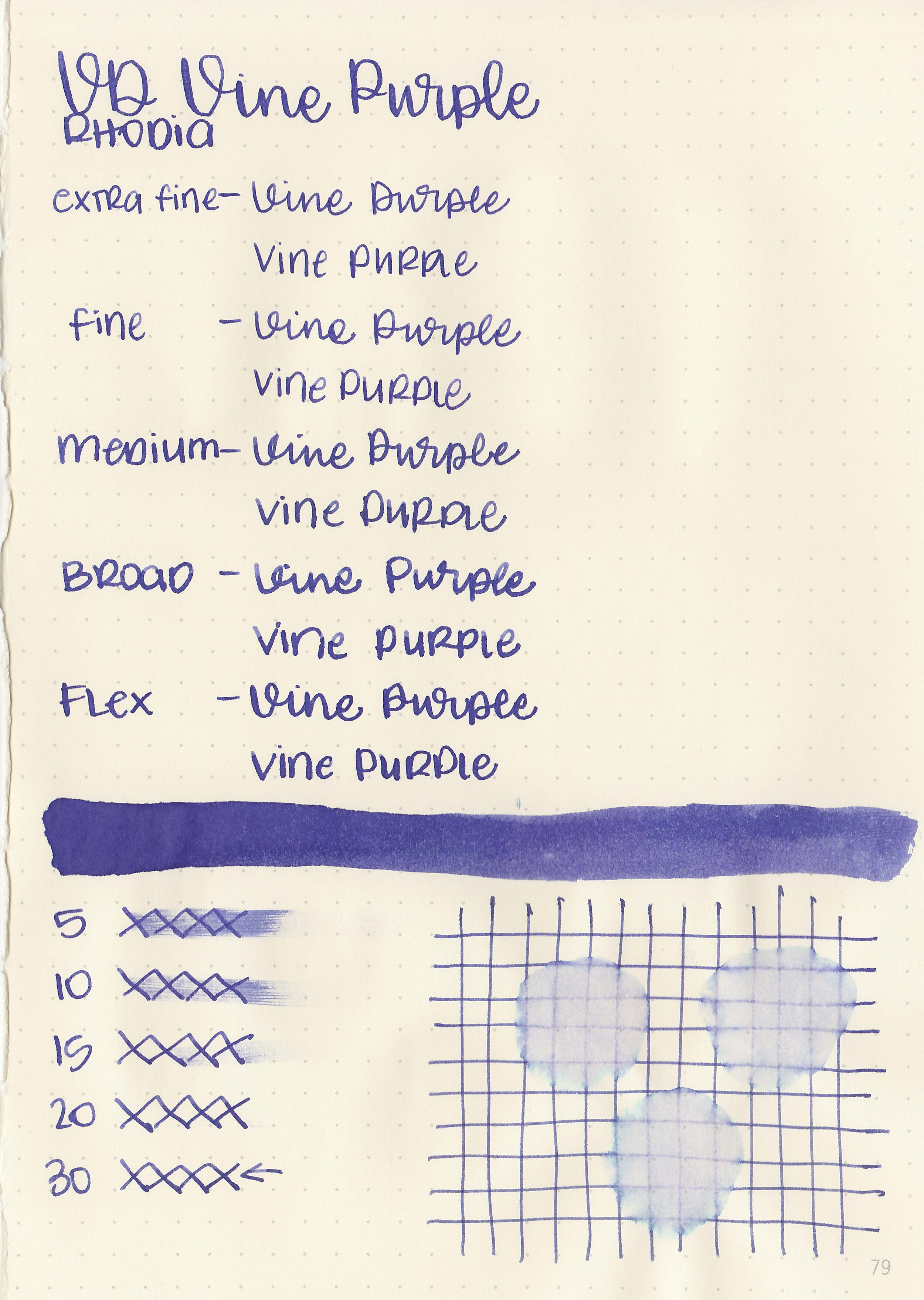
Dry time: 30 seconds
Water resistance: Medium
Feathering: Medium
Show through: Medium
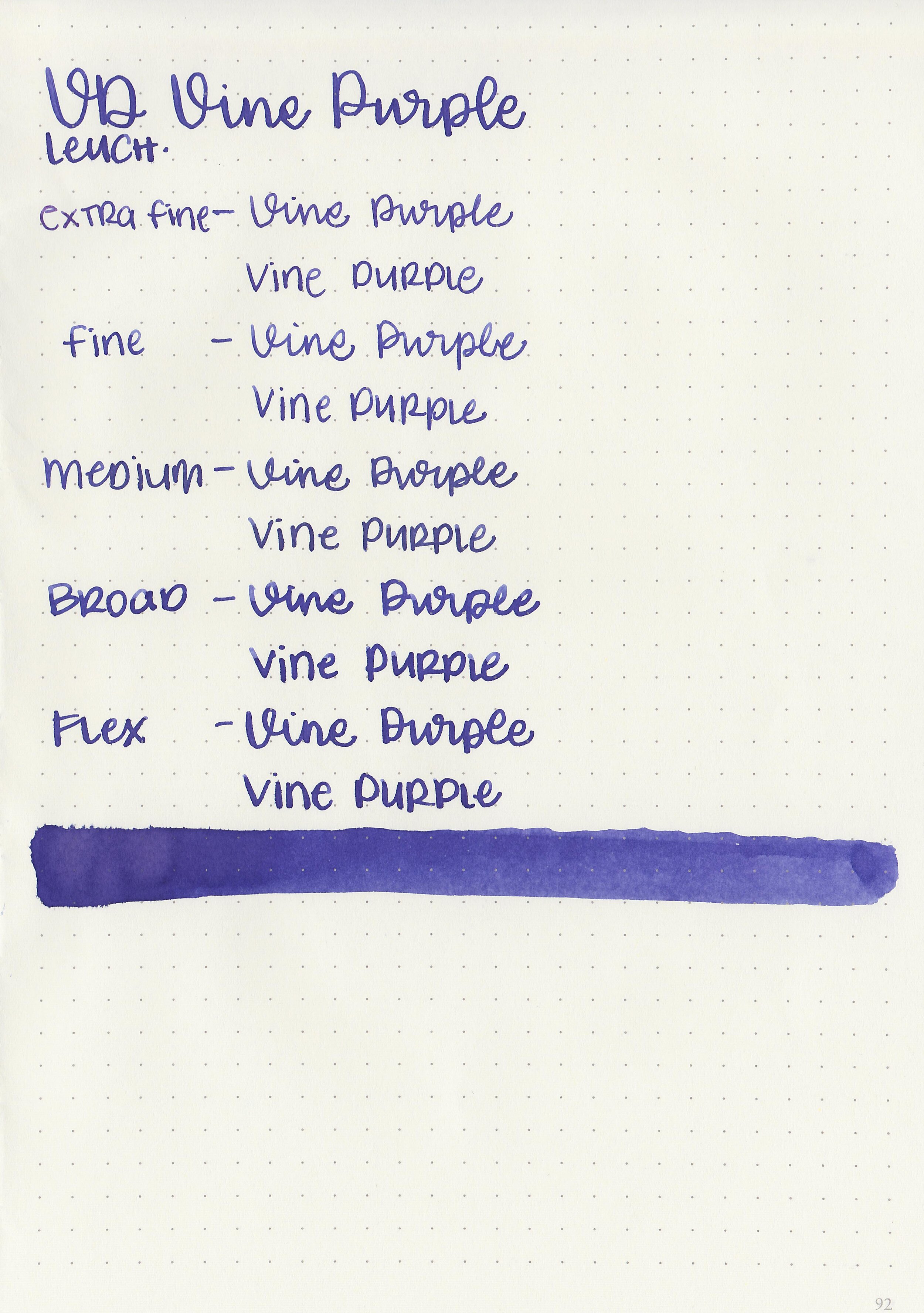
Bleeding: Low
Other properties: no shading, no sheen, and no shimmer.
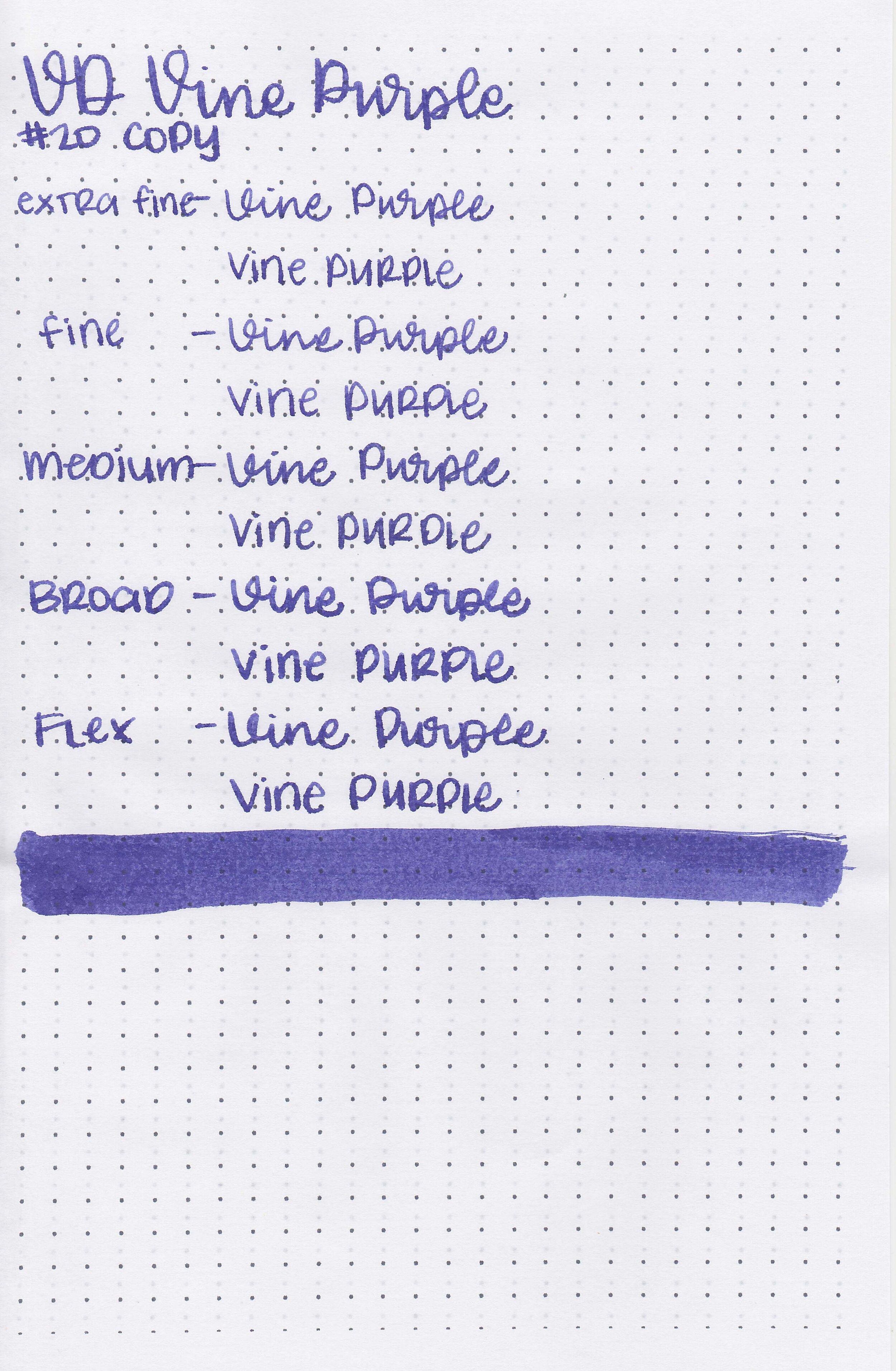
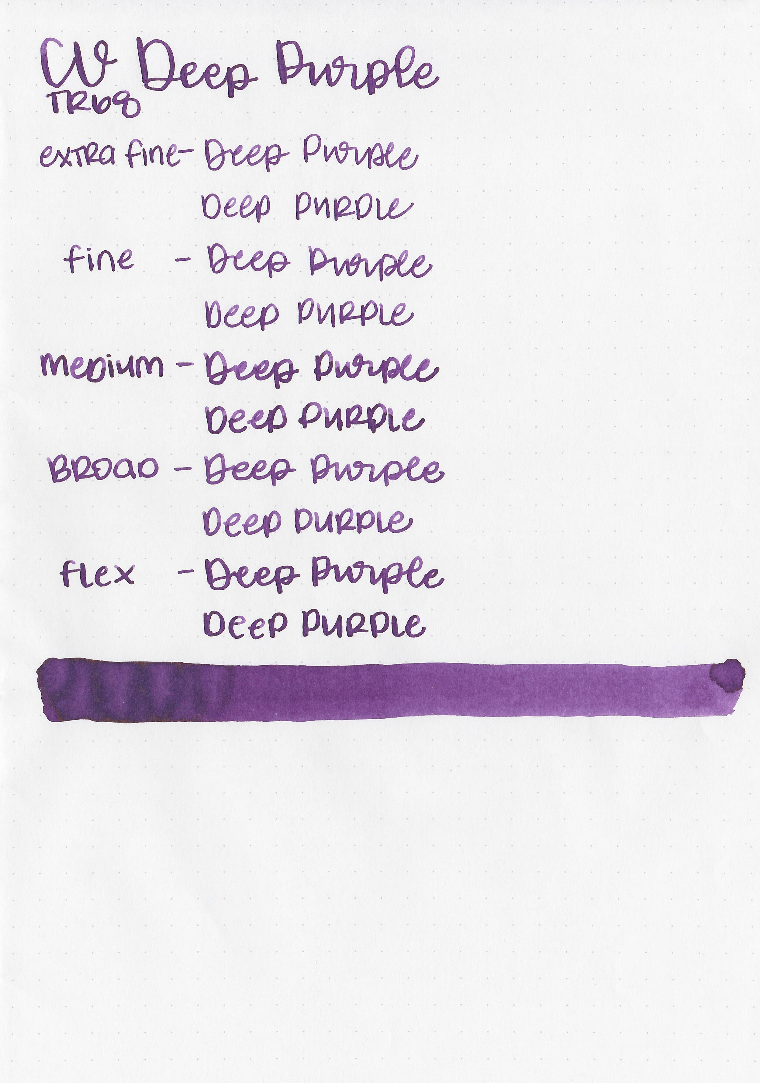
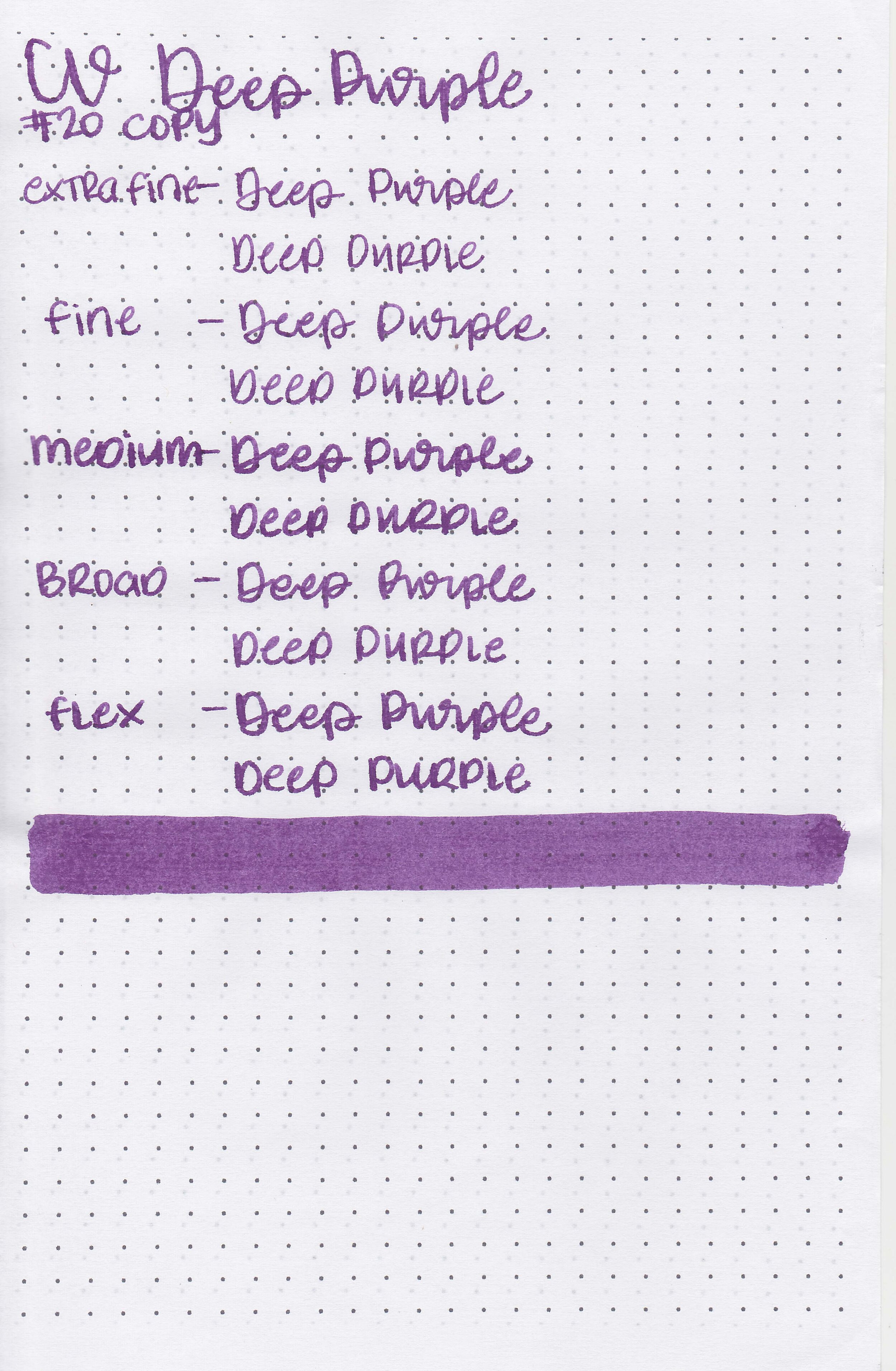
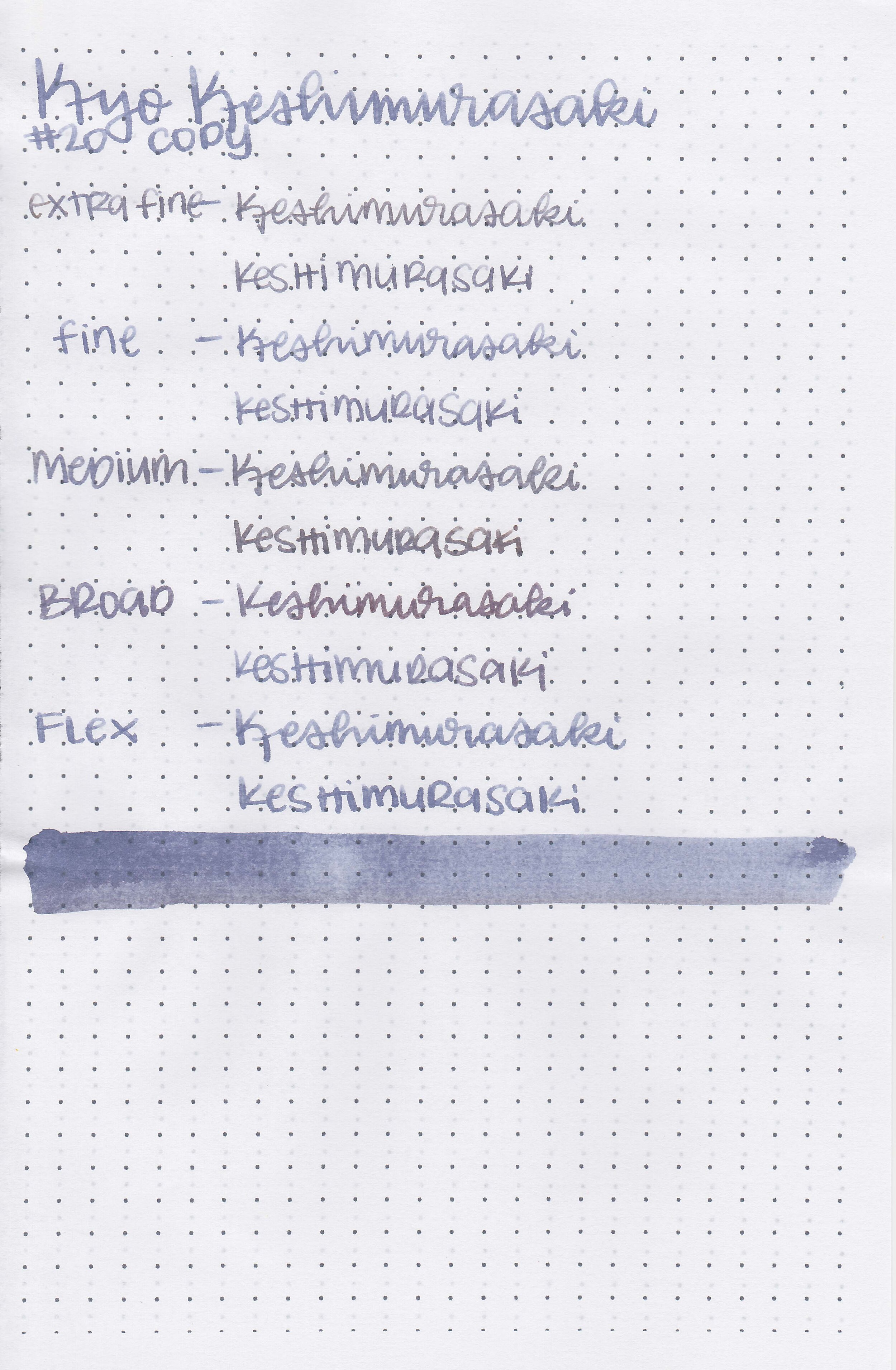
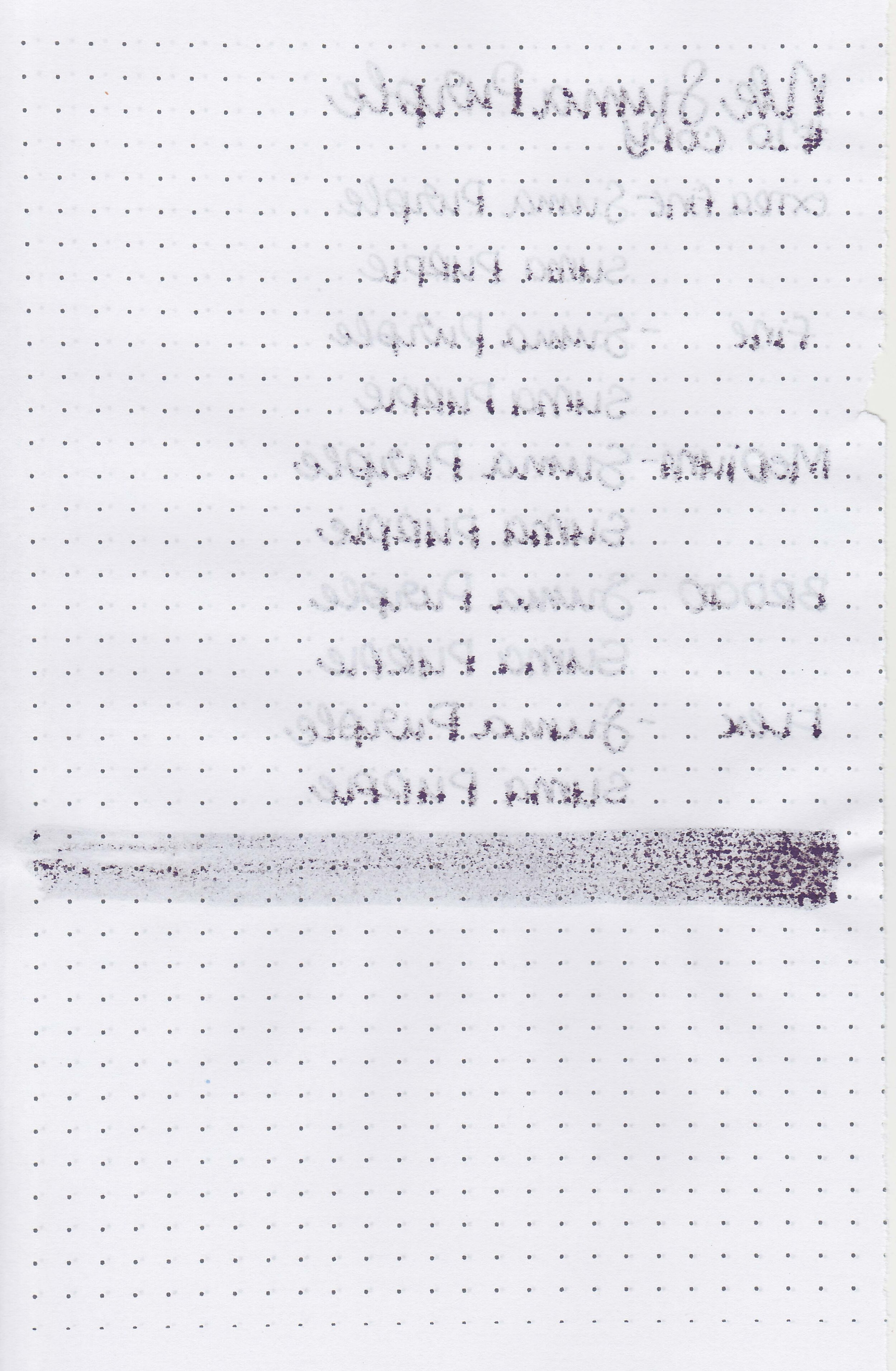
On Staples 24 lb copy paper there was feathering in all nib sizes but only a few dots of bleeding.
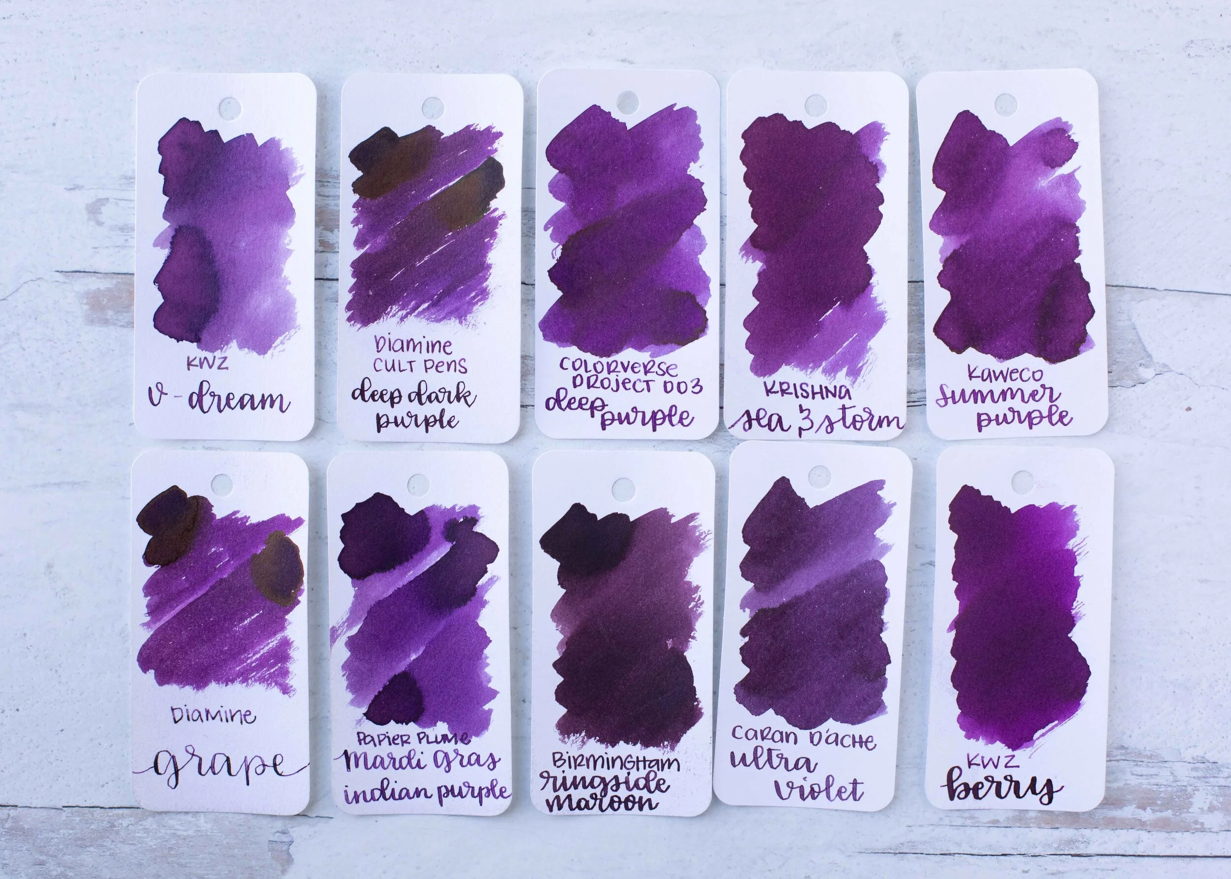
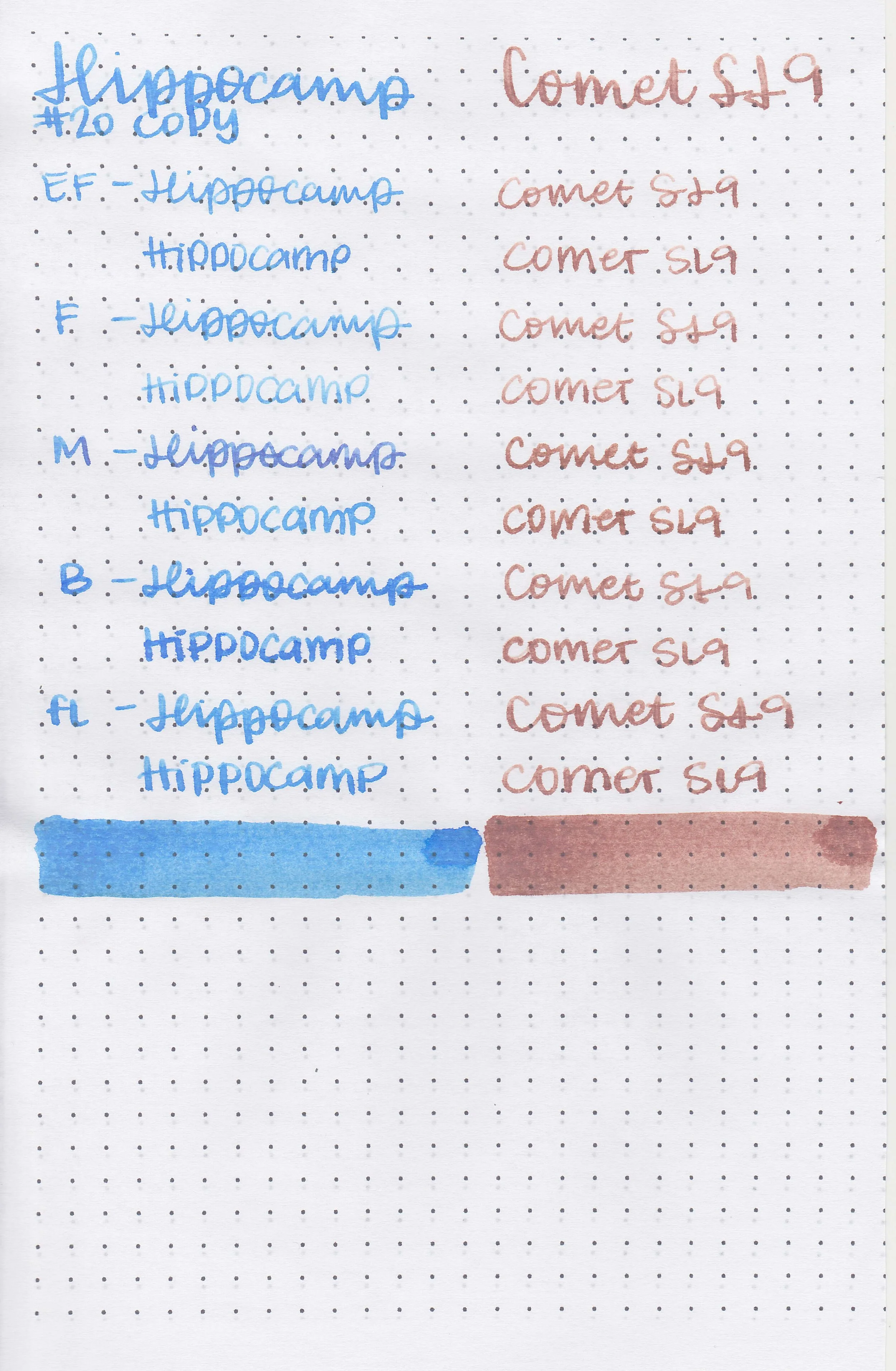
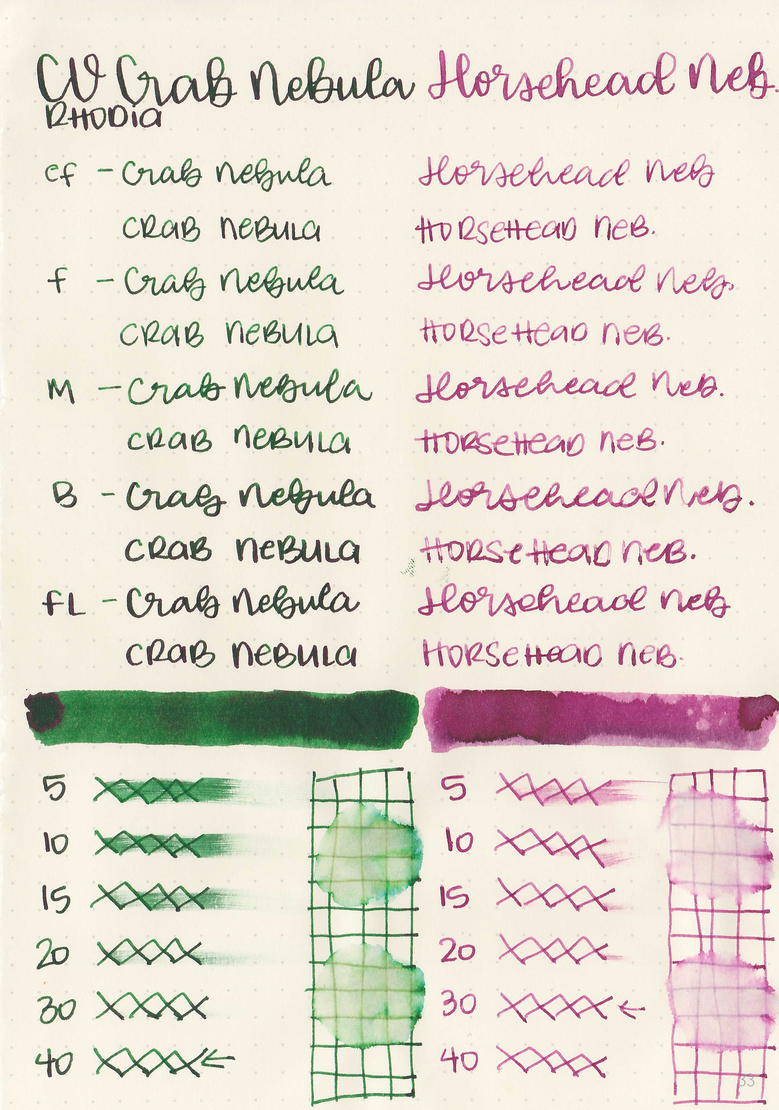
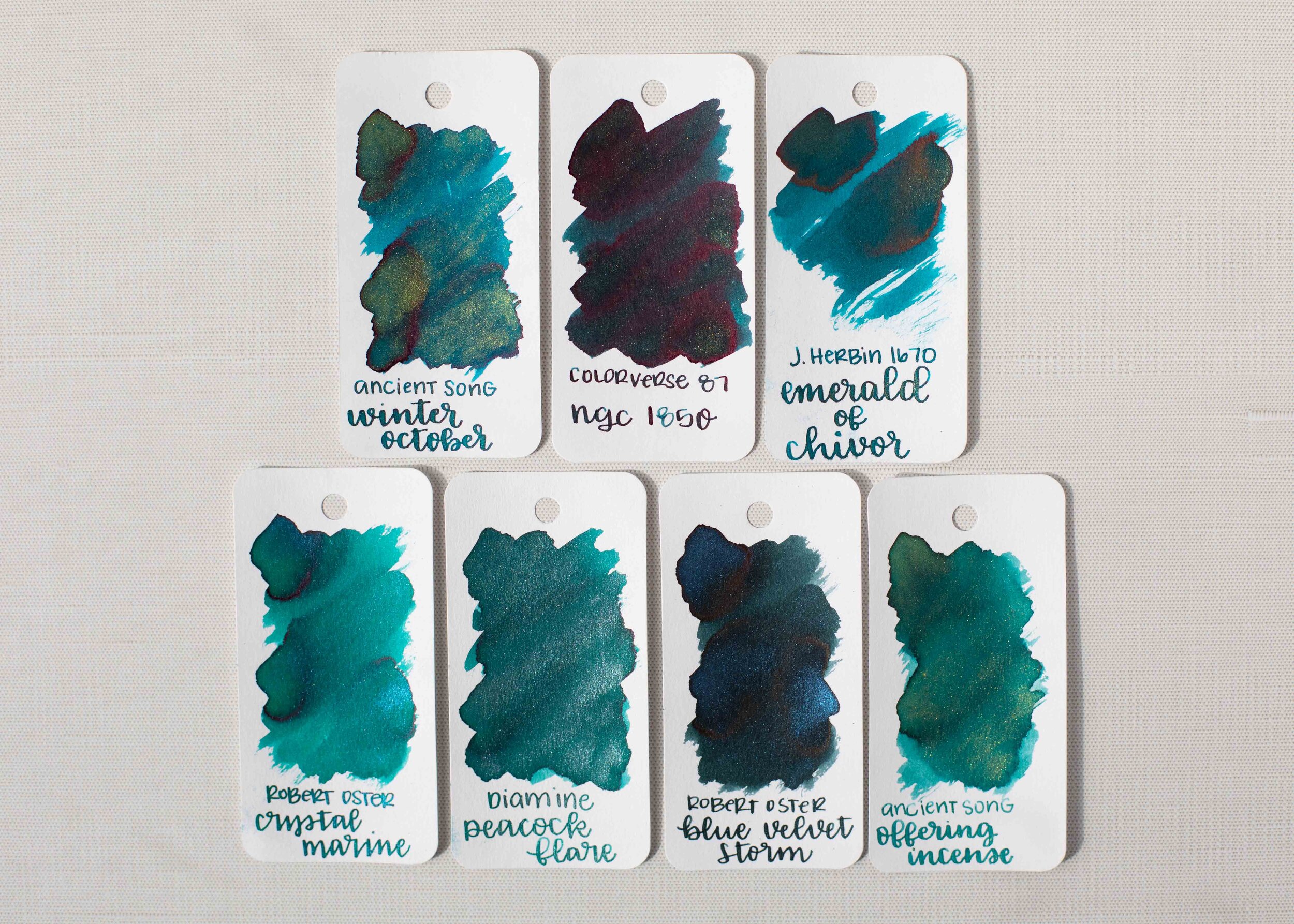
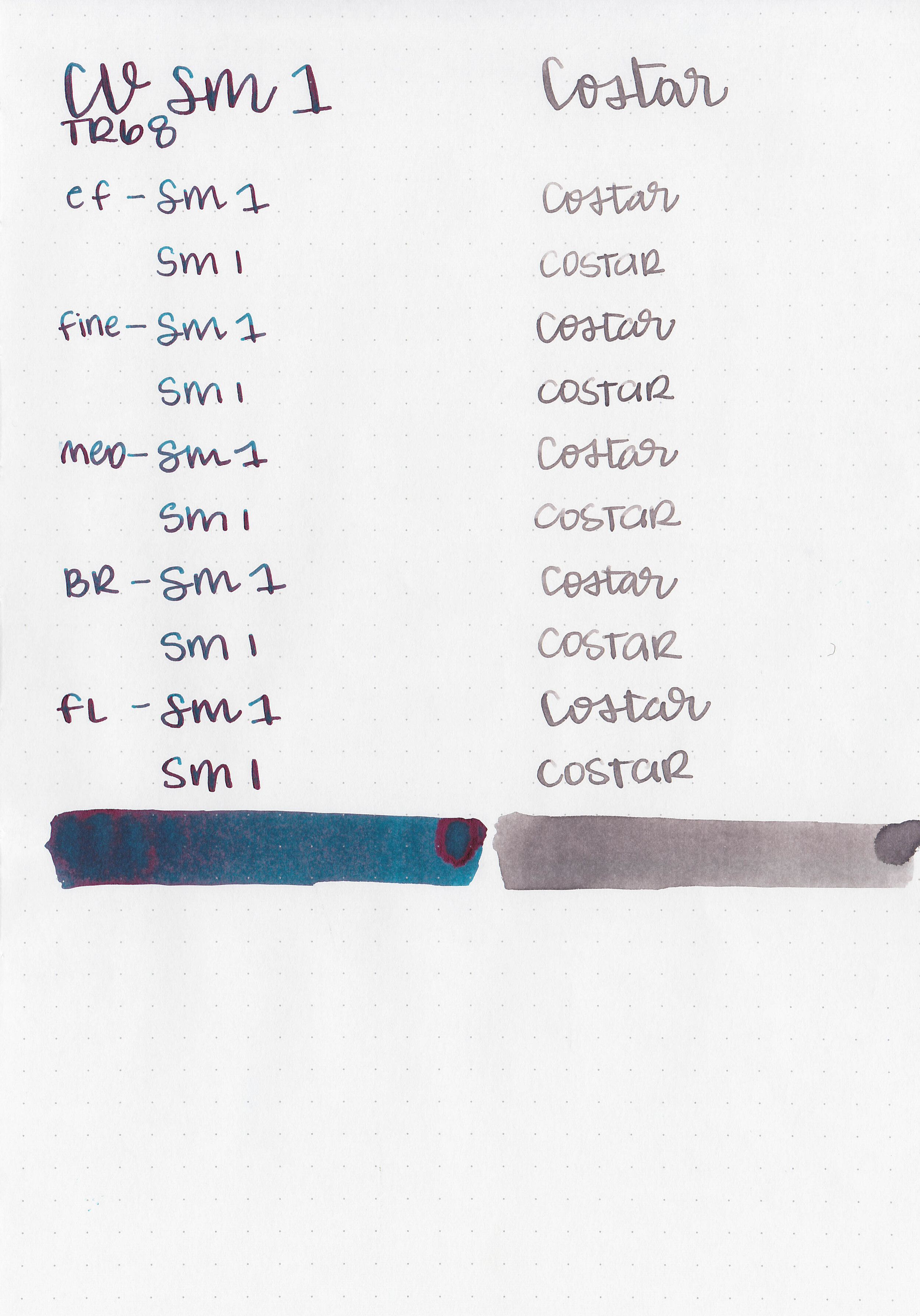
Comparison Swabs:

Vine Purple is more blue than Sailor Shigure but not as blue as Noodler’s Kung Te-Cheng. Click here to see the Van Dieman’s inks together, and click here to see the purple inks together.
Longer writing:

I used an Esterbrook Estie Lilac with a broad nib on a Taroko Enigma notebook. The ink had an average flow.
Overall, the color is nice but there is way too much feathering for me. I would stick to Tomoe River paper with this ink or Cosmo Air Light.
Disclaimer: All photos and opinions are my own. This page does contain affiliate links but this post is not sponsored.