Ink Review #1498: Kobe 59 Hirano Gion Romance Gray
/
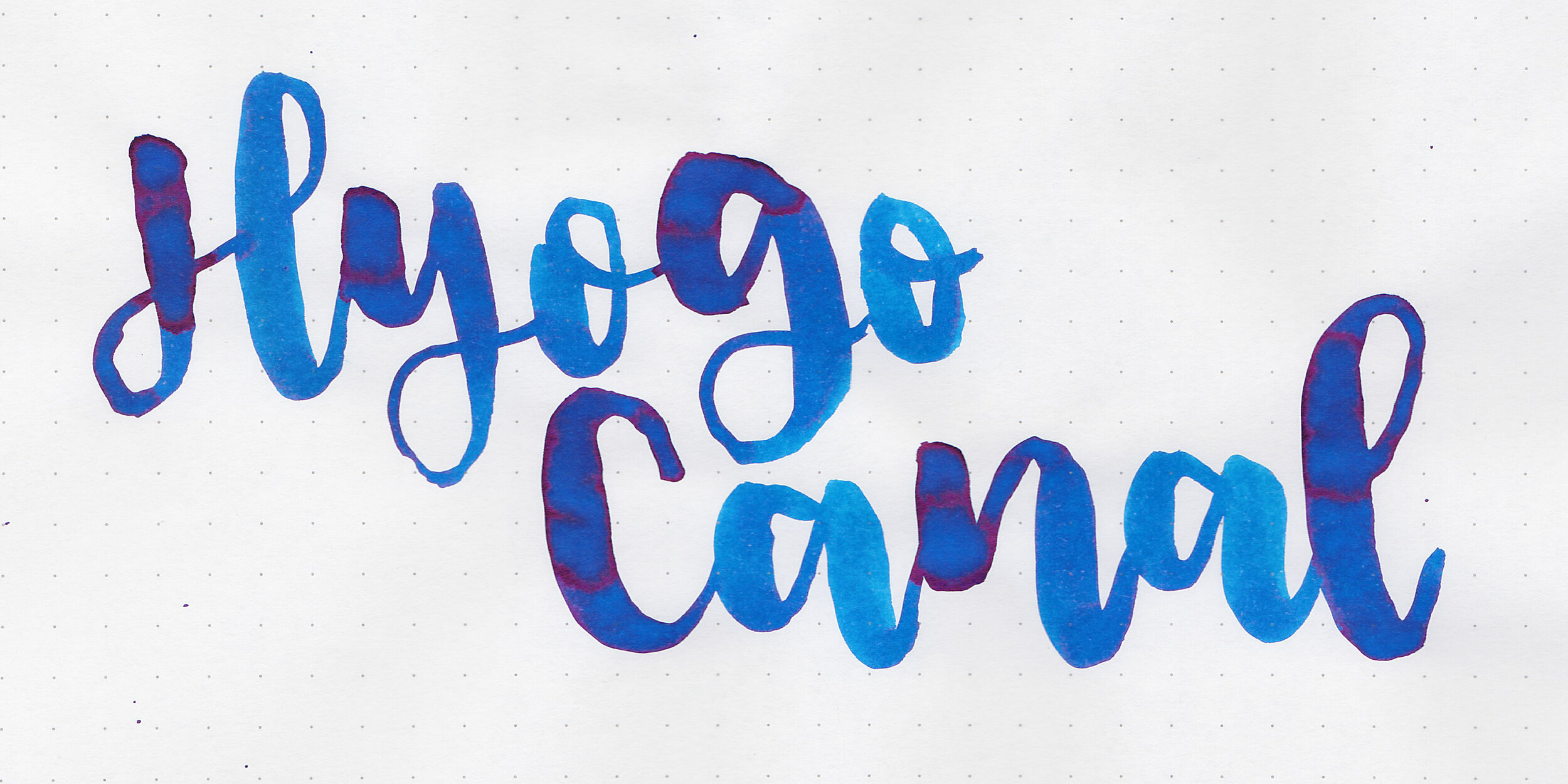
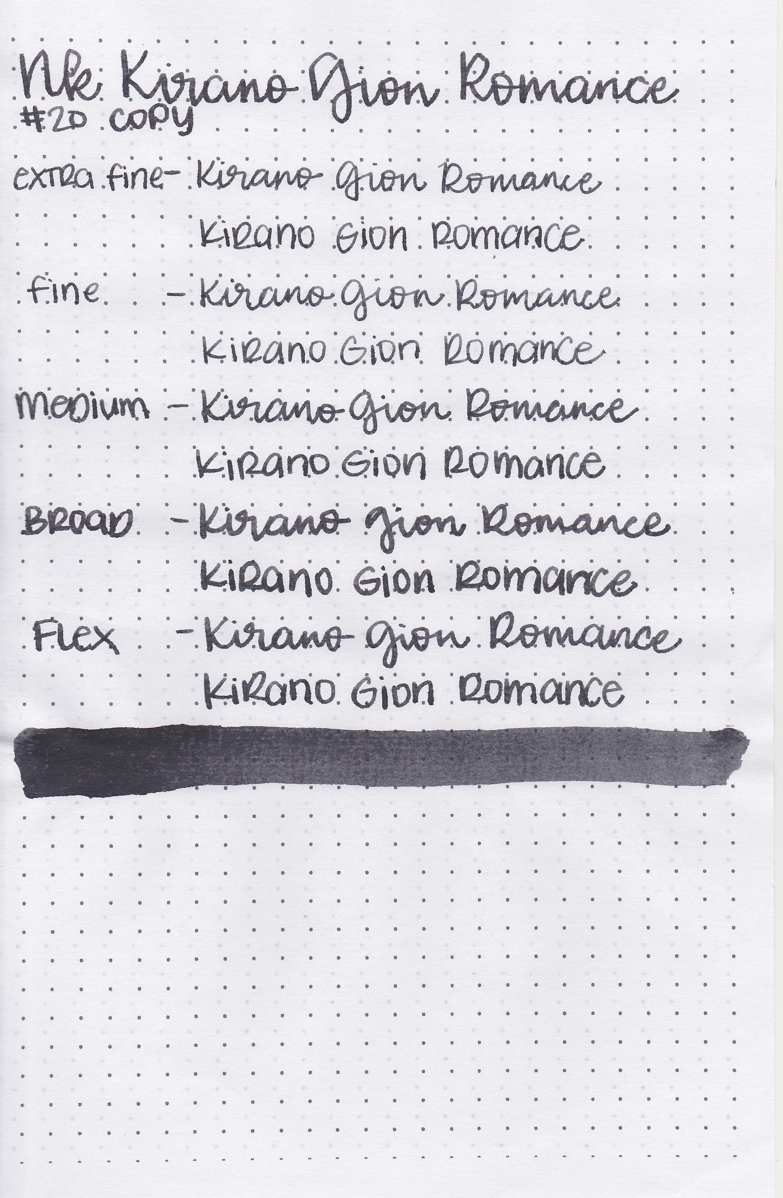
Kobe 59 Hirano Gion Romance Gray is from Kobe’s standard lineup. I know all of my writing samples say Kirano but please pretend it says Hirano-I went with the spelling on the sample which turned out to be different than the official name. You can find this ink for sale at Vanness Pens. Thanks to the reader that sent this ink in for review!

The Color:
Hirano Gion Romance Gray is a deep neutral grey.
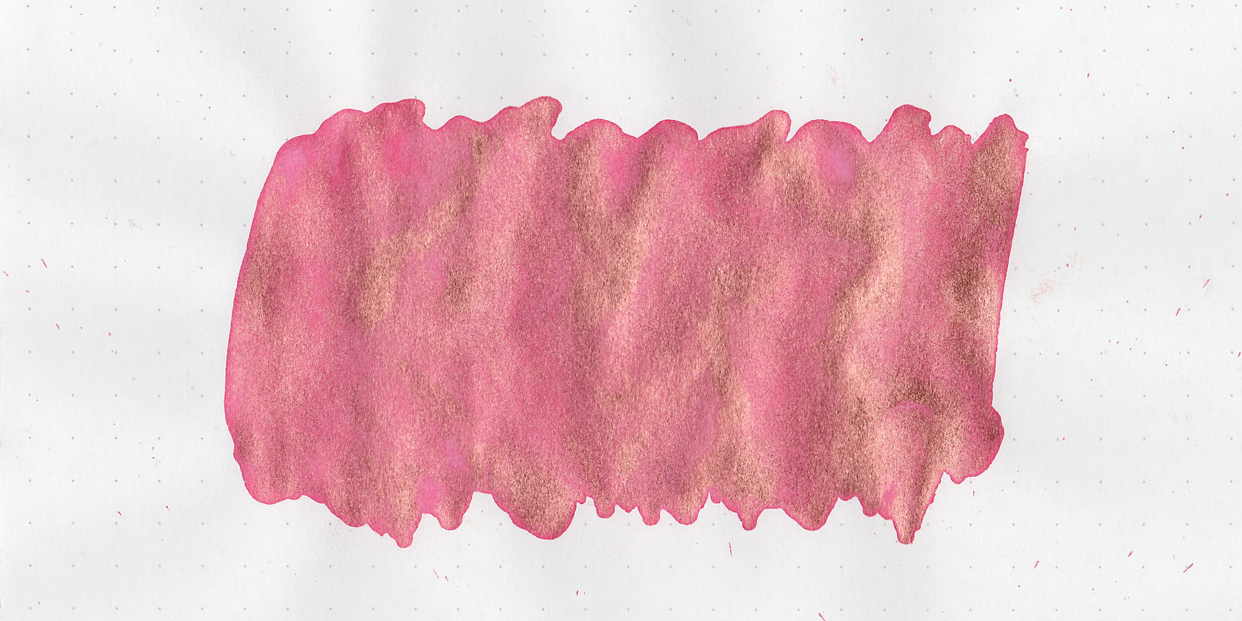
Swabs:

In large swabs on Tomoe River paper the ink has some black sheen.

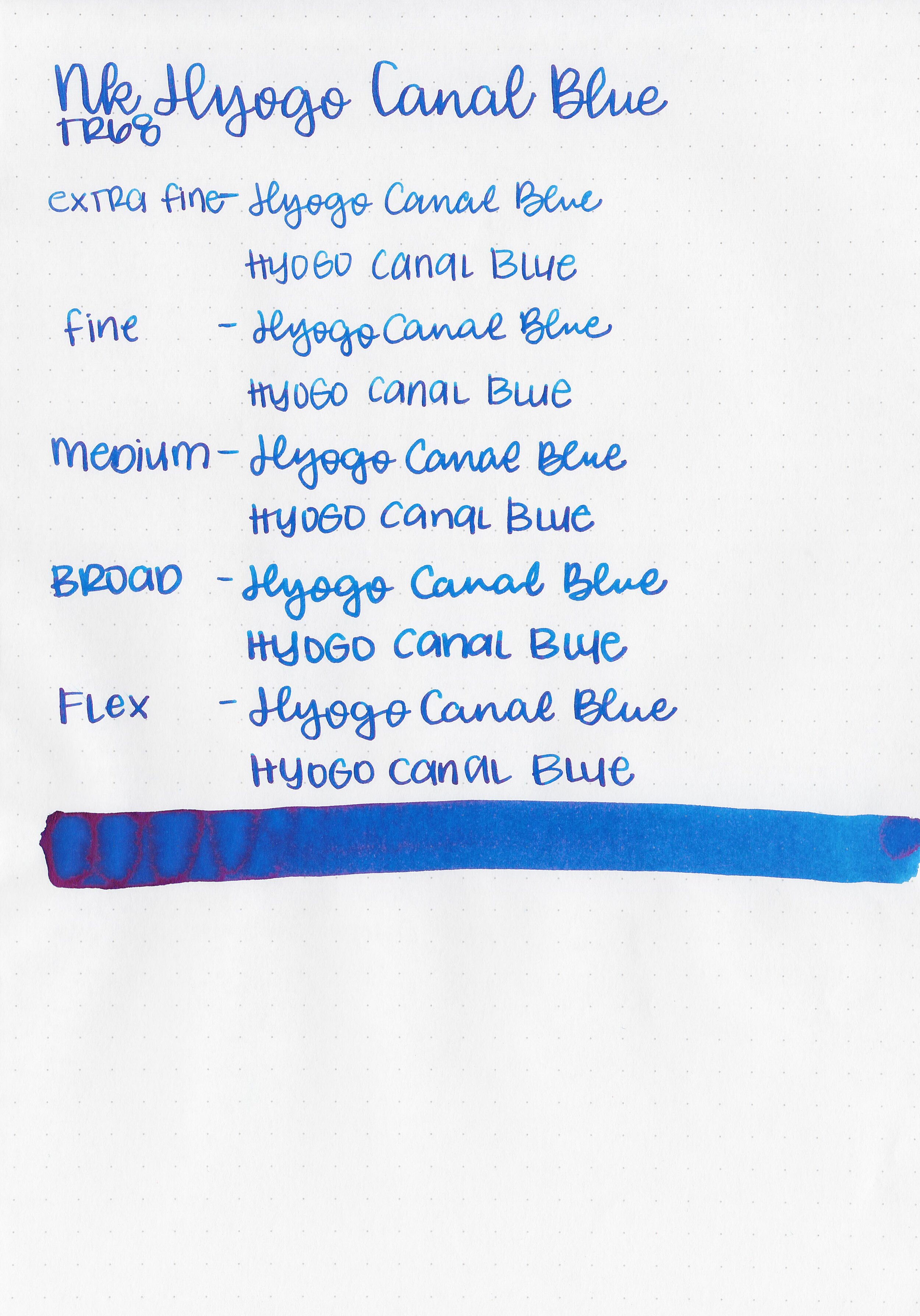
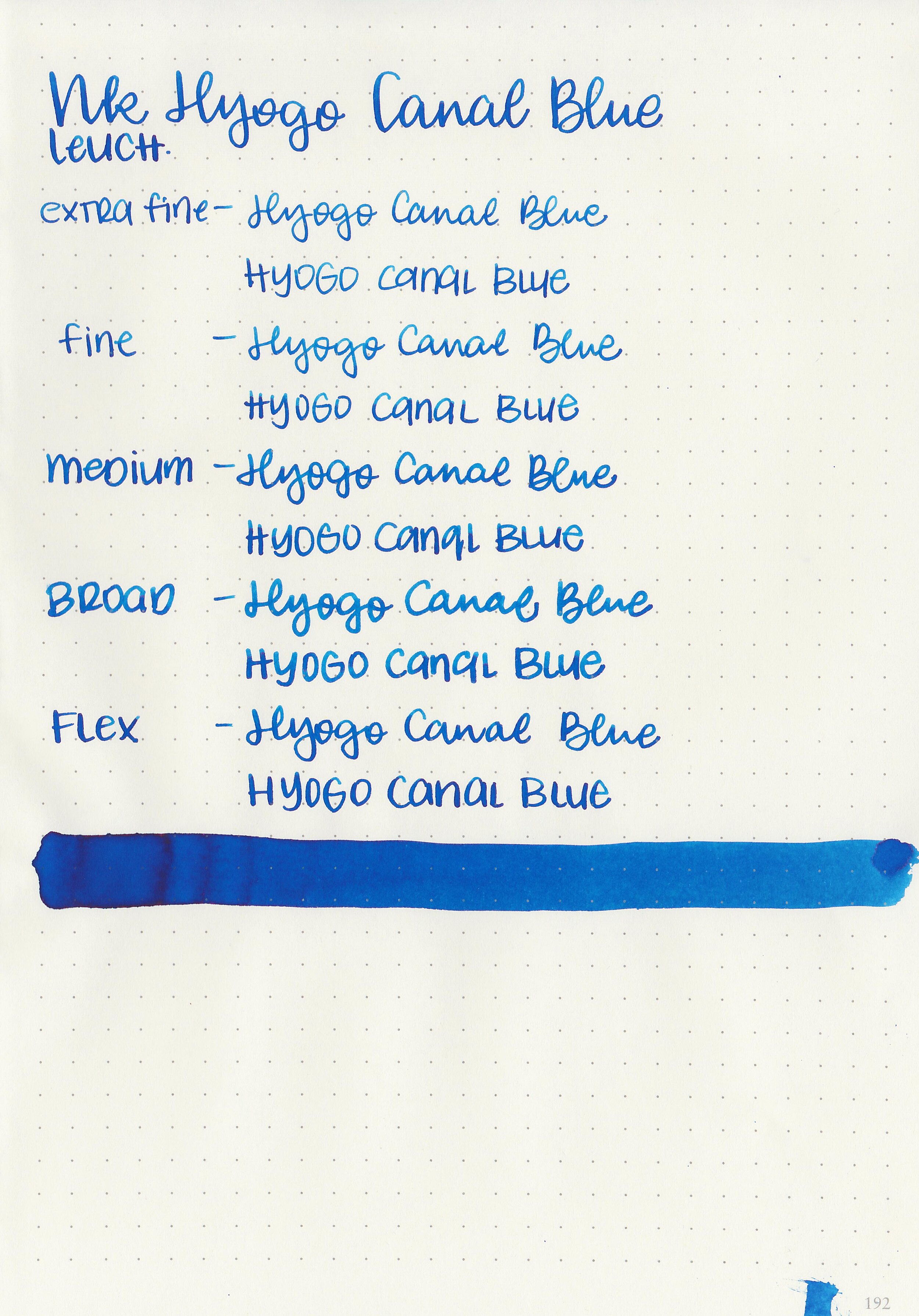
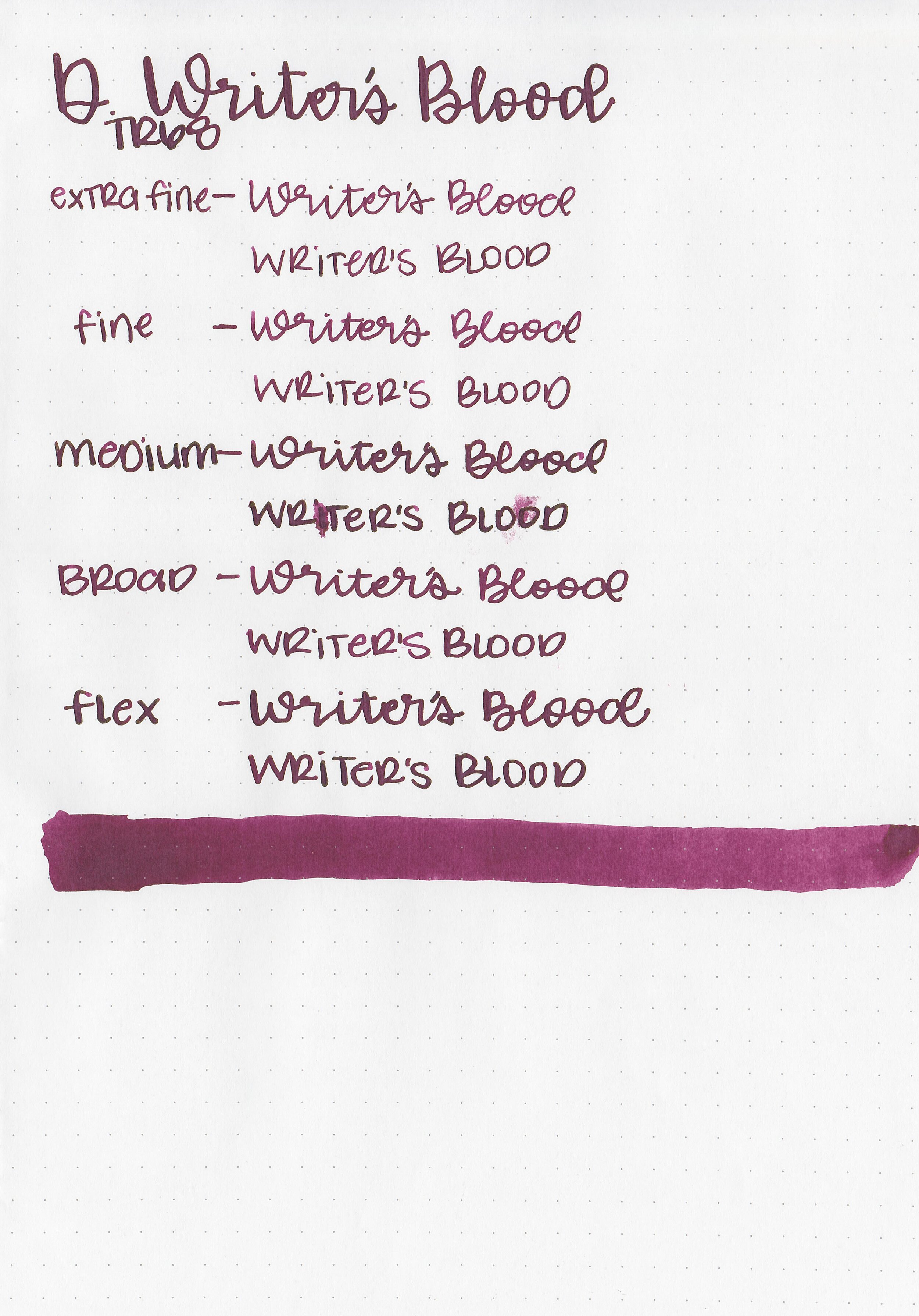
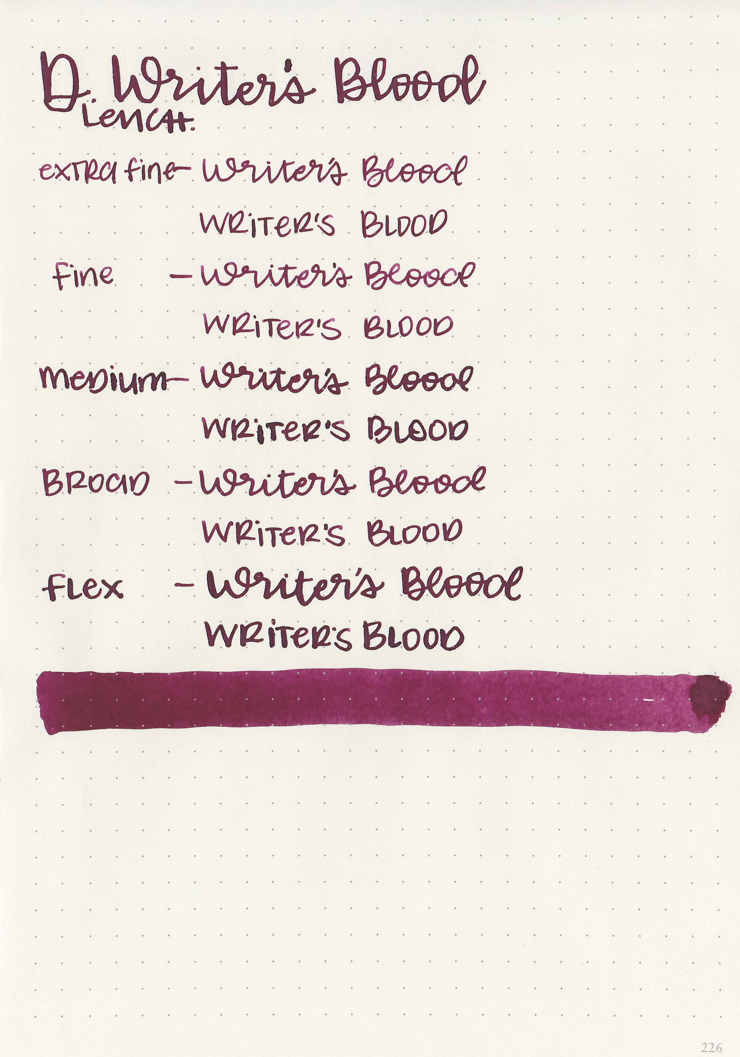
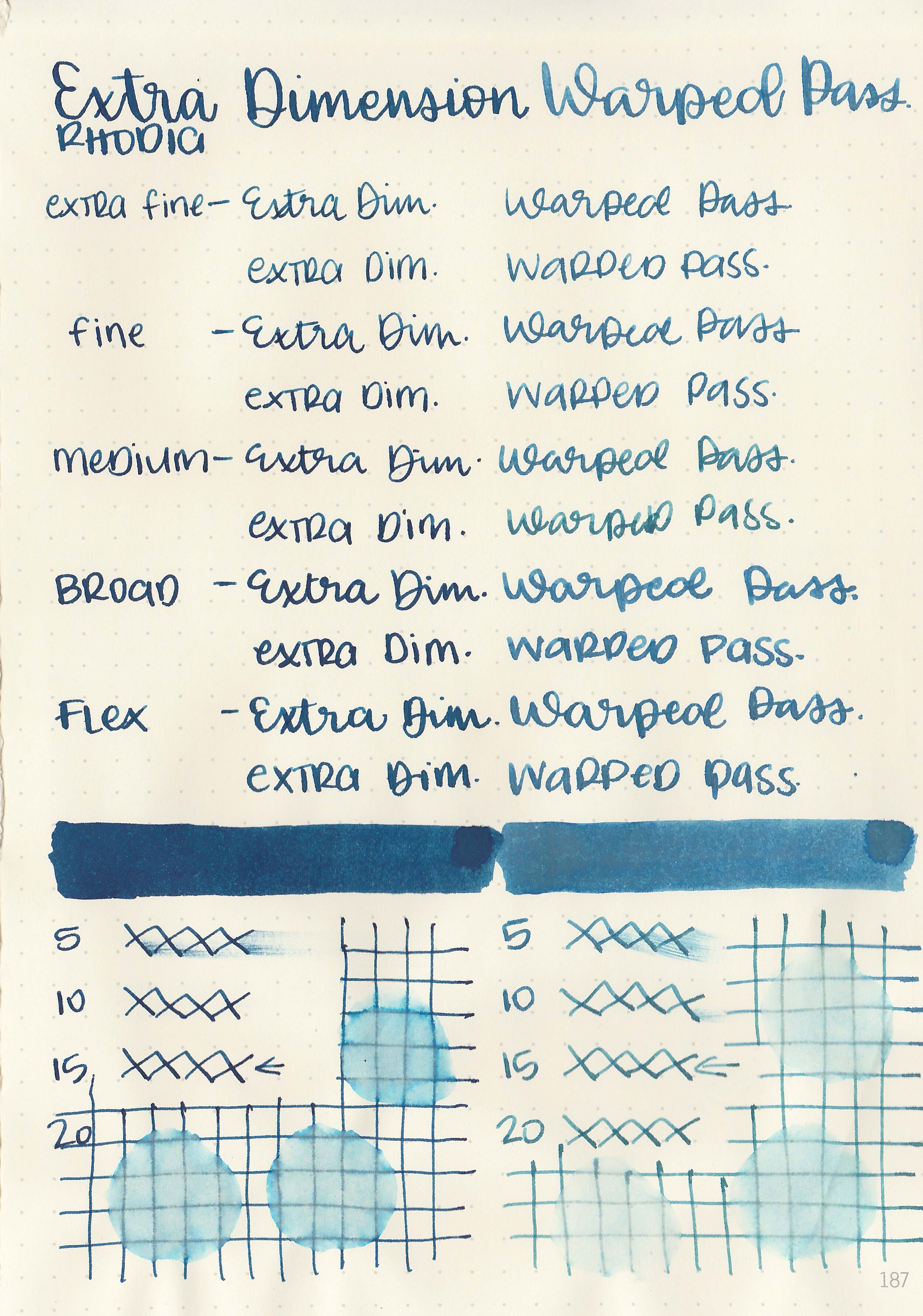
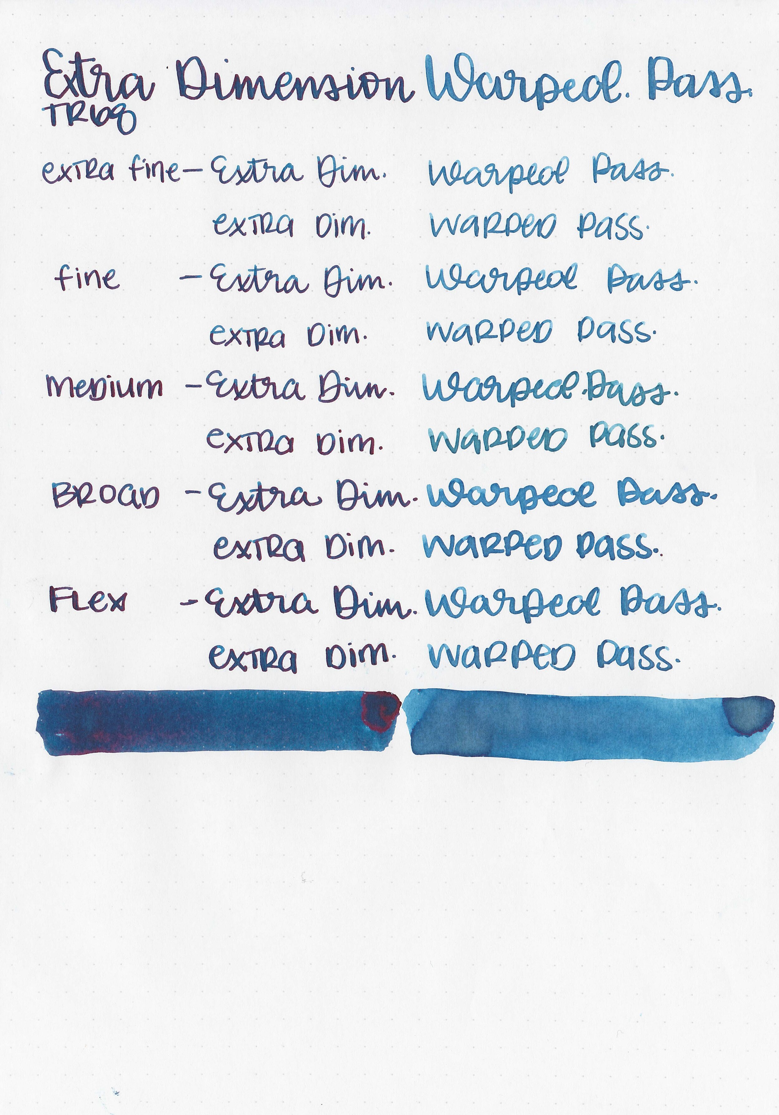
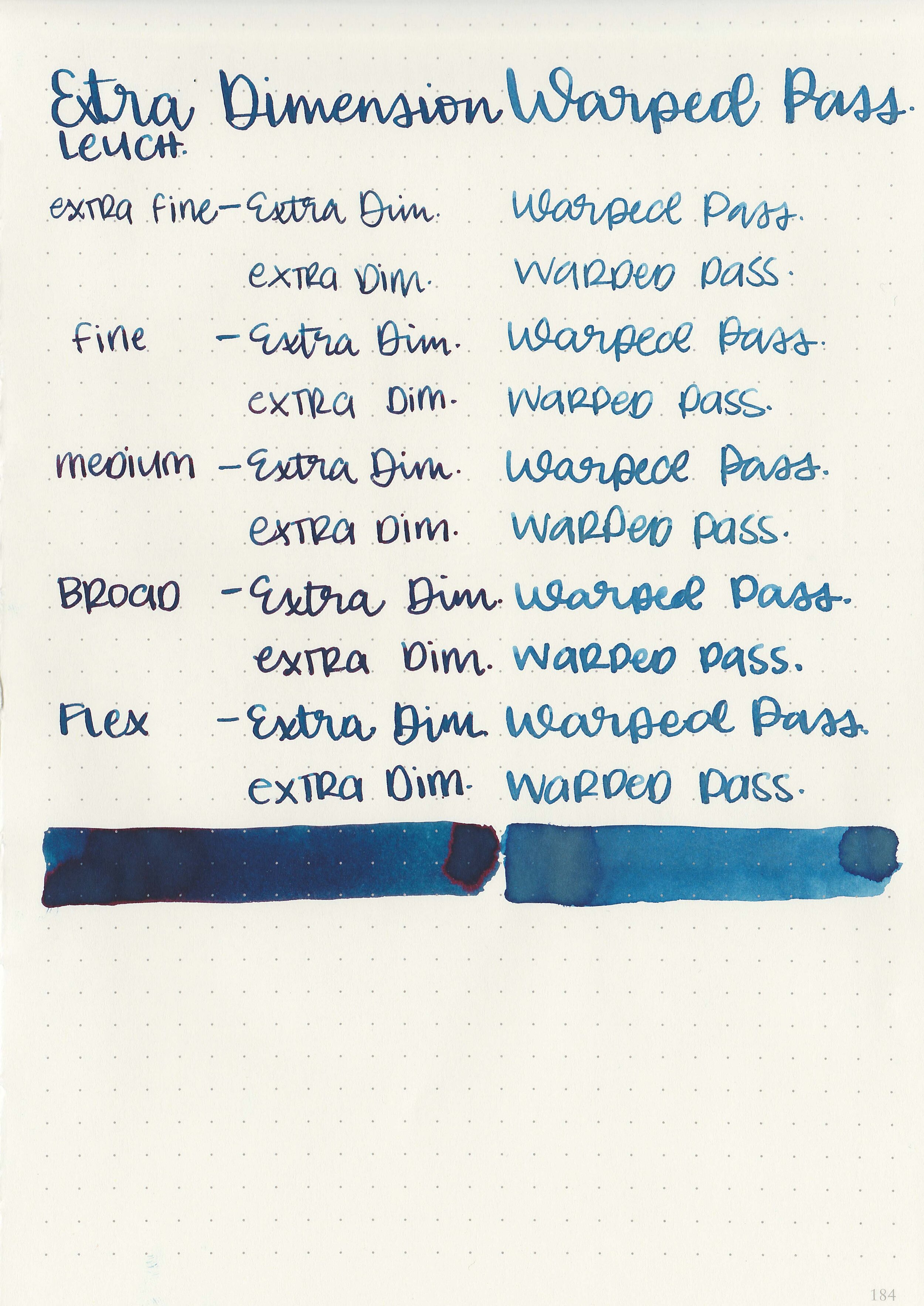
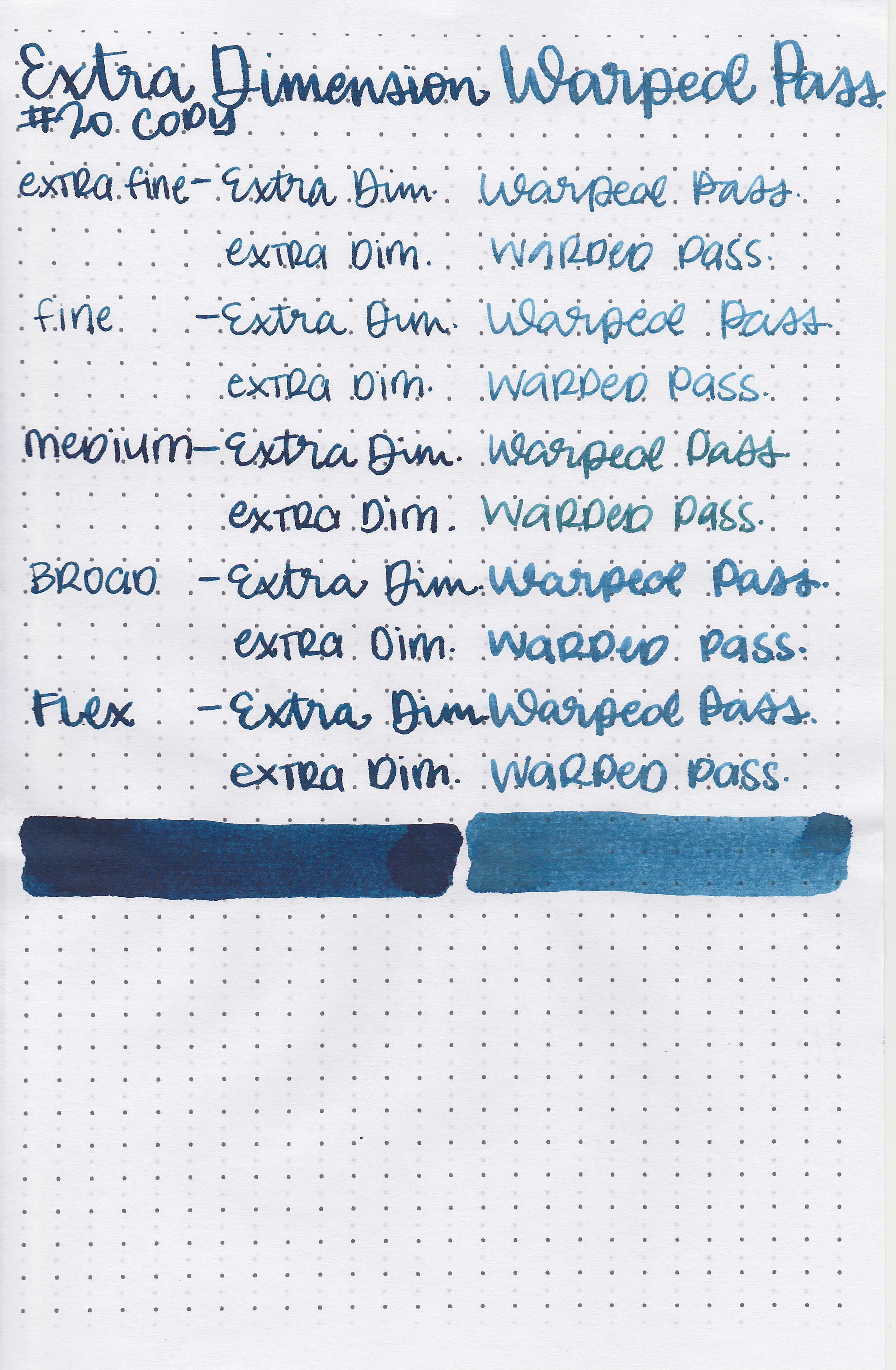
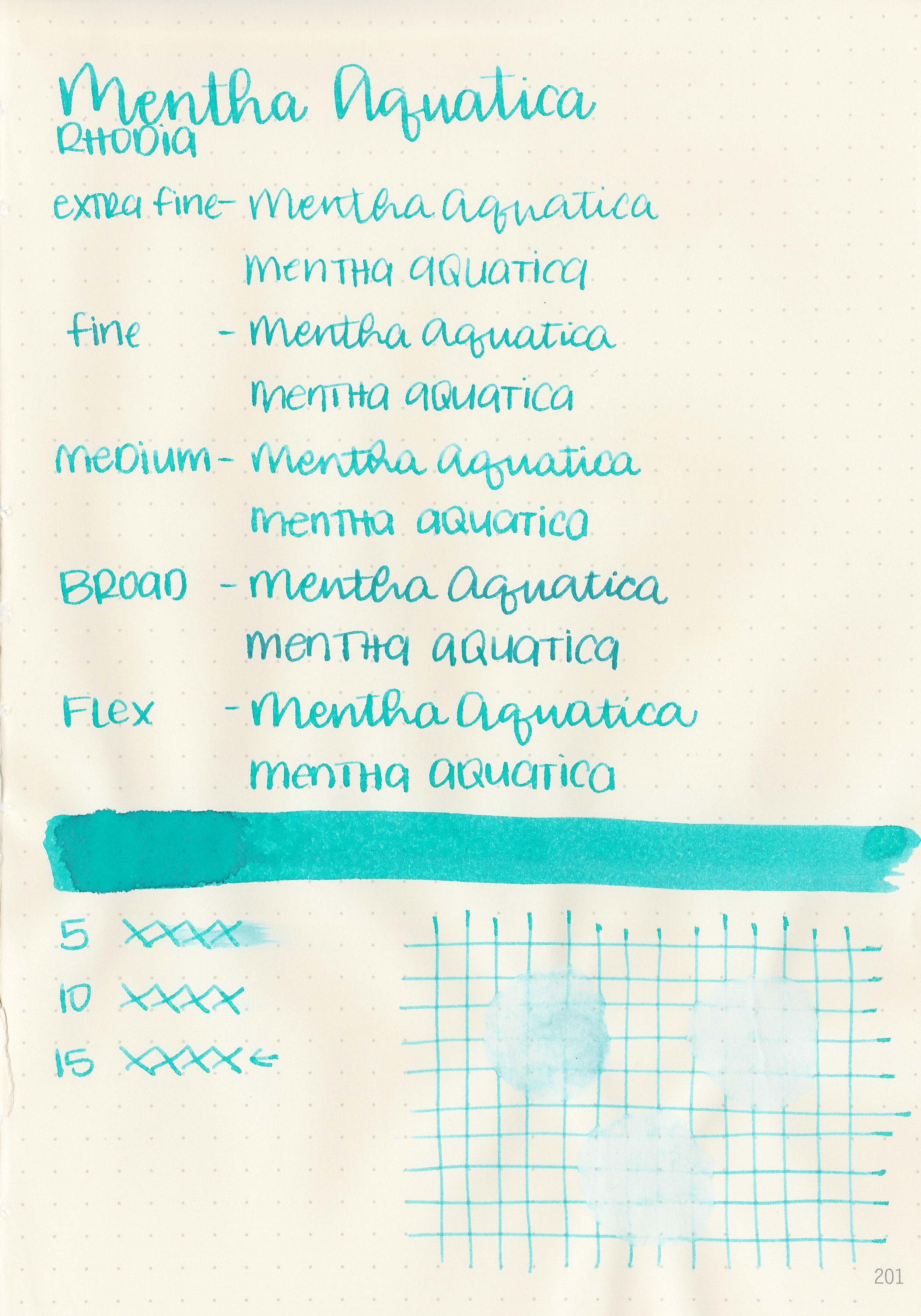
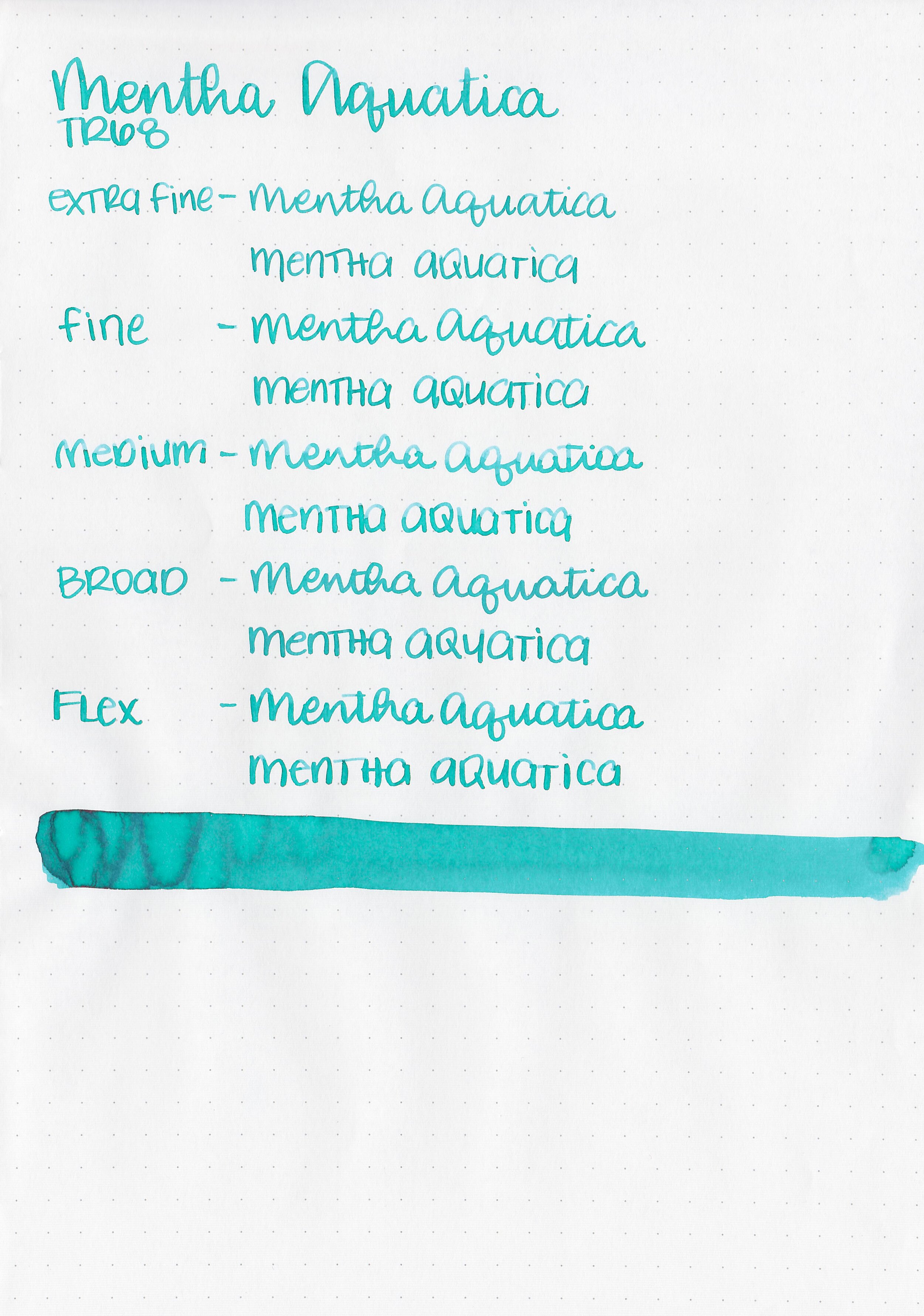
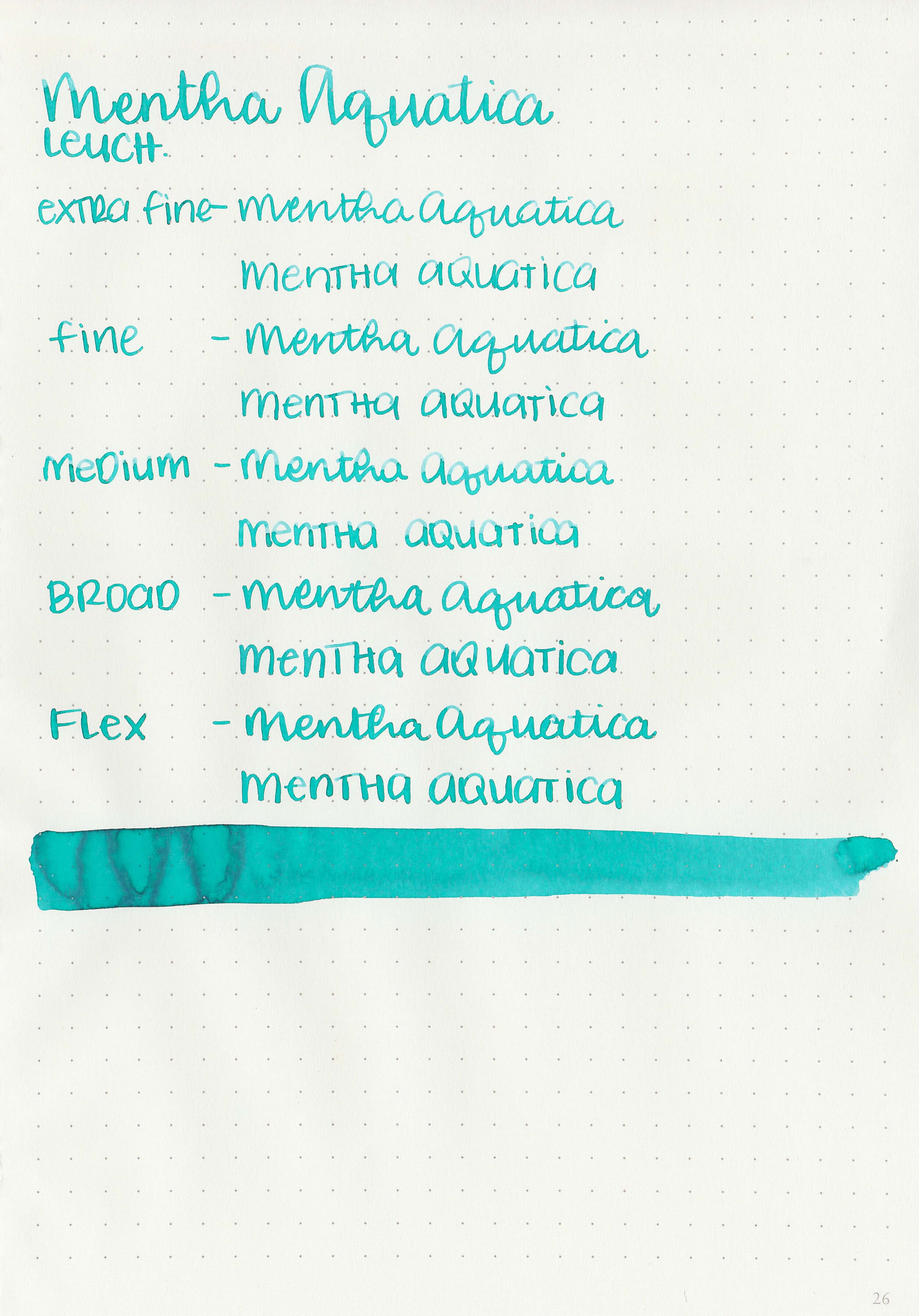
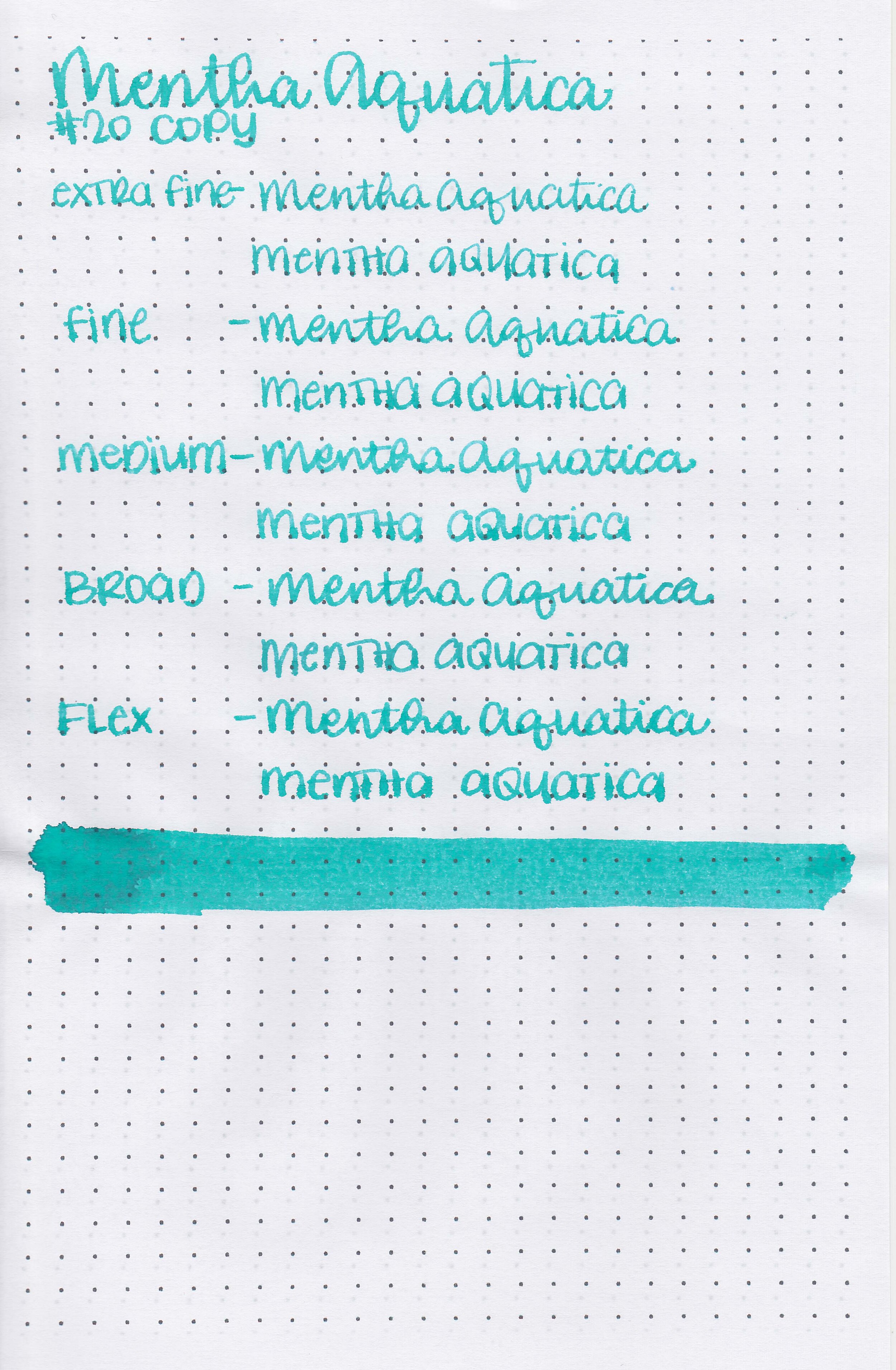
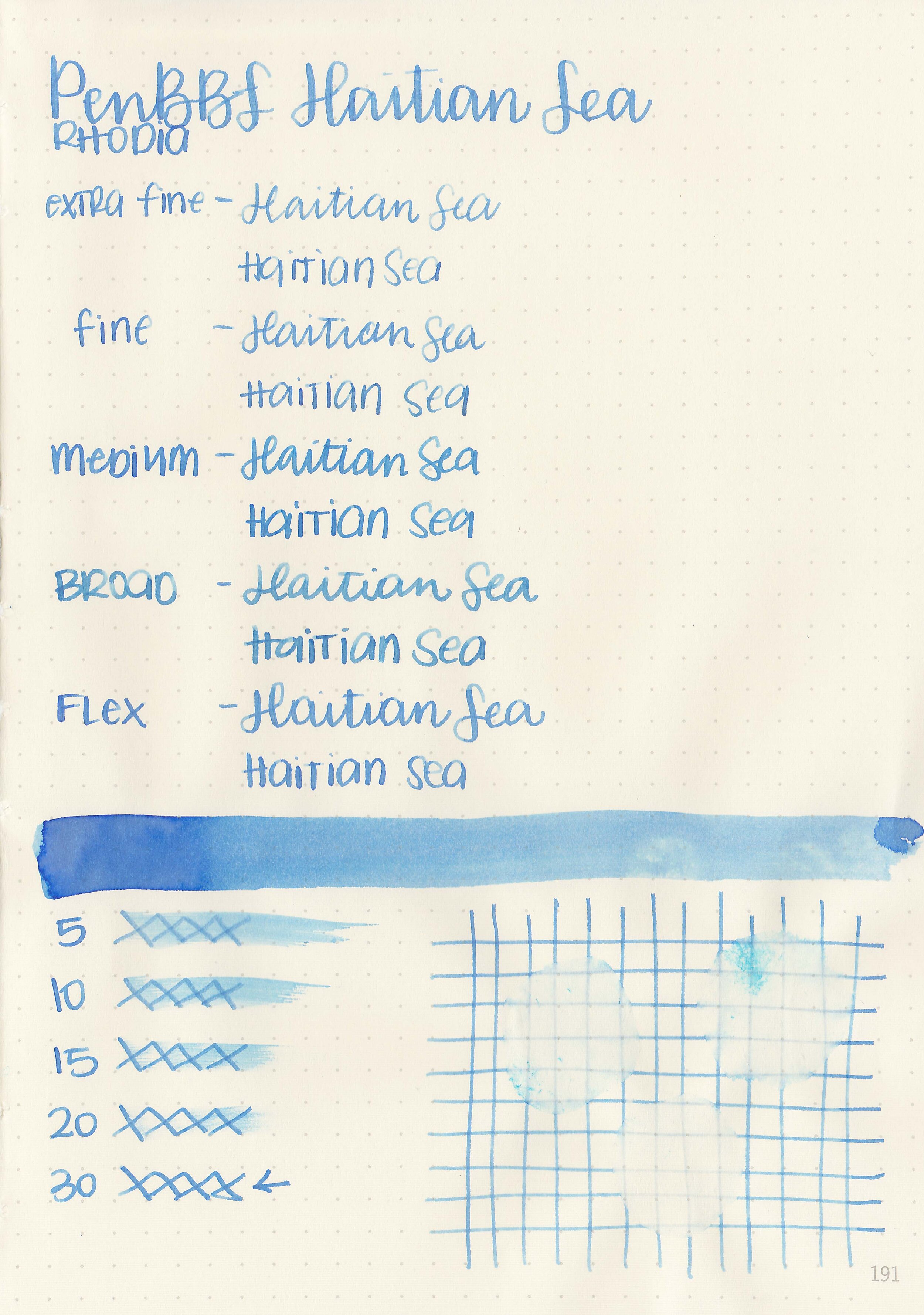
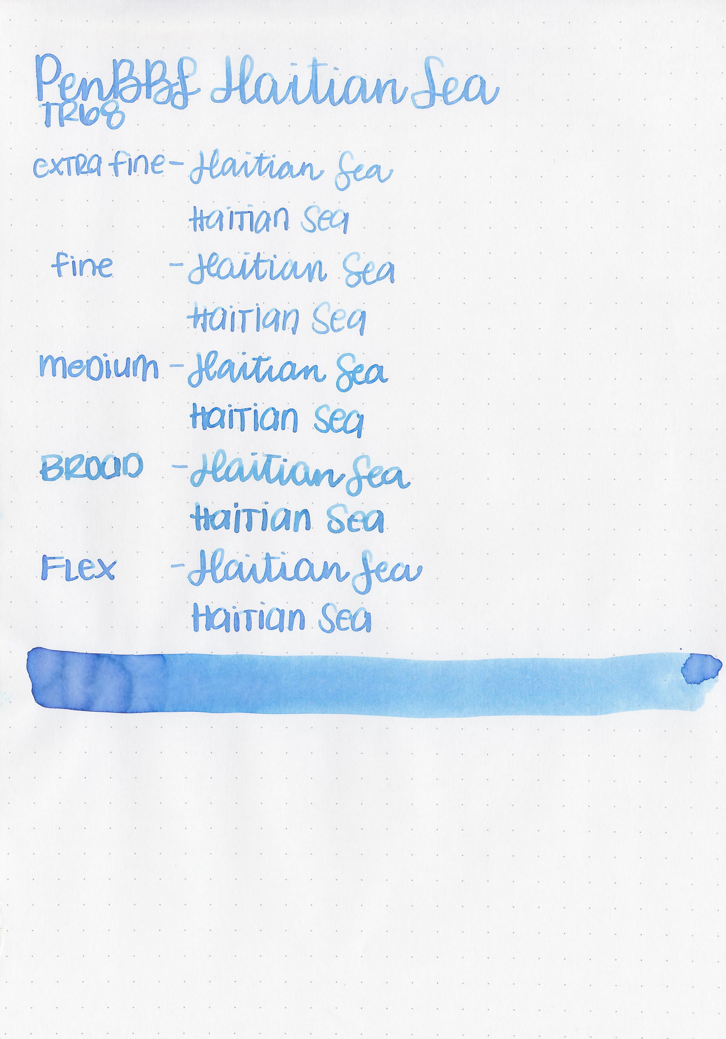
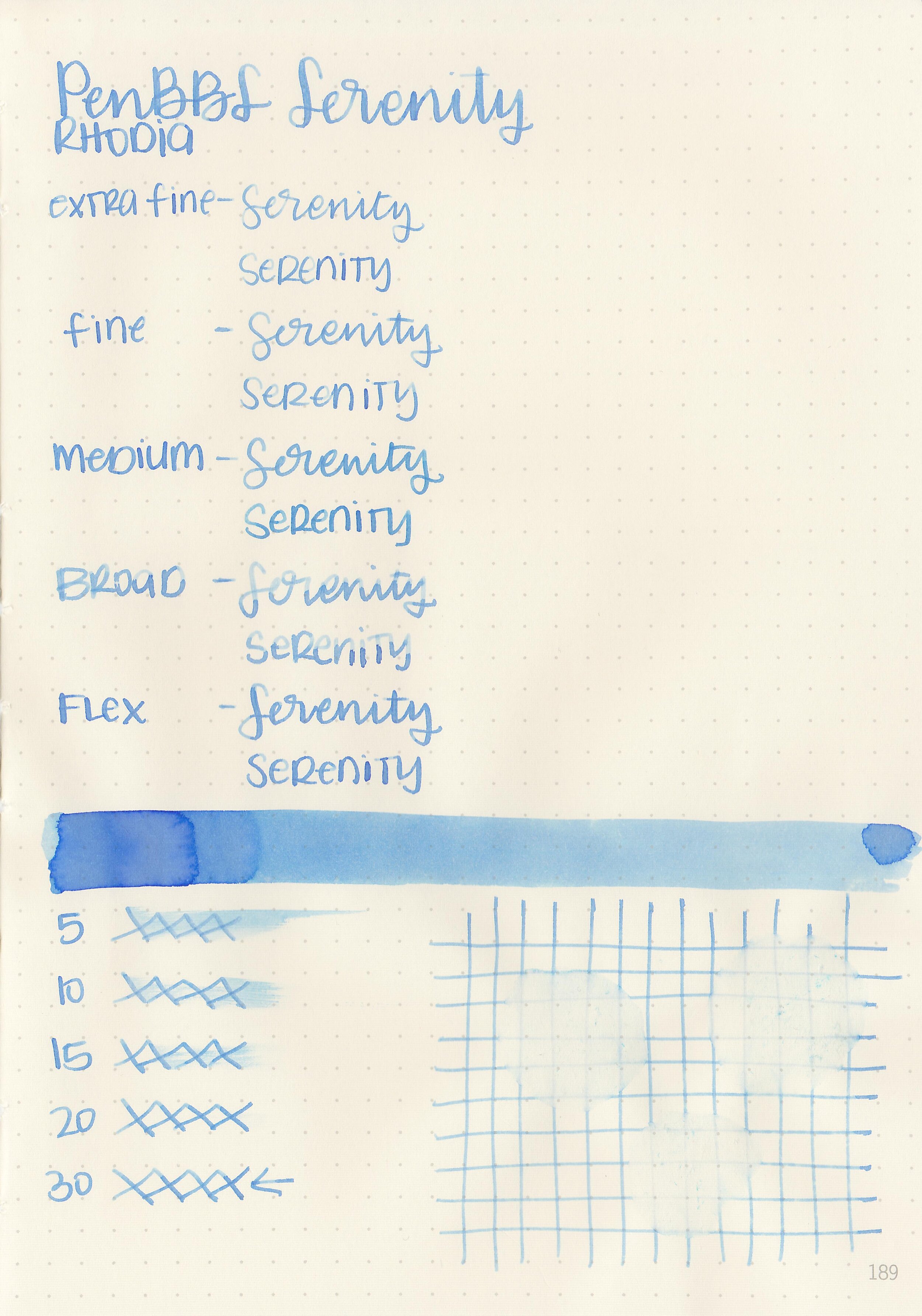
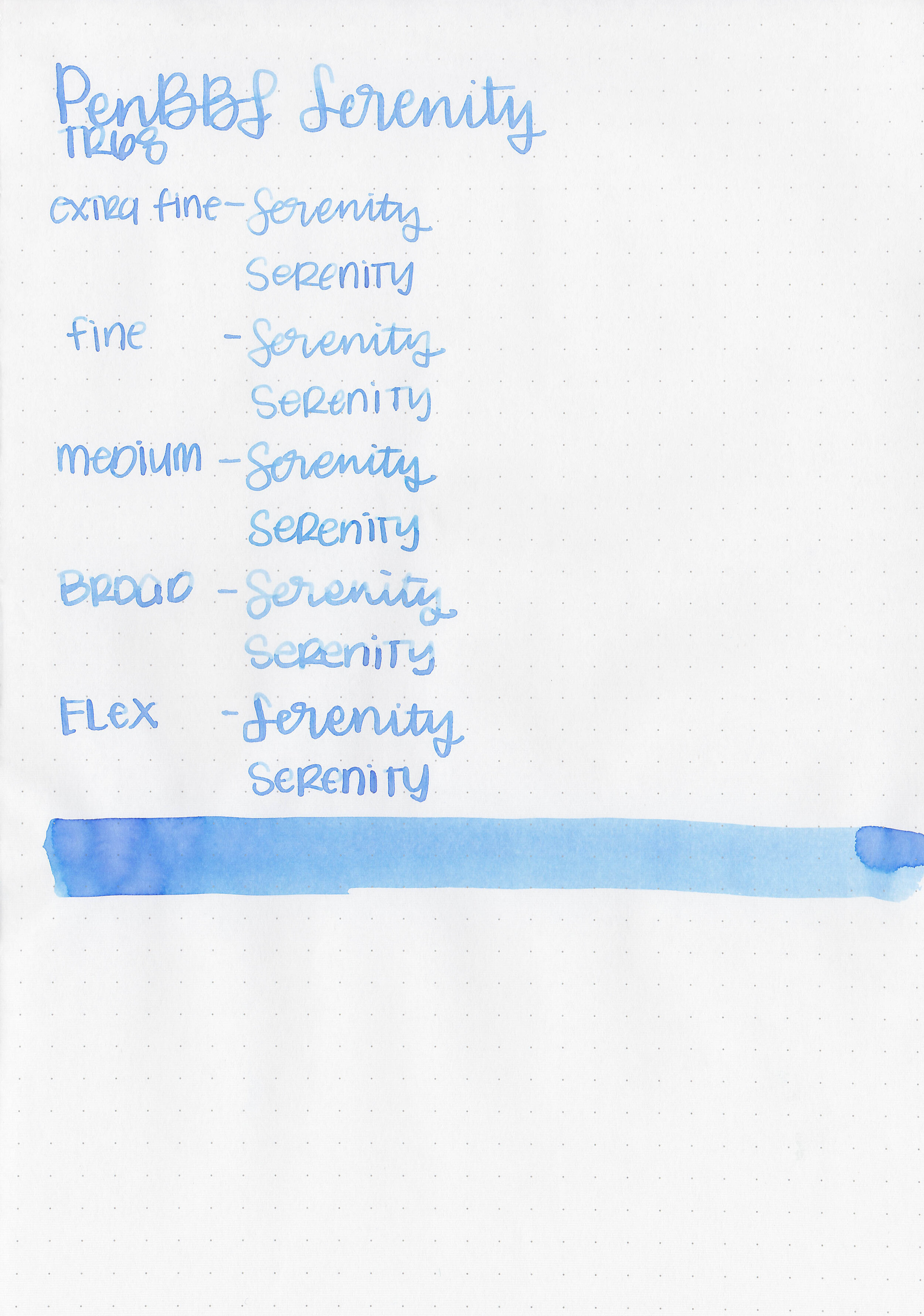
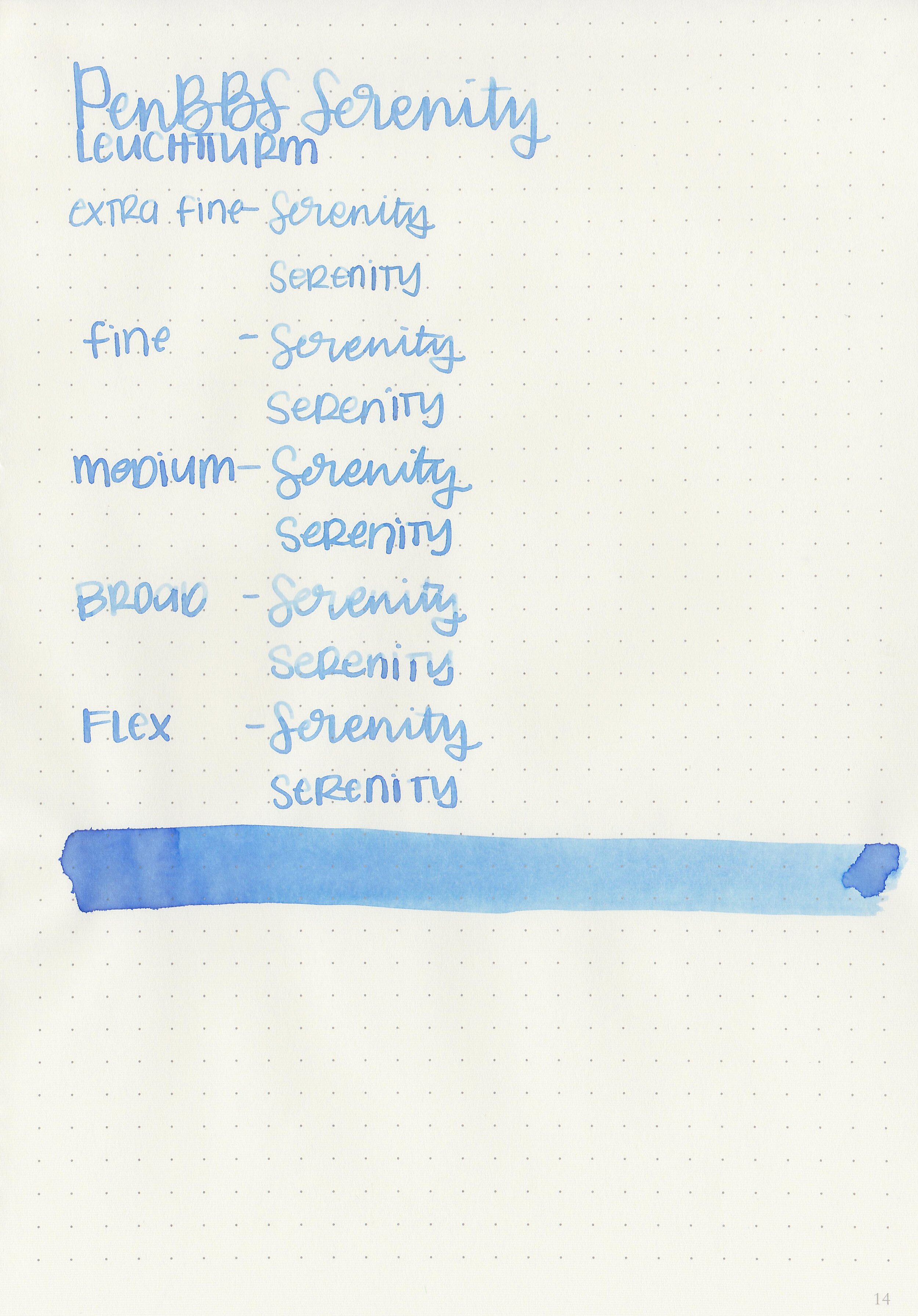
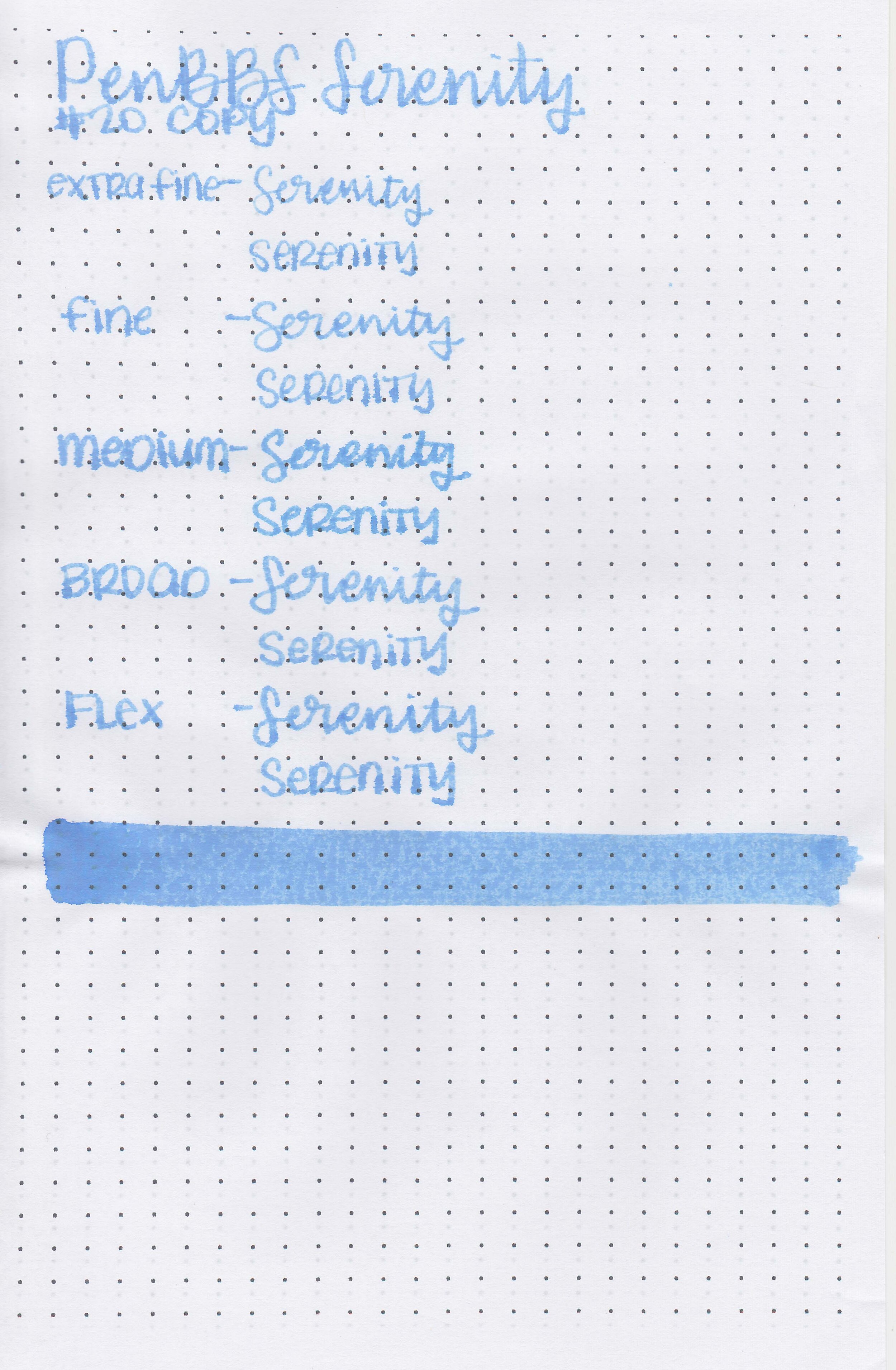
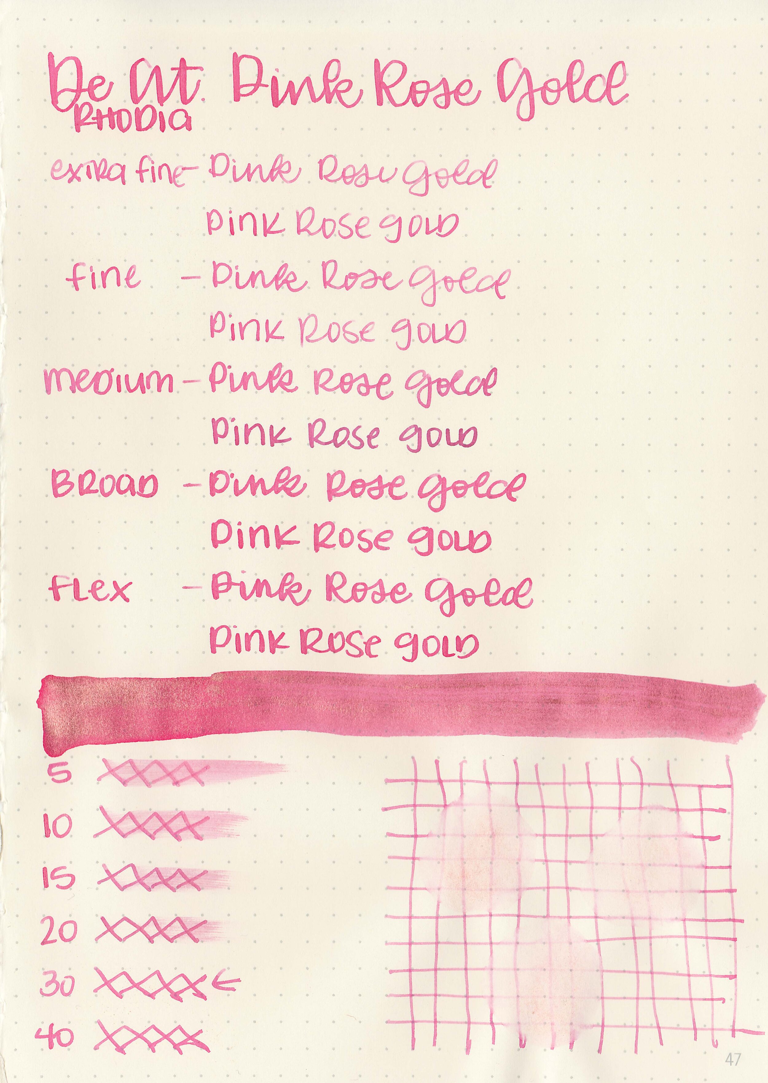
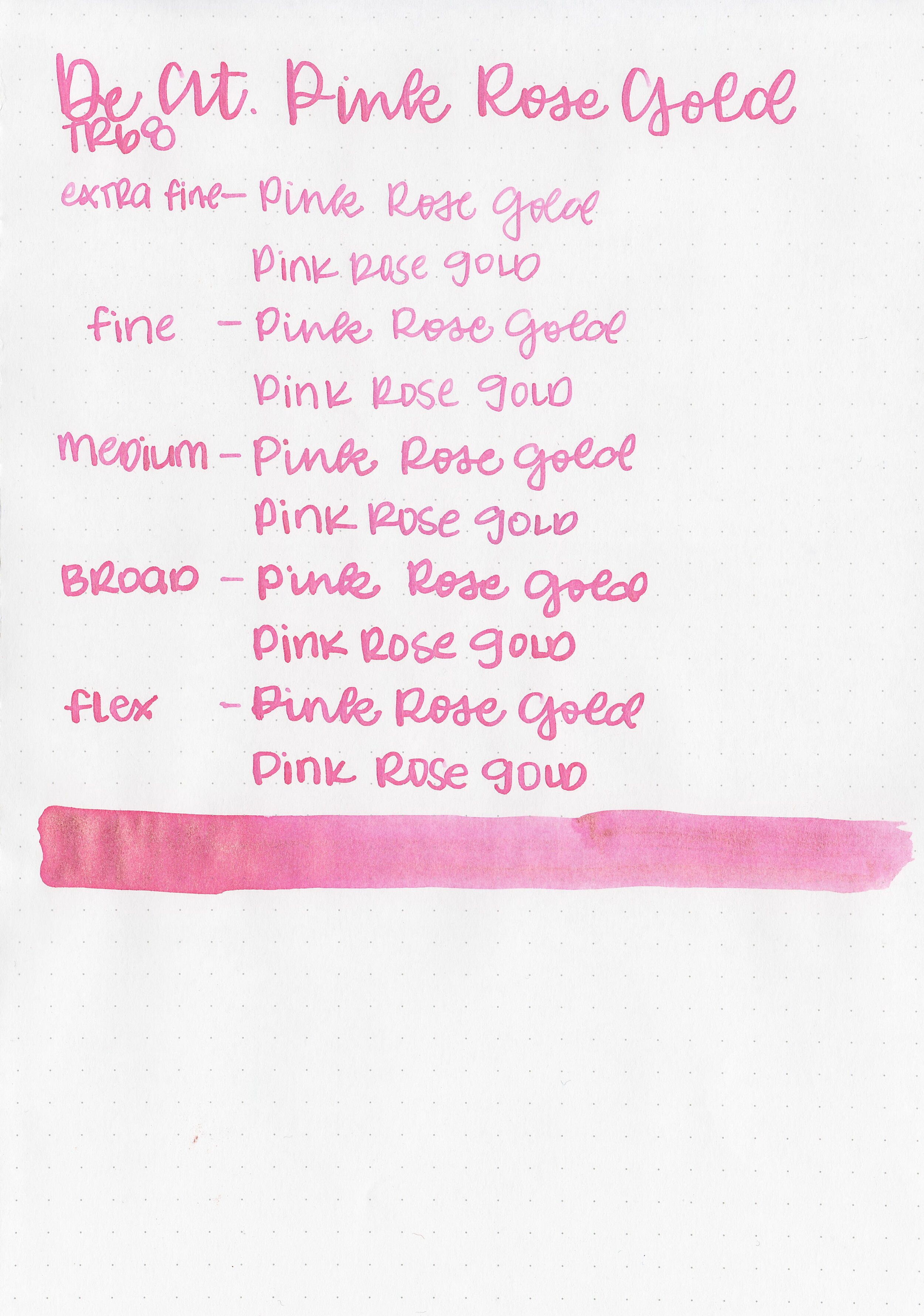
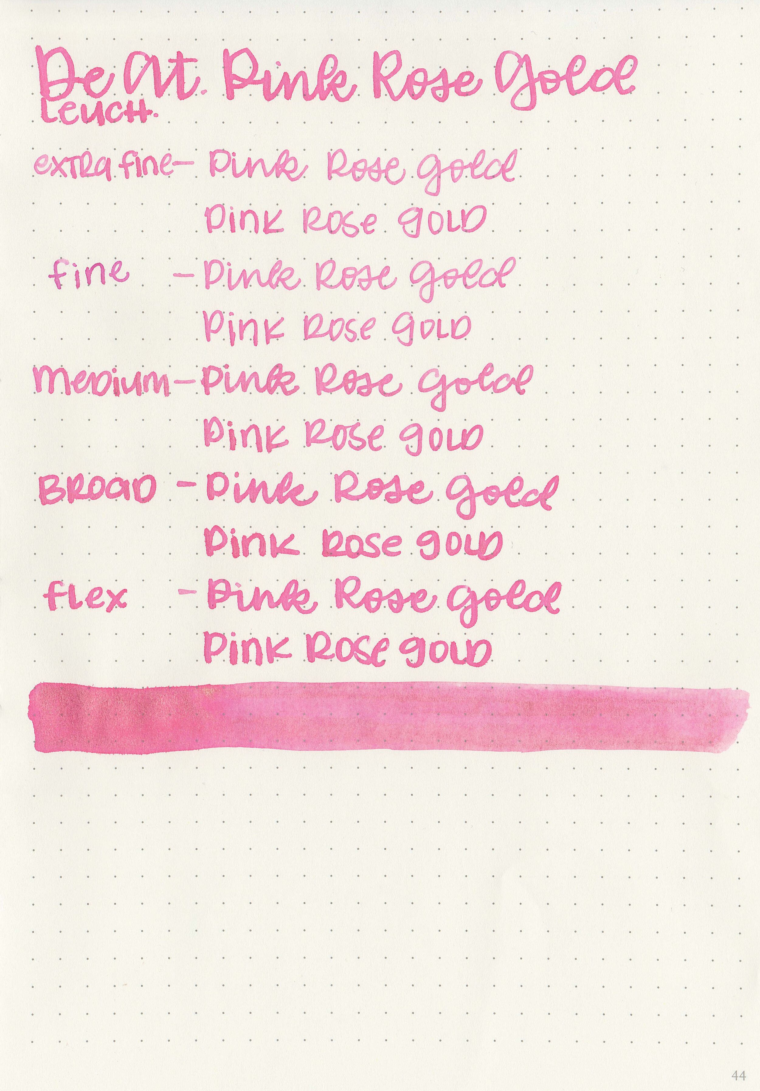
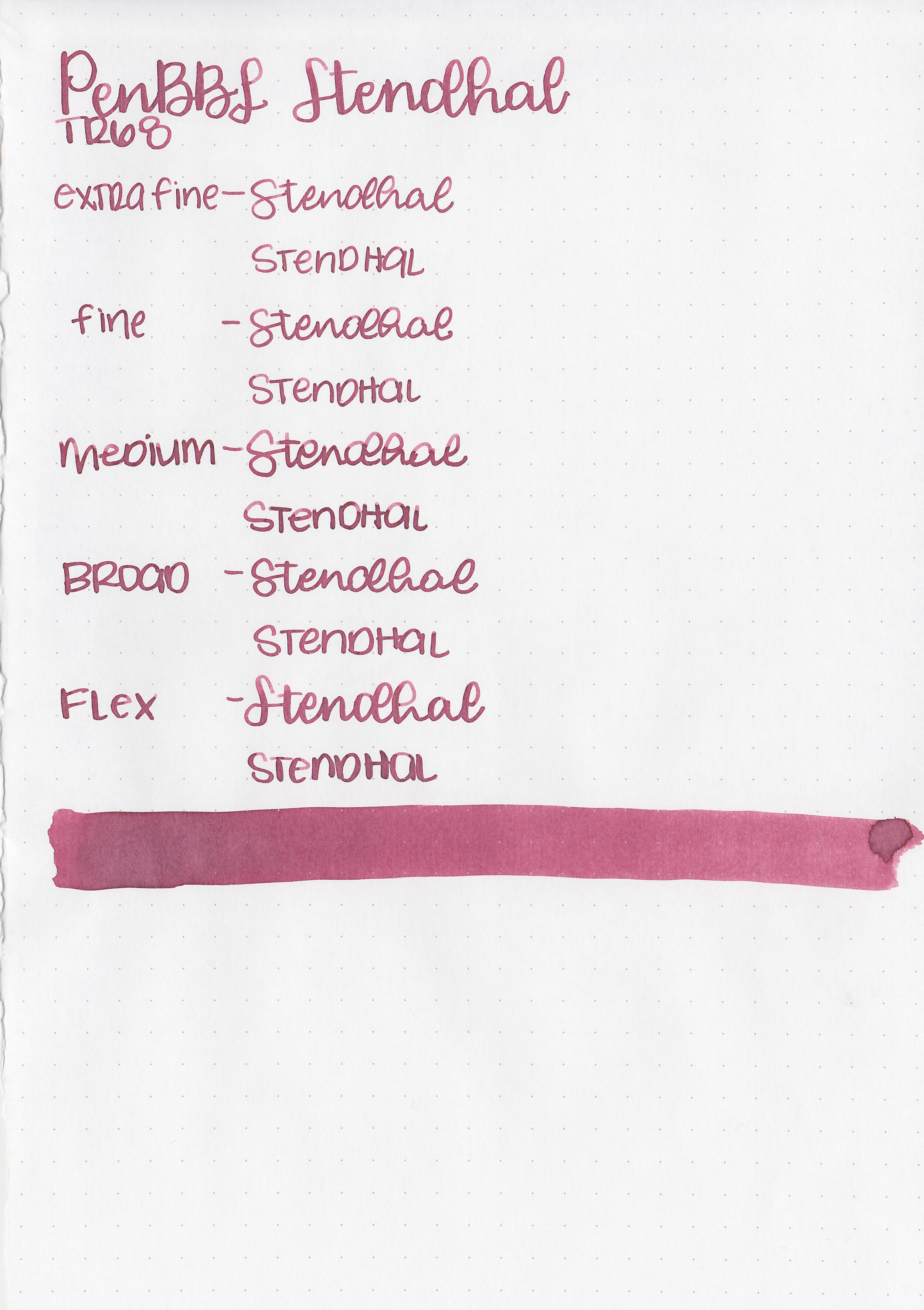
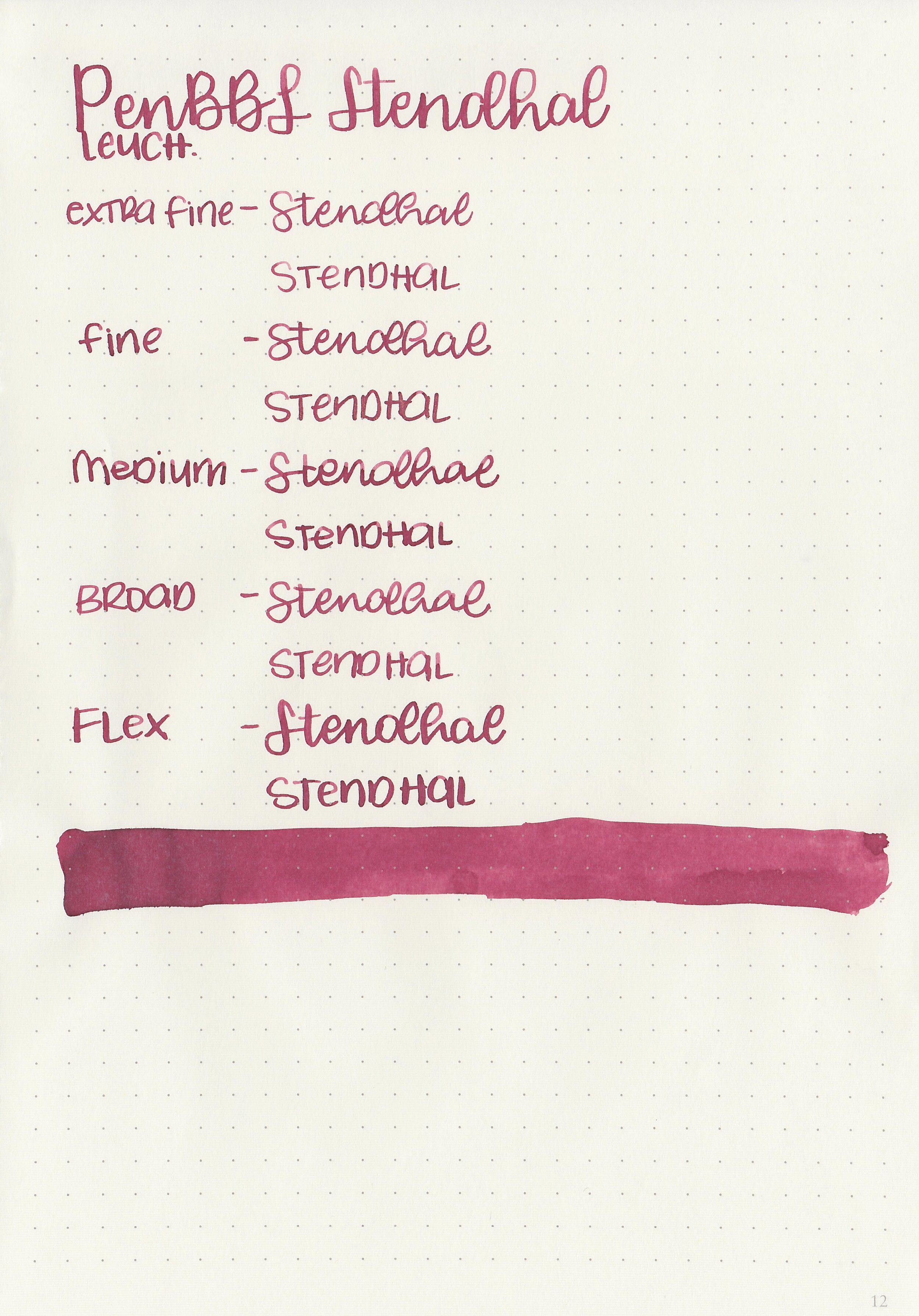
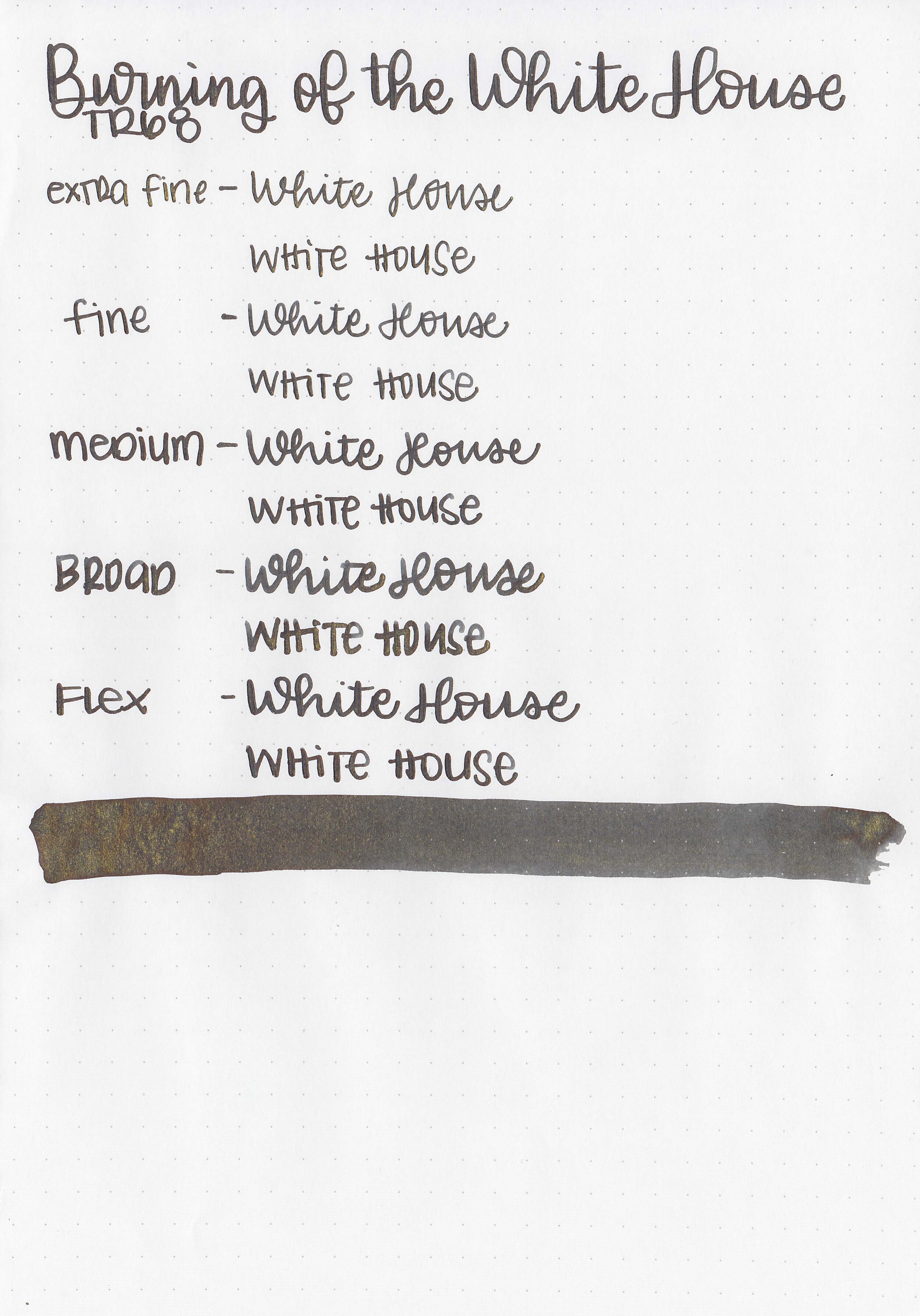
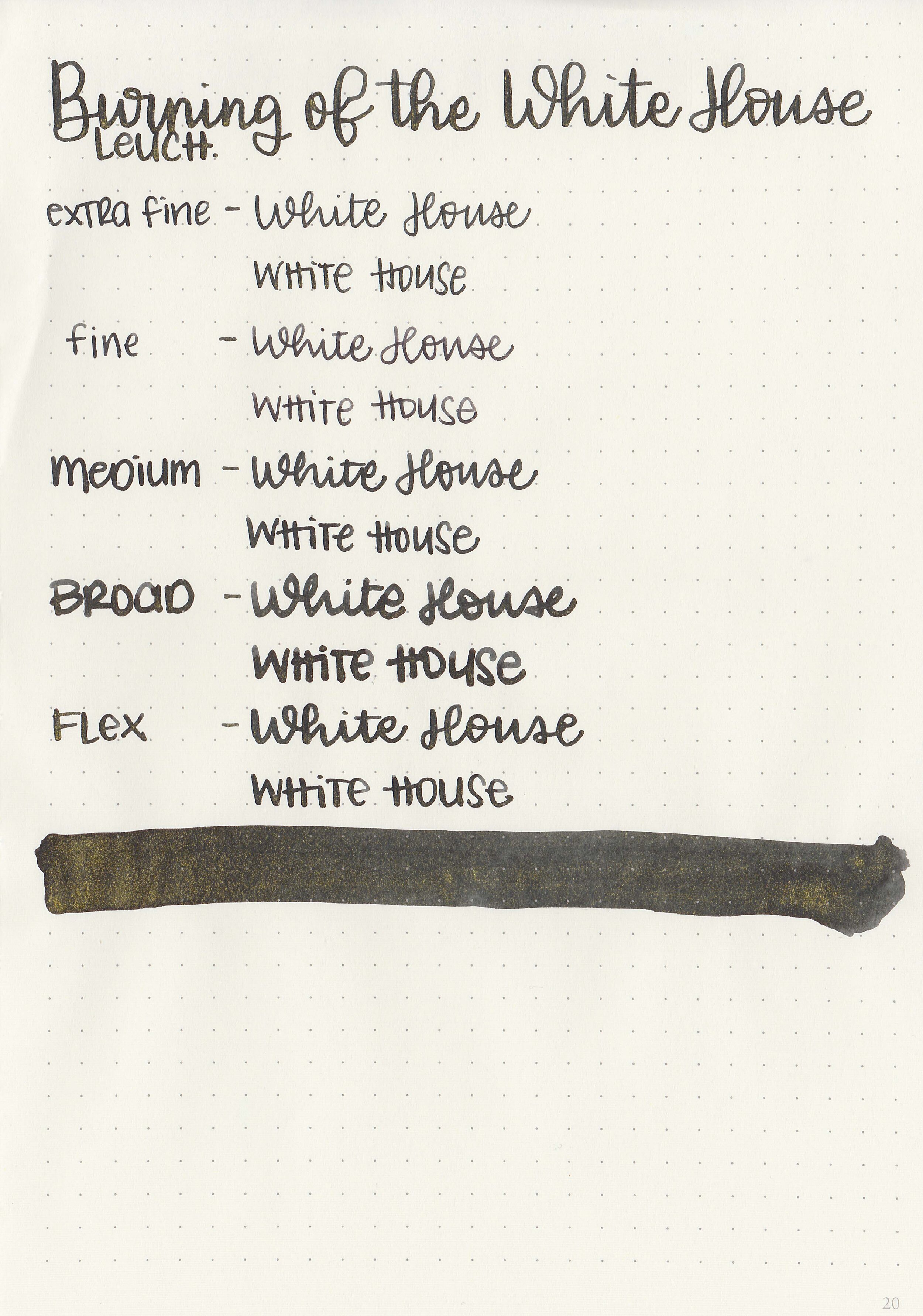
Writing samples:
Let's take a look at how the ink behaves on fountain pen friendly papers: Rhodia, Tomoe River, and Leuchtturm.
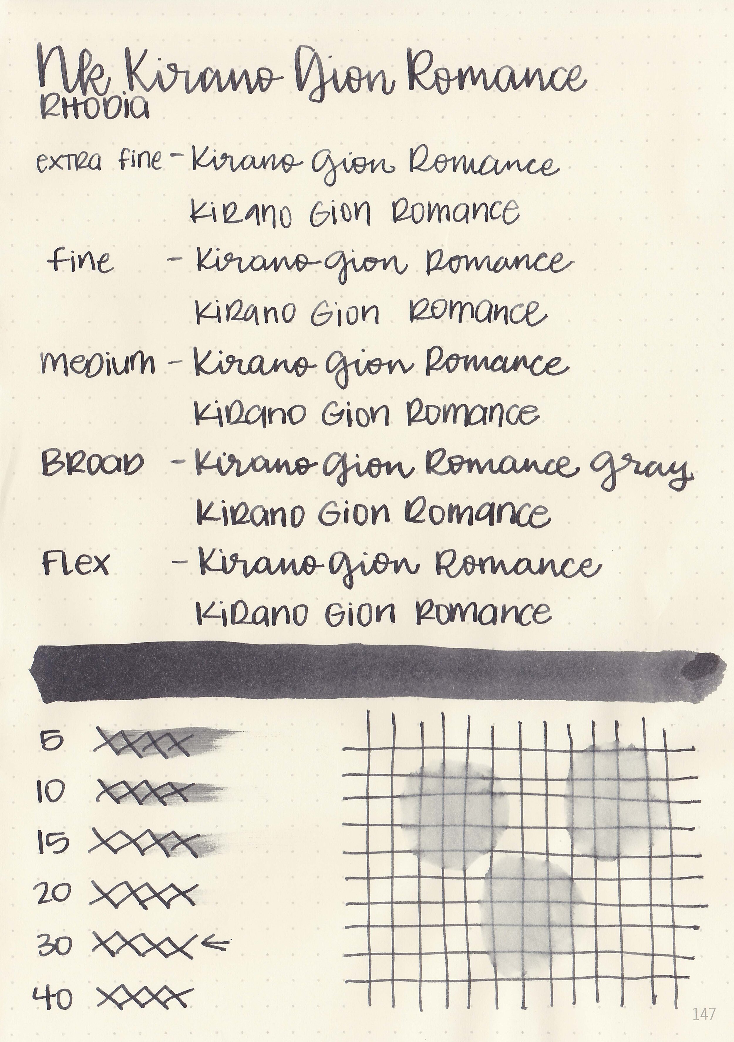
Dry time: 30 seconds
Water resistance: Medium
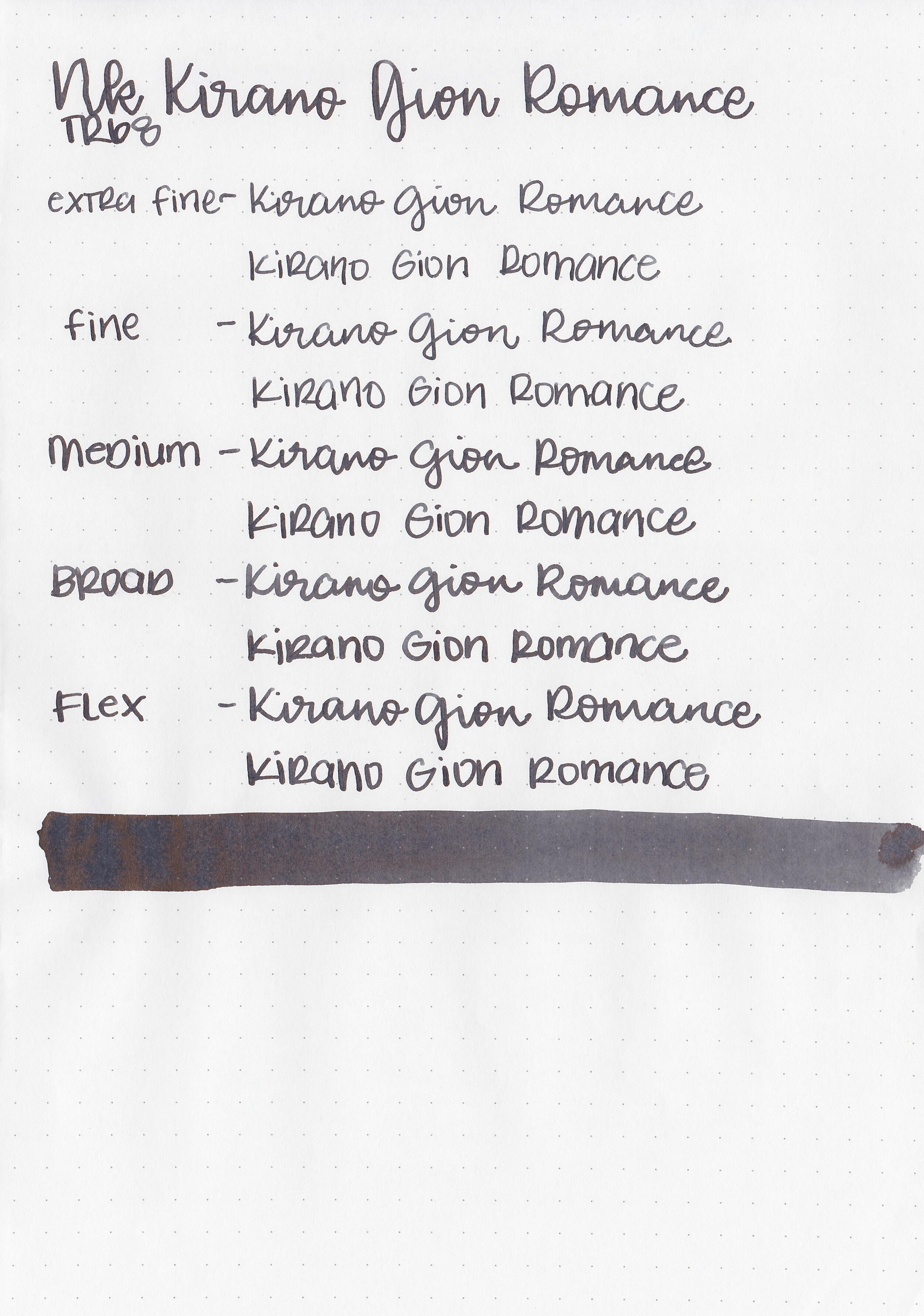
Feathering: None
Show through: Medium
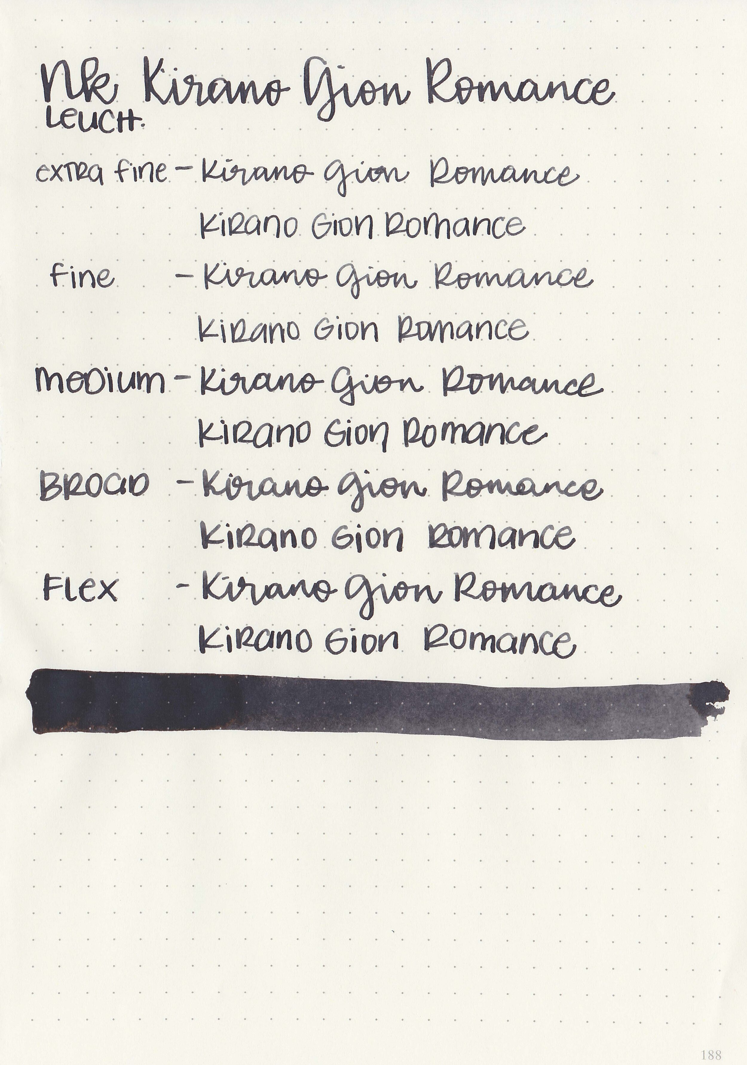
Bleeding: None
Other properties: low shading, low black sheen, and no shimmer.
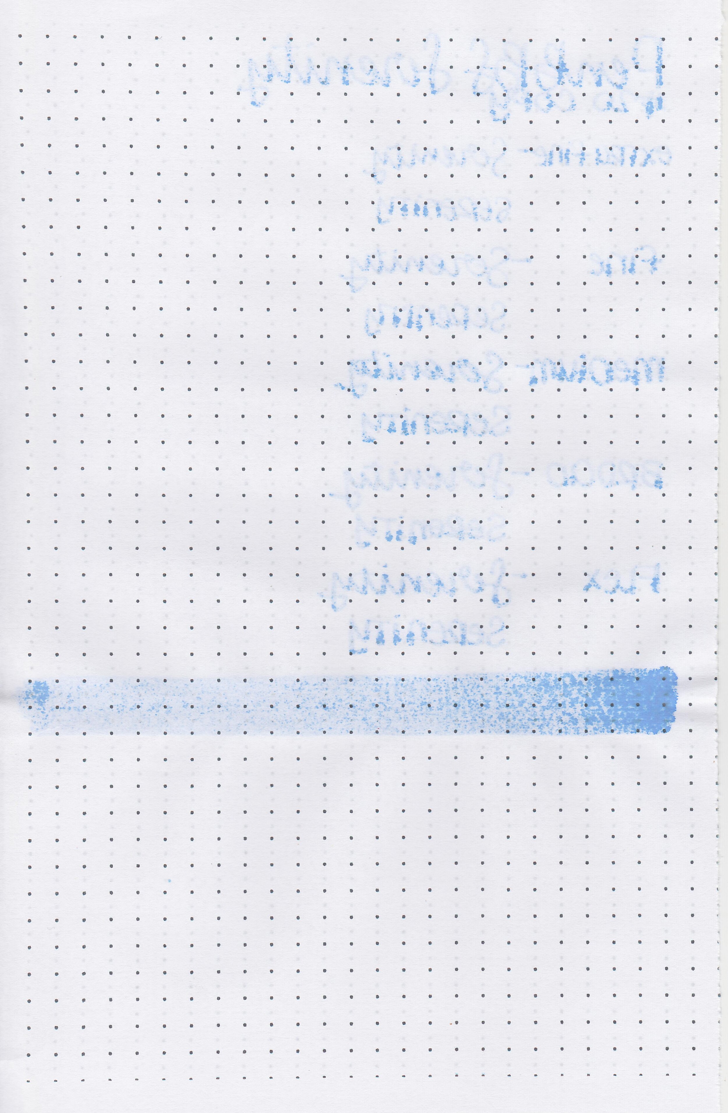
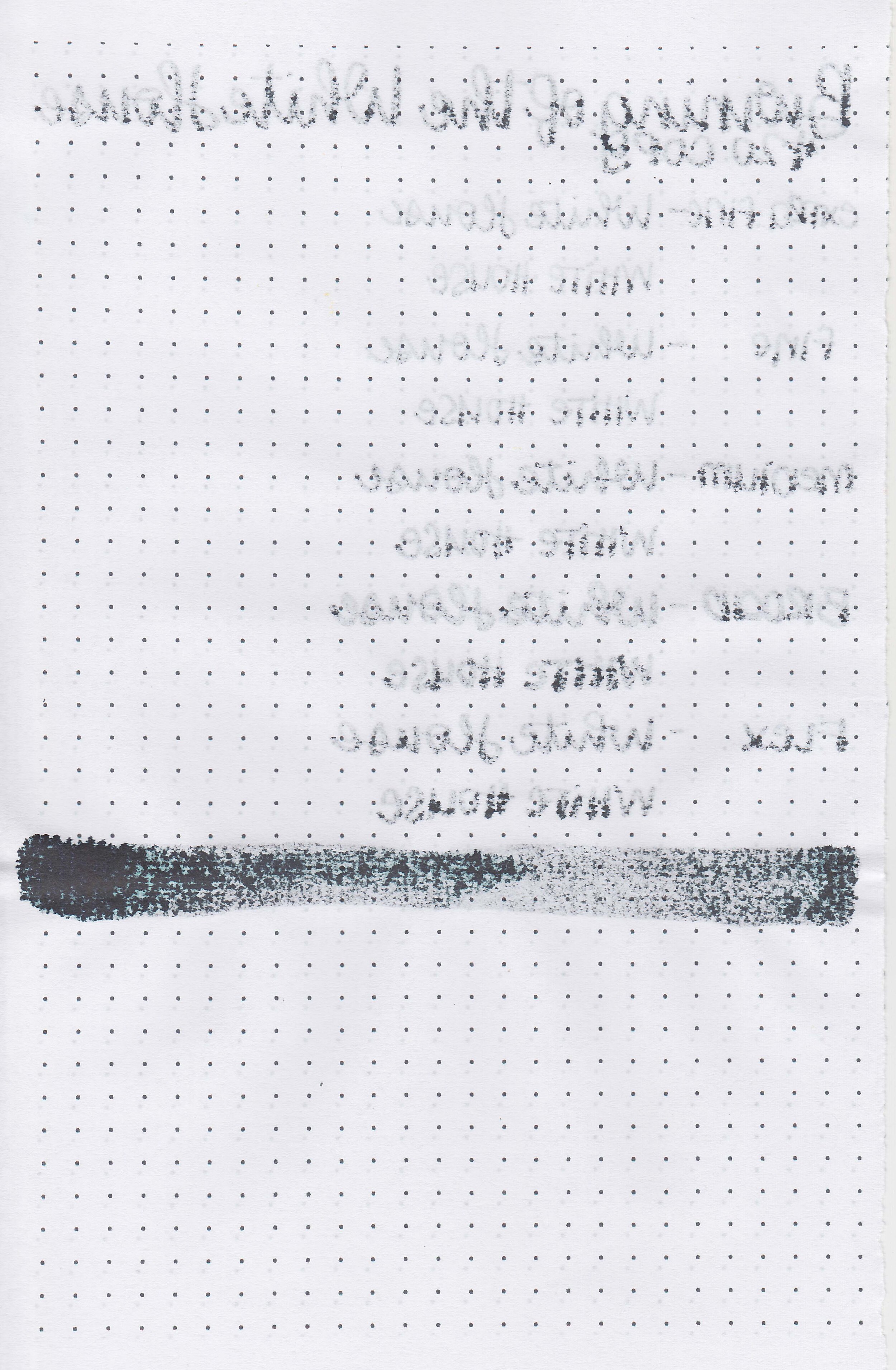
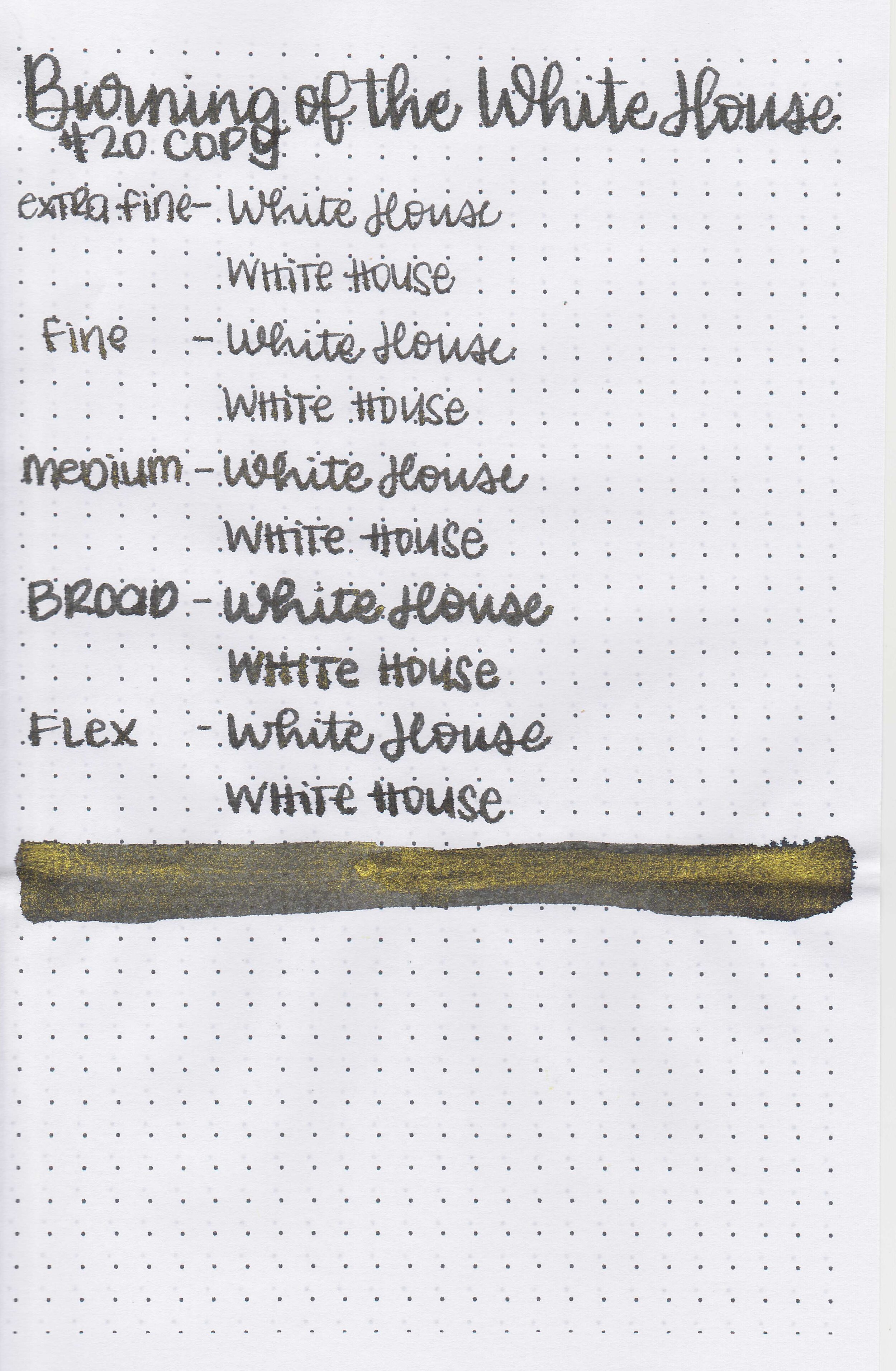
On Staples 24 lb copy paper there was a some feathering but not much bleeding.
Comparison Swabs:

Hirano Gion is closest to Birmingham Smoked Iron. Click here to see the Kobe inks together, and click here to see the grey inks together.
Longer writing:

I used a Sailor Pro Gear Lighthouse with a broad nib on a Taroko Enigma notebook. The ink had a wet flow.
Overall, it’s a lovely neutral grey, great for the office or daily use.
Disclaimer: All photos and opinions are my own. This page does not contain affiliate links and this post is not sponsored.