Ink Review #1497: Kobe 58 Hyogo Canal Blue
/
A while back a pen friend gave me a bottle of Kobe 58 Hyogo Canal Blue. I’ve used it many times but realized I’ve never reviewed it so it’s finally time. You can find this ink for sale at Vanness Pens.

The Color:
Hyogo Canal Blue is a beautiful medium blue.
Swabs:

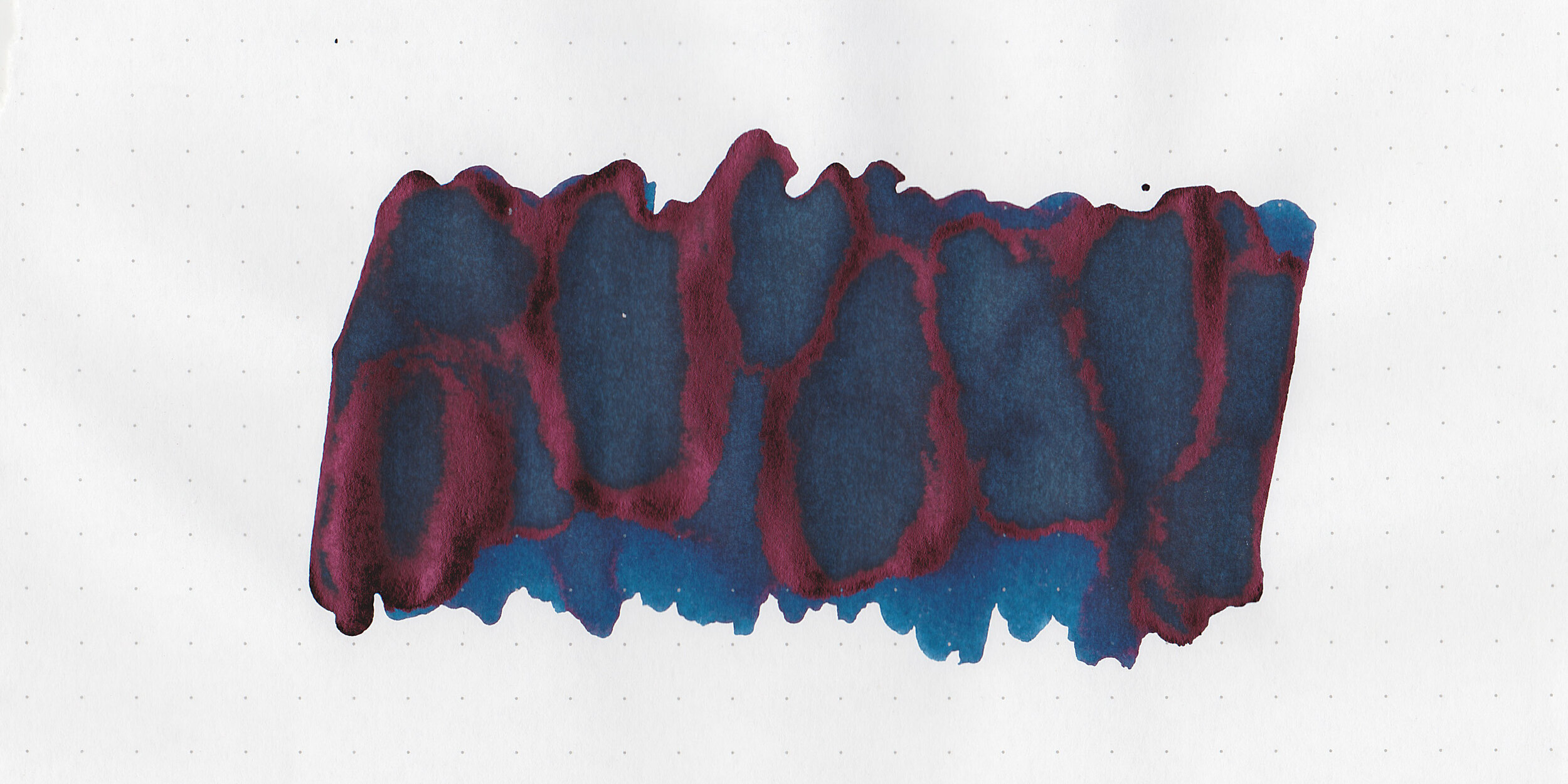
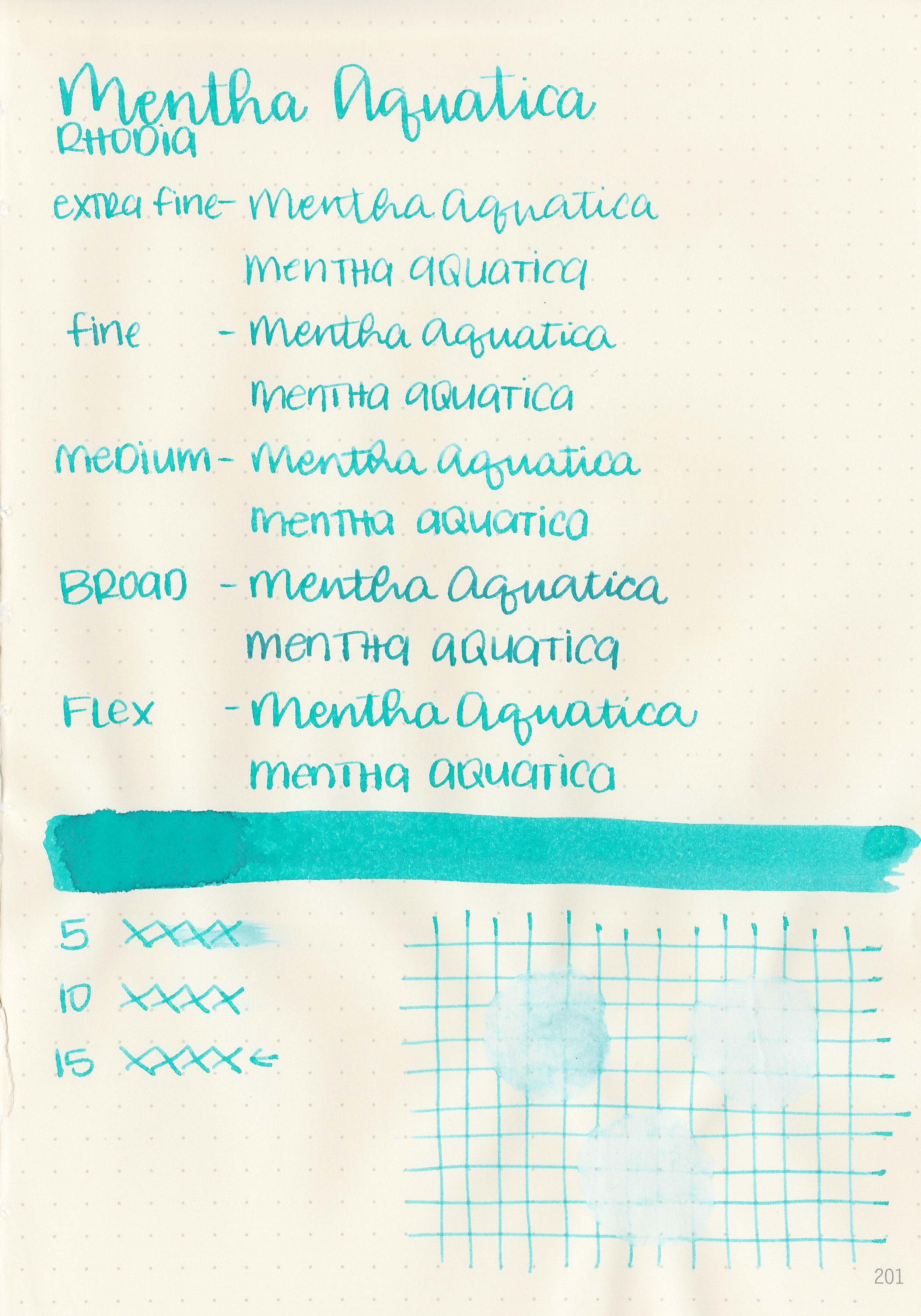
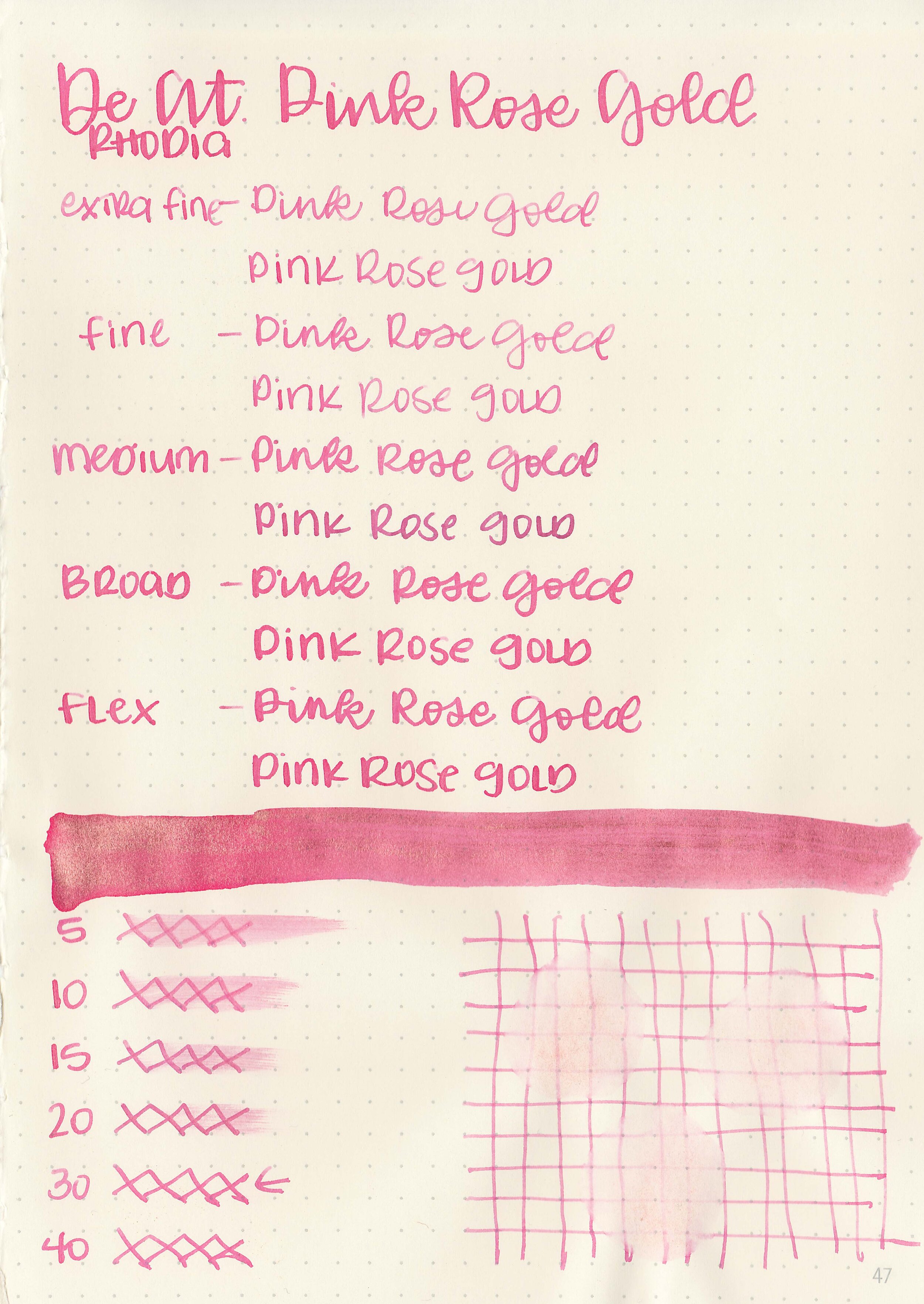
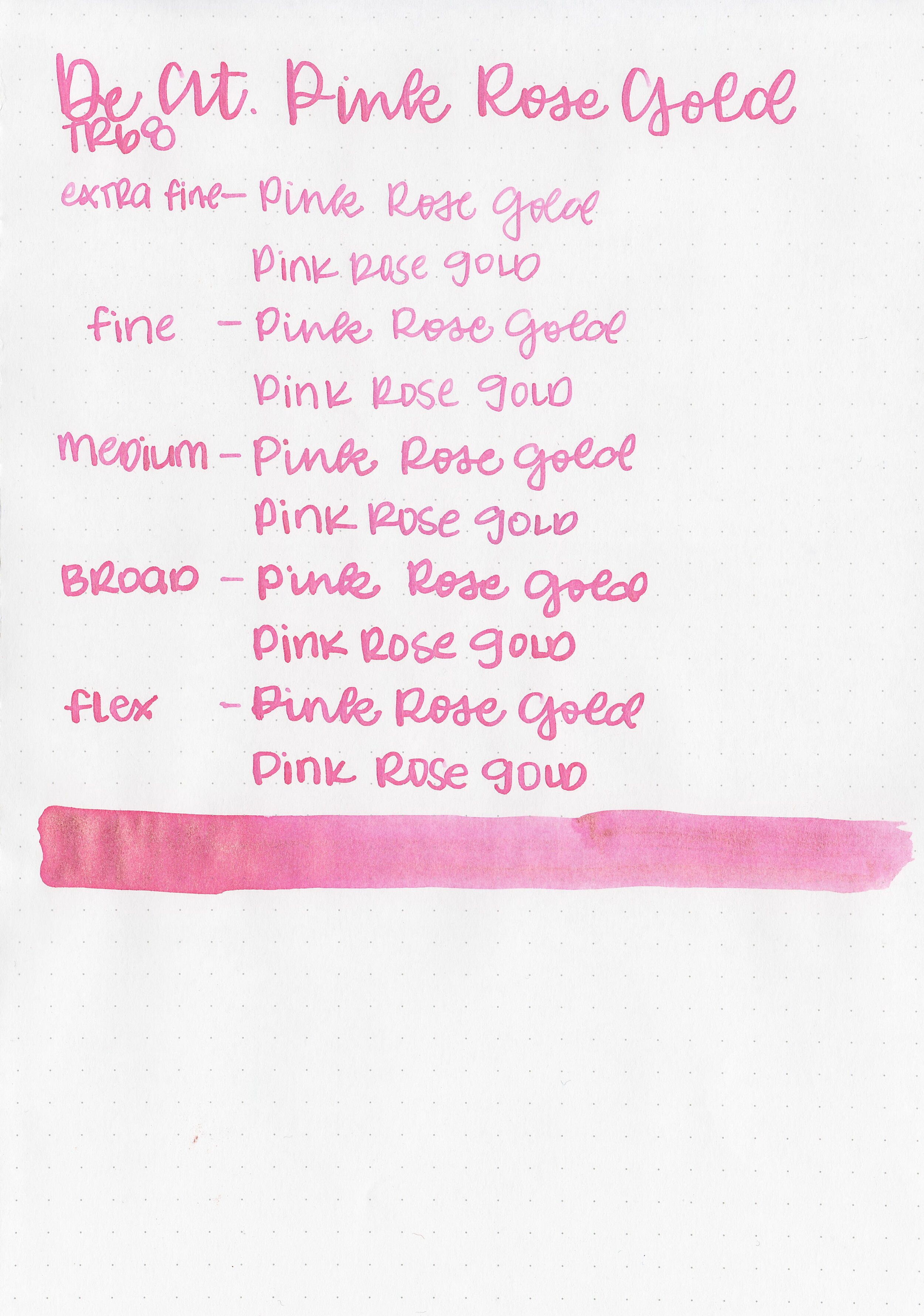
In large swabs on Tomoe River paper the ink is a medium blue with lots of pink sheen.

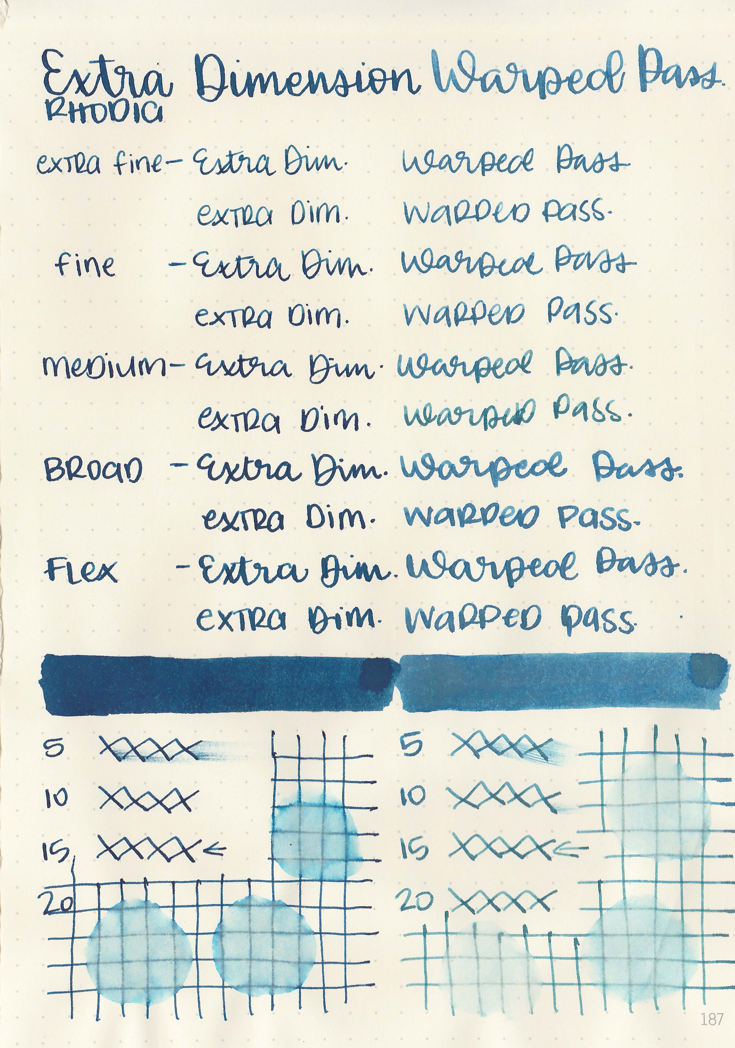
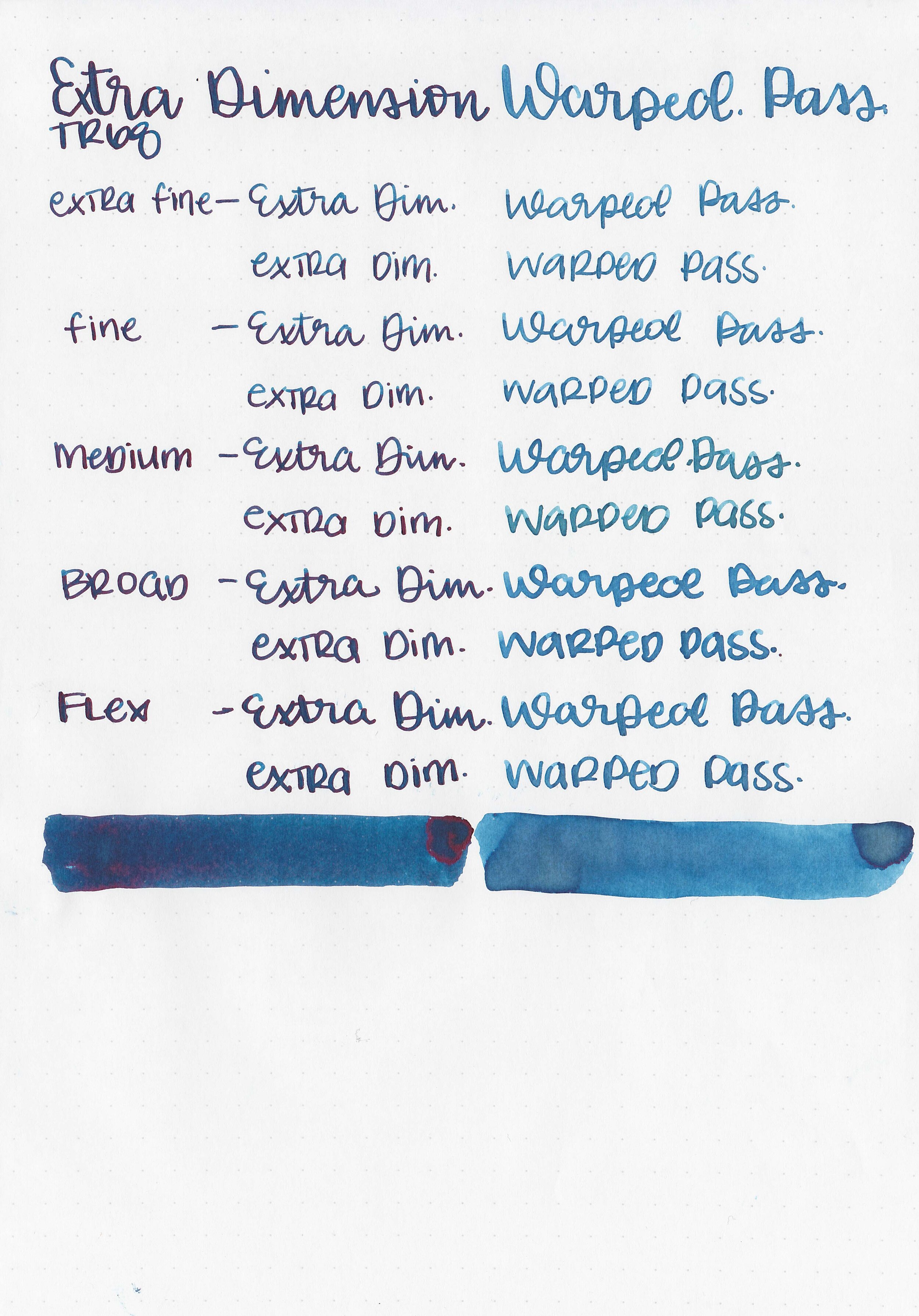
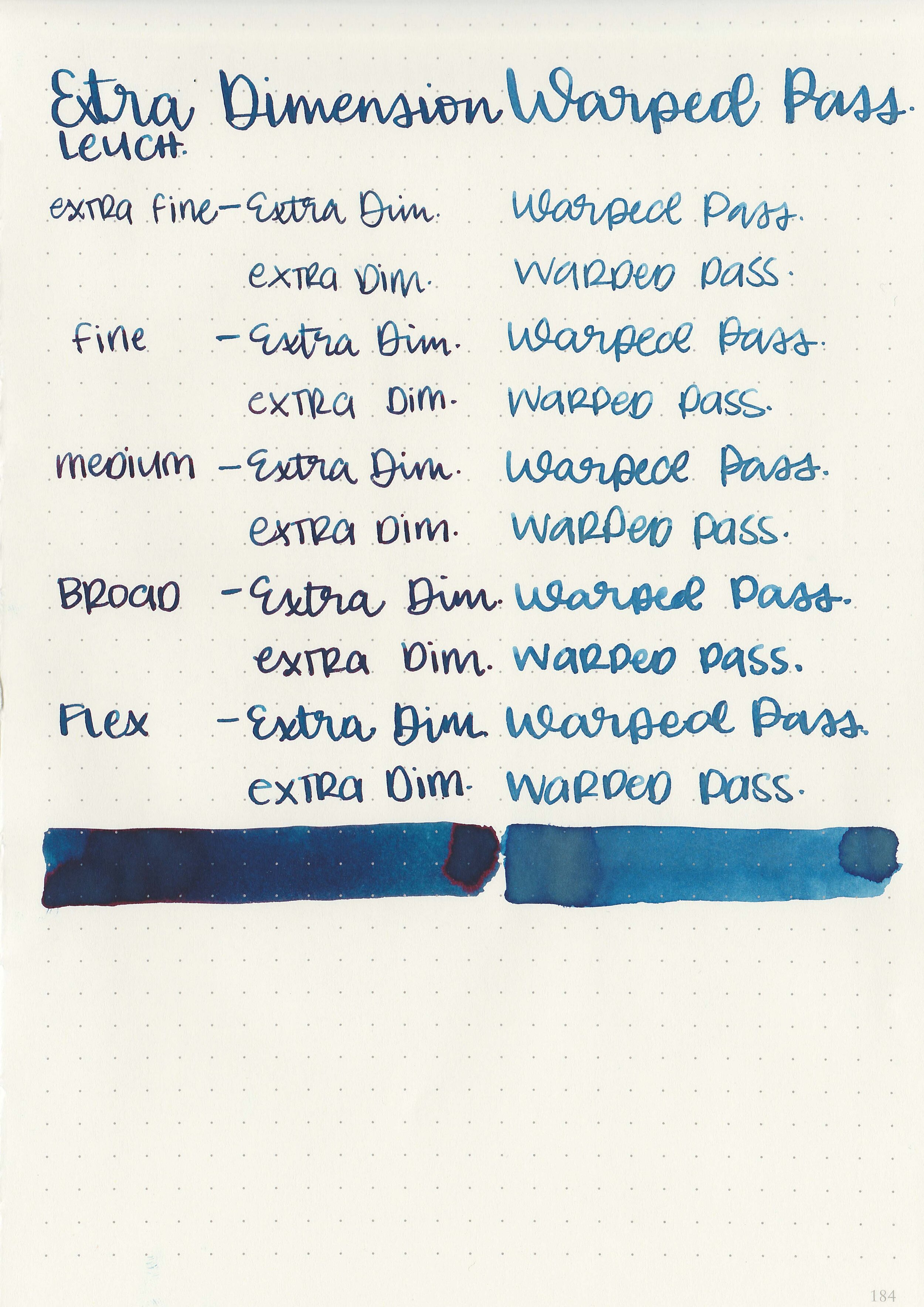
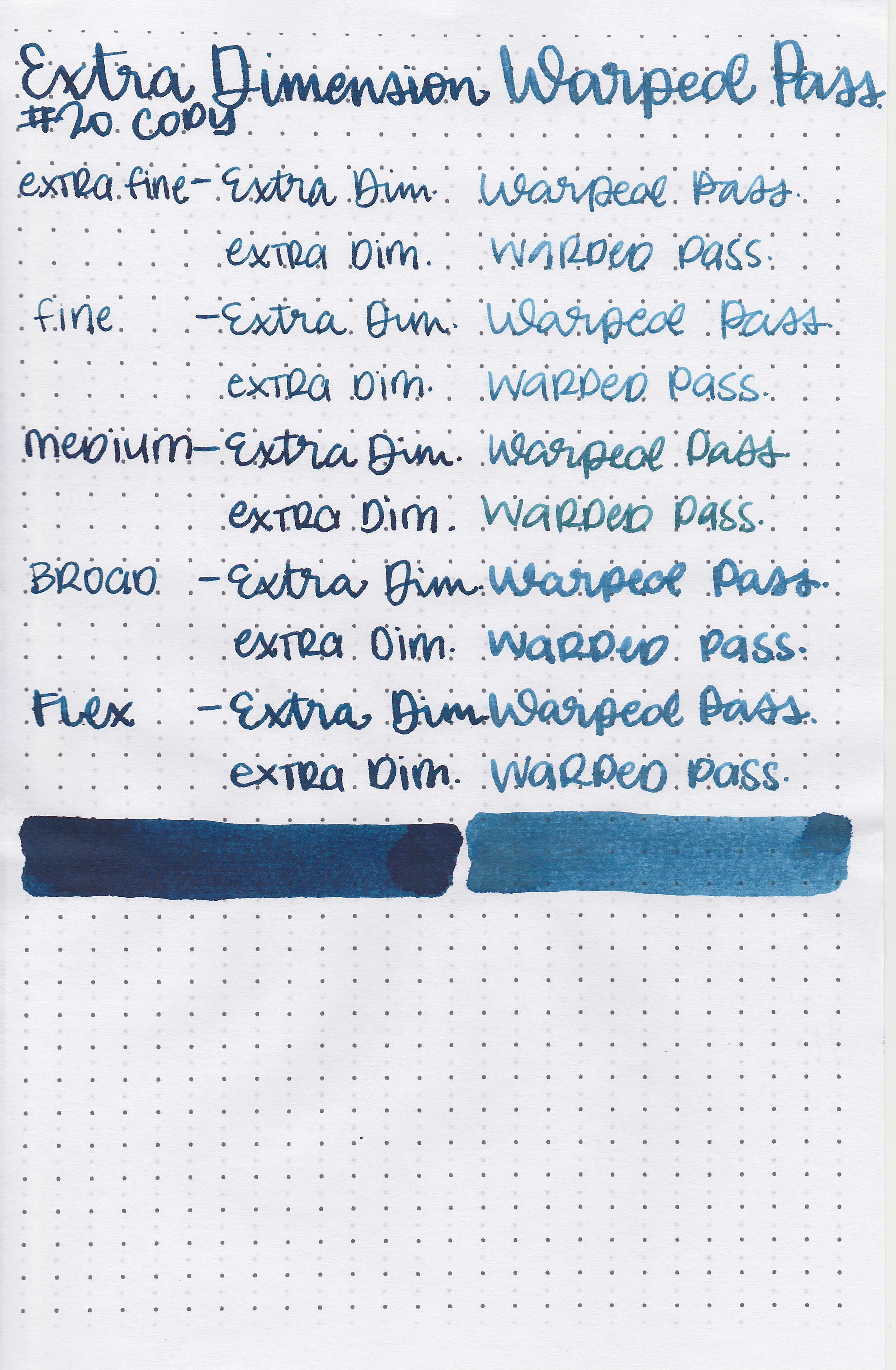
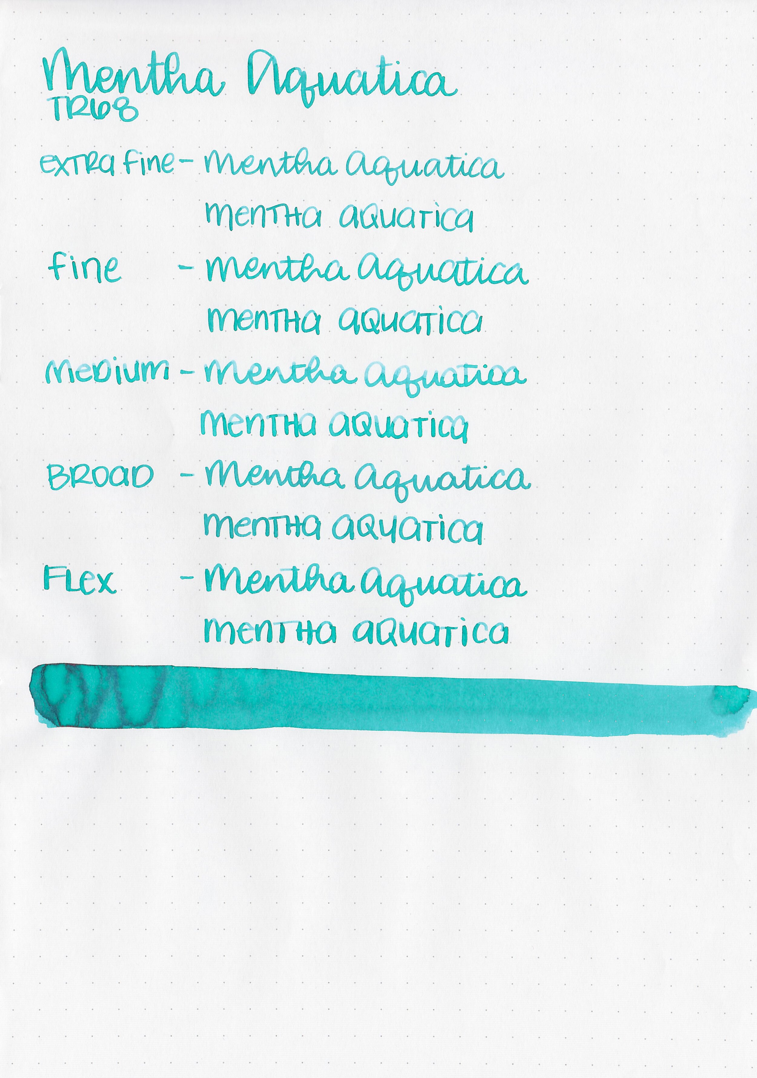
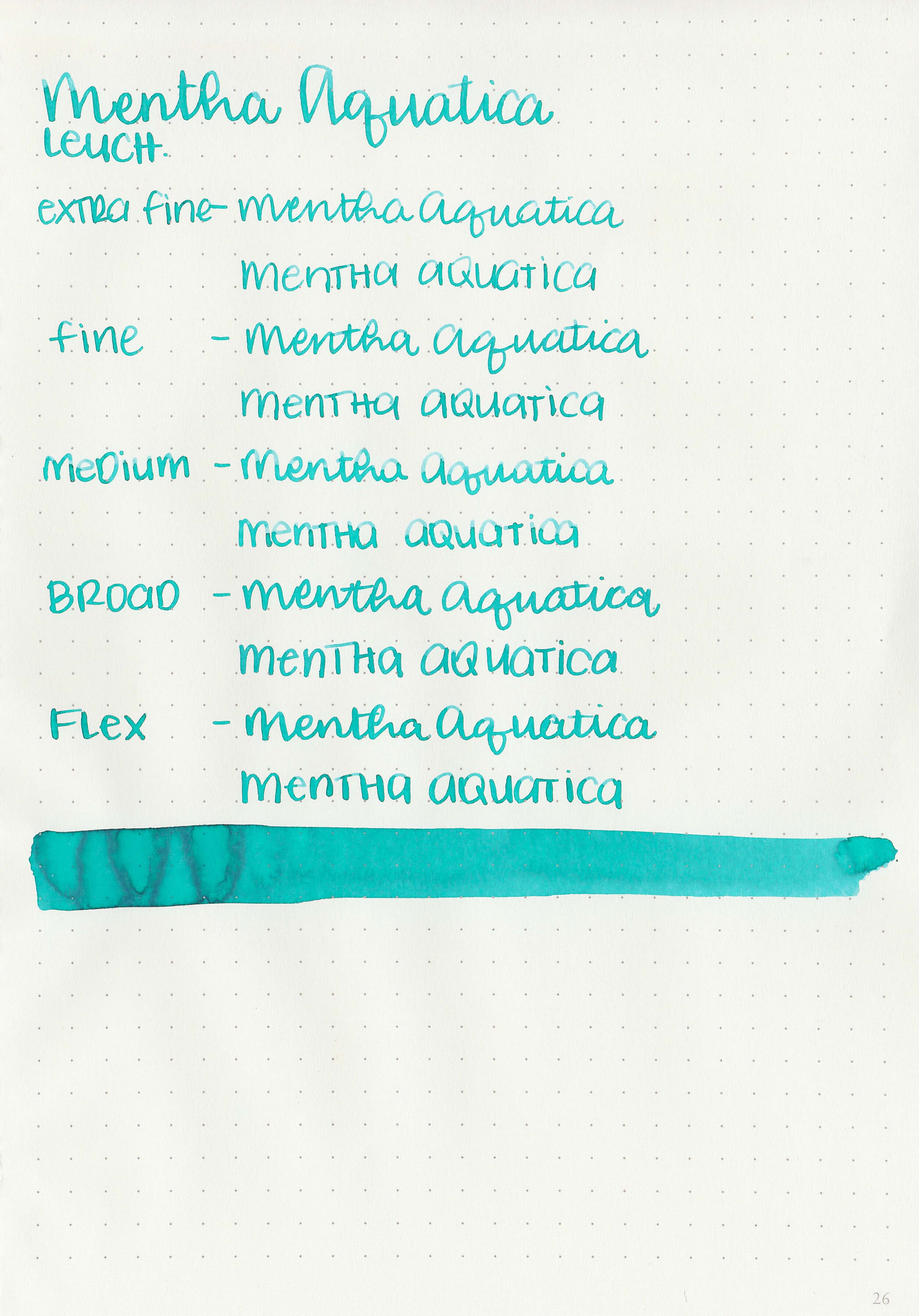
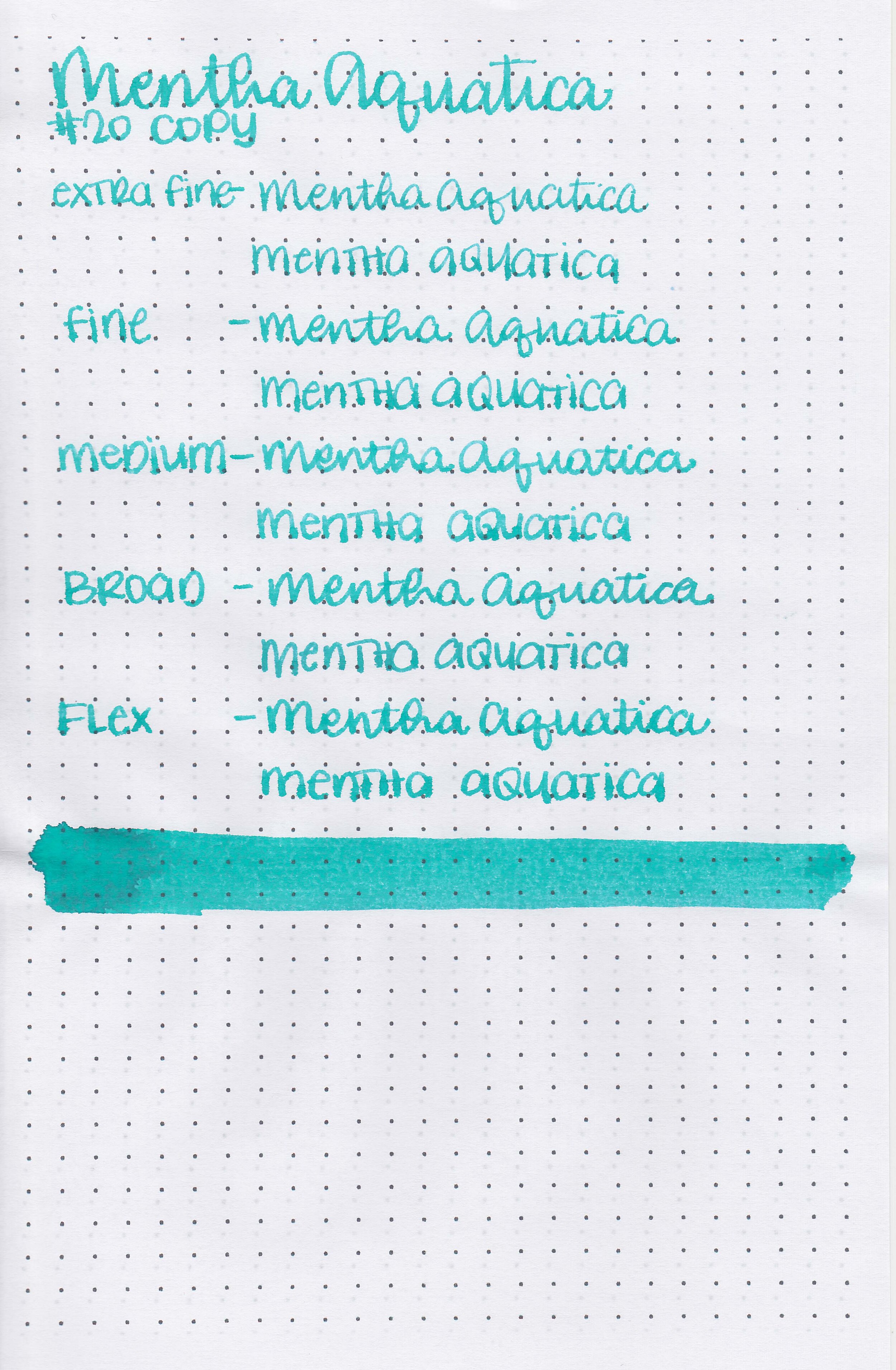
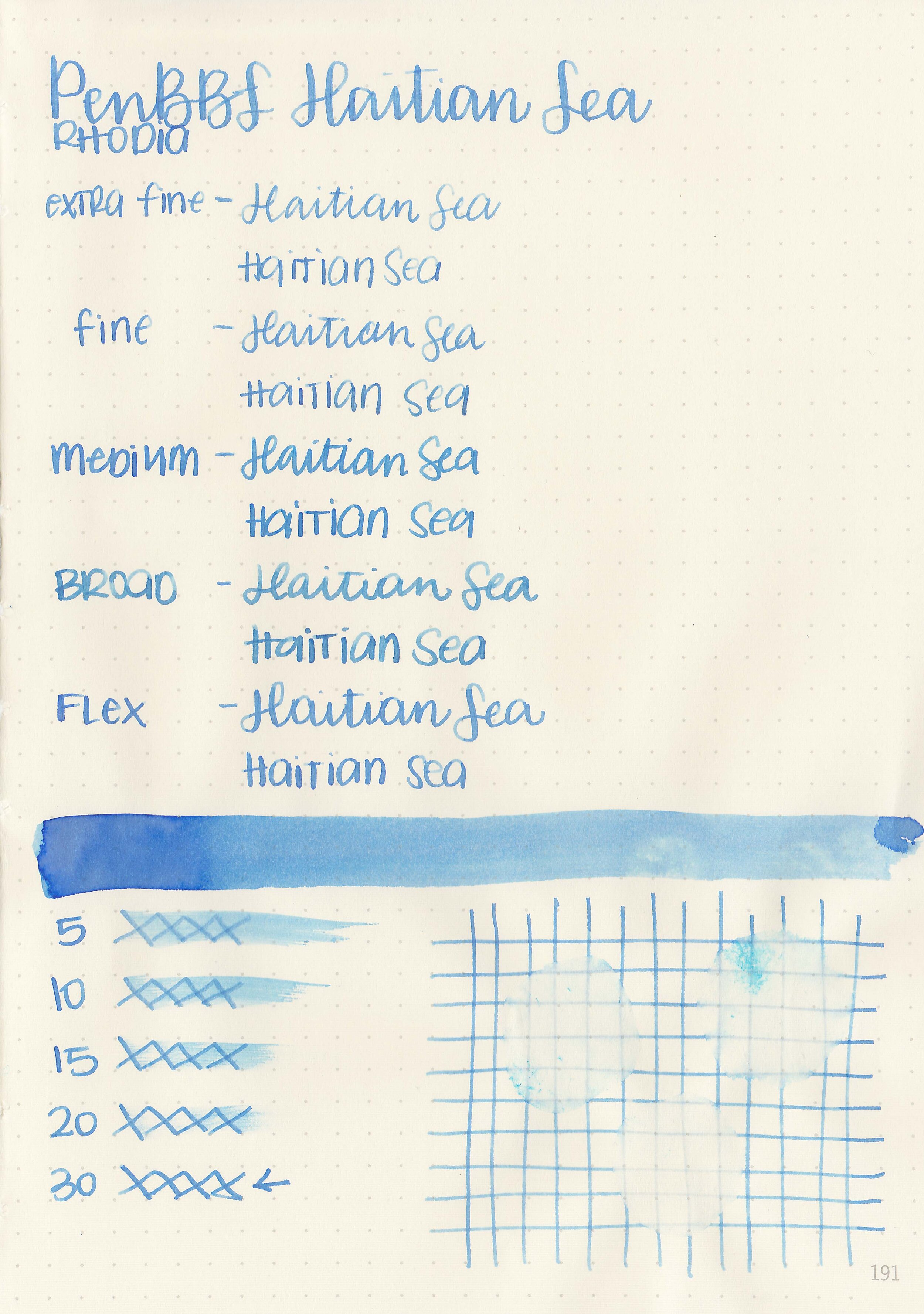
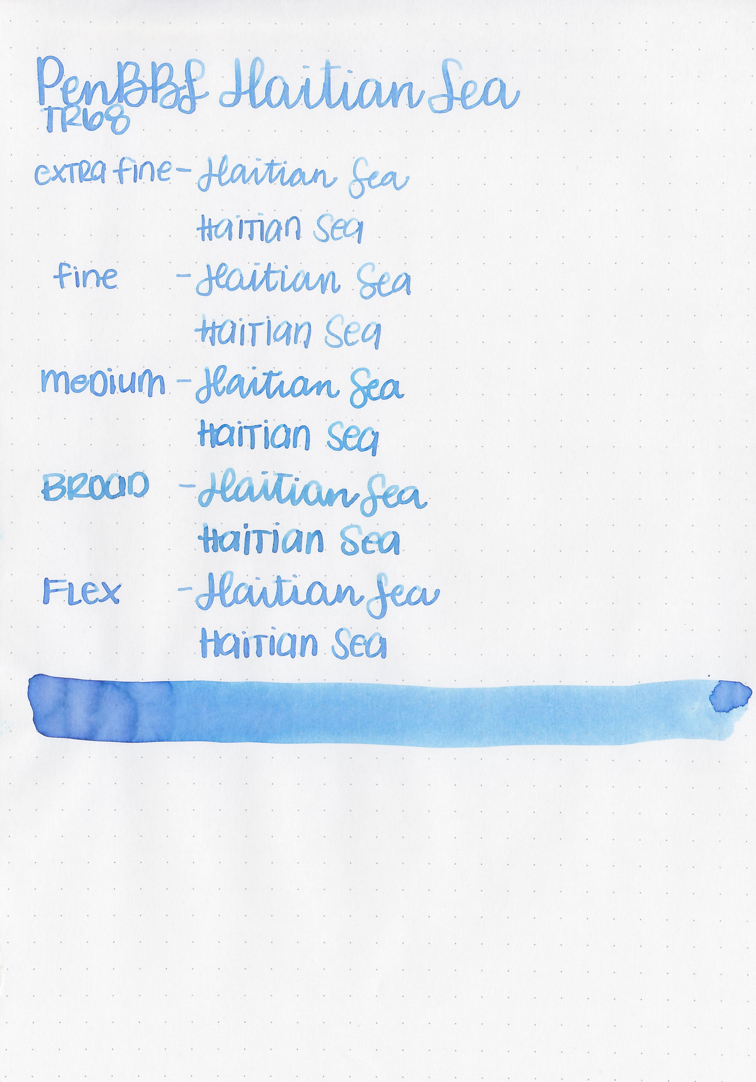
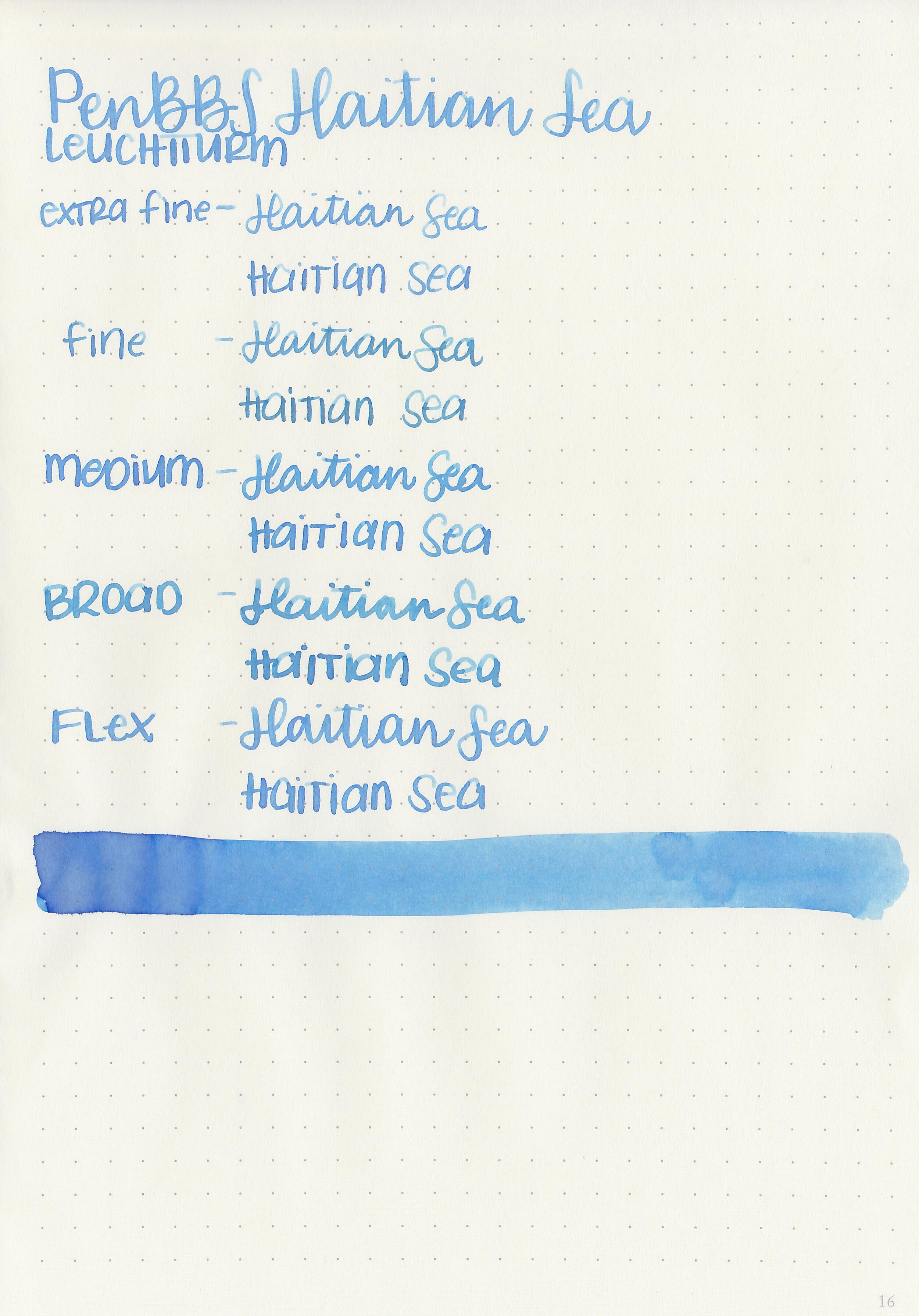
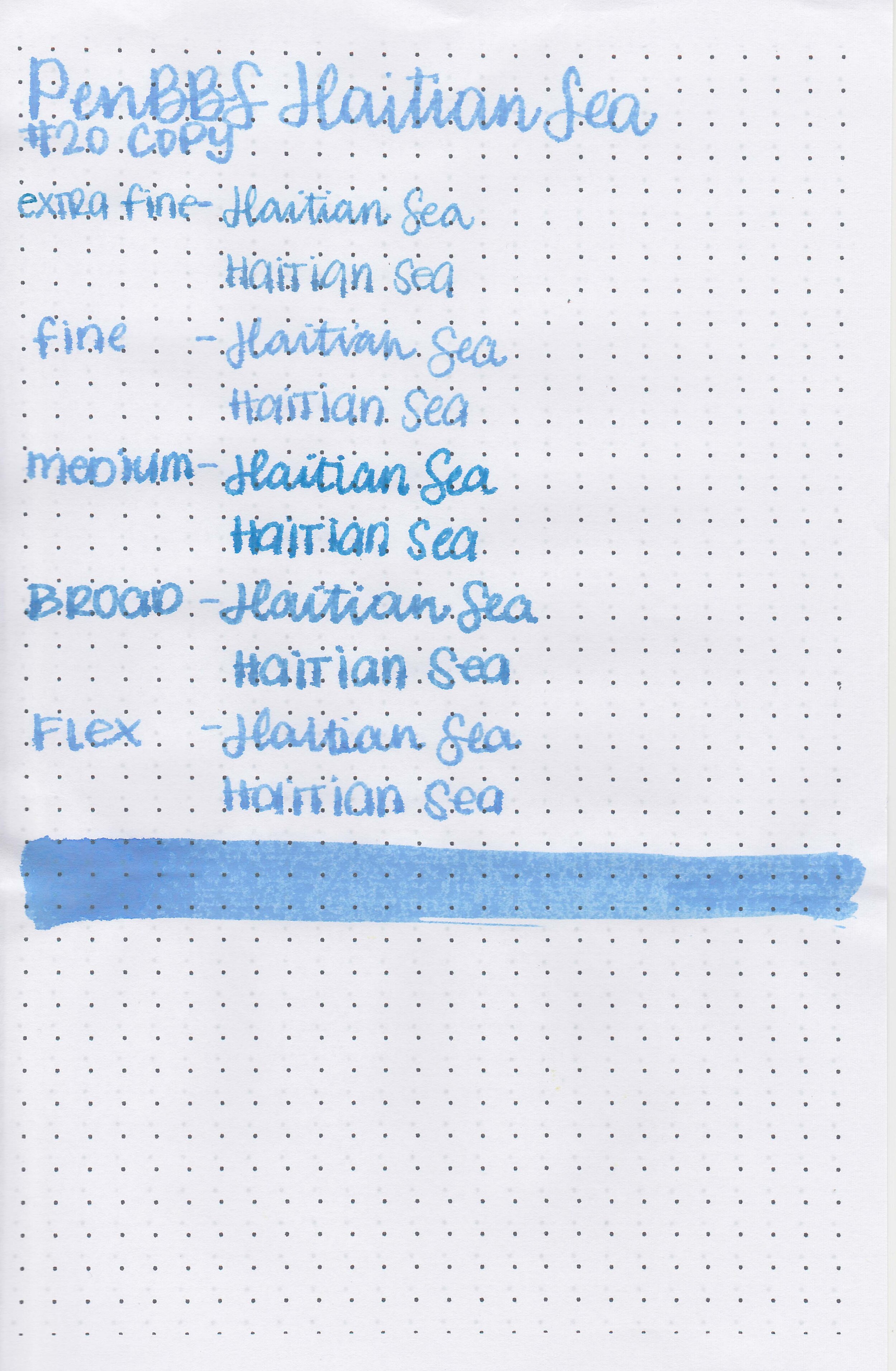
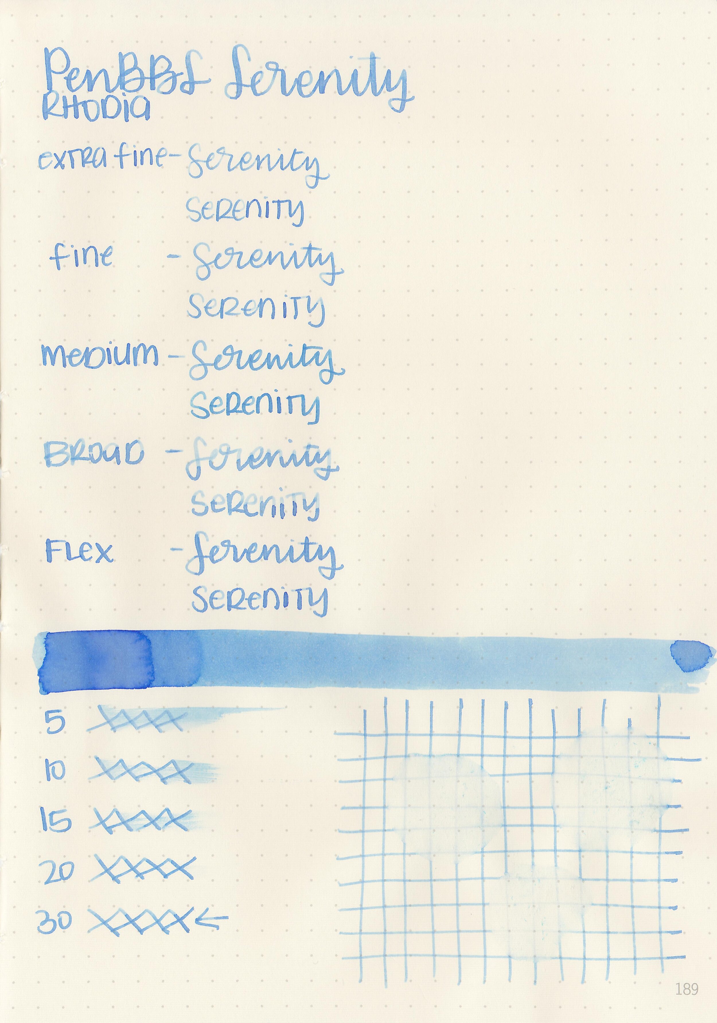
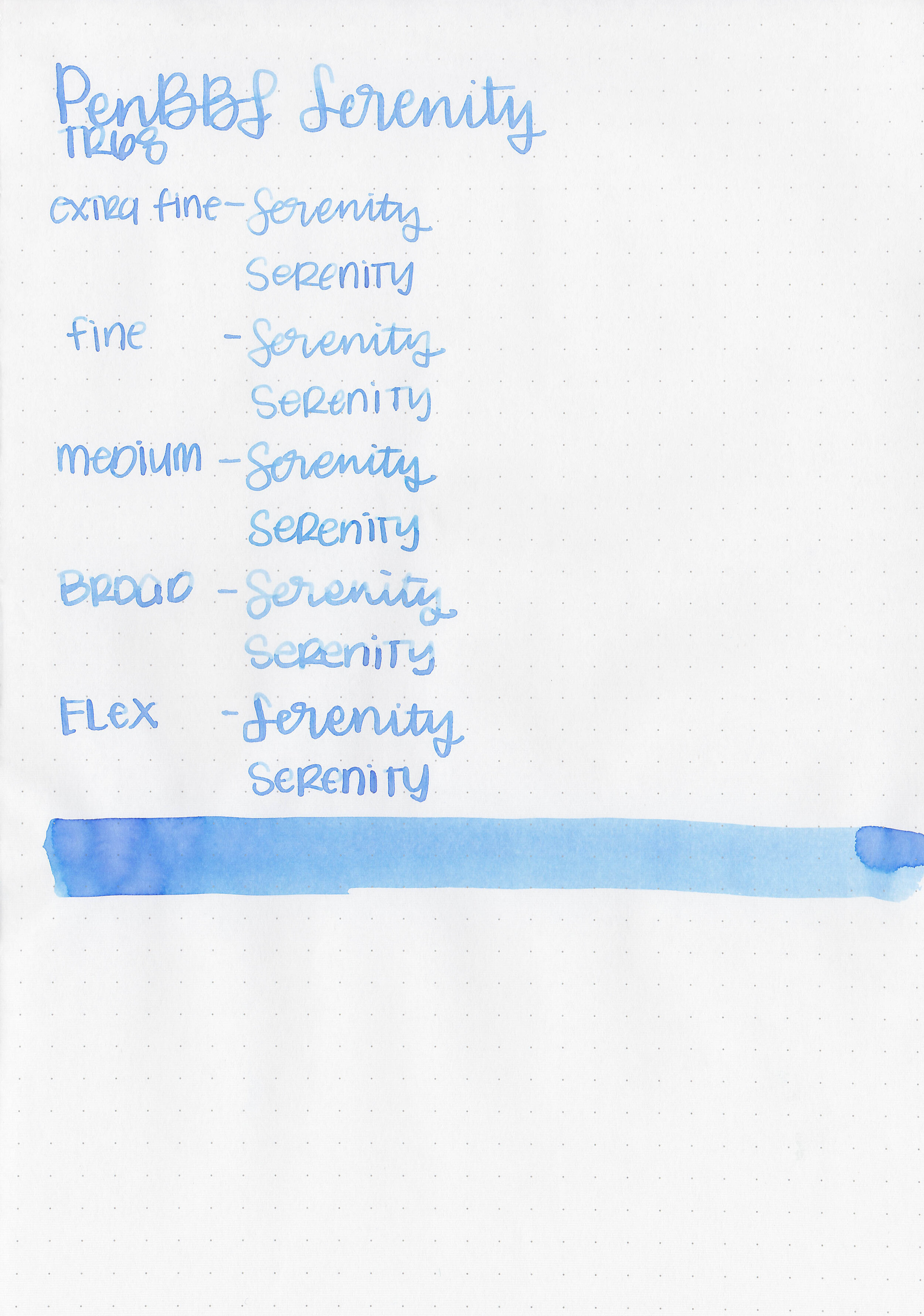
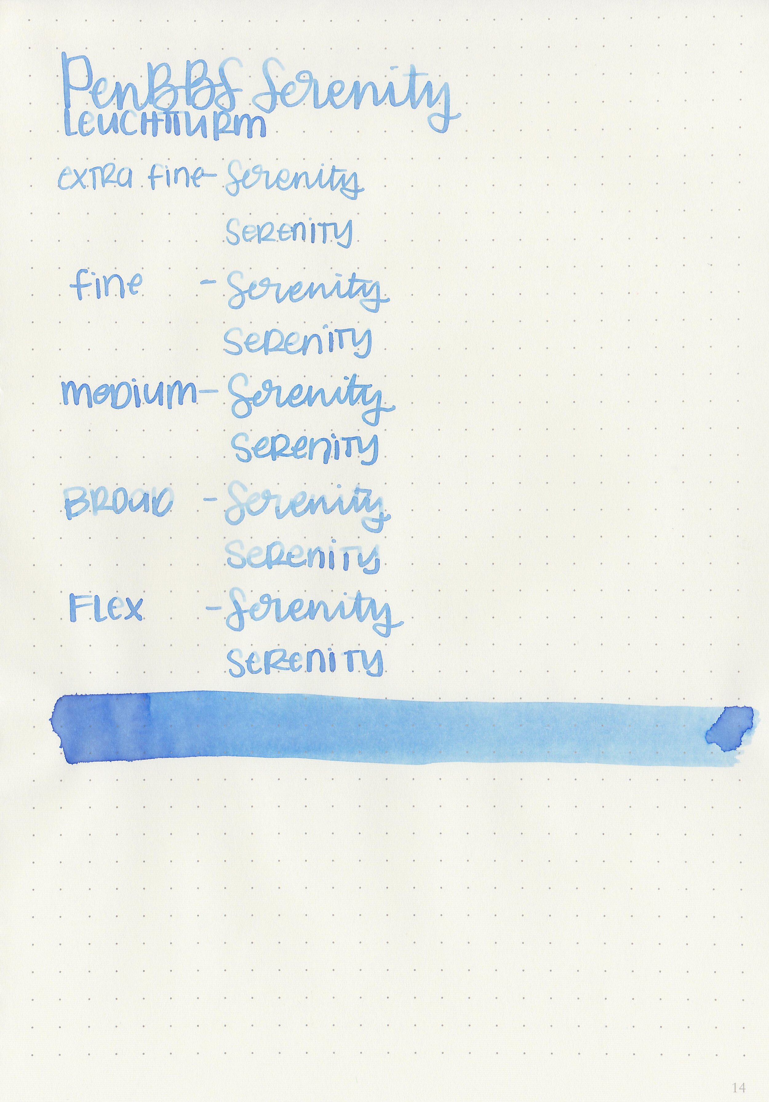
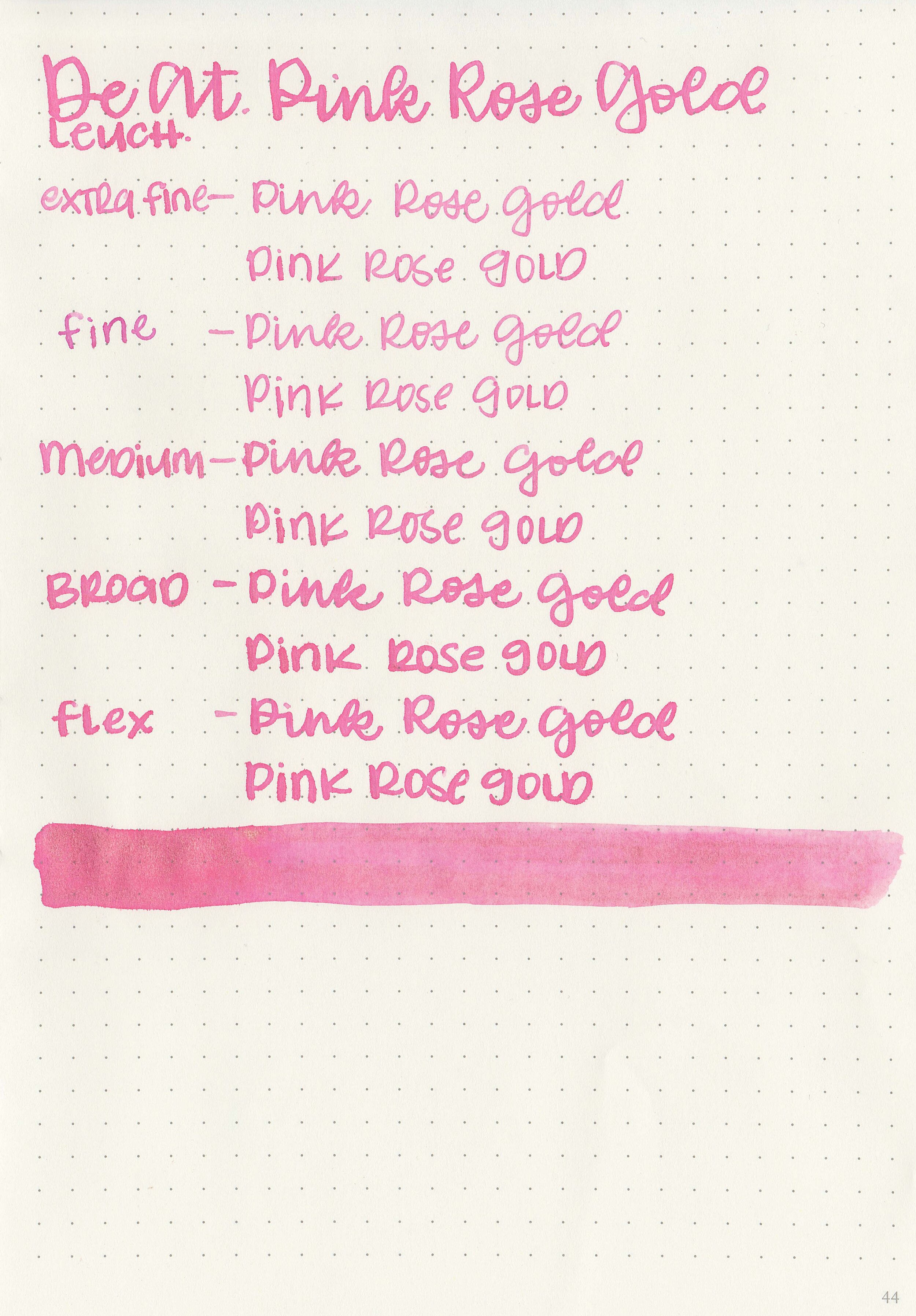
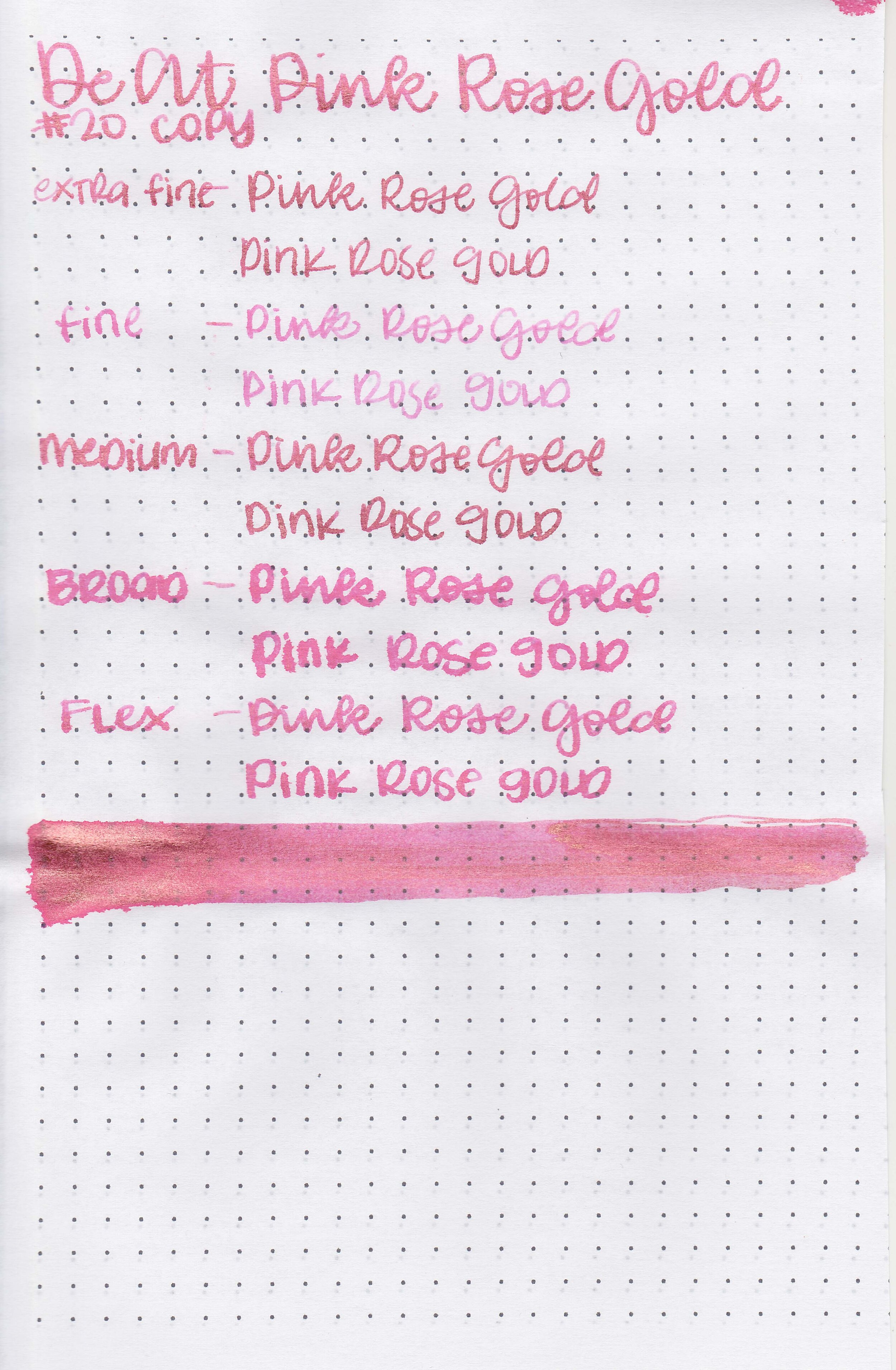
Writing samples:
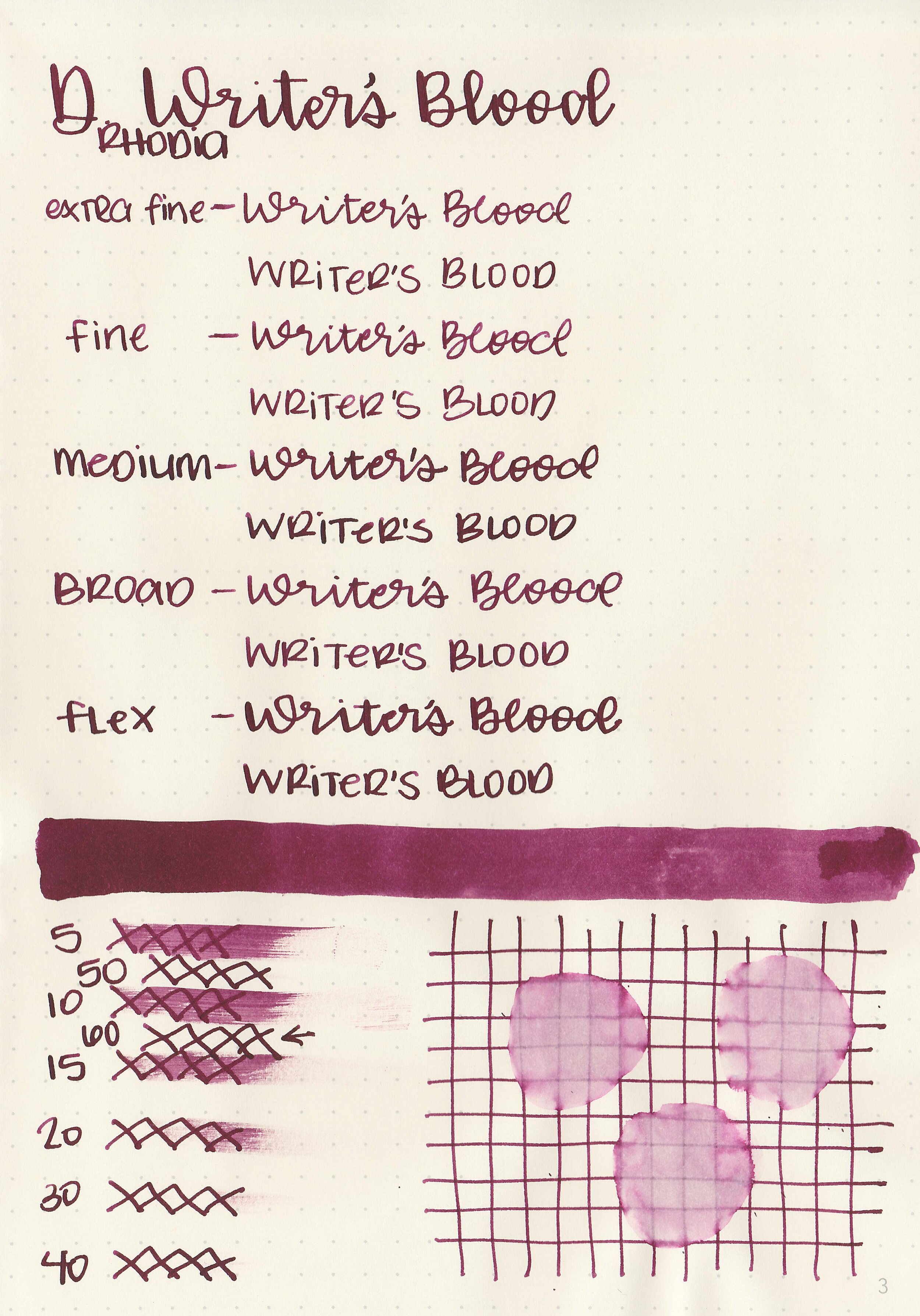
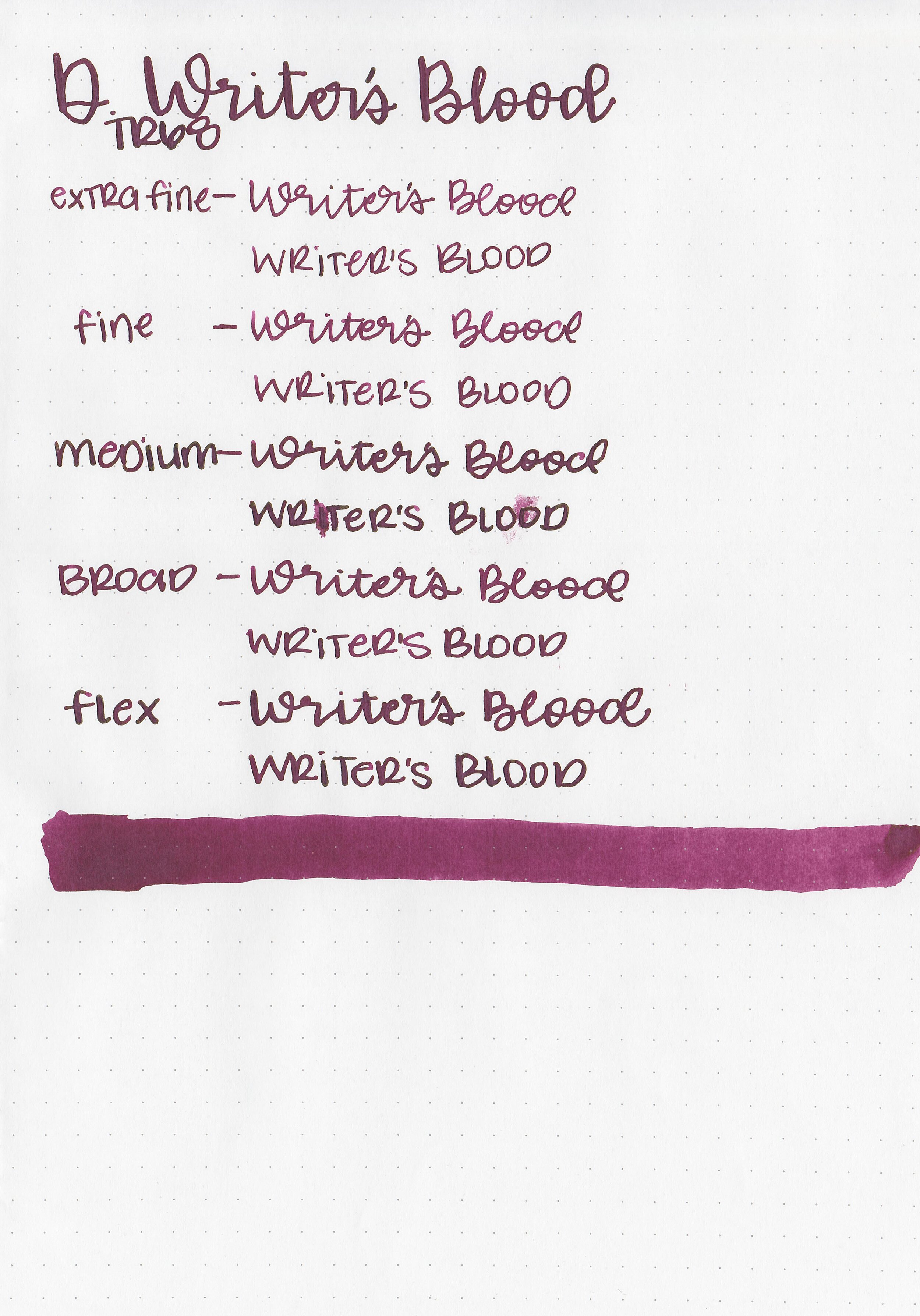
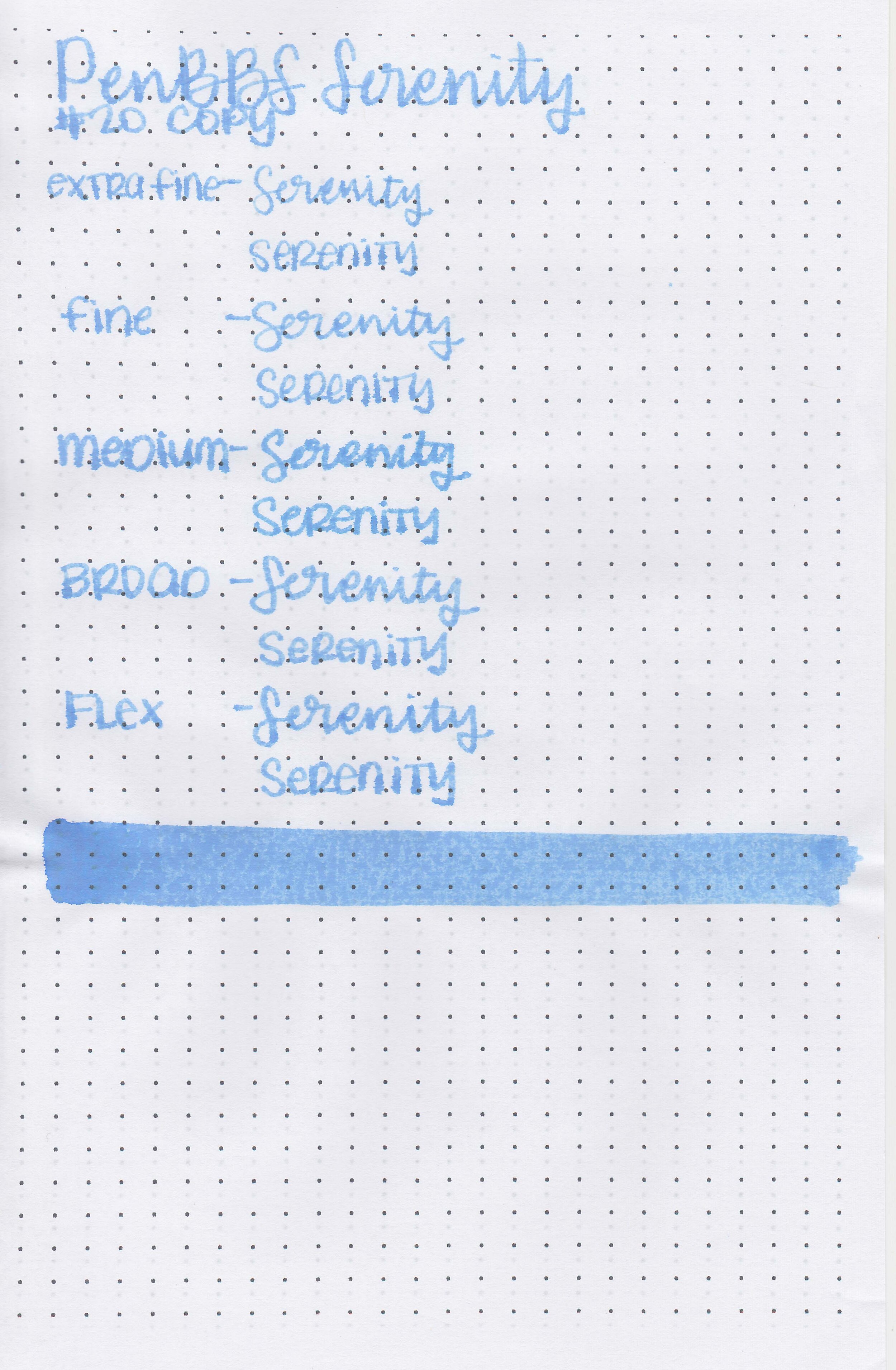
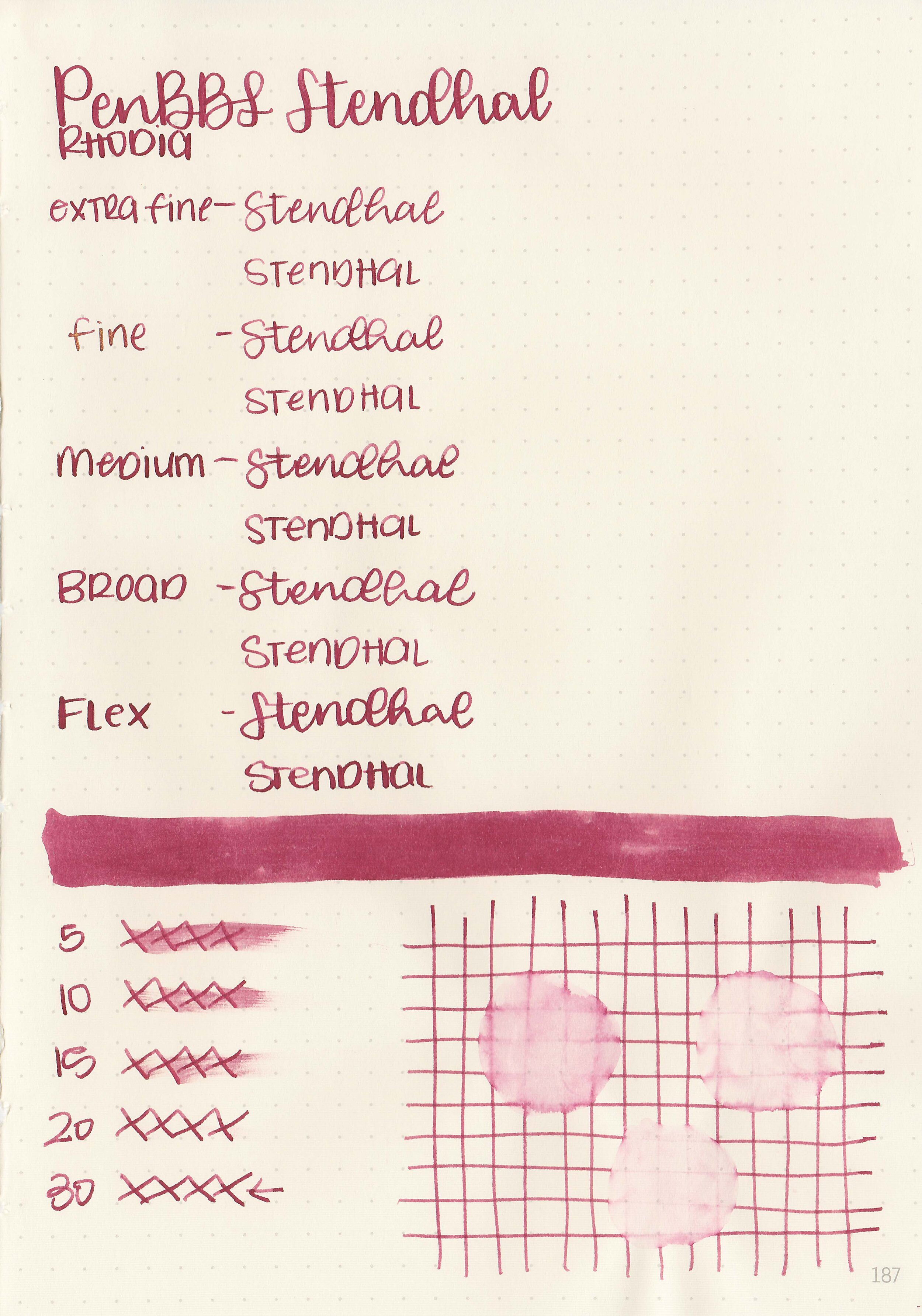
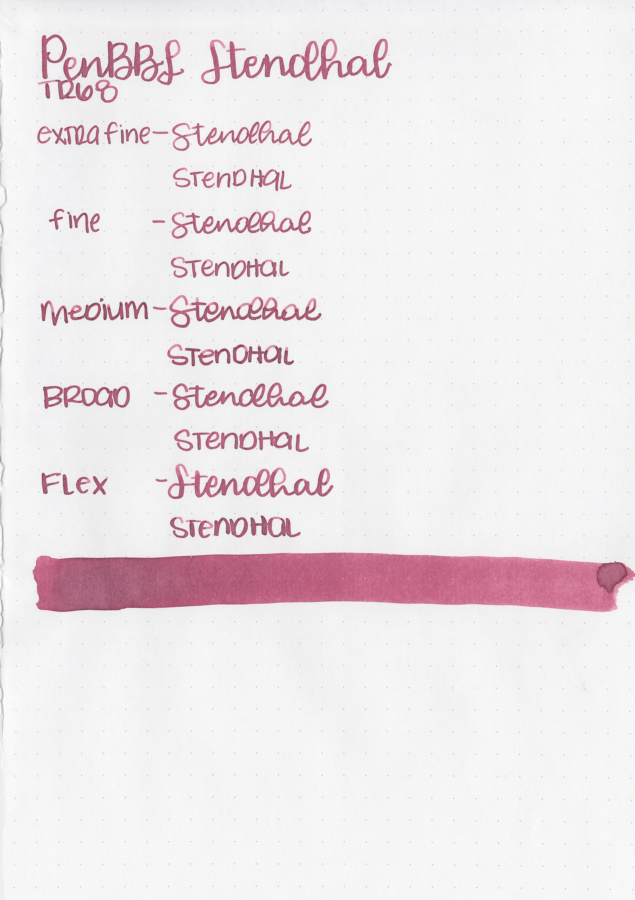
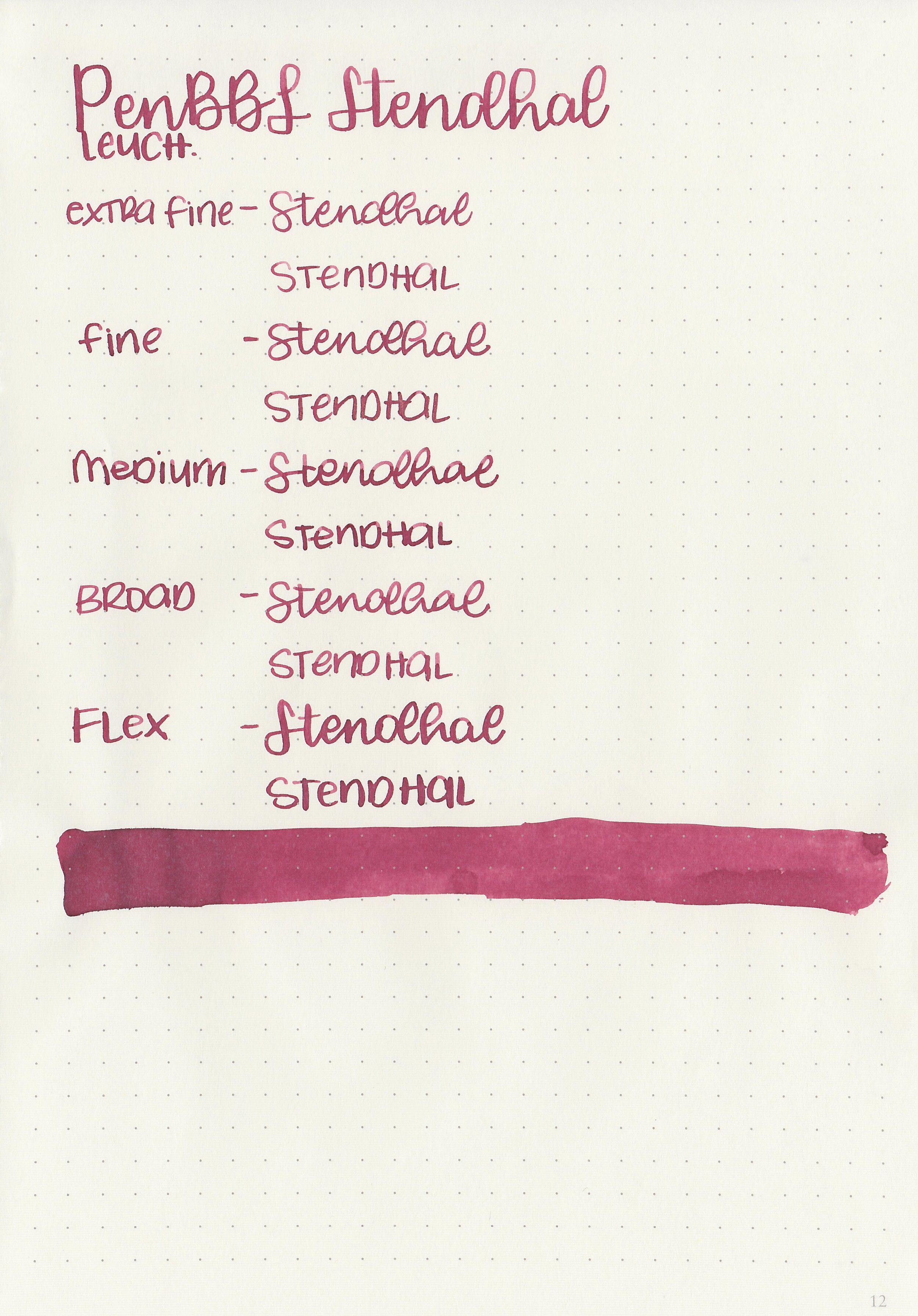
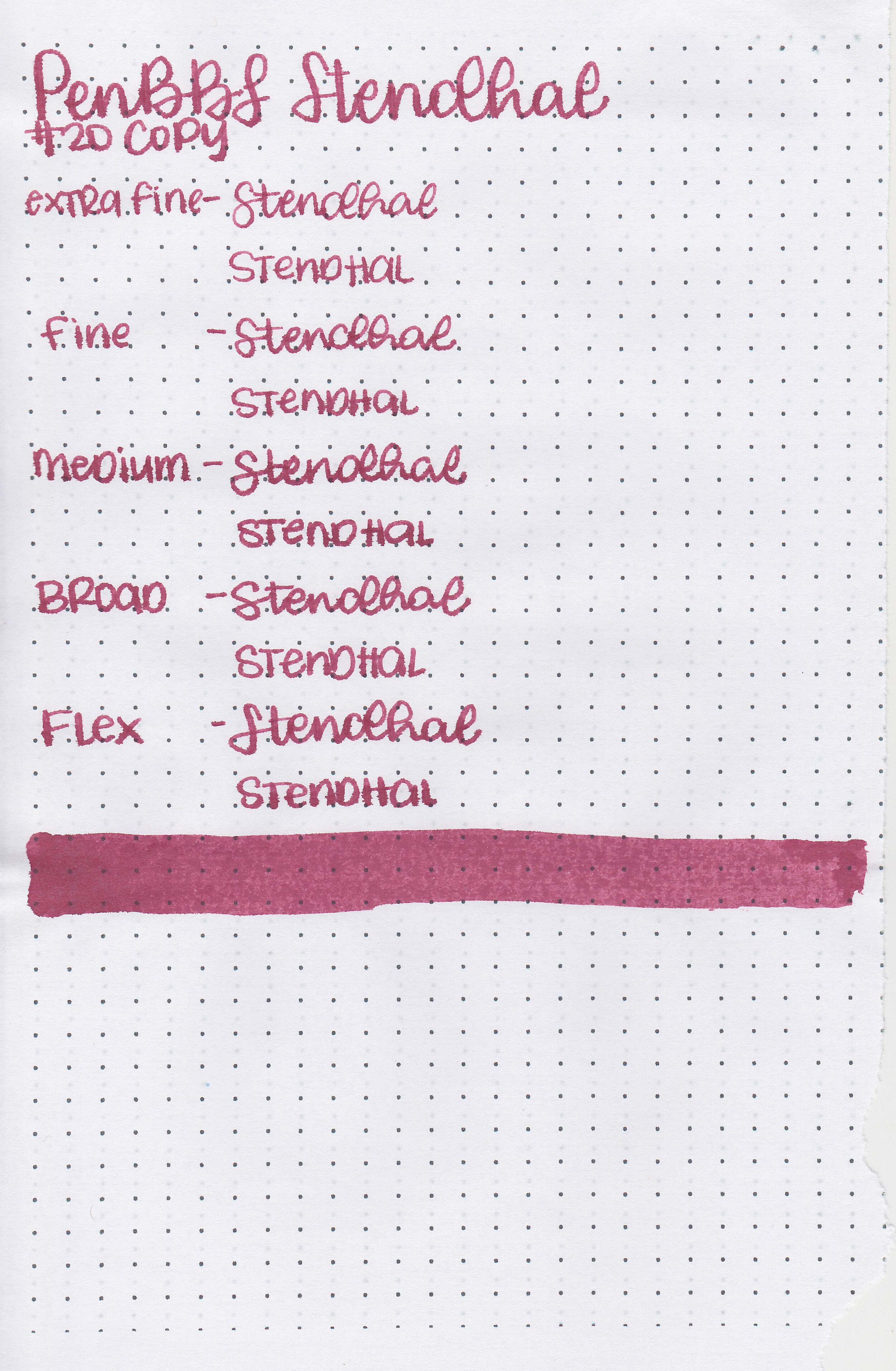
Let's take a look at how the ink behaves on fountain pen friendly papers: Rhodia, Tomoe River, and Leuchtturm.
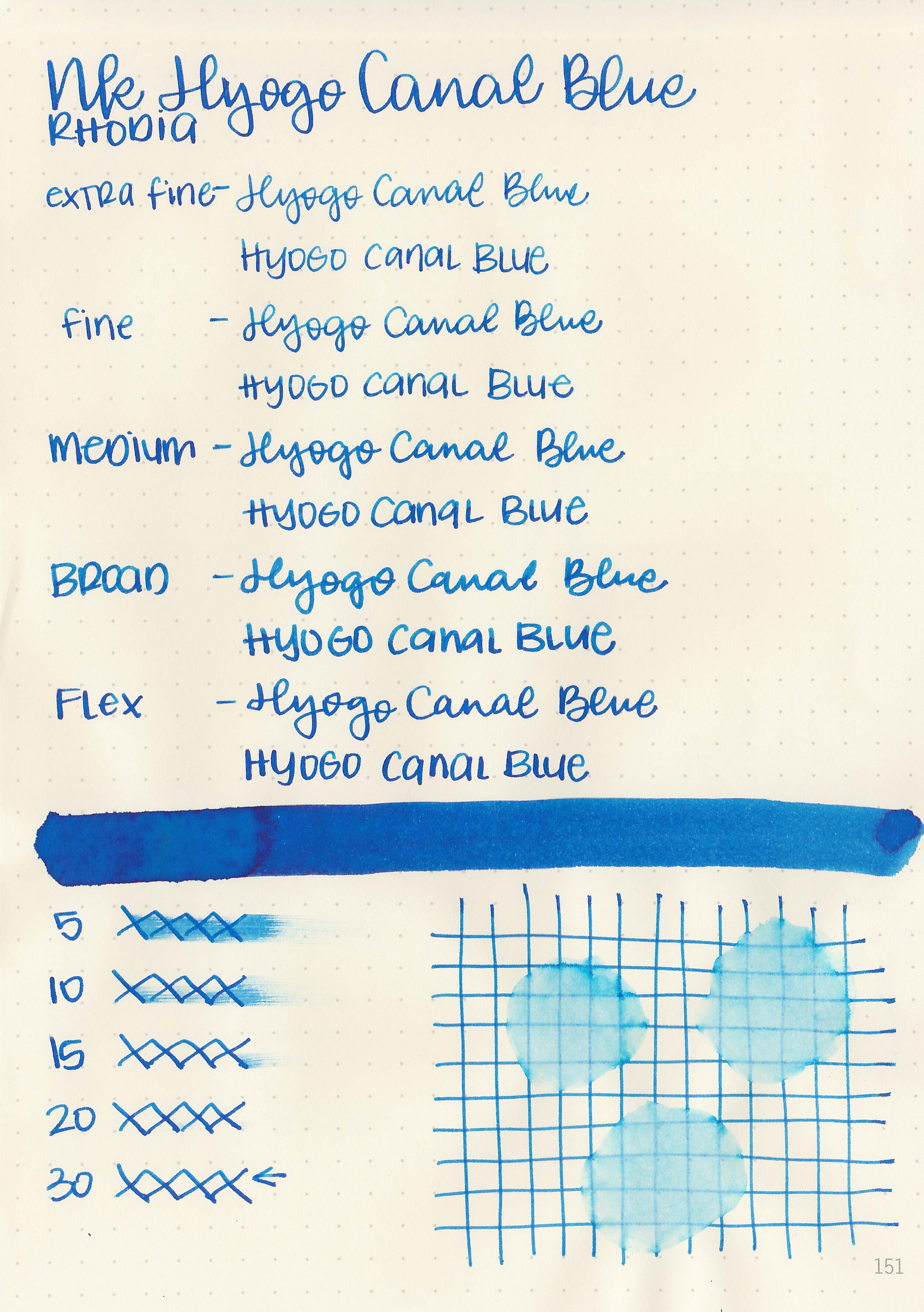
Dry time: 30 seconds
Water resistance: Medium
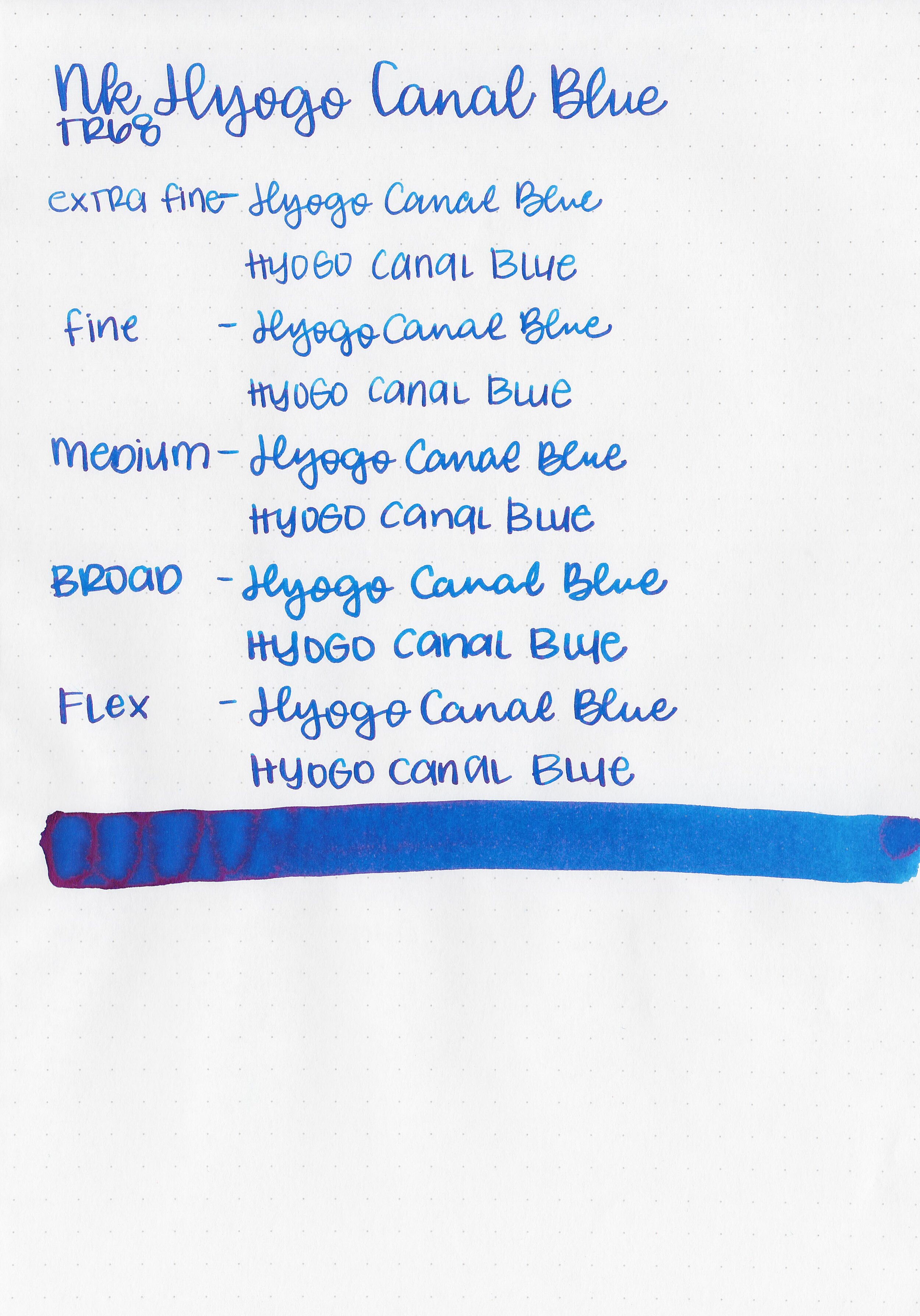
Feathering: None
Show through: Medium
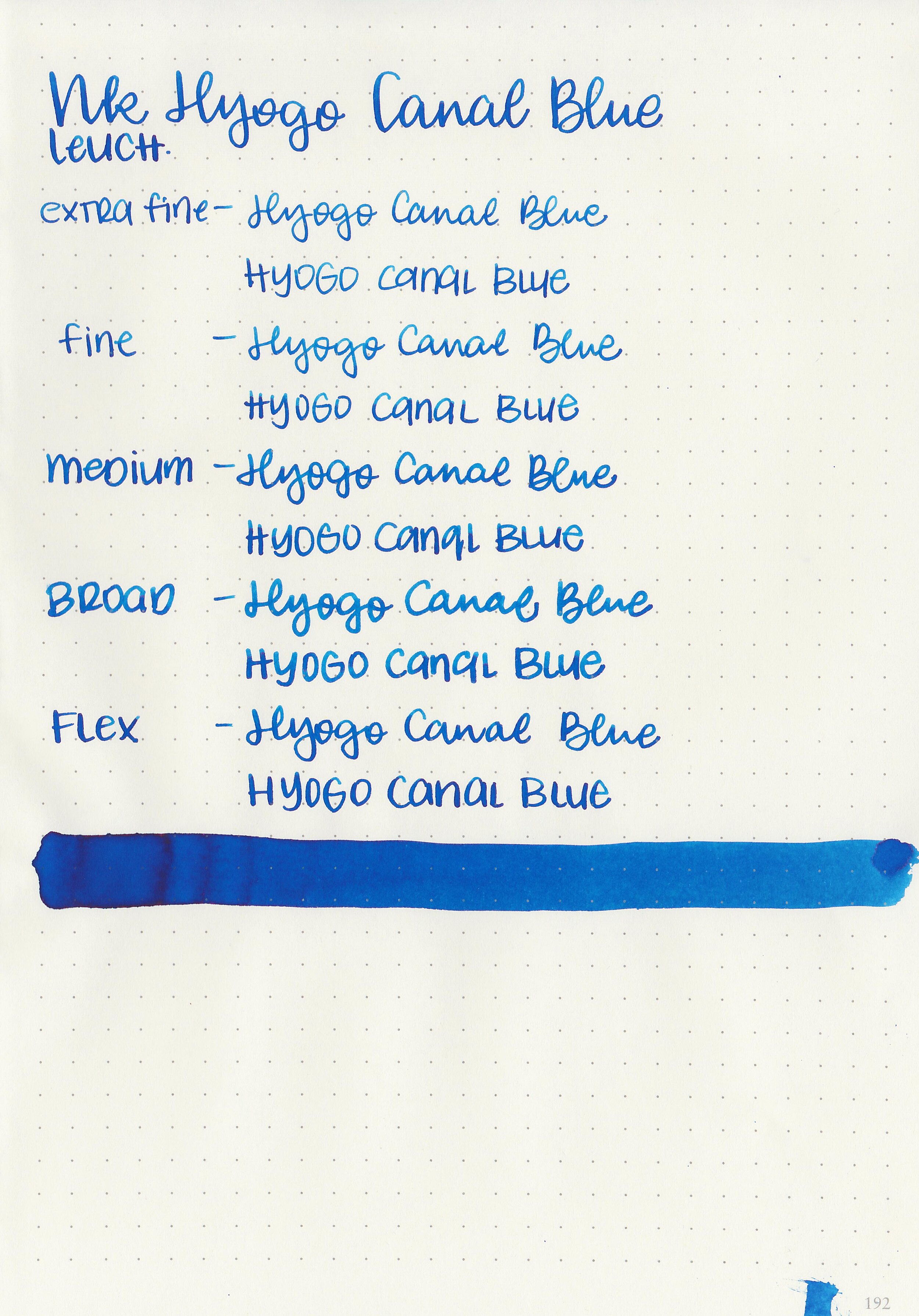
Bleeding: None
Other properties: medium shading, medium pink sheen, and no shimmer.
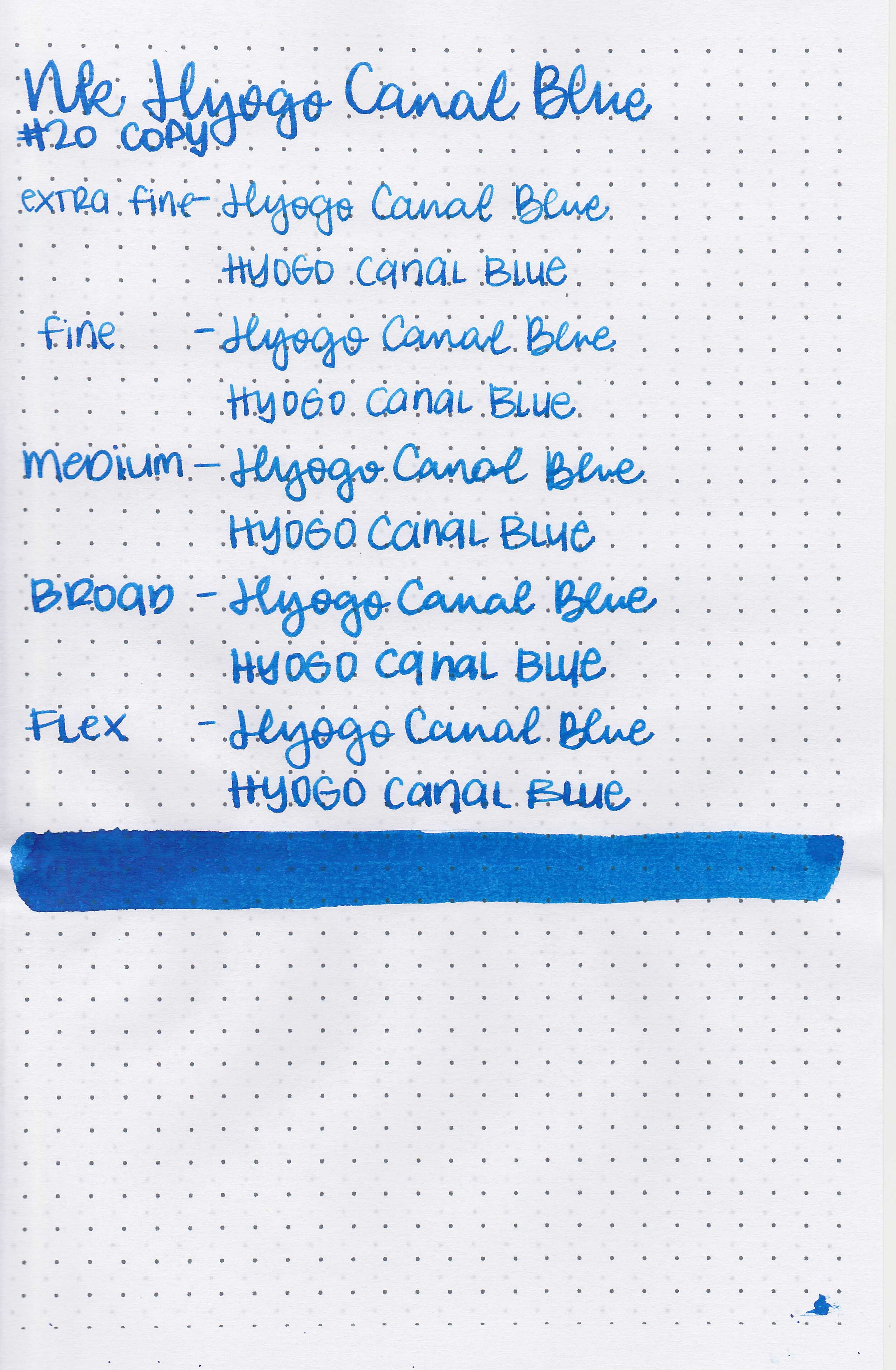
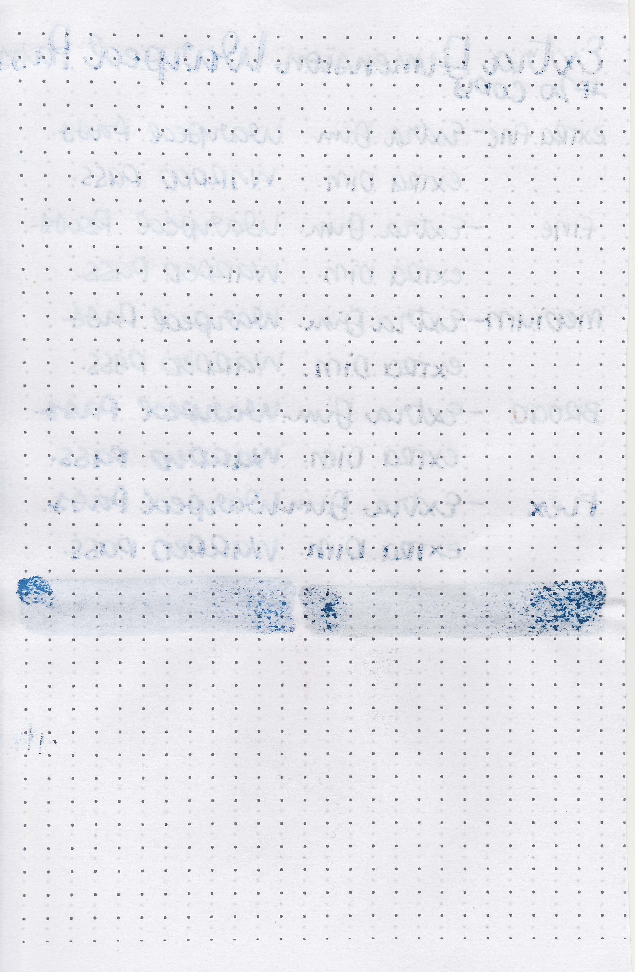
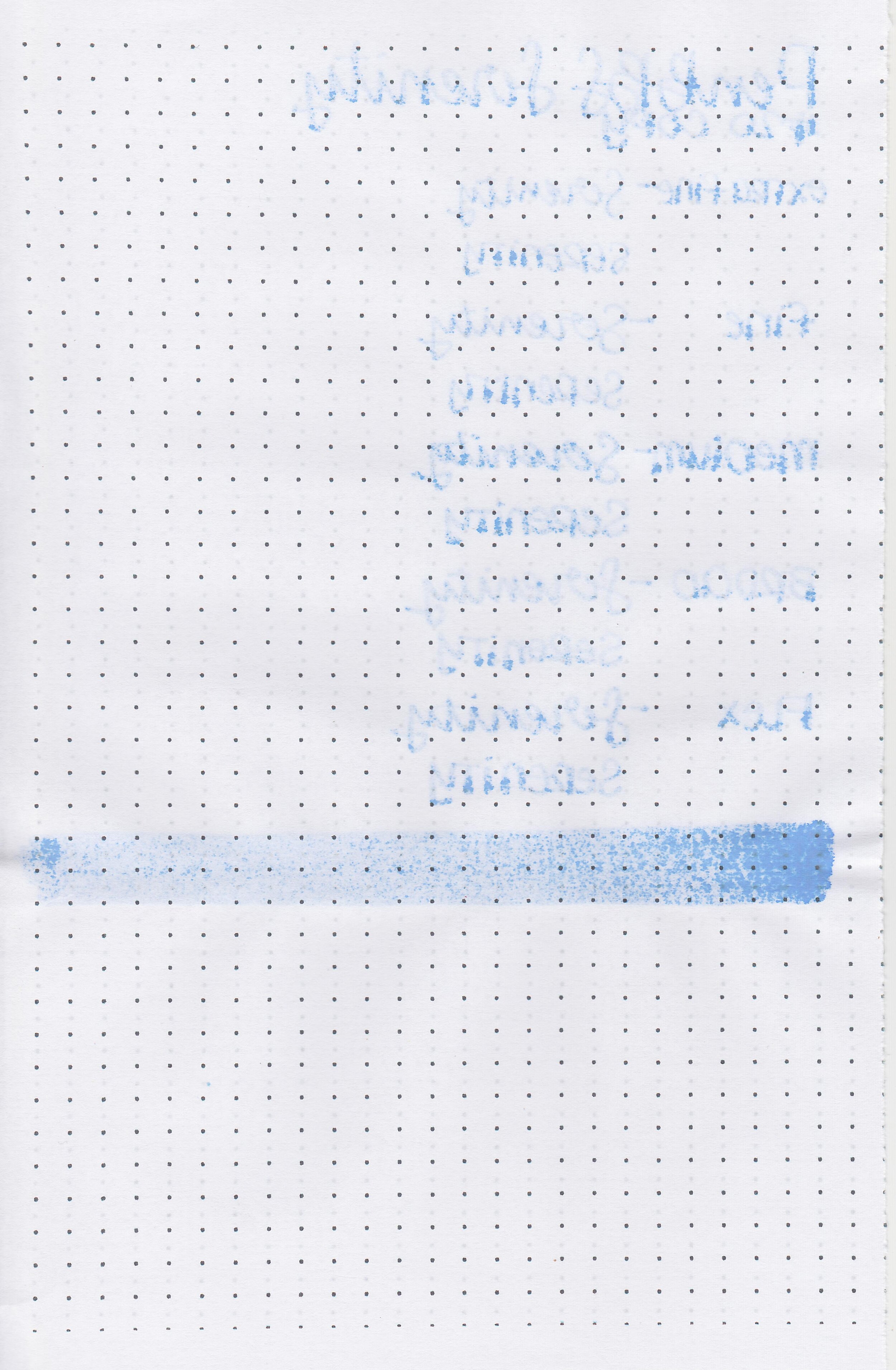
On Staples 24 lb copy paper there was a lot feathering and bleeding in all nib sizes.
Comparison Swabs:

Hyogo Canal Blue is closest to Organics Studio Nitrogen. Click here to see the Kobe inks together, and click here to see the blue inks together.
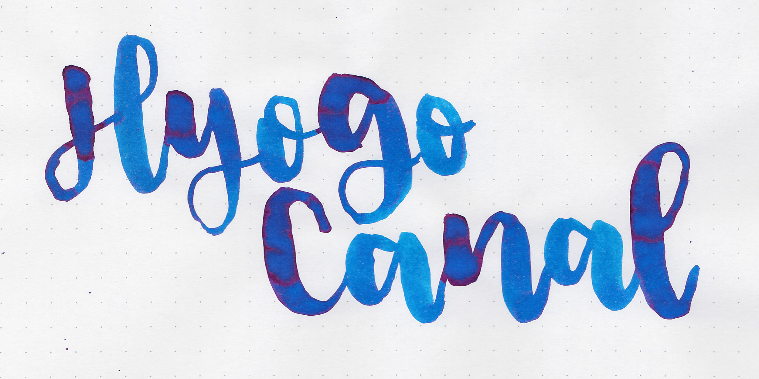
Longer writing:

I used a Pelikan M805 Vibrant Blue with a broad nib on a Taroko Enigma notebook. The ink had a wet flow.
Overall, I really enjoyed this ink. it’s a lovely color with some beautiful shading and sheen.
Disclaimer: All photos and opinions are my own. This page does not contain affiliate links and this post is not sponsored.