Ink Review #1868: Dominant Industry Downpour
/
Dominant Industry Downpour is from Dominant Industry’s Standard collection. Thanks to Yoseka Stationery for sending this ink over for review!

The color:
Downpour is a medium grey.
*For my swab cards I use a Col-o-ring by Skylab Letterpress, a medium Pilot Ishime and a Mabie Todd Swan.
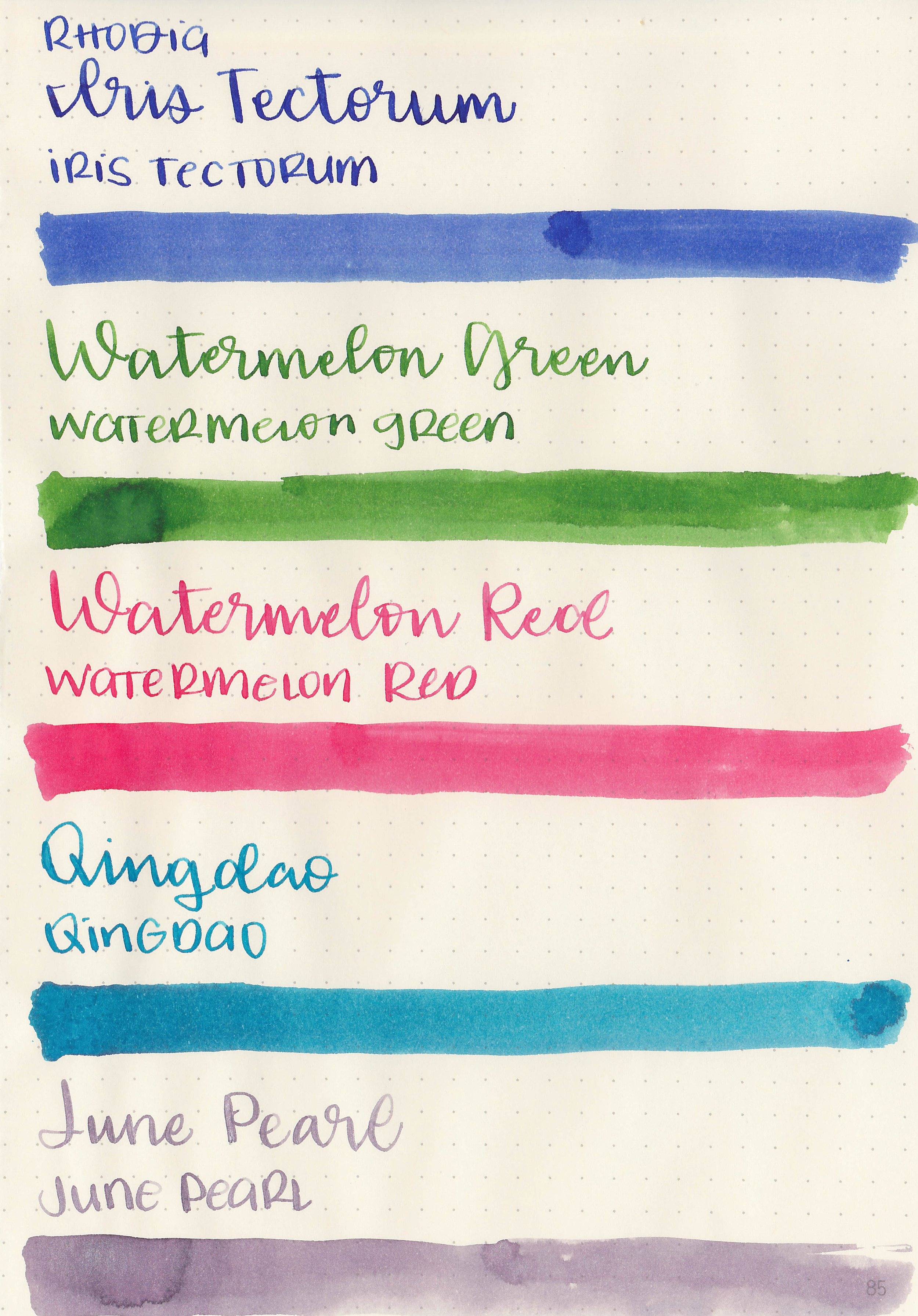
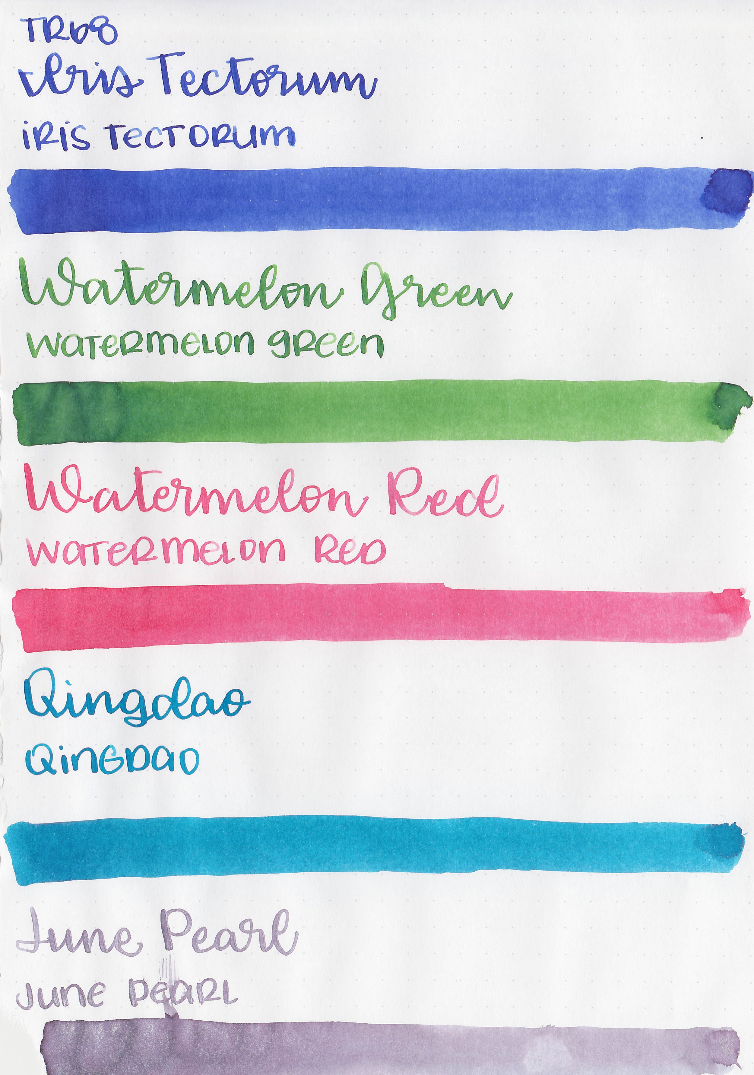
Swabs:
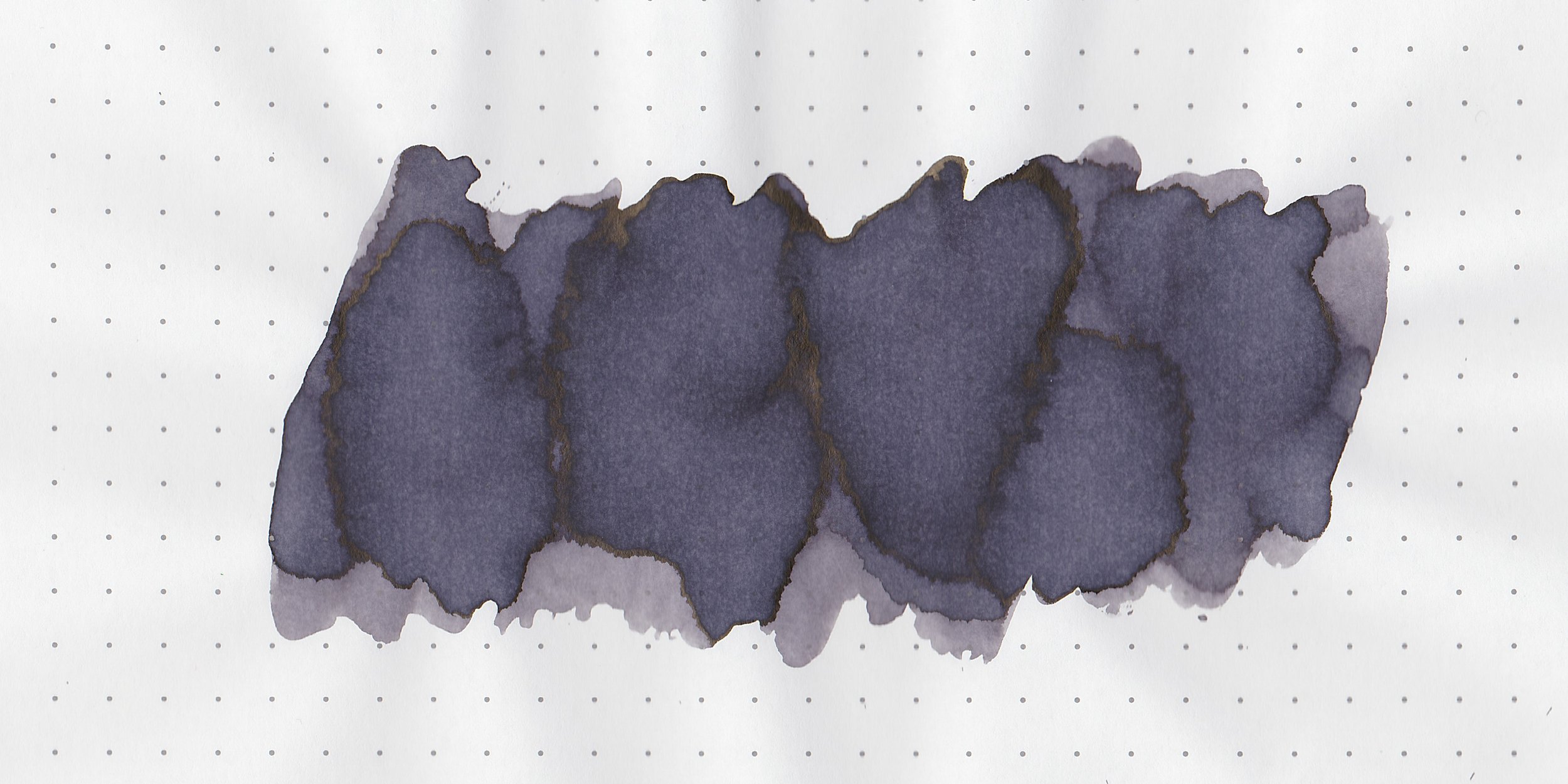
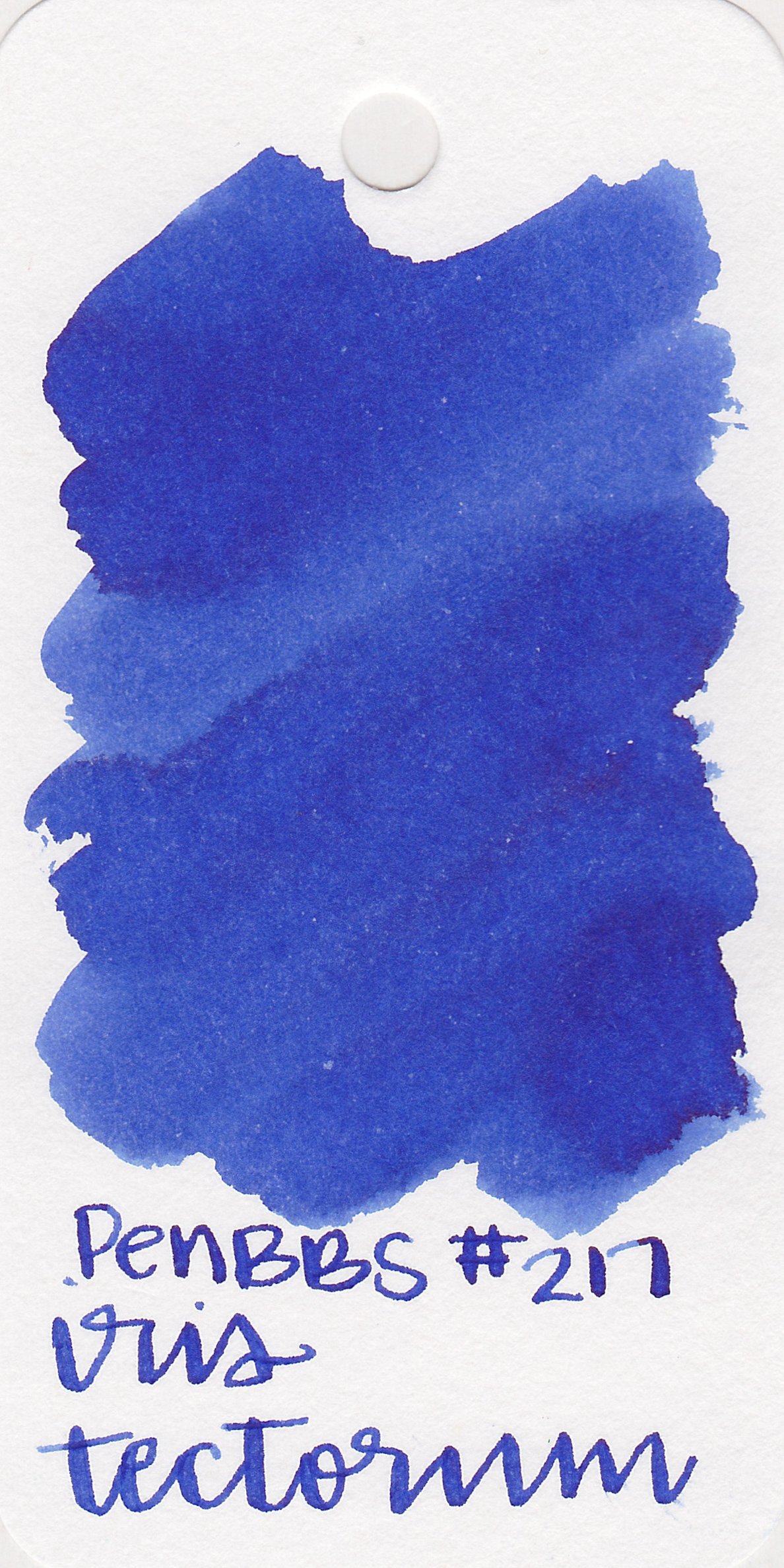
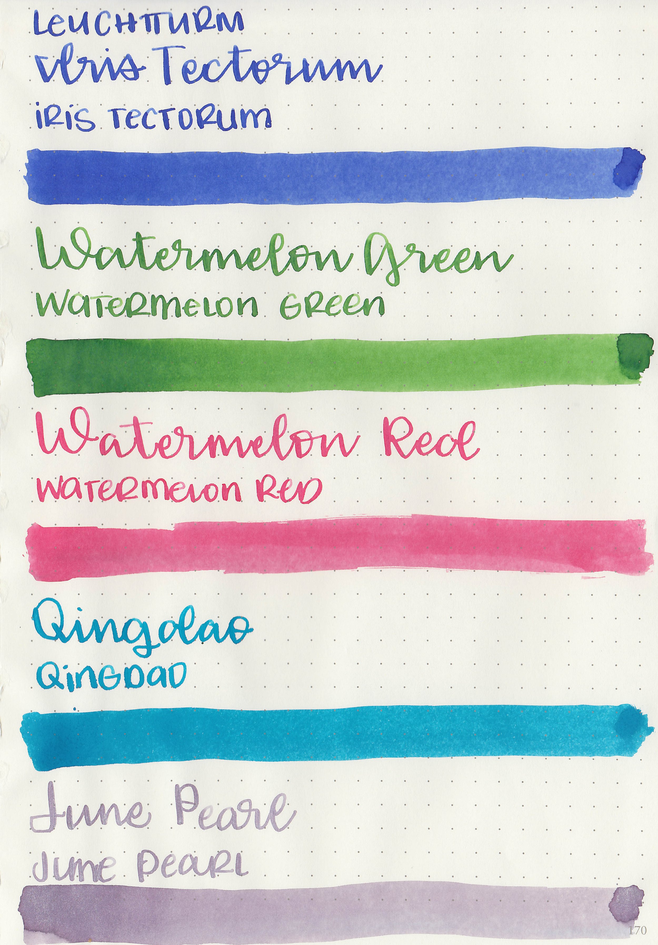
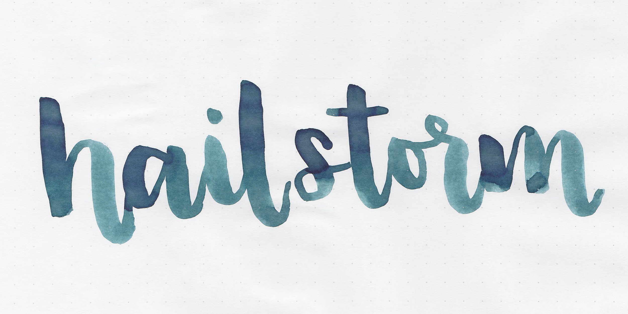
In large swabs on Tomoe River paper the ink looks much darker and more purple.

Writing samples:
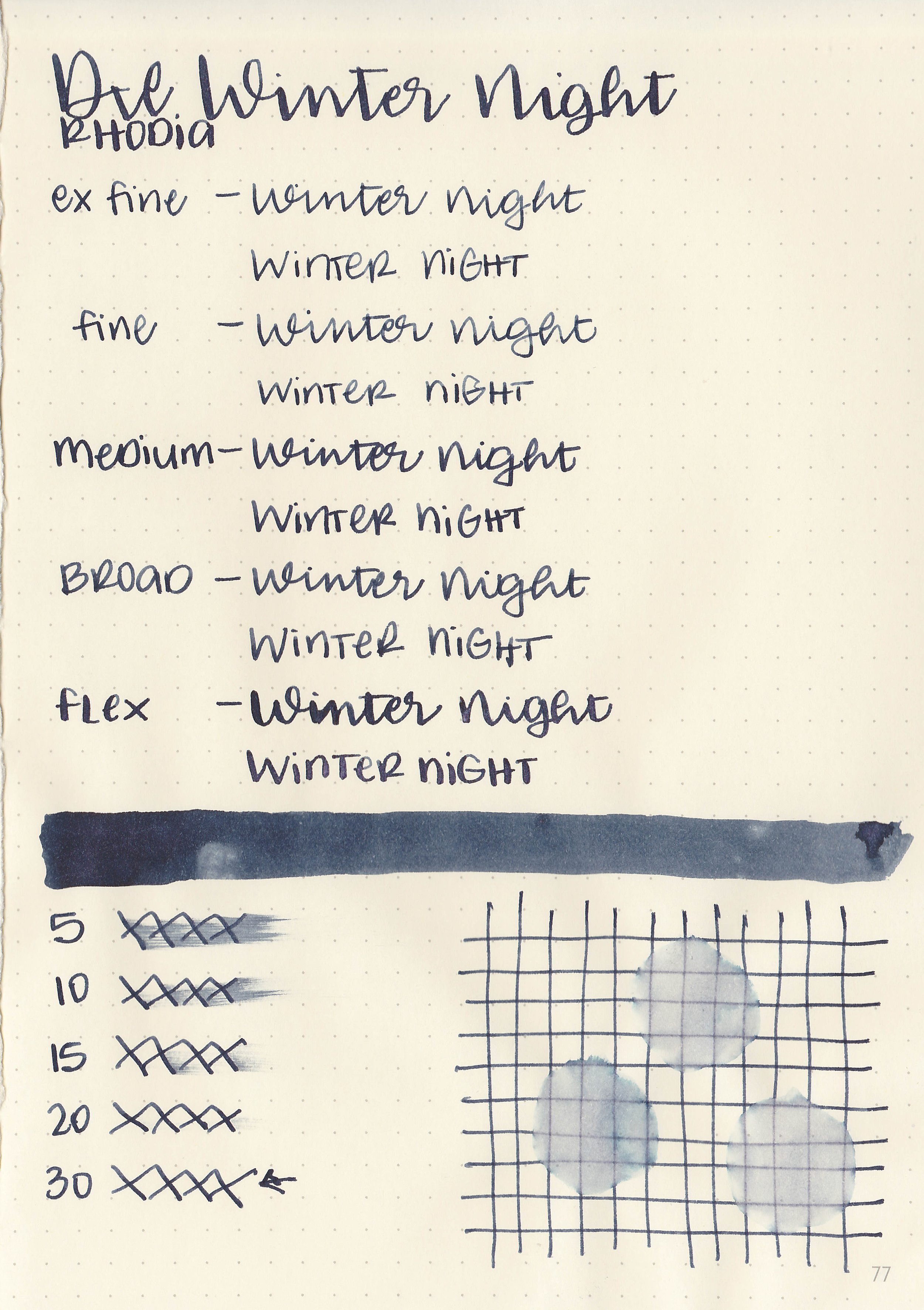
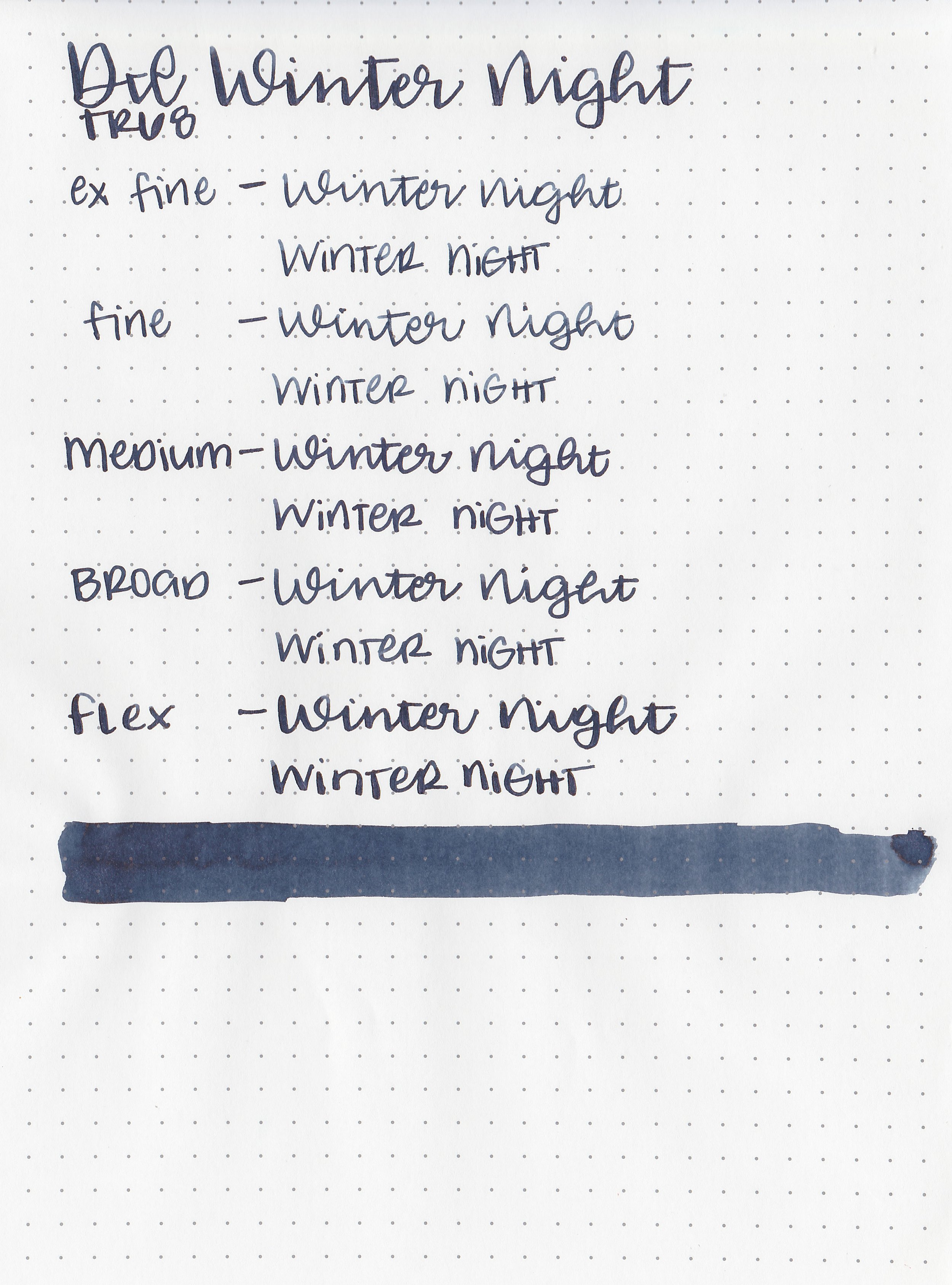
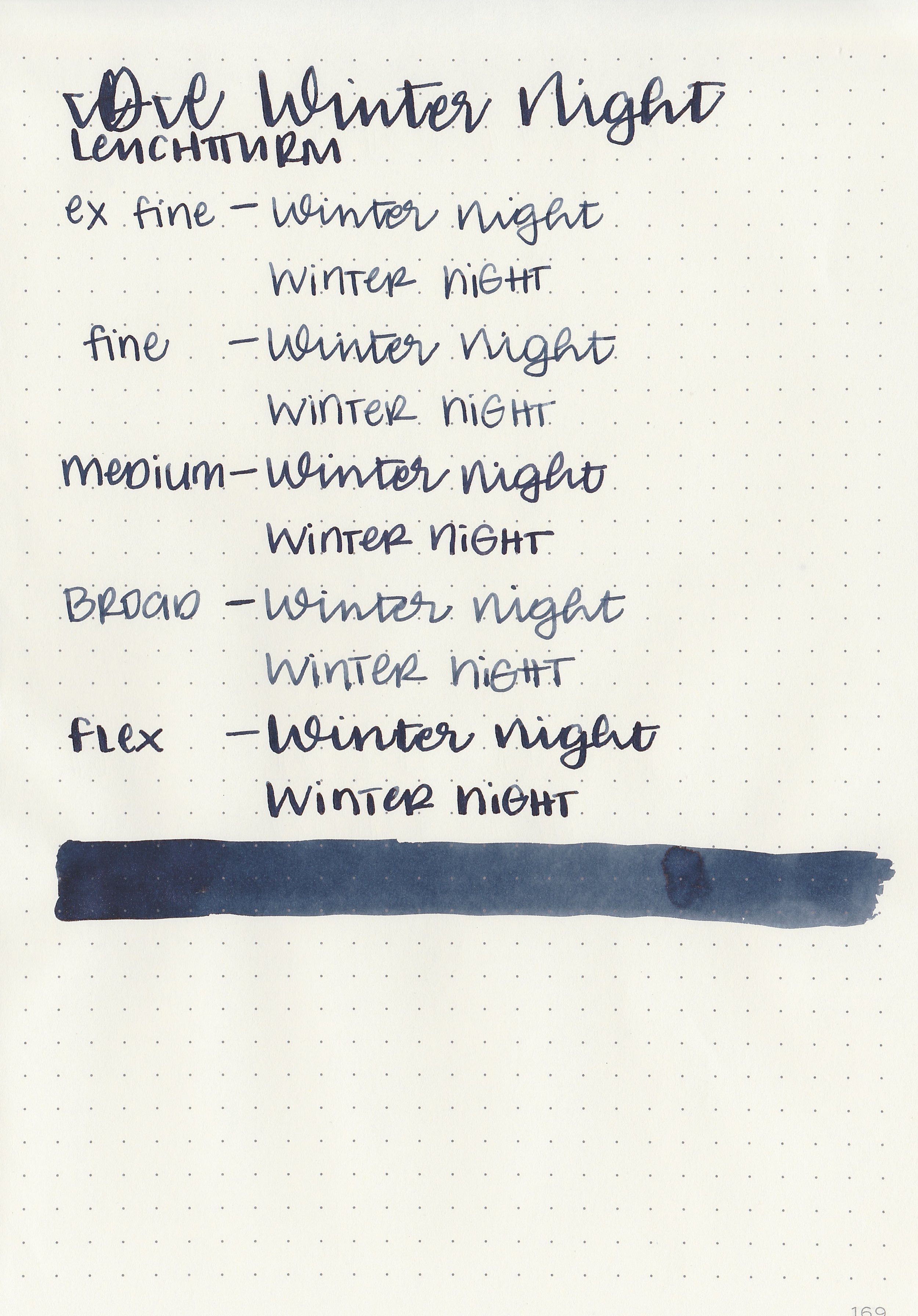
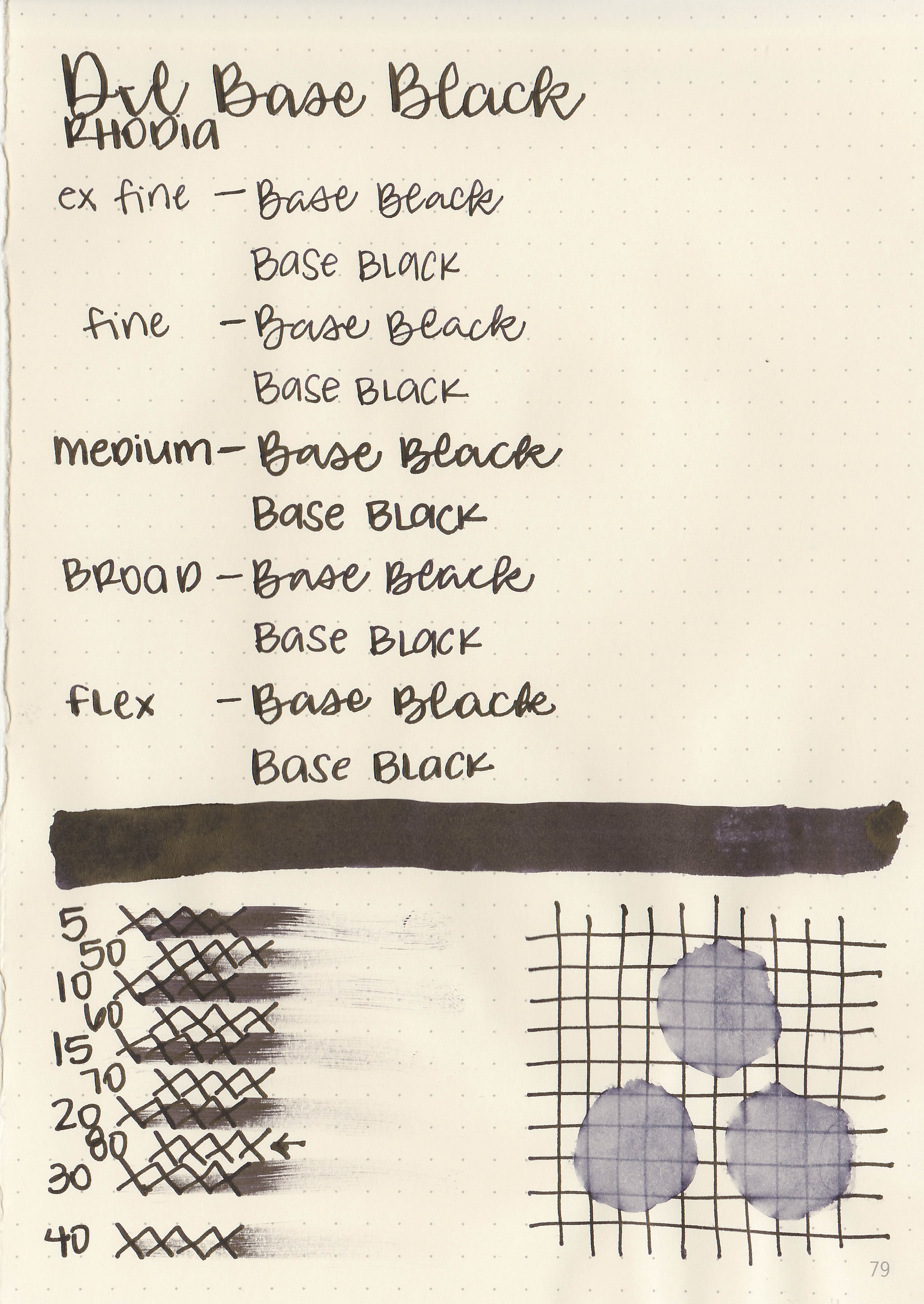
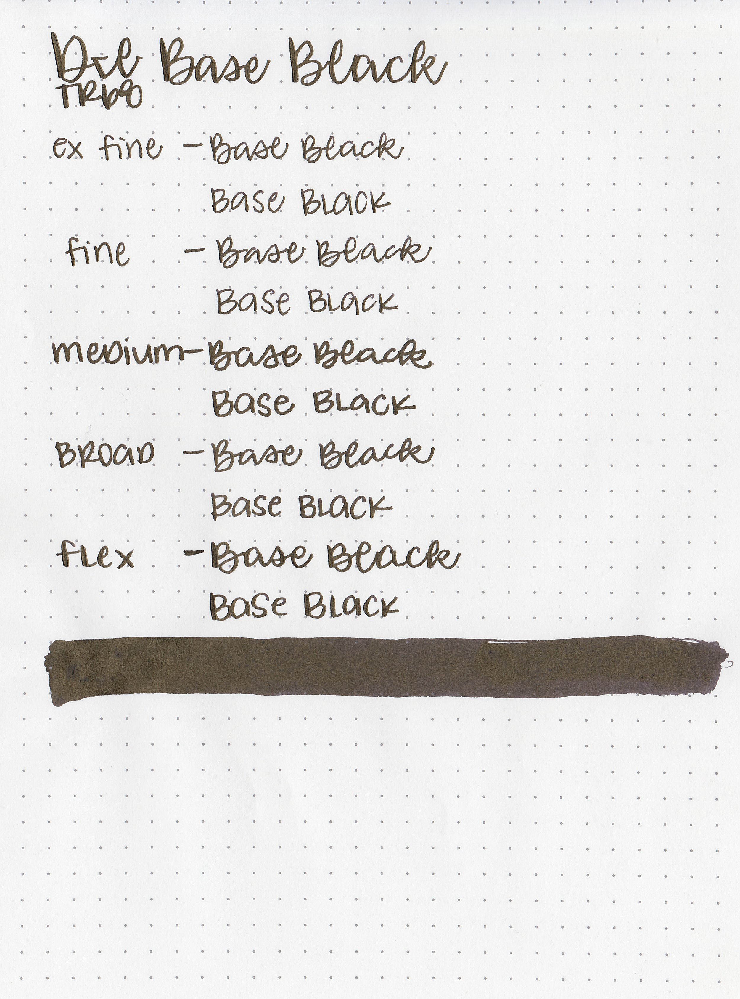
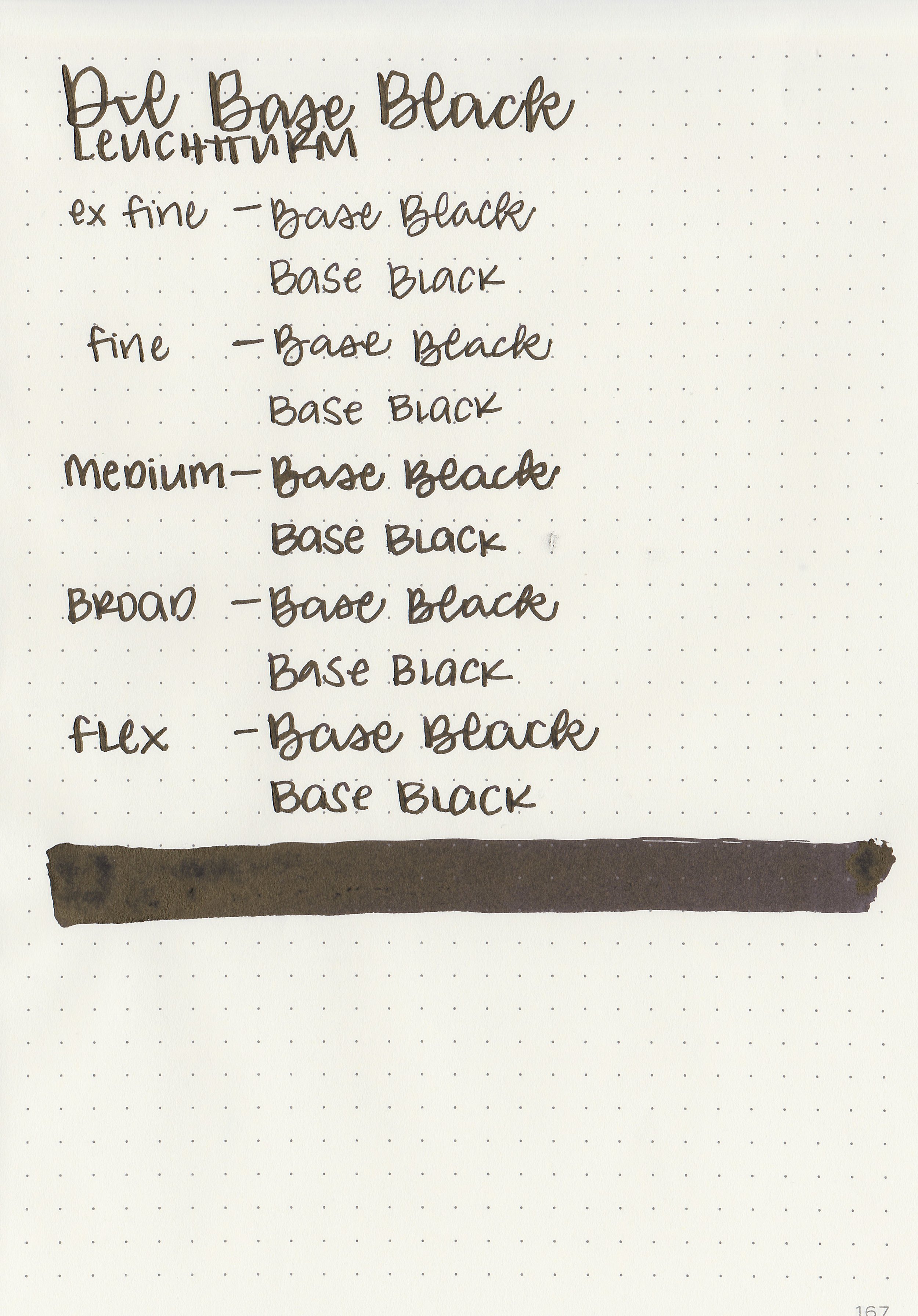
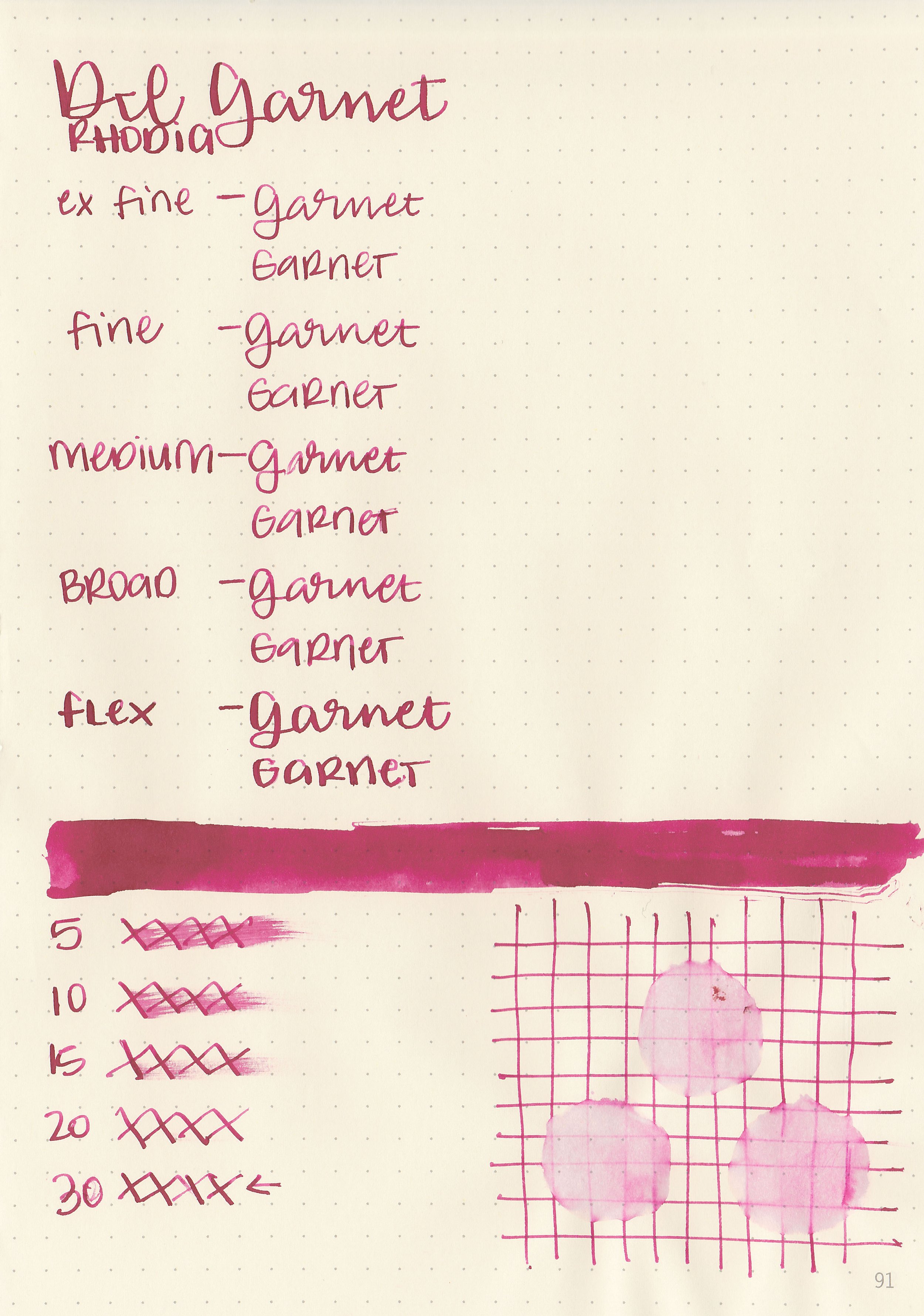
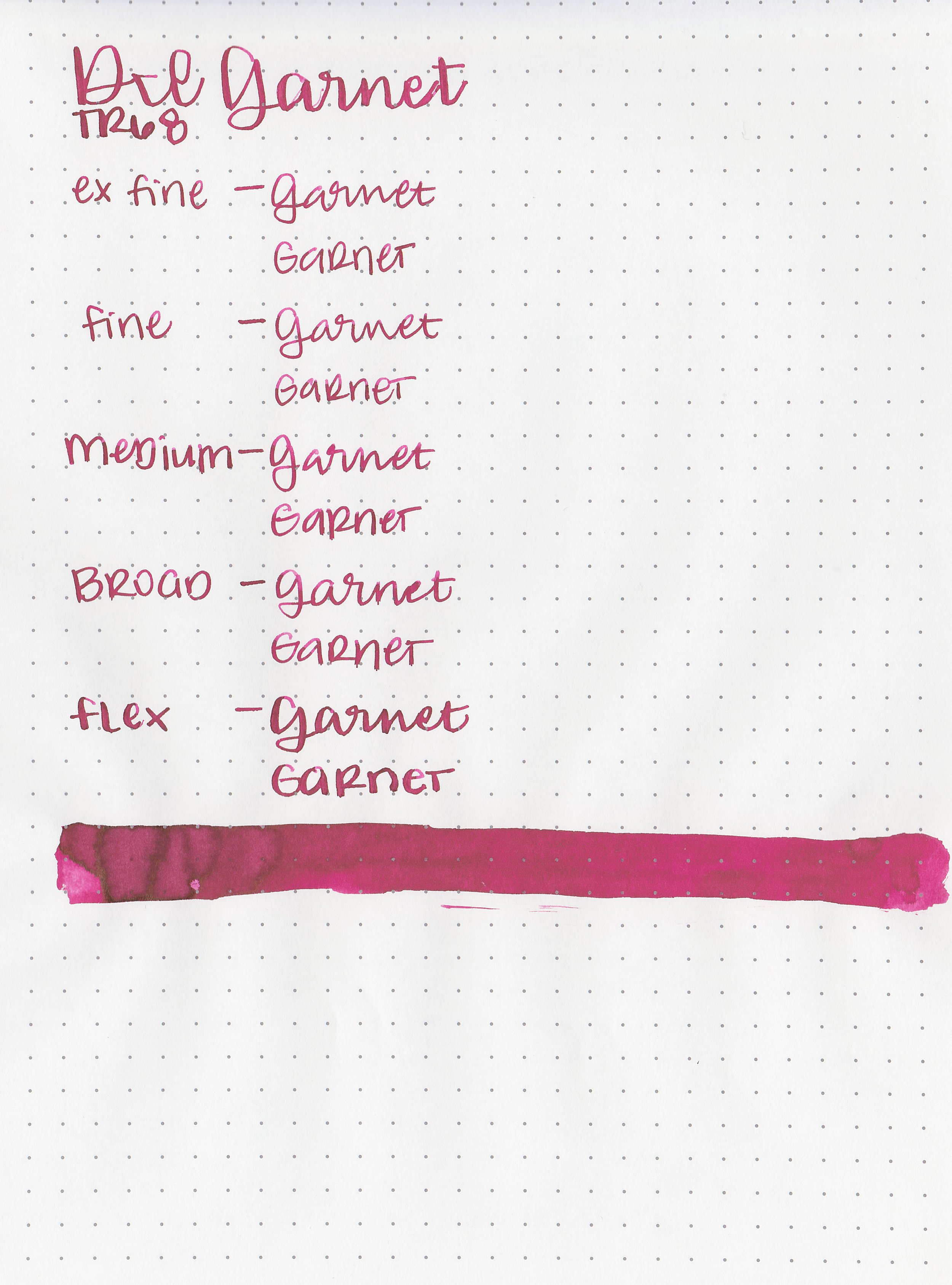
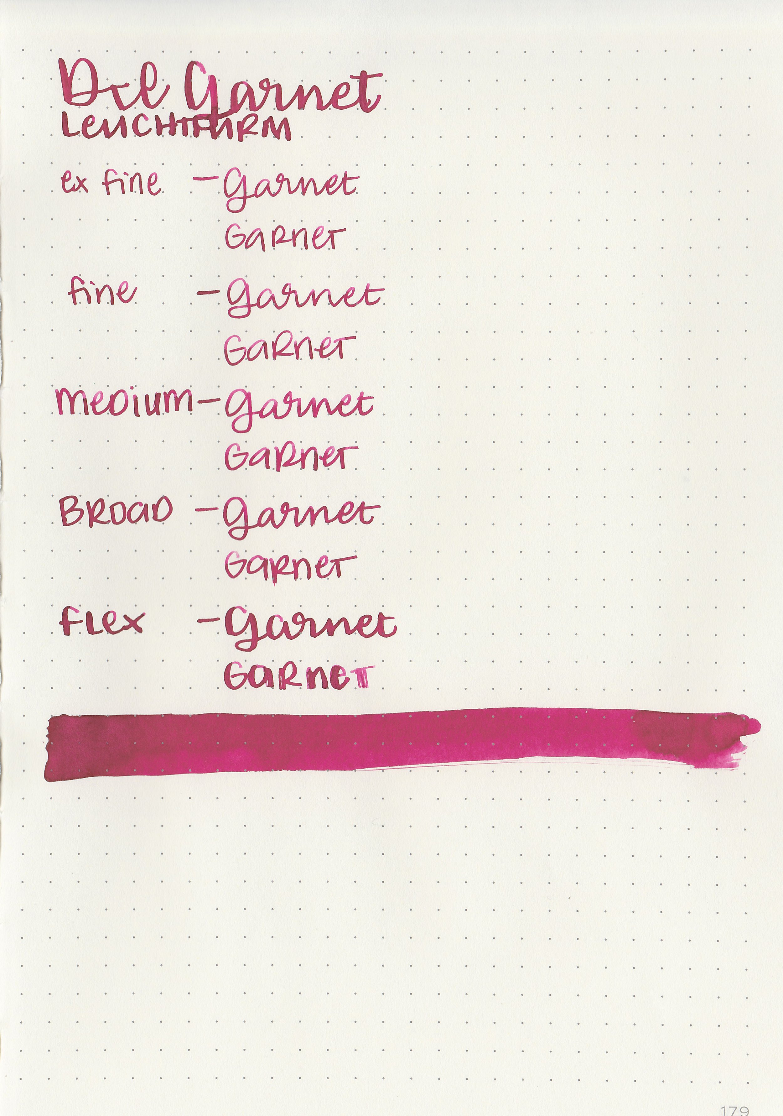
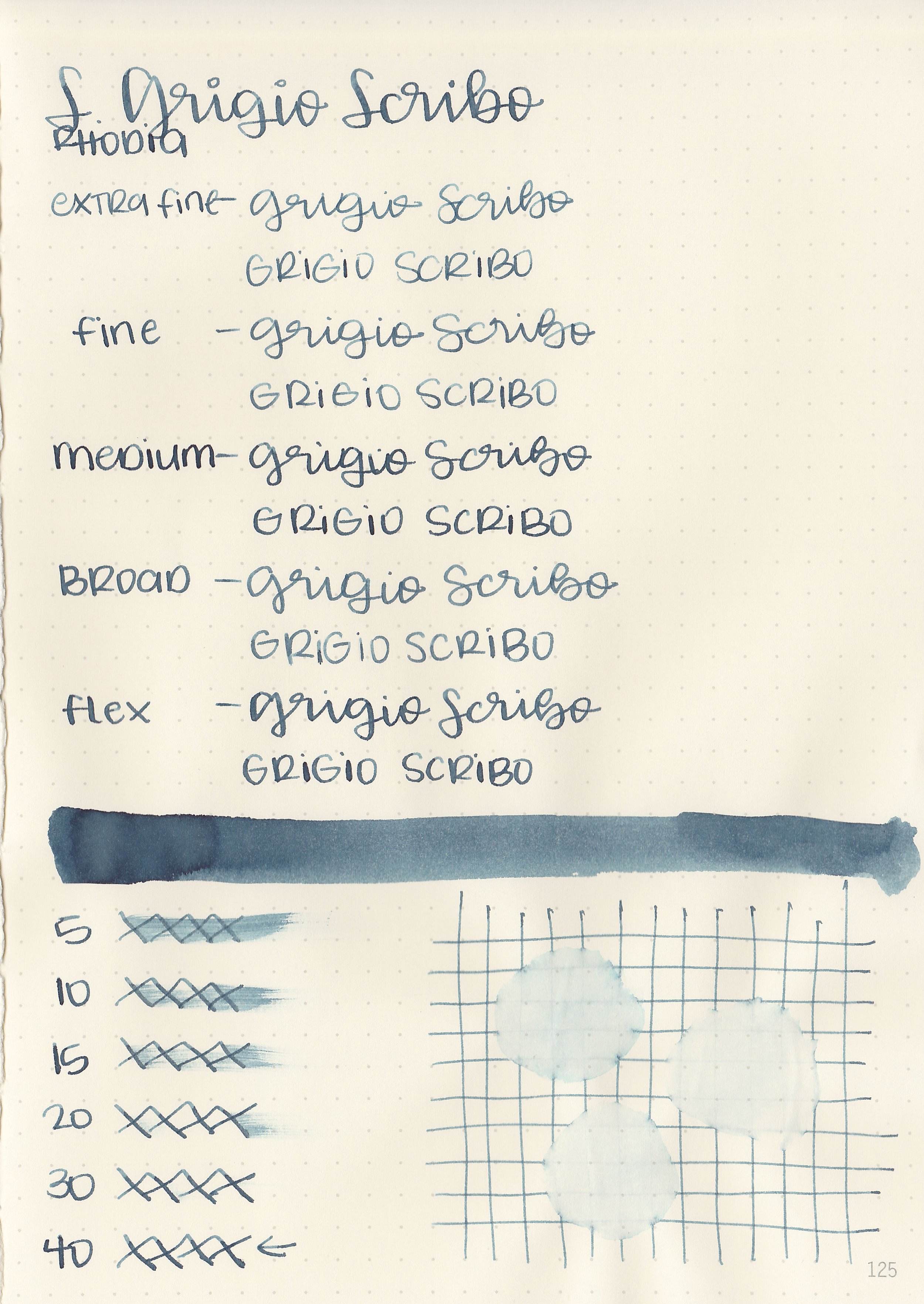
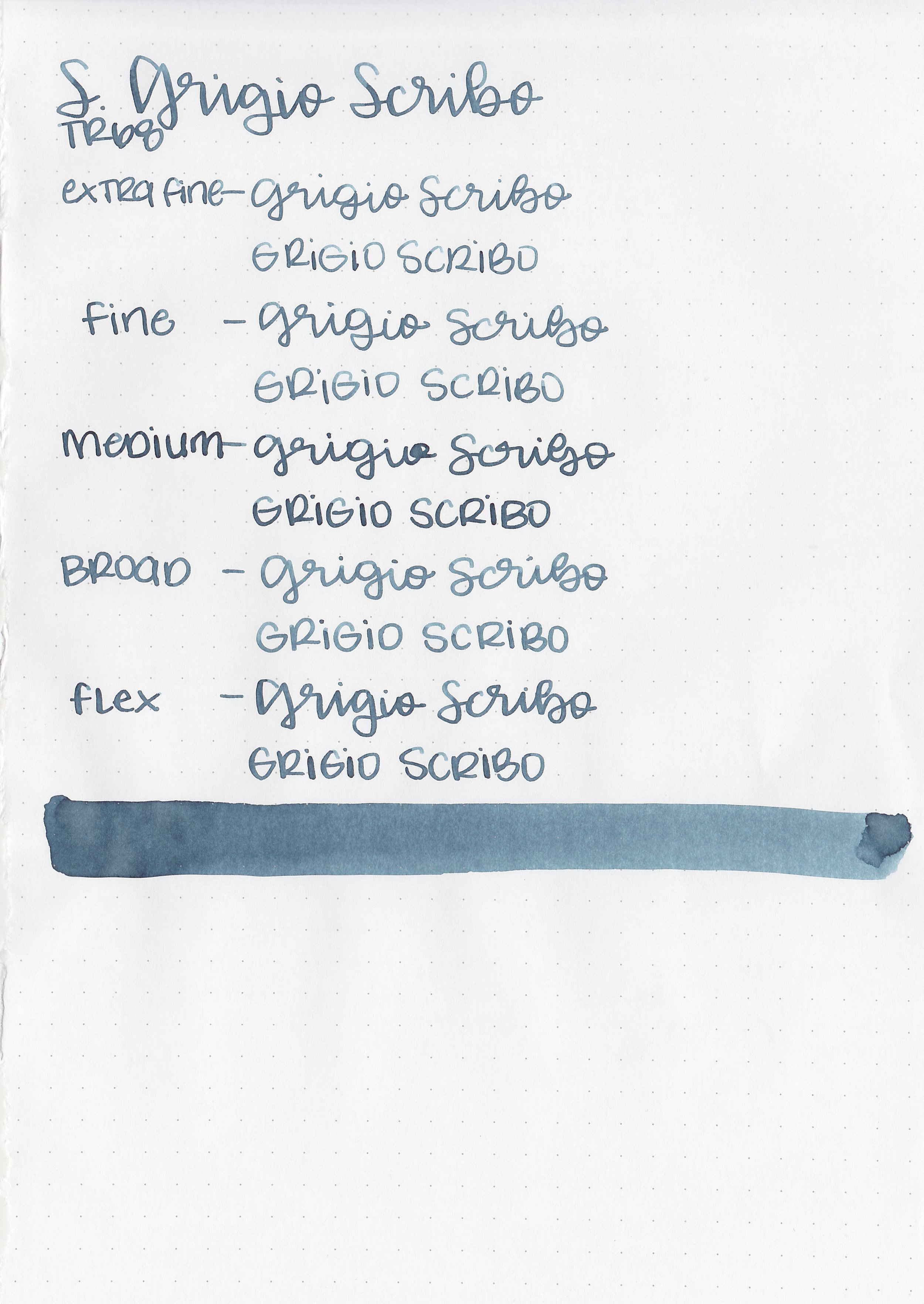
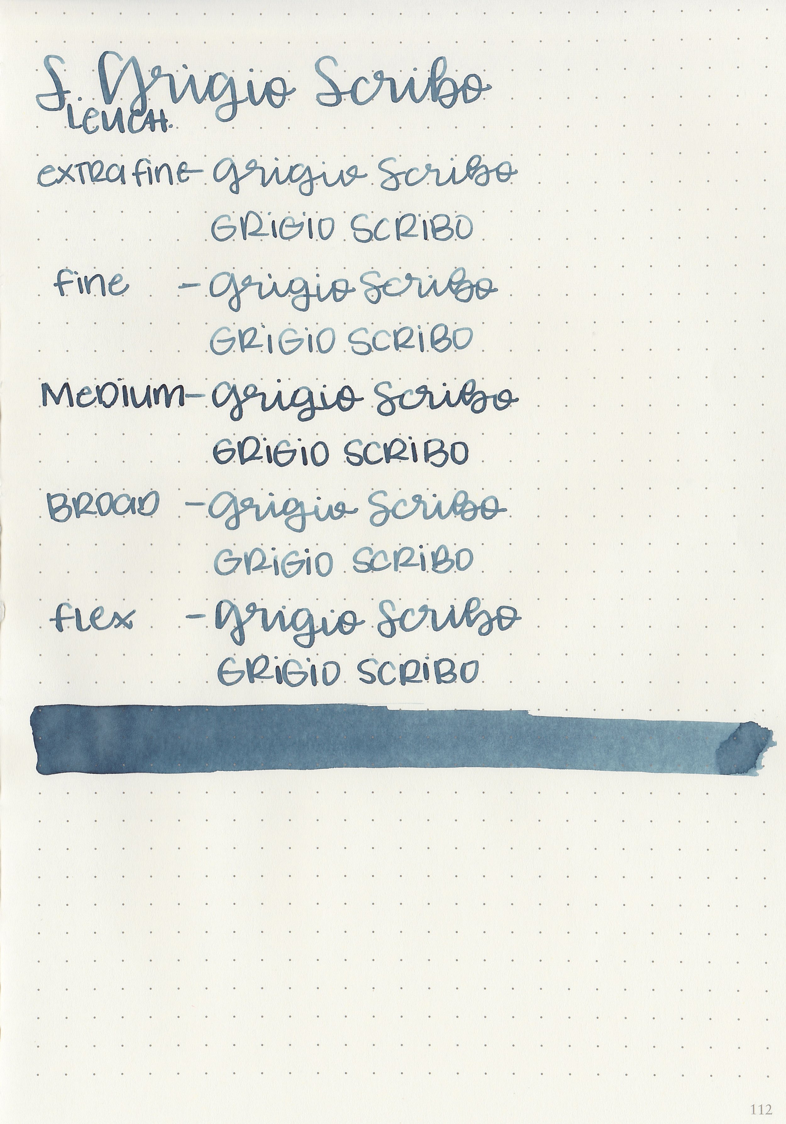
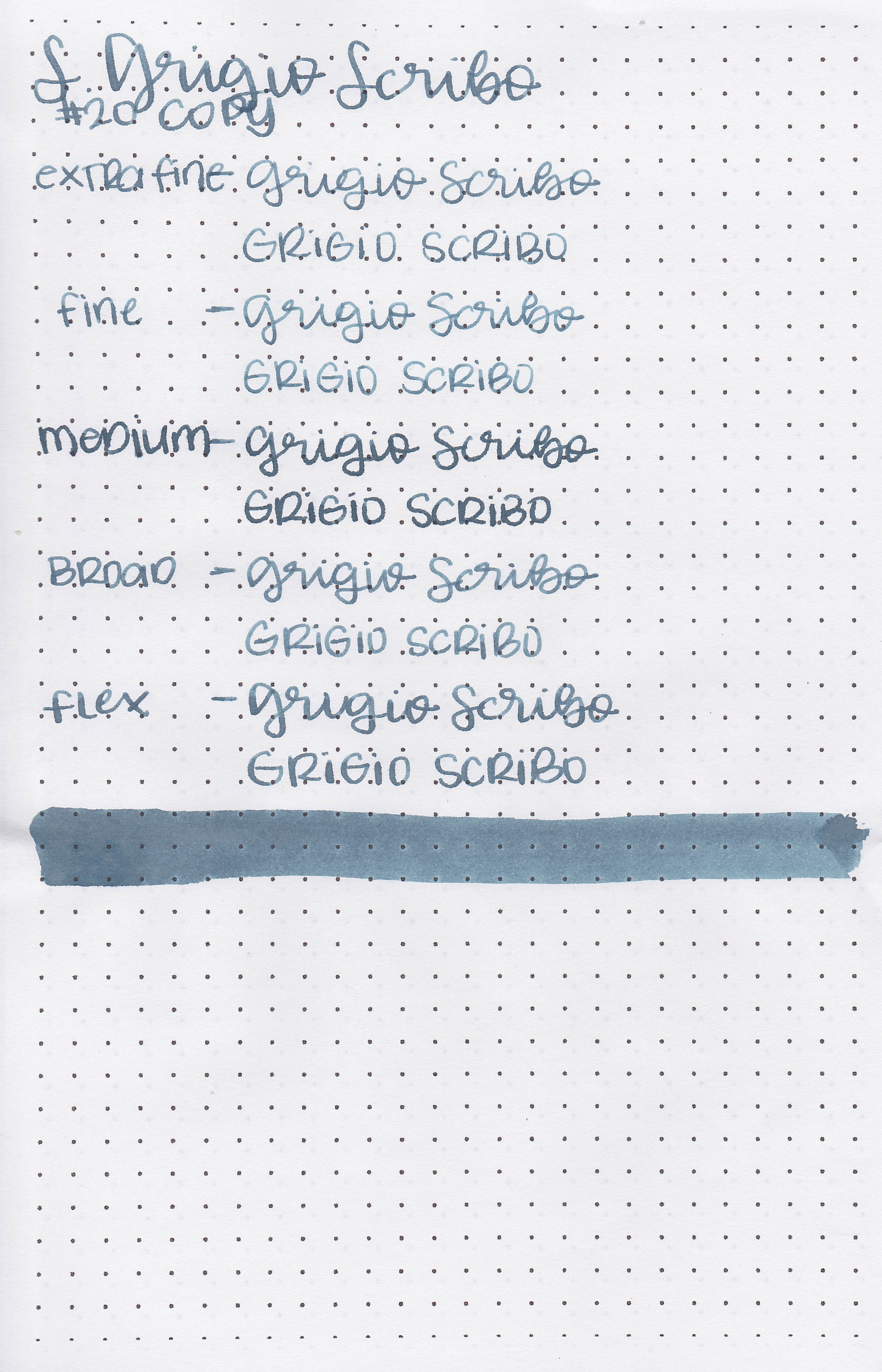
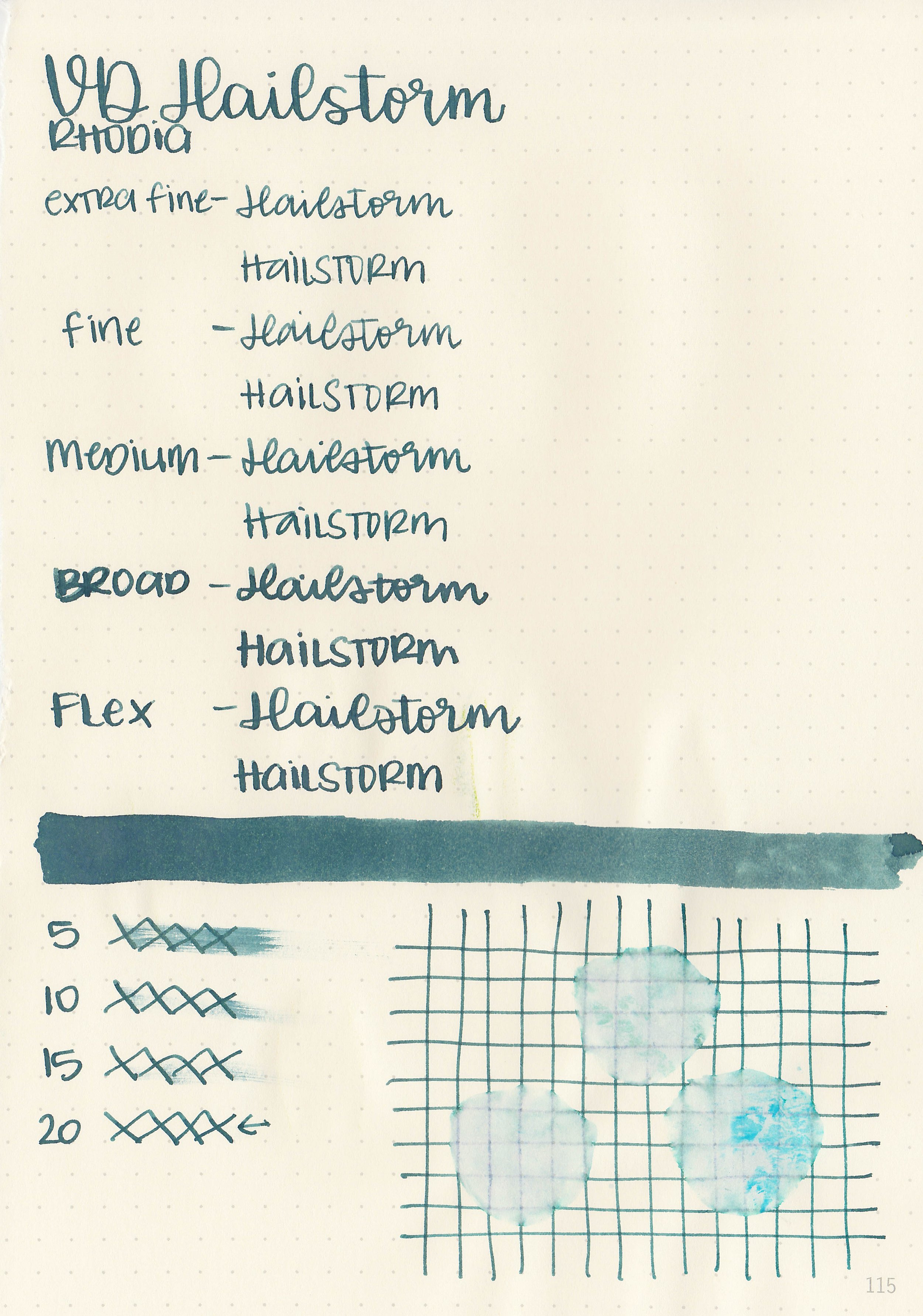
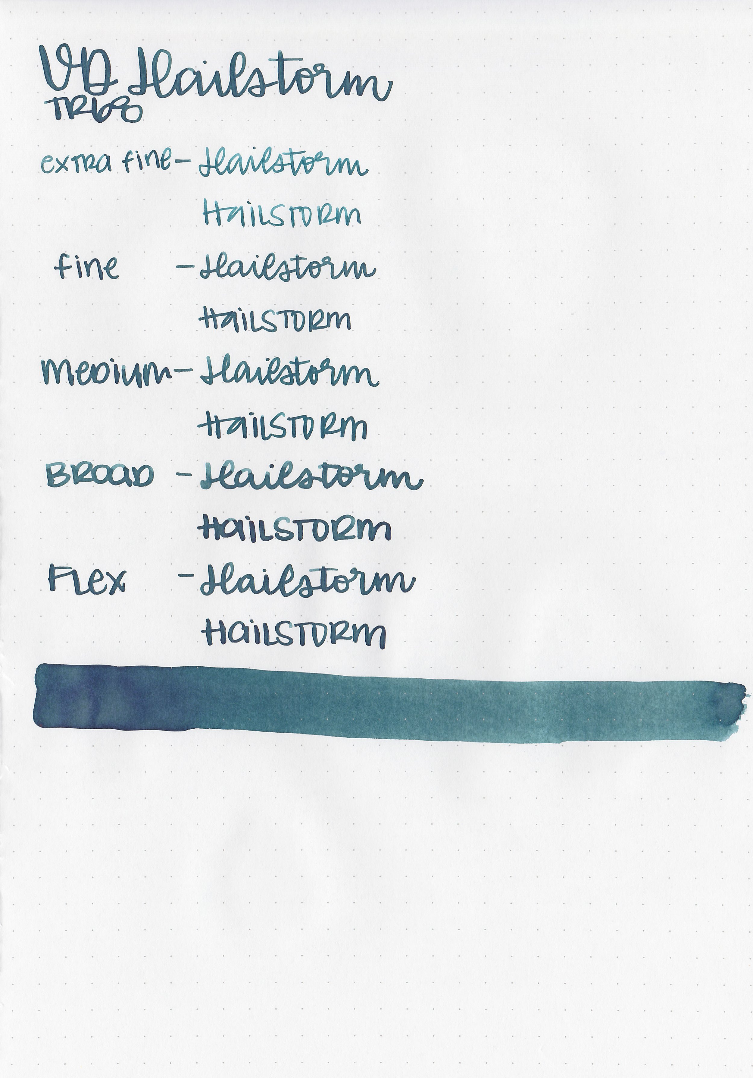
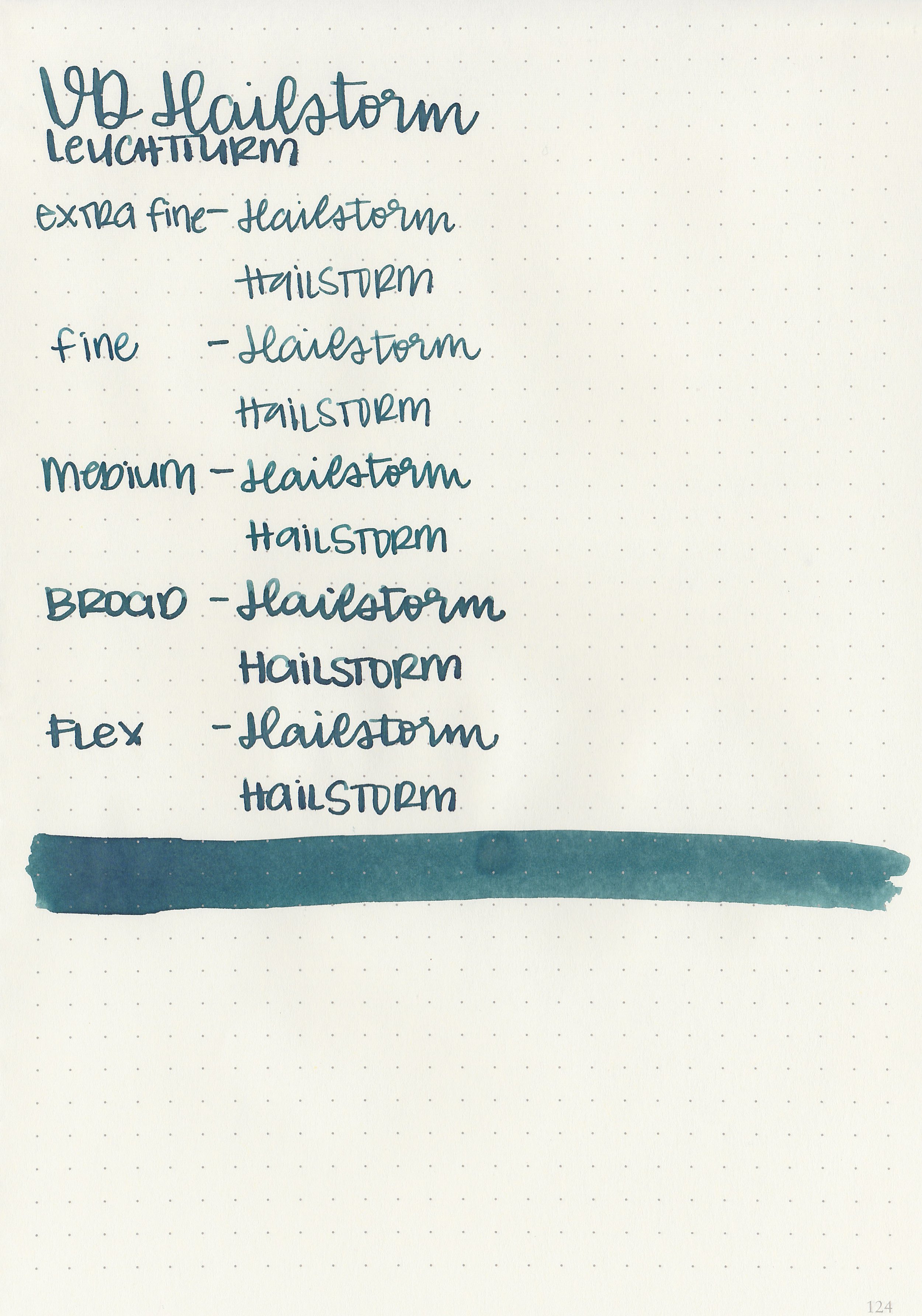
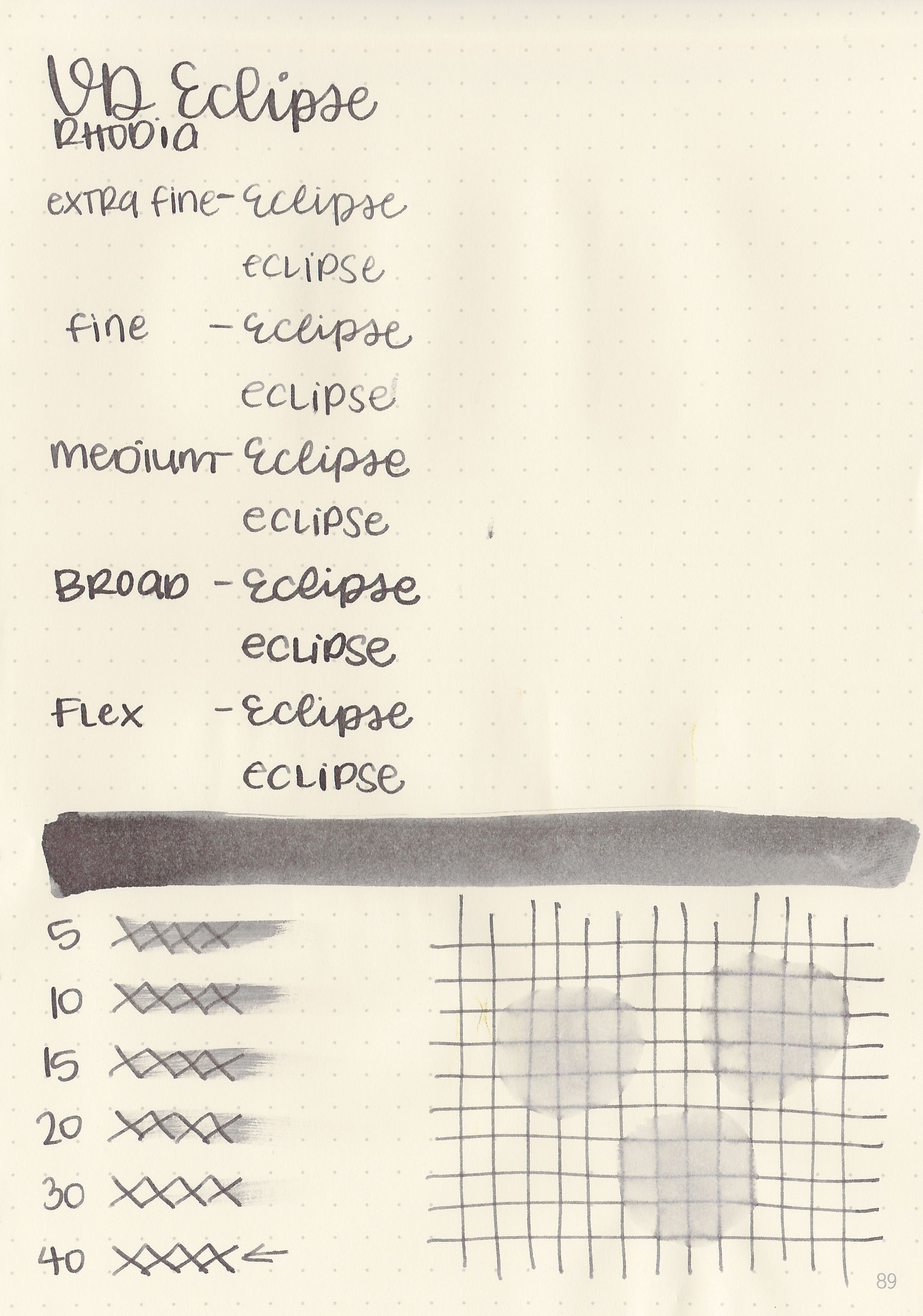
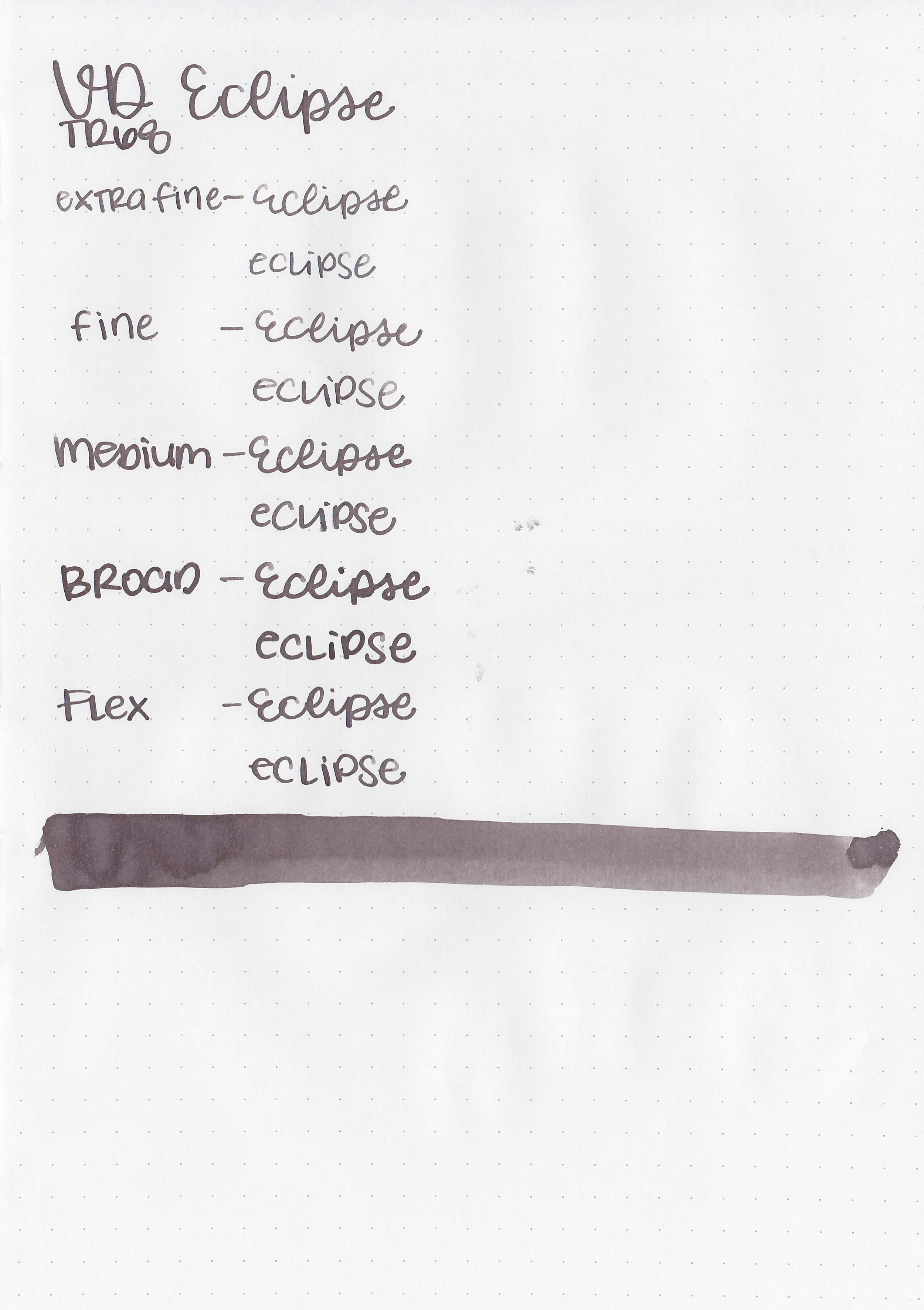
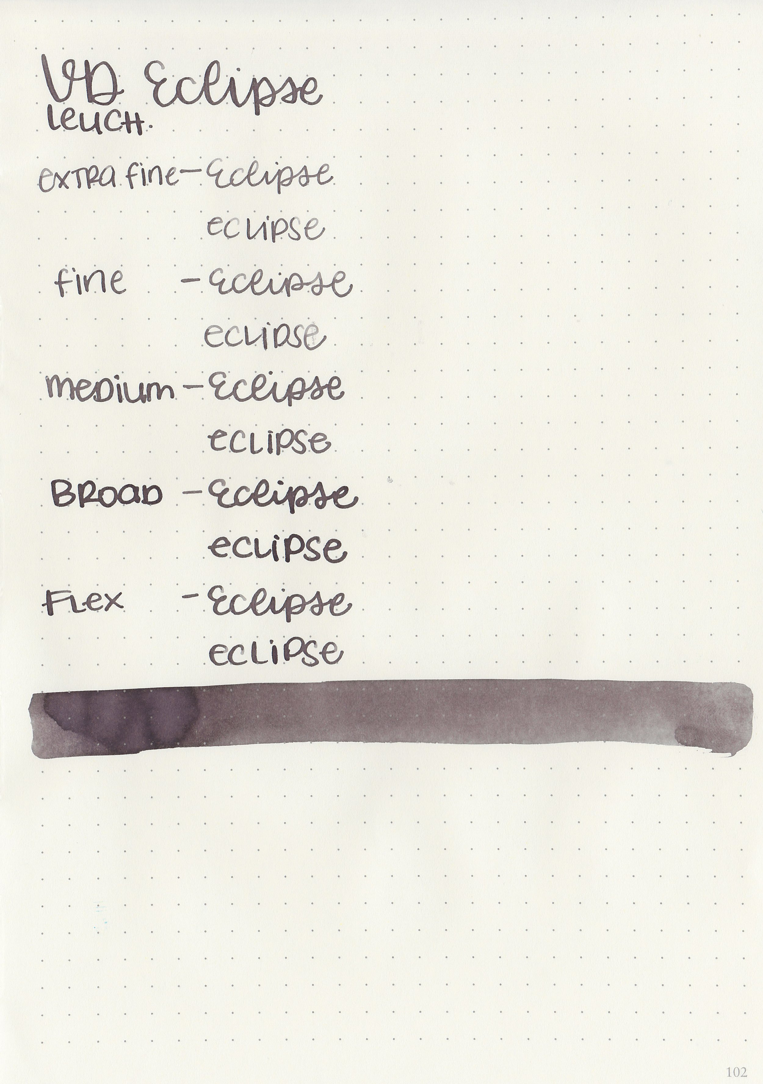
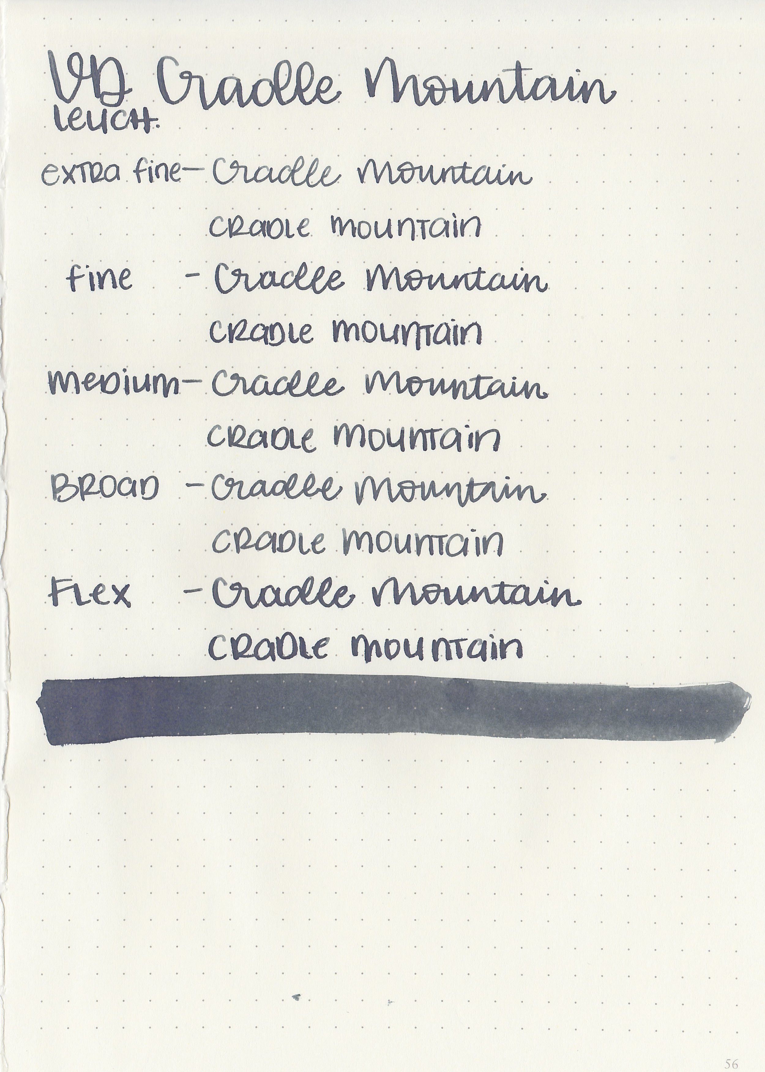
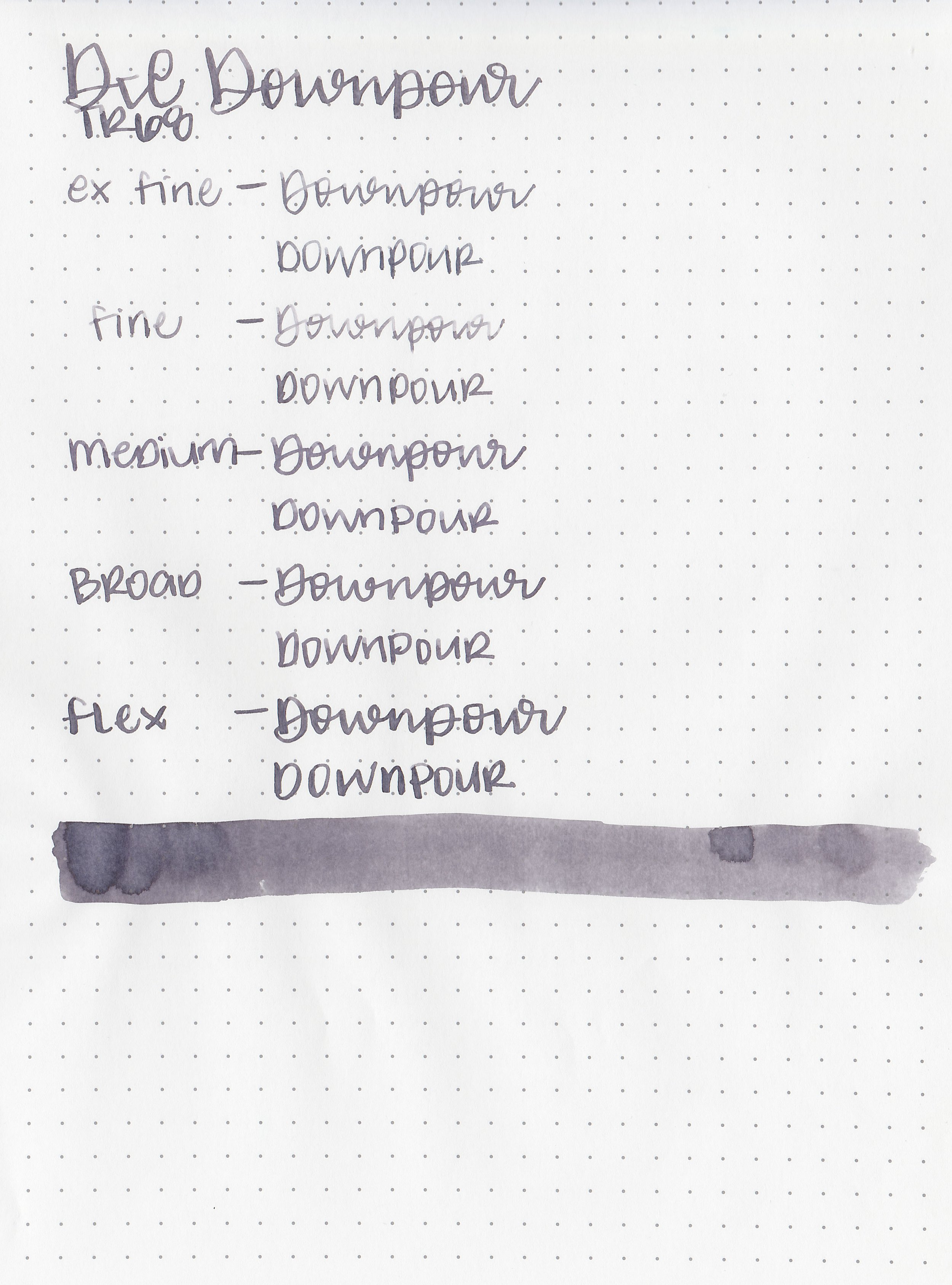
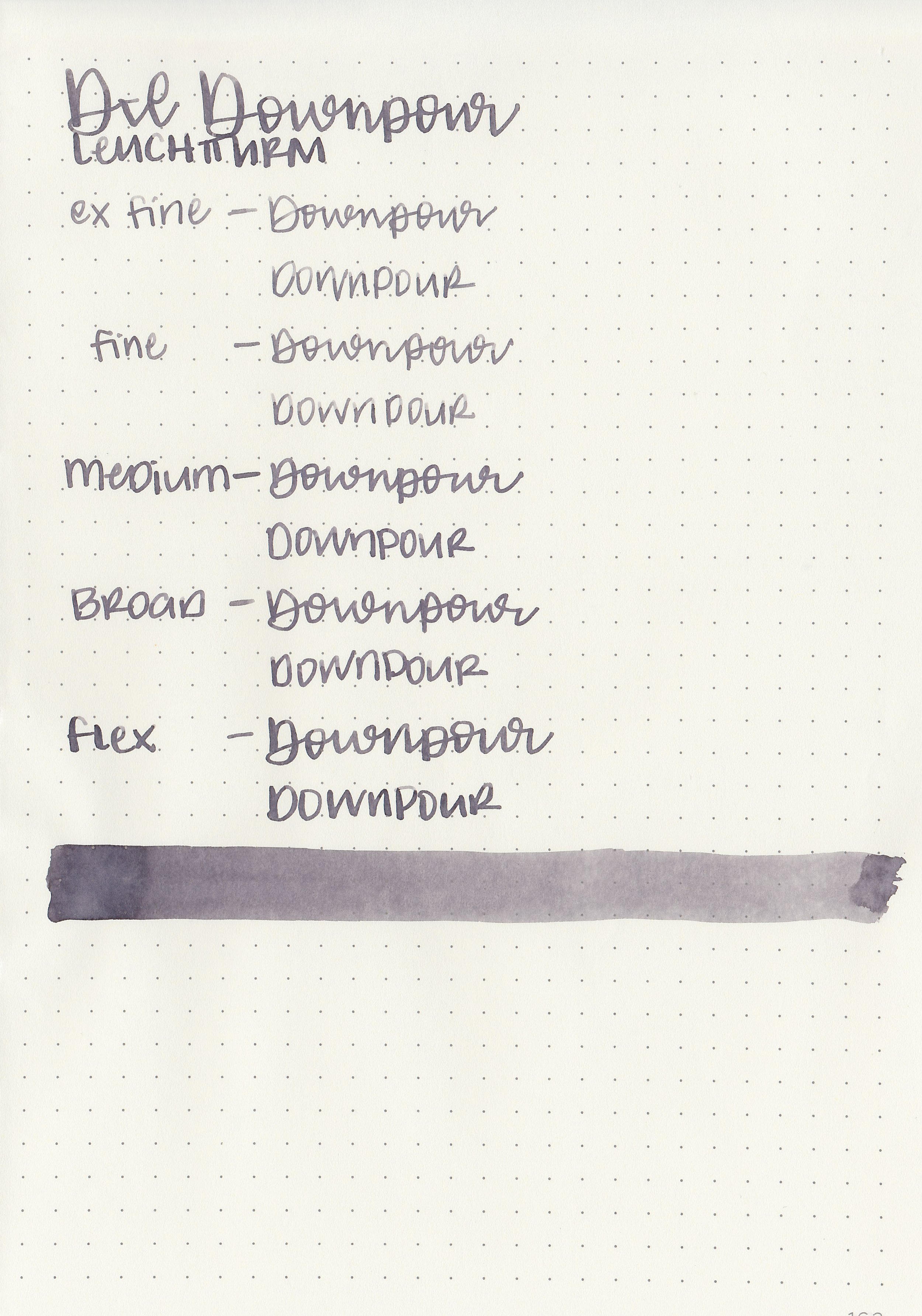
Let's take a look at how the ink behaves on fountain pen friendly papers: Rhodia, Tomoe River, and Leuchtturm.
*For my writing samples I use:
Vintage Mabie Todd Swan (flex nib)
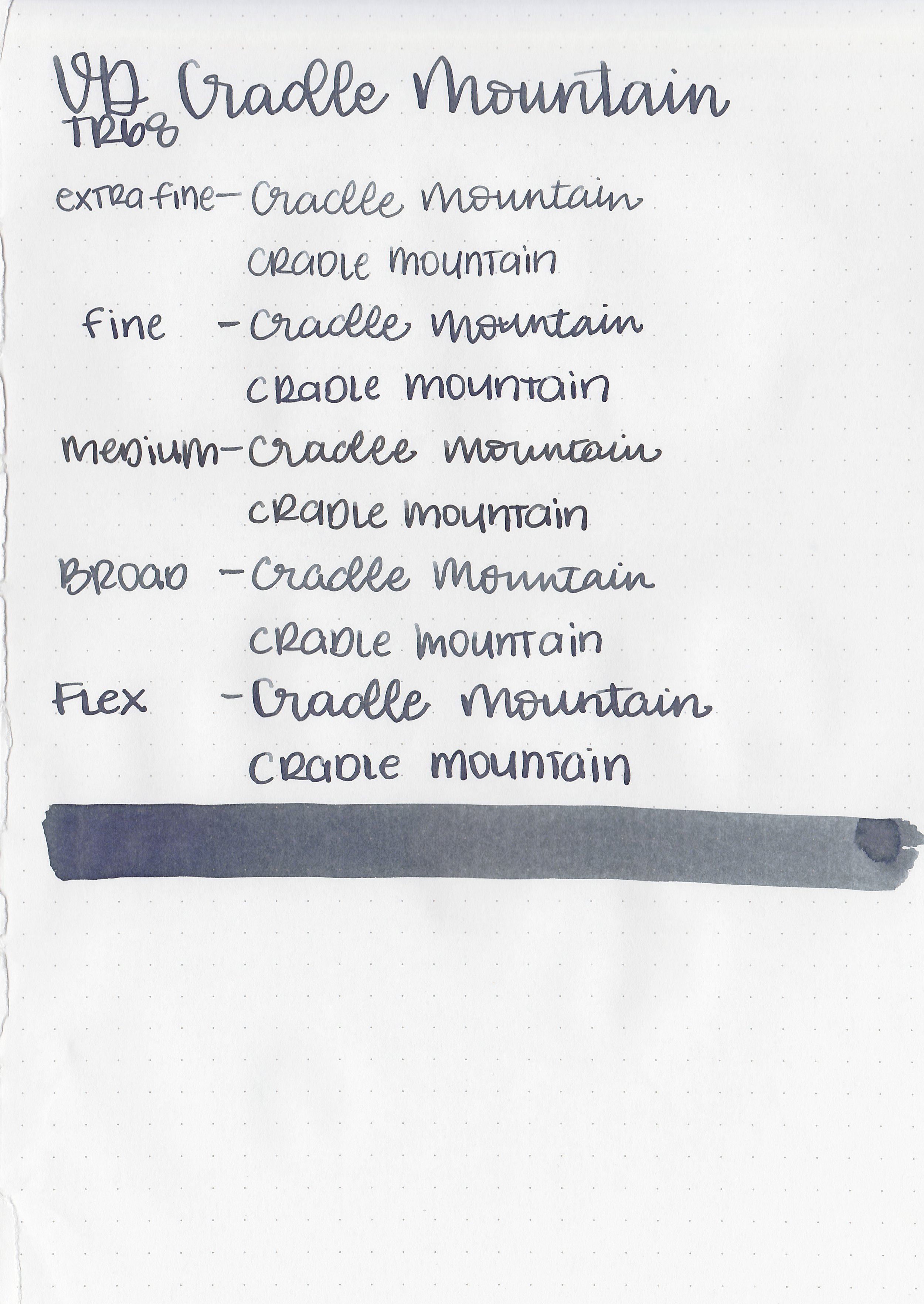
Taroko Enigma notebooks (68gsm TR)
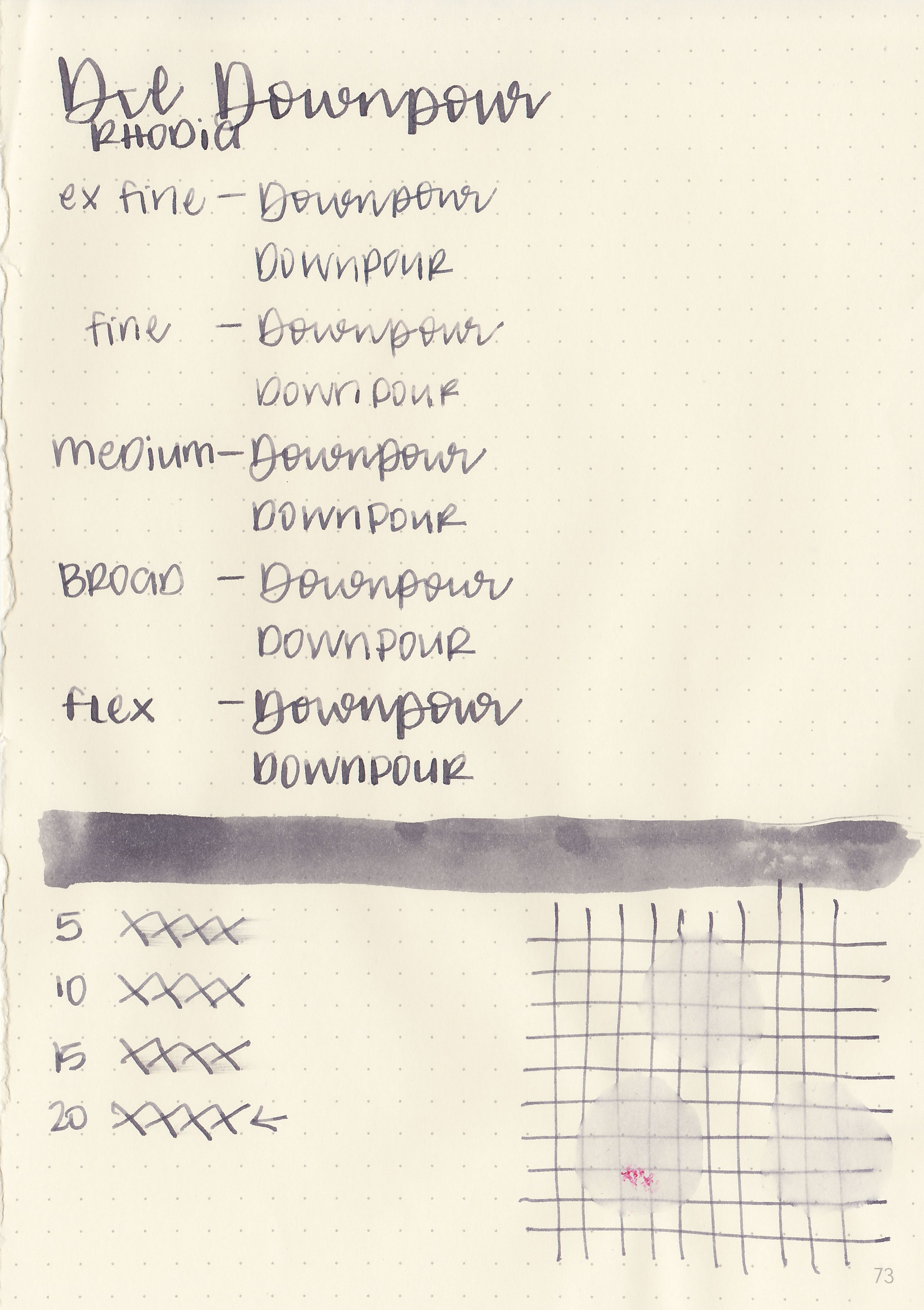
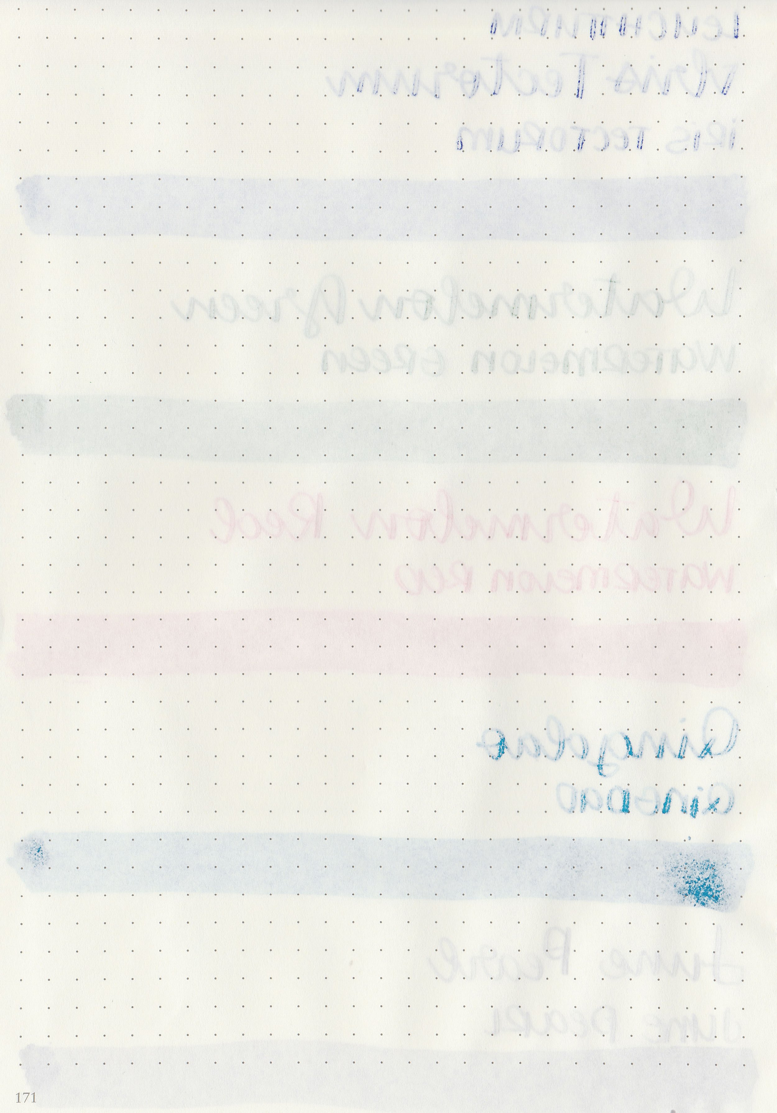
Dry time: 20 seconds
Water resistance: Medium
Feathering: None
Show through: Medium
Bleeding: None
Other properties: medium shading, no sheen, and no shimmer.
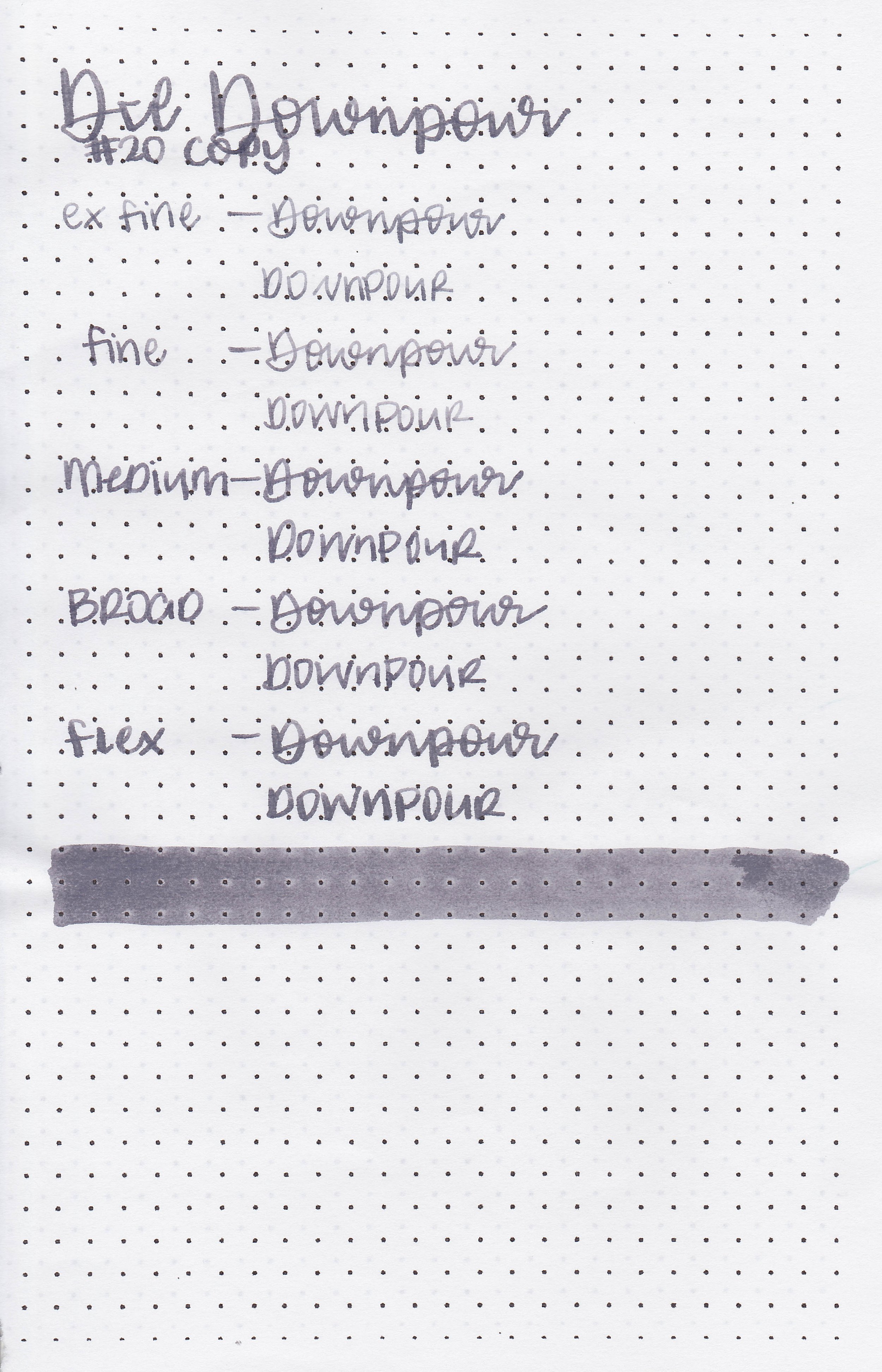
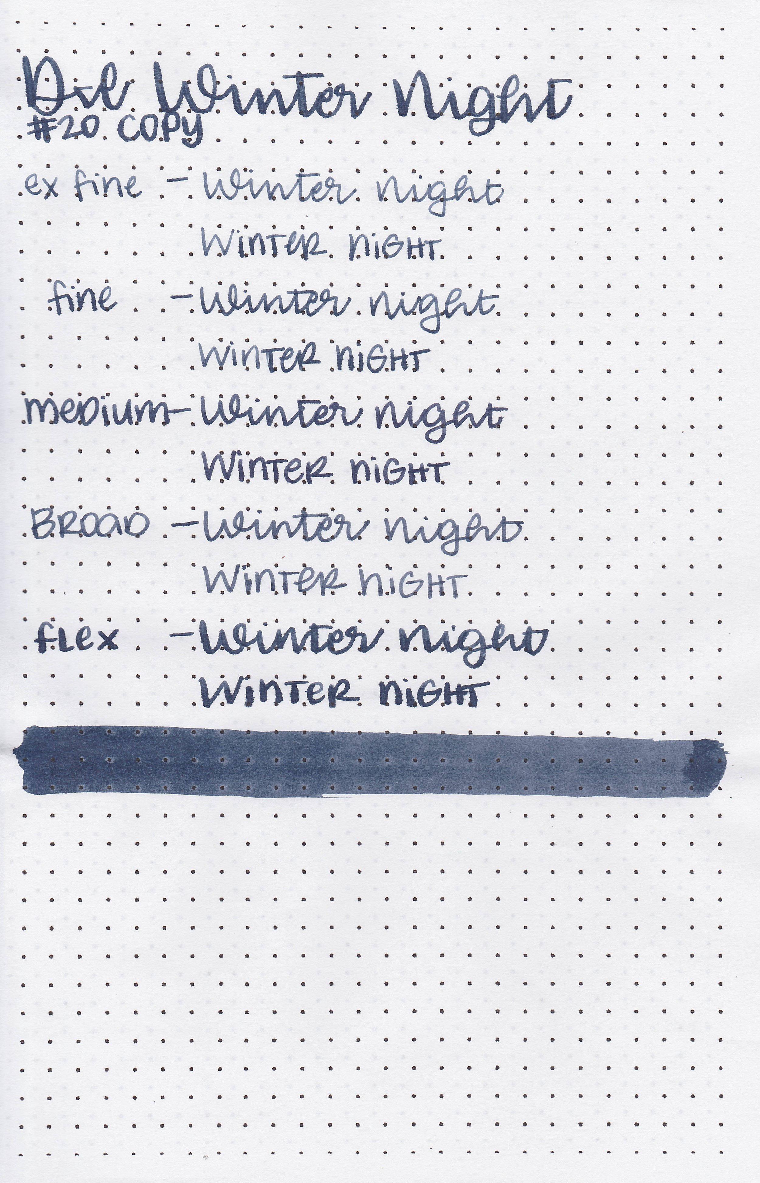
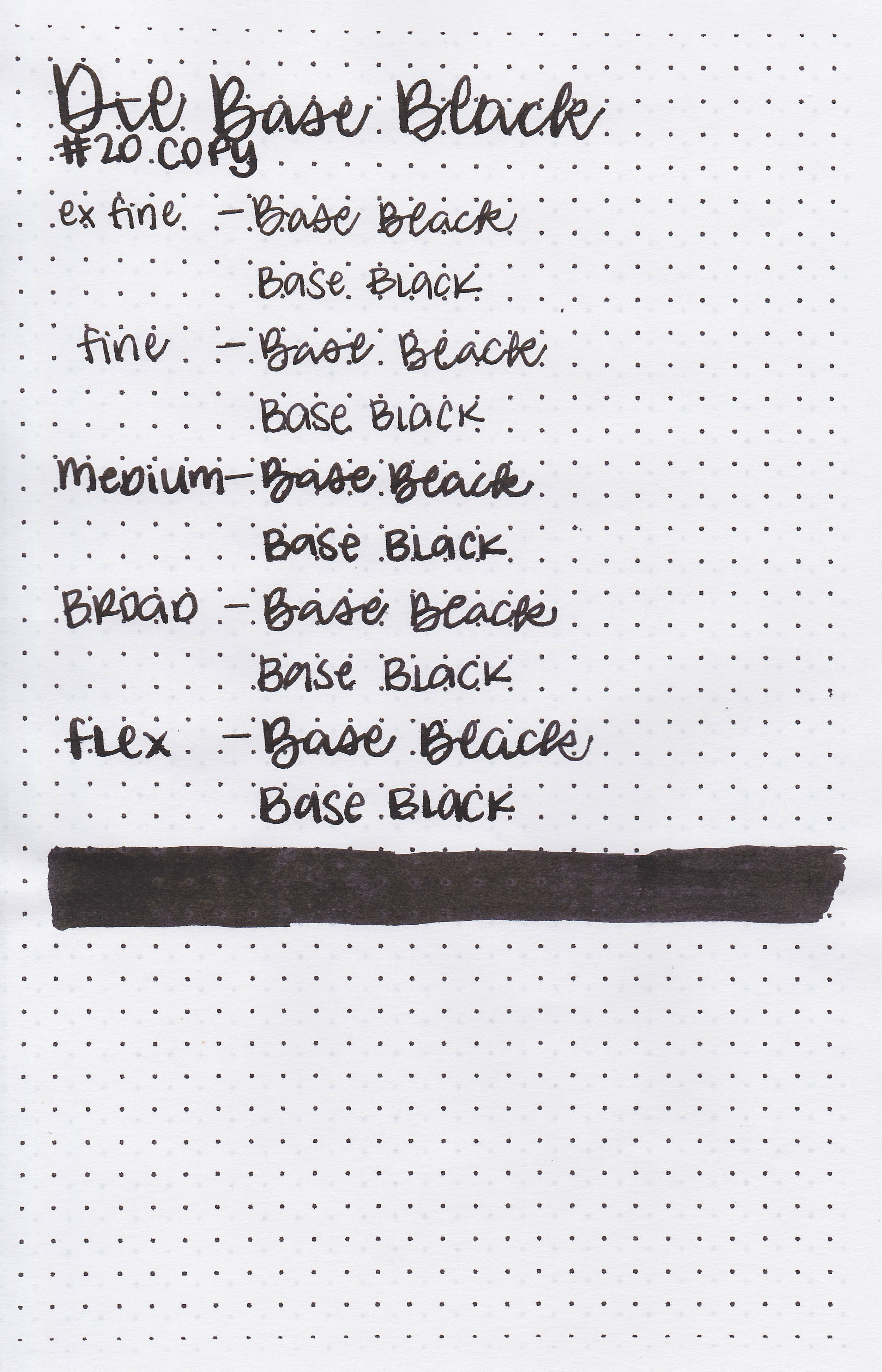
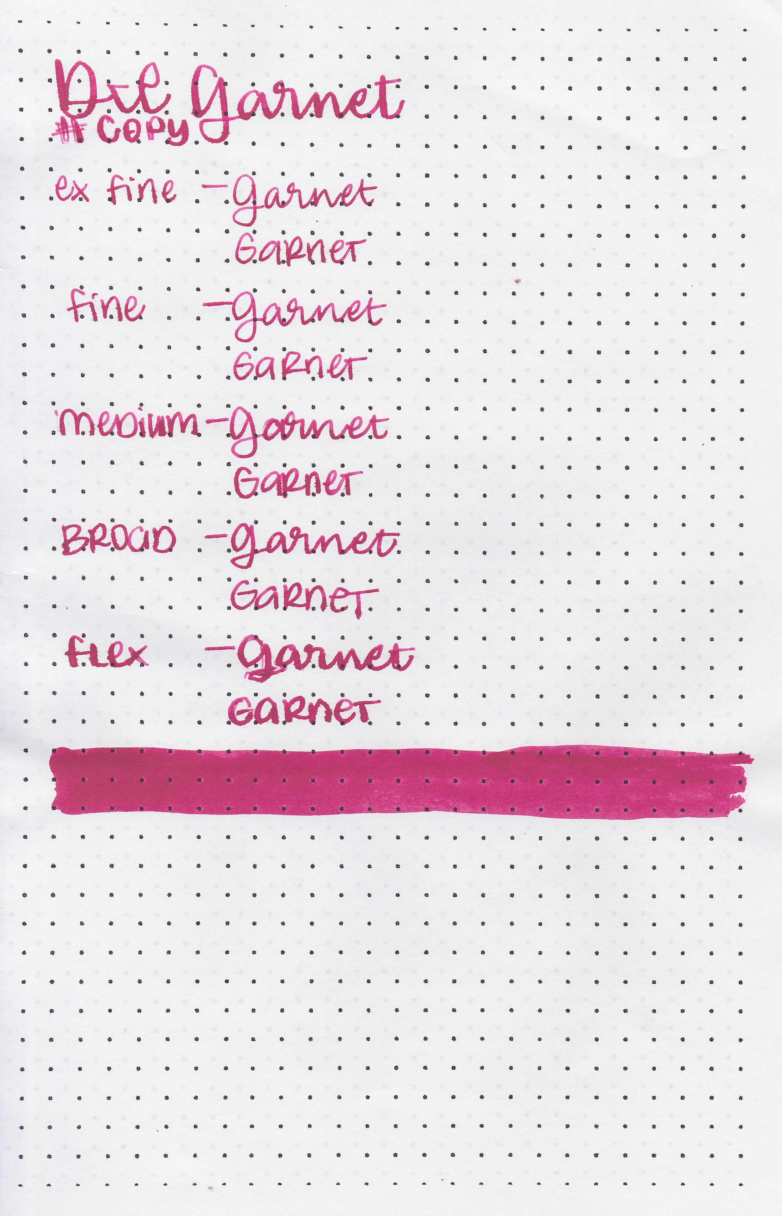
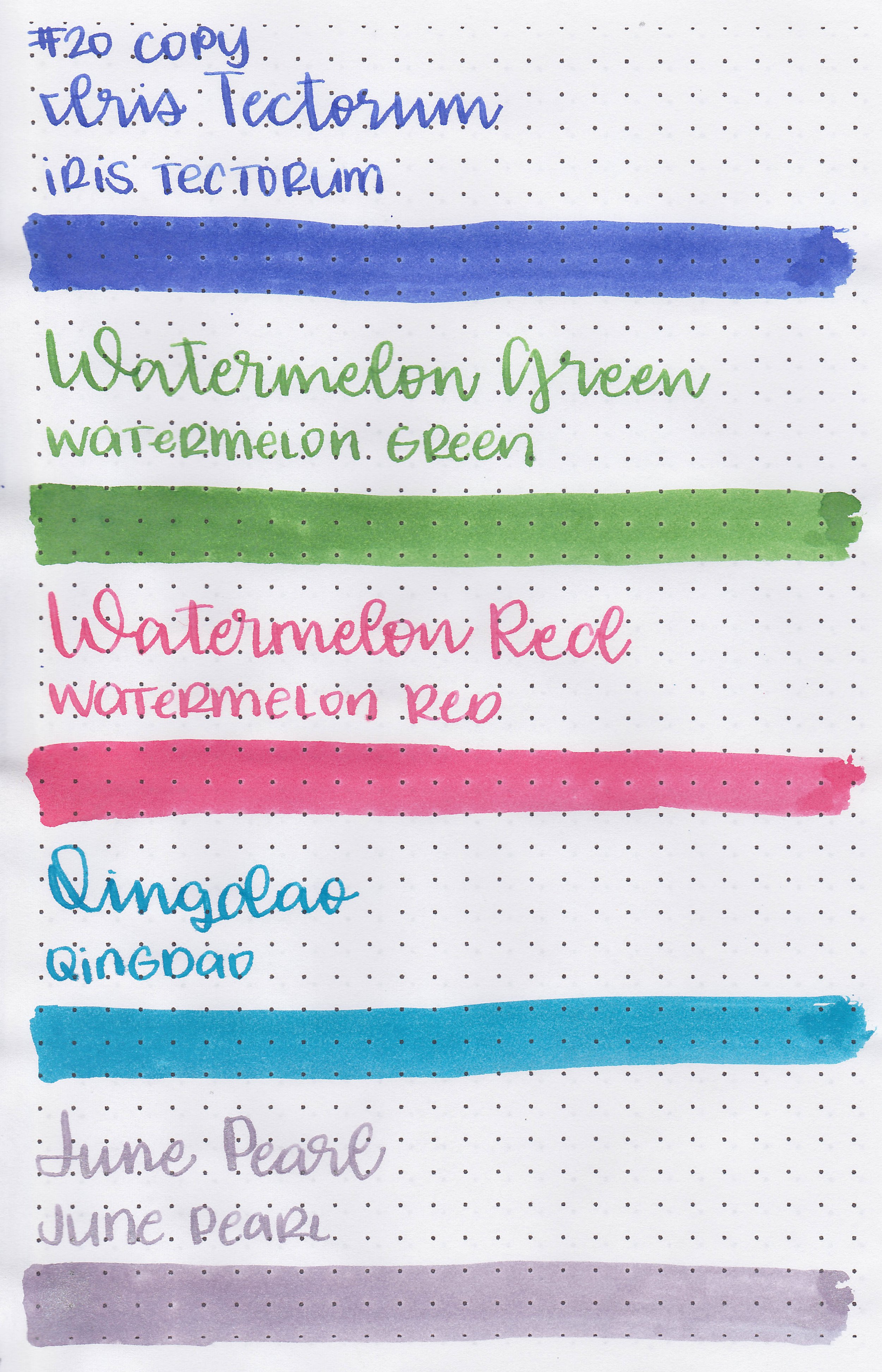
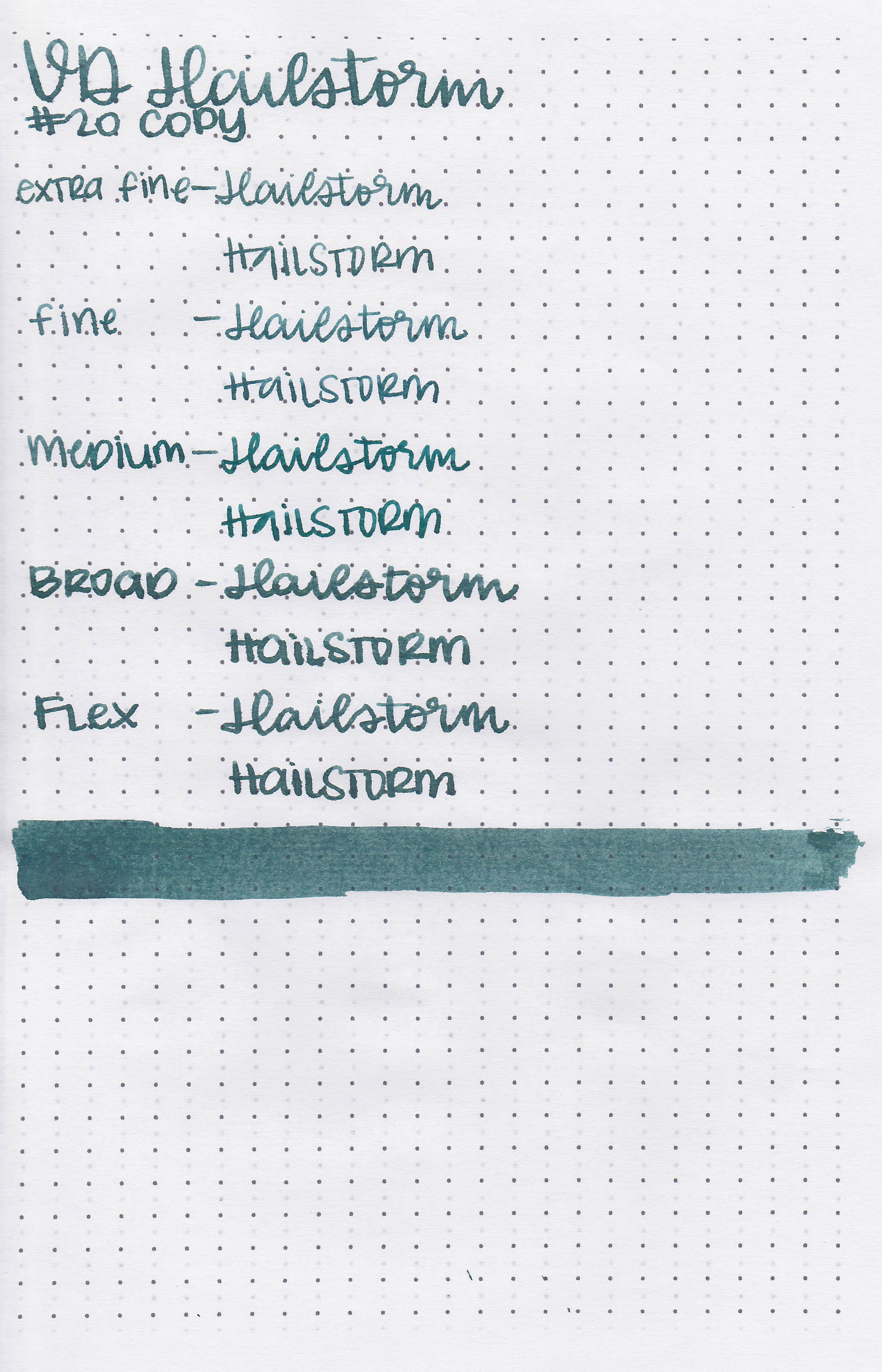
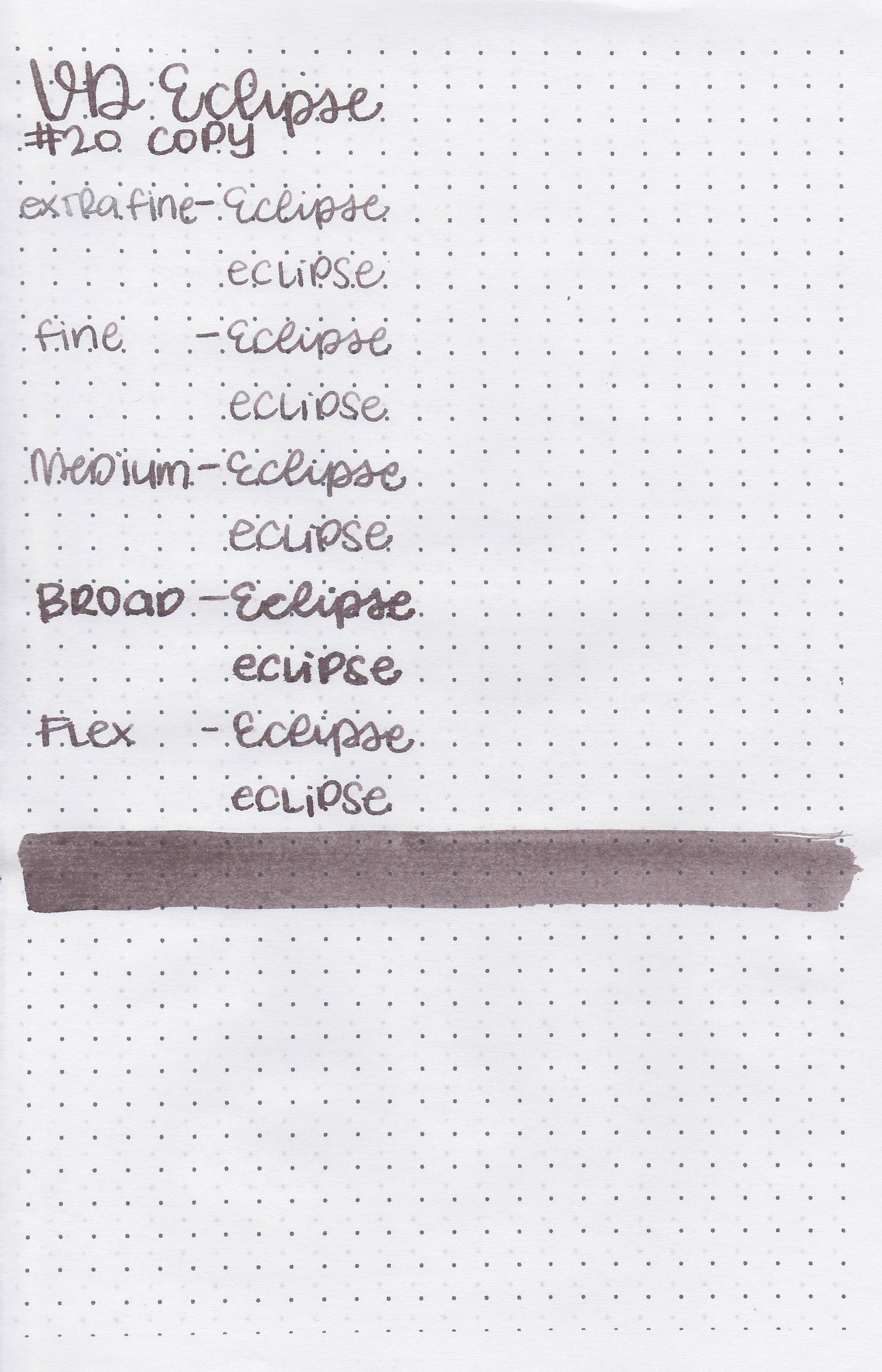
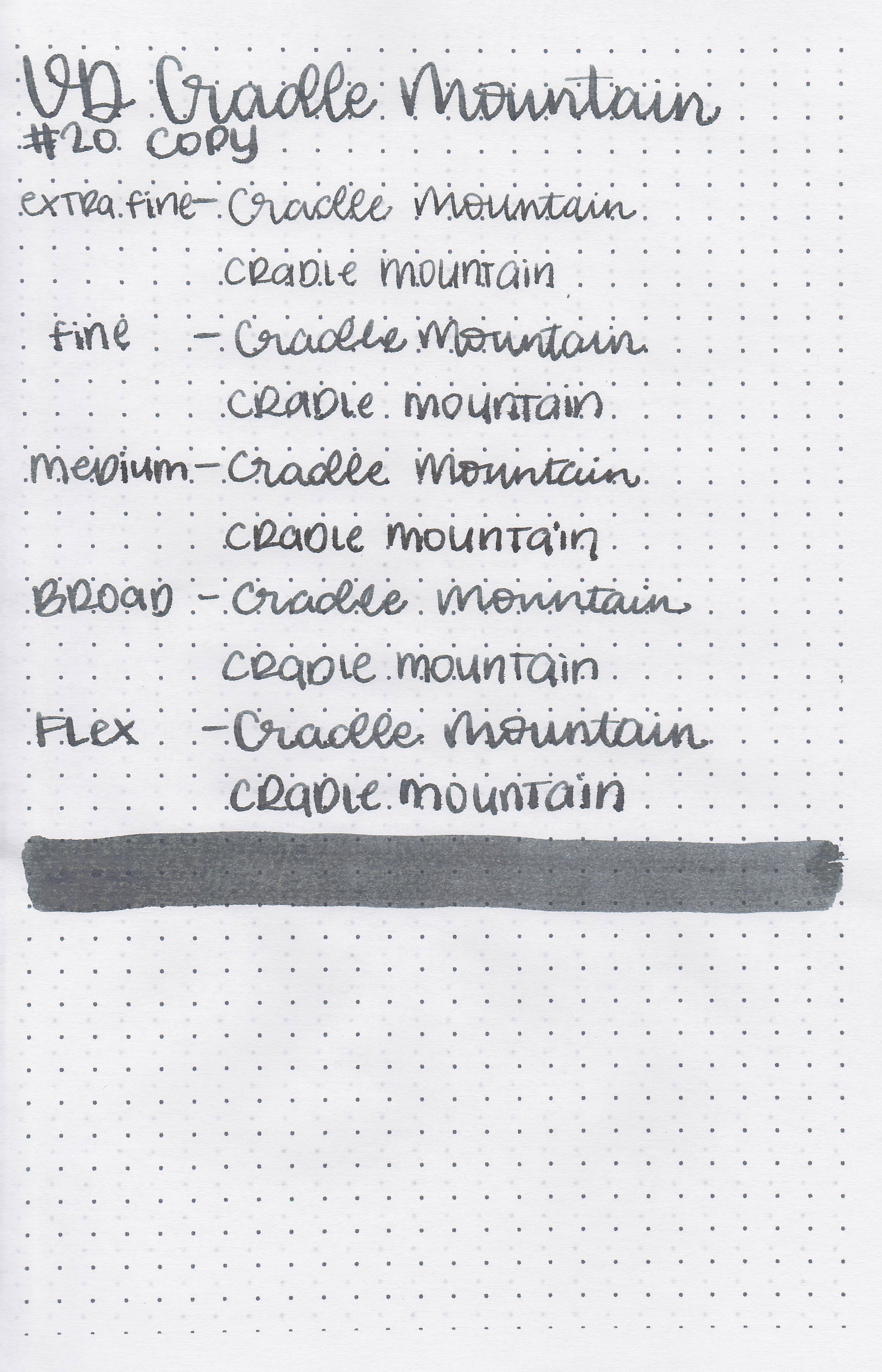
On 20 lb copy paper the ink did really well.
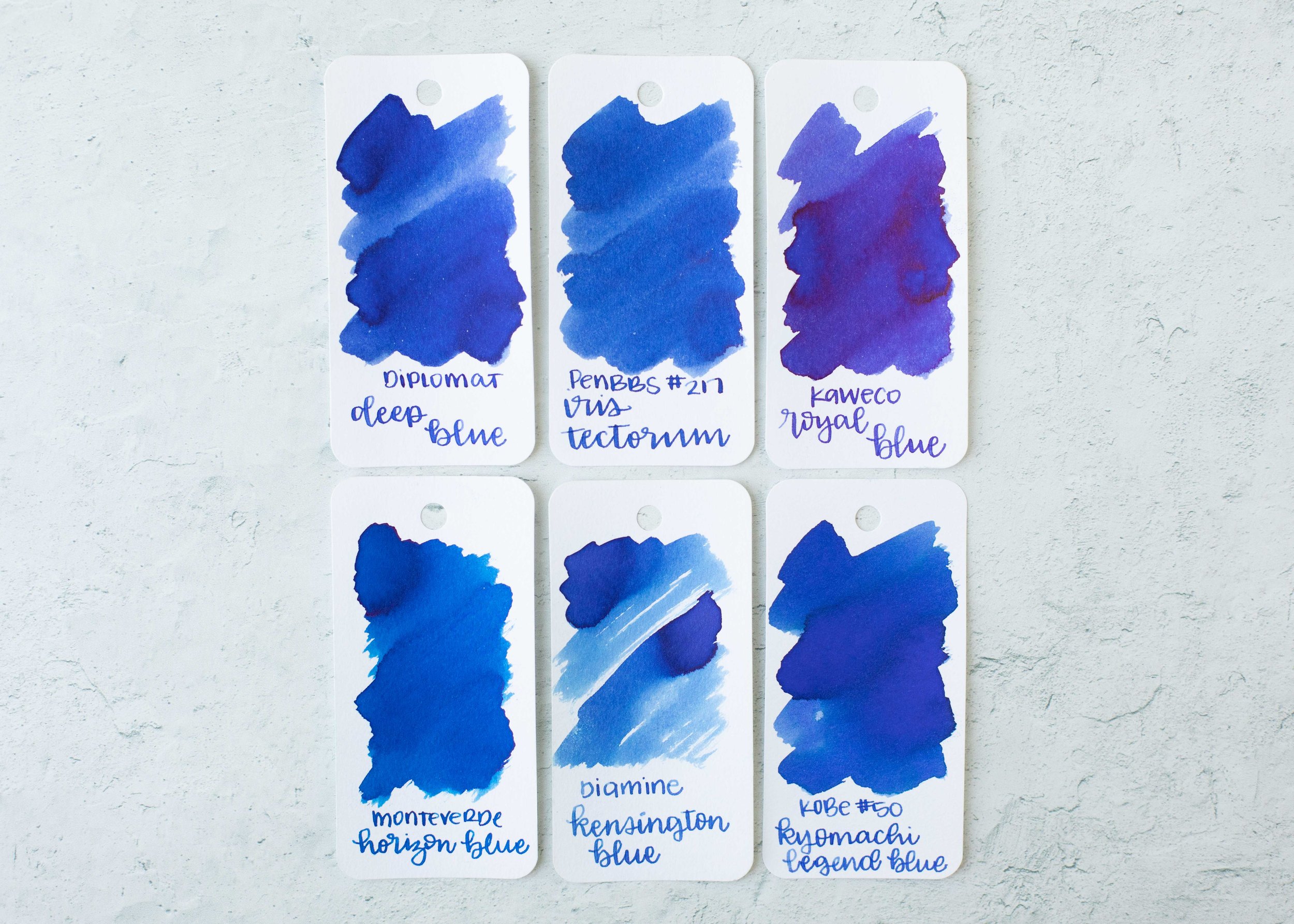
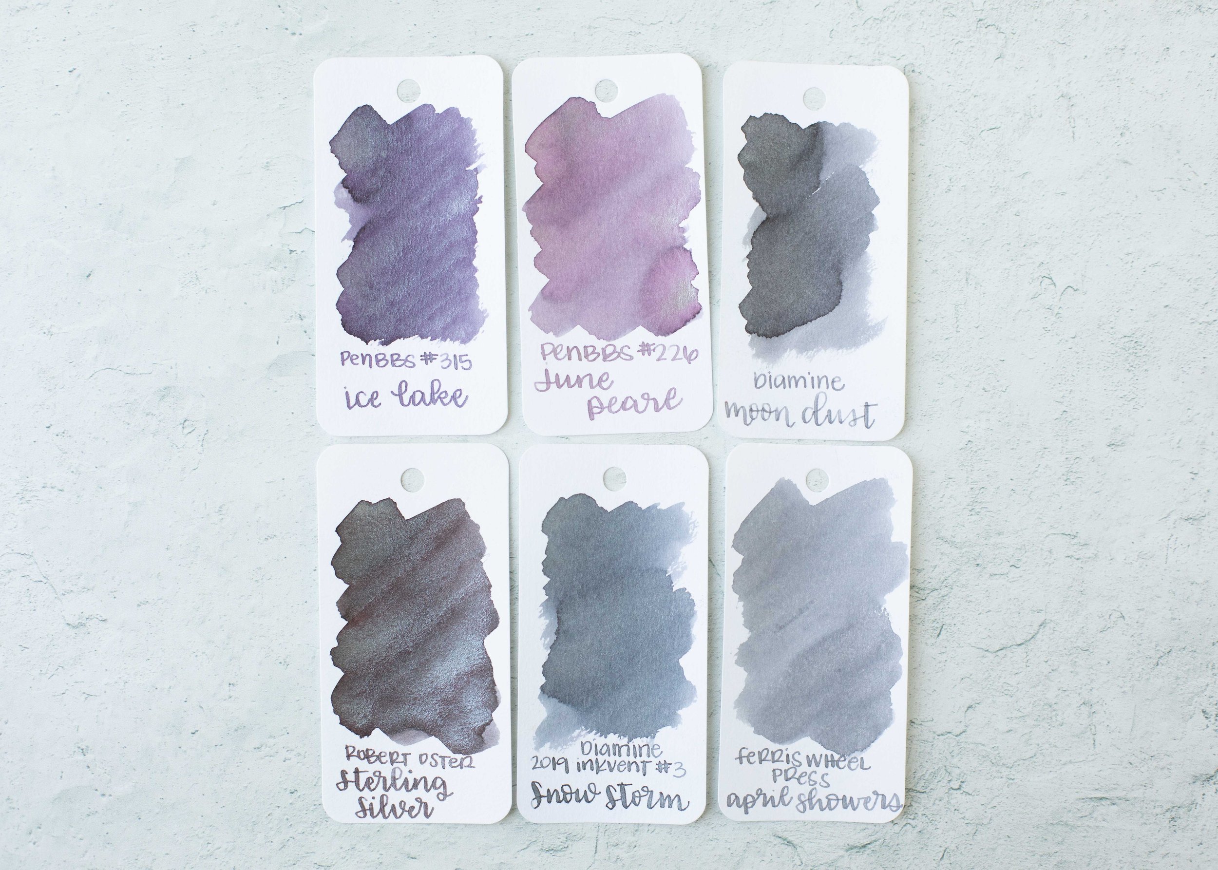
Comparison Swabs:

Downpour is closest to Montblanc Oyster Grey. Click here to see the grey inks together.
Longer writing:
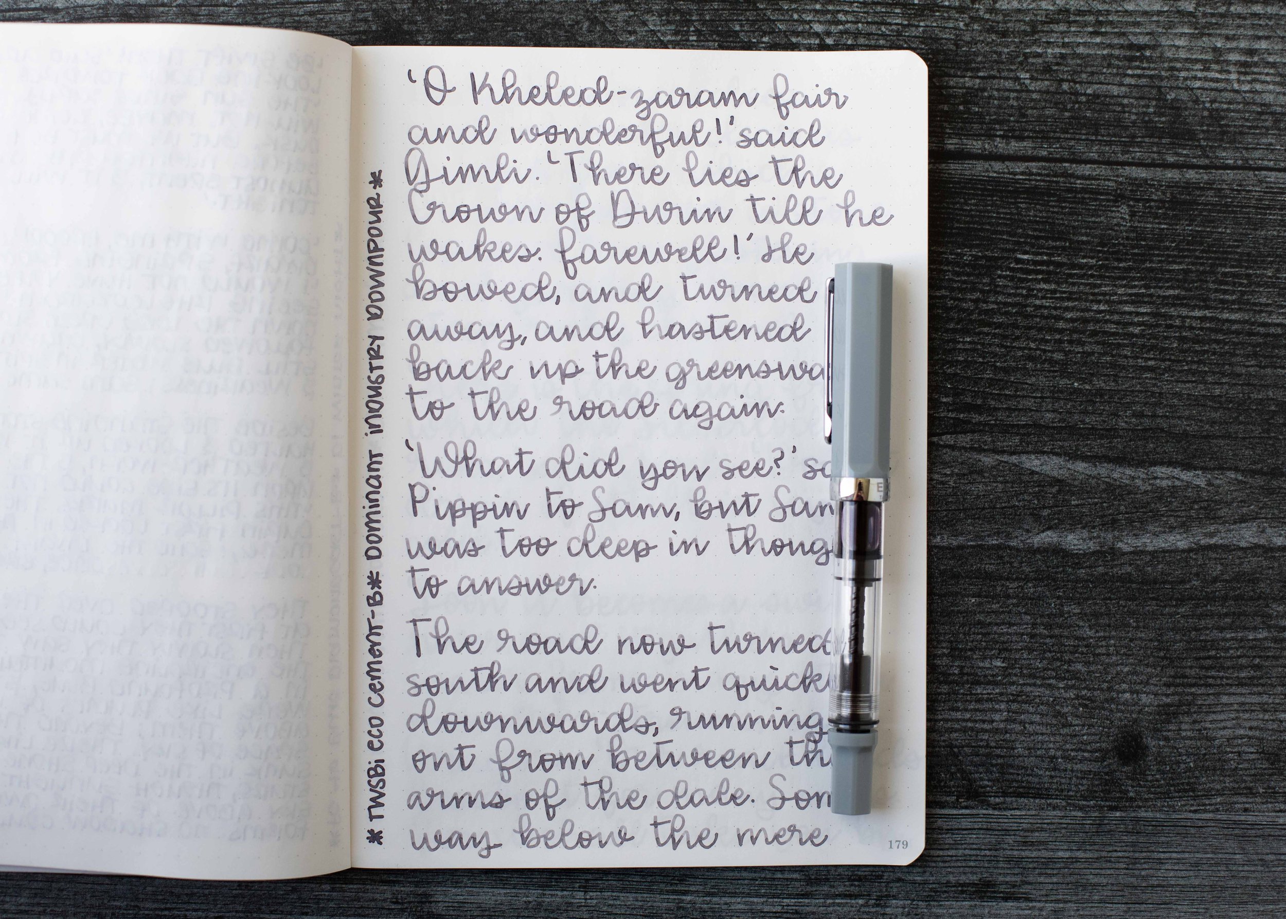
I used a TWSBI Eco Cement with a broad nib on a Taroko Enigma notebook. The ink had an average flow.
Overall, this is a nice ink. It’s well behaved and a nice neutral color.
Disclaimer: This ink was provided by Yoseka Stationery for the purpose of this review. All photos and opinions are my own. This page does not contain affiliate links and this post is not sponsored.