Ink Review #871: Lamy Copper Orange
/
We are still swimming in orange inks this week. One orange ink I’ve had in my drawer forever but never played with is Lamy Copper Orange. Copper Orange was a limited edition ink in 2015. I discovered fountain pens in late 2015, so I didn’t buy a bottle when it was available. Fortunately a friend from my local pen club has a bottle and offered me a sample. My main goal in reviewing past limited edition inks is to show currently available inks that are similar, so if you missed out you can find an alternative.
The color:
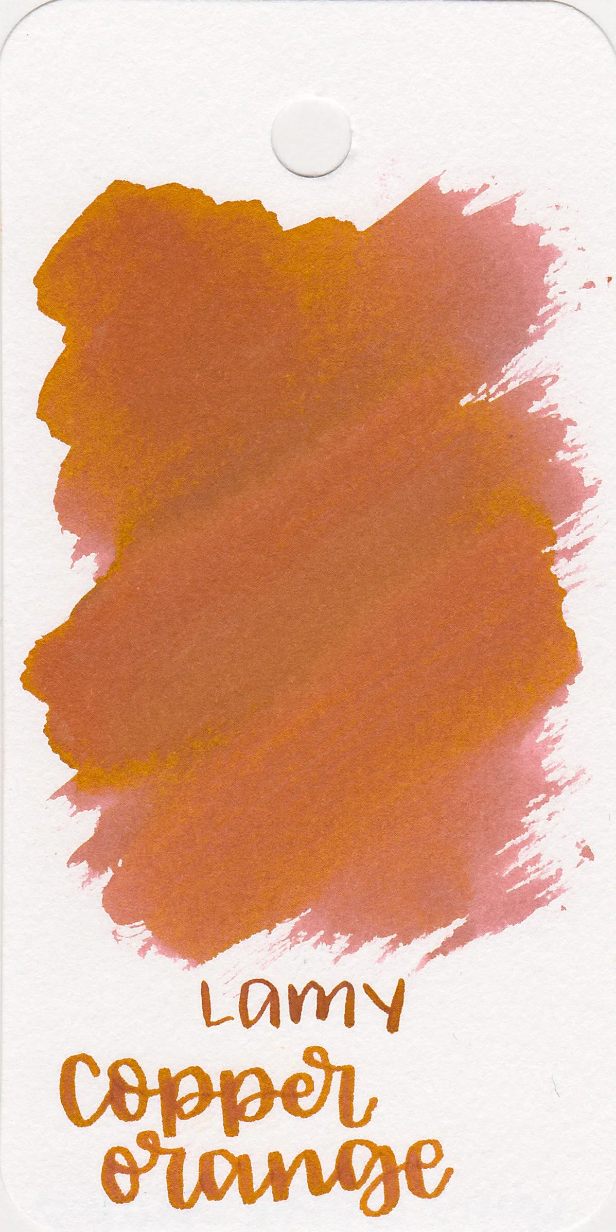
Copper Orange is a medium slightly unsaturated orange. I had a heck of a time trying to color match these images.
Swabs:

In large swabs on Tomoe River paper the ink almost turns brown where pooled.

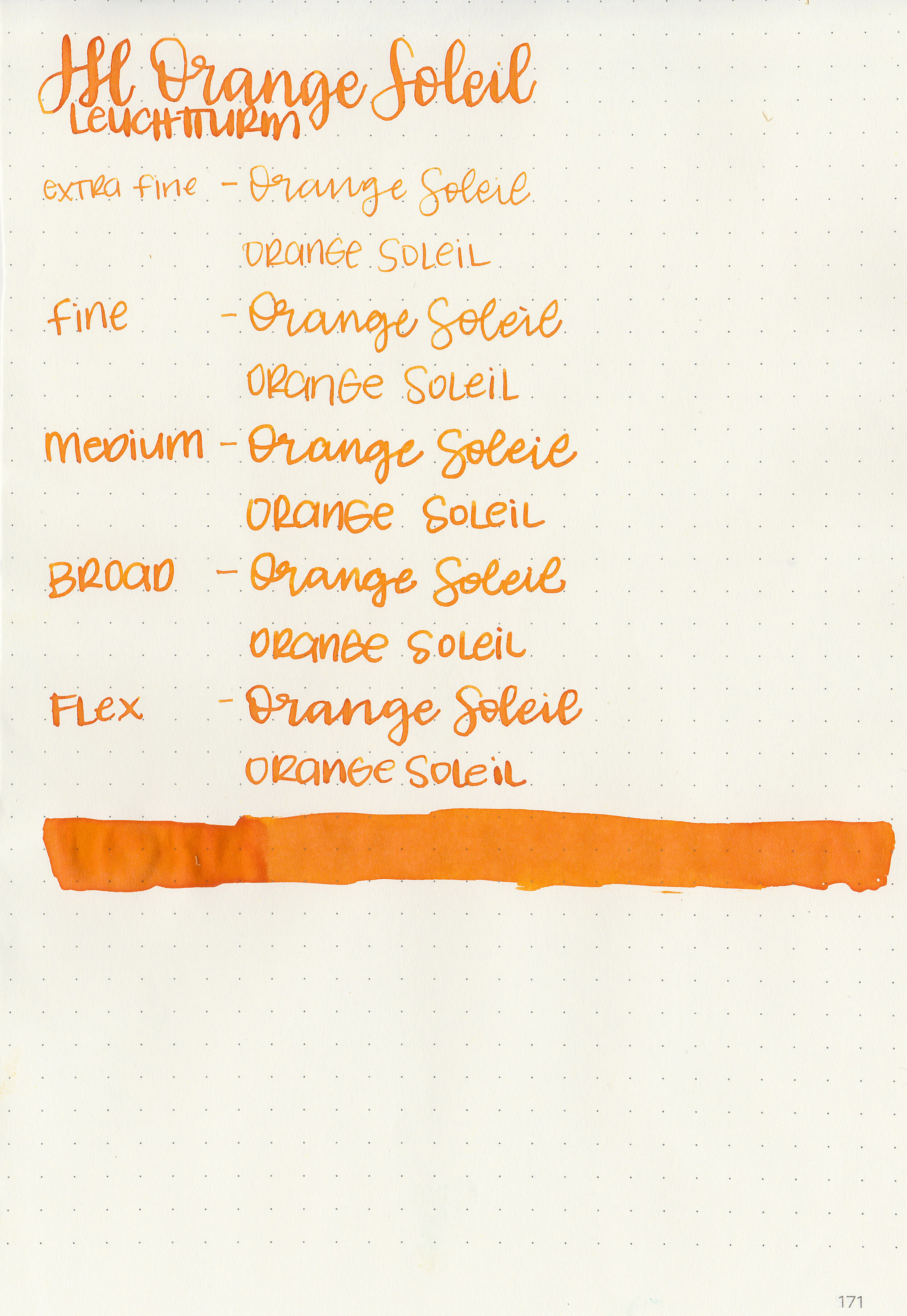
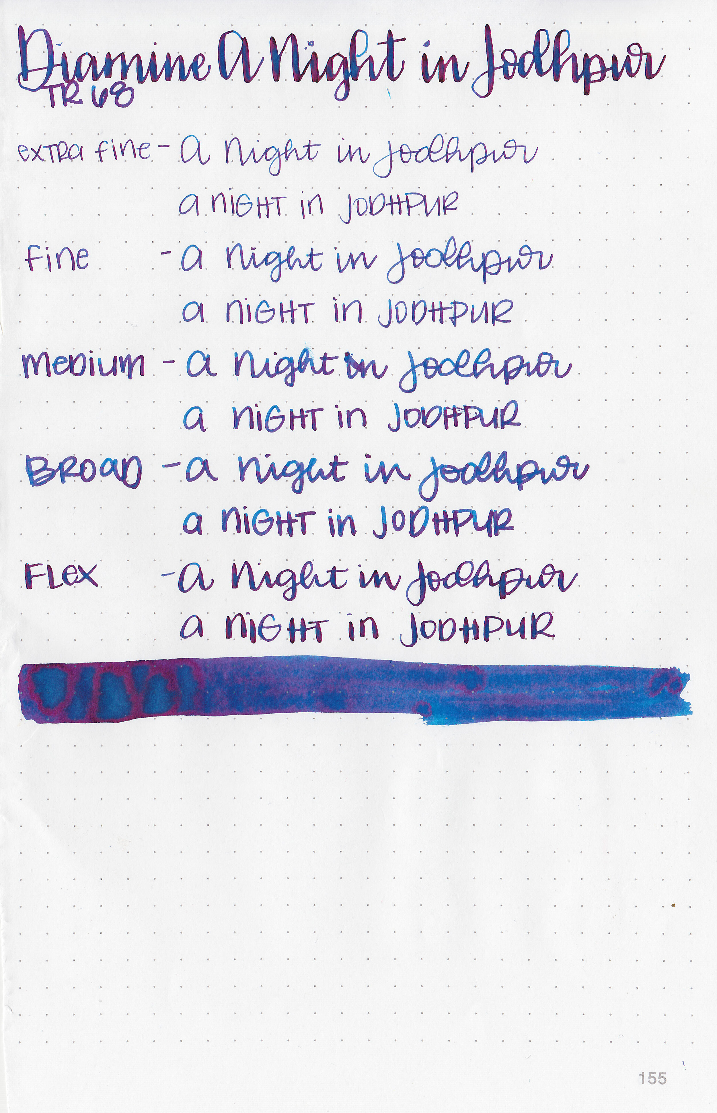
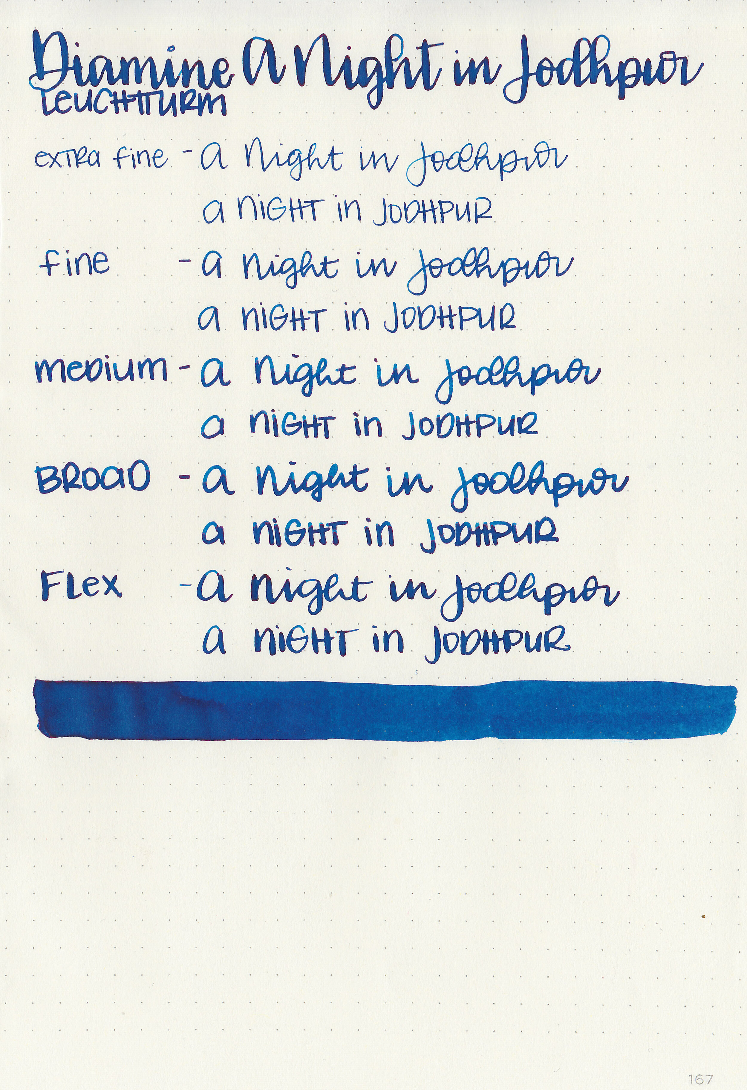
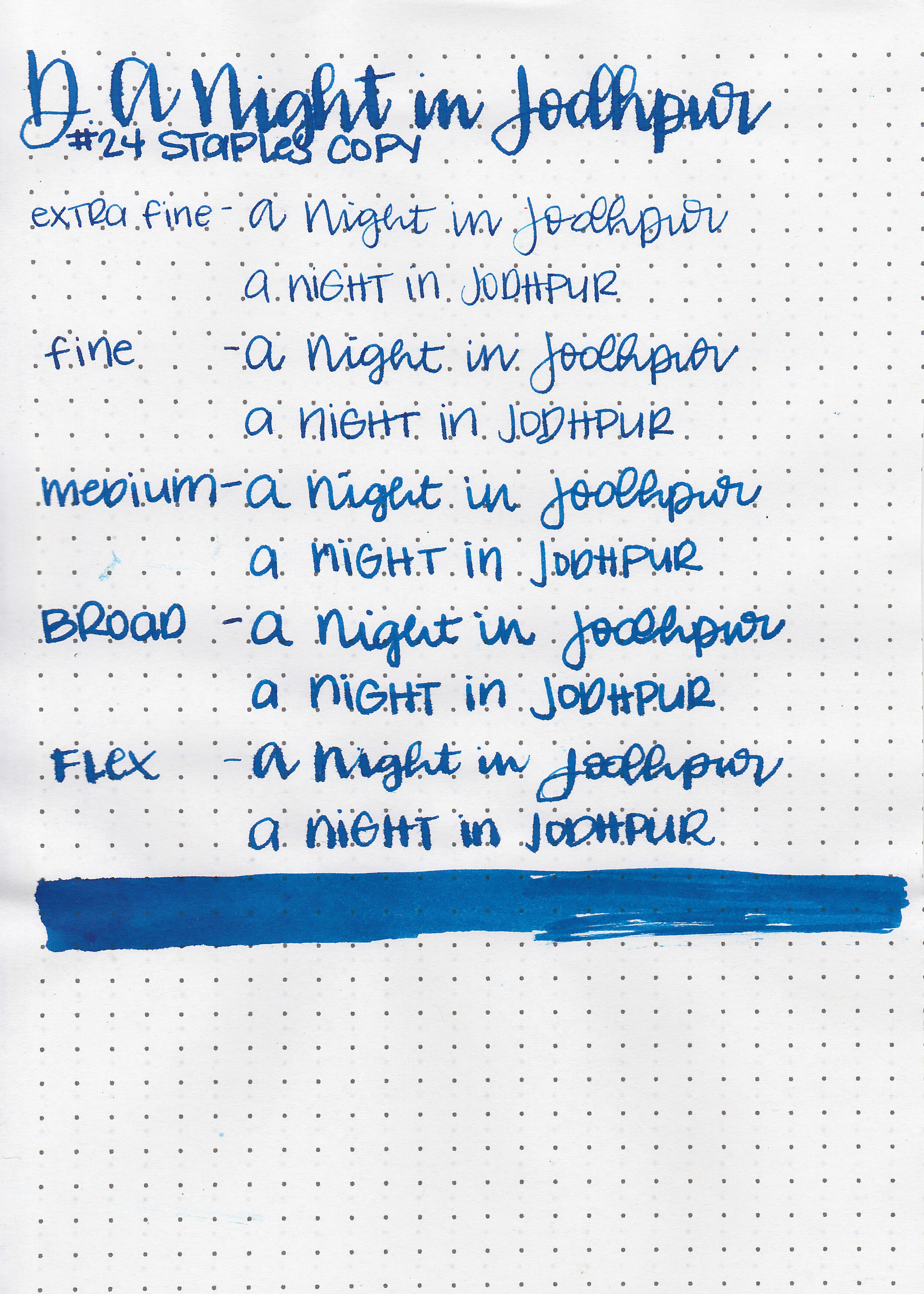
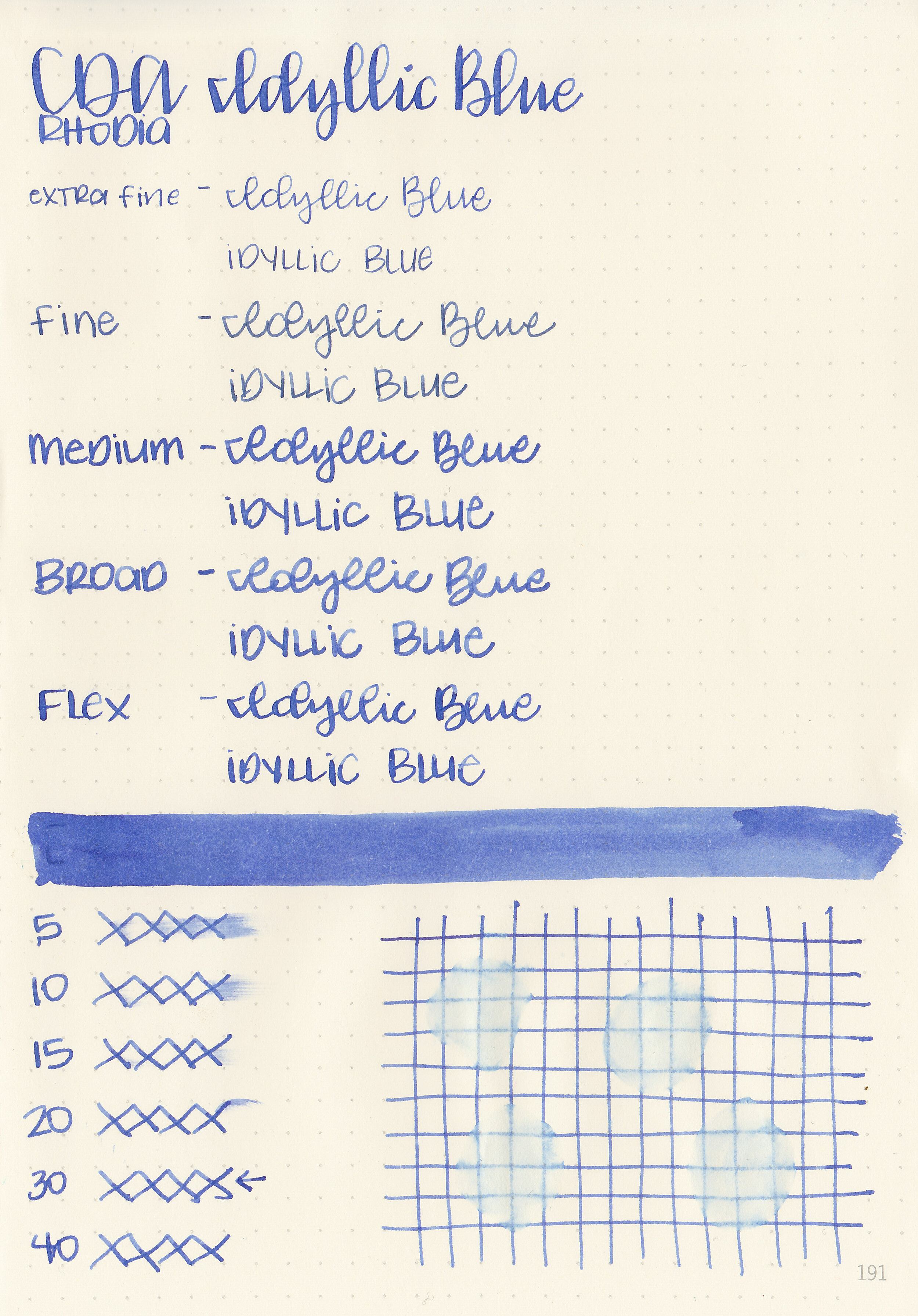
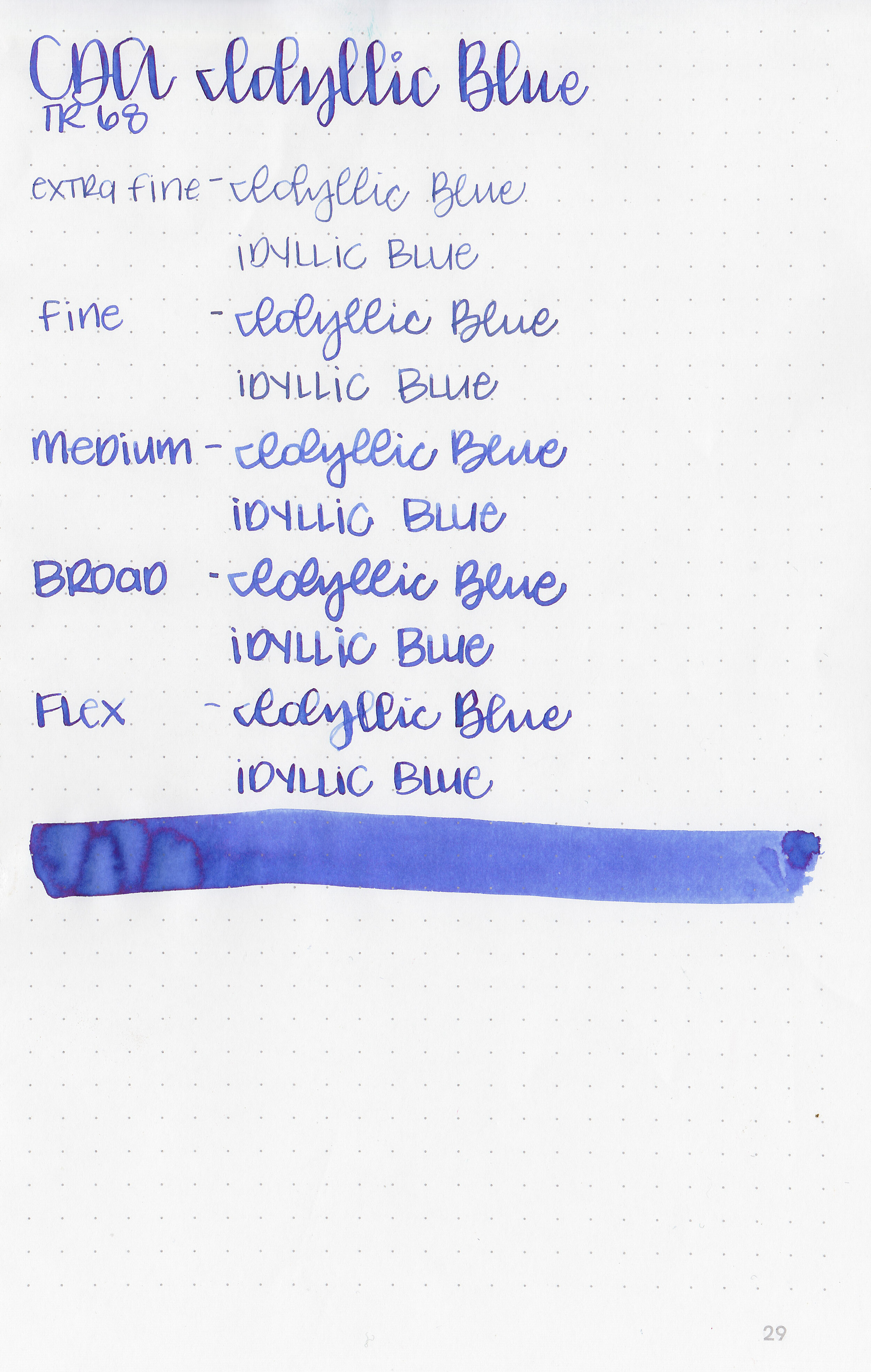
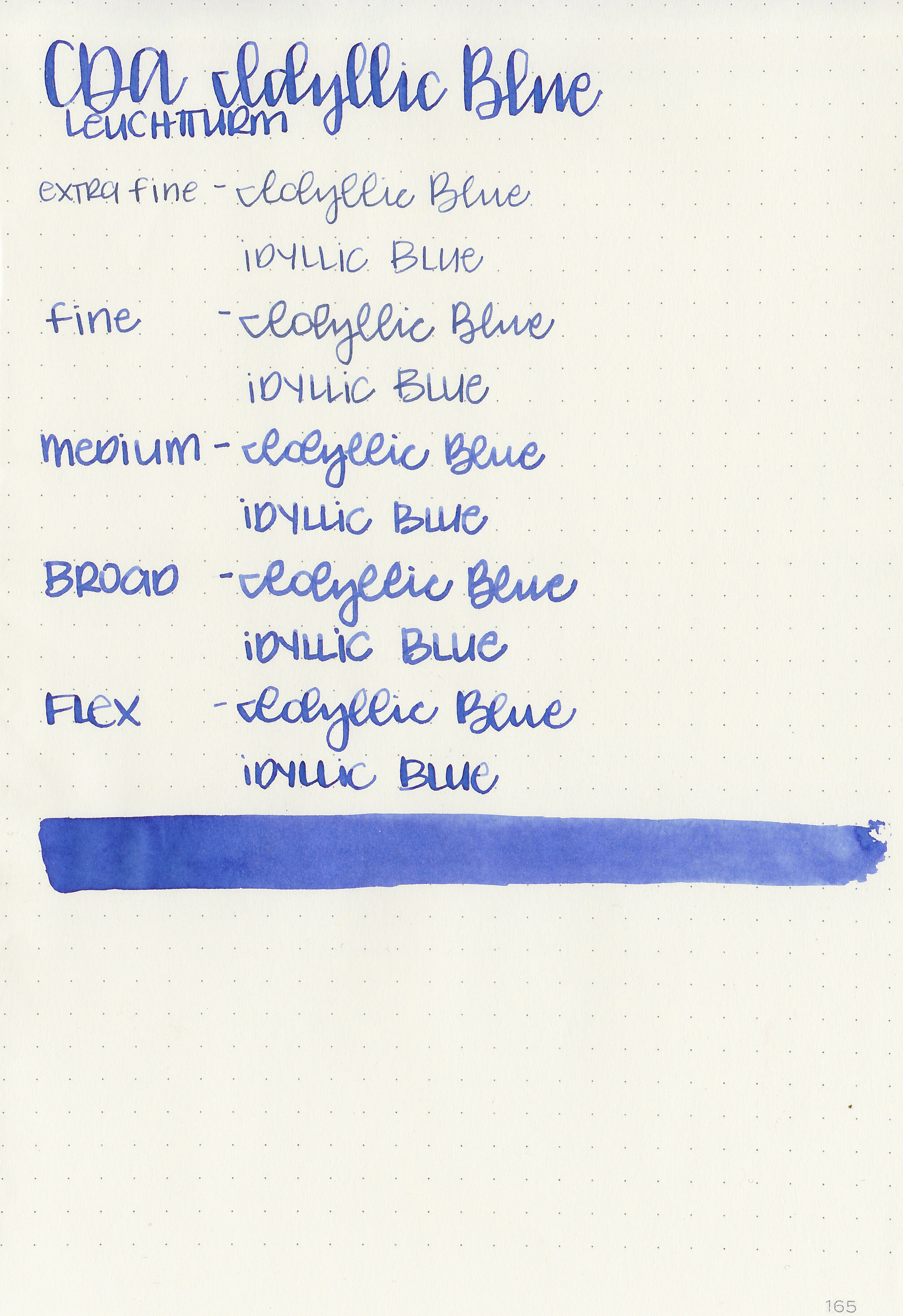
Writing samples:
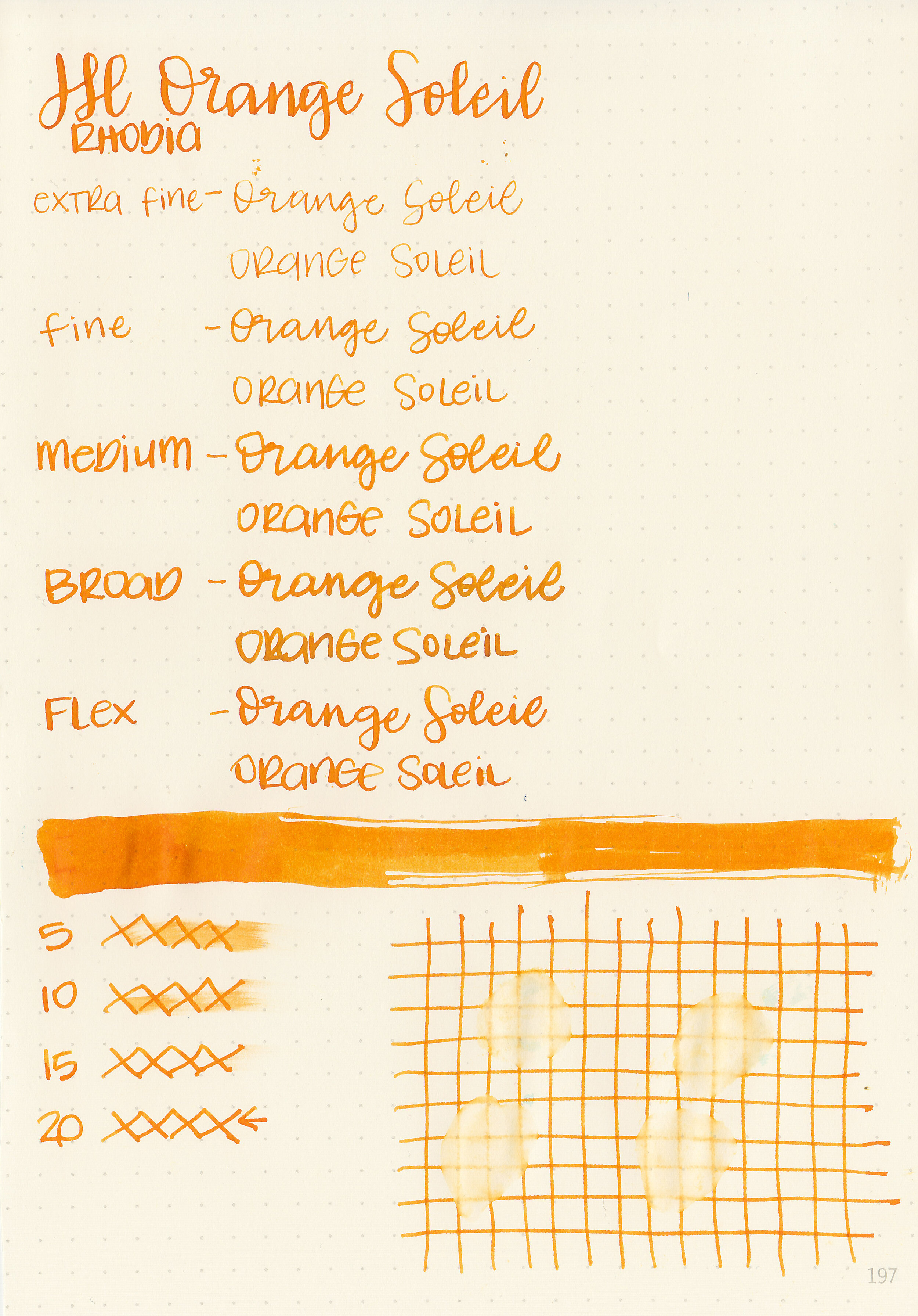
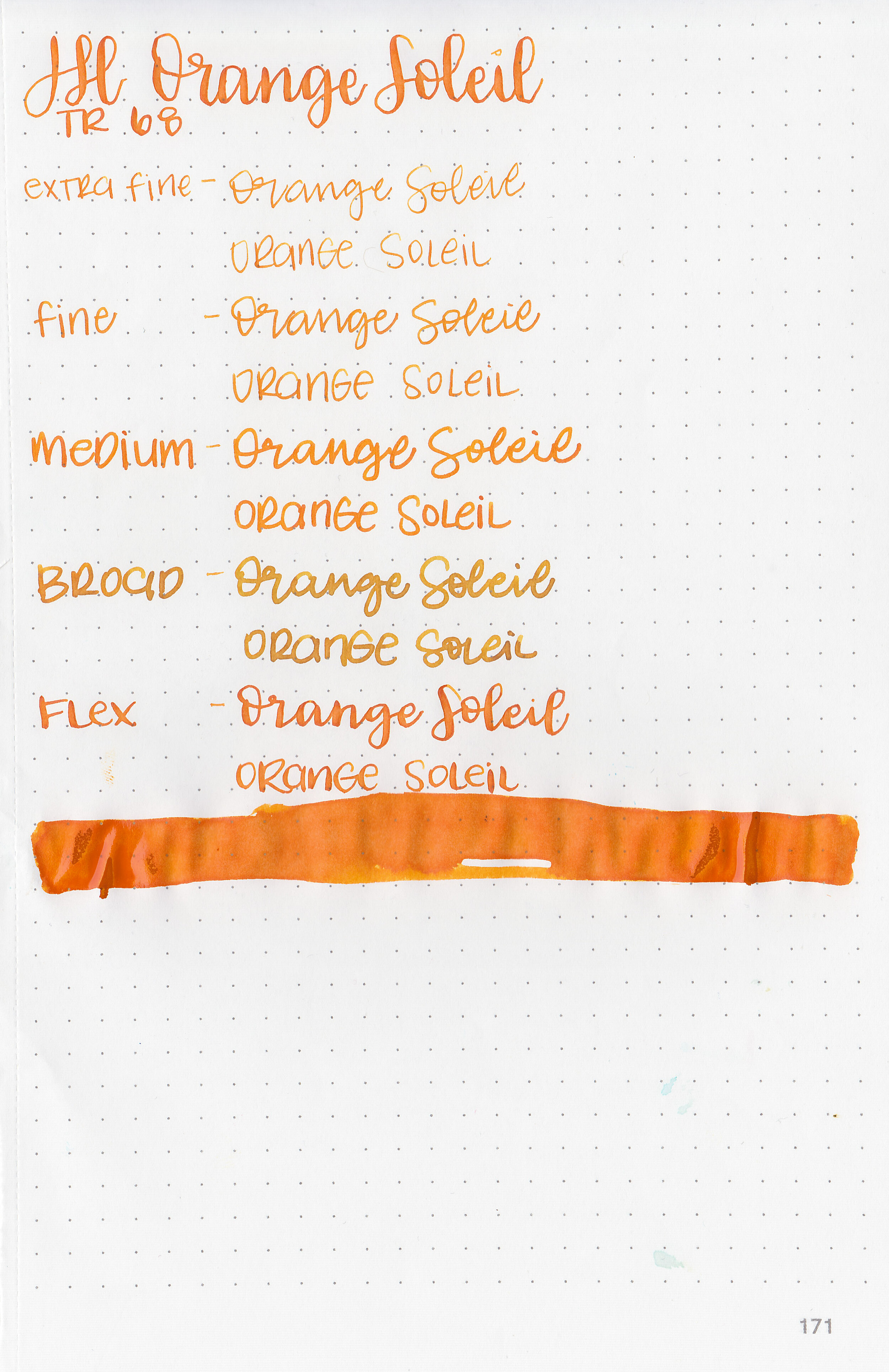
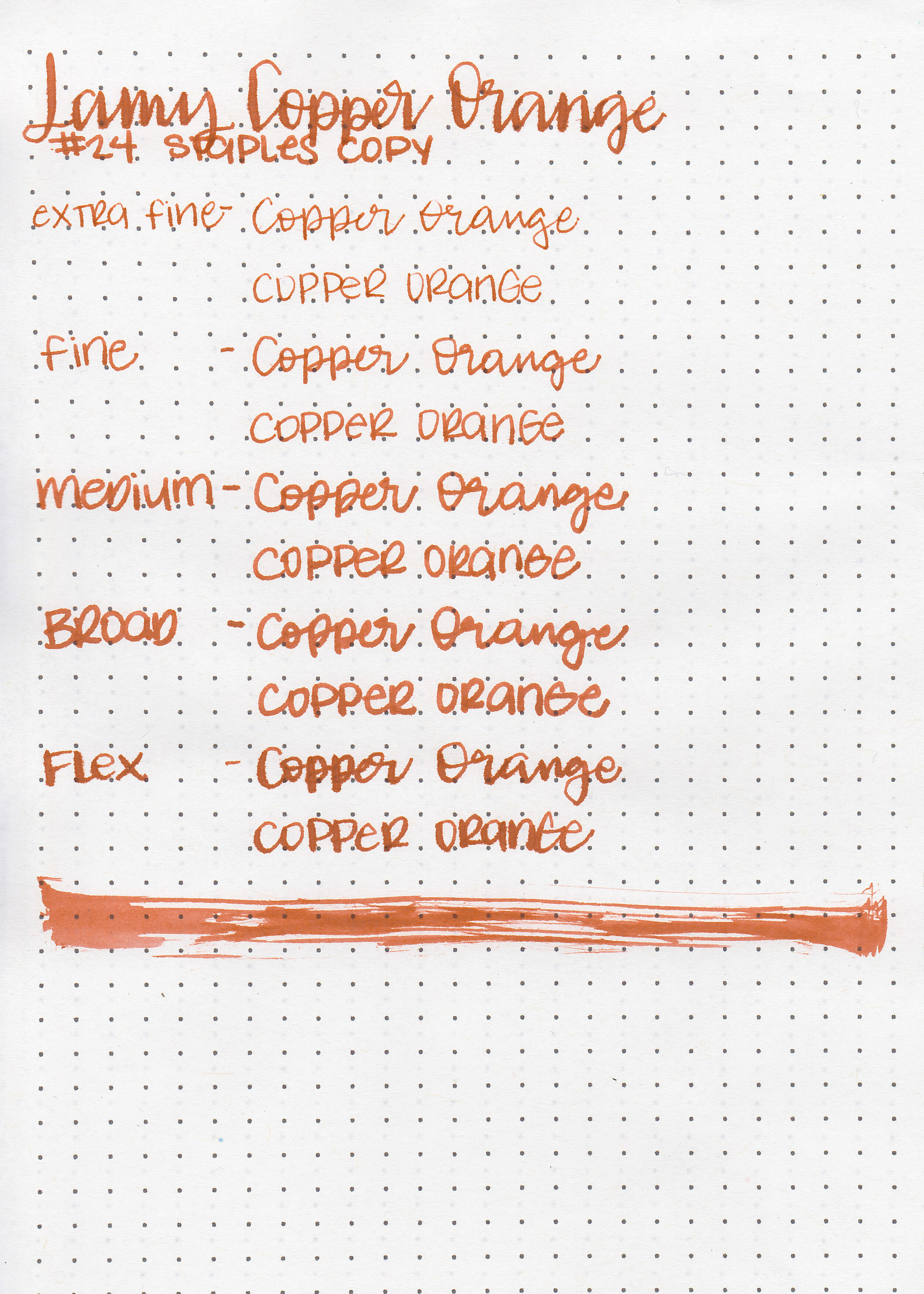
Let's take a look at how the ink behaves on fountain pen friendly papers: Rhodia, Tomoe River, and Leuchtturm.
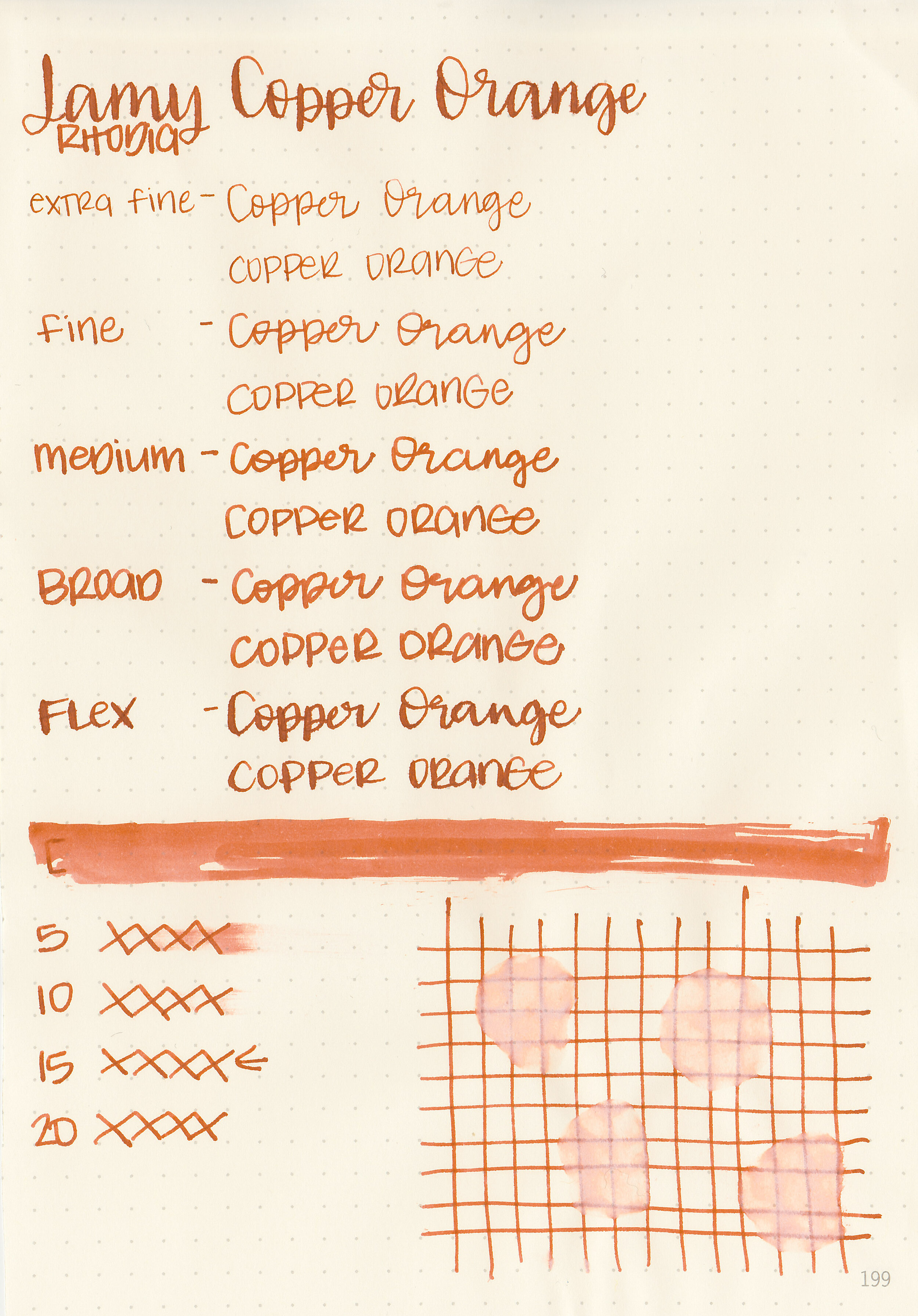
Dry time: 15 seconds
Water resistance: Low
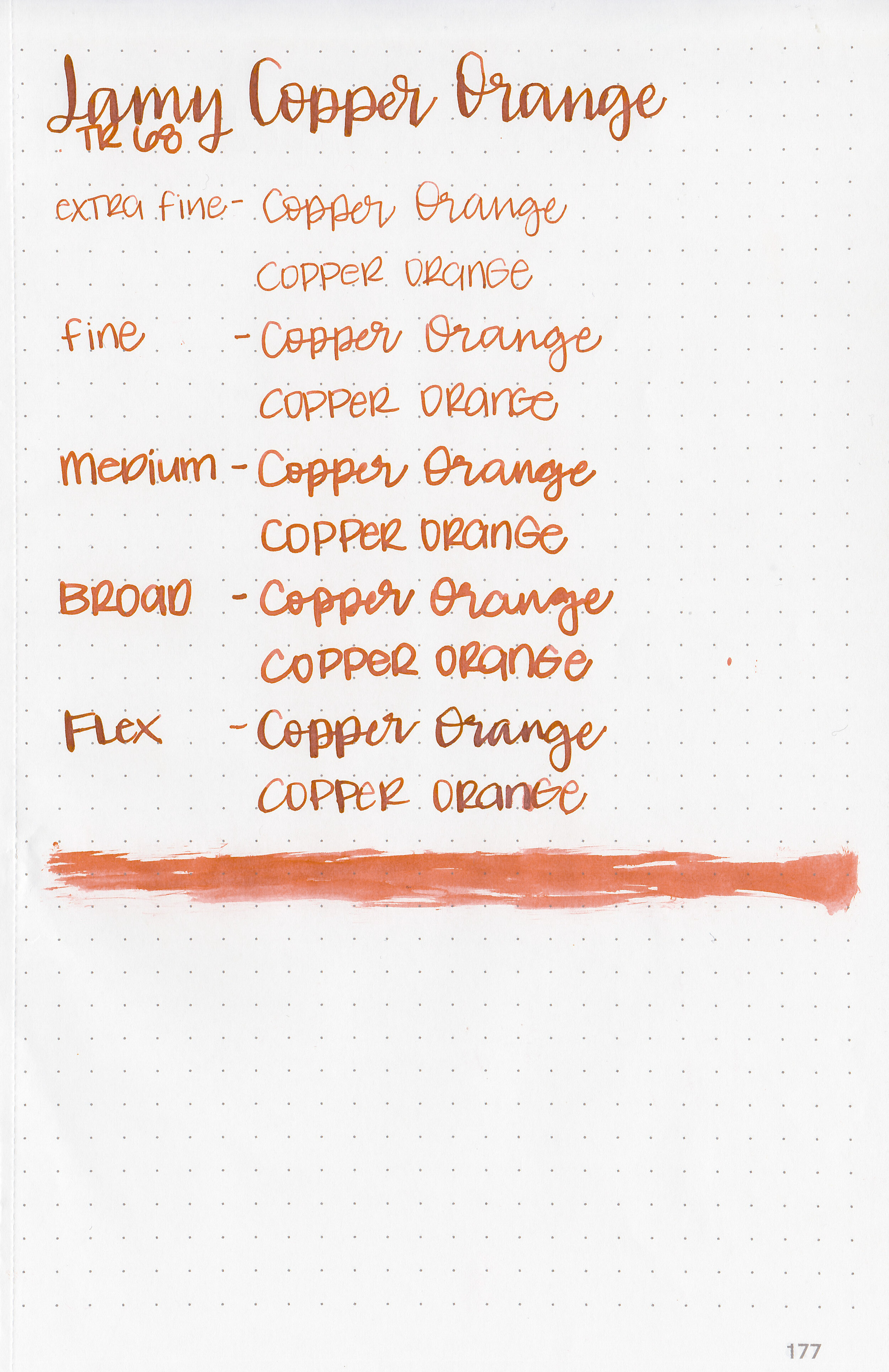
Feathering: Low-there was just a tiny bit of feathering in the flex nib.
Show through: Medium
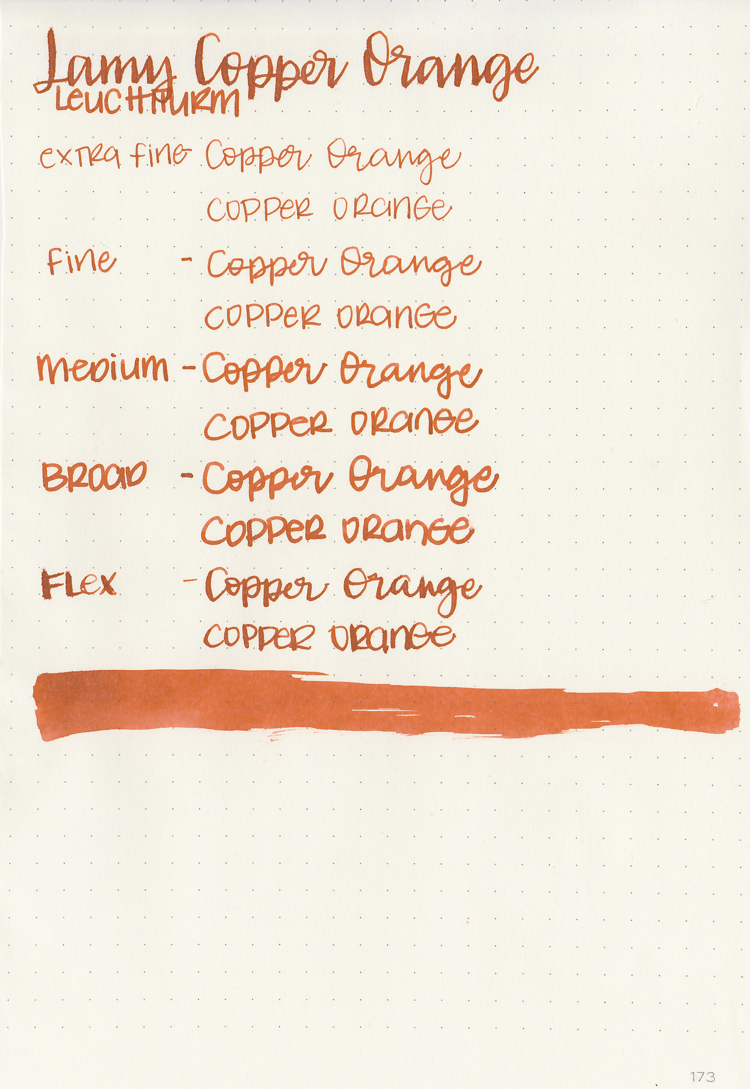
Bleeding: Low-there was some bleeding in the flex nib.
Other properties: low shading, no sheen, and no shimmer.
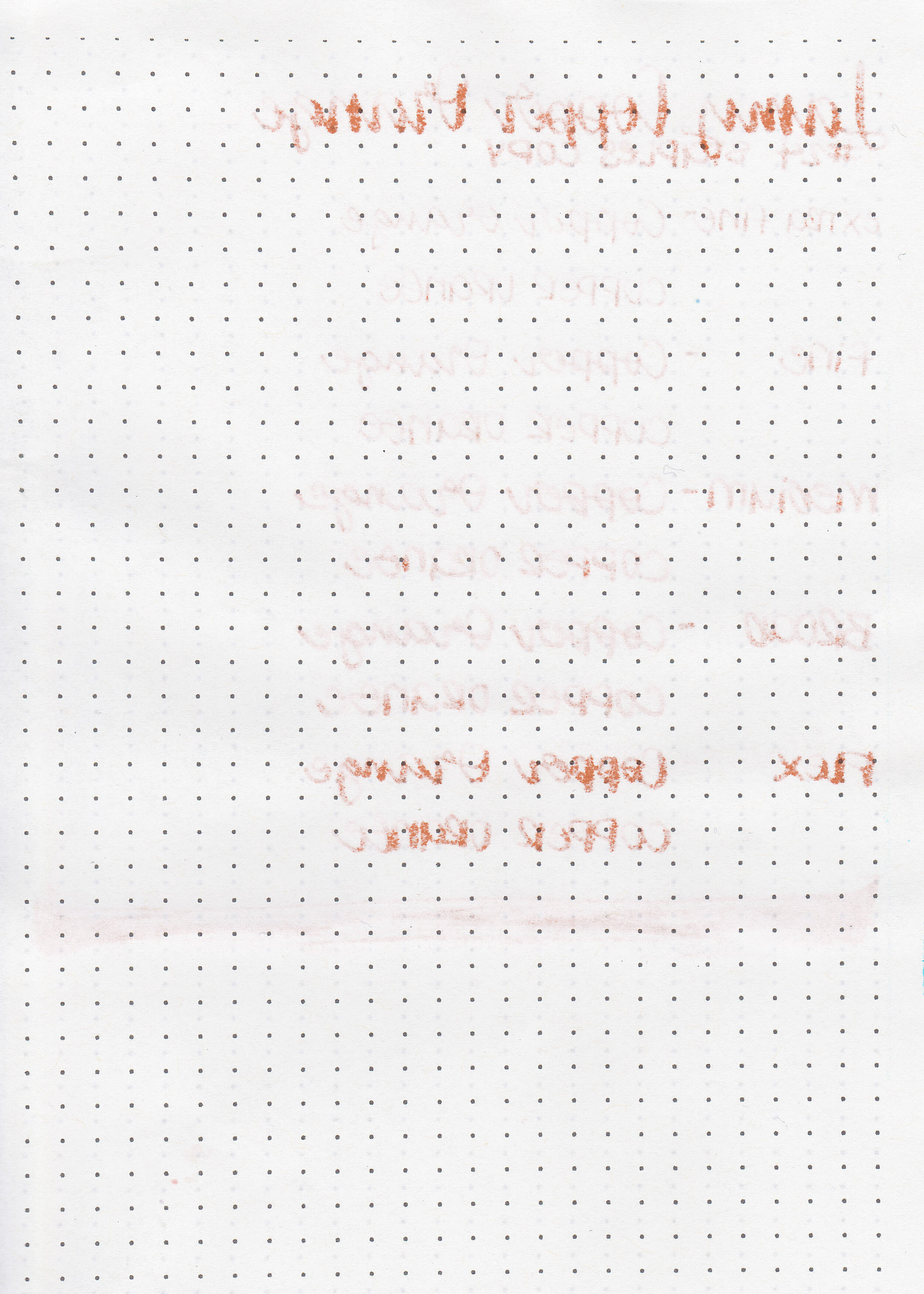
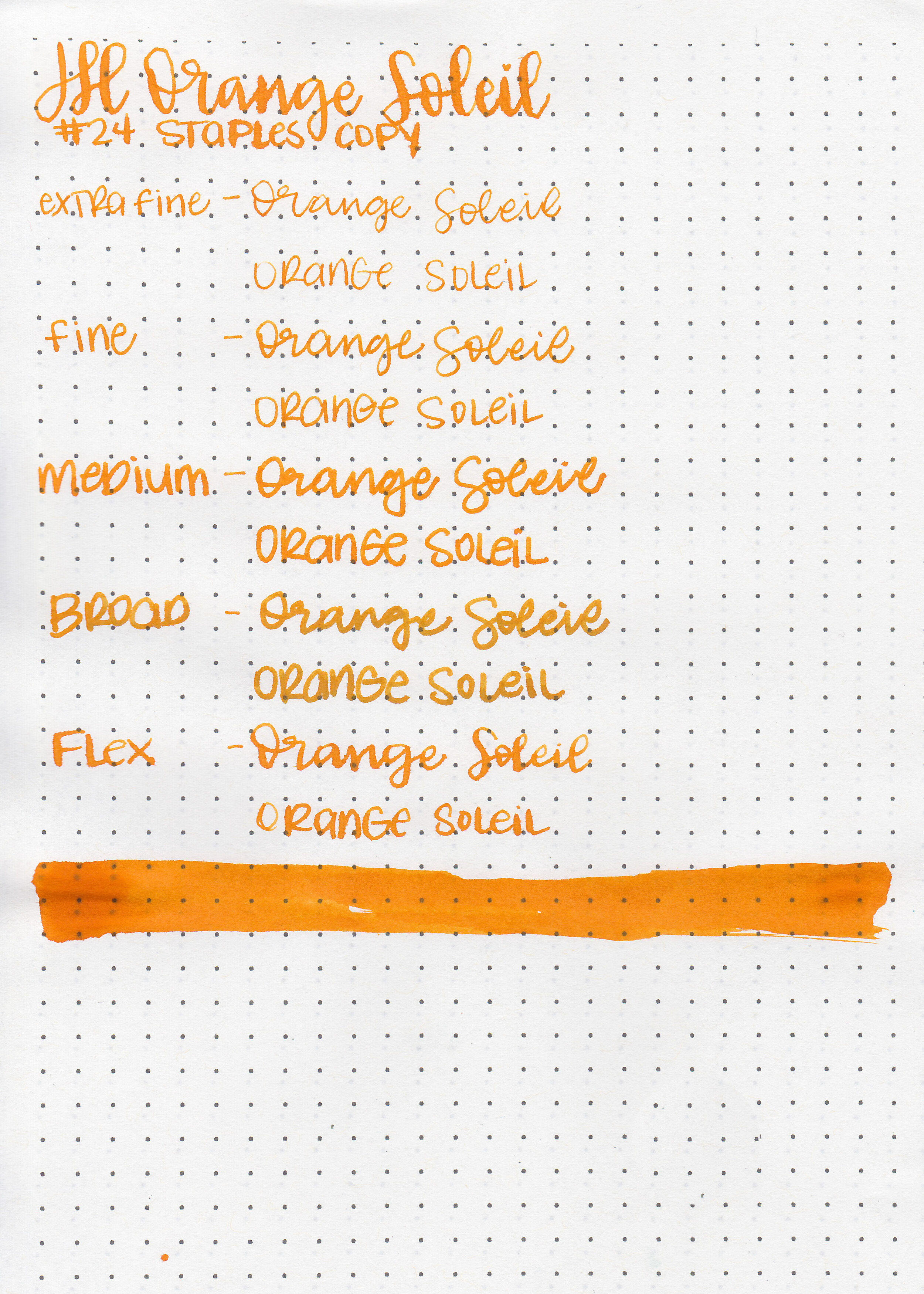
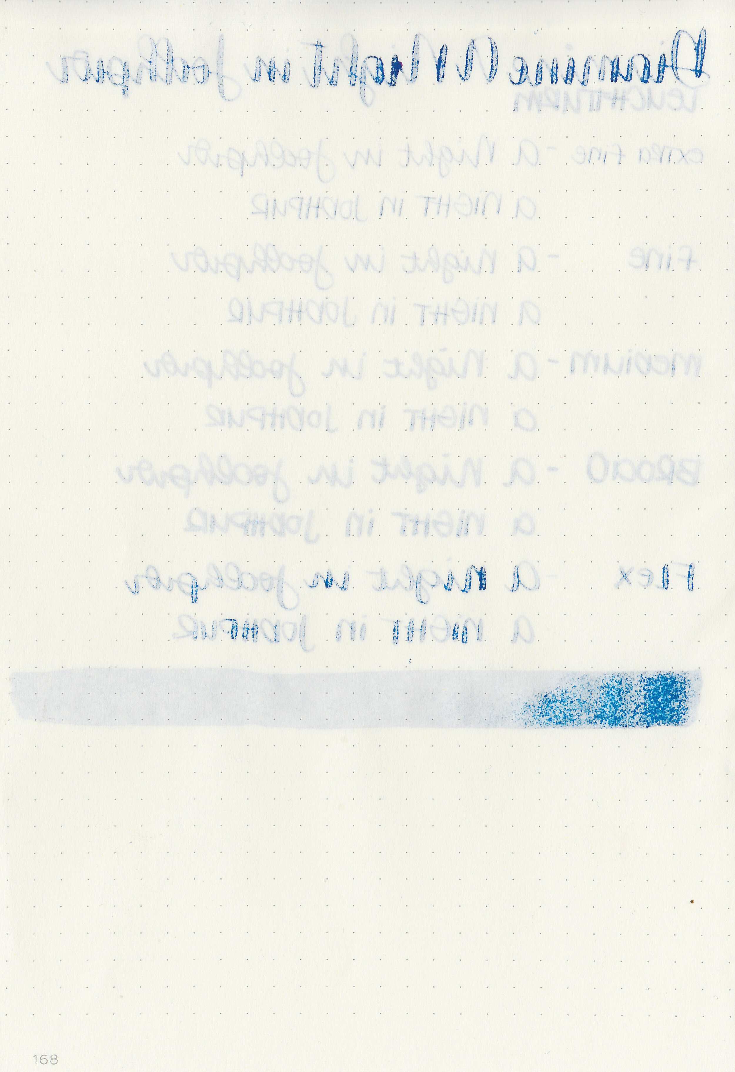
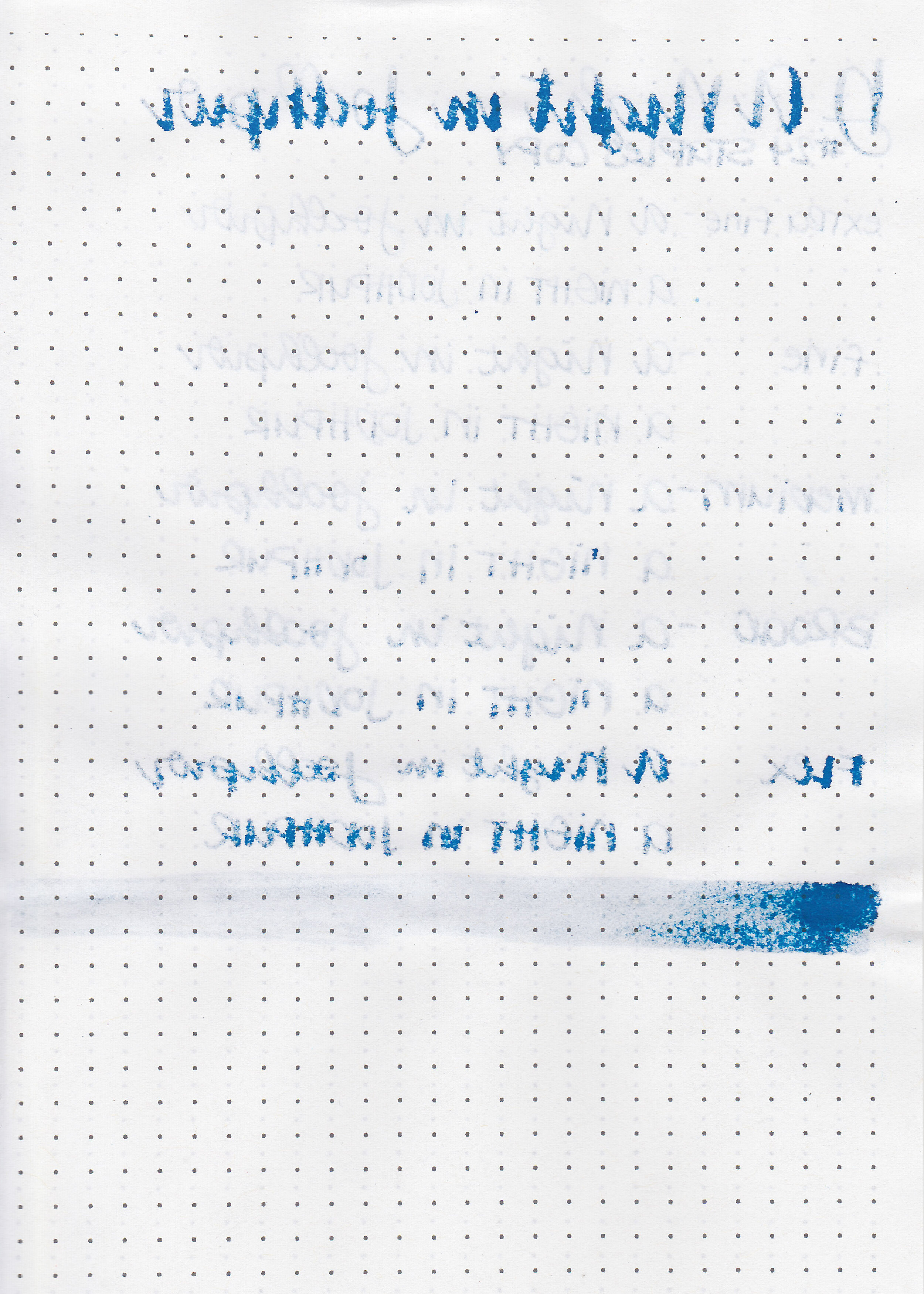
On Staples 24 lb copy paper there was feathering in every nib size, and some bleeding in the flex and broad nibs.
Comparison Swabs:

Copper Orange is just a little bit less saturated than Robert Oster Orange Rumble, and a shade or two lighter than Krishna Jungle Volcano. It’s a shade darker than Lamy Bronze and has a little bit more red in it. Click here to see the Lamy inks together, and click here to see the orange inks together.
Longer writing:

I used a medium Lamy Al-star Bronze on a Lochby A5 Lined Refill-Tomoe River 68gsm. The ink had an average flow.
Overall, Robert Oster Orange Rumble is a good alternative. If you would like something one or two shades darker with some sheen (but similar color) give Krishna Jungle Volcano a try.
Disclaimer: A sample of this ink was provided by a pen friend. All photos and opinions are my own. This page does contain affiliate links, but this post is not sponsored in any way.