Ink Review #2582: Robert Oster Rust Orange

The color:

Rust Orange is a deep red-orange.

*For my swab cards I use a Col-o-ring by Skylab Letterpress, a medium Pilot Ishime and a Mabie Todd Swan.

Swabs:

In large swabs on Tomoe River paper the ink has some shading.

Writing samples:

Let's take a look at how the ink behaves on fountain pen friendly papers: Rhodia, Tomoe River, and Leuchtturm.

*For my writing samples I use:

Dry time: 40 seconds

Water resistance: Low

Feathering: None

Show through: Medium

Bleeding: None

Other properties: medium shading, no sheen, and no shimmer.

On 20 lb copy paper the ink had some feathering and bleeding in the larger nib sizes.

Comparison Swabs:

Rust Orange is lighter than Robert Oster Orange Zest but darker than Robert Oster Fire on Fire. Click here to see the orange inks together.

Longer Writing:

I used an Edison Collier Persimmon Swirl with a medium nib on a Taroko Enigma notebook. The ink has a slightly dry flow.

Overall, I love the color. Robert Oster does a great job with his inks and this one is no exception.

Thanks to all my Patrons! I couldn’t do these reviews without you! You can find my Patreon page here.

Disclaimer: This product was provided by Galen Leather for the purpose of this review. All photos and opinions are my own. This page does not contain affiliate links and this post is not sponsored.

Ink Review #2581: Wearingeul Anna Karenina

Wearingeul Anna Karenina is from the World Literature collection. You can find this ink for sale at most retailers including Vanness Pens.

The color:

Anna Karenina is a burgundy red with red shimmer.

*For my swab cards I use a Col-o-ring by Skylab Letterpress, a medium Pilot Ishime and a Mabie Todd Swan.

Swabs:

In large swabs on Tomoe River paper the ink has lots of shimmer but it’s hard to see in the photo.

Writing samples:

Let's take a look at how the ink behaves on fountain pen friendly papers: Rhodia, Tomoe River, and Leuchtturm.

*For my writing samples I use:

Dry time: 30 seconds

Water resistance: Medium

Feathering: None

Show through: Medium

Bleeding: None

Other properties: low shading, no sheen, and red shimmer.

On 20 lb copy paper the ink had some feathering and some bleeding in the larger nib sizes.

Comparison Swabs:

Anna Karenina is closest to Diamine All the Best. Click here to see the red inks together.

Longer Writing:

I used a Pelikan M205 Star Ruby with a fine nib on a Taroko Enigma notebook. The ink has an dry flow.

Overall, I like the color but the flow is too dry for me. The only other red ink with red shimmer that I know of is Diamine Bah Humbug, so it’s not a very common combo.

Thanks to all my Patrons! I couldn’t do these reviews without you! You can find my Patreon page here.

Disclaimer: All photos and opinions are my own. This page does not contain affiliate links and this post is not sponsored.

Ink Review #2580: Octopus Fluids Phoenix

Octopus Fluids Phoenix is from the Octopus Fluids Sheening collection. You can find this ink for sale at Vanness Pens.

The color:

Phoenix is a bright red with gold sheen.

*For my swab cards I use a Col-o-ring by Skylab Letterpress, a medium Pilot Ishime and a Mabie Todd Swan.

Swabs:

In large swabs on Tomoe River paper the ink has lots of sheen but it’s hard to see in the photo.

Writing samples:

Let's take a look at how the ink behaves on fountain pen friendly papers: Rhodia, Tomoe River, and Leuchtturm.

*For my writing samples I use:

Dry time: 40 seconds

Water resistance: Low

Feathering: None

Show through: Medium

Bleeding: None

Other properties: no shading, monster gold sheen, and no shimmer.

On 20 lb copy paper the ink had some feathering and a dot or two of bleeding in the larger nib sizes.

Comparison Swabs:

Phoenix is closest to Aurora Red. Click here to see the red inks together.

Longer Writing:

I used a Pilot Vanishing Point Coral with a medium nib on a Taroko Enigma notebook. The ink has an average flow.

Overall, this ink is an interesting ink. This is the first red monster sheener I’ve found, so it’s rather unique.

Thanks to all my Patrons! I couldn’t do these reviews without you! You can find my Patreon page here.

Disclaimer: All photos and opinions are my own. This page does not contain affiliate links and this post is not sponsored.

Ink Review #2579: Octopus Fluids Pink Rhino

Octopus Fluids Pink Rhino is from Write & Draw collection. You can find this ink for sale at Vanness Pens.

The color:

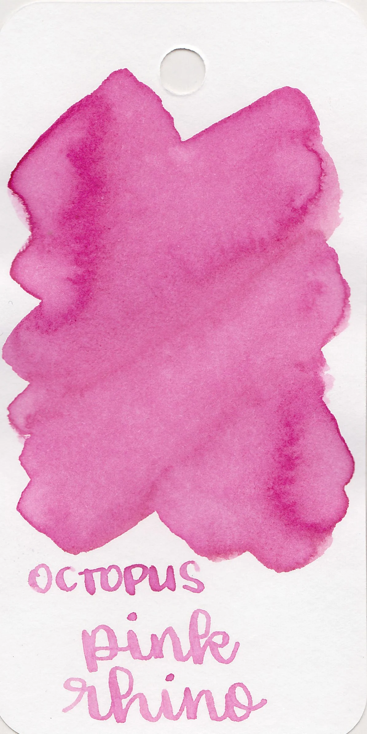
Pink Rhino is a medium bubblegum pink.

*For my swab cards I use a Col-o-ring by Skylab Letterpress, a medium Pilot Ishime and a Mabie Todd Swan.

Swabs:

In large swabs on Tomoe River paper the ink has just a little bit of shading.

Writing samples:

Let's take a look at how the ink behaves on fountain pen friendly papers: Rhodia, Tomoe River, and Leuchtturm.

*For my writing samples I use:

Dry time: 30 seconds

Water resistance: High

Feathering: None

Show through: Medium

Bleeding: None

Other properties: low shading, no sheen, and no shimmer.

On 20 lb copy paper the ink had some feathering and a tiny bit of bleeding in the larger nib sizes.

Comparison Swabs:

Pink Rhino isn’t super close to any of these other pink inks. Click here to see the pink inks together.

Longer Writing:

I used a Pilot Decimo Pink White with a medium nib on a Taroko Enigma notebook. The ink has a slightly wet flow.

Overall, I really like this ink. I love the little bit of shading, high water resistance and slightly wet flow.

Thanks to all my Patrons! I couldn’t do these reviews without you! You can find my Patreon page here.

Disclaimer: All photos and opinions are my own. This page does not contain affiliate links and this post is not sponsored.

Ink Review #2578: Ferris Wheel Press Frontenac Blue

Ferris Wheel Press Frontenac Blue is from the Frosted Carnival collection. You can find this ink for sale at most retailers including Vanness Pens.

The color:

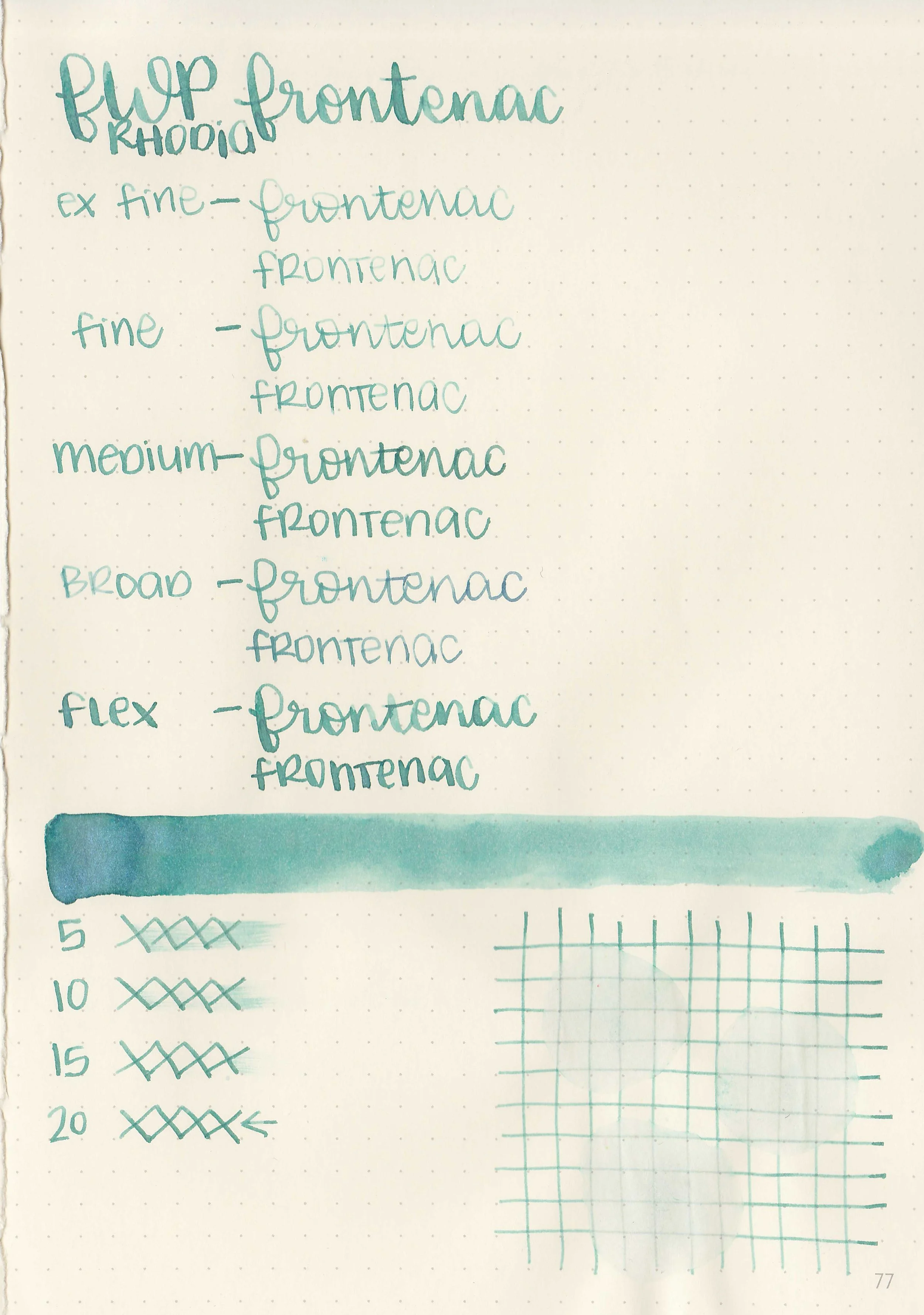
Frontenac Blue is a pale blue-green.

*For my swab cards I use a Col-o-ring by Skylab Letterpress, a medium Pilot Ishime and a Mabie Todd Swan.

Swabs:

In large swabs on Tomoe River paper the ink looks more blue with blue shimmer.

Writing samples:

Let's take a look at how the ink behaves on fountain pen friendly papers: Rhodia, Tomoe River, and Leuchtturm.

*For my writing samples I use:

Dry time: 20 seconds

Water resistance: Low

Feathering: None

Show through: Medium

Bleeding: None

Other properties: medium shading, no sheen, and blue shimmer.

On 20 lb copy paper the ink had some feathering in all nib sizes and some bleeding in the flex nib.

Comparison Swabs:

Frontenac Blue is right in-between blue and teal, so it isn’t close to any of the blue or teal shimmer inks I have. Click here to see the blue inks together.

Longer Writing:

I used a Leonardo Mother of Pearl with a medium nib on a Taroko Enigma notebook. The ink has a dry flow.

Overall, I love the color but it can be too light in the smaller nib sizes and it’s a bit too dry for my preference.

Thanks to all my Patrons! I couldn’t do these reviews without you! You can find my Patreon page here.

Disclaimer: All photos and opinions are my own. This page does not contain affiliate links and this post is not sponsored.
Ink Review #2577: Kobe Dream of a Shooting Star

Kobe Dream of a Shooting Star is a collaboration ink between Kyupo-do and Kobe INK Monogatari. I got my sample from Vanness Pens but they are currently out of stock so I’m not sure where you can get some.

The color:

Dream of a Shooting Star is a pale icy blue.

*For my swab cards I use a Col-o-ring by Skylab Letterpress, a medium Pilot Ishime and a Mabie Todd Swan.

Swabs:

In large swabs on Tomoe River paper the ink looks much darker than it does on the Col-o-ring swab.

Writing samples:

Let's take a look at how the ink behaves on fountain pen friendly papers: Rhodia, Tomoe River, and Leuchtturm.

*For my writing samples I use:

Dry time: 30 seconds

Water resistance: Medium

Feathering: None

Show through: Medium

Bleeding: None

Other properties: medium shading, tiny red sheen, and no shimmer.

On 20 lb copy paper the ink had some feathering in all nib sizes and a tiny bit of bleeding in the flex nib.

Comparison Swabs:

Dream of a Shooting Star is closest to Sailor Ink Studio 340. Click here to see the blue inks together.

Longer Writing:

I used a Montegrappa Elmo with a medium nib on a Taroko Enigma notebook. The ink has an average flow.

Overall, I like the color but it can be too light in the smaller nib sizes.

Thanks to all my Patrons! I couldn’t do these reviews without you! You can find my Patreon page here.

Disclaimer: All photos and opinions are my own. This page does not contain affiliate links and this post is not sponsored.

Ink Review #2576: De Atramentis Slate Grey

Today’s ink is De Atramentis Slate Grey. You can find this ink for sale at most retailers including Vanness Pens.

The color:

Slate Grey is an unsaturated purple grey.

*For my swab cards I use a Col-o-ring by Skylab Letterpress, a medium Pilot Ishime and a Mabie Todd Swan.

Swabs:

In large swabs on Tomoe River paper the ink has just a little bit of shading where the ink pooled.

Writing samples:

Let's take a look at how the ink behaves on fountain pen friendly papers: Rhodia, Tomoe River, and Leuchtturm.

*For my writing samples I use:

Dry time: 20 seconds

Water resistance: Medium

Feathering: None

Show through: Medium

Bleeding: None

Other properties: no shading, no sheen, and no shimmer.

On 20 lb copy paper the ink had some feathering and bleeding in the larger nib sizes.

Comparison Swabs:

Slate Grey isn’t remotely close to any of these other inks, but Krishna Pencil is a similar purple-grey. Click here to see the grey inks together.

Longer Writing:

I used a Kaweco Al-sport Akkerman Navy with a medium nib on a Taroko Enigma notebook. The ink has a wet flow.

Overall, I could take or leave this ink. I like the wet flow and it’s well-behaved, but it’s very purple compared to other grey inks.

Thanks to all my Patrons! I couldn’t do these reviews without you! You can find my Patreon page here.

Disclaimer: All photos and opinions are my own. This page does not contain affiliate links and this post is not sponsored.

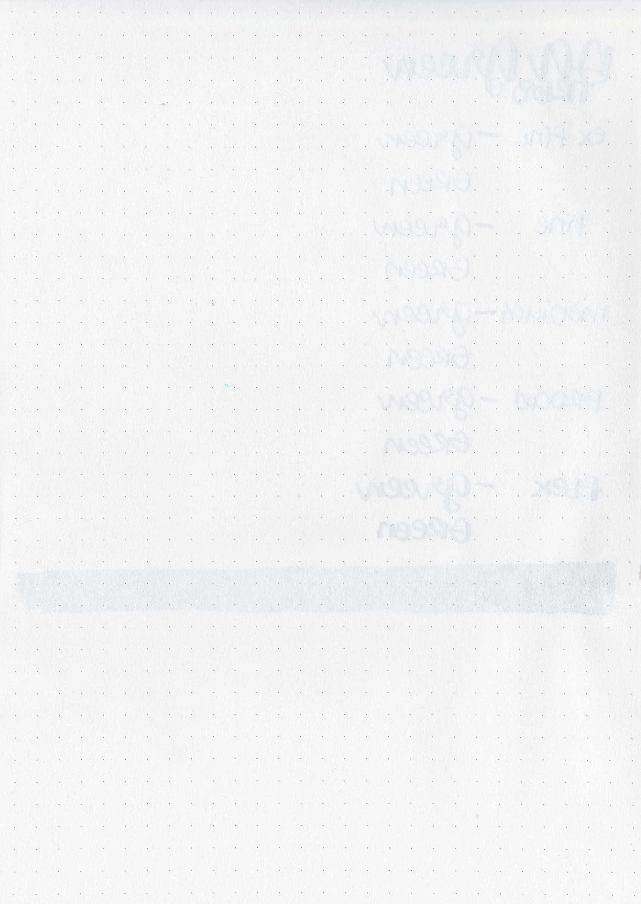
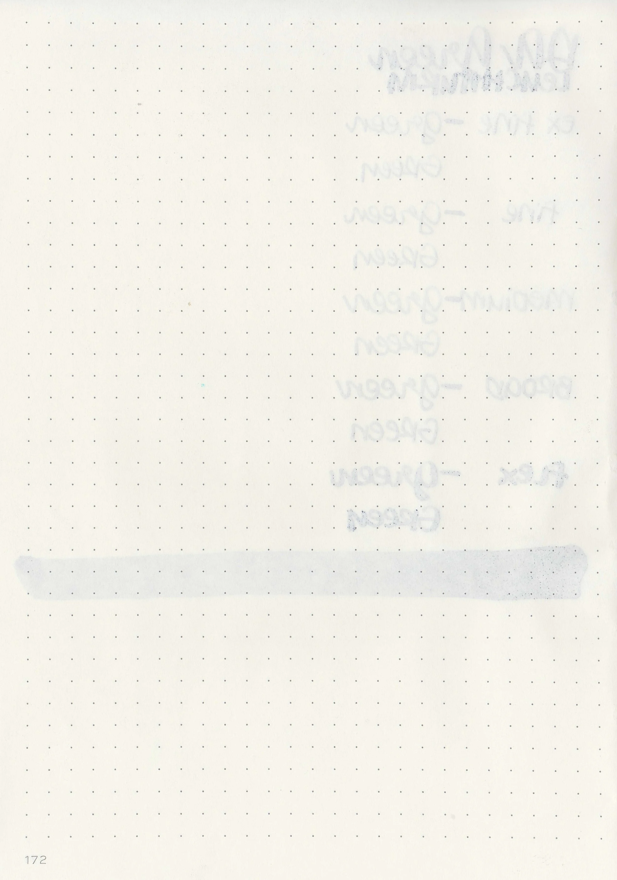
Ink Review #2575: De Atramentis Pearlescent Green

De Atramentis Pearlescent Green, like the Pearlescent Red from yesterday is from De Atramentis’s shimmer collection called the Pearlescents. The name of this one is confusing because usually the De Atramentis Pearlescent inks are named after their base color and then their shimmer color, Velvet Black Copper for example. The base color of Pearlescent Green is grey with red shimmer, so this ink should have been named Grey Green instead of Pearlescent Green. You can find this ink for sale at most retailers including Vanness Pens.

The color:

Pearlescent Green is a neutral grey with green shimmer.

*For my swab cards I use a Col-o-ring by Skylab Letterpress, a medium Pilot Ishime and a Mabie Todd Swan.

Swabs:

In large swabs on Tomoe River paper you can see lots of shimmer-a ridiculous amount really.

Writing samples:

Let's take a look at how the ink behaves on fountain pen friendly papers: Rhodia, Tomoe River, and Leuchtturm.

*For my writing samples I use:

Dry time: 20 seconds

Water resistance: Medium

Feathering: None

Show through: Medium

Bleeding: None

Other properties: medium shading, no sheen, and green shimmer.

On 20 lb copy paper the ink had some feathering and bleeding in the larger nib sizes.

Comparison Swabs:

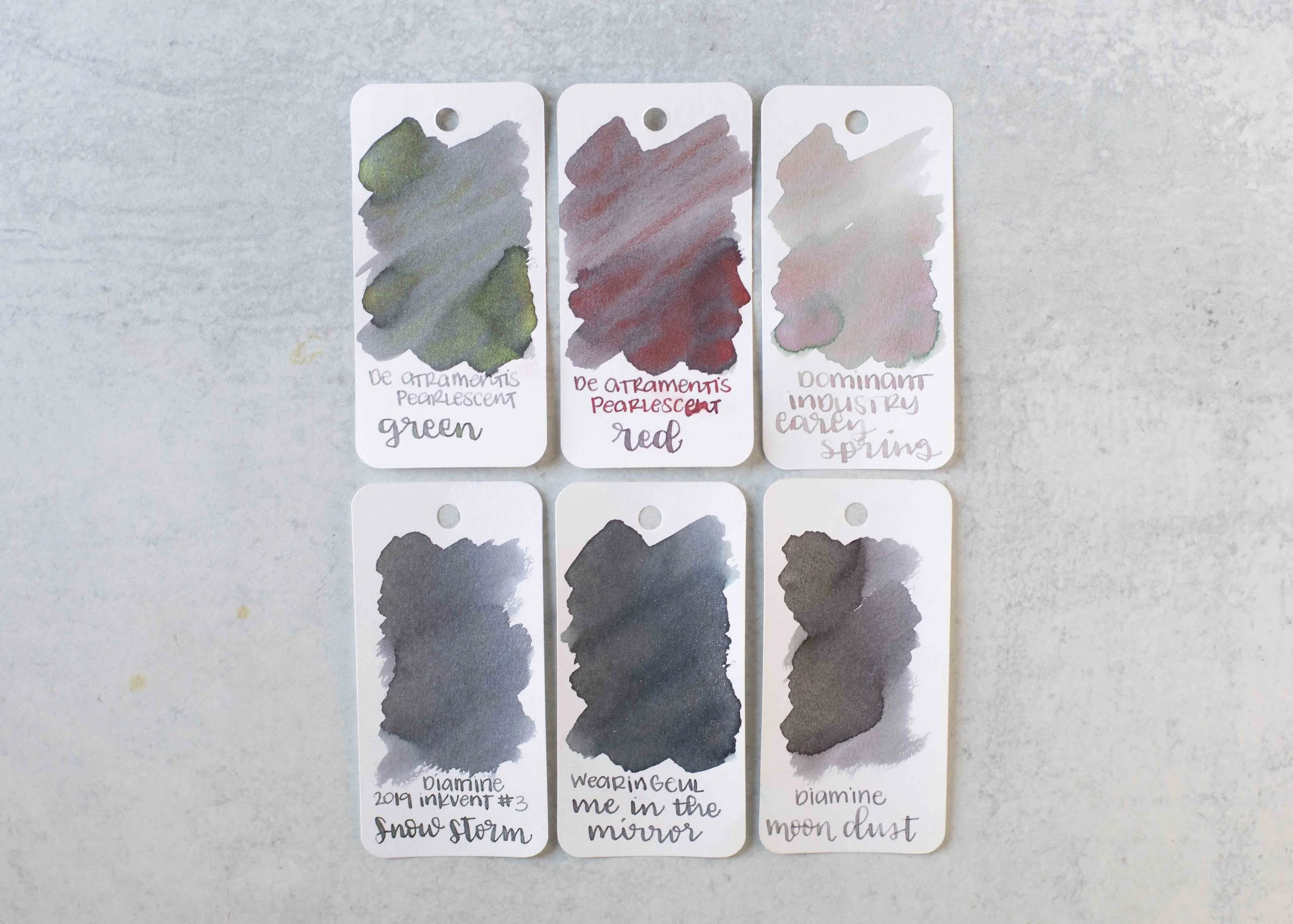
Pearlescent Green is the same base color as De Atramentis Pearlescent Red. Click here to see the grey inks together.

Longer Writing:

I used a Kaweco Al-sport Red with a medium nib on a Taroko Enigma notebook. The ink has a dry flow.

Overall, just like yesterday’s Pearlescent Red, I did not enjoy this ink. Like the other Pearlescent inks I’ve tried this ink had a lot of hard starts and clogging. The shimmer does not stay put-it flakes off and gets on anything around it. It simply has too much shimmer.

Thanks to all my Patrons! I couldn’t do these reviews without you! You can find my Patreon page here.

Disclaimer: All photos and opinions are my own. This page does not contain affiliate links and this post is not sponsored.

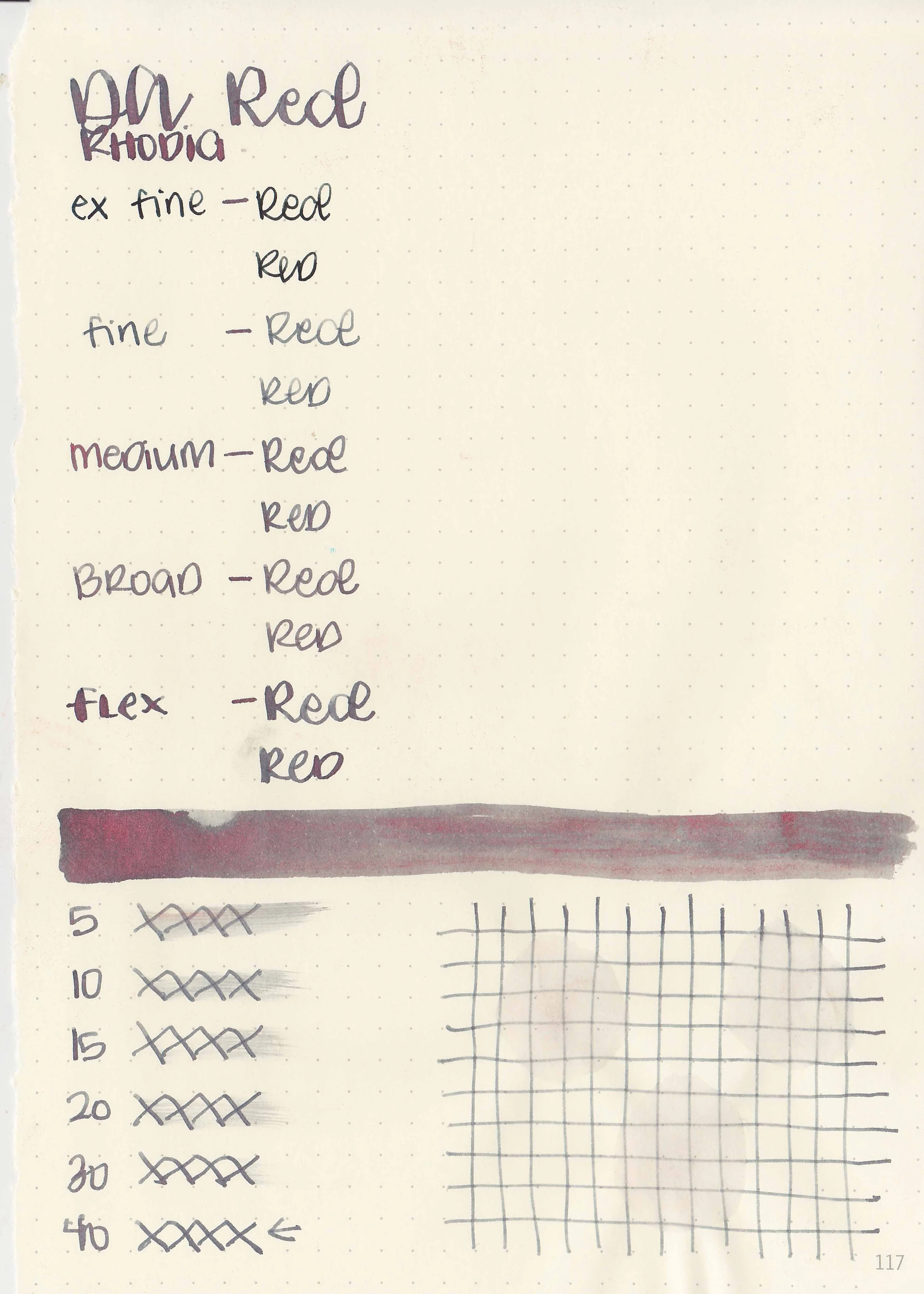
Ink Review #2574: De Atramentis Pearlescent Red

De Atramentis Pearlescent Red is from De Atramentis’s shimmer collection called the Pearlescents. The name of this one is confusing because usually the De Atramentis Pearlescent inks are named after their base color and then their shimmer color, Velvet Black Copper for example. The base color of Pearlescent Red is grey with red shimmer, so this ink should have been named Grey Red instead of Pearlescent Red. You can find this ink for sale at most retailers including Vanness Pens.

The color:

Pearlescent Red is a neutral grey with red shimmer.

*For my swab cards I use a Col-o-ring by Skylab Letterpress, a medium Pilot Ishime and a Mabie Todd Swan.

Swabs:

In large swabs on Tomoe River paper you can see lots of shimmer-a ridiculous amount really.

Writing samples:

Let's take a look at how the ink behaves on fountain pen friendly papers: Rhodia, Tomoe River, and Leuchtturm.

*For my writing samples I use:

Dry time: 40 seconds

Water resistance: Medium

Feathering: None

Show through: Medium

Bleeding: None

Other properties: medium shading, no sheen, and red shimmer.

On 20 lb copy paper the ink had some feathering and bleeding in the larger nib sizes.

Comparison Swabs:

Pearlescent Red is the same base color as De Atramentis Pearlescent Green. Click here to see the grey inks together.

Longer Writing:

I used a Kaweco Al-sport Red with a medium nib on a Taroko Enigma notebook. The ink has a dry flow.

Overall, I did not enjoy this ink. Like the other Pearlescent inks I’ve tried this ink had a lot of hard starts and clogging. The shimmer does not stay put-it flakes off and gets on anything around it. It simply has too much shimmer.

Thanks to all my Patrons! I couldn’t do these reviews without you! You can find my Patreon page here.

Disclaimer: All photos and opinions are my own. This page does not contain affiliate links and this post is not sponsored.

Ink Review #2573: Dominant Industry Early Spring

Today’s ink is Dominant Industry Early Spring. You can find this ink for sale at most retailers including Vanness Pens.

The color:

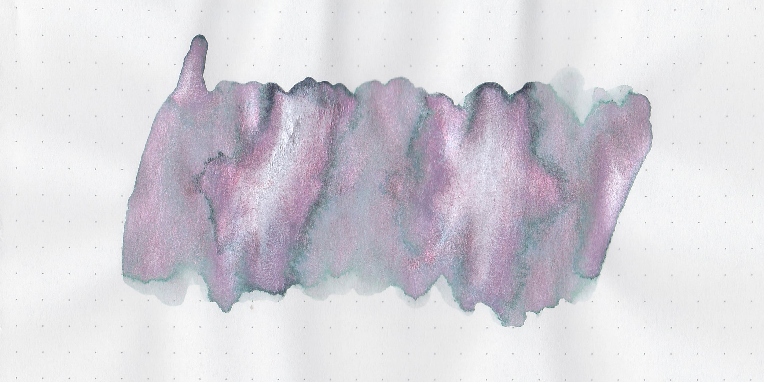
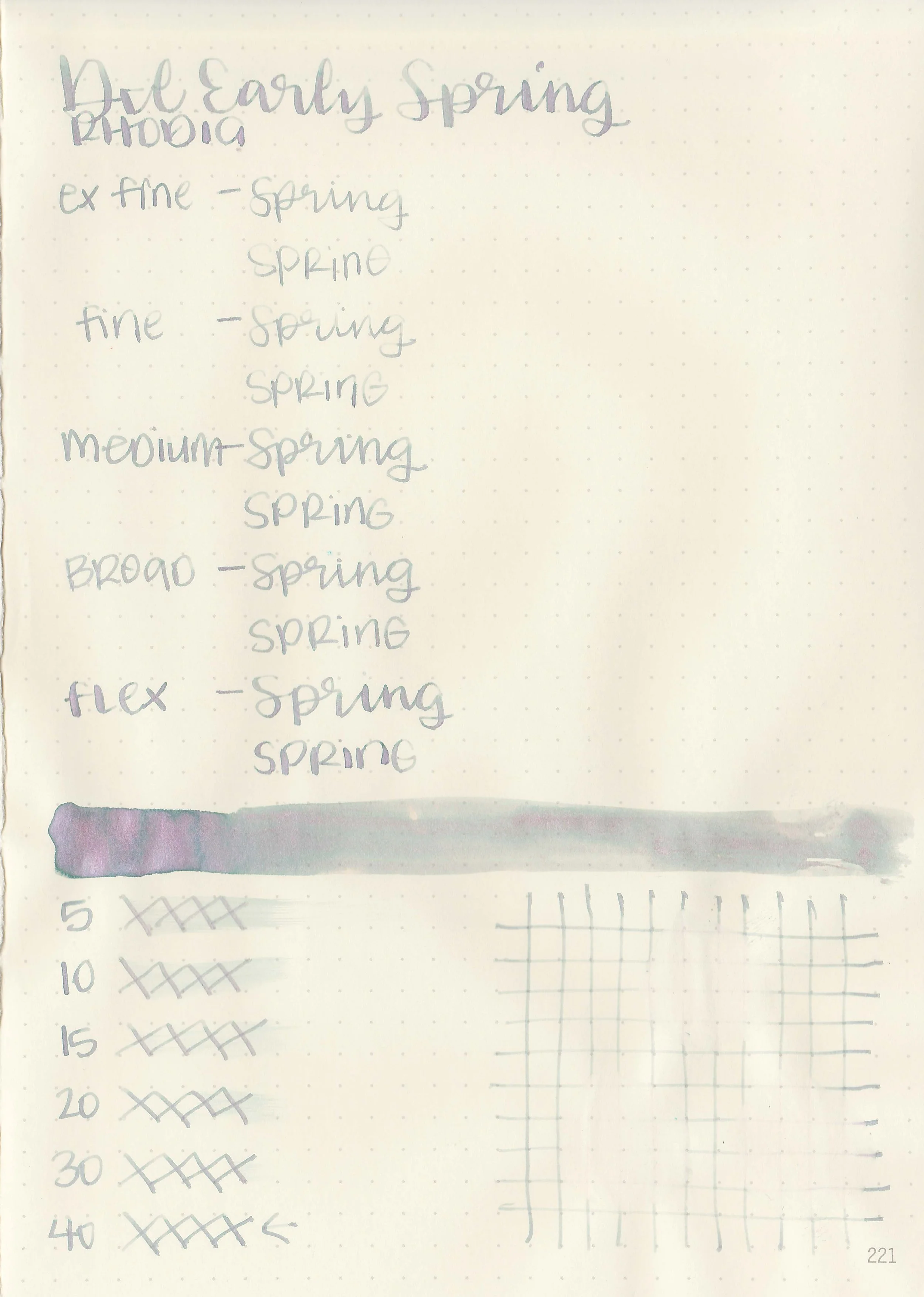
Early Spring is a light grey that shades to green with pink shimmer.

*For my swab cards I use a Col-o-ring by Skylab Letterpress, a medium Pilot Ishime and a Mabie Todd Swan.

Swabs:

In large swabs on Tomoe River paper you can see both the green shading and the pink shimmer.

Writing samples:

Let's take a look at how the ink behaves on fountain pen friendly papers: Rhodia, Tomoe River, and Leuchtturm.

*For my writing samples I use:

Dry time: 40 seconds

Water resistance: Low

Feathering: None

Show through: Medium

Bleeding: None

Other properties: low shading, no sheen, and pink shimmer.

On 20 lb copy paper the ink had some feathering and bleeding in the larger nib sizes.

Comparison Swabs:

Early Spring is much lighter than these other grey shimmer inks. Click here to see the grey inks together.

Longer Writing:

I used a Leonardo Mother of Pearl with a medium nib on a Taroko Enigma notebook. The ink has a dry flow.

Overall, I love the color in large swabs-it shows the green shading and pink shimmer, but hardly any of that shading shows up in writing. It’s also very pale and hard to read, so this isn’t an ink for me.

Thanks to all my Patrons! I couldn’t do these reviews without you! You can find my Patreon page here.

Disclaimer: All photos and opinions are my own. This page does not contain affiliate links and this post is not sponsored.