Ink Review #868: Diamine A Night In Jodhpur
/
Diamine has been creating a ton of sheeny inks lately, let’s take a look at Diamine A Night in Jodhpur, a Papier and Stift store exclusive. When I attended my local Pelikan Hub recently a pen friend handed me a sample so I could try it out.

The color:
A Night in Jodhpur is a medium blue with a green undertone. It’s not quite a teal but has more green than a classic blue.
Swabs:

In large swabs on Tomoe River paper the ink has plenty of dark pink sheen.

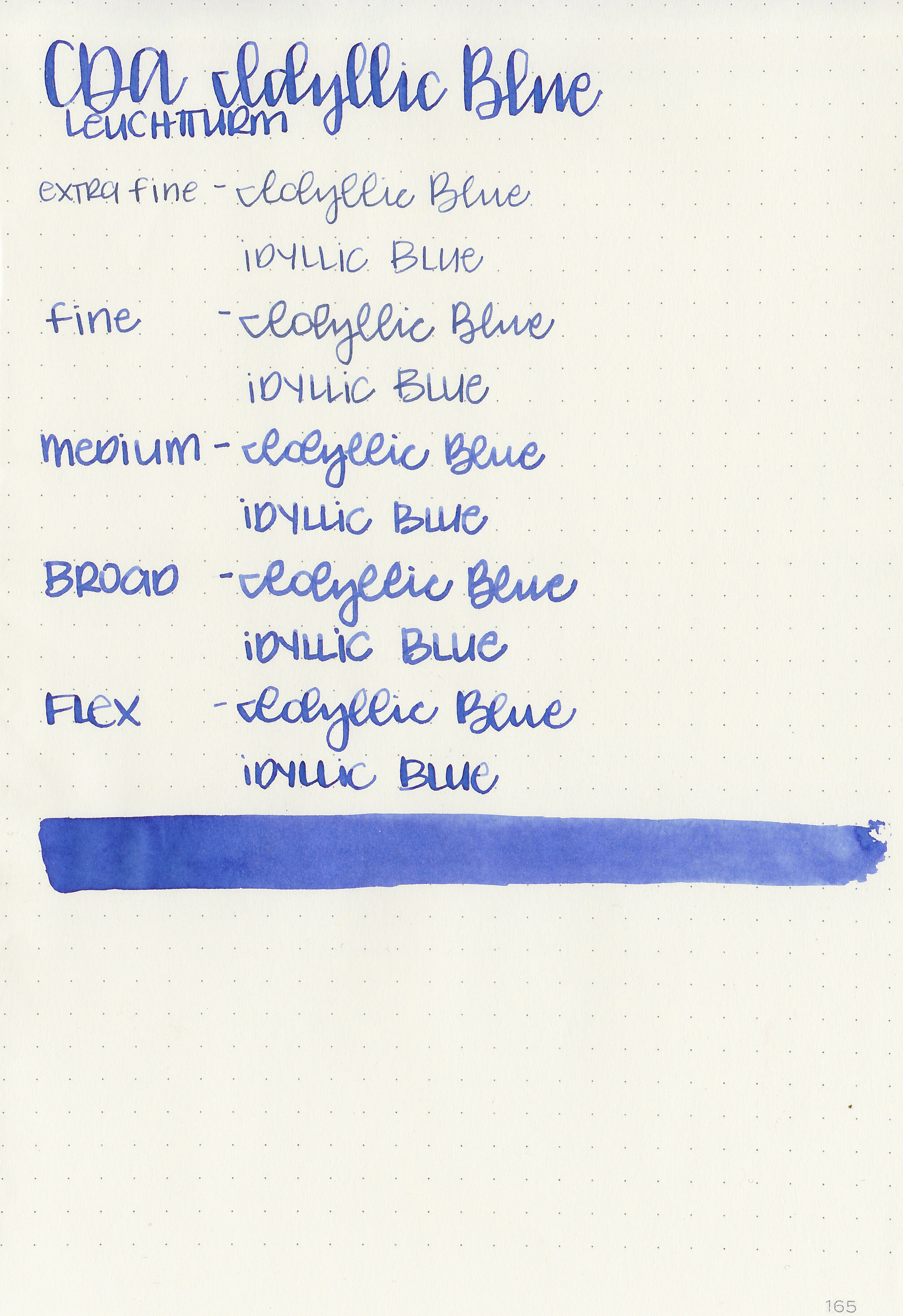
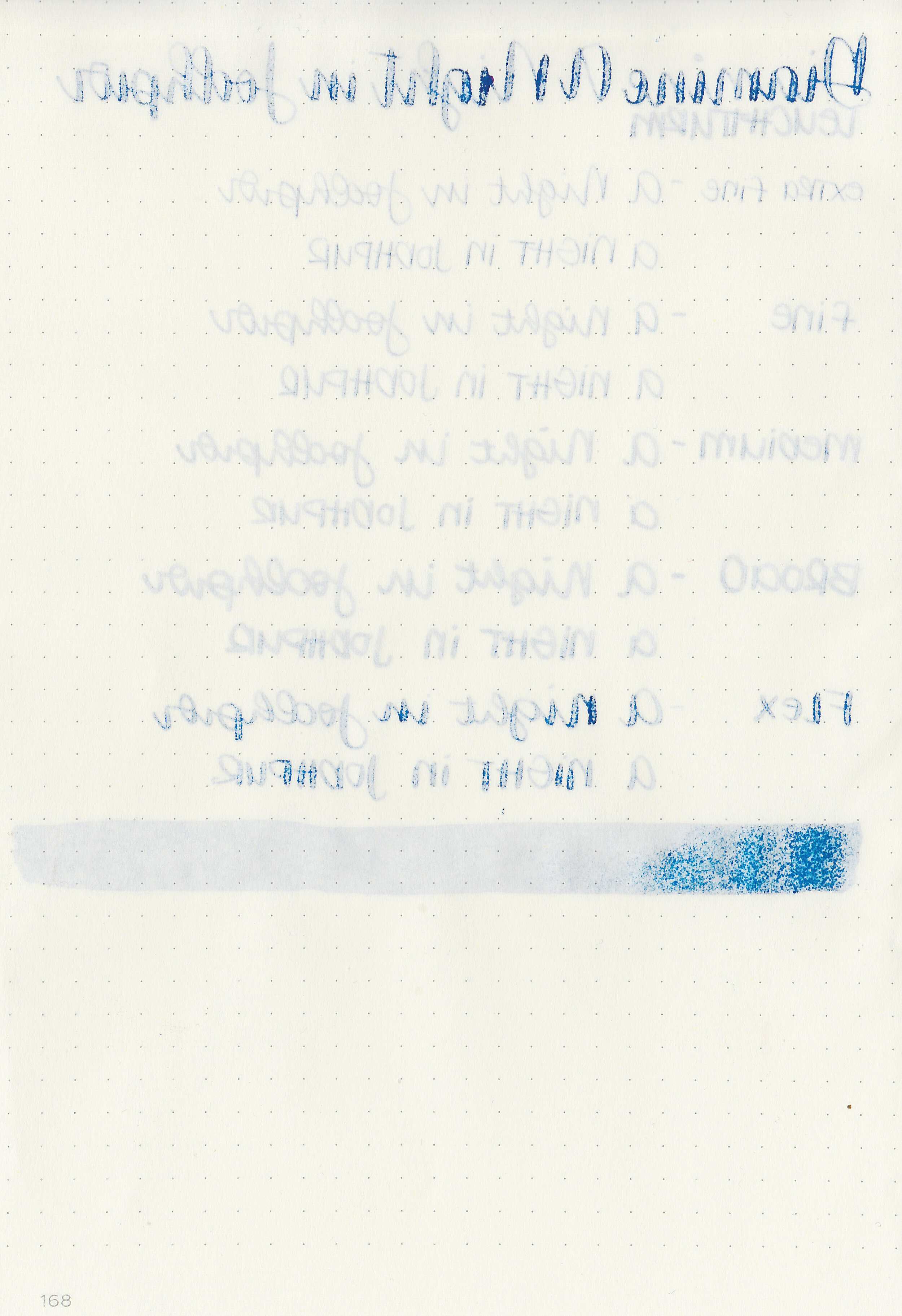
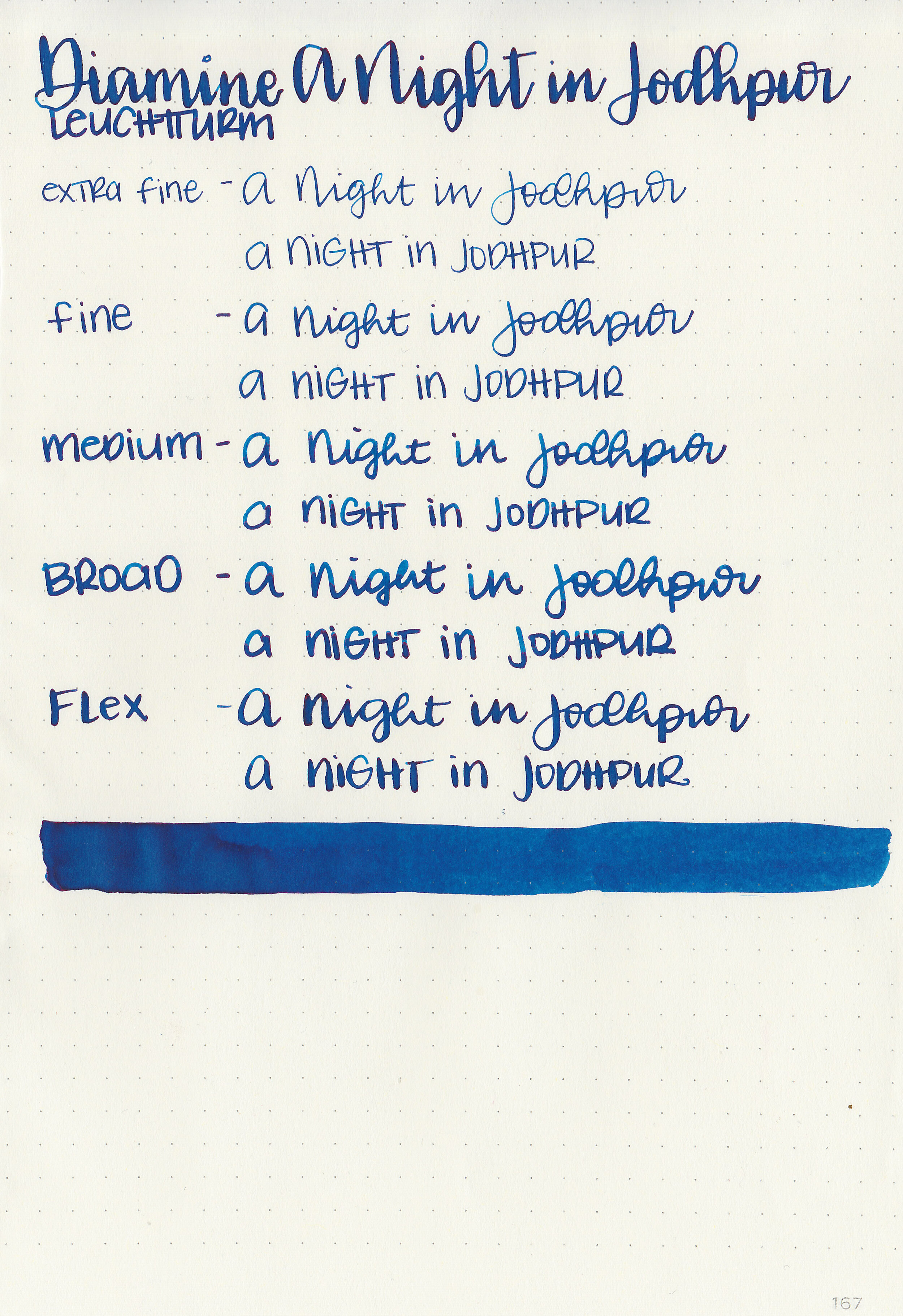
Writing samples:
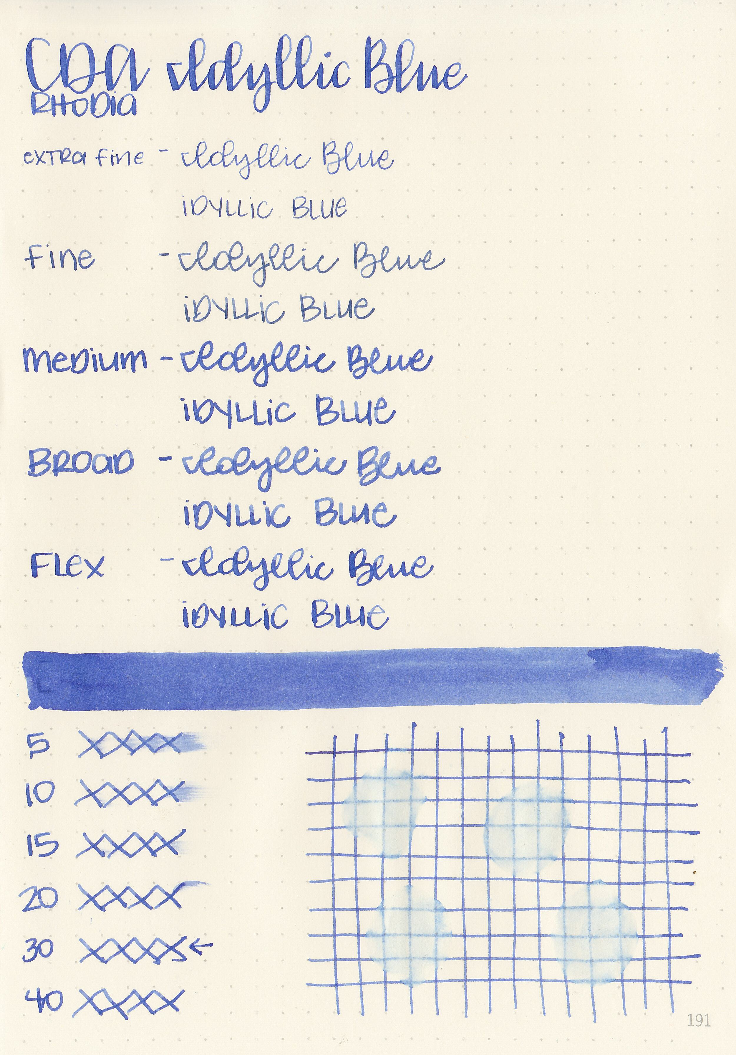
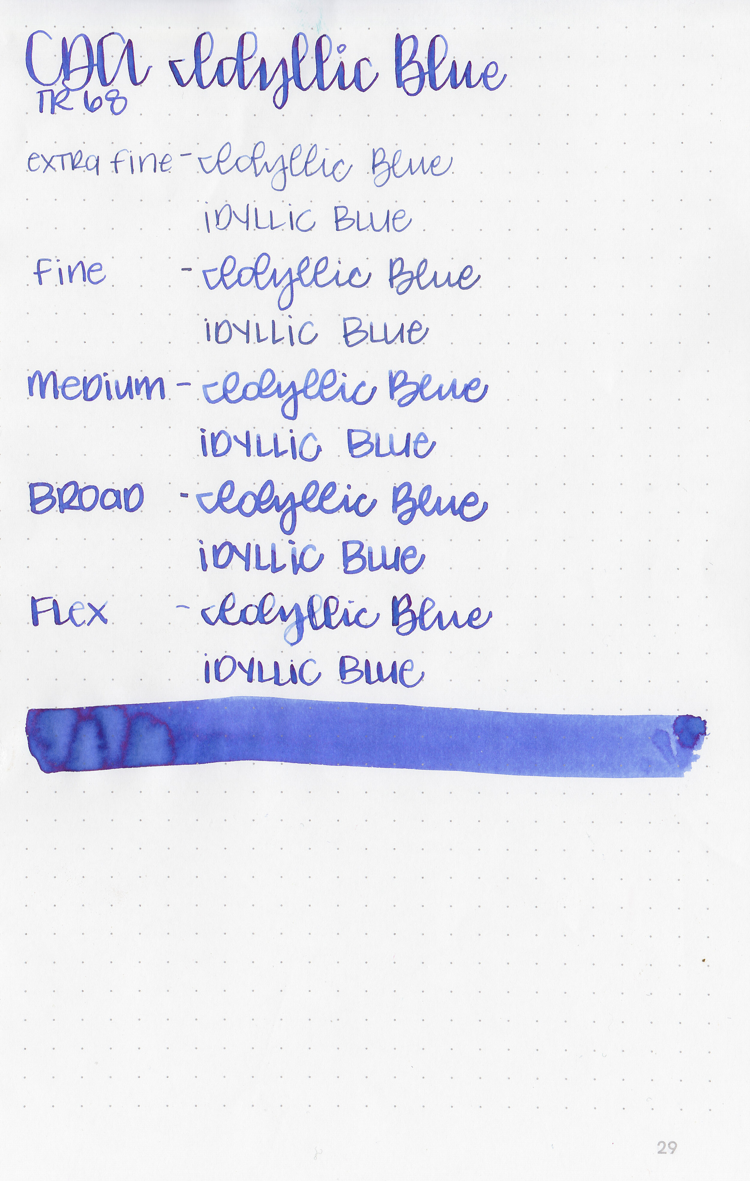
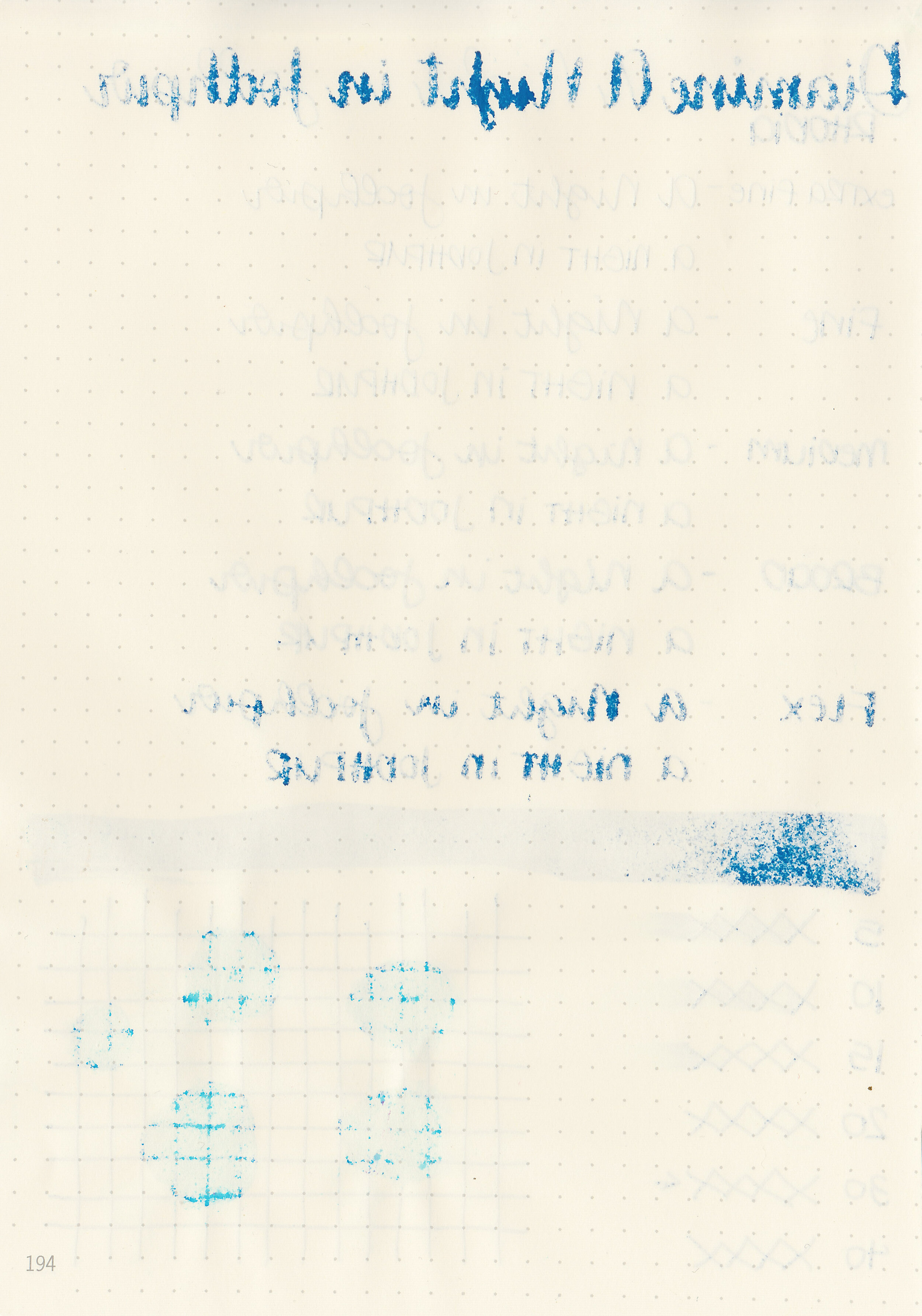
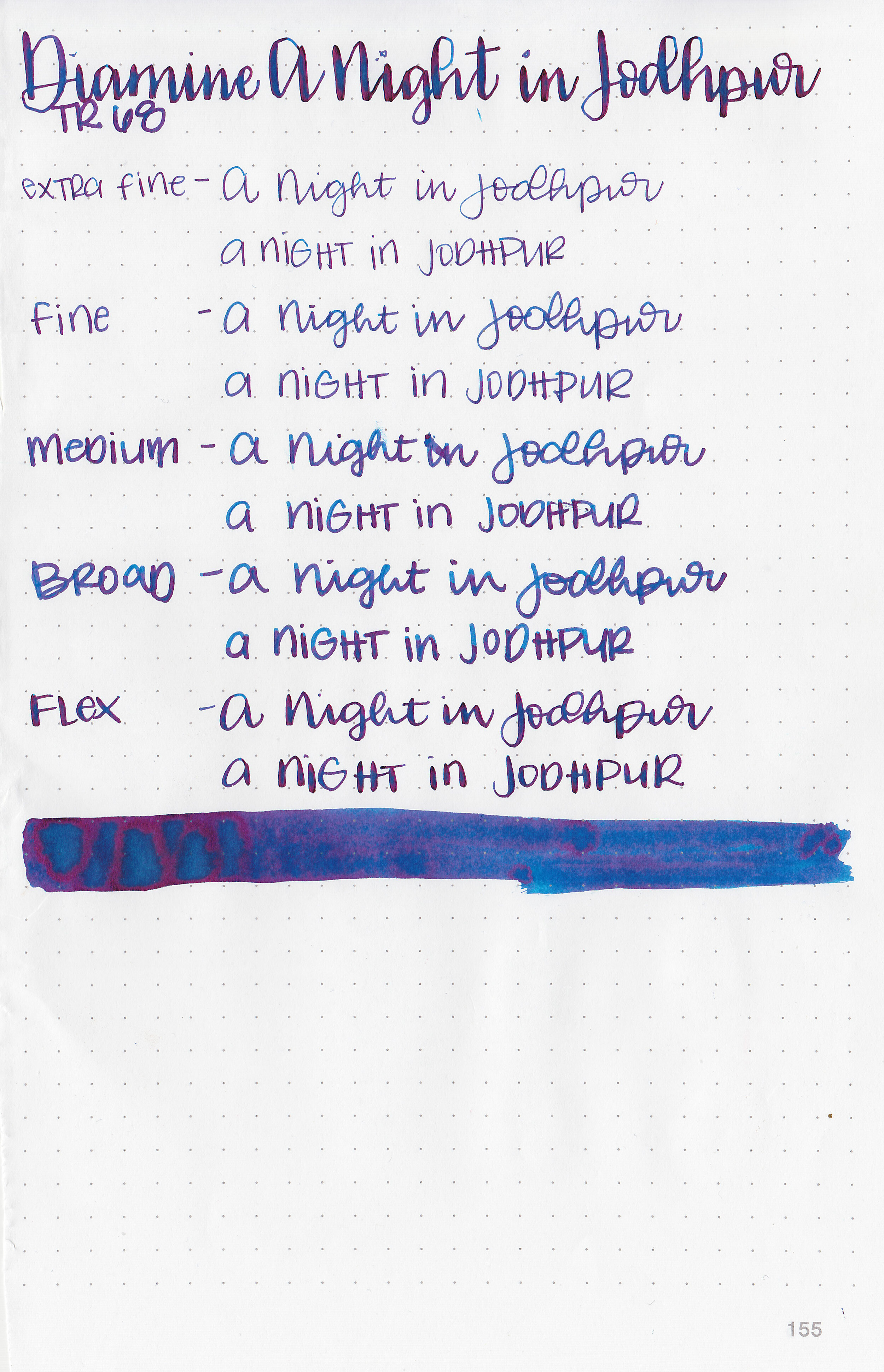
Let's take a look at how the ink behaves on fountain pen friendly papers: Rhodia, Tomoe River, and Leuchtturm.
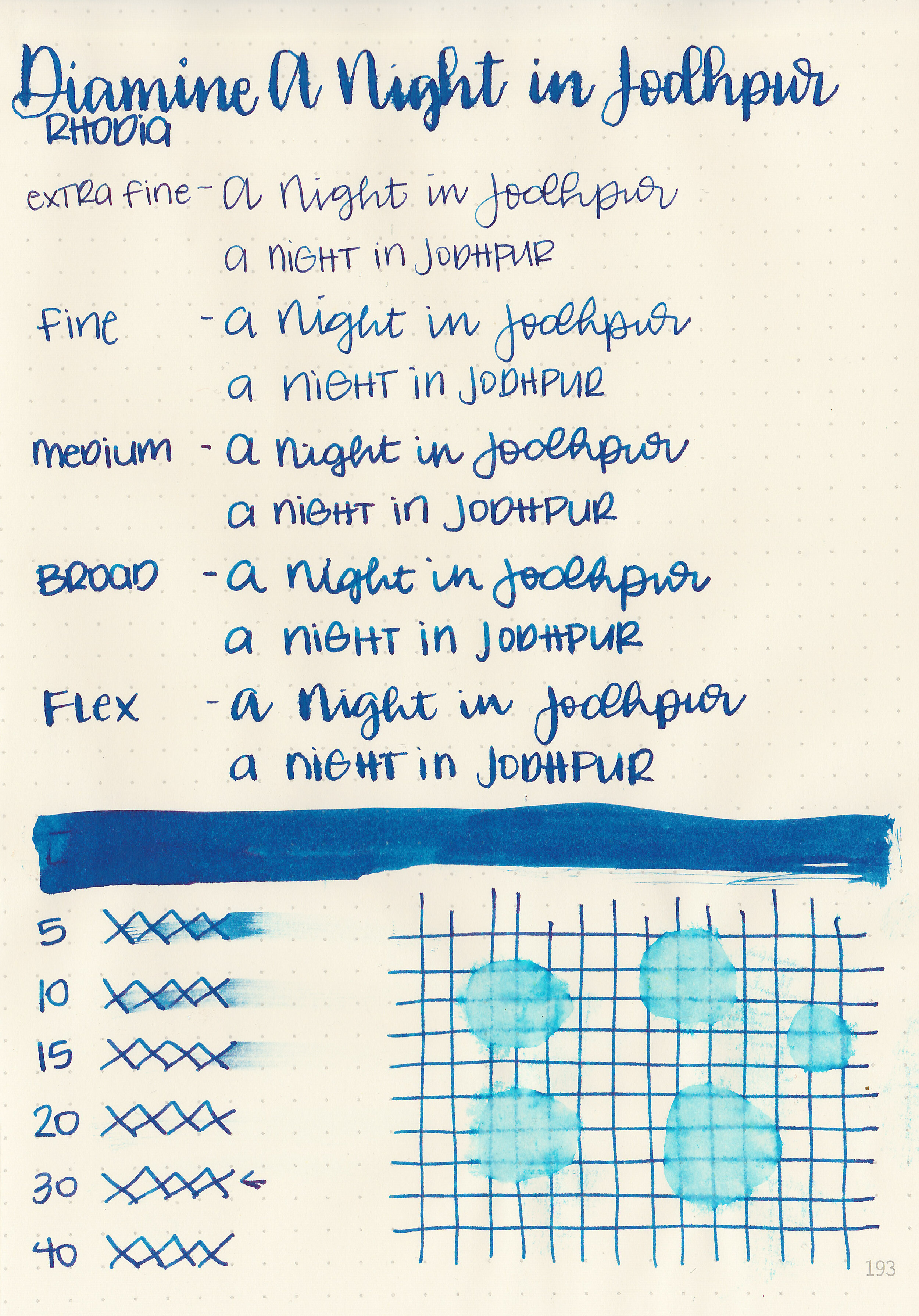
Dry time: 30 seconds
Water resistance: Low
Feathering: Low-there was some feathering in the flex nib.
Show through: Medium
Bleeding: Low-there was some bleeding in the flex nib.
Other properties: medium shading, high sheen, and no shimmer.
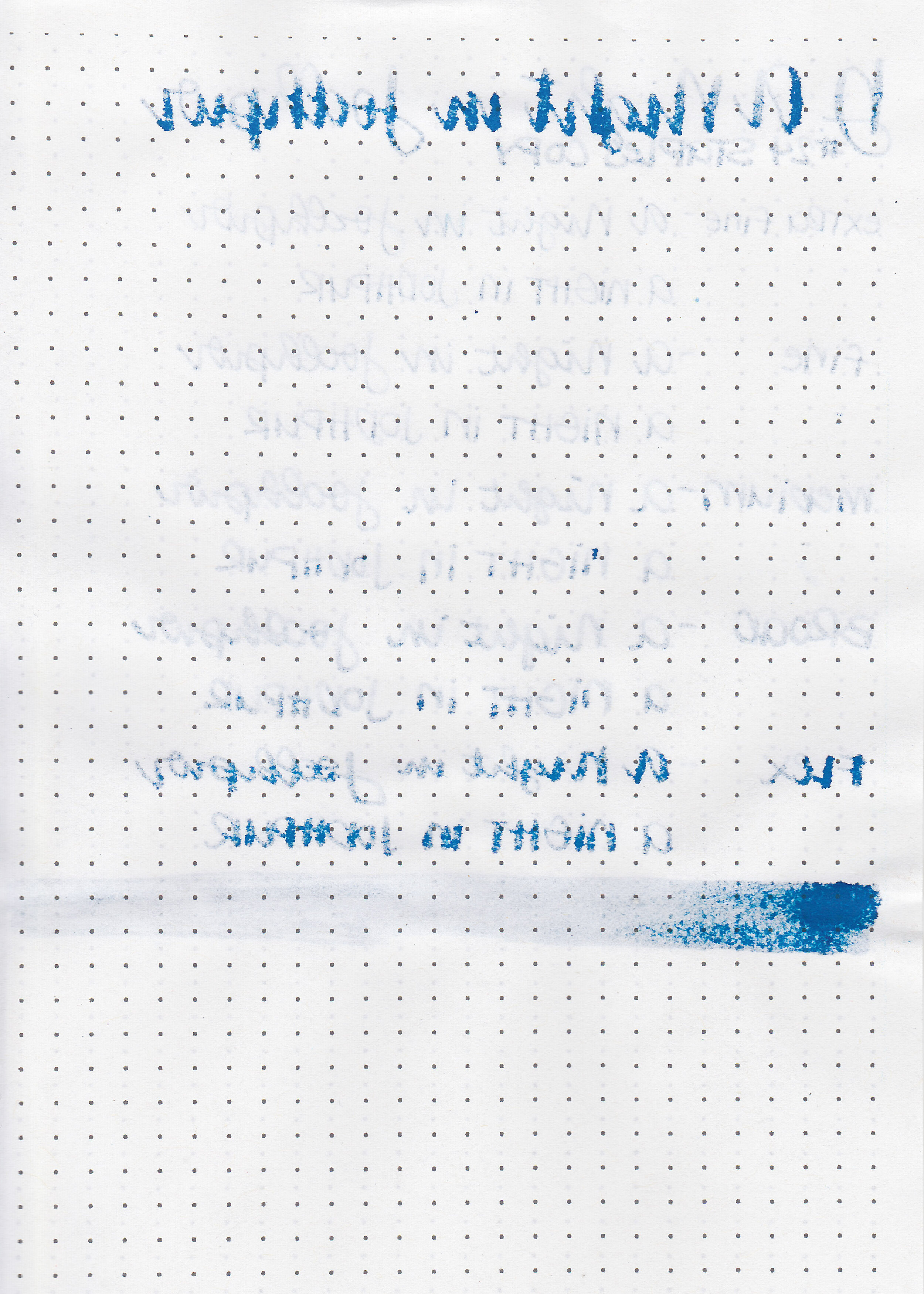
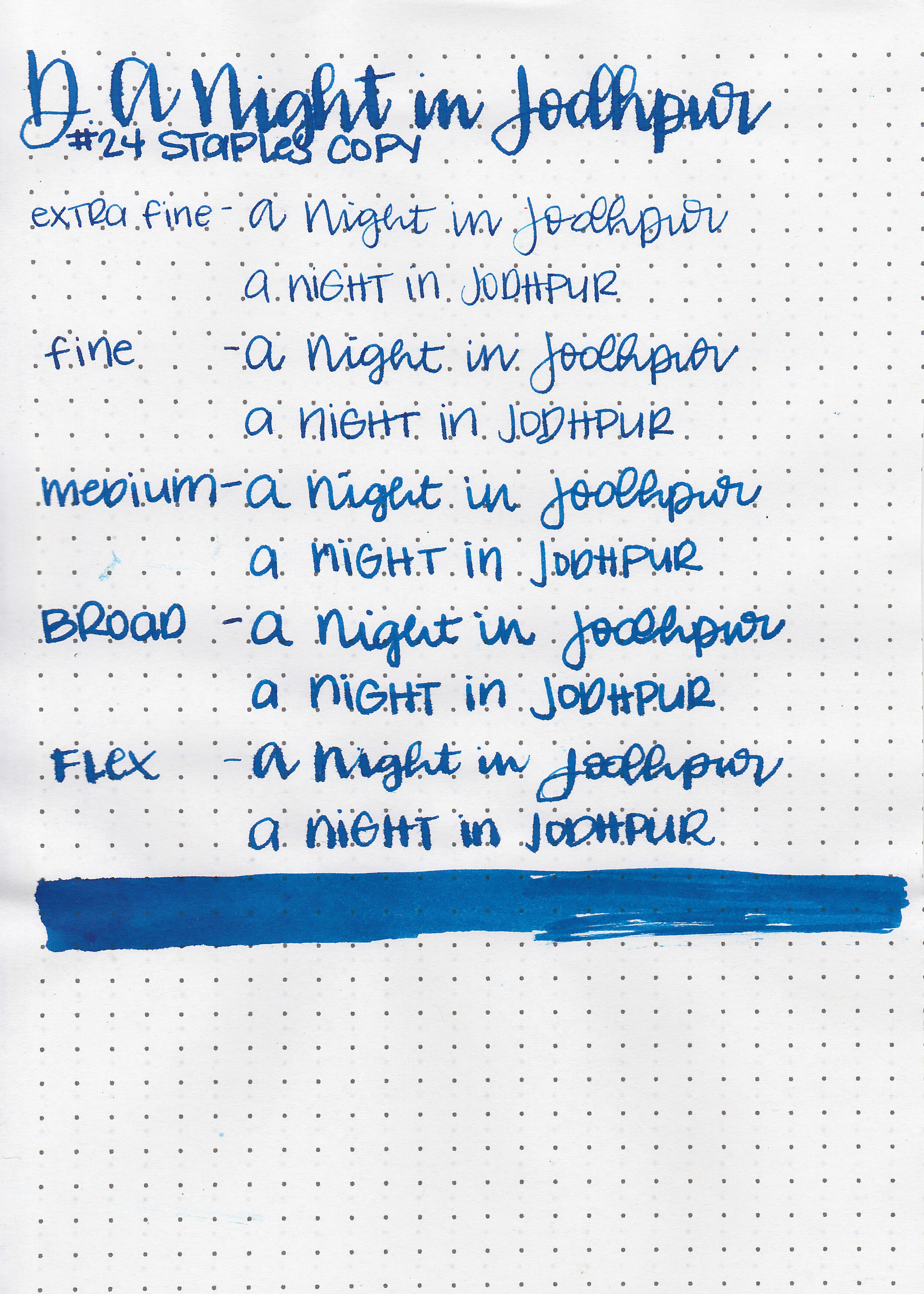
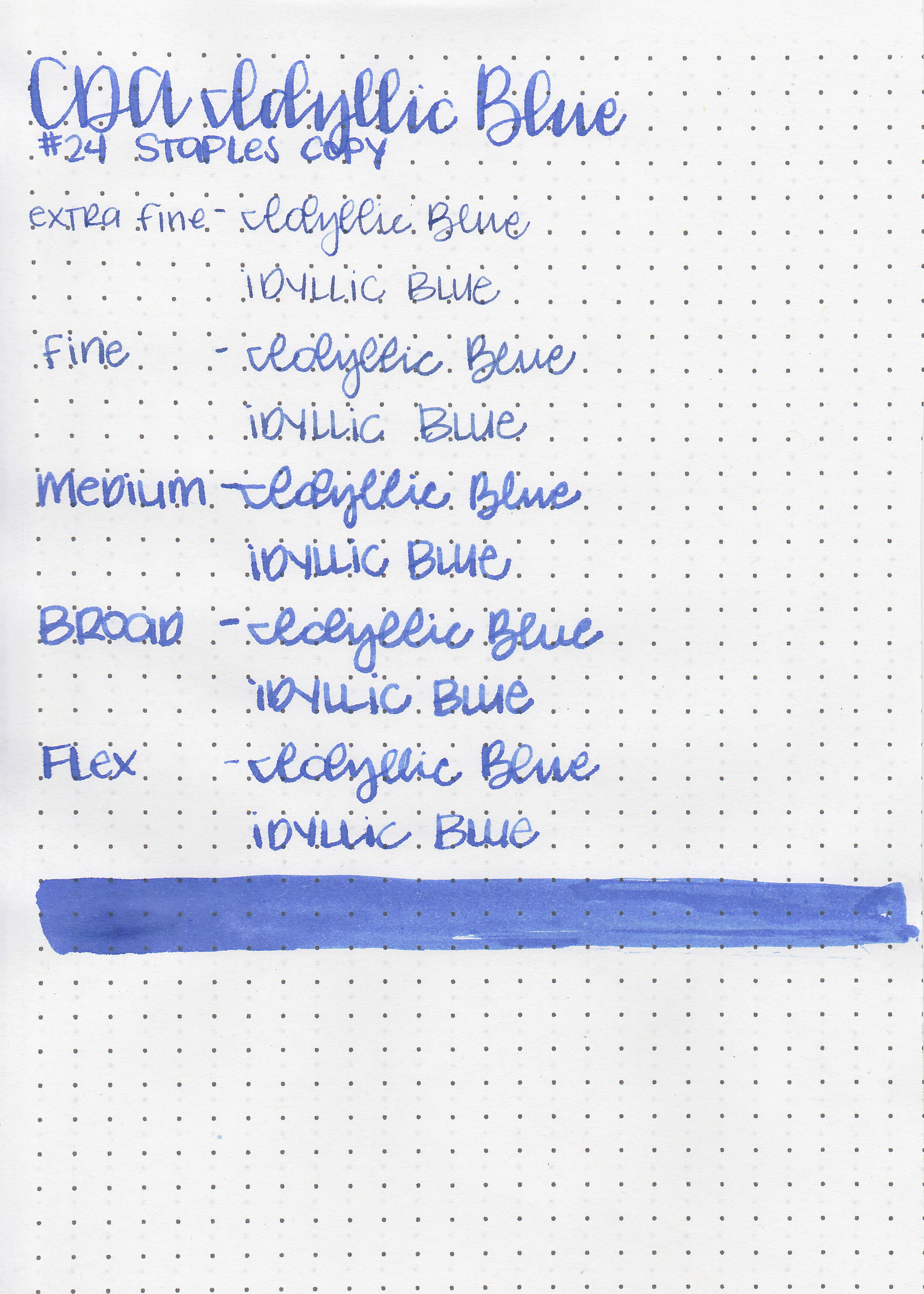
On Staples 24 lb copy paper there was feathering in every nib size, and some bleeding in the flex and broad nibs.
Comparison Swabs:

A Night in Jodhpur is just slightly (by slightly I mean almost indistinguishably close) darker than Diamine Jalur Gemilang. It has more green in it than Diamine Skull and Roses and Diamine Maureen. Click here to see the Diamine inks together.
Longer writing:

I used a broad Pelikan M805 Vibrant Blue on Tomoe River 68gsm. The ink had a slightly wet but sticky flow.
Overall, it has less sheen than some of the other Diamine store exclusives, but there’s still plenty of sheen. There is just a little bit of smearing if you run your hand across the page, but not as bad as some other popular sheening inks. Otherwise it’s pretty well behaved and a nice color.
Disclaimer: A sample of this ink was provided by a pen friend for the purpose of this review. All photos and opinions are my own. This page does not contain affiliate links, and this post is not sponsored in any way.