Robert Oster Holiday 2023
/
I am absurdly late with this post, but let’s take a look at Robert Oster’s Holiday 2023 collection. You can finds these inks for sale at a Vanness Pens.
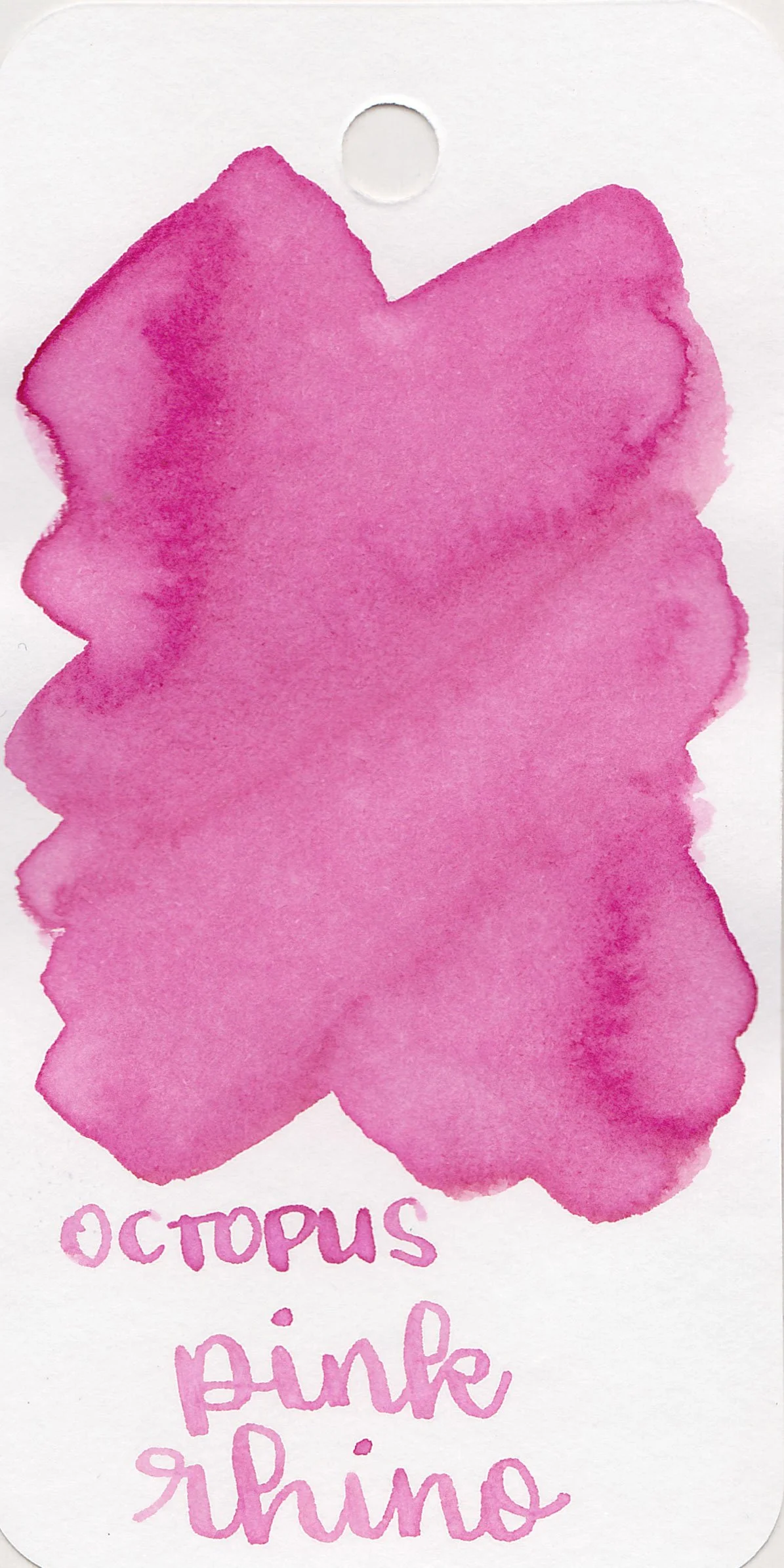
Swabs:


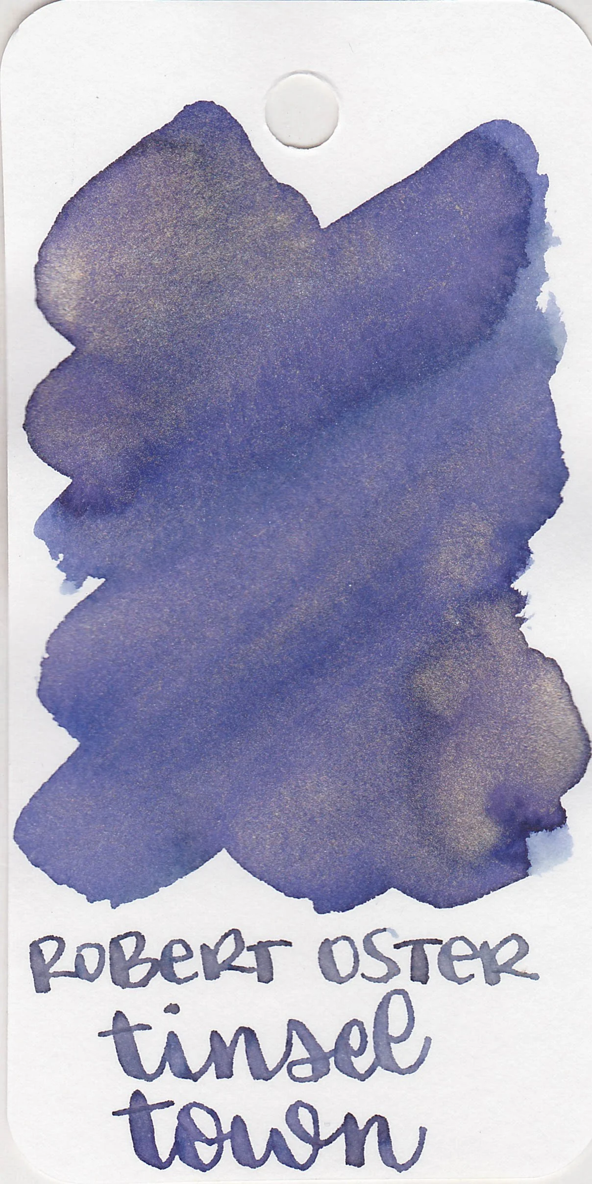
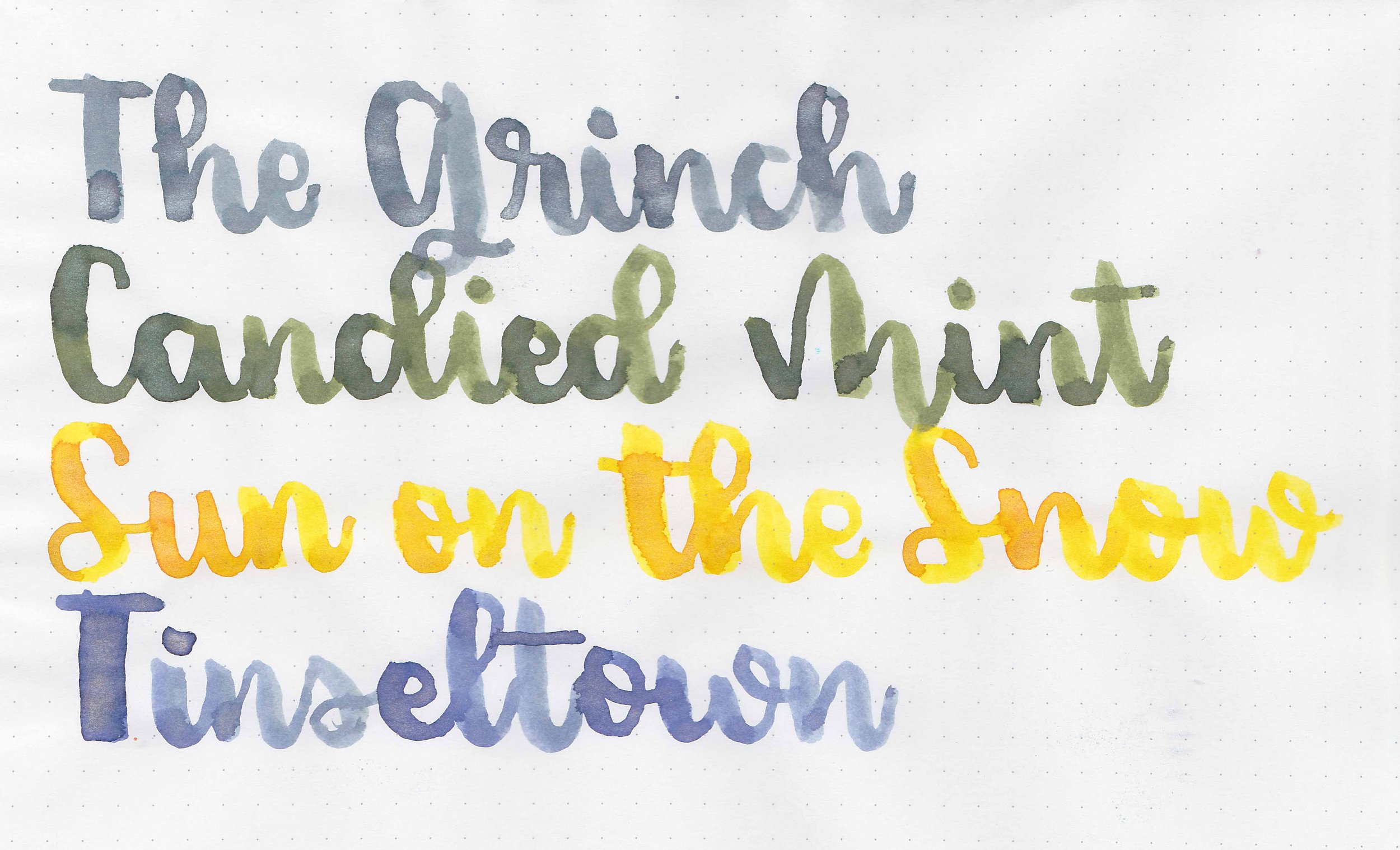
Left to right: The Grinch, Sun on the Snow, Candied Mint, and Tinsel Town.
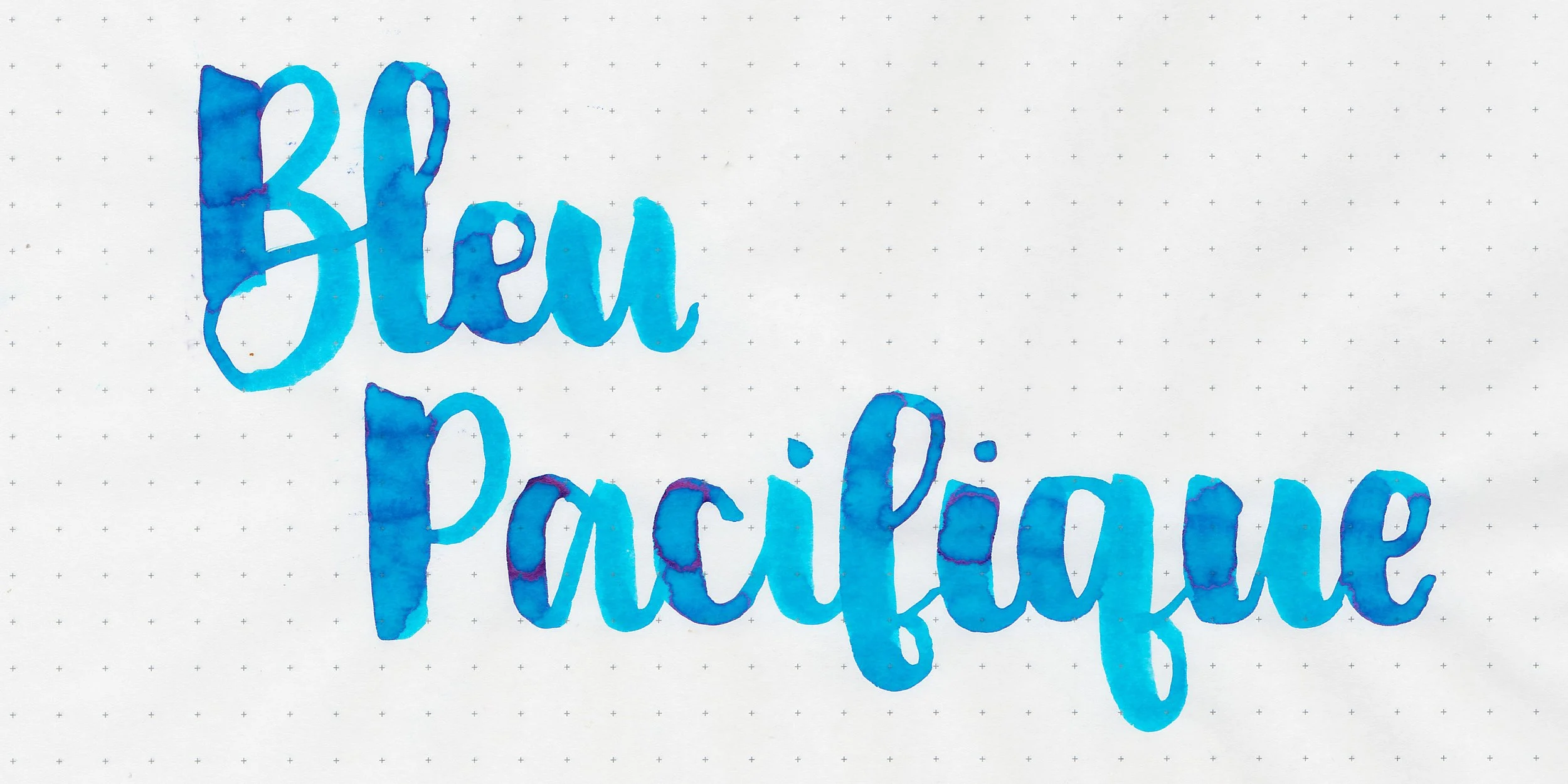
Writing samples:
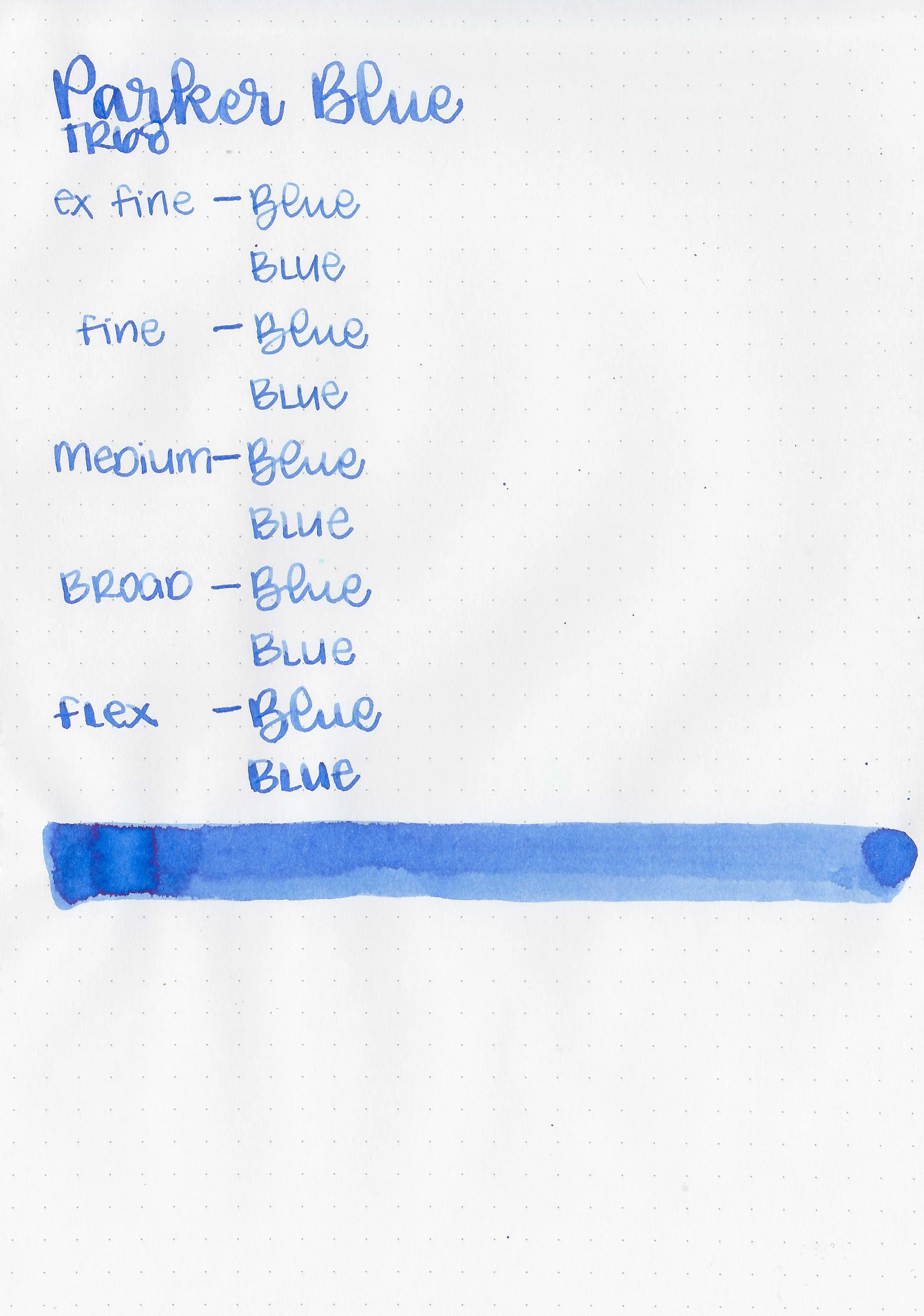
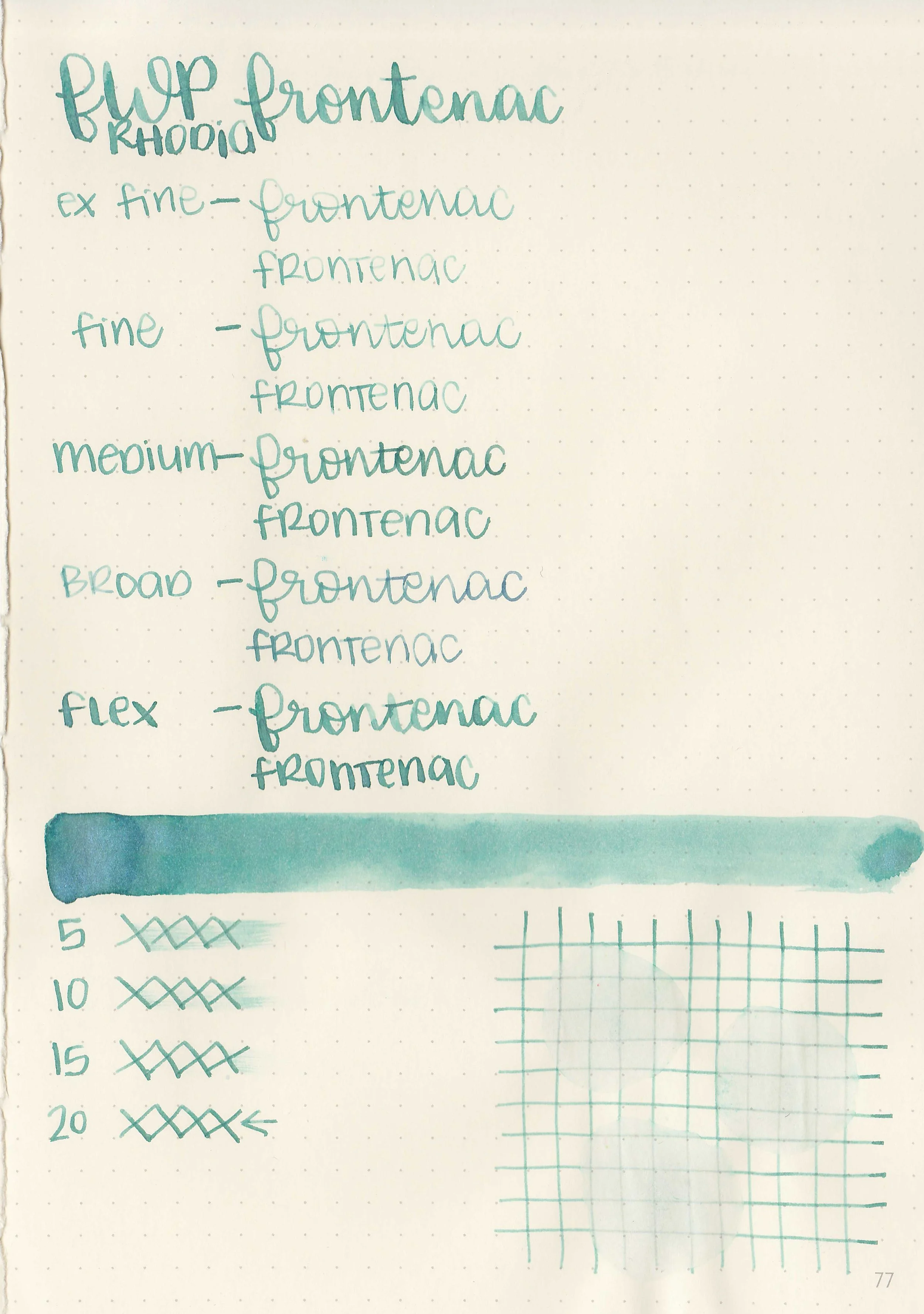
Let's take a look at how the ink behaves on fountain pen friendly papers: Rhodia, Tomoe River, and Leuchtturm.


Dry Time: 40-50 seconds
Water Resistance: Low


Feathering: None

Show through: Medium


Bleeding: None
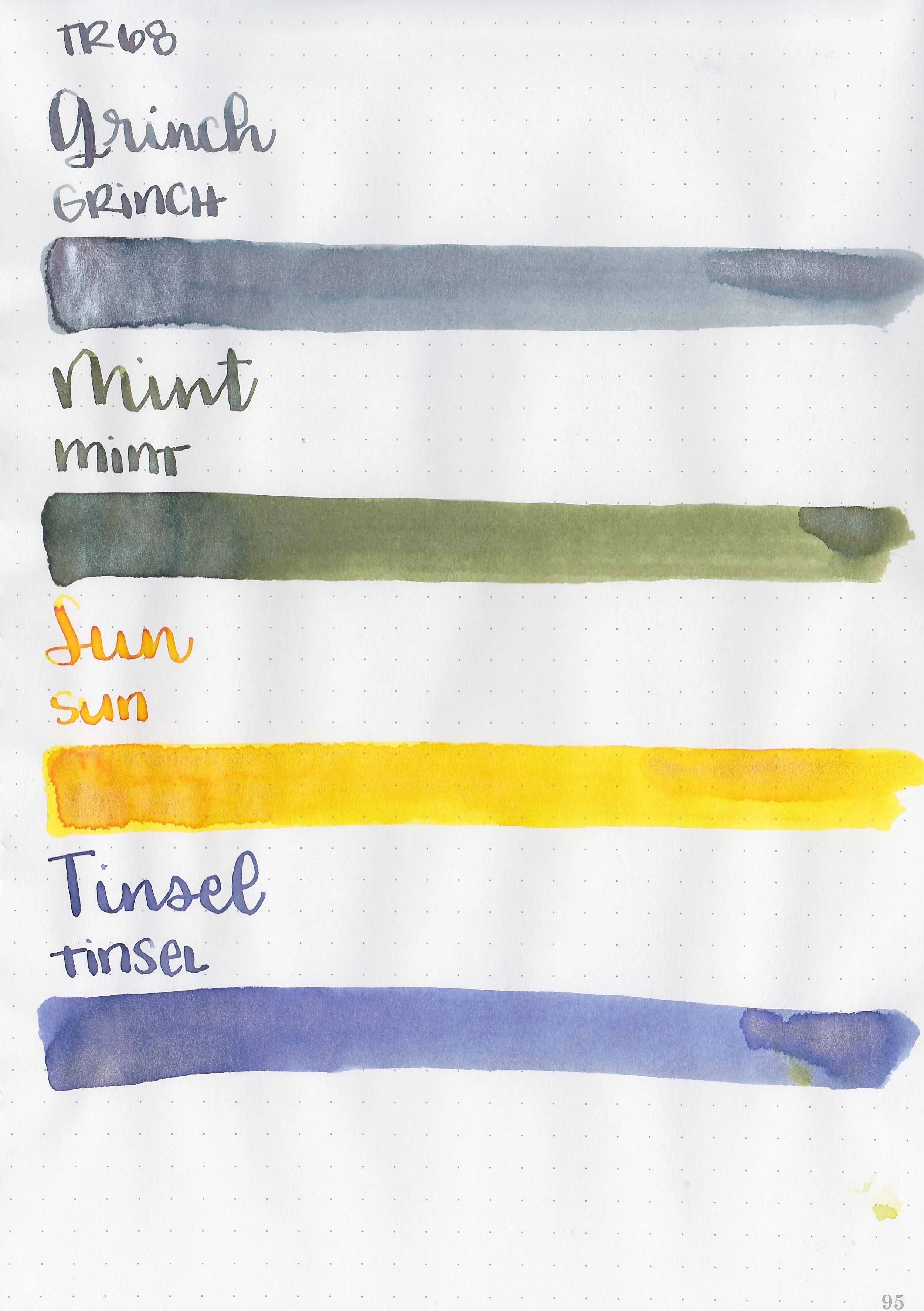
Other properties: All have medium shading and shimmer. The Grinch has silver shimmer. Candied Mint has green shimmer. Sun on the Snow has gold shimmer. Tinseltown has bronze shimmer.


On Walmart Pen + Gear copy paper there was some feathering in every nib size and a few dots of bleeding.
Comparison Swabs:

The Grinch is closest to Vinta Nahan.

Sun on the Snow is closest to Van Dieman’s Golden Orb Web.

Candied Mint isn’t super close to any of these, but it’s probably closes to Ferris Wheel Press Brilliant Beanstalk.

Tinseltown is less blue than J Herbin 1670 Violet Imperial.
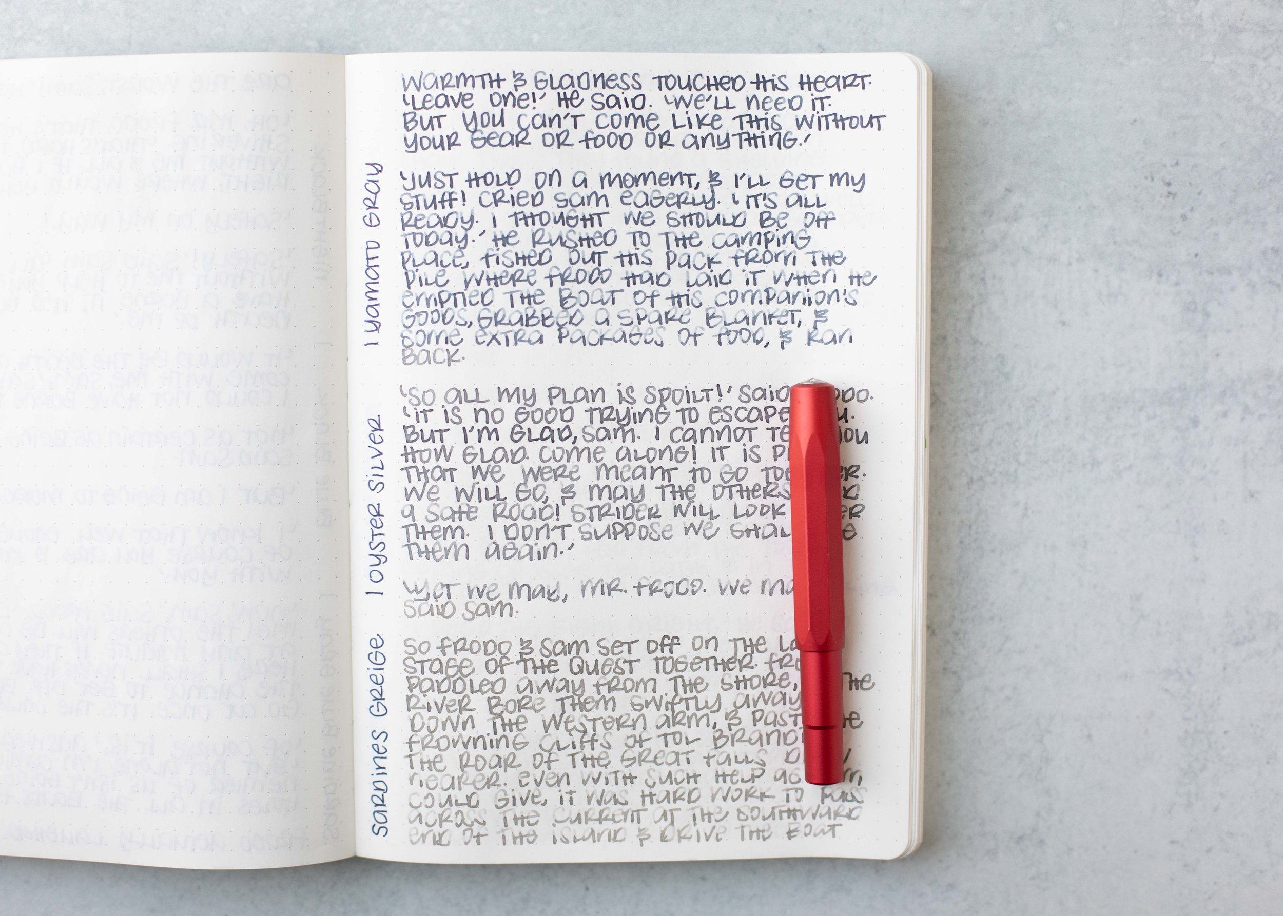
Longer Writing:

I used a Taroko Enigma notebook. All three had slightly dry flows.
Overall, these are lovely inks. I didn’t have any issues with clogging or hard starts. These are absolutely worth a try. I think The Grinch is my favorite out of the four.
Disclaimer: All photos and opinions are my own. This page does not contain affiliate links, and is not sponsored in any way.