Color Traveler Grey Inks
/
Today let’s take a look at three grey inks from Color Traveler: Yamato Gray, Oyster Silver and Sardines Griege. You can finds these inks for sale at a Vanness Pens.
Swabs:


Left to right: Yamato Gray, Oyster Silver and Sardines Griege.
Writing samples:
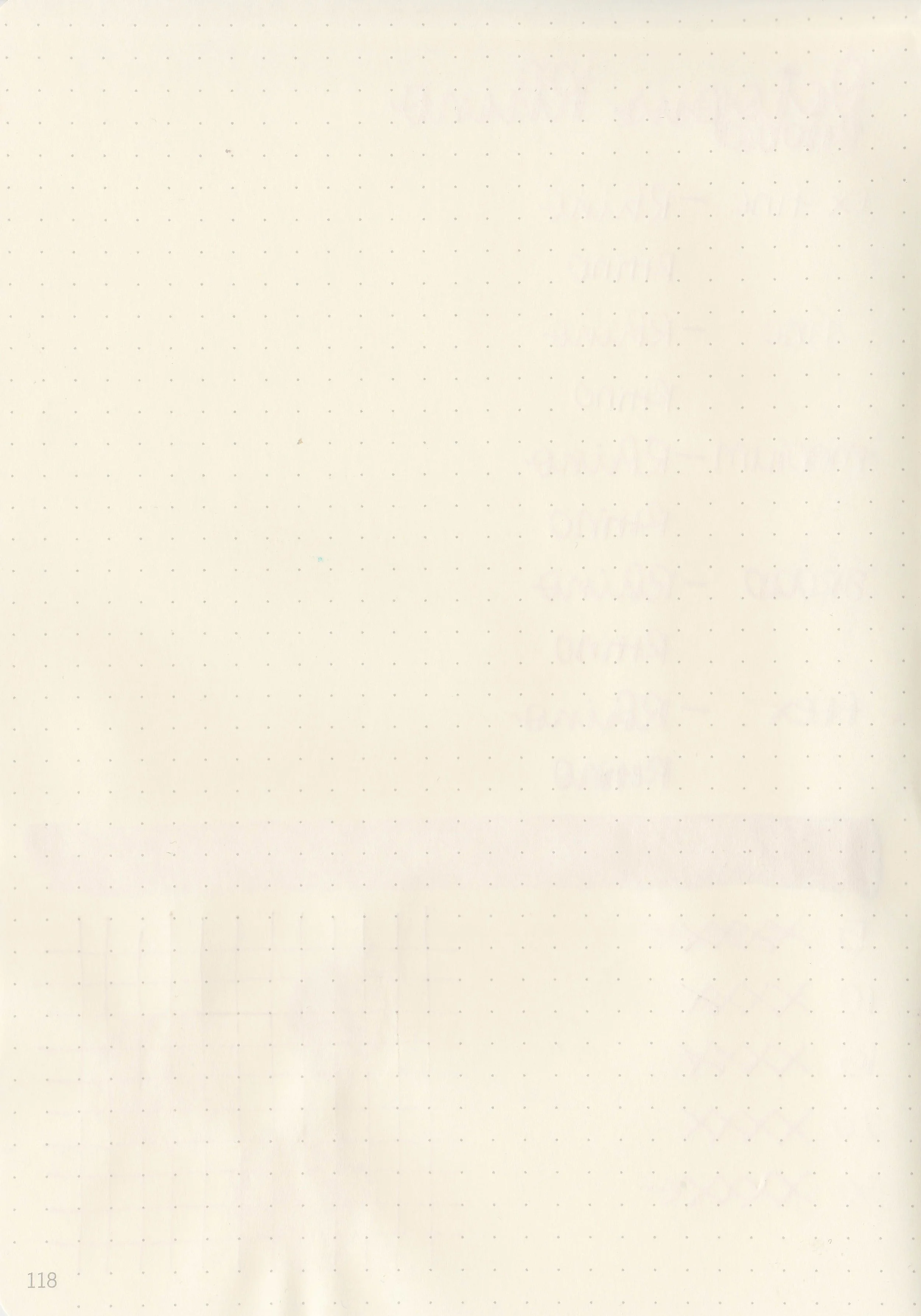
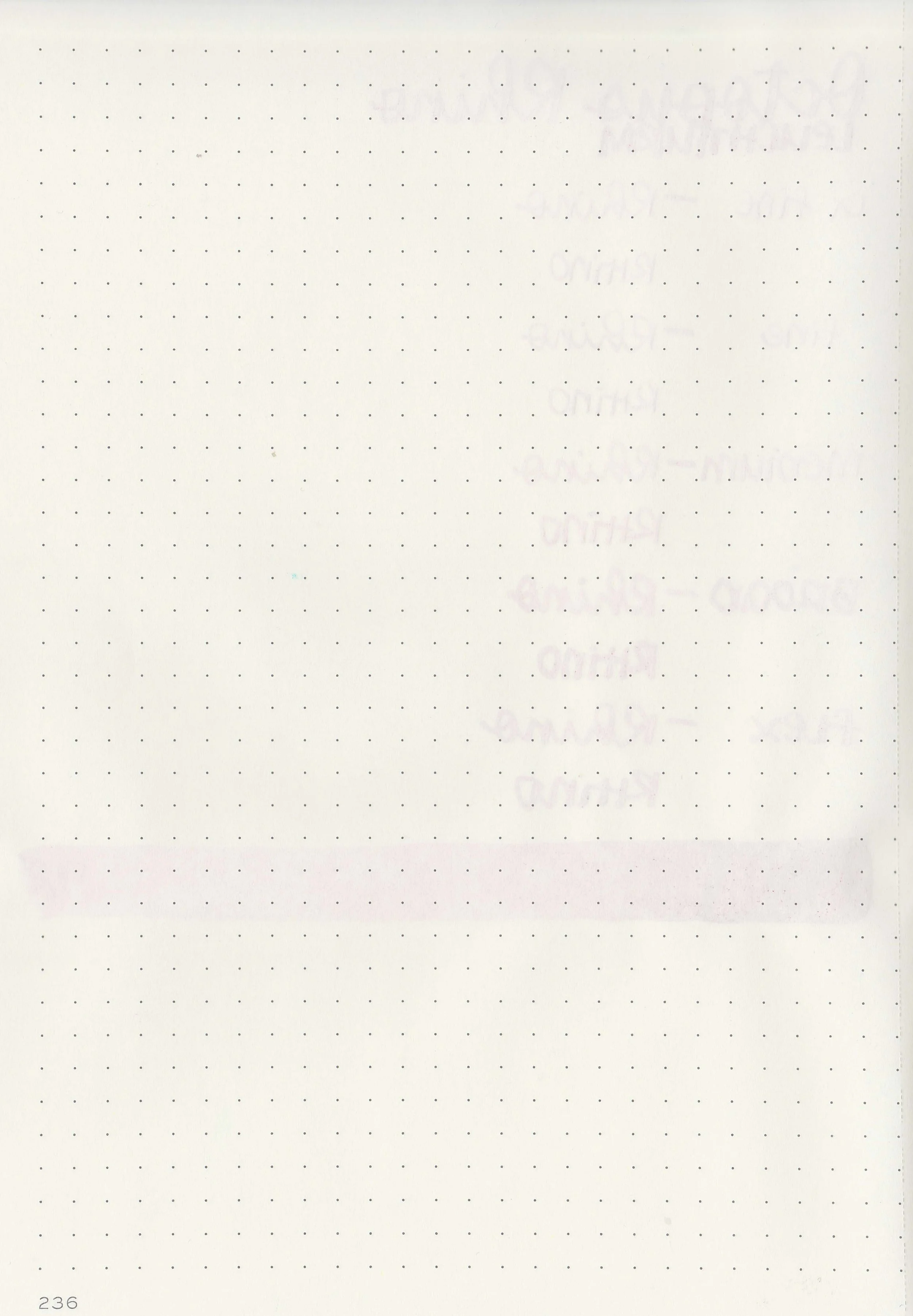
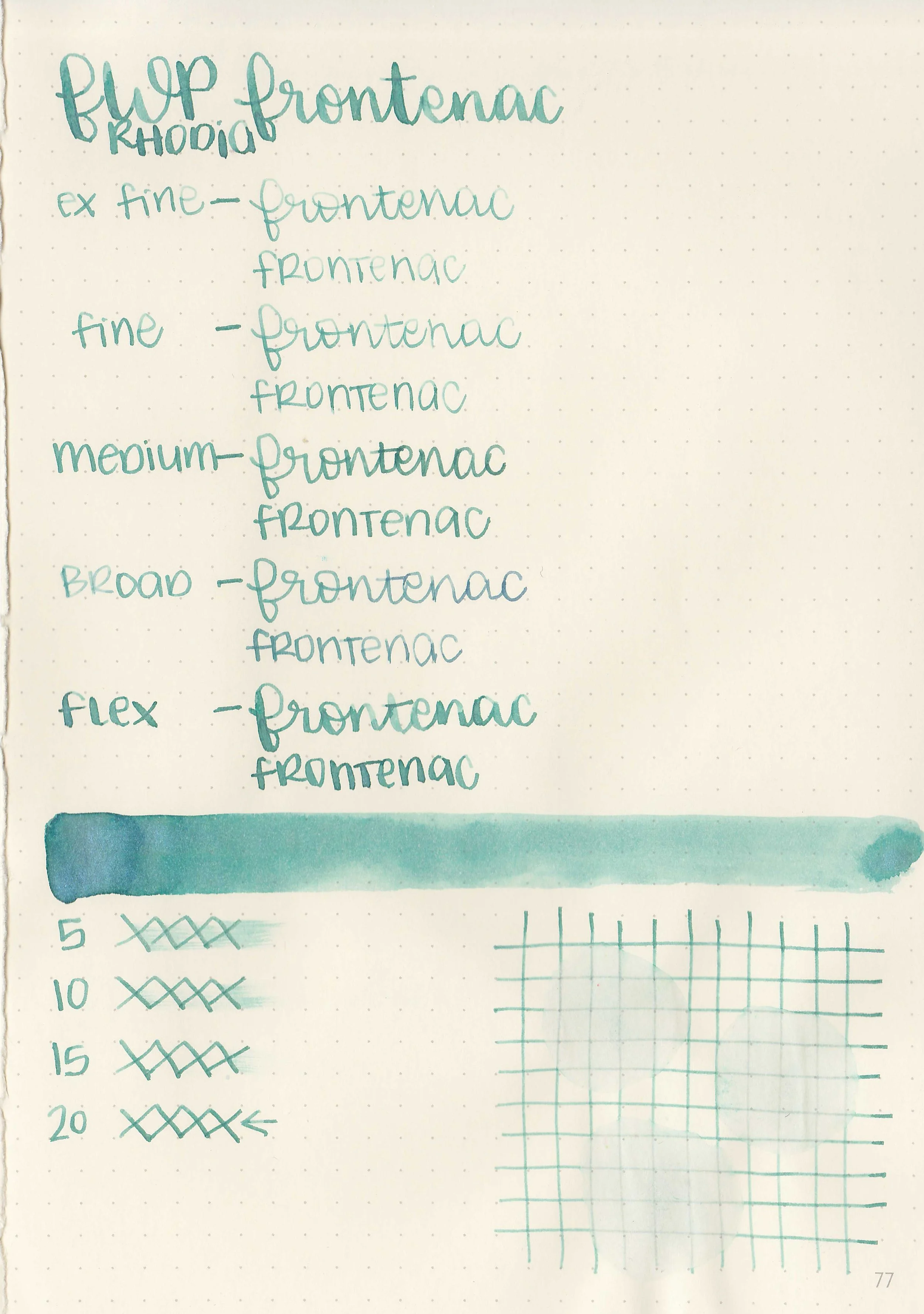
Let's take a look at how the ink behaves on fountain pen friendly papers: Rhodia, Tomoe River, and Leuchtturm.


Dry Time: 30-50 seconds
Water Resistance: Low


Feathering: None


Show through: Medium

Bleeding: None
Other properties: All have medium shading.


On Walmart Pen + Gear copy paper there was some feathering in every nib size and a few dots of bleeding.
Comparison Swabs:

Yamato Gray is closest to 3 Oysters Cool Gray.

Oyster Silver is closest to Pelikan Edelstein Moonstone, Sardines Greige is close to Octopus Fluids Pebble Stone.
Longer Writing:
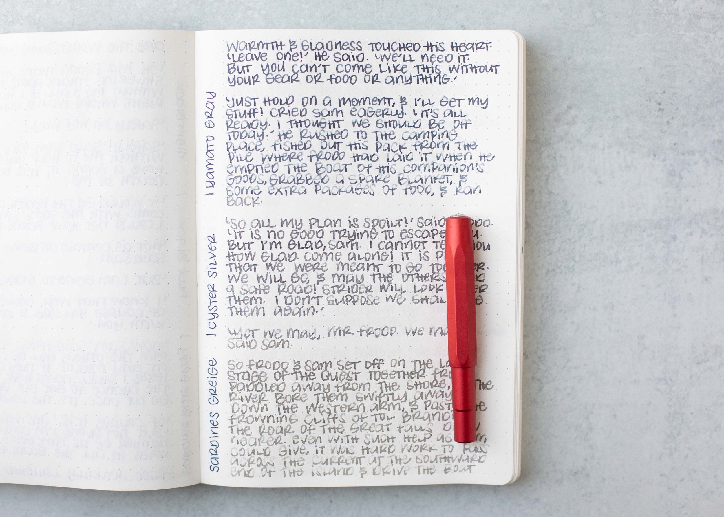
I used a Taroko Enigma notebook. All three had average flows.
Overall, these are good inks. Yamato Gray is my favorite out of the three but I like all three.
Disclaimer: All photos and opinions are my own. This page does not contain affiliate links, and is not sponsored in any way.